The Best Behr Paint Colors for 2026: Trends, Palettes, and How to Use Them
If you’ve been waiting for the gray trend to finally exit the building, 2026 is your year. The era of sterile, “hospital-chic” interiors is officially over. In its place, we are seeing a massive shift toward moody comfort, earthy warmth, and a newfound bravery with color. Behr’s 2026 Color Trends Palette is leading this charge, moving away from safety and toward spaces that feel like a “warm hug.”
Unlike other paint brands that are playing it safe with off-whites, Behr has made a bold statement this year by crowning a deep, dramatic jewel tone as their headliner. But the 2026 palette isn’t just about drama; it’s about versatility. From “baked” clay tones to the perfect “greige” that finally replaces cool gray, this year’s colors are designed to make your home feel lived-in and luxurious.
In this guide, we won’t just list the colors. We’ll break down how to use them, what to pair them with, and why they work, so you can confidently update your home for the year ahead.
Quick Summary: Best Behr Paint Colors 2026
Top Pick (Color of the Year): Hidden Gem (N430-6A) – A smoky, grounding jade green perfect for color drenching.
The Palette at a Glance:
Key Trend: 2026 is about “Mood & Warmth.” Cool grays are out; warm earth tones and deep jewel tones are in.
You can apply wallpapers, paints, etc. on walls and see how they look in various interiors.

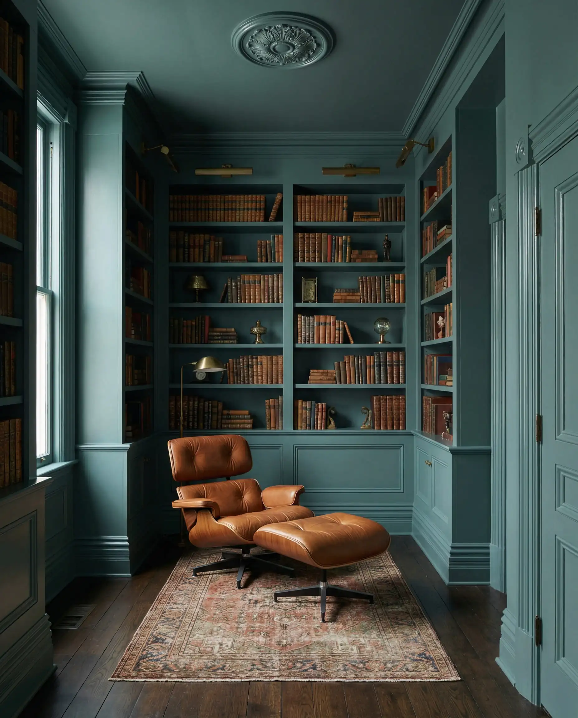
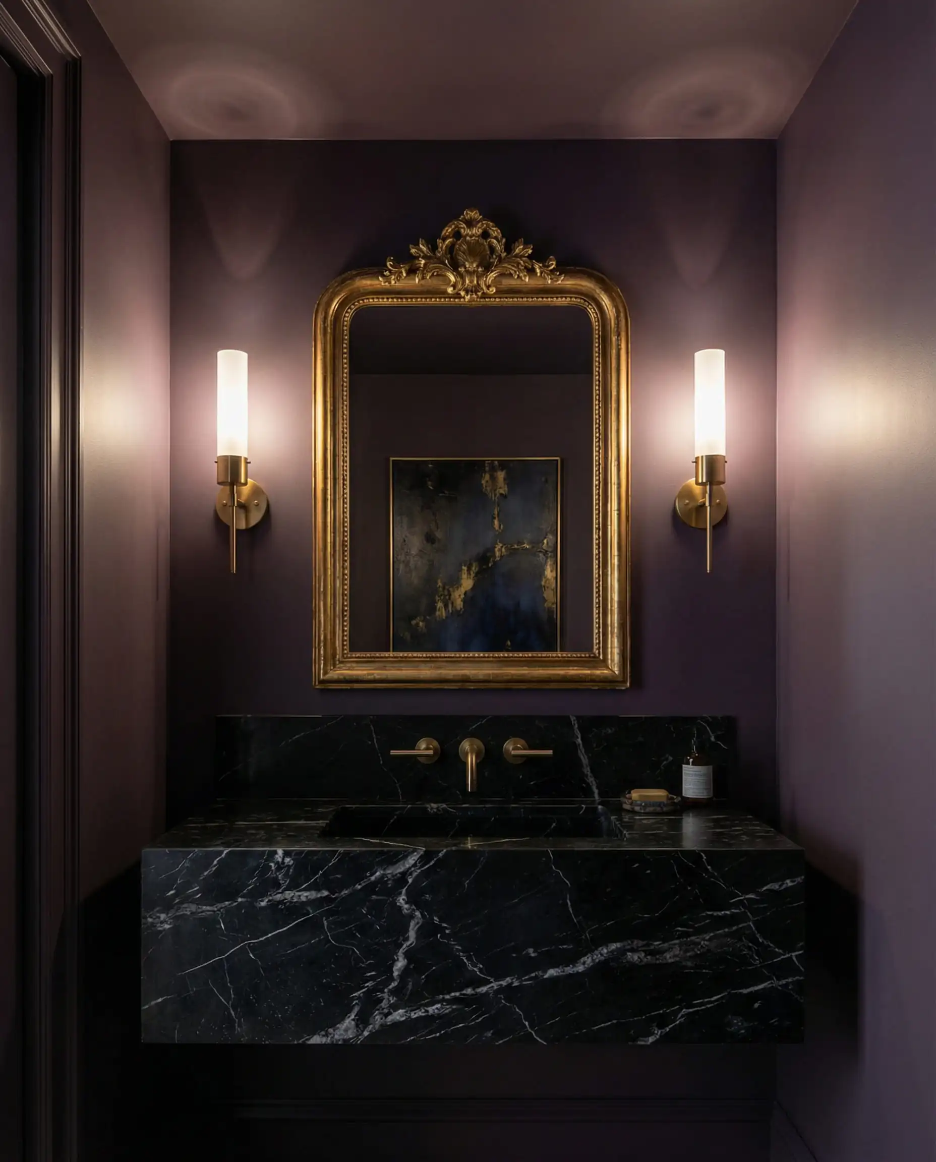
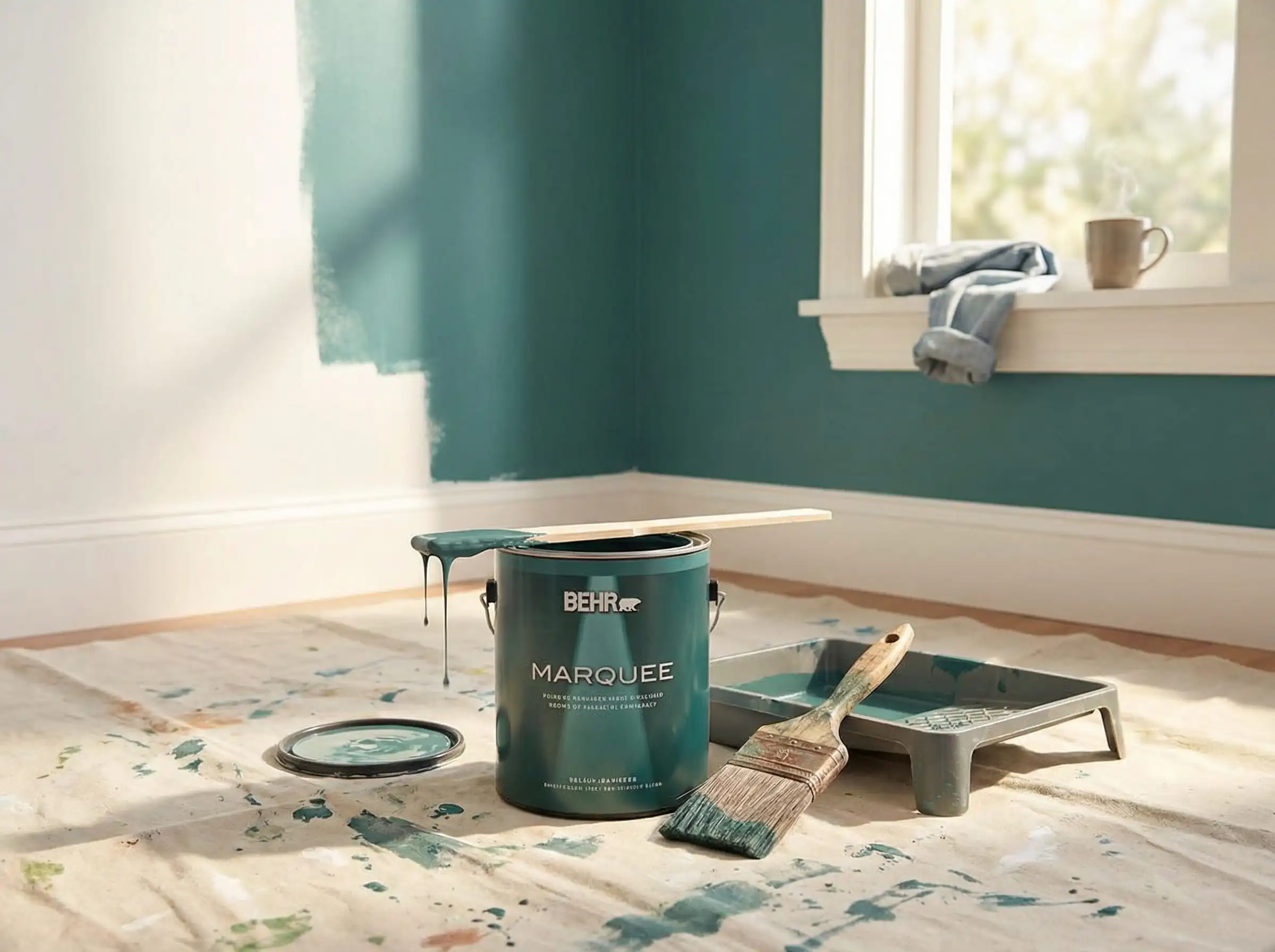
The Star of 2026: Behr’s Color of the Year “Hidden Gem”
Every year, the design world holds its breath for the “Color of the Year” (COTY) announcements. This year, Behr didn’t disappoint. Meet Hidden Gem (N430-6A), the defining shade of 2026.
What is Hidden Gem?
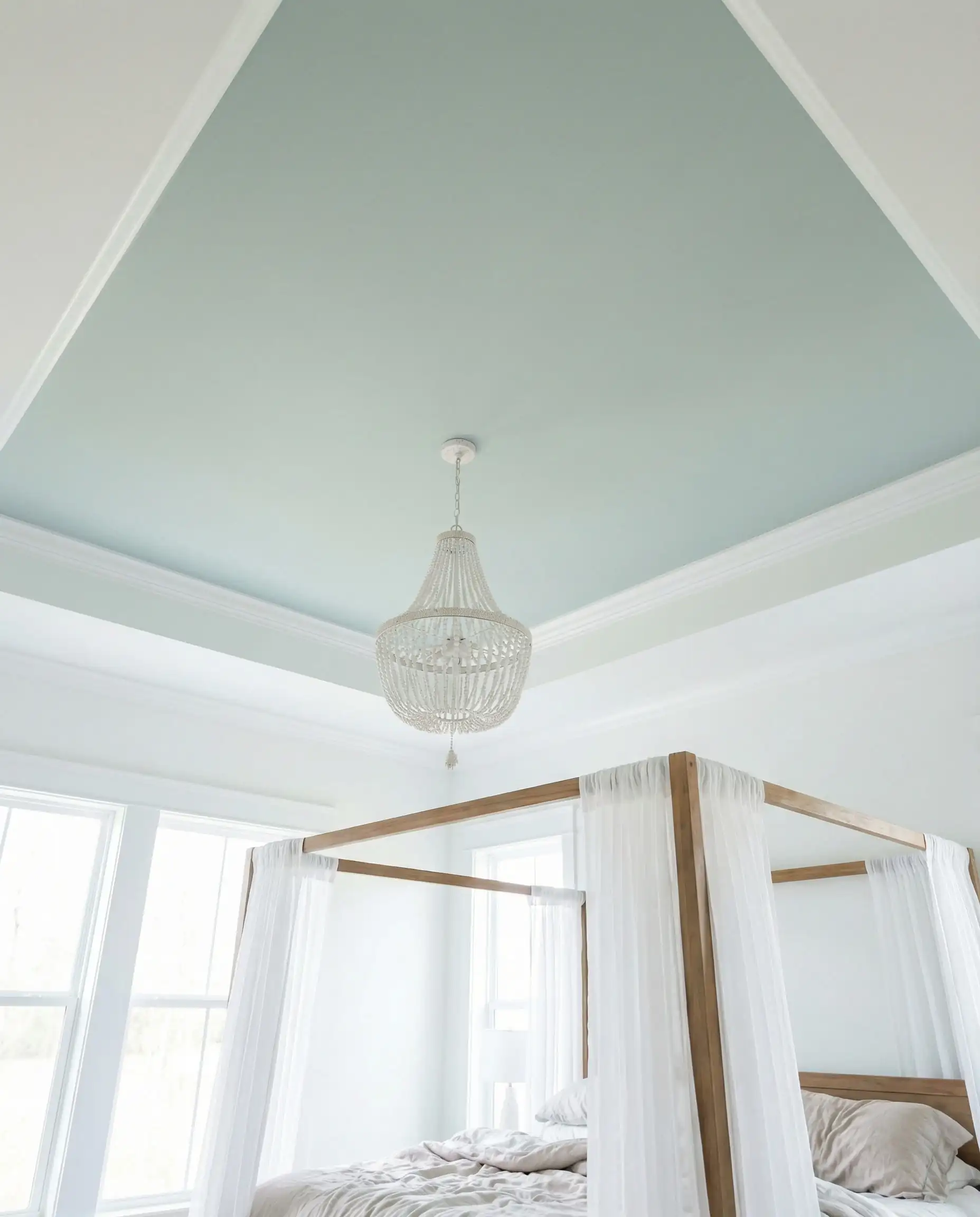
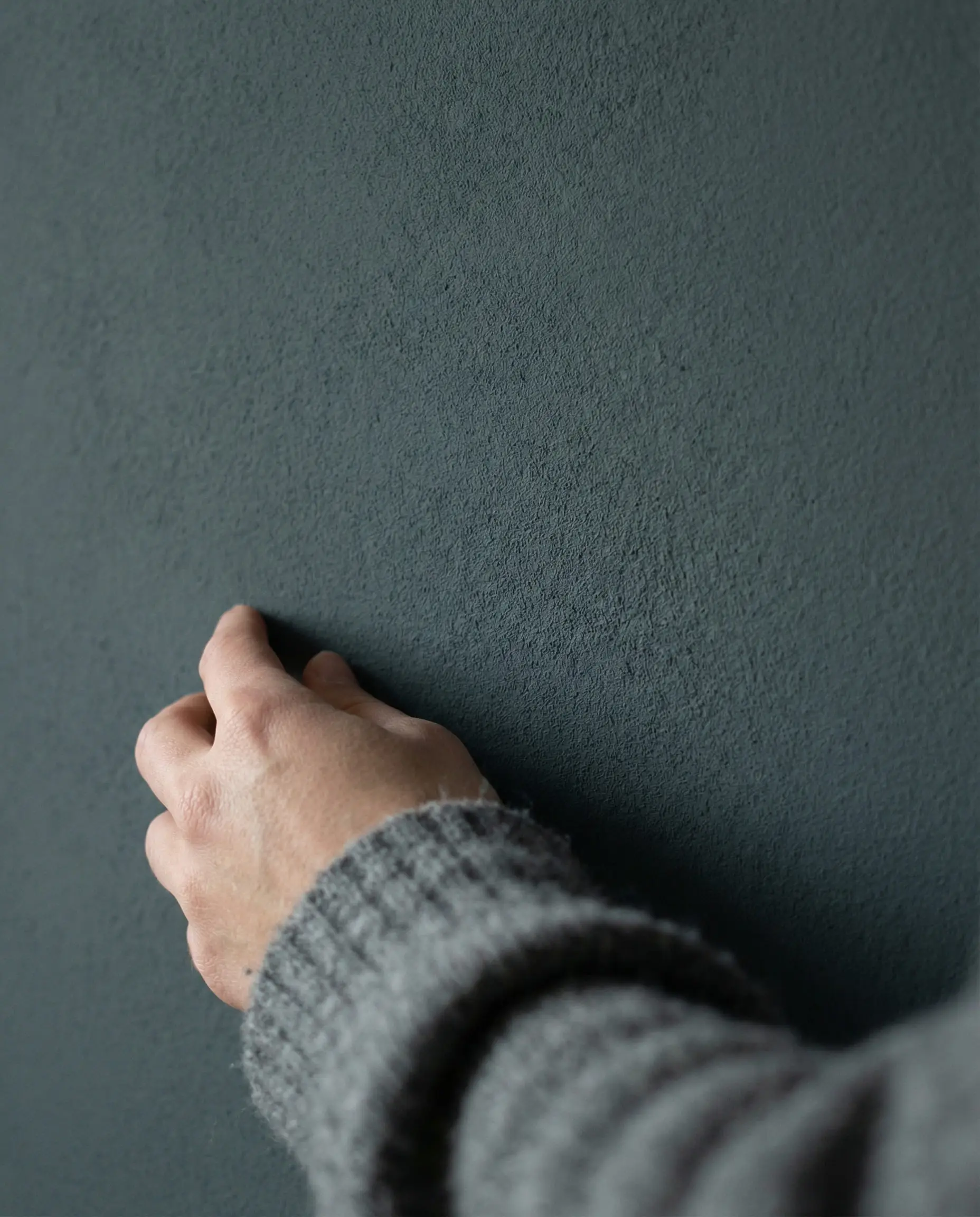
Hidden Gem is a “smoky jade”—a sophisticated blend that sits right on the border between blue and green. It is deep, moody, and undeniably elegant. Unlike the bright teals of the 2010s, Hidden Gem has a “dusted” quality (a lower chroma), which means it feels grounded rather than electric. It changes beautifully with the light: reading as a rich emerald in dim evening light and a calming slate-teal during the day.
Hidden Gem is the ‘adult in the room’ of paint colors. It proves that dark colors don’t make a room feel small; they make it feel infinite. If you loved Sherwin-Williams’ Evergreen Fog a few years ago but wanted something more dramatic, this is your natural next step.
Hackrea Verdict
How to Use Hidden Gem (The “Color Drench” Trend)
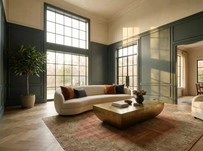
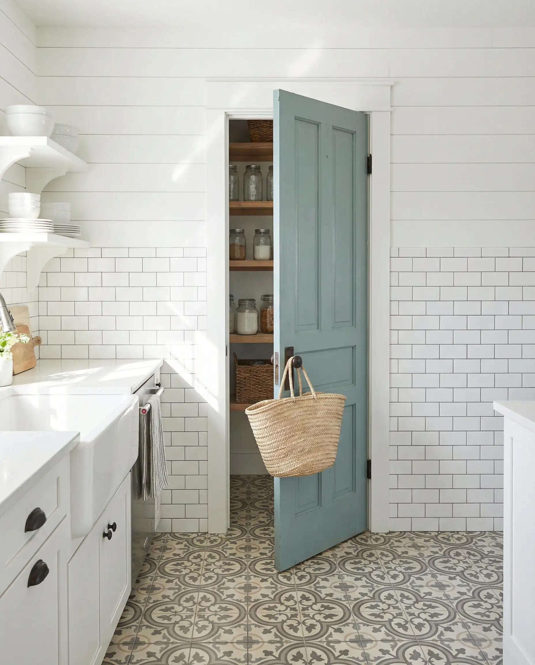
The biggest mistake homeowners make with a color like Hidden Gem is limiting it to a single accent wall. That is the “old” way of painting. In 2026, the trend is Color Drenching.
Best Pairings for Hidden Gem
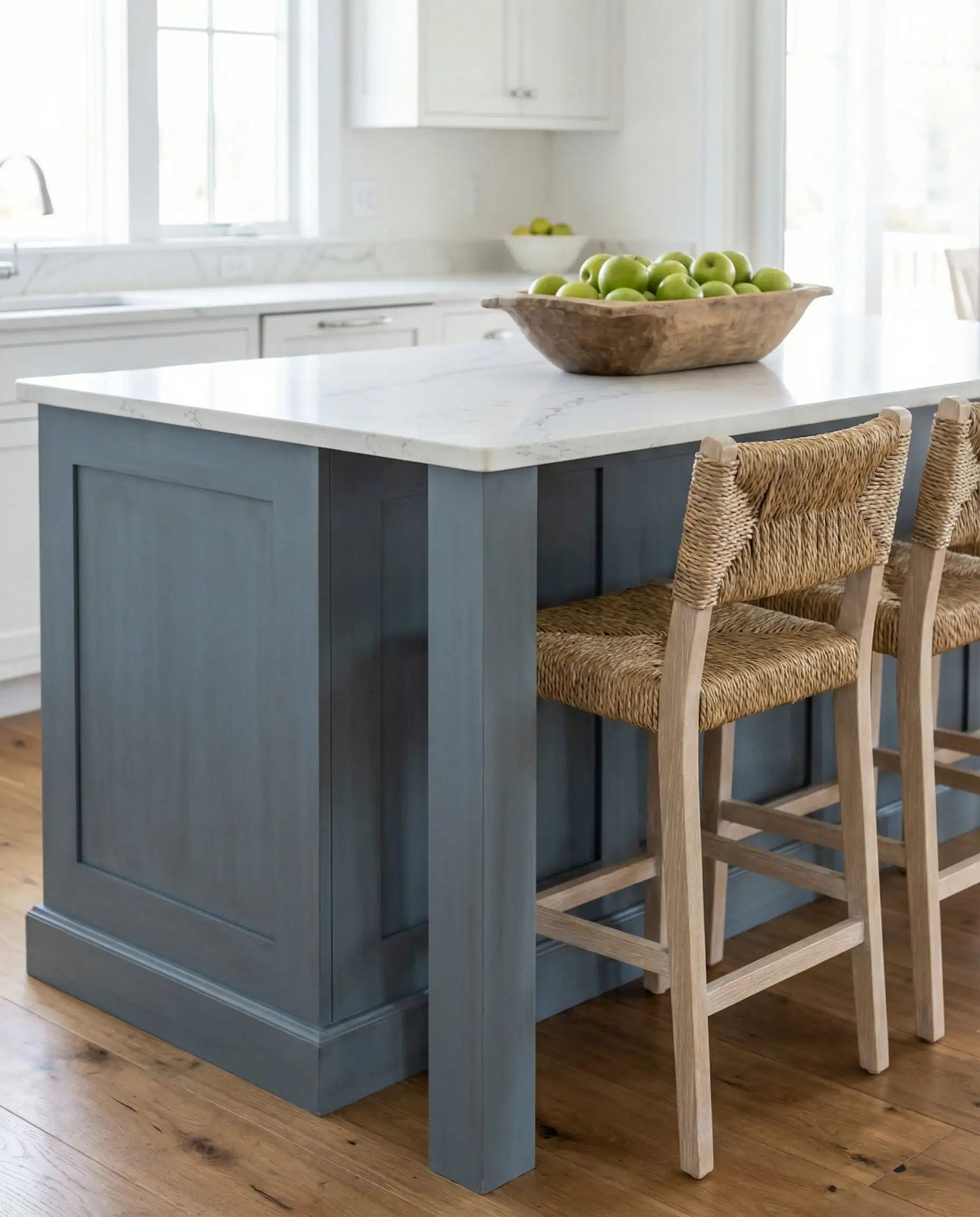
The “New Neutrals”: Warm, Earthy, and Inviting
While jewel tones grab the headlines, neutrals are the workhorses of your home. But in 2026, the definition of “neutral” has changed. We are saying goodbye to “builder’s gray” and hello to colors that feel like they were baked in the sun.
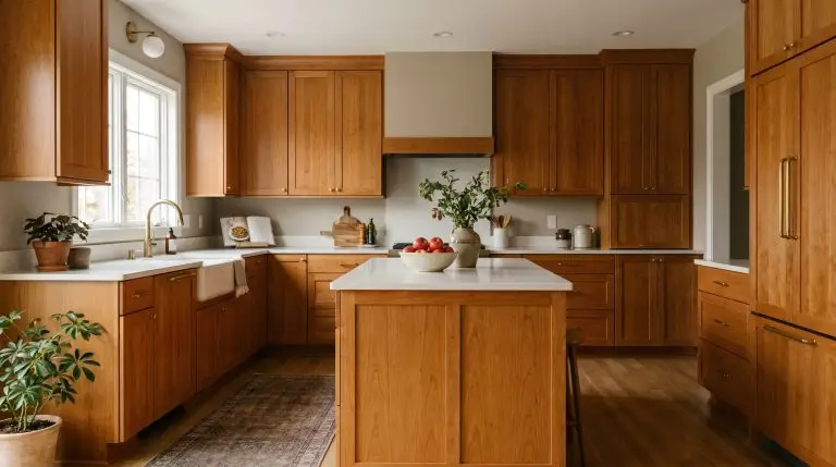
1. Wheat Bread (720C-3)
If you are looking for the perfect “Greige” (Gray + Beige), this is it. Wheat Bread is Behr’s answer to the warming trend. It lacks the cold, blue undertones of yesterday’s grays.
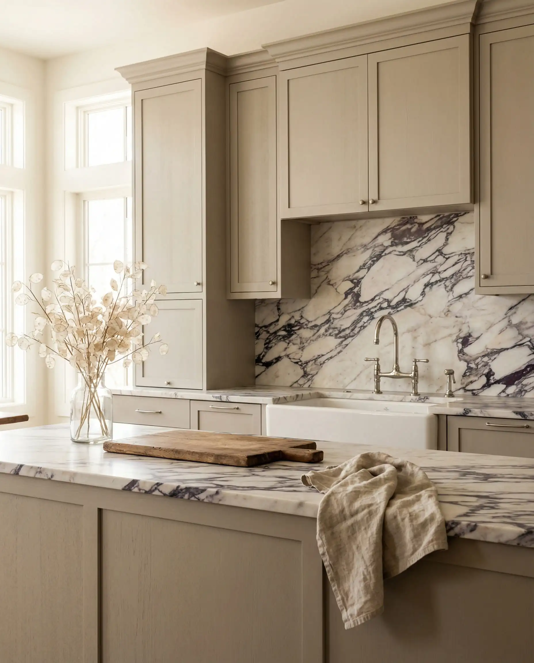
2. Blank Canvas (DC-003)
Behr’s 2023 Color of the Year remains a staple in the 2026 palette because it is simply the best warm white they offer.
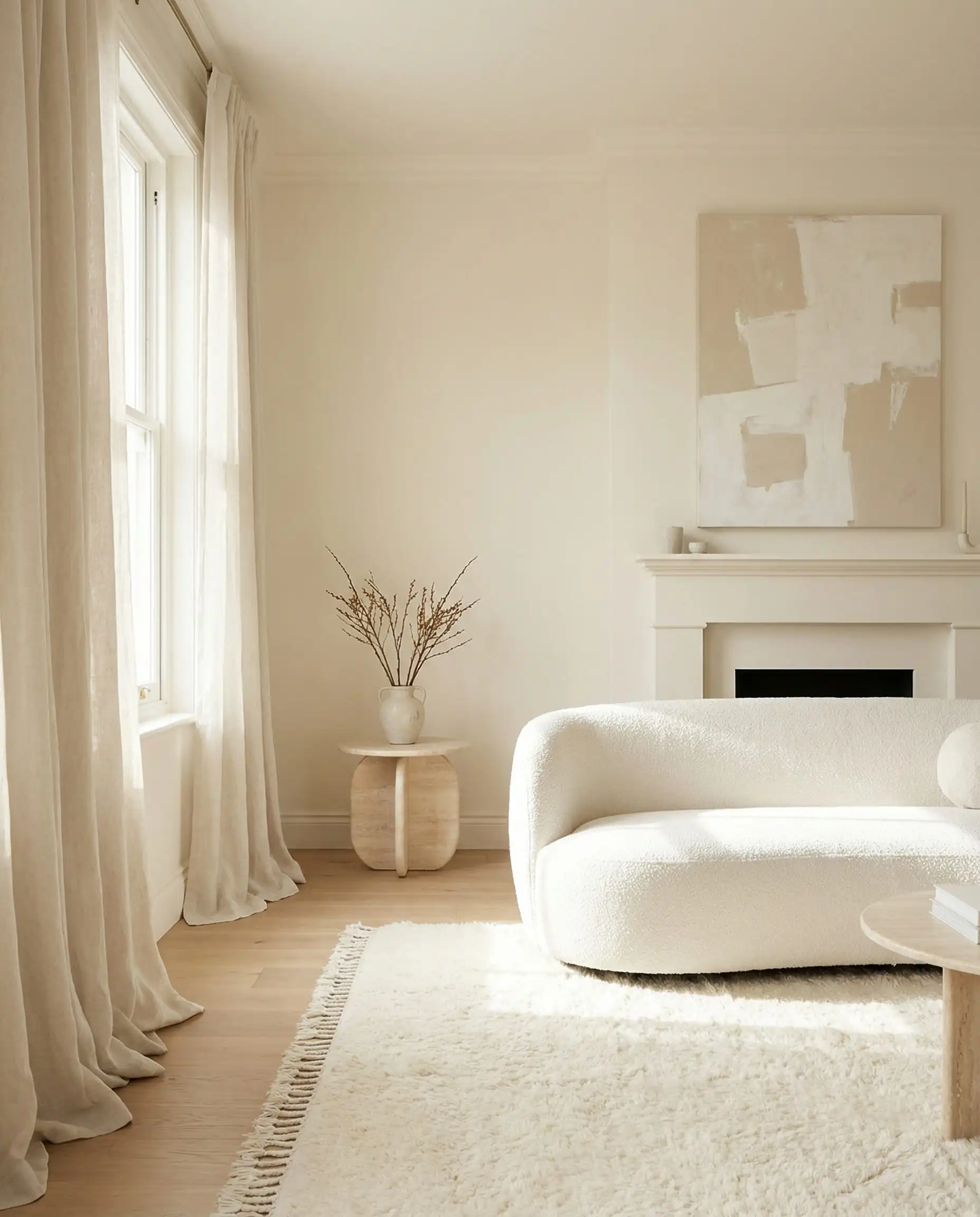
If you have north-facing windows (which let in cool, blue light), Blank Canvas will correct that coolness and warm up the room.
Hackrea Tip
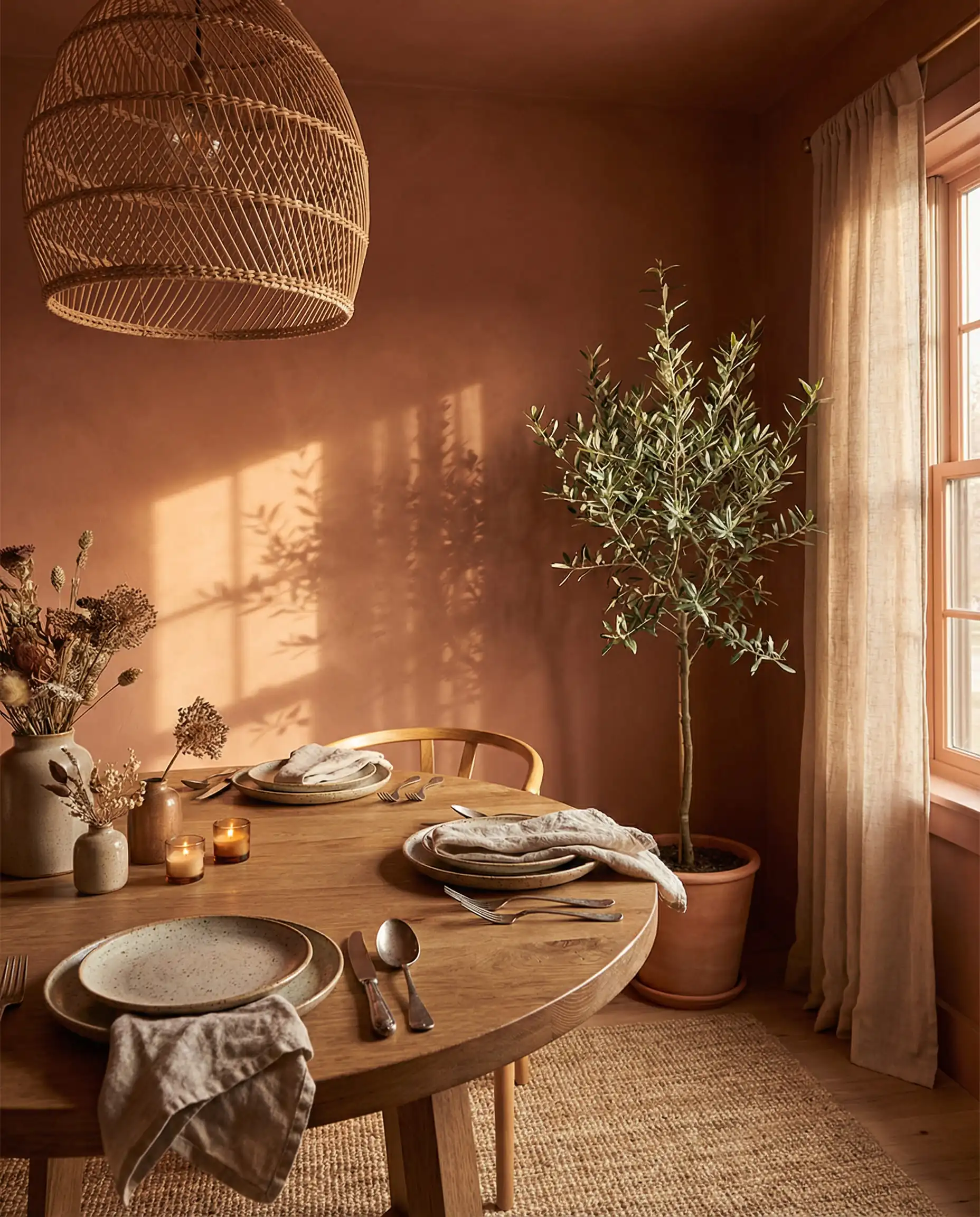
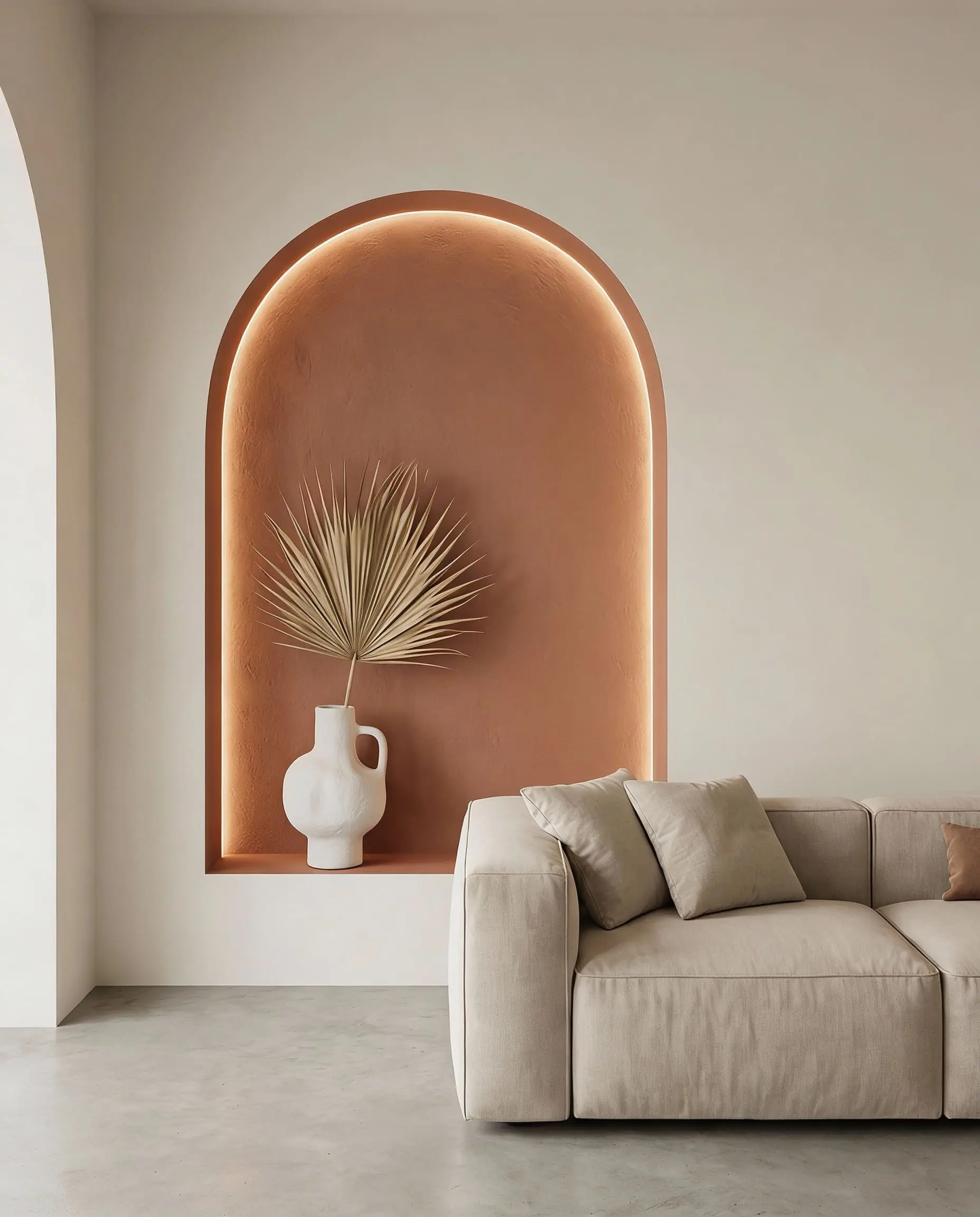
3. Terracotta Urn (PPU2-12)
This color represents the “Earth Tone” movement perfectly. It is a rich, baked clay color that brings Mediterranean warmth into your home.
4. Mocha Ice (N150-1)
Brown is back, but this isn’t the 1970s chocolate brown. Mocha Ice is a cool-toned, dusty brown that feels incredibly modern.
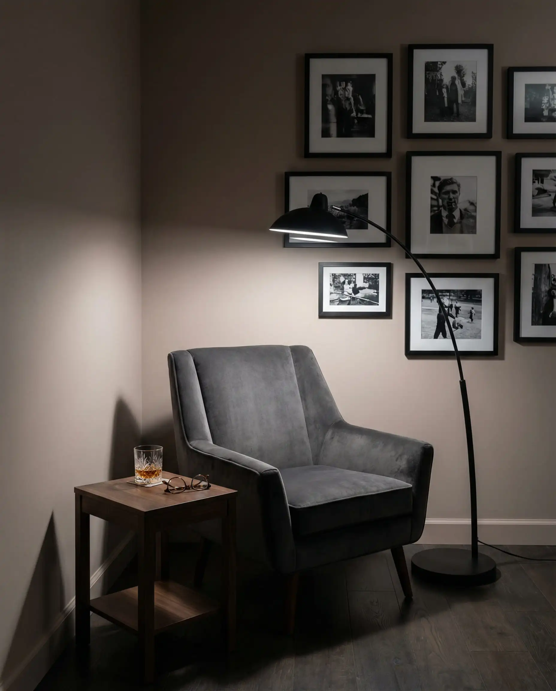
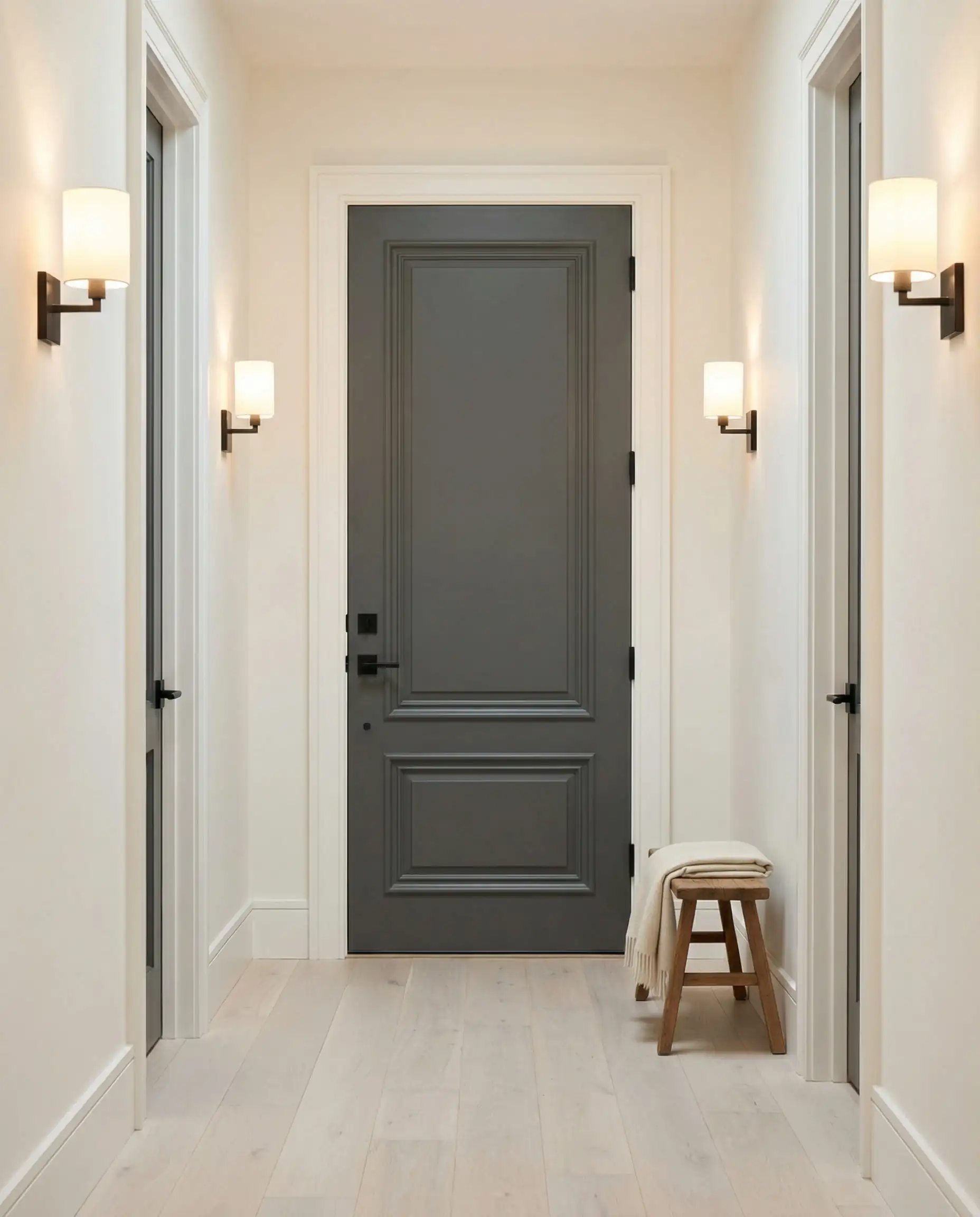
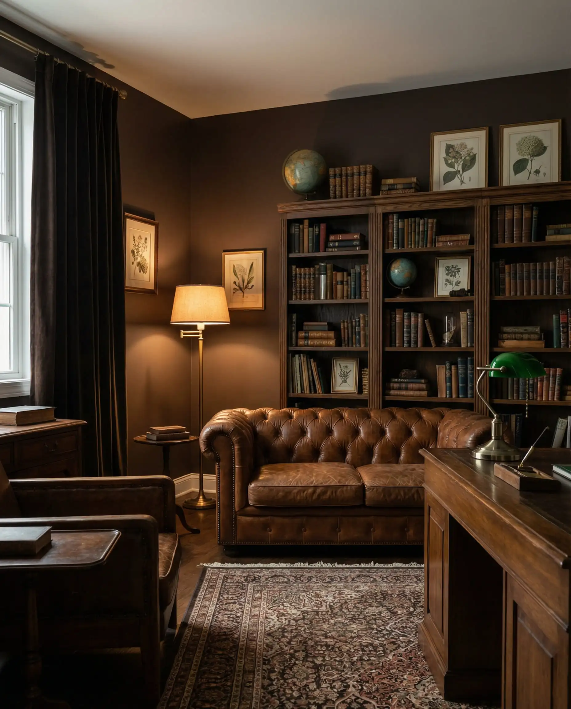
Moody & Dramatic: The Jewel Tone Resurgence
2026 is the year of “Dark Academia” and “Moody Maximalism.” These colors are for those who want their home to feel like a boutique hotel.
1. Curtain Call (N570-5)
A showstopper. Curtain Call is a deep, velvety eggplant/plum shade. Purple has been threatening to make a comeback for years, and this specific shade finally gets it right by keeping it muted and dark.
Use this where you used to use Navy Blue. It’s just as classic but feels infinitely more fashion-forward.
Hackrea Verdict
2. Adirondack Blue (N480-5)
A slate blue with heavy gray undertones. It feels historic, timeless, and very “New England coast.”
3. Cracked Pepper (PPU18-01)
A soft black/charcoal. This was a previous Color of the Year, but it remains critical in 2026 as an anchor color.
4. Baronial Brown (N170-7)
A true, deep chocolate brown.
Playful & Nature-Inspired Accents
Not everything in 2026 is dark and moody. The palette also features “optimistic” colors designed to bring joy and light.
1. Watery (HDC-CT-26)
A pale, spa-like blue-green.
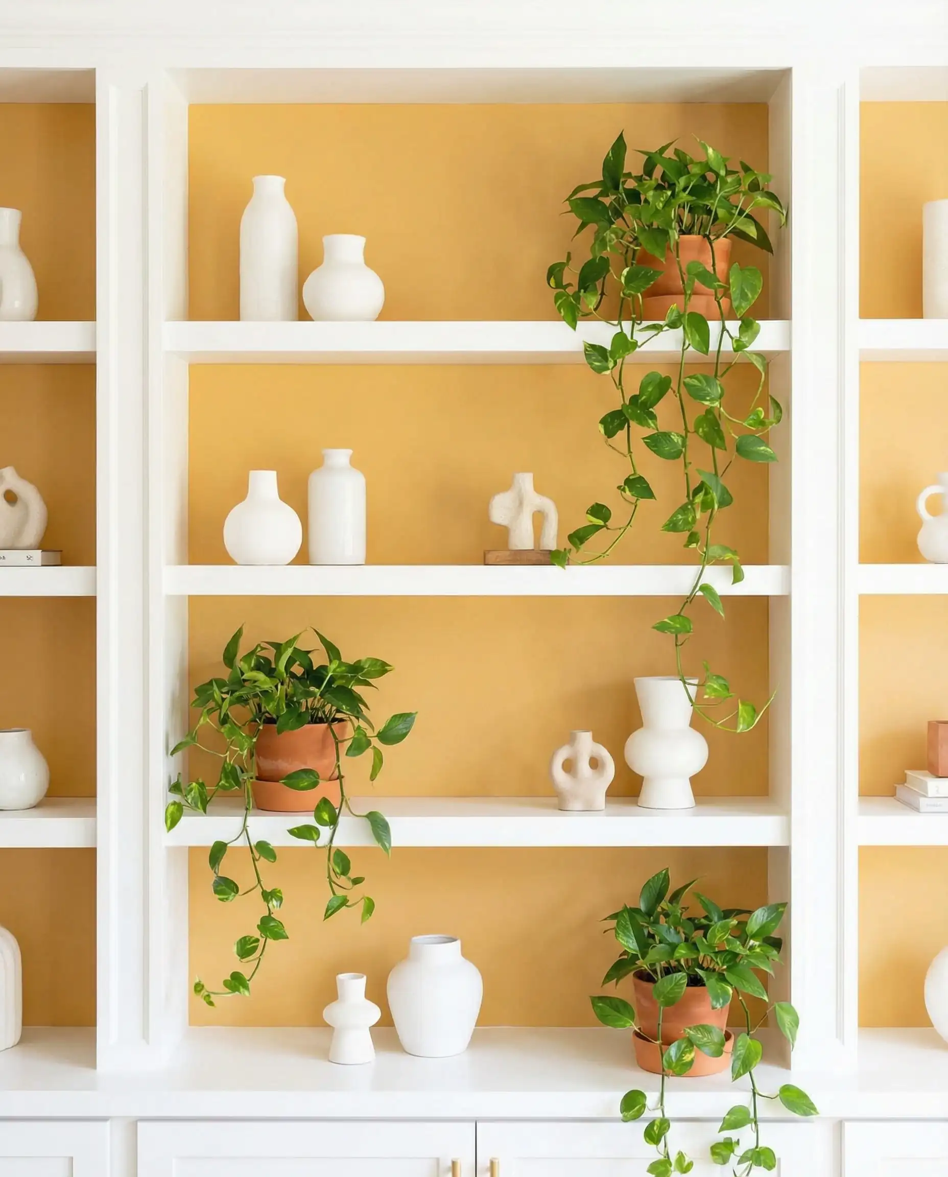
2. Beehive (M270-5)
A sunny, golden yellow.
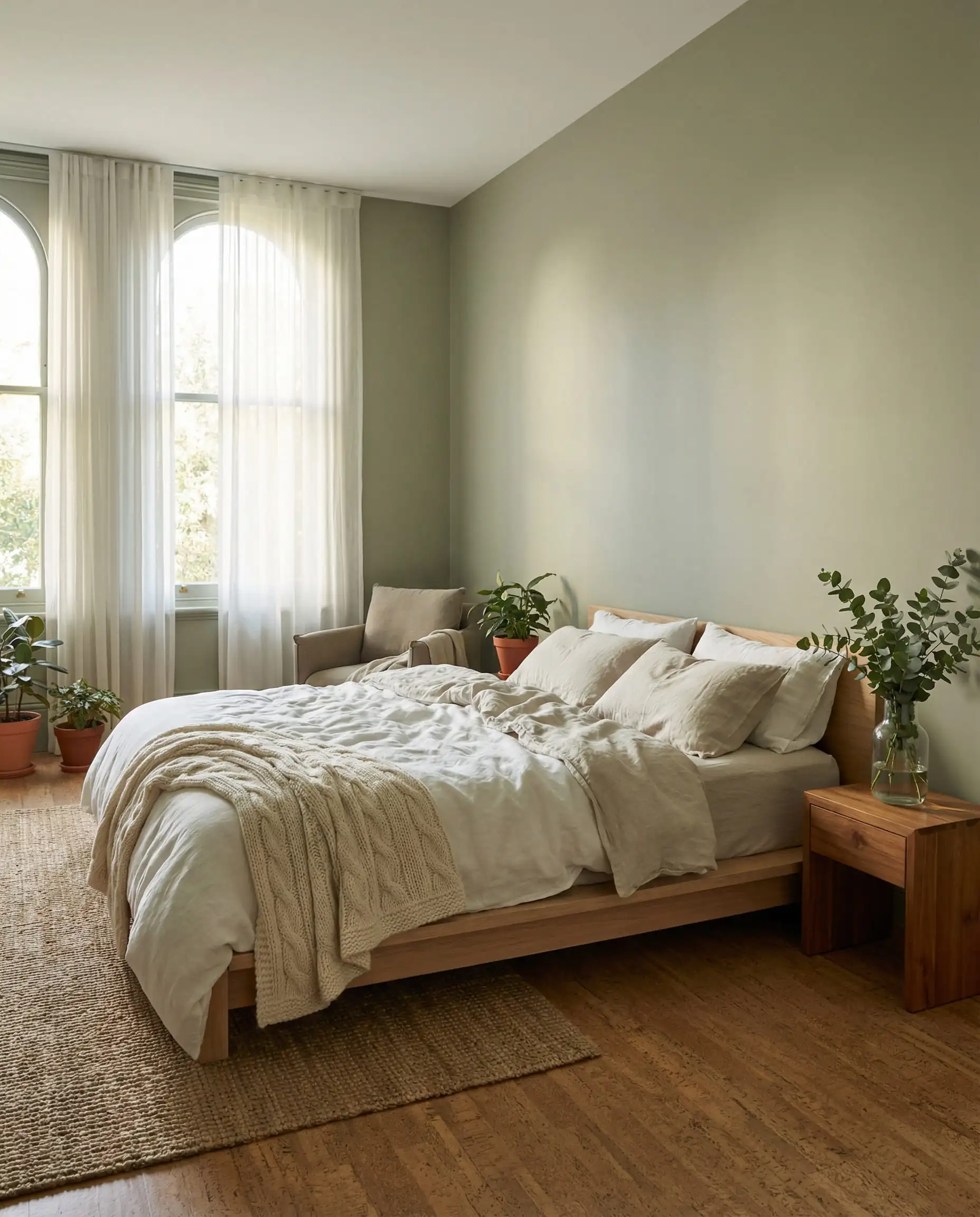
3. Urban Nature (S380-3)
A muted sage green.
How to Style These Colors: 2026 Design Techniques
Knowing the colors is only half the battle. To truly get the “2026 Look,” you need to apply them correctly.
1. The “Color Drenching” Technique
We mentioned this with Hidden Gem, but it applies to all the moody colors (Curtain Call, Baronial Brown).
2. The “Unexpected” Pop
If you paint a room in Wheat Bread or Blank Canvas, do not just buy beige furniture. The 2026 trend is to add a “micro-dose” of color.
3. Texture is King
Paint finish matters more than ever.
Comparison Table: Behr vs. The Competition
If you are trying to decide between brands, here is how the top Behr 2026 colors stack up against famous equivalents from Sherwin-Williams (SW) and Benjamin Moore (BM).
| Behr Color (2026) | The Vibe | The Competitor (SW/BM) | Why Choose Behr? |
| Hidden Gem | Smoky Jade / Deep Teal | SW Evergreen Fog (lighter) / BM Regent Green (darker) | Hidden Gem is the perfect “middle ground”—greener than a navy, but bluer than a forest green. |
| Wheat Bread | Warm Greige | SW Accessible Beige | Wheat Bread has a slightly more “organic” feel, less yellow than Accessible Beige. |
| Blank Canvas | Warm White | SW Alabaster / BM White Dove | Blank Canvas is creamier and covers better in fewer coats (Marquee line). |
| Curtain Call | Deep Eggplant | BM Brinjal | Curtain Call is more muted/grayed out, making it easier to live with on large walls. |
| Cracked Pepper | Soft Black | SW Iron Ore | Cracked Pepper is slightly softer, reading as a very dark gray in bright light. |
Frequently Asked Questions (FAQ)
Cool gray (the blue-based steel grays of 2015) is definitely out. However, warm gray or “greige” (like Behr’s Wheat Bread) is very much in style. The goal is warmth; if the gray feels cold, skip it.
If you aren’t color drenching, the best white trim to pair with Hidden Gem is Blank Canvas (DC-003) or Swiss Coffee (12). Avoid stark, cool whites (like Ultra Pure White), which can look too harsh against the moody teal.
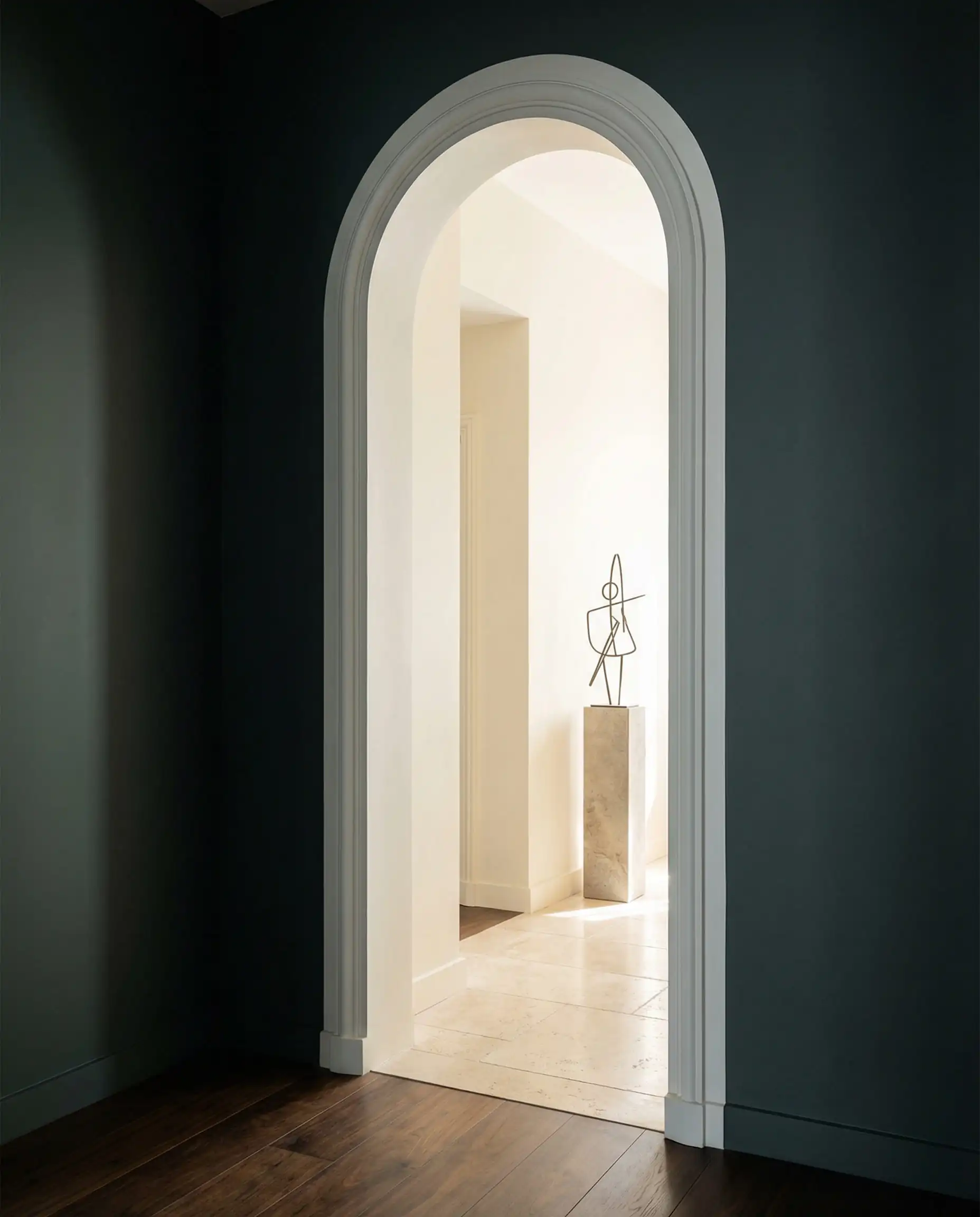
Absolutely. There is a myth that dark colors make small rooms feel smaller. In reality, dark colors blur the corners of a room and create depth, often making a small powder room or office feel grander and more infinite.
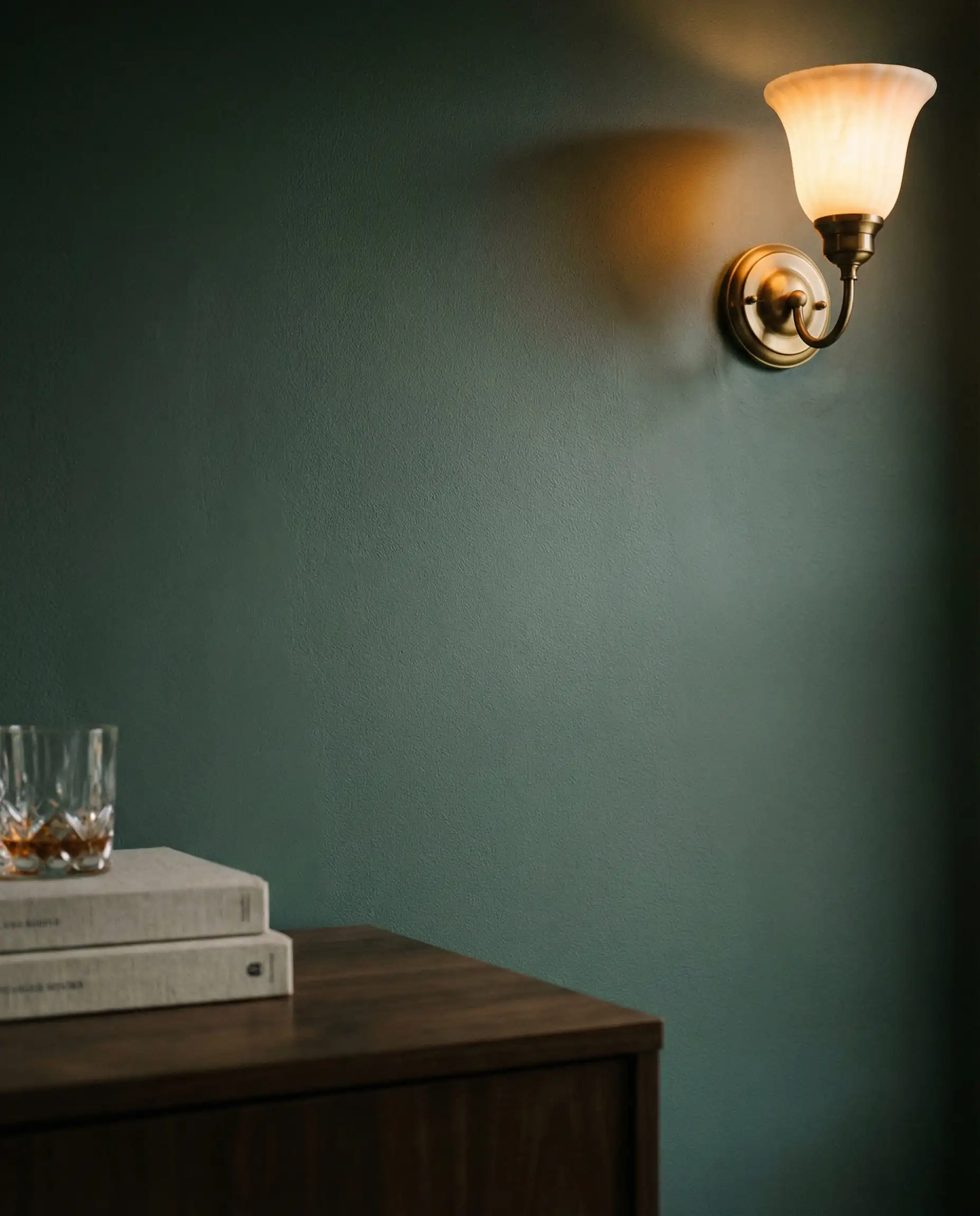
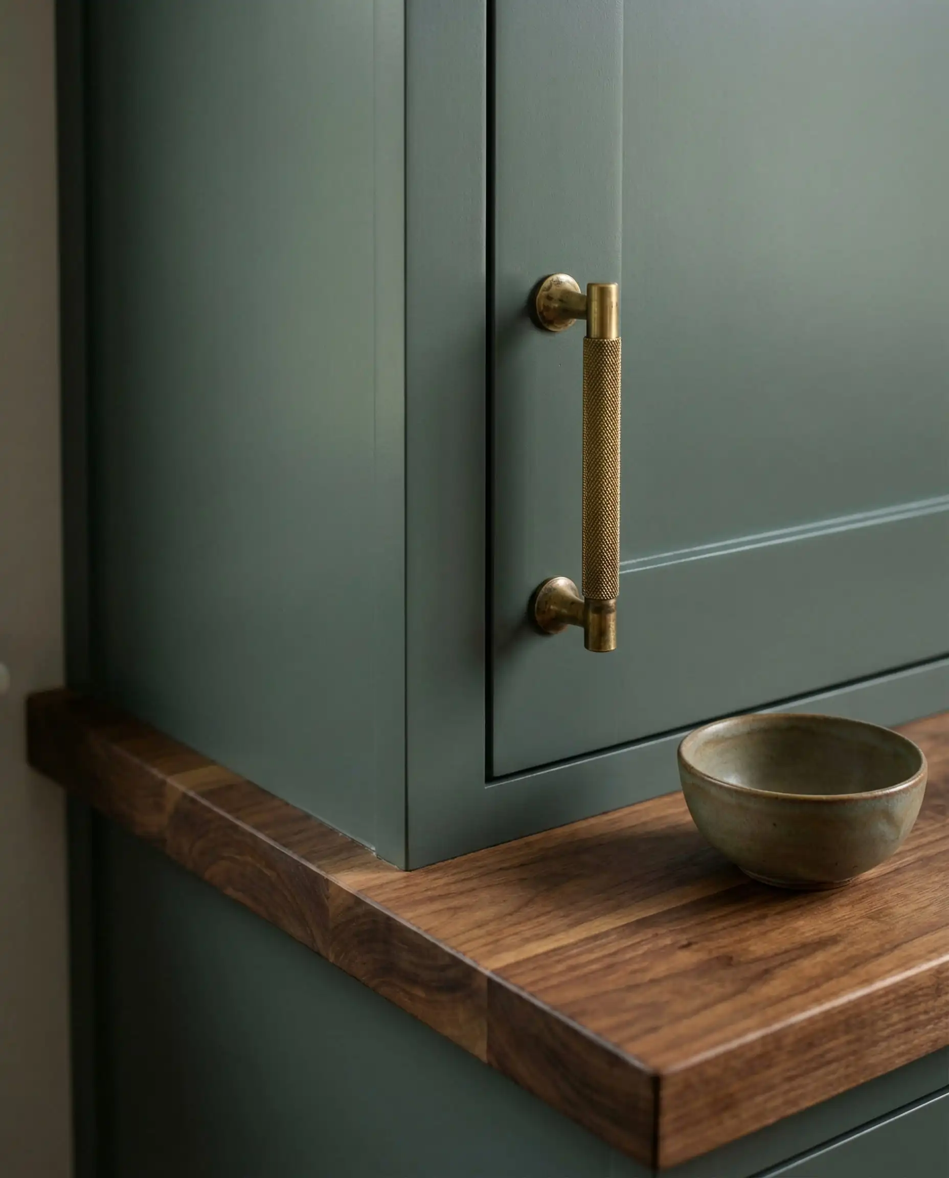
Because the 2026 palette is “warm,” you should lean toward warm metals. Unlacquered Brass, Champagne Bronze, and Polished Nickel look stunning with Hidden Gem and Terracotta Urn. Avoid Chrome, which can look too cold.
The Hackrea Verdict
Behr’s 2026 palette is a masterclass in “livable luxury.” It acknowledges that while we want our homes to look beautiful, we also need them to feel comfortable. Whether you are brave enough to drench your living room in Hidden Gem or you just want to update your kitchen cabinets with Wheat Bread, these colors offer a sophistication that feels entirely fresh.
Your Next Step: If you are nervous about committing to a dark color like Hidden Gem, start small. Buy a sample pot and paint a large poster board. Tape it to different walls in your room and watch how the color changes from morning to night. You might just find that the dark side is brighter than you think.