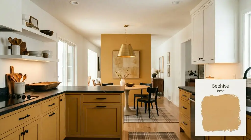
Beehive M270-5
BehrBehr Beehive (M270-5) is a cheerful, medium-toned golden yellow with distinct warm orange undertones. Boasting an LRV of 52, it reflects a moderate amount of light, making it an excellent choice for adding a welcoming, sunlit glow to both interior spaces and exterior accents.
Paint Technical Profile
| Color ID / SKU | M270-5 |
| HEX Code | #e1b781 |
| Light Reflectance (LRV) | 52 |
| Use | Interior, Exterior |
| Best Exposures | North, East |
| Best For | Kitchens, Dining Rooms, Entryways, Exterior Doors |
Behr Beehive: How to Style This Radiant Golden Yellow for High-Impact Interiors
Certain paint colors exist simply to blend into the background, but Behr Beehive demands a deliberate design conversation. This saturated, golden hue acts as a brilliant architectural highlighter, instantly turning standard built-ins, ordinary doors, and flat walls into highly intentional focal points. It is a color built for homeowners who want to inject vibrant, curated energy into their daily routines.
When applied thoughtfully, this color completely alters the sensory experience of a room. It wraps a space in a persistent, radiant warmth that feels both nostalgic and strikingly modern. Instead of relying on massive structural renovations, you can use this intense pigment to completely redefine the boundaries and mood of your home.
The secret to mastering Behr M270-5 lies in how you pair it with the hard finishes and textiles in your space. By treating this golden yellow as a foundational material rather than just a wall color, you open up incredibly sophisticated design pathways. Let us break down exactly how this vibrant shade behaves and how you can use it to craft a beautifully tailored home.
Behr Beehive: Undertones & LRV
If you are wondering whether Behr Beehive reads warm or cool, the answer is definitively and unapologetically warm. This hue is built on a foundation of pure sunshine, radiating a cozy, inviting temperature that instantly heats up any surface it touches. To use it effectively, we need to look closely at the underlying pigments that give it such a specific character.
The Chromatic Profile:
Understanding the Light Reflectance Value (LRV): With an LRV of 52, this golden yellow sits perfectly in the mid-tone range. It absorbs and reflects light in almost equal measure, which is a fantastic trait for a bold color. This specific mid-tone LRV means the paint retains its rich color structure entirely; it will not wash out into a pale cream in bright light, nor will it turn into a muddy brown when the sun goes down.
How Lighting Shifts This Radiant Glow
Even with a perfectly balanced mid-tone LRV, a saturated color like this will always respond to the specific light moving through your windows. Because of those strong amber undertones, the time of day and the direction of your light will fundamentally alter how you experience the room.
The Directional Light Breakdown:
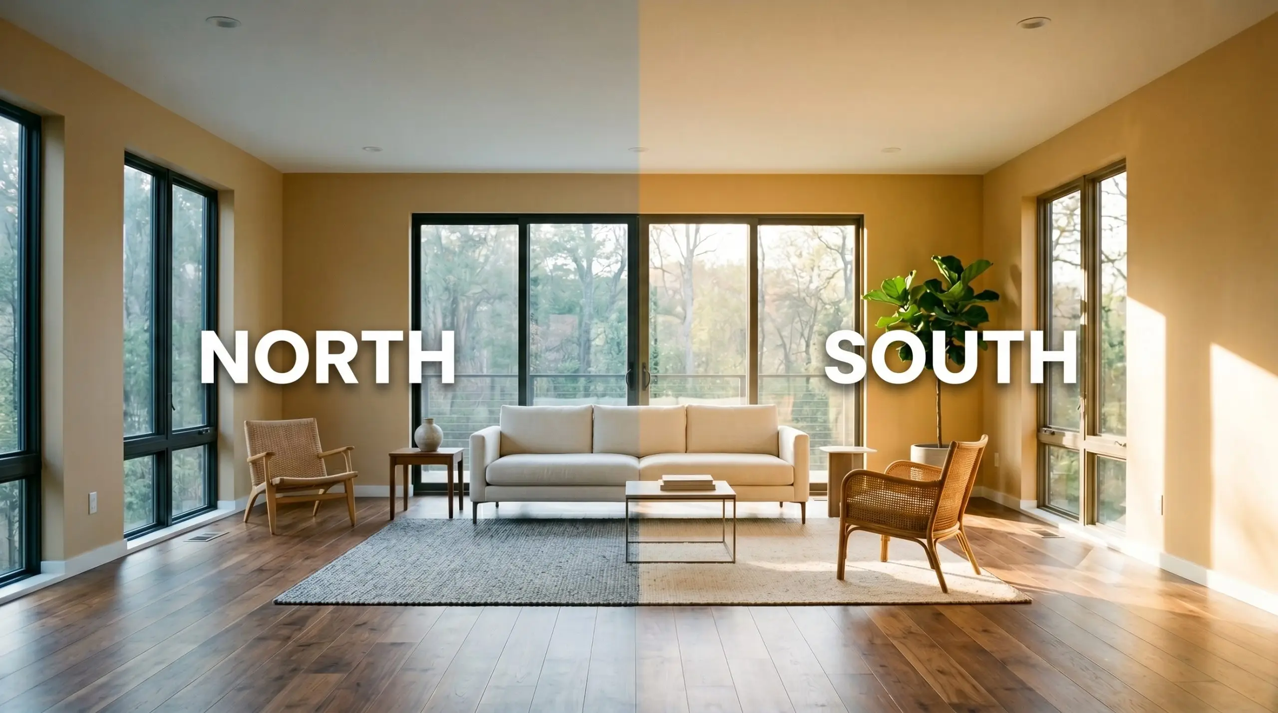
Never evaluate a golden yellow under harsh daylight LEDs unless your room functions as a sterile workspace. To keep the amber undertones looking intentional and premium, stick to layered, ambient lighting with bulbs in the 2700K to 3000K range.
Hackrea Pro-Tip (The Bulb Rule)
Popular Applications for This Golden Hue
Because of its vibrant energy, this is not a color you slap on every wall of a house without a plan. The most successful designs use this radiant pigment strategically, applying it to specific architectural features or contained rooms to create moments of brilliant contrast. Here is how to execute this golden yellow across different spaces to achieve a custom, high-end result.
Striking Kitchen Cabinetry
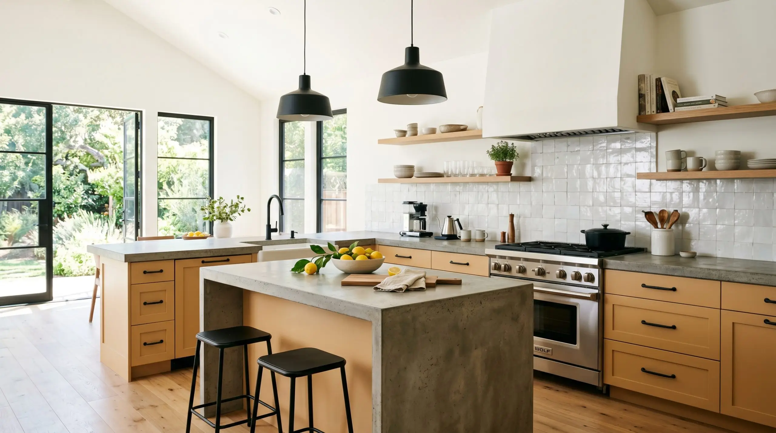
Applying this color to lower kitchen cabinets or a central island is a brilliant way to inject life into an otherwise utilitarian space. Instead of defaulting to a predictable rustic farmhouse look, push the design toward a modern eclectic aesthetic. Pair the golden base with matte black iron hardware and a poured concrete or honed soapstone countertop for a sharp, sophisticated contrast.
If you are updating a mid-century fixer-upper, flat-panel walnut upper cabinets paired with these amber-yellow lowers create an incredibly warm, cohesive material palette. To keep the room feeling elevated, ensure your backsplash provides a quiet visual break. A simple, slightly irregular white zellige tile works beautifully, allowing the intense cabinet color to remain the star of the room without overwhelming the eye.
When using a bold yellow on cabinetry, always establish a neutral upper zone. Painting the upper walls and ceiling a soft, creamy white prevents the color from feeling visually exhausting while maintaining a bright, airy workflow.
Hackrea Design Secret (The Two-Tone Balance)
Welcoming Entryways and Foyers
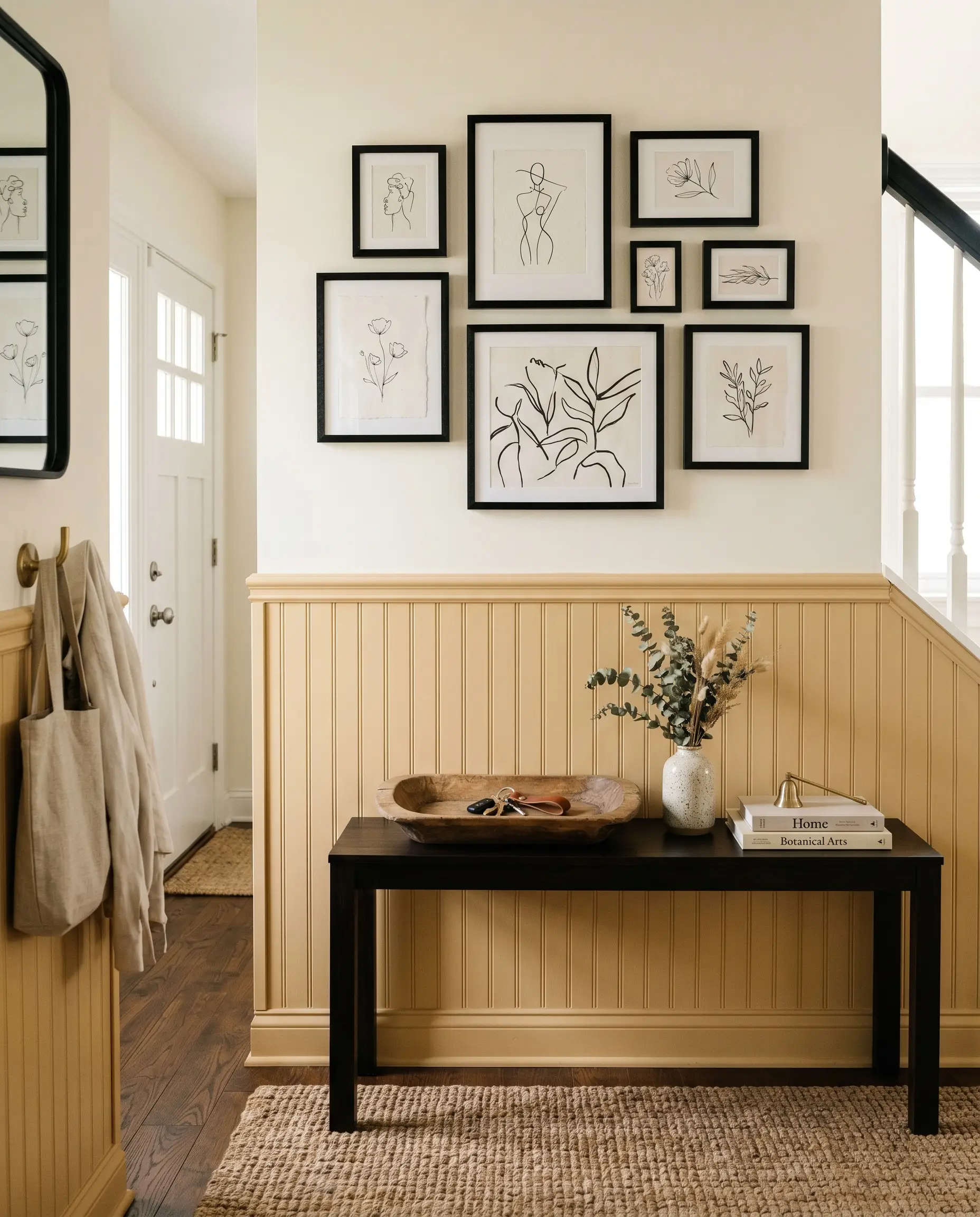
The entryway is the perfect place to experiment with a high-energy color because it is a transitional space where people rarely linger. Using Behr M270-5 here instantly establishes a cheerful, optimistic tone for the rest of the house. For a highly tailored look, install classic beadboard or tongue-and-groove paneling on the lower half of the walls and coat it in this honeyed shade.
You can style this space to feel incredibly current by contrasting the traditional millwork with unexpected decor. Hang an asymmetrical gallery wall featuring minimalist line art and abstract watercolor canvases above the golden paneling. Finish the space with practical but beautiful textures, like a vintage dough bowl for keys on a sleek Parsons table and a durable jute weave rug underfoot.
Cozy, Conversational Dining Rooms
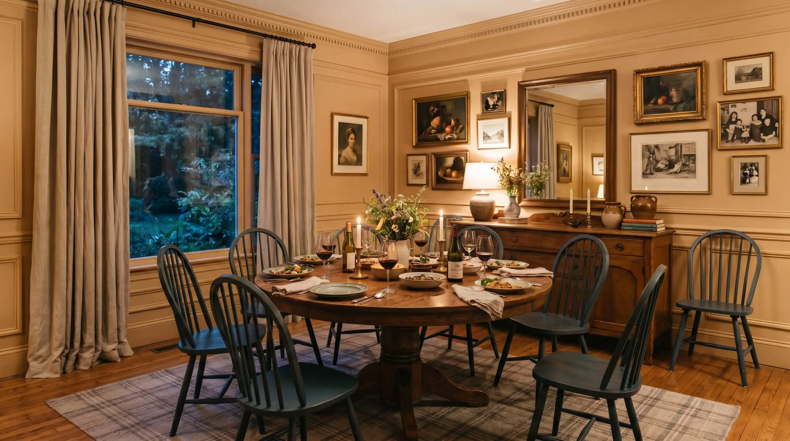
Dining rooms thrive on atmosphere, and this paint can easily facilitate a moody, maximalist environment for hosting long dinner parties. Rather than a standard wall application, consider adding picture molding and painting the entire wall—trim, baseboards, and all—in this rich yellow. This monochromatic technique softens the architectural lines and makes the room feel like a continuous, glowing envelope.
To balance the warmth of the walls, introduce contrasting cool tones through your textiles and furniture. A pedestal dining table surrounded by Windsor chairs painted in a sharp navy blue or olive green provides necessary visual tension. Layer the room with heavy cotton canvas drapery and a subtle plaid rug to give the space a collected, curated permanence.
High-Impact Exterior Front Doors
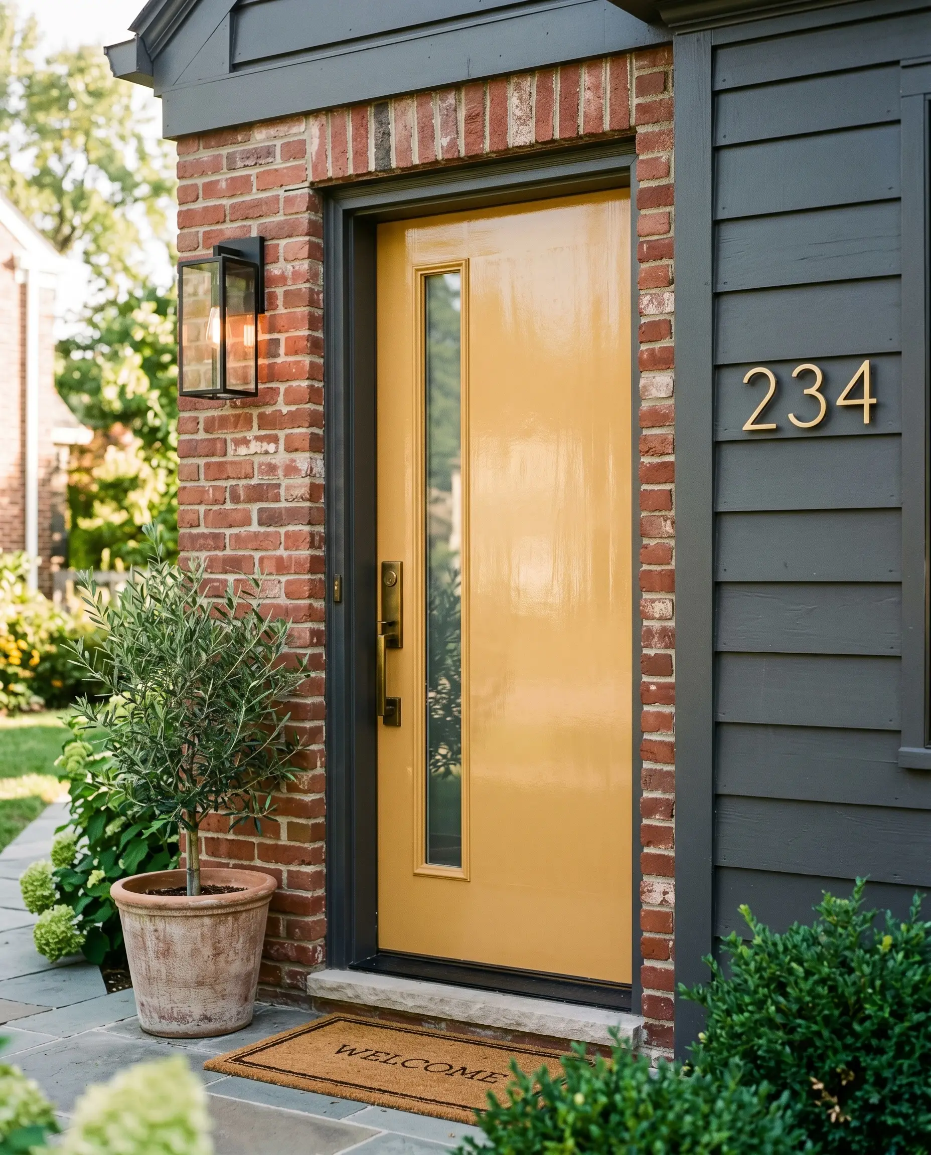
If you want to completely change the curb appeal of your home in a single weekend, applying this golden amber to your front door is an exceptional strategy. It acts as a vibrant focal point that guides the eye directly to the entrance. It looks particularly stunning when framed by charcoal gray siding or classic, slightly weathered red brick.
The finish you choose here is critical to the final aesthetic. A high-gloss lacquer finish will catch the sunlight and make the door look like a polished, premium architectural feature. Pair it with unlacquered brass house numbers and a sleek, modern tray-style sconce to complete the sophisticated exterior update.
Be incredibly cautious if your home features exterior stone with prominent pink or cool-toned gray undertones. The strong orange-amber base of this paint will visually fight with cool pinks, making both surfaces look disjointed and accidental.
Clash Warning (Exterior Undertones)
The Windowless Powder Room Jewel-Box
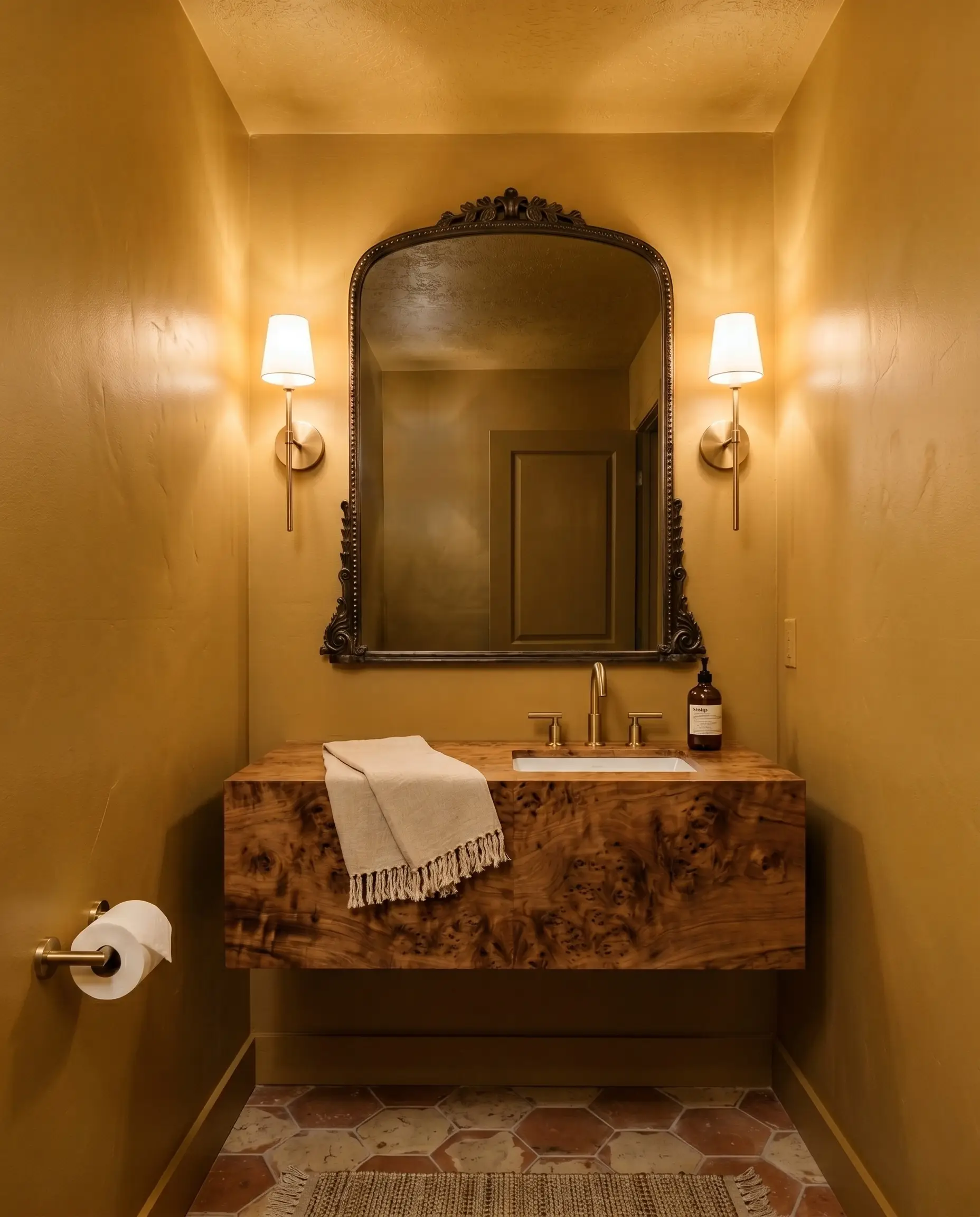
Windowless powder rooms are the ultimate canvas for a dramatic, jewel-box transformation. Because there is no shifting natural light to manage, you have complete control over how the color reads through your bulb selection. Coating the walls and the ceiling in this saturated hue creates a fun, immersive experience for guests.
To elevate the small footprint, lean heavily into reflective surfaces and varied textures. Install a floating vanity made of burl wood and hang an oversized antique mirror to bounce the artificial light around the room. The golden tones of the paint will beautifully echo brushed brass sconces, creating a seamless, glowing environment that feels intentionally designed.
Coordinating Colors & Best Pairings for Behr Beehive
Instead of blending quietly into the background, this saturated pigment demands a deliberate response from the materials around it. It requires crisp, intentional boundaries to hold its shape, allowing its radiant energy to shine without overpowering the room. The way this color behaves depends entirely on the finishes and secondary hues you place next to it.
Selecting the Right Trim
The trim color you choose will dictate how sharp or soft this golden hue appears on your walls. You must decide if you want a high-contrast architectural boundary or a seamless, glowing transition.
Hardware, Wood & Material Pairings
Treating paint as a foundational layer means you must consider how it physically interacts with the tactile elements in the room. This vibrant shade thrives when paired with a mix of grounded, everyday textures and one highly aspirational metallic finish.
Perfecting the Palette
When building a coordinating color palette, you must use secondary shades to either cool down the room’s energy or enhance its rich, earthy qualities.
When pairing a bold yellow with a dark coordinating color like navy or charcoal, use patterned textiles to bridge the gap. A botanical toile or a subtle plaid fabric that incorporates both hues will make the extreme contrast feel completely intentional and unified.
Hackrea Pro-Tip (The Textile Bridge)
Designer Mood Boards
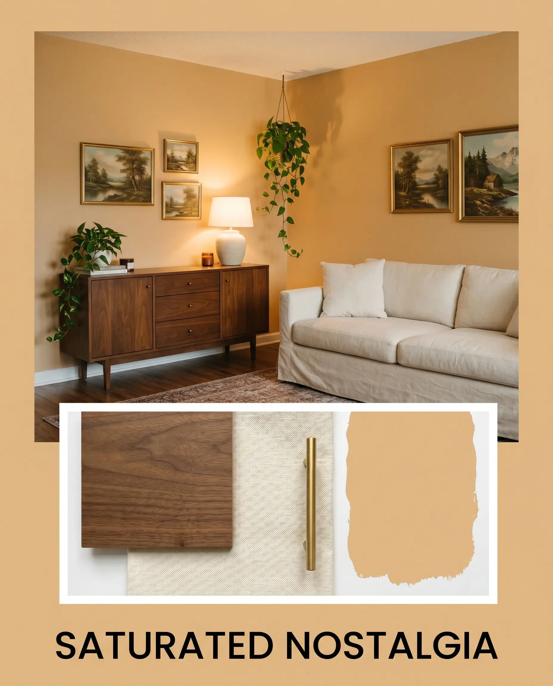
Saturated Nostalgia This aesthetic leans into the cozy, collected energy of the paint by surrounding it with rich woods and tactile fabrics. Imagine walls coated in this golden hue, grounded by a mid-century walnut credenza and a slipcovered sofa in a heavy, cream-colored linen. Add vintage landscapes in unlacquered brass frames and a trailing pothos plant to create a room that feels instantly welcoming and deeply lived-in. The warmth of the wood and the softness of the linen perfectly balance the radiant glow of the paint.
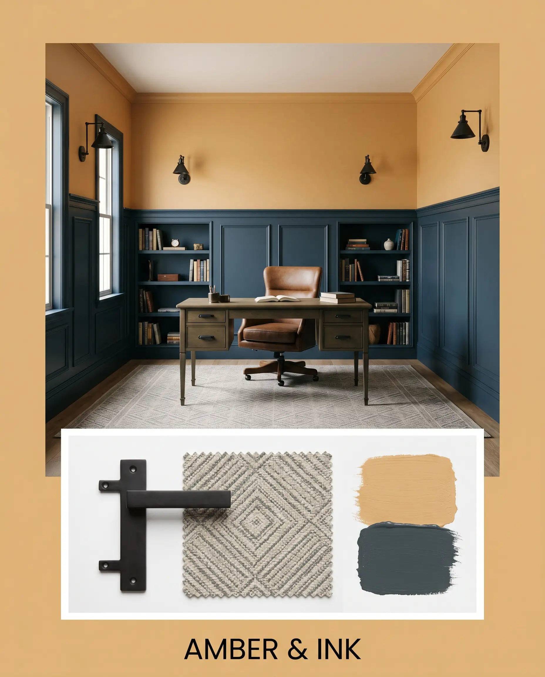
Amber & Ink For a sharper, more dramatic approach, this palette uses intense contrast to elevate the golden base. Picture the vibrant yellow paired with custom built-ins or wainscoting painted in Farrow & Ball Hague Blue. Introduce matte black iron sconces and a subtle, geometric rug to keep the eye moving across the space. The cool, dark inkiness of the blue forces the amber undertones to read as a brilliant, sophisticated pop of color rather than a traditional pastel.
Head-to-Head Color Comparisons
Sometimes a room’s natural lighting or existing fixed elements will cause a specific pigment to lose its intended depth. If your space pulls too much orange out of this hue, or if you simply need a slightly different light reflectance value to accommodate a darker room, comparing rival paints is the best way to pivot. Understanding these subtle shifts will help you make a confident final decision.
Behr Beehive M270-5 vs. Sherwin-Williams Bakelite Gold SW 6368
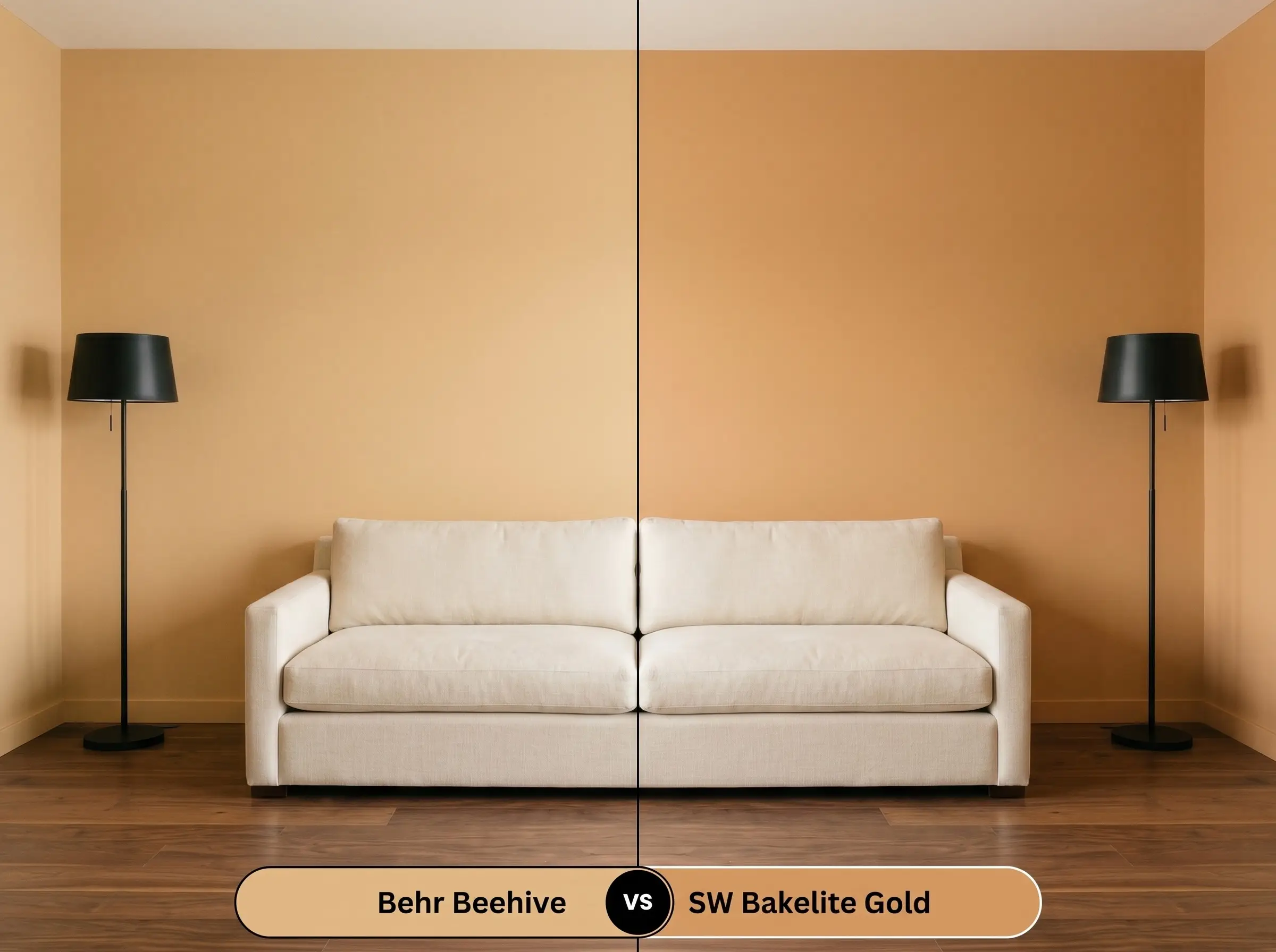
Sherwin-Williams Bakelite Gold carries a slightly lower LRV and leans a bit more into a traditional, earthy mustard. If your room features intense, warm southern light that makes Behr M270-5 feel a little too aggressively orange, Bakelite Gold is an excellent alternative. It holds its shape beautifully under warm light, offering a more subdued, grounded yellow that feels slightly more historic.
Behr Beehive M270-5 vs. Benjamin Moore Stuart Gold HC-10
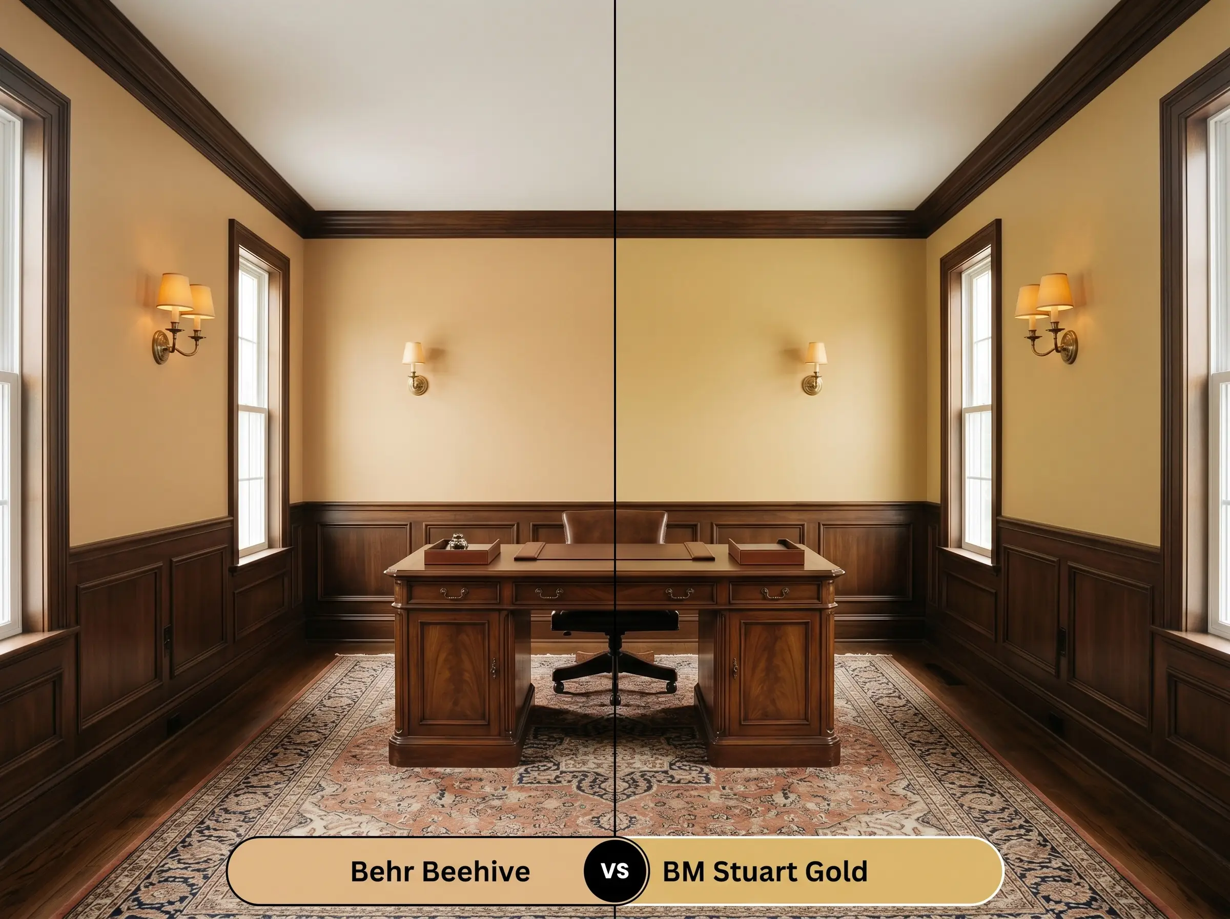
Benjamin Moore Stuart Gold is a beloved heritage color that features a distinct touch of brown in its base, making it significantly more muted. If you are styling a traditional home and find that Behr Beehive reads just a bit too vibrant or modern for your vintage rugs and antiques, Stuart Gold is the better choice. It provides that coveted golden warmth but with a quieter, more restrained energy.
Exploring Alternative Golden Yellows
You might love the concept of a honeyed cast but realize your specific room needs a touch more brightness or a slightly softer edge. Testing closely related hues ensures you find the exact energy you want on your walls.
Similar Colors Within the Brand
Cross-Brand Matches
Painting with Behr Beehive: Real-World Application
Moving from color theory to the practical reality of rolling paint onto drywall requires a shift in strategy. Vibrant, mid-tone hues demand specific preparation to ensure the final architectural finish looks intentional and flawless.
The Dynamic Sheen Guide:
Primer Strategy: Because yellows are notoriously difficult when it comes to hiding the previous wall color, a high-quality primer is non-negotiable. You must use a tinted gray primer beneath this shade to ensure the rich, golden pigments develop properly. A standard white primer will force you to apply unnecessary extra coats to achieve true opacity.
Coverage & Success Tips: Expect to roll at least two generous coats, though three may be required if you are painting over a dark or cool-toned wall. Be incredibly mindful of “flashing”—those visible, uneven streaks that happen when you roll over paint that has already started to dry. To avoid this, keep a wet edge as you work across the wall and avoid the temptation to touch up small spots until the entire coat is completely dry.
Frequently Asked Questions
Because it has a mid-tone LRV and strong amber pigments, this color holds up remarkably well under direct sunlight without washing out. However, intense UV exposure will naturally fade vibrant yellows over time, so using a premium exterior-grade paint with UV protectants is essential to maintain that initial radiant glow.
This pairing can look incredibly charming, provided the brick has warm, earthy undertones rather than cool, purplish ones. The golden hue pulls out the natural warmth of traditional red clay brick, creating a welcoming, high-contrast exterior palette.
Without natural daylight to balance the color, the artificial lighting in a windowless hallway will dictate the final look. If you use warm bulbs (2700K), those orange undertones will amplify significantly, making the space feel intensely cozy and warm; cooler bulbs will flatten the color and make it appear sharper.
It is an exceptional pairing. The rich, chocolatey depth of dark walnut beautifully grounds the vibrant energy of the golden yellow, resulting in a sophisticated, tailored aesthetic that works perfectly in mid-century or transitional spaces.
The Final Verdict on Behr Beehive
Behr Beehive is a brilliant, high-energy pigment designed for the fearless homeowner who views color as an active design tool. Its absolute best application is as a striking architectural highlighter—transforming flat-panel kitchen cabinetry, welcoming front doors, or moody dining rooms into highly curated focal points. It thrives in transitional, modern eclectic, and mid-century spaces where its intense, honey-like warmth can be balanced by rich woods, tactile fabrics, and sharp, contrasting dark tones.
However, this radiant shade requires a very specific environment to succeed. If your home features cool-toned gray luxury vinyl plank flooring, icy Carrara marble, or fixed elements with prominent pink undertones, this paint will actively fight your space. The golden-amber base will clash against those cool surfaces, making the yellow feel jarring and the grays appear dirty. To unlock the premium potential of this color, you must commit to a palette rooted in warmth, organic textures, and intentional contrast.