Hague Blue No. 30
Farrow & BallFarrow & Ball Hague Blue (No. 30) is a deep, blackened blue-green paint color. Known for its rich teal undertones, it behaves like a moody navy in low light but reveals vibrant jewel-toned green flashes in bright, south-facing rooms. It has an LRV of 7.
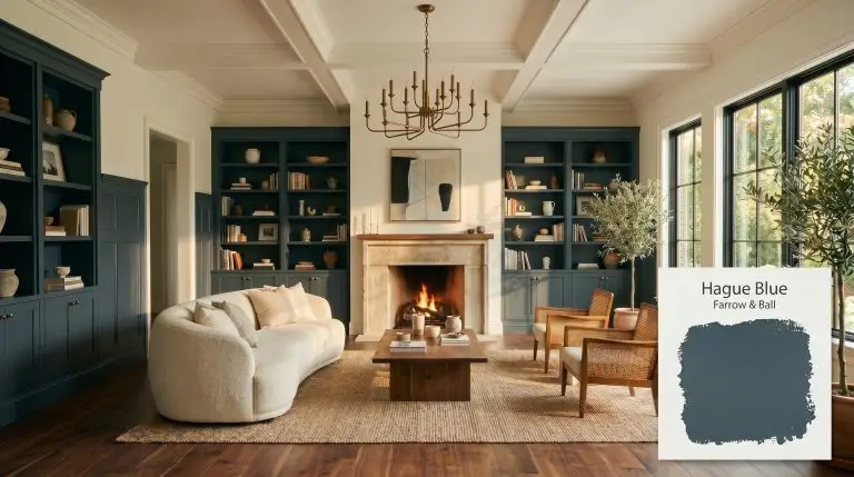
Farrow & Ball Hague Blue: Cultivating a Rich, Tailored Atmosphere
| Best Exposures | South-facing or well-lit spaces |
|---|---|
| Best For | Cabinetry, libraries, dining rooms, front doors |
When homeowners set out to find the ultimate, dramatic navy, they often discover that traditional nautical shades feel entirely too predictable. Farrow & Ball Hague Blue (No. 30) answers this exact frustration by offering a deeply complex, historic alternative.
Rooted in the rich tradition of Dutch woodwork, this shade completely bypasses the standard primary blue in favor of something far more mysterious. It delivers the grounding gravity of a classic dark paint, but carries enough hidden warmth to breathe life into an otherwise flat room.
Farrow & Ball Hague Blue: Undertones & LRV
The most common question surrounding this iconic shade is whether it leans warm or cool. Hague Blue is a definitively warm blue. While the base is undeniably dark, it is thoroughly warmed by complex green pigments that prevent the color from ever feeling icy or sterile.
To understand how this shade builds its signature atmosphere, we have to look at its core anatomy:
With an LRV of 7, No. 30 absorbs a massive 93% of the light in your space. Understanding a paint’s light reflectance value is crucial here, because a number this low means the color will actively pull energy inward. It requires highly intentional lighting plans to maintain its richness and prevent it from reading as a heavy, flat void on your walls.
You can apply wallpapers, paints, etc. on walls and see how they look in various interiors.

Lighting Shifts & The Chameleon Factor
The greatest fear with a shade this deep is that it will either look like a depressing black hole in the evening or an unintentionally vibrant aquatic teal in the afternoon sun. Because of its complex pigmentation, this paint is a true chameleon that shifts dramatically depending on your light source.
Here is exactly how those environmental factors manipulate the color:
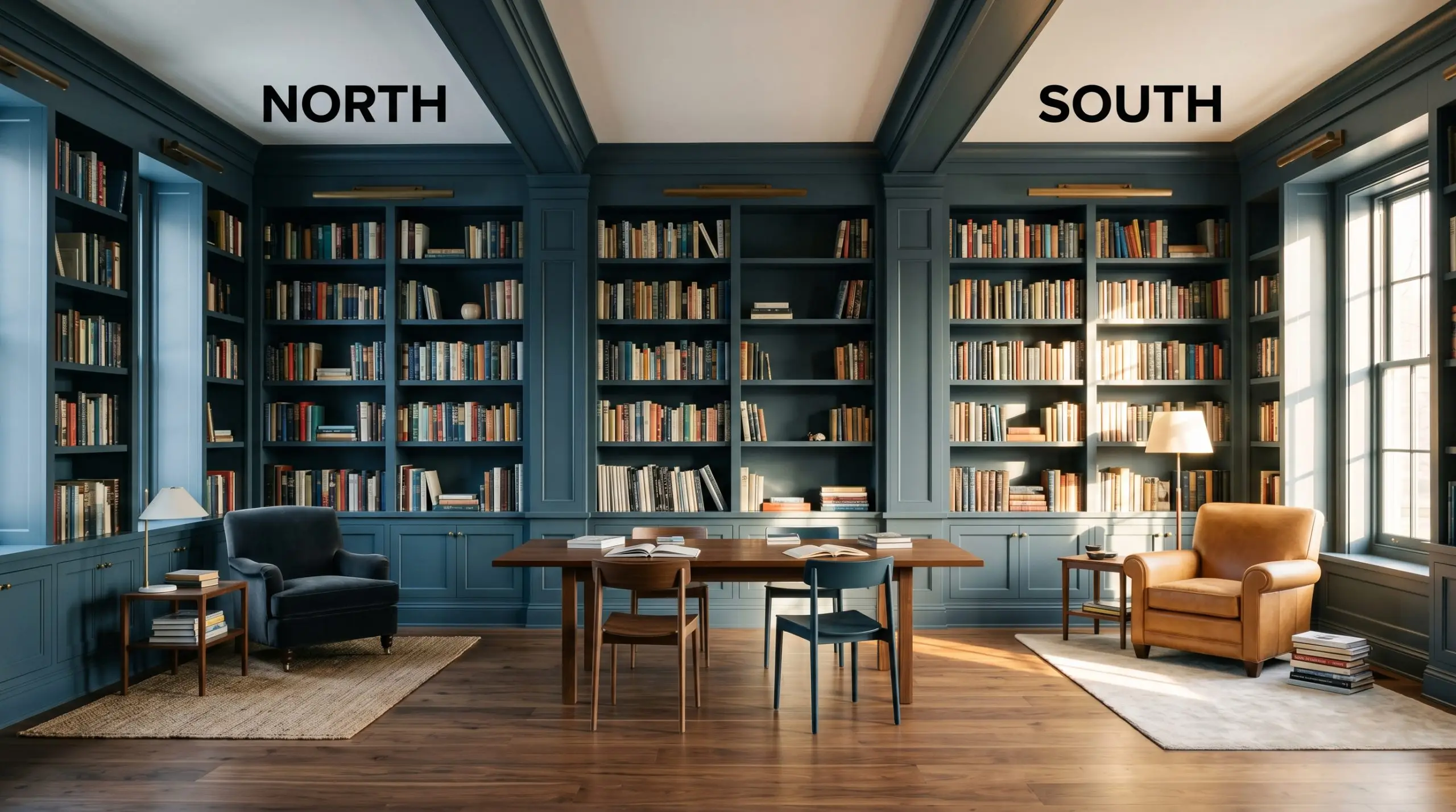
If you are using this shade in a naturally dark room, rely heavily on layered ambient lighting. Wall sconces and shaded table lamps will highlight the teal undertones, whereas harsh overhead recessed lighting will immediately flatten its historic charm.
Hackrea Pro-Tip (Lighting Strategy)
Popular Room Applications
This blackened blue-green demands a moody aesthetic and rewards homeowners who are willing to commit to drama. It is not a passive background color; it is a foundational architectural element that completely dictates the energy of a home.
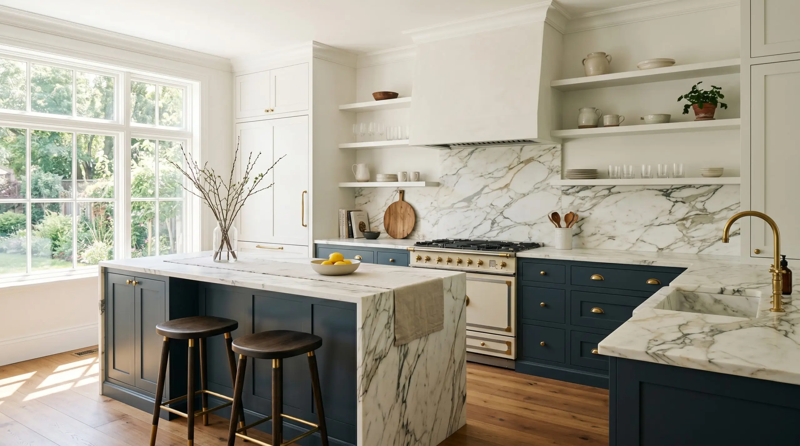
Kitchen Cabinetry & Islands
This shade is a brilliant choice for grounding a culinary space, especially when paired with natural stone countertops. Because it shifts throughout the day, your island or lower cabinets will feel dynamic rather than heavy. It ranks highly among our favorite best paints for kitchen cabinets because it effortlessly bridges the gap between historic charm and crisp, modern tailoring.
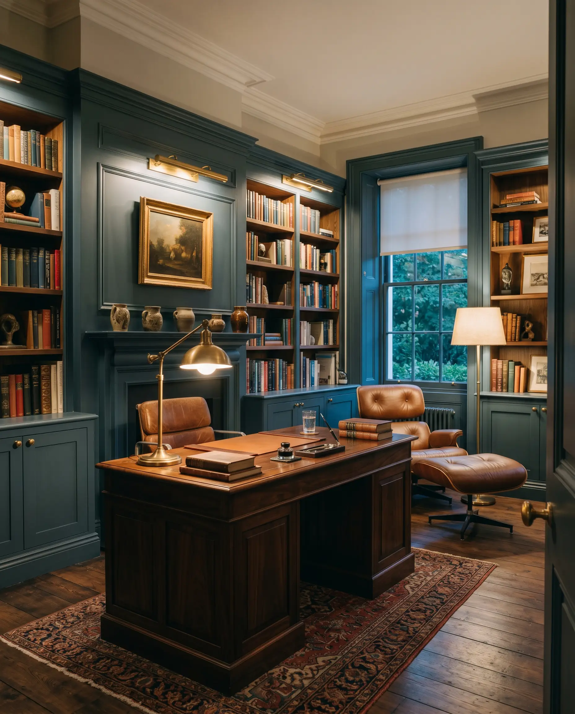
Libraries & Home Offices
When applied to custom millwork or floor-to-ceiling bookshelves, this color creates an environment of intense focus and sophistication. The deep pigmentation absorbs shadows beautifully, making standard drywall look like premium, historic paneling. Pair it with rich, natural woods to enhance the scholarly atmosphere.
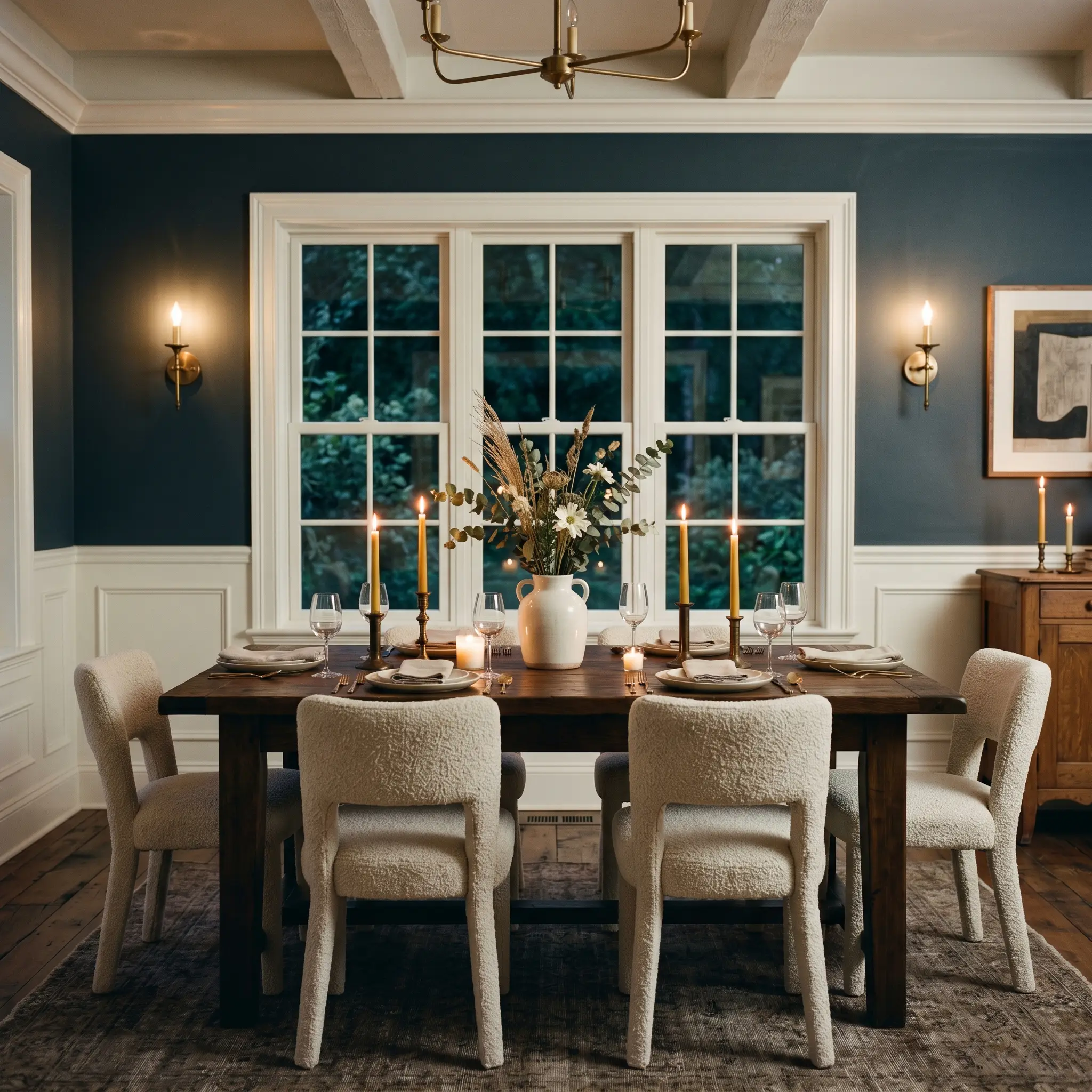
Dining Rooms
In spaces meant for evening entertaining, this deep teal truly shines under warm, flickering light. By utilizing wall sconces or candlelight, you illuminate the green undertones, creating a highly intimate, enveloping dining experience. It provides a stunning backdrop for both rustic farmhouse tables and sleek, modern marble dining sets.
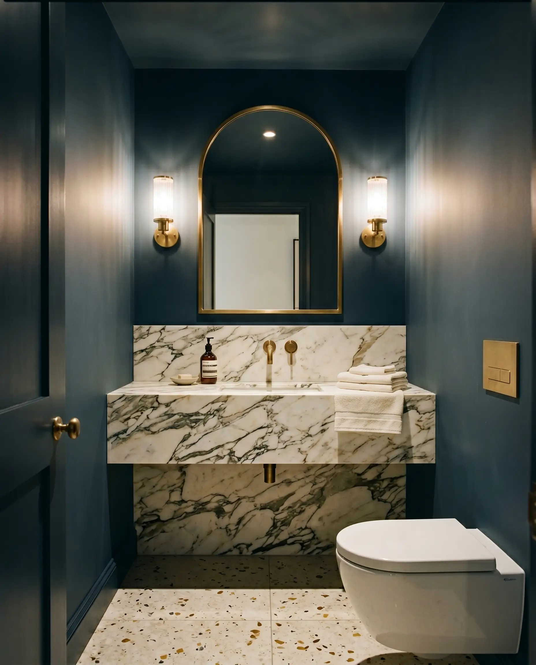
Powder Rooms
Small, windowless spaces are the perfect canvas for high-end drama. Instead of trying to force a tiny room to feel bright, lean into the shadows. Wrapping a powder room in this shade turns it into a luxurious, tailored jewel box that surprises guests.
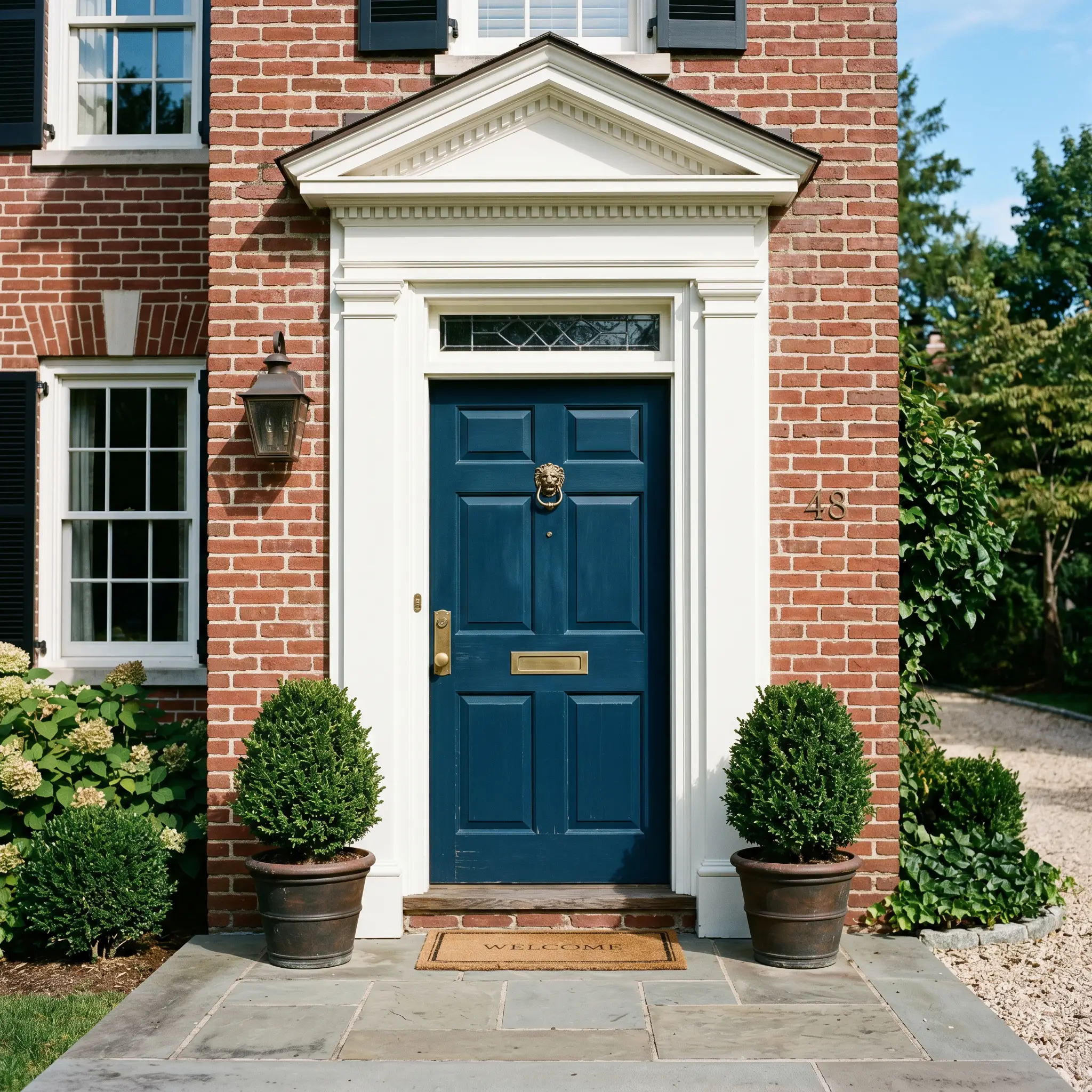
Front Doors
Exterior sunlight will always wash out a paint color slightly, which works to your advantage here. On a front door, the direct sun lifts the heavy black base, allowing it to read as a proud, distinguished historic blue. It immediately elevates the curb appeal of both brick facades and crisp white siding.
Unique Design Ideas & Inspiration
To truly maximize the impact of this premium finish, you have to think beyond standard accent walls. Let the gravity of the pigment dictate bold, unexpected architectural placements.
The Immersive Mudroom Wrap

Elevate a standard utilitarian space by completely saturating the room. By color drenching the baseboards, walls, built-in cubbies, and ceiling in the exact same finish, you erase the visual boundaries of the room. This technique turns a highly trafficked drop-zone into a stunning, tailored transition area that feels incredibly expensive.
Architectural Ceiling Canopies
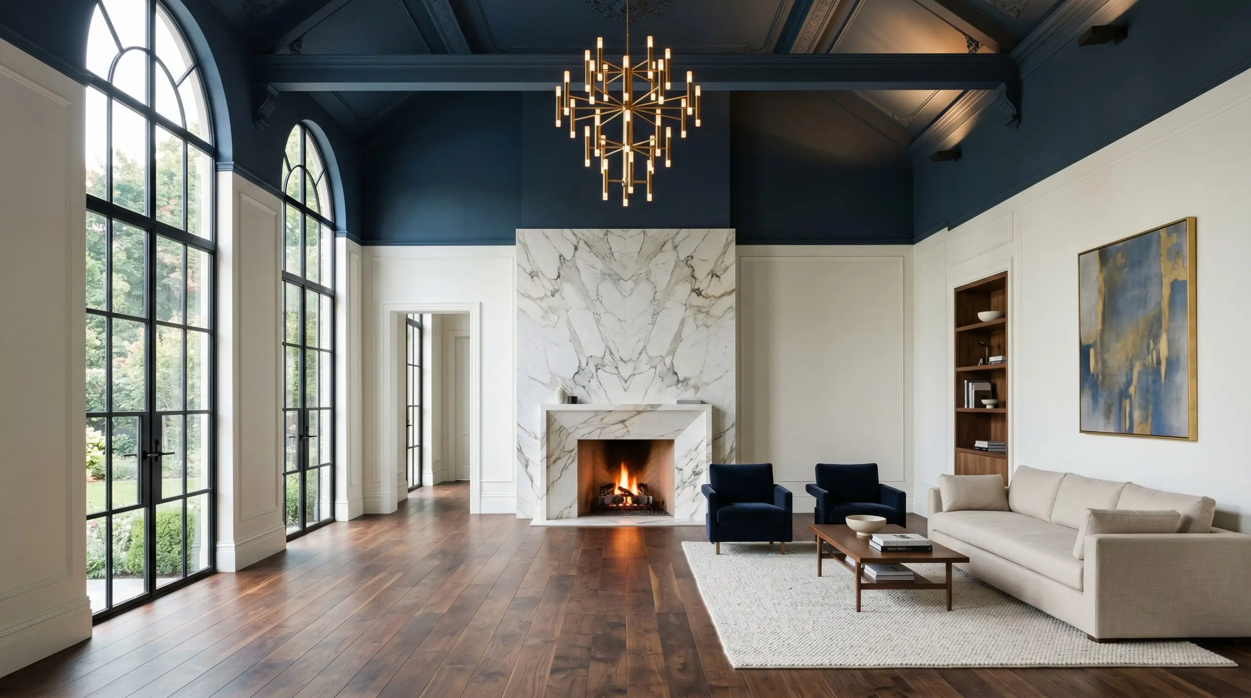
In rooms with exceptionally high ceilings that feel cold or cavernous, paint the ceiling and the top quarter of the walls in this deep shade, leaving the lower walls crisp white. This visually drops the ceiling, creating an intimate, tented canopy effect that immediately warms up the architecture.
The Tailored Gentleman’s Bar
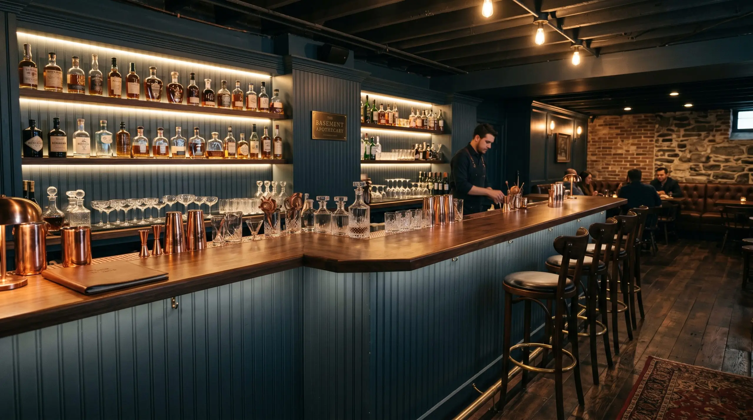
Transform a simple dining room alcove or basement corner into a high-end speakeasy. Use this shade on heavily textured beadboard or custom fluted paneling. The dark, petrol-blue backdrop will make amber liquor bottles, aged copper barware, and ambient LED strip lighting absolutely glow.
Coordinating Colors & Material Pairings
The secret to styling a deep, complex shade is balancing its visual weight. It requires highly intentional pairings to either create crisp, tailored boundaries or soft, tonal transitions.
Trim & Baseboards
To frame this bold color beautifully, you need the right white. Benjamin Moore Chantilly Lace OC-65 provides a stark, brilliant contrast that makes the dark walls feel highly modern and intentional. For a slightly softer, more historic transition that doesn’t feel quite as sharp, Sherwin-Williams Pure White SW 7005 offers a gentle, creamy edge.
Hardware, Wood & Material Pairings
Because this is a heritage color, it thrives alongside premium, tactile materials that share its rich, authentic DNA.
Coordinating Colors
When building a whole-home palette, look for secondary shades that either share the paint’s historic roots or provide a much-needed visual exhale.
Designer Mood Boards
To help visualize how these elements come together, here are a few curated aesthetic blueprints.
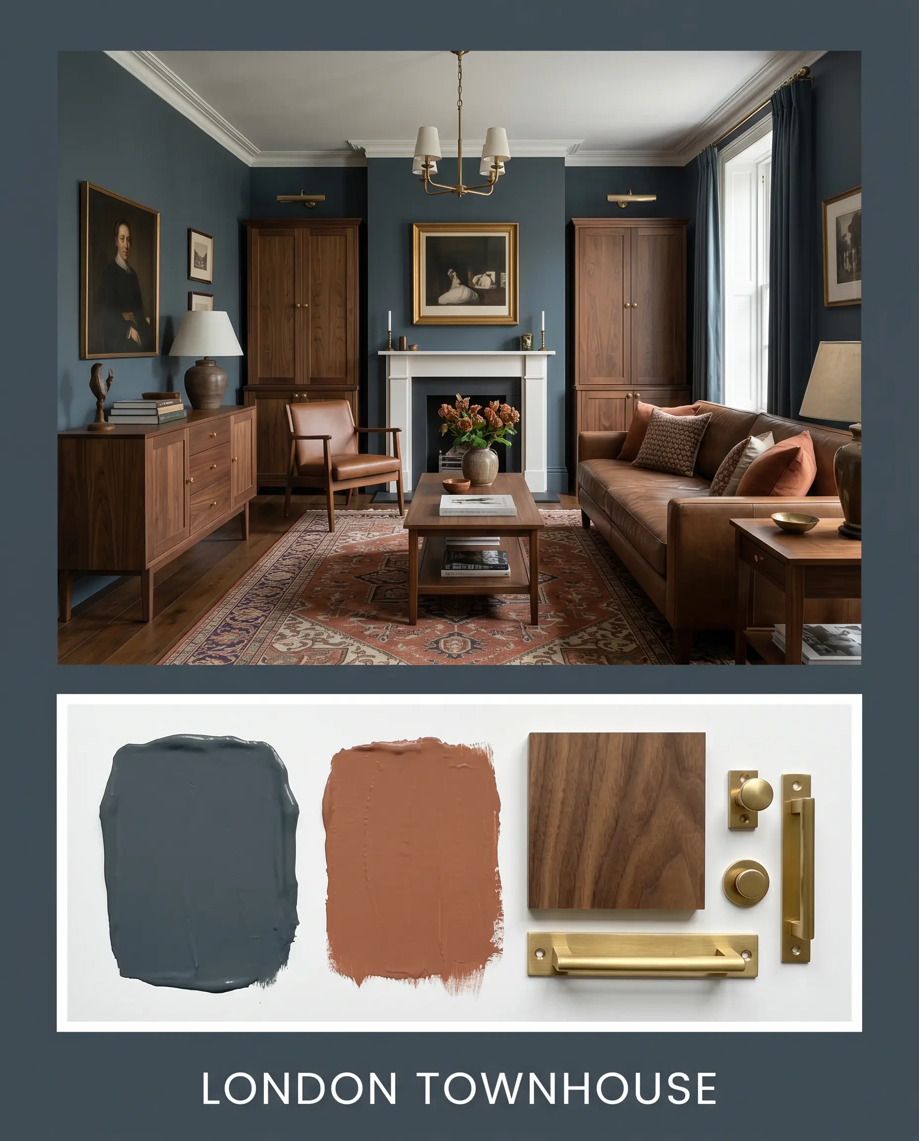
London Townhouse: This palette leans heavily into historic elegance and masculine tailoring. The dark walls provide the foundation for rich walnut furniture silhouettes and unlacquered brass hardware. By pulling in accents of Benjamin Moore Audubon Russet HC-51 through mohair throw pillows or vintage Persian rugs, the entire space feels deeply rooted, scholarly, and undeniably premium.
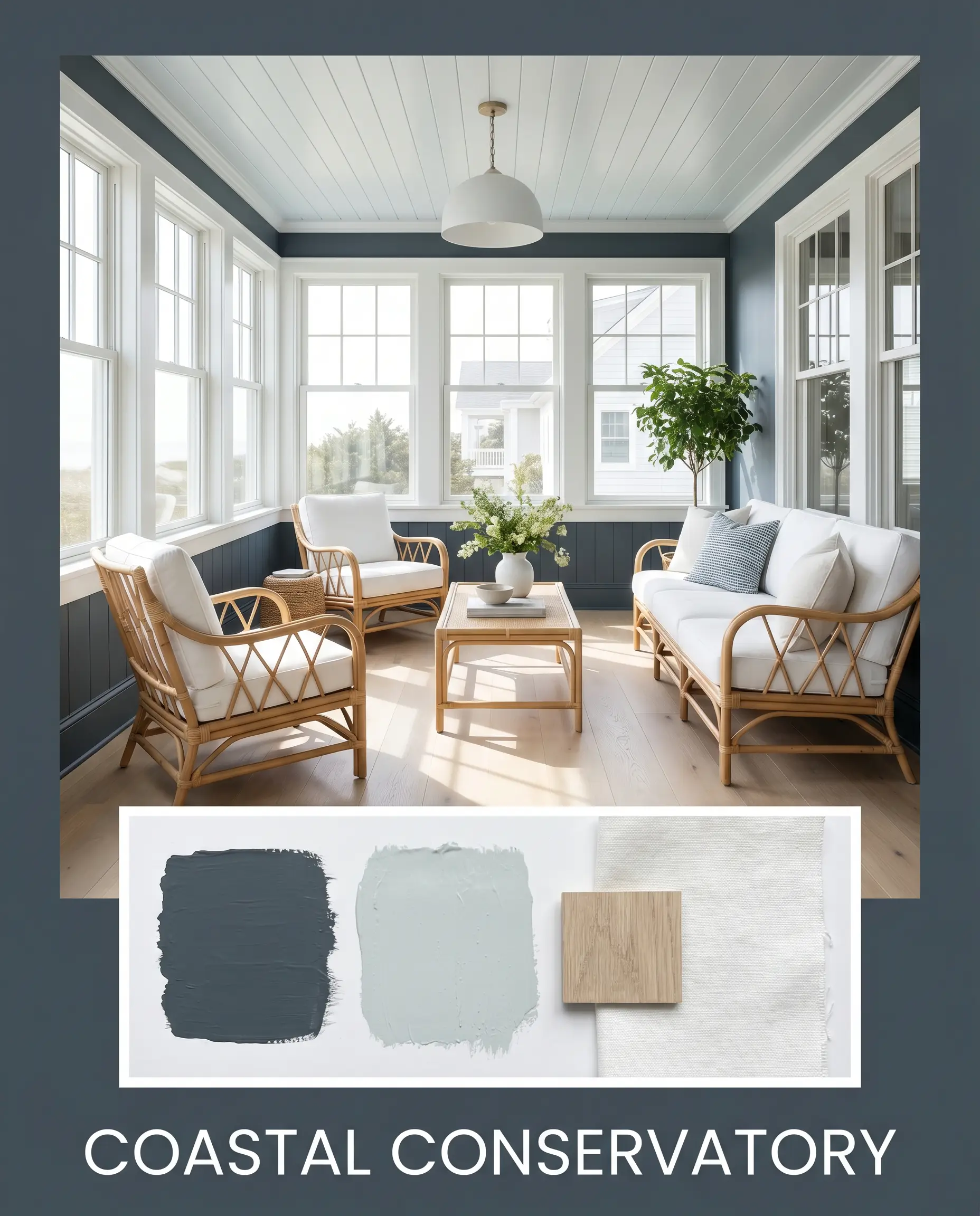
Coastal Conservatory: This approach strips away the heavy historic elements in favor of breezy, elevated contrast. The dark paint serves to anchor the room, while Farrow & Ball Borrowed Light No. 235 softens the ceiling or adjoining hallways. Incorporating bleached oak elements, natural rattan textures, and crisp, white linen upholstery creates a beautifully balanced, sophisticated retreat.
Head-to-Head Comparisons
Selecting the perfect shade often comes down to understanding the subtle differences in pigmentation when exploring the best navy blue paint colors. Here is how this distinctive hue stacks up against its closest rivals.
Farrow & Ball Hague Blue vs. Farrow & Ball Stiffkey Blue No. 281
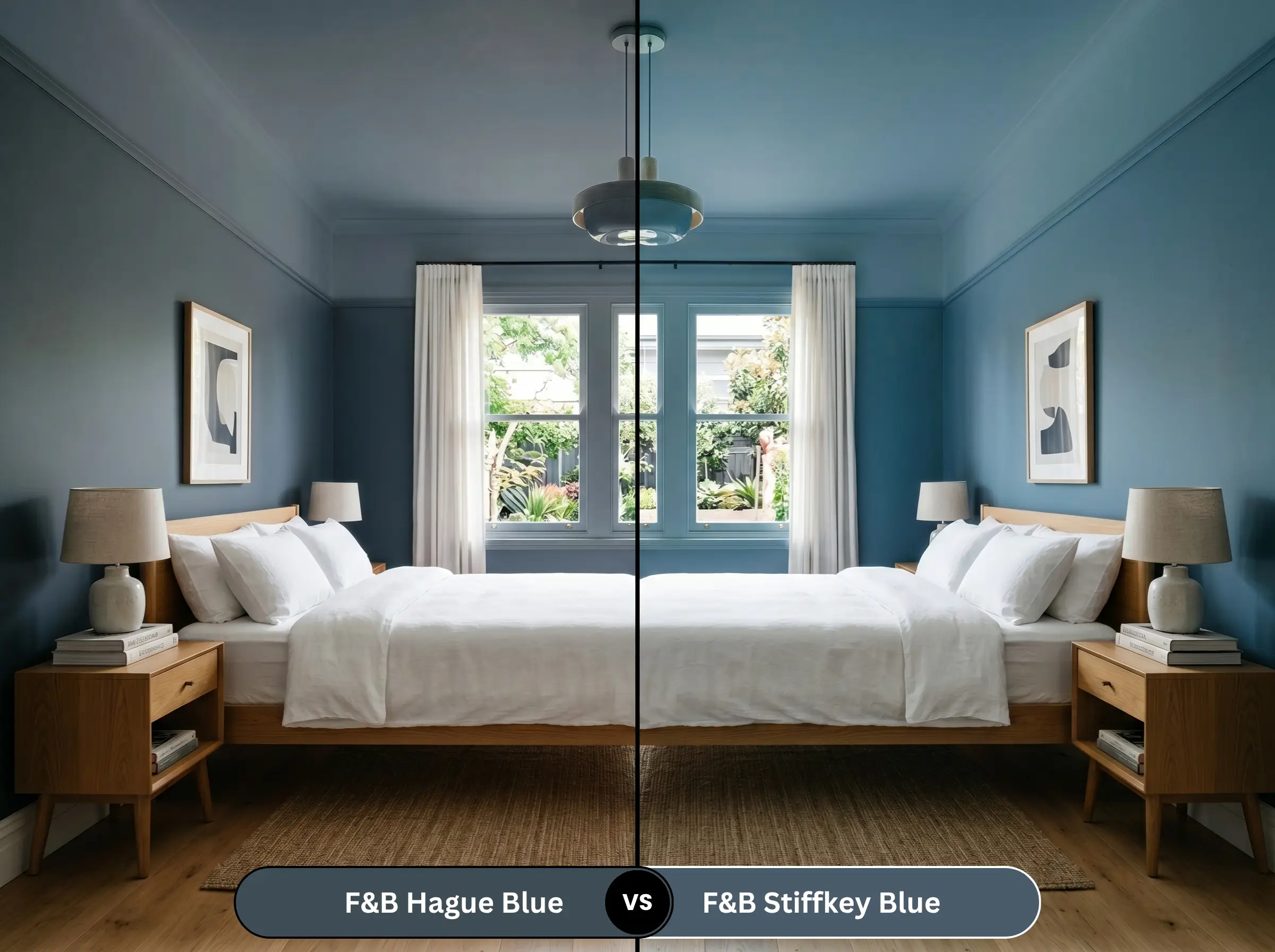
If you are terrified of the green undertones, Stiffkey Blue No. 281 is your safer alternative. While both are deeply saturated, Stiffkey Blue is a much truer, more traditional navy. If your room receives heavy southern light and you want to avoid any hint of teal, Stiffkey Blue will hold its classic blue shape far better.
Farrow & Ball Hague Blue vs. Sherwin-Williams Naval SW 6244
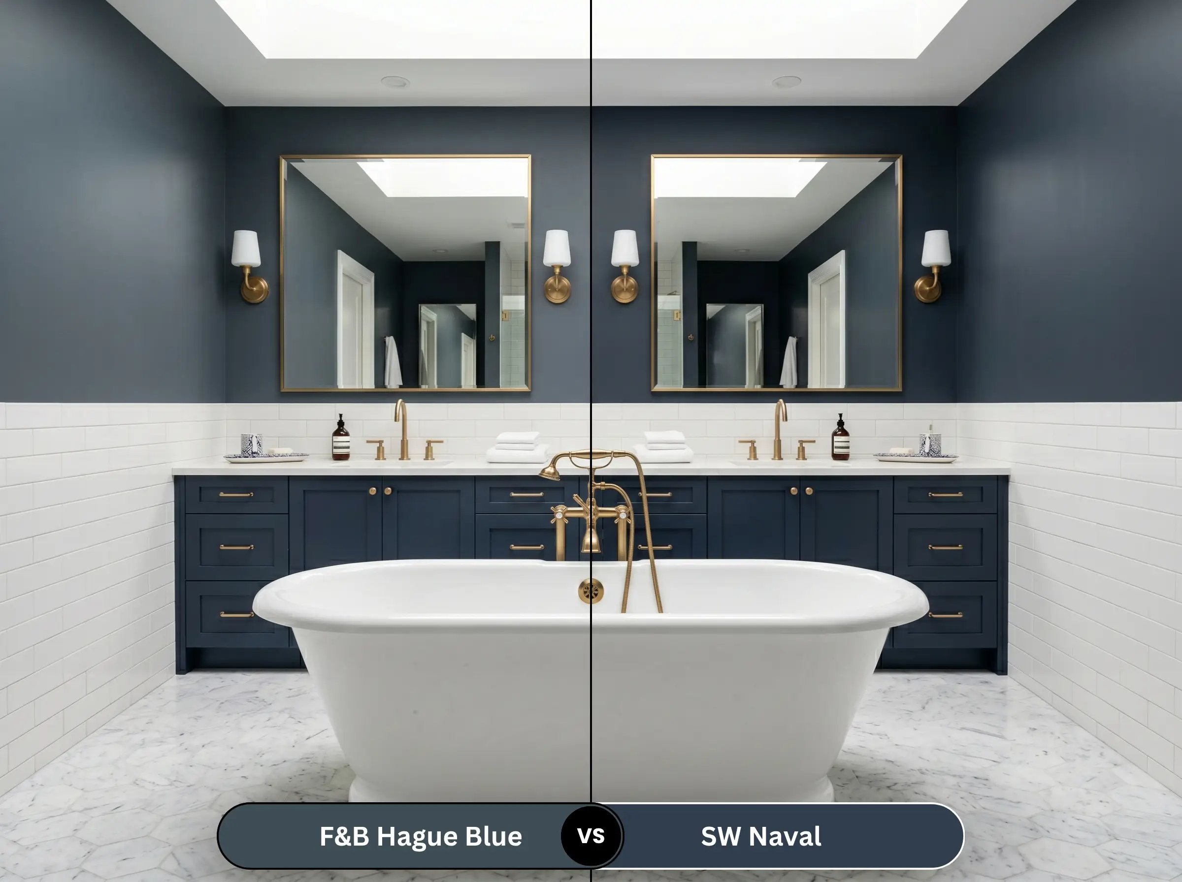
Sherwin-Williams Naval SW 6244 is an iconic, crisp navy with incredibly subtle gray undertones. It feels distinctly more modern and preppy. If you are aiming for a crisp, nautical aesthetic with bright white trim, Naval is the superior choice. However, if you want a color that feels aged, moody, and historically complex, No. 30 easily wins out.
Farrow & Ball Hague Blue vs. Benjamin Moore Hale Navy HC-154
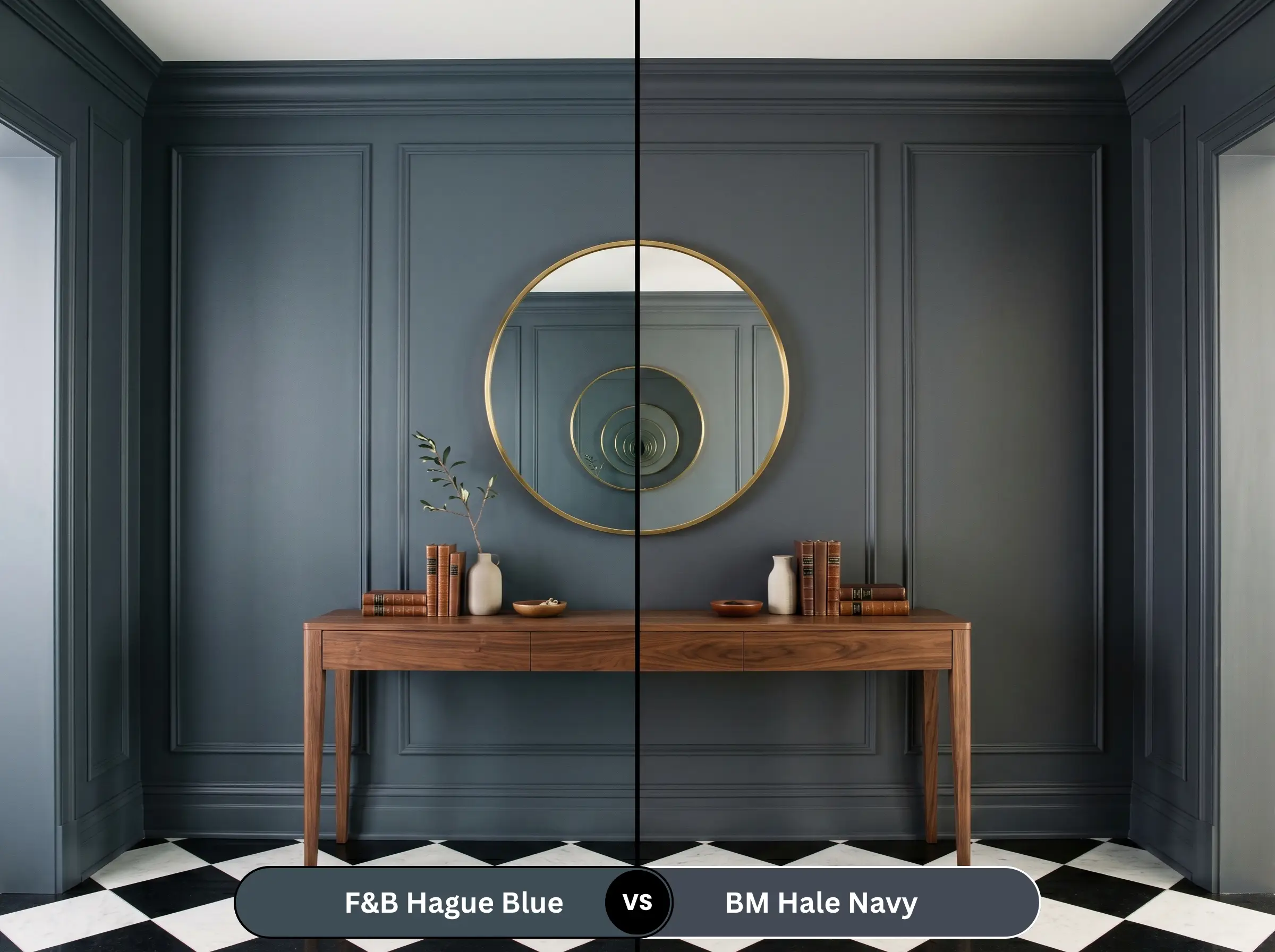
Benjamin Moore Hale Navy HC-154 is famous for its heavy charcoal undertones, making it a highly neutral, muted dark blue. It rarely shifts wildly in different lighting conditions. If you want a predictable, steadfast dark gray-blue, choose Hale Navy. If you prefer a color that actively responds to the sun and transforms throughout the day, stick with Farrow & Ball.
Similar Colors & Brand Equivalents
Sometimes a specific project requires a subtle shift in depth, or you simply need a more readily available alternative from a local supplier.
Farrow & Ball Alternatives
Cross-Brand Matches
Practical Application & DIY Advice
Executing a flawless finish with a deeply pigmented color requires strict attention to detail and the right materials.
The Dynamic Sheen Guide
Primer Strategy
You cannot skip the preparation phase with a color this dark. A standard white primer will aggressively fight the topcoat, resulting in a streaky, uneven finish. You must use a dark, tinted primer (specifically Farrow & Ball’s Dark Tones Primer & Undercoat) to build the necessary depth and ensure the rich pigments actually saturate the wall.
Deep, blackened colors are notoriously unforgiving when it comes to “flashing”—those visible, shiny streaks left behind by uneven roller pressure. Maintain a strictly wet edge while painting, and never go back to touch up a semi-dry section of the wall.
Hackrea Design Secret (Application)
Coverage & Success Tips
Expect to apply a minimum of two generous coats over your dark primer. If you are painting highly textured surfaces or raw wood, a third coat may be necessary to achieve the true, velvety depth the brand is known for.
Frequently Asked Questions
Because direct exterior sunlight washes out the blackened base, the green undertones will become much more prominent outdoors. It will read as a rich, historic teal-blue rather than a standard navy, which looks stunning on traditional architecture but may surprise homeowners expecting a pure blue.
In a windowless space relying entirely on artificial light, Hague Blue will feel much warmer and more jewel-toned due to its green base. Hale Navy, with its heavy charcoal influence, will read as a much cooler, flatter dark gray-blue under the same lighting conditions.
For older cabinetry with visible dings or heavy grain, Estate Eggshell is the superior choice. Its lower sheen level (20%) absorbs light rather than reflecting it, which beautifully masks surface imperfections while still providing a durable, wipeable surface.
While Sherwin-Williams can scan the code and produce a very close visual match, they cannot replicate Farrow & Ball’s proprietary clay-based pigment structure. The color-matched version will look similar at first glance, but it will lack the signature chalky depth and complex lighting shifts of the original.
Final Verdict & Expert Warnings
Farrow & Ball Hague Blue (No. 30) is the ultimate choice for homeowners who want to inject their spaces with rich, tailored sophistication. It performs brilliantly on custom millwork, kitchen islands, and in moody, immersive living spaces. This paint is engineered for the fearless designer who appreciates a color that actively shifts throughout the day, transforming from a blackened, historic navy in the shadows to a vibrant, sophisticated teal in the sun.
However, because this shade carries such a heavy visual weight and prominent green undertones, it is not universally forgiving. You must strictly avoid pairing this color with stark, cool-toned grays, as the icy clash will make the walls look muddy and confused. Furthermore, keep it far away from cheap, highly polished chrome hardware or bright cherry-red accents, which will instantly strip away its premium heritage feel and drag the aesthetic into a dated, primary-color nightmare. When given the proper respect with warm metals, rich woods, and layered lighting, this color delivers an unmatched, luxurious atmosphere.
Expert Warning (Color Clashes)