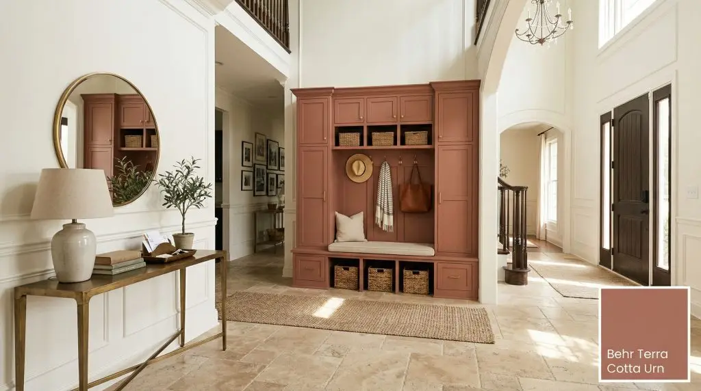
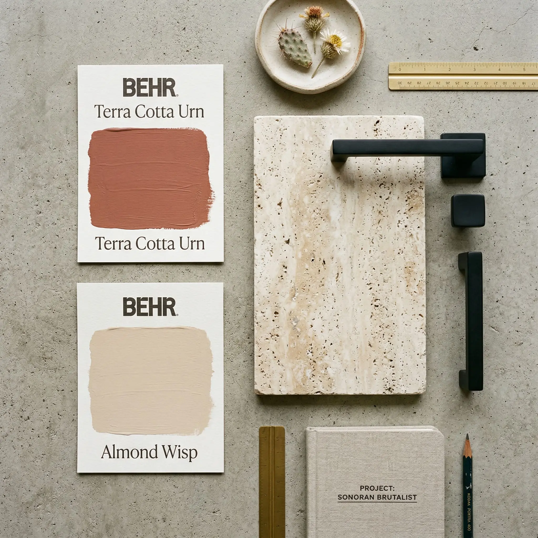
Terra Cotta Urn PPU2-12
BehrBehr Terra Cotta Urn (PPU2-12) is a warm, earthy reddish-brown paint color with an LRV of 22. Reminiscent of sun-baked clay, its muted brown and subtle orange undertones make it perfect for creating grounded, rustic, or desert-inspired spaces without looking overly bright.
Paint Technical Profile
| Color ID / SKU | PPU2-12 |
| HEX Code | #b06f60 |
| Light Reflectance (LRV) | 22 |
| Use | Interior, Exterior |
| Best Exposures | South-Facing or North-Facing (Highly adaptable) |
| Best For | Accent walls, dining rooms, vintage bathroom vanities, exterior shutters |
Behr Terra Cotta Urn PPU2-12: Mastering the Sun-Baked Desert Aesthetic
We crave spaces that feel grounded, tactile, and inherently human. The desire for organic warmth has pushed stark, clinical grays out of the design conversation, replacing them with the rich tones of the earth.
Behr Terra Cotta Urn PPU2-12 answers this exact craving.
This earthy reddish-brown bridges the gap between rugged rustic aesthetics and highly curated, modern interiors. It promises the allure of a desert landscape without overwhelming your walls. But executing a heavily pigmented, muted orange requires strict adherence to color science, lighting rules, and precise material pairings.
Here is exactly how to manipulate this historic shade to achieve flawless architectural depth.
The Color DNA: Undertones & LRV
A paint’s success on your walls is dictated entirely by its chemical makeup and light reflectance. You cannot guess how a color will behave; you must look at the literal math behind the pigment.
With a Light Reflectance Value (LRV) of 22, this is a medium-dark shade. It absorbs a significant amount of light, meaning it will instantly create intimacy, drama, and coziness. It possesses enough body to hold its own in brightly lit rooms without washing out into a pastel. However, in windowless or poorly lit spaces, this depth can feel heavy and cavernous if not balanced by high-contrast trim.
Lighting Effects & The Chameleon Factor
If you are terrified of the dreaded “pumpkin effect”—where an earthy red suddenly morphs into a neon Halloween nightmare or a dated 90s Tuscan kitchen—you can breathe a sigh of relief. The heavy brown undertones in this formulation are your safety net.
Because of its specific hue angle, this sun-baked clay shifts dramatically depending on the directional light hitting your room.
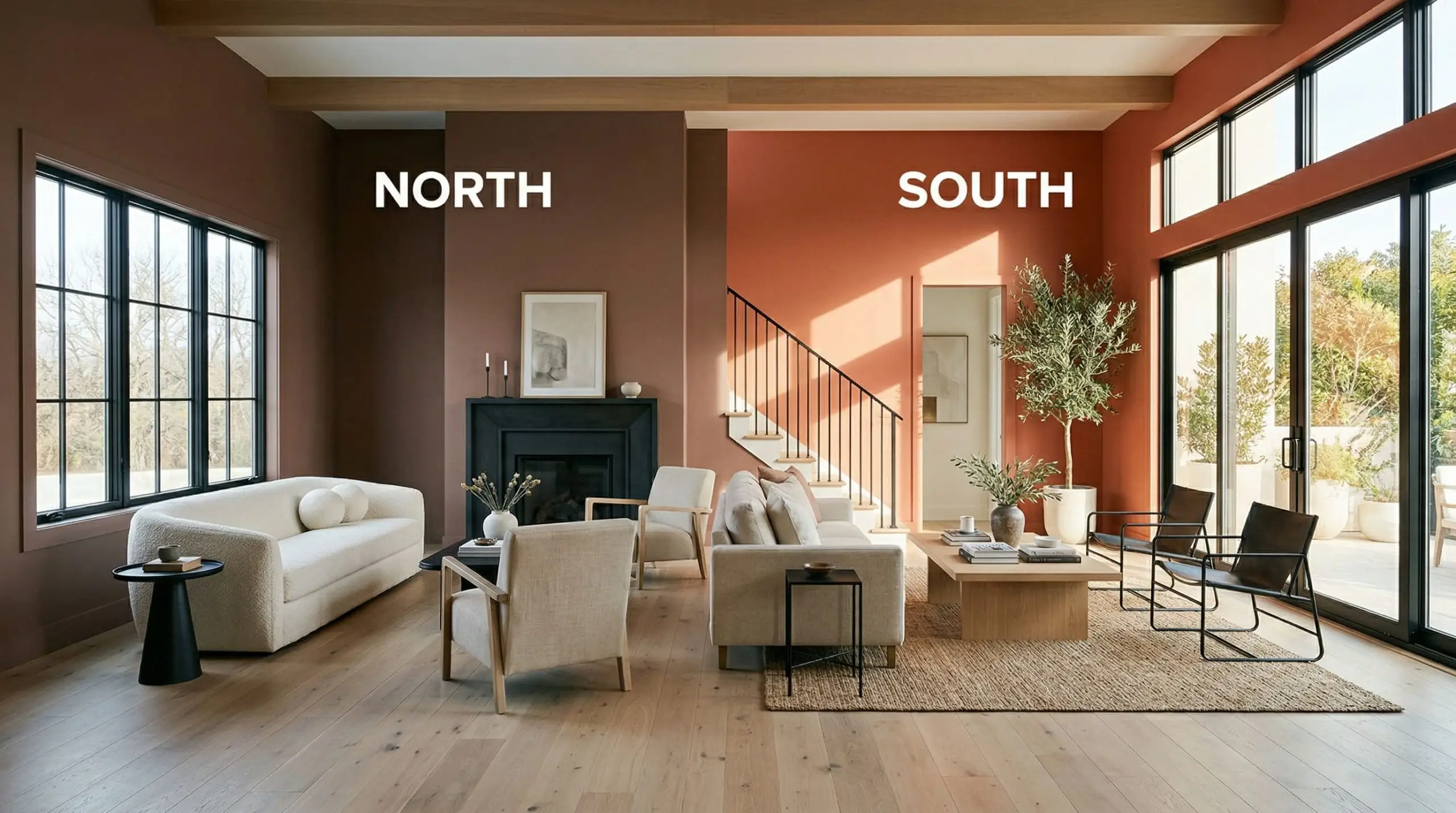
Always test this color on both the window wall and the darkest corner of your room. The shadowplay on an LRV of 22 will create two completely different colors in the exact same space.
Hackrea Pro-Tip
Popular Room Applications
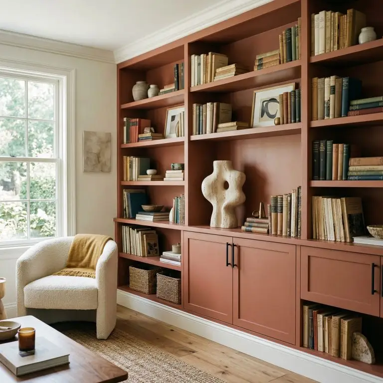
Terra Cotta Urn is undeniably striking, but it is not a universally versatile neutral. It demands intentionality. If you apply it blindly across an entire open-concept floor plan, it will visually shrink your home.
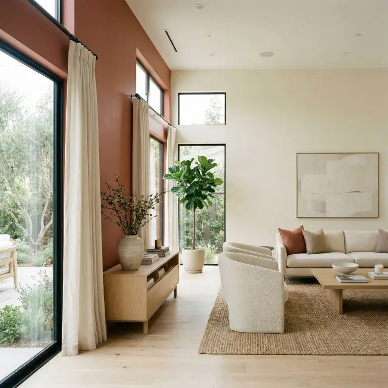
Living Room Accent Walls
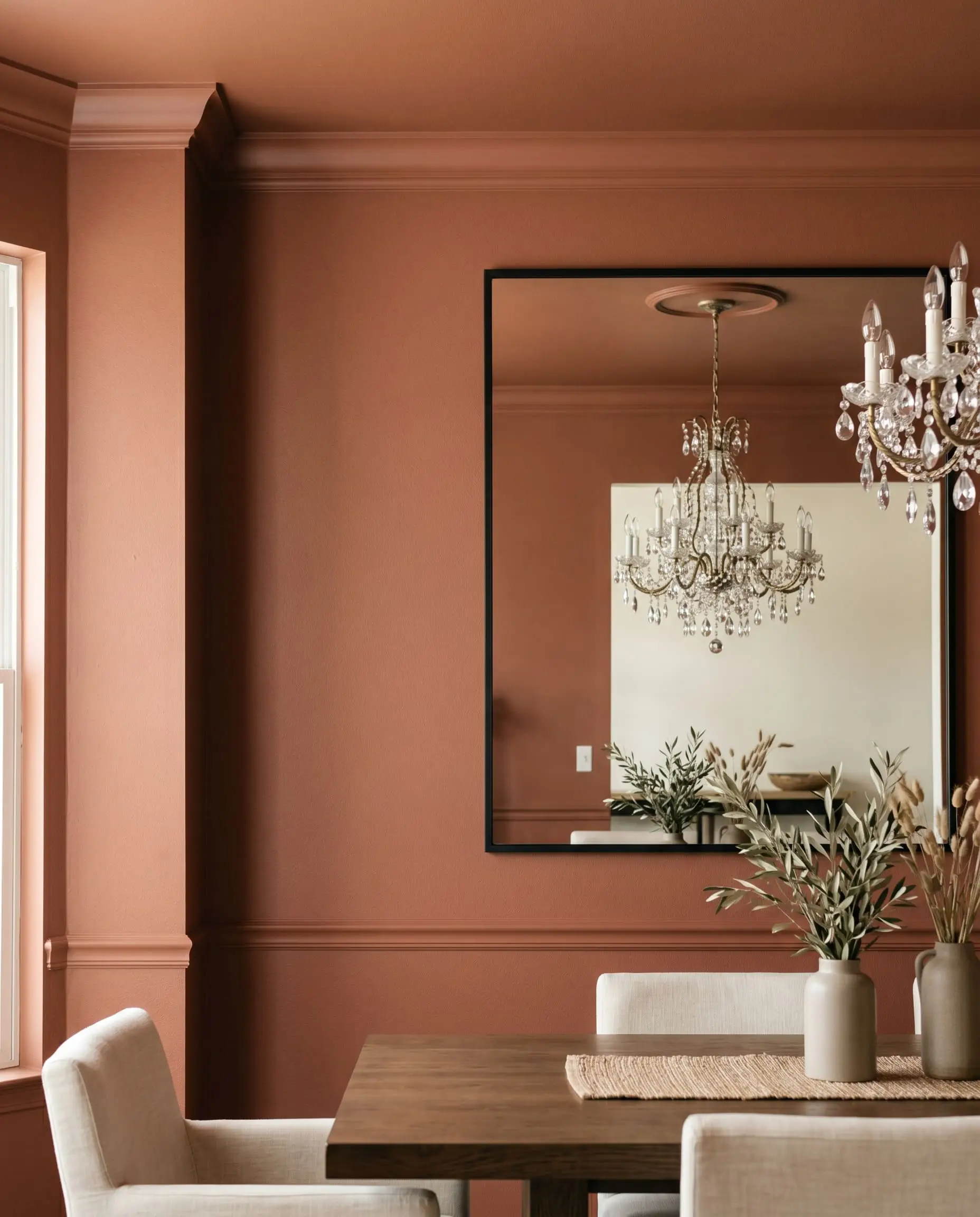
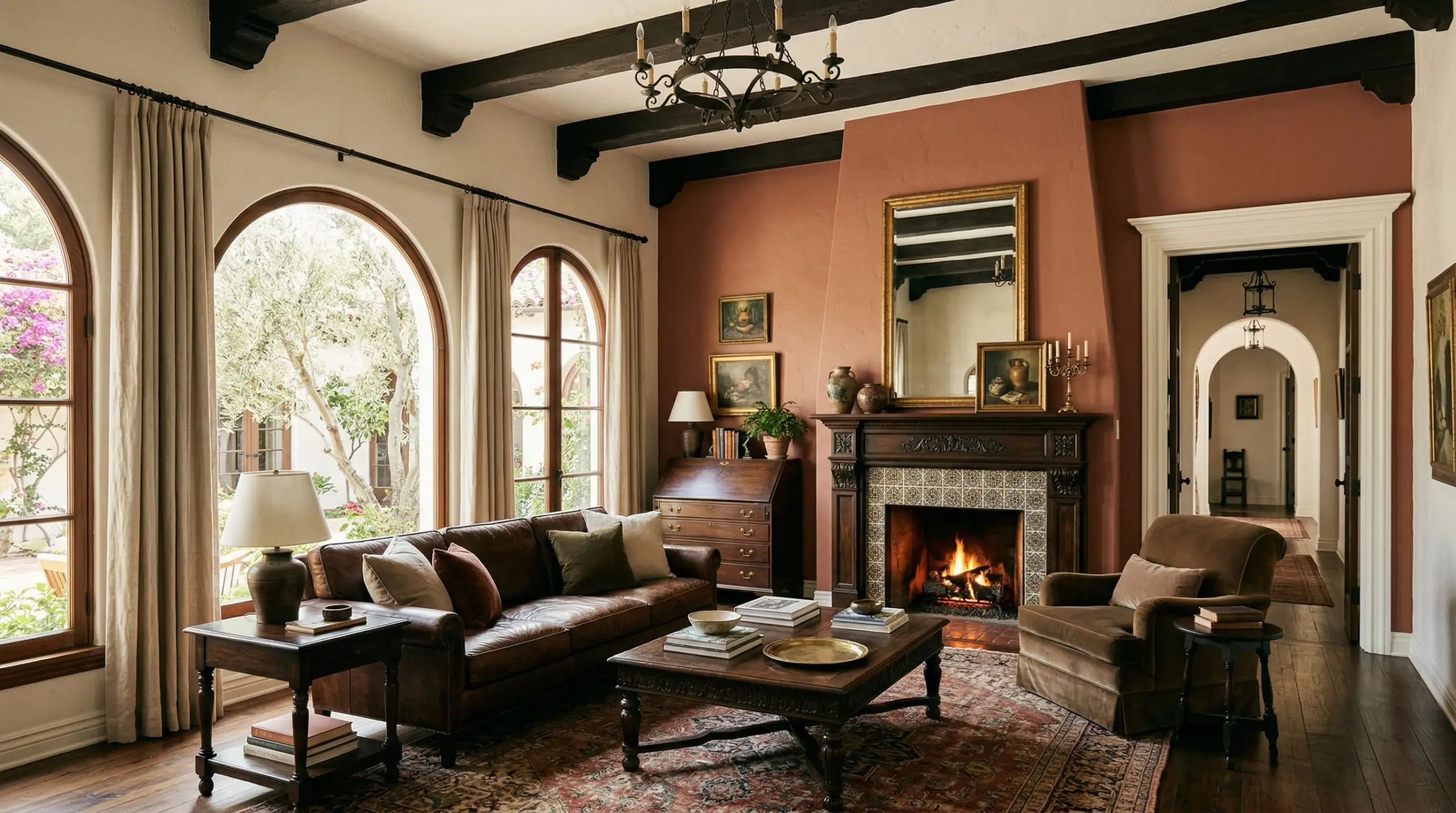
Using this shade as an accent wall requires structural logic. Never paint a random floating wall just to add color. Apply this earthy reddish-brown to a wall that features a fireplace, prominent built-ins, or large architectural windows to anchor the room’s sightline. The dark LRV will visually pull the wall forward, making large, cavernous living rooms feel much more intimate.
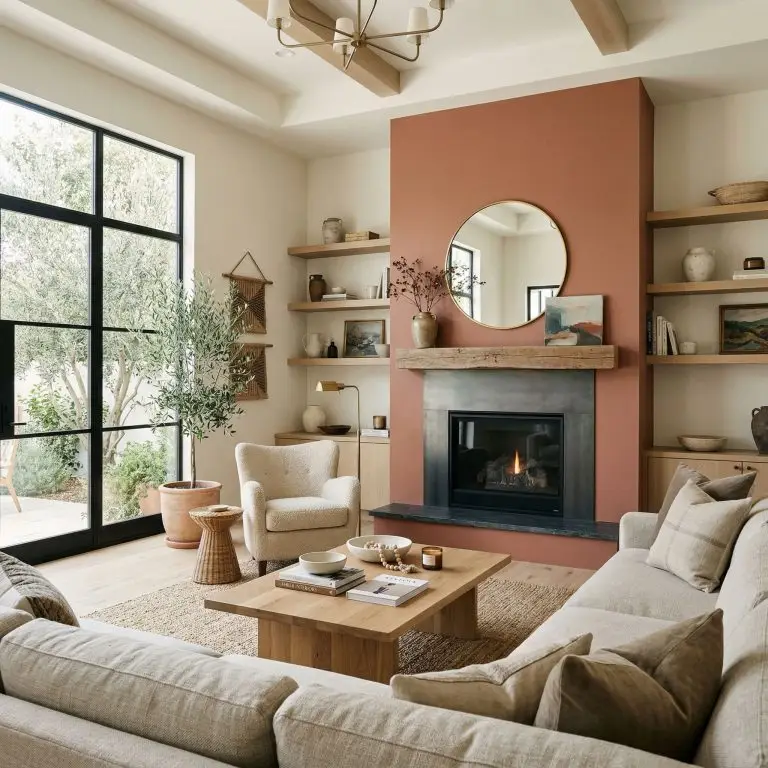
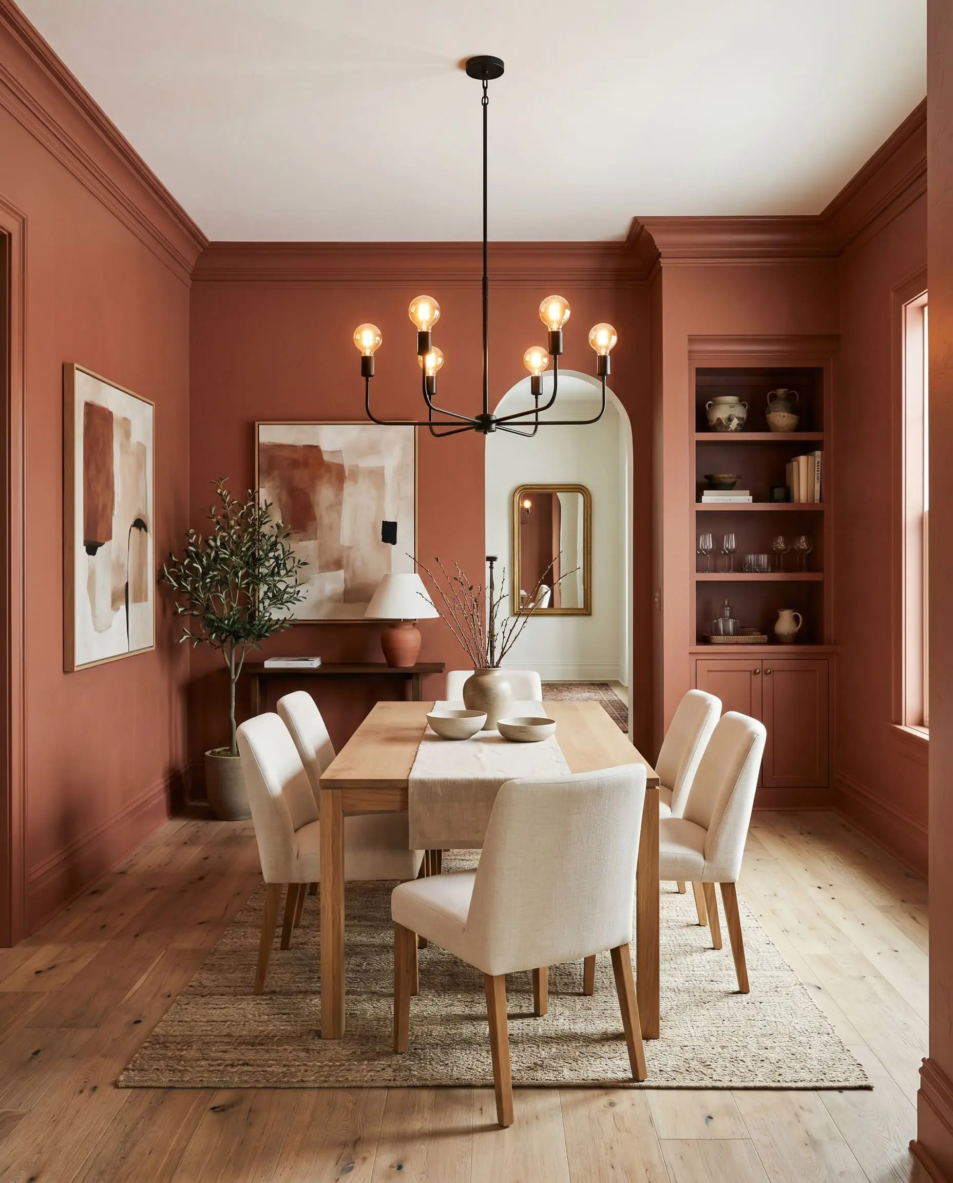
Dining Room Foundations
Dining spaces are meant to be experiential and moody. Color-drenching a dining room in this shade—painting the walls, baseboards, and crown molding the exact same color—creates a seamless, jewel-box effect. Because dining rooms are typically used in the evening under artificial chandelier lighting, the brown undertones will dominate, producing a highly sophisticated, enveloping warmth.
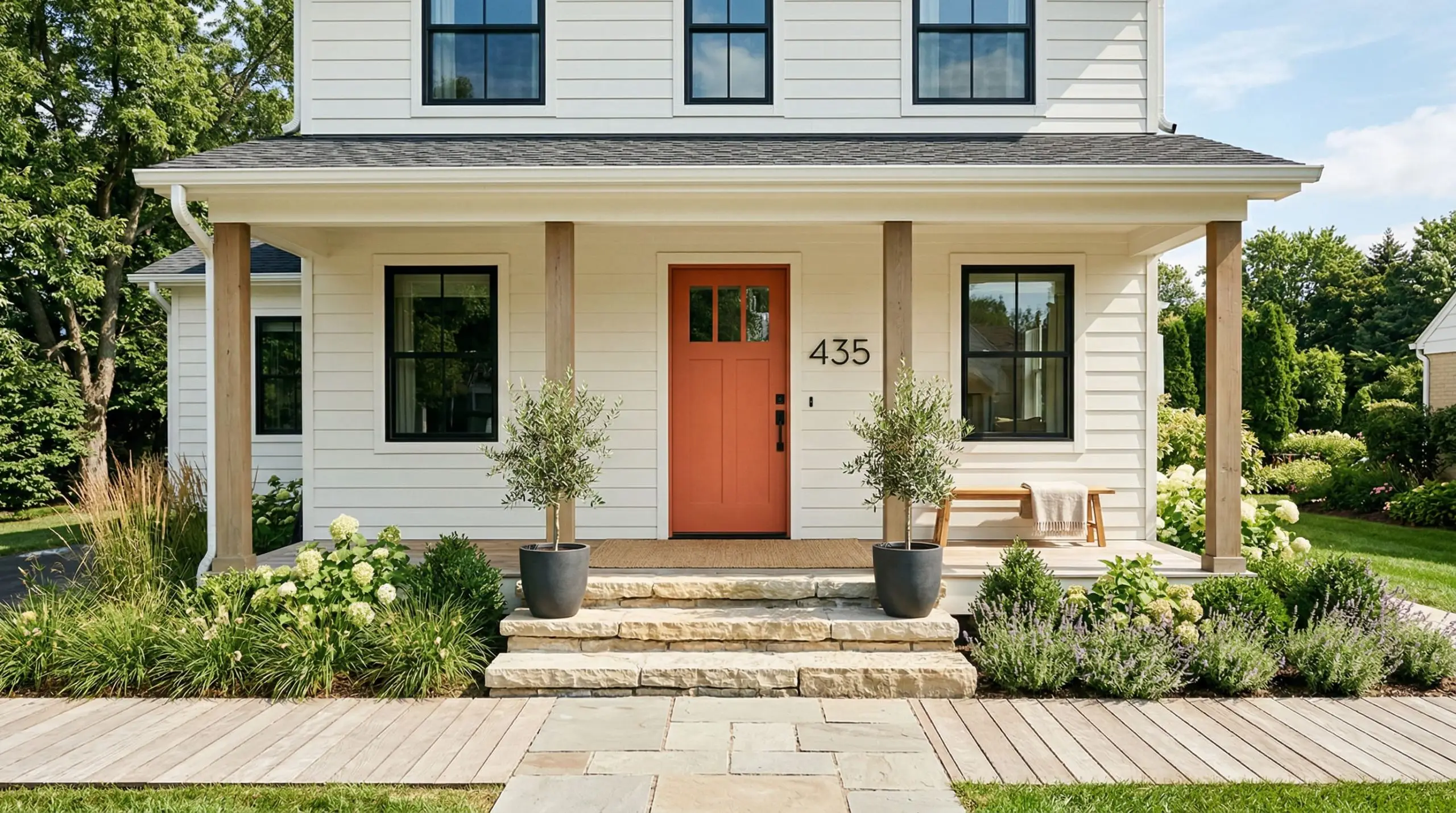
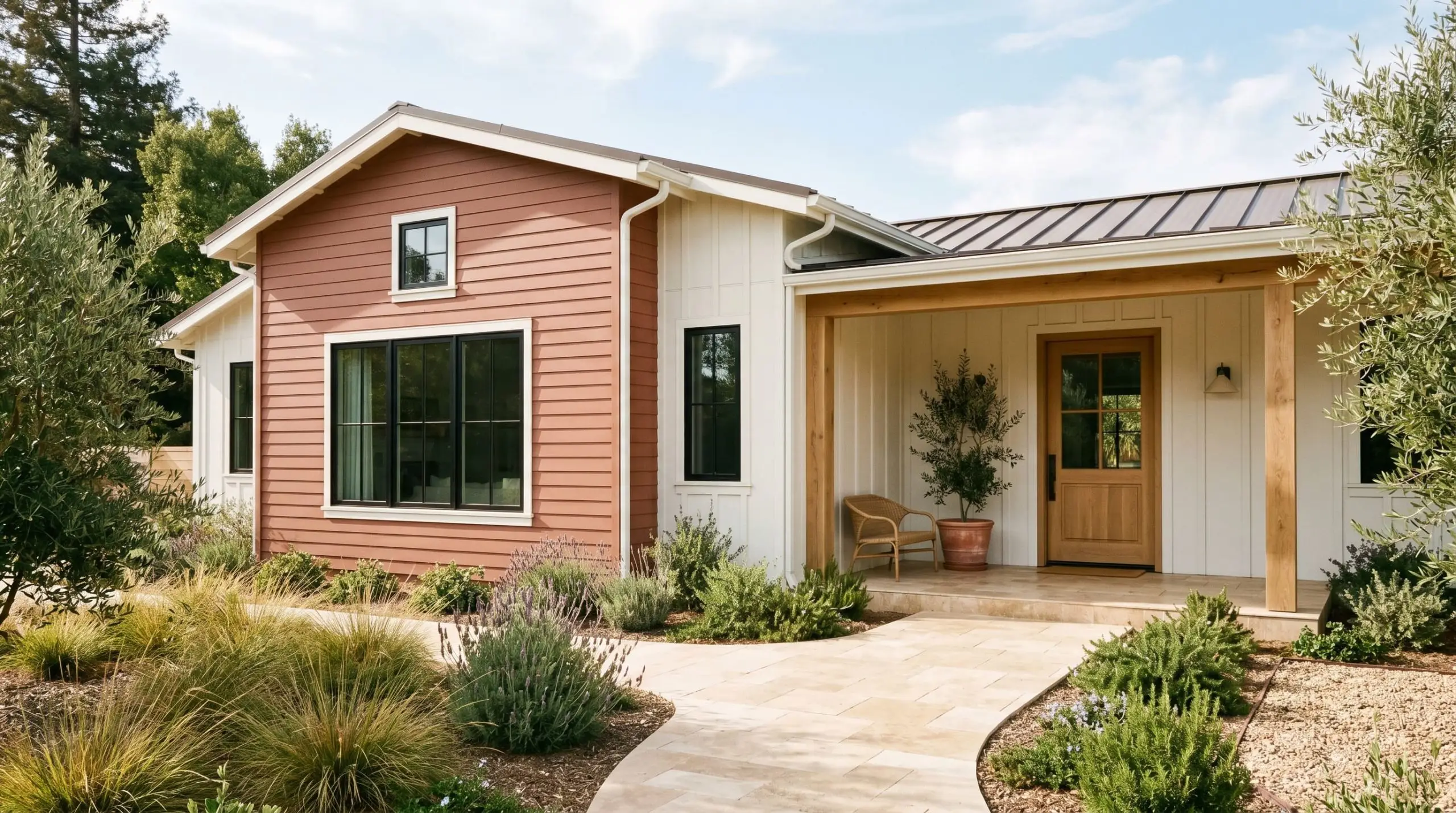
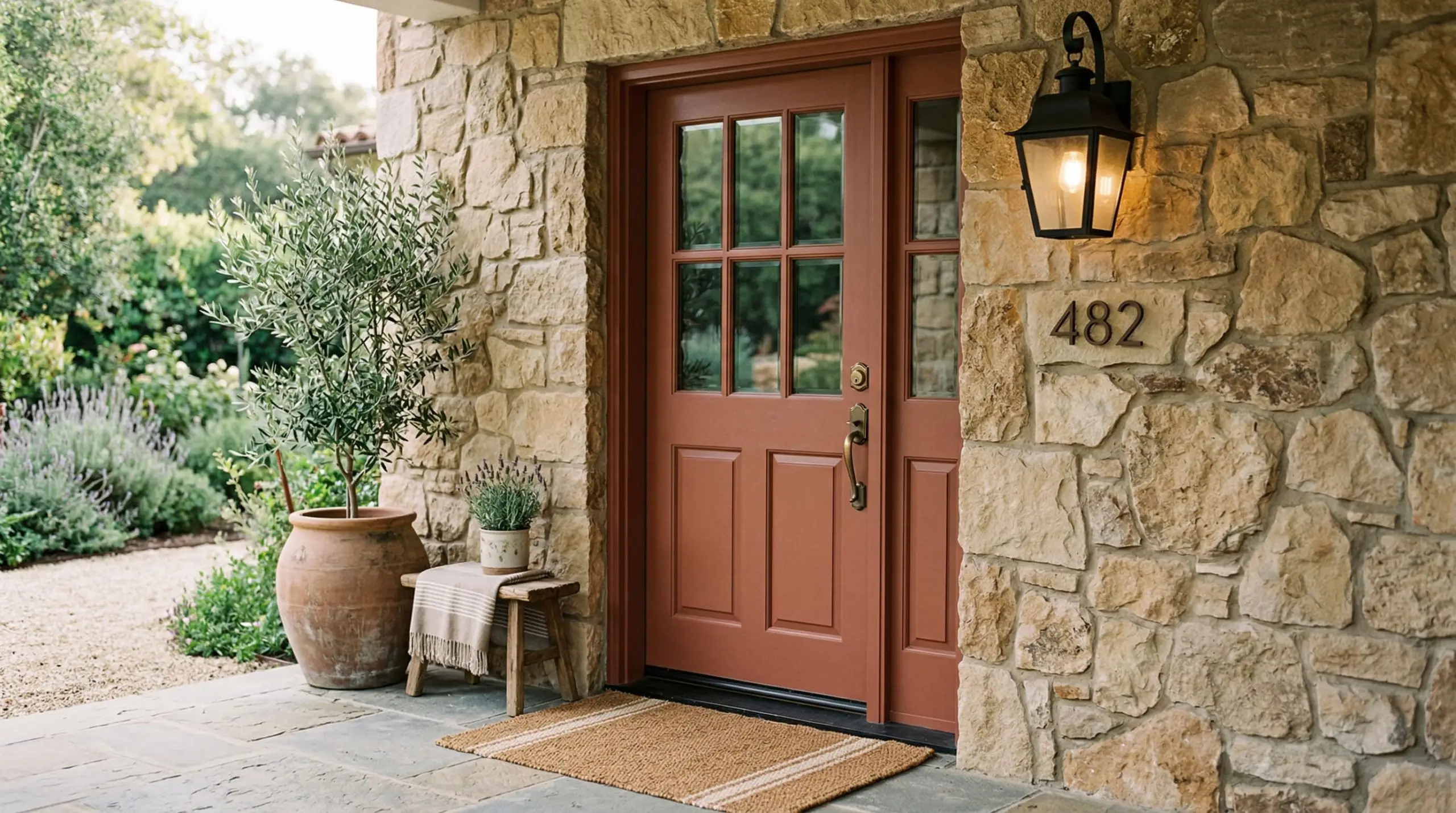
Exterior Siding & Front Doors
When taken outside, natural sunlight washes out paint colors, making them appear significantly lighter and brighter. On an exterior facade, PPU2-12 loses its heavy brown moodiness and reads as a vibrant, welcoming terracotta. It is a phenomenal choice for a front door, especially when contrasting against creamy white siding or natural stone masonry.
Signature Design Ideas & Inspiration
Moving beyond basic applications, this specific paint formulation truly shines when used to highlight distinct architectural features. Here is how our color science team deploys this shade for maximum visual impact.
Vintage Bathroom Vanities
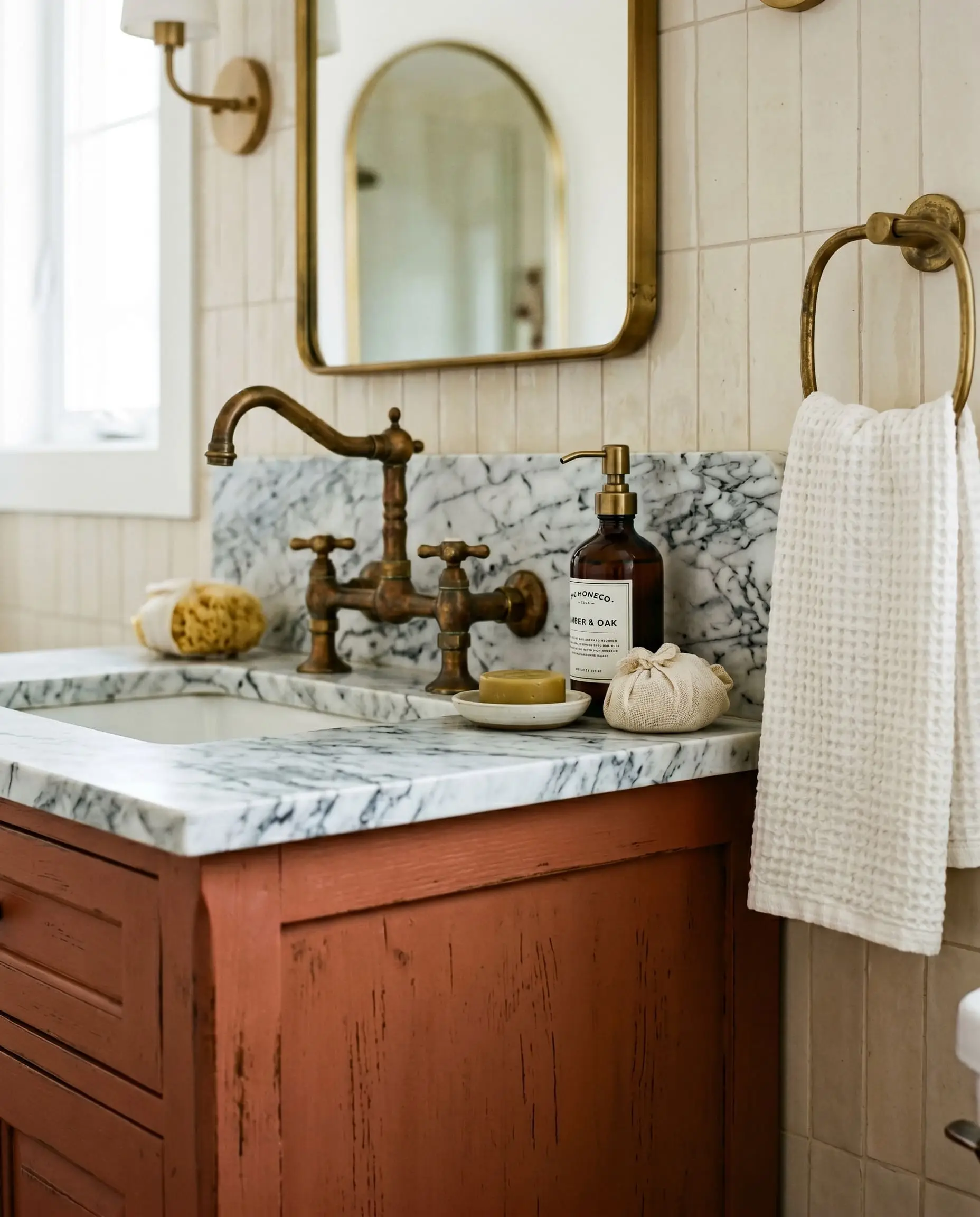
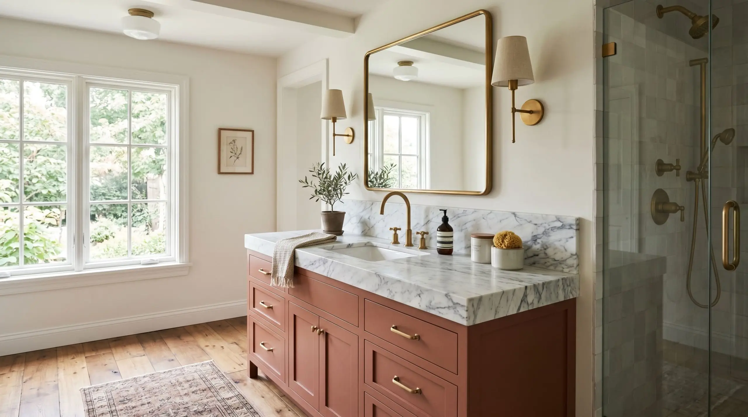
This rich hue works flawlessly when applied to custom cabinetry, provided you engage the right physical textures to amplify the mood. By painting a vintage vanity in this muted orange, you establish a deeply tactile, sensorial experience. Pair it with unlacquered brass hardware that will patina over time, and top it with heavily veined Carrara marble. The icy coolness of the stone creates a brilliant physical tension against the fiery warmth of the wood, resulting in a bespoke, high-end sanctuary. If you are attempting this transformation yourself, mastering how to paint kitchen cabinets and bathroom vanities is essential for a smooth, factory-grade finish.
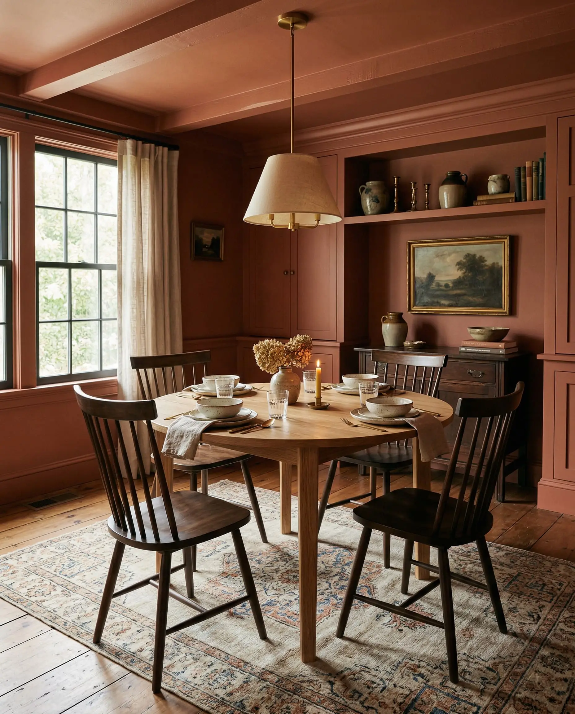
Formal Dining Rooms Above Wainscoting
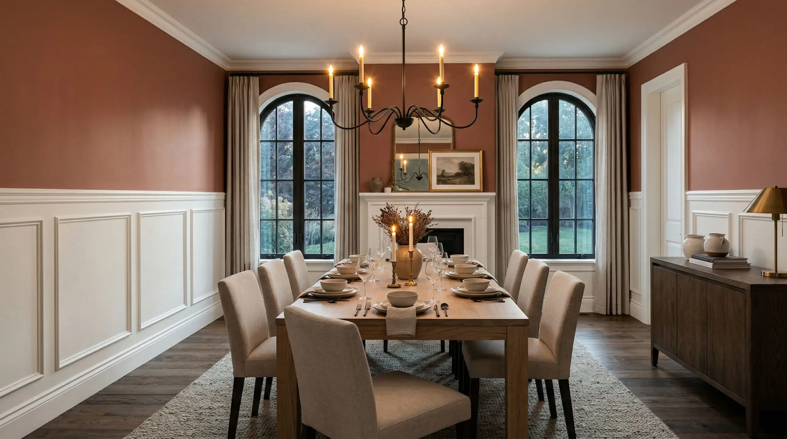
This color explicitly manipulates the perceived temperature of a room, making it feel physically warmer and more insulated. Applying Terra Cotta Urn strictly to the upper half of a dining room wall, directly above crisp white wainscoting, creates a brilliant psychological balance. The white woodwork keeps the lower half of the room feeling expansive and clean, while the upper walls wrap the space in a cozy, intimate glow that perfectly frames candlelit dinners.
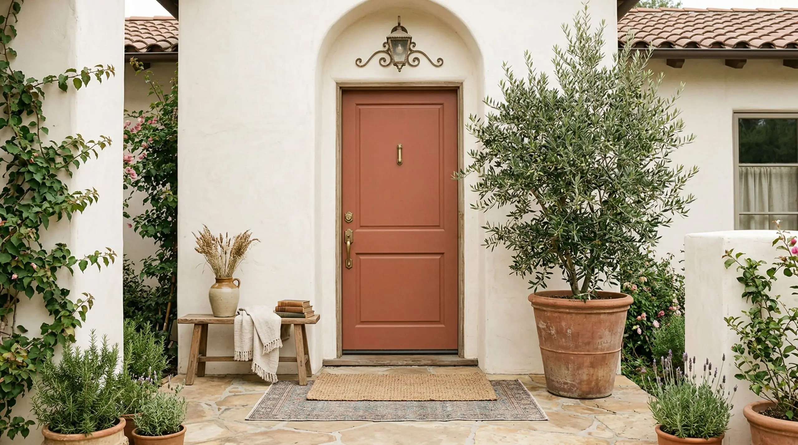
Exterior Shutters on Stucco
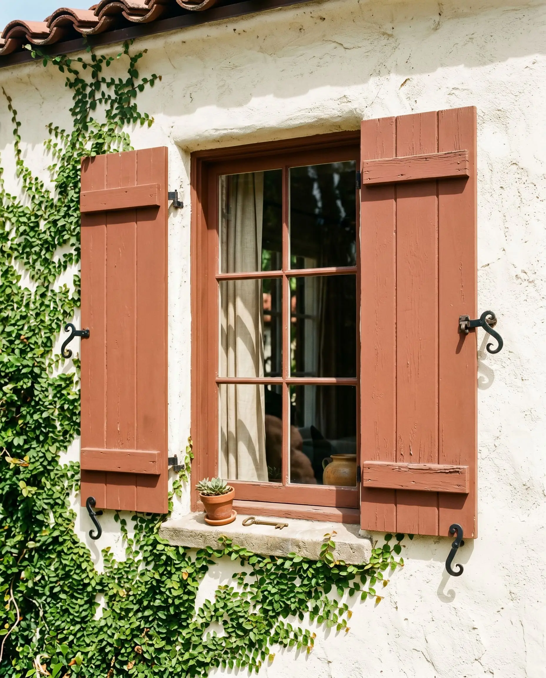
By anchoring this color to specific architectural movements, you instantly legitimize your home’s exterior. Applying this shade to wooden shutters against creamy white stucco explicitly ties the property to the 1920s Spanish Revival and Mediterranean-inspired design eras. The rugged, sun-baked pigment looks historically accurate against the rough texture of the stucco, transforming a standard facade into a curated, historic estate.
Mudroom Built-Ins
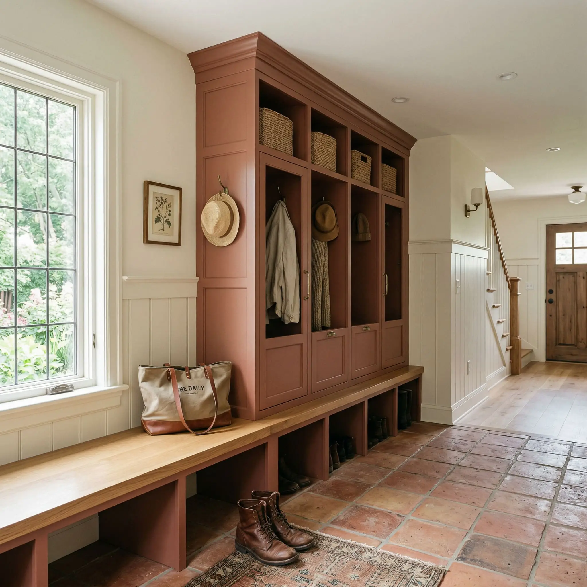
This color thrives in transitional spaces that bridge the outdoors with the interior, but it carries a strict failure state. It looks incredible on mudroom lockers paired with natural terracotta floor tiles and white oak benches. However, if you use a flat sheen on these built-ins, the paint will look like literal dry clay—chalky, scuffed, and amateurish. You must use a satin or semi-gloss finish here to give the cabinetry a rich, leather-like depth that withstands daily physical impact.
The Pairings & Accents Guide
You cannot treat an earthy red-brown like a standard neutral. It demands highly specific companions to balance its visual weight.
Flawless Trim Pairings for Terra Cotta Urn
Never pair this shade with a stark, blue-toned white. The clash will make the terra cotta look harsh and muddy. You must use warm, creamy whites to bridge the transition.
Architectural Material Synergies
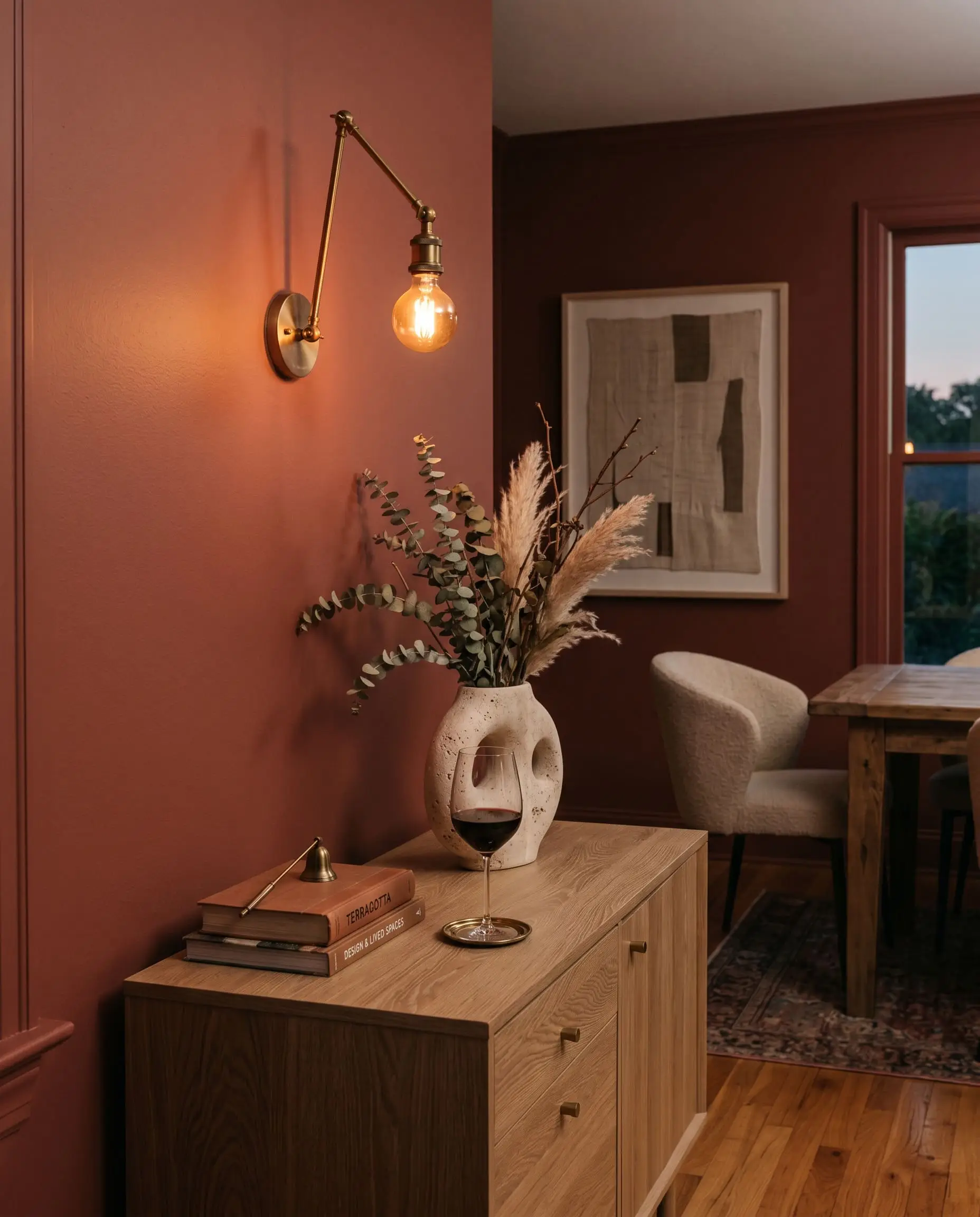
The materials you permanently install around this paint will dictate its final aesthetic. Unlacquered brass and matte black iron hardware are non-negotiable; brass adds a historic gleam, while black iron grounds the space with modern geometry. For flooring and cabinetry, natural white oak is the perfect timber, as its pale, ashy undertones allow the paint to act as the room’s focal point. Travertine stone and creamy stucco are the ultimate fixed materials, seamlessly amplifying the desert landscape vibe.
You must absolutely avoid pairing this paint with cherry, mahogany, or red-toned woods. The red undertones in the wood will aggressively compete with the red-brown walls, resulting in a visually exhausting, muddy disaster.
Clash Warning
Coordinating Palettes
Curated Mood Boards
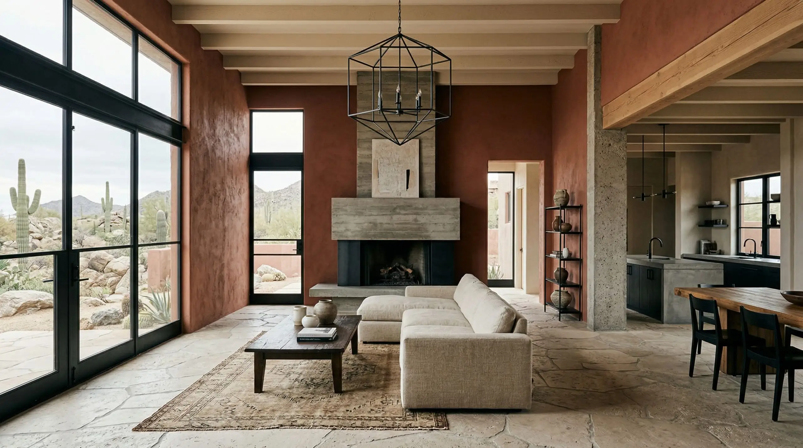
The Sonoran Brutalist Palette: This aesthetic merges rugged geography with stark architectural lines. We combine Terra Cotta Urn on the walls with Behr Almond Wisp on the ceiling, grounding the entire space with matte black iron fixtures and raw travertine stone floors. The result is a highly textural, minimalist environment that feels simultaneously ancient and hyper-modern. To master the structural elements of this look, exploring a dedicated Southwestern interior design guide will help you source the correct geometric furniture.
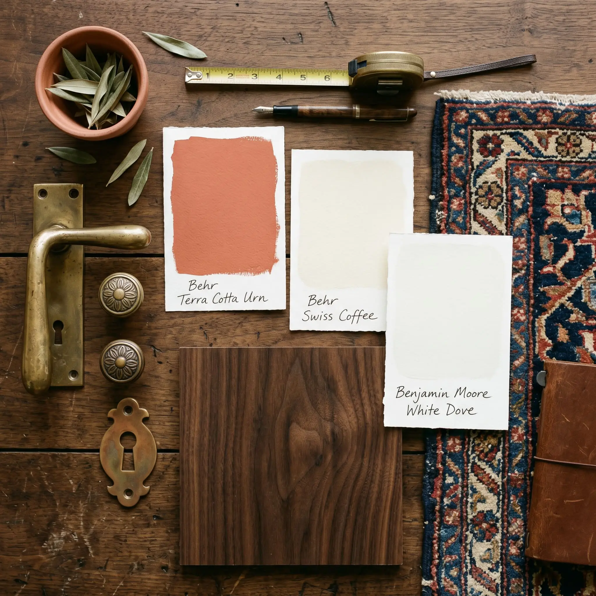
The 1920s Spanish Revival Palette: Tying historical pedigree directly to material warmth, this palette uses PPU2-12 as an accent against expansive walls of Behr Swiss Coffee. Benjamin Moore White Dove is applied to the heavy, ornate trim. We introduce unlacquered brass hardware, dark walnut antique furniture, and vintage Persian rugs. The aesthetic is incredibly rich, layered, and steeped in old-world architectural romance.
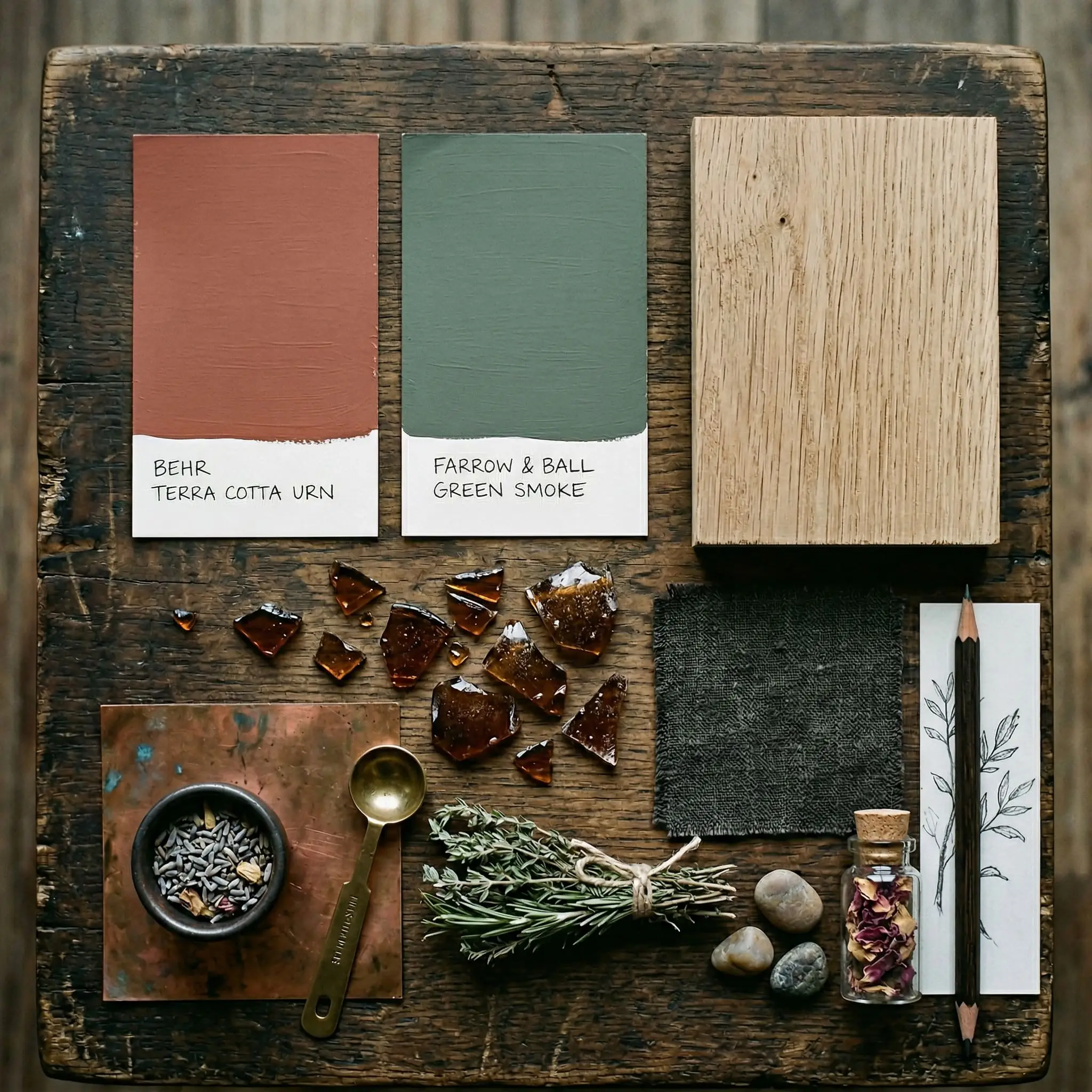
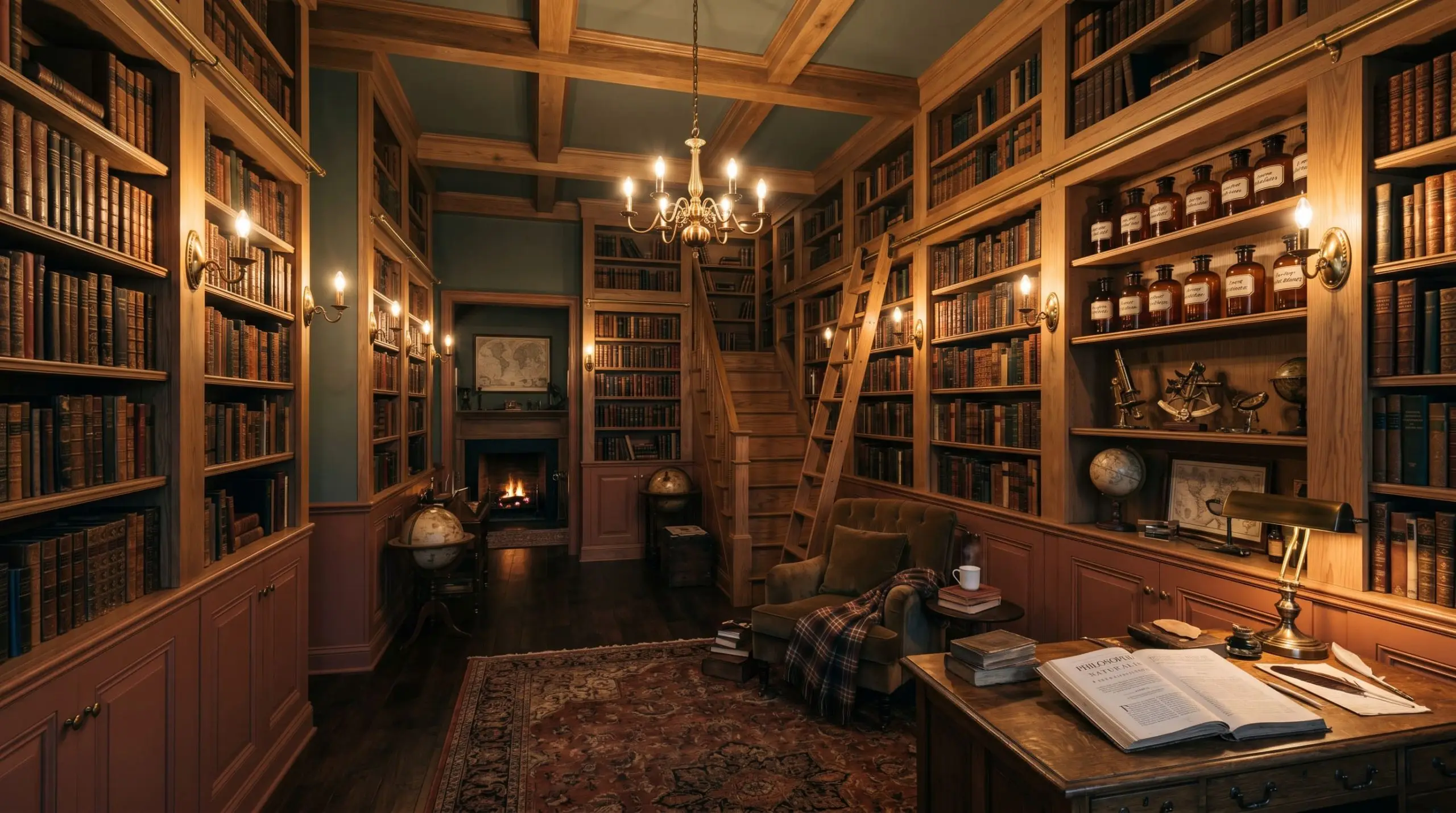
The Moody Apothecary Palette: Fusing a dark, academic vibe with organic materiality, this palette pairs Terra Cotta Urn wainscoting with Farrow & Ball Green Smoke on the upper walls and ceiling. The complementary color math creates a deeply insulated, library-like atmosphere. Natural white oak shelving and amber glass accents complete the space, resulting in a room that feels curated, historic, and intensely private.
Head-to-Head Comparisons
When selecting a dominant, earthy tone, microscopic differences in hue angle will drastically alter your room. Here is how Behr’s formulation stacks up against its direct rivals.
Behr Terra Cotta Urn vs. Sherwin-Williams Cavern Clay
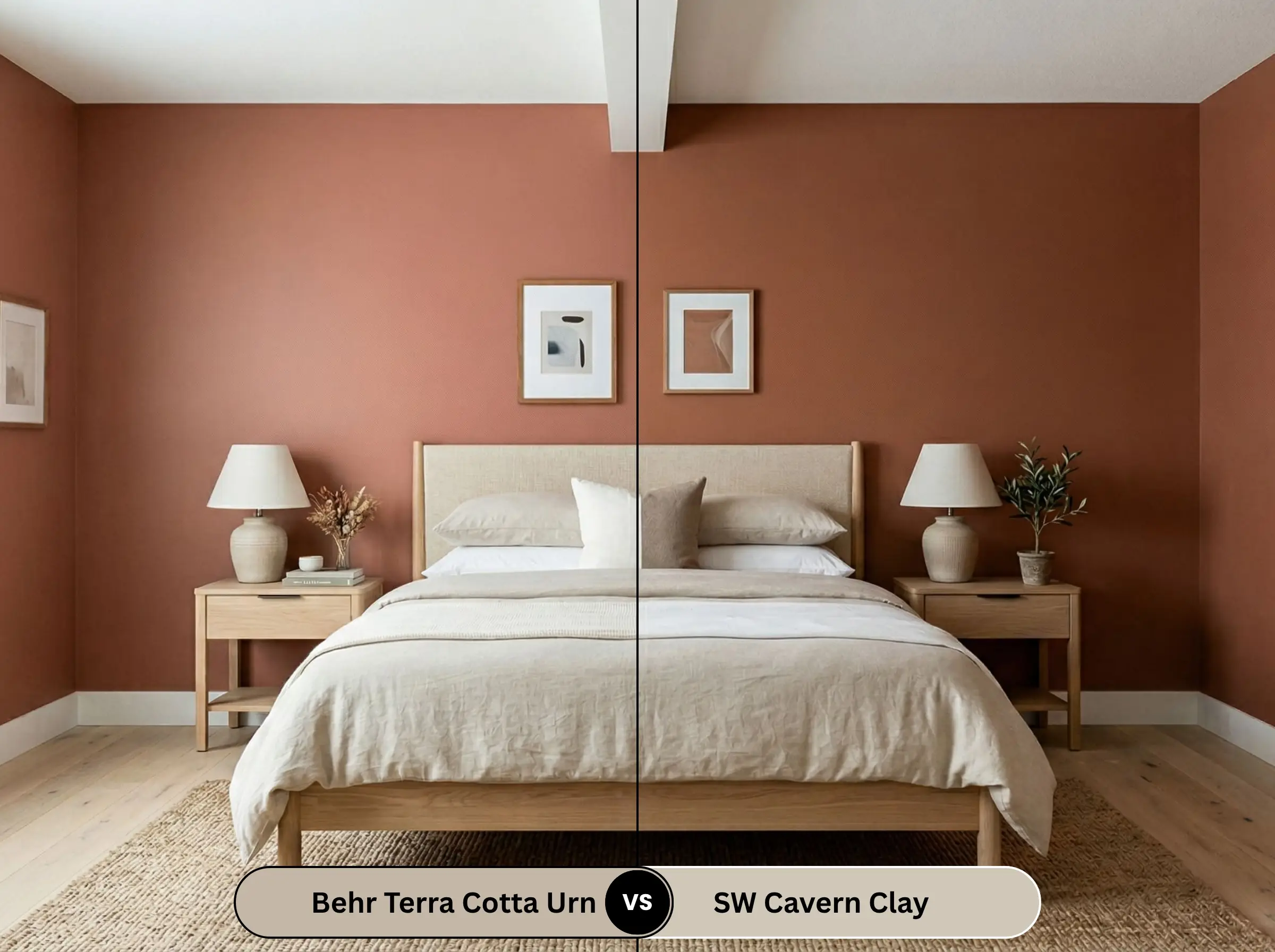
Cavern Clay (SW 7701) is famously vibrant. It has a significantly higher LRV (32) and leans much further into a true, bright rust. If you want a bold, unmistakable Southwestern statement, Cavern Clay is the louder choice. Terra Cotta Urn is much darker, browner, and significantly more restrained, making it the safer option for those terrified of the color orange.
Behr Terra Cotta Urn vs. Benjamin Moore Terra Cotta Tile
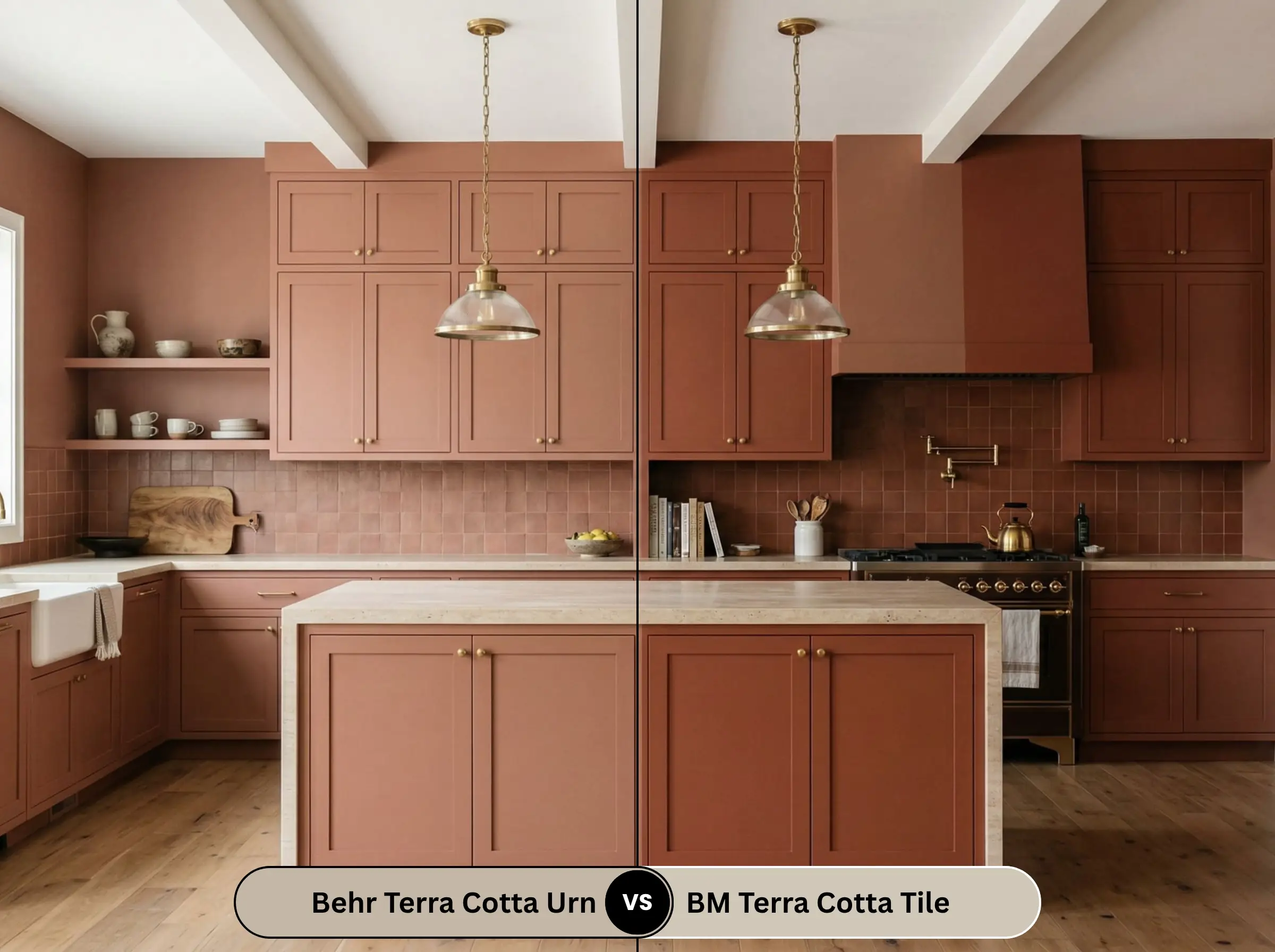
Benjamin Moore’s Terra Cotta Tile (2090-30) is practically a cousin to the Behr shade, but it carries a slightly stronger red undertone. While Behr relies heavily on its brown base to neutralize the pigment, the Benjamin Moore alternative feels slightly more like a traditional, fired brick. Choose the Behr option if you need maximum earthy neutrality. For more options in this color family, comparing the best earthy paint colors across all brands is a mandatory step before purchasing samples.
Similar Colors & Brand Equivalents
If the specific LRV of PPU2-12 isn’t quite right for your lighting, you have architectural alternatives.
Same-Brand Alternatives
Cross-Brand Matches
Practical Application & DIY Advice
Executing a flawless finish with a medium-dark color requires strategic material choices and professional-grade application techniques.
The Dynamic Sheen Matrix for PPU2-12
Primer Strategy
Because this is an LRV 22 shade with deep red and brown pigments, a standard white primer will sabotage your finish. You must use a high-quality, gray-tinted primer. A gray base prevents the white from bleeding through and washing out the terra cotta, ensuring the color reaches its true, intended depth in fewer coats.
Coverage & Touch-Ups
Expect to apply a minimum of two generous coats. Deep red-browns are notoriously prone to “flashing”—visible roller marks that appear when the paint dries unevenly. Maintain a wet edge while rolling and never press hard on the roller to stretch the paint. Touch-ups on an eggshell finish at this depth are moderately difficult; if a wall gets severely scuffed, you will likely need to repaint the entire wall corner-to-corner to avoid a patchy finish.
Frequently Asked Questions
It is exceptionally warm. Driven by a strong red-orange base, it actively radiates visual heat, making it perfect for warming up stark, clinical spaces.
It pairs beautifully with creamy, warm whites (like Swiss Coffee), muted earthy greens (like Green Smoke), and pale blue-greens (like Sea Salt). It also thrives alongside natural materials like unlacquered brass and white oak.
It reads as a muted, earthy orange, but it does not look like a bright, artificial pumpkin orange. The heavy brown undertones anchor the color, ensuring it looks like natural, sun-baked clay rather than a neon accent.
It has an LRV of 22. This makes it a medium-dark shade that absorbs a significant amount of light, creating a moody, intimate, and highly grounded atmosphere.
Final Verdict & Expert Warnings
Behr Terra Cotta Urn (PPU2-12) is a masterclass in restrained pigment. It perfectly captures the organic warmth of a desert landscape without falling into the trap of looking like a dated, 90s Tuscan nightmare. The heavy brown undertone is its greatest asset, providing a sophisticated anchor that makes this color highly usable in modern, curated homes.
The Absolute Best Application: It is unparalleled when used on custom cabinetry or built-ins in a satin finish, paired with unlacquered brass and natural white oak.
Who Should Avoid It: If your home features heavy cherry, mahogany, or red-toned wood flooring, you must abandon this paint immediately. The aggressive clash of red undertones will ruin your space. Likewise, if your home is trimmed in stark, blue-toned cool whites, this earthy reddish-brown will look muddy and entirely out of place.