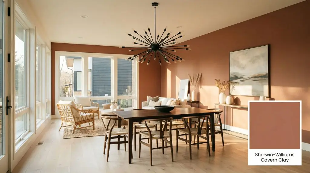
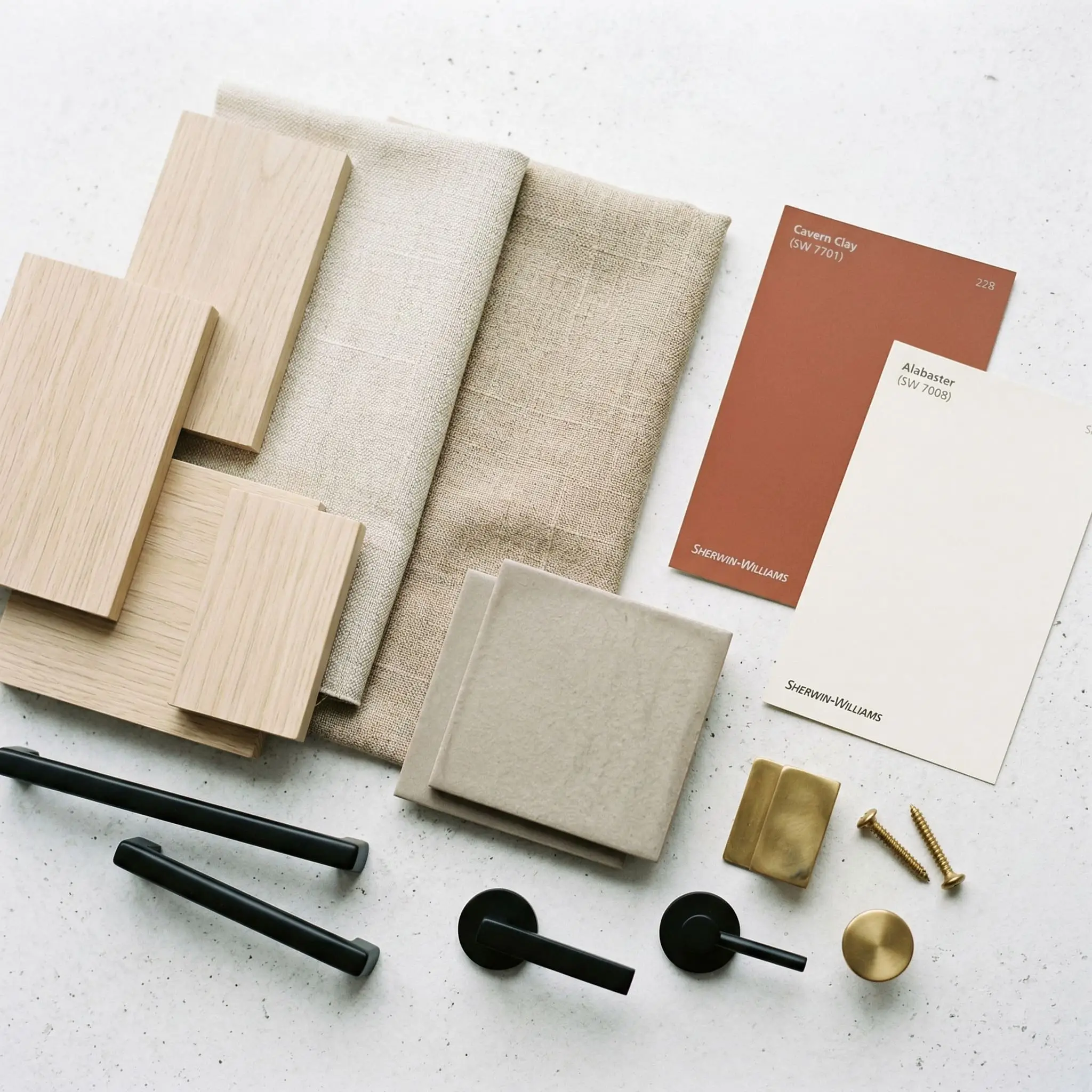
Cavern Clay SW 7701
Sherwin-WilliamsSherwin-Williams Cavern Clay (SW 7701) is a warm, earthy terracotta paint color with deep rust and brown undertones. With an LRV of 20, it is a medium-dark shade that brings a grounded, bohemian, or mid-century modern aesthetic to any space without feeling overly bright or orange.
Paint Technical Profile
| Color ID / SKU | SW 7701 |
| HEX Code | #ac6b53 |
| Light Reflectance (LRV) | 20 |
| Use | Interior, Exterior |
Sherwin-Williams Cavern Clay (SW 7701) Paint Color Review: Mastering the Earthy, Mid-Century Aesthetic
We crave spaces that feel rooted, organic, and intentionally designed. Right now, the design world is aggressively pivoting away from sterile grays, searching for warmth that doesn’t feel manufactured.
Sherwin-Williams Cavern Clay SW 7701 answers that exact call.
This rich, sun-baked terracotta is highly sought after for its ability to inject immediate architectural character into a room. However, this is not a beginner-friendly neutral. Using this historic shade correctly requires a strict understanding of color science, lighting, and material pairings.
The Color DNA: Undertones & LRV
To truly master a paint color, we must strip away the marketing jargon and look directly at the mathematical data. SW 7701 is built on a very specific chemical balance that dictates exactly how it will perform on your walls.
At an LRV of 20, this shade absorbs a massive 80% of the light that hits it.
Because of its low Light Reflectance Value, this is a medium-dark color that demands a strategic environment. Without ample natural light or a highly calculated artificial lighting plan, this beautiful terracotta will quickly turn your space into a literal, gloomy cave.
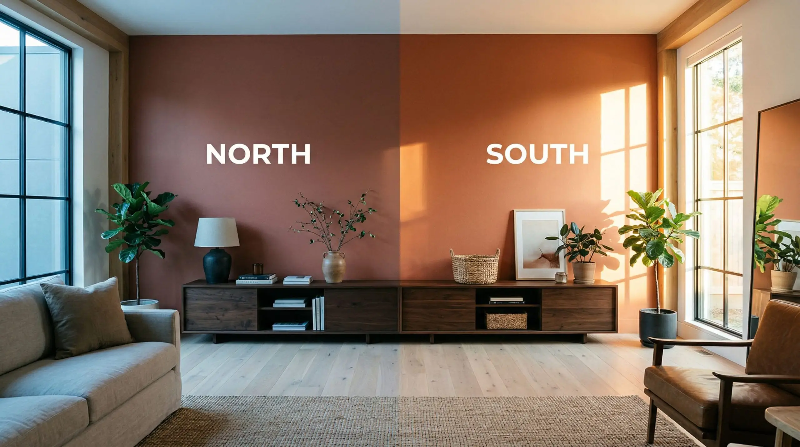
Lighting Effects & The Chameleon Factor
Let’s address the absolute biggest fear surrounding this color: Nobody wants their home to look like a dated 1990s Tuscan kitchen, a cartoonish pumpkin, or a child’s purple dinosaur room.
The secret to avoiding those amateur design failures lies entirely in understanding how this specific pigment reacts to different light temperatures. Because of its heavy brown undertones, this paint is a massive chameleon.
If you put this terracotta in a poorly lit room with cool, icy gray decor, the color will immediately look dirty and flat.
Clash Warning
Popular Room Applications
This is not a color you slap on every single wall of an open-concept suburban home. It is a highly specific, architectural shade that demands boundaries.
If you lack natural light, you must restrict this color to accent features.
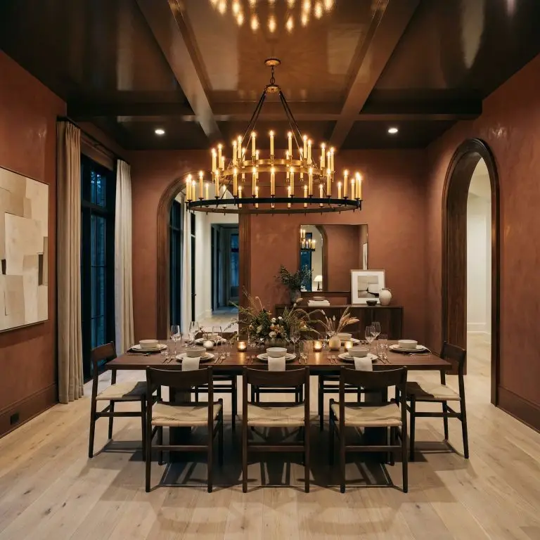
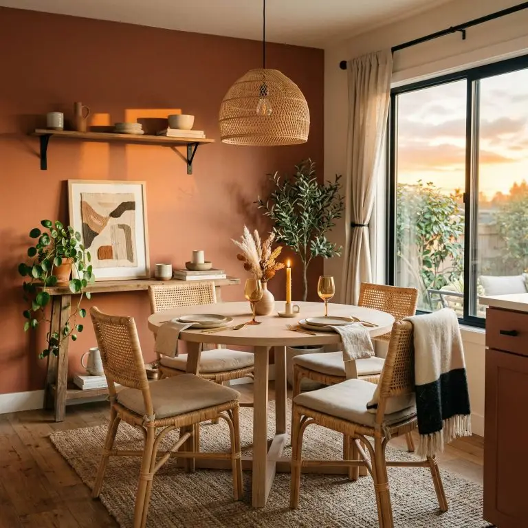
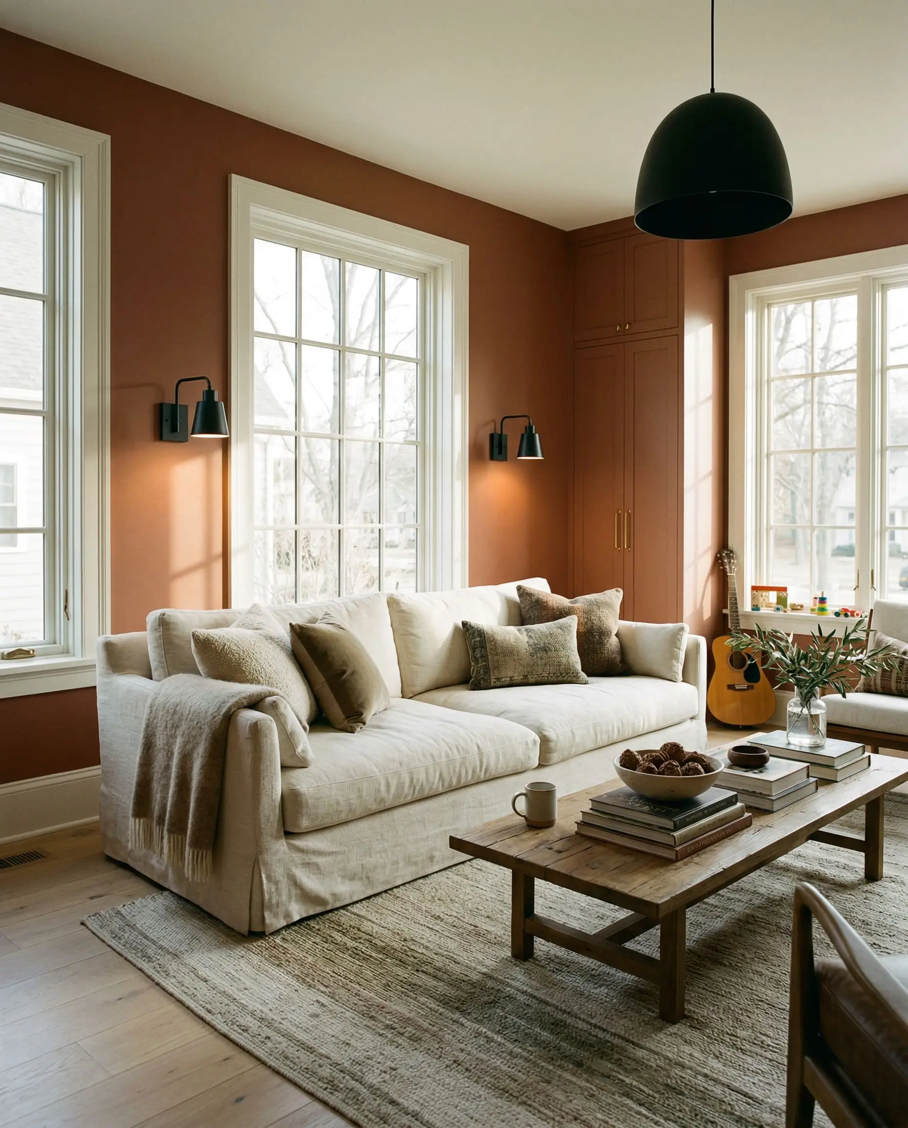
Intimate Dining Rooms
Dining rooms thrive on drama and intimacy. Wrapping a dining space entirely in this deep rust creates an enveloping, sophisticated atmosphere perfect for candlelit dinners.
To prevent the room from feeling oppressive, you must balance the dark walls with a highly reflective ceiling or a massive, dramatic chandelier. The warm light bouncing off the terracotta walls creates a flattering, cinematic glow.
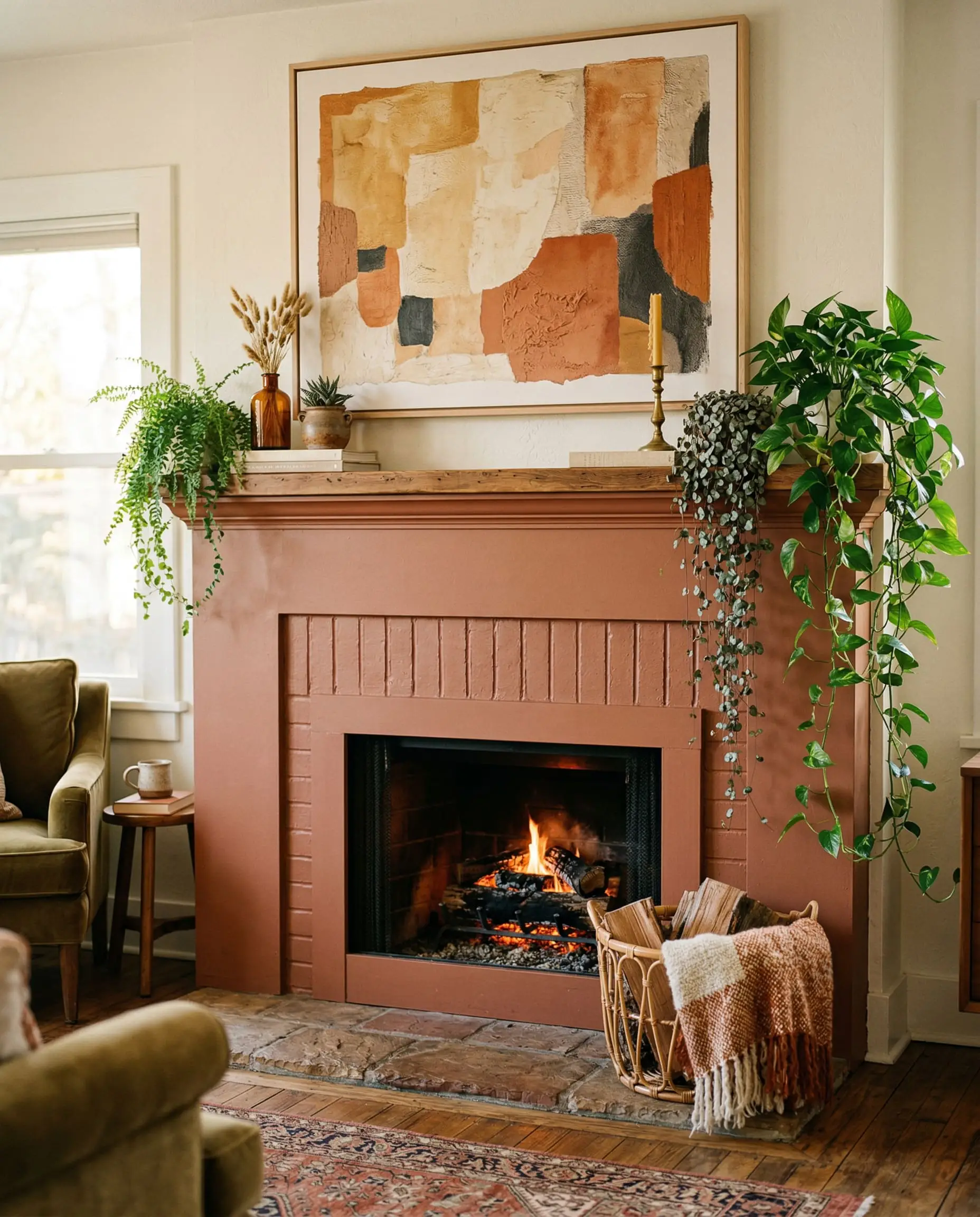
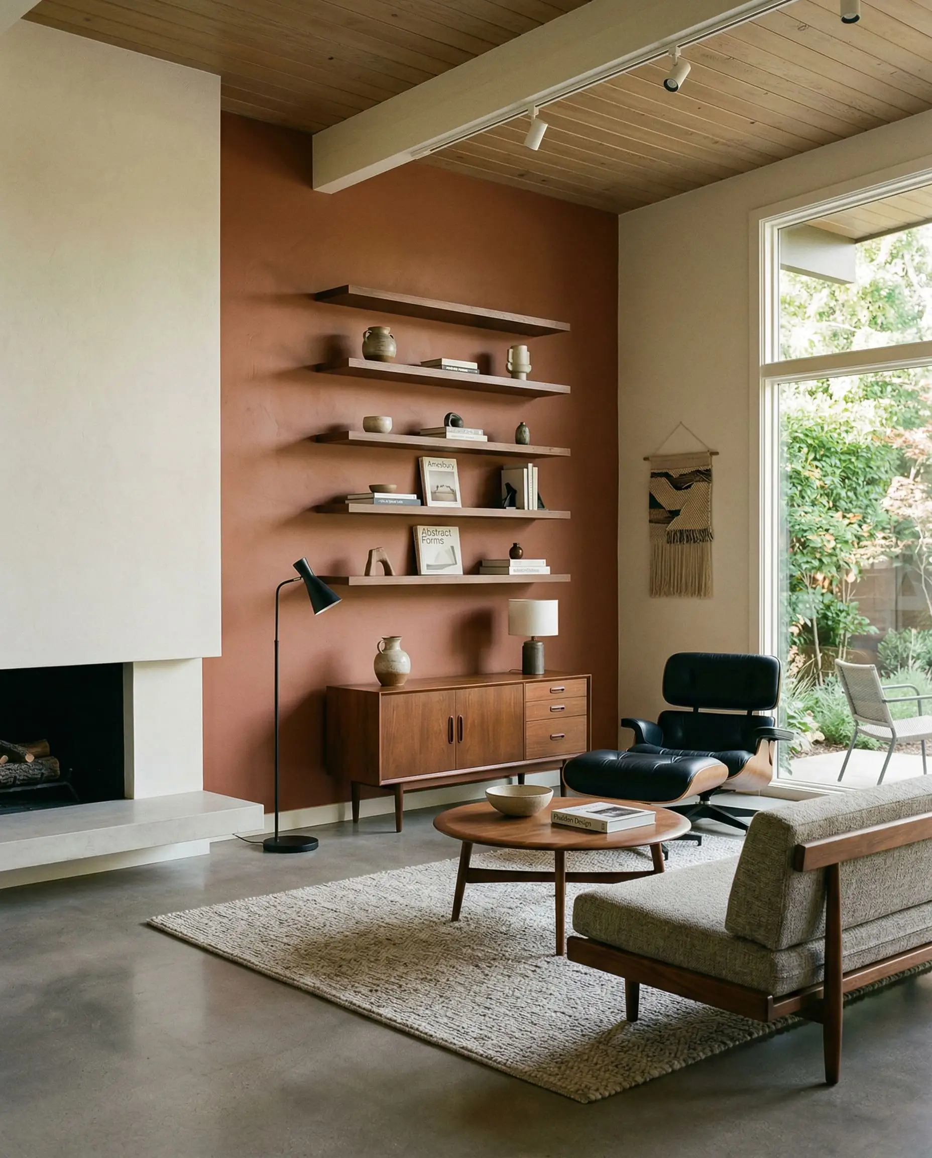
Impactful Accent Walls
If you are intimidated by the LRV of 20, an accent wall is your safest entry point.
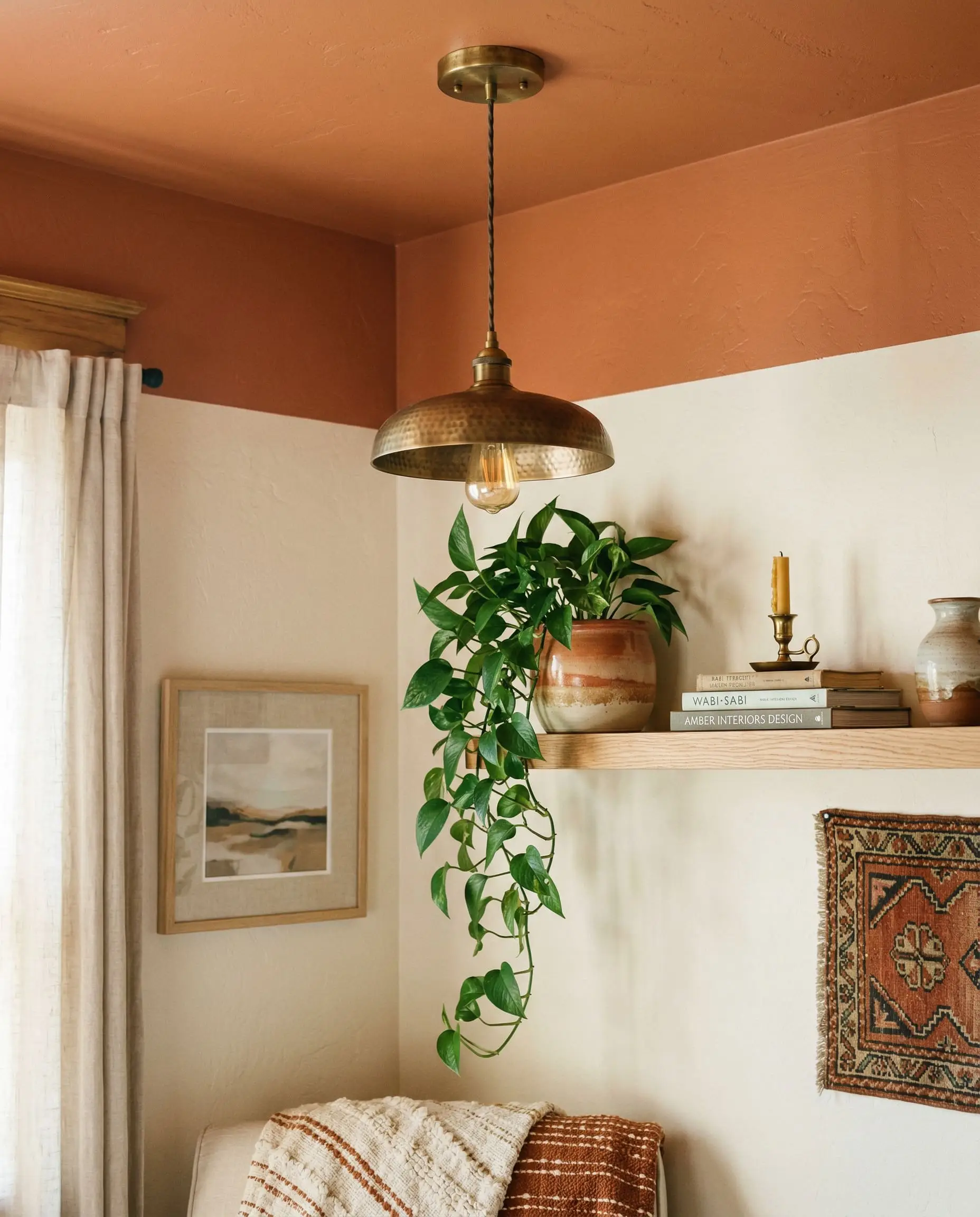
Applying this shade behind a bed frame or anchoring a living room fireplace instantly grounds the space. It provides a massive visual weight that draws the eye, making it an excellent backdrop for oversized art or lush, trailing indoor plants.
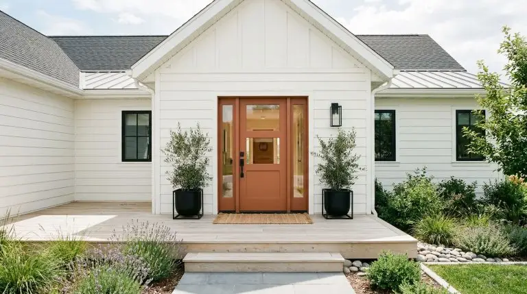
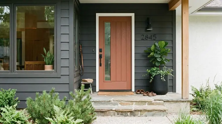
Striking Front Doors
Exterior lighting washes out paint colors by several shades. On a front door, the natural sunlight cuts through the muddy brown undertones, allowing the true red-orange character to shine.
It creates a welcoming, incredibly stylish focal point, particularly when framed against stark white, charcoal gray, or deep navy exterior siding.
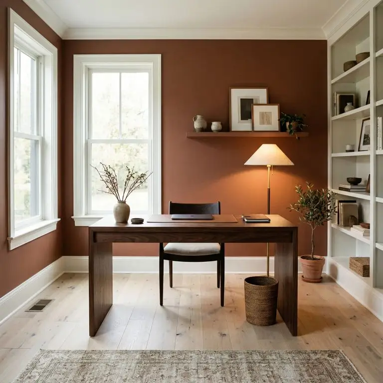
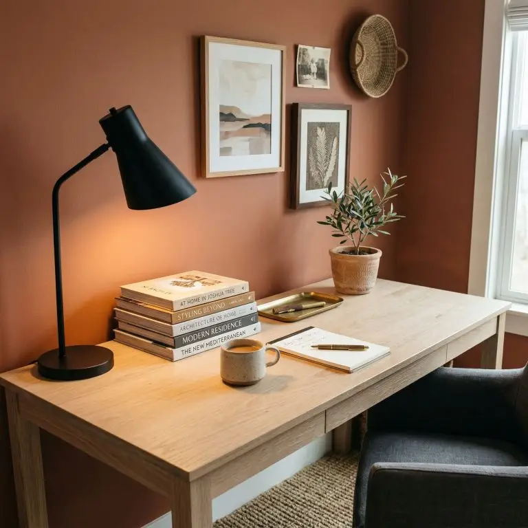
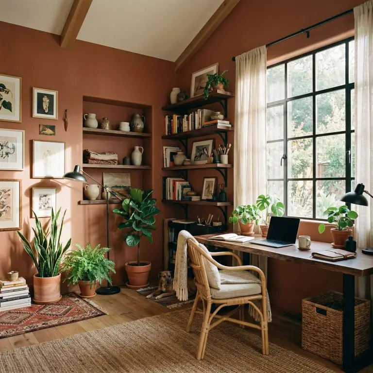
Grounded Home Offices
A home office requires a balance of focus and creativity.
Using this earthy tone in a workspace fosters a grounded, calming environment that feels distinctly separate from the rest of the house. Pair it with warm desk lamps to ensure the color remains vibrant during late-night work sessions.
Signature Design Ideas & Inspiration
While broad applications are helpful, this color truly shines when applied to specific, highly curated architectural features.
When you use this paint deliberately, it transforms from a simple wall color into a defining design statement.
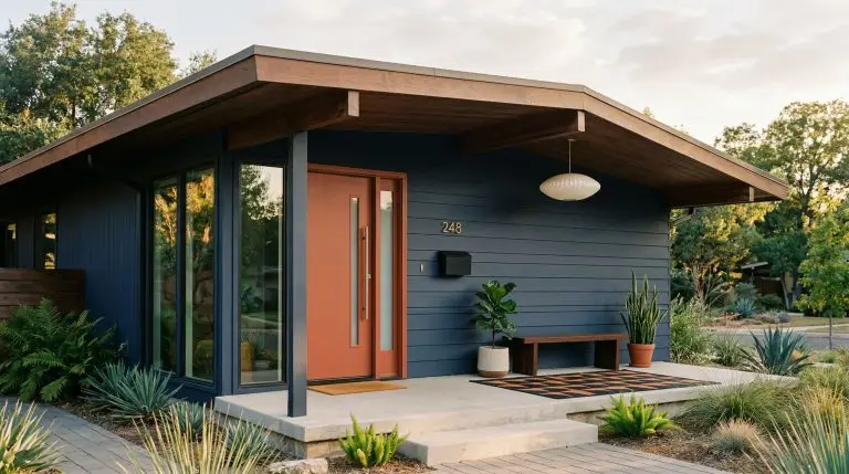
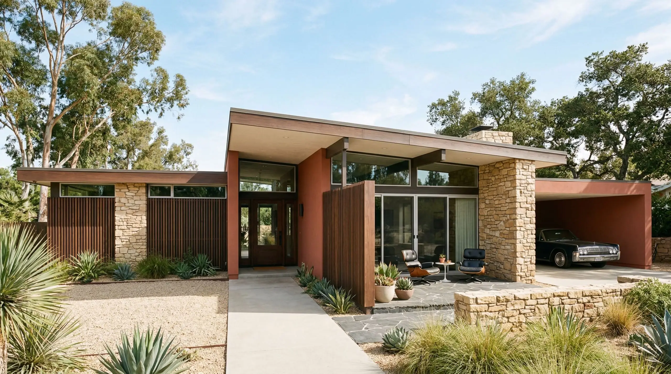
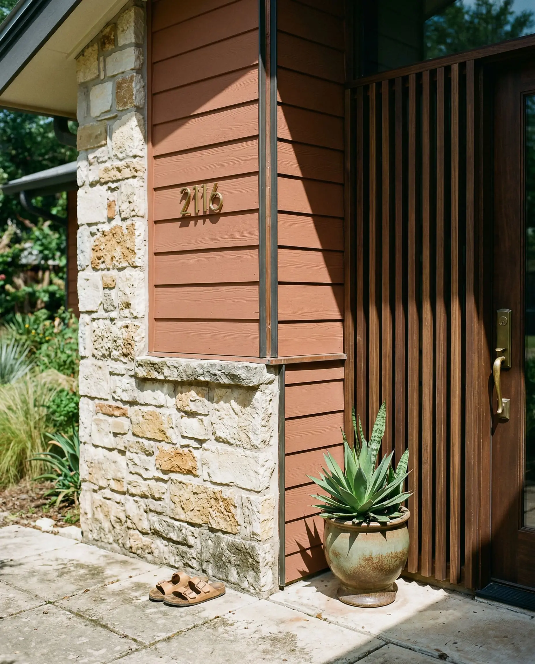
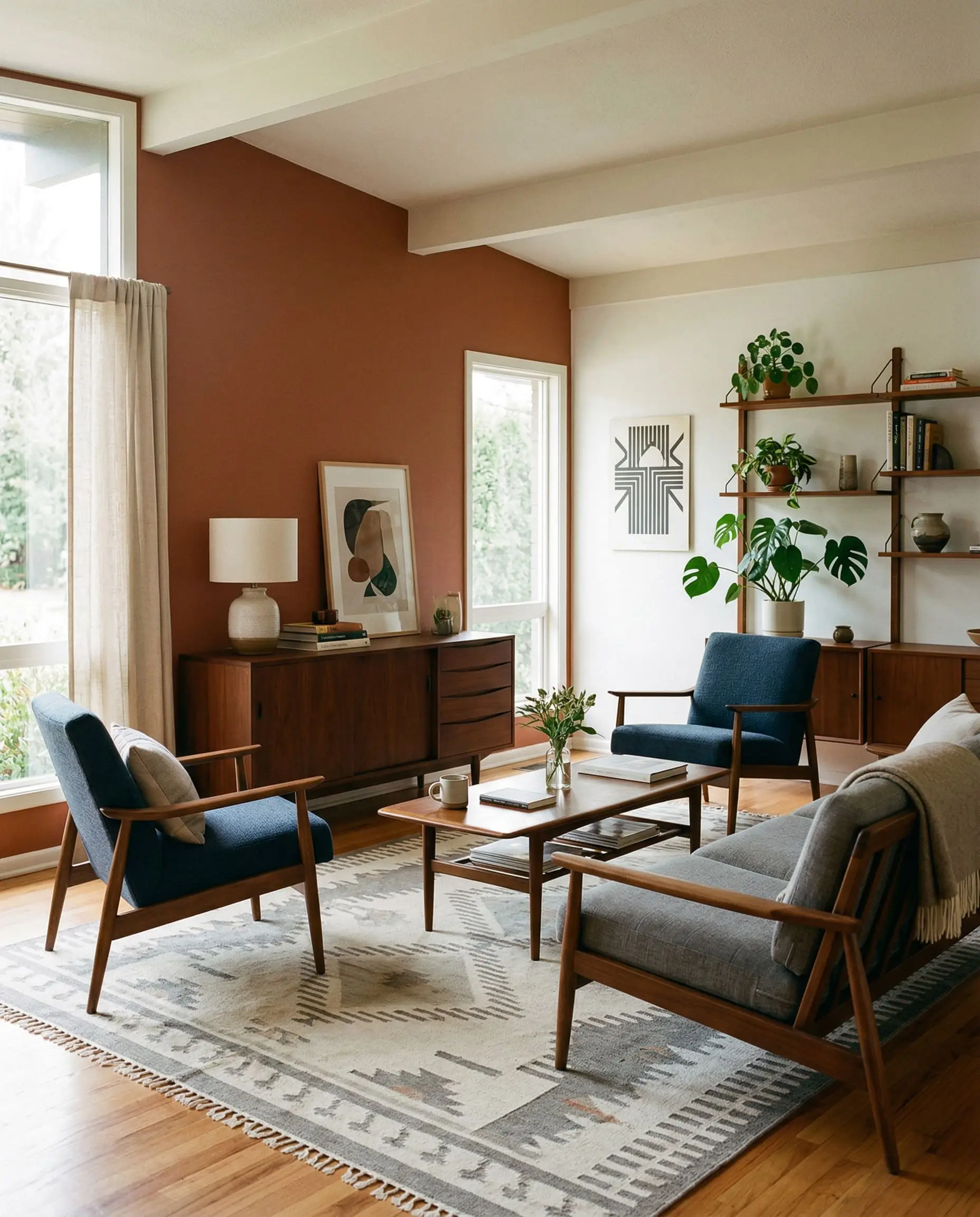
Mid-Century Modern Exteriors
This shade was practically engineered for mid-century architecture.
When applied as an exterior accent color, it interacts flawlessly with dark walnut wood slats, deep eaves, and natural stone masonry. The crisp, geometric lines of mid-century design rely on this exact type of earthy tension to feel authentic to the era.
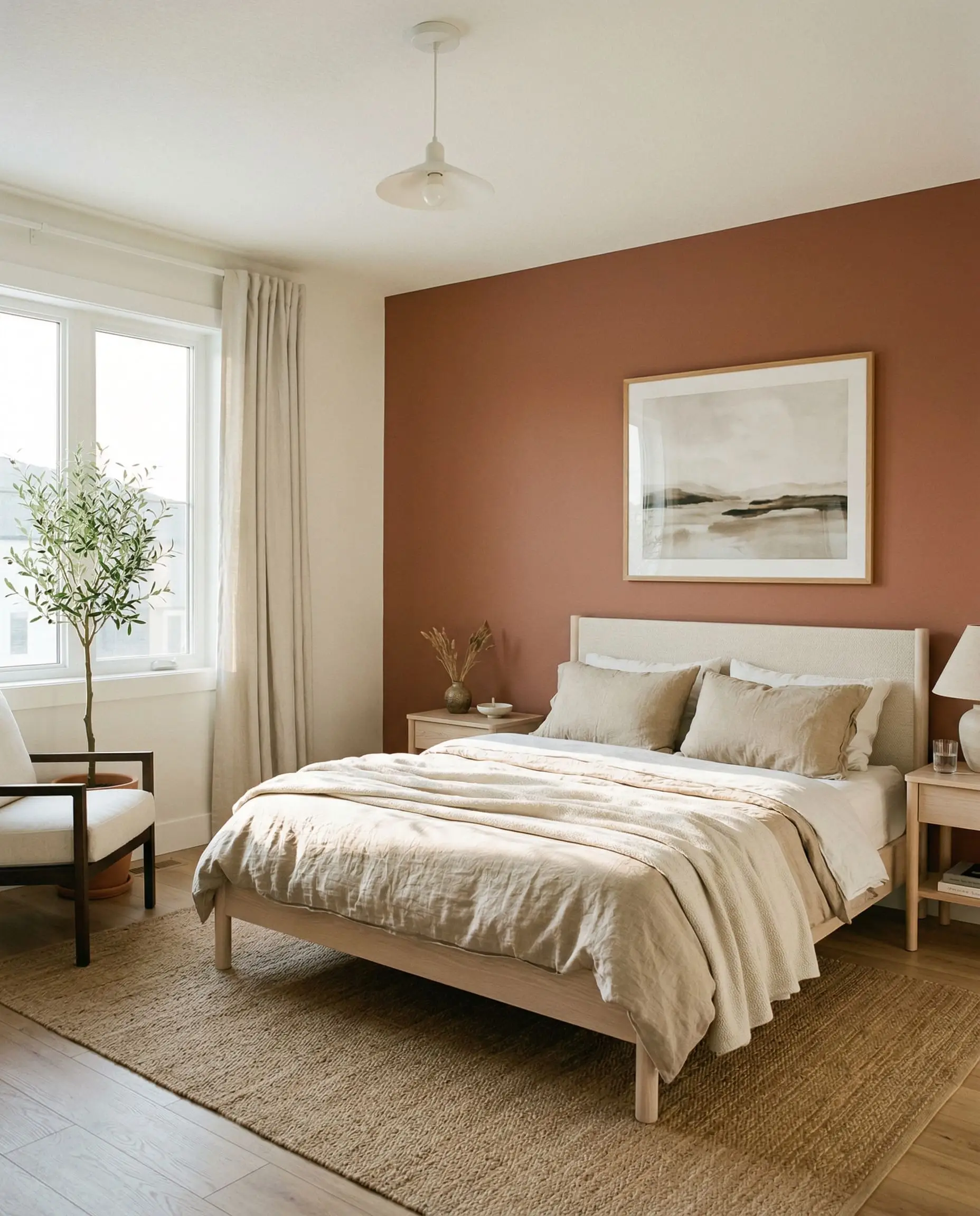
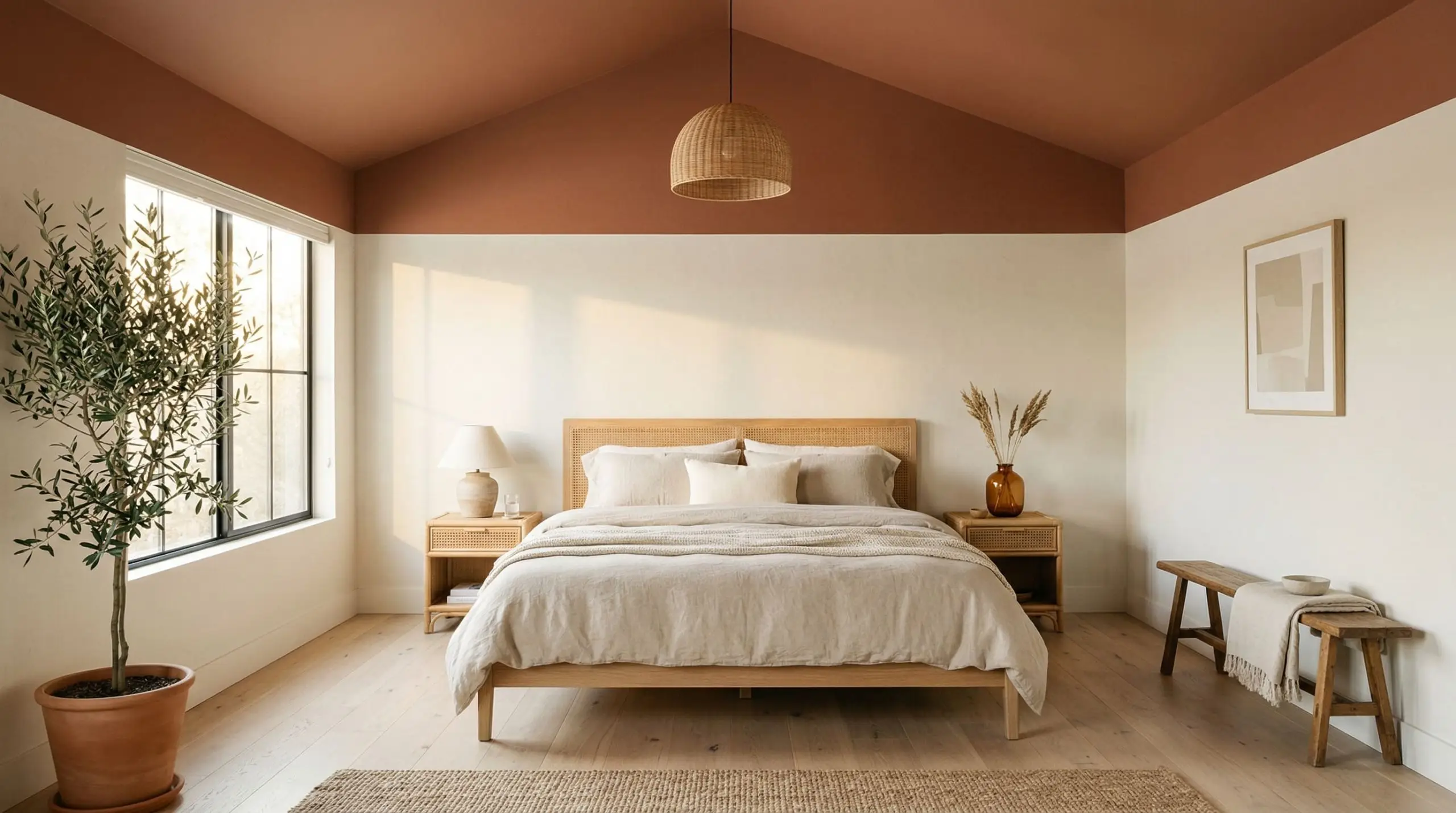
Bohemian Bedroom Ceilings
This application manipulates the psychological temperature of the room.
By painting the ceiling and carrying the rich terracotta down the top quarter of the walls, you create a cocooning, tent-like effect. It visually lowers the ceiling, instantly making a sprawling, sterile bedroom feel intimate, warm, and deeply bohemian.
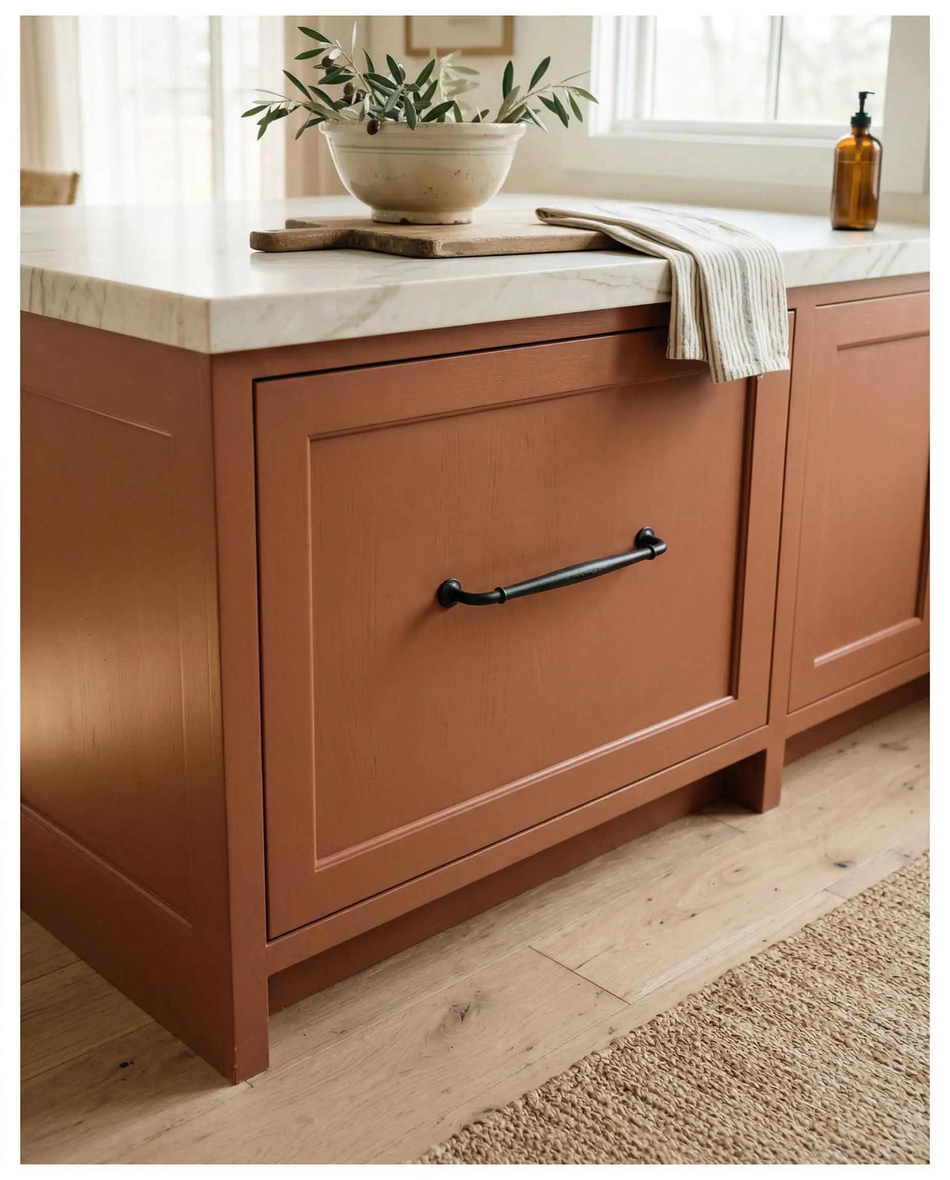
Grounded Kitchen Islands
This is where amateur designers fail and experts succeed.
Applying this muddy rust to the base of a kitchen island works beautifully only if you pair it with creamy white shaker cabinets and matte black hardware.
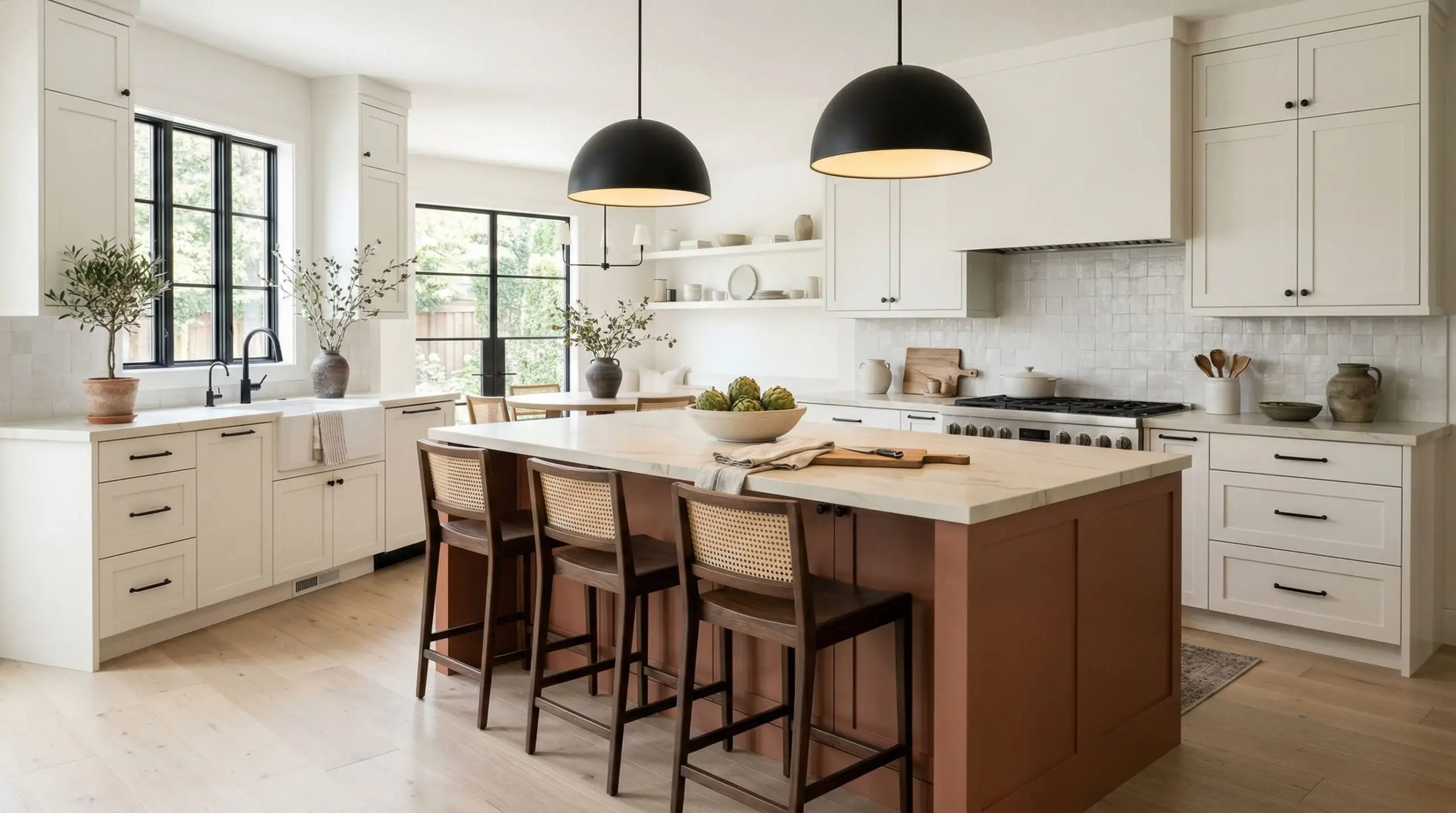
If you pair this island color with 1990s honey oak cabinets or yellow-toned wood floors, the clashing warm tones will instantly create a dated, chaotic “Tuscan” vibe.
Hackrea Pro-Tip
The Pairings & Accents Guide
A paint color is only as successful as the materials placed next to it. To pull off this aesthetic, you must curate your palette with mathematical precision.
Flawless Trim Pairings for Cavern Clay
You cannot use a stark, hospital-white trim with a color this earthy; the contrast is too harsh and will make the walls look cheap.
Architectural Materials That Work
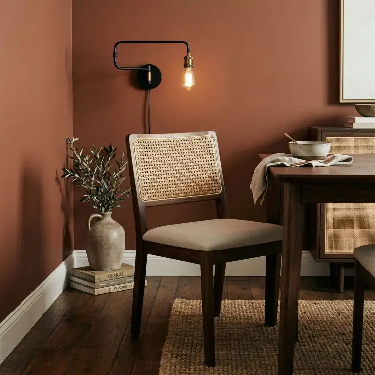
To enhance the best earthy paint colors, you must rely on natural, tactile materials.
Matte black hardware is non-negotiable; it provides the sharp, modern contrast needed to keep the rust tones from feeling vintage. Incorporate natural rattan or cane webbing to introduce organic texture. For flooring and furniture, stick strictly to dark walnut or pale white oak—avoid any woods with a yellow or orange stain.
Coordinating Colors
Understanding color wheel theory is essential when building a palette around a red-orange.
Curated Mood Boards
The Organic Modern Palette: This aesthetic relies on heavy textural contrast. Picture the terracotta walls serving as a backdrop for pale white oak floors, creamy Alabaster trim, and oversized linen upholstery. The introduction of matte black light fixtures and unlacquered brass hardware adds the necessary modern tension.
The Mid-Century Revival Palette: This palette is all about rich, moody saturation. We pair the earthy rust with deep walnut furniture, geometric rugs featuring touches of Moth Wing taupe, and striking accents of Hale Navy. It is a highly curated, architectural look that demands respect.
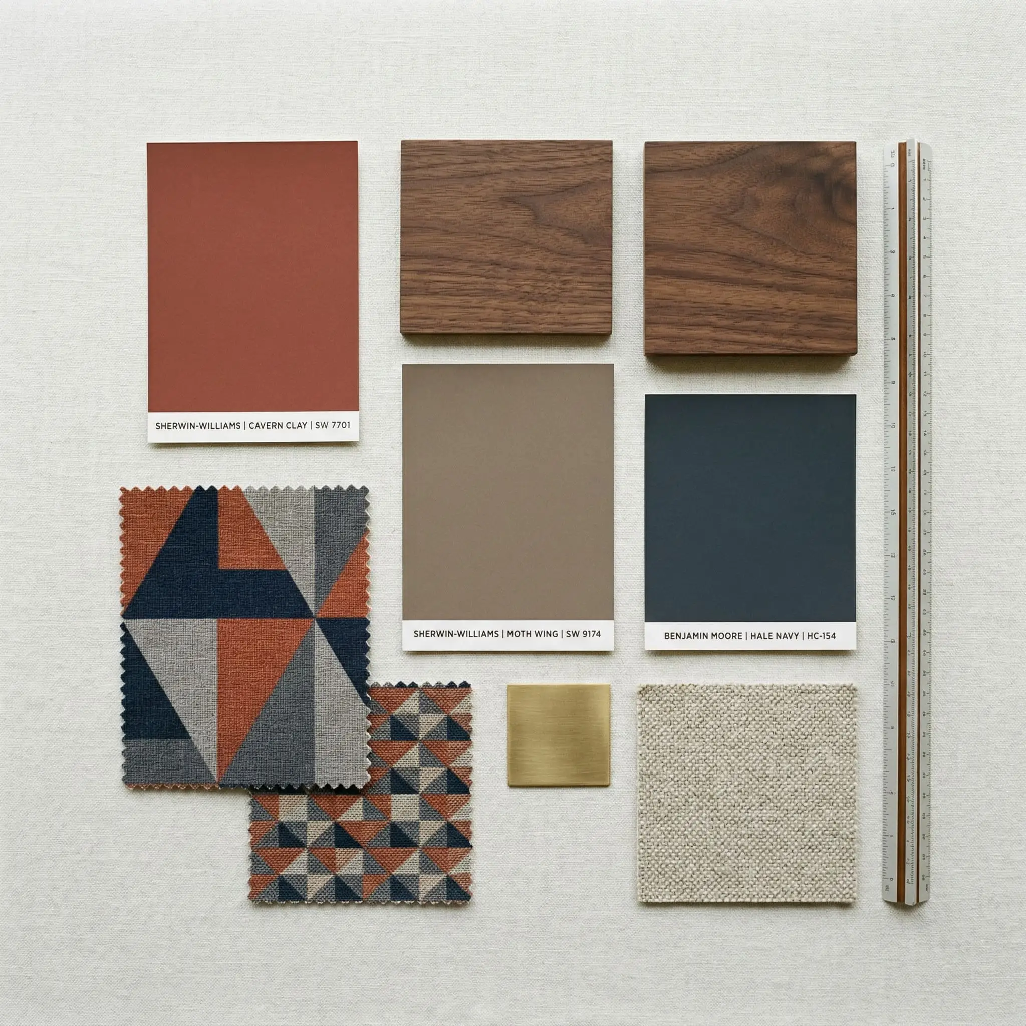
Head-to-Head Comparisons
Before committing to a color this bold, you must test it against its closest rivals. A slight shift in undertone or LRV will completely alter the mood of your room.
Cavern Clay vs. Baked Clay
Sherwin-Williams Baked Clay (SW 6340) is the lighter, more approachable sibling.
Baked Clay has a higher LRV and significantly less brown in its formula, making it read much more like a true, soft orange. If you are terrified of the dark, muddy qualities of SW 7701, Baked Clay is the safer, albeit less dramatic, choice.
Cavern Clay vs. Rookwood Terra Cotta
Sherwin-Williams Rookwood Terra Cotta (SW 2803) is a dive into deep, historic color.
Rookwood is noticeably darker and leans much heavier into its brown and red undertones. While SW 7701 retains a touch of bohemian vibrancy, Rookwood feels incredibly traditional, heavy, and anchored in Victorian or Craftsman architecture.
Similar Colors & Brand Equivalents
If you are locked into a specific paint manufacturer or need a microscopic shift in tone, these are the mathematically closest alternatives.
Same-Brand Alternatives
Cross-Brand Matches
Practical Application & DIY Advice
Moving from design theory to physical application requires contractor-level strategy. This is a dark, heavily pigmented paint, and it will punish sloppy brushwork.
The Dynamic Sheen Matrix
Primer Strategy for Deep Terracotta
Do not attempt to paint this color over a bare white wall without proper preparation.
Because of its LRV of 20, a tinted gray primer is absolutely non-negotiable. If you use a standard white primer, the red-orange pigments will struggle to cover, and you will be forced to apply three or four coats to achieve true depth.
Coverage & Touch-Up Realities
Dark, matte colors are notoriously difficult to touch up.
Undertone Secret: Heavily pigmented colors like this are highly susceptible to “flashing”—visible, shiny roller marks caused by uneven application.
You must maintain a wet edge while rolling and apply two full, generous coats. If you try to touch up a small scuff a month later, the new paint will dry slightly differently, leaving a permanent, visible patch.
Frequently Asked Questions
It is an exceptionally warm color. Anchored by a red-orange base and heavy rust undertones, it actively brings visual heat and a sense of coziness to any room it is applied in.
It heavily depends on your lighting. In bright, South-facing natural light, it looks like a vibrant, earthy orange. In shadowy, North-facing rooms or under cool LED bulbs, the orange recedes and it looks distinctly like a muddy, reddish-brown.
It pairs flawlessly with creamy, warm whites (like SW Alabaster), muted denim blues (like SW Distance), complex taupes, and deep, saturated navies. You must avoid icy grays or stark, cool whites.
It has an LRV of 20, meaning it absorbs 80% of the light in a room. This matters immensely because it dictates that the color is medium-dark; without adequate lighting, it will make a small room feel dim and cave-like.
Final Verdict & Expert Warnings
Sherwin-Williams Cavern Clay (SW 7701) is a masterclass in earthy sophistication, provided you have the architectural confidence to use it correctly.
It is the ultimate choice for mid-century modern exteriors, enveloping dining rooms, and bohemian accent features. When paired with matte black hardware, creamy whites, and dark walnut, it delivers an incredibly high-end, curated aesthetic.
However, we must issue a final, uncompromising warning. Do not use this paint if your home is filled with 1990s honey oak trim, yellow-stained floors, or cool gray furniture. The undertones will violently clash, instantly downgrading your space into a chaotic, dated disaster. If you respect its lighting requirements and curate your materials, this rich terracotta will reward you with one of the most stunning, organic atmospheres achievable in modern design.