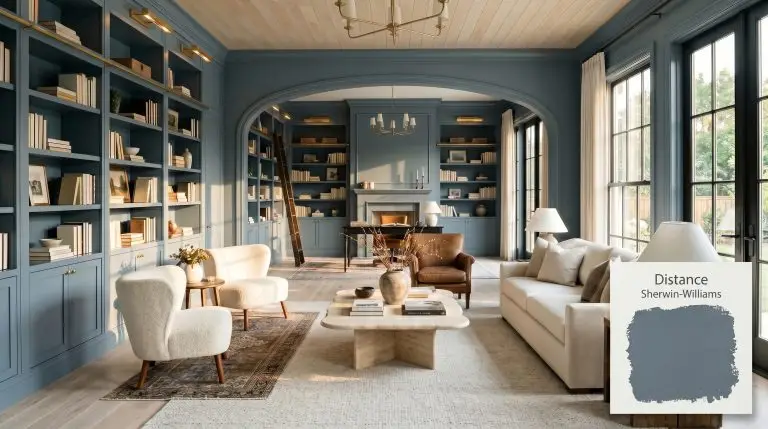
Distance SW 6243
Sherwin-WilliamsSherwin-Williams Distance (SW 6243) is a moody, medium-dark blue-gray paint color with an LRV of 15. Known for its cool slate undertones, it brings sophisticated depth to cabinetry, home offices, and bedrooms, shifting between a muted denim and a deep stormy blue depending on the lighting.
Sherwin-Williams Distance: Mastering the Ultimate Moody Slate Blue
| Best Exposures | South-Facing, West-Facing |
|---|---|
| Best For | Cabinetry, Home Offices, Accent Walls, Bedrooms |
If you are chasing a moody aesthetic, selecting the right dark paint is a high-stakes design decision. You want depth, atmosphere, and sophistication, but a single misstep can leave your space feeling like a bleak cave or, worse, a juvenile primary-colored bedroom.
Sherwin-Williams Distance (SW 6253) is the antidote to those design fears. This is not a standard, nautical navy or a flat charcoal; it is a highly complex, heavily shadowed tone that acts as a commanding architectural anchor. By relying on heavy graying agents rather than pure blue pigments, this shade delivers undeniable drama while maintaining absolute curatorial elegance.
The Tonal Profile of Sherwin-Williams Distance
To understand why this specific paint succeeds where other dark blues fail, you must examine its core pigment makeup. The underlying structure of this shade is tightly bound, preventing it from ever reading as a true, stark primary color.
At an LRV (Light Reflectance Value) of 15, this shade is undeniably dark and absorbs a massive amount of light. It carries significant visual weight, instantly pulling the walls inward to create a sense of intimacy. If you are unfamiliar with how light absorption dictates spatial perception, reviewing our comprehensive light reflectance value guide is a crucial first step before committing to this depth.
You can apply wallpapers, paints, etc. on walls and see how they look in various interiors.

The Chameleon Factor: Lighting & Shadows
The color temperature shift in this pigment is drastic and entirely dependent on your home’s exposure. Because it sits on the edge of blue and gray, the surrounding light dictates which personality dominates the room.
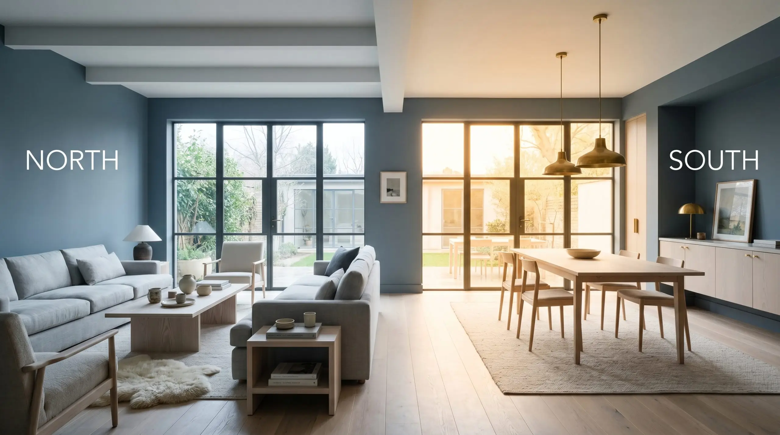
If you are forced to use this shade in a poorly lit space, you must compensate with layered, multi-directional lighting. Relying solely on a single overhead fixture will flatten the color and turn the room into a visual black hole.
Hackrea Pro-Tip
Designing with Sherwin-Williams Distance
This deeply saturated tone is not universally versatile. It demands intention, thriving in spaces designed for focus, intimacy, or rest, but it will aggressively punish a cramped, badly lit floor plan.
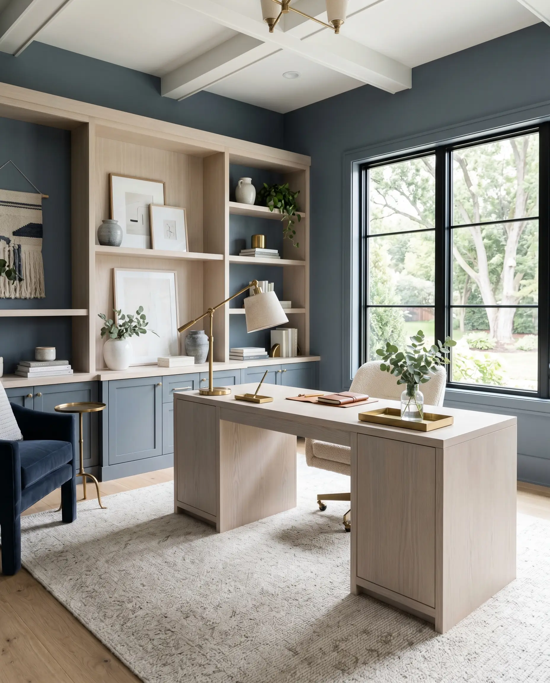
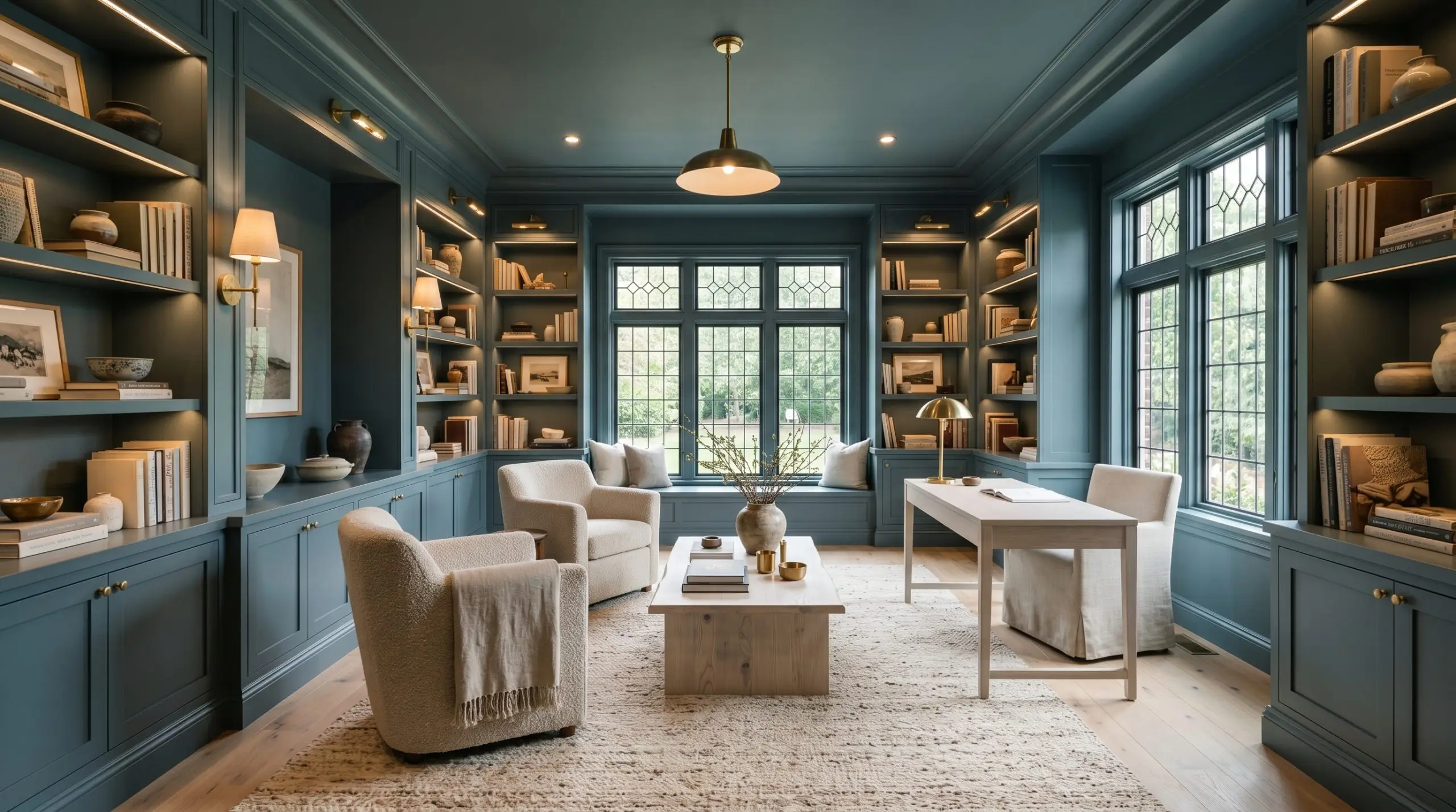
Executive Workspaces & Studies
In a home office, this commanding shade creates an immediate sense of authority and focus. The deep color absorption minimizes visual distractions, acting as a tailored backdrop for executive furniture and curated bookshelves. To prevent the space from feeling like a corporate bunker, pair the dark walls with expansive, light-toned area rugs and warm metallic desk fixtures.
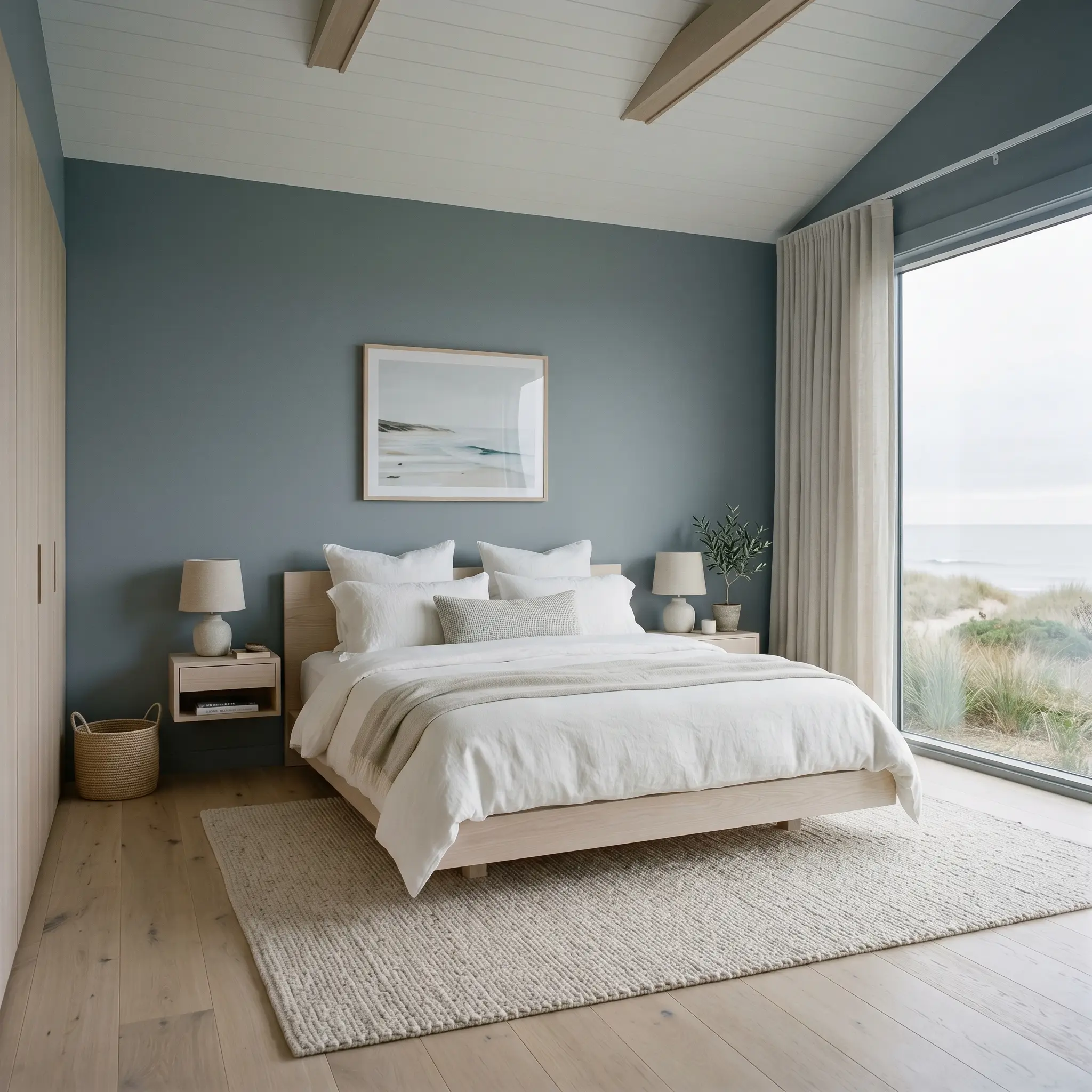
Restorative Sleep Environments
Because of its low LRV, this muted blue naturally induces a cocooning effect, making it a brilliant choice for bedrooms. It visually lowers the ceiling and pulls the walls inward, wrapping the room in a calming, atmospheric tension. Balance the heavy walls by introducing layers of soft, lightweight linens and highly textured, pale organic textiles.
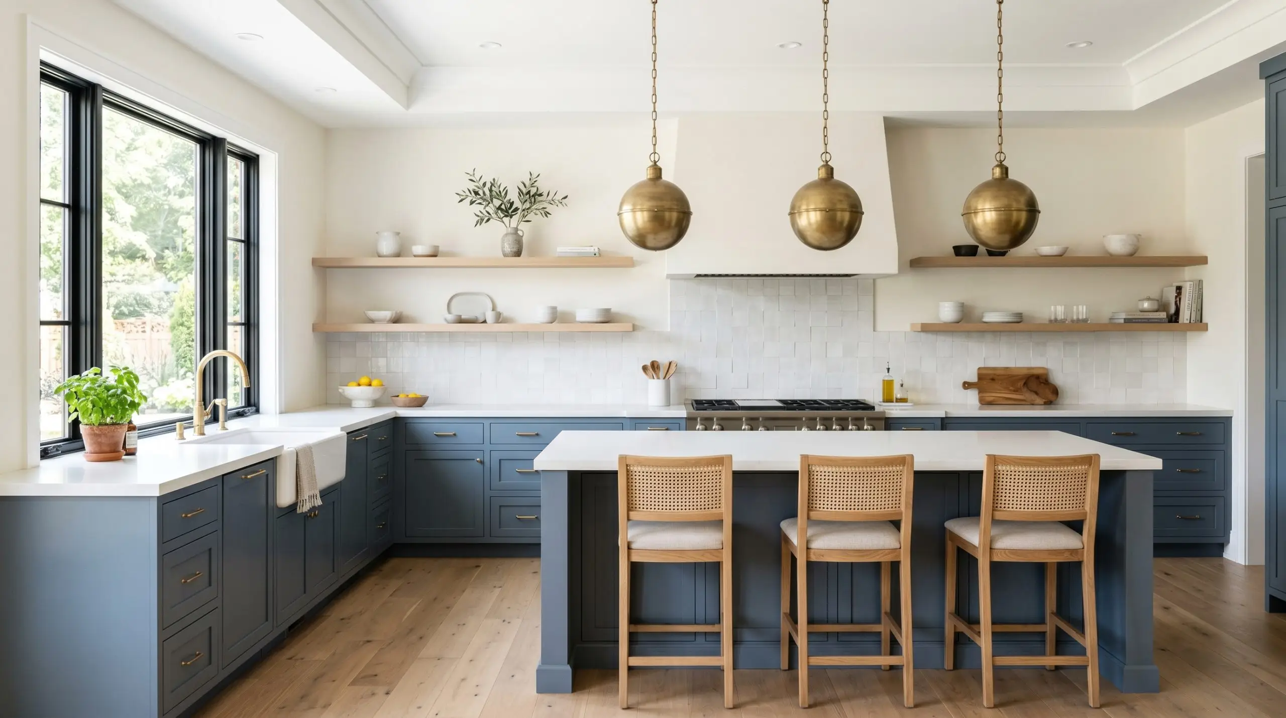
Culinary Spaces & Cabinetry
Using this slate tone on lower cabinets or a central island grounds the kitchen with immense architectural weight. It provides a stunning, high-contrast anchor against stark white quartz or pale marble countertops. For a deeper dive into manipulating these specific tones on millwork, explore our curated breakdown of the best blue-gray paints for cabinetry.
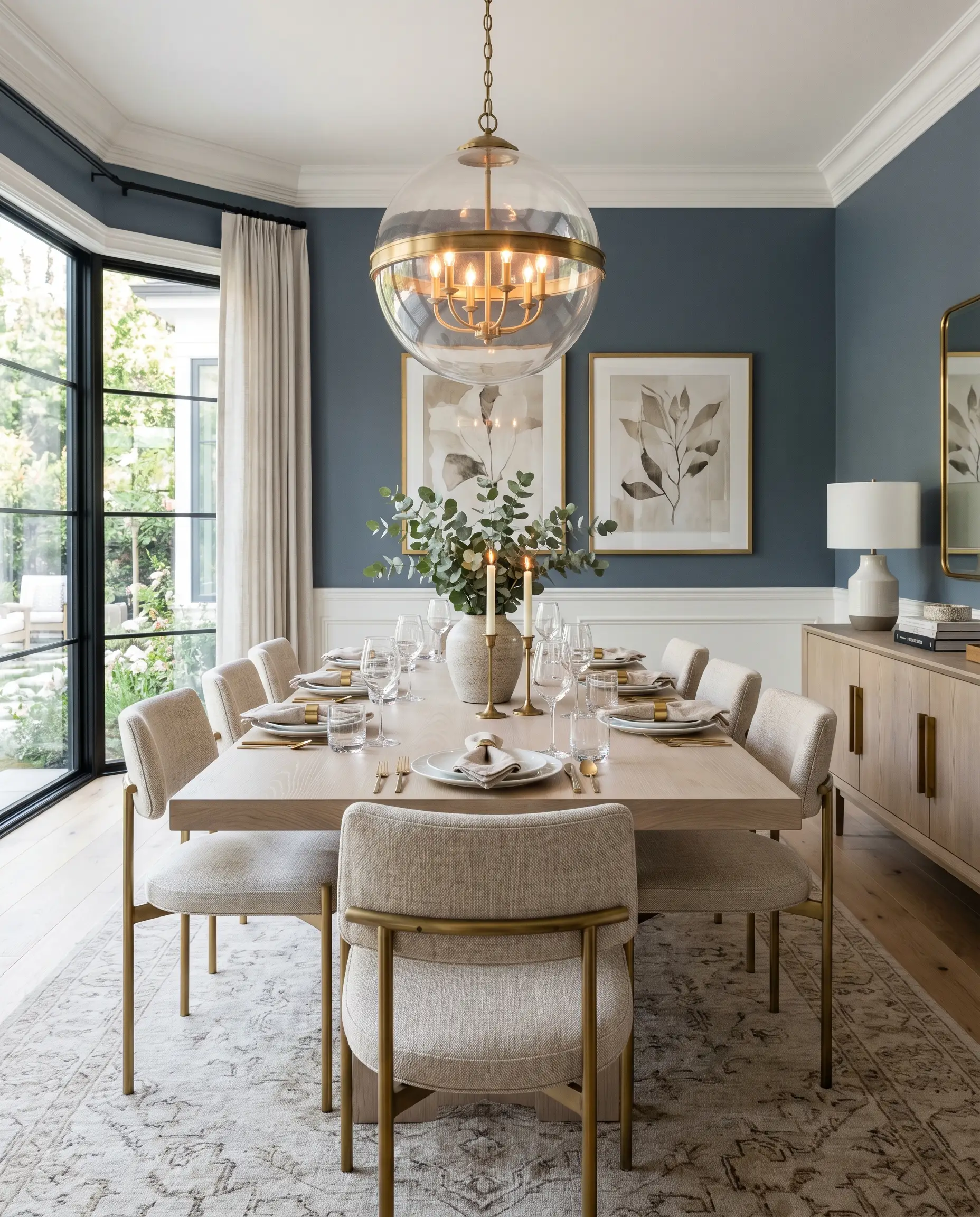
Formal Dining Environments
Dining rooms are inherently transitional spaces designed for evening use, making them the perfect canvas for a moody aesthetic. Under the warm glow of a central chandelier, the graying agents in the paint soften, creating a deeply intimate, sophisticated backdrop for entertaining. Contrast the shadowed walls with highly reflective glassware and polished dining surfaces to keep light bouncing around the room.
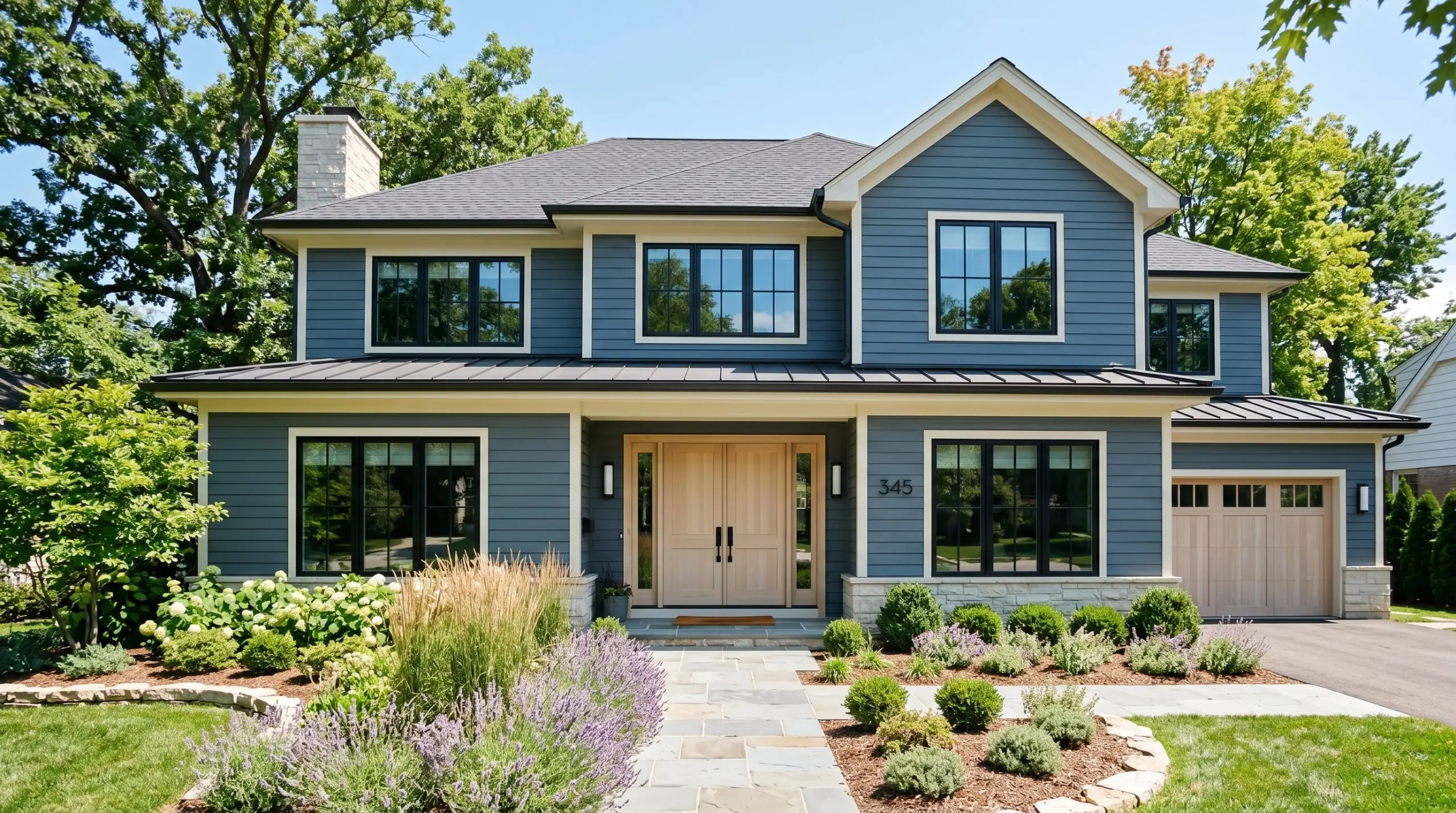
Facades & Exterior Architecture
On an exterior facade, the sheer volume of natural sunlight completely washes out the darkness of the pigment. What looks like a heavy slate indoors transforms into a brilliant, elegant gray-blue under the open sky. It is an exceptional choice for exterior siding, especially when framed by crisp white trim and surrounded by lush, green landscaping.
Structural Ideation & Bespoke Applications
Moving beyond standard wall applications, the true magic of this pigment is unlocked when you apply it to specific architectural features. Its dense visual weight makes it a powerful tool for manipulating spatial geometry.
Grounding Historic Wainscoting
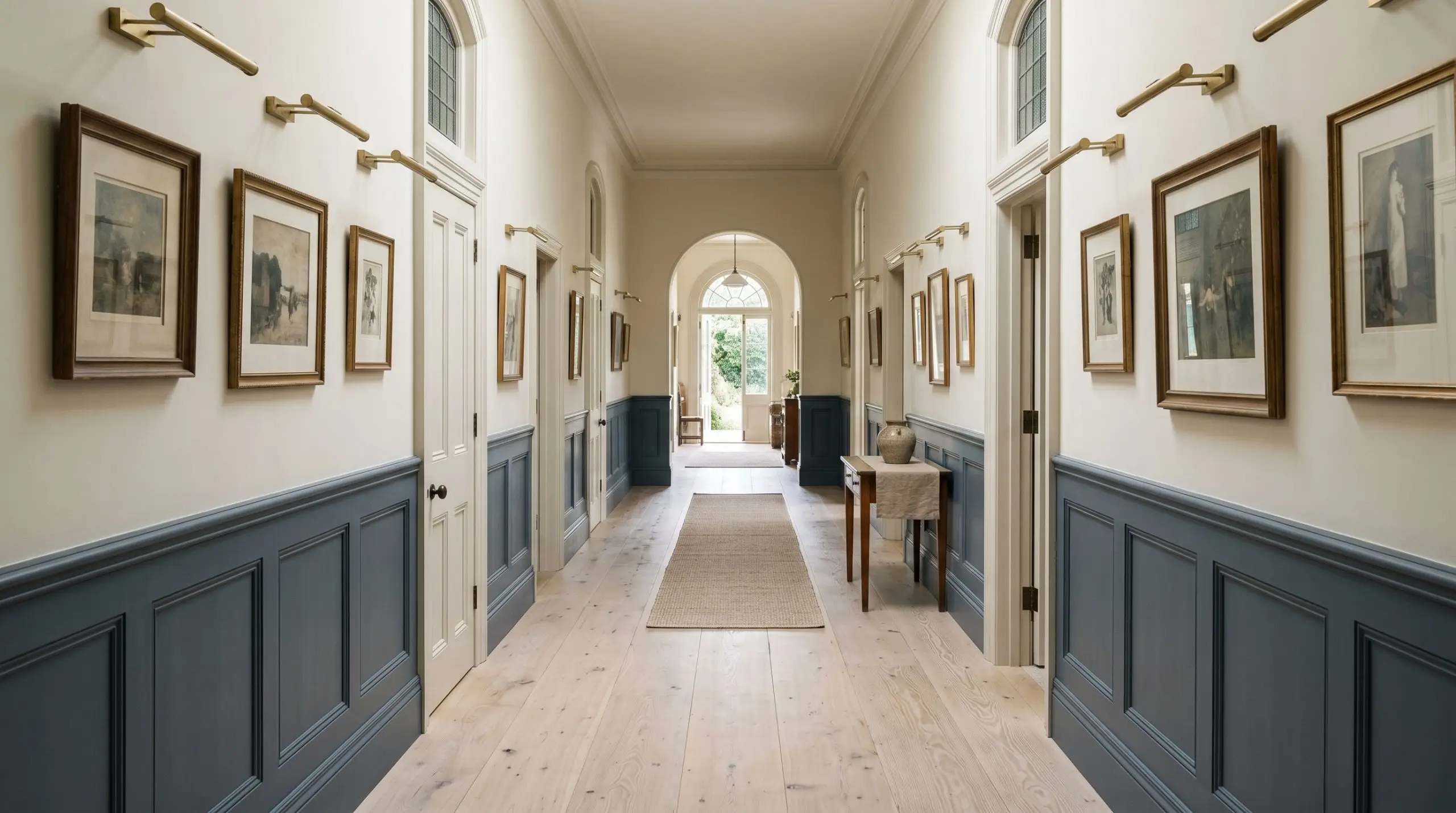
Applying this dense shade strictly to the lower third of a room via traditional wainscoting creates a brilliant spatial illusion. By anchoring the heavy color on the bottom and painting the upper walls a crisp white, you force the eye upward, artificially inflating the perceived height of the ceiling. The deep slate tone modernizes the classic millwork, bridging the gap between historical architecture and contemporary design.
The Color-Drenched Ceiling Warning
Color-drenching—painting the walls, trim, and ceiling the exact same shade—is a masterful way to create a seamless, jewel-box effect. However, applying a shade this dark to a ceiling requires a minimum height of nine feet. If you attempt to color-drench a standard eight-foot room with this pigment, the ceiling will visually collapse, transforming a cozy cocoon into a claustrophobic cavern.
High-Gloss Interior Transitions
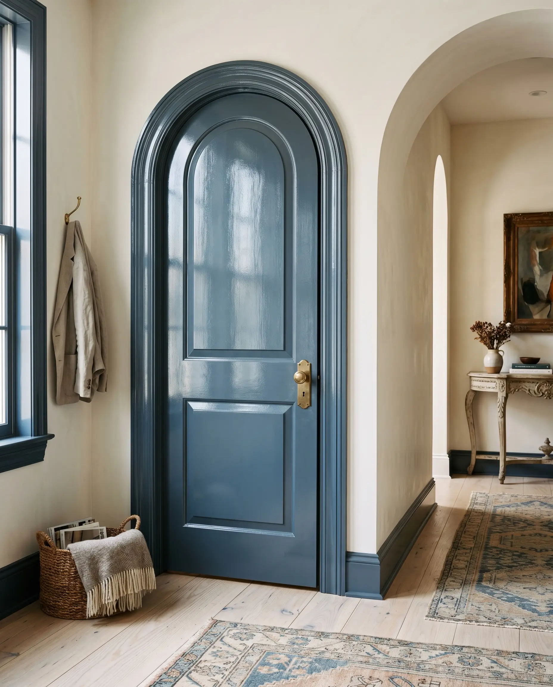
Manipulating the sheen completely alters the DNA of this paint. Applying it in a high-gloss finish to interior doors or transitional archways turns a flat, light-absorbing color into a highly reflective, architectural focal point. The gloss finish catches ambient light, highlighting the complex blue undertones and adding a layer of elite, tactile luxury to otherwise mundane structural transitions.
Curating the Palette for Sherwin-Williams Distance
A paint this complex cannot survive in isolation. It requires a highly specific ecosystem of coordinating colors and tactile materials to prevent its cool undertones from freezing the room.
Crisp Trim & Baseboard Contrasts
Before you begin taping off your baseboards, ensure you are using the correct application techniques. Review our definitive guide on how to paint wood trim to achieve a flawless, factory-smooth finish.
Hackrea Trim Secret
Tactile Finishes & Hardware
To balance the icy slate undertones, you must introduce tangible warmth through your hard finishes.
The Coordinating Color Ecosystem
Bespoke Aesthetic Mood Boards
By synthesizing the tactile materials and coordinating colors above, we can extract distinct, high-end palettes that leverage the paint’s unique tonal profile.
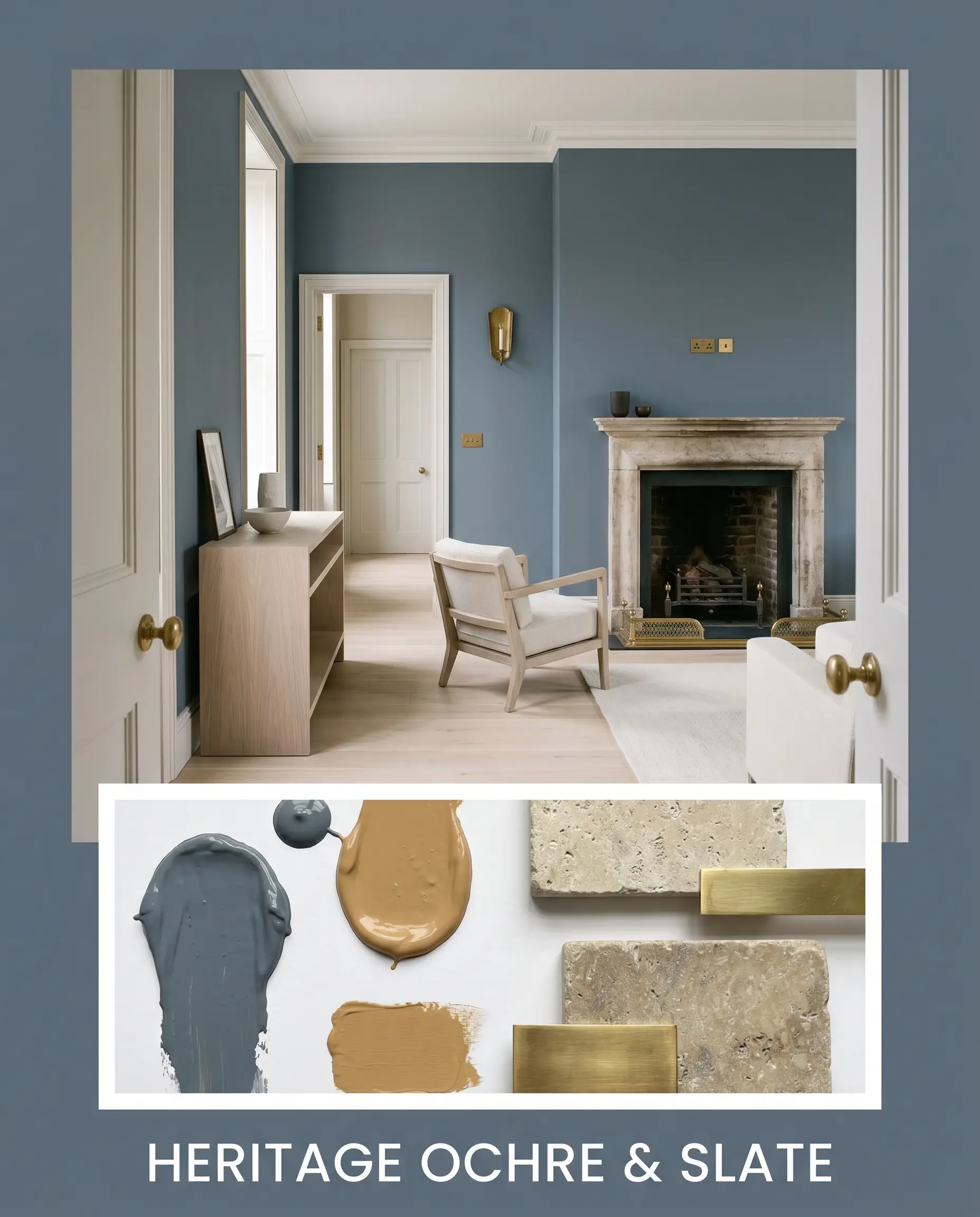
Heritage Ochre & Slate: This palette thrives on historical tension and deep, earthy warmth. By pairing the commanding slate walls with accents of Farrow & Ball India Yellow (No. 66) and heavy tumbled limestone, the atmosphere becomes richly grounded and deeply historical. The raw, chalky texture of the stone absorbs light, while the muddy mustard tones neutralize the icy chill of the primary pigment.
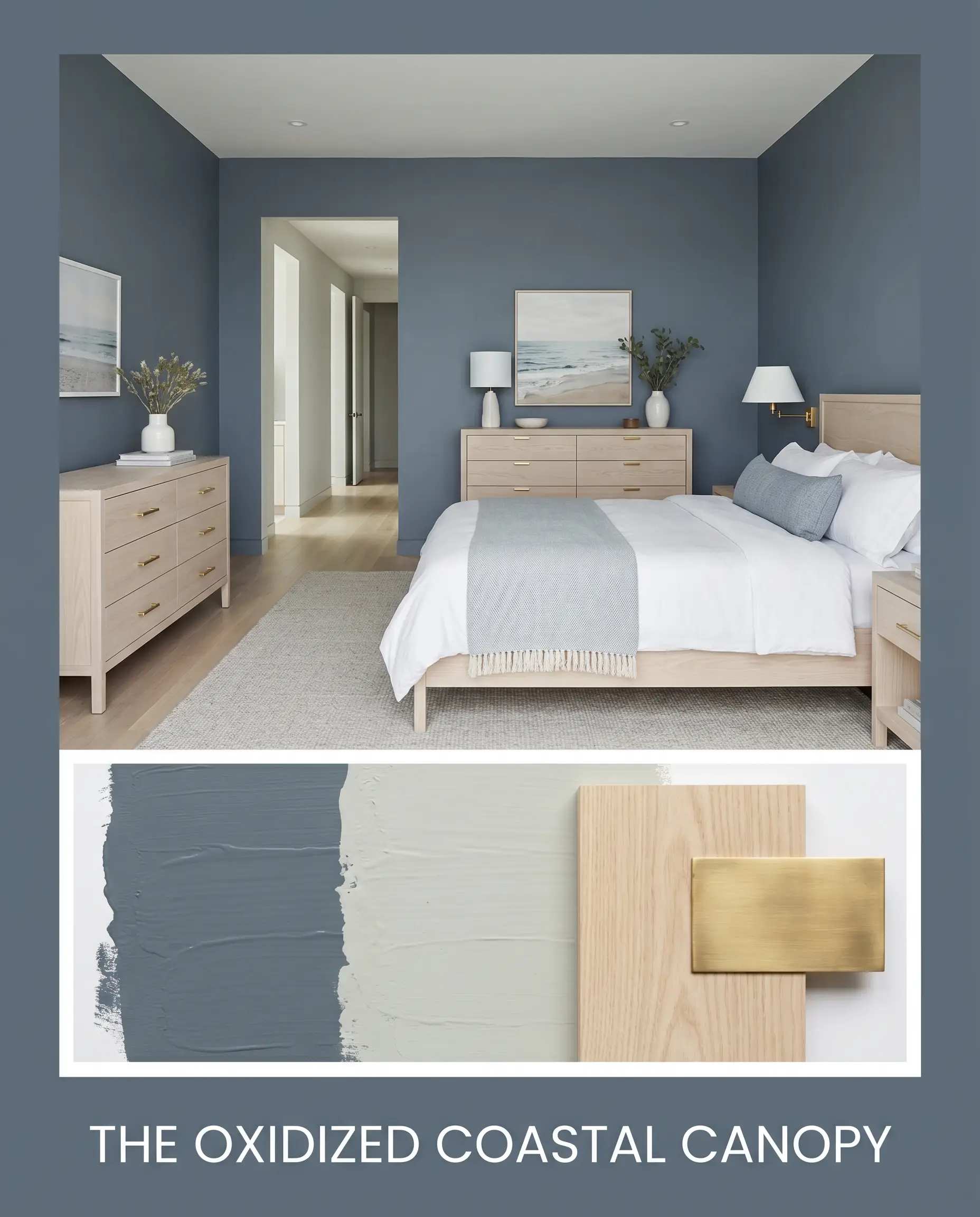
The Oxidized Coastal Canopy: A masterclass in refined, atmospheric restraint. Here, the dark denim base is softened by adjacent flashes of Sherwin-Williams Sea Salt (SW 6204) and grounded by expansive planes of pale ash wood. The inclusion of unlacquered brass hardware acts as a reflective, golden lifeline, ensuring the muted, cool-toned environment feels sophisticated rather than sterile.
Head-to-Head Comparisons
When navigating the darker end of the color wheel, microscopic shifts in undertone dictate the entire mood of the space. Comparing direct rivals is the only way to ensure you are making the right curatorial choice.
Sherwin-Williams Distance vs. Sherwin-Williams Smoky Blue
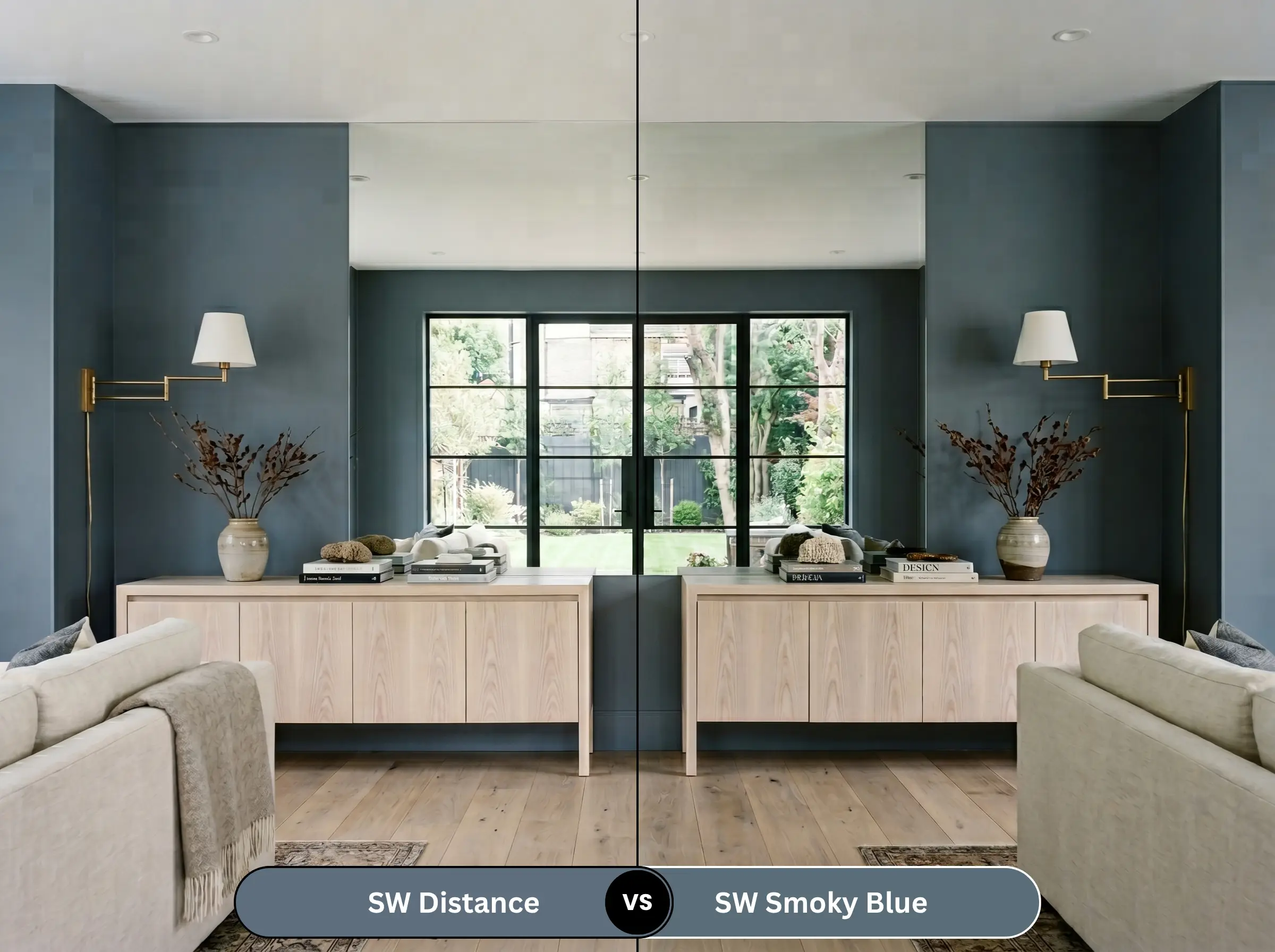
Sherwin-Williams Smoky Blue (SW 7604) is significantly more vibrant and leans much closer to a true, traditional navy. While both share a denim quality, Smoky Blue lacks the aggressive graying agents that give our primary color its signature slate edge. If you want a classic, nautical punch, choose Smoky Blue; if you want a moody, subdued architectural neutral, stick with the slate.
Sherwin-Williams Distance vs. Sherwin-Williams Slate Tile
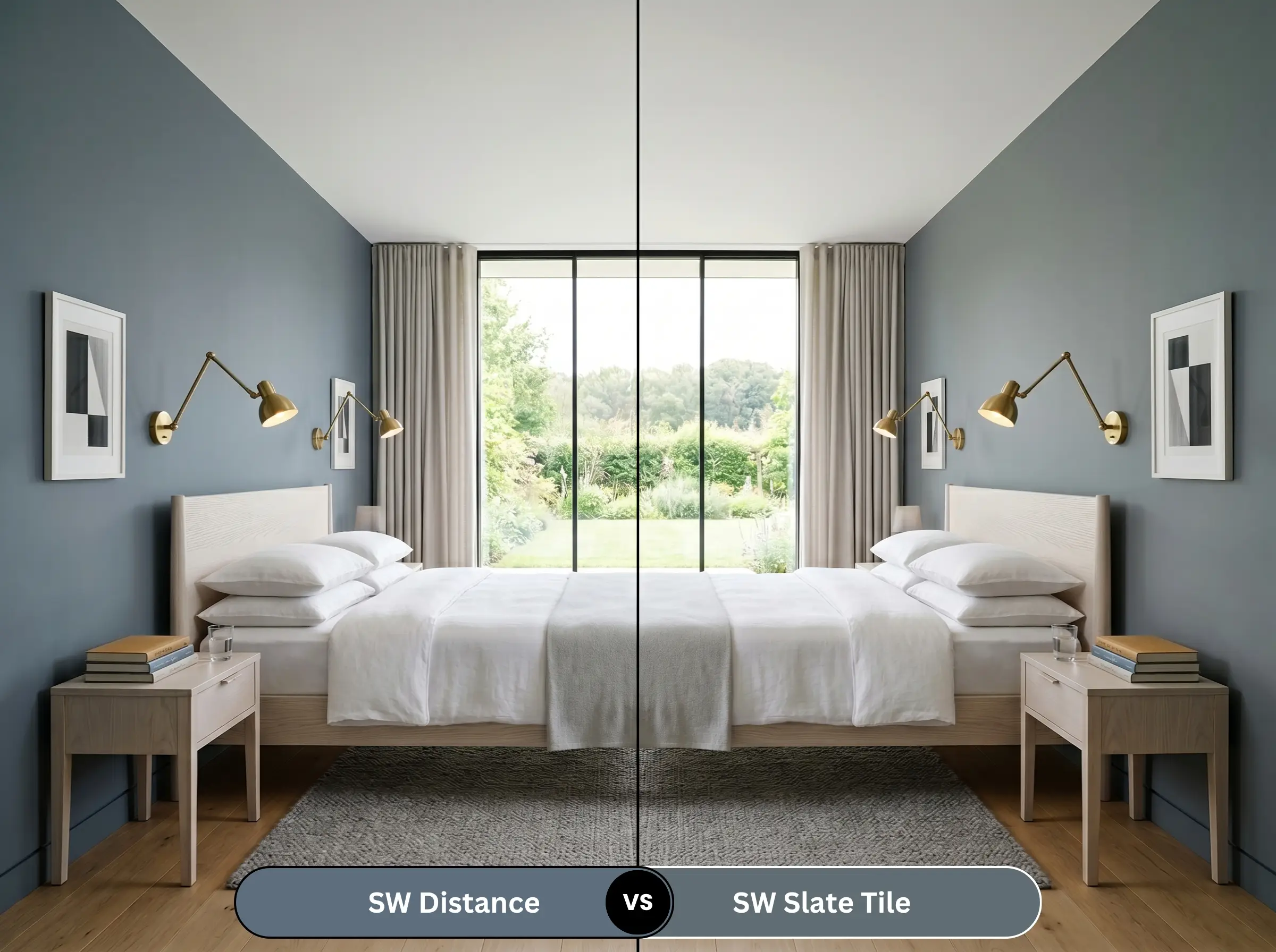
Sherwin-Williams Slate Tile (SW 7624) pushes the gray undertones to their absolute limit. It is noticeably darker and reads almost entirely as a charcoal-gray with only a whisper of blue. If you are terrified of your walls looking blue, Slate Tile is the safer, more industrial option, whereas our primary shade retains a clear, undeniable denim identity.
Sherwin-Williams Distance vs. Benjamin Moore Hale Navy
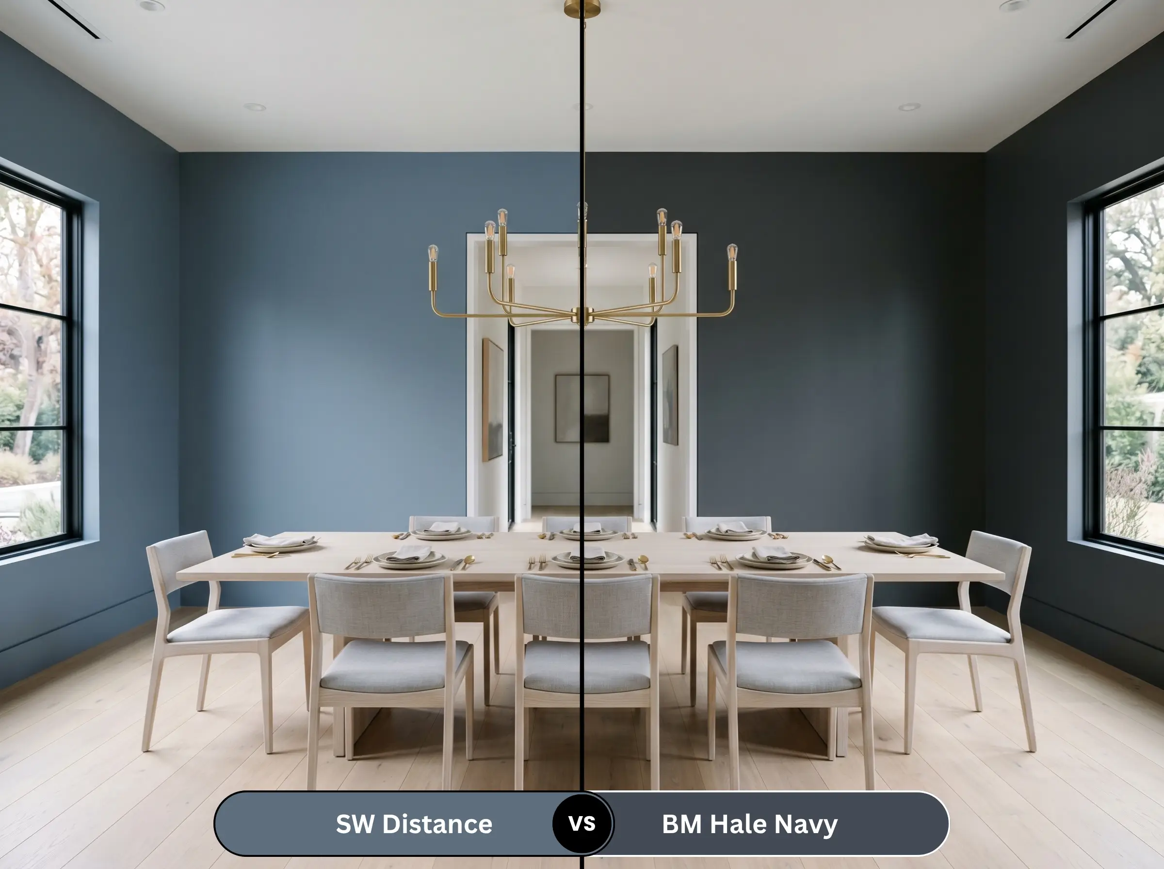
Benjamin Moore Hale Navy (HC-154) is the undisputed king of transitional navies, boasting a much lower LRV and a near-black depth in shadows. Hale Navy is significantly darker and more formal. Our primary SW shade is lighter, dustier, and inherently more casual, making it better suited for relaxed, modern environments rather than strictly traditional estates.
Brand Equivalents & Alternate Tones
If you are locked into a specific manufacturer or need a microscopic shift in depth, these alternatives provide the same overarching aesthetic with slight structural variations.
Same-Brand Alternatives
Cross-Brand Matches
Practical Execution & Painting Strategy
Translating a high-end color concept into a tangible reality requires strict adherence to professional application methods. Dark paints are notoriously unforgiving.
The Dynamic Sheen Guide
Primer Specifications
Do not attempt to paint this shade over a light wall using a standard white primer. A color with an LRV of 15 requires a high-quality, tinted gray primer to achieve its true, rich depth. Using a white primer will force you to apply three to four topcoats to prevent the white from bleeding through and creating a chalky, diluted finish.
Coverage Expectations & Touch-Ups
Dark, heavily pigmented paints are highly susceptible to “flashing”—visible roller marks that appear when the paint dries unevenly. Maintain a wet edge at all times while rolling. Furthermore, touch-ups on a dark, flat wall are almost always visible; if a wall gets scuffed, you will likely need to repaint the entire plane from corner to corner to maintain a flawless finish.
Frequently Asked Questions
No. Because its undertones are heavily anchored in slate and gray, it actively resists the purple shift that ruins many traditional navy paints. It will shift between gray and denim, but it will not turn violet.
Dark blues are notoriously prone to UV fading. While the gray undertones help mask slight fading over time, prolonged exposure to harsh, direct sunlight will eventually chalk the finish. Using a premium, UV-resistant exterior acrylic is mandatory.
Yes, but only if you embrace the mood. A windowless powder room is the perfect place to color-drench the walls and ceiling, creating a deliberate, jewel-box effect. You must offset the darkness with highly reflective mirrors and brilliant sconce lighting.
A Satin finish is the industry standard for dark cabinetry. It provides enough durability to wipe away grease and fingerprints, but it avoids the high-glare reflection of Semi-Gloss, which highlights every single smudge and wood grain imperfection.
The Hackrea Verdict: Is Sherwin-Williams Distance Right for You?
Sherwin-Williams Distance (SW 6253) is a masterclass in atmospheric design. It is the ultimate choice for the homeowner who craves the drama of a dark room but possesses the curatorial restraint to avoid standard, overly saturated navies. Its absolute best application is as a color-drenched anchor in a well-lit home office or as a grounding force on heavily textured historic millwork.
However, it comes with a strict set of architectural boundaries. Avoid this paint entirely if your home features heavy red or orange brick fireplaces, yellow travertine floors, or cherry wood cabinetry. The resulting clash will instantly date your home. If you are willing to respect its cool undertones and pair it with raw, organic textures like white oak and unlacquered brass, this dusty slate will deliver an elite, magazine-ready aesthetic.