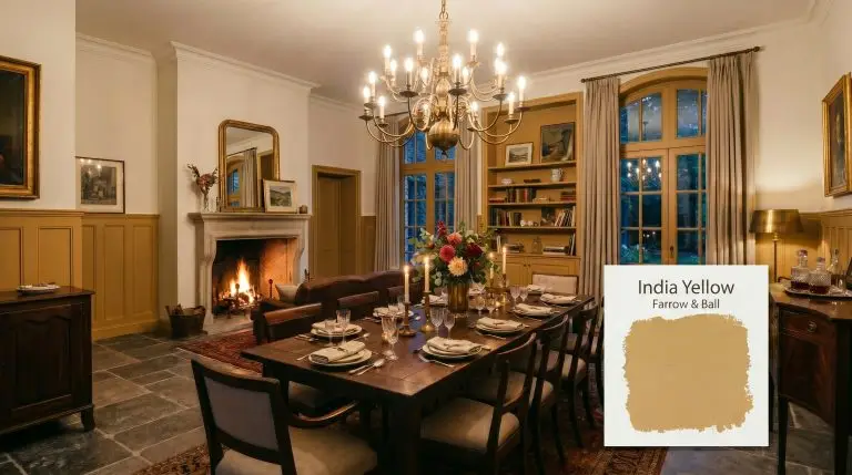
India Yellow 66
Farrow & BallFarrow & Ball India Yellow (66) is a deep, moody mustard ochre with strong earthy brown undertones. With an LRV of 37.05, this rich, historical color absorbs light to create a cozy, enveloping atmosphere, making it perfect for dining rooms, libraries, and dramatic kitchen cabinetry.
Farrow & Ball India Yellow: Mastering Sophisticated, Historical Warmth
If the thought of yellow paint conjures nightmares of a chaotic school bus or a blindingly bright fast-food restaurant, take a deep breath. Farrow & Ball India Yellow is the ultimate antidote to juvenile primary colors. This deeply sophisticated, historical shade delivers the moody intensity you crave without overwhelming the senses. It acts as a grounded, earthy yellow that feels curated and mature.
The Color DNA of Farrow & Ball India Yellow
To truly understand this historic pigment, you have to look past the name and analyze its core tonal profile. The pigment makeup of this shade is complex, relying heavily on grounding elements rather than pure brightness.
With a light reflectance value of 37.05, this brown-based neutral absorbs far more illumination than it bounces back. It will not magically expand your space or fake square footage. Instead, this specific depth creates a wrapped, jewel-box effect that intentionally pulls the walls inward for a cozy, enveloping atmosphere.
You can apply wallpapers, paints, etc. on walls and see how they look in various interiors.
Lighting Scenarios: The Chameleon Factor
The secret to keeping this shade sophisticated rather than chaotic lies entirely in how it reacts to your home’s natural exposure. Because of its complex base, it shifts dramatically as the sun moves across the sky.
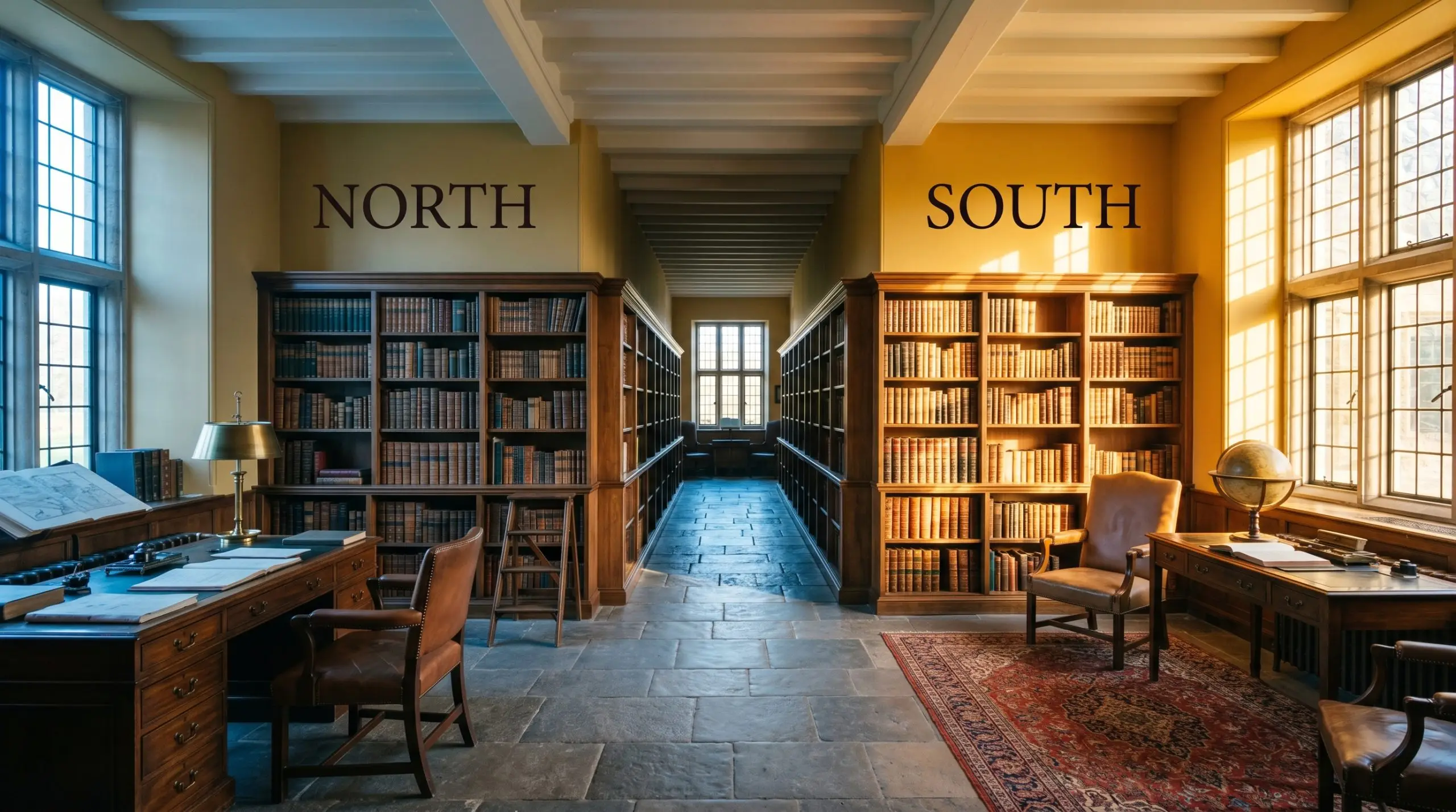
If you are terrified of the green shadow creeping in, heavily rely on floor and table lamps with warm amber bulbs rather than overhead recessed lighting to force the golden tones to stay active after dark.
Hackrea Undertone Secret
Best Applications for India Yellow
This is not a foolproof, slap-it-anywhere neutral. It thrives in spaces dedicated to intimacy, gathering, and evening relaxation, but it will absolutely fail in cramped, poorly lit transitional areas like narrow hallways. If you do not have the architectural scale or the intentional design plan to support it, you must proceed with caution.
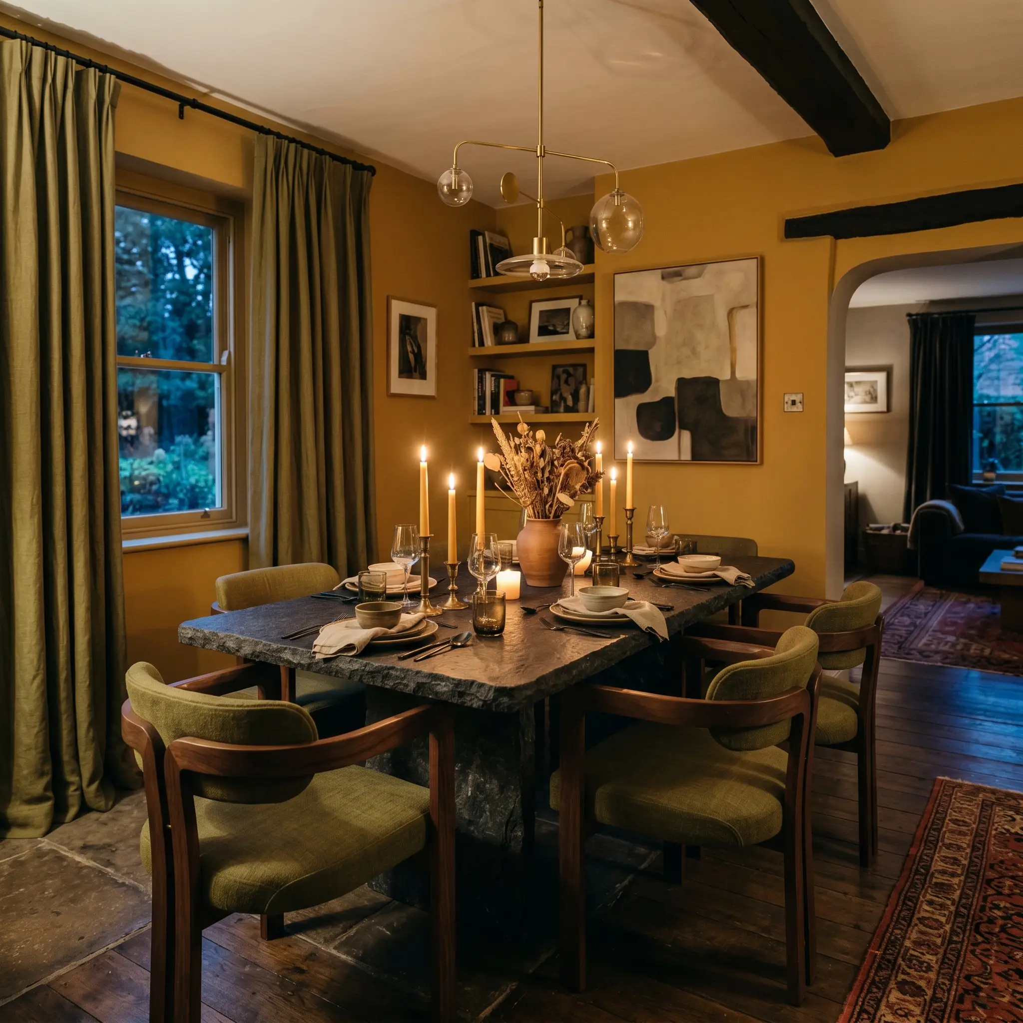
Dining Rooms
This shade is a brilliant choice for setting a mood for evening entertainment. When exploring the best dining room colors, we constantly look for shades that foster conversation and intimacy. Wrap the walls in this deep ochre to create a glowing, candlelit atmosphere that pairs beautifully with heavy drapery and layered lighting. You can lean into a traditional aesthetic with antique furniture, or push it modern with sleek, dark stone tables and sculptural seating.
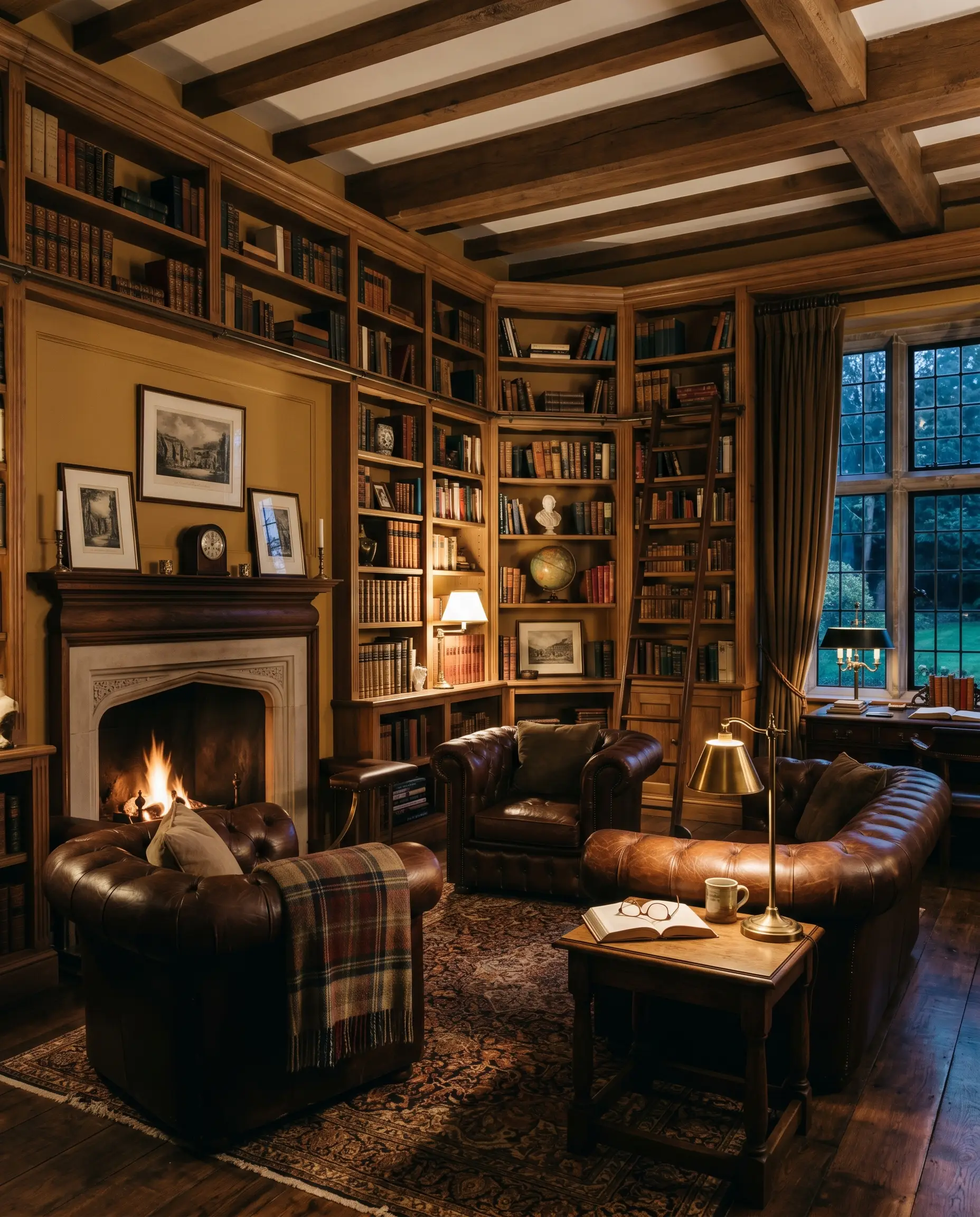
Cozy Living Spaces & Libraries
In spaces meant for winding down, this earthy tone acts as a warm embrace. It anchors the perimeter, allowing you to layer in rich leathers, heavily textured rugs, and built-in shelving. The darker the environment gets, the more the brown foundation takes over, turning the walls into a shadowy, grounding backdrop rather than a bright focal point.
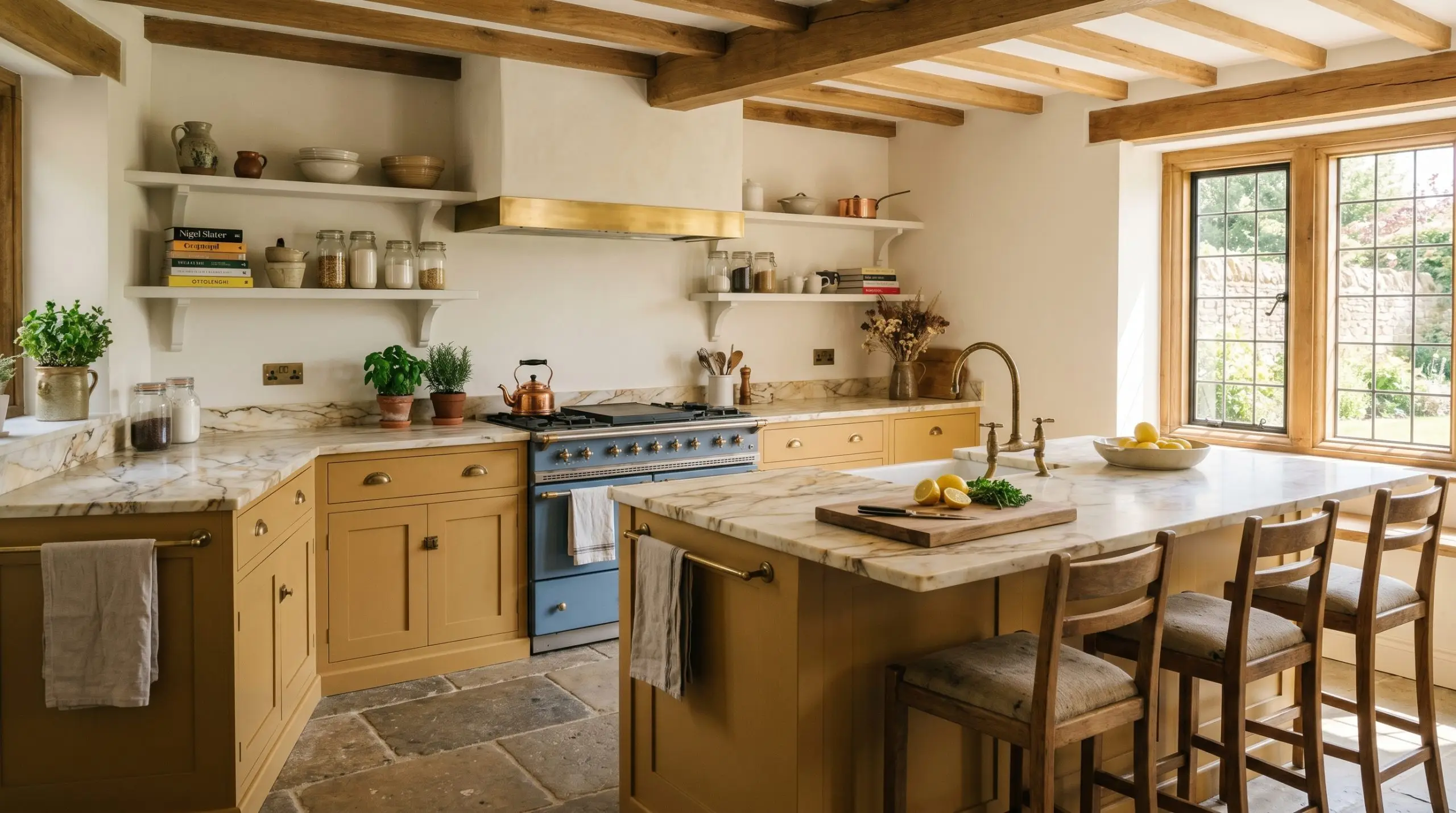
Kitchen Cabinetry
If you are tired of sterile white kitchens, this hue offers a striking, historical alternative for millwork. Understanding how to paint cabinetry is only half the battle; choosing a color with enough depth to ground the lower half of your layout is crucial. It pairs seamlessly with rustic styling, unlacquered metals, and heavily veined, warm stones, giving the heart of the home a lived-in, bespoke character.
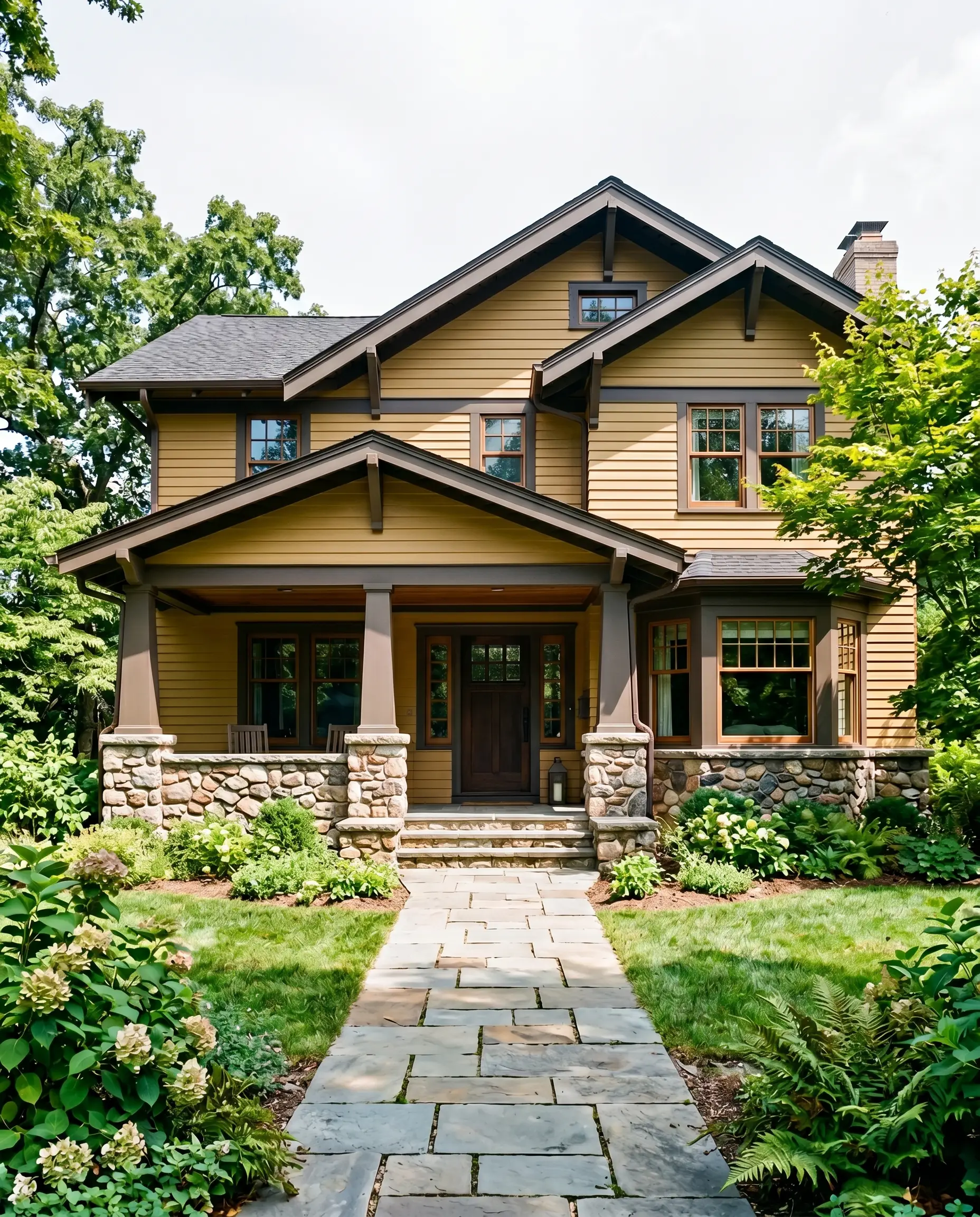
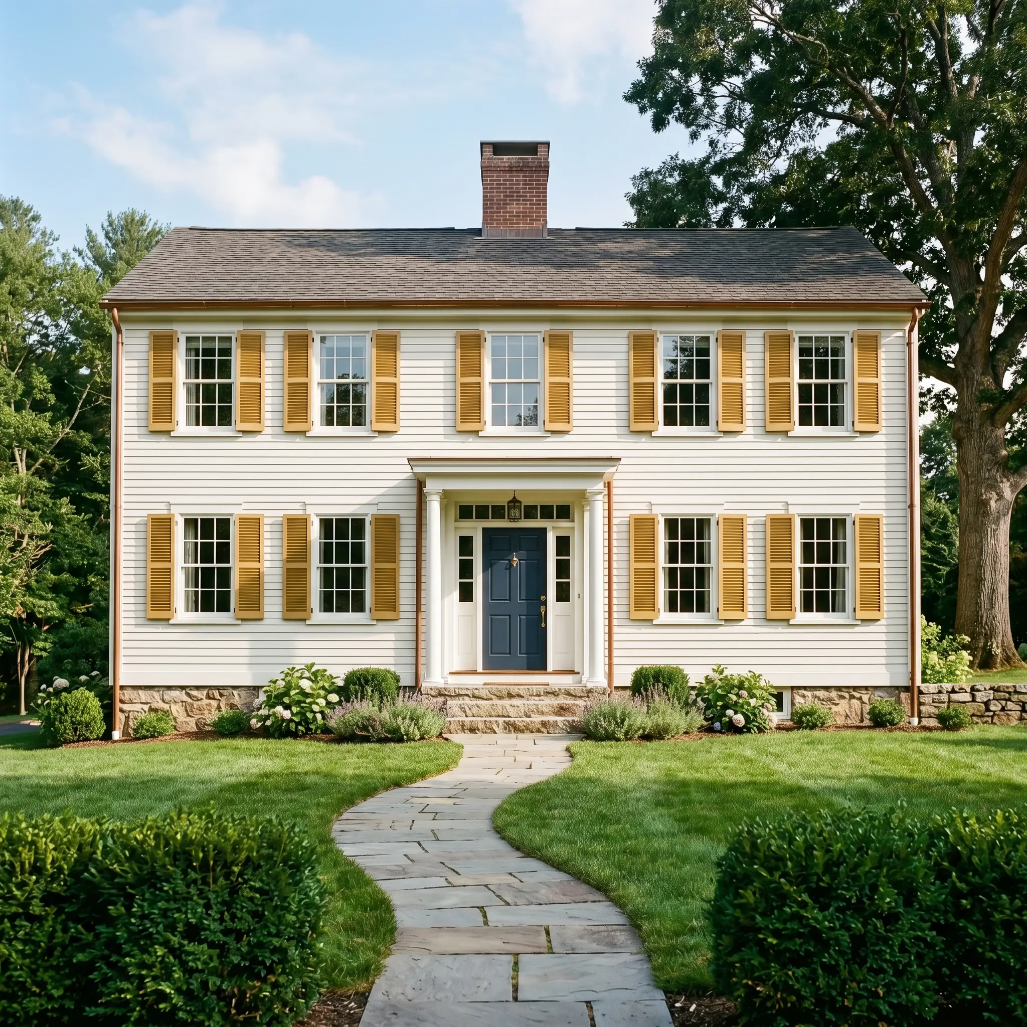
Home Exteriors
On an exterior facade, natural sunlight washes out a significant portion of a paint’s depth. Here, the shade reads much brighter, offering a welcoming, historic charm that beautifully complements natural stone foundations and dark, contrasting trim. Always test a large swatch outside, as the color will appear significantly lighter than it does on an interior wall.
Signature Architectural Ideas & Geometry
Moving beyond basic four-wall applications, the true magic of this hue is unlocked when applied to specific structural features. This is where you leverage its unique pigment makeup to explicitly manipulate spatial geometry.
The Color-Drenched Vestibule
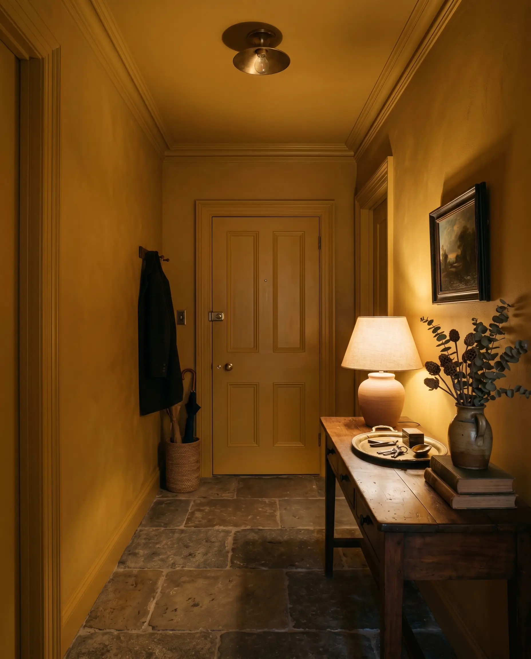
Color drenching a small, windowless entry vestibule—painting the walls, trim, doors, and ceiling in the exact same finish—completely erases the visual boundaries of the area. By leaning into the lack of light rather than fighting it, the deep ochre wraps the structure in a continuous, moody shadow. This technique turns a forgotten, cramped transitional zone into a deliberate, highly curated experience.
Historic Wainscoting & Millwork
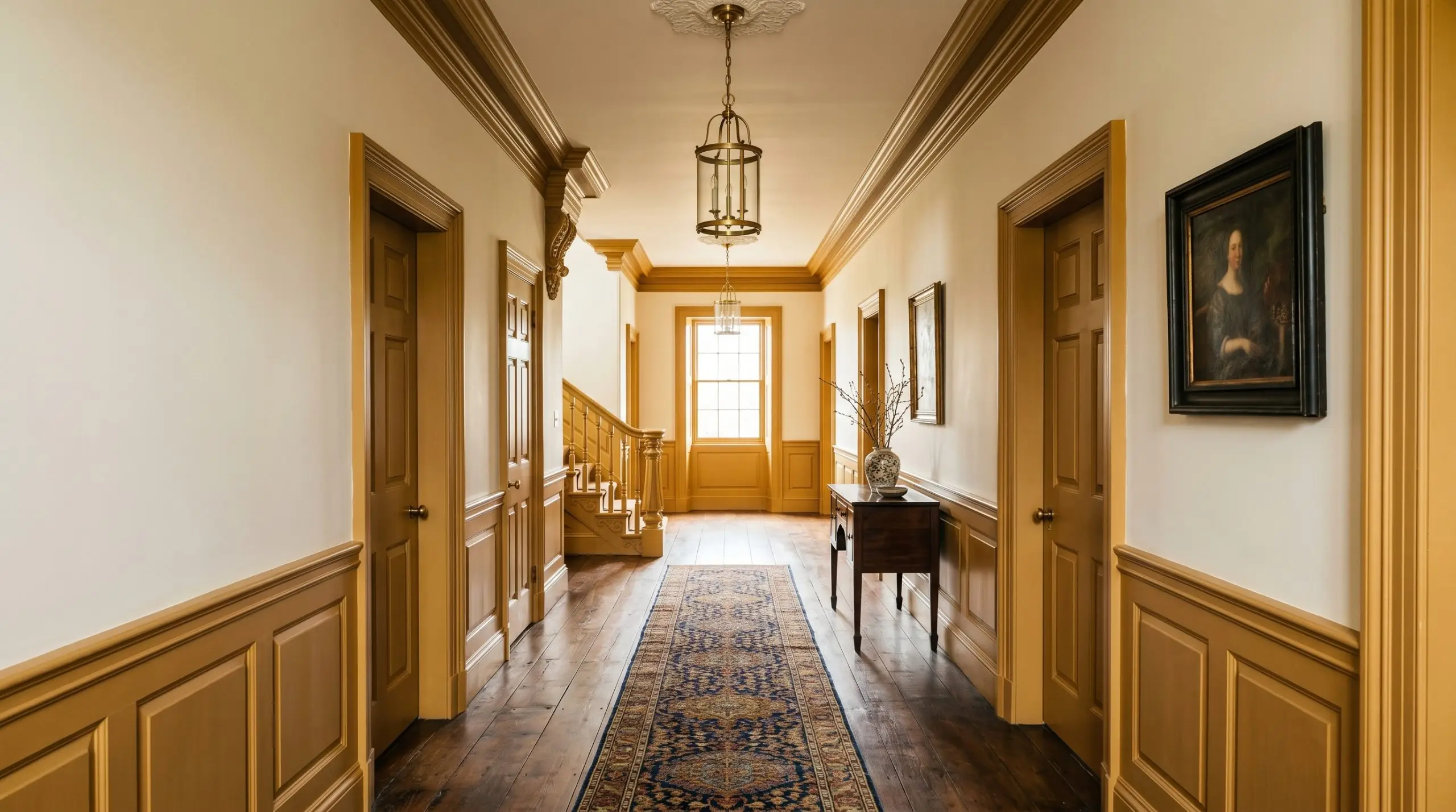
This shade is historically rooted, making it the ultimate framing device for traditional wainscoting or heavy crown molding. When applied to lower wall panelling beneath a softer, creamy upper wall, it visually anchors the structure and highlights the intricate shadows of the woodwork. The deep brown base ensures the molding feels substantial and permanent, never flimsy or purely decorative.
High-Gloss Ceiling Illusions
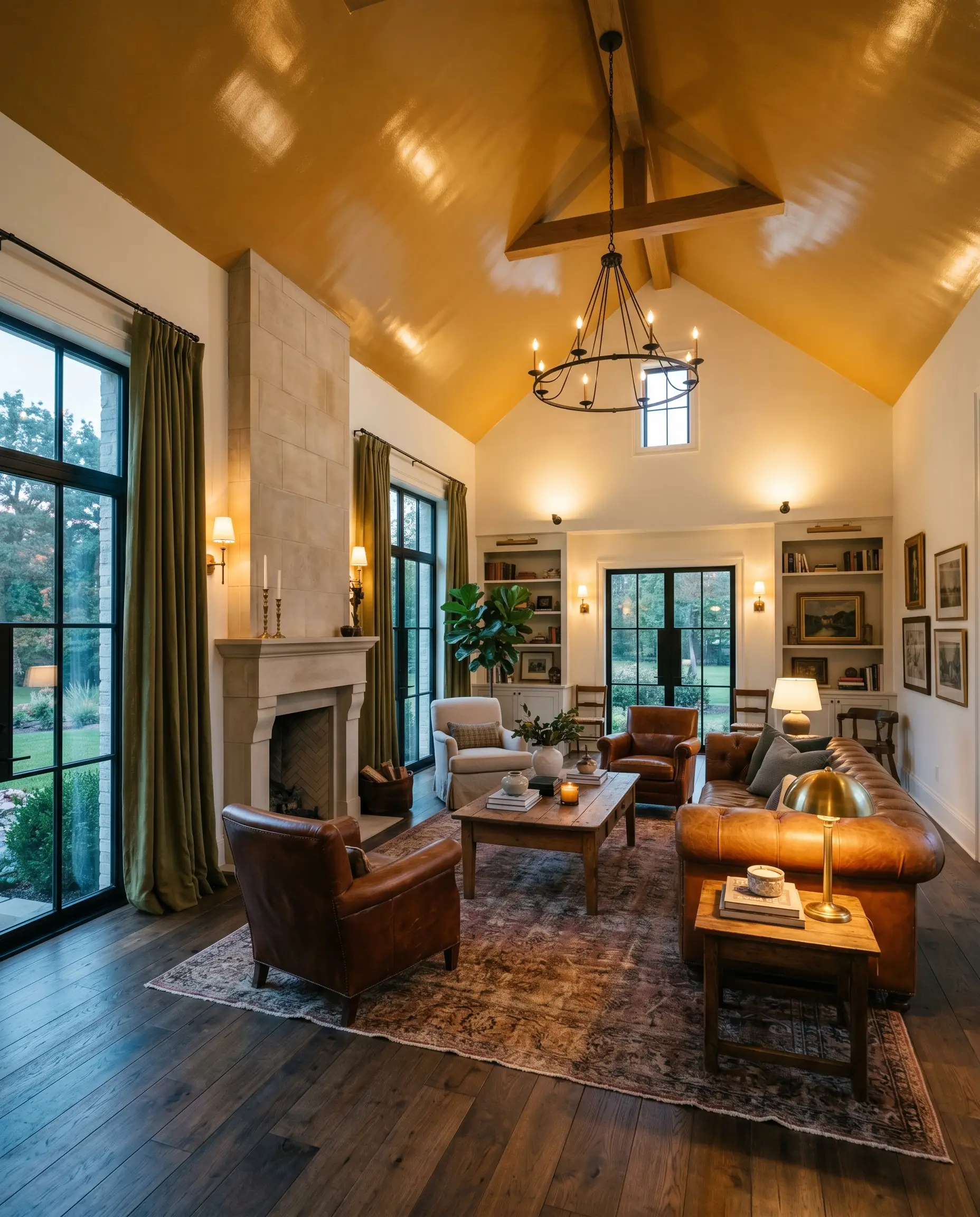
While a flat finish absorbs light, applying this deep mustard in a high-gloss sheen to a ceiling completely flips the script. The highly reflective surface bounces ambient lamplight downward, while the dark, warm hue visually lowers the ceiling plane. This creates an incredibly intimate, tented effect that makes soaring architecture feel cozy and human-scaled.
The Exterior Shutter Misstep
It is tempting to use this as an accent on exterior shutters, but you must evaluate your siding color first. If paired against a stark, cool white exterior, the extreme contrast strips the color of its earthy sophistication, making it look jarring and disjointed. It requires a softer, creamy backdrop to maintain its historic integrity and avoid looking like a cheap afterthought.
The Accents & Pairings Guide
To build a cohesive ecosystem, you must surround this paint with elements that respect its heavy, historical nature.
Trim & Baseboards
A stark, pure white trim will ruin the warmth of this wall color. You must use soft, creamy whites to bridge the transition. Farrow & Ball Wimborne White offers a perfectly balanced, slightly warm contrast. Benjamin Moore White Dove brings a touch of greige to soften the architectural lines, while Sherwin-Williams Alabaster (SW 7008) provides a rich, creamy boundary that enhances the wall’s golden depth.
Tactile Finishes & Textiles
Coordinating Colors
Curated Mood Boards
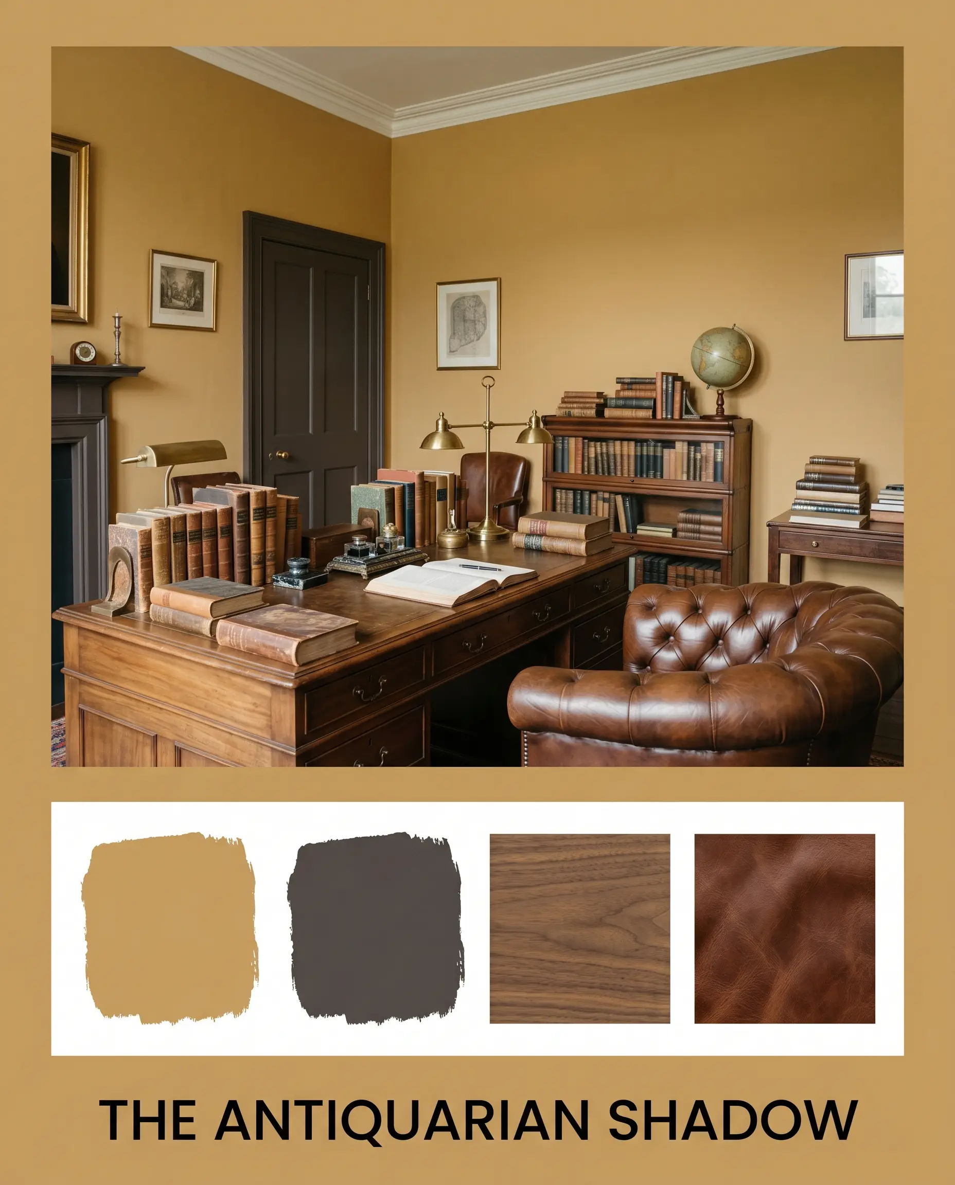
The Antiquarian Shadow: Grounded by the heavy presence of aged walnut and Tanner’s Brown, this palette feels inherently academic and shadowed. The deep mustard acts as the primary light source, while the dark woods and rich leathers absorb the excess warmth. It is an exercise in creating a deeply focused, enveloping atmosphere that feels centuries old.
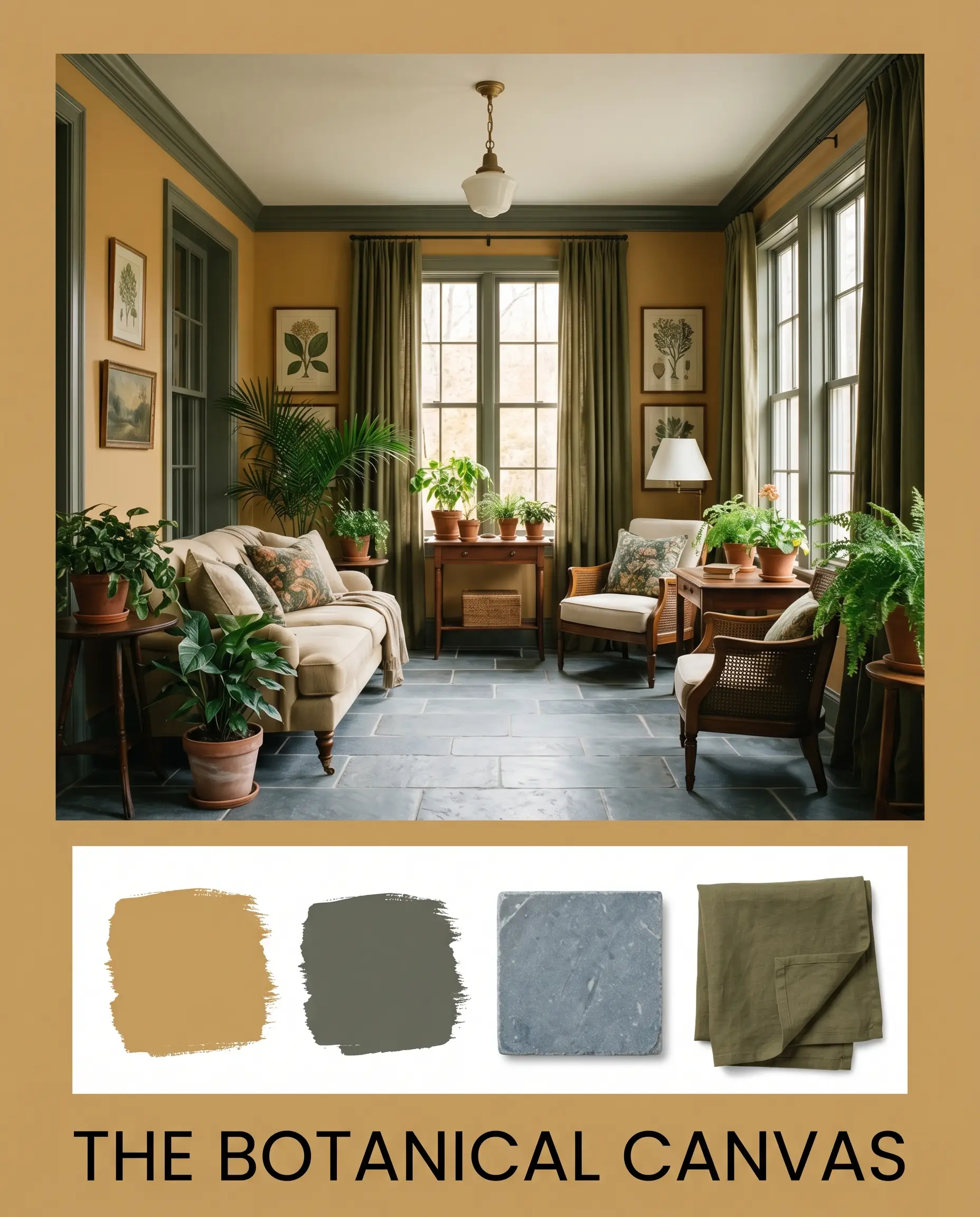
The Botanical Canvas: By weaving in the muted herbal notes of Sherwin-Williams Rosemary (SW 6187) and the dense texture of olive linen, this combination highlights the earthy origins of the pigment. The tumbled bluestone adds a rugged, greenhouse-inspired foundation, resulting in a lush, highly tactile environment that feels deeply connected to the natural world.
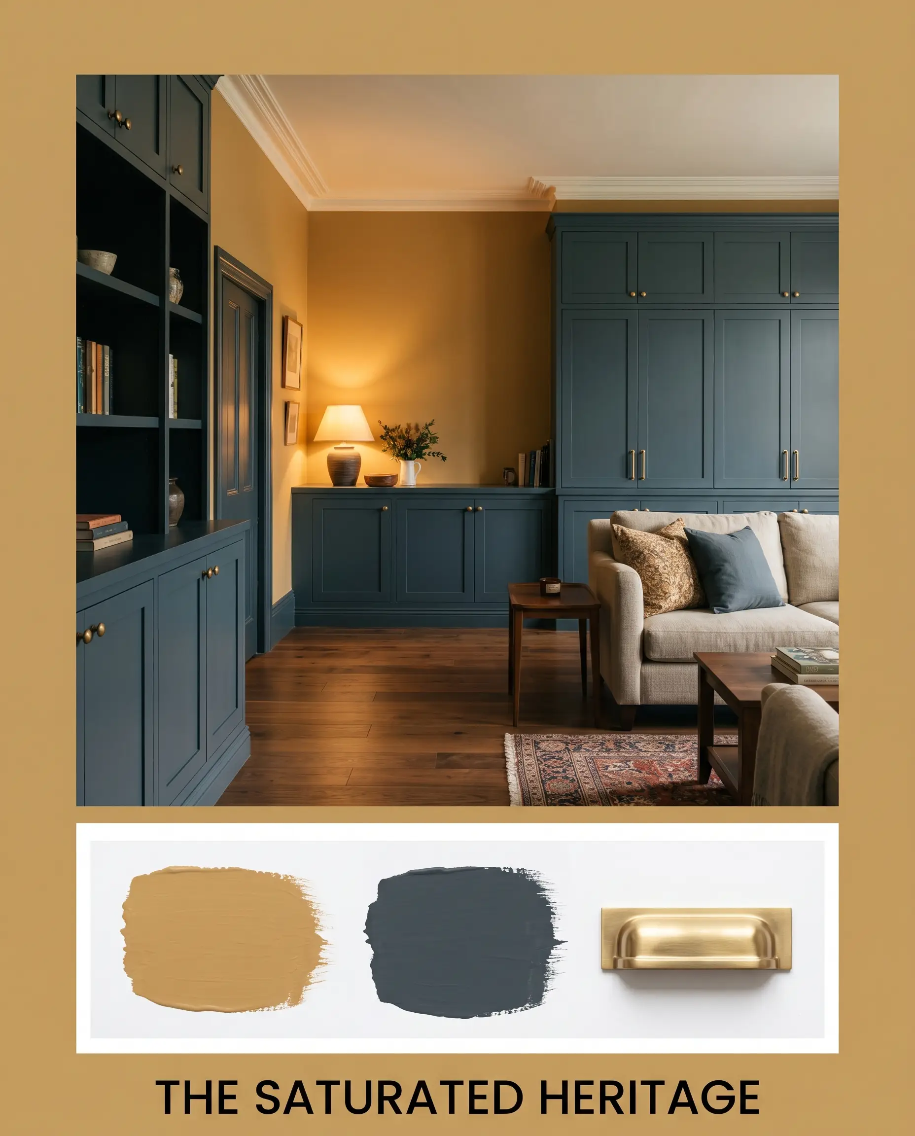
The Saturated Heritage: Utilizing the sharp, moody contrast of Hague Blue alongside unlacquered brass hardware, this palette leans heavily into dramatic, historic tension. The cool, dark navy sharpens the golden vibrancy of the ochre, creating a sophisticated, high-end aesthetic that feels both traditional and fiercely opinionated.
Farrow & Ball India Yellow Head-to-Head
When finalizing a high-end color palette, comparing direct rivals is the only way to ensure you are capturing the exact atmospheric tension you desire.
Farrow & Ball India Yellow vs. Farrow & Ball Sudbury Yellow
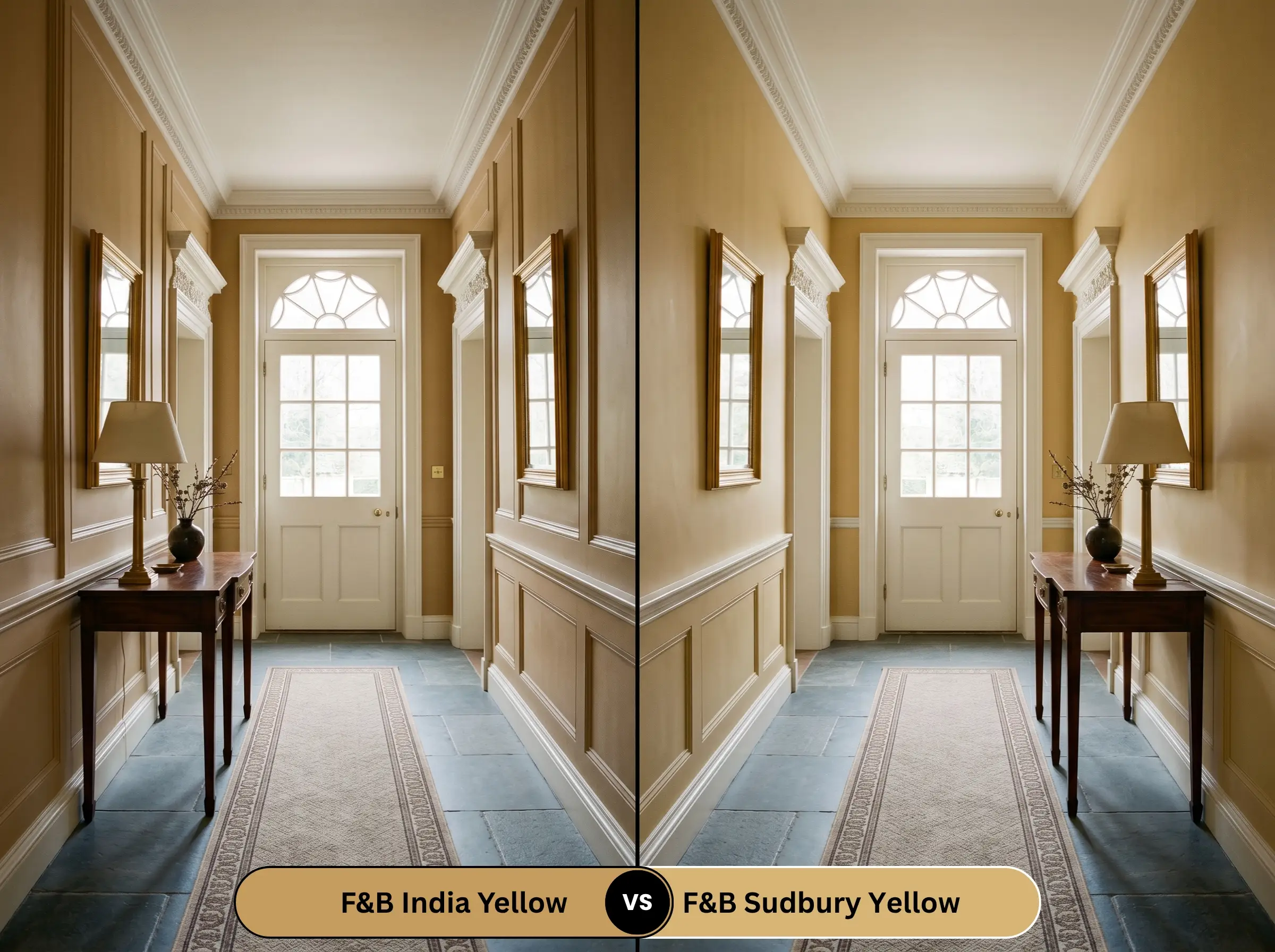
Sudbury Yellow is significantly cleaner and more traditional. While our primary color relies on a heavy brown shadow to create its moody intensity, Sudbury removes that shadow, resulting in a clearer, more straightforward historic yellow. Choose Sudbury if your environment lacks natural light and you need a brighter, more uplifting presence.
Farrow & Ball India Yellow vs. Benjamin Moore Ochre
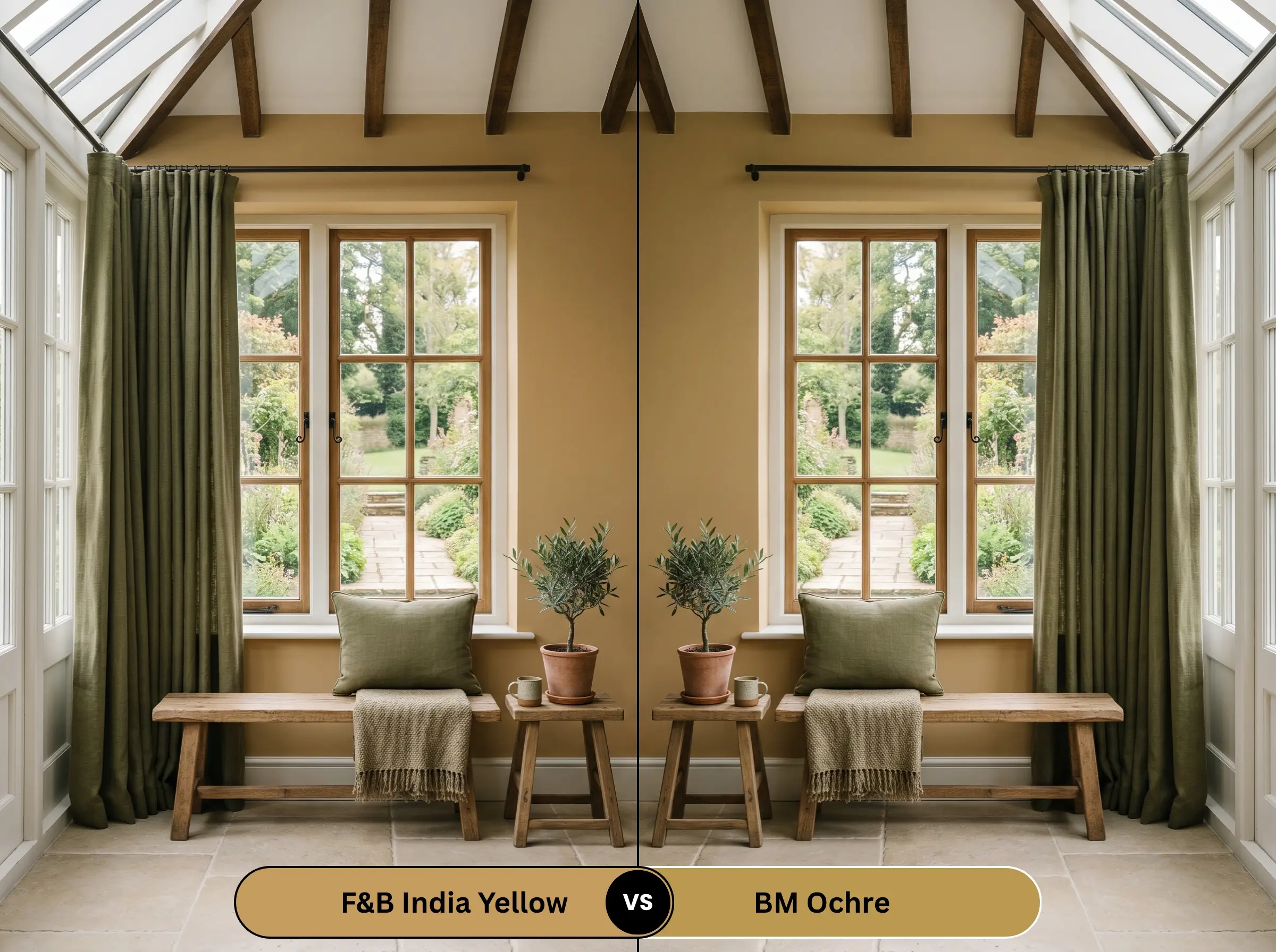
Benjamin Moore Ochre (2151-30) pushes much further into orange territory. Where the Farrow & Ball shade maintains a delicate balance of brown and subtle green, BM Ochre brings a fiery, terracotta-adjacent heat. If you want a grounded, aged look, stick to the Farrow & Ball; if you want aggressive, sun-baked warmth, shift to Benjamin Moore.
Alternative Choices & Brand Matches
If the specific tonal profile of this shade isn’t quite right for your lighting, these alternatives offer slight variations in depth and temperature.
Similar Colors in the Same Brand
Cross-Brand Equivalents
Practical Application & Finishes
Shifting from design theory to practical execution requires understanding how this specific pigment interacts with different sheens and preparation methods.
The Dynamic Sheen Guide
Primer Strategy
Do not skip the foundation. Because this hue relies on deep, light-absorbing pigments, a standard white primer will dilute its richness. You must use a mid-tone gray or specifically tinted warm primer to ensure the final coat achieves its true, moody intensity.
Coverage & Touch-Ups
Darker, complex shades are notoriously unforgiving during application. Expect to apply a minimum of two generous coats, and potentially a third if you are painting over a lighter, cool-toned wall. Flashing (visible roller marks) is a significant risk in flat finishes; maintain a wet edge at all times and avoid aggressive spot touch-ups later, as they will dry noticeably darker.
Frequently Asked Questions
While the original historic pigment derived from mango leaves was prone to rapid degradation, the modern synthetic formulation is highly UV stable. However, on a south-facing facade, the intense, continuous sunlight will eventually bake out the subtle green and brown undertones, causing the color to slowly fade into a softer, more generic golden tan over a decade.
Yes, if applied incorrectly. In a windowless room with only artificial light, the heavy brown base dominates, which can feel oppressive and visually exhausting over long periods. To prevent this, you must rely on strategic, warm layered lighting (2700K) to constantly activate the golden top-notes.
A high-gloss finish actively bounces ambient light, artificially raising the perceived brightness of the color. On a textured surface like beadboard, the gloss highlights every groove and ridge, creating a dynamic, glittering effect that makes the ceiling feel significantly lighter and more active than the literal 37.05 rating suggests.
The Final Verdict
Farrow & Ball India Yellow is a triumph of historic color design, perfectly suited for those who want a deeply curated, enveloping atmosphere. It is the ultimate choice for evening dining, moody studies, and bespoke cabinetry, offering a sophisticated warmth that standard yellows simply cannot touch.
Hackrea Clash Warning: This color demands strict architectural discipline. You must avoid architectural clashes by never pairing it with cool-toned Carrara marble or pinkish-beige travertine, as the conflicting undertones will create immediate visual chaos. Likewise, banish polished chrome hardware and reddish woods like cherry or mahogany from the room entirely. If you cannot control these surrounding elements, walk away and choose a safer, standard warm neutral paint guide alternative.