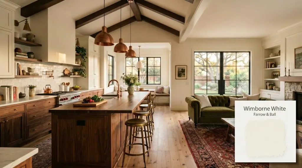
Farrow & Ball Wimborne White No. 239 is a bright, warm off-white with a subtle yellow undertone. Boasting an LRV of 89, it reflects abundant light while maintaining a soft, inviting glow, making it a highly versatile choice for walls, trim, and cabinetry.
Will Wimborne White clash with your room?
Paint Technical Profile
| Color ID / SKU | No. 239 |
| HEX Code | #f4f2e7 |
| Light Reflectance (LRV) | 89 |
| Use | Interior, Exterior |
| Best Exposures | North-Facing, South-Facing |
| Best For | Kitchen Cabinets, Living Rooms, Trim, Ceilings |
Farrow & Ball Wimborne White No. 239: The Warm White for Luminous Interiors
Finding a white paint that illuminates a heavily shadowed, low-ceilinged living room without turning it into a sterile clinic is a persistent design challenge. Farrow & Ball Wimborne White No. 239 solves this effortlessly by combining immense light-bouncing capabilities with a deeply comforting, historic softness.
It takes the sharp edge off bright spaces while gently warming up dimly lit corners.
We rely on this specific shade when a room demands the crispness of a true white but requires the soulful, lived-in energy of an older home. It acts as a brilliant foundational layer, allowing you to build a beautifully curated room around it without the wall color ever feeling cold or abrasive.
Farrow & Ball Wimborne White No. 239: Undertones & LRV
If you are wondering whether this shade is warm or cool, it is definitively warm. This is one of the most reliable options available if you are searching for the best warm white paint colors to elevate a residential interior. It carries a rich color complexity that prevents it from feeling flat or generic on the wall.
With an LRV (Light Reflectance Value) of 89, this shade offers exceptionally high light reflectance. It absorbs very little light, allowing it to dramatically expand the perceived volume of a room. Instead of a blinding glare, that high reflectivity translates into a soft, luminous glow that wraps around the architecture.
Lighting Effects & The Chameleon Factor
Because this color relies on a delicate balance of pigments to achieve its signature softness, it is highly reactive to the environment around it. You must observe how it shifts throughout the day before committing.
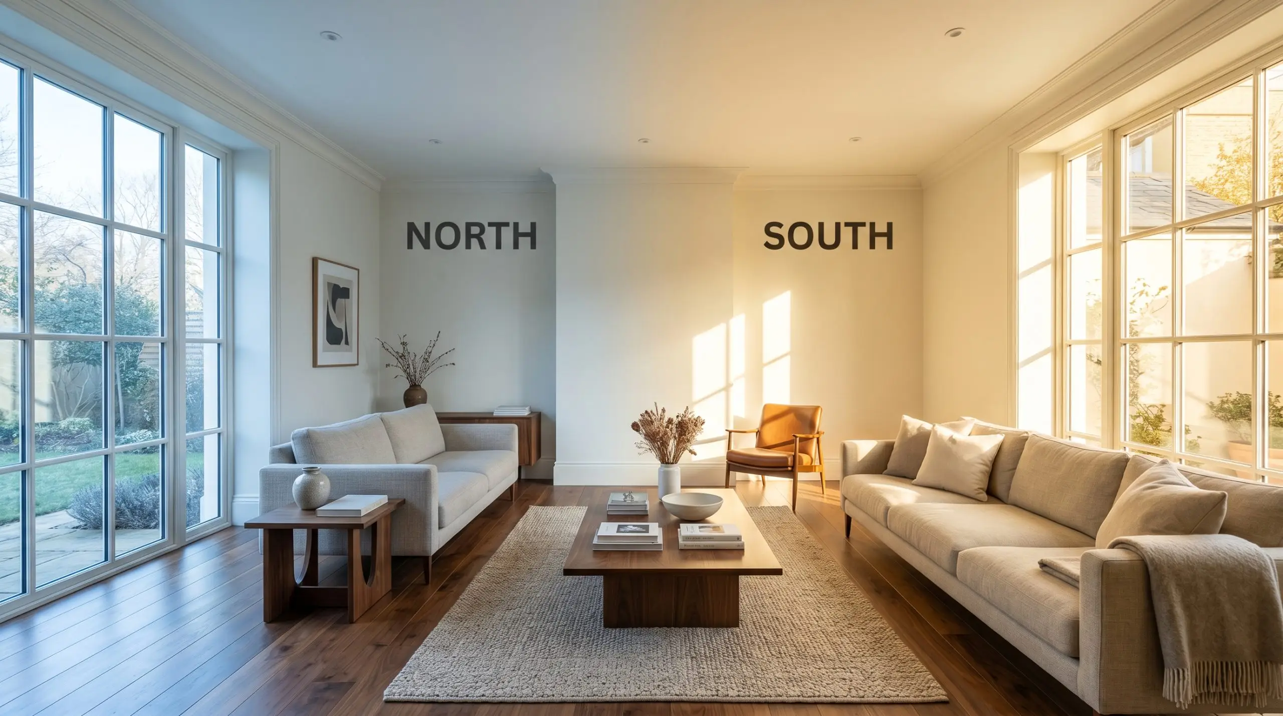
Do not evaluate this shade under cool 4000K daylight bulbs. The sharp, blue-tinted artificial light will flatten its beautiful complexity, stripping away the warmth and making it look like a sterile hospital white. Always use warm 2700K or 3000K LED bulbs to maintain its creamy, off-white elegance.
Hackrea Pro-Tip (The Lighting Warning)
Popular Room Applications
This shade brings an inherent sense of tailored comfort to a home, demanding spaces that benefit from both brightness and a touch of historic charm. It provides a cohesive energy that easily transitions between a relaxed English country aesthetic and a refined, soft-minimalist approach.
Kitchen Cabinets & Islands
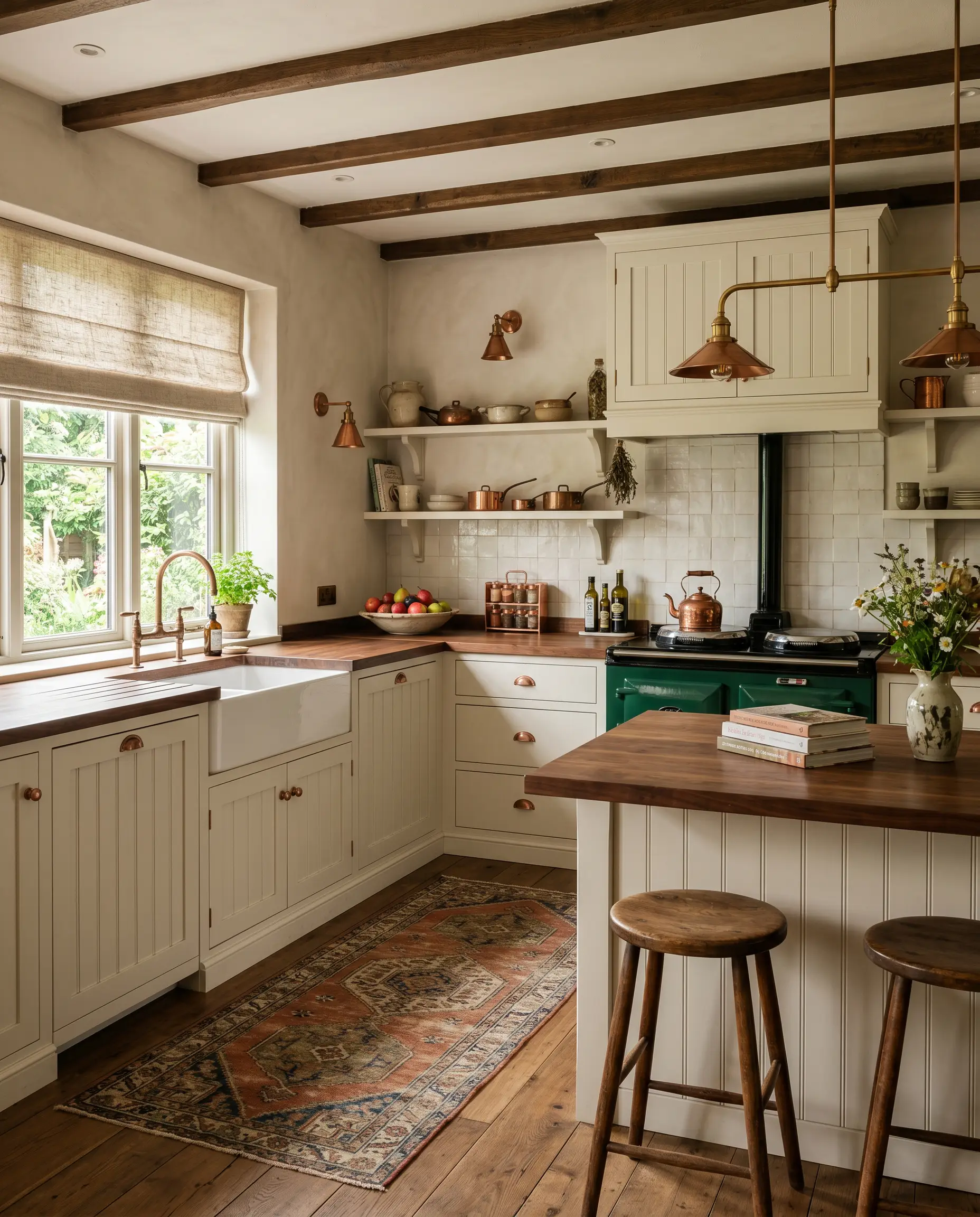
This is a brilliant choice for upper and lower cabinetry when you want a classic, timeless kitchen. It pairs beautifully with unlacquered copper fixtures and rich walnut butcher block counters, offering a softer alternative to stark modern whites. Keep the surrounding elements grounded with earthy runner rugs and woven window treatments to highlight its creamy nature.
Will Wimborne White work with your specific lighting, floor, or furniture?
Open-Concept Living Rooms
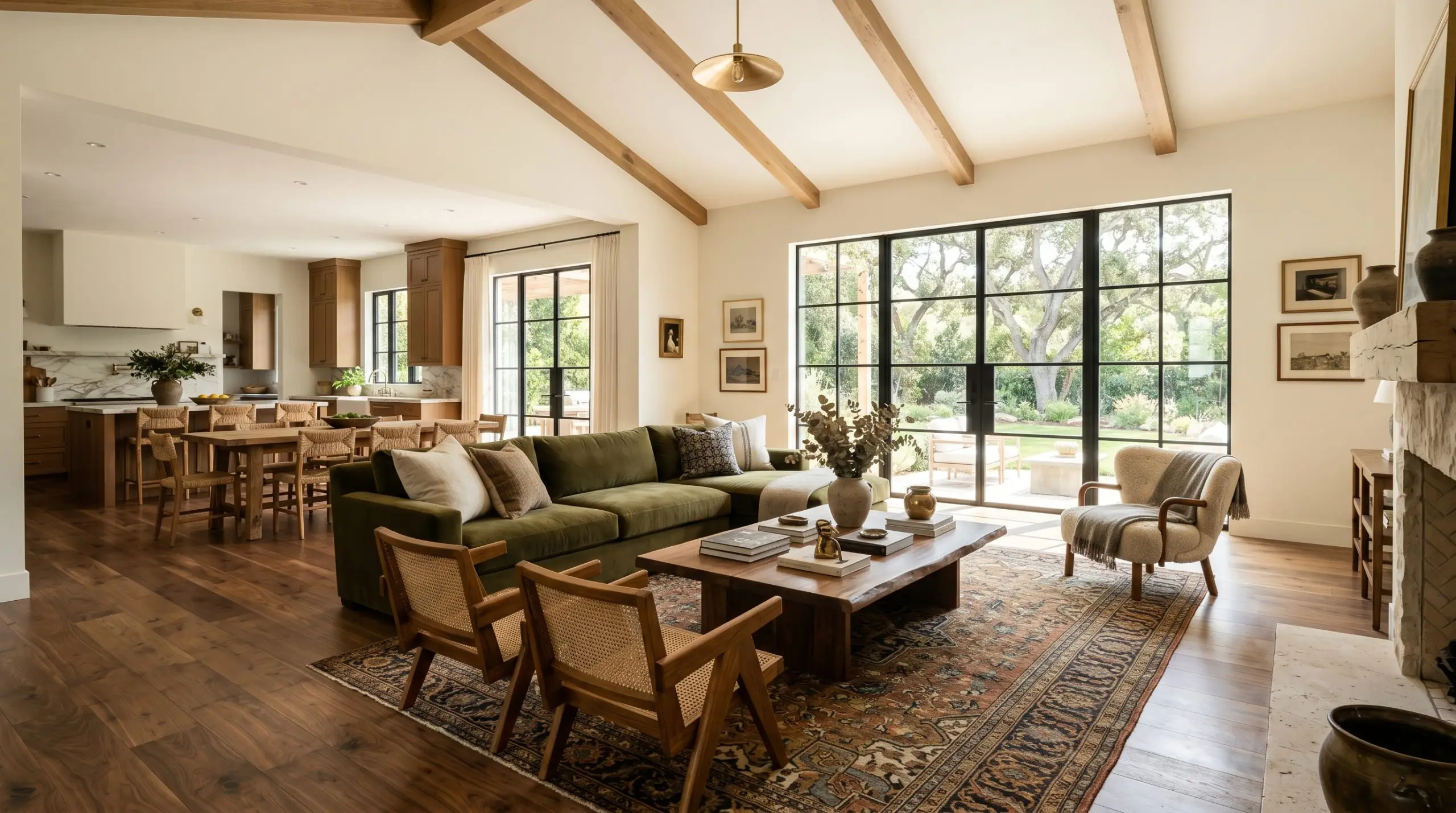
In expansive, multi-use spaces, this shade provides exceptional color massing without feeling overwhelming. It acts as a luminous canvas that effortlessly bridges the gap between different functional zones. It allows heavy, textural furniture like a deep olive velvet sofa or a vintage Persian rug to stand out vibrantly against the walls.
Master Bedrooms
This color creates an incredibly serene and restorative atmosphere for a private retreat. It wraps the room in a gentle warmth that feels cozy in the evening and uplifting in the morning. Layer the bed with heavy linen duvets and incorporate tumbled limestone bedside lamps to enhance the tactile, comforting energy.
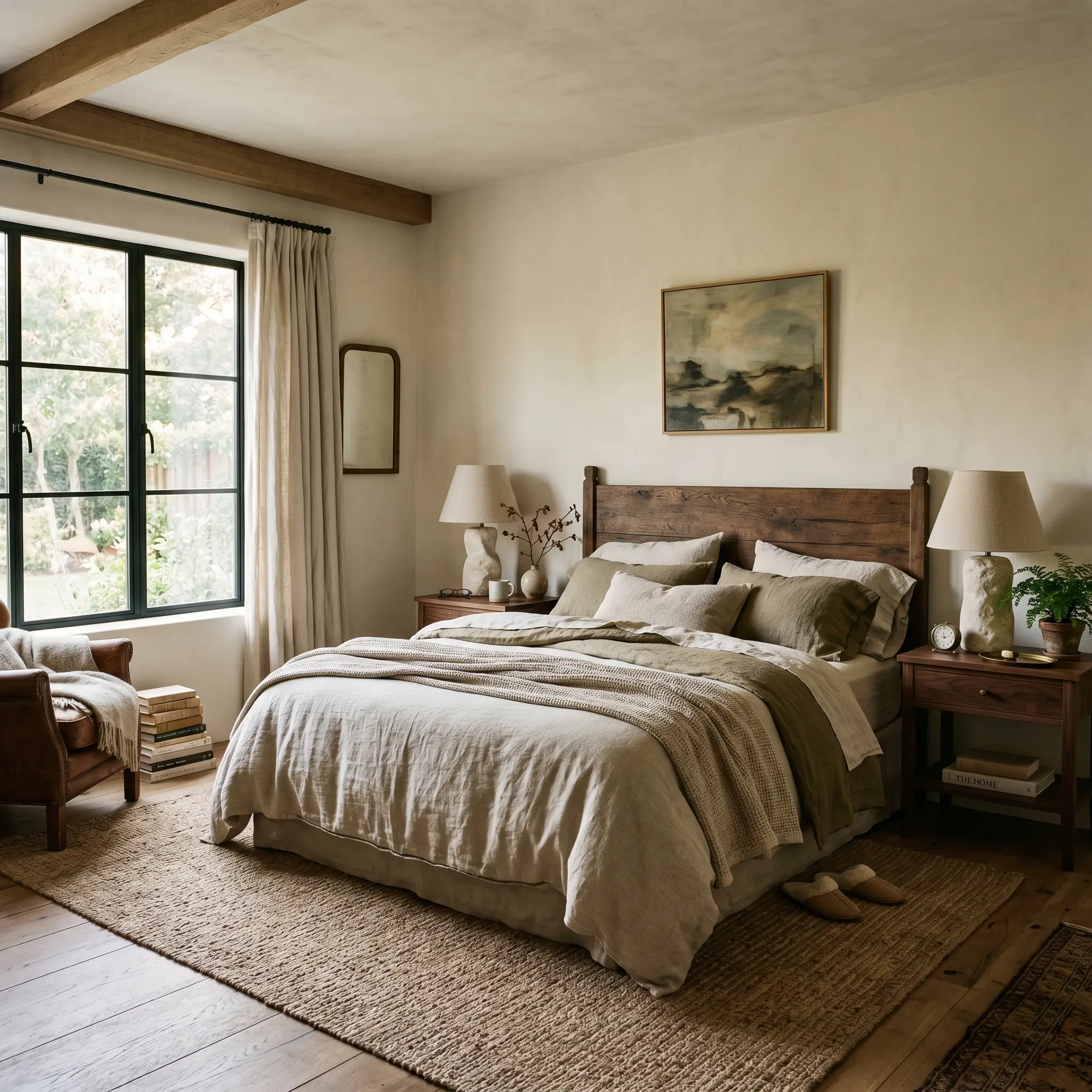
Millwork & Wainscoting
When applied to historic architectural features, this shade highlights intricate details with a soft, elegant shadow play. It is perfect for tall baseboards, crown molding, and paneled dining rooms. The slight warmth ensures the trim feels integrated into the home’s history rather than looking like a fresh, overly modern addition.
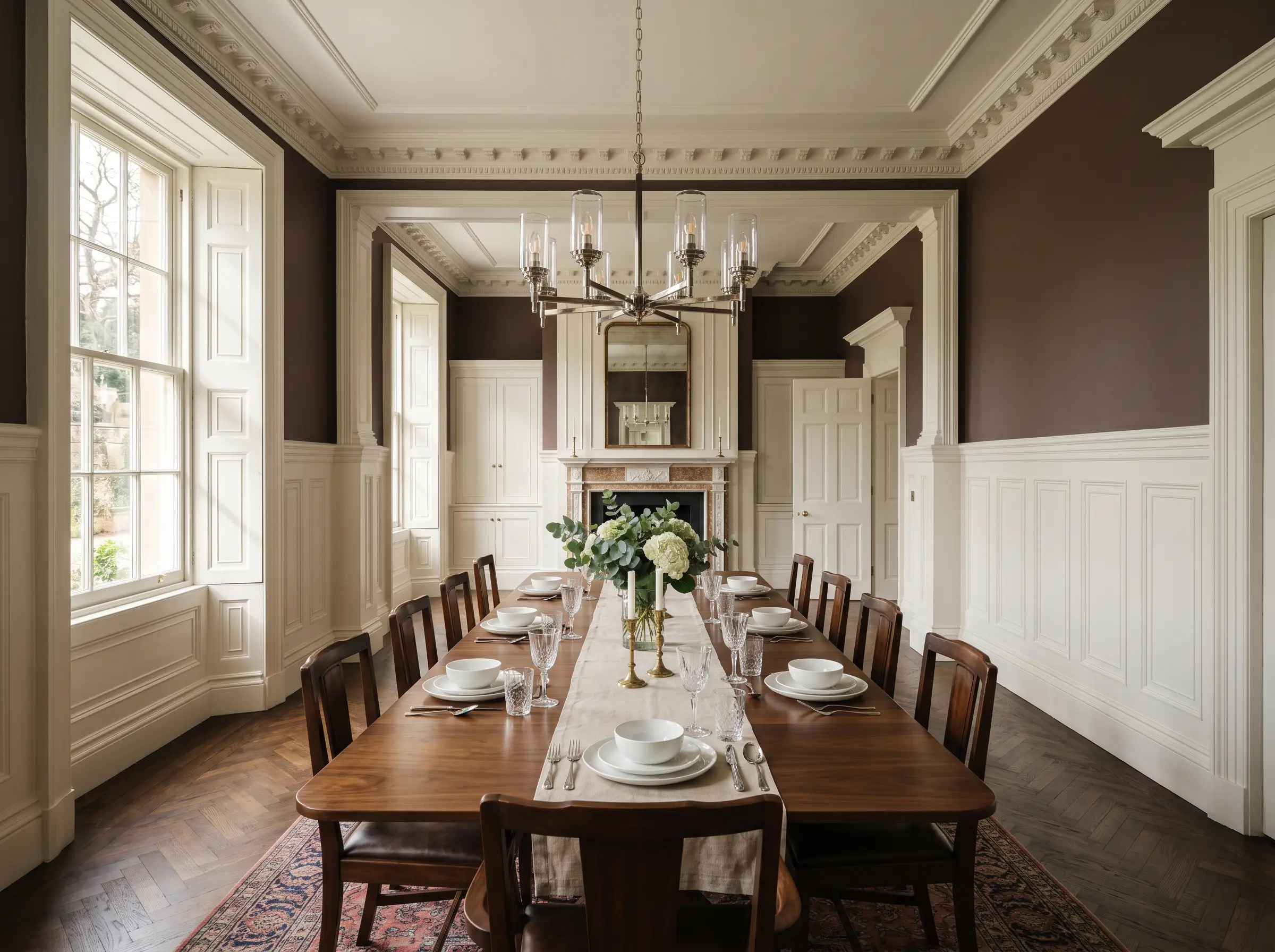
Nurseries
For a northern-facing nursery that struggles to capture natural light, this color is a perfect solution. It lifts the shadows and injects a subtle cheerfulness into the room. It serves as a beautiful, adaptable background that grows seamlessly with the child, easily accommodating both pastel accents and deeper, muted jewel tones.
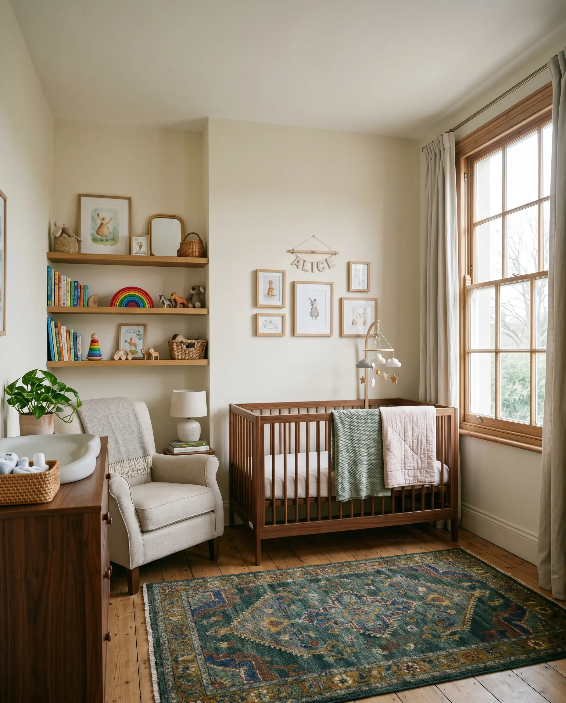
Will Wimborne White work with your specific lighting, floor, or furniture?
Creative Ways to Use Farrow & Ball Wimborne White
While standard wall applications are beautiful, the unique DNA of this paint allows for highly curated, bespoke design moments throughout the home.
A Restored Victorian Ceiling Medallion
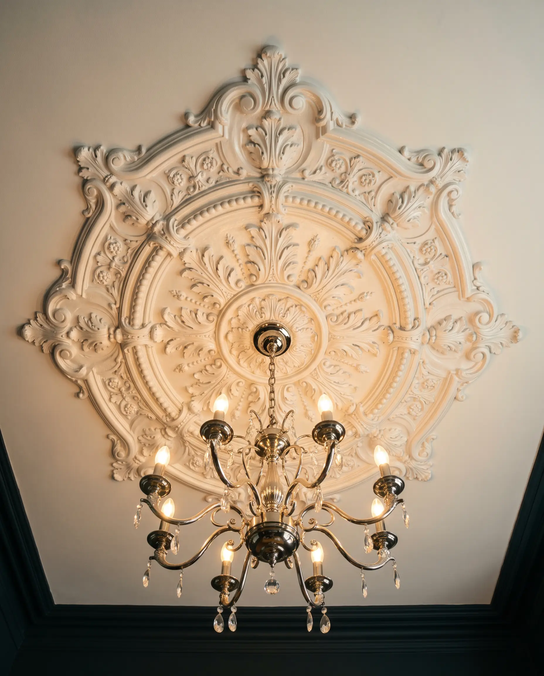
Draw the eye upward by applying this shade to a highly ornate plaster ceiling medallion in a formal dining room. The high reflectivity catches the light from a central chandelier, highlighting the intricate floral or geometric plasterwork. The subtle warmth prevents the ceiling from feeling disconnected from deeper, moodier wall colors below.
A Paneled Mudroom Locker System
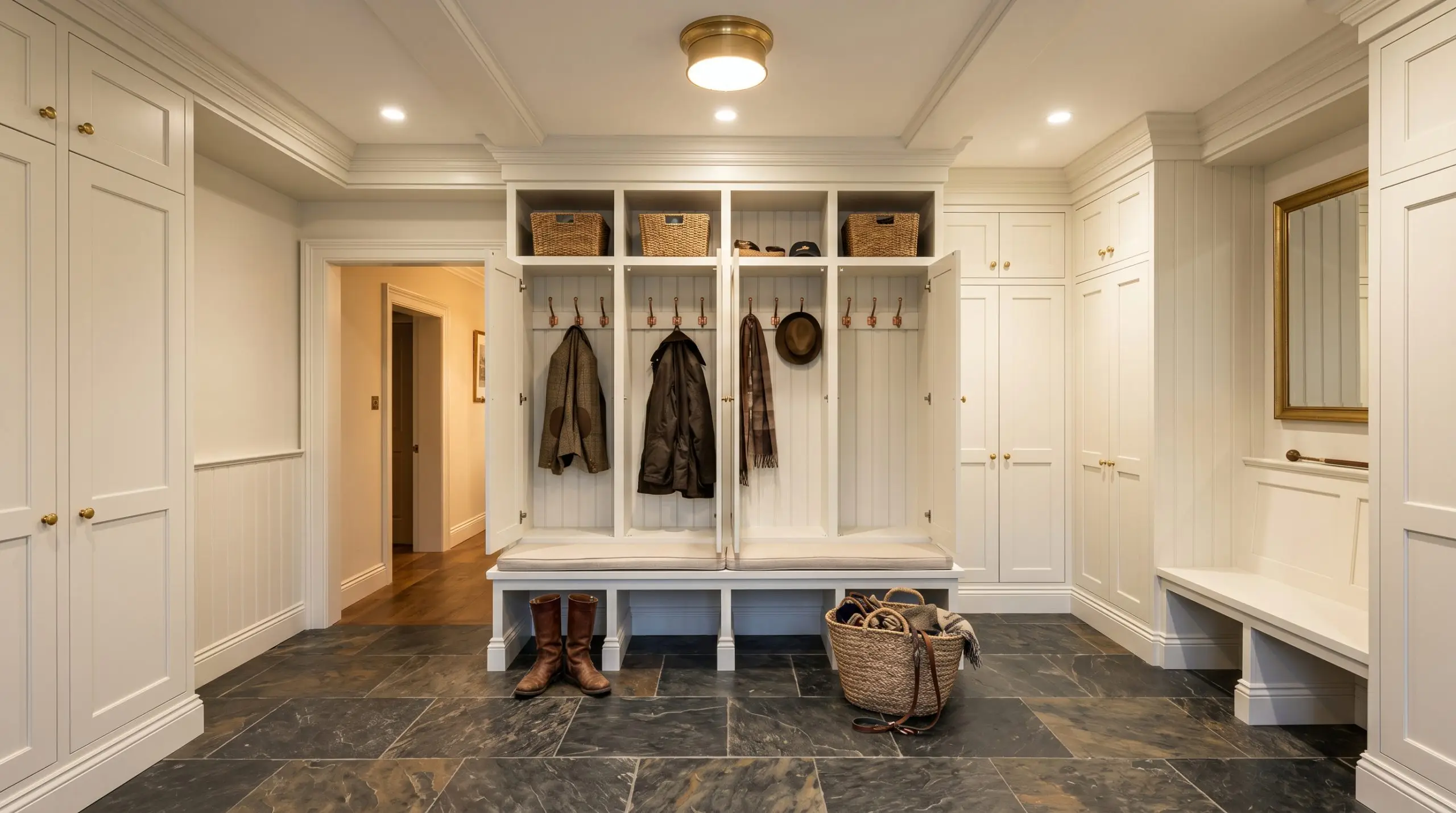
Will Wimborne White work with your specific lighting, floor, or furniture?
Transform a utilitarian entryway by painting custom, floor-to-ceiling wooden lockers in this luminous shade. It immediately brightens a typically windowless space, making the daily transition into the home feel expansive and welcoming. Pair it with a heavily veined slate floor to anchor the brightness with rugged texture.
A Color-Drenched Reading Nook
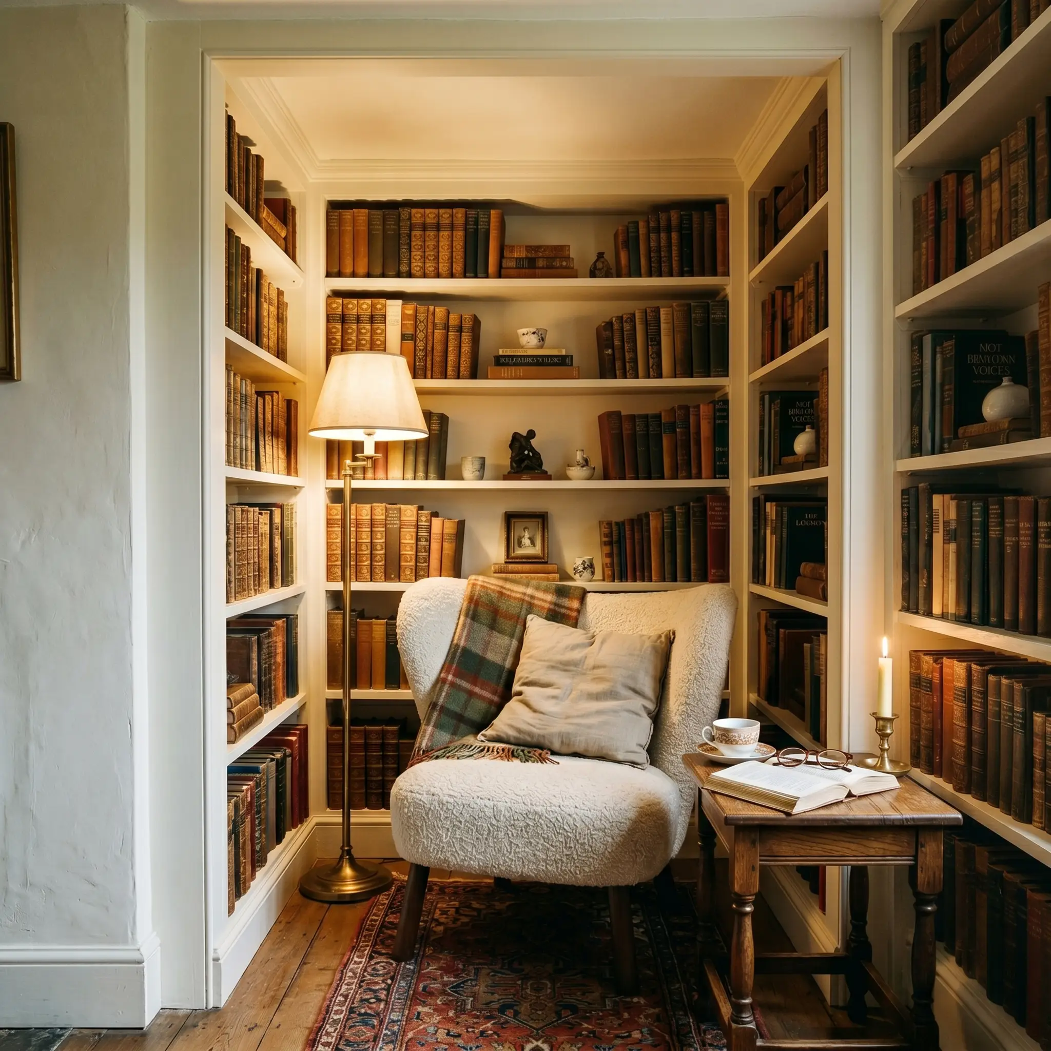
Take a small, recessed alcove and paint the walls, built-in bookshelves, and ceiling entirely in this soft off-white. This technique erases the visual boundaries of the tight space, making it feel like a cozy, glowing sanctuary. Style the shelves with antique leather-bound books and a heavily textured bouclé reading chair to maximize the sensory experience.
Coordinating Colors & Best Pairings
The key to successfully styling this shade is understanding its need for intentional contrast. It thrives when paired with elements that either crisply define its edges or ground its airy lightness with deep, earthy weight.
Trim & Architectural Borders
To make the subtle warmth of the walls truly visible, you need a crisp, clean border. Understanding how to choose the right trim color is essential for framing this shade effectively.
Hardware, Wood & Material Pairings
Coordinating Colors
Designer Mood Boards
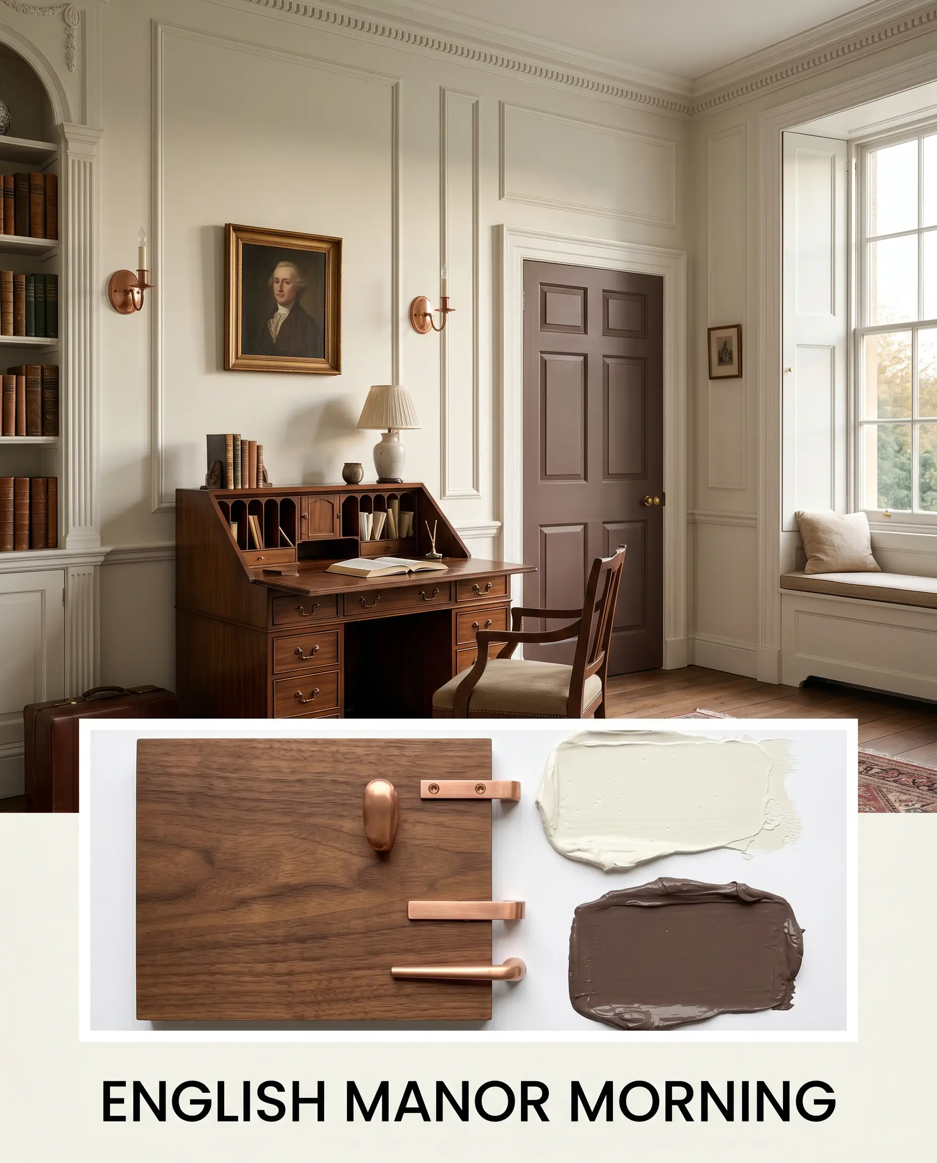
English Manor Morning
This palette captures the quiet, refined energy of a historic countryside estate at dawn. The walls provide a luminous, soft backdrop for heavy, traditional elements like a rich walnut writing desk and unlacquered copper sconces. Accents of Benjamin Moore Townsend Harbor Brown HC-64 on the interior doors add a layer of deep, grounding heritage.
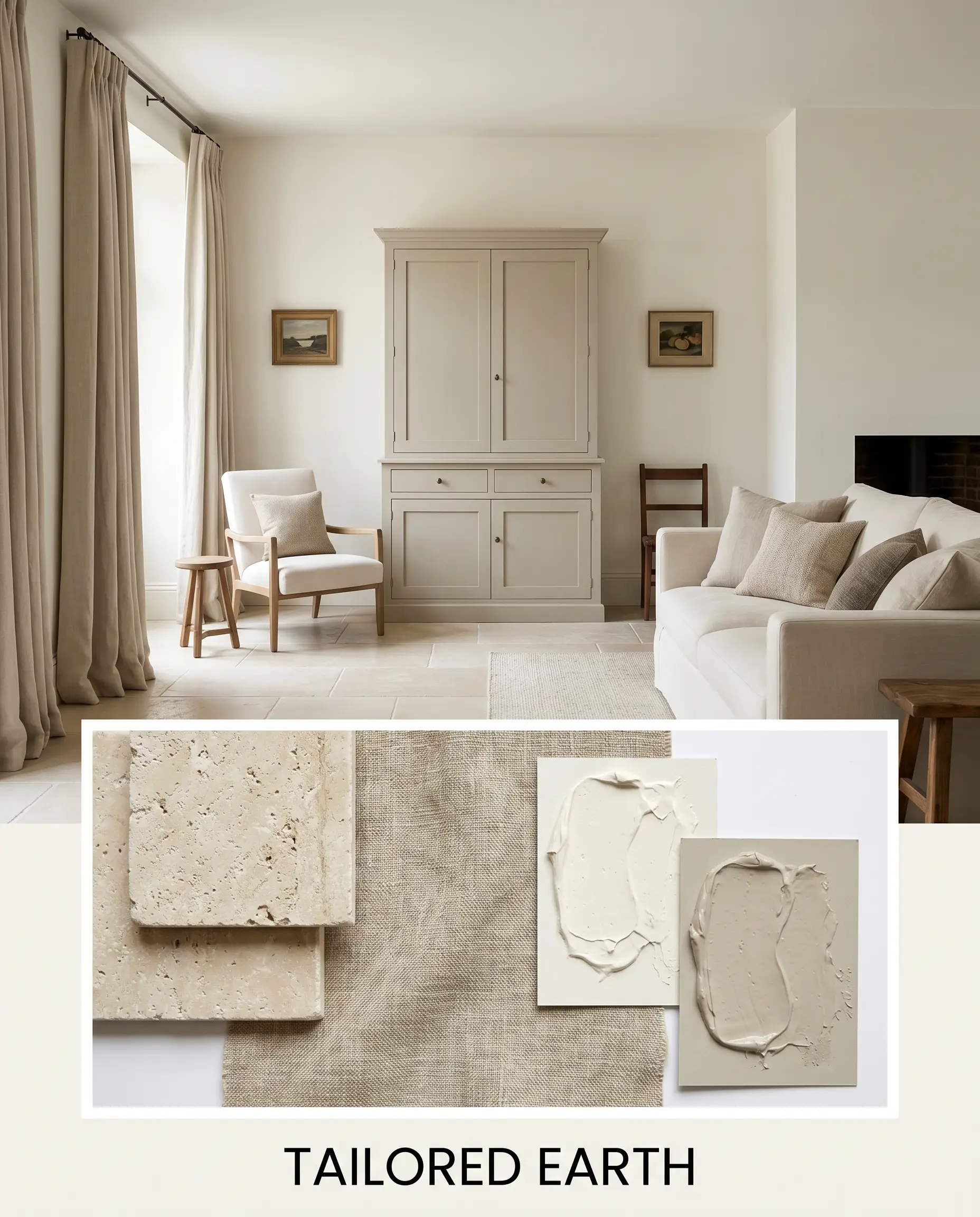
Tailored Earth
A beautifully grounded approach that relies on natural textures to elevate the bright walls. Imagine tumbled limestone floors and heavy, natural linen drapery interacting with the soft, reflective paint. A central island or focal piece painted in Farrow & Ball Drop Cloth No. 283 brings a subtle, muddy sophistication to the airy space.
Will Wimborne White work with your specific lighting, floor, or furniture?
Wimborne White No. 239 Comparisons
Selecting the perfect white often comes down to microscopic differences in how the color behaves under your specific lighting conditions.
Farrow & Ball Wimborne White No. 239 vs. Farrow & Ball All White No. 2005
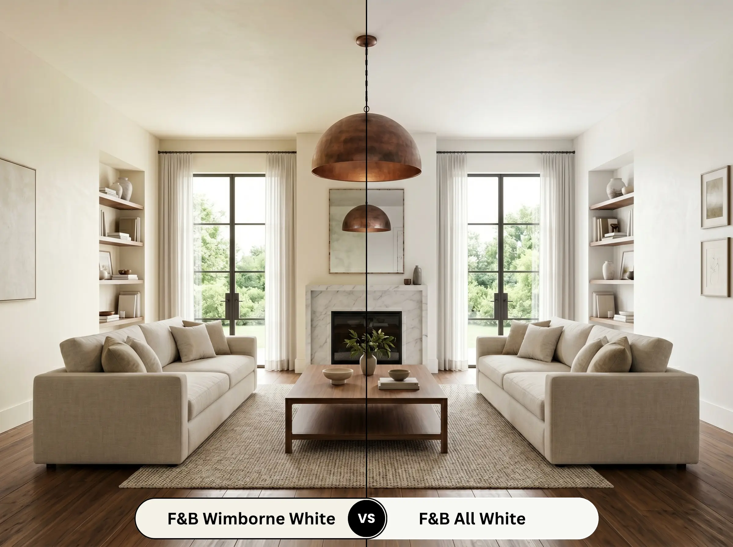
If your room gets spectacular, warm southern light, All White No. 2005 might be the better choice, as it contains no colored pigments and reads as a pure, clean white. However, in cooler or heavily shadowed spaces, All White can feel a bit stark. Wimborne White No. 239 brings in that essential touch of yellow to ensure the room remains inviting regardless of the exposure.
Farrow & Ball Wimborne White No. 239 vs. Farrow & Ball Pointing No. 2003
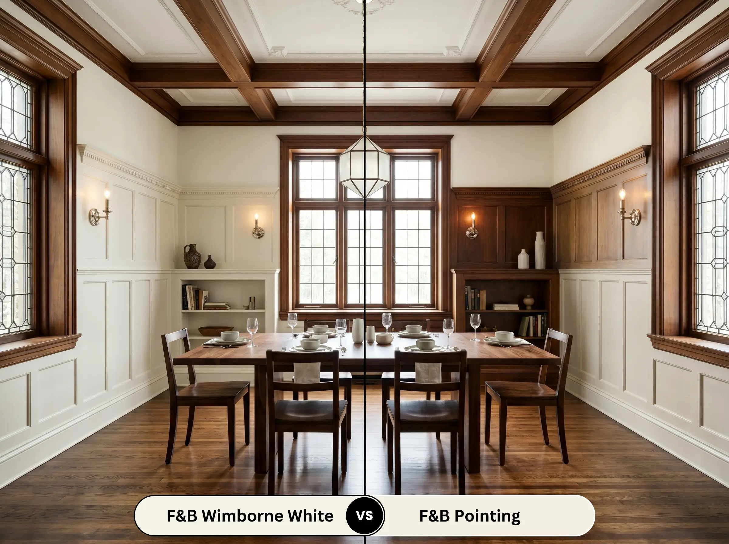
Pointing No. 2003 pushes much further into warm territory, featuring a distinct red undertone that makes it incredibly creamy and traditional. If you are aiming for a highly historic, almost aged aesthetic, Pointing is excellent. If you want a brighter, cleaner look that still retains a subtle softness, stick with No. 239.
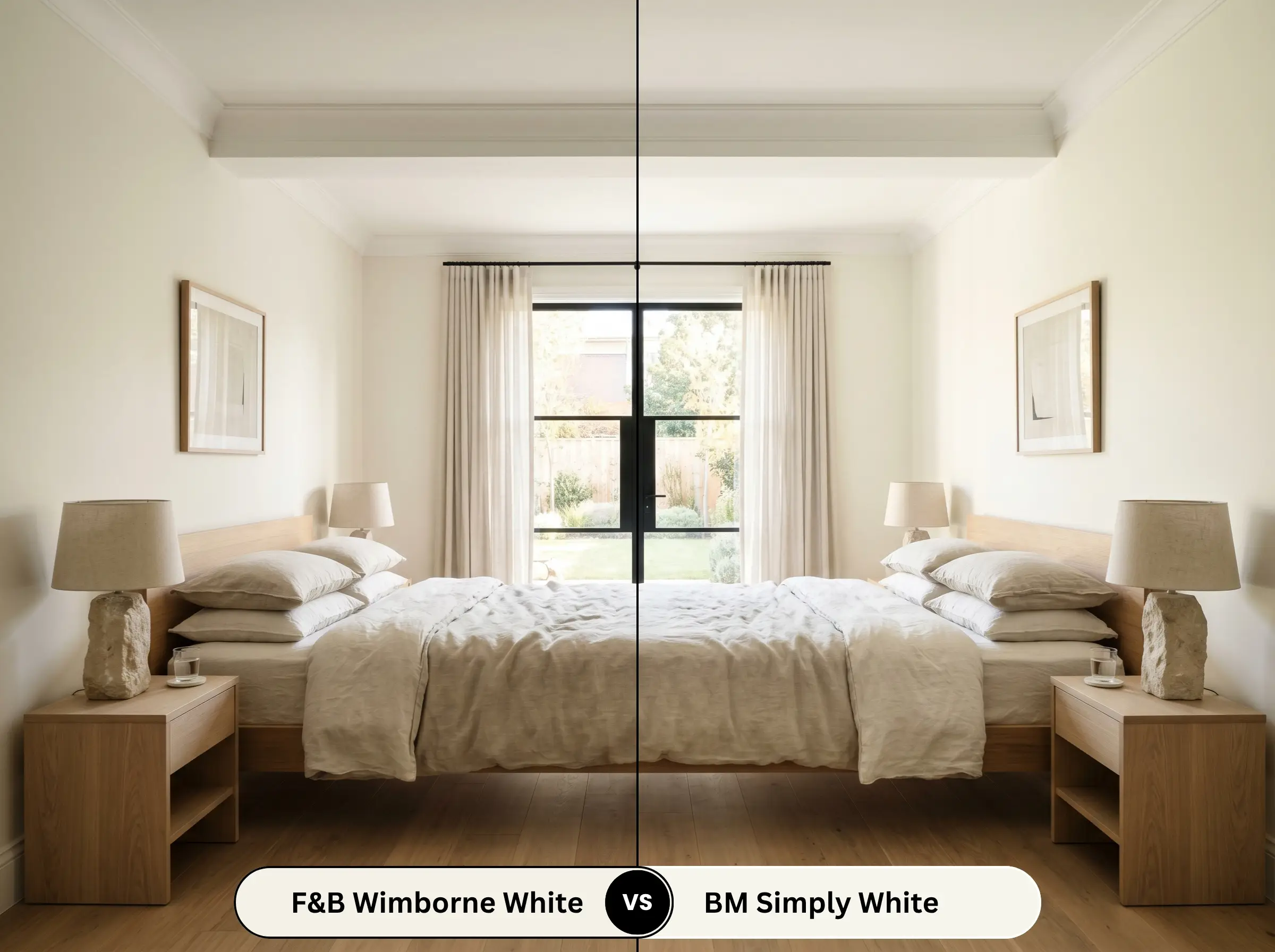
Farrow & Ball Wimborne White No. 239 vs. Benjamin Moore Simply White OC-117
Will Wimborne White work with your specific lighting, floor, or furniture?
Simply White OC-117 is wildly popular for its clean, crisp yellow undertone, but it can occasionally flash a bit bright or stark in direct sunlight. The Farrow & Ball option utilizes a more complex pigment blend, resulting in a slightly softer, more muted glow that feels a bit more relaxed and historically grounded on the wall.
Farrow & Ball Wimborne White No. 239 vs. Sherwin-Williams Greek Villa SW 7551
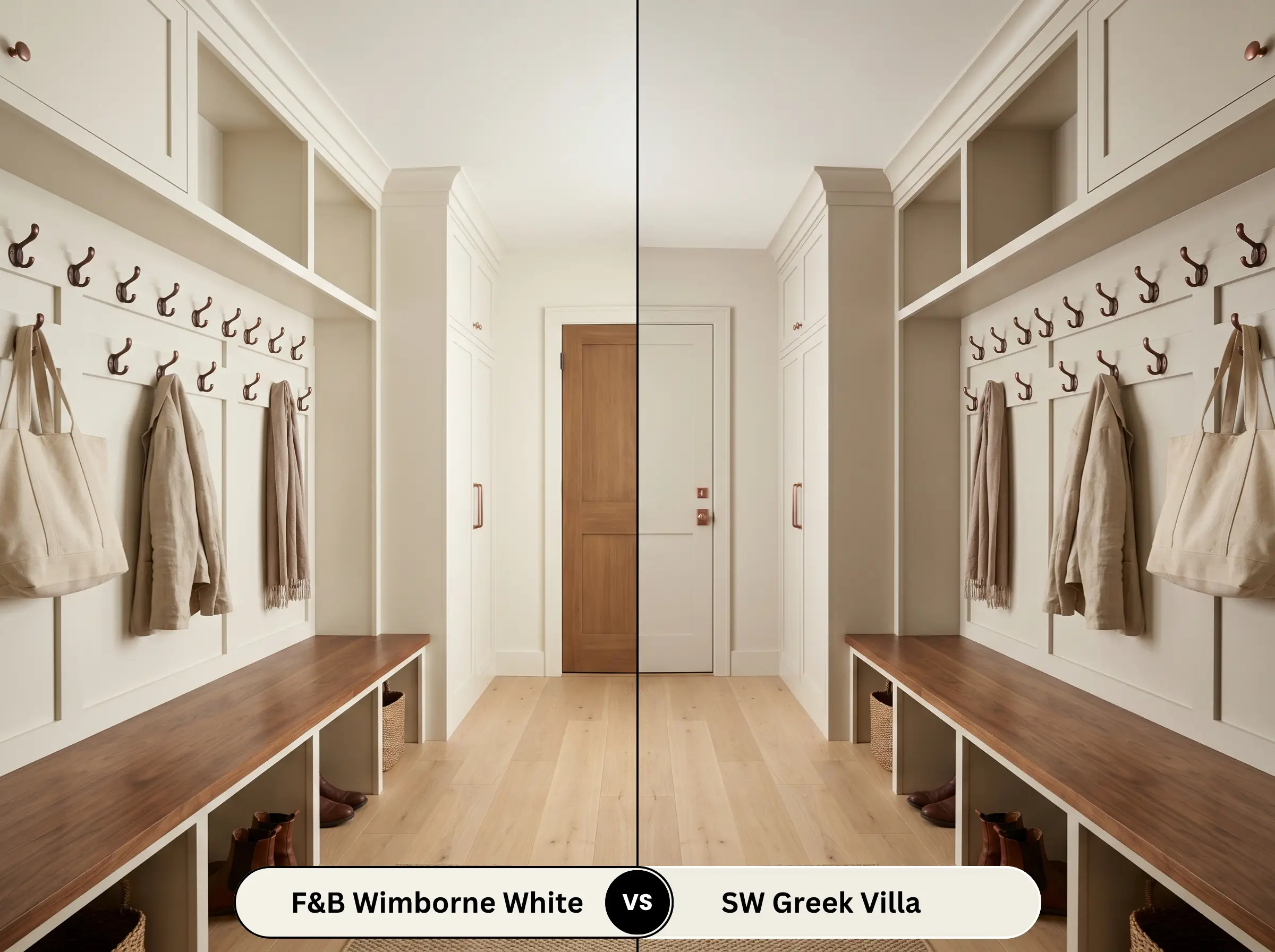
Greek Villa SW 7551 is a beautiful, warm off-white, but it carries a slightly heavier, beige-leaning depth. If you need a color that actively lifts the shadows and bounces maximum light around a dim room, No. 239 is significantly more reflective and will achieve that airy feel much more successfully.
Similar Colors & Brand Equivalents
If you are looking for a slight variation in depth or need to match this aesthetic using a different manufacturer, these alternatives provide excellent starting points.
Farrow & Ball Alternatives
Cross-Brand Matches
Practical Application & DIY Advice
To achieve a premium, flawless result, you must pair this beautiful color with the correct finishes and application techniques.
The Dynamic Sheen Guide
Primer Strategy
Because this is a highly reflective, bright color, achieving full opacity requires a high-quality white primer. If you are painting over raw wood or historic trim, you must use a stain-blocking primer first to prevent natural wood tannins from bleeding through and ruining the crisp finish.
When using the ultra-matte Estate Emulsion finish, you must maintain a wet edge while rolling. If you let sections dry and try to roll back over them, you risk “flashing”—leaving visible, uneven streaks across the wall that ruin the seamless, chalky aesthetic.
Hackrea Design Secret (The Application Warning)
Coverage & Success Tips
Expect to apply a minimum of two full coats over a primed surface to achieve the true, rich complexity of the pigments. Take your time during application, as touching up ultra-matte finishes later can sometimes leave slight variations in texture.
Frequently Asked Questions
Because of its high light absorption and reflective nature, this shade will easily pick up the colors around it. If you have a large red brick patio directly outside a window, the intense natural light bouncing off the brick can cast a slight pinkish hue onto these soft white walls.
While the ultra-matte finish is visually stunning, it is inherently more delicate than standard paints. For a busy hallway or a home with active pets, we highly recommend upgrading to the brand’s Modern Emulsion finish, which provides the same beautiful color but adds essential wipeable durability.
Absolutely, and it is a brilliant strategy. By wrapping the entire windowless space in this highly reflective shade, you blur the sharp architectural lines, making the small powder room feel significantly larger and softly illuminated by the vanity lighting.
This requires careful testing in your specific kitchen lighting. Calacatta marble often features crisp, cool gray veining and a bright white background, which can sometimes make the warm yellow undertones of the paint look slightly dingy or aged in comparison.
Final Verdict & Expert Warnings
Farrow & Ball Wimborne White No. 239 is an exceptional, highly versatile paint that effortlessly bridges the gap between crisp modernity and soulful heritage. It is the perfect choice for homeowners who want a bright, airy space but absolutely refuse to live in a room that feels cold, sterile, or clinical.
Its brilliant light reflectance and subtle warmth make it an ideal foundational layer for transitional living rooms, classic kitchens, and elegant historic renovations.
This warm off-white struggles when forced to compete with stark, cool-toned elements like icy blue-gray glass tiles, heavy chrome fixtures, or cool-toned Carrara marble floors. When paired with these chilly materials, the paint’s beautiful biscuit nuance can suddenly read as yellowed or unclean. To guarantee success, always anchor this shade with warm metals, rich woods, and earthy, tactile textiles that celebrate its inherent, glowing warmth.
Clash Warning (Hard Finishes)
Room Compatibility & Clashes Diagnoses
Hackrea's reports evaluating the compatibility of Wimborne White in real rooms.No compatibility tests for Wimborne White yet.
Be the first to see how this color reacts to your space. Run a free architectural diagnostic now.
Closest Cross-Brand Equivalents
The absolute closest scientific color matches for Wimborne White across top paint brands.