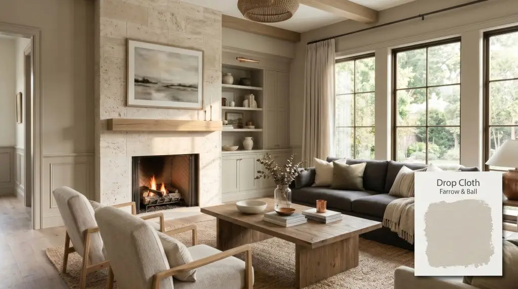
Farrow & Ball Drop Cloth (No. 283) is a sophisticated mid-grey beige, often referred to as a warm greige or taupe. With an LRV of 51.53, it features subtle green-yellow undertones that shift beautifully depending on the lighting, making it a highly versatile, grounded neutral.
Will Drop Cloth clash with your room?
Paint Technical Profile
| Color ID / SKU | No. 283 |
| HEX Code | #c5bdac |
| Light Reflectance (LRV) | 51.53 |
| Use | Interior, Exterior |
| Best Exposures | South-facing, West-facing, or well-lit North-facing |
| Best For | Living rooms, cozy bedrooms, kitchen cabinets, exterior trim |
Farrow & Ball Drop Cloth: The Ultimate Guide to This Grounding Historic Greige
The name might conjure images of a crumpled, paint-splattered canvas on a construction site, but Farrow & Ball has engineered this exact shade into one of the most sophisticated, high-end foundations on the market. It is a brilliant chameleon that expertly walks the line between an earthy, grounded tone and a refined architectural layer. Many homeowners hesitate before committing, terrified this shade will read as a muddy, dingy plaster or flash an unexpected sickly hue in dim corners. In reality, when properly applied and paired with the right lighting, this historic neutral wraps a room in quiet, confident luxury.
Is Farrow & Ball Drop Cloth Warm or Cool? Undertones & LRV
When evaluating whether Farrow & Ball Drop Cloth No. 283 leans warm or cool, the answer is decisively warm. It is anchored by a rich, earthy base that radiates a subtle, inviting heat without ever tipping into a harsh yellow or orange territory. This color is a foundational pillar within the brand’s legendary Timeless Neutrals group, offering a profound sense of history and permanence.
At an LRV (Light Reflectance Value) of 51.53, this paint sits perfectly in the middle of the light reflectance scale. It absorbs enough light to feel incredibly substantial and intentional on your walls, avoiding the flimsy look of lighter off-whites. Yet, it reflects just enough illumination to prevent a hallway or closed-off room from feeling heavy or cavernous.
Lighting Effects & The Chameleon Factor
The hidden green-yellow undertone is exactly what prevents this paint from falling flat or looking like dirty plaster, but it also means the color requires strategic lighting to thrive. This inherent color shifting is a feature, not a flaw. You must understand how your directional lighting will pull these hidden notes forward to avoid any unexpected surprises.
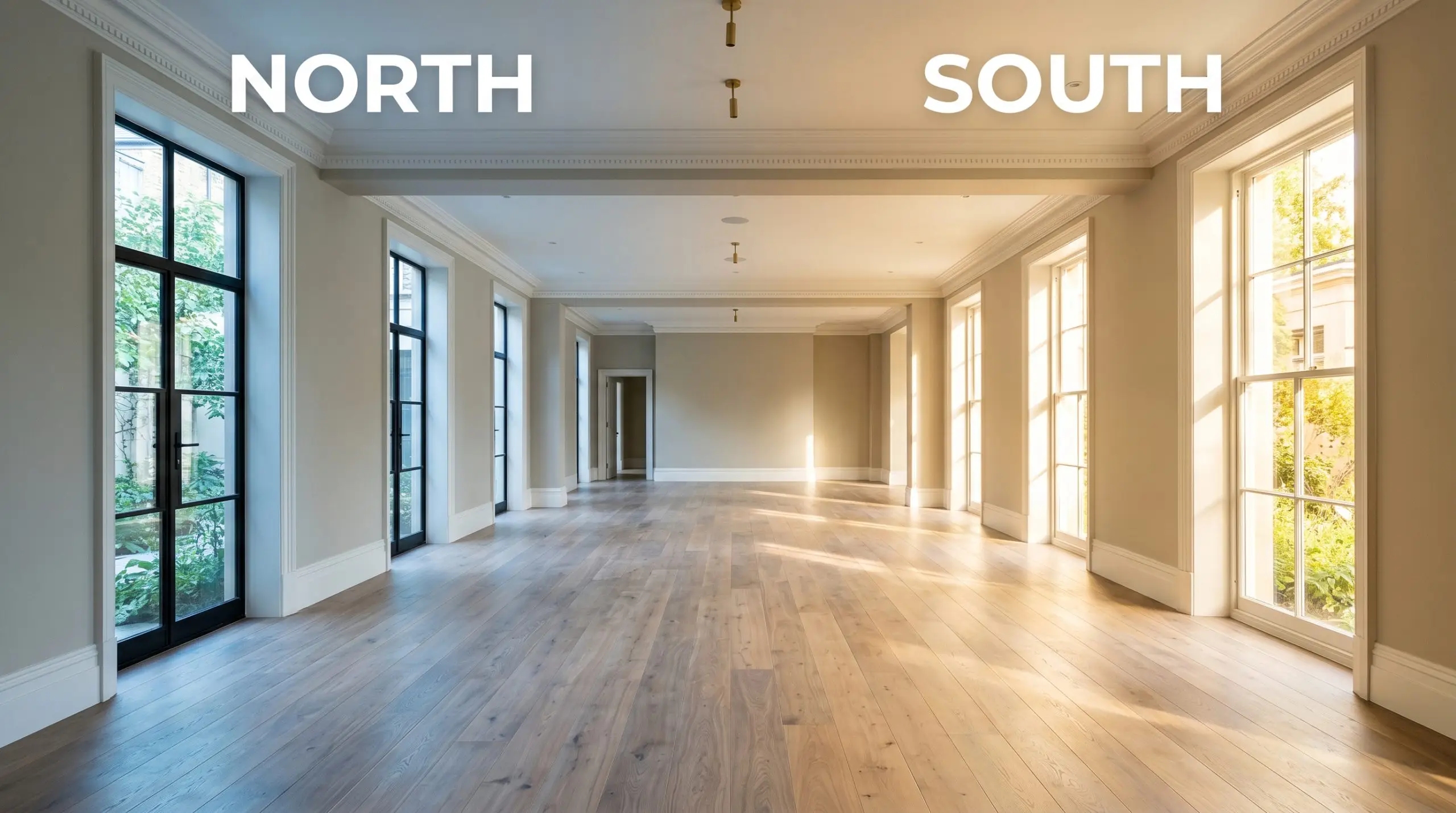
If you are painting a room with heavy tree coverage outside the windows, the filtered light will aggressively pull the green undertones forward. Counteract this by relying on warm ambient floor lamps to push the color back toward a balanced greige.
Hackrea Pro-Tip (Lighting Strategy)
Elevating Everyday Spaces with Drop Cloth
This mid grey beige demands to be taken seriously as an architectural element. It brings a cohesive, grounded energy to a home, bridging the gap between stark modernism and overly ornate traditionalism. It provides a stunning, high-quality backdrop that elevates both the everyday items you already own and the premium pieces you invest in.
Living Spaces & Gathering Rooms
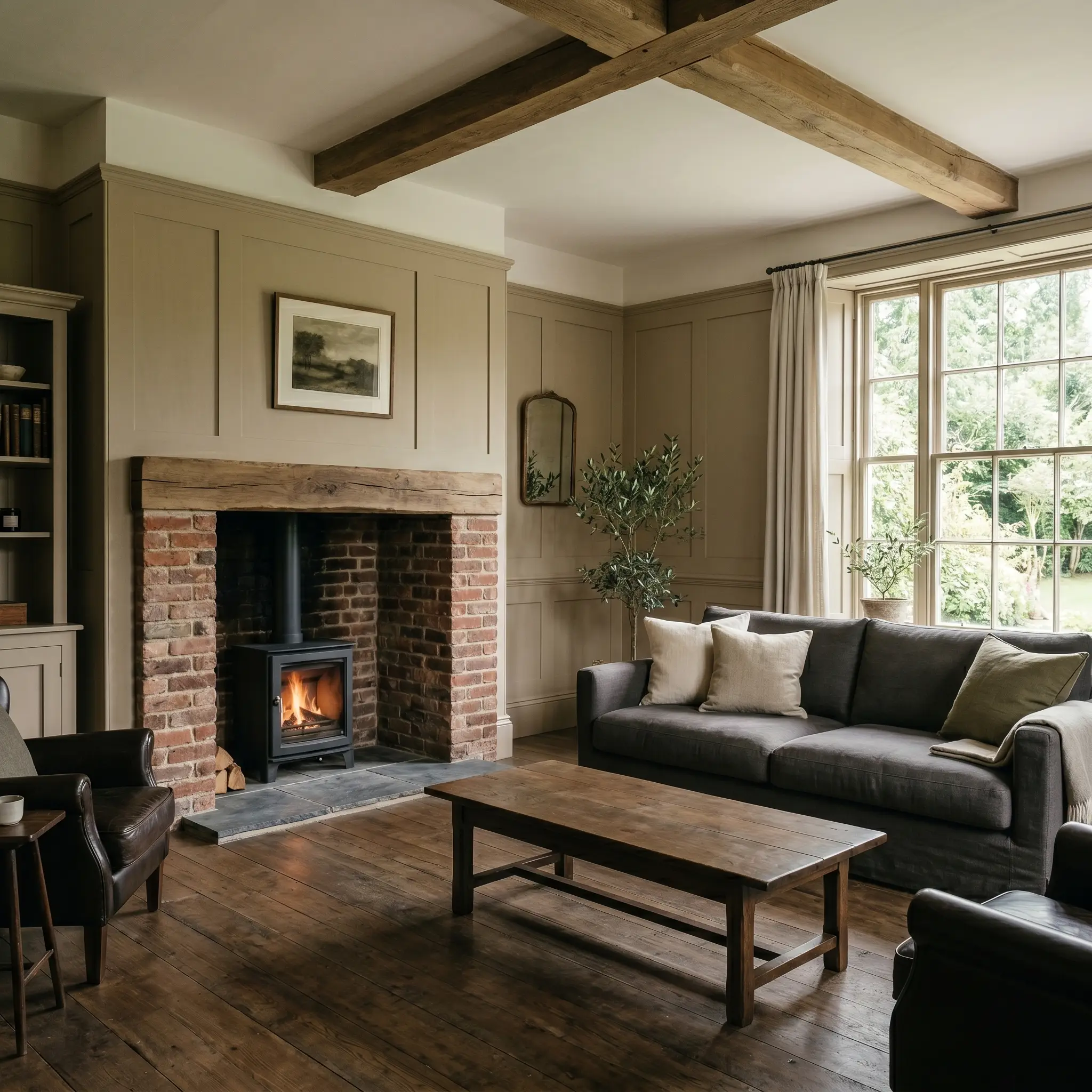
This shade is a brilliant choice for main living areas, especially those featuring rich architectural details like traditional wainscoting, crown molding, or tall baseboards. It provides a stunning backdrop for a standard charcoal linen sofa, but also grounds deeply saturated, jewel-toned accent chairs beautifully. If you have a brick fireplace, the earthy warmth of the paint perfectly complements the masonry, creating a highly cohesive, intentional gathering space.
Culinary Environments
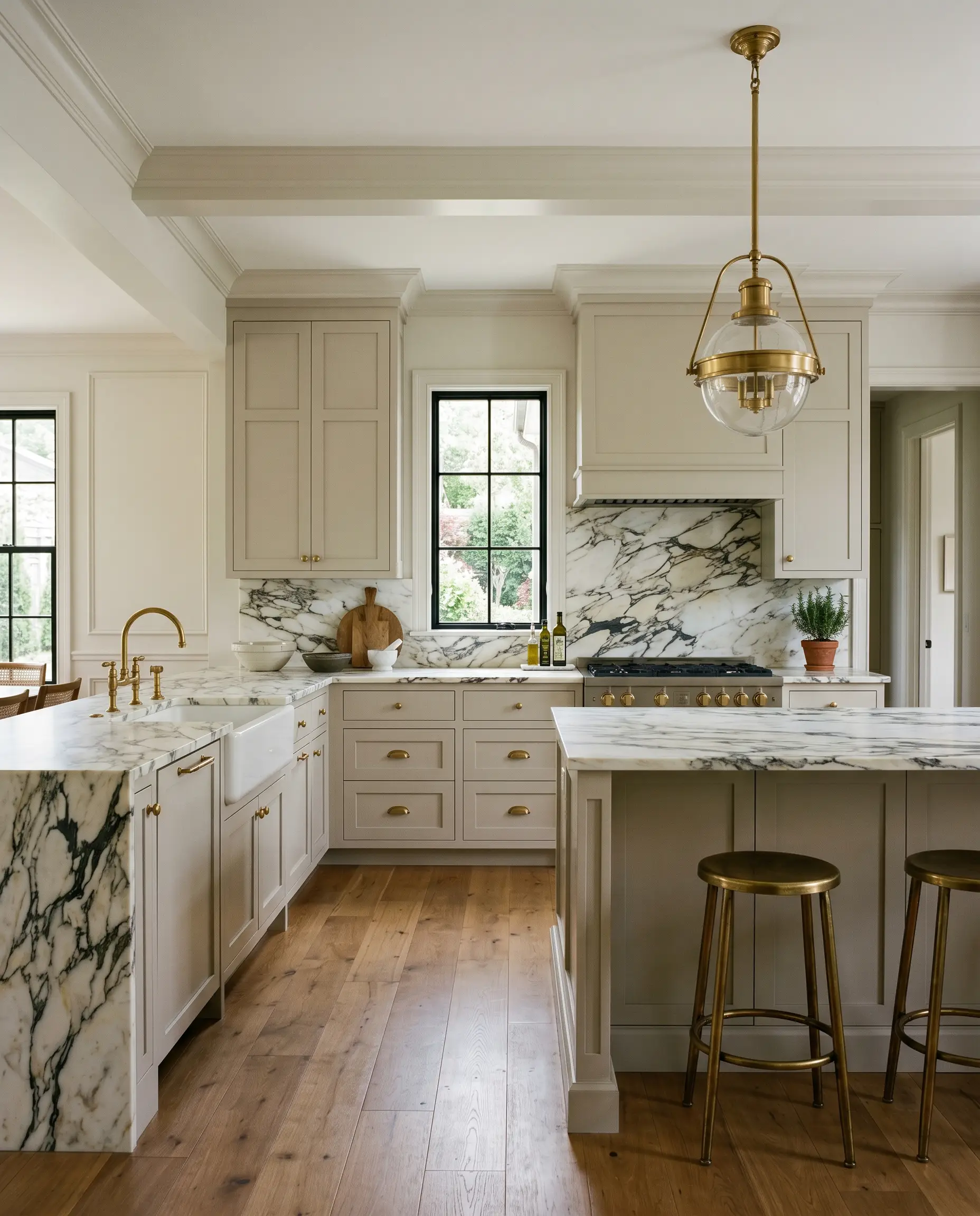
Using this color on kitchen cabinetry instantly upgrades the heart of the home, offering a softer, more inviting alternative to stark white or trendy navy. It pairs flawlessly with heavily veined marble countertops, allowing the stone to remain the focal point while warming up the perimeter. For a highly curated look, paint both the upper and lower cabinets in this shade, relying on unlacquered hardware to bounce light around the room and add a layer of everyday luxury.
Will Drop Cloth work with your specific lighting, floor, or furniture?
Restful Retreats
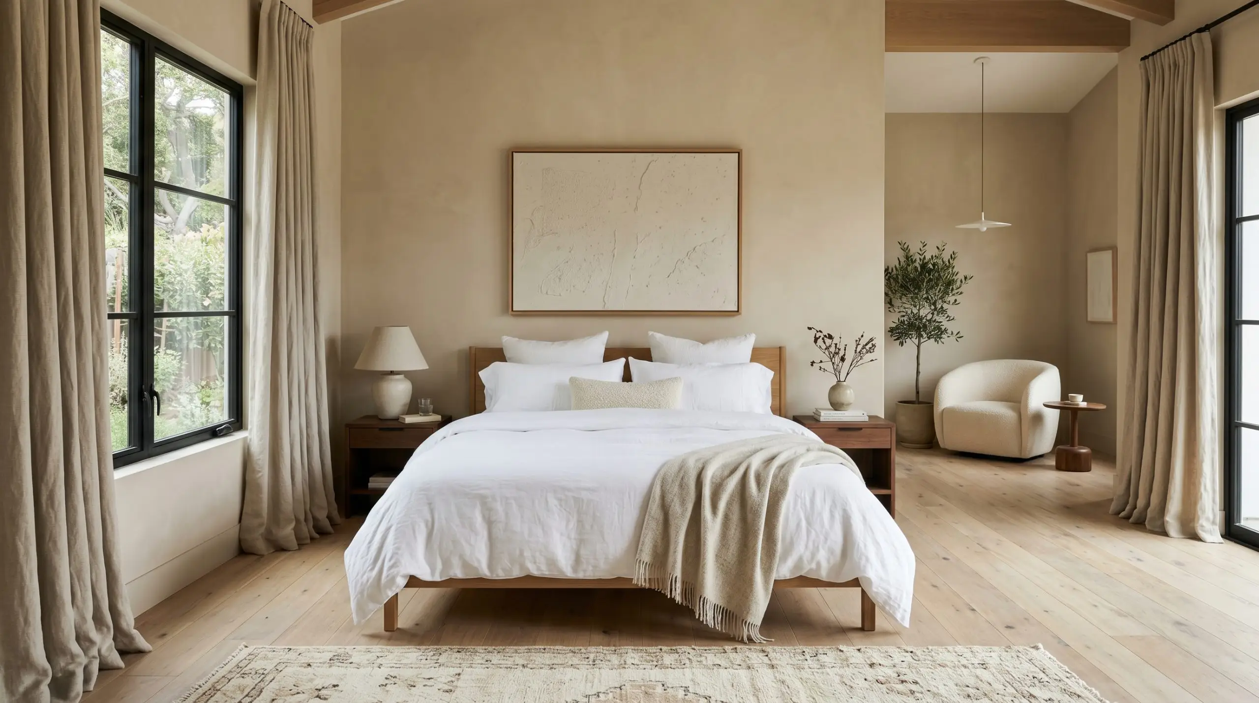
In a bedroom, this paint acts as a visual anchor, wrapping the space in a quiet, restorative warmth. It supports a wide variety of window treatments, looking equally at home behind heavy, pooling linen drapes or crisp, tailored Roman shades. To keep the room feeling elevated rather than heavy, pair the walls with crisp white bedding and layer in textured, tonal throw pillows to build a serene, layered environment.
Exterior Facades & Trims
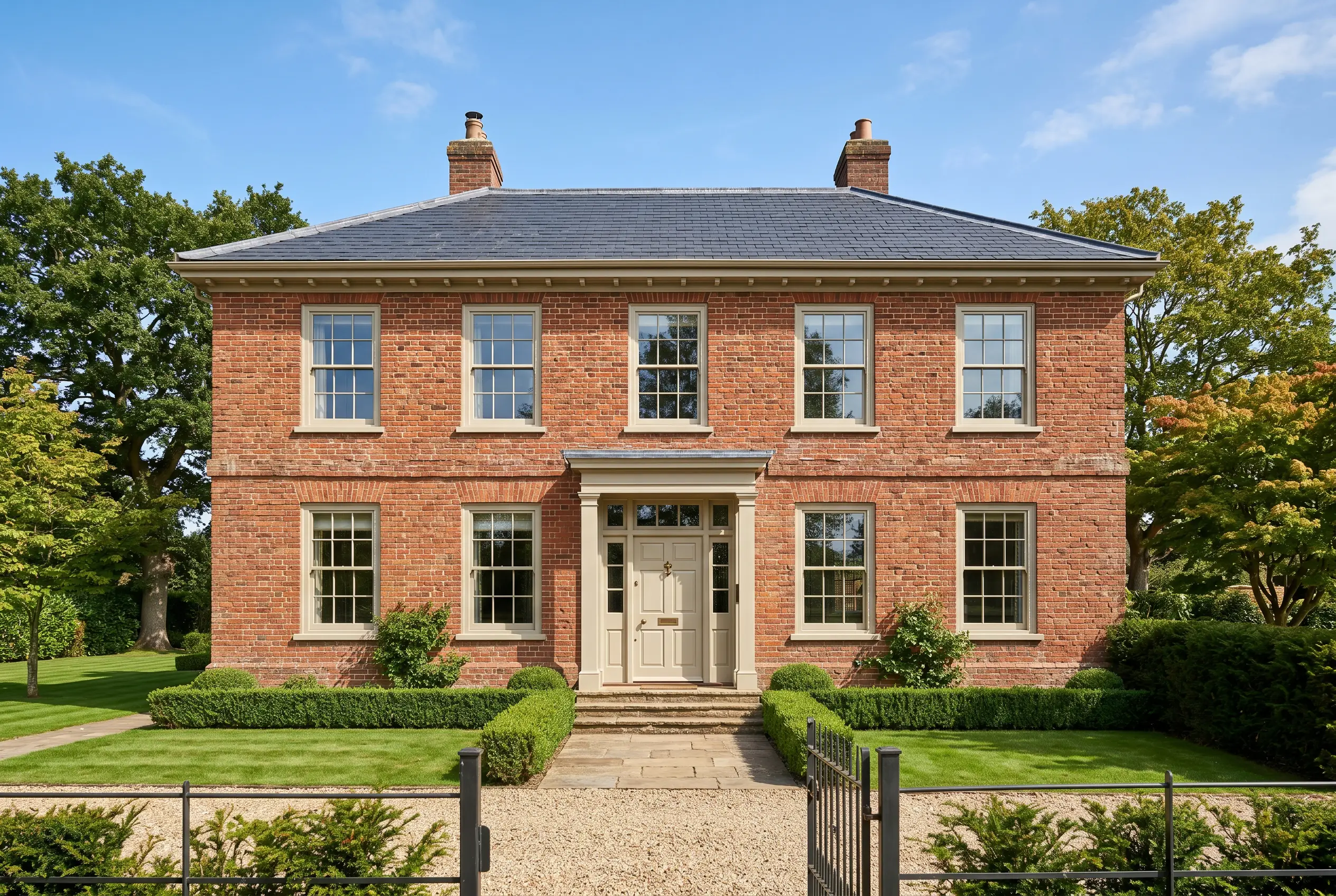
When taken outside, the intense wash of direct sunlight will significantly lighten the perceived depth of the color. It serves as a brilliant exterior trim and fascia color, particularly on historic brick homes or properties with heavy stone accents. The subtle green-yellow undertones harmonize perfectly with natural landscaping, creating a seamless transition between the architecture and the outdoors.
Will Drop Cloth work with your specific lighting, floor, or furniture?
Unexpected Architectural Applications
Stepping away from standard four-wall applications allows you to truly harness the structural power of this shade. By manipulating where and how the color is applied, you can drastically alter the visual boundaries and overall atmosphere of your home.
The Monochromatic Entry Vestibule
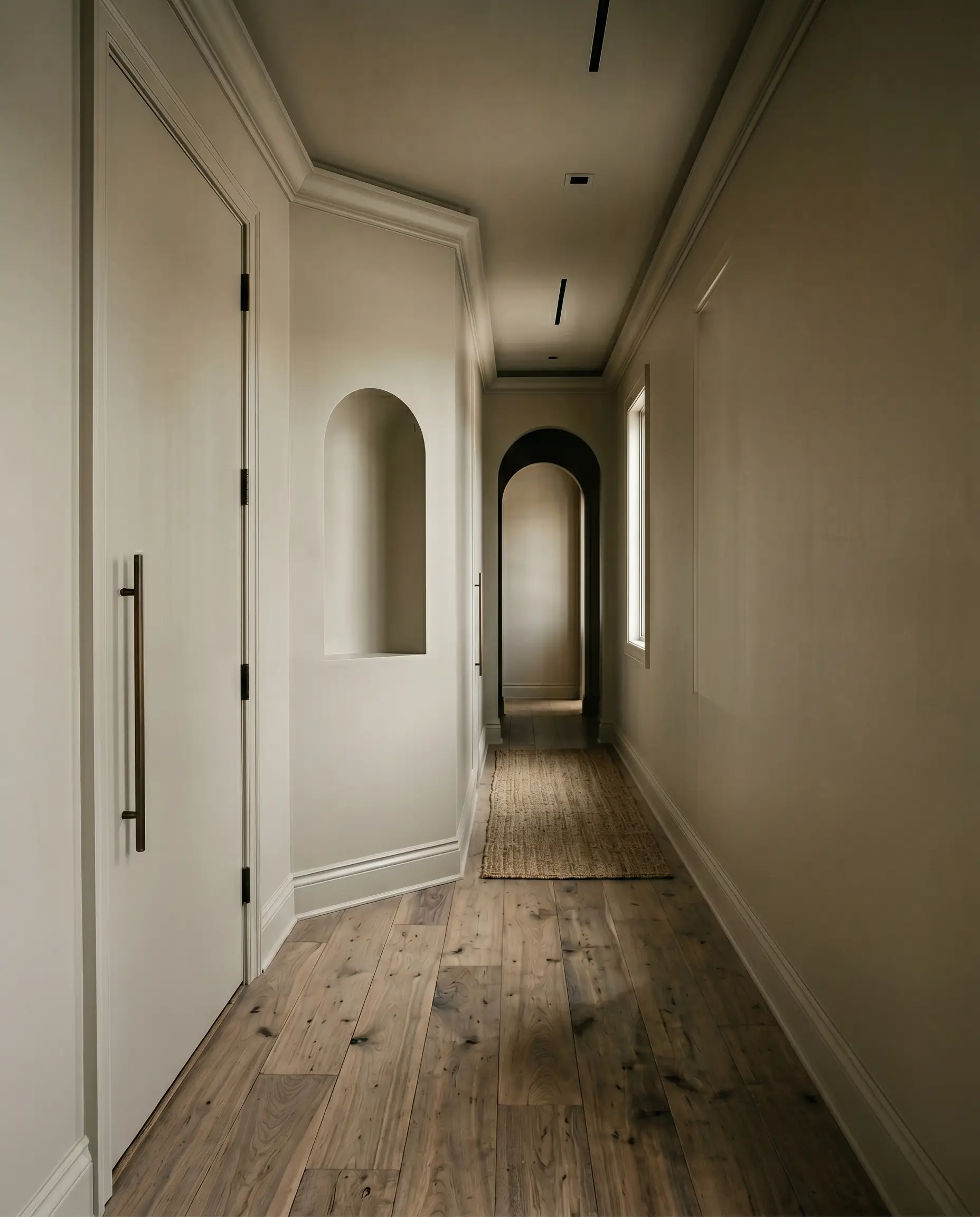
Transform a cramped or overlooked entryway by painting the walls, trim, doors, and ceiling entirely in this grounding shade. This color-drenching technique erases the harsh visual boundaries of the room, making the small space feel intentionally moody and incredibly high-end. The enveloping warmth immediately sets a sophisticated, welcoming tone the moment guests step through the front door.
A Moody Botanical Conservatory
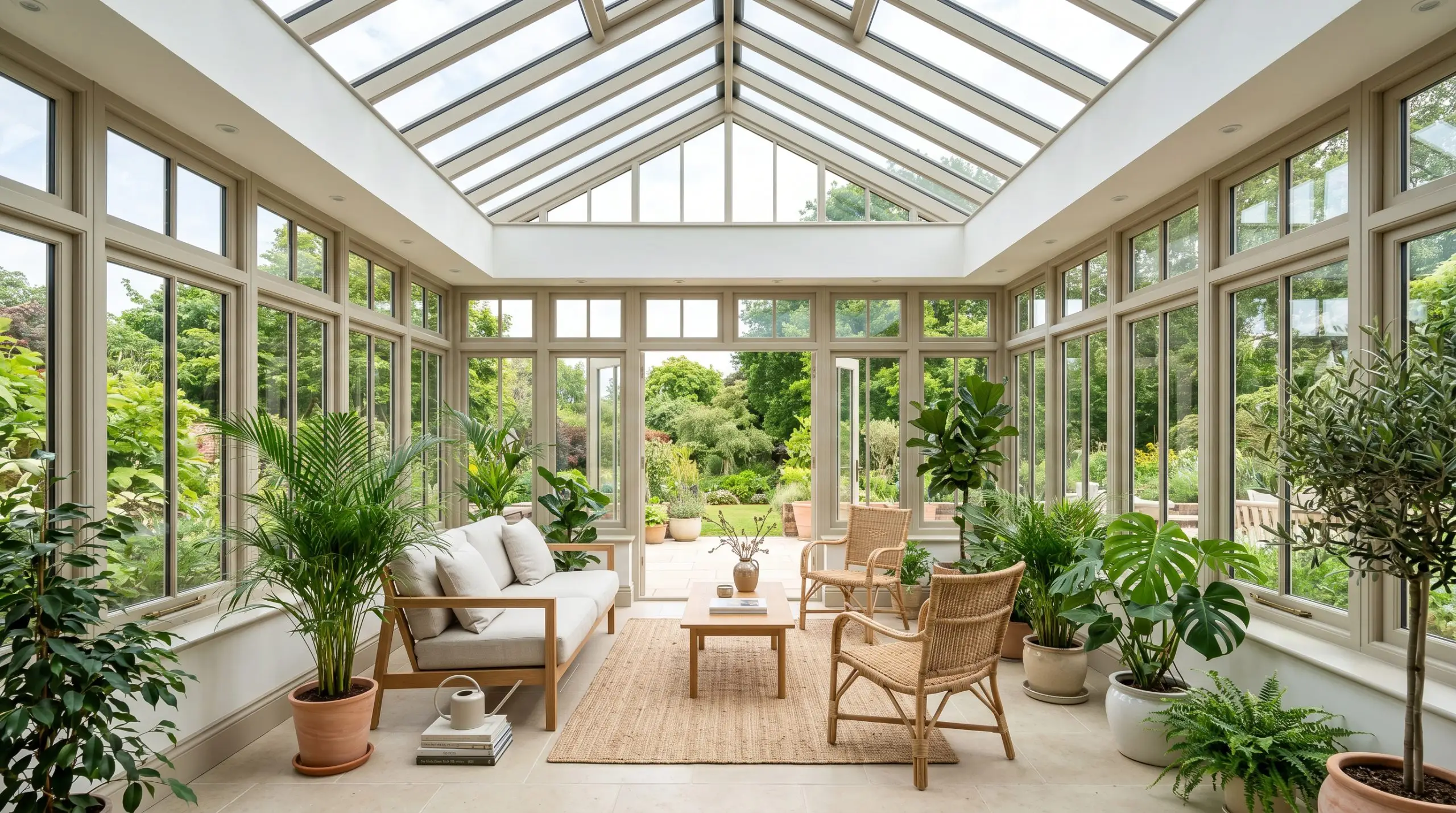
If you have a sunroom or a heavily glazed sitting area, use this earthy tone on the window sashes, mullions, and baseboards, leaving the walls a crisp white. The subtle green-yellow notes will beautifully frame the exterior views, acting as a natural extension of the garden outside. This application highlights the architectural framework of the room while keeping the overall energy bright and incredibly airy.
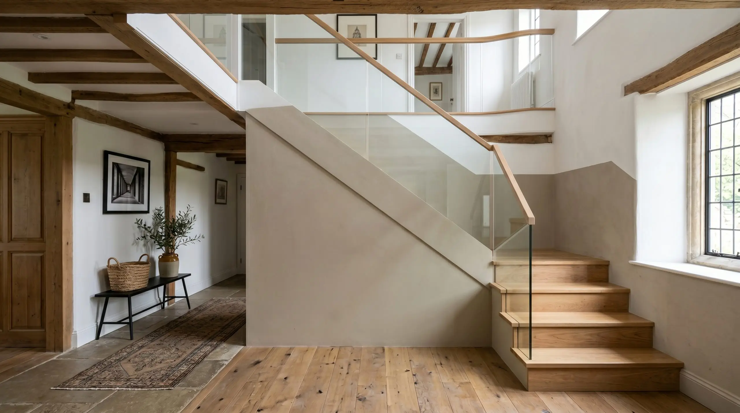
The Color-Blocked Staircase
Will Drop Cloth work with your specific lighting, floor, or furniture?
For a modern update in a traditional home, use this shade to color-block the lower half of a prominent staircase wall, following the angle of the stairs without relying on physical wood molding. This creates a striking, geometric focal point that anchors the stairwell. It adds a layer of curated tension to the architecture, proving that historic colors can be manipulated to feel highly contemporary.
Hardware, Wood & Material Pairings
The secret to styling this color lies in balancing its earthy weight with contrasting textures and reflective surfaces. It requires a curated mix of materials to truly sing, blending everyday durability with premium, aspirational accents.
Tailored Borders & Baseboards
To ensure the walls feel intentional, you must frame them with the right trim color. The undertones of your baseboards will dictate whether the room feels seamlessly atmospheric or crisply tailored.
Tactile Finishes & Metals
The Coordinating Palette
When building a comprehensive color story, you must select secondary shades that either pull out the paint’s hidden crispness or enhance its inherent warmth. For a deeper dive into crafting these palettes, explore our guide to the best greige paint colors.
Curated Mood Boards
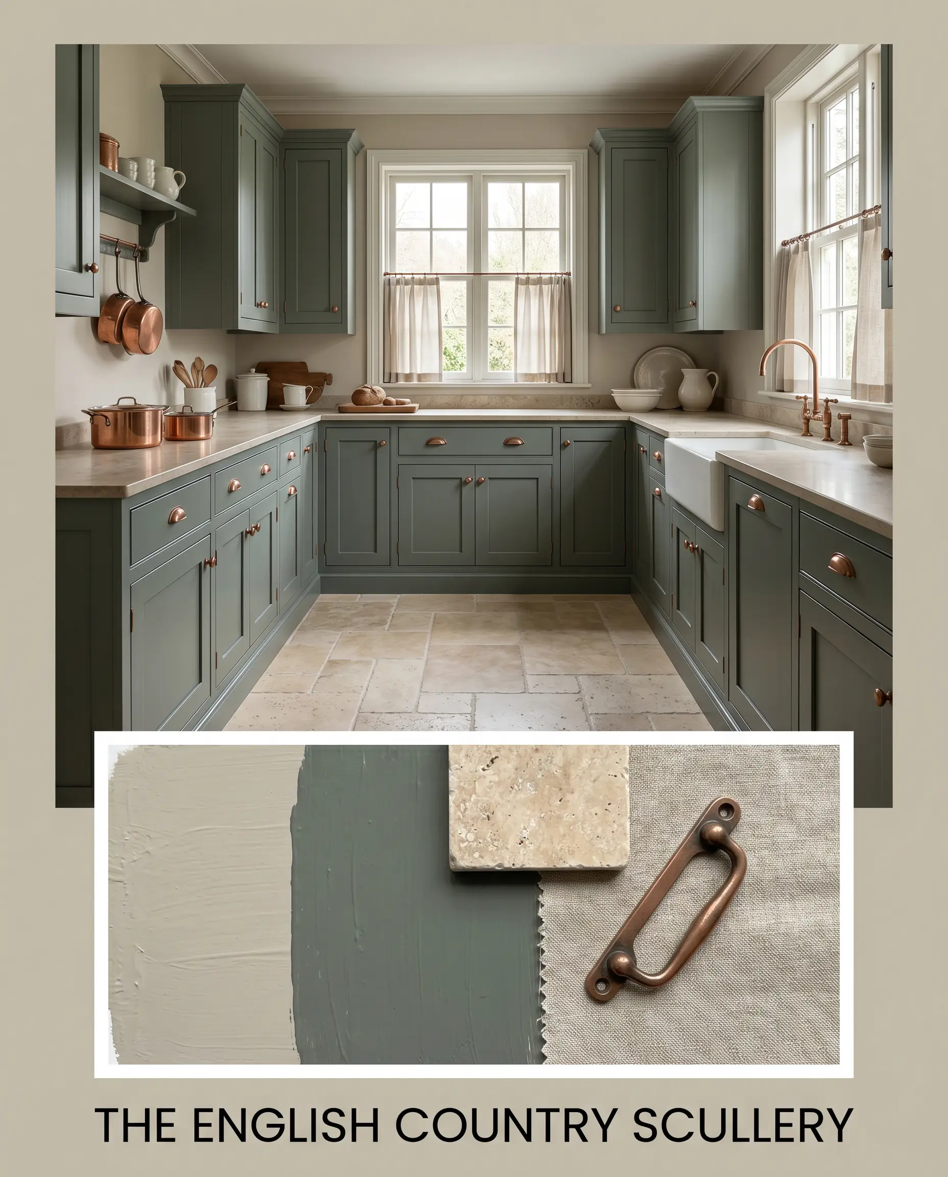
The English Country Scullery: This palette leans heavily into the paint’s historic roots. The walls are paired with Benjamin Moore Caldwell Green HC-124 on the cabinetry, grounded by tumbled travertine floors. Aged, unlacquered copper hardware bounces warm light across the room, while heavily textured linen cafe curtains soften the hard architectural lines, creating a space that feels both highly functional and deeply curated.
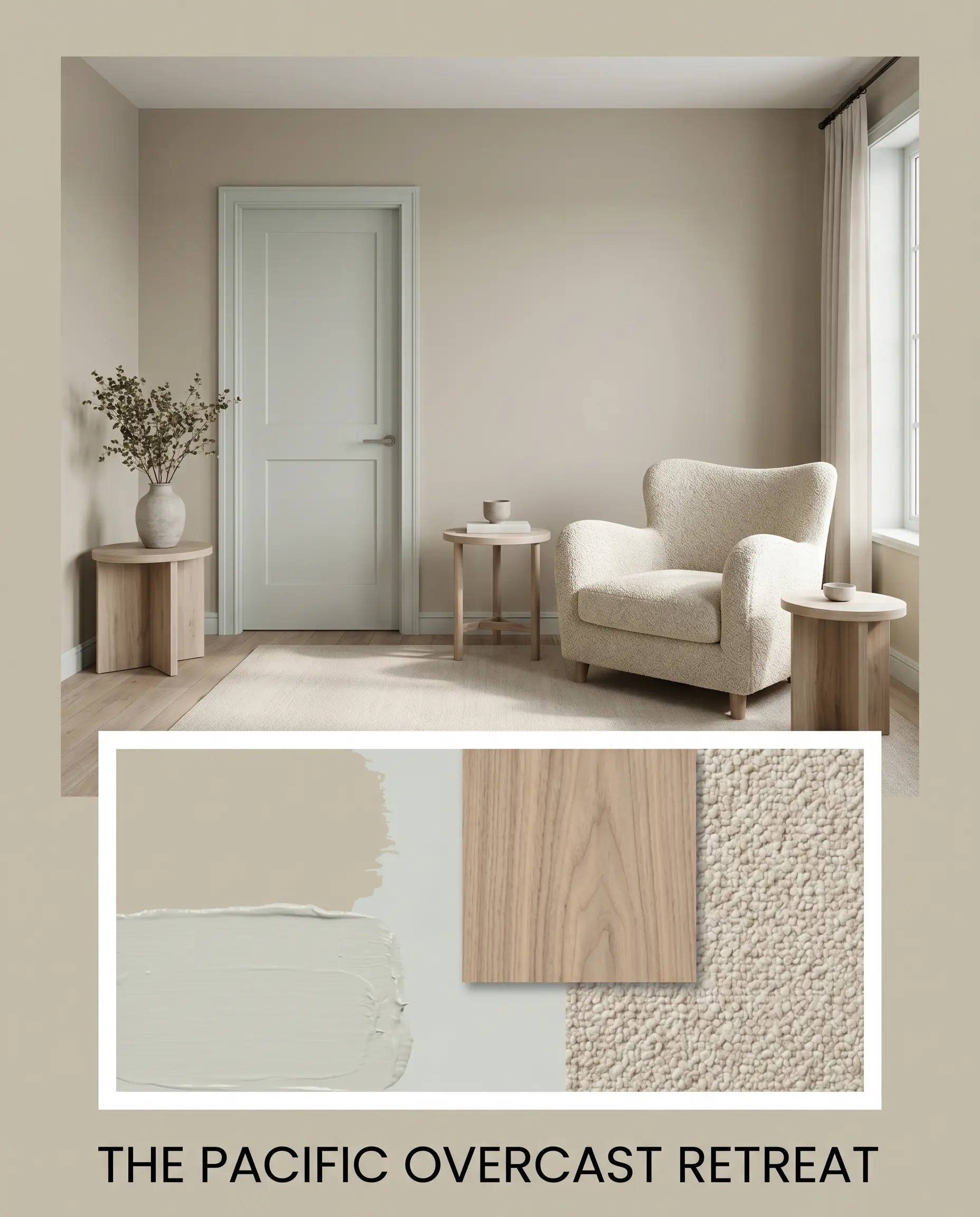
The Pacific Overcast Retreat: Designed for a serene, restorative atmosphere, this combination balances warmth and crispness. The main walls are contrasted with accents of Sherwin-Williams Sea Salt SW 6204. Bleached walnut side tables provide an organic, approachable foundation, while an oversized chair upholstered in chunky wool bouclé invites immediate relaxation. The tension between the cool blue-green accents and the warm greige walls creates a beautifully balanced, modern energy.
Farrow & Ball Drop Cloth Head-to-Head Comparisons
When narrowing down your final selection, it is crucial to understand how this shade behaves against its closest rivals. The specific lighting in your home and your ultimate design goals will dictate which color is the true winner.
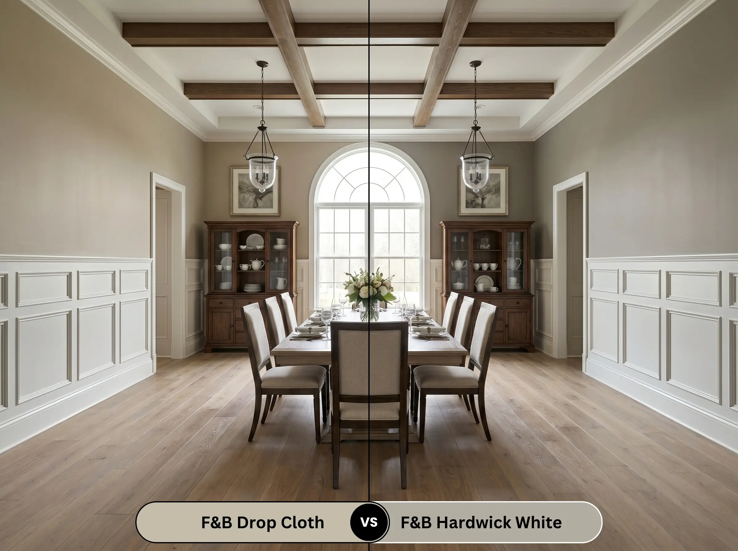
Farrow & Ball Drop Cloth No. 283 vs. Farrow & Ball Hardwick White No. 5
Will Drop Cloth work with your specific lighting, floor, or furniture?
If you are painting a room with minimal natural light, Hardwick White No. 5 will read significantly cooler and traditionally grey, pulling away from the earthy warmth. Drop Cloth No. 283, with its stronger beige base, retains its inviting heat even in shadows. Choose Hardwick White if you want a crisp, historic grey, but stick with Drop Cloth if your goal is an enveloping, warm greige.
Farrow & Ball Drop Cloth No. 283 vs. Benjamin Moore Revere Pewter HC-172

Revere Pewter HC-172 is a legendary, highly popular greige, but it carries a slightly higher LRV and less complex green undertones than its Farrow & Ball rival. If you need a universally safe, slightly lighter transition color for an open-concept suburban home, Revere Pewter is highly effective. However, if you crave the deeply nuanced, shifting shadows of premium heritage design, Drop Cloth provides a much richer, more curated aesthetic.
Farrow & Ball Drop Cloth No. 283 vs. Sherwin-Williams Agreeable Gray SW 7029
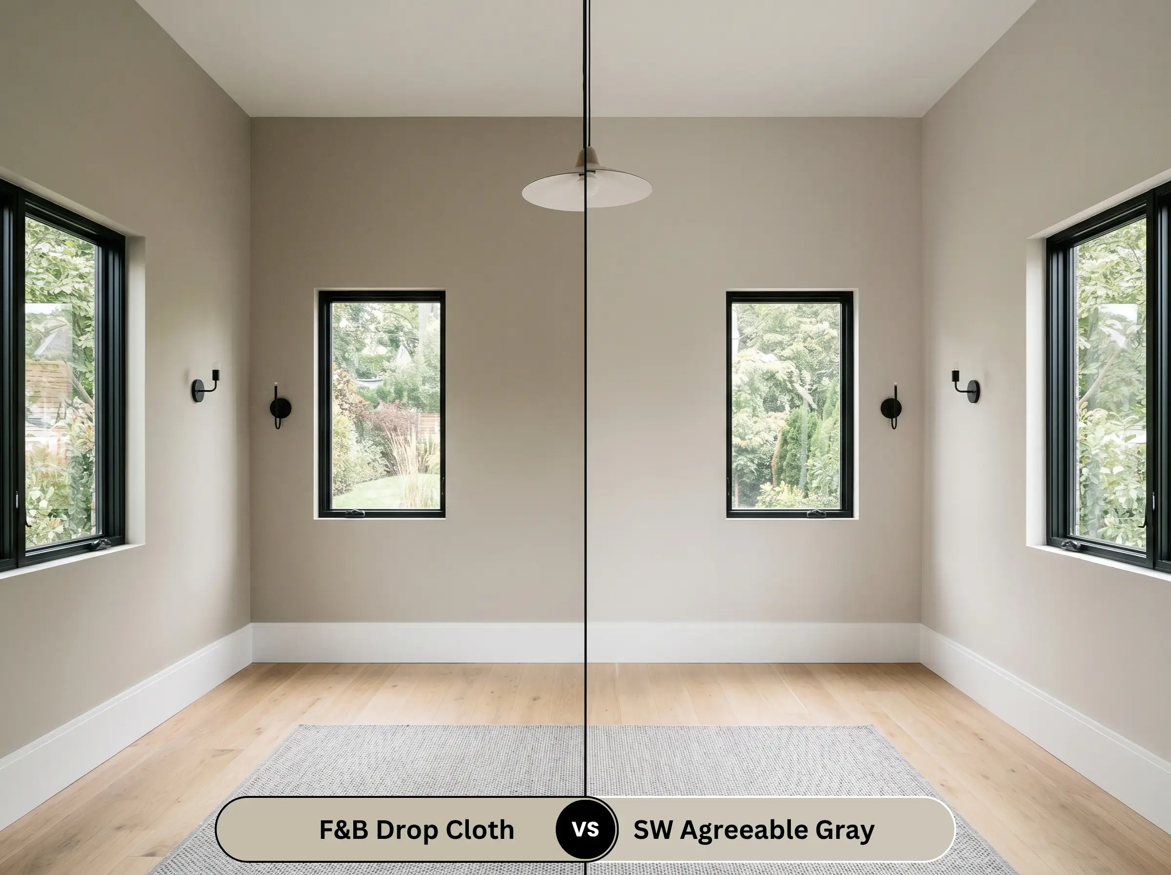
Will Drop Cloth work with your specific lighting, floor, or furniture?
Agreeable Gray SW 7029 is significantly lighter and leans much further into a standard, warm grey, lacking the distinct earthy depth found in the Farrow & Ball option. If you are preparing a house for a quick real estate sale and need a blank, inoffensive canvas, Agreeable Gray is the practical choice. If you are designing your forever home and want the walls to act as a definitive, high-end architectural layer, Drop Cloth is the superior investment.
Sourcing Similar Colors & Brand Equivalents
Whether you are looking for a slightly different depth to perfectly match your lighting, or you need a reliable match from a different manufacturer due to local availability, these alternatives provide excellent starting points.
Farrow & Ball Alternatives
Cross-Brand Matches
Professional Application & DIY Strategy
Executing a premium paint job requires more than just picking the right color. The physical application, sheen selection, and underlying preparation will ultimately determine if the final result looks like a luxury investment or a rushed weekend project.
The Dynamic Sheen Guide
Primer Requirements
Because this color sits firmly in the mid-tone range, it requires a high-quality primer to achieve its true, complex depth. If you are painting over a stark white or a very dark, saturated color, you must use a mid-tone grey tinted primer. A standard white primer will force you to apply three or four topcoats to stop the stark white from glowing through and diluting the earthy warmth.
Coverage Expectations
Expect to apply a strict minimum of two full coats to achieve the true color profile.
This specific depth of greige is highly susceptible to “flashing”—visible, uneven roller marks that appear when the paint dries at different rates. To avoid this, maintain a wet edge while rolling, do not stretch the paint too thin on the roller, and absolutely avoid going back to touch up a semi-dry wall. Let it dry completely before assessing if a third coat is needed.
Hackrea Design Secret (Application Warning)
Frequently Asked Questions
Because of its hidden undertones, the cool, blue-tinted light of a north-facing room will absolutely pull the green notes forward. It will not look like a bright, vibrant green, but rather a sophisticated, muted khaki-grey. If you want to minimize this effect, rely heavily on warm ambient lighting.
Drop Cloth carries a slightly lower LRV and a more complex, earthy depth compared to Revere Pewter. For kitchen cabinets, the Farrow & Ball shade will feel slightly more historic, grounded, and bespoke, whereas Revere Pewter will read as a slightly lighter, more universally standard greige.
Thanks to its solid mid-tone LRV, it performs beautifully on exteriors without turning into a blinding, washed-out white. The direct sunlight will neutralize the green undertones, allowing the stucco to read as a rich, creamy taupe that harmonizes brilliantly with natural landscaping.
To suppress the yellow-green warmth, frame the walls with a crisp, slightly cool white like Benjamin Moore Chantilly Lace OC-65. The stark, clean boundary creates a sharp visual contrast that tricks the eye into reading the main wall color as a cooler, more tailored grey.
The Final Design Verdict
Farrow & Ball Drop Cloth No. 283 is the ultimate architectural anchor for homeowners who want to inject a profound sense of history, warmth, and grounded sophistication into their spaces. It is perfectly suited for transitional and traditional homes, thriving in living rooms with heavy millwork, highly curated kitchens, and enveloping bedrooms. When paired with rich, tactile materials and thoughtful lighting, it delivers a deeply premium, magazine-ready aesthetic that standard builder-grade greiges simply cannot replicate.
However, this color demands respect when selecting your surrounding fixed elements. Do not pair this earthy, green-tinged greige with heavily red-toned cherry or mahogany flooring, as the competing warm undertones will aggressively clash, making the paint look sickly and the wood look dated. Similarly, avoid pairing it with icy, blue-toned stark whites or cool, synthetic grey carpets, which will strip away the paint’s inviting warmth and leave the room feeling disjointed and confused. Surround it with organic textures, warm metals, and intentional lighting, and it will reward you with a flawless, timeless foundation.
Room Compatibility & Clashes Diagnoses
Hackrea's reports evaluating the compatibility of Drop Cloth in real rooms.South-Facing Dining Room
"The paint's earthy greige base complements the amber hardwood floors, though it produces a noticeable high-contrast break against the crisp white radiator and trim."
South-Facing Home Office
"Generous southern daylight activates the paint's subtle yellow-gray undertones, keeping it warm and preventing it from looking drab above the heavy wainscoting. Its muted character offers an understated neutral boundary that does not fight the intense red and amber tones of the surrounding millwork."
Closest Cross-Brand Equivalents
The absolute closest scientific color matches for Drop Cloth across top paint brands.