Wine Dark No. 308
Farrow & BallFarrow & Ball Wine Dark (No. 308) is a rich, sophisticated deep blue with an LRV of 13. Inspired by midnight skies and Homeric seas, this complex navy features subtle violet and slate undertones that create a velvety, enveloping atmosphere, especially in low-light environments.
Paint Technical Profile
| Color ID / SKU | No. 308 |
| HEX Code | #5C6576 |
| Light Reflectance (LRV) | 13 |
| Use | Interior, Exterior |
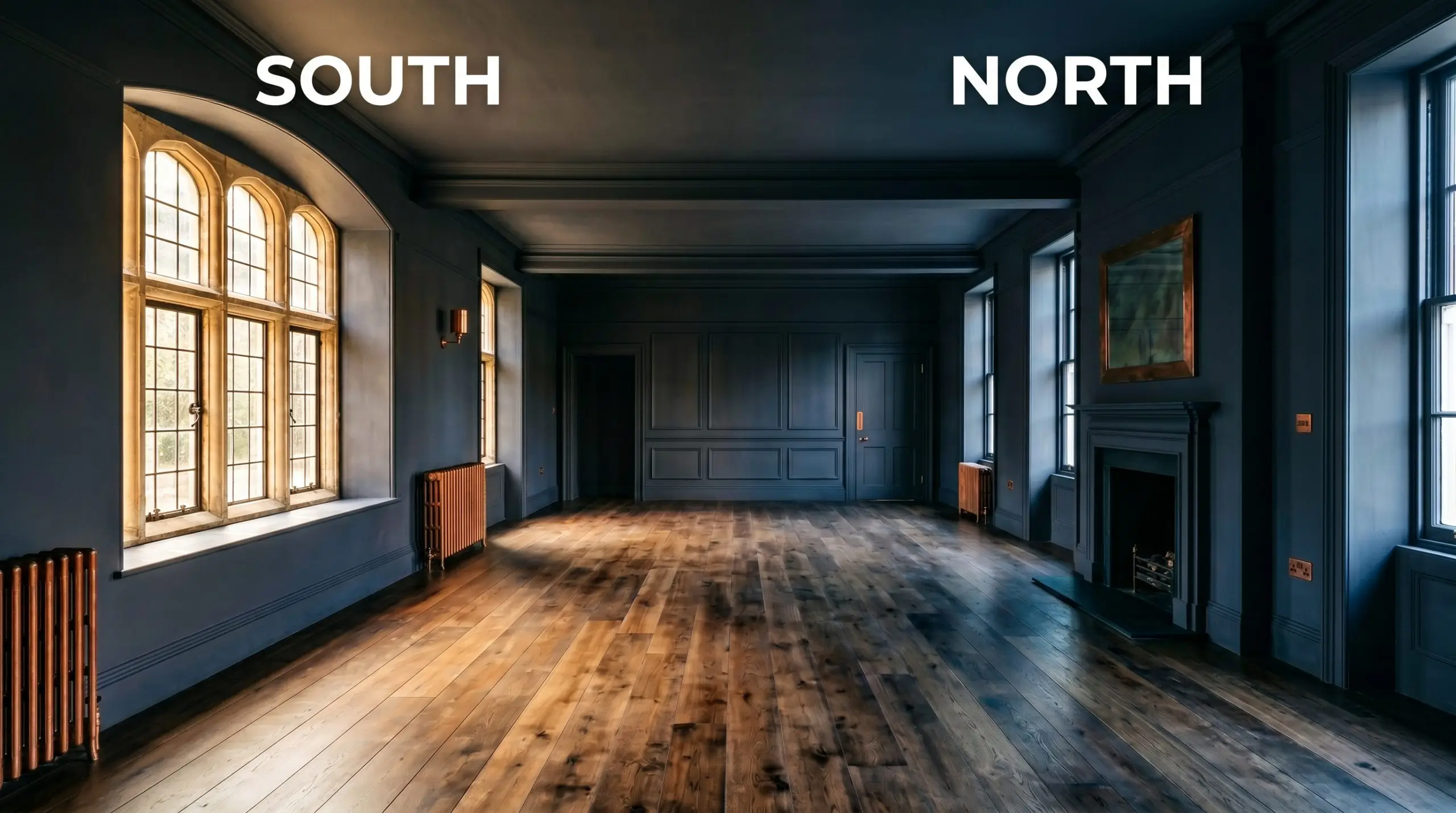
| Best Exposures | South-Facing, West-Facing |
| Best For | Dining rooms, studies, libraries, cozy bedrooms, cabinetry |
Farrow & Ball Wine Dark: The Ultimate Guide to Crafting a Moody, Historic Retreat
There is a common misconception that dark blues exist solely to create nautical themes or overly traditional, heavy spaces. Farrow & Ball Wine Dark shatters that assumption completely, offering a deeply pigmented, nuanced shade inspired by the Homeric sea. This isn’t just another standard navy; it is a complex, historical pigment engineered to wrap a room in undeniable luxury. If you are craving an enveloping atmosphere that feels both curated and incredibly intimate, this specific shade demands your attention. Let’s break down exactly how this captivating color behaves on the wall.
Farrow & Ball Wine Dark: Undertones & LRV
When determining if a paint is warm or cool, Farrow & Ball Wine Dark sits firmly on the cool side of the color spectrum. However, its complex pigment structure prevents it from ever feeling icy or detached, offering a deeply layered visual experience.
With a Light Reflectance Value (LRV) of 13, this shade exhibits significant light absorption. It functions as a moody, grounding force rather than a bright accent, requiring intentional lighting strategies to keep it from reading as a heavy, flat shadow.
Lighting Effects & The Chameleon Factor
The greatest fear with any deep shade is that it will collapse into a flat, depressing black or a cold, sterile void when the sun goes down. Because of its chromatic depth, this Farrow & Ball creation actively shifts and responds to directional lighting, ensuring your walls always feel alive and richly layered.
Elevating Your Home with Farrow & Ball Wine Dark
This rich pigment brings a distinctly cohesive, grounding energy to any home it touches. It demands to be used intentionally, transforming everyday drywall into a highly curated architectural feature.
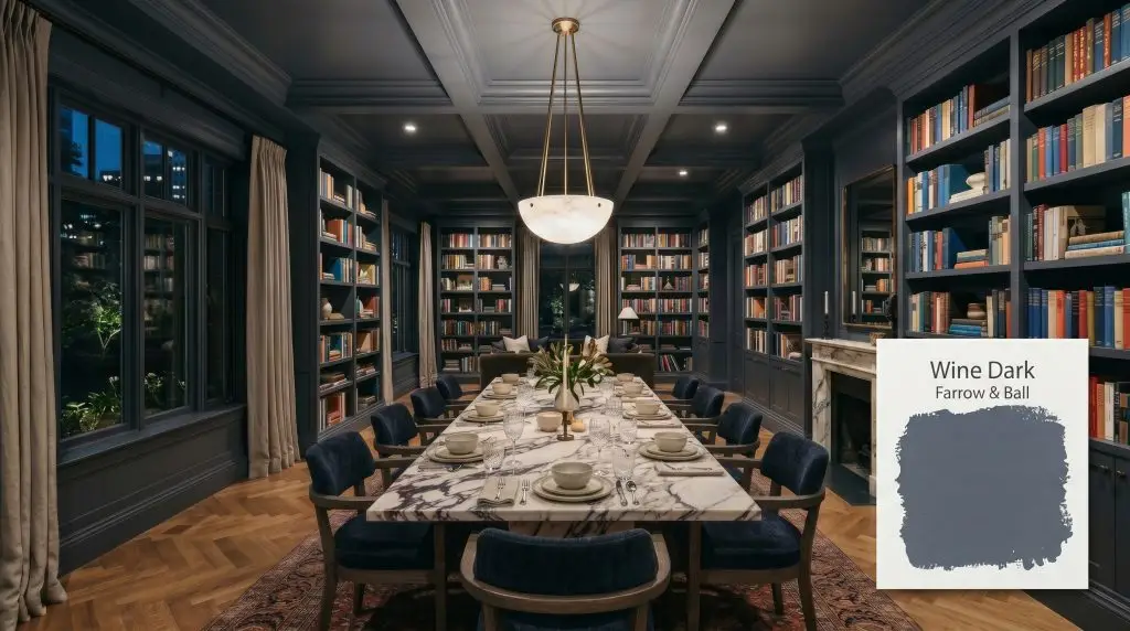
Dining Rooms
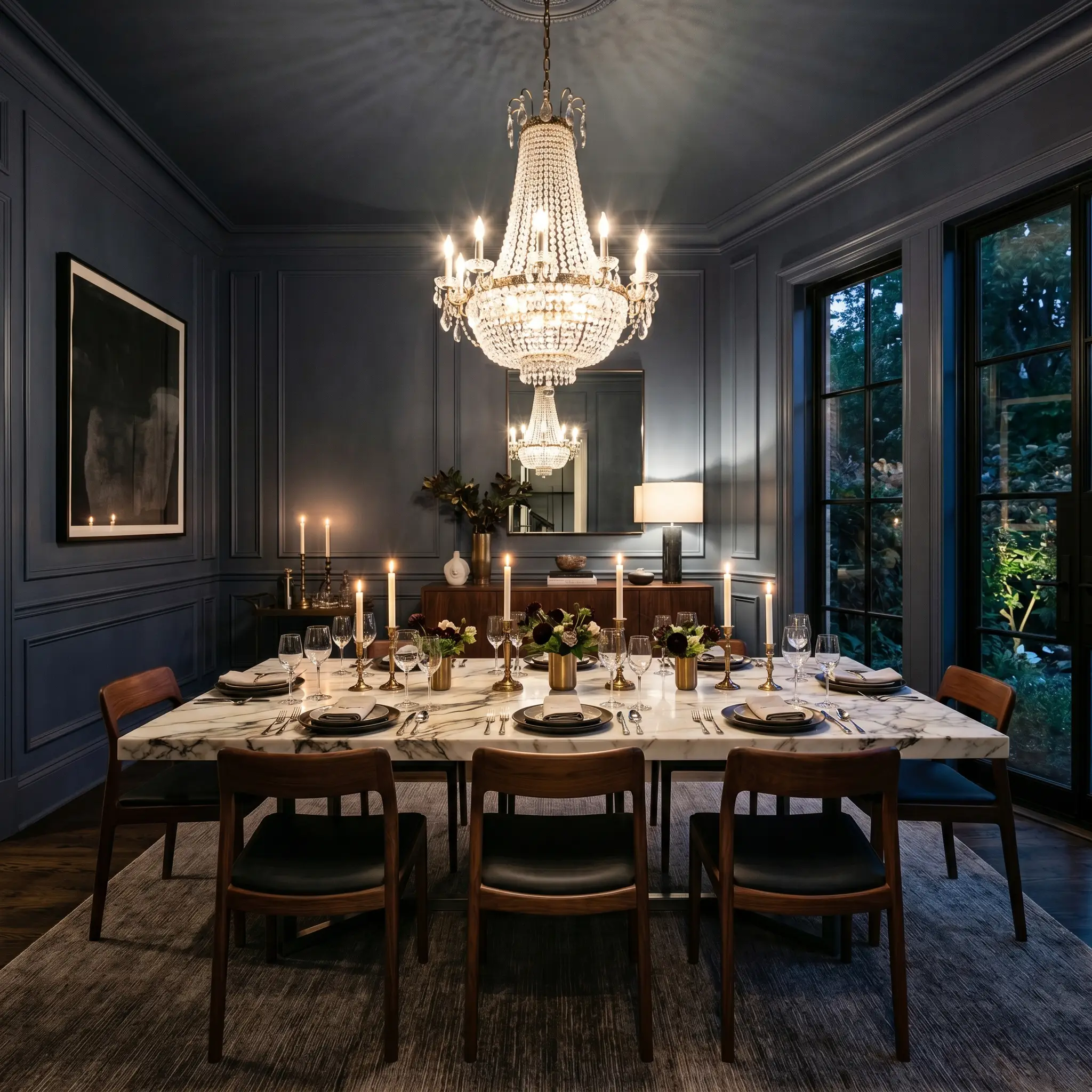
This shade thrives in spaces meant for evening gathering and conversation. Applying it across all four walls creates a stunning backdrop for glittering crystal chandeliers or modern alabaster pendants. If you are exploring dark & moody dining room ideas, wrapping the entire room in this deep hue—including the ceiling—forces the visual boundaries of the room to recede beautifully. Pair it with heavily veined marble tables or rich walnut dining chairs to balance the cool tones with organic warmth.
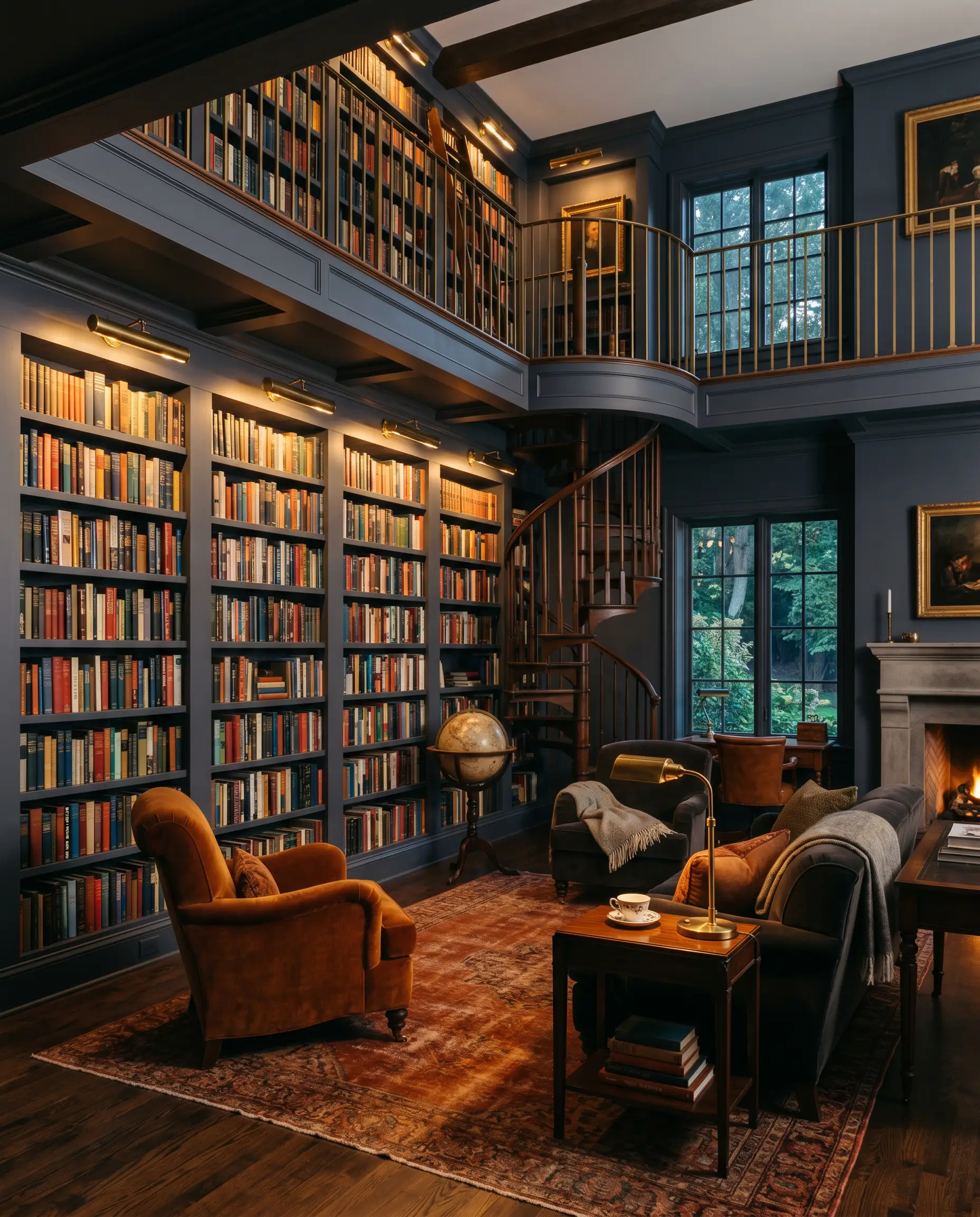
Home Libraries & Studies
For spaces dedicated to focus and retreat, this color offers unparalleled sophistication. It anchors floor-to-ceiling shelving brilliantly, allowing the varied colors of book spines and curated art to pop against the dark foundation. Ground the room with a plush, rust-toned vintage rug and incorporate heavily textured fabrics like mohair or velvet on your seating. The resulting aesthetic feels deeply intellectual without leaning into tired, old-world clichés.
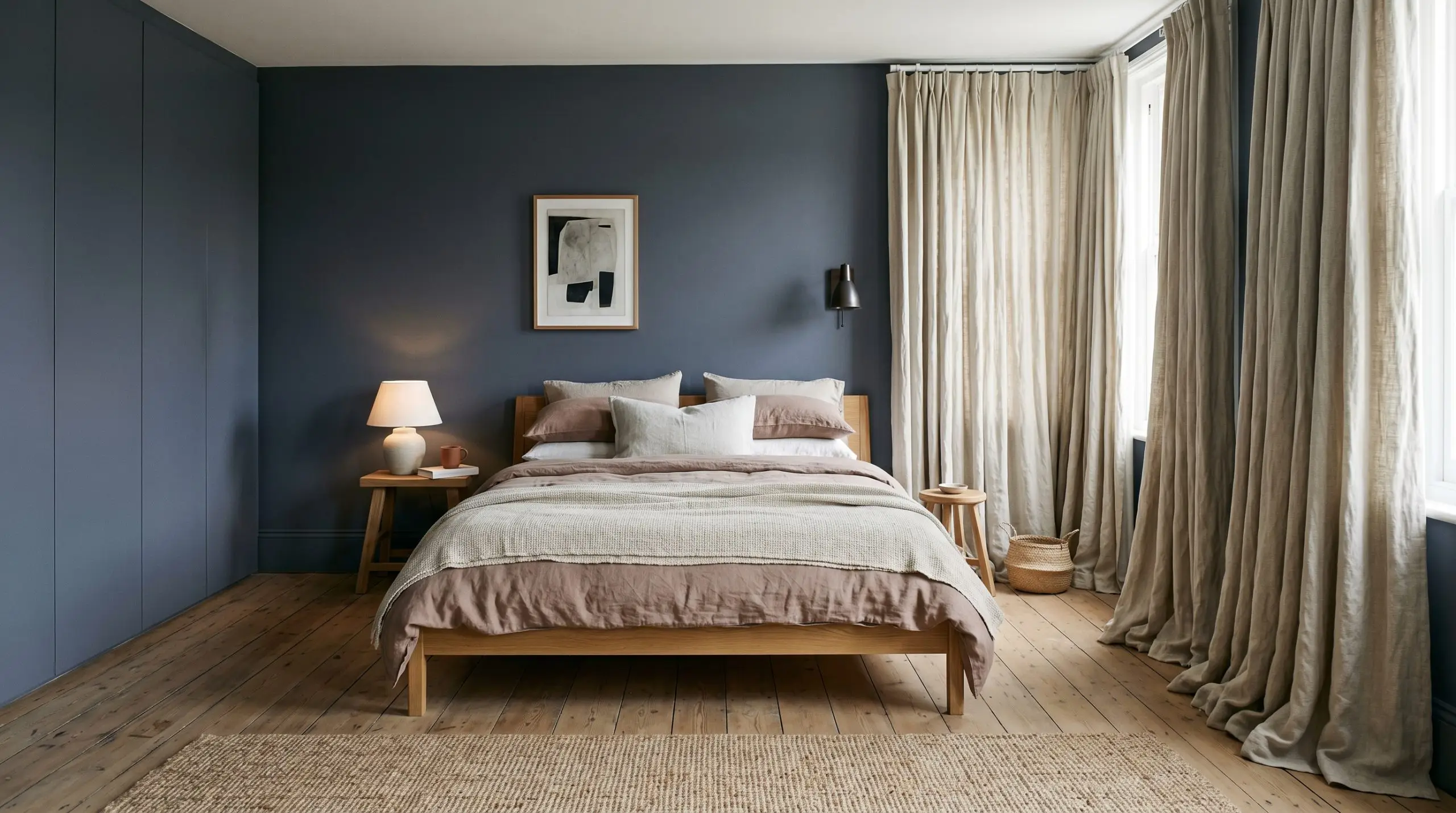
Cozy Bedrooms
Using a deeply saturated tone in a sleeping quarters creates an immediate sense of rest and tranquility. The dark walls act as a visual embrace, making the bed itself the undeniable focal point of the room. Soften the dramatic walls with layers of washed linen bedding in muted clay or soft chalky whites. Adding heavily textured, floor-pooling drapery will further enhance the calming energy of the space.
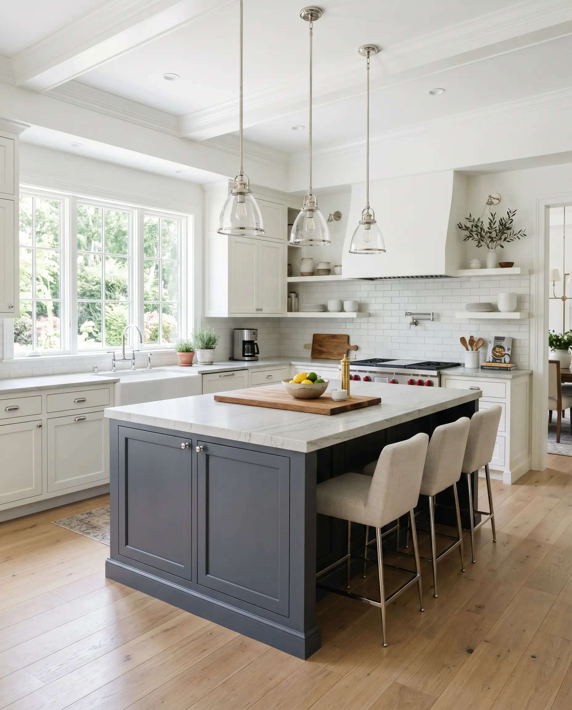
Kitchen Island Cabinetry
If you are not ready to commit to dark walls, utilizing this shade on lower cabinetry is a phenomenal compromise. It anchors the center of a culinary space, especially when surrounded by crisp white perimeter cabinets. When searching for the best navy blues for kitchen cabinets, this specific hue stands out because its gray influence hides everyday scuffs beautifully. Top the island with a honed quartzite and install polished chrome hardware for a high-end, classic contrast.
Creative Ways to Use This Historic Pigment
Beyond the standard four walls, this sophisticated shade presents incredible opportunities for architectural manipulation. By rethinking where and how we apply color, we can elevate the entire aesthetic of the home through unexpected focal points.
The Color-Drenched Entryway
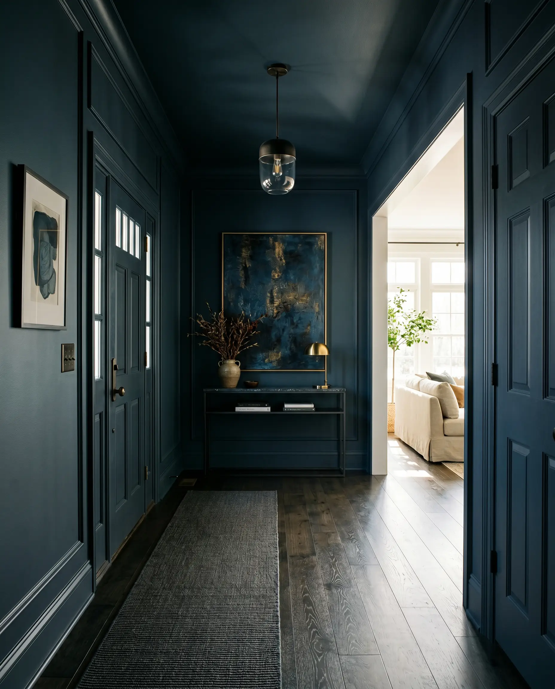
Transform a cramped, transitional foyer into a striking jewel box by painting the walls, trim, doors, and ceiling in the exact same dark shade. This technique blurs the hard architectural lines, making a small space feel surprisingly expansive and endlessly chic. The immediate contrast experienced when walking from this dark, moody vestibule into a bright, light-filled living room creates an unforgettable, highly curated entry sequence.
A Cinematic Media Room
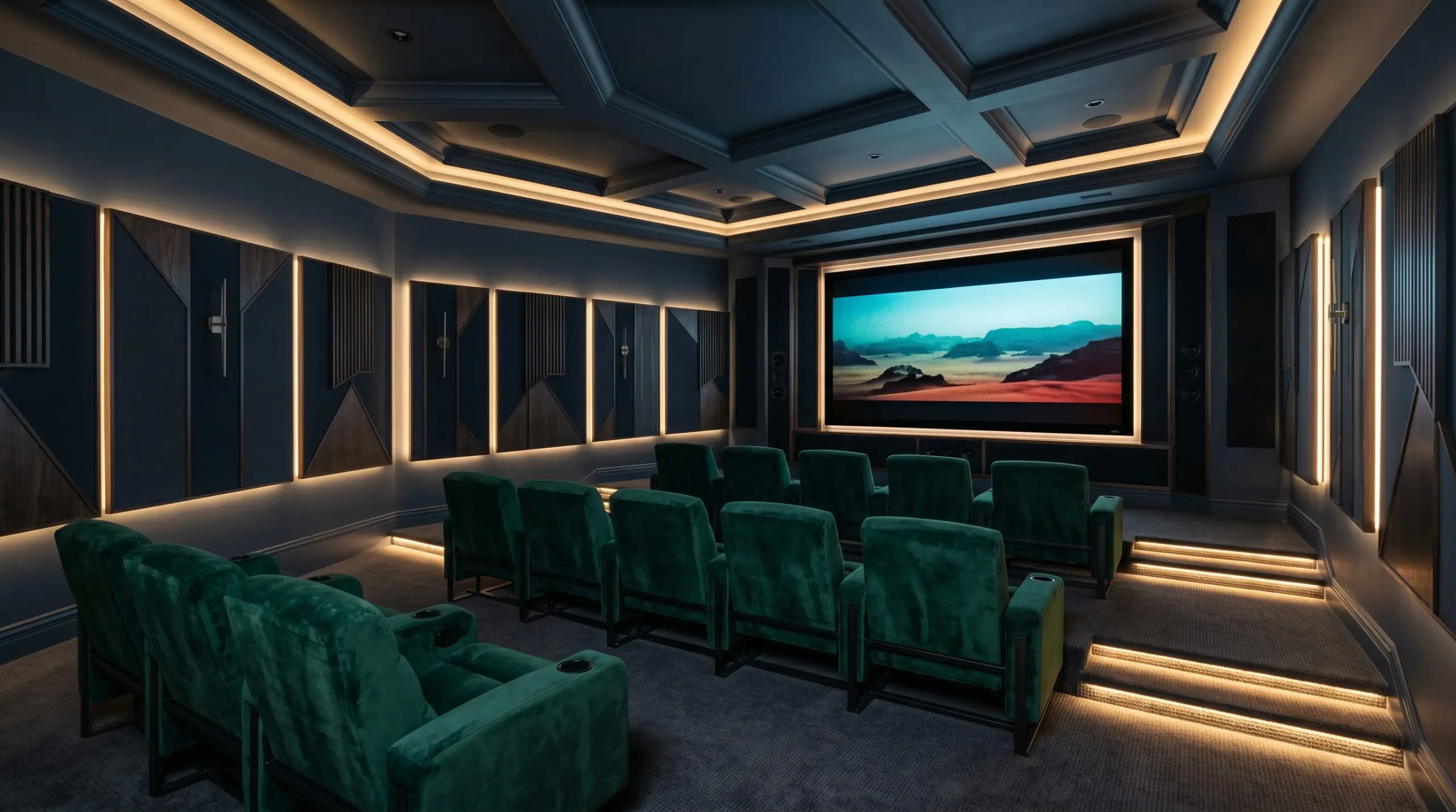
Instead of defaulting to generic black or charcoal for a home theater, this rich blue offers a vastly superior alternative. The inherent light absorption of the paint minimizes screen glare perfectly, while the subtle violet notes keep the room feeling like a luxurious screening lounge rather than a cold basement. Upholster the seating in deep emerald or rich ochre velvet to push the cinematic glamour even further.
The Modern Millwork Corridor
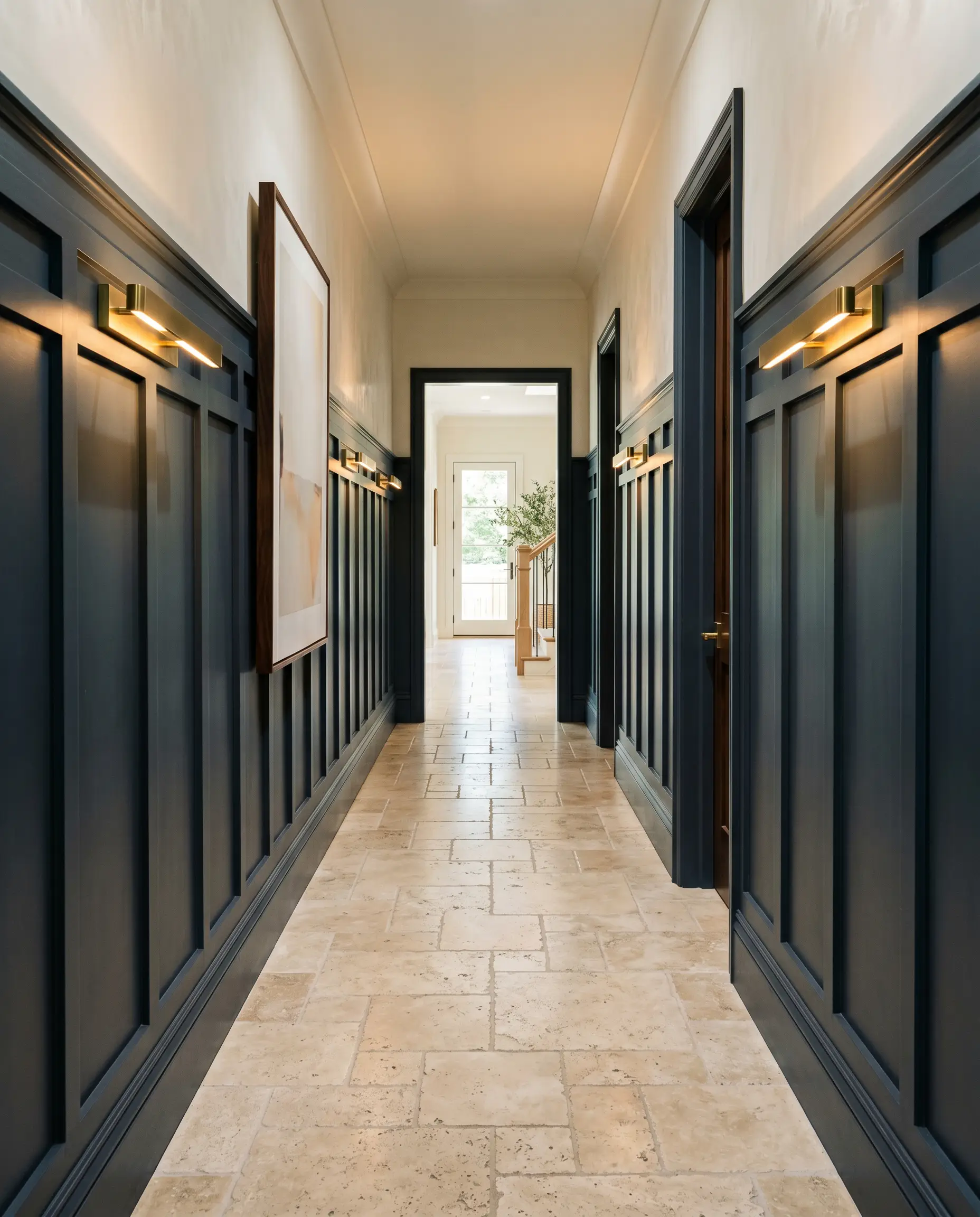
Hallways are often neglected, but applying this deep tone to custom board-and-batten or picture-frame molding turns a mere passageway into an art gallery. The intricate shadows cast by the millwork highlight the paint’s shifting gray and blue tones beautifully. Pair this application with modern, linear brass sconces to bounce warm light down the corridor, guiding the eye effortlessly through the home.
Curating the Perfect Palette for Farrow & Ball Wine Dark
The secret to styling this intense hue lies in intentional contrast and textural balance. It requires surrounding elements that either crisply frame its depth or gently soften its commanding presence.
Trim & Baseboards
Hardware, Wood & Material Pairings
Coordinating Colors
Designer Mood Boards
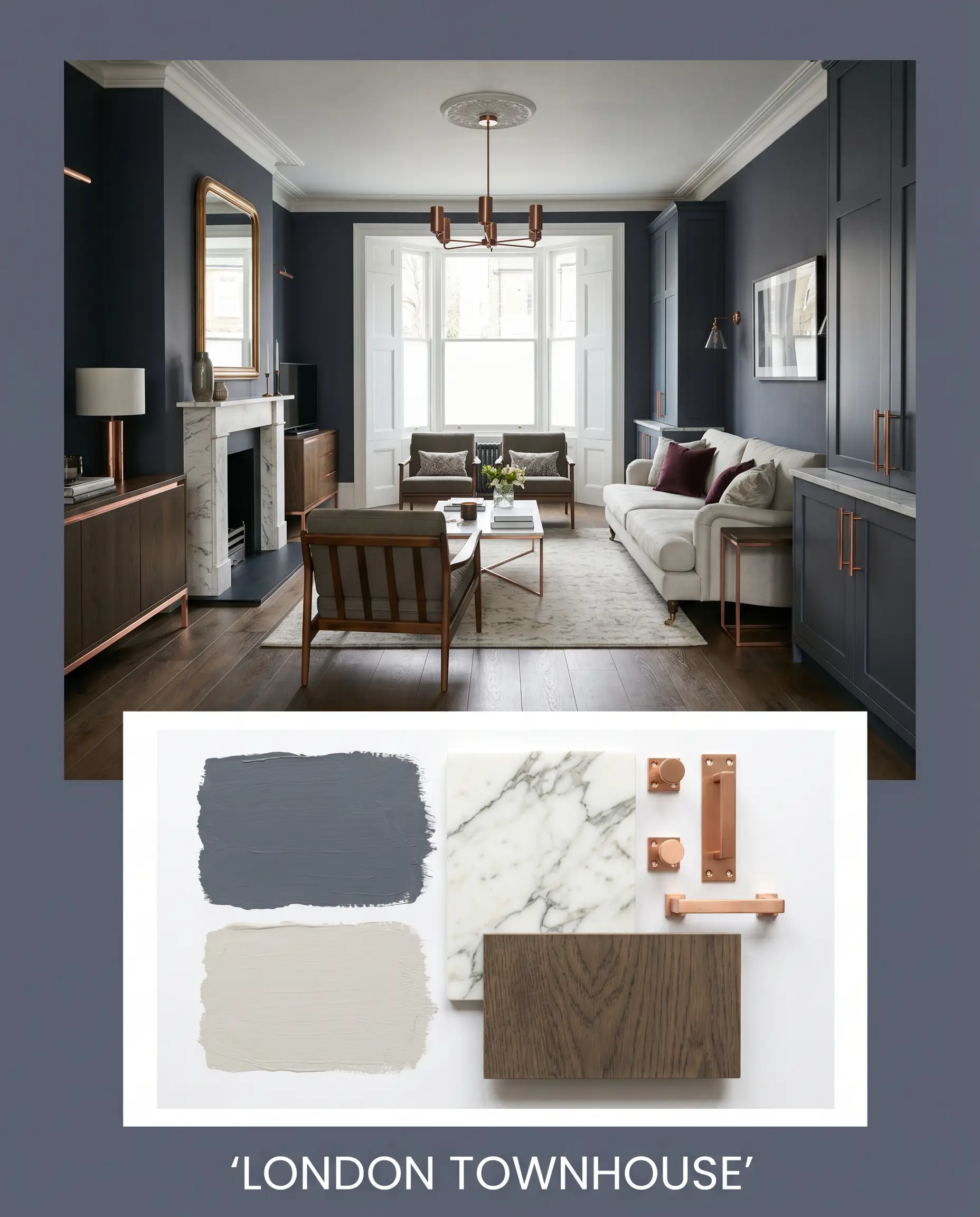
London Townhouse: Anchored by the deep blue walls, this palette layers in Farrow & Ball Ammonite No. 274 for a tailored, sophisticated contrast. Weave in rich smoked oak flooring and heavily veined Calacatta marble to establish a decidedly upscale, architectural mood. The addition of polished unlacquered copper hardware brings a flash of fiery brilliance to the subdued elegance.
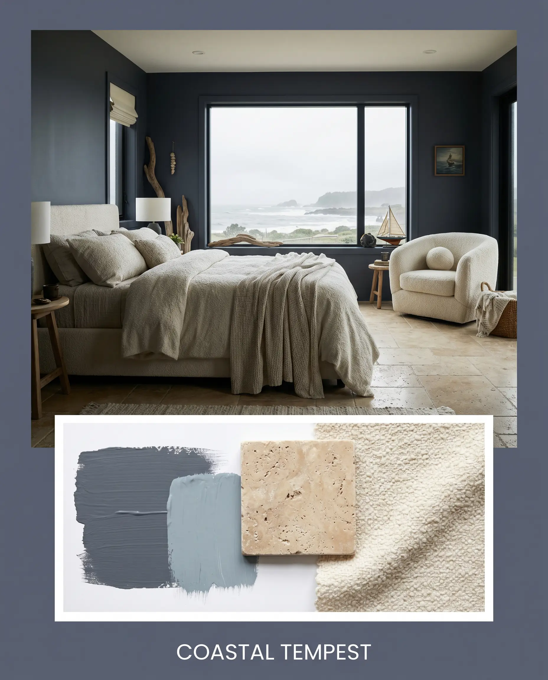
Coastal Tempest: This look embraces the stormy side of the paint’s DNA, pairing it with the breezy Farrow & Ball Kittiwake No. 307. Soften the dramatic contrast by incorporating tumbled travertine surfaces and expansive, creamy woven bouclé textiles. The energy here is moody, organic, and incredibly restful, evoking a luxurious seaside retreat during a summer storm.
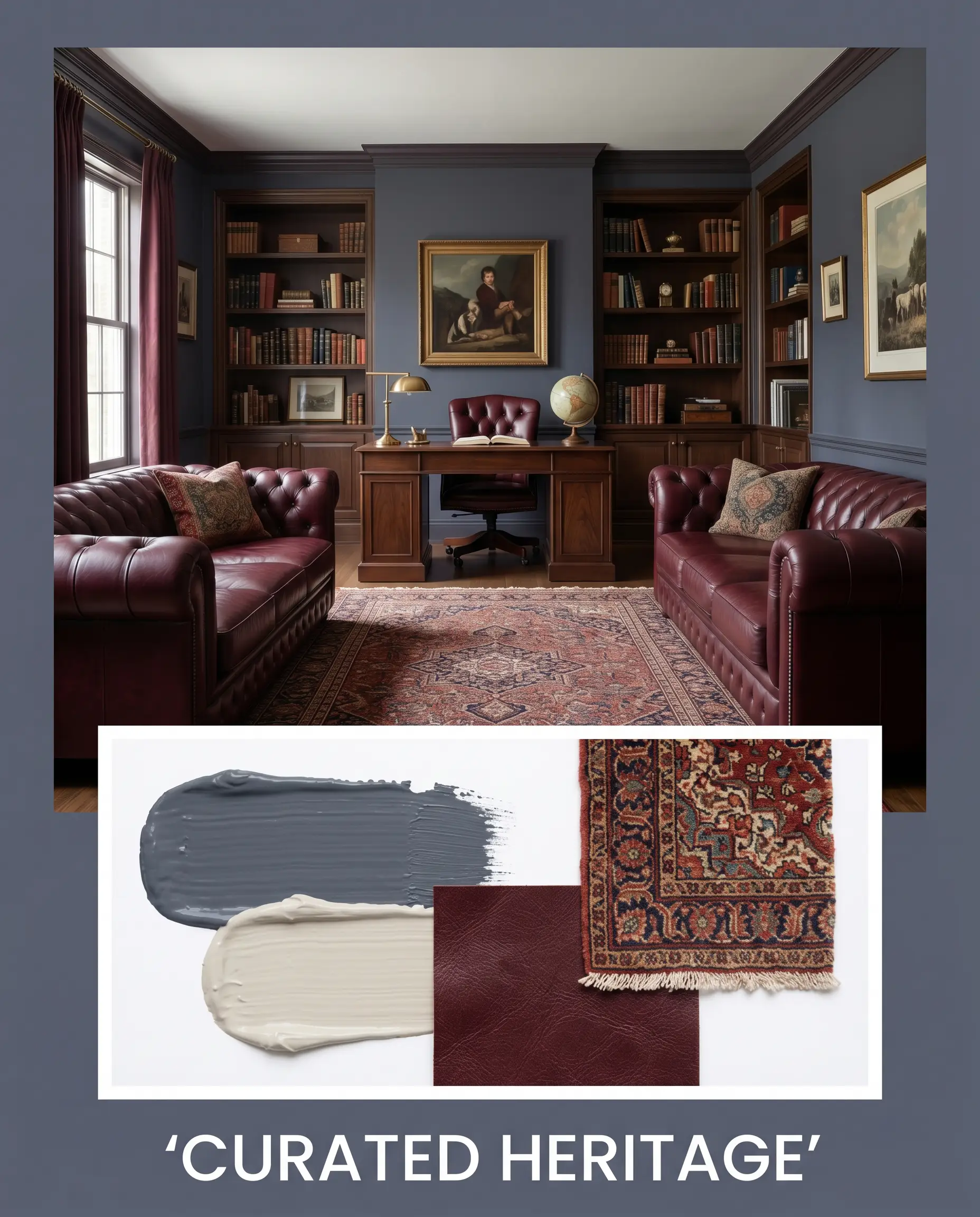
Curated Heritage: Grounded in tradition but styled for today, this palette uses Benjamin Moore Pale Oak OC-20 to introduce a soft, inviting warmth. Introduce deep burgundy leather seating and vintage Persian rugs to play off the paint’s hidden violet notes. It creates an energy that is deeply intellectual, grounded, and timelessly chic.
Deciding Between Rival Dark Blues
Choosing the right dark blue often comes down to the specific lighting conditions and architectural style of your home. If your space lacks natural light or your fixed elements lean a certain way, a rival shade might be the superior choice.
Farrow & Ball Wine Dark vs. Farrow & Ball Hague Blue No. 30
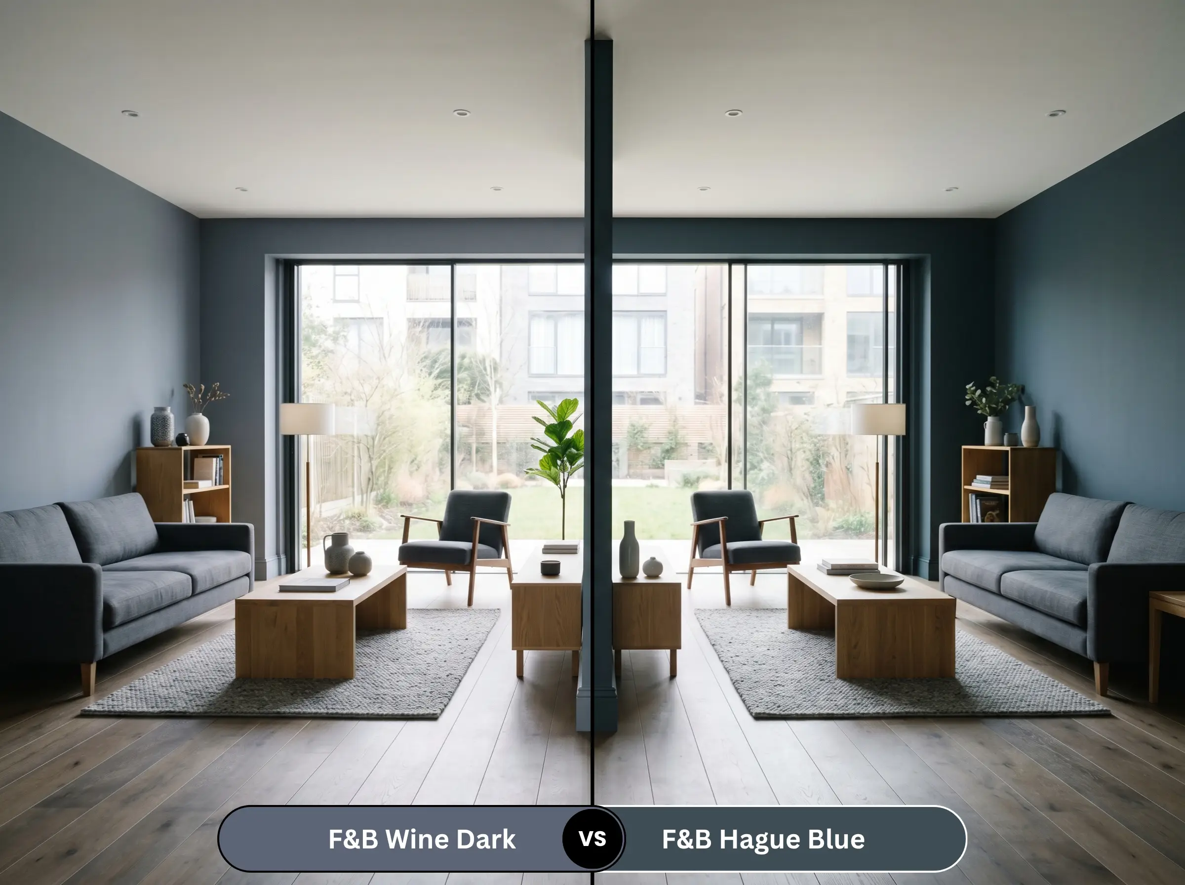
Hague Blue is famous for its strong green undertones, giving it a distinctly teal, vibrant flash in direct sunlight. If your room features heavily warm-toned woods and you want a color that feels slightly more energetic and botanical, Hague Blue is the better option. However, if you prefer a truer, moodier blue with sophisticated slate-gray shadows, Wine Dark offers a much more grounded, tailored experience.
Farrow & Ball Wine Dark vs. Benjamin Moore Hale Navy HC-154
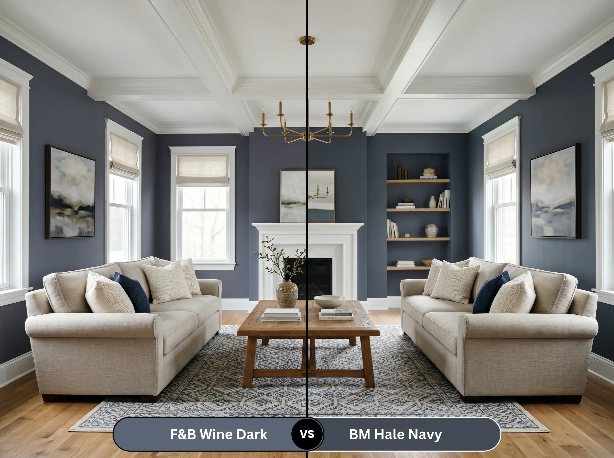
Hale Navy is the ultimate transitional, deeply muted navy, heavily anchored by a neutral gray base that rarely shifts in different lighting. If you need a completely predictable, steadfast color for a highly active family space, Hale Navy is incredibly safe. In contrast, Wine Dark is much more dynamic; its violet-blue notes make it the superior choice for homeowners who want a color that actively changes mood throughout the day.
Exploring Alternative Moody Blues
Sometimes a color is almost perfect, but you need a slight adjustment in depth or you require a match from a different manufacturer for local availability.
Similar Colors from Farrow & Ball
Cross-Brand Matches
Executing a Flawless Finish with Wine Dark
Transitioning this luxurious hue from a tiny swatch to full-scale architectural reality requires precise execution. Deep, highly pigmented paints demand specific preparation to ensure a flawless, premium result.
The Dynamic Sheen Guide
Primer Strategy
You cannot apply a shade this deep directly over a light wall or bare drywall and expect true color accuracy. A high-quality, dark gray tinted primer is absolutely mandatory. This dark foundation reduces the number of topcoats required and ensures the rich, midnight navy achieves its full chromatic depth without looking patchy.
Never skip the tinted primer with shades this dark. Using a standard white primer will force you to apply three or four coats of expensive paint just to eliminate the chalky, translucent bleed-through.
Hackrea Pro-Tip (Application Insight)
Coverage & Success Tips
For a truly professional aesthetic, plan for at least two generous coats over your dark primer. Be highly aware of “flashing”—the appearance of shiny, uneven roller marks caused by inconsistent pressure or overlapping semi-dry paint. To avoid this, keep a “wet edge” as you roll and avoid excessive back-rolling. Touch-ups on dark, flat finishes are notoriously difficult, so aim for a perfect application on the final coat.
Frequently Asked Questions
Because skylights flood a space with intense, direct overhead sunlight, they will absolutely amplify the violet undertone in this paint. It will not look like a bright, artificial purple, but it will read much warmer and more plum-leaning than it would in a room with standard, indirect lighting.
The Dead Flat finish drastically increases the light absorption, maximizing the velvety, enveloping atmosphere and making the color feel incredibly deep and rich. Estate Eggshell introduces a slight sheen, which bounces a fraction of the light back into the room, slightly lightening the perceived color and highlighting the slate-gray cast.
While it creates a stunning, moody exterior, dark colors naturally absorb more UV radiation, which accelerates fading. If you apply this to exterior brick, especially on a south-facing facade, you must use a premium, UV-resistant exterior formulation and anticipate repainting a few years sooner than you would with a lighter shade.
Rather than feeling claustrophobic, wrapping a windowless space in this dark hue actually creates a highly glamorous, jewel-box effect. The dark walls obscure the room’s hard boundaries, tricking the eye into perceiving the space as endless, intimate, and deeply sophisticated.
Not at all; in fact, the aging process enhances the pairing. As unlacquered brass darkens and develops a rich, earthy patina, it harmonizes beautifully with the historic, slate-gray undertones of the paint, creating a deeply curated, timeless aesthetic.
Final Verdict & Expert Warnings
Farrow & Ball Wine Dark is a brilliantly crafted, deeply atmospheric shade perfect for homeowners who want to inject historic elegance and undeniable luxury into their spaces. It excels in rooms designed for evening relaxation, intimate dining, or focused study, wrapping the architecture in a rich, velvety embrace.
However, this commanding color demands careful styling and will aggressively clash with overly warm, yellow-leaning fixed elements. If your home features heavy, orange-toned cherry cabinetry, golden oak floors, or highly saturated beige carpets, this cool, slate-anchored blue will severely highlight those dated yellow tones, making the space feel instantly disjointed and visually chaotic. It requires crisp whites, muted grays, or deeply smoked woods to truly succeed and deliver the high-end aesthetic it was engineered to create.