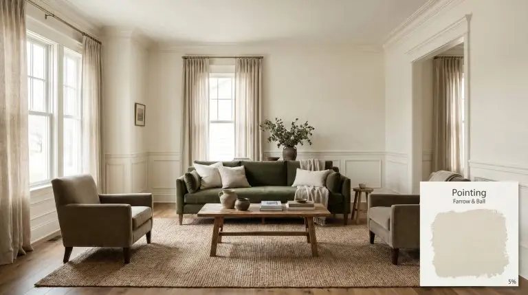
Pointing 2003
Farrow & BallFarrow & Ball Pointing is a warm, delicate off-white named after the lime pointing used in traditional brickwork. As a red-based neutral, it carries a soft, inviting warmth that prevents spaces from feeling clinical, making it a highly versatile tone for walls, trim, and ceilings.
| Temperature | Warm |
|---|---|
| Primary Undertone | Red |
| Hidden Undertones | Subtle cream and yellow |
| Best Exposures | North-facing, East-facing |
| Best For | Trim and molding, ceilings, traditional kitchen cabinets, living room walls |
Hackrea Review
Pointing is an incredibly nuanced warm white that excels in traditional spaces. While its red base provides a beautiful, luminous glow, buyers should be aware that Farrow & Ball's signature chalky finishes require careful application. It is a gorgeous architectural finish, but attempting to color-match it elsewhere often ruins its unique chromatic profile.Architectural Applications for Farrow & Ball Pointing 2003
Traditional Kitchen Cabinets
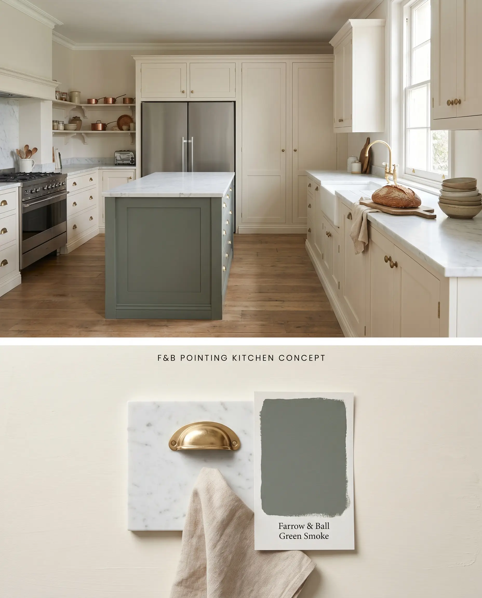
Pointing’s red-based neutral profile absorbs the harsh light bouncing off cold, reflective marble countertops and stainless appliances, grounding the space without reading as a stark, modern white. When applied to traditional shaker profiles, the base tint softens the rigid geometry of the millwork. This creates a relaxed, un-fitted English kitchen aesthetic that shifts organically as the sun moves throughout the day.
Living Room Walls & Trim
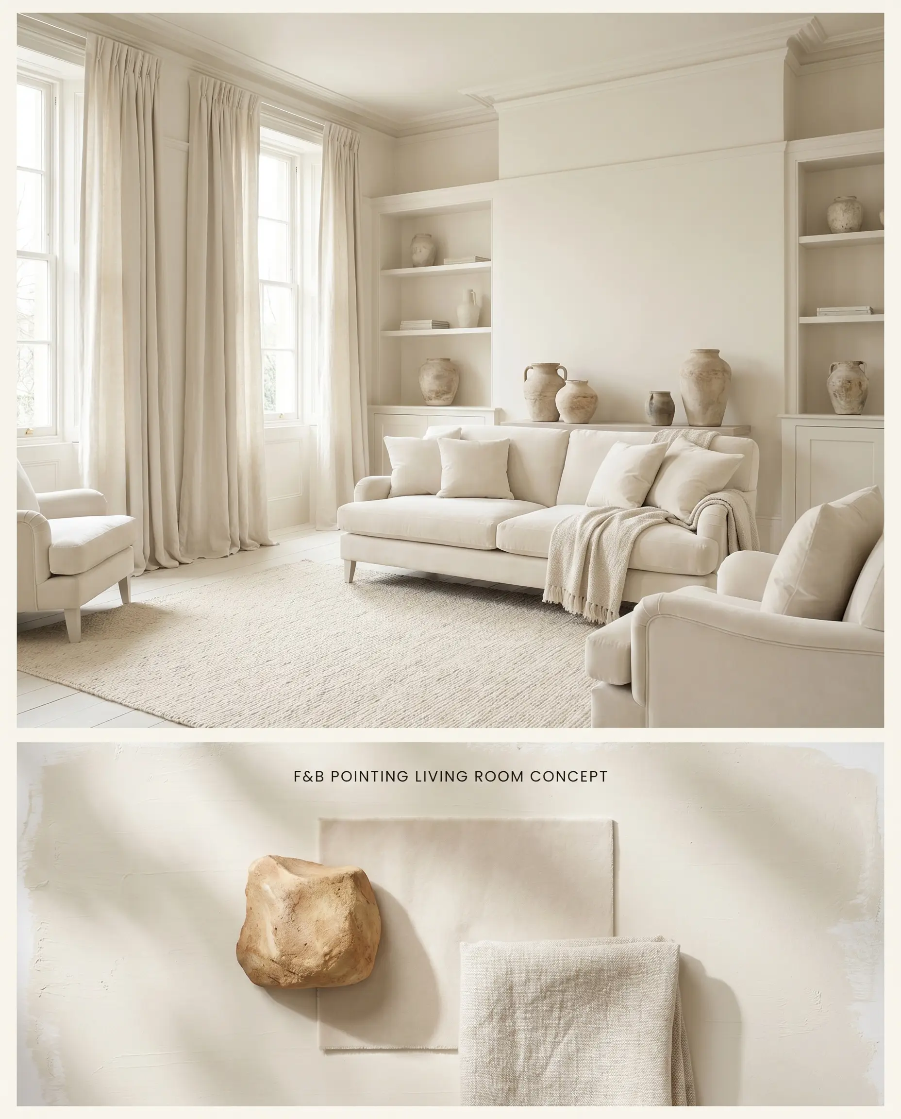
Drenching both walls and trim in this warm off-white blurs the transition lines between vertical and horizontal planes, eliminating harsh corner shadows. The underlying red prevents the ambient light from turning flat or muddy, maintaining a lively color structure throughout the day. This monolithic application forces the eye to focus on the textures of the furnishings rather than the boundaries of the room.
Bedroom Ceilings
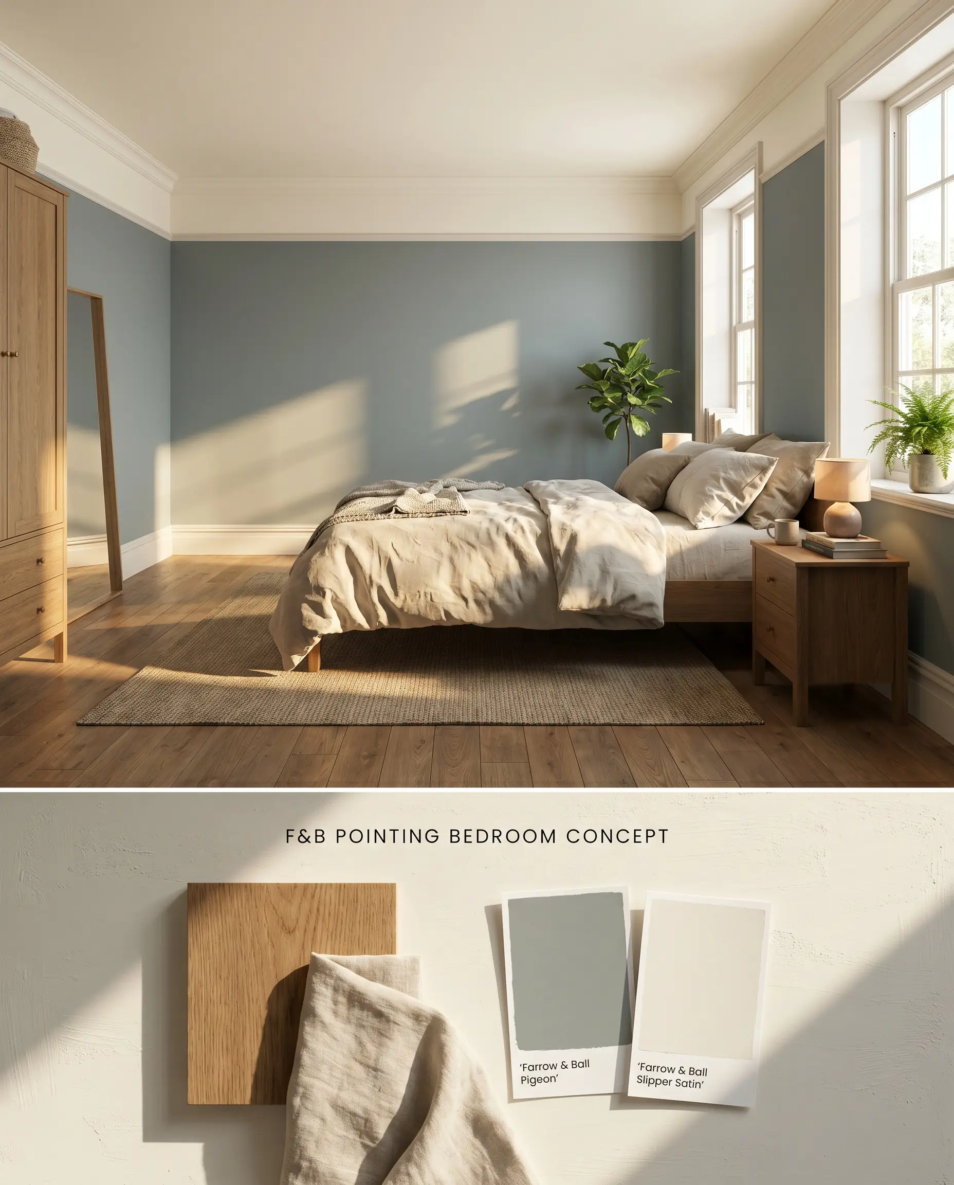
Applying this specific chromatic profile overhead mimics the warmth of natural morning sunlight, instantly warming up cooler bedroom palettes. The subtle pigmentation creates a gentle canopy effect, reflecting ambient light downward without the stark, icy glare of a standard untinted ceiling white. It lowers the visual ceiling height just enough to make expansive rooms feel intimate.
Hallways and Entryways
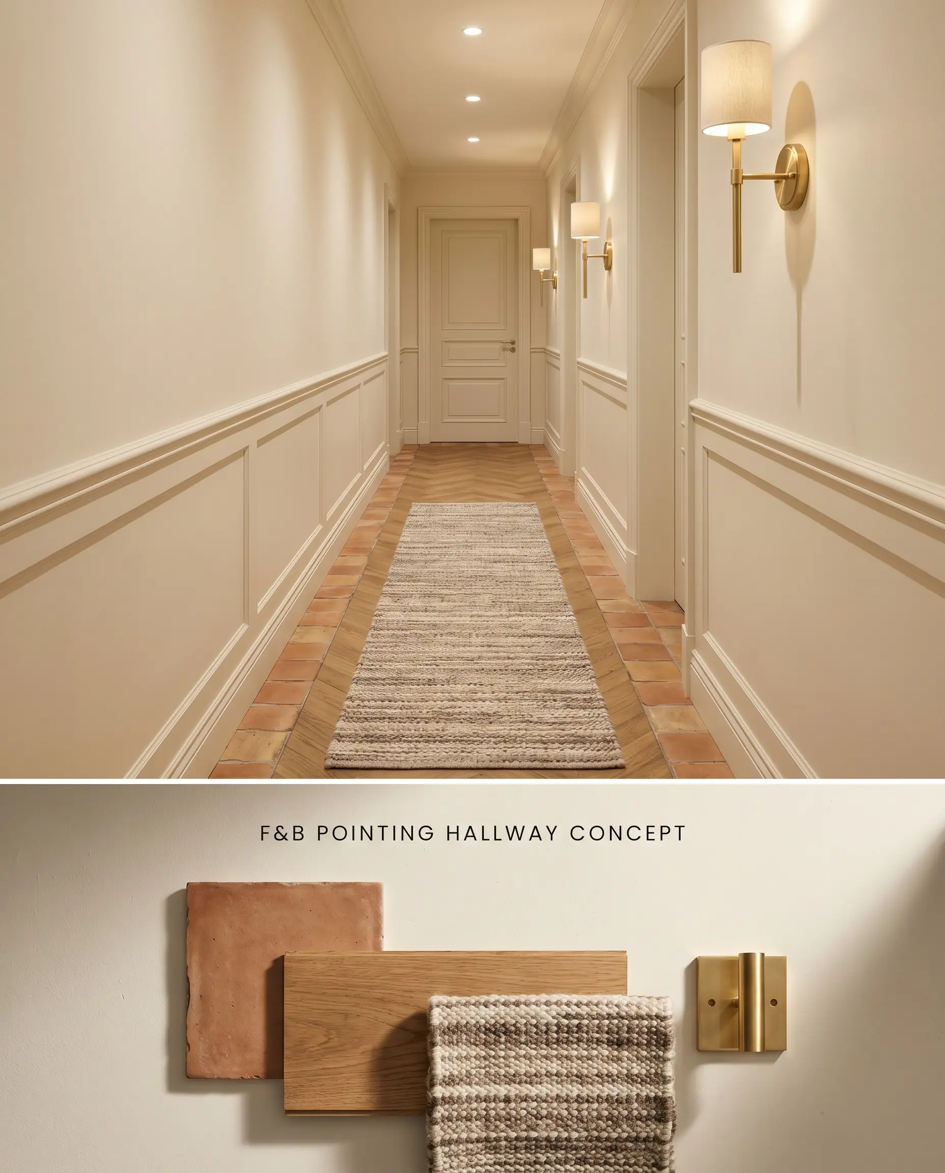
Windowless transitional spaces benefit from this shade’s high LRV and inherent warmth, preventing narrow corridors from feeling like sterile, clinical tunnels. The red undertone actively fights the low-light trap, projecting a welcoming softness even without direct natural illumination. It acts as a luminous bridge, connecting darker, moodier adjacent rooms without jarring the eye.
You can apply wallpapers, paints, etc. on walls and see how they look in various interiors.

Comparative Color Theory: Rival Whites
Farrow & Ball Pointing 2003 vs. Farrow & Ball Wimborne White 239
Farrow & Ball Wimborne White 239 is a clean white enriched with a touch of warm yellow, projecting a crisper, more modern brightness compared to Pointing. Pointing’s red-based neutral foundation actively absorbs shadows to create an aged, historical softness. Deploy Wimborne White for sharp, contemporary contrast on millwork, but rely on Pointing in North-facing rooms where its underlying red prevents the ambient light from reading cold or stark.
Farrow & Ball Pointing 2003 vs. Sherwin-Williams Creamy SW 7012
Sherwin-Williams Creamy SW 7012 leans significantly further into a yellow-beige undertone, making it a denser, more traditional ivory. Pointing maintains a higher LRV (88.19) and utilizes a subtle red base tint, which keeps it feeling airy and luminous rather than thick or buttery. Specify Creamy for rustic, Tuscan-inspired stone fireplaces, but use Pointing when you need a warm off-white that won’t turn excessively yellow in sun-drenched Southern exposures.
Farrow & Ball Pointing 2003 vs. Farrow & Ball White Tie 2002
Farrow & Ball White Tie 2002 contains a distinct, prominent yellow-buff undertone, making it visibly deeper and warmer than Pointing. When placed side-by-side, Pointing appears almost like a clean white, while White Tie registers as a true cream. Utilize White Tie in drafty, expansive rooms to artificially generate intense warmth, but select Pointing for low-light, windowless hallways where the lighter chromatic profile prevents the space from feeling enclosed or muddy.
Technical FAQs
In warm, late-afternoon Southern light, Pointing’s red-based neutral formula can flash a subtle pinkish-cream. In highly reflective rooms, this warmth bounces and amplifies, turning it into a more pronounced creamy ivory rather than a stark yellow.
Yes, pairing Pointing with stark, cool whites like Chantilly Lace or All White creates a harsh clash. The stark contrast will immediately make Pointing’s warm off-white base look dirty, dingy, or overly yellow.
Modern Eggshell is the mandatory finish for kitchen cabinets painted in Pointing. This exceptionally durable, mid-sheen waterborne architectural finish withstands rigorous friction and frequent wipe-downs while preserving the color structure.
Color-matching Farrow & Ball paints across brands typically fails because standard tinting machines cannot replicate their proprietary clay and mineral base. A match will likely lose the delicate red undertone, resulting in a flat, generic cream that lacks the original’s dynamic reaction to lighting shifts.
Similar Paint Colors
Same Brand
Cross-Brand Equivalents