Green Smoke No. 47
Farrow & BallFarrow & Ball Green Smoke (No. 47) is a deeply atmospheric, medium-dark smoky green with pronounced blue and gray undertones. With an LRV of 19, it acts as a moody, historic hue that shifts between a rich teal-green in bright light and a muted gray-green in shadows.
Farrow & Ball Green Smoke (No. 47) Paint Color Review: A Heritage Green for Sophisticated, Timeless Spaces
We are living in an era where homeowners are desperate to bring the outside in, yet terrified of turning their living rooms into a literal greenhouse. You want a color that feels connected to nature through biophilic design, but it must carry enough architectural weight to feel expensive, curated, and highly intentional.
Farrow & Ball Green Smoke No. 47 is the exact answer to this very specific design anxiety.
This is not a bright, synthetic emerald or a predictable sage. This historic shade is a deeply complex, slate-anchored hue that has dominated high-end editorial spreads for years. However, this muted plum-green is notoriously shape-shifting. We are going to break down the exact color math, lighting requirements, and architectural pairings necessary to force this iconic pigment to perform flawlessly in your home.
The Color DNA of Farrow & Ball Green Smoke
To understand why this pigment behaves the way it does, we have to look past the marketing and analyze the raw color chemistry.
Green Smoke is fundamentally a chameleon. It is categorized as a green, but its actual base is heavily saturated with complex, cooling elements.
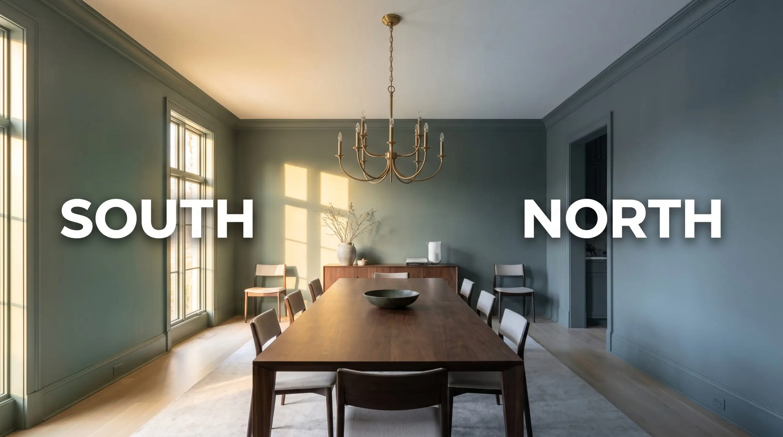
Because of its specific chemical makeup, navigating the blue-green undertones of this paint is crucial. With a Light Reflectance Value (LRV) of 19, this is definitively a medium-dark color. It absorbs a massive amount of light. It will not bounce sunshine around your room or make a small space feel artificially larger. Instead, it is a space-defining, light-absorbing hue designed to create immediate intimacy and architectural grounding.
You can apply wallpapers, paints, etc. on walls and see how they look in various interiors.

Lighting Effects & Resolving The “Muddy” Fear
The single biggest fear our editorial team hears regarding this specific Farrow & Ball shade is that it will look like a dreary, muddy gray in low light.
This anxiety is entirely valid. If you put a color with an LRV of 19 and heavy blue-gray undertones into a poorly lit room with the wrong bulbs, it will absolutely turn into a dark, depressing cave.
You can actively manipulate how this paint reads by controlling your light bulbs. To keep the green vibrant and suppress the gray, you must use bulbs in the 3000K to 3500K range.
Hackrea Pro-Tip
Here is exactly how the pigment reacts to environmental light:
Broad Applications for Historic Greens
This Farrow & Ball classic is highly versatile, but only if you respect its lighting demands. It is not a slap-it-anywhere neutral.
If you lack natural light, you must commit to the moodiness. If you are looking for the best historic green paints to wash a dark hallway in brightness, look elsewhere. But for purposeful, intentional spaces, it is a powerhouse.
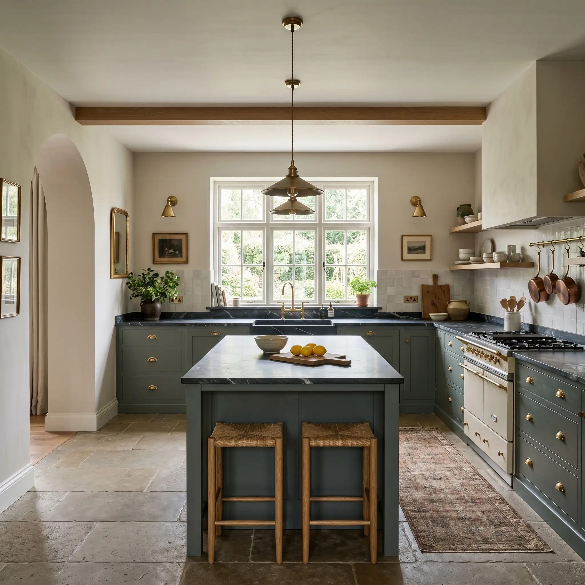
Kitchen Cabinetry
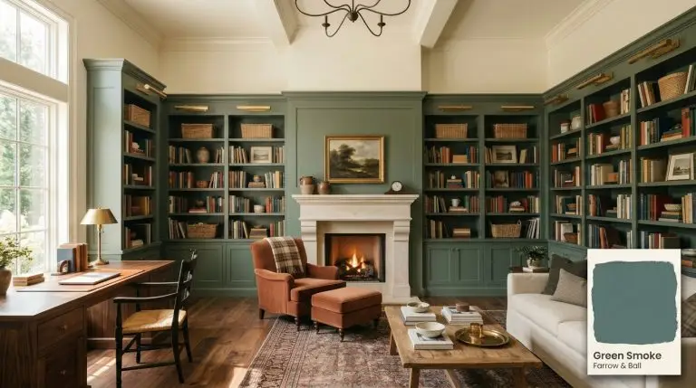
This hue is a phenomenal cabinetry paint, provided your kitchen has adequate task lighting. When applied to lower cabinets or a central island, it grounds the room beautifully against lighter upper walls. Because of the heavy gray undertone, it pairs seamlessly with heavily veined marble countertops, acting as an organic anchor. Be meticulous about your sheen choice here to ensure durability against grease and scrubbing. For a deep dive into execution, review our guide on how to paint kitchen cabinets.
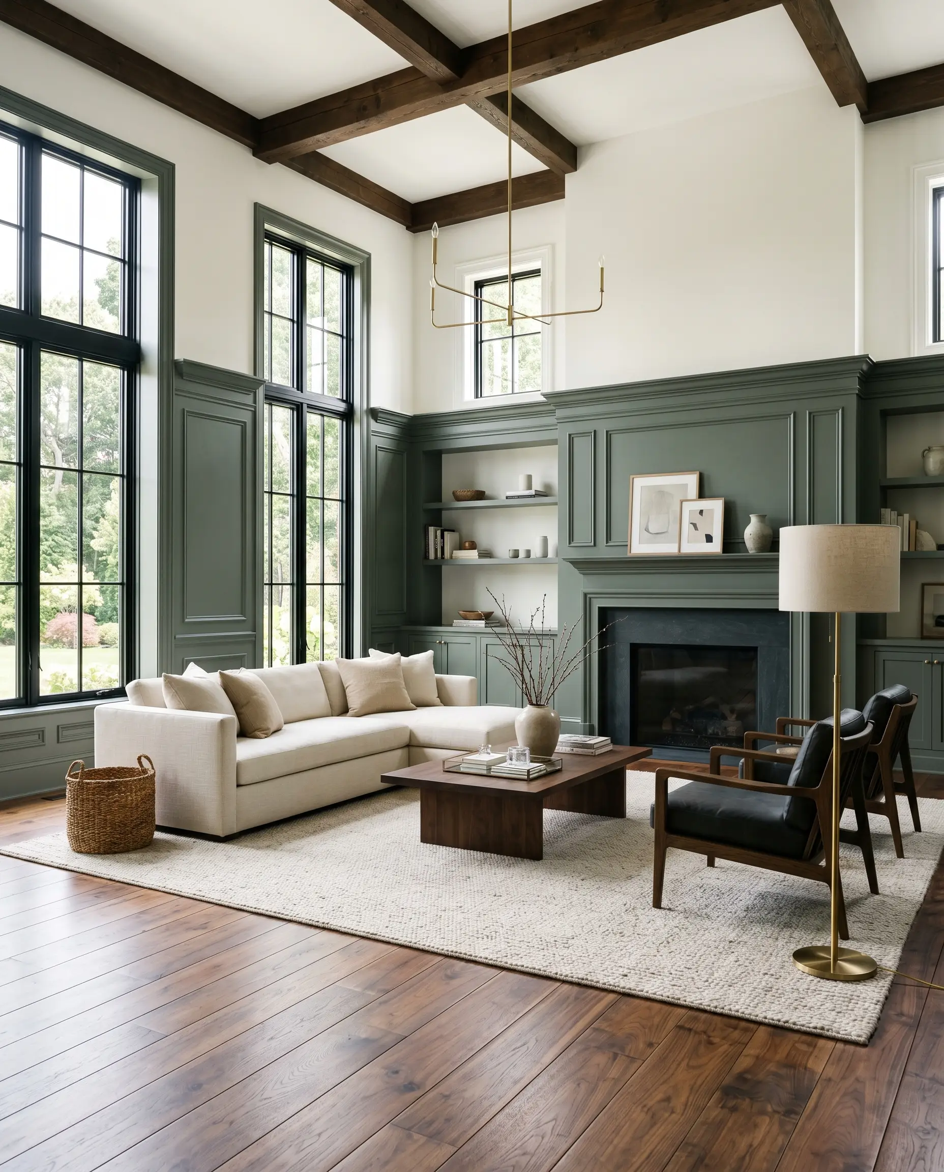
Living Rooms
Using this medium-dark shade on all four walls of a living room requires architectural conviction. It works best in living spaces that feature high ceilings or abundant natural light to offset the low LRV. If your living room is naturally dark, restrict this color to wainscoting or a dedicated focal wall, pairing it with a creamy, warm white above the chair rail to maintain visual balance.
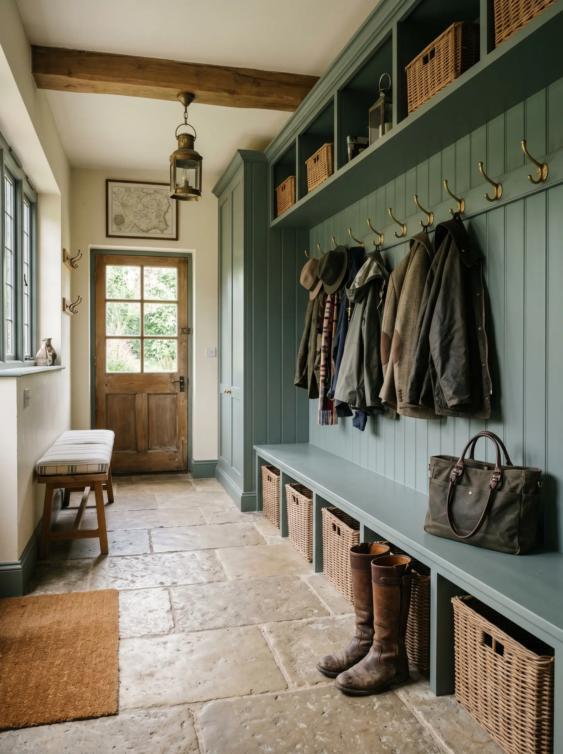
Mudrooms
Mudrooms are transitional spaces that crave durability and dirt-hiding prowess. The slate-green DNA of No. 47 thrives here. It instantly disguises scuffs and outdoor grime while providing a handsome, utilitarian backdrop for brass hooks, woven baskets, and natural stone floors.
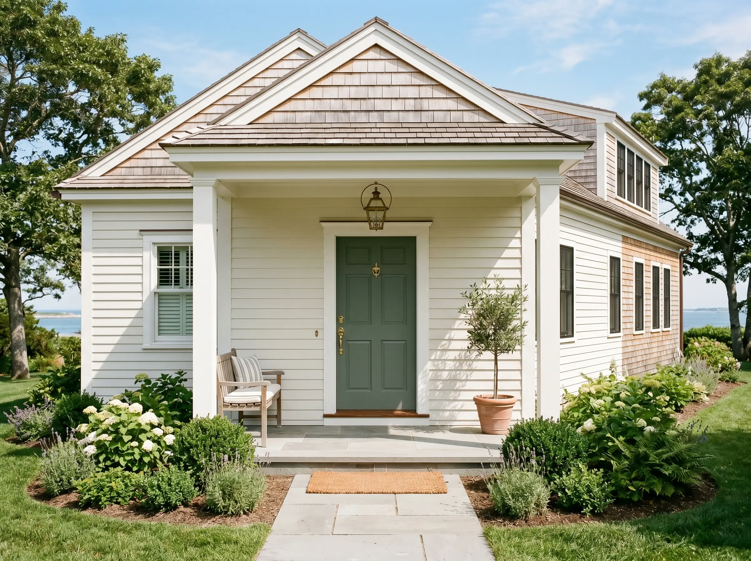
Exterior Doors & Trim
When taken outside, natural sunlight washes out a significant portion of a paint’s depth. Outdoors, this Farrow & Ball shade loses its dark, moody interior persona and transforms into a lush, vibrant heritage green. It is a stunning choice for a front door, especially when set against warm white exterior siding or natural cedar shingles.
Signature Architectural Uses for Green Smoke
While you can technically use this paint anywhere, there are specific architectural applications where its color DNA truly dominates.
These are the high-end, editorial use cases that maximize the pigment’s potential.
The Windowless Powder Room
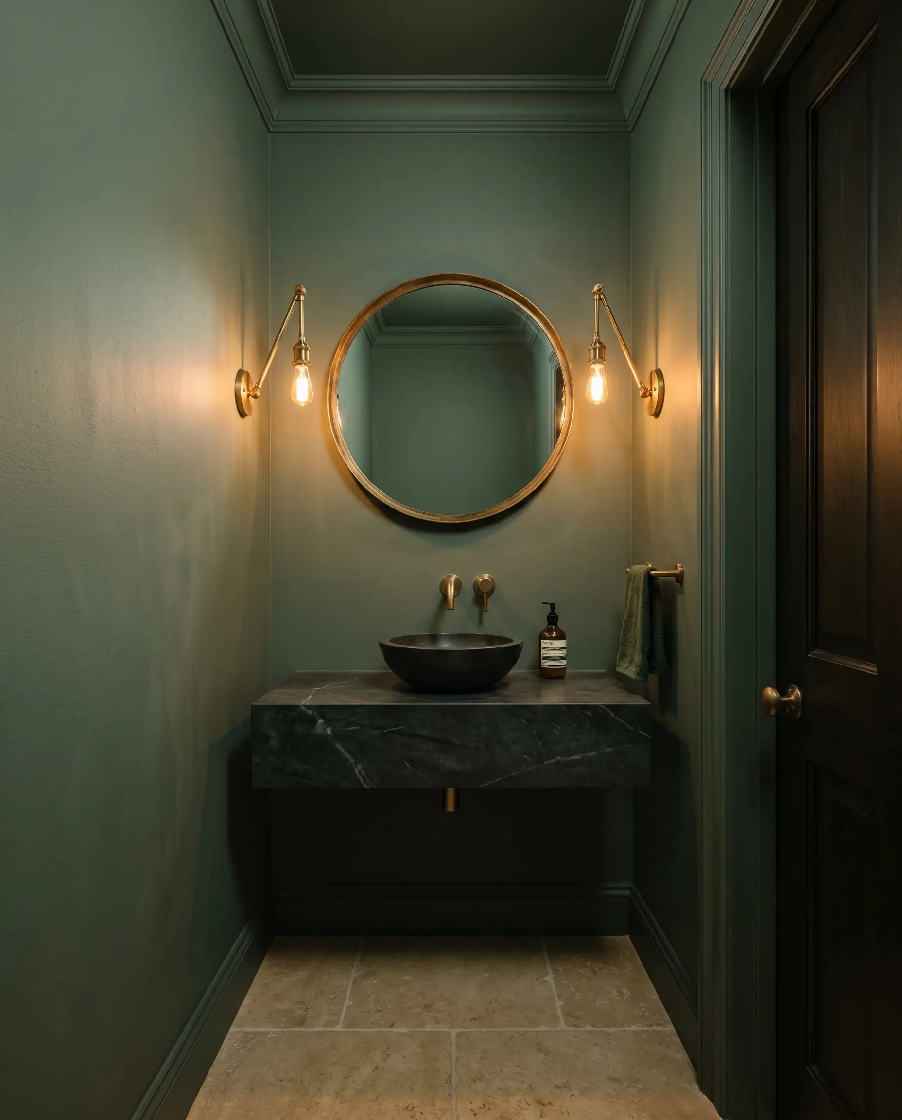
Small, windowless rooms are inherently dark, and trying to paint them white to “brighten” them only results in dingy, gray shadows. Instead, lean into the cavernous psychology of the space. By color-drenching a powder room—painting the walls, trim, and ceiling entirely in No. 47—you eliminate contrasting shadow lines. The room instantly transforms from a cramped closet into a moody, expensive jewel-box.
Victorian & Craftsman Exterior Millwork
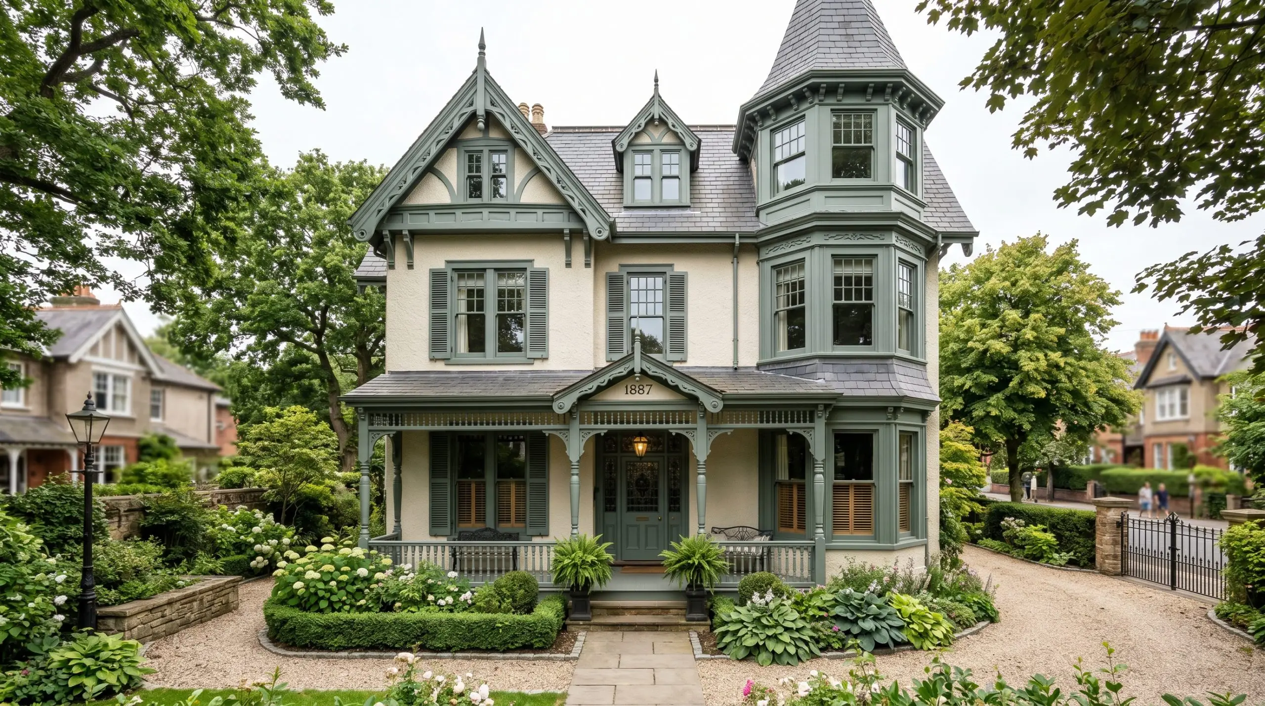
This color possesses a specific “weathered familiarity” that feels intrinsically tied to late 19th-century architecture. Applying it to exterior window sashes, shutters, and intricate fascia boards grounds historical homes. The muted slate-green provides the perfect historical tension against lighter masonry or classic cream stucco, honoring the architectural era without feeling like a museum replica.
The Moody Library Built-Ins
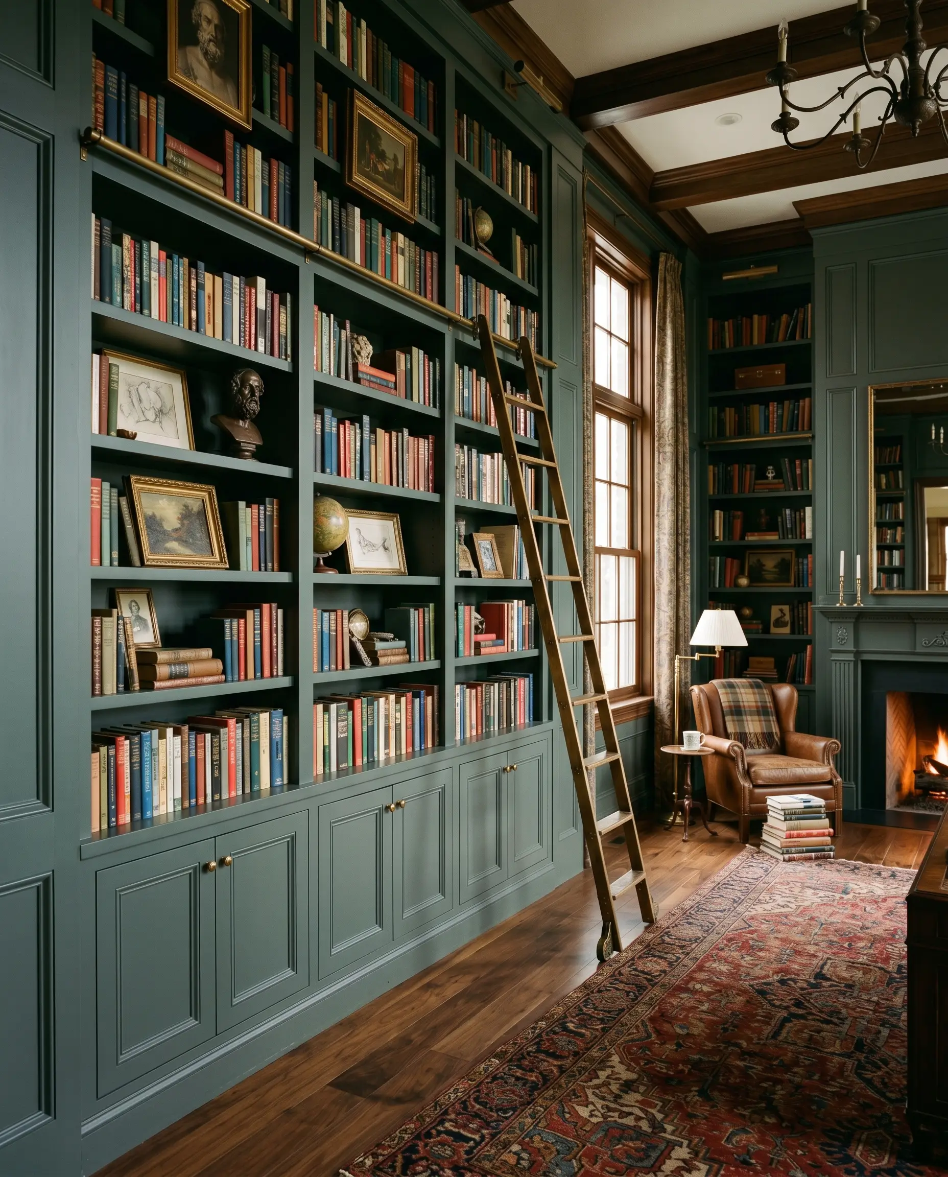
Built-in bookcases and wainscoting are physical, structural elements that demand visual weight. When you coat library built-ins in this deeply saturated shade, the woodwork recedes, allowing the colorful spines of books and curated art to push forward. The green physically frames the architecture, turning standard carpentry into a commanding focal point.
Conservatory & Sunroom Beadboard
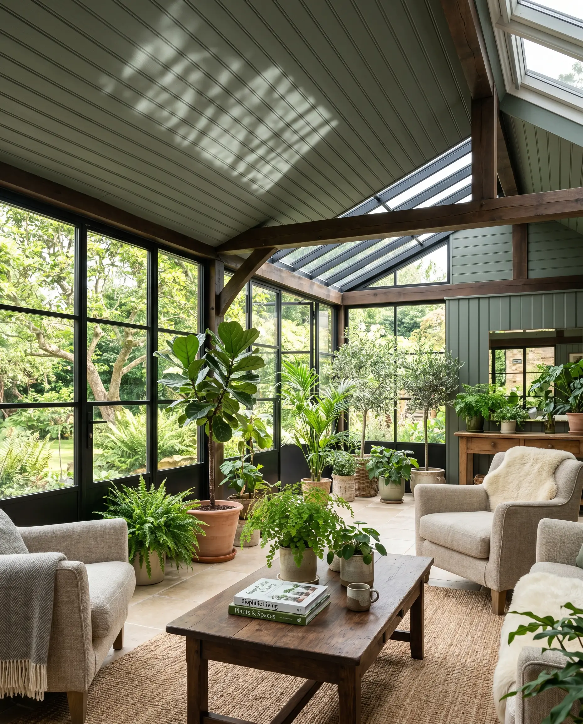
Sunrooms are heavily glazed, meaning the line between the interior and the garden is already blurred. Applying this organic, earthy tone to a textured beadboard ceiling amplifies that biophilic connection. The physical texture of the beadboard catches the shifting natural light, creating subtle stripes of shadow that make the ceiling feel like a natural canopy.
Farrow & Ball Green Smoke Pairings & Accents Guide
A paint color never exists in a vacuum. Its success is entirely dependent on the materials and colors physically touching it.
Trim & Baseboards
Because of the heavy gray base, stark, cool whites will make the green look dirty. You need warm, soft whites to bridge the contrast.
Hardware & Architectural Materials
The cool slate undertones of this paint demand warm, living finishes to create high-end visual tension. Unlacquered brass is non-negotiable; the golden warmth of the metal cuts directly through the moody green. Pair it with honed dark soapstone countertops, medium-to-dark walnut wood tones, and tumbled limestone flooring to complete the heritage aesthetic.
Coordinating Colors
Curated Mood Boards
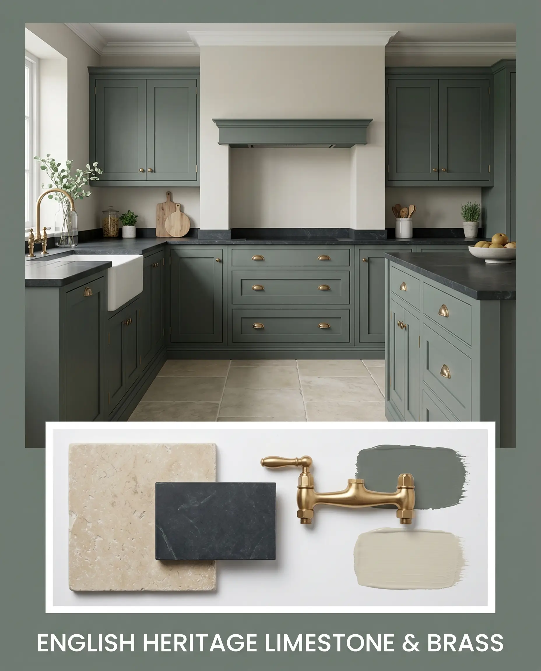
English Heritage Limestone & Brass: This palette relies on high-end, tactile materials to ground the green in history. Imagine No. 47 on traditional shaker cabinetry, topped with deeply veined, honed soapstone. The floors are tumbled, porous limestone, providing a chalky, organic base. Heavy, unlacquered brass cup pulls and a bridge faucet introduce a living, warm metal that will patina over time, perfectly offsetting the cool slate undertones of the paint. The adjoining walls are coated in Shaded White to keep the transitions soft and historical.
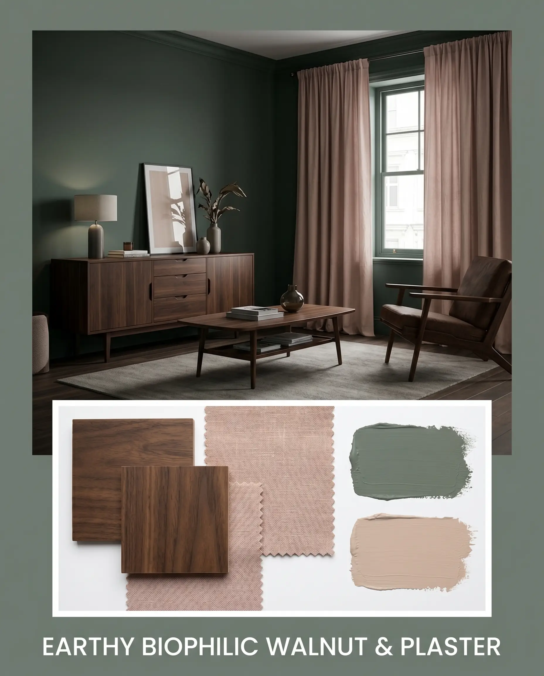
Earthy Biophilic Walnut & Plaster: This aesthetic is purely about organic warmth and modern, moody interiors. The walls are color-drenched in the dark green, creating a dense, forest-like perimeter. Mid-century modern furniture crafted from rich, dark walnut sits against the green, the wood’s natural orange-red undertones completely neutralized by the green’s cool blue base. Accents of Setting Plaster are introduced through heavy linen drapery or a velvet accent chair, injecting a dusty, earthy pink that perfectly balances the heavy, light-absorbing walls.
Head-to-Head Paint Comparisons
When narrowing down moody greens, you must scrutinize the undertones. Here is how this shade stacks up against its fiercest competitors.
Farrow & Ball Green Smoke vs. Farrow & Ball Pigeon
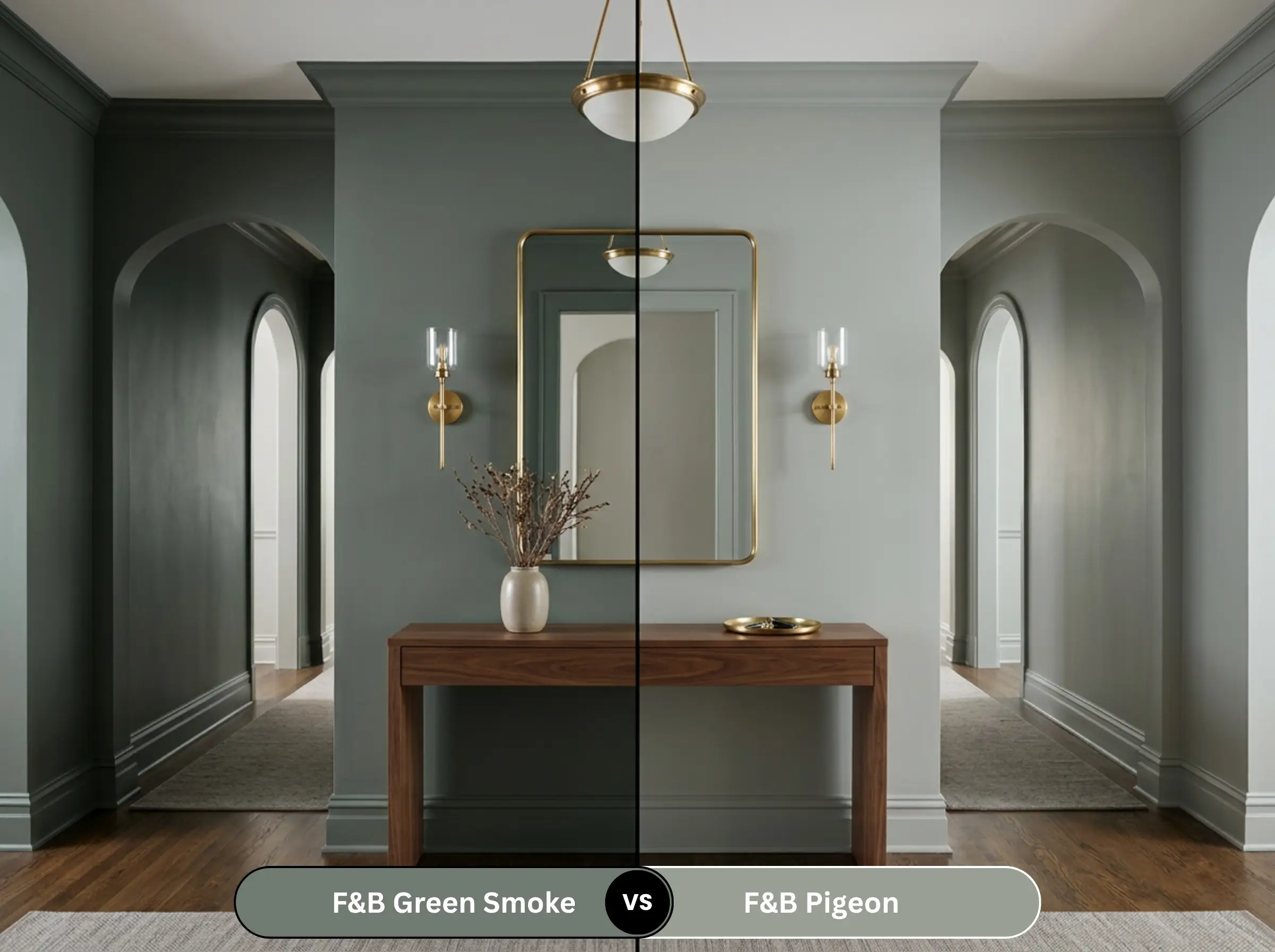
Pigeon is significantly lighter (LRV 35) and leans much further into the gray-blue spectrum. While No. 47 is definitively a dark green with gray undertones, Pigeon is a gray that merely flashes green in certain lighting. If you are terrified of a room feeling too dark, Pigeon is the safer, more reflective choice.
Farrow & Ball Green Smoke vs. Farrow & Ball Card Room Green
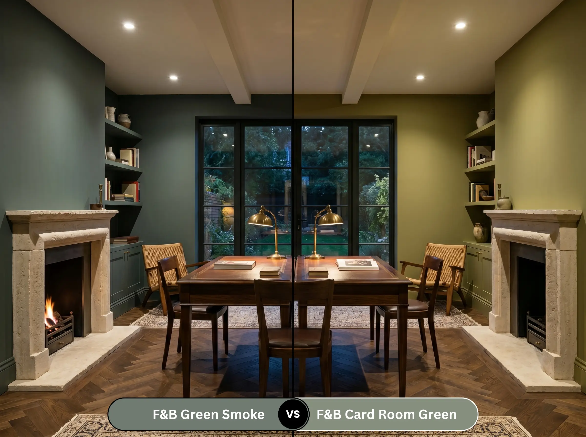
Card Room Green is lighter and lacks the heavy slate-blue base. It is a much warmer, more traditional Victorian green that leans slightly yellow-olive. If your room faces North and you want to avoid the color turning into a cold, blue-gray cave, Card Room Green will hold its warmth far better than No. 47.
Farrow & Ball Green Smoke vs. Benjamin Moore Cushing Green
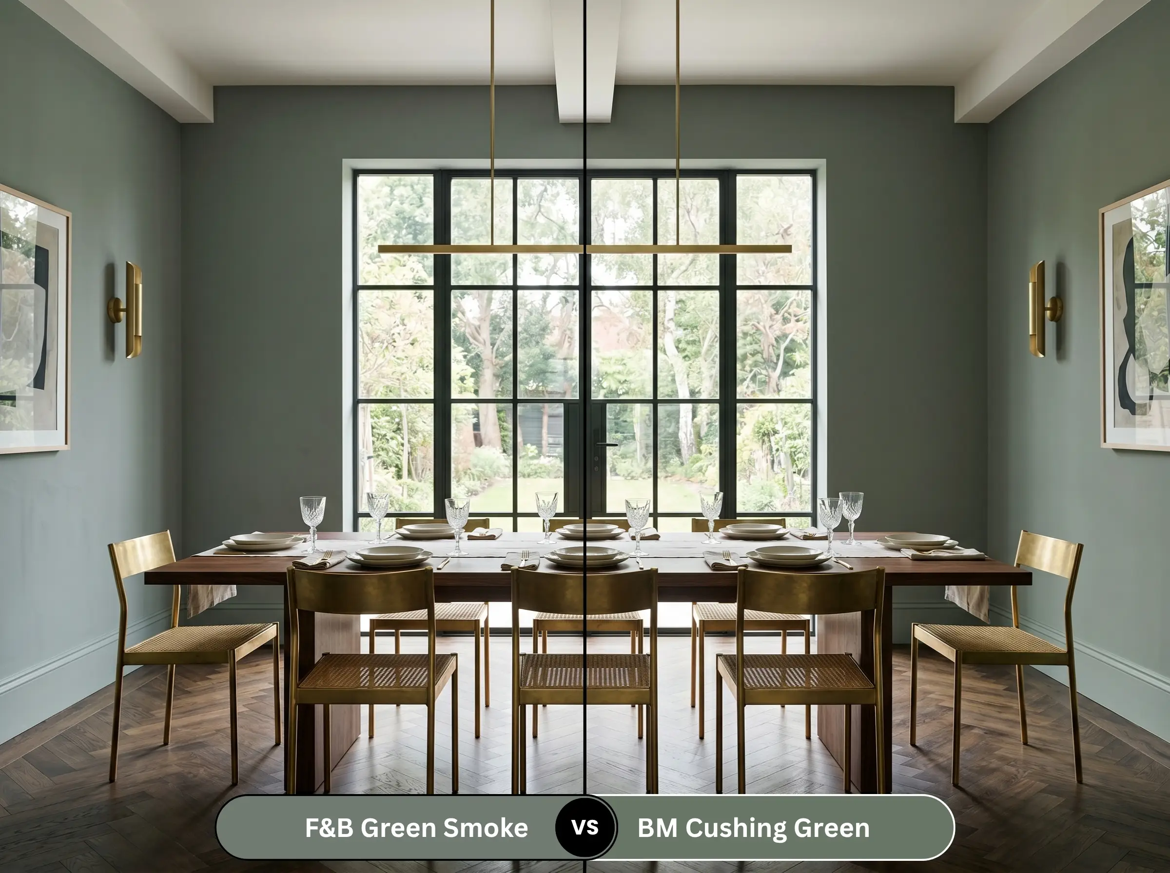
Cushing Green is a classic, rich forest green. It does not possess the smoky, chalky gray undertones that define the Farrow & Ball color. Cushing Green will look noticeably more vibrant, synthetic, and traditionally “green” on the wall, whereas the F&B shade will always look slightly muted and aged.
Alternative Moody Interiors & Color Equivalents
If you love the concept but need a slight pivot in depth, or if you require a different brand formulation, these are the mathematical equivalents.
Similar Colors in the Same Brand
Cross-Brand Equivalents
The Mechanics of Farrow & Ball No. 47
Applying high-end, heavily pigmented paint requires specific technical execution. The finish is just as important as the color itself.
The Dynamic Sheen Matrix
Primer Strategy
You cannot paint an LRV 19 color directly over a light wall or raw wood without a tinted primer. You must use Farrow & Ball’s Dark Tones Primer (or a high-quality gray-tinted primer). A white primer will inevitably shine through the micro-pores of the roller texture, making the final green look chalky, thin, and drastically lighter than the swatch.
Coverage & Touch-Ups
Dark, flat paints are notoriously unforgiving when it comes to “flashing”—visible roller marks caused by uneven pressure or overlapping wet and dry edges. You must maintain a wet edge while rolling. Furthermore, touching up Estate Emulsion is incredibly difficult; if you scuff a wall months later, spot-touching will leave a visible ring. You will likely need to repaint the entire wall corner-to-corner.
Frequently Asked Questions
Yes, it absolutely can. North-facing light is cool and blue-tinted, which bypasses the green pigment and amplifies the slate-gray undertones. If you do not have adequate artificial lighting (3000K bulbs) to counteract this, the color will look like a dark, muddy gray rather than a rich green.
Estate Emulsion is a true 2% chalky matte finish. It absorbs light, giving the green a soft, powdery, and highly historical depth. Modern Emulsion has a 7% sheen; while more durable, that slight reflectivity bounces light off the surface, making the green look slightly sharper, colder, and less velvety.
You can absolutely use it on stucco using Farrow & Ball’s Exterior Masonry finish. However, be aware that the sheer volume of natural sunlight outdoors will wash out the dark, moody undertones, making the color appear significantly lighter and more vibrant than it does indoors.
It depends entirely on the Kelvin temperature of the LED. Under standard “Daylight” LEDs (4000K and above), the color will pull heavily gray and cold blue. Under “Soft White” LEDs (2700K), it will pull warm, suppressing the blue entirely and looking like a dark olive.
Final Verdict & Expert Warnings
Farrow & Ball Green Smoke No. 47 is a masterfully engineered pigment that delivers instant historical gravity to any room. It is the definitive choice for homeowners who want a moody, biophilic anchor color that feels sophisticated rather than trendy. Its absolute best application is color-drenched in a small, windowless powder room or painted across massive library built-ins where its light-absorbing qualities can be fully weaponized.
However, it requires strict environmental control.
Clash Warning: Do not pair this paint with 1990s honey oak floors; the yellow-orange clash brings out the absolute worst muddy, dirty qualities in the green. Similarly, avoid red-toned brick fireplaces or cherry wood built-ins, as the blue undertone in the paint will clash with the harsh reds, creating a jarring, unintentional “Christmas” effect. Finally, keep polished chrome and brushed nickel far away from this color, as cool metals will render the green washed out and institutional. Stick to warm woods and unlacquered brass, and this paint will perform flawlessly.