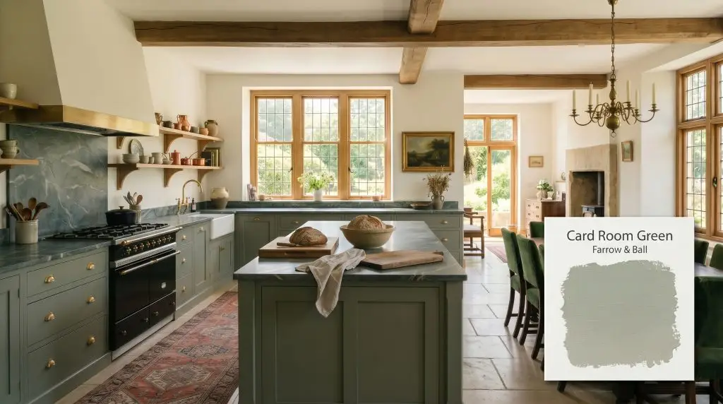
Farrow & Ball Card Room Green No. 79 is a deeply saturated, moody grey-green inspired by Victorian study rooms. With an LRV of 27, it acts as a sophisticated, grounding neutral that shifts between an earthy olive and a muted slate depending on the lighting.
Will Card Room Green clash with your room?
Paint Technical Profile
| Color ID / SKU | No. 79 |
| HEX Code | #878f81 |
| Light Reflectance (LRV) | 27 |
| Use | Interior, Exterior |
| Best Exposures | South-Facing, West-Facing |
| Best For | Studies, Dining Rooms, Cabinetry, Exterior Accents |
Farrow & Ball Card Room Green: The Ultimate Moody Heritage Tone
There is a distinct design challenge when dealing with a soaring, drafty living room that receives an overwhelming amount of natural light. To anchor that kind of airy volume, you need a foundational layer that absorbs the glare without shrinking the room into an uninviting cave. Farrow & Ball Card Room Green No. 79 accomplishes exactly this, acting as a deeply grounding anchor that completely changes the atmospheric temperature of the home.
By wrapping your walls in this heavy, historic pigment, you instantly pull the ceiling down visually and give the architecture a sense of established permanence. It is a brilliant, highly intentional choice for homeowners looking to graduate from safe, stark whites into the world of rich, saturated color.
Undertones & LRV of Farrow & Ball Card Room Green
When evaluating its core color temperature, this shade is definitively a warm-leaning neutral. It possesses a hidden, earthy heat that prevents it from ever feeling chilly, even in challenging exposures. The anatomy of this pigment is built on a very tight clustering of red, green, and blue, which creates a highly complex, muddy base.
With a light reflectance value of exactly 27, this shade absorbs a massive 73 percent of the light that hits it. This places it firmly in the medium-dark category, meaning it will wrap a space in heavy, intimate warmth. It provides a gorgeous, moody neutral backdrop without entirely collapsing into a black hole.
Lighting Effects & The Chameleon Factor
The biggest environmental risk with this specific grey-green occurs in heavily shadowed, windowless rooms illuminated entirely by harsh, cool LED bulbs. Under those strict conditions, the rich olive warmth completely flatlines, leaving you with a sterile, austere grey that loses all of its heritage charm. Because of this extreme sensitivity, you must test this pigment against the shifting daylight in your specific room.
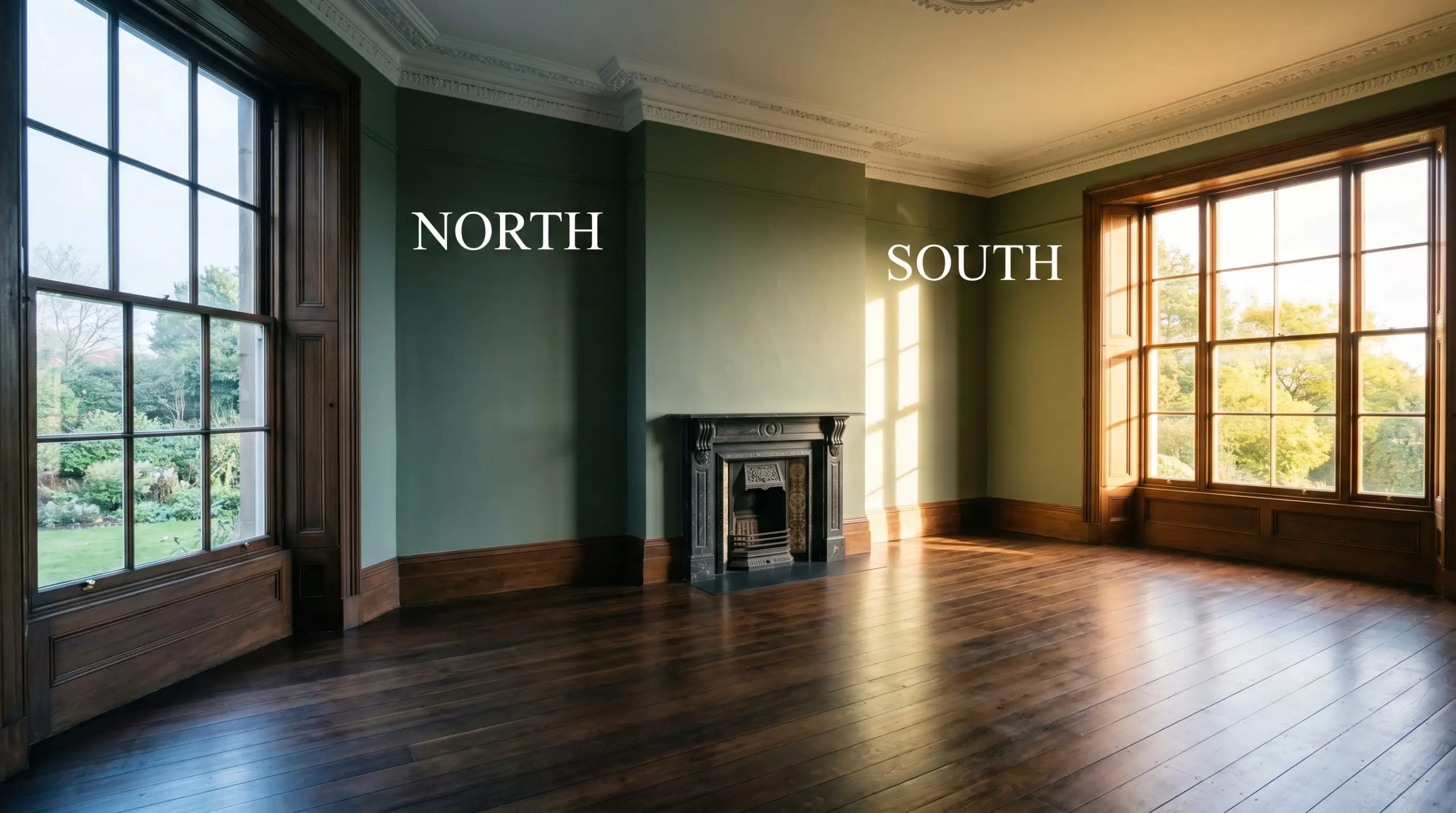
Architectural Features & Broad Room Applications
This shade brings an unmistakable, grounding energy to a home, demanding to be paired with substantial millwork and intentional styling. It transitions beautifully from intimate corners to high-traffic utility zones, adapting its mood to the function of the space.
Home Offices & Studies
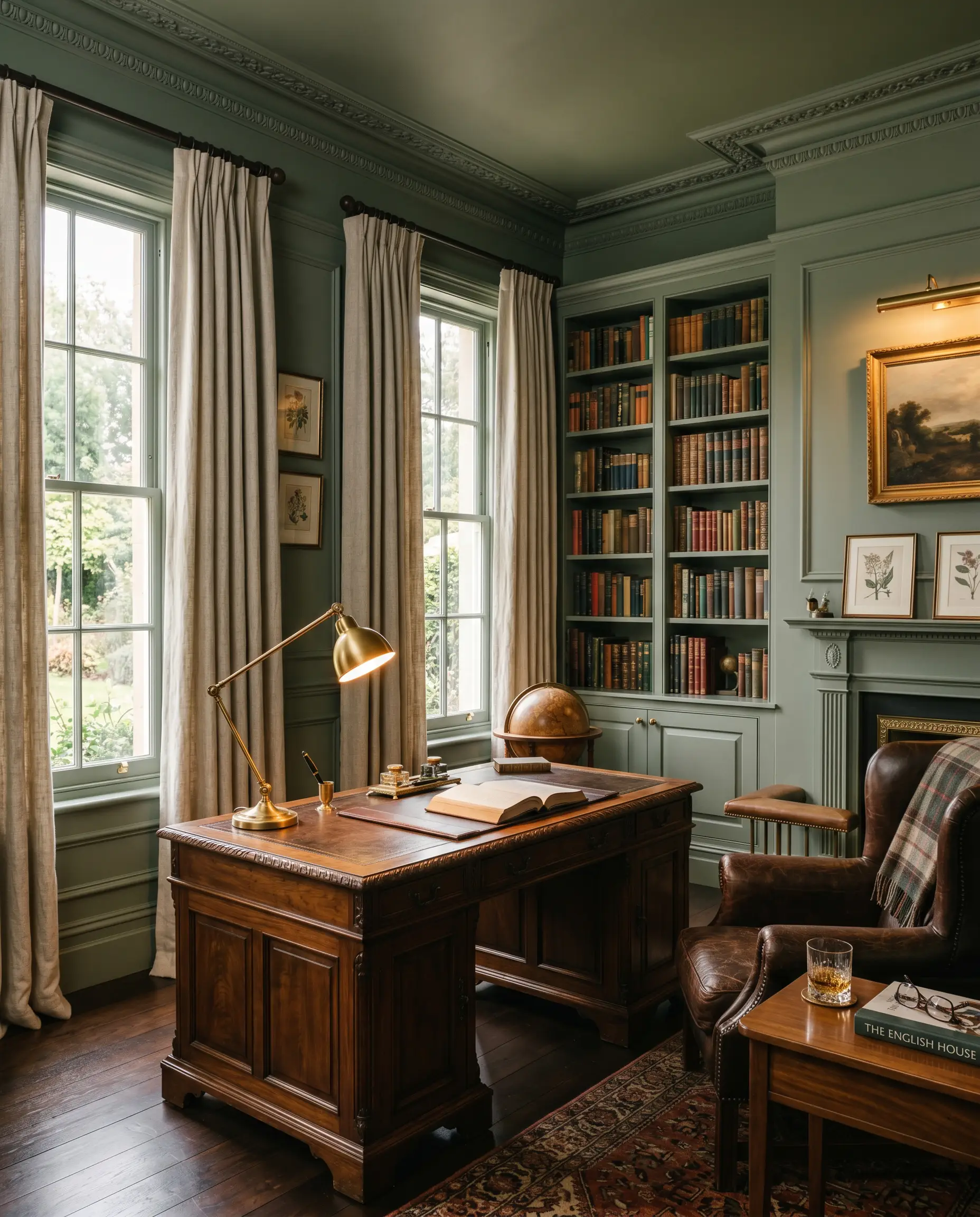
This depth of color is practically engineered for a classic Victorian study, bringing a sense of quiet focus and library-like intimacy. To maximize this enveloping feeling, learning how to color-drench a home office with this shade across the walls, trim, and ceiling creates a truly seamless, distraction-free environment. Pair it with rich walnut desks, heavily textured linen drapery, and warm brass task lighting to complete the sophisticated aesthetic.
Will Card Room Green work with your specific lighting, floor, or furniture?
Kitchen Cabinetry & Islands
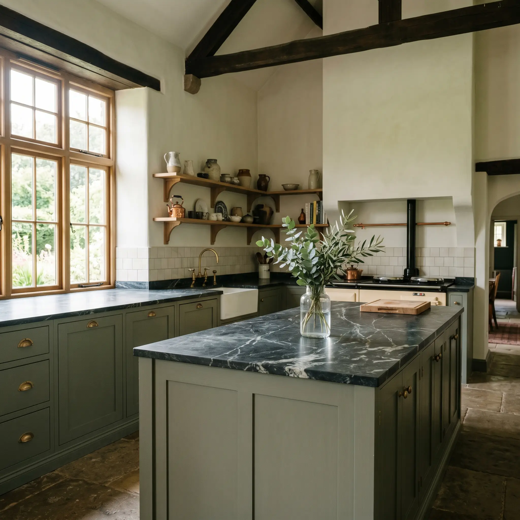
Using this earthy tone on your lower runs or an expansive island instantly grounds a bright, marble-heavy kitchen. When researching the best moody green kitchen cabinets, you will find this specific shade constantly recommended because it hides everyday scuffs while feeling incredibly premium. It is the perfect canvas for bespoke cabinetry, especially when accented with unlacquered brass cup pulls and a heavily veined soapstone countertop.
Formal Dining Rooms
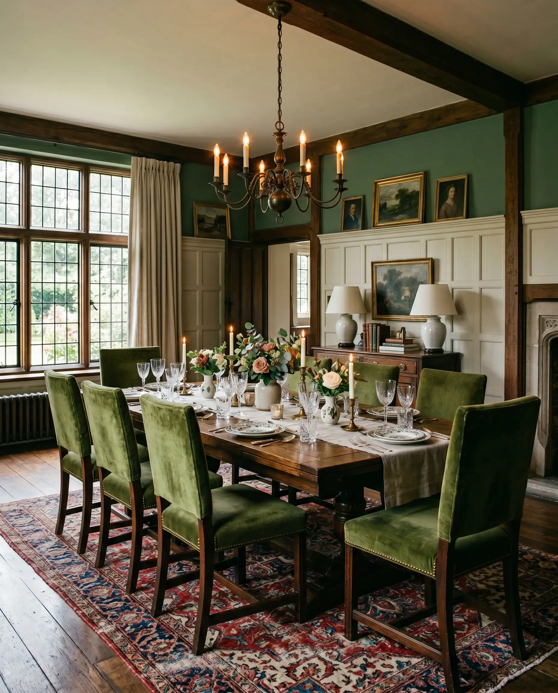
In a dining space, this desaturated tone creates a gorgeous, intimate backdrop for evening entertaining. It looks stunning applied above traditional wainscoting, allowing the dark green to glow under the warm light of a central chandelier. You can easily style this with heavy velvet dining chairs and a heavily distressed vintage rug to amplify the heritage feel.
Mudrooms & Entryways
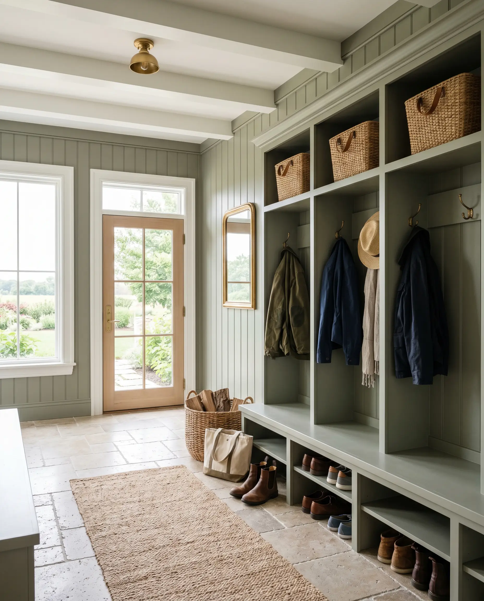
Utility spaces benefit immensely from this hardworking, medium-dark tone. It provides a highly durable, dirt-forgiving surface for beadboard or built-in storage lockers. Contrast the muddy green walls with tumbled limestone floors and woven rattan baskets for a highly practical, beautifully curated drop zone.
Will Card Room Green work with your specific lighting, floor, or furniture?
Exterior Front Doors & Shutters
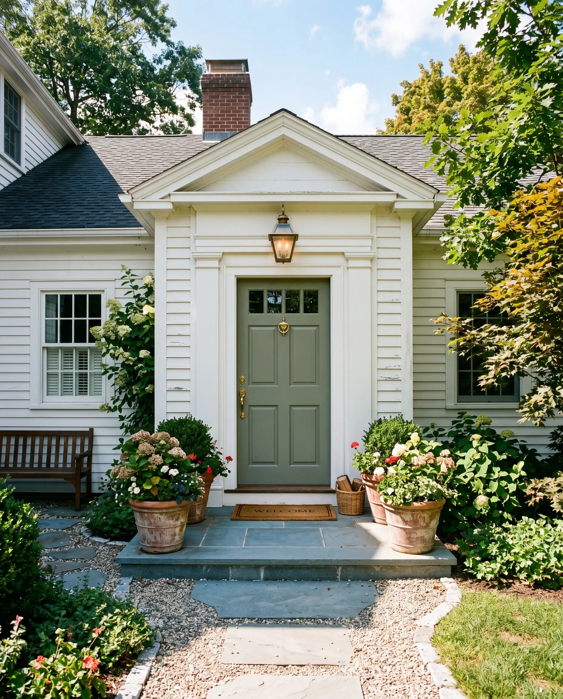
On an exterior facade, the intense natural sunlight will wash out a significant portion of the color’s depth. This means the dark, moody olive you see indoors will translate into a softer, welcoming grey-green on your front door. It pairs beautifully against classic red brick exteriors or crisp white clapboard siding.
Creative Ways to Use Farrow & Ball Card Room Green
Beyond standard wall applications, this deeply historic pigment is perfect for highly curated, inventive design projects. Its heavy, light-absorbing nature makes it an incredible tool for defining specific zones within a larger home.
The Seamless Built-In Wardrobe
Will Card Room Green work with your specific lighting, floor, or furniture?
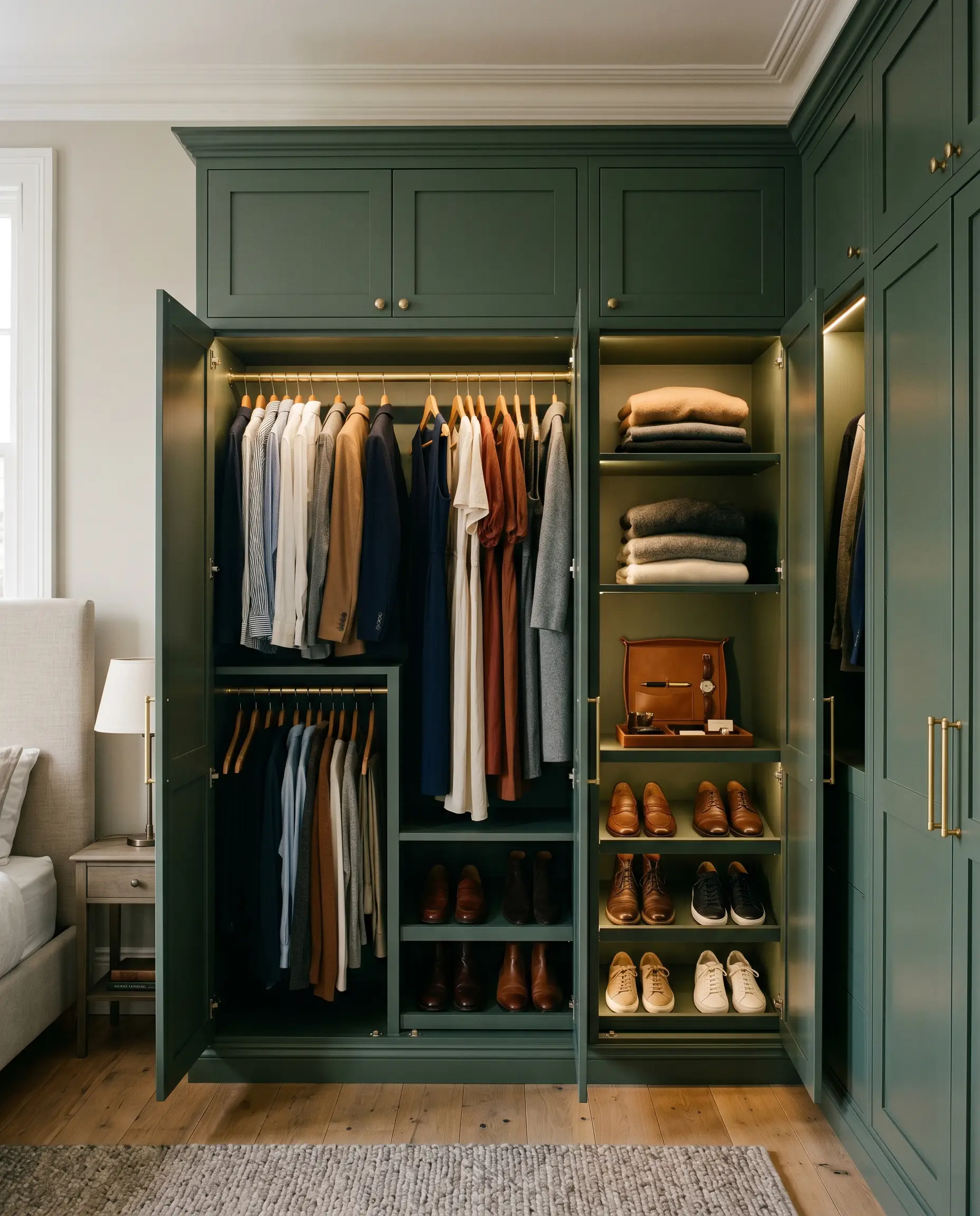
Transforming a standard bedroom closet into a premium, built-in wardrobe requires a color that feels intentional and permanent. Painting the entire wardrobe structure—including the doors, interior shelving, and surrounding trim—in this muted olive elevates standard MDF into what looks like custom, high-end millwork. The dark backdrop also makes your hanging garments and organized shoes pop visually against the earthy green.
A Grounding Two-Tone Staircase
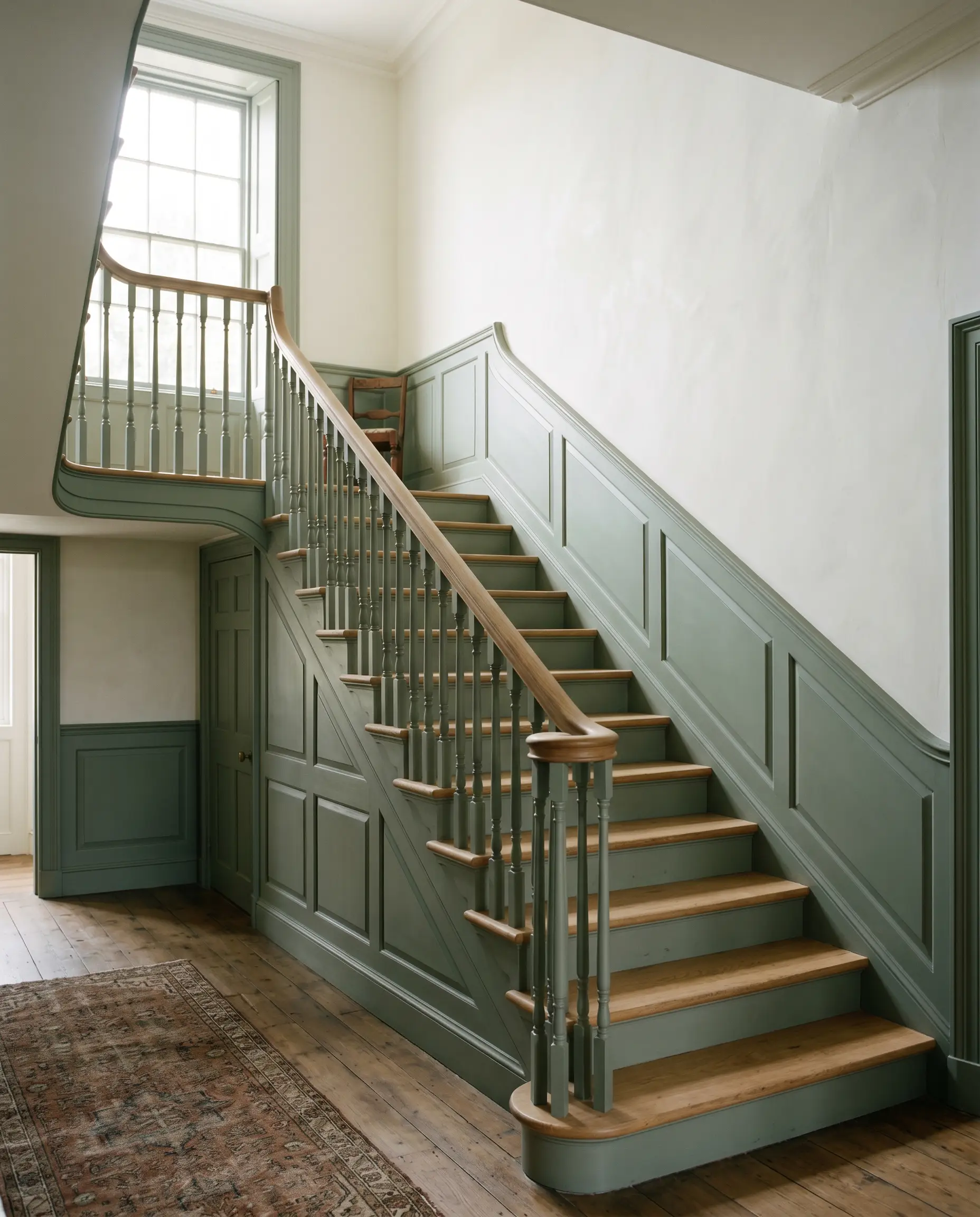
For a staircase that feels too steep or visually overwhelming, you can use this shade to anchor the lower half of the architecture. Applying this rich color to the stringers, spindles, and a continuous lower wainscot creates a heavy visual baseline. This technique pulls the eye downward, making the ascent feel safer, more grounded, and highly tailored.
The Atmospheric Bar Alcove
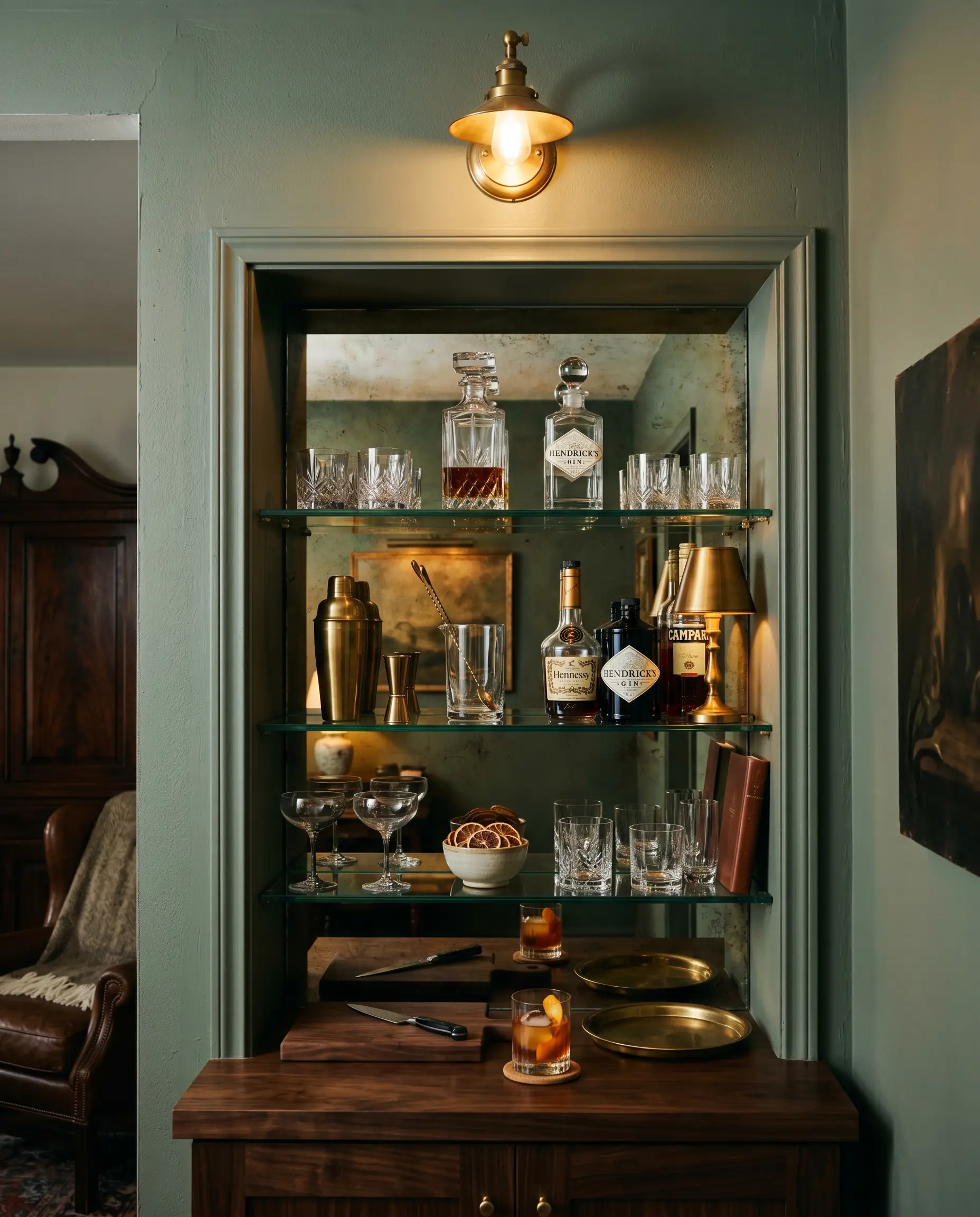
If you have an awkward, recessed niche in your living or dining room, this shade is ideal for carving out an intimate cocktail station. Coating the entire alcove creates a shadowy, speakeasy-inspired depth that contrasts brilliantly with the rest of the brightly lit room. Install floating glass shelves and a mirrored backsplash to bounce the ambient light around the dark, moody green.
Coordinating Colors & Best Pairings for Card Room Green
To make this earthy tone feel truly intentional, you must surround it with elements that either match its historic weight or provide a crisp, tailored boundary. The wrong metallic or a poorly chosen white trim can easily make the green feel murky rather than sophisticated.
Trim & Baseboards
Hardware, Wood & Material Pairings
Coordinating Colors
Designer Mood Boards
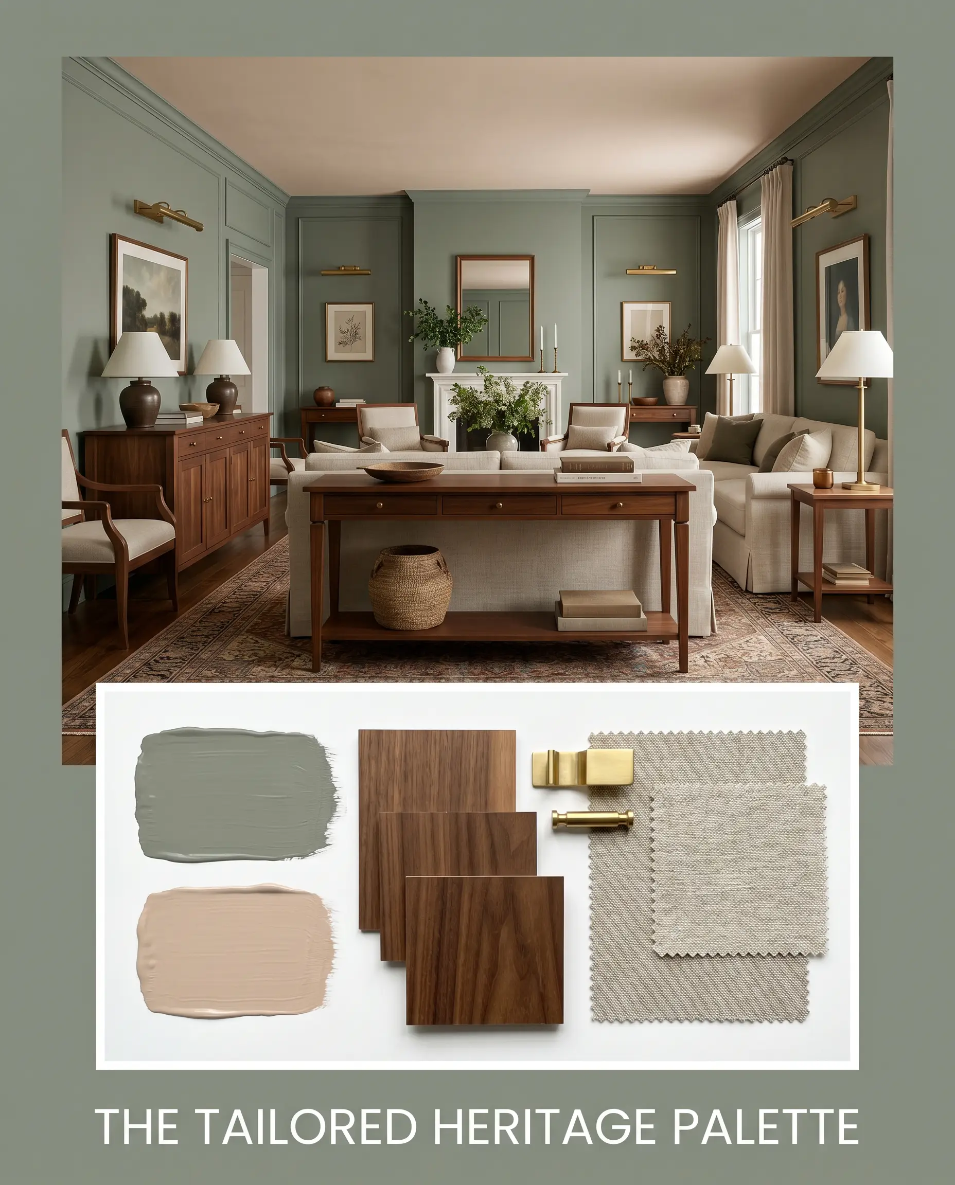
The Tailored Heritage Palette This aesthetic leans heavily into classic, structured elegance, utilizing the muddy green as a backdrop for rich walnut furniture and unlacquered brass picture lights. By layering in heavily textured, natural linen upholstery and a vintage Persian rug, the room feels instantly established and collected. The inclusion of Farrow & Ball Setting Plaster No. 231 on the ceiling or inside a neighboring alcove softens the entire mood.
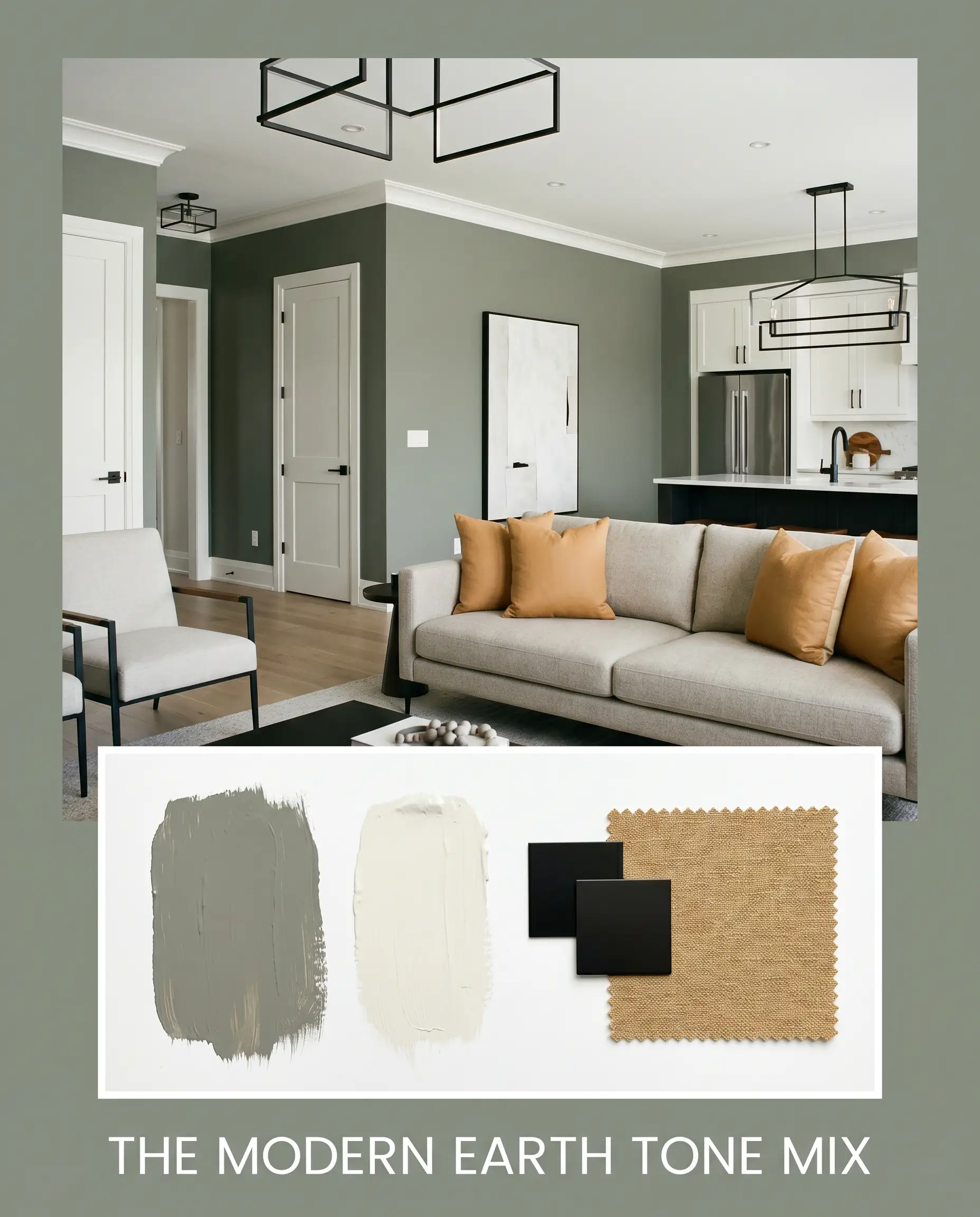
The Modern Earth Tone Mix This approach strips away the traditional elements, pairing the dark, desaturated olive with sleek, matte black hardware and clean, geometric lighting. It relies on the crisp contrast of Benjamin Moore White Dove OC-17 on the trim to modernize the heavy green walls. Layering in Sherwin-Williams Tarnished Trumpet SW 9026 via throw pillows or artwork adds a sharp, contemporary edge to the earthy foundation.
Will Card Room Green work with your specific lighting, floor, or furniture?
Head-to-Head Comparisons
Choosing the right moody green often comes down to the specific lighting conditions and architectural flow of your home. If your room lacks natural light or your existing floors pull too cool, a rival shade might be the safer, more successful choice.
Farrow & Ball Card Room Green vs. Farrow & Ball French Gray
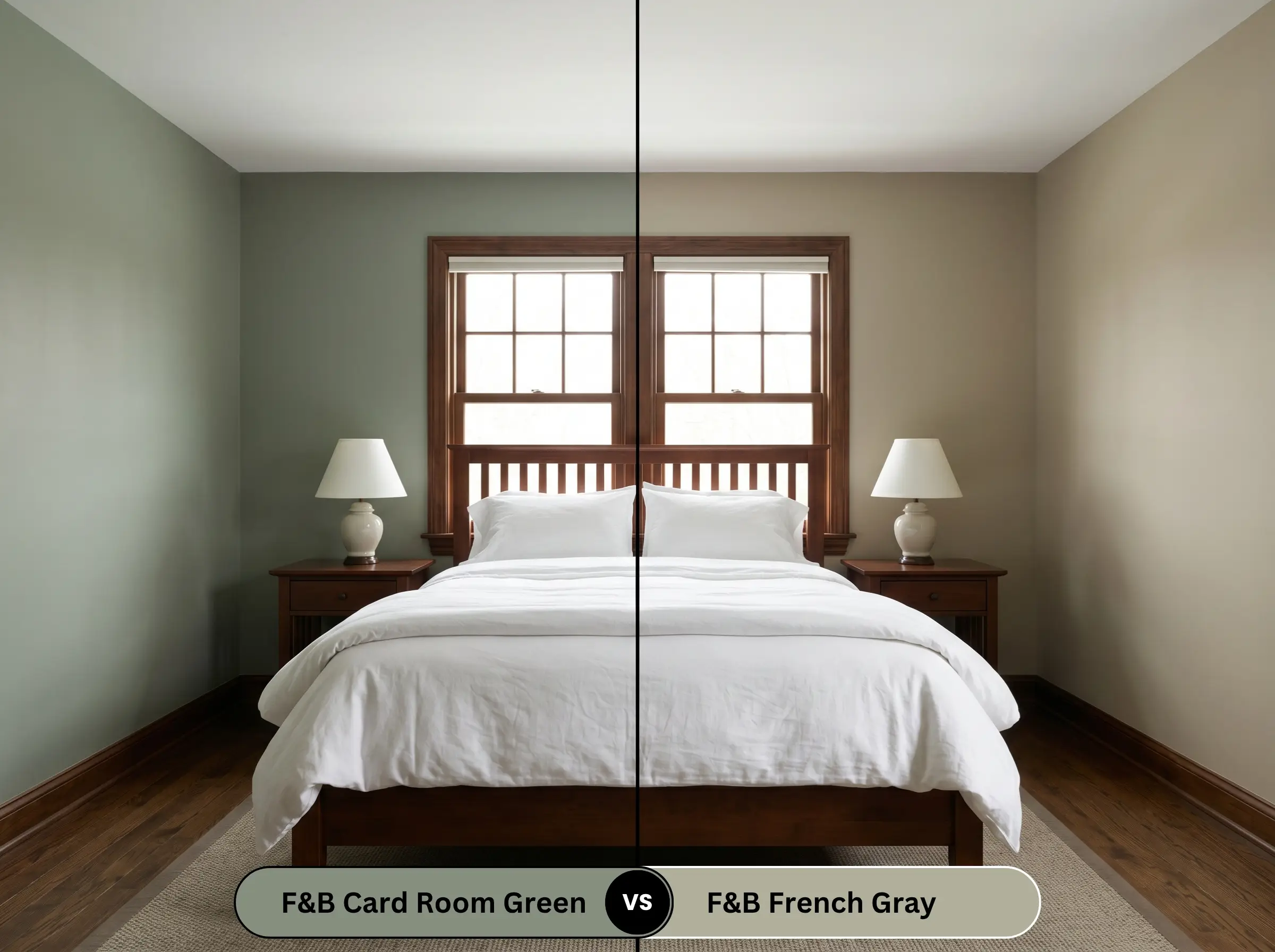
If you are dealing with a heavily shaded, north-facing room, French Gray is often the more forgiving option. French Gray sits significantly lighter on the wall and leans much further into its grey-blue undertones, whereas No. 79 is heavier, darker, and aggressively olive. Choose French Gray for a breezy, coastal-inspired softness, and reserve the darker green for spaces that demand dramatic, historic weight.
Farrow & Ball Card Room Green vs. Sherwin-Williams Evergreen Fog
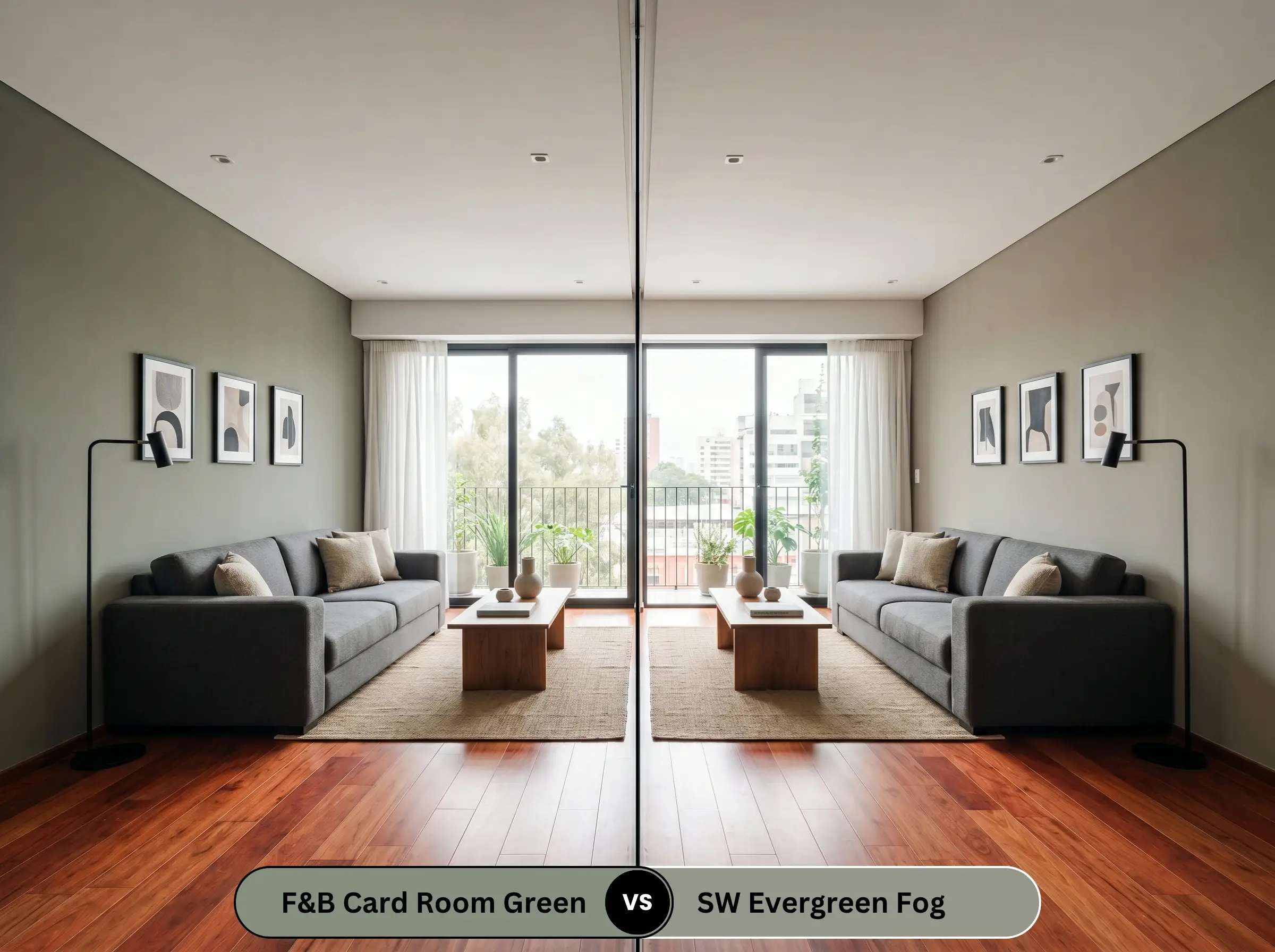
Sherwin-Williams Evergreen Fog SW 9130 offers a much cooler, more silver-backed approach to the sage green trend. If your room features warm, red-toned wood floors, Evergreen Fog provides a cooling balance, while the Farrow & Ball shade might clash by amplifying the heat. Opt for Evergreen Fog when you want a versatile, modern neutral, but stick with No. 79 if you crave a deeply saturated, traditional English aesthetic.
Farrow & Ball Card Room Green vs. Benjamin Moore Gloucester Sage
Will Card Room Green work with your specific lighting, floor, or furniture?
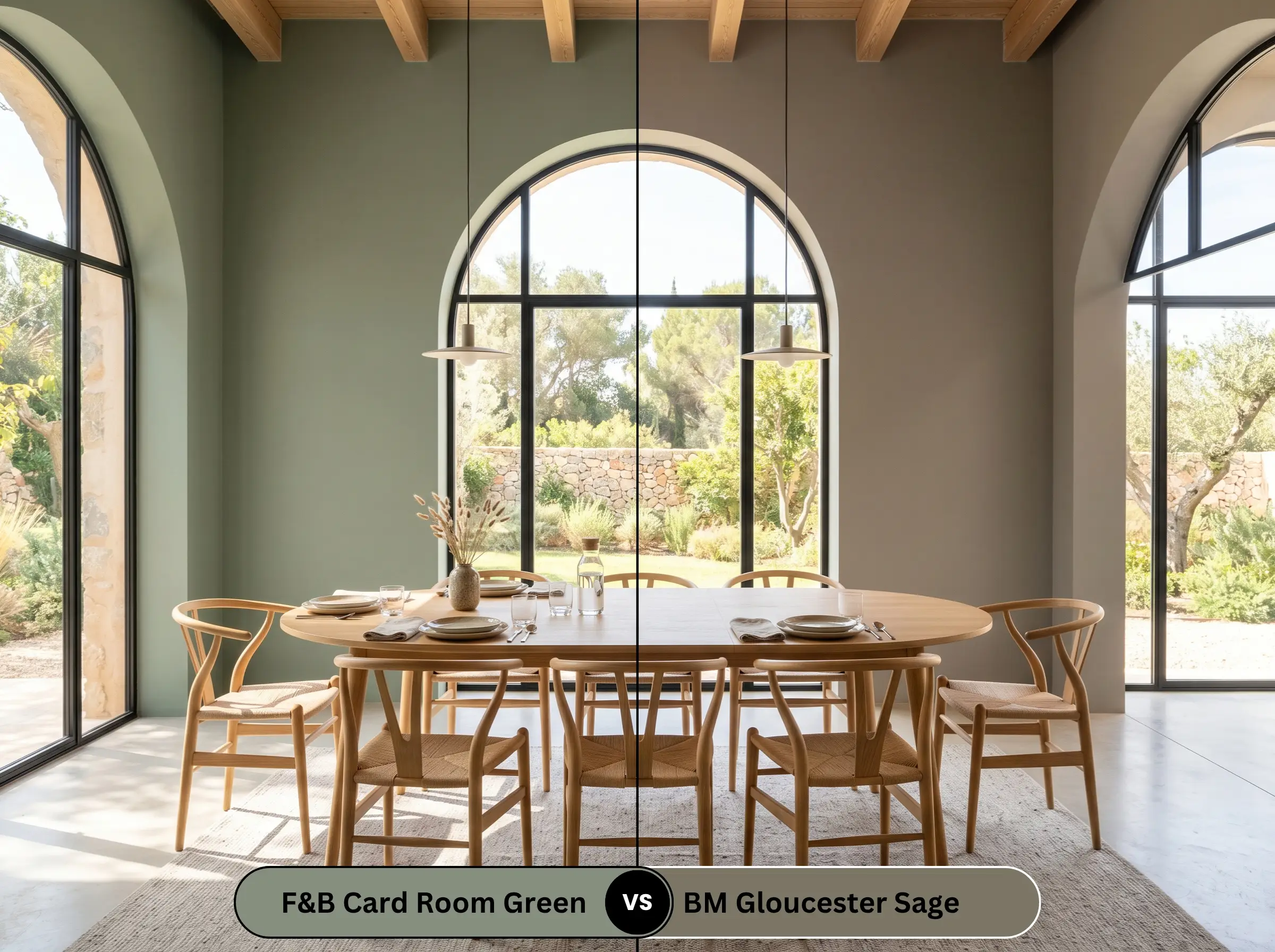
Benjamin Moore Gloucester Sage HC-100 is a significantly darker, browner color that pushes firmly into the territory of a true, heavy olive. If your space gets flooded with intense southern sunlight, Gloucester Sage will hold its dark depth beautifully, whereas the Farrow & Ball shade might wash out slightly. However, in standard lighting, No. 79 maintains a much more recognizable green presence, while Gloucester Sage can easily read as a dark brown.
Similar Colors & Brand Equivalents
Even when you fall in love with a specific color profile, the structural realities of your home might demand a slight pivot. You may need a shade that offers just a touch more light reflection for a dark hallway, or you might need to match the aesthetic using a more locally available brand.
Similar Farrow & Ball Shades
Cross-Brand Matches
Will Card Room Green work with your specific lighting, floor, or furniture?
Practical Application & DIY Advice
Transitioning this deeply pigmented color from the sample pot to your actual walls requires careful planning and the right mechanical approach. Because of its complex undertones and medium-dark depth, improper application will immediately highlight flaws in your drywall or trim.
The Dynamic Sheen Guide
Primer Strategy
To achieve the true, rich olive depth without applying four coats, you must use a high-quality, dark-tinted primer. Applying this heavy shade directly over a stark white wall or builder-grade beige will cause the final color to look washed out and streaky. Always invest in the brand’s recommended mid-tone primer to properly anchor the heavy green pigments.
Coverage & Success Tips
Expect to apply a minimum of two generous coats over your tinted primer to achieve complete, opaque coverage. Flashing Warning: Because this shade is highly saturated and often applied in a matte finish, applying uneven pressure on your roller will cause “flashing”—visible, shiny streaks that ruin the chalky aesthetic. To avoid this, always maintain a wet edge and roll from the ceiling straight down to the baseboard in one smooth, uninterrupted motion.
When touching up a scuff on a dark, matte wall, never use a brush. Always use a miniature foam roller and feather the edges outward; otherwise, the touch-up will dry as a highly visible, shiny patch.
Hackrea Pro-Tip
Frequently Asked Questions
Because of its light-absorbing nature, it will indeed feel incredibly dark and enclosed in a windowless space. However, powder rooms are the perfect place to embrace this dramatic, jewel-box energy. Lean into the darkness by wrapping the walls and ceiling, then add highly reflective brass sconces and a large mirror to bounce the artificial light beautifully.
Dark, earthy pigments are notoriously susceptible to UV fading when exposed to direct, relentless sunlight. Over several years, the intense heat will slowly bake the yellow-olive undertones, causing the color to soften into a lighter, more muted grey. To combat this, you must use a premium, UV-resistant exterior formula and expect to repaint slightly more often than you would with a stark white.
The pairing of muddy olive and baked terracotta is a brilliant, highly successful combination. The red-orange heat of the terracotta sits directly opposite the green on the color wheel, creating a vibrant, earthy tension. This combination instantly evokes a warm, Mediterranean aesthetic or a rustic, historic country kitchen.
When applied to a ceiling, the color is constantly in shadow, shielded from direct overhead lighting. Because shadows naturally pull out the cooler, slate-grey undertones, the ceiling will almost always read more grey than the surrounding walls. To counteract this and keep the green alive, you must rely on tall floor lamps or warm wall sconces that cast light upward.
Final Verdict & Expert Warnings
Farrow & Ball Card Room Green No. 79 is an incredibly sophisticated, grounding pigment designed for homeowners who want to inject historic gravity into their spaces. It performs brilliantly in traditional studies, formal dining spaces, and on custom cabinetry, offering a deeply enveloping warmth that feels both curated and comfortable. This shade thrives when surrounded by rich, tactile materials and intentional, layered lighting.
However, you must exercise extreme caution if your home is dominated by cool, stark materials. Pairing this muddy, warm olive with highly polished chrome hardware, icy blue-grey luxury vinyl flooring, or stark, blue-toned white trim will create an immediate, uncomfortable visual clash. The cool, synthetic nature of those modern finishes will strip the paint of its historic charm, making the green look dirty and accidental rather than rich and intentional. If your fixed elements lean heavily cool, you must pivot to a much crisper, silver-backed shade.
Room Compatibility & Clashes Diagnoses
Hackrea's reports evaluating the compatibility of Card Room Green in real rooms.No compatibility tests for Card Room Green yet.
Be the first to see how this color reacts to your space. Run a free architectural diagnostic now.