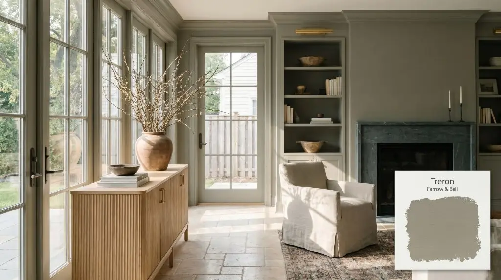
Farrow & Ball Treron No. 292 is a sophisticated, dark grey-green with earthy, warm undertones. Acting as a darker sibling to the classic Pigeon, it blends organic green with a muted grey base, making it an incredibly versatile, nature-inspired architectural finish.
Will Treron clash with your room?
Paint Technical Profile
| Color ID / SKU | No. 292 |
| HEX Code | #8c8c7a |
| Light Reflectance (LRV) | 24.92 |
| Use | Interior, Exterior |
| Best Exposures | South, West, East |
| Best For | Kitchen Cabinets, Mudrooms, Studies, Exteriors |
Farrow & Ball Treron: The Botanical Hue Redefining Traditional Neutrals
Finding a paint that completely dissolves the boundary between your interior walls and the natural landscape outside it’s a real challenge. Farrow & Ball Treron achieves exactly this, offering an organic color structure that feels less like a manufactured pigment and more like an extension of the outdoors. It is a profoundly stabilizing presence in any room, bringing a sense of quiet maturity to your architectural finish.
This is not your standard, predictable sage or a vibrant, energetic emerald. Instead, this muted olive tone acts as a highly sophisticated foundational layer, ready to amplify the tactile materials you place against it. Whether you are wrapping a sunlit dining space or revitalizing tired exterior woodwork, this shade demands attention through its subtle complexity rather than sheer volume.
Let’s examine the underlying pigments, the crucial lighting behaviors, and the precise material pairings that make this earthy grey-green such a remarkable tool for your home.
Farrow & Ball Treron: Undertones & LRV
When evaluating Farrow & Ball Treron for your home, the most immediate question is usually about its temperature: Is this paint warm or cool? This botanical hue is decisively warm, rooted in a nuanced blend of pigments that prioritize a welcoming, earthy energy. Its foundational DNA prevents it from ever feeling stark or chilly on your walls.
To truly understand how this color will behave, we must look at its core structure:
With a Light Reflectance Value (LRV) of 24.92, this shade sits confidently in the mid-to-dark range. This specific light reflectance means the paint will absorb a significant amount of ambient light, creating a beautifully intimate atmosphere. It possesses enough density to deliver dramatic impact, yet it remains luminous enough to avoid feeling like a dark, light-swallowing void.
The Chameleon Factor: How Light Alters This Earthy Grey-Green
Because of its complex grey and brown base, this paint is highly reactive to the shifting path of the sun. You must anticipate how your specific lighting conditions will pull different characteristics forward throughout the day.
Here is exactly how this color shifts across different exposures:
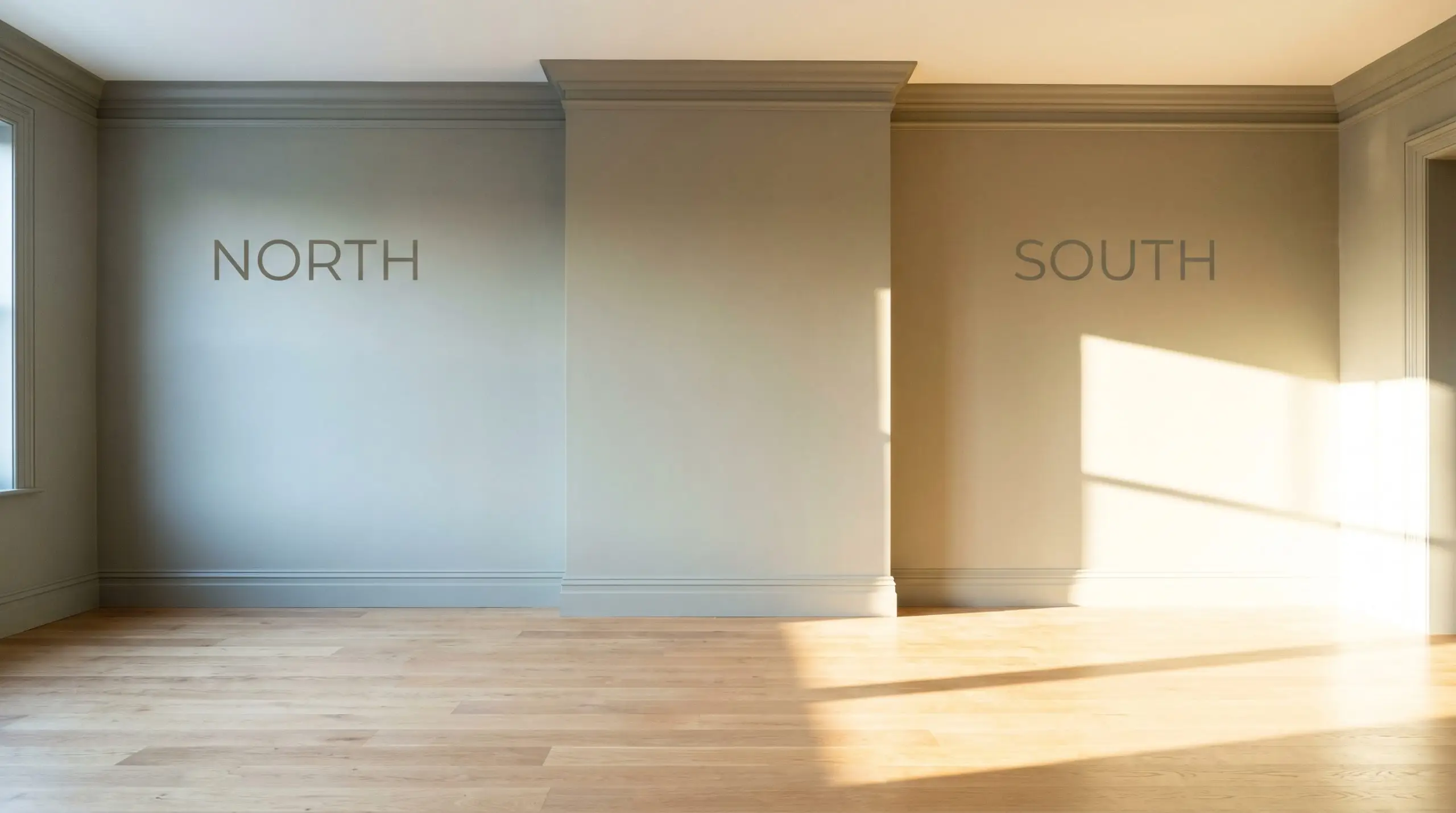
If you want to maintain the lush, organic feel of this olive tone after the sun goes down, strictly avoid cool daylight LEDs. Opt for 3000K bulbs, which provide a clean, neutral glow that perfectly preserves the delicate balance between the green and the grey.
Hackrea Pro-Tip (The Bulb Calibration)
Popular Applications
Understanding the numerical data is only the first step; the true artistry lies in how you apply this shade to your architecture. Because of its stabilizing nature, this color excels in spaces that require both intimacy and a connection to the natural world. Let’s explore how to maximize its potential across different functional areas of your home.
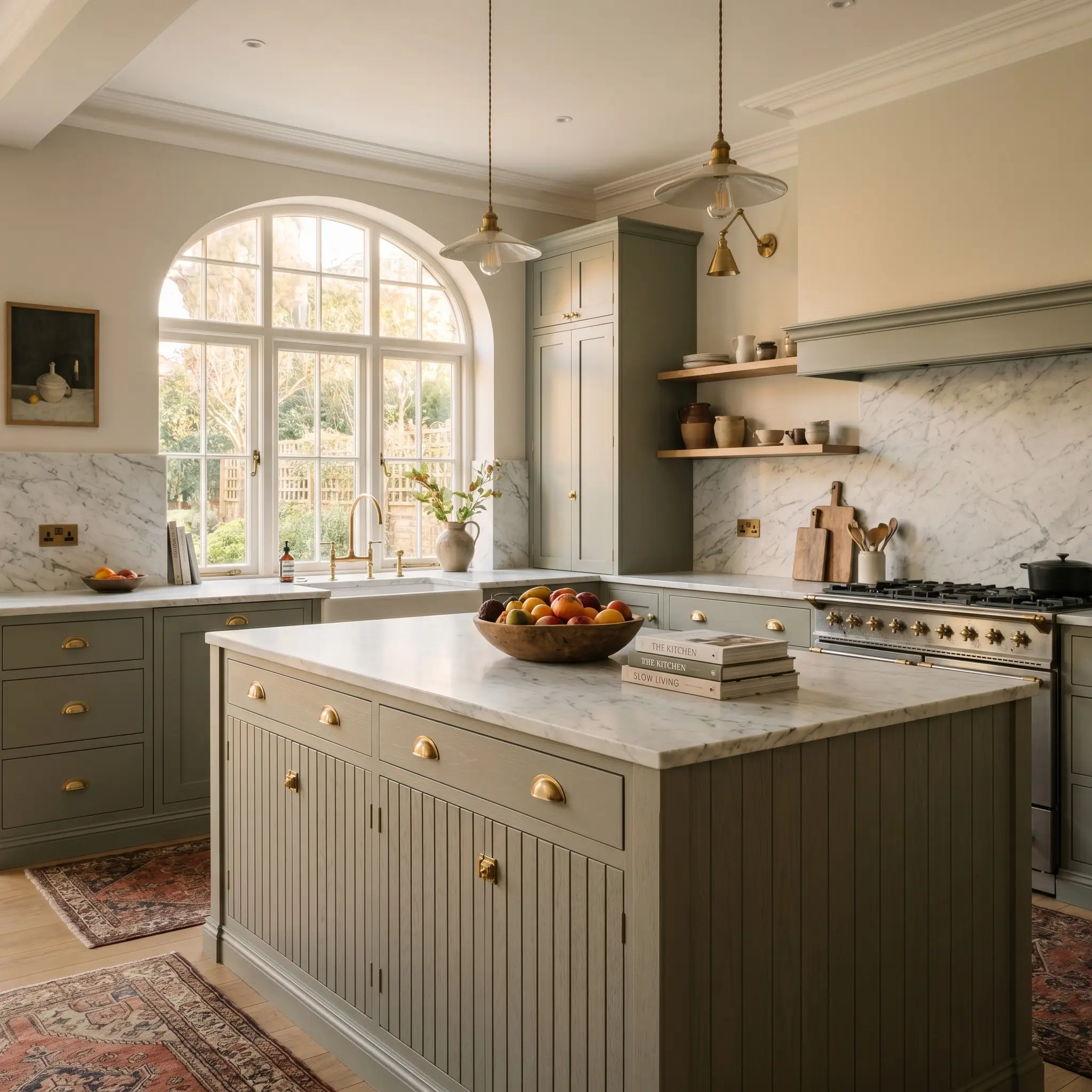
Kitchen Cabinetry & Islands
Using this muted olive tone as a cabinetry lacquer is a brilliant way to introduce color into a kitchen without overwhelming the space. It acts as a stunning alternative to stark black or predictable navy, offering a softer, more organic focal point. Pair it with fluted oak accents and unlacquered brass hardware to create a transitional space that feels both highly customized and effortlessly timeless.
For a truly elevated look, consider extending the color to the surrounding millwork, creating a seamless, color-drenched environment. If you prefer a lighter touch, use it exclusively on a central island to root the room, balancing it with soft, creamy perimeter cabinets. The grey undertones ensure the cabinetry will coordinate beautifully with heavily veined marble countertops.
Boot Rooms / Mudrooms
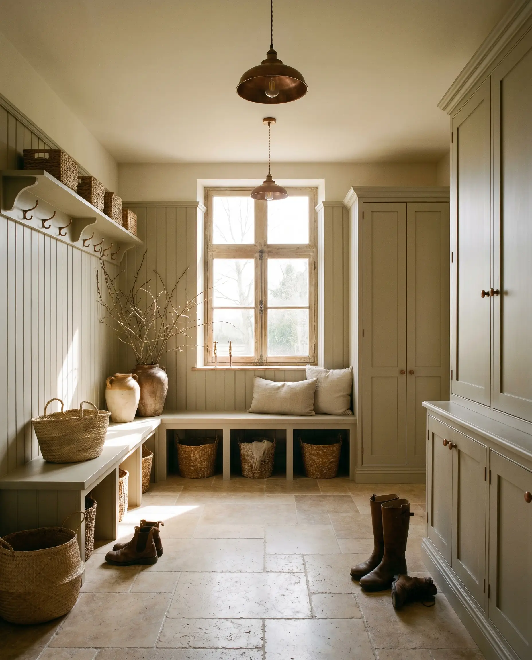
Mudrooms are transition zones, making them the perfect canvas for a biophilic design approach. Wrapping the beadboard, built-in benches, and cubbies in this rich shade instantly elevates a purely functional space into a curated architectural moment. It hides scuffs and daily wear exceptionally well, proving that high-end design can still be fiercely practical.
Instead of defaulting to a predictable rustic farmhouse look, push the aesthetic toward a Belgian Farmhouse vibe. Introduce tumbled travertine flooring and aged copper fixtures to add a layer of sophisticated patina. The earthy grey-green provides a stunning backdrop for woven baskets, raw linen cushions, and oversized branches arranged in handcrafted ceramics.
Will Treron work with your specific lighting, floor, or furniture?
Cozy Studies / Libraries
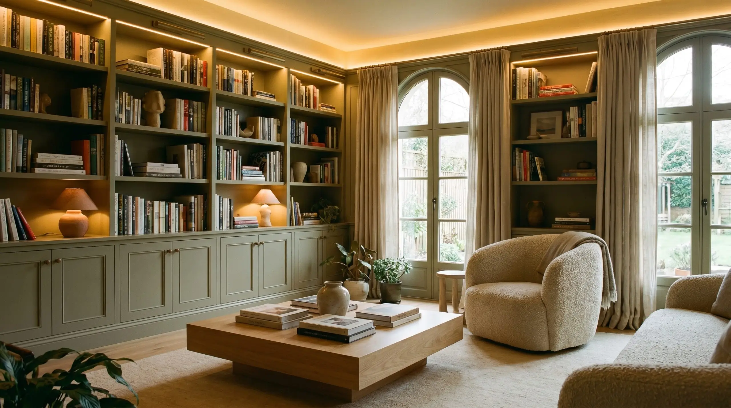
This color was practically engineered for spaces dedicated to quiet reflection and focused work. When applied to paneled wainscoting or floor-to-ceiling built-in library shelves, it creates an incredibly enveloping, intellectual atmosphere. The mid-to-dark LRV pulls the walls inward just enough to foster intimacy without making the room feel restrictive.
To keep the study from feeling like a dusty heritage relic, lean into an Organic Modern styling approach. Contrast the traditional wall paneling with a sleek plinth coffee table, a bouclé accent chair, and sculptural clay lamps. The tension between the classic architectural finish and the modern silhouettes creates a highly dynamic, curated environment.
Exterior Siding & Trim
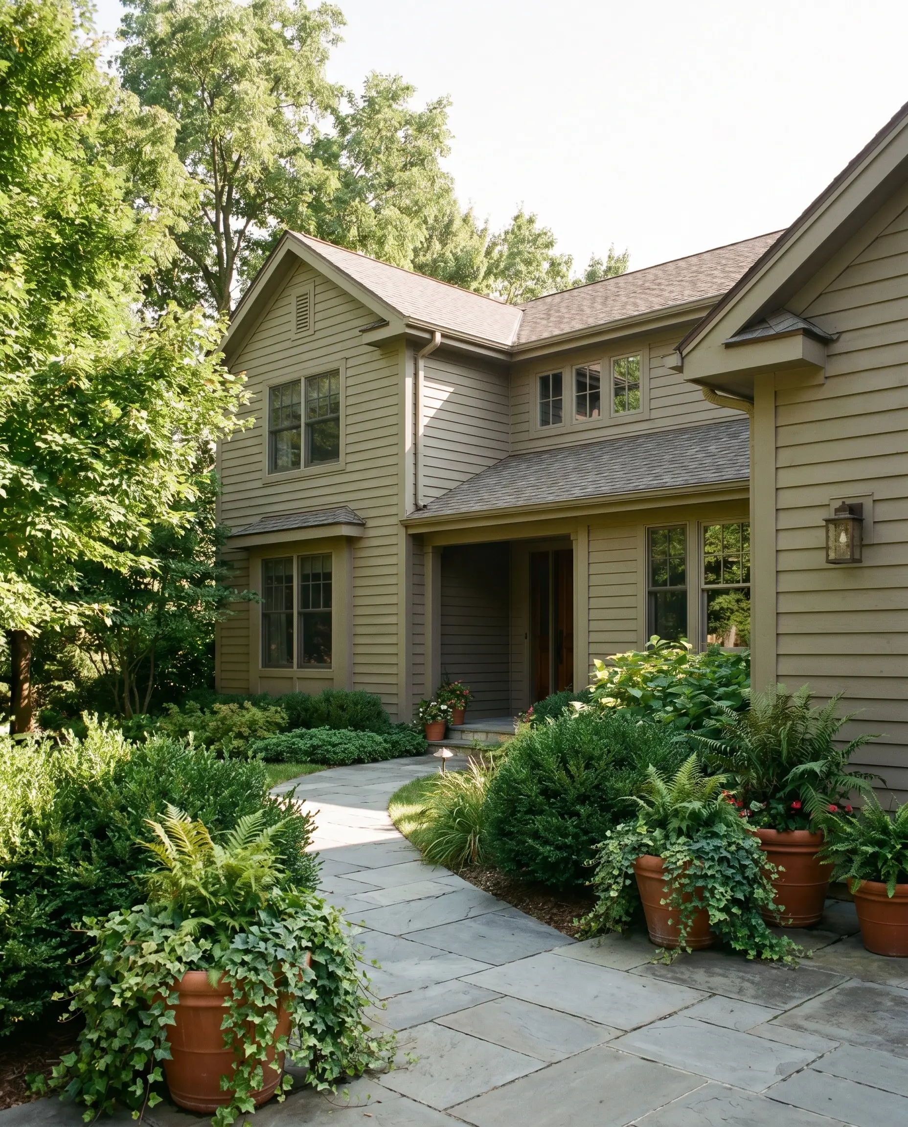
On an exterior facade, brilliant natural sunlight will significantly wash out the perceived depth of any paint. What appears as a dense olive indoors will soften into a beautifully relaxed, earthy grey-green when applied to exterior siding or trim. It is a phenomenal choice for homes surrounded by dense foliage, as it harmonizes perfectly with the natural landscape.
Always test a large swatch on the brightest side of your home. Because the sun strips away visual weight, you may find that this shade reads much lighter and greyer outside than you initially anticipated.
Hackrea Design Secret (The Exterior Washout Rule)
Dining Rooms
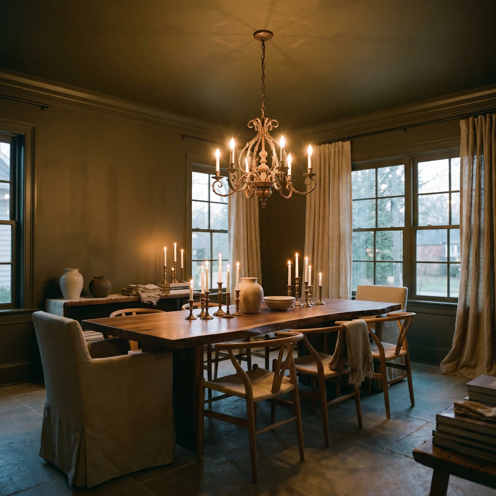
A dining room requires an atmosphere that feels special, and color drenching this space—painting the walls, trim, and even the ceiling—delivers an unforgettable dining experience. The ambient light absorption of this hue creates a beautifully shadowed, romantic environment in the evening. It sets a moody, sophisticated stage that makes candlelight and metallic accents truly glow.
To maximize the impact, introduce textural contrast through your furnishings and decor. A live-edge dining table, slipcovered wishbone chairs, and a striking oxidized bronze chandelier will interact beautifully with the muted walls. Add a layer of raw linen drapery to soften the acoustics and complete the tactile, elevated aesthetic.
Will Treron work with your specific lighting, floor, or furniture?
Designing with Farrow & Ball Treron: Material Pairings & Color Palettes
The secret to mastering this color lies in recognizing that it is a relational hue—it changes its personality based entirely on what you place next to it. Its organic color structure requires thoughtful textural pairings to truly come alive.
Trim & Baseboards
Your trim color dictates the visual boundary of the room, and with a shade this complex, you have two distinct pathways. For a crisp, tailored contrast that highlights your architectural features, pair it with a clean, slightly warm white. If you prefer a more atmospheric, seamless flow, choose a shaded, putty-toned neutral that blurs the lines between the wall and the woodwork, enhancing the overall biophilic design.
Hardware, Wood & Material Pairings
To honor the botanical nature of this paint, your material palette should feel equally grounded and tactile.
Coordinating Colors
Building a cohesive palette around this earthy grey-green requires secondary colors that share its muted, complex DNA.
Designer Mood Boards
To help you visualize how these elements synthesize in a real-world application, here are two distinct curatorial directions.
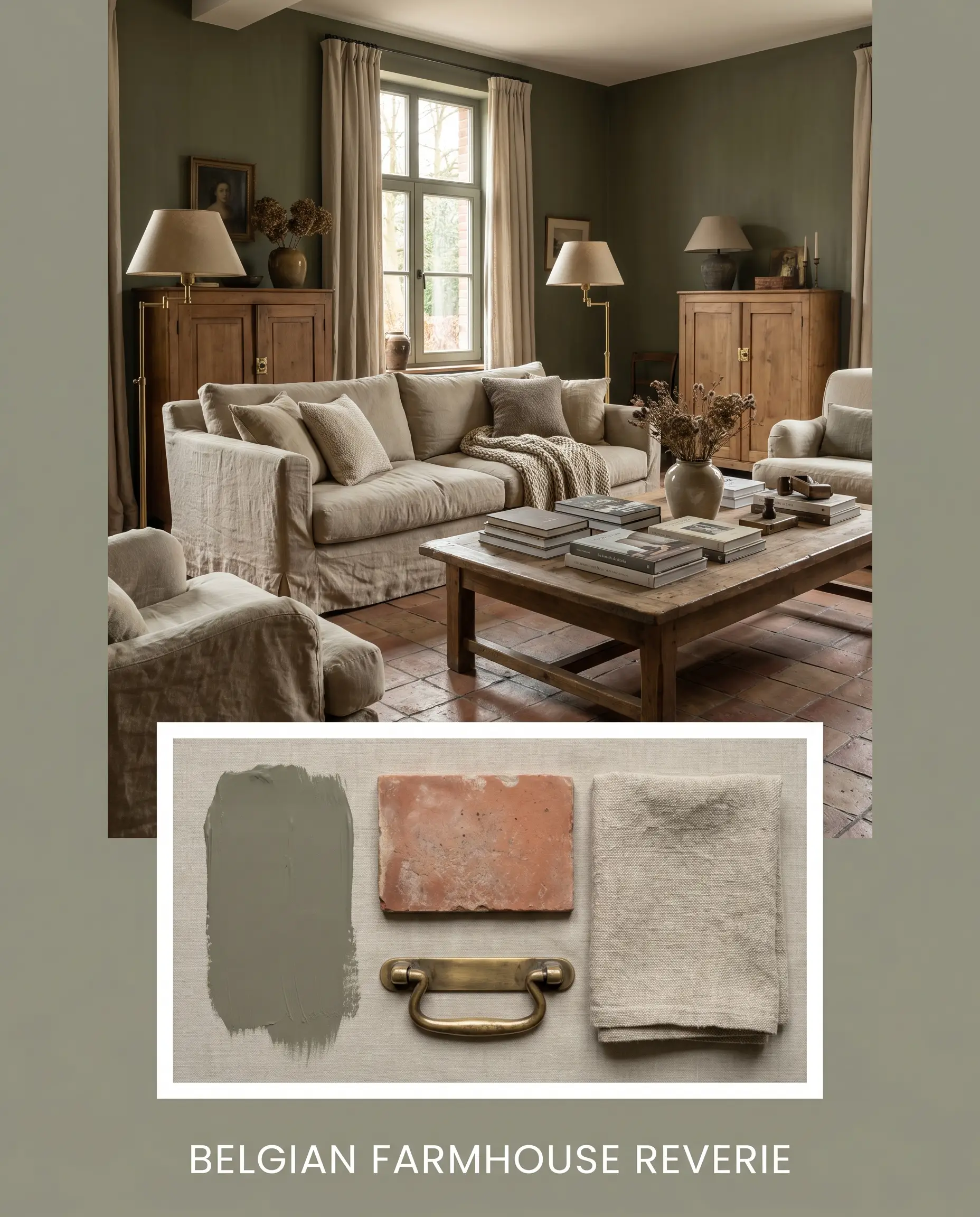
Belgian Farmhouse Reverie This palette leans heavily into texture and historical warmth, creating an atmosphere that feels lived-in and deeply comforting. The muted olive walls are paired with expansive terracotta flooring and aged unlacquered brass fixtures to emphasize the earthy undertones. Soften the architecture with raw linen slipcovers, vintage oil portraits, and oversized branches displayed in handcrafted ceramics. The resulting energy is quiet, grounded, and effortlessly sophisticated.
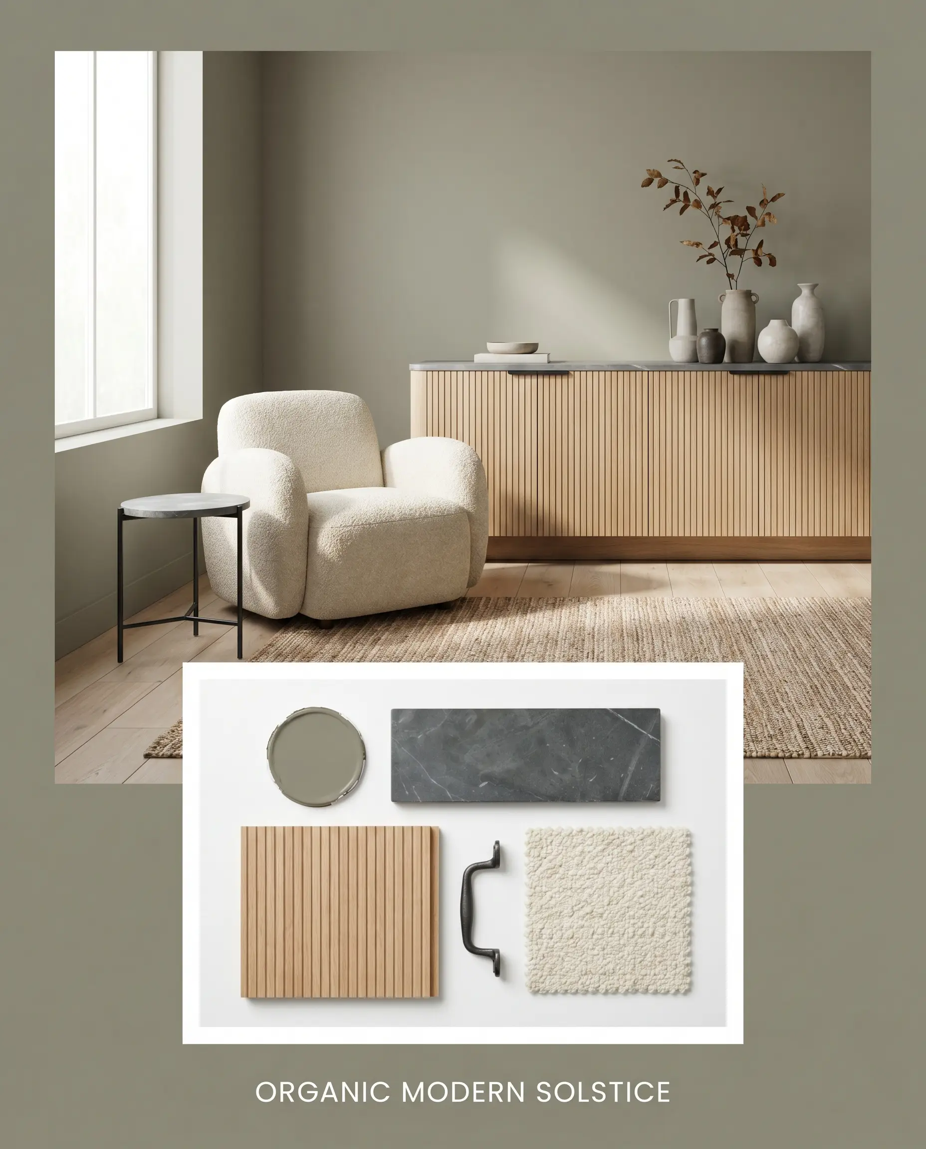
Organic Modern Solstice For a more contemporary execution, this palette relies on clean lines and high-contrast tactile materials. The grey-green backdrop is sharpened by the introduction of sleek blackened steel hardware and smooth soapstone surfaces. Incorporate fluted white oak furniture, a nubby bouclé accent chair, and abstract plaster art to introduce warmth without clutter. This combination feels incredibly tailored, serene, and intentionally minimalist.
Will Treron work with your specific lighting, floor, or furniture?
Head-to-Head Paint Comparisons
Sometimes, finding the perfect architectural finish means understanding exactly why a close alternative might be the better choice for your specific space. By comparing this hue directly against its closest rivals, you can make a confident, highly informed decision.
Farrow & Ball Treron vs. Farrow & Ball Pigeon No. 25
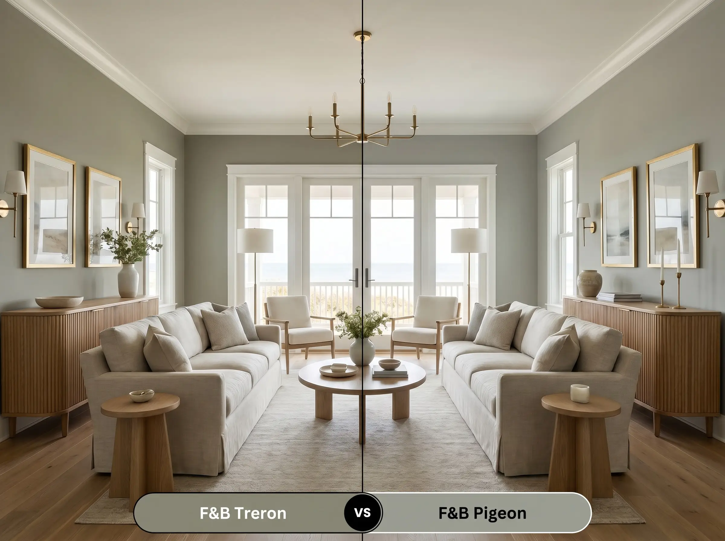
While both are beloved, complex hues, they occupy completely different temperature zones. Pigeon leans heavily into a cool, blue-grey undertone, making it feel crisper and more coastal. If your room receives intense, warm southern light, Pigeon will beautifully balance that warmth, whereas Treron might amplify the heat and read too yellow-brown.
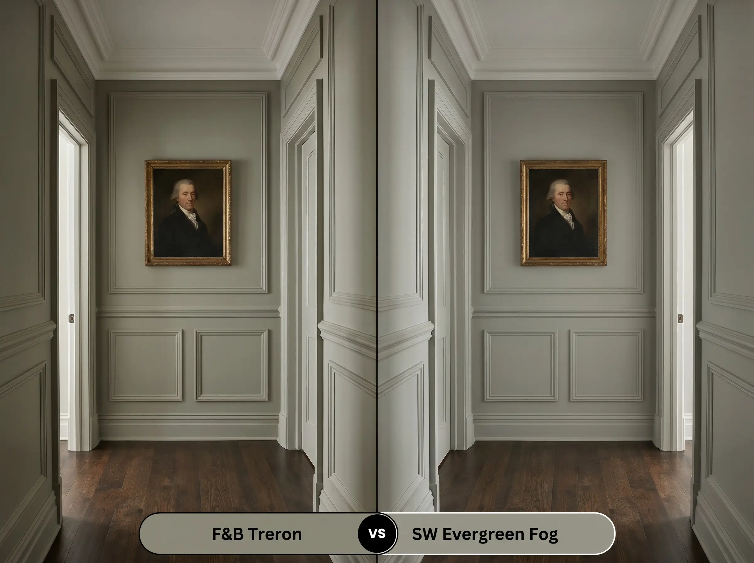
Farrow & Ball Treron vs. Sherwin-Williams Evergreen Fog SW 9130
Will Treron work with your specific lighting, floor, or furniture?
Evergreen Fog is a slightly softer, more approachable sage with a touch more silver in its base. It has a slightly higher LRV, meaning it reflects a bit more light back into the room. If you are working with a hallway or space that lacks natural light, Evergreen Fog will feel slightly more forgiving, while the Farrow & Ball option delivers a denser, more historic depth.
Farrow & Ball Treron vs. Benjamin Moore Gloucester Sage HC-100
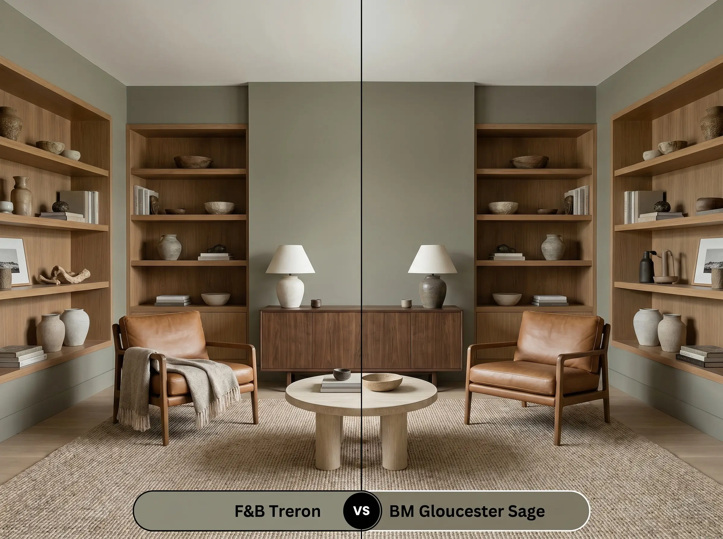
Gloucester Sage is a significantly darker, more intense olive that carries a much heavier visual weight. It lacks the subtle grey diffusion that gives our featured Farrow & Ball shade its relaxed, chameleon-like quality. If you want a truly dramatic, enveloping den or exterior, Gloucester Sage delivers absolute impact, but it requires ample lighting to prevent it from feeling restrictive.
Similar Botanical Hues & Cross-Brand Alternatives
If you love the general aesthetic but need a slight adjustment in depth or tone, exploring adjacent colors within the same family is a smart design strategy.
Similar Same-Brand Colors:
Cross-Brand Matches:
Farrow & Ball Treron: Application Guide & Finishes
Transitioning from color theory to physical application requires an understanding of how sheens and primers interact with this specific depth of color. The right finish will elevate the paint from a standard coating to a premium architectural feature.
Because this is a mid-to-dark tone, achieving flawless coverage requires a dedicated strategy. You must use a Mid Tones primer to create a proper foundation; skipping this step will result in a patchy finish that fails to capture the true undertones.
Plan for a minimum of two generous coats, and always maintain a wet edge while rolling to prevent “flashing”—those frustrating, visible overlap marks that occur when the paint dries unevenly.
Frequently Asked Questions
In heavy shade, the cooler North-facing light will pull the grey and brown undertones forward, minimizing the green. While it won’t look ‘muddy,’ it will read as a much more austere, stony grey-green rather than a vibrant botanical hue.
It pairs beautifully with warm, earthy elements like brick and terracotta. The red and orange tones in the masonry naturally complement the green, enhancing the paint’s richness and creating a deeply grounded, biophilic atmosphere.
Because of its mid-to-dark LRV and light-absorbing qualities, it will feel quite dense in a windowless room. The grey base will certainly be prominent, but if you embrace the moodiness and use warm 3000K lighting, it creates a stunning, jewel-box effect.
Yes, it is a highly sophisticated pairing. The substantial grey base in the paint beautifully bridges the gap between the warm olive tones and the cool, icy grey veining found in Carrara marble, resulting in a balanced, tailored aesthetic.
The Final Verdict: Elevating Your Architectural Finish
Farrow & Ball Treron is an incredibly sophisticated, stabilizing hue designed for homeowners who want to introduce color without sacrificing maturity or elegance. Its absolute best application is in spaces that bridge the gap between indoors and outdoors, such as sunlit boot rooms, expansive kitchen cabinetry, or textural, organic modern living spaces. If you are seeking an earthy grey-green that shifts beautifully with the light and acts as a brilliant canvas for tactile materials like soapstone and raw brass, this shade is an exceptional choice.
Because this color relies so heavily on its warm, organic undertones to feel welcoming, it struggles immensely when paired with stark, blue-toned whites or cool, synthetic grey flooring. Placing it next to icy, high-energy finishes will instantly drain the life from the olive, making the paint look murky and unresolved. Always ensure your surrounding materials and trim colors carry a complementary, subtle warmth to keep the biophilic energy intact.
Clash Warning (The Temperature Conflict)
Room Compatibility & Clashes Diagnoses
Hackrea's reports evaluating the compatibility of Treron in real rooms.No compatibility tests for Treron yet.
Be the first to see how this color reacts to your space. Run a free architectural diagnostic now.
Closest Cross-Brand Equivalents
The absolute closest scientific color matches for Treron across top paint brands.