Pashmina AF-100
Benjamin MooreBenjamin Moore Pashmina (AF-100) is a sophisticated, mid-tone greige with subtle earthy green undertones. Sitting perfectly between warm and cool, this complex neutral boasts an LRV of 44.2, giving it enough depth to ground a room without feeling overwhelmingly dark or muddy.
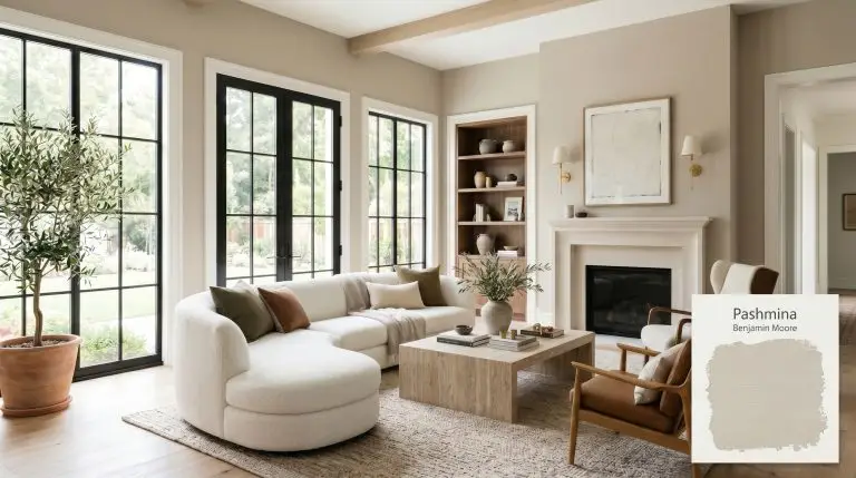
Benjamin Moore Pashmina (AF-100) Paint Color Review & Palette: Designing with Grounded Warmth
Finding a paint color that bridges the gap between airy lightness and dramatic depth is one of the most common challenges in home design. Benjamin Moore Pashmina (AF-100) steps into this void brilliantly, offering a grounded, sophisticated anchor for spaces that crave warmth without leaning into heavy browns.
Part of the brand’s highly curated affinity color collection, this shade is engineered to bring a sense of tailored elegance to your walls. It acts as a foundational layer that instantly makes standard architectural features look intentional and expensive.
Benjamin Moore Pashmina: Undertones & LRV
If you are wondering whether this shade reads warm or cool, the answer is definitively warm. Pashmina is a taupe-meets-greige that wraps a room in a cozy, inviting glow.
To truly understand how this color behaves on the wall, we have to look closely at its underlying structure.
At an official light reflectance value of 44.2, this shade sits squarely in the mid-tone range. It absorbs a significant amount of light, allowing it to hold its color mass beautifully without washing out. Because it is not a bright, highly reflective neutral, it requires adequate natural or artificial light to truly shine and prevent a room from feeling overly heavy or shadowed.
You can apply wallpapers, paints, etc. on walls and see how they look in various interiors.

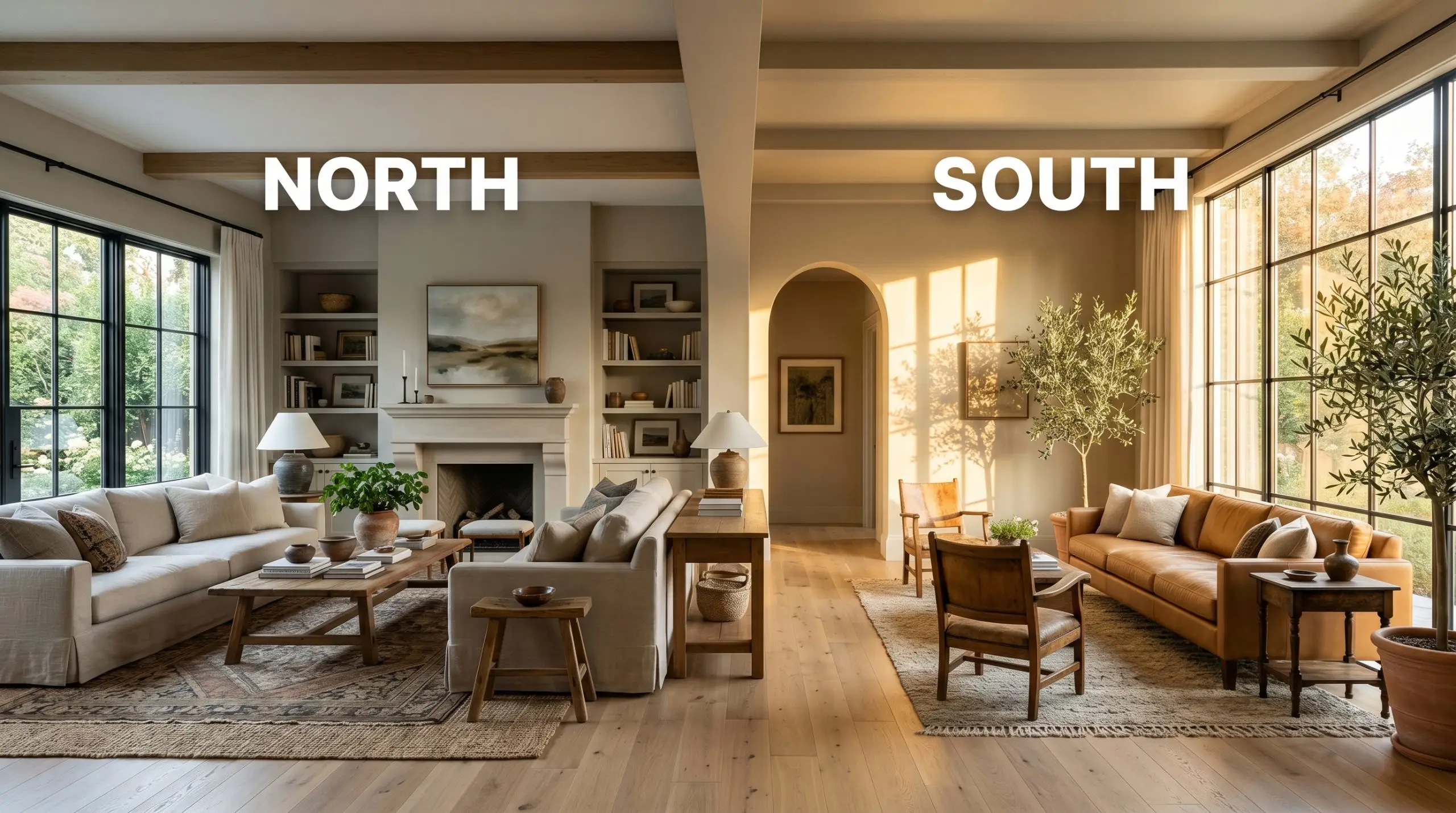
The Chameleon Factor: How Lighting Shifts This Complex Neutral
A major fear with deeper greige tones is that they will unexpectedly flash purple or look excessively muddy depending on the time of day. Because of its specific pigment structure, Pashmina avoids the dreaded purple flash, but it is still highly responsive to its environment. Understanding how lighting affects paint undertones is crucial before committing to this shade.
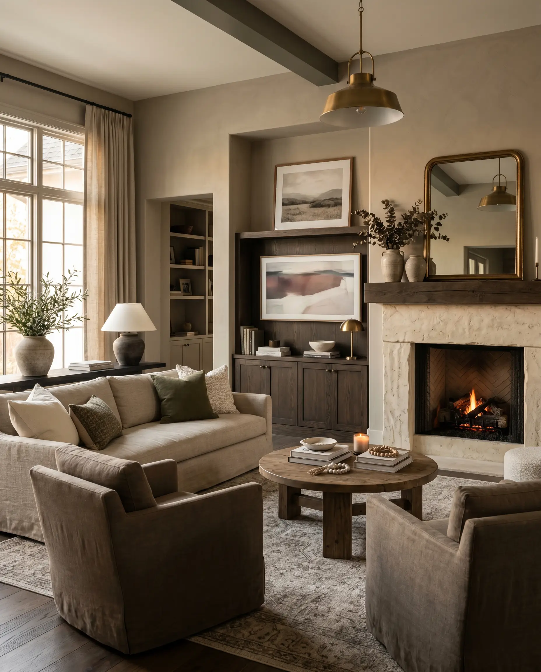
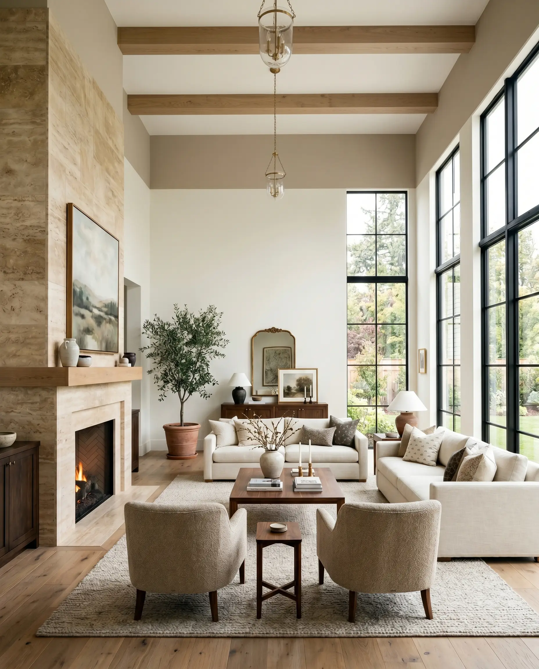
Anchoring Everyday Spaces
This paint demands to be noticed without overwhelming the eye. It brings a cohesive, grounded energy to a home, acting as a rich canvas that elevates everyday furnishings.
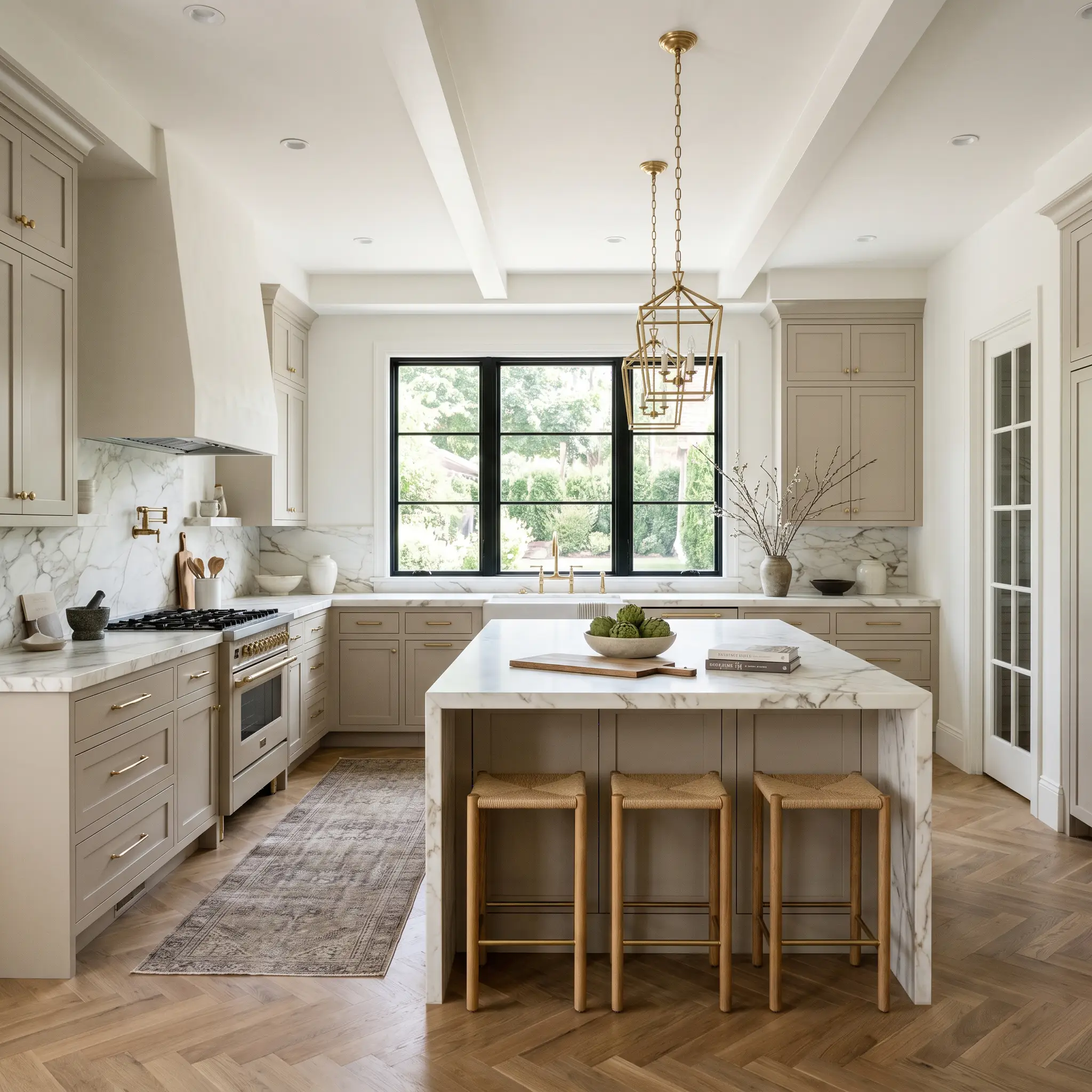
Kitchen and Bathroom Cabinetry
Taking this deep taupe off the walls and onto cabinetry is a brilliant way to achieve a premium, custom look. It pairs beautifully with classic marble veining, grounding the crispness of the stone with its earthy warmth. For a high-end transitional kitchen, use it on the lower cabinets or a central island to anchor the room, keeping the upper walls a creamy white to maintain a bright, open feel.
Cozy Living Rooms
In a main gathering space, this color excels at creating intimacy. It provides a stunning, slightly moody backdrop that makes standard upholstery look richer. It plays incredibly well with textured fabrics like bouclé or heavy linen, and it easily handles the visual weight of large media consoles or substantial fireplaces.
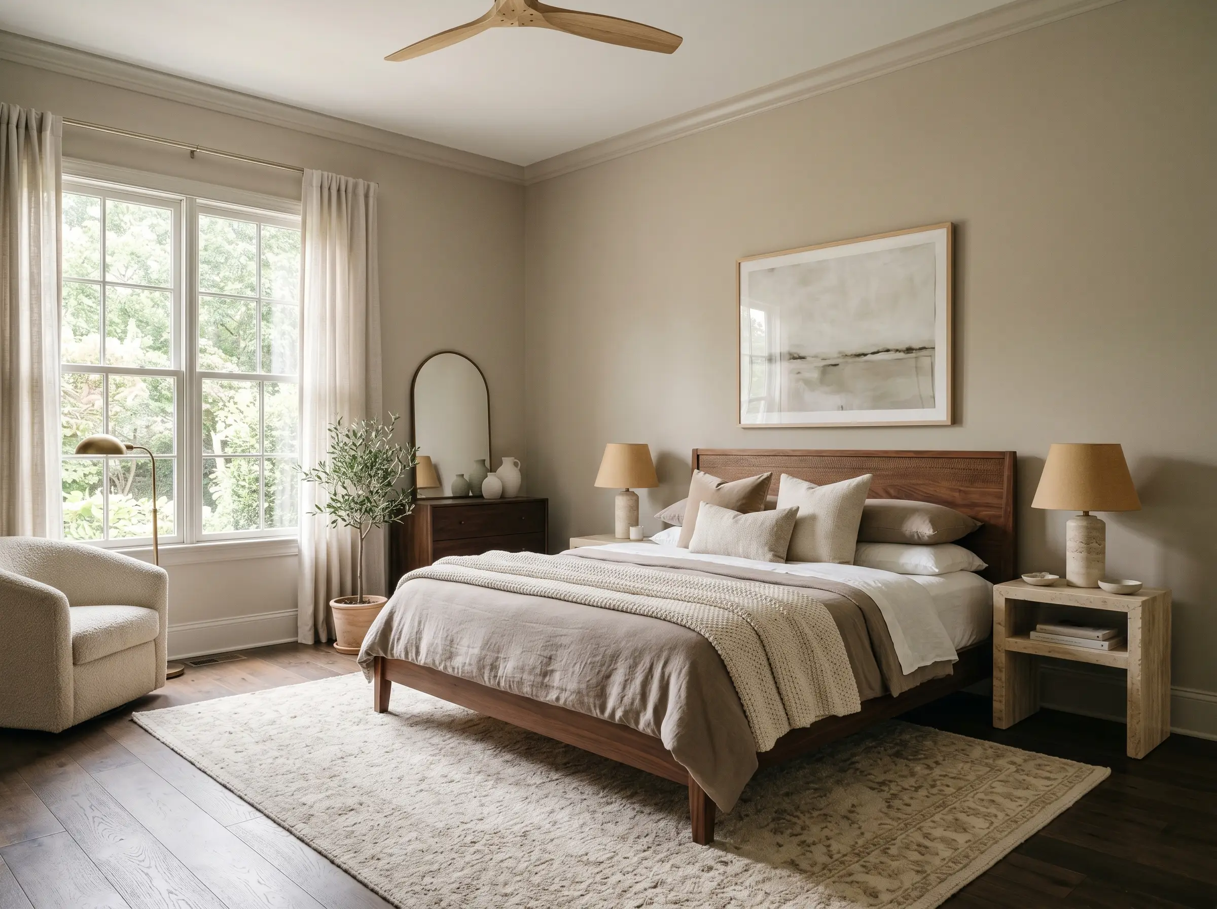
Primary Bedrooms
When used as a whole-room wall color in a bedroom, it creates an immediate sense of sanctuary. The mid-tone depth wraps the room, reducing visual glare and promoting relaxation. Pair it with layered, tonal bedding and soft, diffused lighting to maximize its cozy, retreat-like energy.
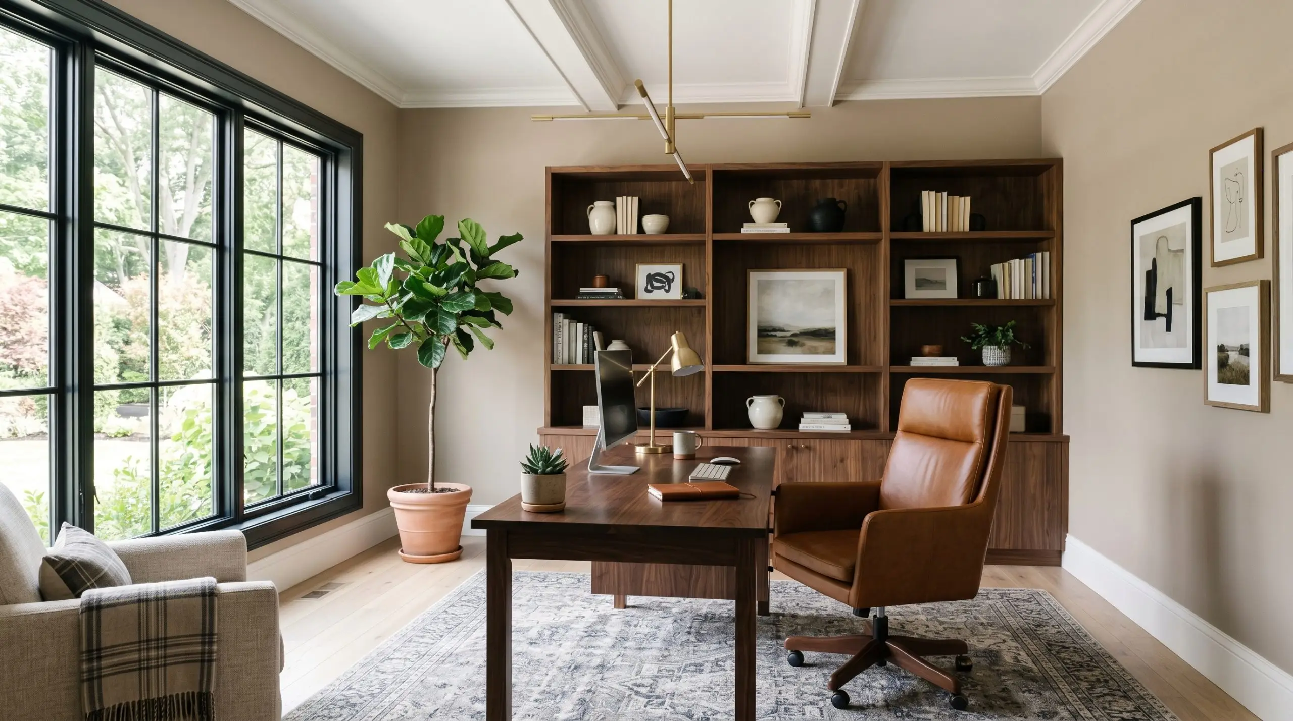
Home Offices
A dedicated workspace benefits greatly from this color’s grounded nature. It provides a highly tailored, professional backdrop for video calls while reducing the stark contrast of computer screens. It looks exceptionally handsome when paired with rich leather desk chairs and structured, modern shelving.
Creative Ways to Elevate BM Pashmina
When you have a color with this much inherent sophistication, you can push it past standard drywall applications. Here are a few distinctive ways to leverage its depth.
Monochromatic Millwork Corridors
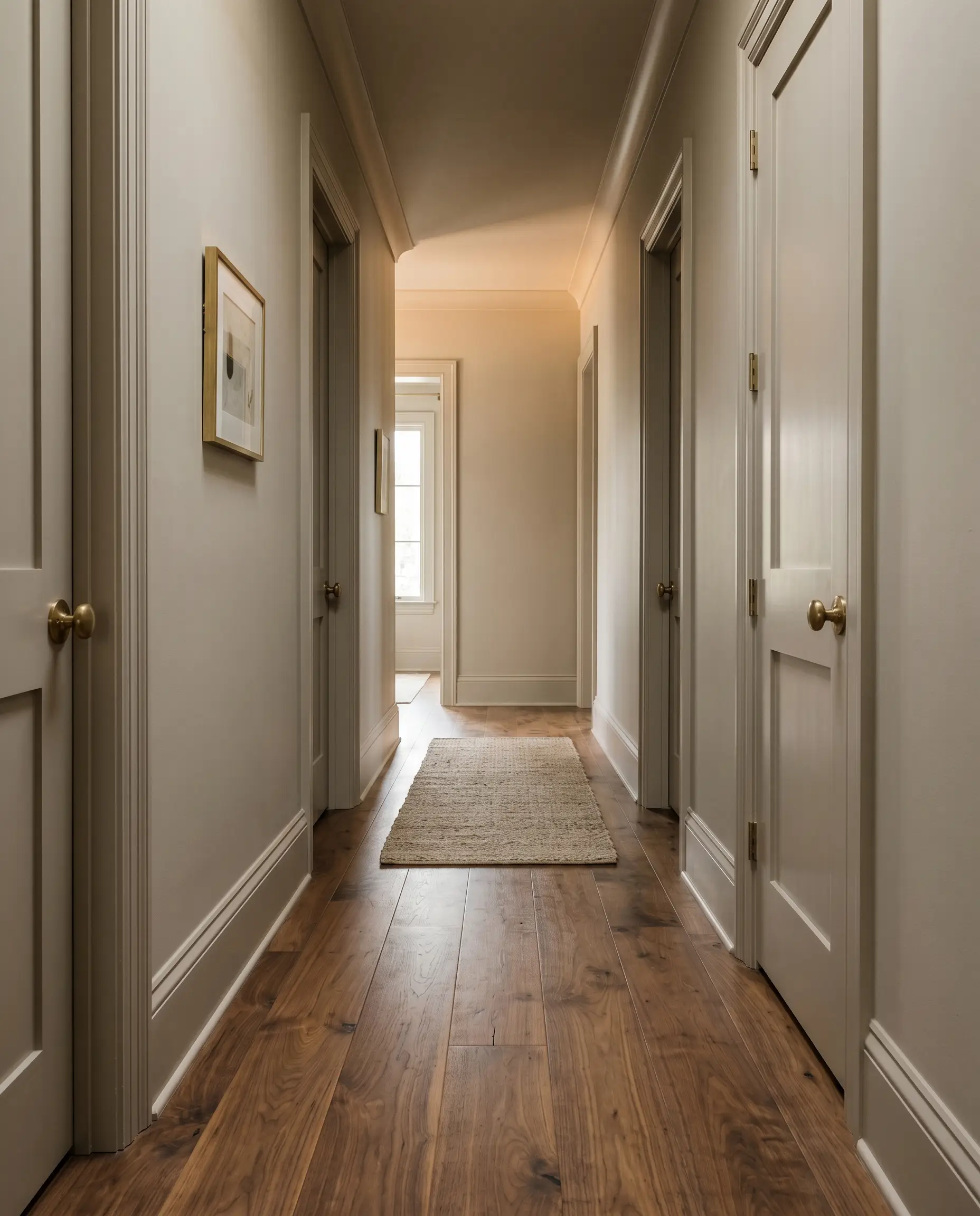
Transform a standard, transitional hallway by applying this rich taupe across every surface—baseboards, doors, trim, and walls. By wrapping a transitional space entirely in one mid-tone color, you create a beautifully moody, highly tailored corridor that makes the brighter rooms branching off from it feel even more expansive and luminous.
A Tailored Scullery Concept
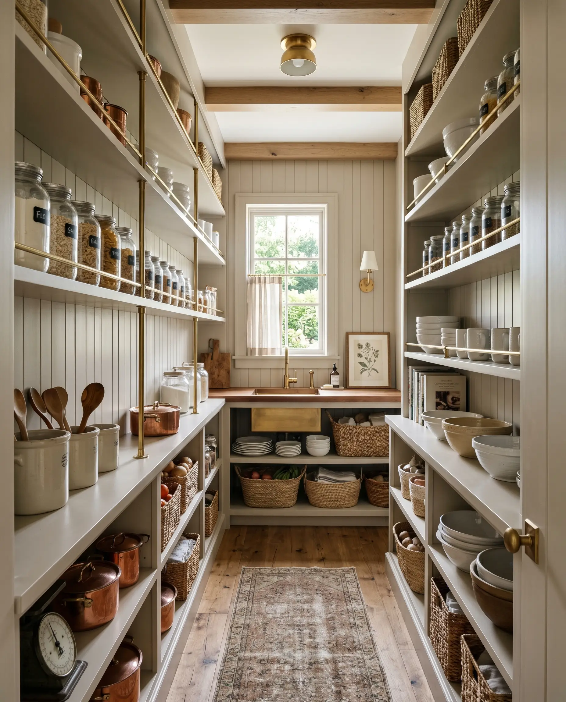
If you are updating a walk-in pantry or a secondary prep kitchen, use this shade to create a boutique, jewel-box effect. Paint the open shelving and the beadboard backing in the exact same finish. The earthy depth of the paint provides a stunning contrast against everyday glass jars, white ceramic dishware, and simple brass rail systems, turning a utilitarian storage zone into a design feature.
Color-Blocked Architectural Ceilings
Instead of defaulting to a stark white ceiling, use this greige to visually lower the ceiling in a room with exaggerated, overly tall proportions. By painting the ceiling and carrying the color down the top twelve inches of the wall, you create a capping effect that makes a cavernous room feel instantly more intimate and grounded.
When color-blocking a ceiling with a mid-tone like this, always ensure your primary wall color shares a similar warm undertone. A stark, cool white on the lower walls will clash aggressively with the earthy warmth above.
Hackrea Design Secret
Styling & Material Pairings for AF-100
Because this color holds a significant amount of depth, it requires intentional styling. It thrives when paired with crisp, creamy boundaries that frame its warmth, alongside tactile materials that enhance its earthy nature.
Trim & Baseboards
To keep this mid-tone looking intentional, you need a trim color that provides enough contrast without feeling icy or stark.
Hardware, Wood & Material Pairings
Balancing the visual weight of this paint requires a mix of grounded textures and light-reflecting accents.
Coordinating Colors
Building a cohesive palette around this shade involves leaning into its natural, earthy inclinations.
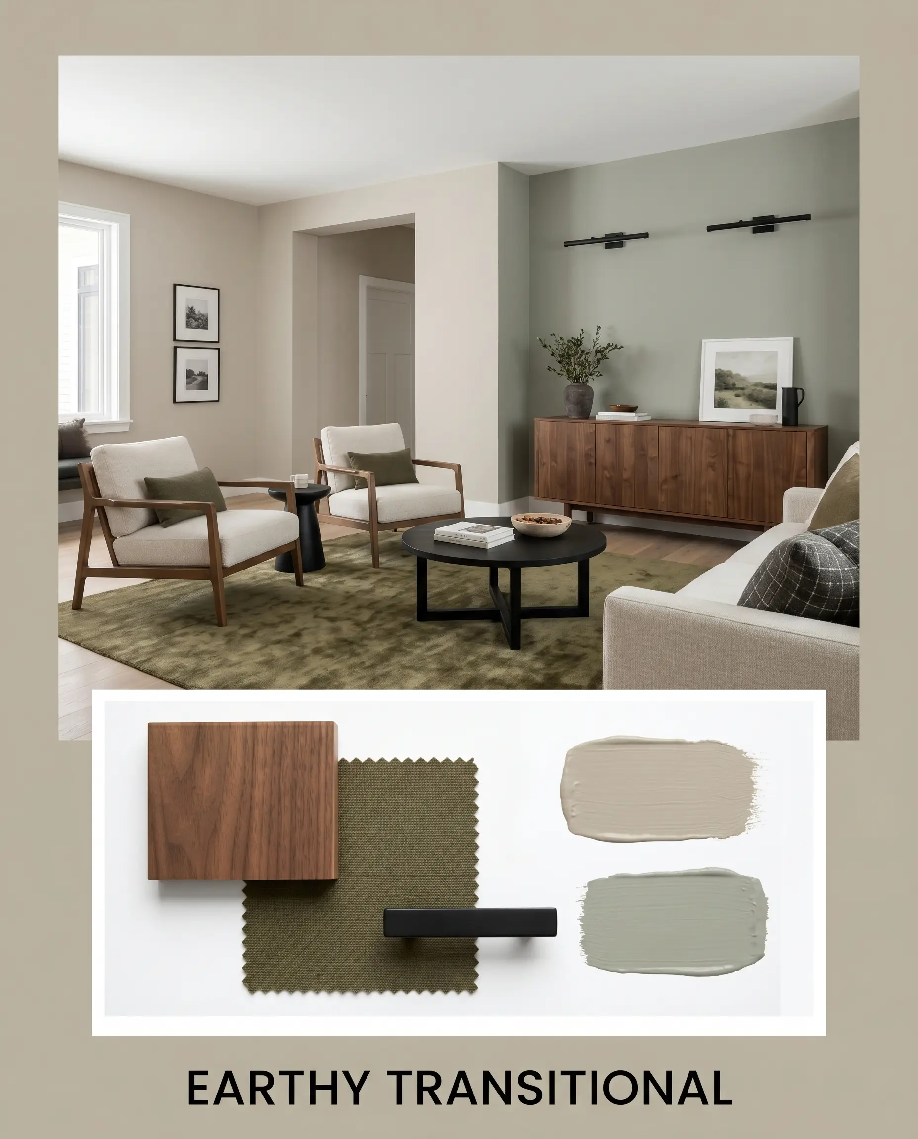
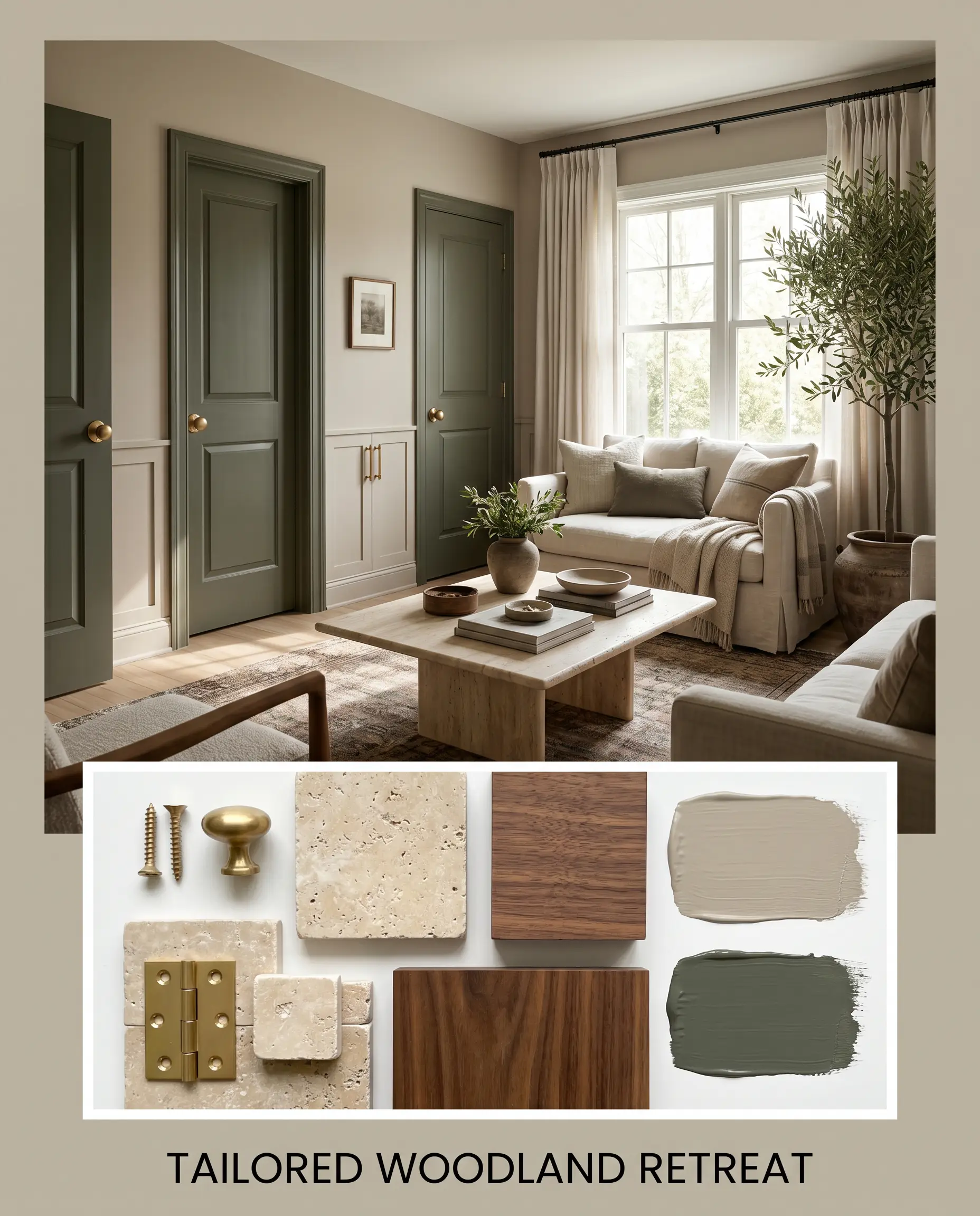
Designer Mood Boards
Earthy Transitional: This palette relies on the organic interplay between Benjamin Moore Flora and our main taupe. Imagine a space anchored by a plush, olive-toned area rug, complemented by a sleek walnut credenza. Matte black linear sconces provide crisp, modern contrast, while the soft, muted green of Flora on an adjoining accent wall creates a deeply calming, nature-inspired flow.
Tailored Woodland Retreat: Here, we lean into dramatic, sophisticated contrast. The rich depth of Sherwin-Williams Rosemary is used on interior doors, standing out beautifully against the warm greige walls. We elevate the space with unlacquered brass hardware that bounces light around the room. A tumbled travertine coffee table adds an accessible yet highly textured focal point, resulting in a room that feels curated, grounded, and intensely cozy.
Benjamin Moore Pashmina vs. Industry Rivals
Sometimes a color is almost perfect, but your specific lighting or architectural style demands a slight pivot. Here is how this shade stacks up against its biggest competitors.
Benjamin Moore Pashmina AF-100 vs. Benjamin Moore Revere Pewter HC-172
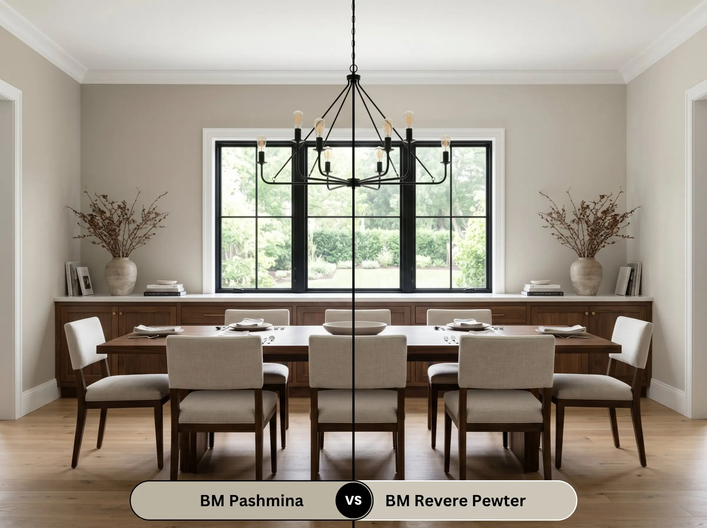
If you are worried that AF-100 is simply too dark for your space, Revere Pewter is the logical step down in depth. Revere Pewter sits significantly lighter on the wall and leans slightly more gray. If your room lacks natural light and you want a classic greige that feels airy, then Revere Pewter is the safer choice. However, if you want a richer, more tailored aesthetic that makes a definitive statement, the deeper taupe wins.
Benjamin Moore Pashmina AF-100 vs. Sherwin-Williams Agreeable Gray SW 7029
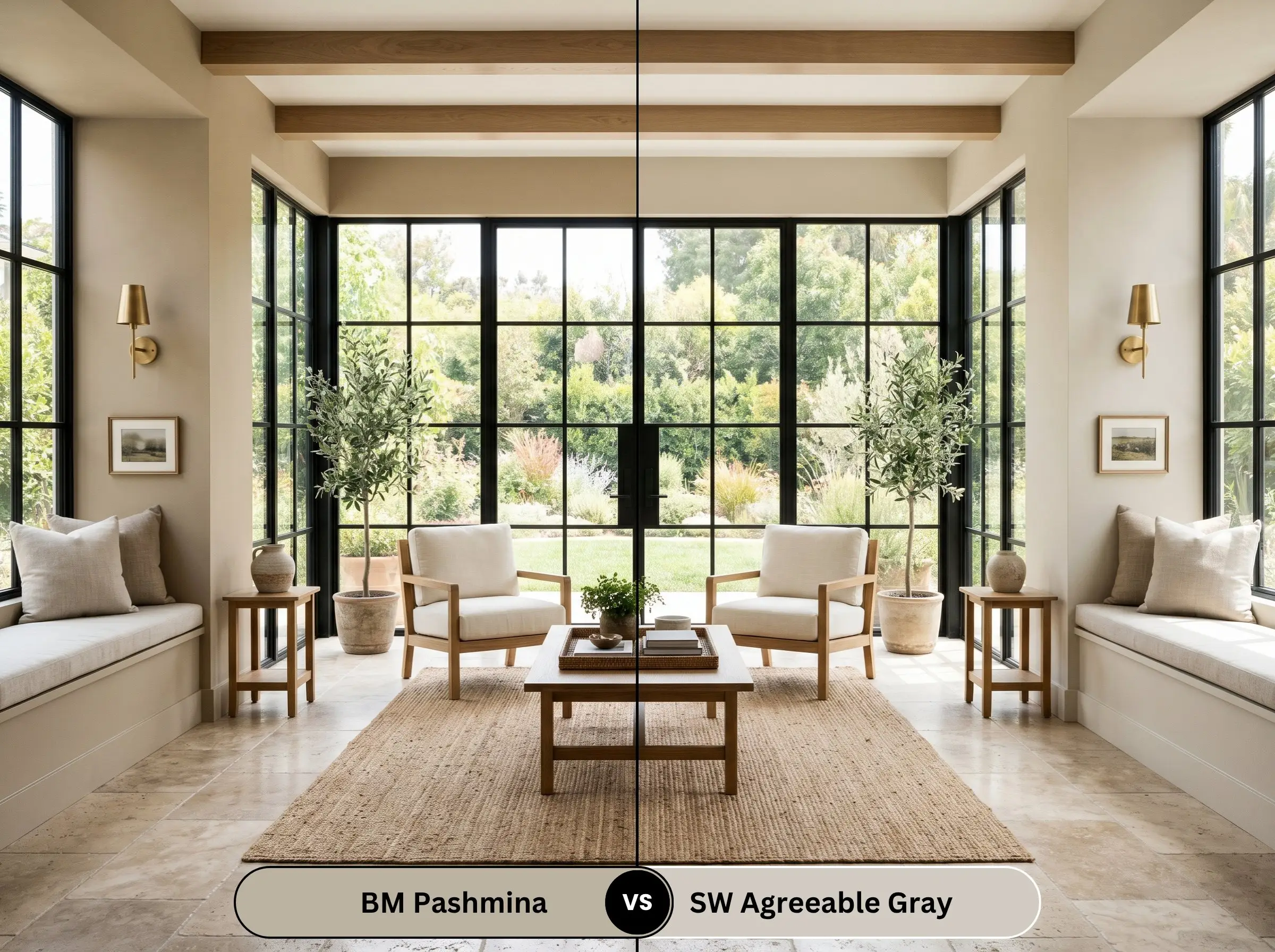
Agreeable Gray is the ultimate crowd-pleasing, light-reflecting neutral. It is significantly lighter and far less complex. If you are preparing a home for resale or want a highly adaptable, whole-house backdrop that fades into the background, then Agreeable Gray is the better utility player. But if you are designing a specific, highly curated room that needs architectural weight, Agreeable Gray will look washed out compared to the rich depth of BM’s offering.
Alternative Options in the Mid-Tone Range
If you love the general vibe of this color but need to tweak the warmth or find a match in a different brand, consider these highly reliable best greige paint colors for low light.
Similar Colors
Cross-Brand Matches
Executing Your Whole-Room Wall Color
Moving from color theory to the actual application requires a strategic approach, especially with a color that holds this much depth.
The Dynamic Sheen Guide
Primer Strategy
Because this is a true mid-tone with a solid chroma level, you do not need a deeply tinted primer. A standard, high-quality white or lightly tinted gray primer will provide an excellent base over standard drywall. However, if you are painting over raw wood or highly glossy cabinetry, a premium bonding primer is absolutely non-negotiable to ensure the paint adheres perfectly.
Coverage & Success Tips
Expect to apply two full coats for absolute color accuracy.
Because mid-tones absorb light differently than pale whites, they are highly susceptible to “flashing”—visible roller marks or uneven patches that show up when the light hits the wall at an angle. To avoid this, always maintain a “wet edge” while rolling, and never go back over semi-dry paint.
Hackrea Pro-Tip
Common Concerns Addressed
Because of its distinct earthy green micro-undertone, this shade is incredibly stable. While heavy tree cover will certainly make the color look cooler, grayer, and slightly more muted, it actively resists the dreaded purple flash that ruins so many other taupe paints.
Without natural light to lift it, a 44.2 LRV will look surprisingly dark and heavy. In a windowless basement, it will read more like a deep, shadowy brown rather than a sophisticated greige. If you use it in these spaces, you must compensate with excellent, layered artificial lighting.
Yes, it performs beautifully on exteriors. Because direct sunlight washes out paint colors by several shades, its mid-tone depth prevents it from looking blindingly white. On stucco, it will read as a soft, warm, highly elegant greige that feels natural and grounded.
The earthy, slightly green undertones of the paint will directly contrast with the red tones of the cherry wood. This complementary relationship will actually intensify the redness of the cabinets, while the paint may suddenly look much greener than you intended.
The Final Verdict on Benjamin Moore Pashmina
Benjamin Moore Pashmina is a brilliant, highly sophisticated tool for homeowners who want to inject genuine warmth and architectural weight into their spaces without resorting to outdated, heavy browns. It is perfect for creating intimate, tailored living rooms, grounding expansive transitional kitchens, or providing a rich, elegant backdrop for home offices. It excels in well-lit spaces where its complex taupe-greige balance can be fully appreciated.
However, this color requires intentional pairing and is not a universal fix for every home. If your house features extensive red-toned woods—like classic cherry cabinetry or mahogany floors—the subtle earthy green undertones in this paint will aggressively clash, highlighting the red in the wood and making the walls appear unintentionally green. Furthermore, it completely fails when placed next to stark, icy grays or cool-toned luxury vinyl plank flooring; the clash in temperature will make the paint look dirty and the floors look sterile. Use it alongside creamy whites, rich walnuts, and warm metals, and it will reward you with a beautifully curated, high-end atmosphere.