High Reflective White SW 7757
Sherwin-WilliamsSherwin-Williams High Reflective White (SW 7757) is the brand's brightest, cleanest white paint color. With an exceptionally high LRV of 93, it is a highly neutral, crisp white that bounces maximum light, making it the ultimate choice for ceilings, trim, and modern gallery walls.
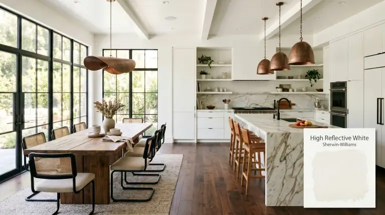
Sherwin-Williams High Reflective White (SW 7757): The Solution for a Flawless, Luminous Home
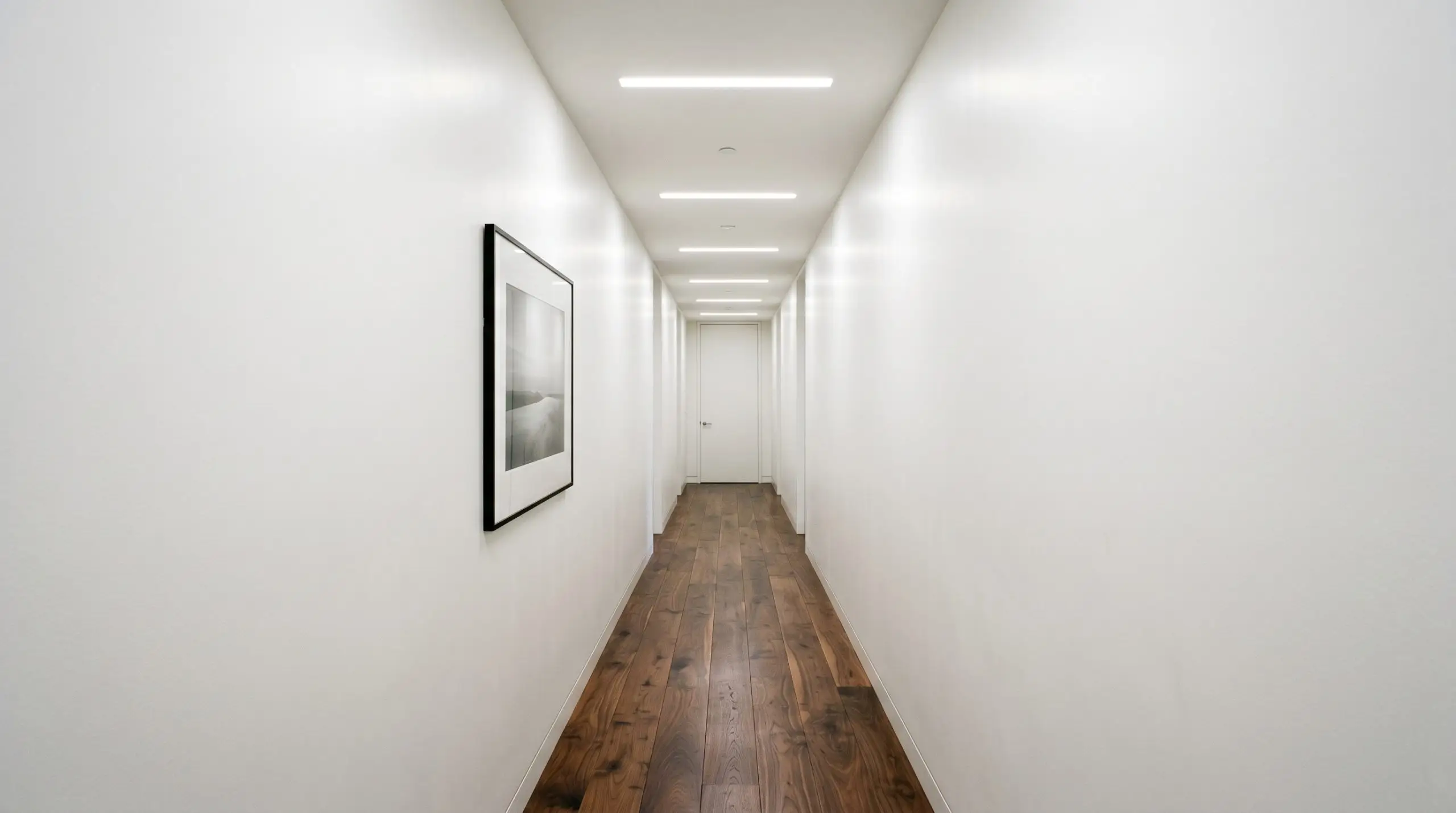
When you are dealing with a light-starved corridor or a cramped, shadowy entryway, the sheer reflective power of a paint color changes everything. Sherwin-Williams High Reflective White (SW 7757) behaves like a hidden light source, bouncing whatever illumination you have from wall to ceiling to floor.
This isn’t just another pale shade on a fan deck; it is a highly active architectural tool. By stripping away heavy pigments, this brilliant hue instantly expands the visual boundaries of your most challenging rooms.
Undertones & LRV of Sherwin-Williams High Reflective White
If you are wondering whether this brilliant shade reads warm or cool, Sherwin-Williams High Reflective White is definitively neutral, leaning just a fraction of a degree toward warm. This subtle color temperature keeps it from feeling like a harsh, clinical hospital corridor.
Sitting at a staggering Light Reflectance Value of 93, this paint bounces an enormous amount of light back into the room. It has virtually zero light absorption, meaning it will dramatically illuminate dim spaces but requires careful handling to avoid washing out completely on a sun-drenched facade. Need a refresher on how this impacts your walls? Check out our guide on understanding LRV in paint for a deeper dive.
You can apply wallpapers, paints, etc. on walls and see how they look in various interiors.

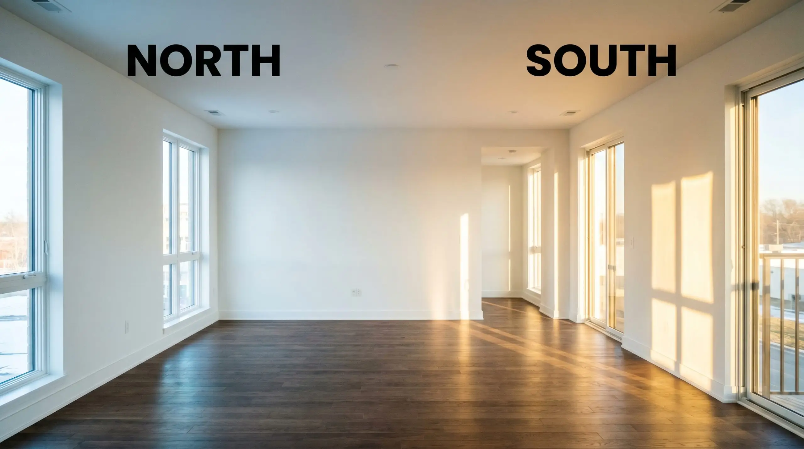
Lighting Effects & The Chameleon Factor
Because it lacks heavy grounding pigments, its greatest risk is becoming blindingly stark when blasted with unmitigated, direct afternoon sun. This ultra-bright hue shifts its personality depending entirely on the direction of your windows and the bulbs in your fixtures. You must test this color in your specific environment, as it eagerly mirrors the light it receives.
Popular Room Applications for SW 7757
This luminous shade brings a sense of boundless, airy energy to a home. It thrives wherever you need to create a pristine canvas or establish a sharp, tailored boundary.
Architectural Trim & Baseboards
Using this brilliantly crisp shade on your millwork is the ultimate way to frame a room. It provides a razor-sharp border that makes every other color on your walls look instantly more intentional and defined.
Ceilings
Whether you are rolling it over smooth drywall or a textured surface, it physically lifts the ceiling line. It acts like a canopy of light, pulling the eye upward and making standard eight-foot rooms feel significantly taller.
Windowless Bathrooms & Hallways
This is where the sheer reflective power truly shines. It is a brilliant strategy for brightening windowless rooms, bouncing ambient lighting around the space to eliminate shadowy corners.
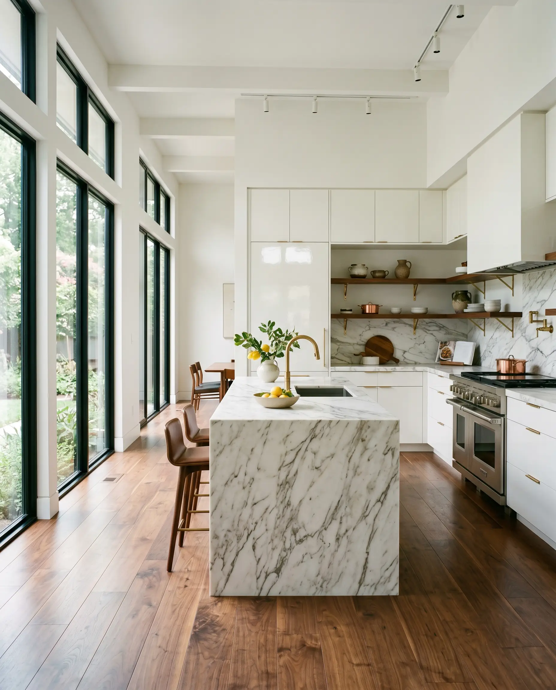
Kitchen Cabinets
For a sleek, contemporary culinary space, a high-gloss enamel finish on flat-panel doors creates a stunning, mirror-like effect. It pairs gorgeously with rich, veined marble counters and unlacquered hardware.
Art Gallery Walls
If you have a curated collection of framed prints or vibrant canvases, this neutral backdrop completely disappears. It allows the artwork to command the room without competing with underlying wall pigments.

Unique Design Ideas & Inspiration
Beyond the standard baseboards and ceilings, this ultra-pure hue is a remarkable tool for highly curated, inventive design moments.
The Color-Blocked Archway
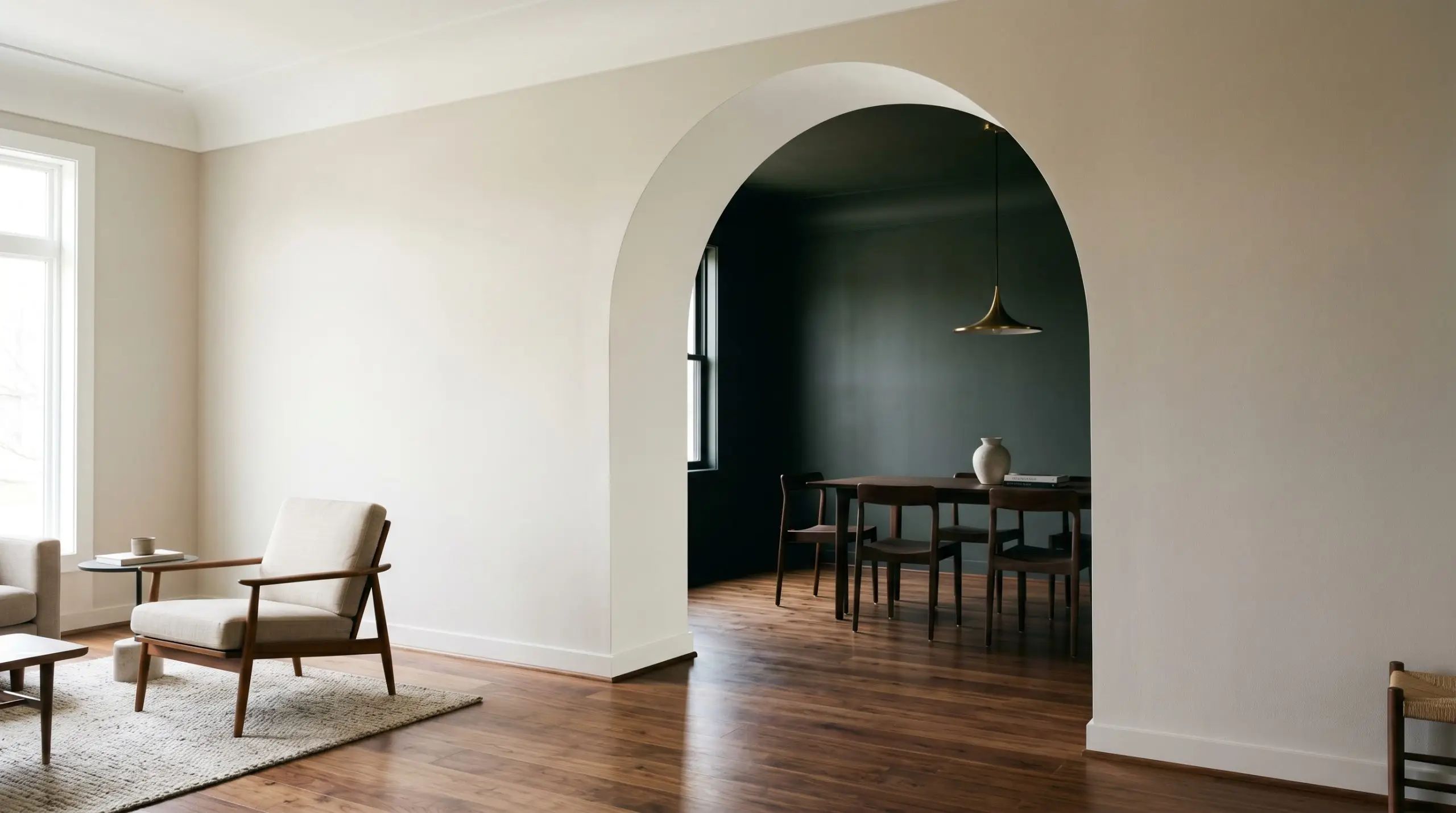
Use this brilliant shade to paint the interior curve of a transition arch between a dark, moody dining space and a sunlit living area. The stark contrast acts as a visual palate cleanser, signaling a shift in mood and energy as you walk through.
The Modern Coastal Bunk Room
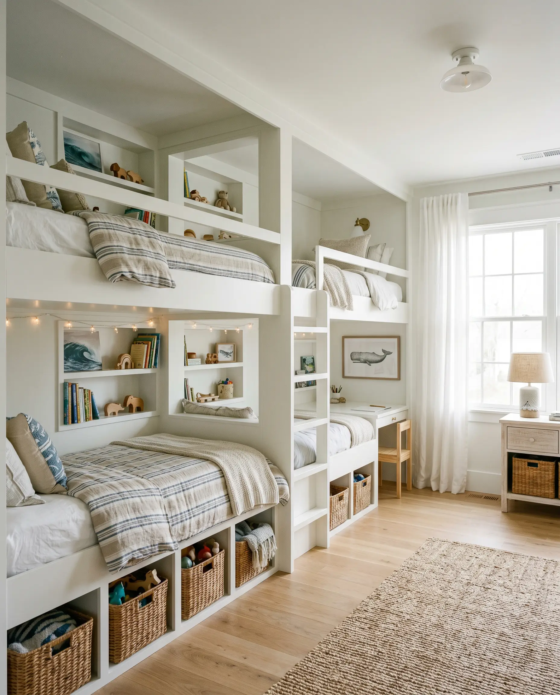
In a cramped children’s shared bedroom, wrapping the entire built-in bunk bed structure in this crisp hue makes the heavy carpentry feel weightless. Pair it with woven rattan baskets and striped linen bedding to create a breezy, elevated nautical retreat.
The High-Contrast Fireplace Surround
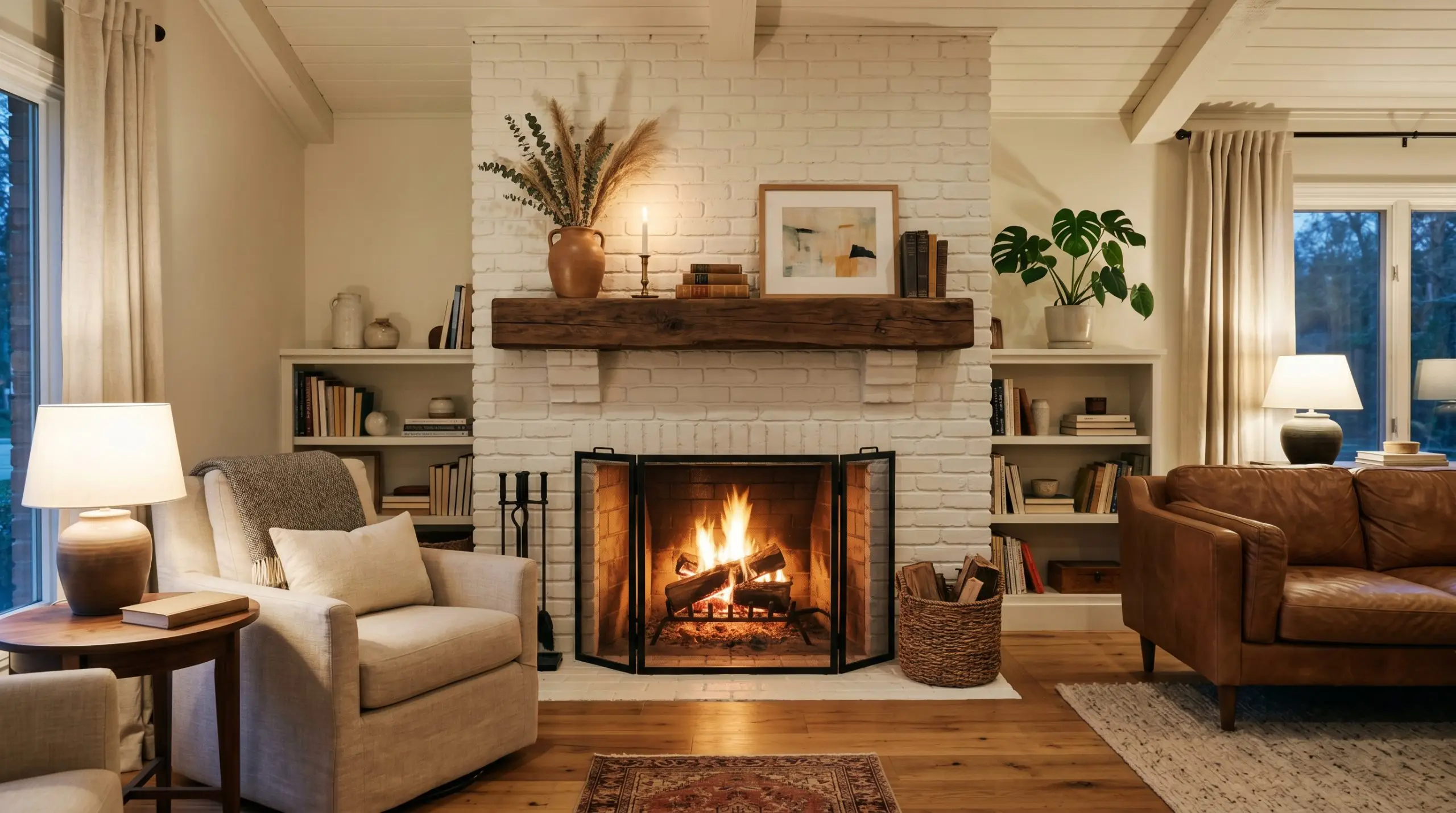
Transform a dated brick fireplace by coating it entirely in this luminous color, paired with a chunky, reclaimed walnut mantel. The bright facade modernizes the masonry texture while allowing the rich wood grain to become the absolute focal point of the room.
A Chic Retail-Inspired Closet

Turn a standard walk-in closet into a premium boutique experience by drenching the shelving and walls in this shade. The extreme light bounce ensures your clothing colors render accurately, making the daily routine feel incredibly luxurious.
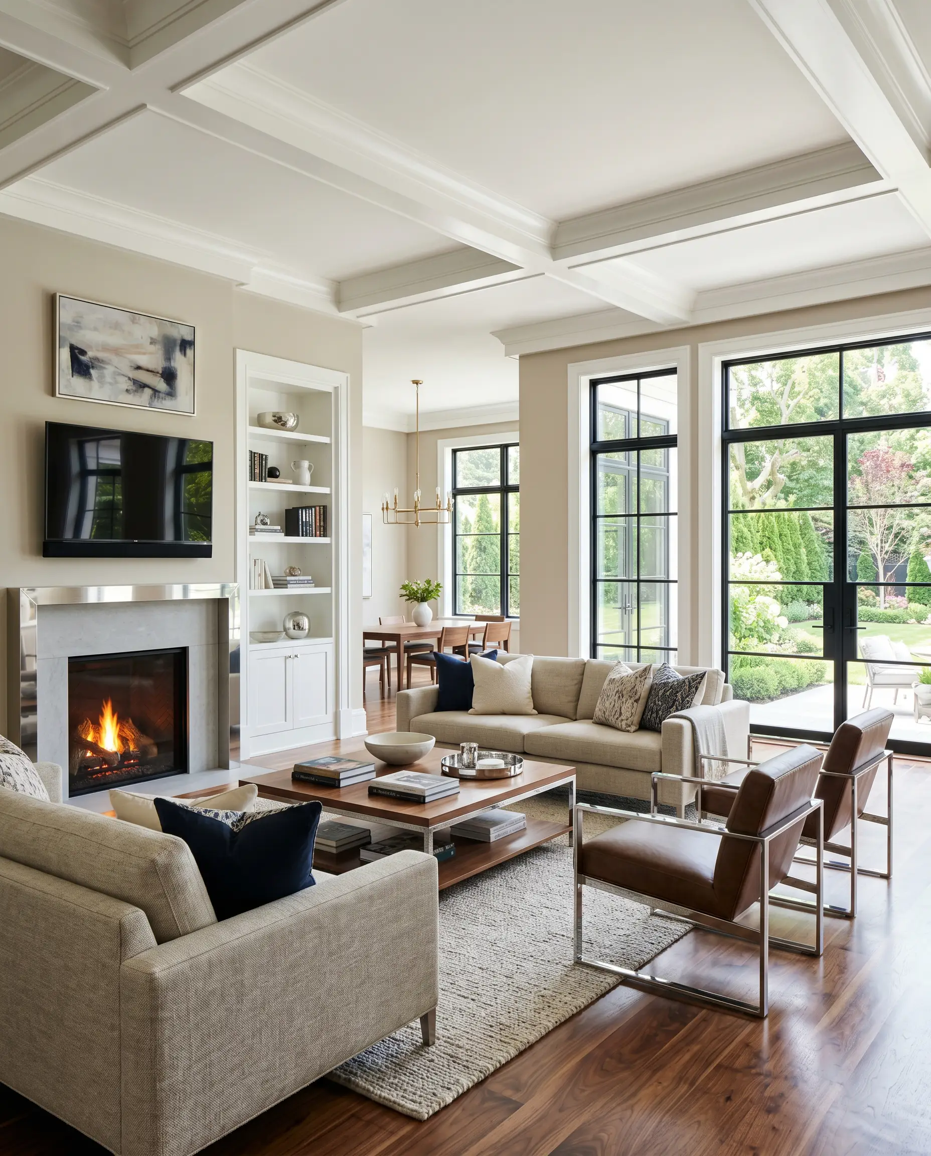
Coordinating Colors & Best Pairings
The secret to styling this brilliant hue is entirely about managing contrast. It requires either deeply saturated partners to ground its weightlessness or soft, earthy tones to create a serene, tonal flow.
Trim & Baseboards
If you are using this as your main wall color, your best approach is wrapping the trim in the exact same shade, simply shifting to a more durable finish. If you want a microscopic shift in depth, pairing it with Benjamin Moore Super White or Farrow & Ball All White on the baseboards offers a beautifully tailored, layered white-on-white aesthetic. Check out our best white trim colors to explore more nuanced options.
Hardware, Wood & Material Pairings
Coordinating Colors
Designer Mood Boards
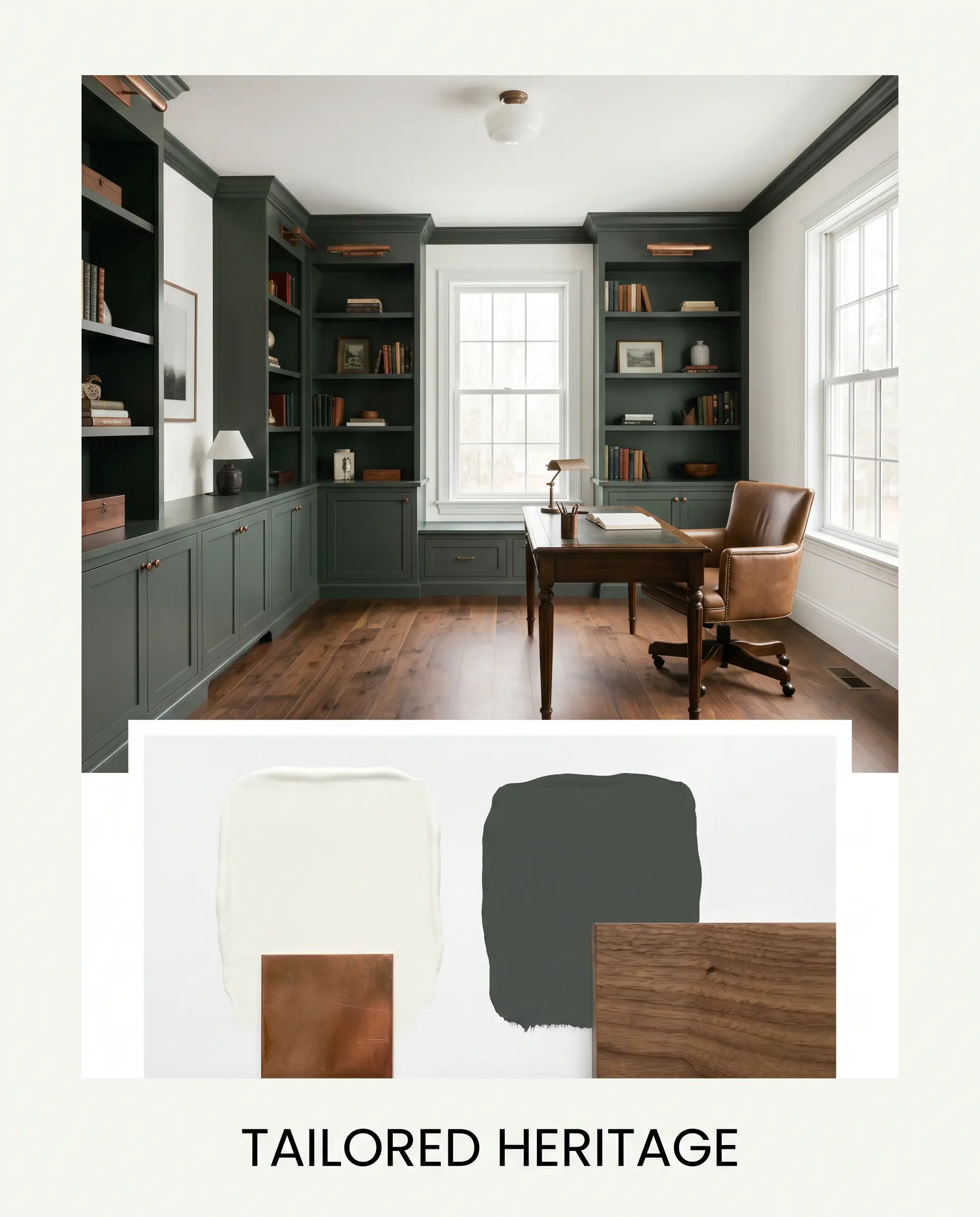
Tailored Heritage: This palette balances the sharp, pristine walls with the deep, grounding weight of Farrow & Ball Studio Green on built-in bookcases. Weave in aged copper hardware and rich walnut hardwood floors to create a study that feels both historic and brilliantly updated.
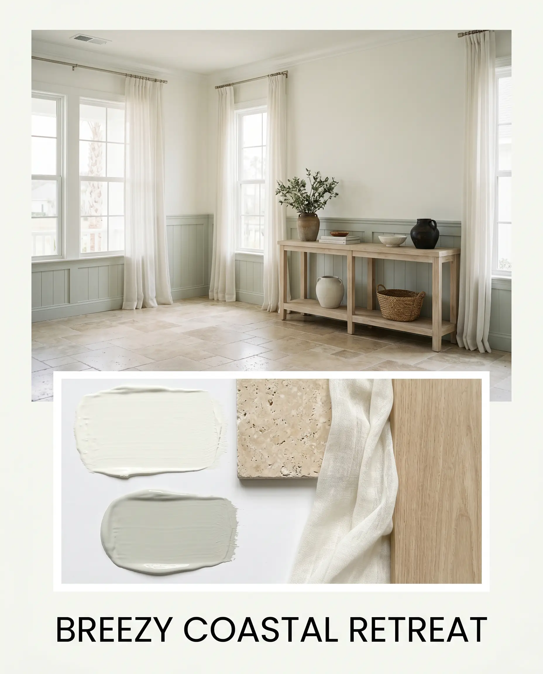
Breezy Coastal Retreat: Ground the luminous walls with Sherwin-Williams Sea Salt on interior doors or wainscoting. Style the room with tumbled travertine tile, sheer cotton drapery, and a bleached-wood console table to capture an effortless, sun-washed energy.
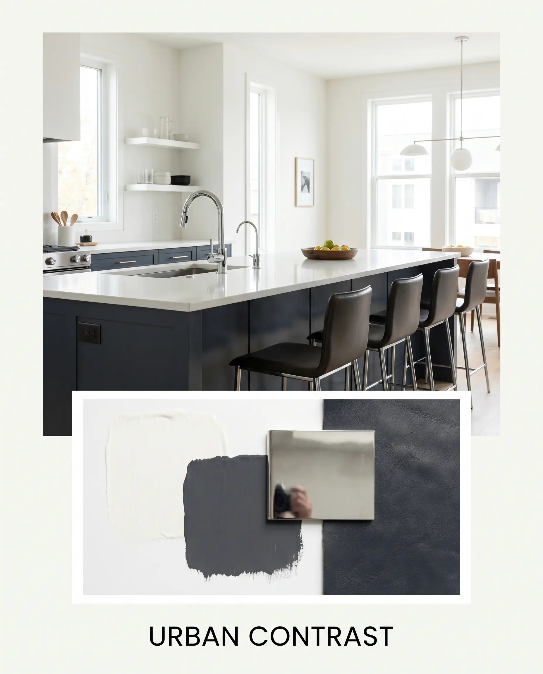
Urban Contrast: A deeply modern approach that pairs the ultra-bright backdrop with Benjamin Moore Hale Navy lower cabinetry. Introduce polished chrome plumbing fixtures and sleek, backless leather counter stools for a sharp, cosmopolitan vibe.
Head-to-Head Comparisons
Choosing the perfect white often comes down to analyzing the specific lighting of your room and determining if you need a softer glow or a sharper edge.
Sherwin-Williams High Reflective White vs. Sherwin-Williams Pure White
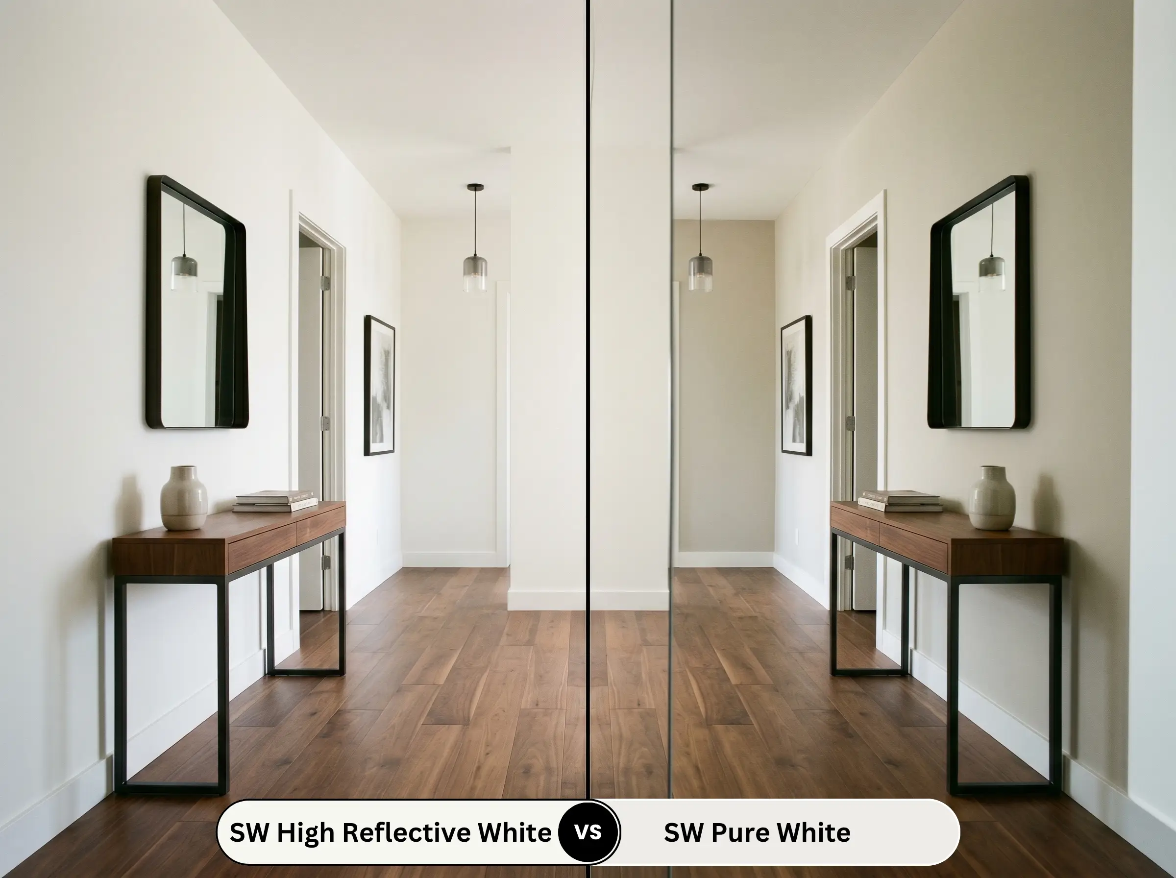
If your room faces north and feels a bit chilly, SW Pure White is often the safer choice because it carries a slightly heavier dose of warmth to soften the shadows. However, if you are looking for maximum light bounce in a dim, windowless space, High Reflective White is significantly brighter and crisper.
Sherwin-Williams High Reflective White vs. Benjamin Moore Chantilly Lace
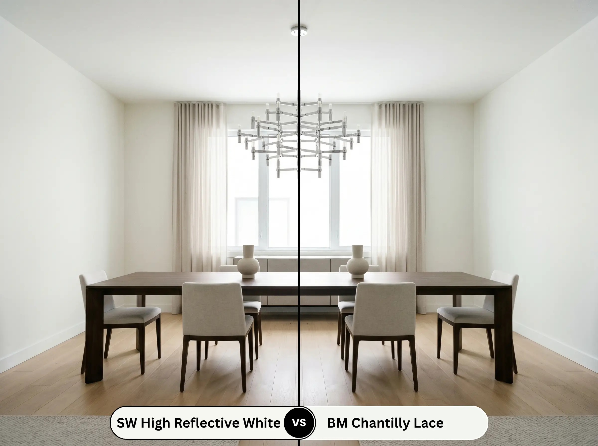
These two are fierce rivals for the title of the cleanest white. Chantilly Lace leans slightly cooler, making it perfect for ultra-modern, icy aesthetics. High Reflective White holds onto that microscopic trace of yellow-green, allowing it to feel just a fraction softer and more adaptable alongside earthy materials.
Similar Colors & Brand Equivalents
If you need a slightly different depth to accommodate your home’s unique shadows, or if you simply need to color match at a different hardware store, these alternatives deliver a very similar energy.
Similar Colors
Cross-Brand Matches
Practical Application & DIY Advice for SW 7757
Moving from the color wheel to the paint roller requires a strategic approach, especially when dealing with a shade that has so little pigment to hide imperfections.
The Dynamic Sheen Guide
Primer Strategy
Because this hue lacks heavy, light-blocking pigments, a high-quality, stain-blocking white primer is absolutely mandatory. If you are painting over raw wood or a previously dark wall, skipping the primer will result in the old color bleeding through and muddying the crisp finish.
Be prepared to apply at least three coats to achieve true, opaque perfection.
Hackrea Pro-Tip (The Coverage Reality)
Due to its sheer nature, rolling this paint requires patience. Do not press hard on the roller to stretch the paint, as this will cause visible flashing and uneven streaks that are incredibly difficult to touch up later.
Frequently Asked Questions
The very lack of chroma that makes this color so brilliantly pure also means it has very few hiding pigments. You must use a pure white, high-hiding primer to create a blank canvas, ensuring the topcoats don’t have to work overtime to mask the existing wall color.
On a pristine, level-5 drywall surface, this extreme brightness creates a flawless, mirror-like expanse. However, on heavily textured ceilings, that high light bounce will cast sharp micro-shadows behind every single bump, visually amplifying the texture you might be trying to hide.
Because it reflects almost all incoming light, flooding it with intense, direct southern sun can indeed create a blinding, uncomfortable glare. In these heavily glazed rooms, it is often wiser to step down to a slightly more muted shade to absorb some of that harsh energy.
While it works beautifully on exterior trim, using it across a massive, highly textured stucco facade in full daylight will absolutely look blinding and washed out. The sheer volume of natural sunlight strips away its subtle warmth, turning the exterior into a stark, glowing block.
Final Verdict & Expert Warnings
Sherwin-Williams High Reflective White (SW 7757) is the ultimate architectural tool for homeowners who need to instantly expand, illuminate, and modernize a dim space. It is perfect for crisp, tailored trim, sleek contemporary cabinetry, and low-light corridors that desperately need a bright, airy lift.
However, you must be incredibly careful when pairing this ultra-pure shade with heavily yellowed, dated finishes. If you place it directly against creamy travertine floors, yellow-toned oak cabinets from the 1990s, or dingy beige carpets, the pristine nature of the walls will instantly make those older elements look dirty and aged. The sharp contrast forces those earthy, dated tones to look unintentionally muddy rather than intentionally warm, completely undermining the fresh energy you are trying to create.
Expert Warning (The Clash Risk)