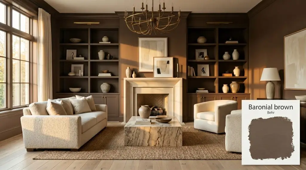
Baronial Brown N170-7
BehrBehr Baronial Brown (N170-7) is a deeply saturated, nearly-black brown with a warm red cast. Boasting an LRV of 7, it serves as a sophisticated, grounding neutral that envelops a space in cozy warmth while absorbing significant light.
Paint Technical Profile
| Color ID / SKU | N170-7 |
| HEX Code | #5a4840 |
| Light Reflectance (LRV) | 7 |
| Use | Interior, Exterior |
| Best Exposures | South, West |
| Best For | Cabinetry, Accent Walls, Exterior Trim, Powder Rooms |
Behr Baronial Brown: Mastering the Art of the Enveloping Atmosphere
Committing to a truly dark wall color completely rewrites how a room absorbs and reflects light. Behr Baronial Brown is a rich, mahogany-laced neutral that instantly gives standard drywall the visual weight of custom, high-end millwork.
It is a pigment built for tactile environments. This specific shade begs to be paired with heavily veined stone, unlacquered brass, and soft, natural textiles that play off its inherent warmth.
When you use a color this saturating, you are not just painting a room; you are crafting a highly intentional, sensory experience.
Behr Baronial Brown: Undertones & LRV
When homeowners ask if this deep brown leans warm or cool, the answer is an undeniable, radiant warm. It possesses a distinct mahogany cast that prevents the color from feeling flat or icy, even in shadowed corners. This inherent warmth makes it an incredibly forgiving dark neutral for everyday spaces.
With an LRV (Light Reflectance Value) of exactly 7, this paint absorbs a staggering 93% of visible light. In practical terms, this means the color will visually recede, blurring the hard edges of a room to create an intensely enveloping atmosphere.
Harnessing Light with a Low-LRV Neutral
Darker pigments are incredibly reactive to their environment, meaning this velvety finish will dramatically shift its mood depending on the sun’s trajectory. Understanding your room’s exposure is the secret to unlocking the exact vibe you want.
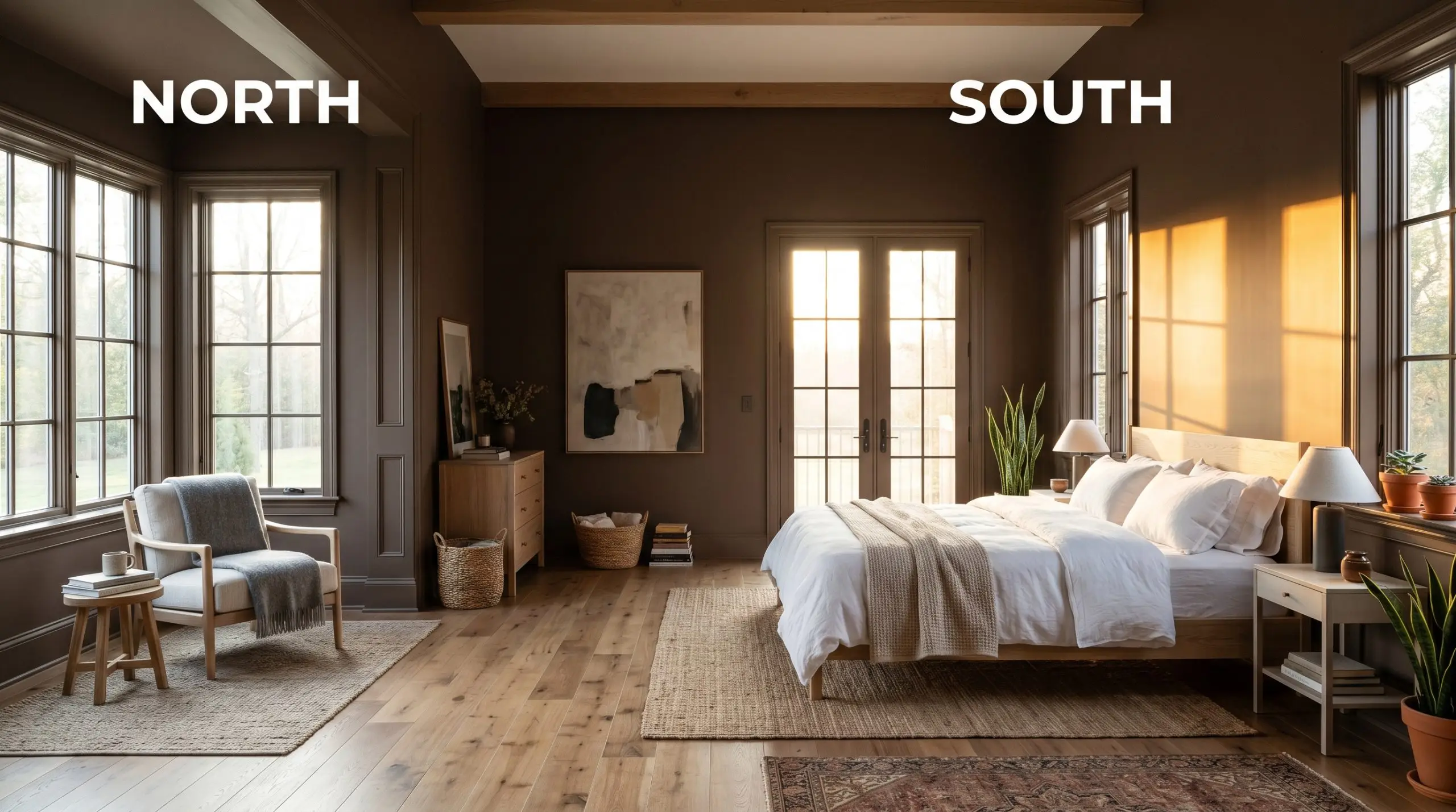
When using a color this dark, always install dimmers and stick to 2700K-3000K bulbs. Anything cooler will turn your rich, chocolatey walls into a harsh, industrial gray.
Hackrea Pro-Tip (The Bulb Rule)
Architectural Grounding: Where to Apply This Deep Neutral
The beauty of a saturated, low-light color lies in its ability to make standard architectural features feel incredibly intentional. Whether you are wrapping an entire room or highlighting a single focal point, here is how to maximize this rich pigment.
High-Impact Powder Rooms
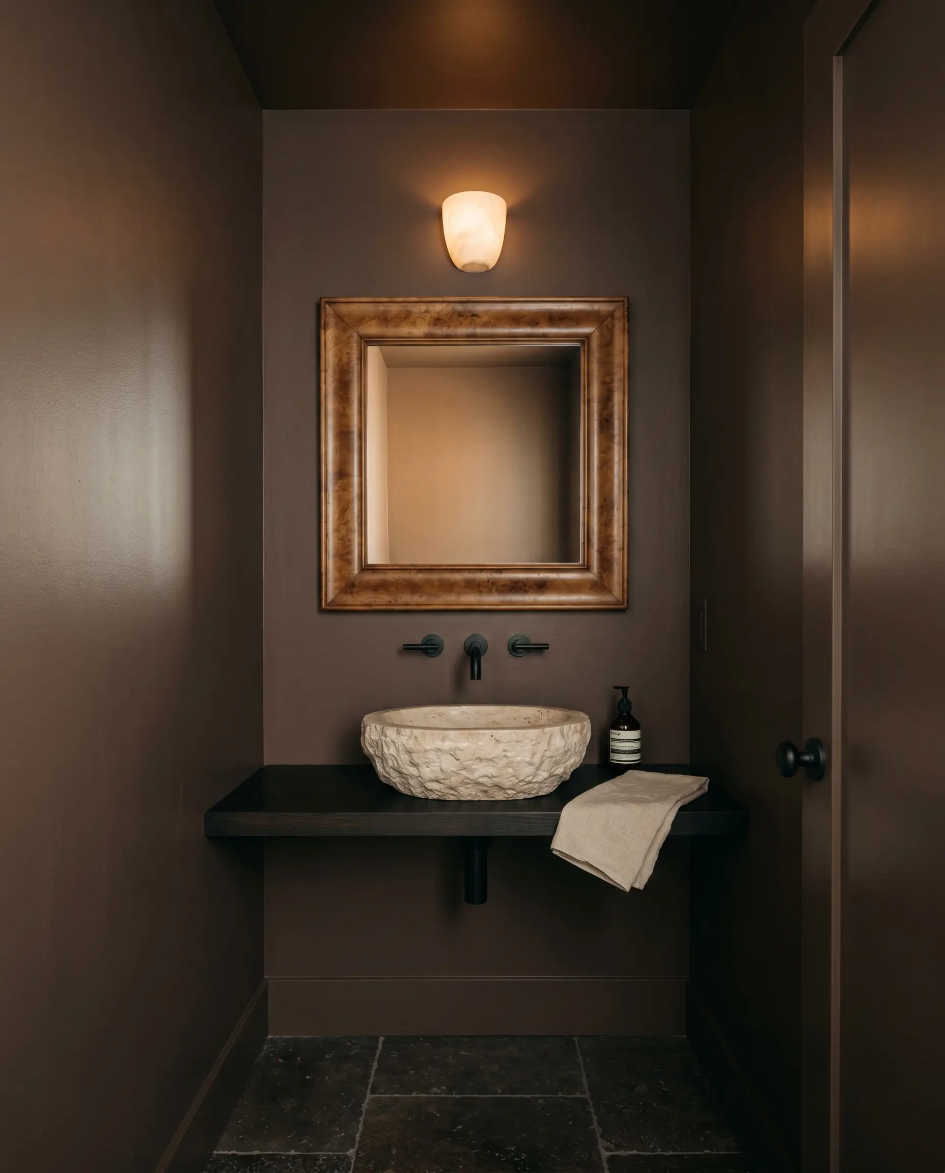
Small, windowless bathrooms are the perfect testing ground for an enveloping atmosphere. Instead of fighting the lack of light, lean into the shadows by wrapping the walls, ceiling, and baseboards in a single, continuous sheen.
To modernize the space, step away from expected traditional fixtures and pair the dark walls with heavily textured materials. A raw, tumbled travertine sink and matte black wall-mounted faucets create a beautiful Modern Organic tension against the velvety walls.
Adding a vintage burl wood mirror introduces organic pattern, while a single alabaster sconce will cast a soft, flattering glow against the dark backdrop.
Home Office and Study Built-Ins
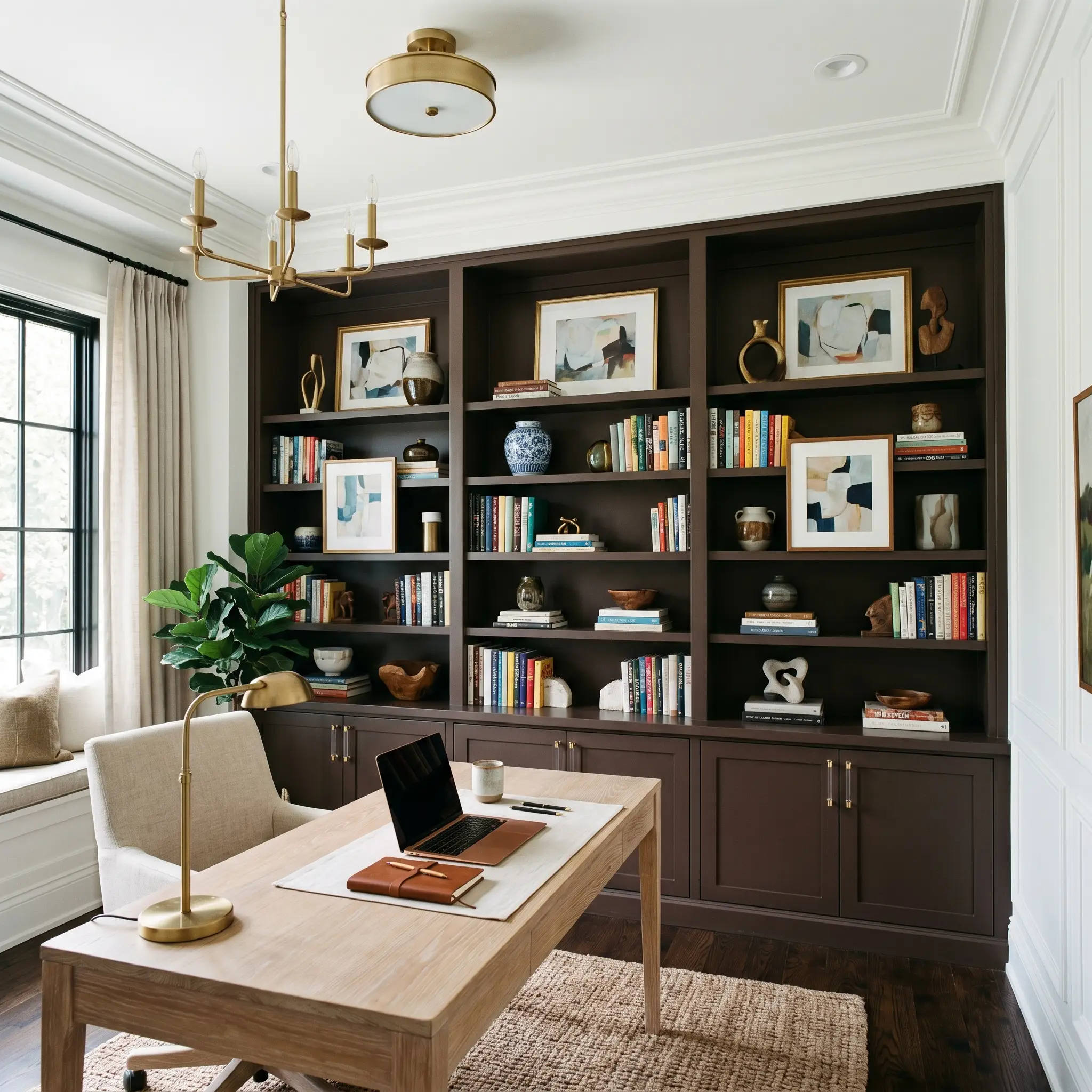
Painting standard MDF or basic wooden bookshelves in this rich hue instantly mimics the look of expensive, custom mahogany millwork. It provides a visual presence that roots the entire room, making it an ideal backdrop for a work-from-home professional who needs a focused, sophisticated environment.
Resist the urge to style these shelves exclusively with dusty antiques or heavy leather-bound books. You can easily push this color into a fresh, transitional aesthetic.
Style the dark shelves with vibrant contemporary art, glossy ceramic vases, and sleek acrylic cabinet hardware to create a brilliant high/low visual mix.
Exterior Trim and Fascia Updates
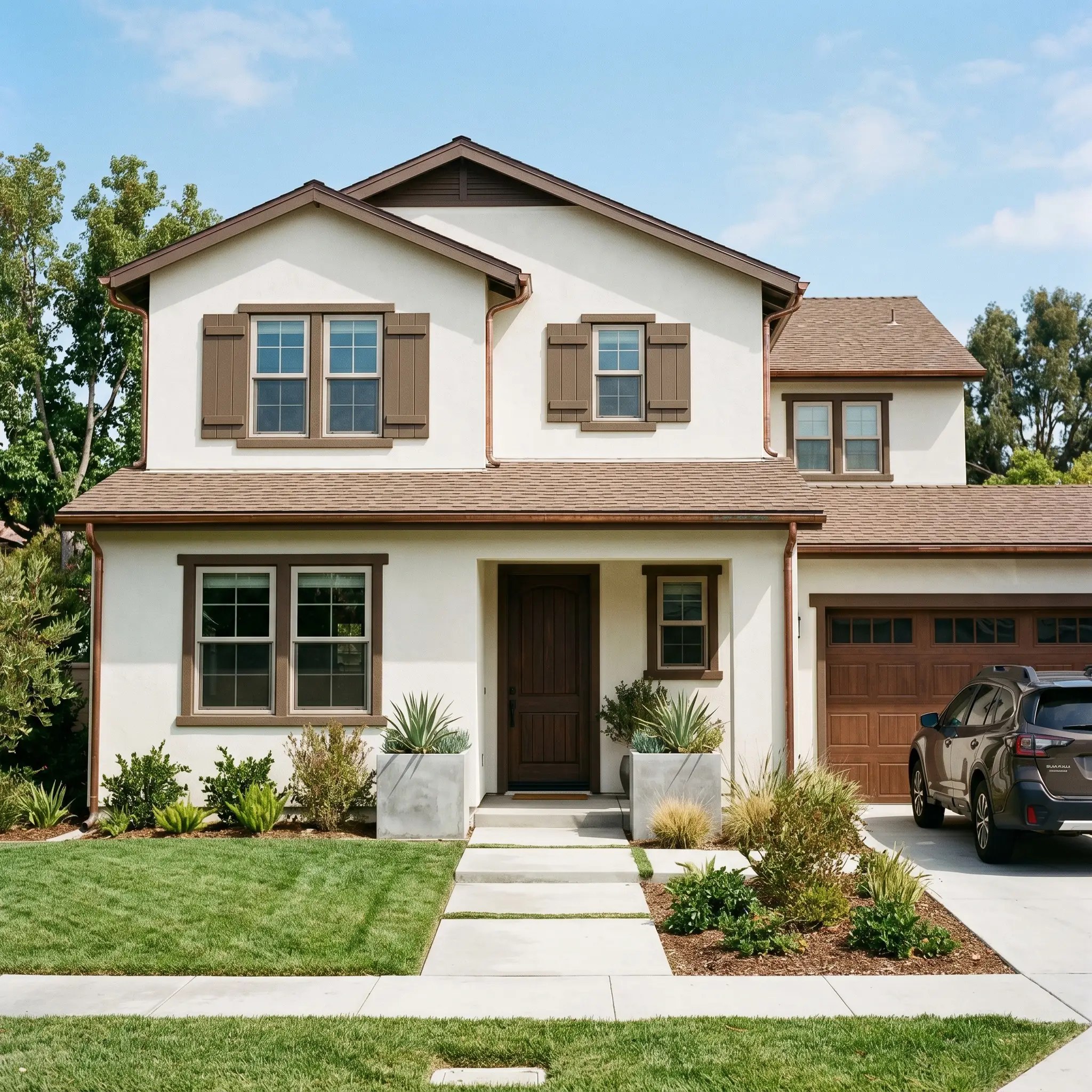
On an exterior facade, intense sunlight will wash out a significant amount of a paint’s darkness, pulling the underlying red-orange base forward. Using this shade on window trims, shutters, or fascia boards delivers a striking, earthy contrast against lighter siding.
It is a brilliant strategy for updating a standard suburban brick or stucco home, offering a softer, more organic alternative to harsh black trim. Pair it with copper gutters that will naturally patina over time, or flank the entryway with oversized, concrete planters to nail a modern curb appeal.
Before committing to this shade on your trim, test it against your roof shingles. If your roof features prominent cool gray or blue-slate undertones, the warm, reddish-brown base of the trim will visually clash and feel disconnected.
Clash Warning (Exterior Undertones)
Elevating Kitchen Island Cabinetry
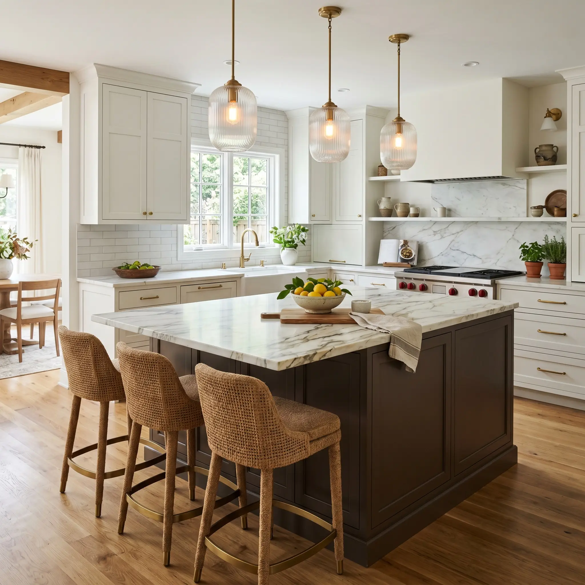
If a fully dark kitchen feels too intimidating, isolating this velvety finish on the center island is a highly practical compromise. It establishes the center of the room and expertly hides daily scuffs in a busy family household.
This application shines when you contrast the heavy base with light, highly reflective materials on top. Top the island with a dramatically veined Calacatta marble to bounce light around the room.
Finally, introduce reeded glass pendants overhead and pull up a set of woven mohair or saddle leather counter stools for a beautifully layered, tactile kitchen.
Building the Palette: Best Pairings for Behr Baronial Brown
This rich, mahogany-laced pigment thrives on intentional contrast and requires careful boundary management to truly shine. Because it absorbs so much light, it forces lighter surrounding materials to pop forward visually, requiring either crisp, reflective trims to hold its shape or soft tonal companions to create a seamless glow.
Formulating the Perfect Trim Boundary
The trim color you select will completely alter how the underlying warmth of this dark brown is perceived. You must decide if you want a stark, modern outline or a softer, more traditional transition.
Tactile Material Pairings
Treat this deep neutral as a foundational canvas for rich textures. The goal is to introduce materials that either bounce light around the room or lean into the enveloping atmosphere with contrasting tactile finishes.
The Core Coordinating Palette
Conceptual Styling & Mood Boards
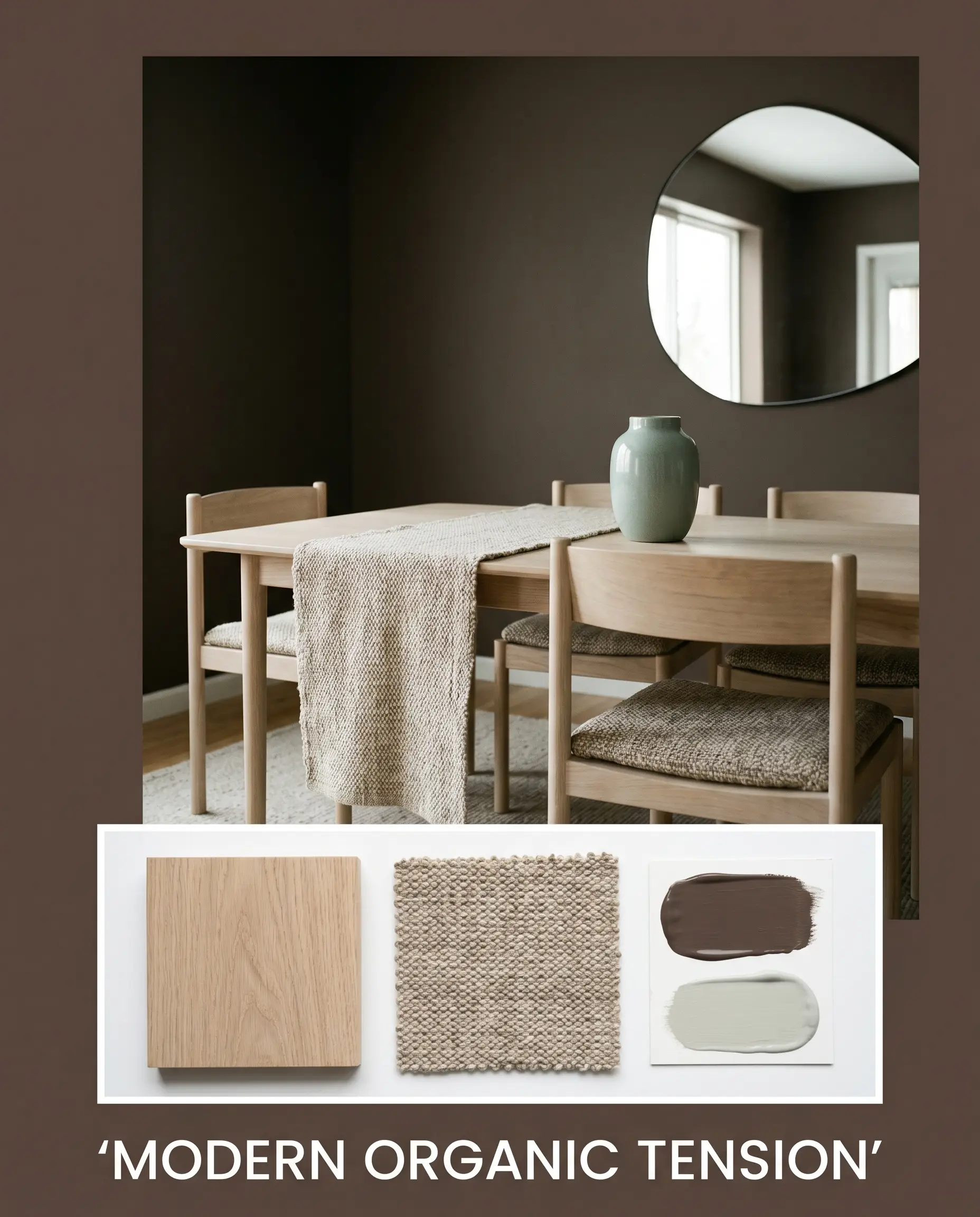
Modern Organic Tension This aesthetic relies on the dramatic contrast between light-absorbing walls and pale, organic textures. Anchor the space with bleached oak furniture and highly textured woven wool textiles to immediately soften the intensity of the dark brown walls. Introduce accents of Sherwin-Williams Sea Salt SW 6204 through abstract canvas art or ceramic vases to inject a breath of cool, watery relief into the warm palette. Finish the styling with an asymmetrical mirror to bounce natural light and amplify the room’s dynamic energy.
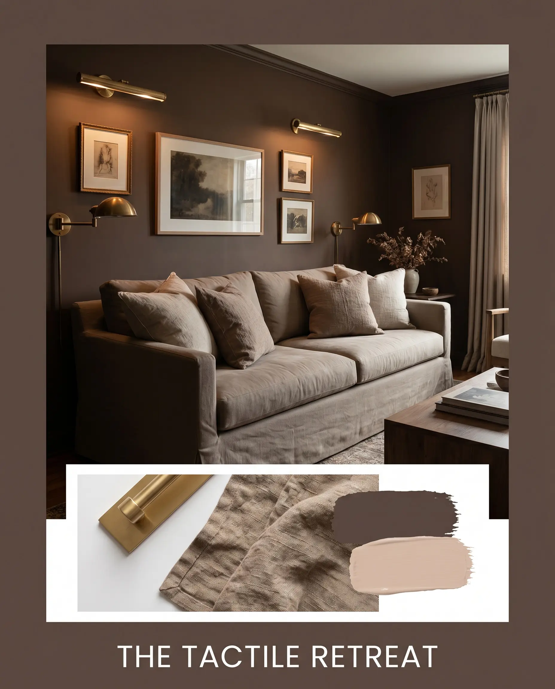
The Tactile Retreat Designed to feel like a warm, enveloping sanctuary, this palette leans entirely into rich, sensory materials. The deep walls act as a velvety backdrop for a slipcovered sofa and layers of crushed linen throw pillows. Introduce unlacquered brass picture lights or minimalist candelabras to cast a warm, reflective glow against the matte paint. The energy here is quiet and deeply restorative, utilizing low-profile silhouettes and monochromatic book spines to keep the visual clutter to an absolute minimum.
Head-to-Head Paint Comparisons
Specific lighting conditions, local exterior exposures, or existing architectural finishes often dictate when a rival paint might actually perform better in your home. If you are struggling with how this specific Behr shade reads in your lighting, comparing its foundational structure against its closest competitors will reveal the right path forward.
Behr Baronial Brown vs. Sherwin-Williams Black Bean SW 6006
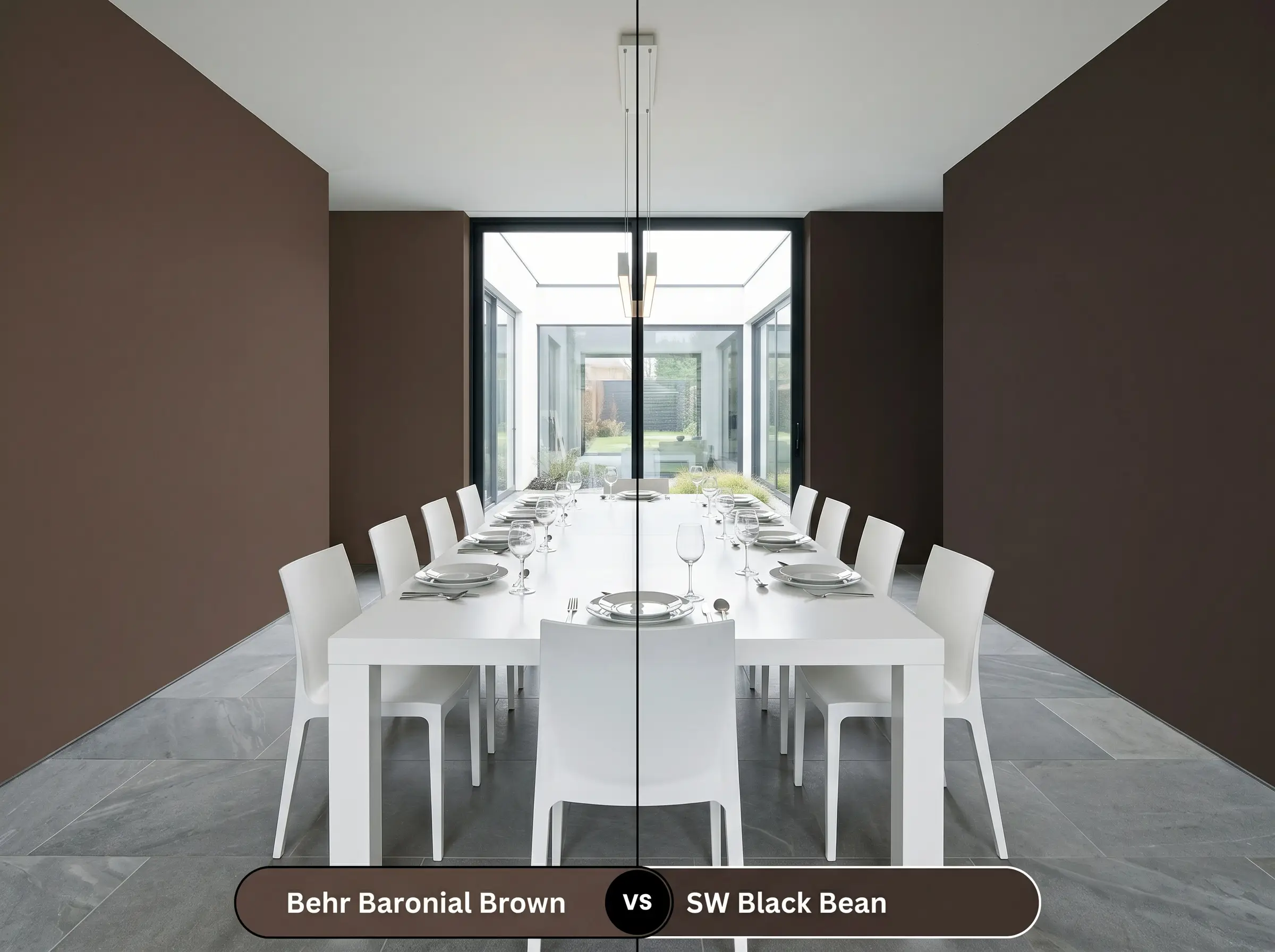
If your room receives intense, direct southern light, you might find that the Behr option pulls a bit too much red for your liking. Sherwin-Williams Black Bean SW 6006 is the solution when you need a slightly cooler, more muted alternative.
Black Bean carries a subtle purplish-gray undertone that acts as a neutralizing agent against harsh sunlight. If you are working with cool-toned stone floors or stark white modern furniture, then the Sherwin-Williams shade will bridge those elements much more smoothly than the warmer mahogany cast of the Behr paint.
Behr Baronial Brown vs. Benjamin Moore Bittersweet Chocolate 2114-10
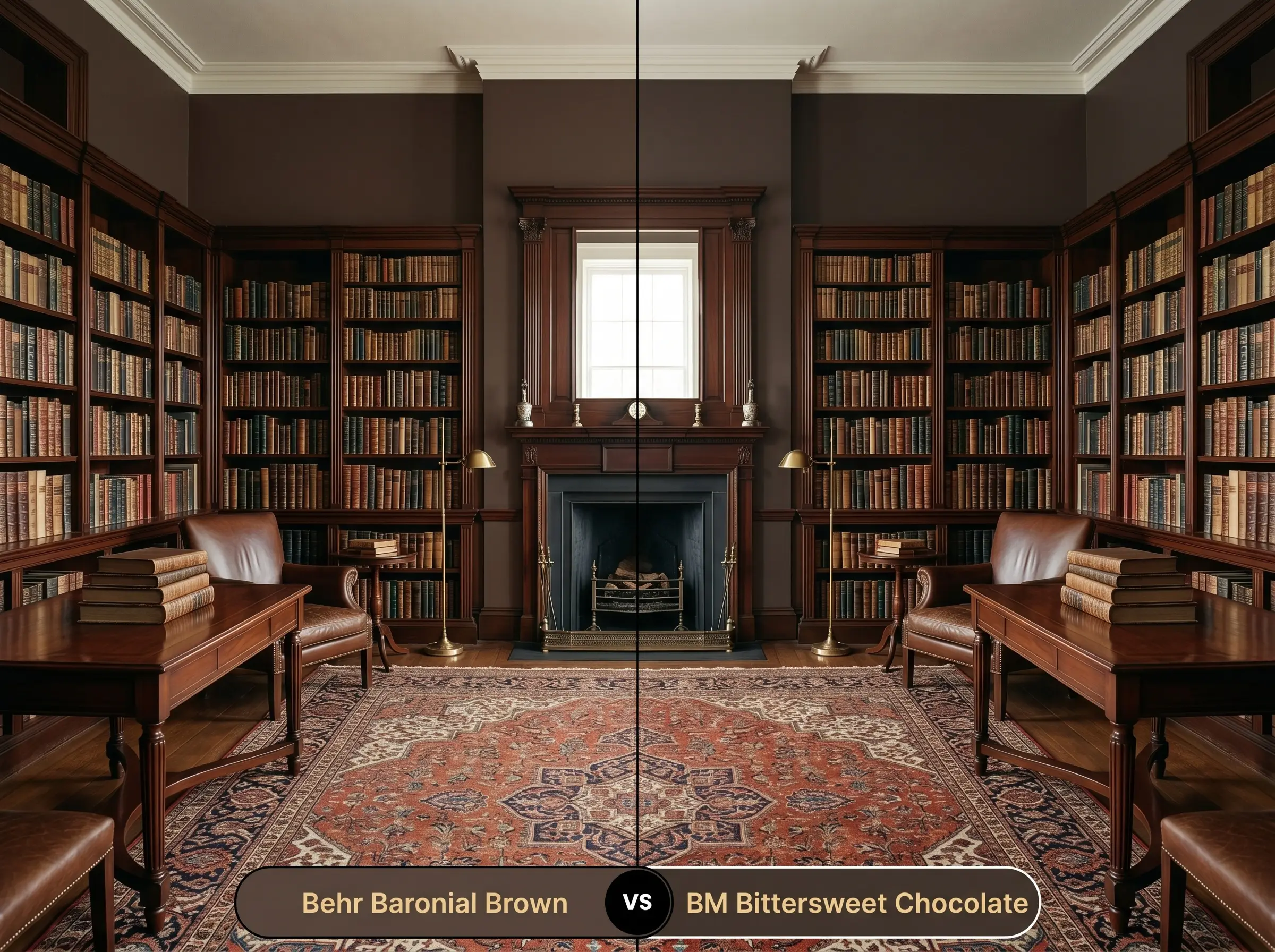
This comparison comes down to the desired intensity of the room’s atmosphere. Benjamin Moore Bittersweet Chocolate 2114-10 is a notoriously rich, highly saturated hue that leans even further into a decadent, warm profile.
While both colors sit at the very bottom of the light reflectance scale, the Benjamin Moore option feels slightly more vibrant and traditional. If you are aiming for a highly saturated, historic aesthetic featuring antique rugs and polished mahogany furniture, then Bittersweet Chocolate will provide that classic library feel, whereas the Behr option feels slightly more muted and earthy.
Behr Baronial Brown vs. Behr Bison Brown 780B-7
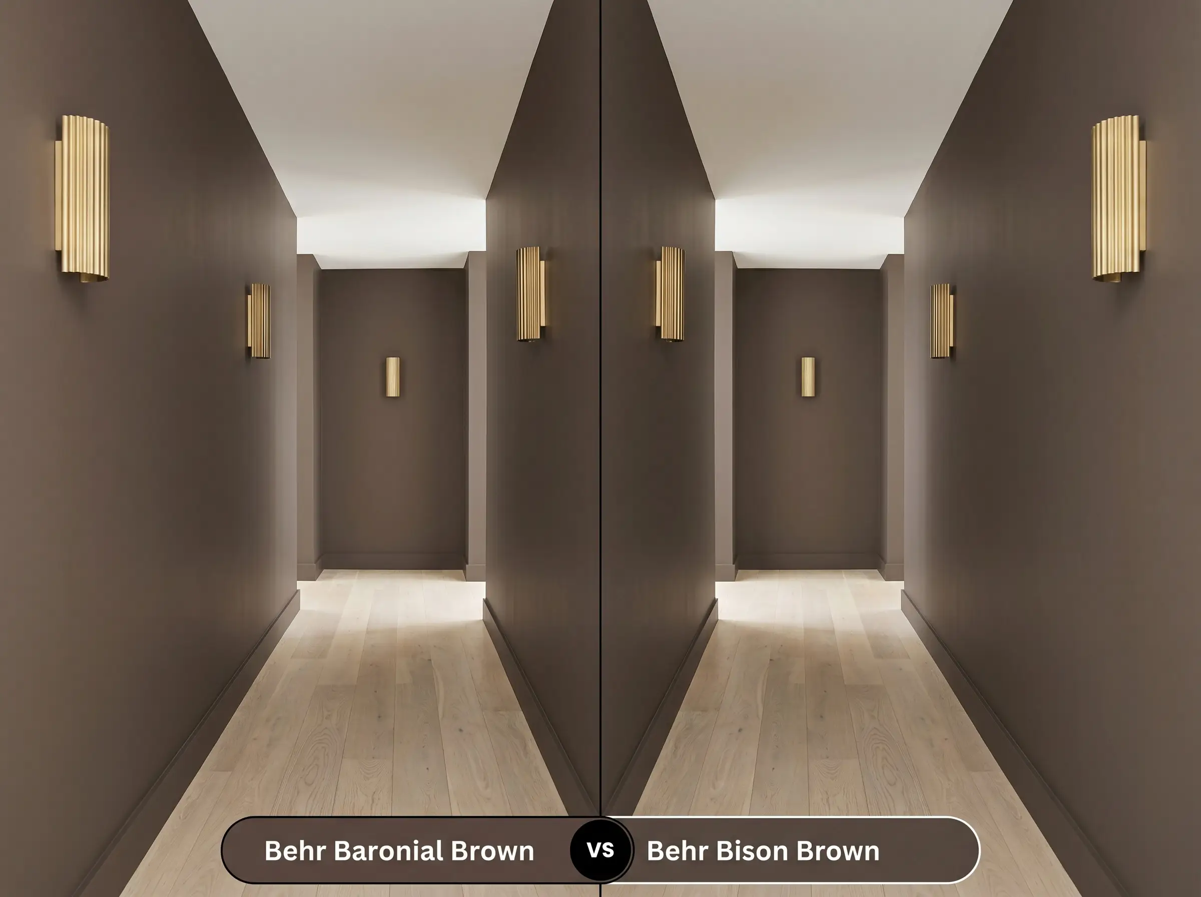
When you want to stay within the same brand but need just a fraction more light reflection, this is the pivot to make. Behr Bison Brown 780B-7 is slightly lighter and carries a touch more golden-yellow in its base compared to the red-orange roots of its darker sibling.
If your room is entirely windowless and the LRV 7 option feels too close to black in the shadows, then Bison Brown will offer a softer, more forgiving warmth. It retains the earthy identity you want without completely absorbing every ounce of artificial light in the space.
Navigating Similar Colors & Brand Matches
Sometimes a color is almost perfect, but you need a slight shift in undertone to harmonize with your existing floors, or you simply need to match the aesthetic using a different paint manufacturer.
Exploring Behr Alternatives
Rival Brand Color Matches
Application Strategy for Behr Baronial Brown
Transitioning a color this dark from a swatch to a fully painted wall requires a specific technical approach. Dark pigments behave entirely differently on the roller than light neutrals, demanding careful prep work to ensure a flawless, premium finish.
The Dynamic Sheen Guide
Primer Strategy
You cannot skip the primer when applying an LRV 7 paint over a lighter wall. You must request a deeply tinted gray primer at the paint counter.
Using a standard white primer will force you to apply three or four coats of the dark brown just to achieve true opacity. A dark gray base coat ensures the rich mahogany undertones develop properly on the very first pass.
Coverage & Success Tips
Even with a tinted primer, expect to apply two full, generous coats for a professional-grade finish. Dark paints are notoriously prone to “flashing,” which occurs when uneven roller pressure leaves visible, shiny streaks across the wall.
To prevent flashing with dark colors, you must maintain a “wet edge” while rolling. Work in small, three-foot vertical sections and never roll back over paint that has already started to tack up and dry.
Hackrea Pro-Tip (The Wet Edge Rule)
Touch-ups on dark, matte walls are highly visible because the new paint will cure at a slightly different sheen. If a wall gets severely scuffed a year down the line, plan on repainting that entire wall corner-to-corner rather than attempting a spot fix.
Frequently Asked Questions
Because it shares a similar warm, earthy DNA, it actually harmonizes beautifully with orange-toned oak rather than clashing. The dark walls will act as an anchor, making the warm floors feel like an intentional design choice rather than an outdated feature.
Intense sunlight will wash out the darkness of the paint, pulling the underlying red-orange base forward so it reads significantly warmer and slightly lighter outside. However, dark colors absorb massive amounts of heat, which can lead to premature fading or chalking on textured stucco in extreme UV environments.
Yes, painting a ceiling in this deep, light-absorbing shade creates an immediate sense of intimacy. It visually pulls the ceiling down, turning a stark, overly tall room into a cozy, enveloping space, especially when paired with warm ambient lighting.
A high-quality Satin or Semi-Gloss exterior enamel is mandatory. The higher sheen levels contain more binding resins, which create a protective, UV-resistant barrier that actively prevents the dark pigment from chalking or fading prematurely.
The Final Verdict on Baronial Brown
Behr Baronial Brown is a masterclass in creating an intentional, grounding atmosphere. It is the perfect paint for homeowners looking to inject instant architectural weight into standard spaces, transforming basic drywall into rich, tactile environments.
Its distinct mahogany warmth makes it incredibly versatile, allowing it to easily bridge the gap between Modern Organic styling and curated, transitional aesthetics. It performs best in intimate spaces—like home libraries, powder rooms, or dining spaces—where you want to embrace the shadows and craft a deeply restorative, sensory mood.
This color requires warm lighting to survive. If your home is outfitted with cool, daylight-toned LED bulbs (4000K or higher), or if you are pairing it with stark, cool-toned gray luxury vinyl plank flooring, this paint will fail. The cool lights and gray floors will fight the red-brown base, turning the walls into a muddy, flat shadow rather than the rich, velvety feature you intended. Always ensure your foundational hard finishes share its underlying warmth.
Hackrea Design Secret (The Lighting Clash)
Closest Cross-Brand Equivalents
The absolute closest scientific color matches for Baronial Brown across top paint brands.