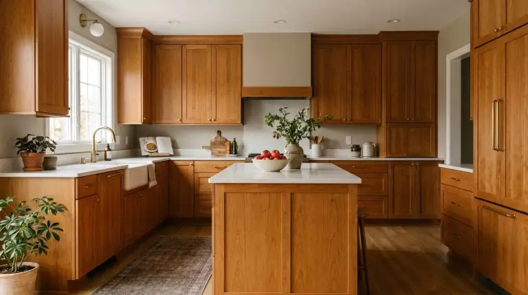
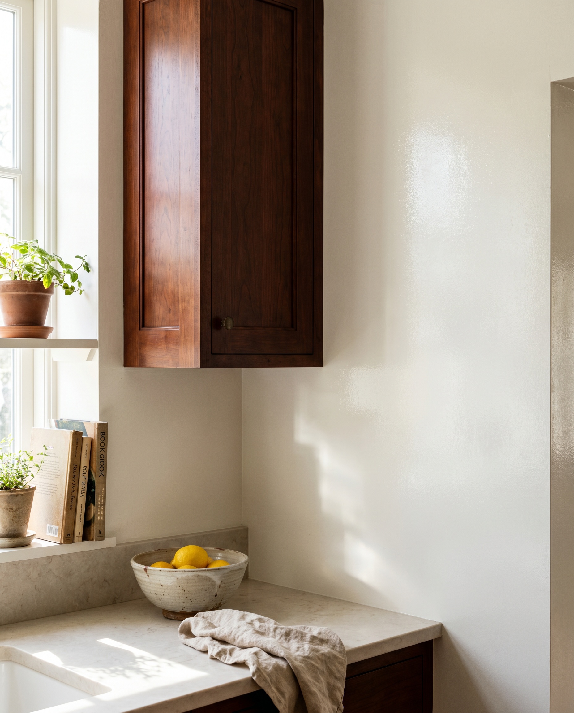
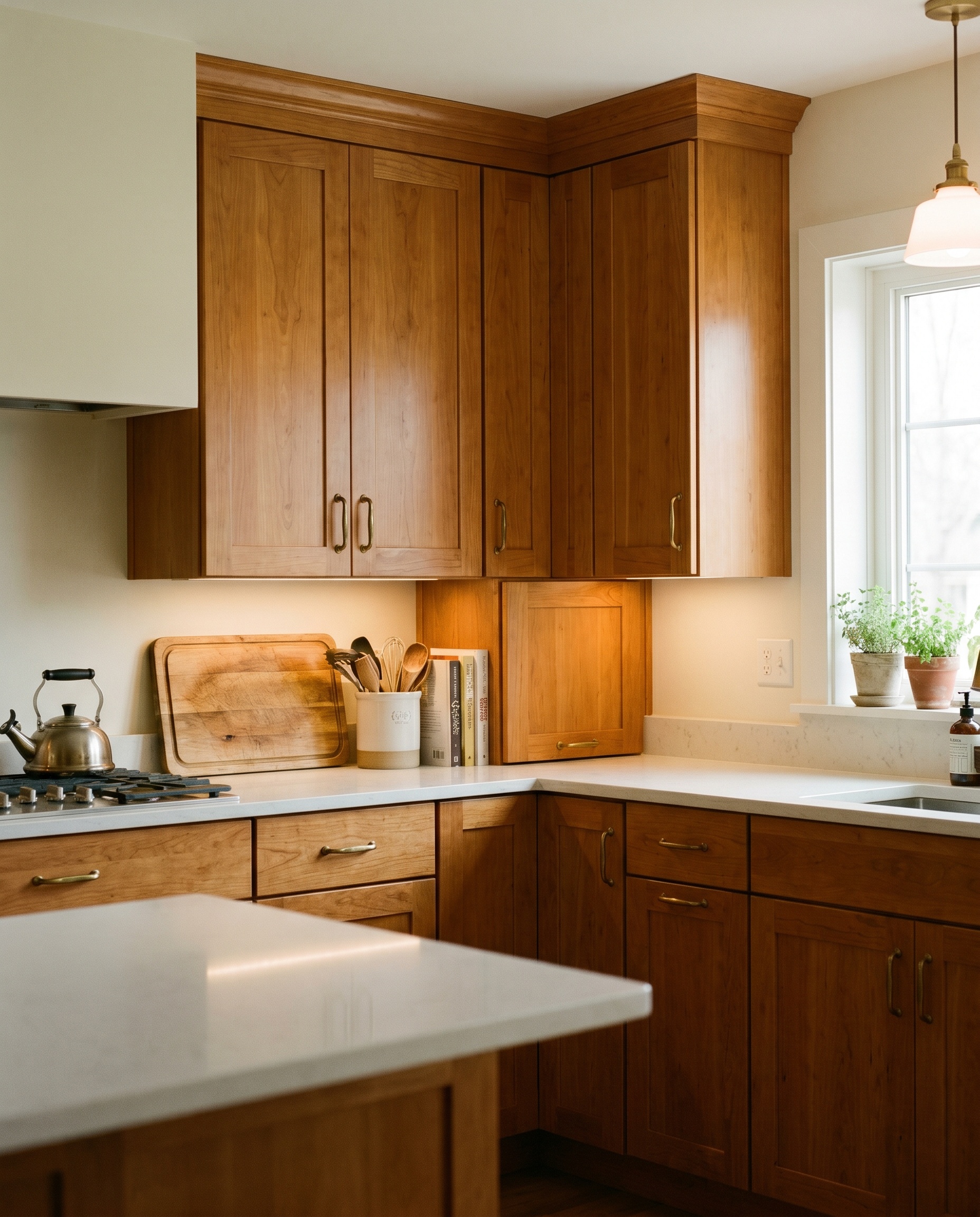
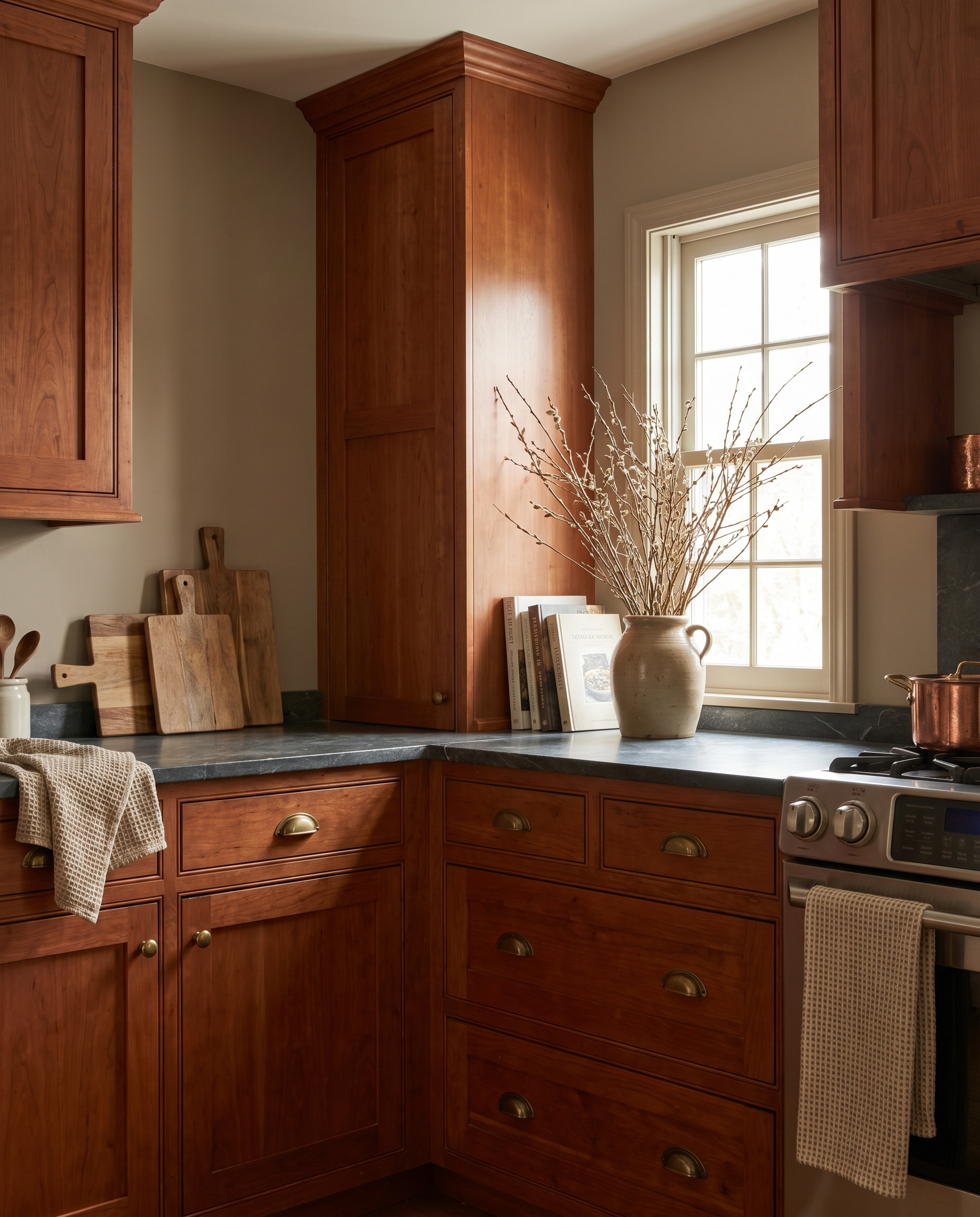
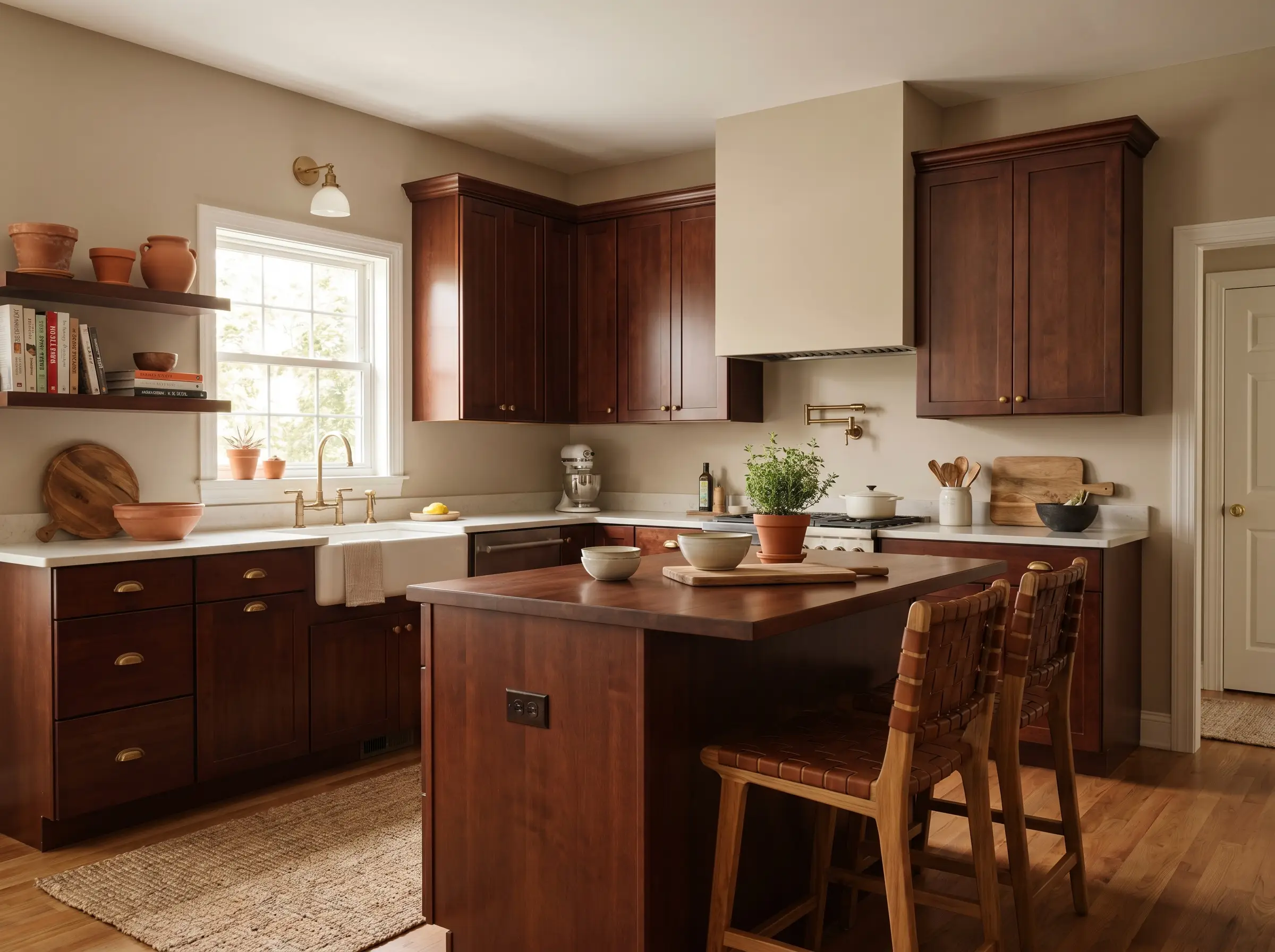
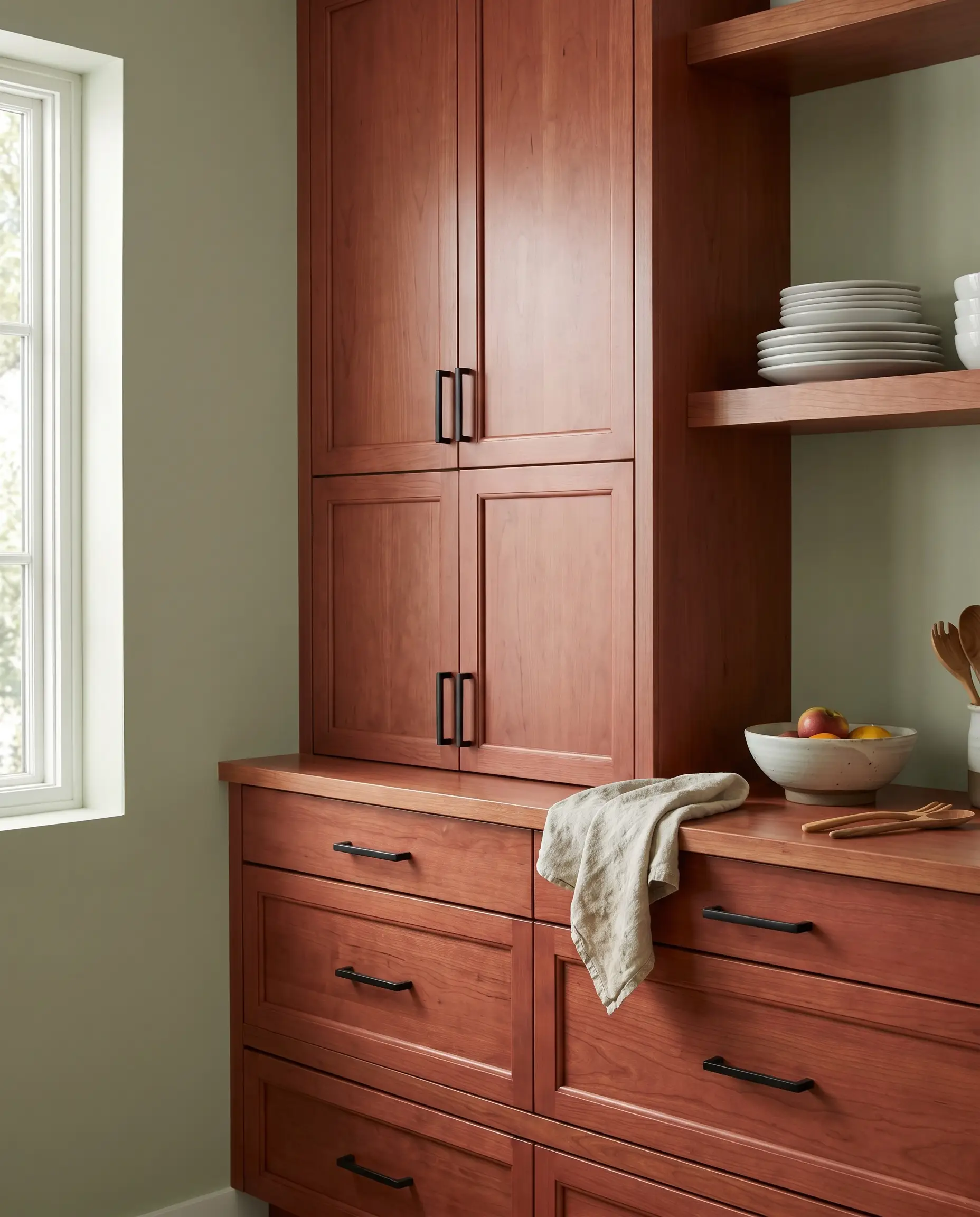
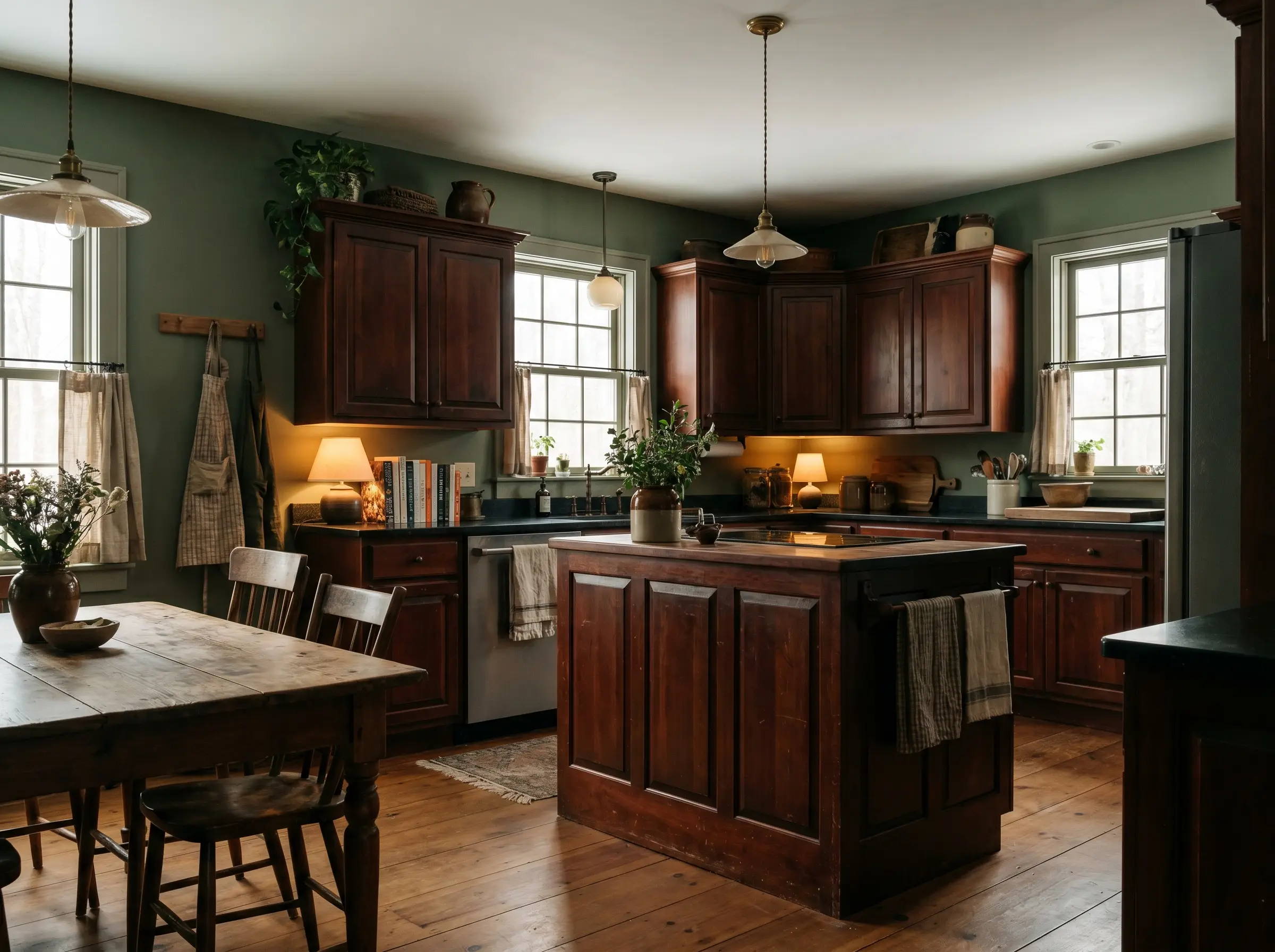
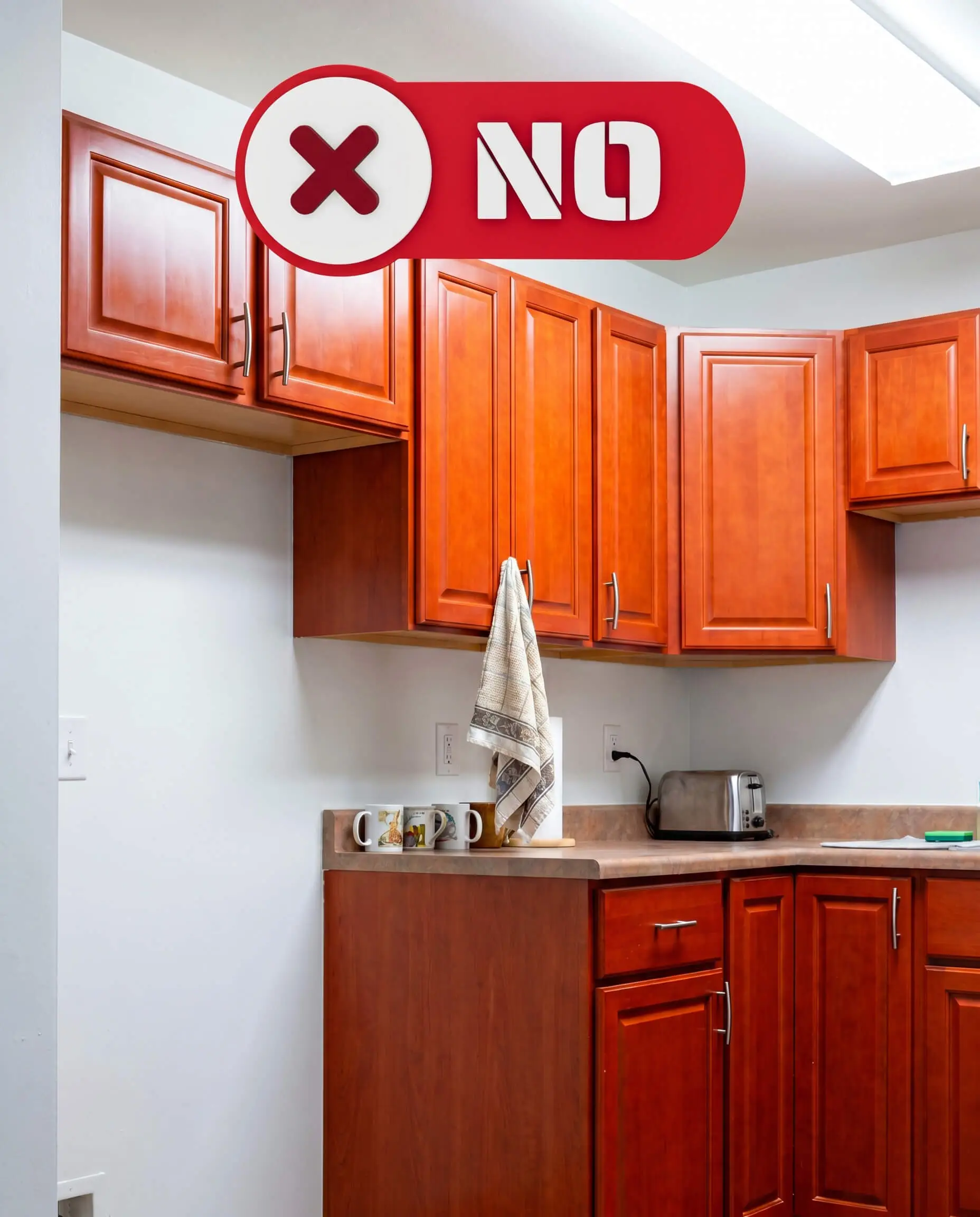
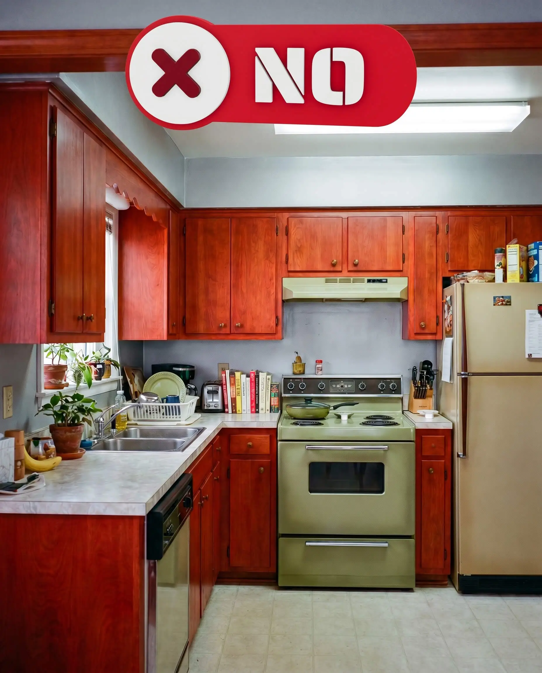
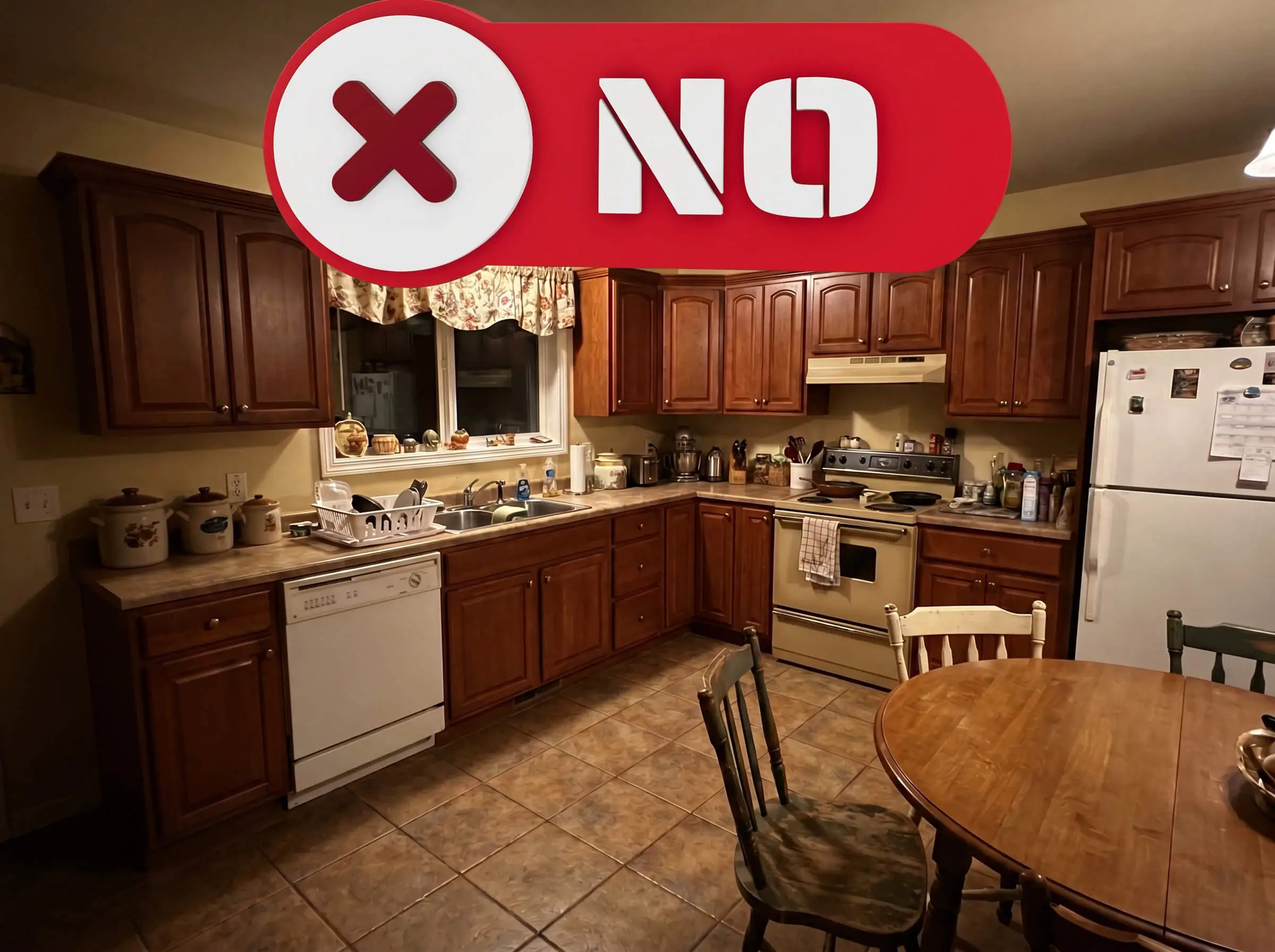
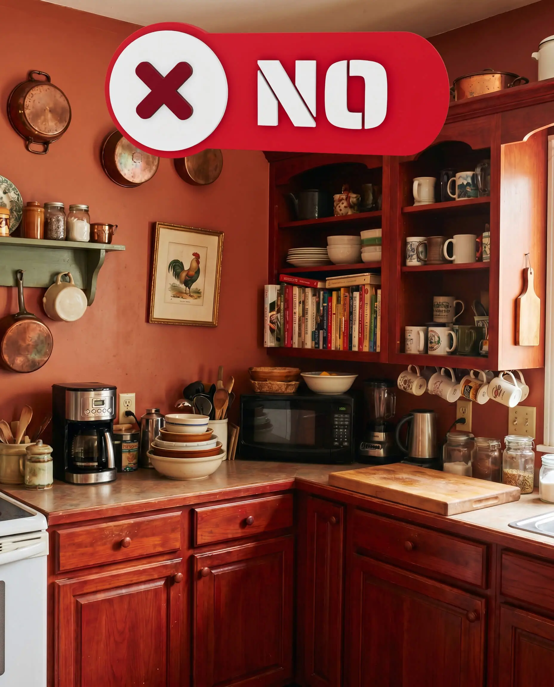
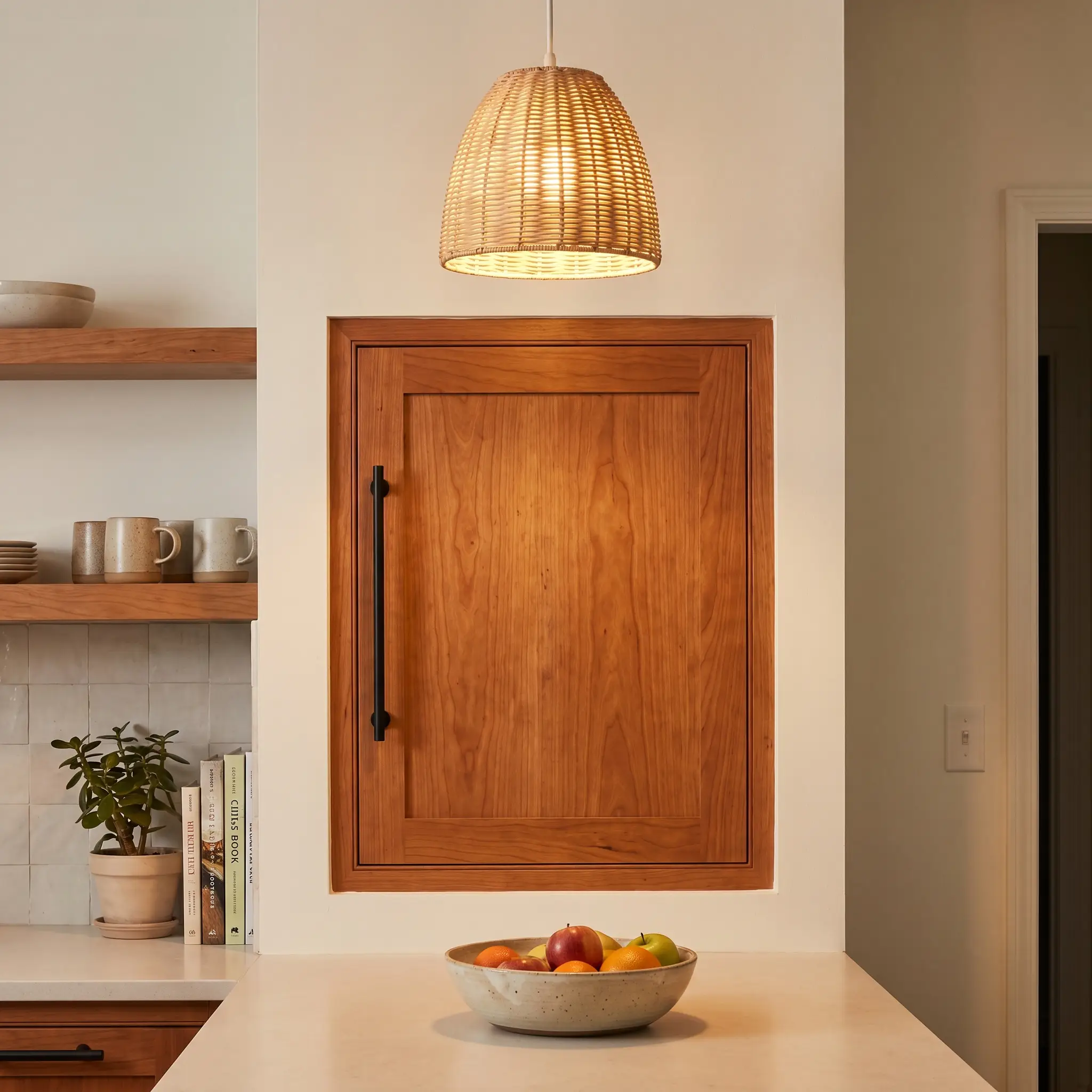
Solid cherry cabinets are premium, expensive architectural features, but their aggressive red and orange undertones often leave homeowners feeling trapped in a dark, dated kitchen. Ripping out or painting over this high-quality wood is a grueling, costly mistake when the real issue is simply the contextual colors surrounding it.
By mastering undertone management—whether actively neutralizing the fiery red or intentionally grounding it—you can completely modernize the space.
We have mapped out the exact designer shades required to shift your existing cherry wood from a heavy 90s relic into a deliberate, bespoke design choice.
The Undertone Rule: How to Work With (Not Against) Cherry Wood
Before testing a single swatch on your walls, you must understand the specific scientific relationship between paint and red-leaning wood. Successfully modernizing this space requires analyzing the exact nature of your cabinetry and knowing how light interacts with dark finishes.
Identifying Your Cherry’s True Tone (Natural vs. Stained)
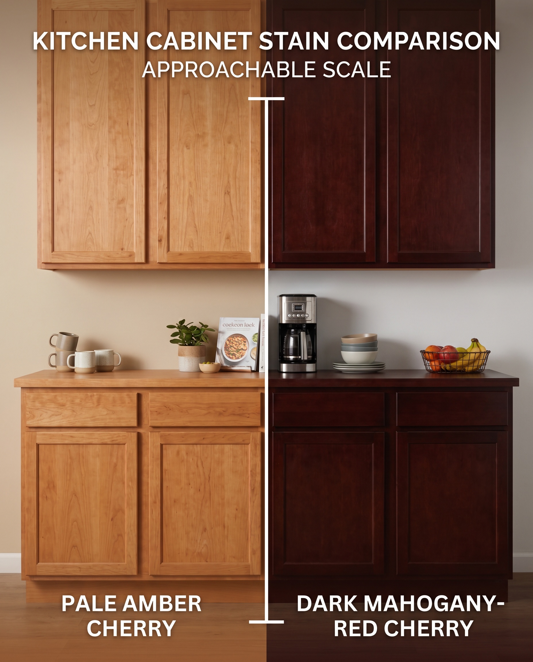
Natural cherry starts pale and oxidizes over time into a warm, golden-amber, whereas factory-stained cherry is typically coated in a heavy mahogany or Brazilian red finish. You cannot select a neutralizer without first identifying which variation you have, as stained variations demand much stronger green or blue counterparts to counteract the magenta.
- Wood Type: Natural Cherry (Golden/Amber) vs. Stained Cherry (Red/Magenta)
- Design Strategy: Match your paint’s undertone intensity directly to the wood’s stain level.
The LRV Requirement for Heavy Wood Cabinets
Cherry wood actively absorbs light, creating immense visual weight that can easily turn a kitchen into a dark cave. To counteract this, your wall paint requires a Light Reflectance Value (LRV)—the percentage of light a color reflects—of 60 or higher, unless you are intentionally designing a moody, historic space.
- Metric Focus: Light Reflectance Value (LRV)
- Target Range: 60+ for brightening; <30 for moody contrast
You can apply wallpapers, paints, etc. on walls and see how they look in various interiors.

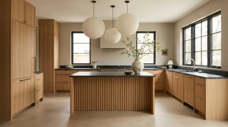
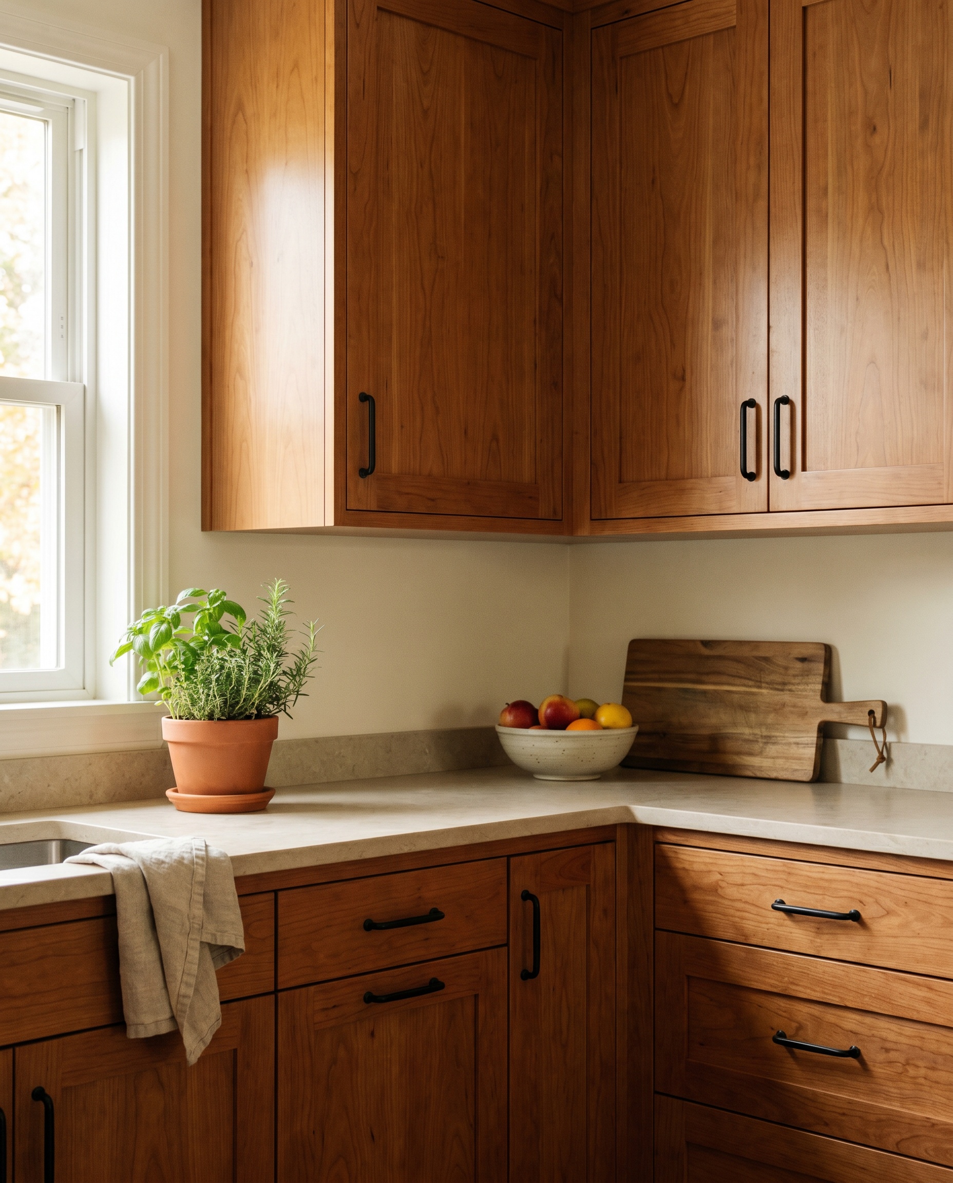
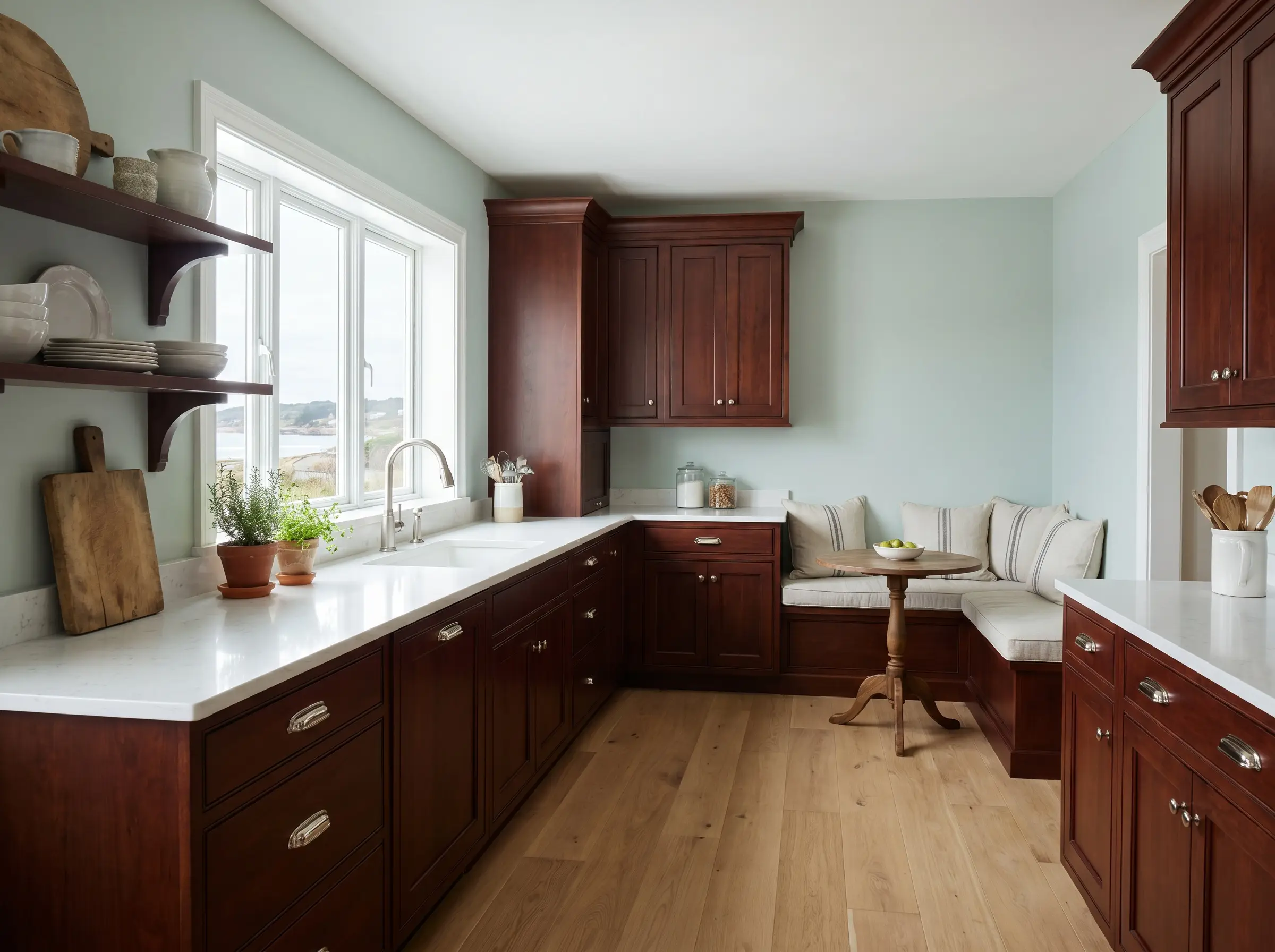
The Modernizing Neutrals: Warm Whites and Greiges
Warm whites and earthy greiges are the safest, most effective route to achieving a Transitional or Organic Modern aesthetic. Stark white creates a cheap, jarring clash against red wood, making these warm, grounding undertones absolutely essential for visual harmony.
Benjamin Moore White Dove (The Foolproof Warm White)
Why it works with cherry: This soft white carries a faint greige and yellow undertone that acts as a gentle bridge between the heavy cabinetry and lighter countertops. It provides necessary contrast without the hospital-like sterility of bright white, immediately softening the harshness of the wood.
- Designer Color Code: Benjamin Moore White Dove (OC-17)
- LRV: 85.38
- Vibe: Soft, Transitional, Inviting
Sherwin-Williams Alabaster (For Soft, Creamy Contrast)
Why it works with cherry: Marginally warmer than our previous option, this shade effectively bounces light around kitchens suffering from poor natural illumination. The creamy undertone aligns beautifully with the warmth of the cherry, creating a seamless, organic transition.
- Designer Color Code: Sherwin-Williams Alabaster (SW 7008)
- LRV: 82
- Vibe: Creamy, Organic, Luminous
Farrow & Ball Drop Cloth (The Anti-Gray Greige)
Why it works with cherry: This mid-tone greige completely avoids the cool blue undertones that notoriously clash with warm wood. By offering a sophisticated, earthy mud-tone, it grounds the red in the cabinets, framing them as a high-end, bespoke choice for historic or transitional homes.
- Designer Color Code: Farrow & Ball Drop Cloth (No. 283)
- LRV: ~50
- Vibe: Earthy, Bespoke, Historic
Benjamin Moore Swiss Coffee (For a Rich, Transitional Base)
Why it works with cherry: This highly creamy, luxurious off-white wraps the room in a traditional, rich aesthetic without looking dated. It highlights the natural grain of the wood while maintaining an upscale, tailored atmosphere.
- Designer Color Code: Benjamin Moore Swiss Coffee (OC-45)
- LRV: 83.93
- Vibe: Luxurious, Traditional, Warm
Always test this shade in your specific space, as it can lean overly yellow in south-facing rooms flushed with warm afternoon light.
Hackrea Lighting Warning
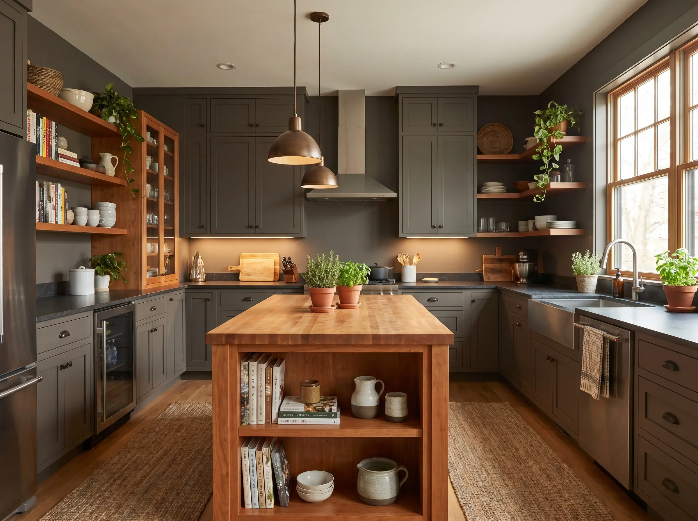
Sherwin-Williams Accessible Beige (Grounding the Red)
Why it works with cherry: Beige has returned as the definitive organic modern base, and this taupe-leaning variation significantly dials down the contrast between wall and cabinet. It makes the cherry look integrated into the architecture rather than floating aggressively on the wall.
- Designer Color Code: Sherwin-Williams Accessible Beige (SW 7036)
- LRV: 58
- Vibe: Grounded, Organic Modern, Cohesive
Hardware Pairing: Unlacquered Brass or Matte Black
The Neutralizers: Greens and Blues That Cool Down Red
According to fundamental color theory, green sits directly opposite red on the color wheel. Placing highly specific greens and blues next to cherry wood actively cools down the fiery undertones, neutralizing the space and establishing a calm, curated atmosphere.
Benjamin Moore October Mist (The Subtle Sage)
Why it works with cherry: This soft, silvery sage utilizes a gray base to prevent the walls from looking like a literal forest. The green actively fights the red in the wood, making it the absolute best choice for modernizing 90s cherry into a calming Organic Modern design.
- Designer Color Code: Benjamin Moore October Mist (1495)
- LRV: 46.33
- Vibe: Calming, Organic Modern, Subtle
Sherwin-Williams Evergreen Fog (Earthy and Grounded)
Why it works with cherry: Darker and moodier than a standard sage, this pigment brings the outdoors in and anchors the heavy wood. It transforms the cherry from an outdated feature into a deliberate, earthy material choice rooted in nature.
- Designer Color Code: Sherwin-Williams Evergreen Fog (SW 9130)
- LRV: 30
- Vibe: Earthy, Grounded, Moody
Farrow & Ball Pigeon (Blue-Gray with a Green Edge)
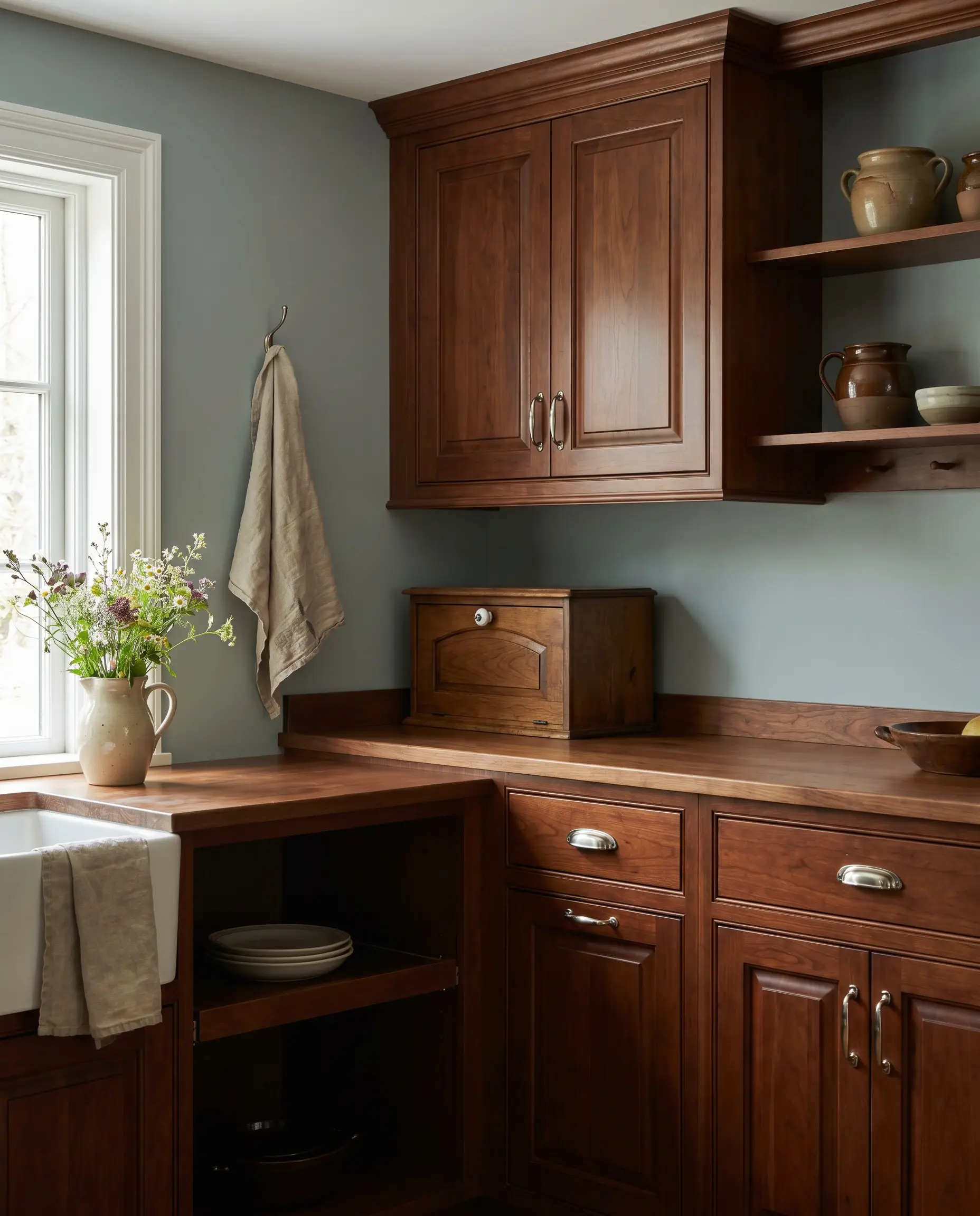
Why it works with cherry: This chameleon color shifts beautifully between blue, green, and gray depending on how the light hits it. It is highly sophisticated, bringing a bespoke English cottage or moody historic feel to standard factory cherry.
- Designer Color Code: Farrow & Ball Pigeon (No. 25)
- LRV: ~35
- Vibe: Historic, Sophisticated, English Cottage
Be mindful of your Kelvin temperature; warm 2700K bulbs will pull out its green undertones, while cool daylight bulbs will emphasize its blue-gray edge.
Hackrea Lighting Warning
Benjamin Moore Hale Navy (High-Contrast Coastal Modern)
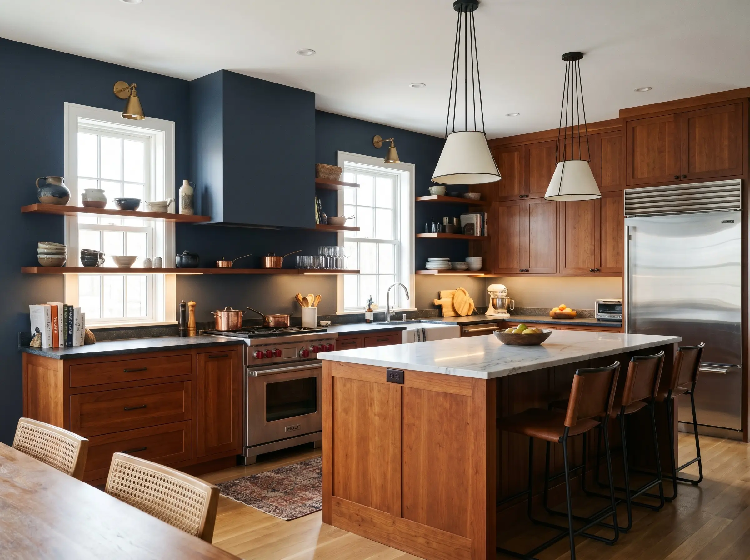
Why it works with cherry: Sitting next to orange and red on the color wheel, this deeply saturated navy creates a striking, high-contrast aesthetic. It commands attention, establishing a highly refined, masculine, or Coastal Modern look.
- Designer Color Code: Benjamin Moore Hale Navy (HC-154)
- LRV: 8.36
- Vibe: High-Contrast, Masculine, Coastal Modern
Because this is an incredibly dark pairing, this scheme requires excellent natural light or robust under-cabinet lighting to prevent the room from feeling oppressive.
Design Ally Tip
Sherwin-Williams Sea Salt (Light, Airy, and Cool)
Why it works with cherry: This muted coastal blue-green is highly effective at brightening a dark kitchen while actively fighting aggressive orange undertones. It is the definitive choice for expanding the visual footprint of a small kitchen burdened by heavy cabinetry.
- Designer Color Code: Sherwin-Williams Sea Salt (SW 6204)
- LRV: 63
- Vibe: Light, Airy, Coastal
Farrow & Ball Green Smoke (Moody and Historic)
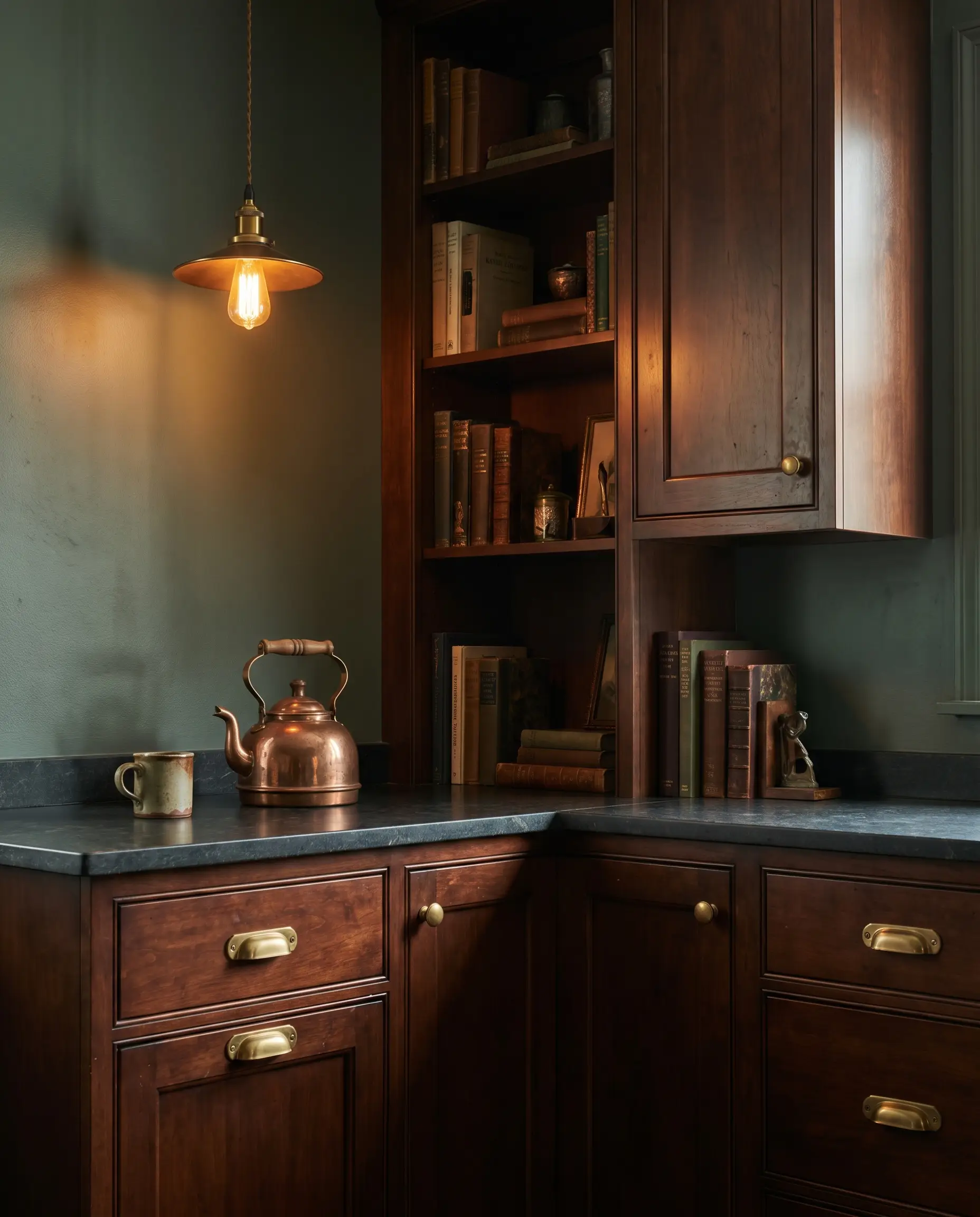
Why it works with cherry: This deep, smoky green completely recontextualizes dated cherry, turning it into something resembling a moody, high-end private library. It provides immense architectural depth and pairs flawlessly with heritage metal finishes.
- Designer Color Code: Farrow & Ball Green Smoke (No. 47)
- LRV: ~19
- Vibe: Moody, Historic, Bespoke
Pair this specific color with unlacquered brass hardware to maximize the historic, high-end English kitchen aesthetic.
Hackrea Styling Tip
Hardware Pairing: Polished Nickel or Aged Antique Brass
The Bold & Moody Contrasts: Embracing Darker Tones
For those who want to lean into the drama rather than fight it, embracing dark tones is a highly confident design strategy. These saturated colors blur the lines between the cabinets and the walls, creating a seamless, architectural look that feels incredibly expensive.
Benjamin Moore Wrought Iron (Soft Black for Edge)
Why it works with cherry: A true, stark black is far too harsh against natural wood grain, but this soft, muted black makes the red in the cherry look rich and deliberate. It instantly updates the space to an industrial or hyper-modern aesthetic.
- Designer Color Code: Benjamin Moore Wrought Iron (2124-10)
- LRV: 6.16
- Vibe: Industrial, Edgy, Hyper-Modern
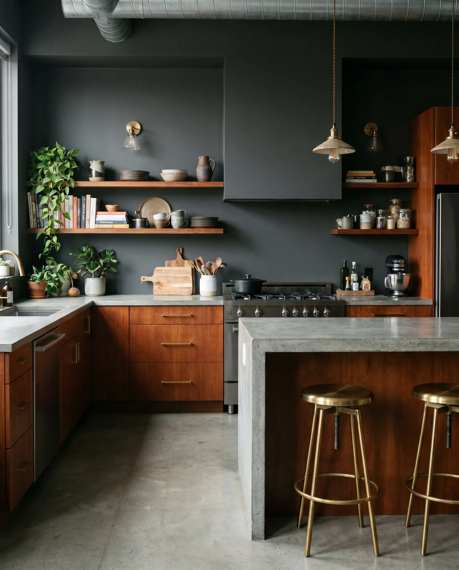
Sherwin-Williams Urbane Bronze (Warm, Earthy Charcoal)
Why it works with cherry: This brownish-gray charcoal relies on brown undertones that speak directly to the wood grain. It harmonizes perfectly with the cherry rather than fighting it, making it a staple in modern, earthy interiors.
- Designer Color Code: Sherwin-Williams Urbane Bronze (SW 7048)
- LRV: 8
- Vibe: Earthy, Warm, Modern
Farrow & Ball Hague Blue (Rich, Dramatic Depth)
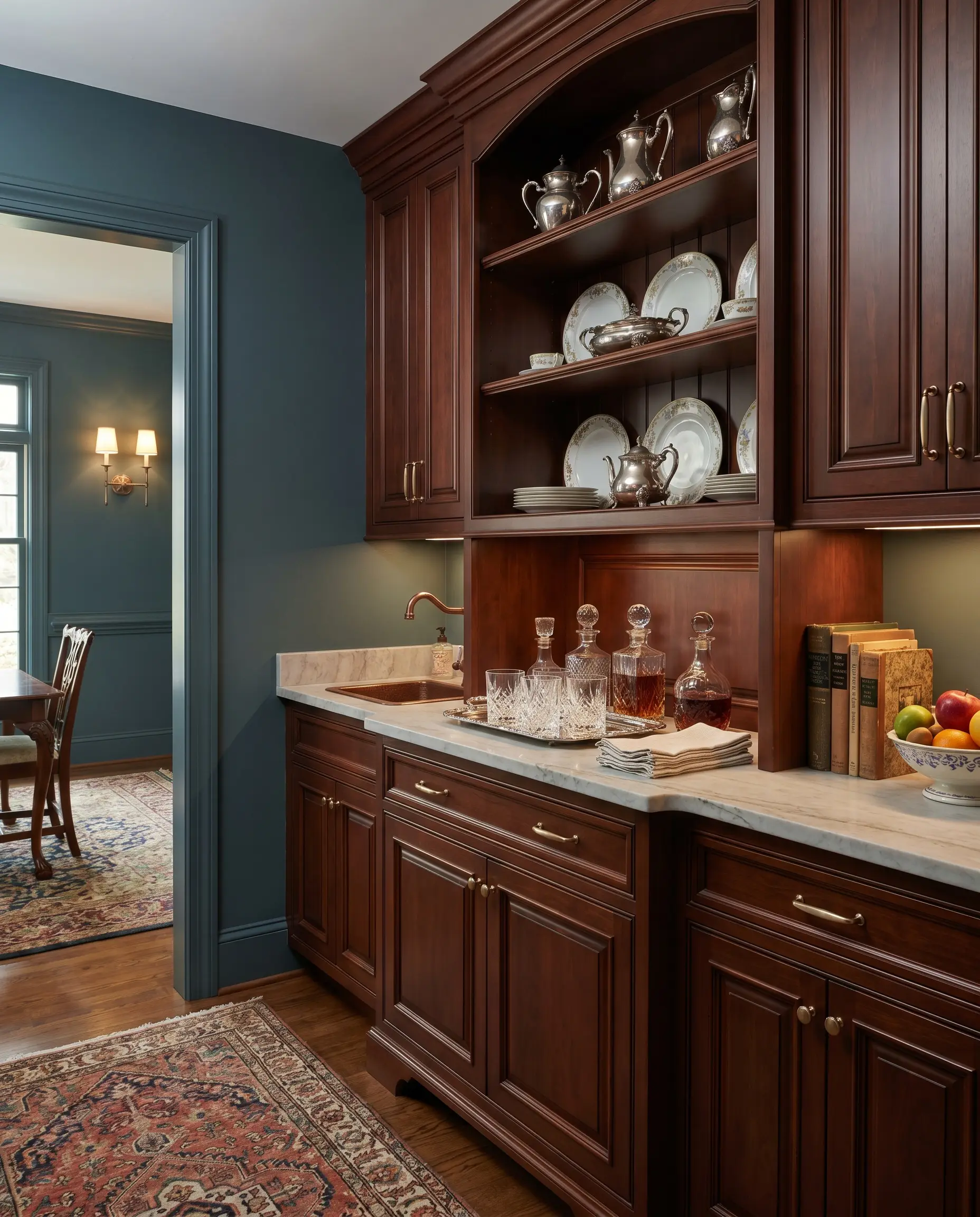
Why it works with cherry: Featuring a slight green undertone hidden within a strong, deep blue, this shade makes cherry wood look incredibly expensive and traditional. It is highly recommended for spaces that demand formal elegance, like dining rooms or butler’s pantries.
- Designer Color Code: Farrow & Ball Hague Blue (No. 30)
- LRV: ~7
- Vibe: Dramatic, Formal, Expensive
Hardware Pairing: Brushed Brass or Champagne Bronze
The Tones to Strictly Avoid with Cherry Wood
Knowing what not to paint is just as critical as selecting the perfect neutralizer. The following four color profiles will actively sabotage your cherry cabinets, amplifying their most dated qualities and creating jarring visual clashes.
Stark, Hospital Whites (Creates Harsh, Cheap Contrast)
Colors like Chantilly Lace or pure builder-grade white create an aggressive disparity in visual weight. This extreme starkness highlights the orange and red in the wood, making the finish look plastic and cheap rather than premium.
- The Culprits: Chantilly Lace, High Reflective White
- The Result: Harsh contrast, cheapened wood finish
Cool, Blue-Based Grays (Clashes with Warm Wood)
The cool gray clash—often a remnant of a bygone era—is the absolute worst offender when paired with cherry. Placing cool walls against intensely warm wood creates a vibrating, uncomfortable visual clash that immediately dates the home.
- The Culprits: Icy grays, silver-leaning grays
- The Result: Visual vibration, severe color clash
Yellow-Leaning Creams (Amplifies the Orange/Red)
Heavy yellows or Tuscan creams blend too closely with the orange and red of the cherry. This lack of tonal variation results in a muddy, monochromatic 1990s look that fails to provide any modern contrast.
- The Culprits: Tuscan creams, butter yellows
- The Result: Muddy, dated monochromatic aesthetic
Bright Primary Reds and Oranges (Visual Overload)
Pairing red walls with red wood creates immediate visual exhaustion. There is no place for the eye to rest, completely overwhelming the architecture of the kitchen.
- The Culprits: Primary reds, terracotta, bright orange
- The Result: Visual fatigue, overwhelming warmth
Final Styling Layers to Anchor Your Cherry Wood
Paint is only step one of your renovation strategy. To successfully complete the modernization of your kitchen, the surrounding lighting and hardware must actively support your new color palette.
- Lighting Temperature: Avoid 4000K+ (cool white) bulbs; they cast a sterile light that makes cherry look harsh and artificial. Install 2700K to 3000K (warm white) Kelvin temperature bulbs to harmoniously blend the wood and the wall paint.
- Hardware Swap: You cannot fix a cherry cabinet with paint alone if it still features 1990s polished brass or cheap brushed nickel pulls. Swap outdated metals for Matte Black, Unlacquered Brass, or Polished Nickel to finalize the modernization.
Stop fighting the architecture of your home. By controlling your undertones and curating your hardware, you can command your cherry wood to look exactly as high-end and intentional as it truly is.