How to Highlight Red Brick: 18 Exterior Color Schemes for Flawless Curb Appeal
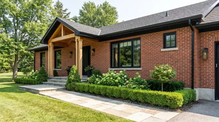
Red brick exteriors often feel like an unyielding design constraint, leaving homeowners paralyzed by the fear of choosing a clashing trim or siding color. The secret to modernizing your home is not fighting the masonry, but finding the best exterior colors for red brick houses by mastering Light Reflectance Value (LRV) and architectural undertones. Because direct sunlight relentlessly washes out exterior paint, a shade that looks perfectly saturated indoors can quickly turn stark or muddy outside.
Here are 18 highly specific, designer-approved paint pairings strategically chosen to flatter your red brick exterior.
The Foundation: Reading Your Brick and Mortar
Before you ever tape up a paint swatch, you must diagnose the masonry. Red brick is rarely a flat crimson; it carries distinct orange, brown, or purple undertones that dictate your entire palette. Professional color consultants rely heavily on the “Mortar Match” rule—pulling cues from the grayish, beige, or white mortar joints to ensure cohesive trim selections, while strictly monitoring LRV to ensure the paint stands up to harsh daylight.
| Brick Undertone | Visual Cue | Best Color Family Pairing |
|---|---|---|
| Orange-Red | Looks fiery or terracotta in direct afternoon sun. | Cool, muddy greens and soft greiges to neutralize the heat. |
| Brown-Red | Earthy, dark, and historic; often found on older classic homes. | Warm putties, mushroom tones, and deep olive greens. |
| Cherry/Purple-Red | Casts a subtle plum or burgundy shadow, particularly in overcast weather. | Charcoal grays, soft blacks, and muted navy blues. |
You can apply wallpapers, paints, etc. on walls and see how they look in various interiors.

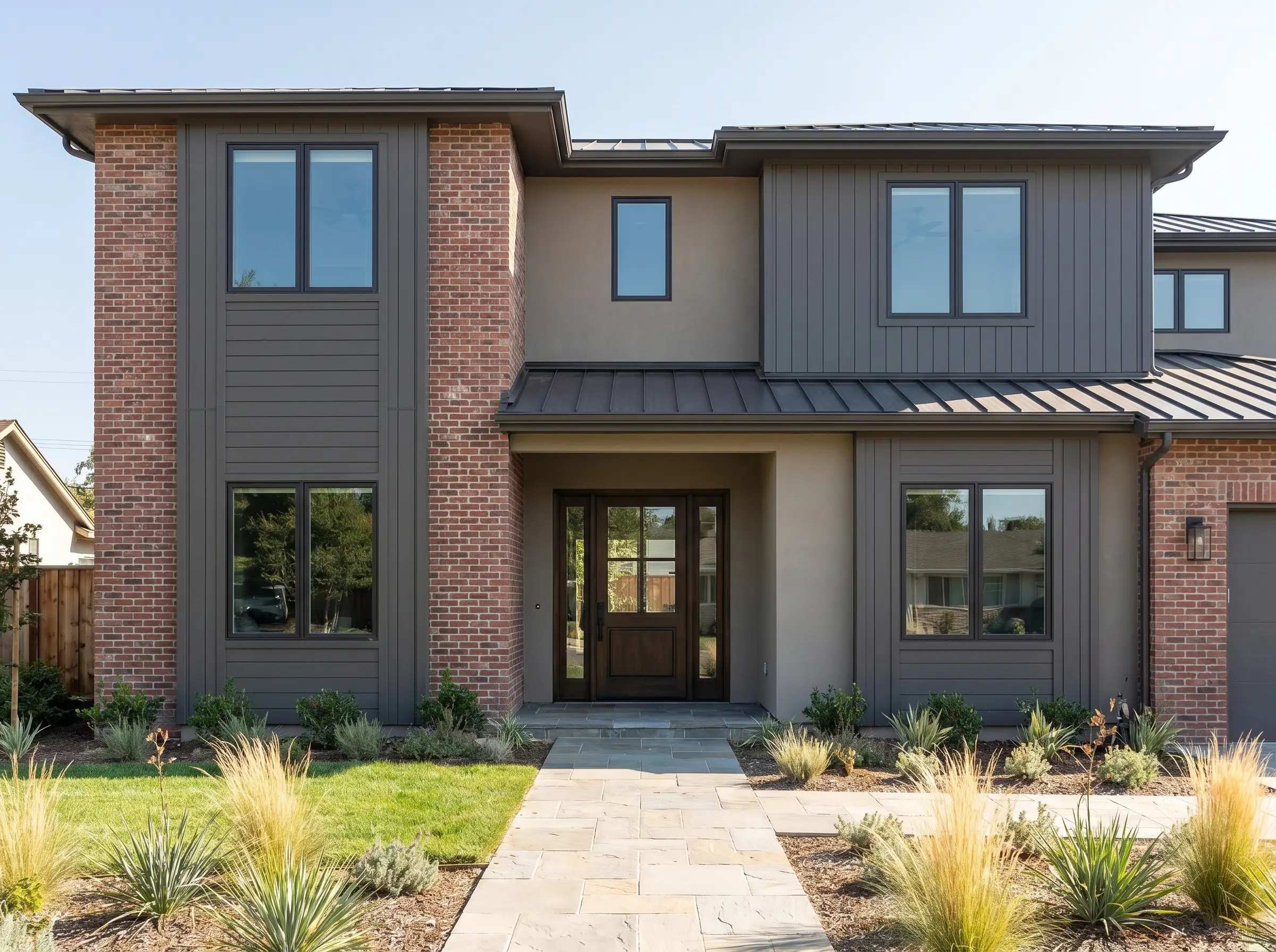
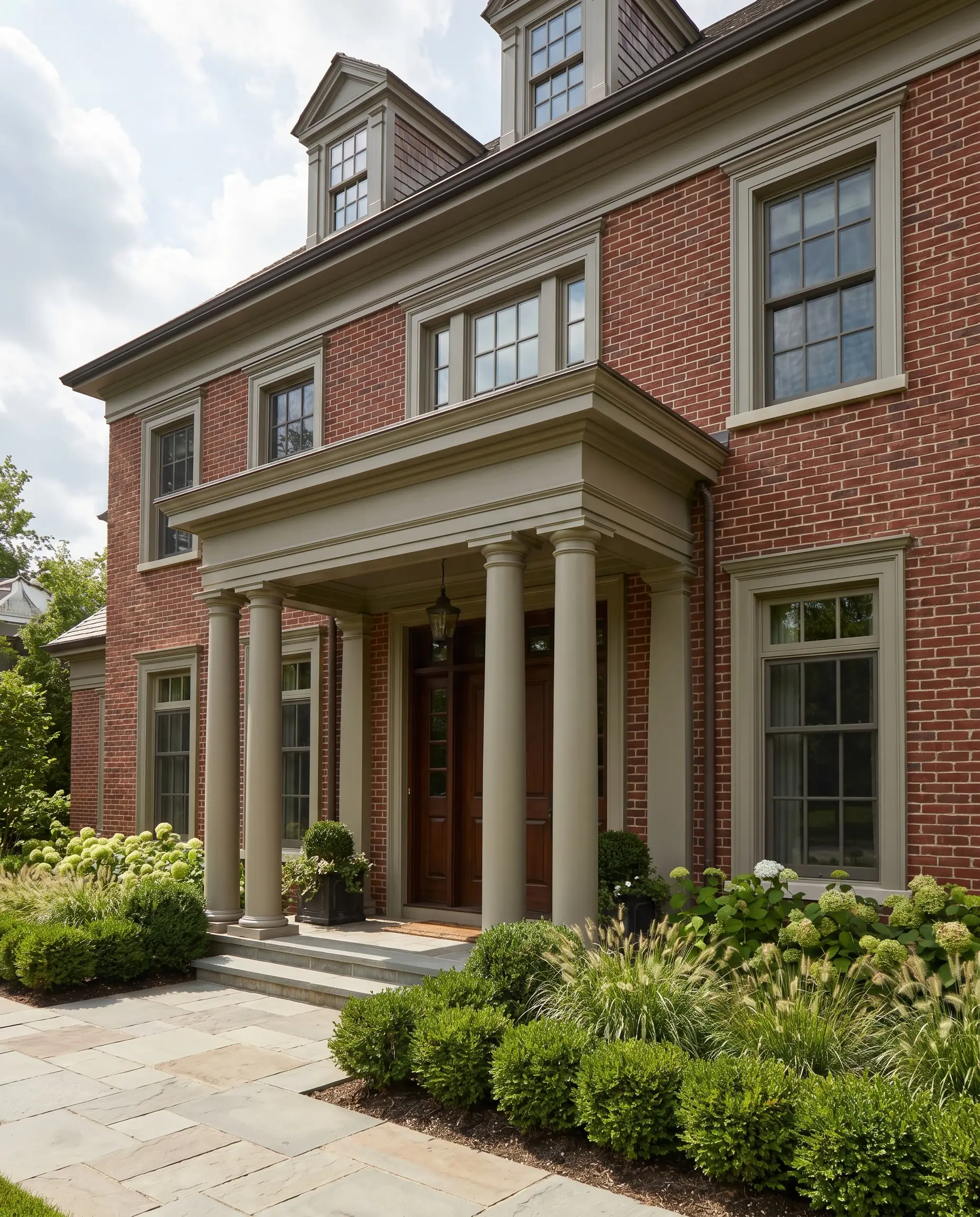
The High-Contrast Modern Palette: Charcoals and Soft Blacks
Dark trims instantly modernize dated brick by anchoring the structure and providing immense, grounding visual weight. However, you must avoid harsh, true blacks with an LRV of 0-3, which translate as flat, empty voids under the sun. Instead, source soft blacks and deep charcoals carrying subtle green or brown undertones to bridge the visual gap between heavy masonry and the surrounding landscape.
Sherwin-Williams Iron Ore for Modern Fascia and Trim
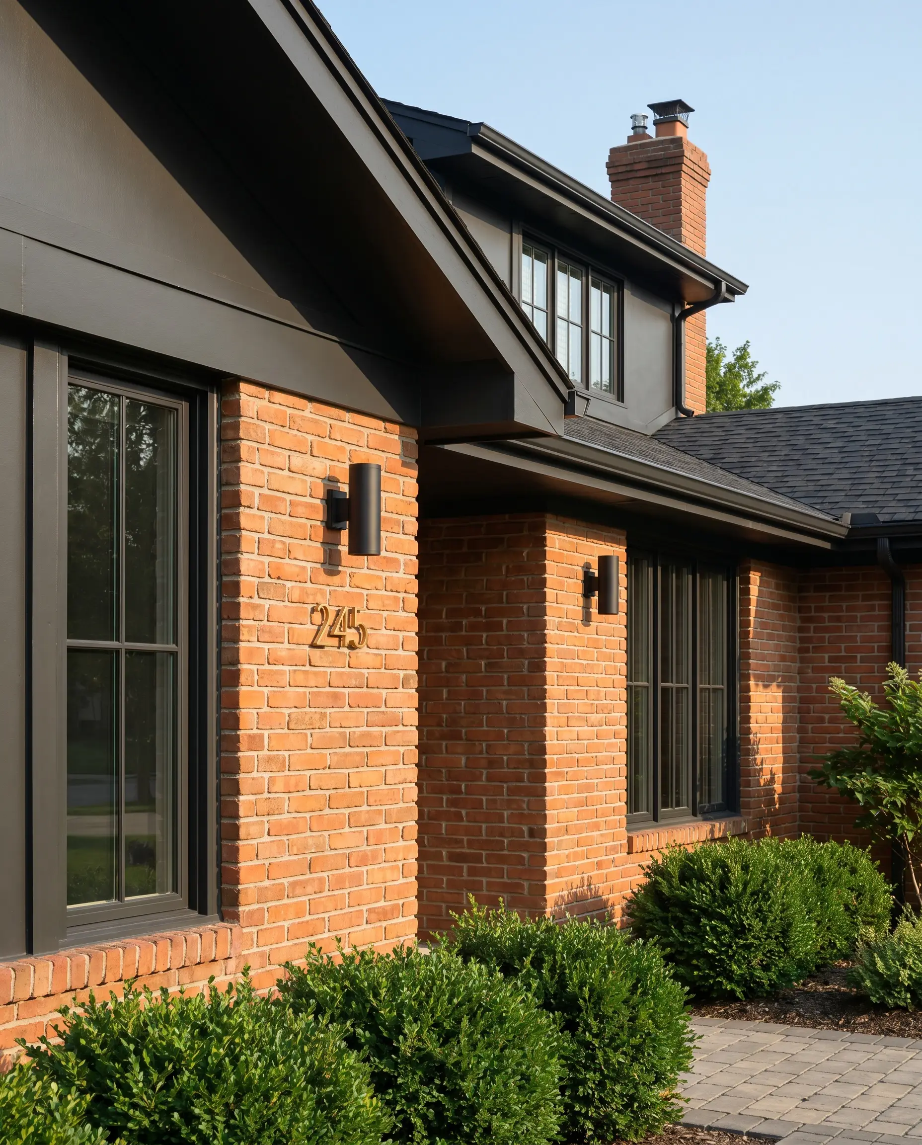
This soft, dimensional black carries an LRV of 6, offering enough subtle warmth to prevent it from looking unnervingly stark against red brick. The muted depth creates a crisp, industrial-leaning edge that beautifully frames the home without overwhelming the masonry.
- Best Application: Fascia and window mullions.
- LRV: 6.15.
- Vibe: Sophisticated, transitional modernism.
- Hardware Pairing: Matte black sconces and unlacquered brass house numbers.
Benjamin Moore Cheating Heart for Garage Doors
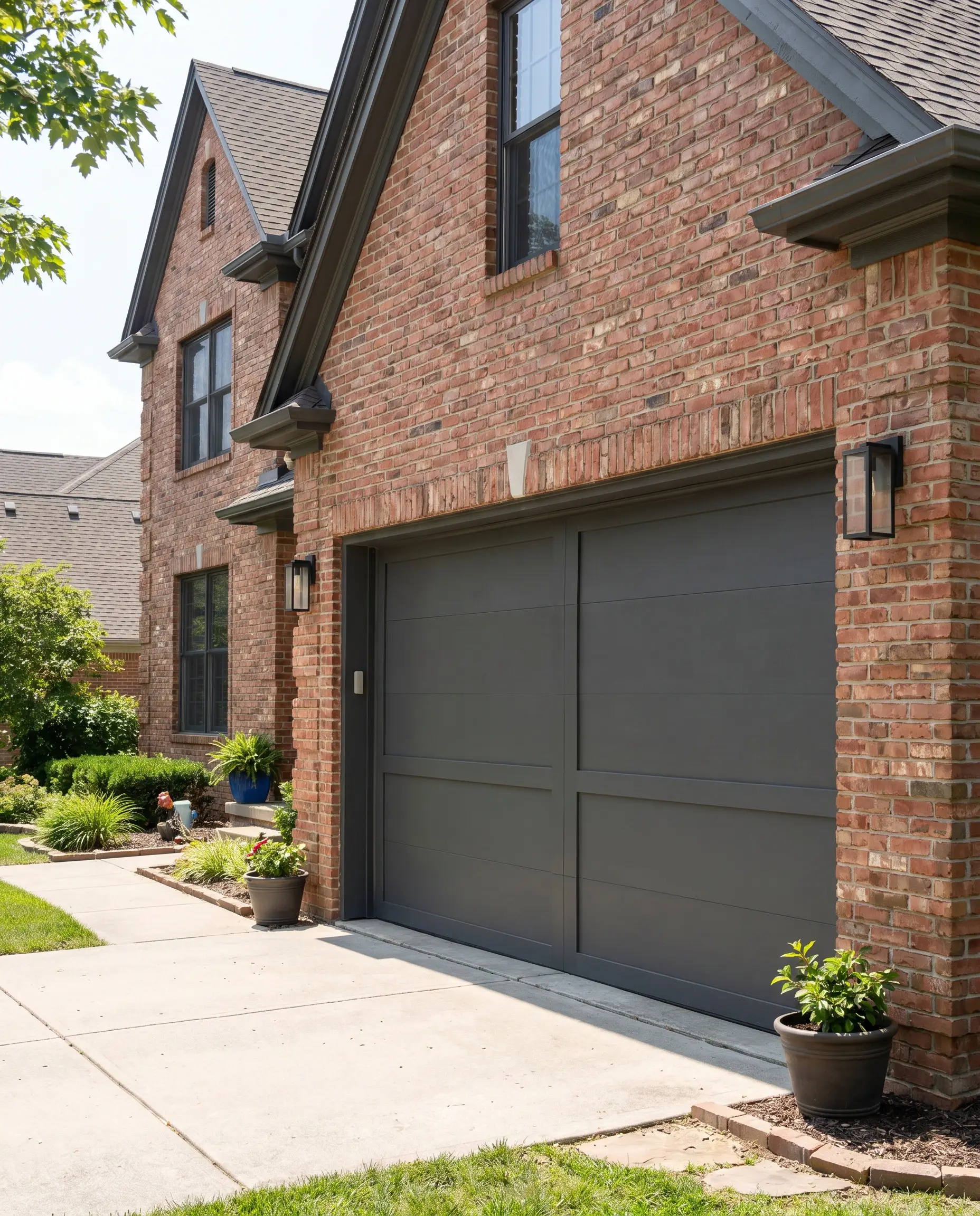
A masterful, deep charcoal carrying the faintest hint of navy and brown, this shade expertly handles the sheer scale of expansive surfaces. It absorbs light beautifully, allowing large, utilitarian architectural features to blend into the shadows rather than fighting the brick for attention.
Never paint your garage doors a highly saturated accent shade. You want these massive, functional doors to recede visually, allowing the architectural brickwork to remain the hero of the facade.
Designer Secret
- Best Application: Double and single garage doors.
- Finish Requirement: Exterior satin finish for durability.
- Vibe: Grounded and unobtrusive.
Farrow & Ball Off-Black for Front Doors and Shutters
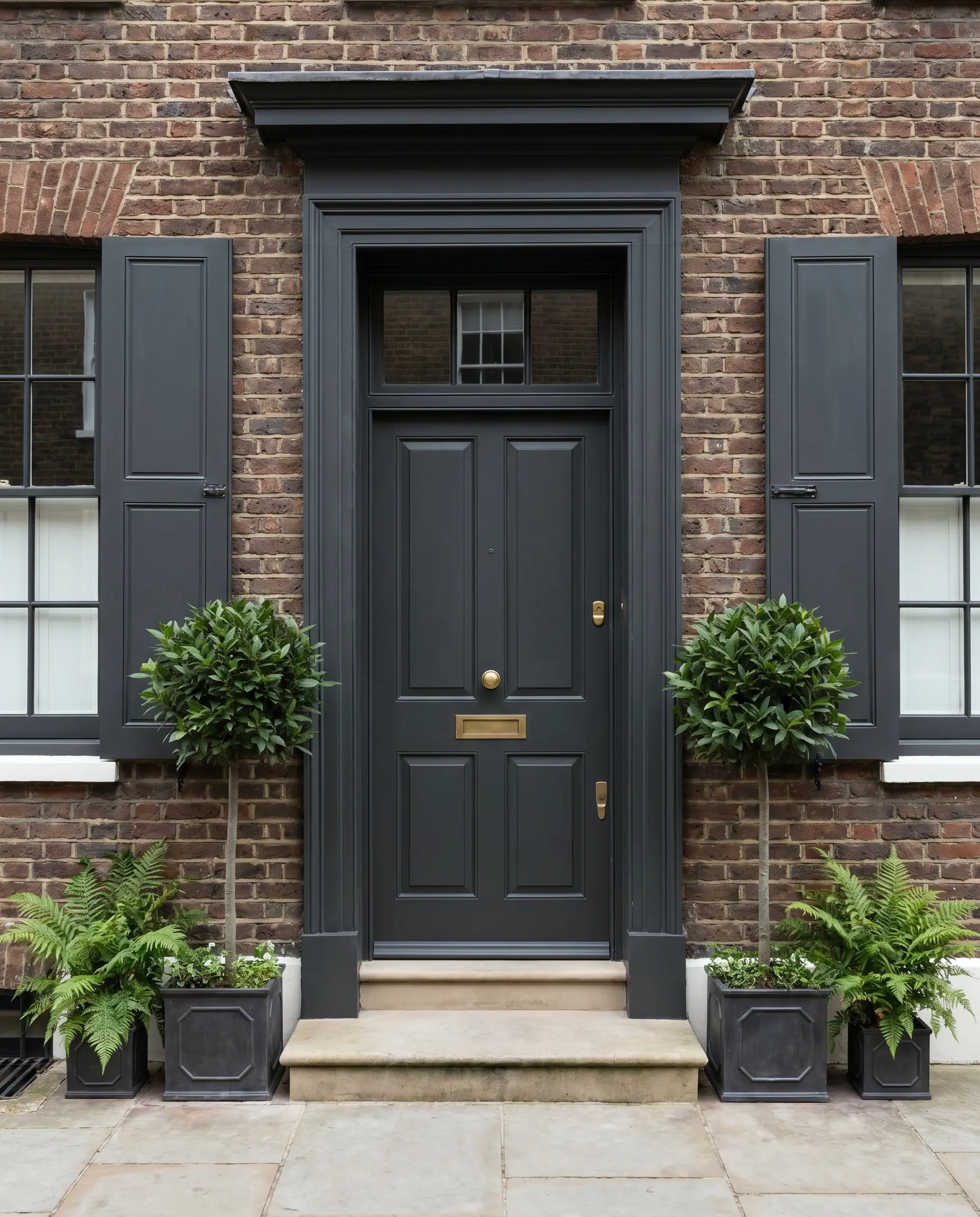
Offering a remarkably softer alternative to jet black, this profoundly elegant shade absorbs light to create a historic, London townhouse aesthetic. Its chalky, muted profile feels completely organic next to the rough texture of traditional red brick.
- Best Application: Front doors and operable shutters.
- Finish Requirement: Exterior eggshell or satin to maintain the rich depth.
- Vibe: Refined, heritage luxury.
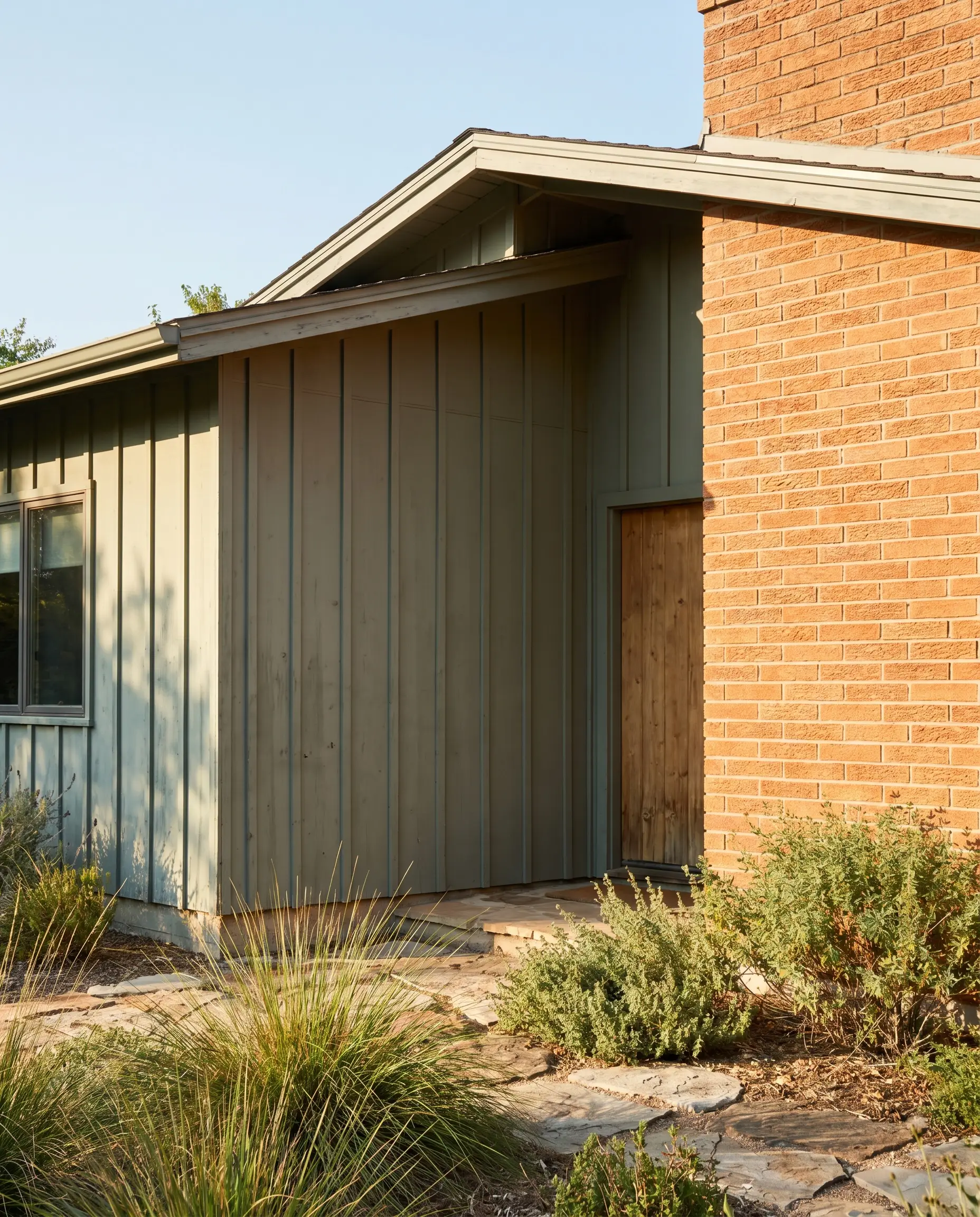
Sherwin-Williams Peppercorn for Expansive Siding
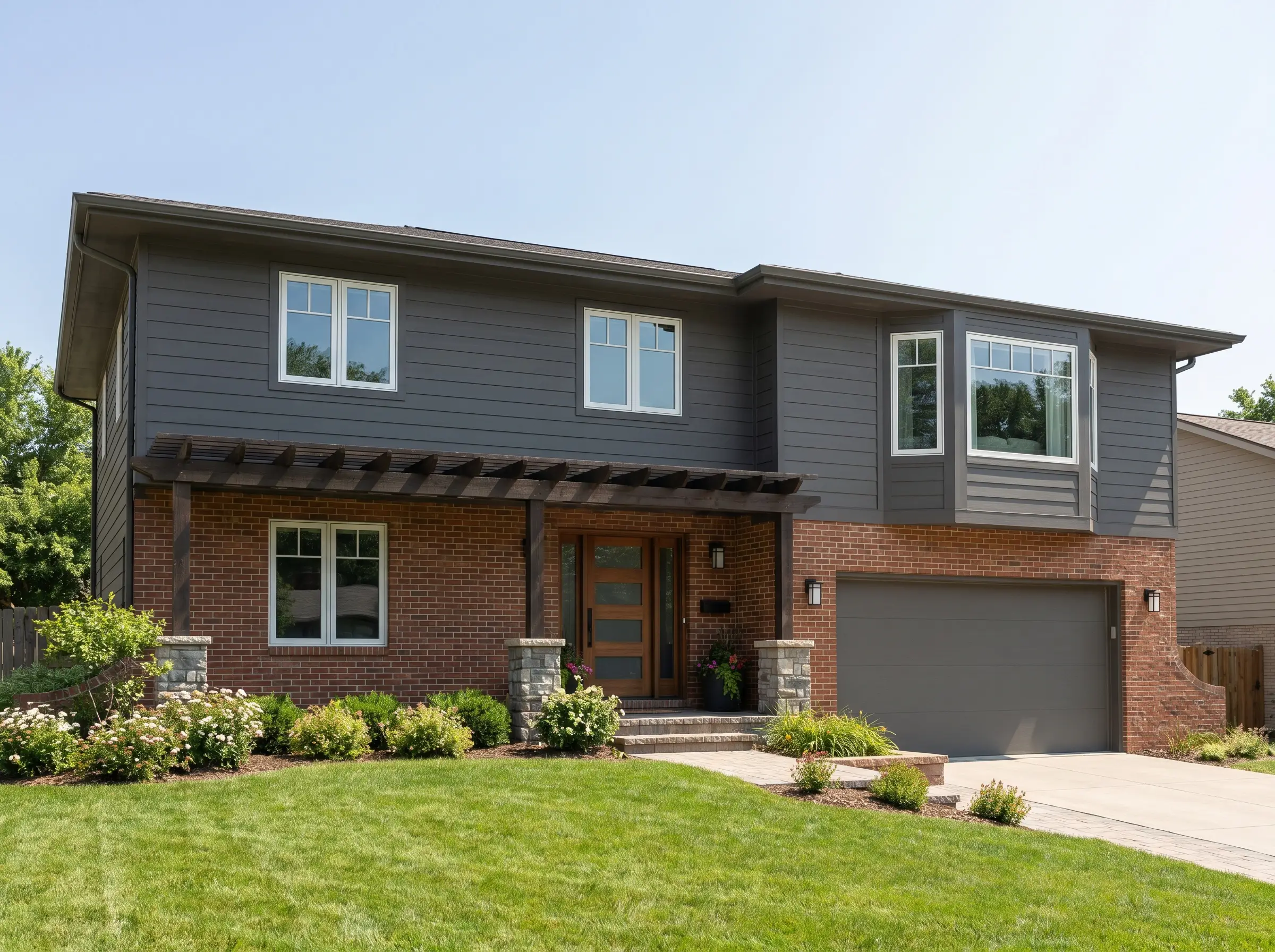
When you are dealing with a split facade of partial brick and upper siding, this true dark gray perfectly balances the visual weight of the heavy lower masonry. It creates a seamless, grounded transition rather than a stark, horizontal chop.
- Best Application: Large swaths of upper-story siding.
- Ideal Architectural Styles: Mid-Century Modern splits, Contemporary Craftsmans, Ranch homes with prominent brick skirting.
The Organic Earth Palette: Muddy Greens and Greiges
While the color wheel dictates that green and red are complementary, applying a clear, bright green next to red brick will instantly create an undesirable holiday aesthetic. The professional requirement here is heavy muddiness; your greens and greiges must carry profound gray or brown undertones to establish a cohesive, natural connection to the outdoors.
Sherwin-Williams Pewter Green for Board and Batten
This cool, silvery-green masterfully tones down the intense, fiery warmth of orange-leaning red brick. Under direct afternoon sun, its LRV of 12 ensures it retains its rich, earthy depth without washing out into a pastel.
- Best Application: Large swaths of board and batten siding.
- Sun Reaction: Reads slightly cooler and more silver in direct southern light.
- Vibe: Relaxed, organic modern.
Benjamin Moore Gloucester Sage for Historic Accents
A deeply historic, brownish-green that looks incredibly wealthy when applied to thick, traditional millwork. It bridges the gap between the structured masonry and the organic landscaping, feeling exceptionally grounded.
- Best Application: Thick trim, architectural shingles, and substantial porticos.
- Pairs Perfectly With: Aged copper gutters, heavy brass door hardware, lush, structured boxwood landscaping.
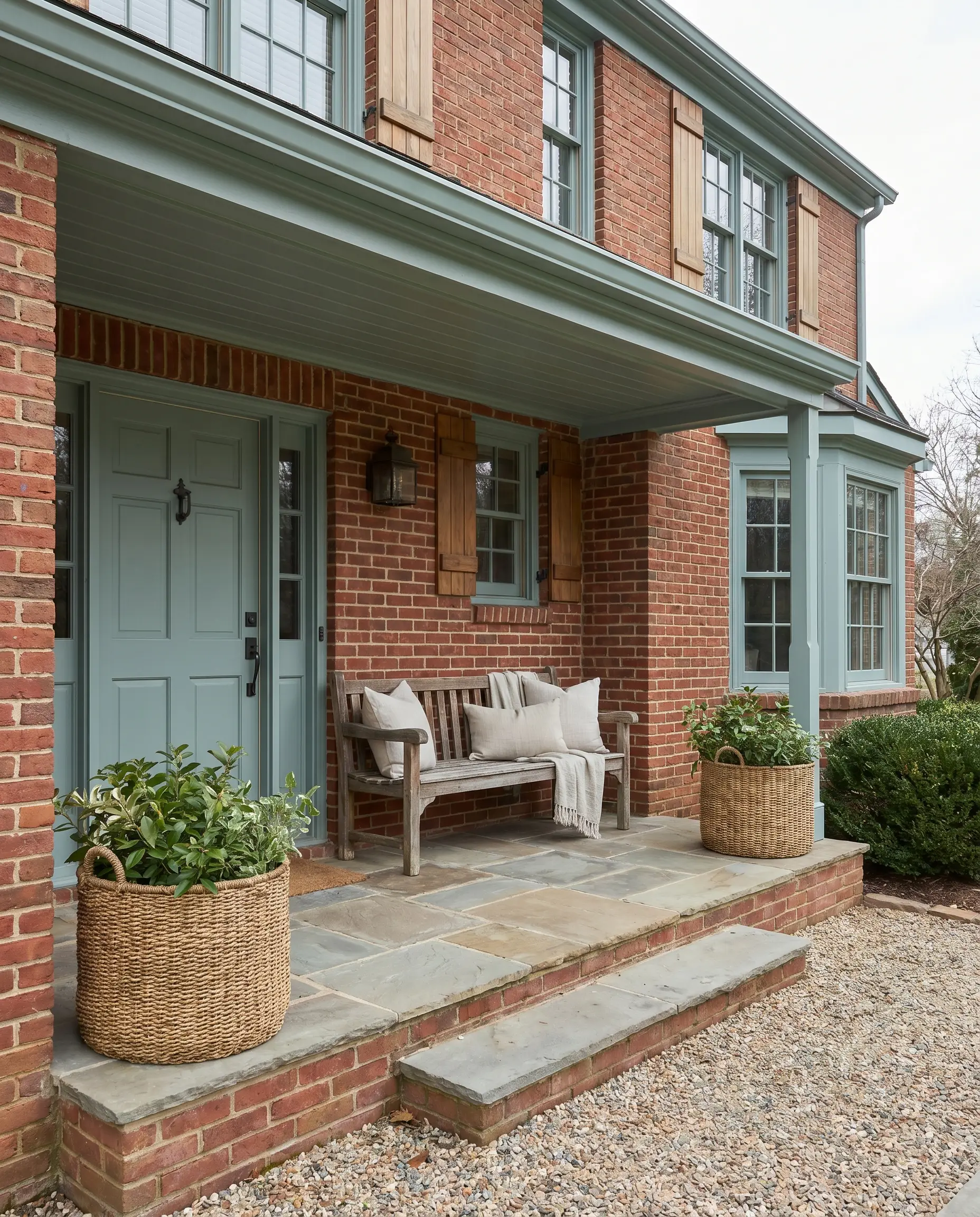
Farrow & Ball Pigeon for Subtle Shutters
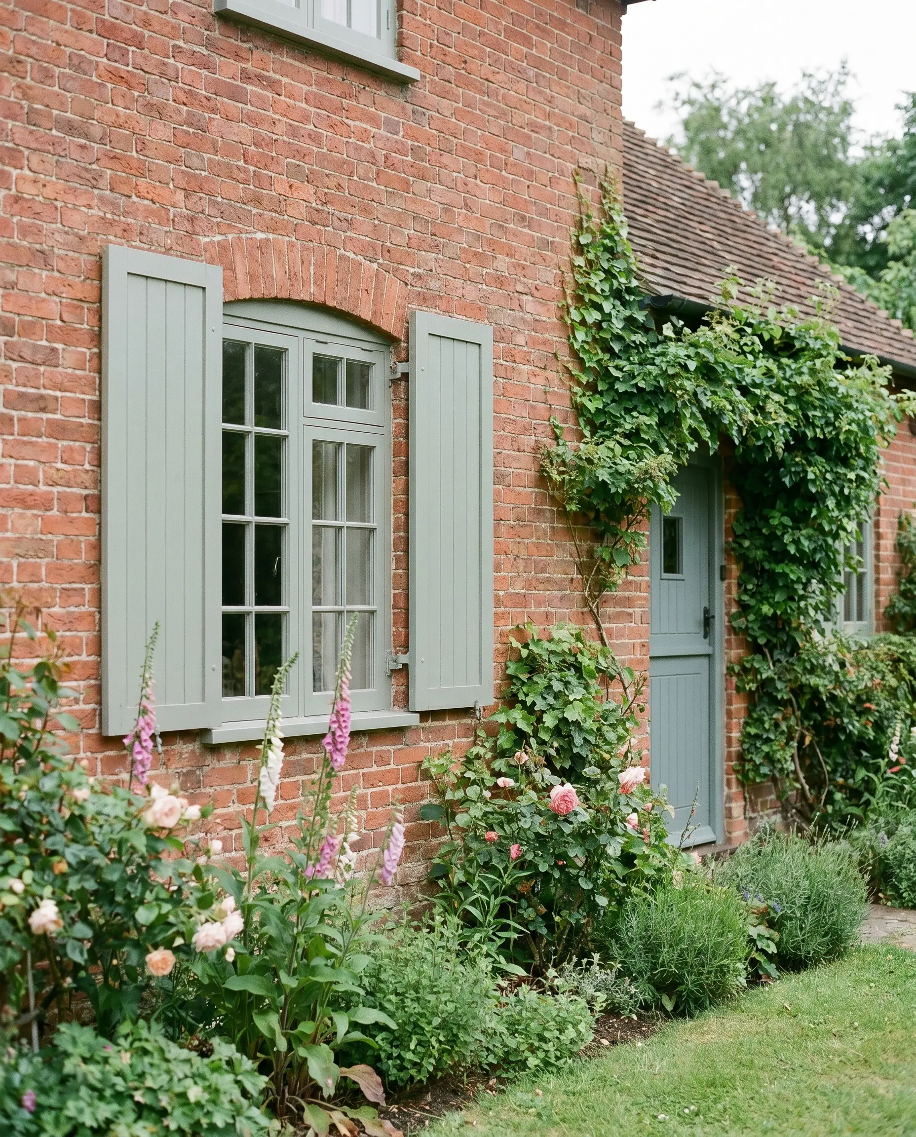
This nuanced blue-gray green is highly reactive to light, shifting beautifully from a soft moss to a misty gray throughout the day. It provides a relaxed, English countryside aesthetic that perfectly complements cottage-style brick homes.
- Best Application: Shutters and secondary entrance doors.
- Testing Tip: Always paint a large swatch on both the north-facing and south-facing sides of your house to observe its shifting undertone.
- Vibe: Soft, heritage charm.
Sherwin-Williams Andiron for Earthy Trim
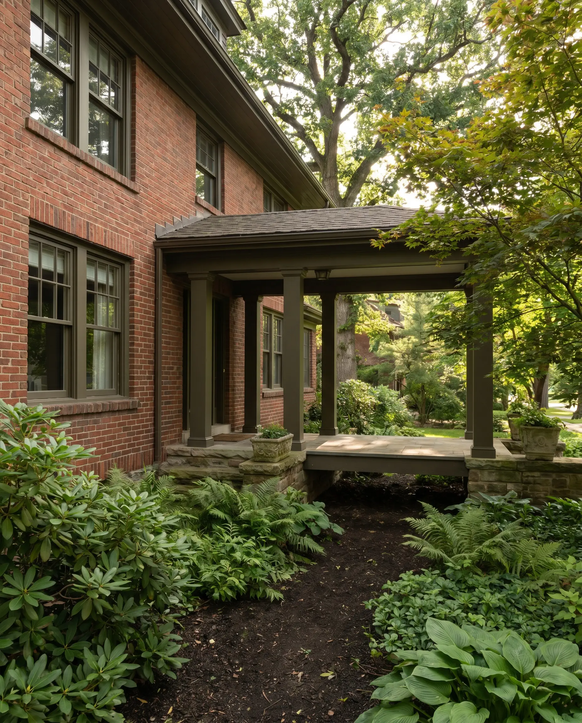
Acting as a literal bridge between the soil and the architecture, this dark, olive-brown is a striking choice for homes surrounded by heavy, mature foliage. It roots the red brick firmly into its environment, creating a settled, established presence.
- Best Application: Window trim, fascia, and structural columns.
- Landscape Interaction: Harmonizes beautifully with heavily wooded lots and shade gardens.
- LRV: 5.
Benjamin Moore River Reflections for Stucco and Cladding
For homes featuring a busy mix of materials, this mid-tone greige pulls slightly cool to harmonize competing textures. It calms the facade, acting as a neutral buffer between rough brick, stone, and smooth cladding.
- Best Application: Stucco sections, composite cladding, and large siding panels.
- Texture Contrast: Highlights the raw texture of the brick by providing a smooth, muted counterpoint.
- Vibe: Calm, transitional cohesion.
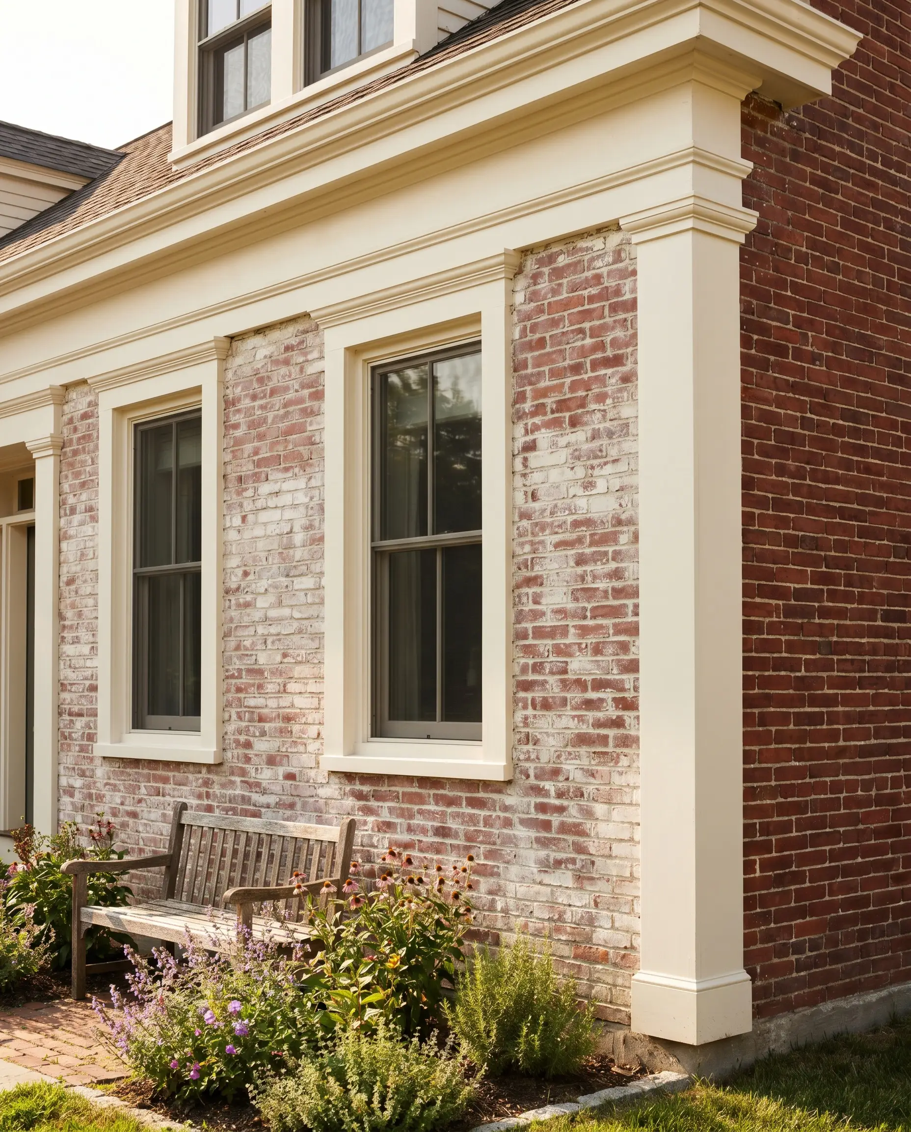
The Timeless Light Palette: Warm Creams and Putty
Lightening up a heavy brick exterior is a frequent goal, but high-LRV, blinding whites (LRV 85+) outdoors will make your beautiful red brick look dirty and dated. The sophisticated approach relies on creamy, warm whites or mushroom putty tones that gently bridge the visual gap to the mortar joint.
- DO: Select whites with distinct greige, yellow, or taupe undertones to warm up the sunlight.
- DO: Match your white to the lightest color found in your brick’s mortar joint for instant cohesion.
- DON’T: Use stark, untinted whites or cool, blue-leaning whites, which look like unprimed plastic outdoors.
- DON’T: Ignore the LRV; anything above 85 will likely be blindingly reflective in full sun.
Benjamin Moore White Dove for Universal Trim
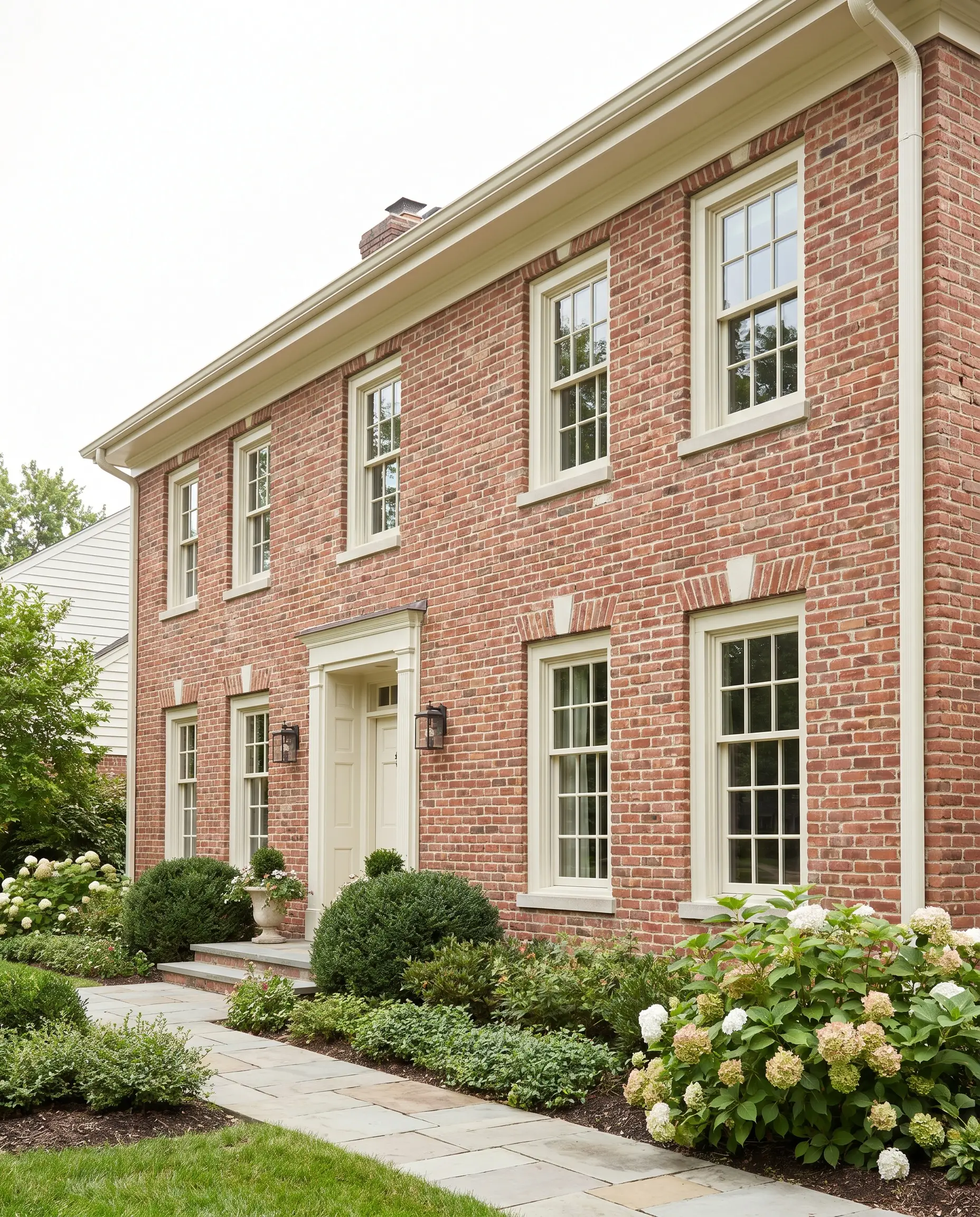
Considered a gold standard in the industry, this shade features a subtle greige and yellow undertone that prevents it from blinding the eye. It is the absolute safest bet for almost any red brick undertone, offering a crisp but gentle contrast.
- Best Application: Universal trim, gutters, and window casings.
- LRV: 85.3 (The upper limit of safe exterior whites).
- Vibe: Classic, timeless, and clean.
Sherwin-Williams Shoji White for Warm Siding
This creamy, inviting greige carries an LRV of 74, meaning it reads as a beautifully soft white under the harsh outdoor sun. It is perfect for painting expansive upper siding on split-level brick homes without creating a harsh, glaring transition line where the siding meets the masonry.
- Best Application: Main siding and large architectural panels.
- Visual Transition: Softens the horizontal line between brick and siding.
- Hardware Pairing: Bronze or warm antique brass.
Benjamin Moore Pale Oak for Soft Soffits
A masterful light taupe that works brilliantly on the undersides of your roofline. Because light bounces off the warm red brick and up into the soffit, this muted tone absorbs that reflected warmth to create an incredibly inviting, diffused glow.
- Best Application: Soffits, porch ceilings, and deep overhangs.
- Light Bounce Theory: Prevents the sickly, fluorescent cast that stark white soffits often create when reflecting red brick.
- Vibe: Warm, welcoming, and intentionally designed.
Farrow & Ball Drop Cloth for Traditional Millwork
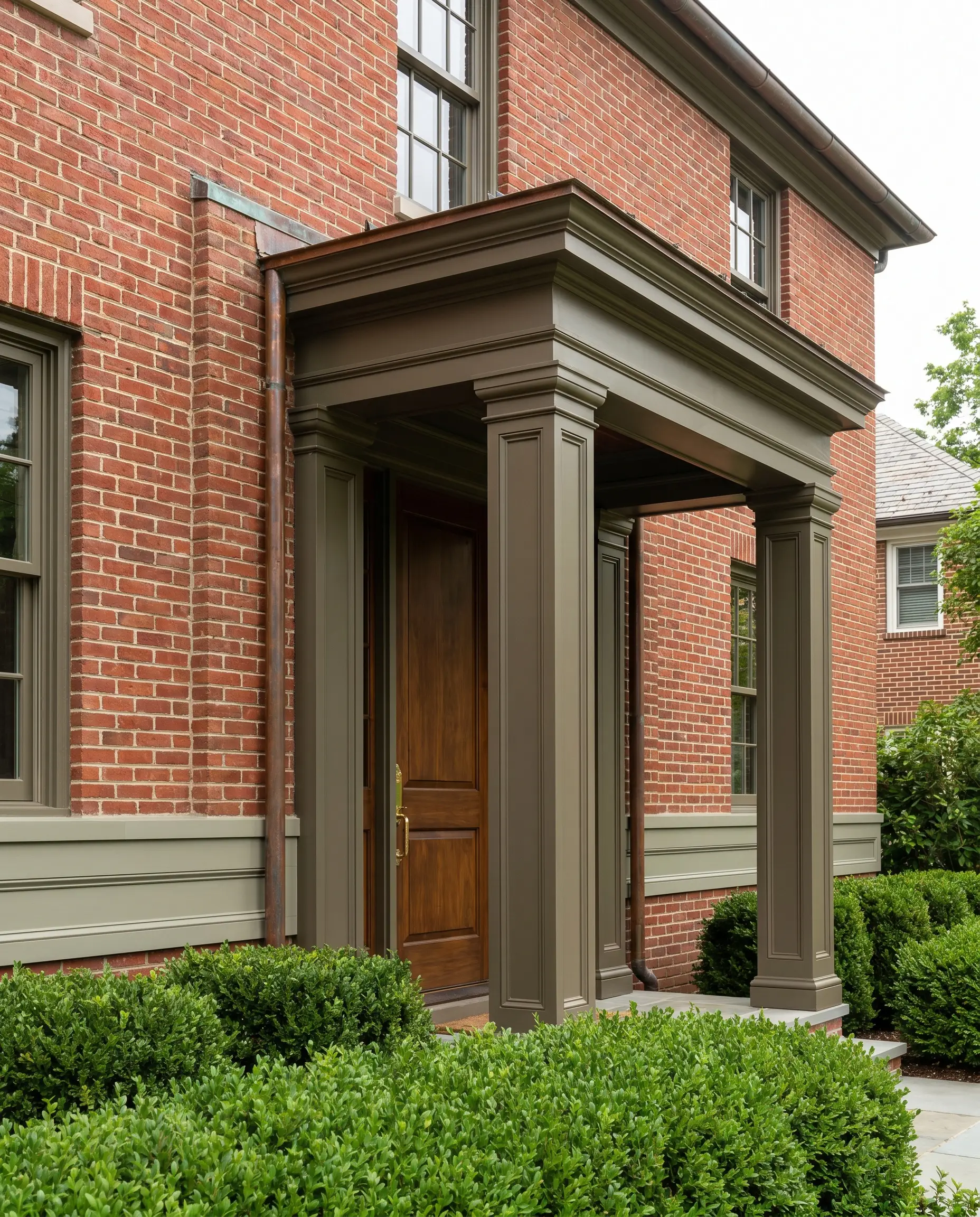
This deeper, muted putty avoids the artificial, plastic look of modern bright whites, offering a sense of historical permanence. It is an exceptional choice for grounding heavy, traditional architectural details.
- Best Application: Chunky millwork, prominent columns, and grand porticos.
- Finish Requirement: Exterior satin for easy cleaning of intricate millwork.
- Vibe: Established, heritage elegance.
Sherwin-Williams Alabaster for Limewashed Accents
If your home features sections of partially limewashed brick alongside raw red brick, this creamy, warm white acts as the perfect unifying force. It shares the exact soft, chalky undertone necessary to tie the dual masonry treatments together.
- Best Application: Connecting trim on mixed-treatment facades.
- Styling Pro-Tip: Read our guide on limewash vs. german schmear: brick treatments to perfect this layered masonry look.
- LRV: 82.
The Statement Palette: Curated Front Doors
While your siding, soffit, and trim must work as a cohesive, unified background, the front door is your primary focal point and the one architectural element where you can afford high contrast. Opting for a saturated shade in a high-gloss or satin finish instantly modernizes the entry, drawing the eye directly to the threshold.
Benjamin Moore Hale Navy for Classic Contrast
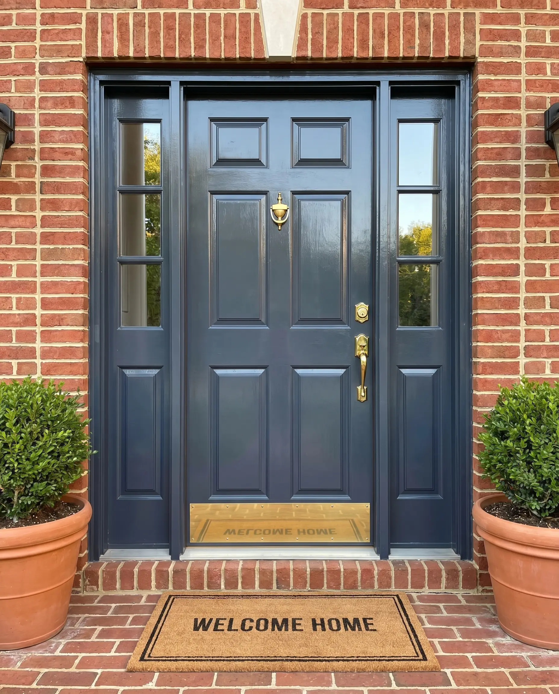
A deeply saturated, muted navy that serves as the most universally loved and classic door color for red brick homes. It provides a crisp, tailored contrast that feels both historically rooted and sharply modern.
- Best Application: Primary front doors and sidelights.
- Hardware Pairing: Unlacquered brass handlesets for a nautical, colonial polish.
- Vibe: Tailored, confident, and timeless.
Sherwin-Williams Rookwood Sash Green for Historical Accuracy
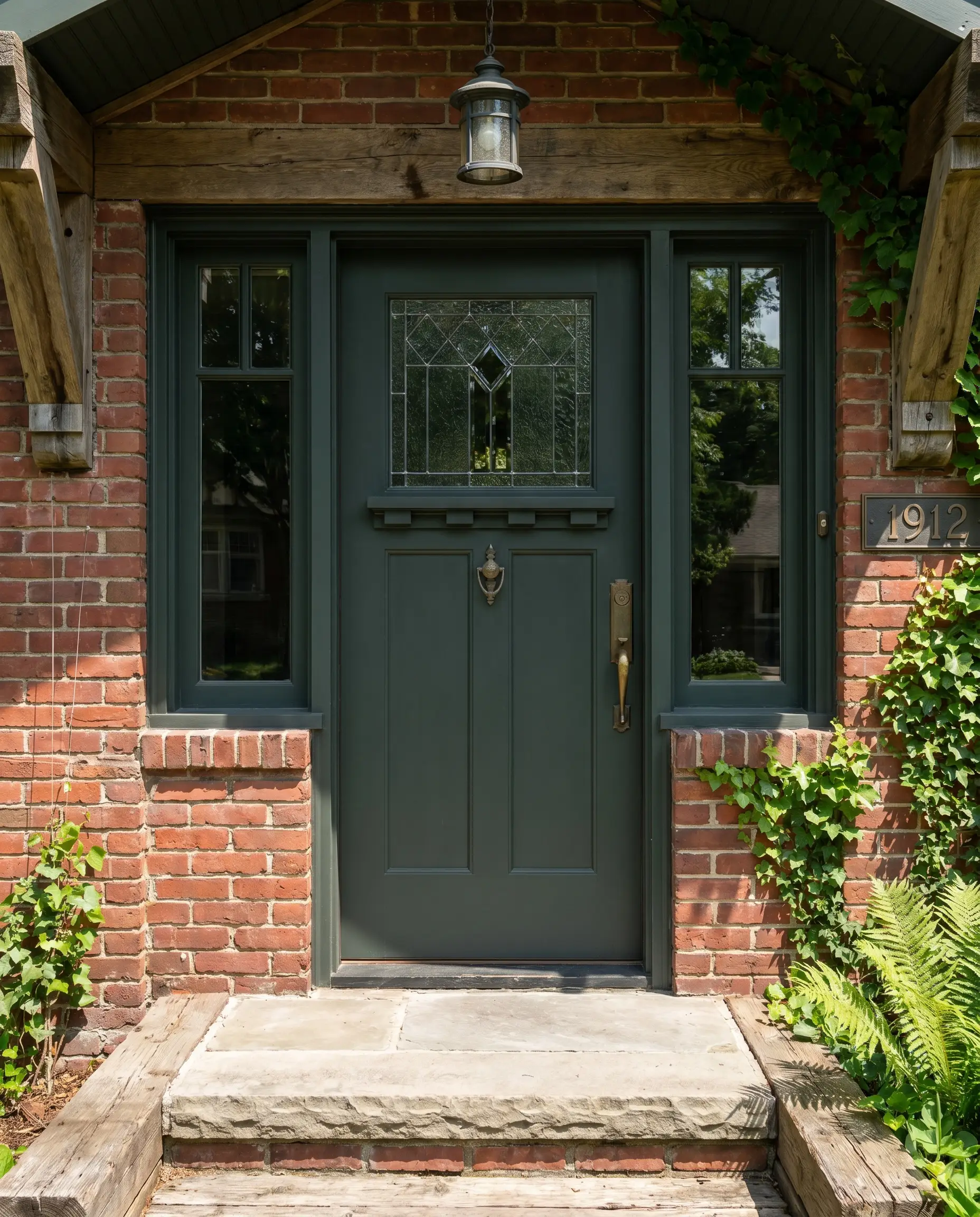
An incredibly deep, blackened green that carries massive historical significance for Craftsman and Victorian architecture. In the shade, it reads as a sophisticated black, but under direct sunlight, the rich, forest-green undertone reveals itself beautifully.
- Best Application: Historic entry doors and flanking window sashes.
- Historical Context: A cornerstone of the authentic Arts & Crafts exterior palette.
- Vibe: Heritage-rich and deeply grounded.
Farrow & Ball Brinjal for a Moody Plum Pop
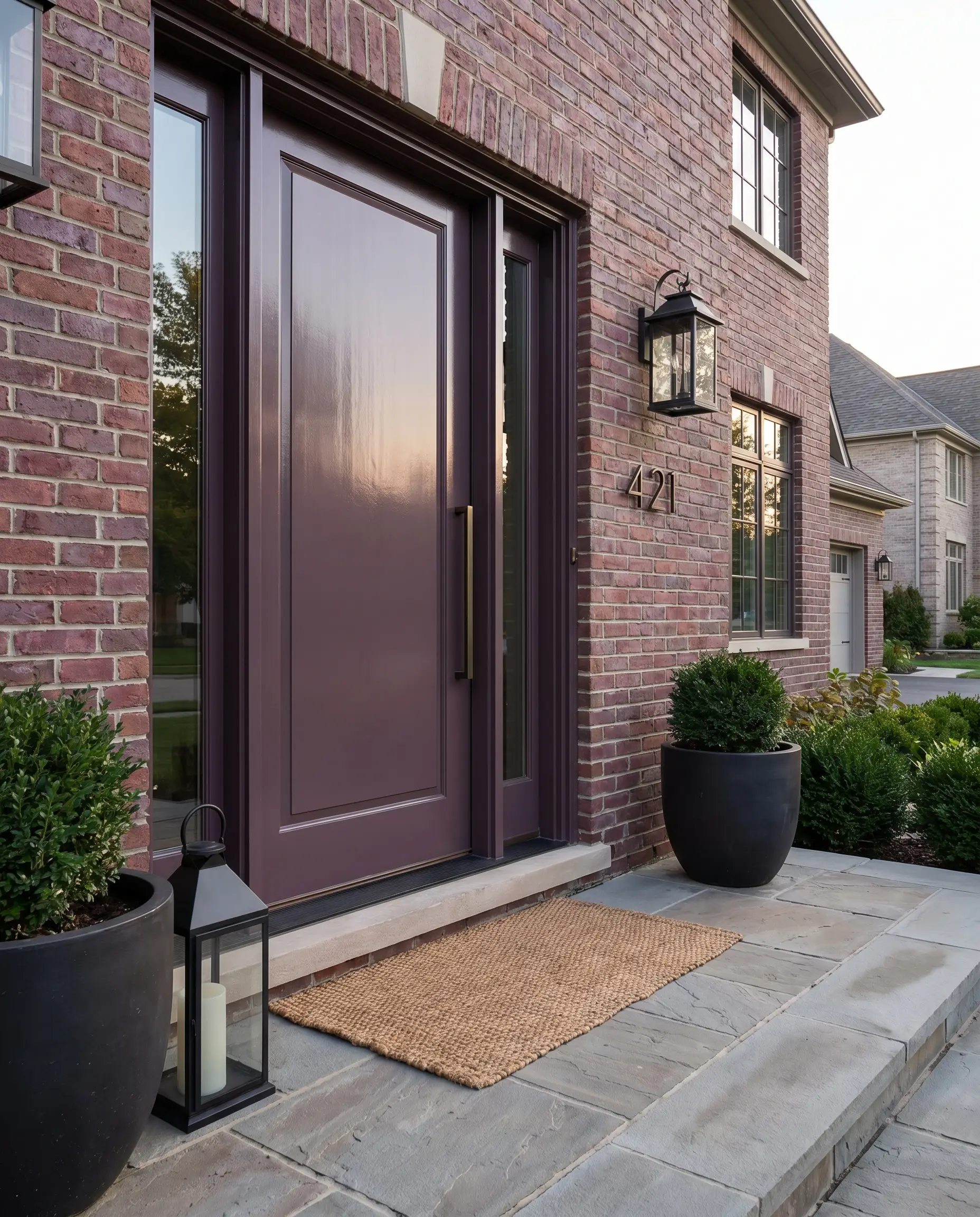
This sophisticated, dusty eggplant is a brilliant, monochromatic-adjacent choice because purple and red share underlying color DNA. It feels incredibly bespoke and provides a rich, tactile depth that standard primary colors simply cannot achieve.
This is a daring, highly designer-forward choice. If you want to make a bespoke statement without clashing with your red brick, this muted plum is the ultimate insider cheat code.
Designer Secret
- Best Application: Solid wood front doors.
- Finish Requirement: High-gloss exterior finish to maximize the rich, jewel-box effect.
- Vibe: Daring, bespoke luxury.
Benjamin Moore Wythe Blue for Coastal Charm
A highly nuanced, muted blue-green that excels at softening the heavy severity of traditional red brick. It is particularly effective for Southern or coastal homes, offering a refreshing, airy contrast to the dense, warm masonry.
- Best Application: Front doors and porch ceilings.
- Contrast Theory: The cool, breezy undertones perfectly balance the visual heat of the red brick.
- Vibe: Welcoming, relaxed, and coastal.
Perfecting the Entire Facade
Nailing your exterior color scheme requires more than just reading a paint chip indoors; you must test large swaths of these colors outside, observing how the LRV shifts on every side of the house from morning to dusk. Once your paint is finalized, upgrading your exterior lighting fixtures to matte black or aged brass, and installing modern, architectural house numbers, will firmly cement the transformation. Do not leave this expensive investment to chance—order large, peel-and-stick exterior paint samples to view these exact shades against your brick and mortar before committing to gallons of paint.