Off-Black No. 57
Farrow & BallFarrow & Ball Off-Black No. 57 is a soft, muted charcoal black with subtle cool blue undertones. With an LRV of 6, it offers a milder, much more flattering alternative to stark jet blacks, making it an incredibly versatile choice for cabinetry, trim, and moody interior spaces.
Paint Technical Profile
| Color ID / SKU | No. 57 |
| HEX Code | #454749 |
| Light Reflectance (LRV) | 6 |
| Use | Interior, Exterior |
| Best Exposures | South-facing, East-facing |
| Best For | Kitchen islands, front doors, moody studies, wainscoting, cabinetry. |
Farrow & Ball Off-Black: The Velvet Shadow That Redefines Interior Architecture
True black paint often feels like a visual void that flattens a room into a two-dimensional box. Farrow & Ball Off-Black No. 57 rejects that harshness entirely, operating instead as a highly tailored, breathable charcoal. This muted dark behaves more like a plush velvet shadow than a stark geometric line, softening the boundaries of your architecture.
Because it carries a subtle color structure, this shade reacts beautifully to the materials placed against it. It allows natural light to graze its surface rather than swallowing it whole. This unique responsiveness makes it an incredibly sophisticated choice for homeowners who want dramatic contrast without the severe, intimidating edge of a pure black.
Farrow & Ball Off-Black: Undertones & LRV
Homeowners constantly ask if this soft black leans warm or cool on the wall. The answer is a definitive, sophisticated cool. While it might look perfectly neutral on a tiny paper swatch, its underlying pigment structure tells a different story once rolled across a larger surface.
With a light reflectance value of 6, this shade absorbs a massive amount of light but stops just short of total darkness. This specific LRV allows the paint to retain just enough luminosity to show off its subtle blue notes. It gives your walls a rich, tactile depth rather than a flat, lifeless finish.
The Chameleon Factor: Lighting Effects
That hidden blue undertone makes this architectural finish incredibly responsive to the shifting sun. Here is exactly how different light waves will manipulate the final aesthetic of the room.
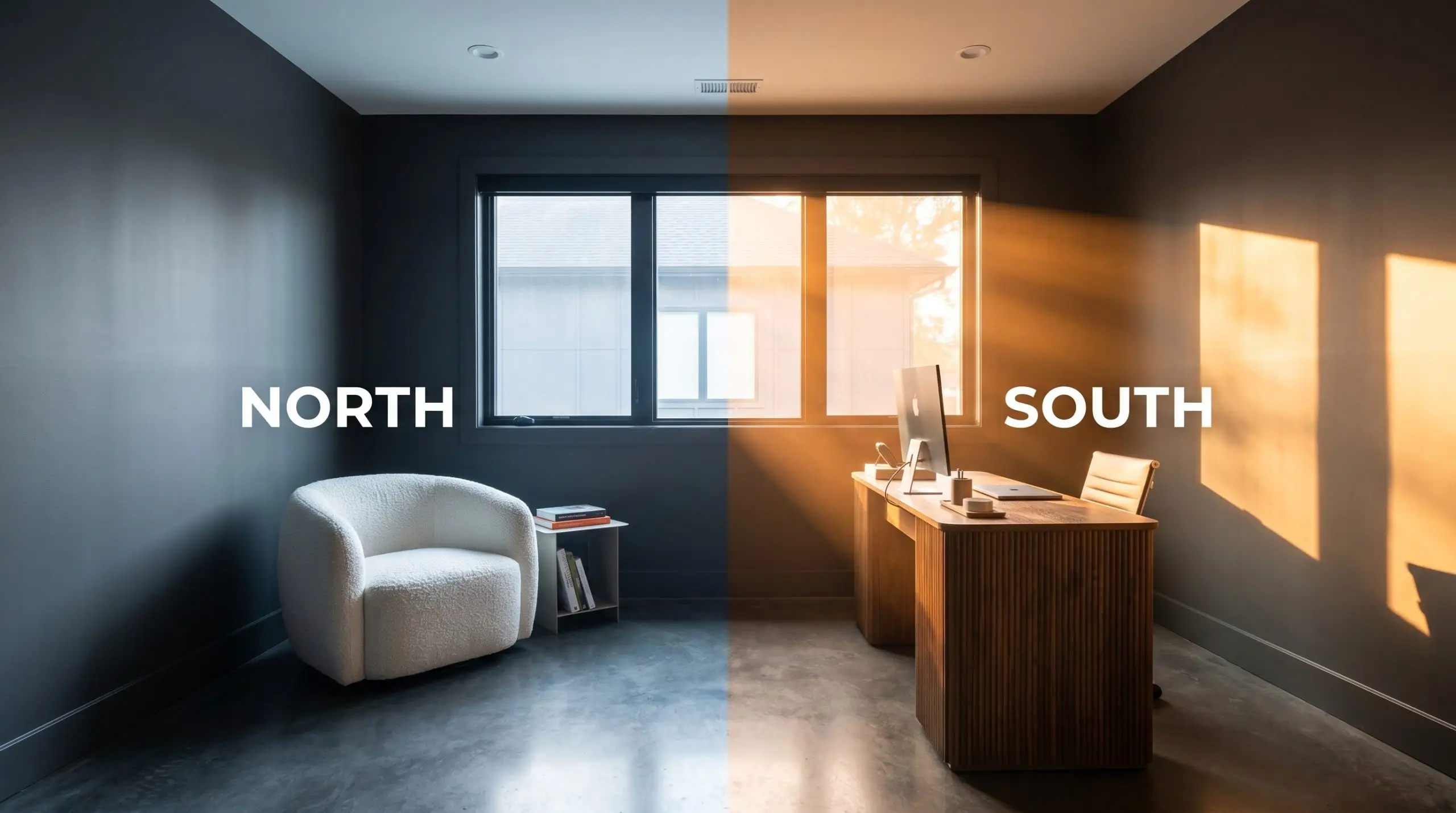
When using this shade on an exterior facade, direct sunlight will significantly lighten its appearance. It will read much closer to a mid-tone charcoal than a true black, so always test a large swath on the brightest side of your home before committing.
Hackrea Pro-Tip (The Exterior Washout)
Executing Moody Interiors: Popular Applications
Understanding the literal light reflectance value is only half the battle. The true magic of this muted dark reveals itself when it interacts with physical materials, hard finishes, and thoughtful styling throughout your home.
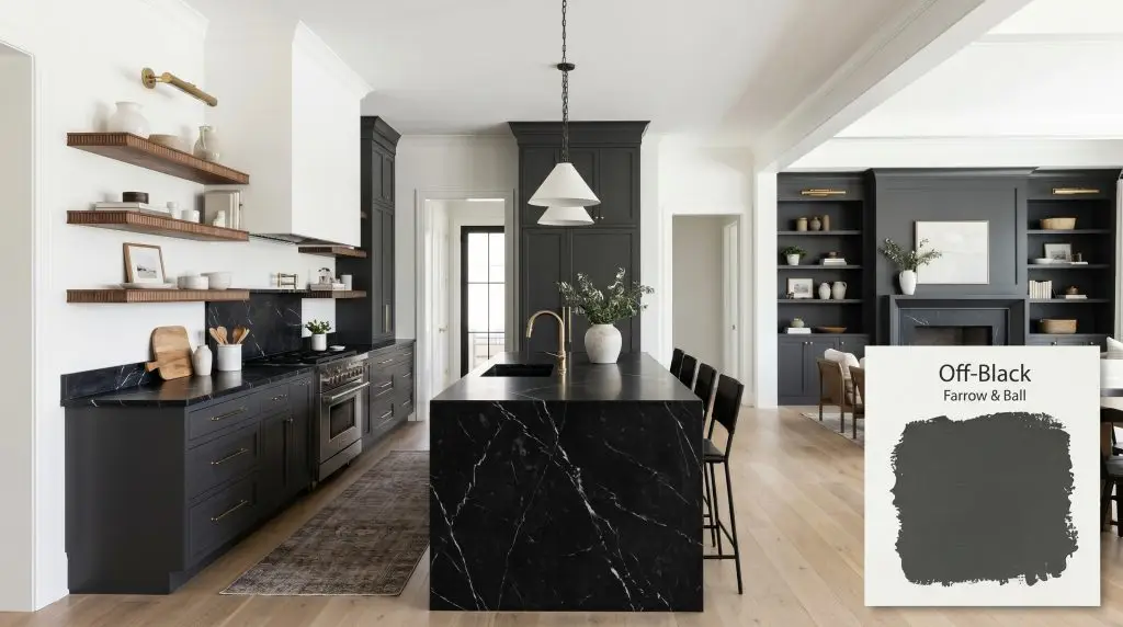
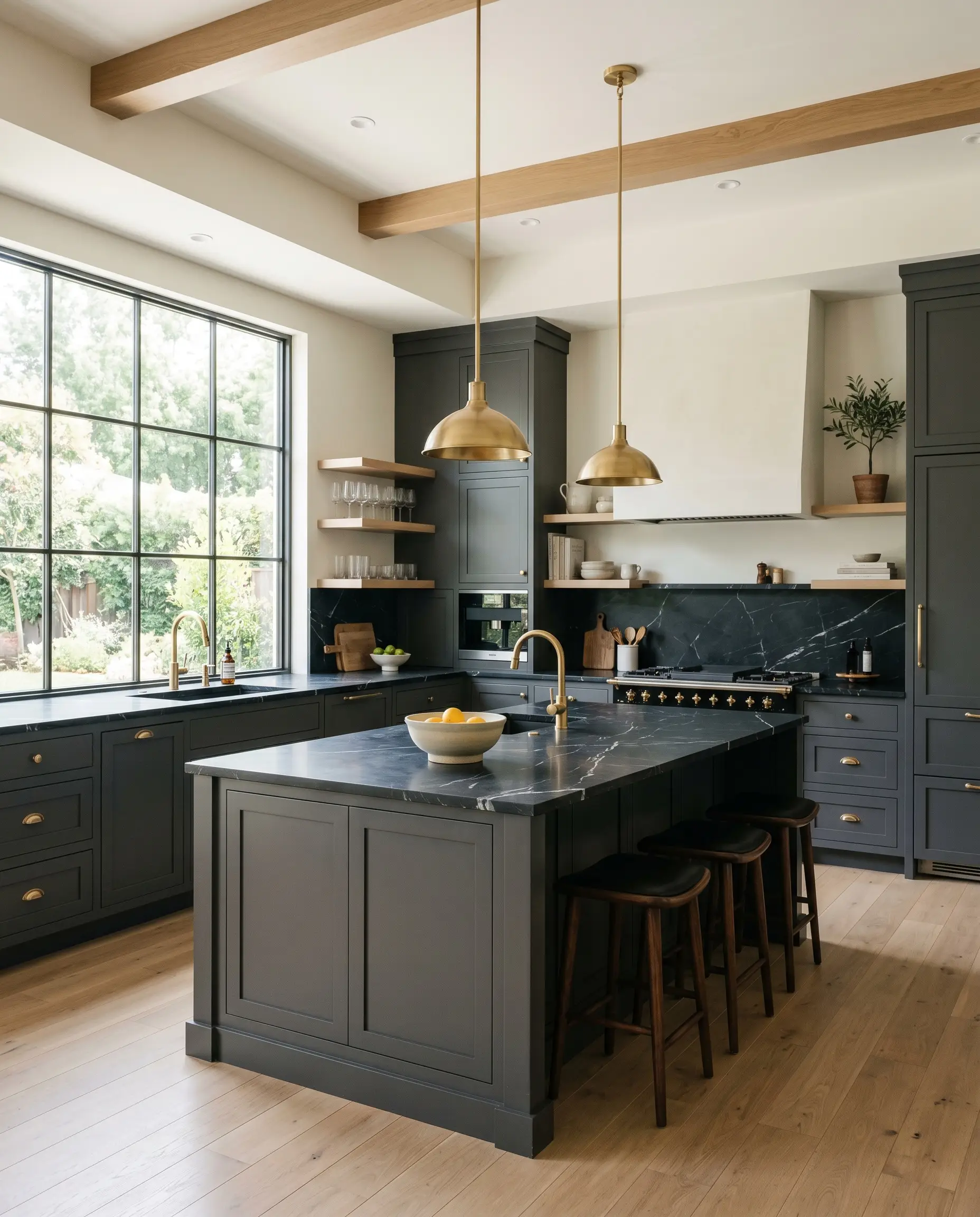
Kitchen Cabinetry & Islands
Applying this shade to kitchen cabinetry instantly establishes a sophisticated, bespoke atmosphere. When finished in a durable Modern Eggshell, the subtle sheen catches the light, highlighting those crisp cool notes.
Pair these dark cabinets with honed Nero Marquina marble counters and unlacquered brass hardware for a striking, tactile contrast. If you want to warm up the cool slate aesthetic, integrate reeded walnut accents or floating white oak shelves.
Be cautious when pairing this cool-leaning charcoal with strongly yellow-toned granites. The crisp blue base will fight the yellow, making the stone look dated and the paint feel entirely unintentional.
Clash Warning (The Stone Conflict)
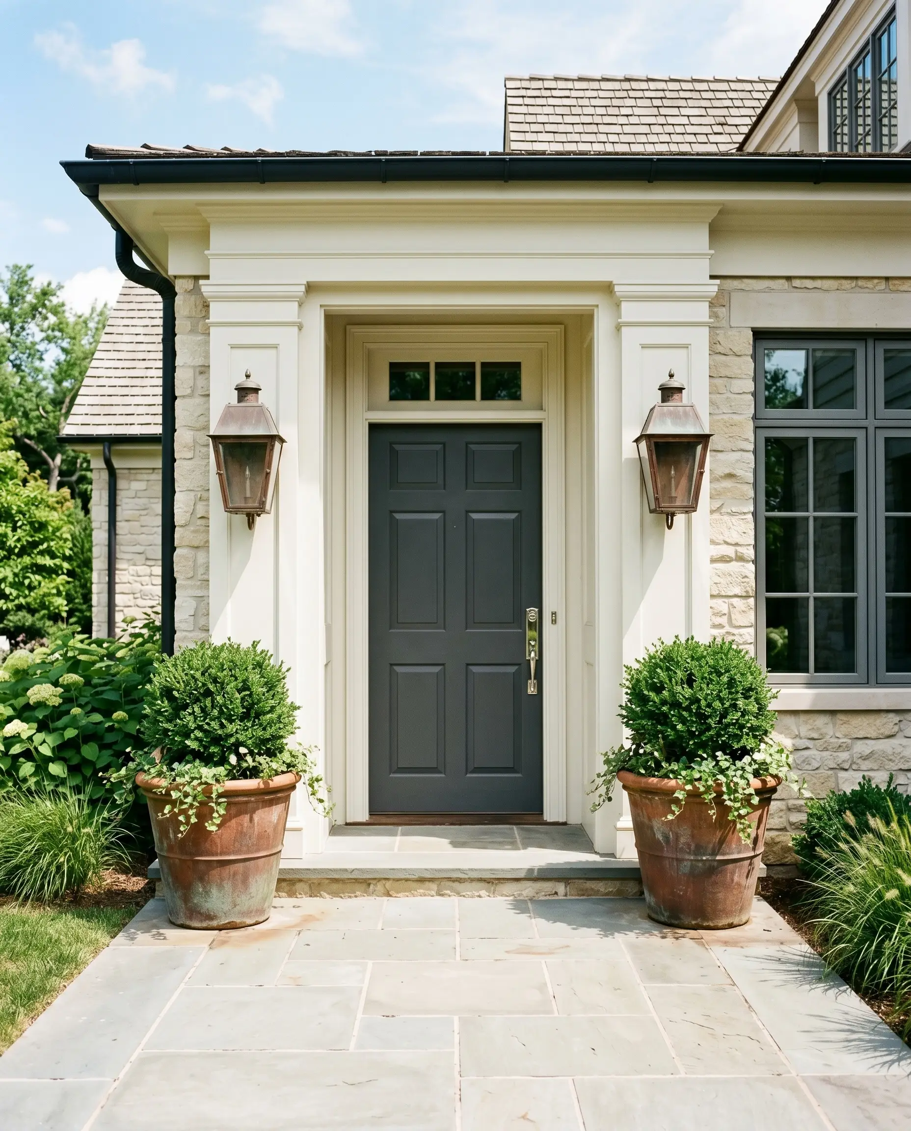
Front Doors & Exterior Shutters
Your front door is the architectural handshake of your home, and Off-Black offers incredible curb appeal. It provides the gravitas of a traditional dark door without the severe, imposing energy of a pure black.
To maximize the visual impact, frame the dark door with chalky white exterior trim and flank it with oversized terracotta planters. Polished nickel hardware will pull out the cool notes, while oxidized copper lanterns create a beautifully aged, transitional aesthetic.
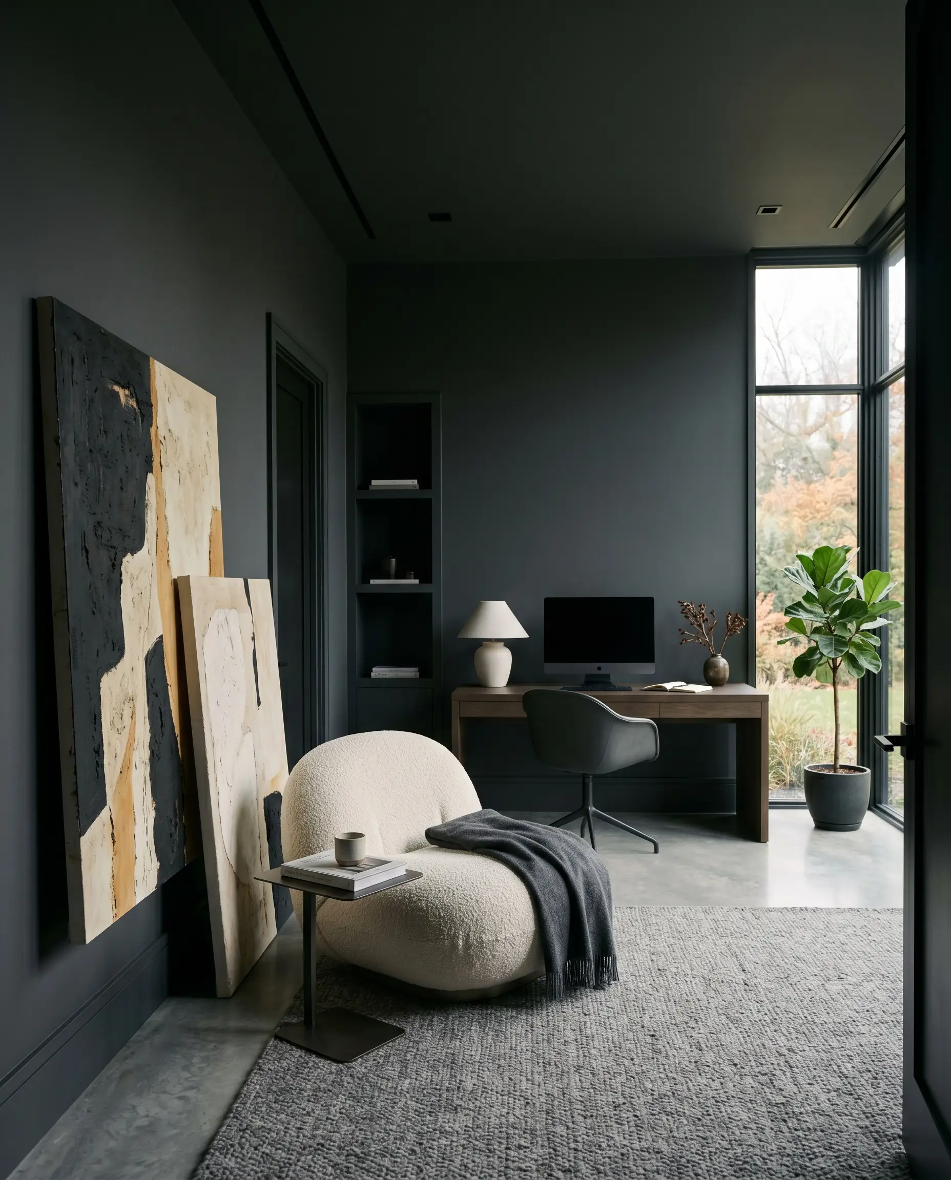
Moody Home Offices & Libraries
While it is easy to default to a traditional, leather-bound library look, this shade thrives in a sleek, minimalist workspace. Color-drenching the room—painting the walls, ceiling, and trim in the flat Estate Emulsion—blurs the architectural boundaries.
This enveloping technique creates a quiet, focused retreat for a creative professional working from home. Break up the dark expanse by leaning oversized abstract canvases against the wall and introducing a plush boucle armchair for textural relief.
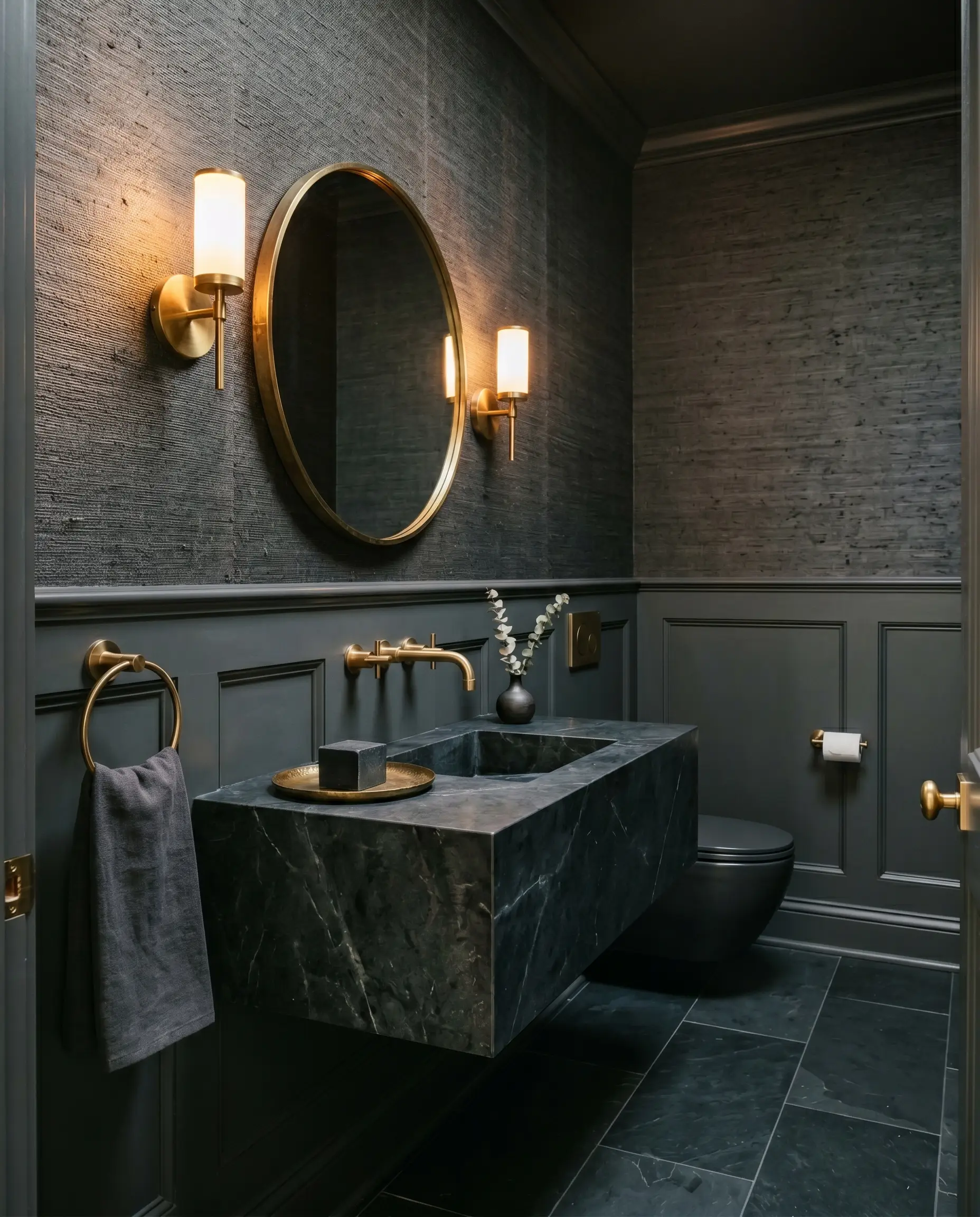
Powder Rooms
Small, windowless spaces are the perfect canvas for committing to a high-contrast, dramatic design. Instead of trying to make a tiny powder room feel larger with pale colors, lean into the shadows.
Pair the dark walls with a floating soapstone vanity and dramatic brass sconces to create an intimate, luxurious atmosphere. Adding a richly textured grasscloth wallpaper above a painted wainscoting adds a brilliant layer of bespoke craftsmanship.
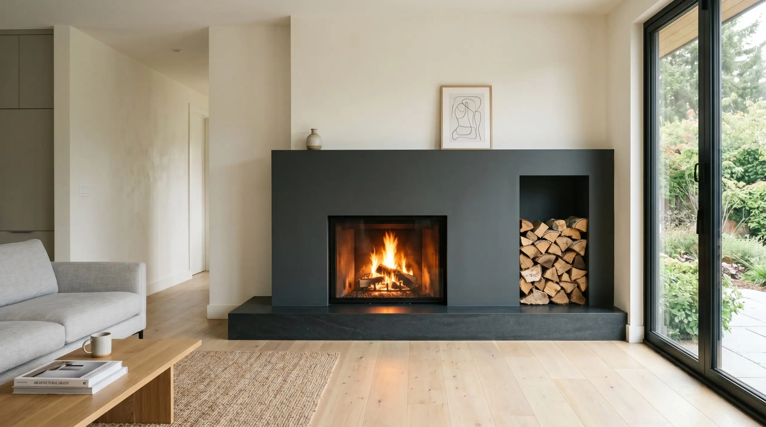
Living Room Built-ins & Fireplace Surrounds
Painting your living room built-ins this saturated charcoal instantly centers the room’s energy. It acts as a magnificent visual frame, allowing the objects displayed on the shelves to truly command attention.
Stack vintage art books, sculptural ceramic vessels, and trailing ivy against the dark backdrop to make their colors pop. When applied to a fireplace surround, the cool undertones provide a stunning counterpoint to the warm, flickering amber light of the fire.
Perfecting the Palette: Coordinating Colors for Farrow & Ball Off-Black
This muted charcoal requires highly intentional companions to truly shine. Rather than blending quietly into the background, its cool pigment demands crisp boundaries to hold its shape. Pairing it with the right textures and hues dictates whether the room feels expansive or enclosed.
Baseboards & Architectural Trim
Framing this soft black requires pure, unadulterated whites to create a tailored, high-end boundary. Benjamin Moore Chantilly Lace OC-65 provides a pristine, ultra-crisp edge that makes the dark walls recede beautifully. For an equally striking but slightly softer transition, Sherwin-Williams High Reflective White 7757 offers a brilliant contrast without feeling clinical.
Hardware, Wood & Material Pairings
The secret to softening this dark hue lies in tactile, organic surfaces that catch the light. Unlacquered brass is the ultimate companion, as its living, oxidized warmth directly balances the cool undertones of the paint.
Heavily veined Calacatta marble introduces necessary movement, breaking up the dark expanse while keeping the aesthetic incredibly elevated.
For timber elements, reeded walnut introduces a ribbed texture that absorbs shadows while injecting a rich, organic warmth.
Finally, incorporating fluted glass in cabinetry or lighting allows illumination to dance across the room, preventing the dark walls from feeling flat.
Harmonizing Color Palettes
Here are the specific hues that beautifully manipulate this dark shade.
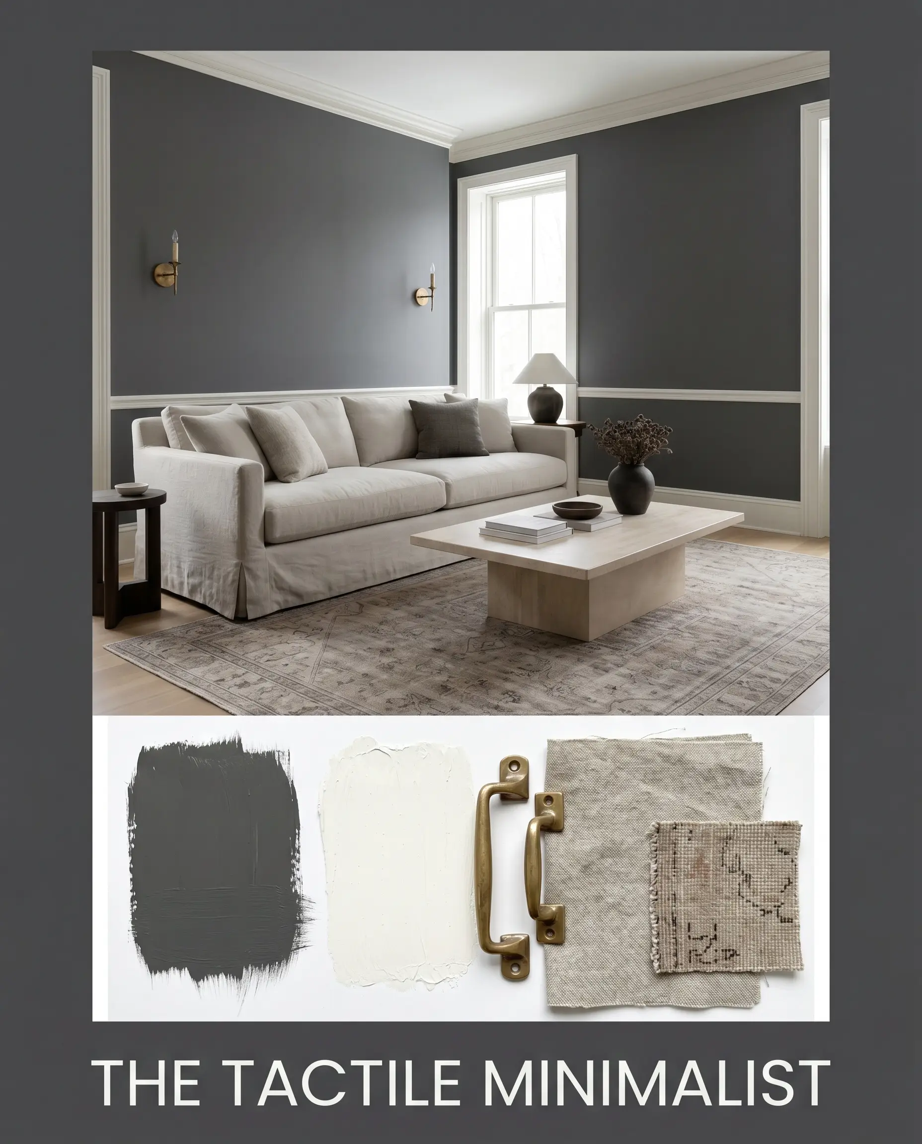
Curated Room Aesthetics
To visualize how these elements combine, explore these curated styling directions.
The Tactile Minimalist This aesthetic relies on the tension between the dark walls and raw, organic textures to create a calming retreat. Slipcovered washed linen sofas sit atop a muted, neutral-toned vintage rug, while a plinth coffee table centers the arrangement. The addition of unlacquered brass sconces casts a warm glow, ensuring the cool walls feel incredibly inviting.
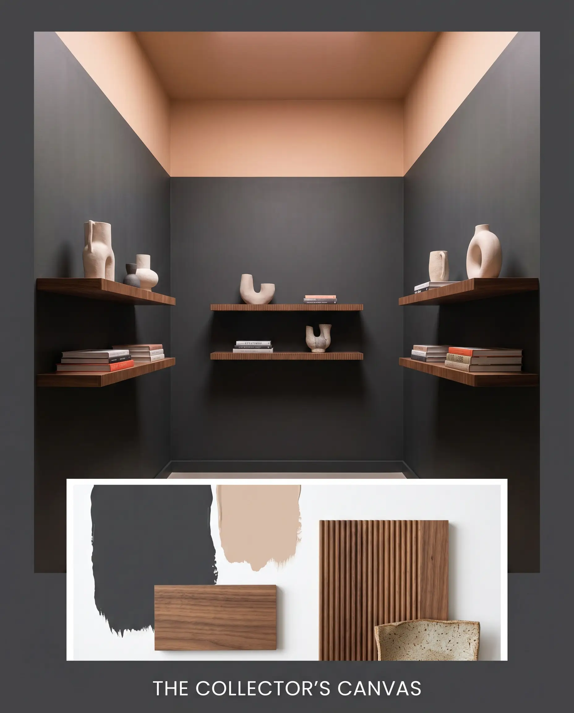
The Collector’s Canvas Designed to let art and objects take center stage, this palette uses the dark paint as a dramatic, receding backdrop. Incorporate floating reeded walnut shelves to display abstract ceramic vessels and stacked art books. Farrow & Ball Setting Plaster No. 231 painted on the ceiling introduces a soft, rosy overhead light that completely changes the room’s energy.
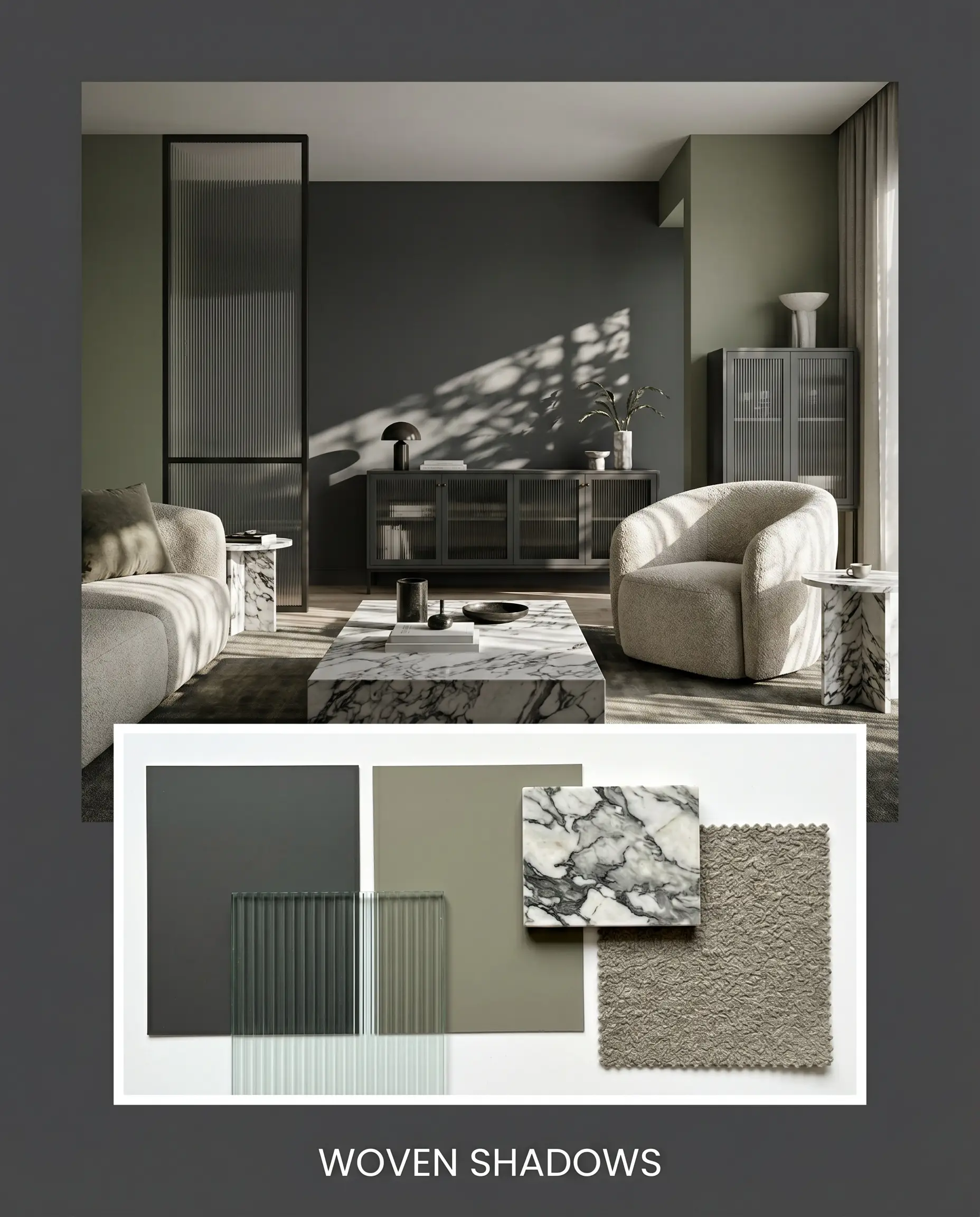
Woven Shadows This direction embraces a deeply layered, sensory experience by mixing varied textiles and reflective surfaces. Fluted glass accents and heavily veined marble surfaces bounce available light around the space. Incorporating a plush boucle armchair and Sherwin-Williams Evergreen Fog SW 9130 on adjoining walls creates a lush, highly dimensional environment.
Comparing Muted Darks: The Ultimate Match-Ups
Selecting the right charcoal often comes down to your home’s specific lighting and architectural exposure. In rooms flooded with intense, direct southern sunlight, you might need a shade with a more rigid base to prevent it from washing out. Here is how this Farrow & Ball favorite stacks up against its closest competitors.
Farrow & Ball Off-Black vs. Farrow & Ball Pitch Black No. 256
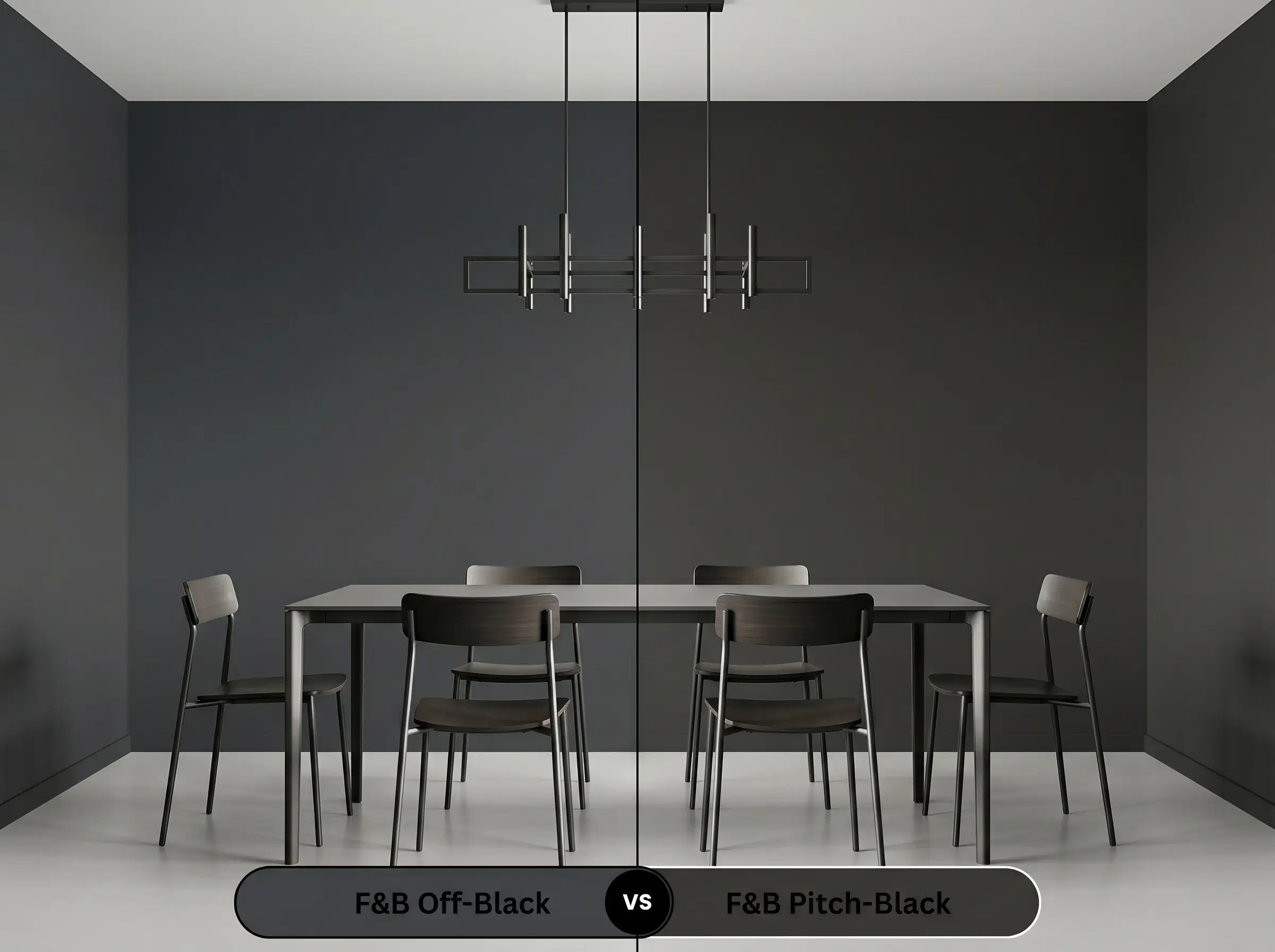
Pitch Black No. 256 is an uncompromising, true black devoid of any complicated underlying color notes. If you want a stark, graphic line that feels entirely modern, Pitch Black is the more decisive choice. However, if you prefer a softer, more breathable shadow that subtly shifts with the daylight, stick with the muted charcoal.
Farrow & Ball Off-Black vs. Benjamin Moore Wrought Iron 2124-10
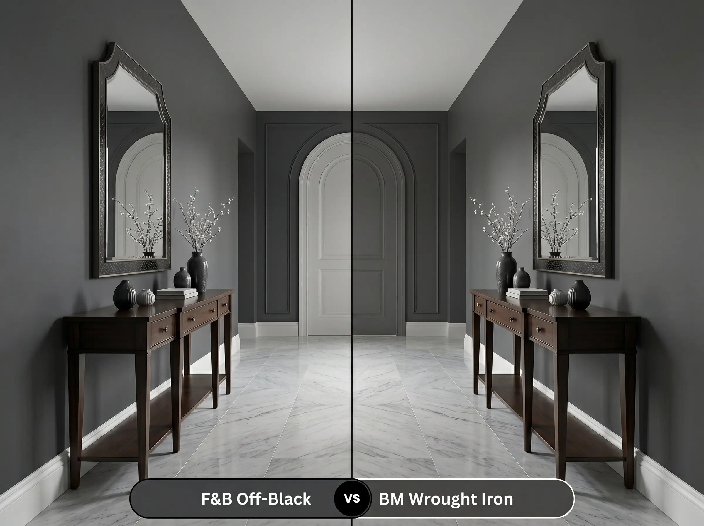
Benjamin Moore Wrought Iron 2124-10 carries a slightly warmer, browner base compared to the subtle blue chill of the Farrow & Ball shade. Wrought Iron is incredibly forgiving in north-facing rooms where you want to avoid any icy undertones. Choose the Farrow & Ball option if you want that crisp, tailored slate aesthetic that pairs so effortlessly with cool-toned marbles.
Farrow & Ball Off-Black vs. Sherwin-Williams Iron Ore SW 7069
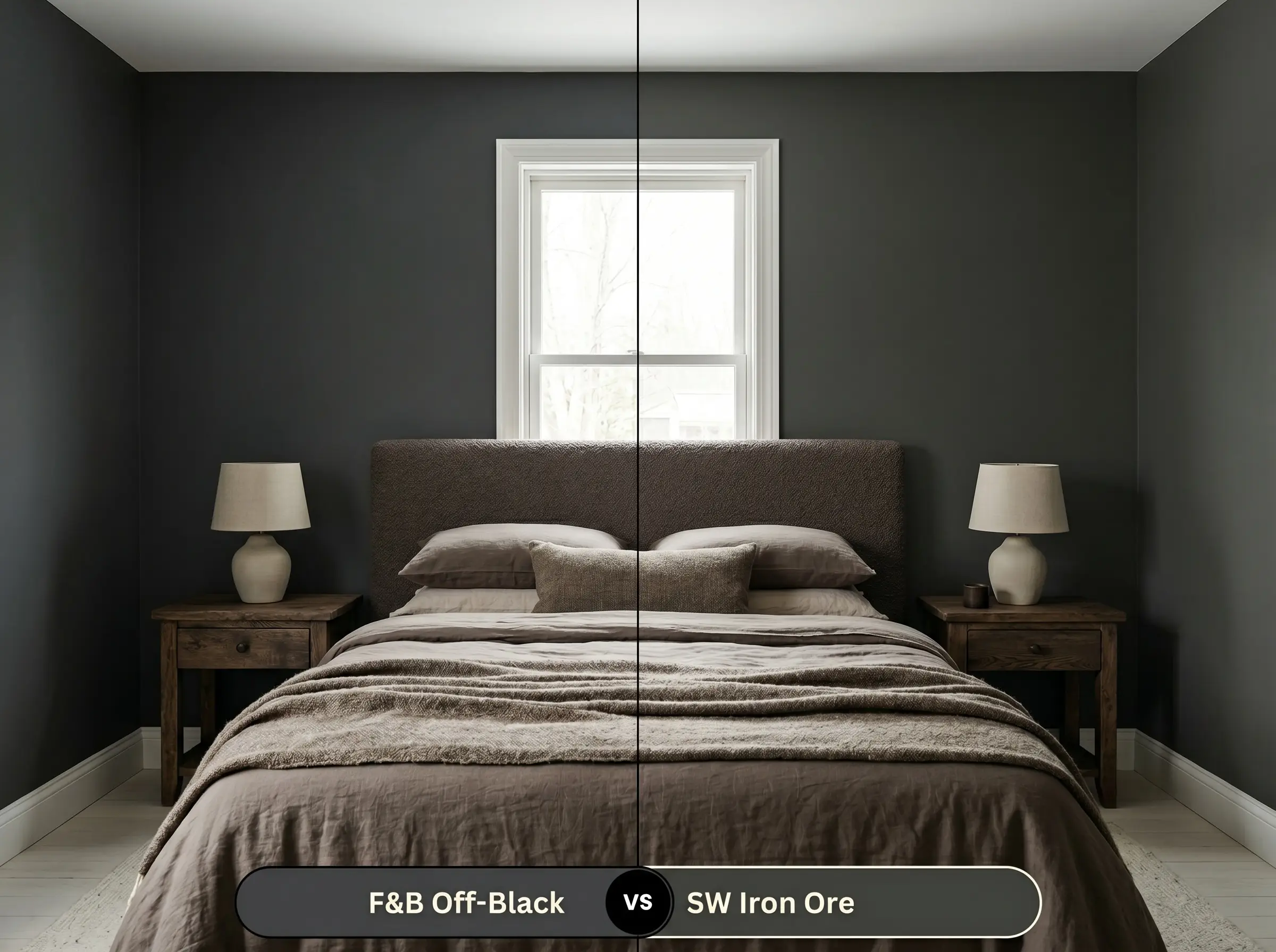
Sherwin-Williams Iron Ore SW 7069 is a highly popular, slightly lighter charcoal that feels incredibly organic and grounded. It carries a faint green-brown note, making it exceptionally versatile alongside rustic woods and earthy textiles. If you need a color that seamlessly transitions between modern and traditional without leaning blue, Iron Ore is your perfect candidate.
Exploring Farrow & Ball Off-Black Alternatives
Sometimes a room requires a subtle shift in intensity to achieve the exact mood you are chasing. Whether you need a slightly lighter slate for a dim hallway or a cross-brand match for local convenience, these alternatives deliver similar drama.
Farrow & Ball Sibling Shades
Color Matches Across Major Brands
Executing a Flawless Architectural Finish
Transitioning this stunning color from a small swatch to a massive wall requires meticulous planning. Dark paints are notoriously unforgiving, meaning your choice of sheen and application technique will dictate the final aesthetic.
Sheen Selection & Painting Strategy
Primer Strategy You must use a high-quality, dark-tinted primer specifically formulated for deep colors. Applying this charcoal over a standard white primer will result in a streaky, uneven finish that lacks true depth.
Coverage & Success Tips Expect to apply an absolute minimum of two generous coats, though three are often required to achieve an opaque, luxurious result. Be incredibly careful with touch-ups. Dark, flat paints are highly prone to “flashing,” meaning any localized touch-ups will dry with a slightly different sheen, often forcing you to repaint the entire wall to fix a small scuff.
Because it absorbs significant heat, this dark shade can be prone to faster UV fading in intense southern exposures. It requires a premium exterior formulation and routine maintenance to prevent the cool charcoal pigment from chalking or losing its depth.
Instead of shrinking the room, painting the ceiling this dark hue actually blurs the boundary lines, drawing the eye upward toward the natural light. The skylight will beautifully illuminate the subtle blue notes, making the ceiling feel like an expansive night sky rather than a tight lid.
The subtle sheen of Modern Eggshell reflects ambient light, which slightly lightens the perceived color and highlights the crisp, tailored edges of the shelving. In contrast, the flat Estate Emulsion absorbs light completely, creating a softer, more velvety shadow with less defined boundaries.
The cool blue notes actually provide a stunning, intentional contrast against the warm, orange-red tones of the oak flooring. This dynamic tension balances the room, preventing the warm woods from feeling overly rustic while grounding the cool walls.
The Final Verdict on Elevating Moody Interiors
Farrow & Ball Off-Black No. 57 is an exceptional tool for homeowners who crave dramatic, highly tailored spaces. Its brilliance lies in its restraint; it delivers the luxurious impact of a dark room without the aggressive, flattening effect of a pure black. This shade is absolutely perfect for transitional kitchens, sleek home offices, and anyone looking to create a sophisticated, enveloping retreat.
While this color is undeniably gorgeous, it is not for every environment. You must avoid using this specific charcoal in heavily shaded, north-facing rooms that lack adequate artificial lighting, as the lack of illumination will completely kill the subtle blue notes, leaving the walls looking flat and dismal. Furthermore, it fiercely clashes with prominent yellow-toned fixed elements, like dated oak cabinetry or warm beige carpets. The crisp, cool base of the paint will fight those yellow hues, making the room feel disjointed and visually confusing.
Hackrea Design Secret (The Illumination Warning)
Closest Cross-Brand Equivalents
The absolute closest scientific color matches for Off-Black across top paint brands.