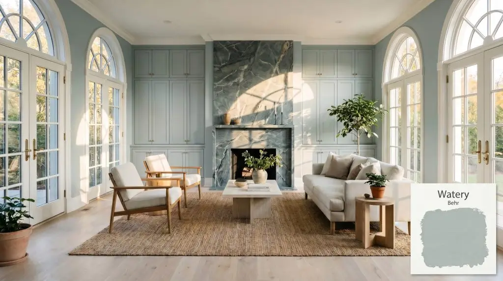
Watery HDC-CT-26
BehrBehr Watery (HDC-CT-26) is a serene, mid-tone gray-blue paint color with prominent green undertones. Boasting an LRV of 49, it strikes a perfect balance between light and depth, creating a calming, coastal-inspired atmosphere without feeling overly pastel or washed out.
Paint Technical Profile
| Color ID / SKU | HDC-CT-26 |
| HEX Code | #aebdbb |
| Light Reflectance (LRV) | 49 |
| Use | Interior, Exterior |
| Best Exposures | South, West |
| Best For | Bedrooms, Bathrooms, Kitchen Cabinets, Laundry Rooms |
Behr Watery: The Muted Teal That Redefines Modern Coastal Calm
There is a distinct, grounding energy that happens when you bring the muted tones of the shoreline indoors, stripping away the predictable pastels to reveal something far more sophisticated. Behr Watery (HDC-CT-26) achieves exactly this, acting as a brilliant architectural filter that softens harsh afternoon sunlight while adding profound depth to standard drywall. It completely bypasses the juvenile brightness often associated with blues, offering instead a highly curated, weathered coastal palette.
If your home suffers from sterile, light-starved corridors or undefined, open-concept layouts, this subdued aquatic hue provides an immediate sense of gravity. It wraps a room in a quiet, restorative atmosphere without demanding a massive structural overhaul. By simply rolling this complex pigment onto standard baseboards or stock cabinetry, you can instantly shift the entire mood of your home.
Undertones & LRV of Behr Watery
The Definitive Temperature: Behr Watery is a decisively cool paint color. However, it relies heavily on a dusty, shadowed foundation to keep that coolness from feeling icy or unwelcoming in residential spaces.
To truly understand how this color behaves, we have to look at its structural pigment profile. It is fundamentally built as a cyan-based hue, but it carries a fascinating internal tension that dictates its final appearance on your walls.
When we look at its light reflectance value 49, we see a color that sits perfectly in the mid-tone pocket. It absorbs just over half the light it receives, giving it enough internal weight to contrast beautifully against crisp white trim. This specific depth means it will hold its shape and character on the wall, rather than washing out into a vague shadow when hit by direct sunlight.
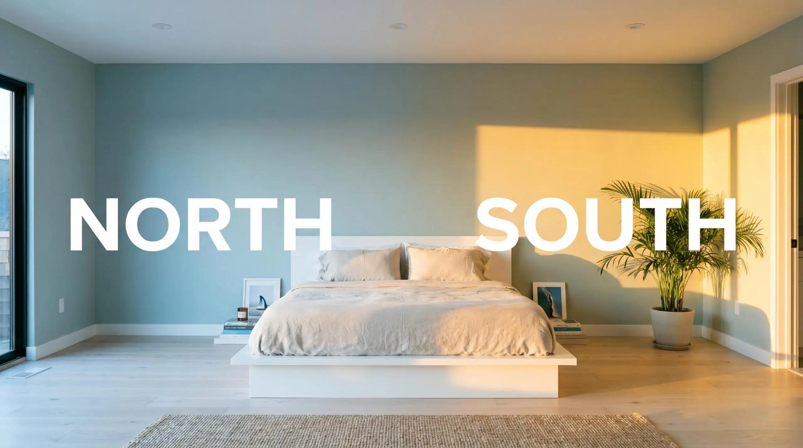
Lighting Effects & The Chameleon Factor
The most significant environmental risk with Watery HDC-CT-26 is placing it in a windowless room illuminated entirely by low-kelvin, amber-tinted bulbs. Without natural daylight to activate the blue notes, warm artificial light will drag the gray and green undertones forward, resulting in a murky, muddy finish that loses all its coastal charm.
Because of its complex undertones, this paint is highly reactive to the specific color temperature shift of your home’s lighting. You must test large swatches on different walls to see how it bends throughout the day.
Popular Room Applications
This color excels at bringing custom warmth and architectural weight to spaces that typically feel purely utilitarian. It introduces a serene, grounded energy that translates beautifully across a variety of everyday environments.
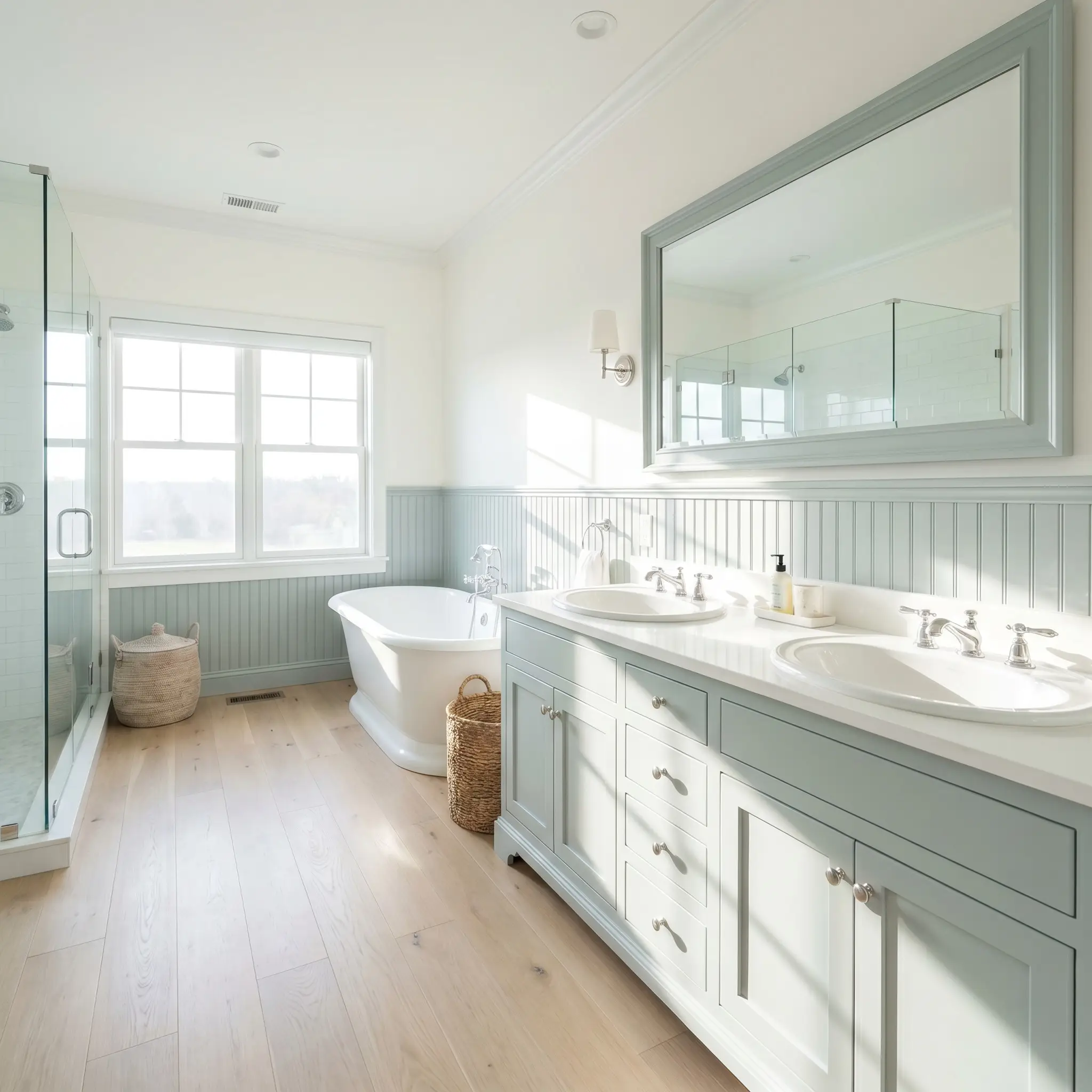
Bathrooms
This is the ultimate spa-like bathroom paint, particularly when applied to beadboard wainscoting or standard vanity cabinets. The mid-tone depth grounds the often-sterile combination of white porcelain and mirrors. Pair it with polished hardware to bounce light around the room, creating a crisp, rejuvenating morning atmosphere.
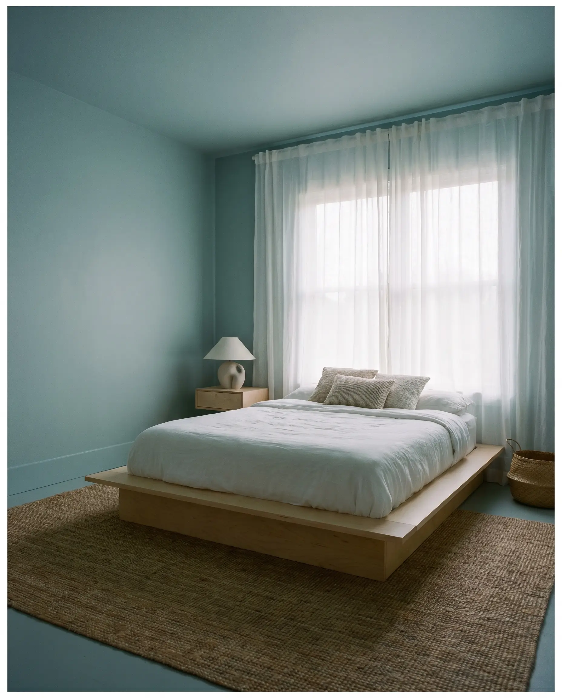
Bedrooms
In sleeping quarters, this muted teal acts as a visual sedative, lowering the perceived temperature of the room to encourage rest. It performs brilliantly wrapped across all four walls and the baseboards, softening the sharp corners of a basic square room. The gray undertone ensures the walls recede beautifully in the evening shadows.
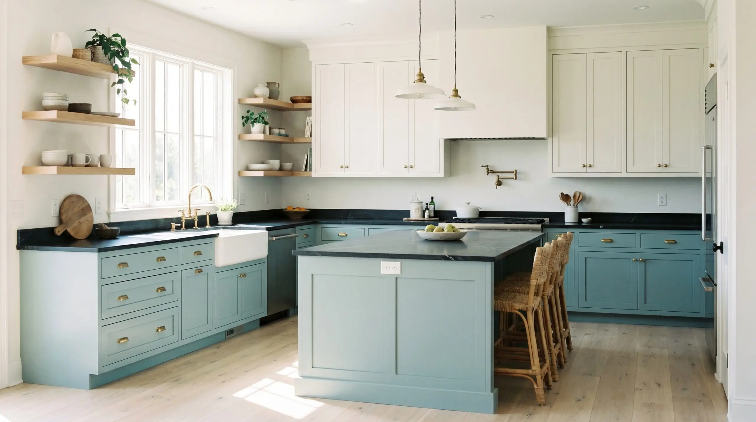
Kitchen Cabinetry
Painting lower cabinets or a central island in this hue is a brilliant way to anchor a kitchen without resorting to heavy navy or stark black. It pairs seamlessly with classic white upper cabinets, bringing a touch of organic color to the heart of the home. The green undertone plays beautifully against natural wood cutting boards and floating shelves.
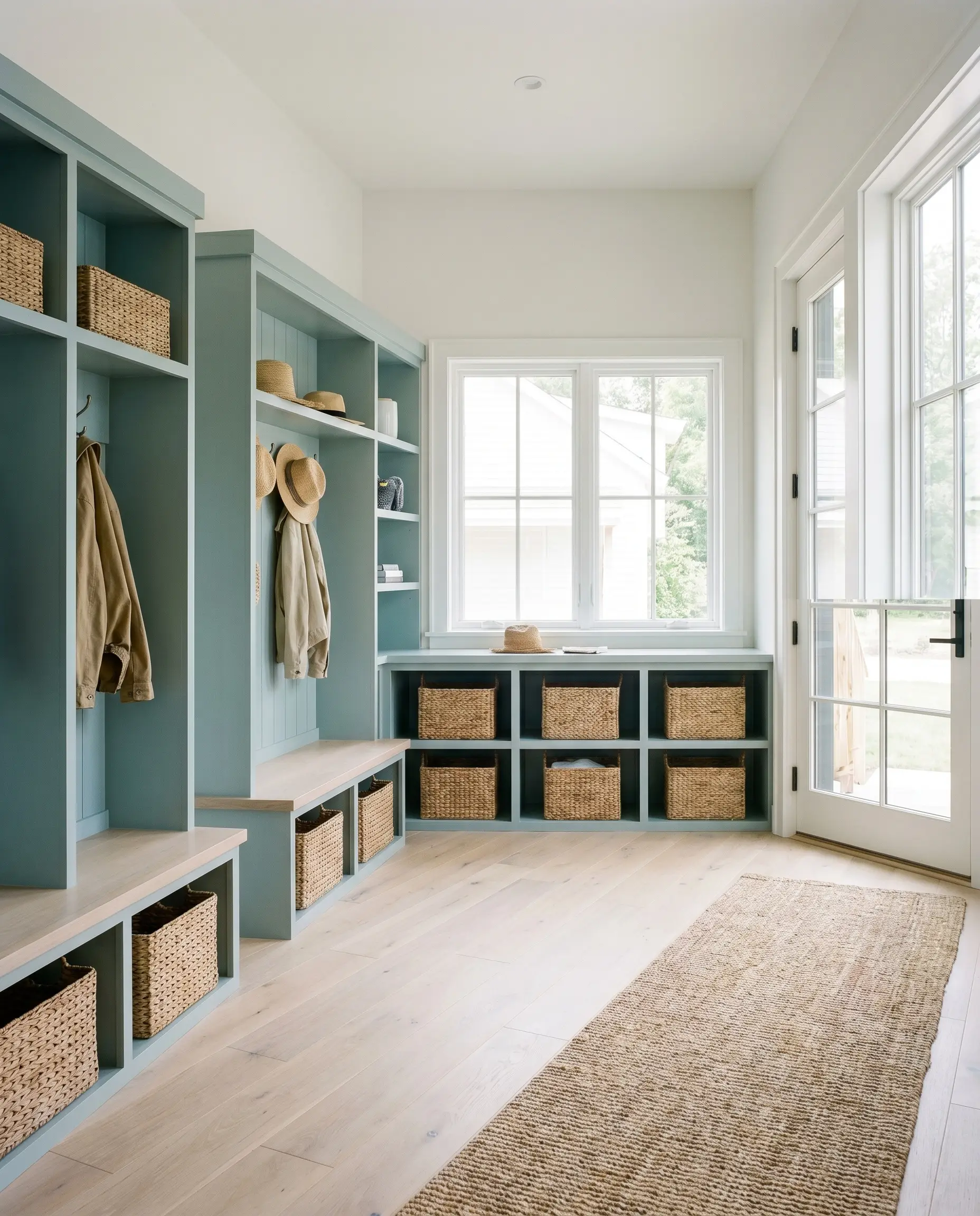
Utility Spaces
Laundry rooms and mudrooms are prime real estate for a high-impact color transformation. Applying this shade to standard MDF cubbies or shelving instantly upgrades the look of flat-pack furniture. It brings a cheerful yet sophisticated energy to rooms dedicated to daily chores, making them feel like intentional design moments rather than forgotten closets.
Creative Ways to Use Watery HDC-CT-26
When you treat paint as a versatile architectural tool, you unlock incredible design potential. Here is how this specific color inspires highly custom, out-of-the-box thinking.
The Restorative Canopy
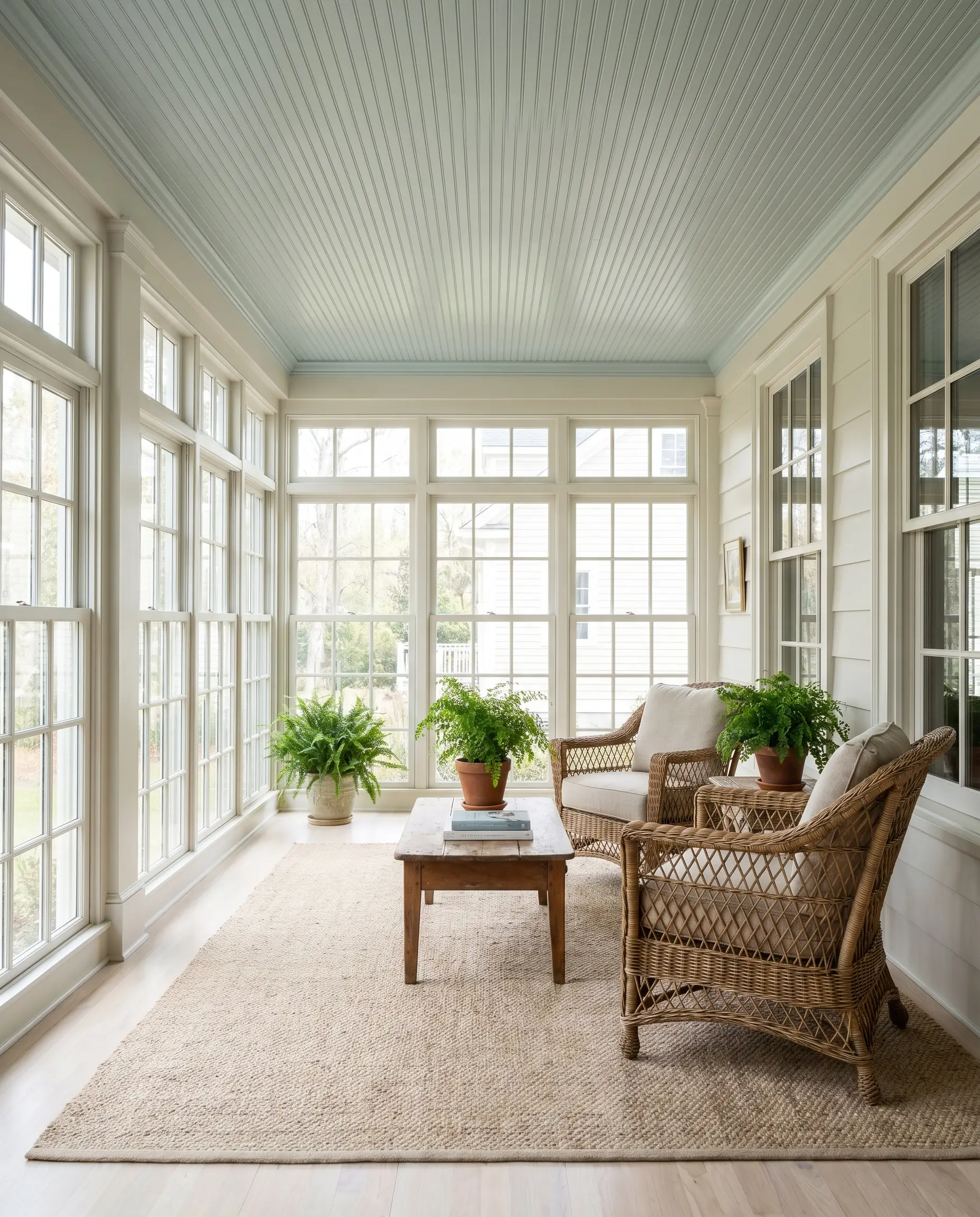
Instead of leaving a sunroom or enclosed porch ceiling standard flat white, coat the beadboard or tongue-and-groove paneling in this soothing shade. The high volume of natural light in these spaces will pull out the coastal bliss of the blue-green pigment. This application draws the eye upward, mimicking the sky while adding a layer of historic, southern-inspired charm to the architecture.
The Tactile Threshold
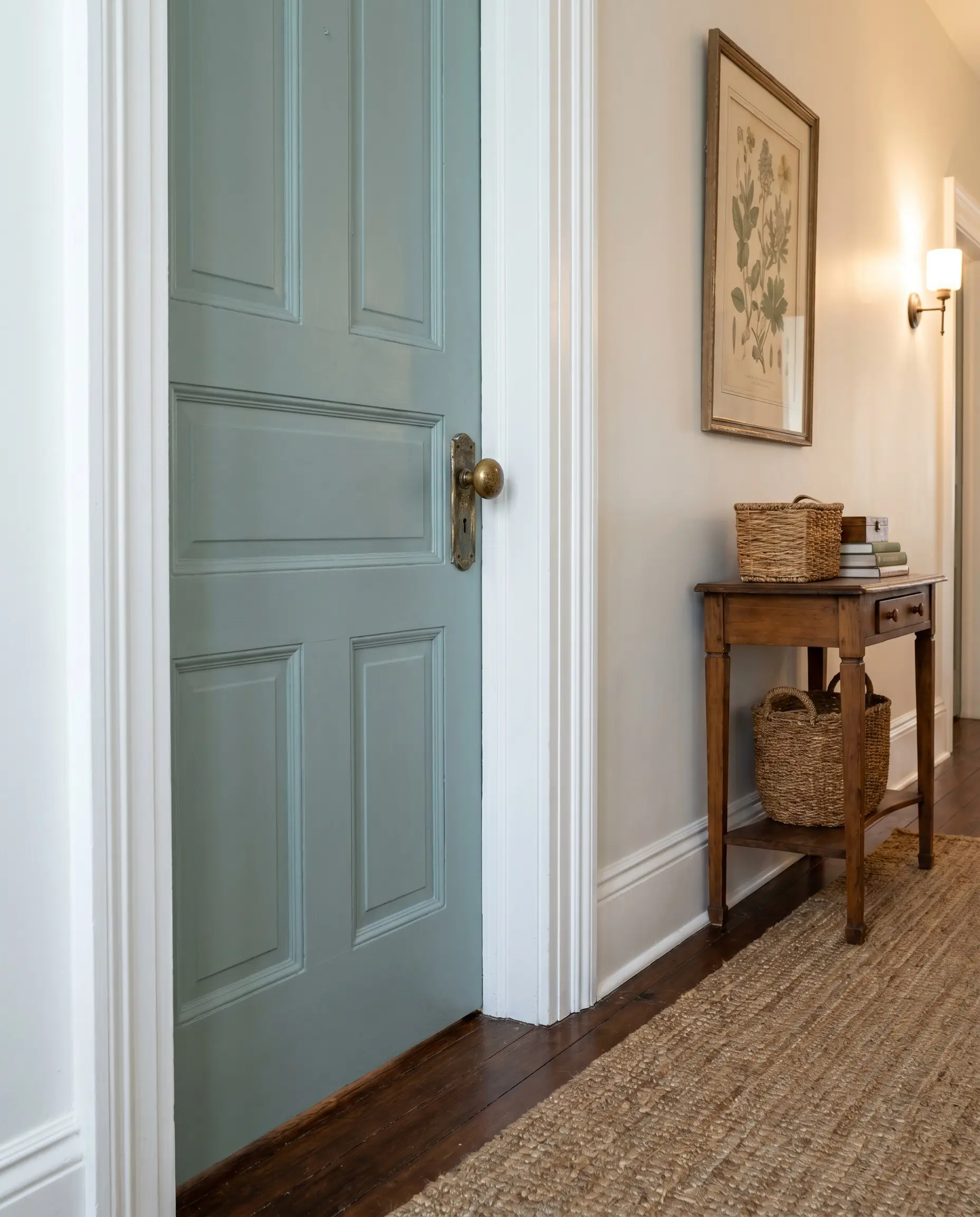
Interior doors are almost always ignored, but painting a hallway door in this dusty seafoam creates a brilliant transition zone. Because of its LRV, the color is dark enough to hide daily fingerprints but soft enough to avoid looking like a dark void. When paired with unlacquered brass doorknobs, the cool cyan-gray base creates a stunning, high-contrast tactile collision.
The Curated Backdrop
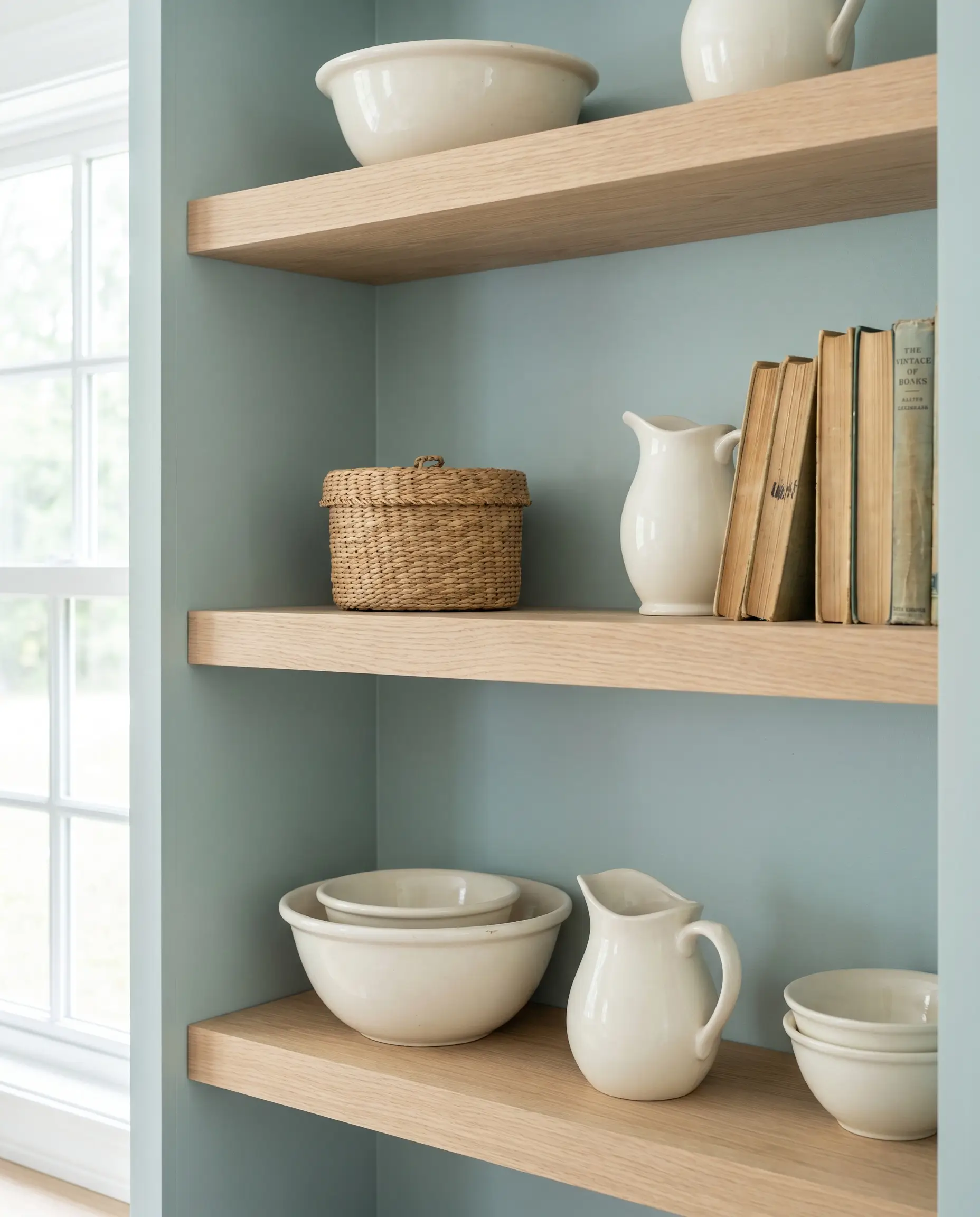
If you have basic built-in bookcases or open shelving, painting just the back interior panel in this hue adds profound depth to the room. The muted teal acts as a phenomenal shadow box for displaying ironstone pottery, woven baskets, or vintage books. It allows the objects to pop forward visually, turning standard shelving into a highly curated focal point.
Hardware, Wood & Material Pairings
The secret to styling this mid-tone blue-green is leaning into its organic, weathered nature. You want to surround it with tactile elements that either ground its airy qualities or reflect light to enhance its crispness.
Coordinating Colors
When dealing with mid-tone colors like this, your trim choice dictates the entire vibe. To force the blue-green to look as clean and vibrant as possible, pair it with a stark, un-tinted white like Benjamin Moore Chantilly Lace OC-65 or Sherwin-Williams High Reflective White SW 7757.
Hackrea Pro-Tip (Crisp Boundaries)
Designer Mood Boards
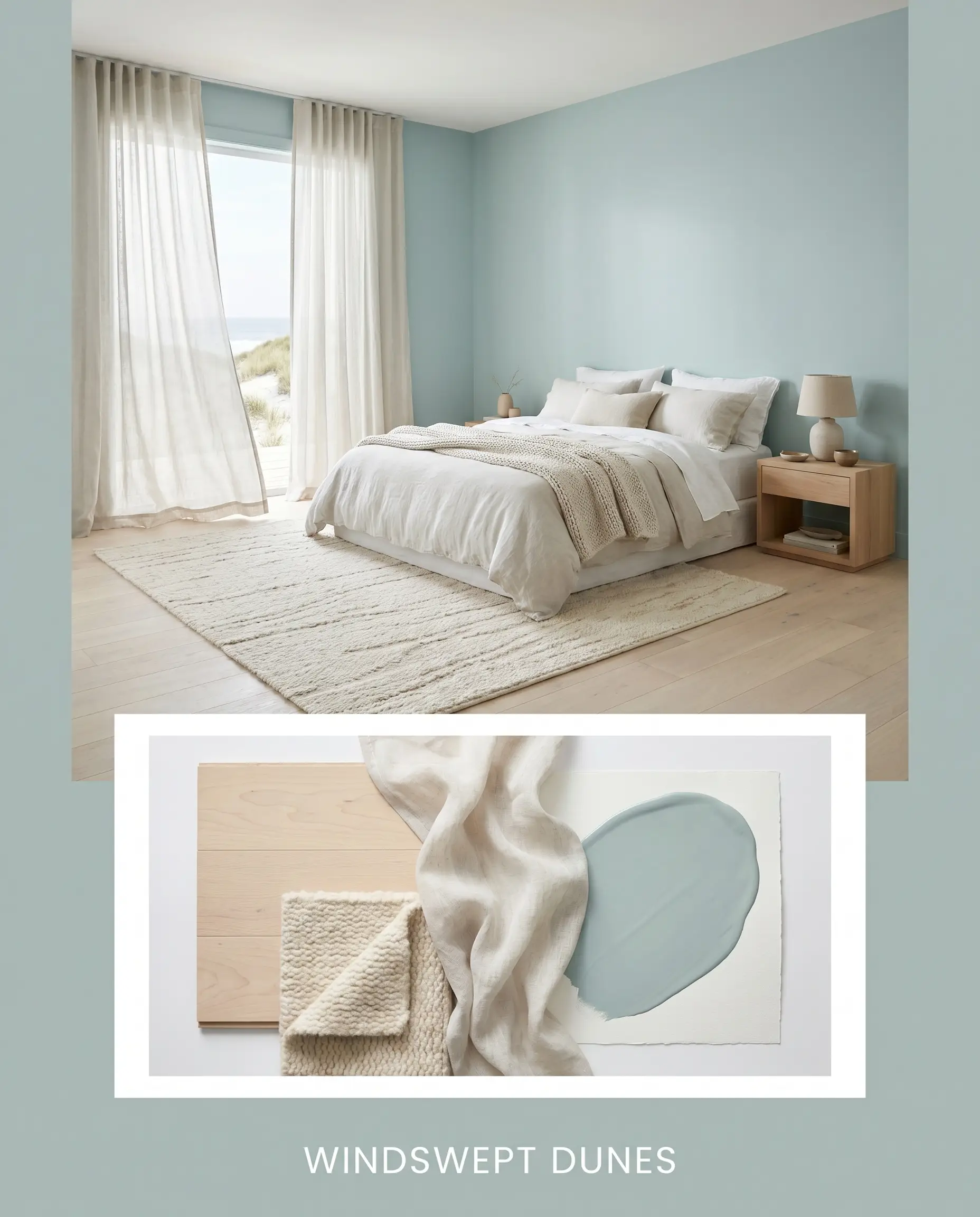
Windswept Dunes This palette captures the essence of a quiet morning on the coast without relying on nautical clichés. Imagine the muted teal walls acting as a soft backdrop for pale birch flooring, a chunky natural wool rug, and sheer linen drapery blowing in the breeze. The energy is entirely restorative, relying on soft textures and low-contrast transitions to create a sanctuary of calm.
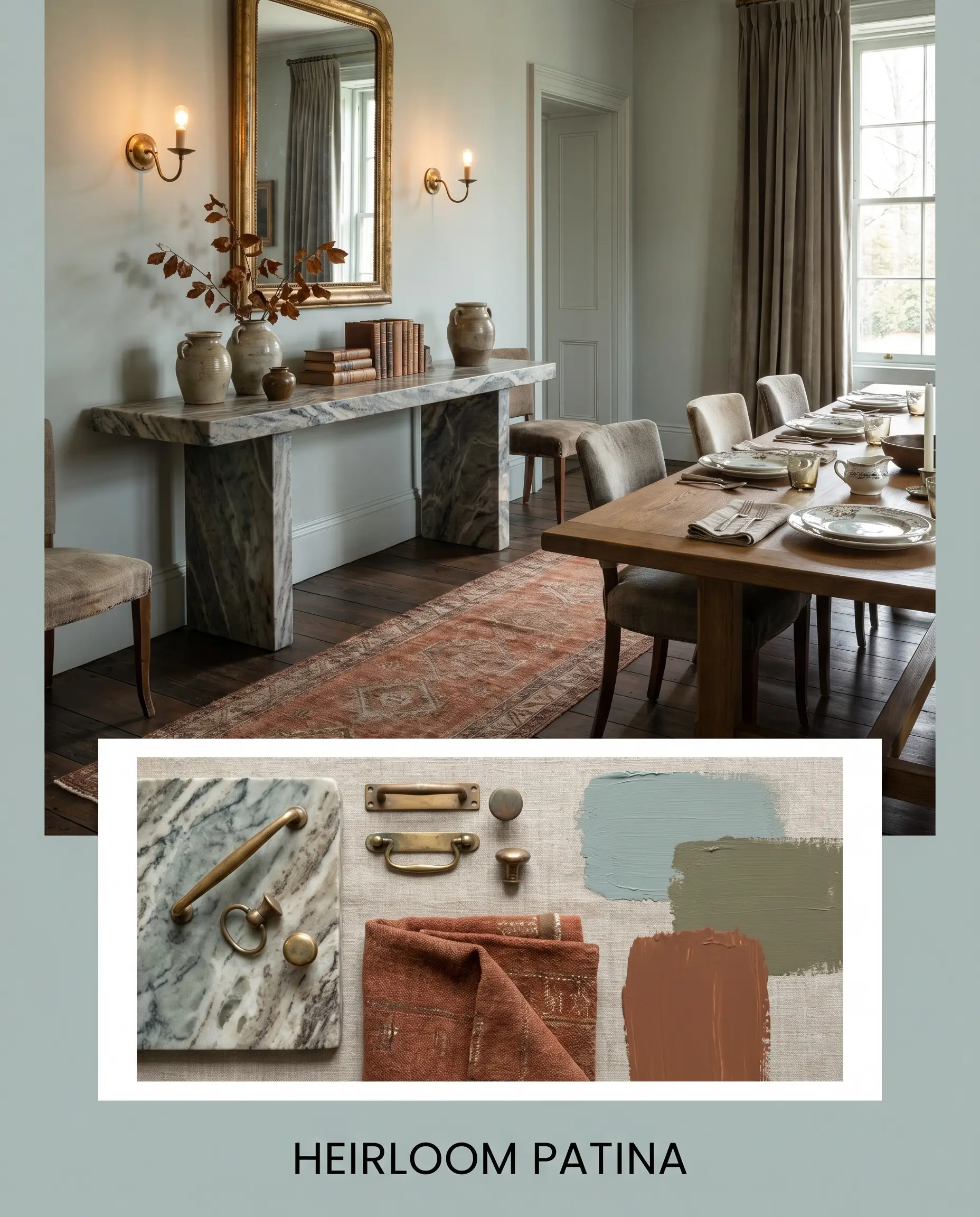
Heirloom Patina Here, we lean into the historic, dusty qualities of the paint’s gray undertone. We pair the walls with heavily veined soapstone, aged unlacquered brass sconces that have naturally tarnished over time, and a vintage runner featuring deep rust and terra cotta threads. The mood is collected, grounded, and deeply personal, proving that blue-green can feel incredibly traditional.
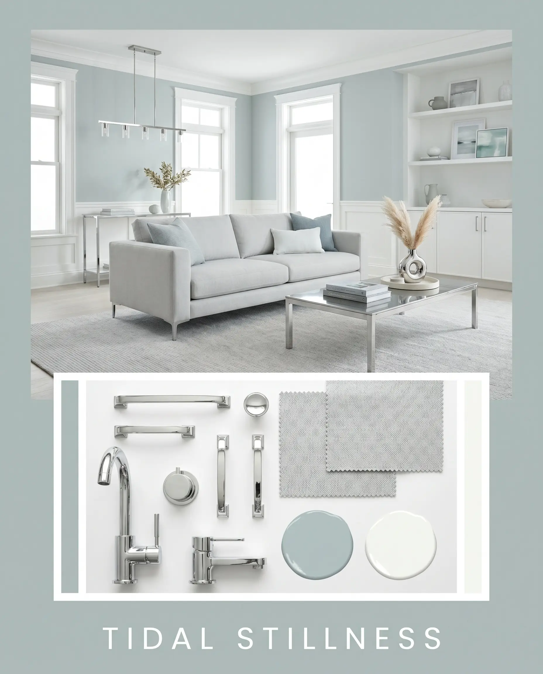
Tidal Stillness This approach is sleek, tailored, and highly modern. The mid-tone walls are sharply contrasted by brilliant white trim, polished chrome fixtures, and a sleek, low-profile sofa in a pale gray performance fabric. By eliminating heavy wood tones and relying on reflective metals, the space feels crisp, energizing, and effortlessly clean.
Head-to-Head Comparisons
When you are standing in the paint aisle, the subtle differences in undertones become critical. Here is how this hue stacks up against its closest rivals.
Behr Watery vs. Sherwin-Williams Sea Salt SW 6204
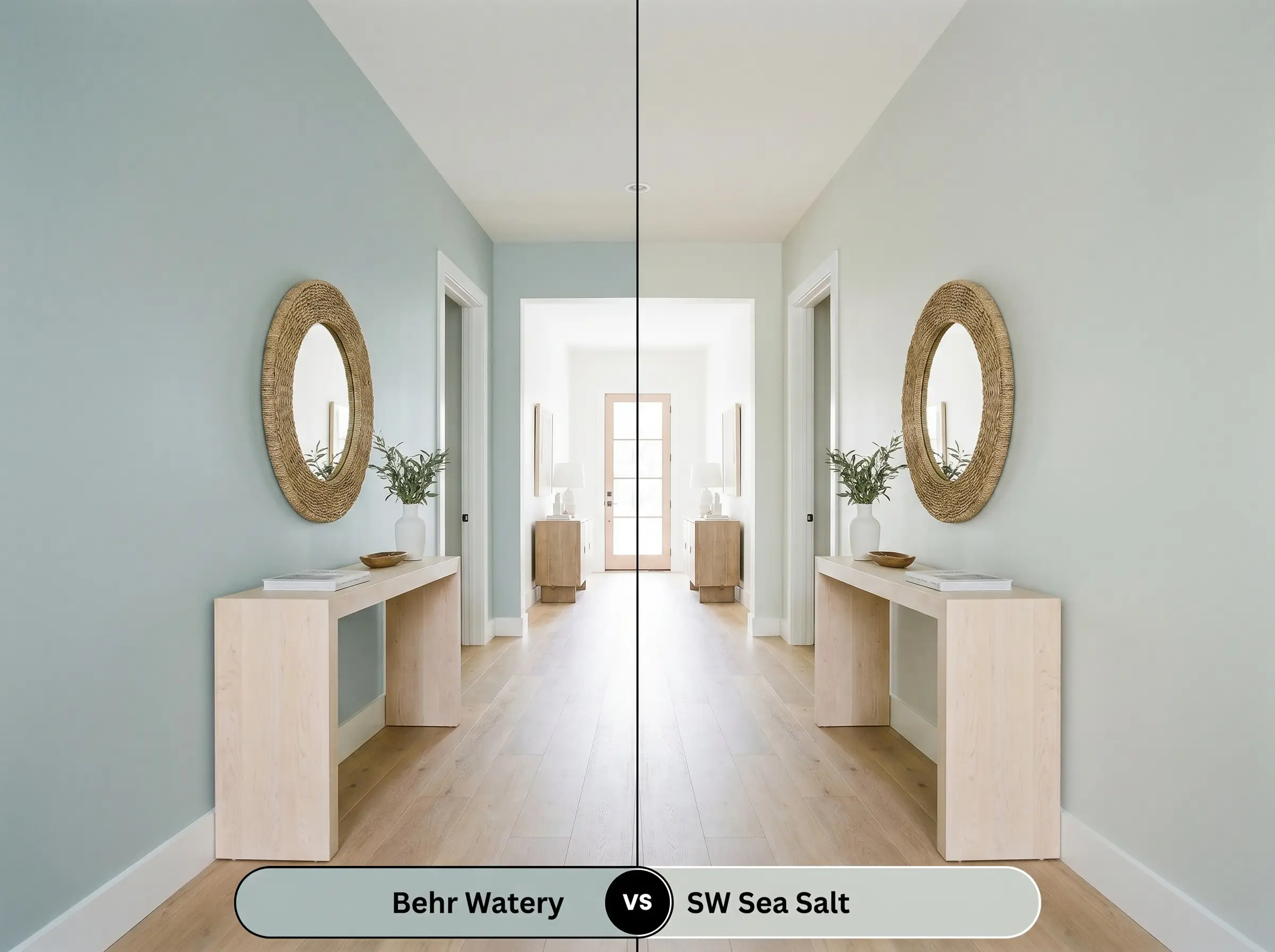
Sea Salt is a legendary chameleon, but it is fundamentally a green-gray that occasionally flashes blue. Behr’s version is the exact opposite—a blue-green that flashes gray. If your room lacks natural light, Sea Salt can sometimes wash out into a pale, vague silver, whereas the Behr option has enough pigment depth (LRV 49) to hold its aquatic identity firmly on the wall.
Behr Watery vs. Benjamin Moore Palladian Blue HC-144
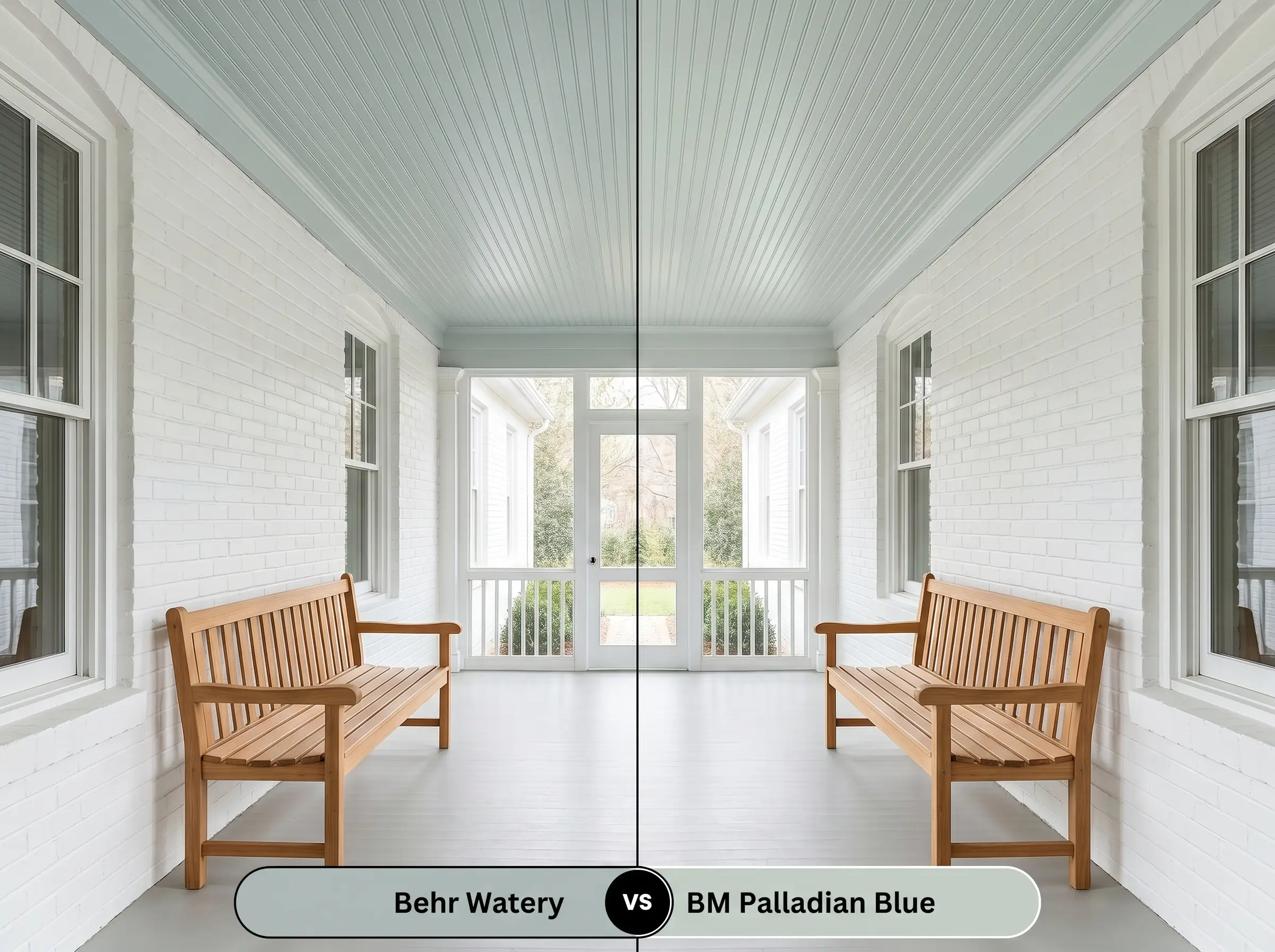
Palladian Blue is noticeably cleaner, brighter, and slightly more vibrant. It lacks the heavy, dusty gray shadow that gives the Behr color its weathered, muted appeal. If you want a cheerful, classic southern porch ceiling, Palladian Blue is the winner; if you want a sophisticated, moody bedroom that feels a bit more grown-up, stick with the Behr.
Behr Watery vs. Sherwin-Williams Watery SW 6478
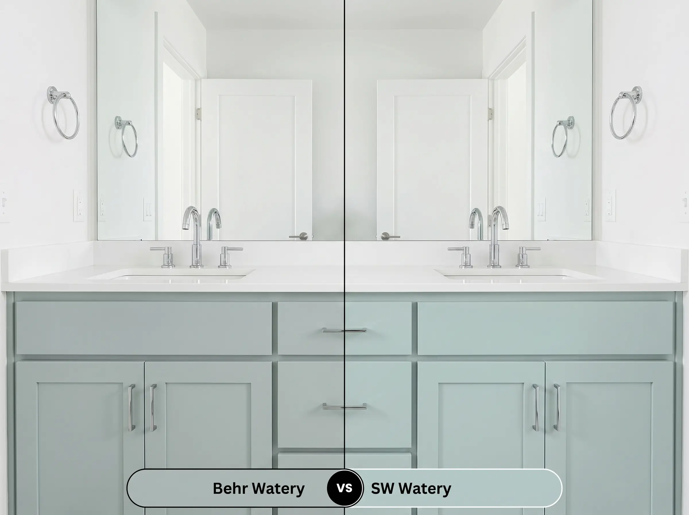
Despite sharing the exact same name, these two paints behave differently. The Sherwin-Williams iteration is a clearer, more straightforward blue with less green interference. The Behr version leans much harder into its seafoam and gray roots. If you are terrified of your walls looking like a baby boy’s nursery, the Behr formulation offers the necessary muddy undertones to keep the design feeling mature.
Similar Colors to Behr Watery
If you love the general energy but need a slight adjustment in depth or temperature, consider these alternatives.
Practical Application & DIY Advice
Executing a flawless paint job requires understanding how the color’s specific DNA interacts with your chosen materials.
Frequently Asked Questions
Because an LRV of 49 absorbs a fair amount of light, it holds its color beautifully outdoors without washing out into a blinding white. However, the heavy texture of stucco will create deep micro-shadows, which will amplify the gray undertones, making the paint look noticeably darker and more muted than it does on a smooth interior wall.
It absolutely can if the artificial lighting is poor. Without natural daylight to activate the vibrant blue-green notes, the gray base takes over, and under harsh fluorescent or dim amber lights, the space can feel heavy and enclosed. To prevent this, use 4000K LED bulbs to keep the color crisp and energizing.
No, they actually create a beautiful complementary balance. The warm, slightly orange-red tones of the oak flooring sit opposite the cool blue-green on the color wheel, meaning they naturally enhance one another. The 3000K lighting provides just enough warmth to bridge the gap between the cool walls and the warm floor.
Yes, it is a phenomenal alternative for a more sophisticated, weathered look. While traditional haint blues are often very bright and sky-toned, the dusty gray and seafoam notes in this paint provide a historic, grounded feel that honors the southern tradition without looking overly vibrant.
Final Verdict & Expert Warnings
Behr Watery is a masterclass in restrained, sophisticated color formulation. It is the absolute perfect choice for the homeowner who craves the serene, restorative energy of the coast but fiercely wants to avoid the predictable, overly bright pastels found in typical beach-themed decor. Its mid-tone depth and dusty gray shadow make it incredibly versatile, allowing it to anchor a sleek, modern bathroom vanity just as beautifully as it softens the walls of a historic, transitional bedroom.
However, this color requires careful contextual planning. You must actively avoid pairing this muted teal with heavy, cherry-toned wood furniture or rich, Tuscan-red terracotta floor tiles. The intense, dark red-orange pigments in those materials will violently clash with the cool cyan base, making the paint look sickly and the wood look unnaturally orange. Furthermore, avoid using heavily yellowed, creamy trim paints; the yellow will pull the green undertone out of the walls in an unflattering, swampy way. Stick to clean whites, pale woods, and crisp metals to let this beautiful, subdued aquatic hue truly shine.