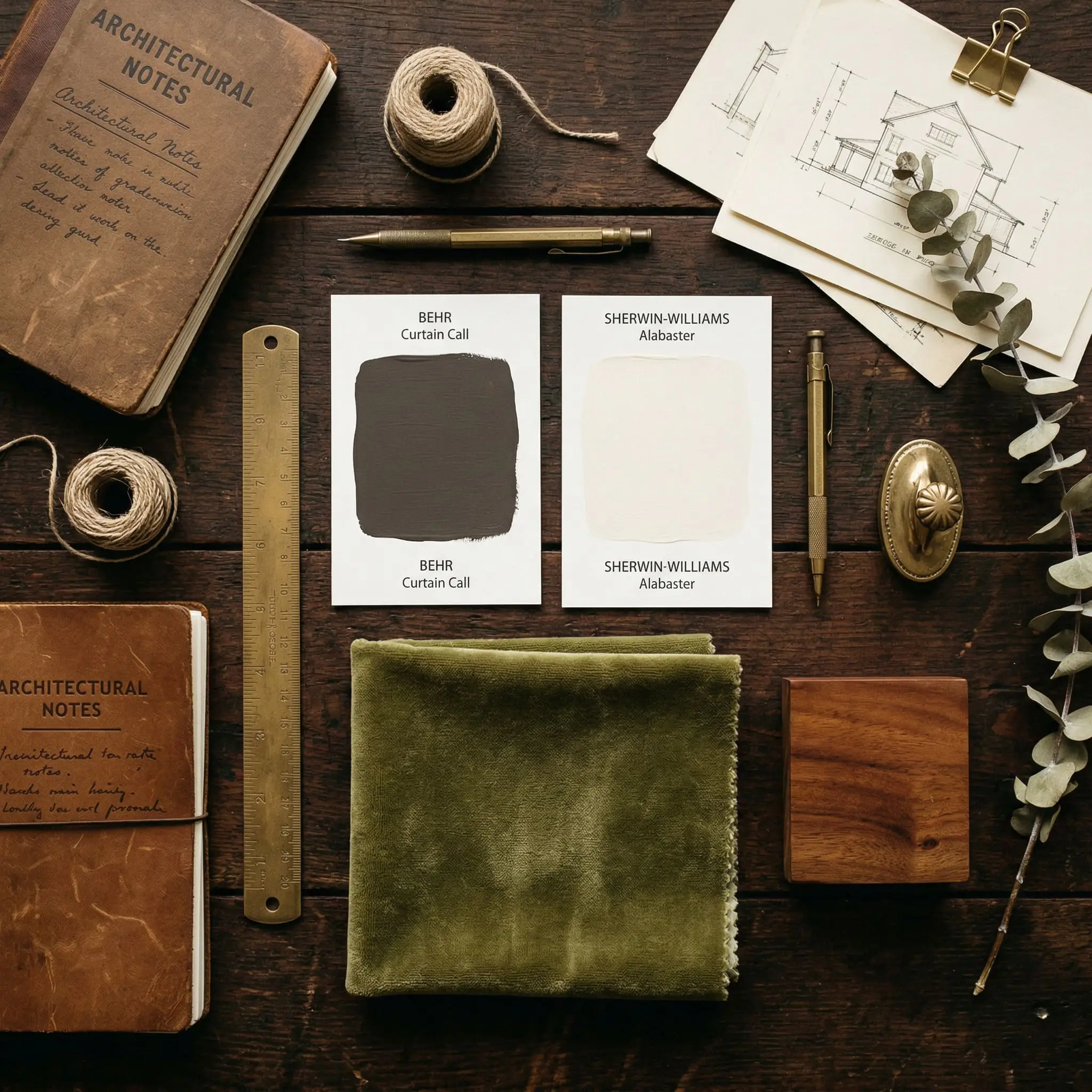
Curtain Call N570-5
BehrBehr Curtain Call (N570-5) is a velvety, dark plum-gray paint color with an LRV of 14. Depending on the lighting, it acts as a color-shifting chameleon, appearing as a warm taupe-brown in bright sunlight or a moody, cool purple-gray in shadowed spaces.
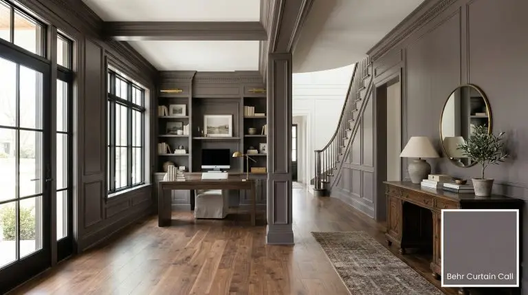
Behr Curtain Call N570-5 Review: The Ultimate Plum-Gray for Architectural Drama
| Best Exposures | South-facing, West-facing |
|---|---|
| Best For | Powder rooms, dining rooms, home theaters, primary bedrooms, cabinetry |
We hear the same panic from design enthusiasts every single week. You want a sophisticated, moody neutral that offers significantly more personality than a standard, sterile charcoal. But the moment you start looking at purples, a very specific fear sets in.
You are terrified of accidentally painting your living room the color of a 1990s cartoon dinosaur.
Let the color science put your mind at ease. Behr Curtain Call N570-5 is not a juvenile violet. It is a masterfully engineered taupe-gray that relies on a heavy, anchoring shadow to ground its plum undertones. This specific formulation ensures the color reads as a deeply sophisticated, velvety finish rather than a bright, chaotic purple.
If you are ready to introduce a muted, highly controlled dose of color into your home, this is how we manipulate this shade to perfection.
The Color DNA: Undertones & LRV
To understand why this paint works, we have to look at the math dictating its behavior. Hex #70666a sits firmly in the red-violet spectrum, but its muted nature comes from a tightly restricted color chroma.
With an Light Reflectance Value of 14, this shade absorbs a massive amount of light.
Because of its low LRV, this paint acts as a deep, dramatic backdrop that will actively recede into the shadows. It requires a highly intentional lighting strategy to prevent the room from feeling like a cavernous void.
You can apply wallpapers, paints, etc. on walls and see how they look in various interiors.

Lighting Effects & The Chameleon Factor
The fastest way to ruin a room is to ignore how natural light chemically alters a paint’s undertone. This color-shifting shade is notoriously reactive to its environment.
If you do not test this paint in your specific lighting conditions, you risk the plum undertones flattening out into a muddy, lifeless brown.
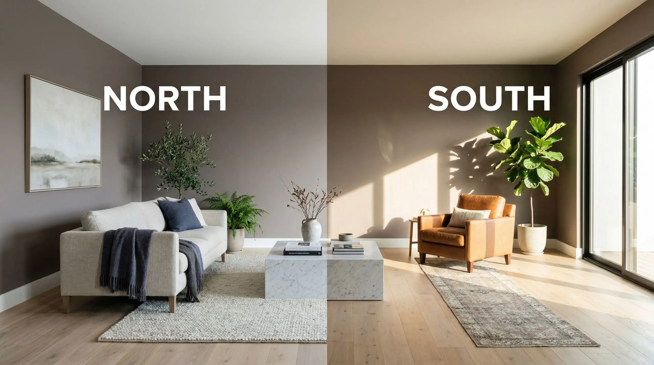
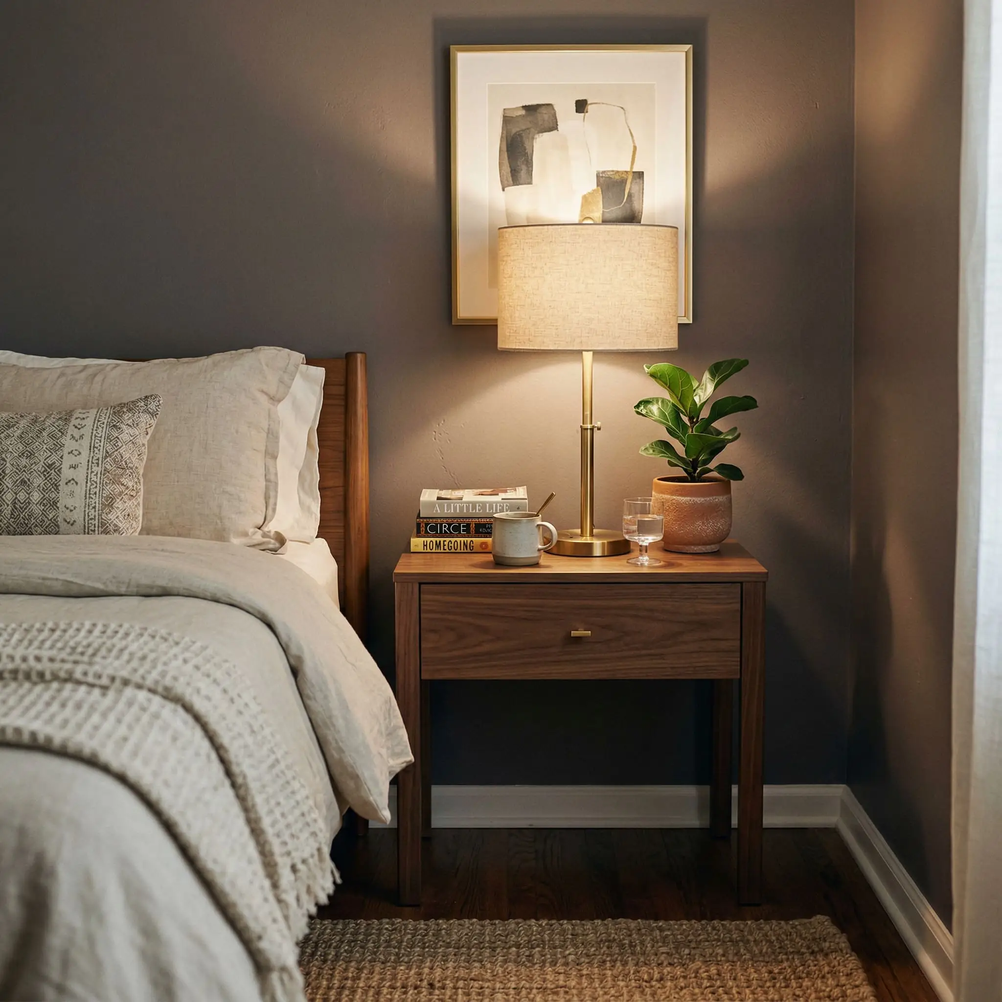
To keep the plum undertones from turning into a muddy brown at night, you must layer your lighting. Rely heavily on ambient lighting via wall sconces and picture lights rather than a single, harsh overhead fixture.
Hackrea Pro-Tip
Popular Room Applications
This is not a versatile, slap-it-everywhere builder-grade neutral. It is a highly specific, dominant architectural color. If you use it in a room with zero natural light and no supplementary lighting plan, it will fail. But when deployed in the right spaces, it creates undeniable architectural drama.
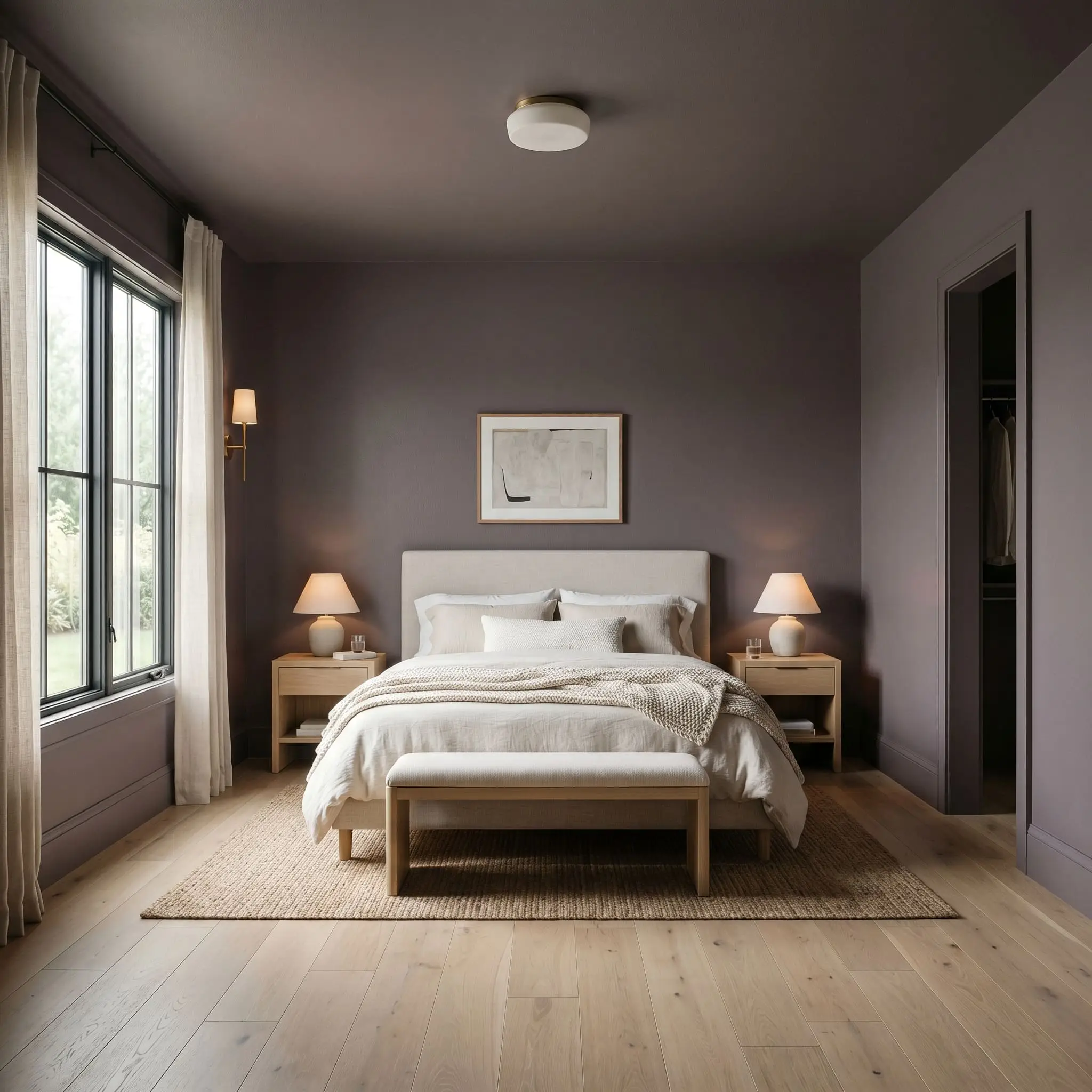
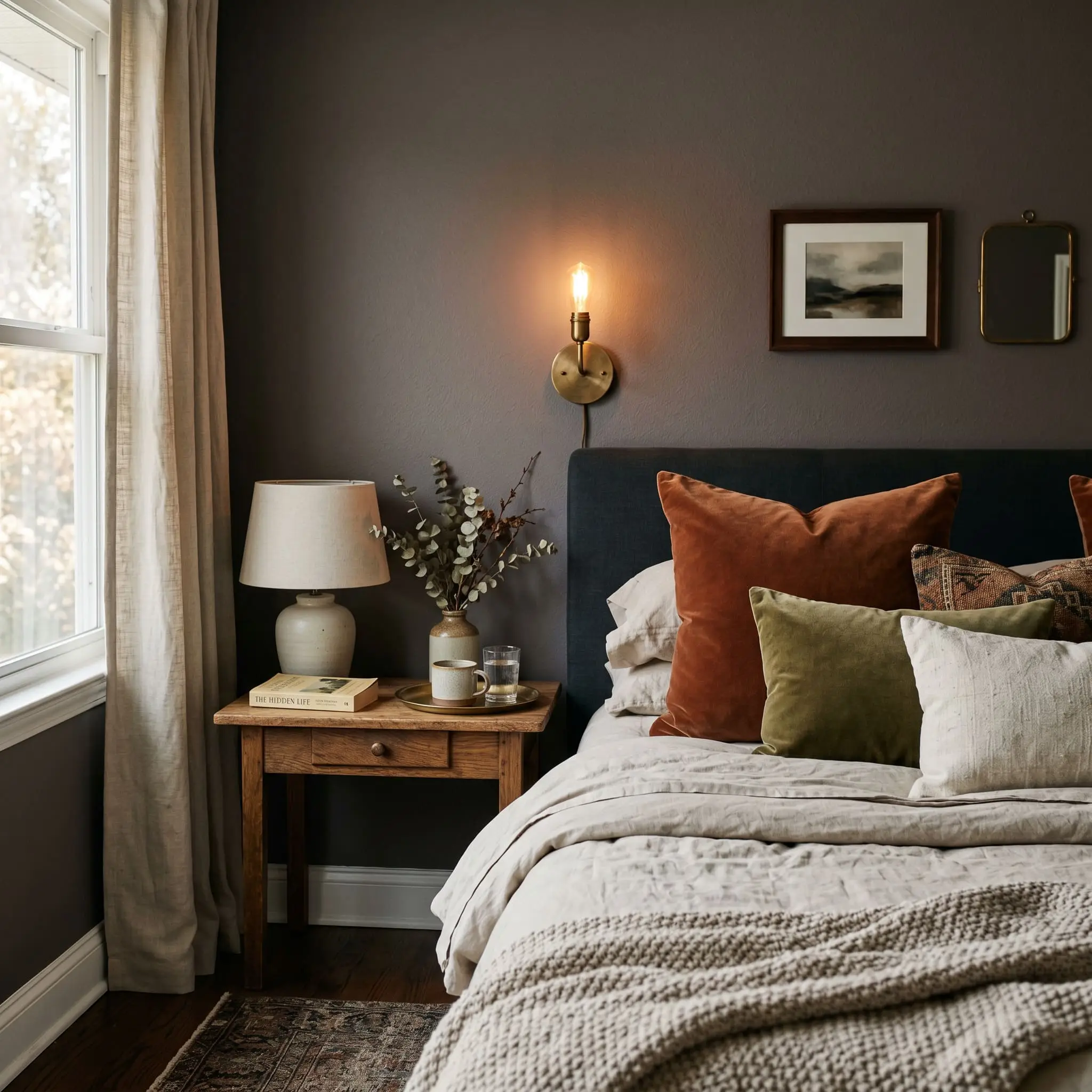
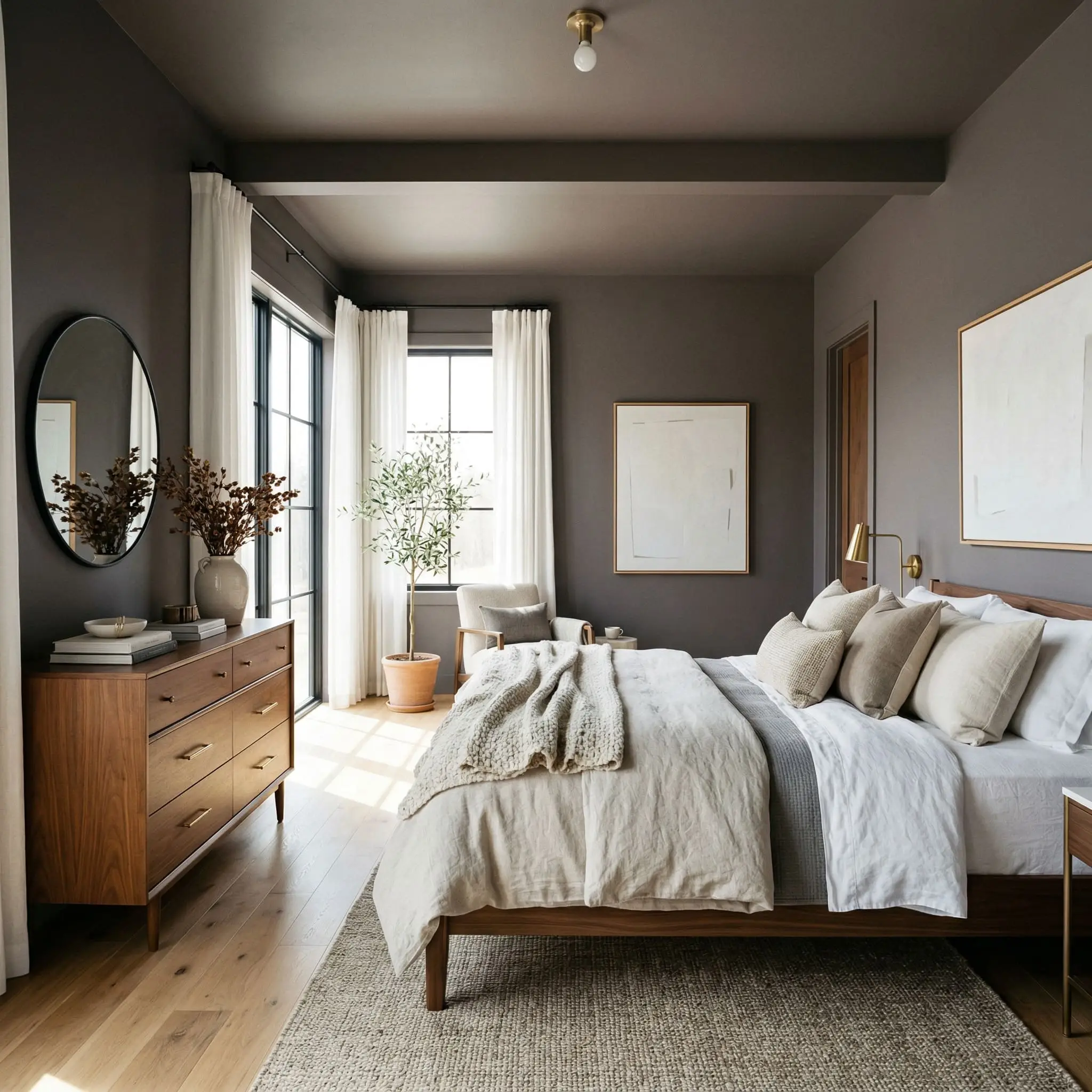
Primary Bedrooms
A bedroom should not feel like a sterile hospital waiting room. We frequently use deep taupe-grays to forcefully lower the visual temperature of a sleeping space. When exploring moody bedroom colors, this shade excels when color-drenched across the walls, baseboards, and ceiling. By erasing the visual contrast of white trim, the room transforms into a seamless, cocoon-like retreat.
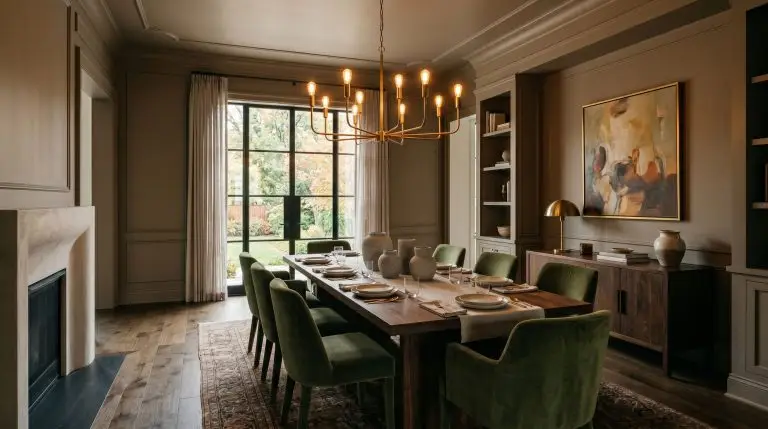
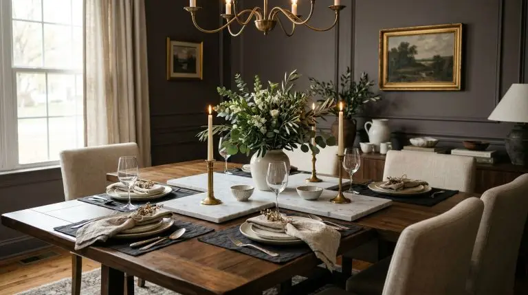
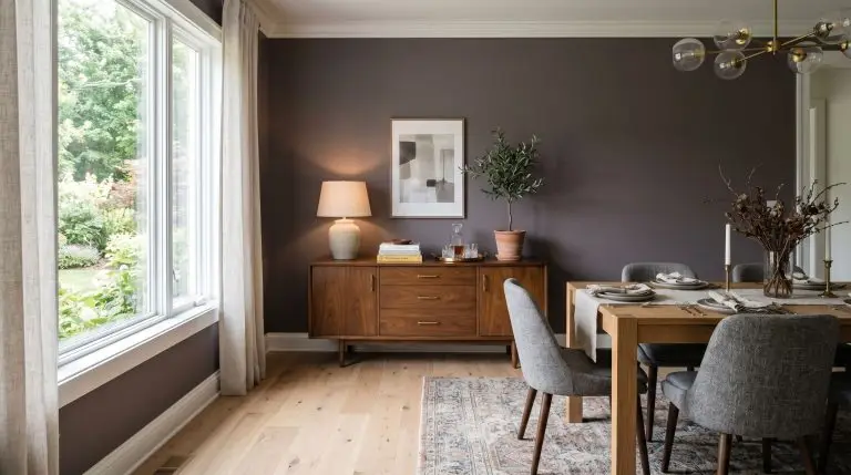
Formal Dining Rooms
Dining rooms are inherently transient spaces; you use them for a few hours at a time, usually in the evening. This gives you permission to go dark. In a dining space, this plum-gray thrives under the warm glow of a low-hanging brass chandelier. The low LRV absorbs the harsh edges of the room, allowing the dining table and the food to become the sole focal point.
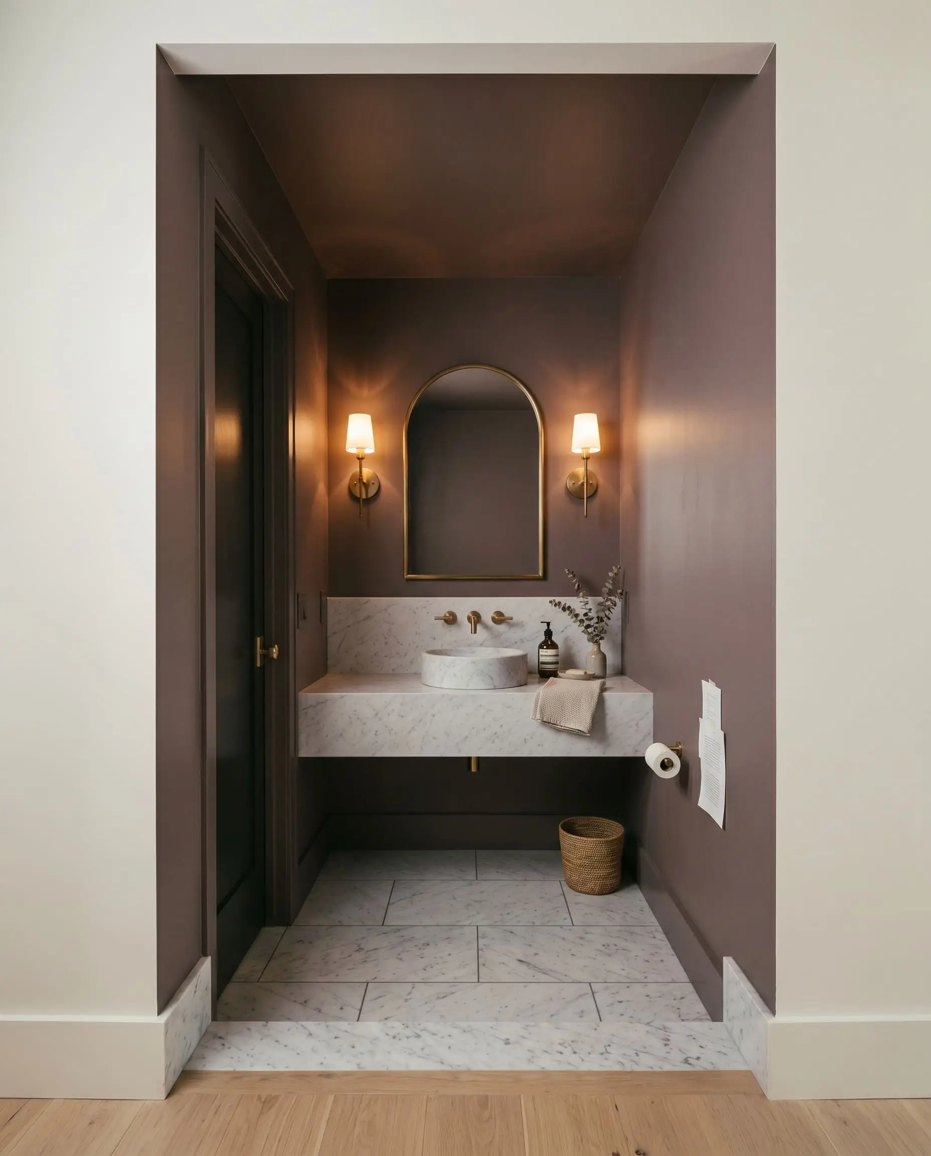
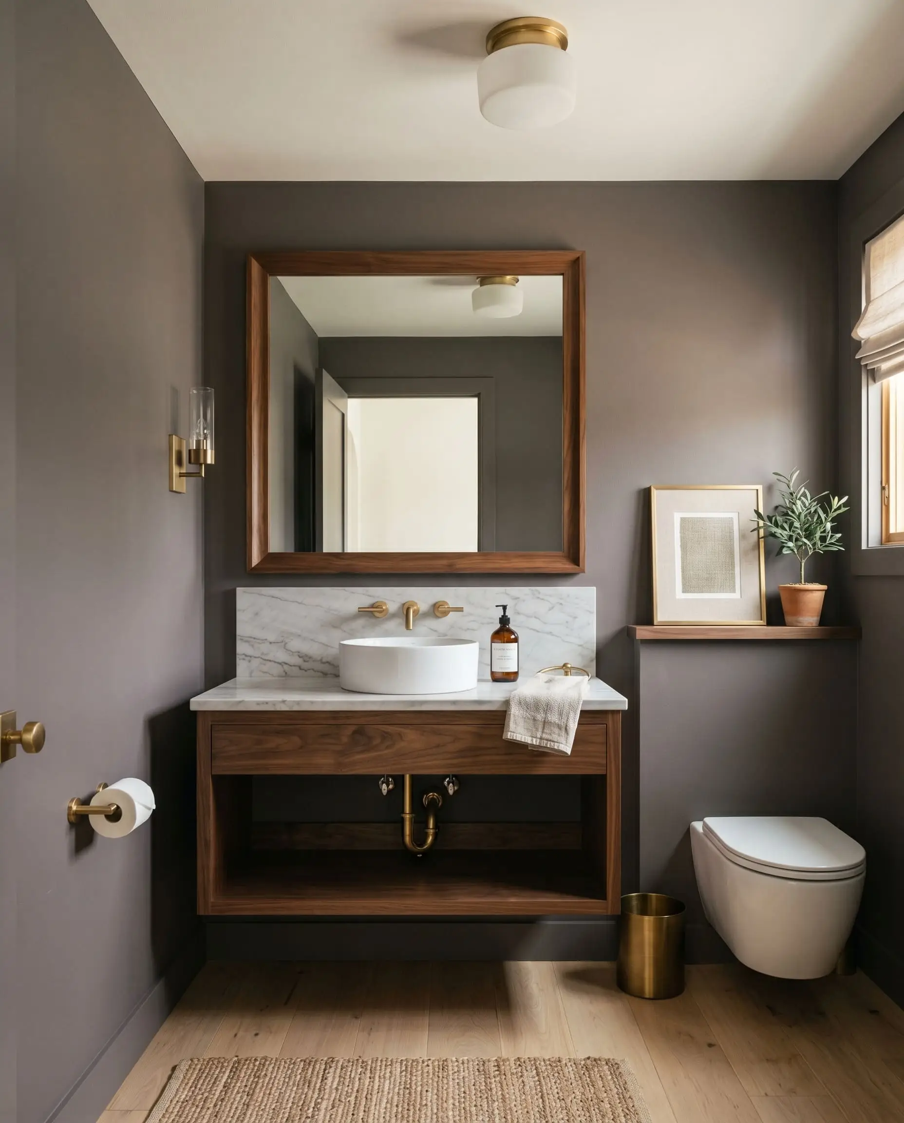
Powder Rooms
Powder rooms are the perfect laboratory for high-tension design. Do not try to make a windowless powder room look “bright and airy”—it is a mathematical impossibility. Instead, lean into the darkness. Painting the walls and ceiling in this deep shade creates a jewel-box effect that feels intensely intimate and expensive.
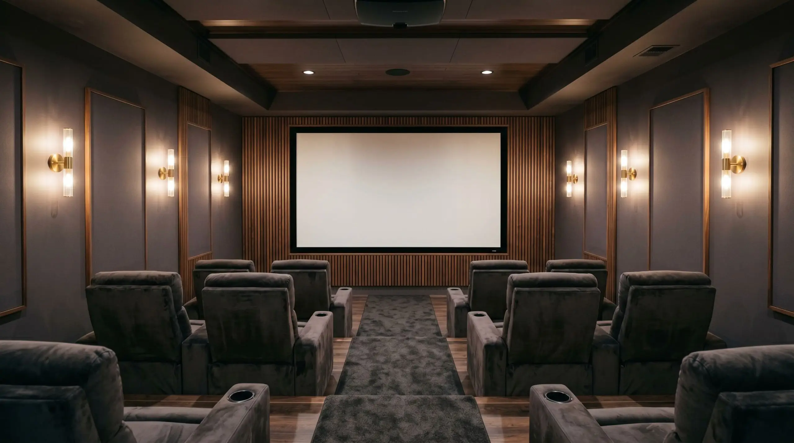
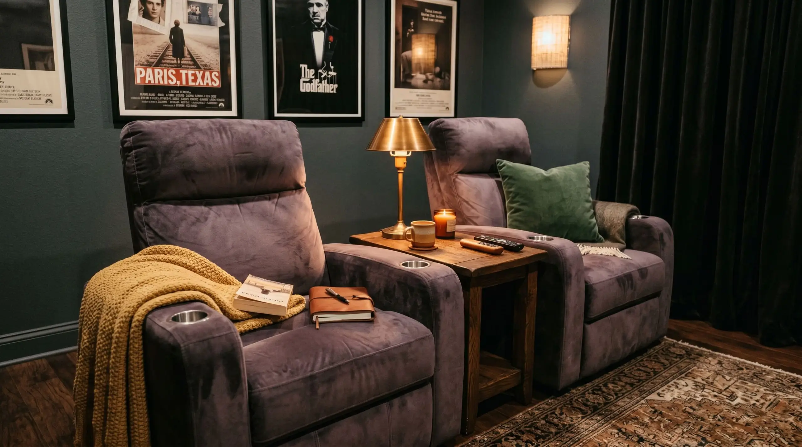
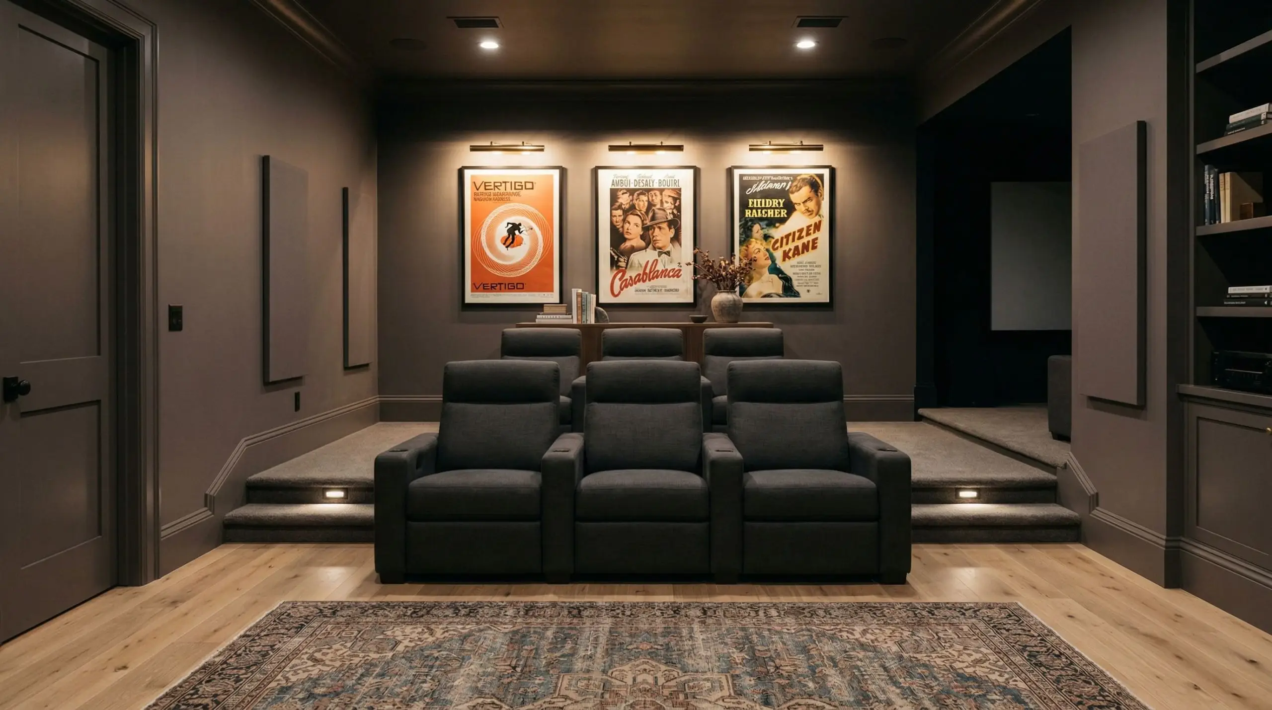
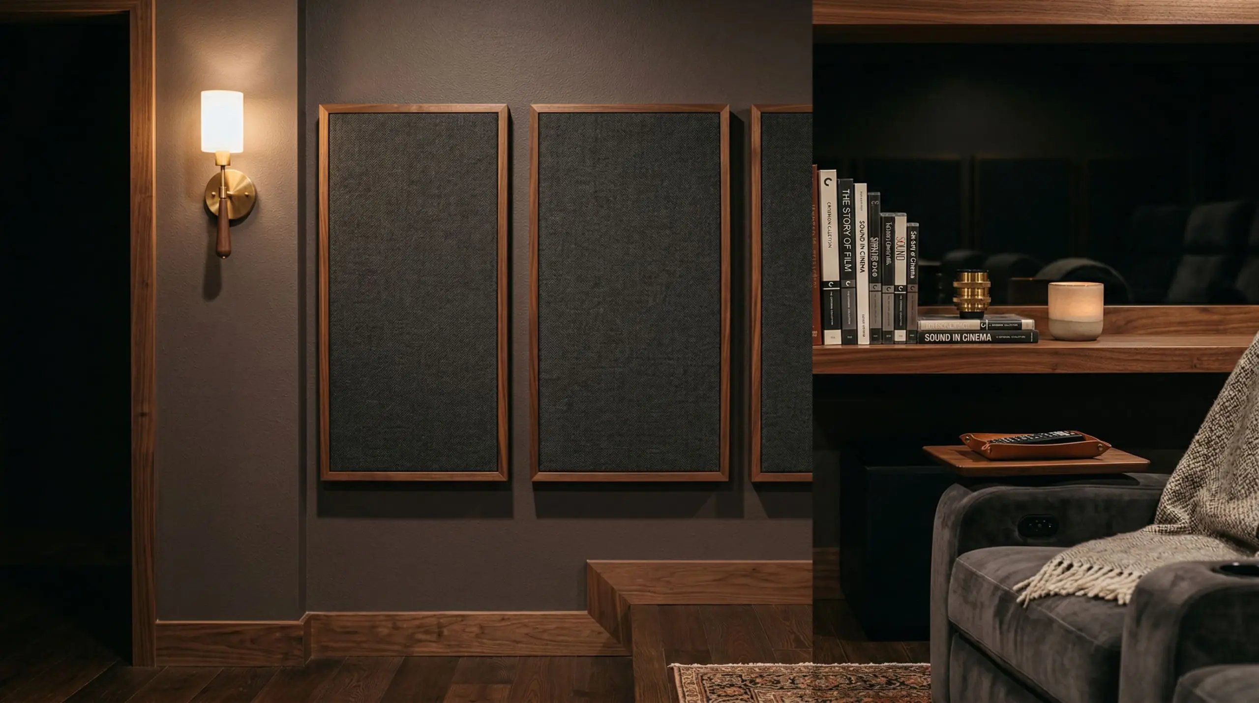
Home Theaters
If you are designing a media room, you need a paint that absorbs light scatter from the screen. While standard black is visually exhausting, a deep plum-gray provides the necessary light absorption while maintaining a subtle, luxurious undertone that feels intentional rather than industrial.
Signature Design Ideas & Inspiration
Moving beyond broad room applications, there are specific architectural features where this exact color DNA truly shines. These are the highly curated applications where the paint transitions from a mere wall covering into a tactile design element.
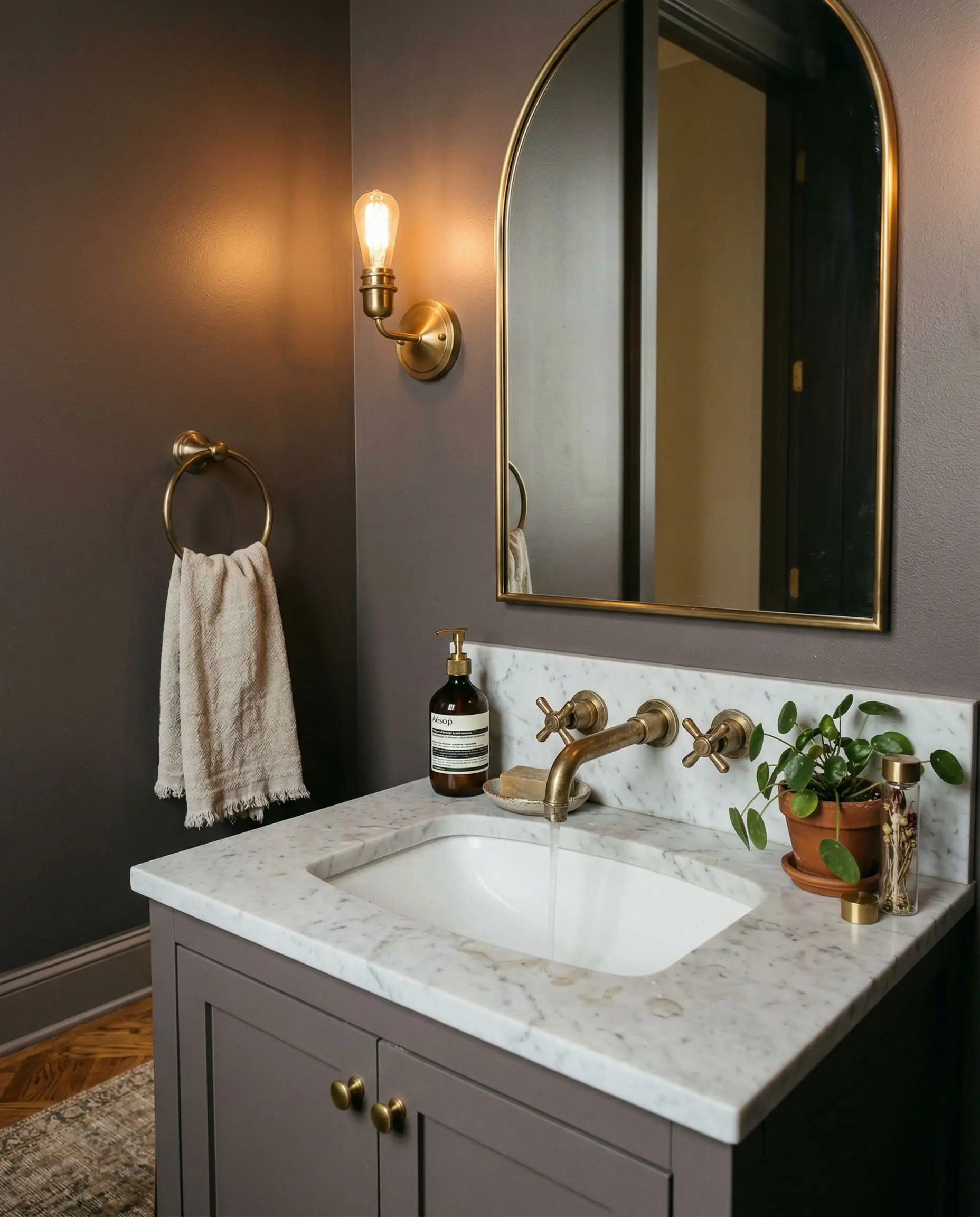
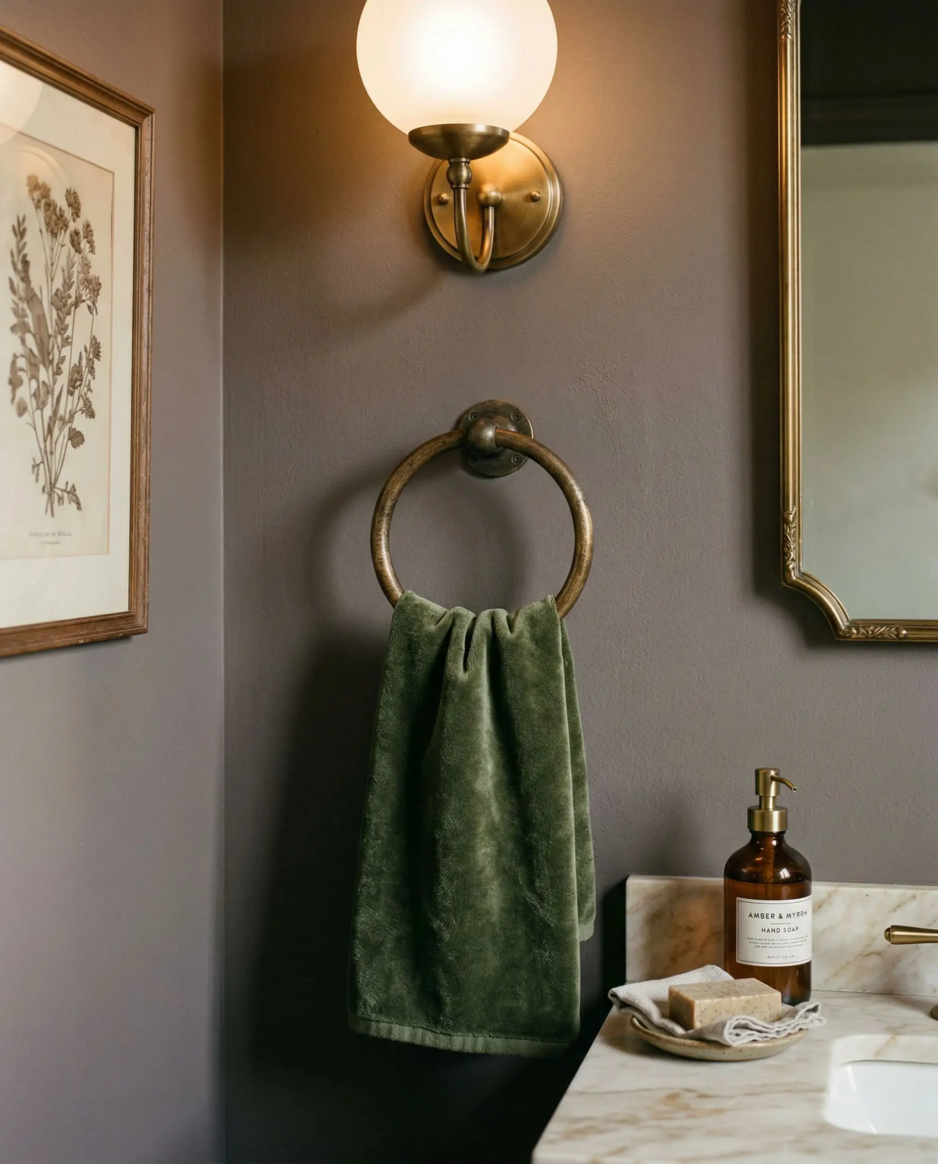
Vintage Bathroom Vanities
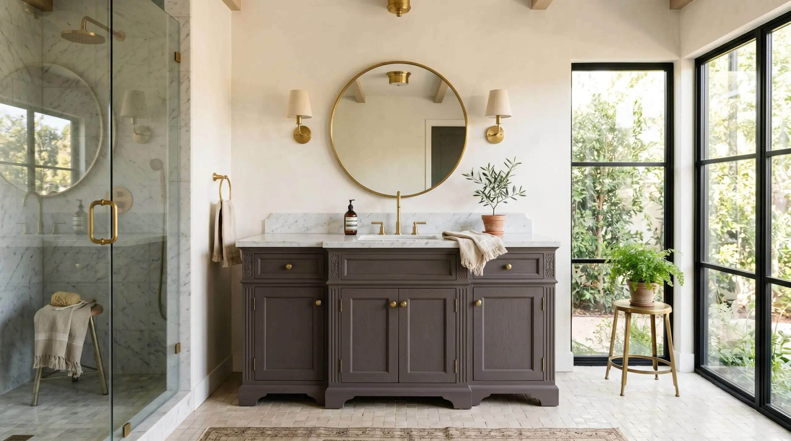
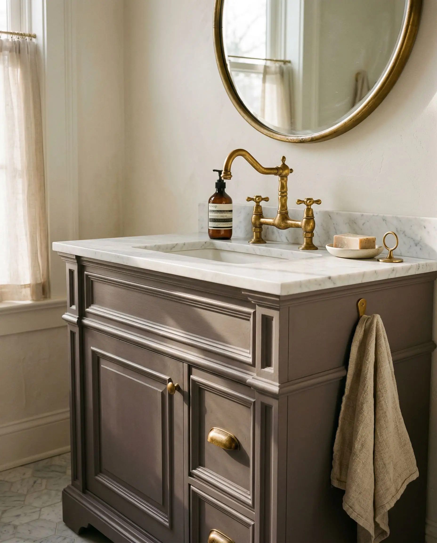
There is an undeniable magic that happens when you pair a velvety finish with raw, living metals. Painting a vintage, heavily milled bathroom vanity in this shade completely modernizes the piece without erasing its history.
The cool, muted plum tones of the wood aggressively contrast against the warm, golden reflection of unlacquered brass hardware. As the brass patinas over time, the visual tension between the metal and the paint only grows stronger.
Hackrea Sensorial Secret
Wainscoting and Formal Millwork
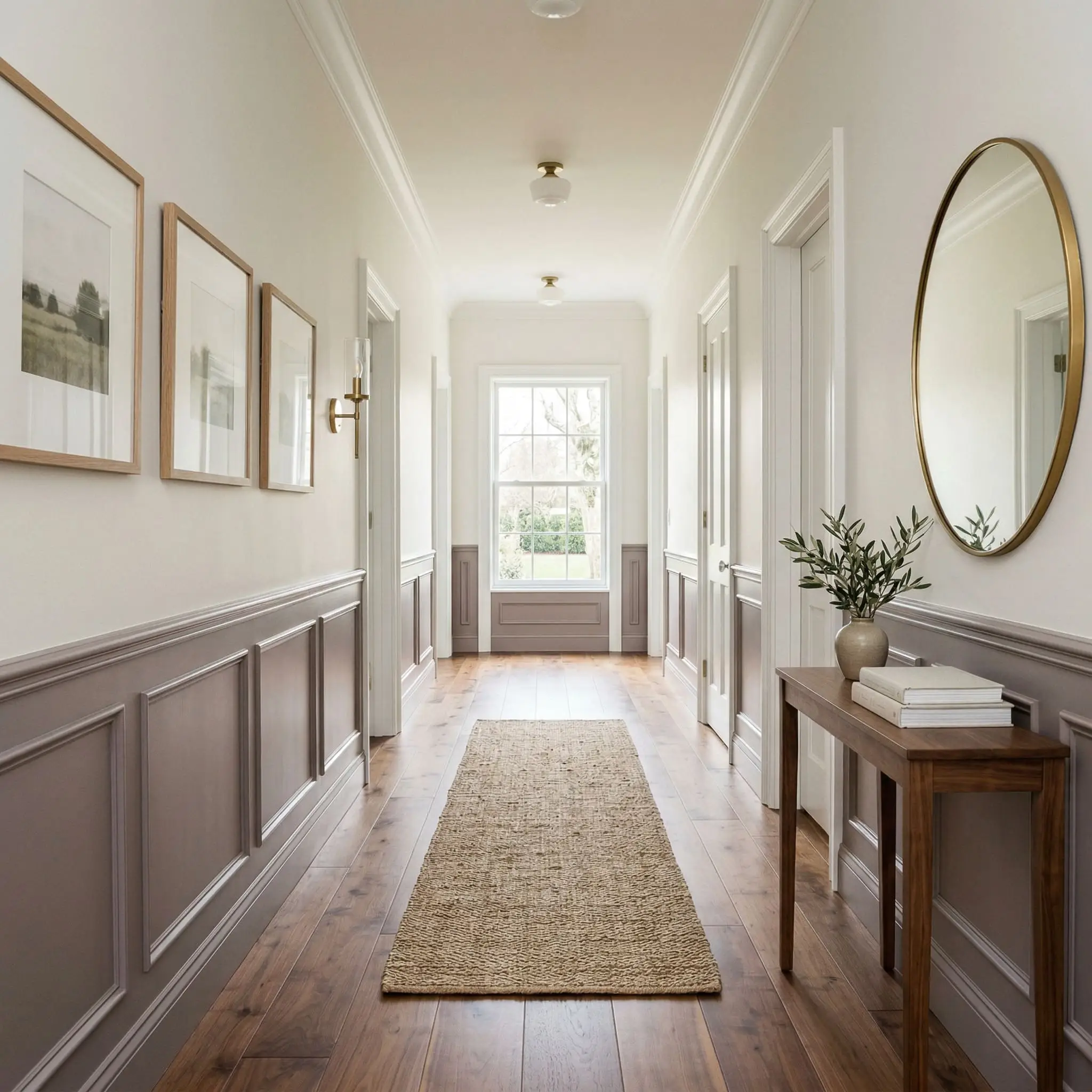
If color-drenching an entire room feels too oppressive, you must rely on architectural grounding. Applying this dark taupe-gray to the lower third of a room via wainscoting or beadboard anchors the space.
By keeping the heavy visual weight near the floor, you create a striking foundation. If you fail to pair this with a crisp, high-reflectance white on the upper walls, the room will lose its necessary structural tension and look top-heavy.
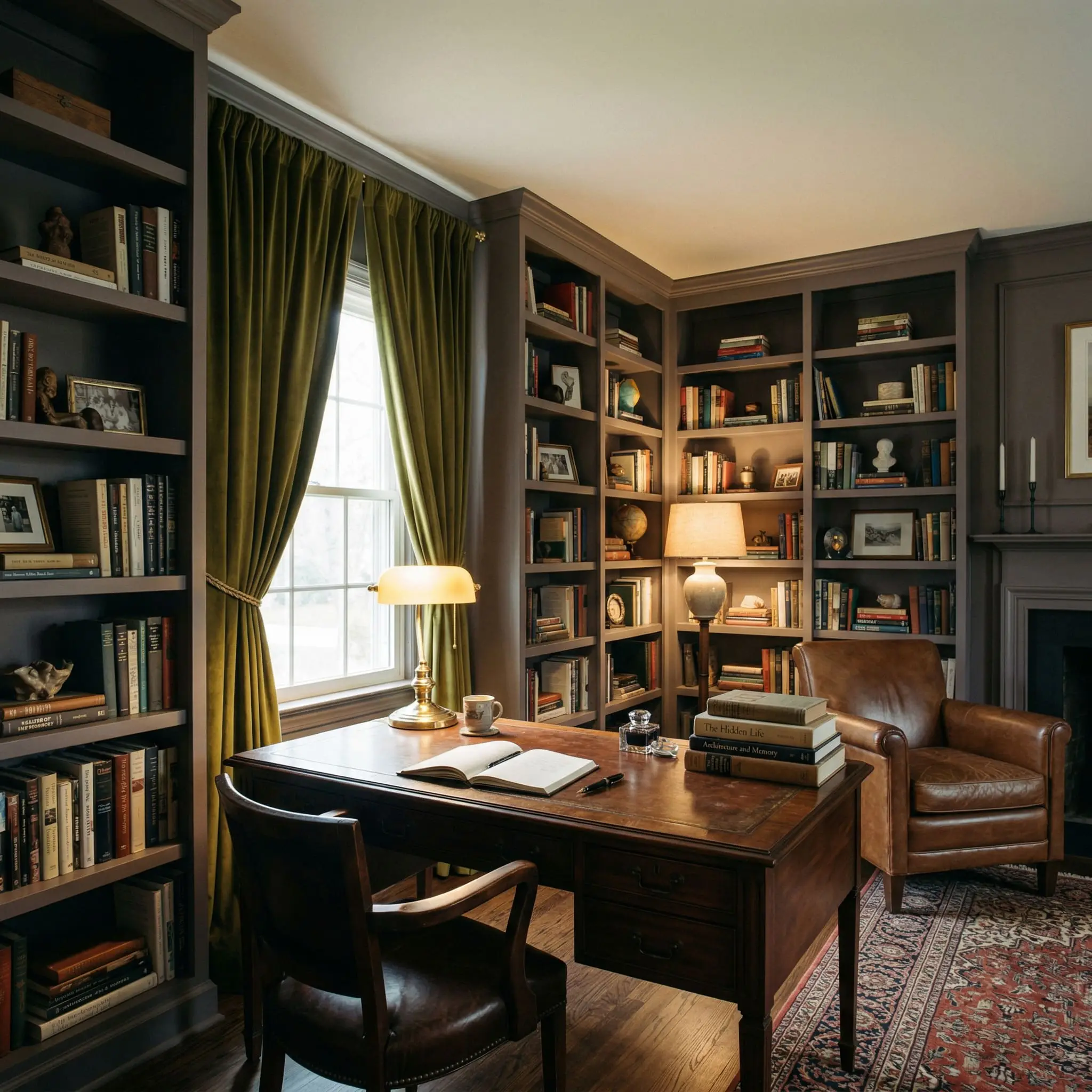
The Dark Academia Home Office
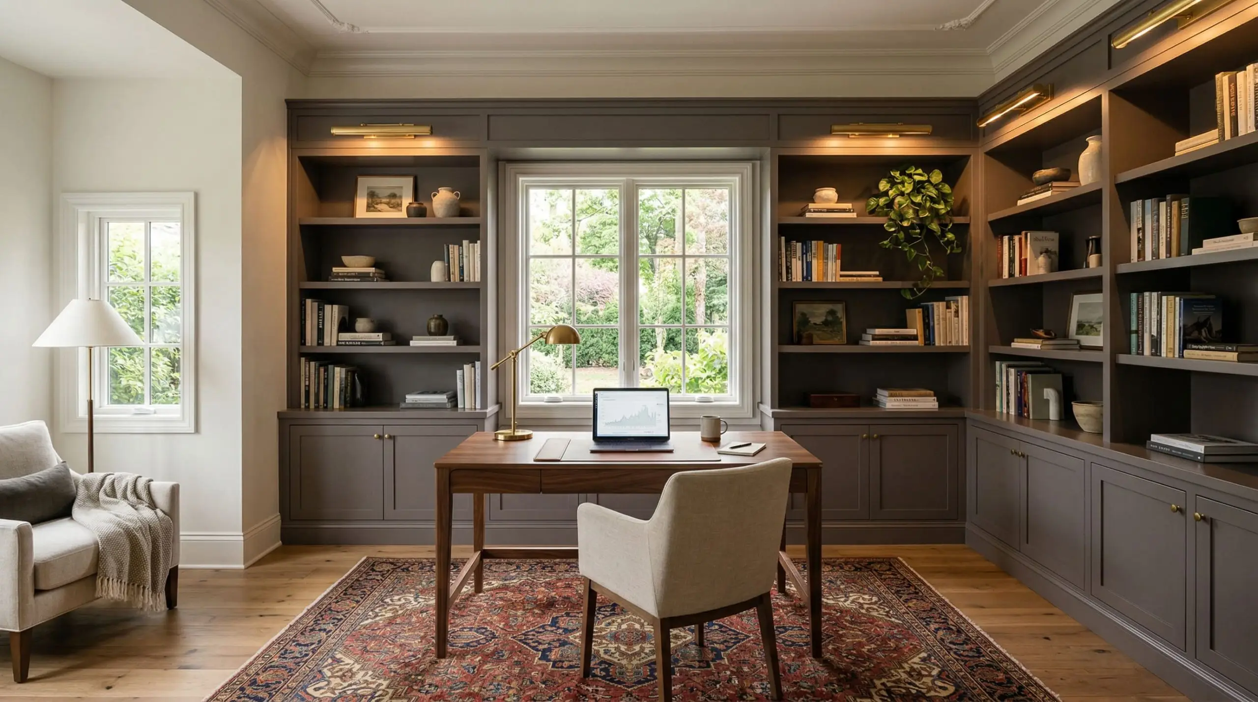
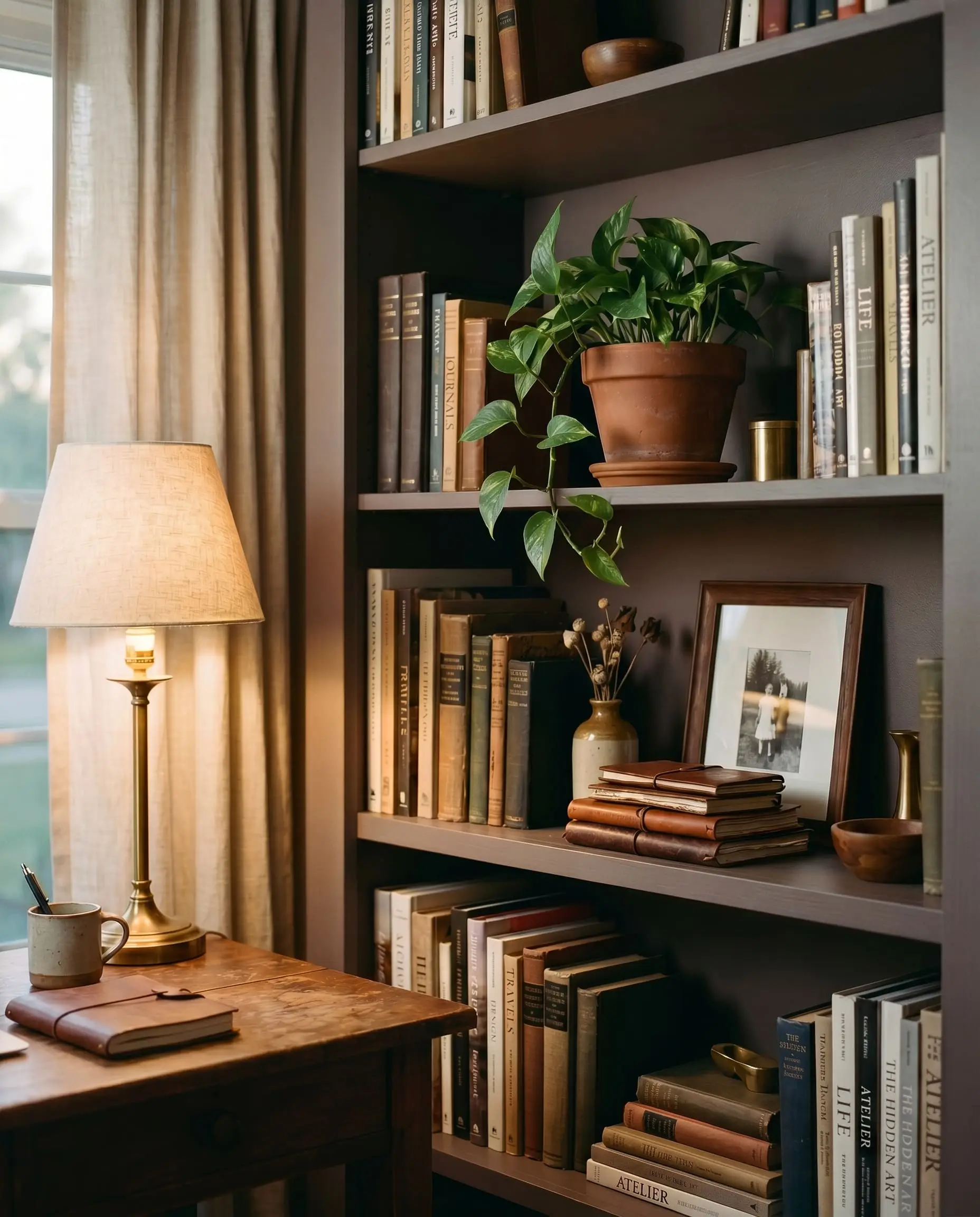
This color was practically engineered for built-in bookcases. Using this shade in a home office explicitly manipulates the psychological temperature of the room.
It forces a sense of quiet focus. The dark plum-gray creates a moody, dark academia vibe that makes leather-bound books, vintage rugs, and warm ambient desk lamps look incredibly rich. It feels like stepping into a private, historic library.
The Pairings & Accents Guide
A low-chroma paint will only look as good as the materials you place next to it. You must control the contrast.
Flawless Trim Pairings for N570-5
If you are not color-drenching the room, you need a trim color that provides a sharp, clean break without looking stark or icy.
Elevating Architectural Materials
Fixed elements in the room dictate the success of the paint.
Coordinating Color Palette
To build out a cohesive home, you need colors that share a complementary mathematical structure.
Curated Mood Boards
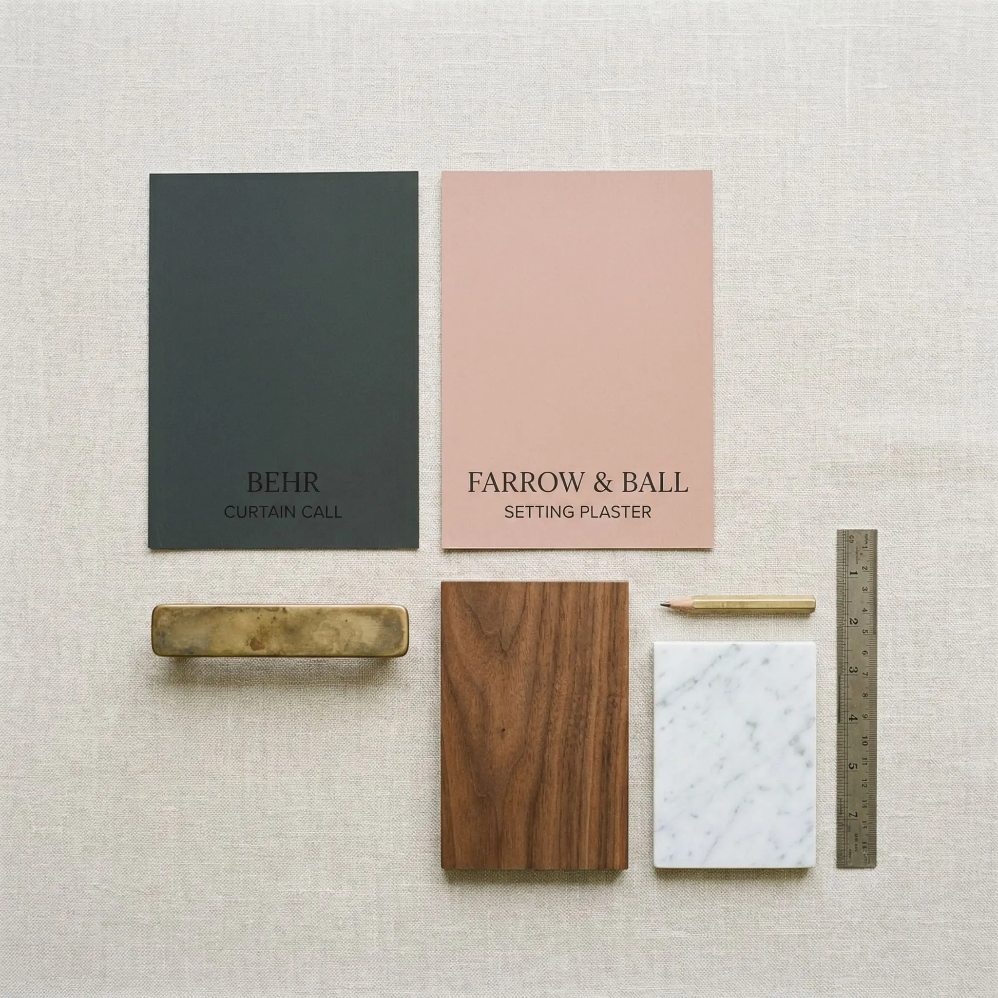
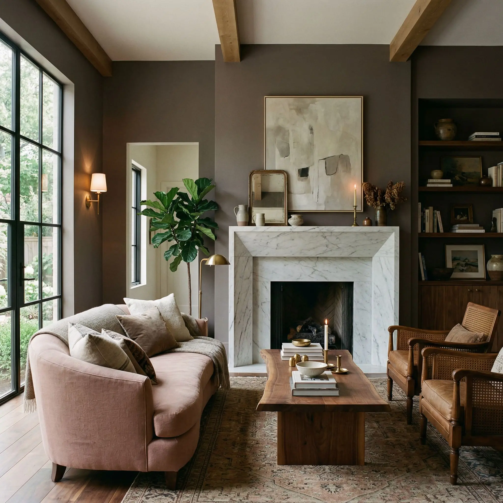
The Organic Modern Victorian Palette: This palette marries historic depth with modern restraint. Picture walls drenched in N570-5, grounded by matte-finished walnut floors. The heaviness of the room is instantly broken by a massive, honed Carrara marble fireplace. Unlacquered brass wall sconces provide pools of warm light, while a dusty pink (Setting Plaster) linen sofa sits in the center, bridging the gap between old-world plum and modern organic textures.
The Moody Academic Palette: Built for focus and tension. Floor-to-ceiling bookcases painted in this rich plum-gray, paired with Sherwin-Williams Alabaster on the ceiling to keep the room from caving in. Deep, olive-green velvet curtains frame the windows, while an antique mahogany desk anchors the floor. The entire space is lit by low-wattage, warm ambient lamps that force the paint to reveal its deepest, darkest taupe-brown secrets.
Head-to-Head Comparisons
When you are dealing with dark, color-shifting neutrals, you have to look at the microscopic differences between rivals.
Behr Curtain Call vs. Sherwin-Williams Expressive Plum
Expressive Plum carries a significantly higher color chroma. It is undeniably, aggressively purple. If you want a true, vivid violet that commands attention, choose Sherwin-Williams. If you want a stealthy gray that only hints at plum under specific lighting, stick with Behr.
Behr Curtain Call vs. Benjamin Moore Vintage Charm
Vintage Charm is noticeably lighter and warmer. It reads much more like a dusty, historic mauve than a dark gray. Vintage Charm will feel softer and more feminine, whereas the Behr option delivers a heavier, more masculine architectural shadow.
Behr Curtain Call vs. Behr Sultry Smoke
Sultry Smoke abandons the red-violet spectrum entirely, leaning heavily into a cool, stormy blue-gray. If your room faces North and you want to embrace an icy, slate-like mood, Sultry Smoke is the better mathematical choice.
Similar Colors & Brand Equivalents
If you need a slight adjustment in depth or are restricted to a specific paint manufacturer, these are the mathematically closest alternatives.
Same-Brand Alternatives from Behr
Cross-Brand Matches
If you are utilizing our guide to the best gray-purple paints but your contractor insists on using a different brand, these are your closest matches.
Practical Application & DIY Advice
A brilliant color choice means nothing if the physical execution is flawed. Dark paints require strict adherence to application rules.
The Dynamic Sheen Matrix
Primer Strategy
Do not attempt to paint a color with an LRV of 14 over a light wall using a standard white primer. You must use a high-quality, tinted gray primer. A gray base coat reduces the number of topcoats required and ensures the deep taupe-gray achieves its true, intended depth without looking patchy.
Coverage, Flashing & Touch-Ups
Deep colors are notoriously unforgiving to amateur roller technique.
You must maintain a “wet edge” while rolling this paint. If you let a section dry and then roll over it, you will create “flashing”—highly visible, shiny overlap marks that ruin the velvety illusion.
Clash Warning
Expect to apply a minimum of two full coats over a tinted primer. Touch-ups on dark, matte finishes are incredibly difficult; if you scuff the wall months later, you will likely need to repaint the entire wall corner-to-corner to hide the fix.
Frequently Asked Questions
It is fundamentally a taupe-gray base with a heavy, subdued rose-violet undertone. In low light, it reads as a dark gray; in bright, warm light, the purple becomes highly visible.
Yes. Under warm artificial lighting (incandescent bulbs around 2700K) or in late-afternoon Western sunlight, the warm taupe notes dominate, making the paint look like a rich, muddy brown-plum.
The primary undertones are subdued rose-violet and plum, anchored by a warm taupe.
To maintain a sophisticated contrast, pair it with soft, shaded off-whites like Benjamin Moore White Dove or the slightly creamier Sherwin-Williams Alabaster.
Final Verdict & Expert Warnings
Behr Curtain Call N570-5 is a triumph of color engineering for those who want the drama of a dark room without the sterility of a standard charcoal. Its absolute best application is color-drenched across the walls and ceiling of a formal dining room or a moody home office, where layered ambient lighting can manipulate its plum-gray undertones.
However, we must issue a strict, non-negotiable warning.
Do not use this paint if your home features honey oak floors, honey oak cabinetry, or bright, primary yellow accents. The intense yellow and orange tones in the wood will clash aggressively with the subdued rose-violet undertones of the paint. The resulting chemical reaction will make your expensive wood floors look artificially orange, and the paint will look like a bruised, muddy disaster. If you have warm walnut or neutral white oak, proceed with confidence. If you have honey oak, walk away.