The Anatomy of a Pale Oak Bathroom: Mastering Benjamin Moore’s Most Versatile Greige
Designing a cohesive Benjamin Moore Pale Oak bathroom requires far more than just rolling a fresh coat of paint onto drywall. Pale Oak (OC-20) is an industry favorite for its sophisticated, warm taupe qualities, boasting an LRV (Light Reflectance Value) of 68.64 that allows it to bounce ambient light beautifully without ever feeling stark. Yet, many renovators hesitate, wary of the subtle pink or violet undertone that can unexpectedly emerge in spaces lacking heavy natural sunlight.
To make this nuanced greige work, you must actively control the surrounding materials, trim paints, and artificial lighting. Bathrooms are notoriously difficult environments; heavy reliance on vanity sconces, reflective mirrors, and hardscaping constantly alters paint chemistry. Our analysis of high-end spatial dynamics shows that leaving these interactions to chance results in muddy, unpredictable walls.
This architectural guide details the precise cabinetry, stone, hardware, and lighting pairings required to master Benjamin Moore Pale Oak and dictate exactly how its undertones behave in your space.
Decoding Benjamin Moore Pale Oak in Bathroom Environments
Before sourcing tile or cabinetry, we must establish the technical realities of this specific color. Pale Oak is a highly reactive chameleon; its core warm greige profile shifts dramatically based on directional exposure and artificial illumination. Understanding its structural data allows us to manipulate the room’s perception intentionally.
| Technical Spec | The Details |
|---|---|
| LRV (Light Reflectance Value) | 68.64 (High-mid range; reflects ambient light effectively while holding enough depth to contrast against white trim) |
| Core Undertone | Warm Taupe / Greige |
| Secondary Undertone | Whisper of pink/violet (Highly reactive to artificial lighting and northern vs. southern exposure) |
| Optimal Trim Pairing | Chantilly Lace (OC-65) for stark contrast; White Dove (OC-17) for creamy transitions |
| Hex Code | #DDD9CE |
You can apply wallpapers, paints, etc. on walls and see how they look in various interiors.

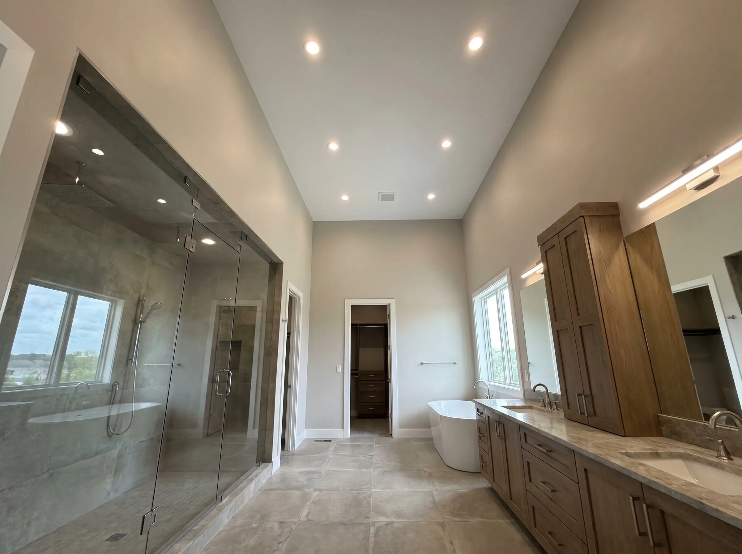
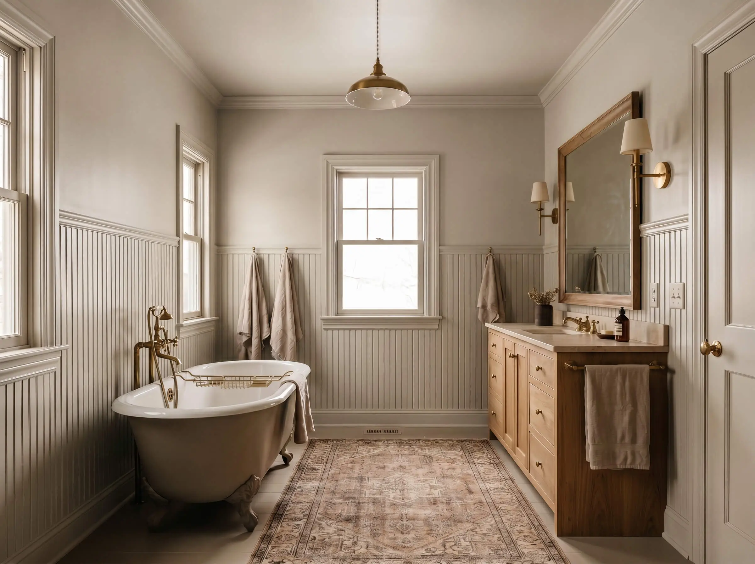
Vanity & Cabinetry Pairings for Pale Oak Walls
The vanity acts as the heaviest visual anchor in the bathroom footprint, meaning its finish heavily dictates whether your walls read cool and gray or warm and creamy. The interaction between the wood grain or paint saturation of the cabinet and the taupe walls requires precise coordination.
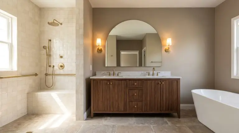
Anchor the Space with a Fluted Walnut Vanity
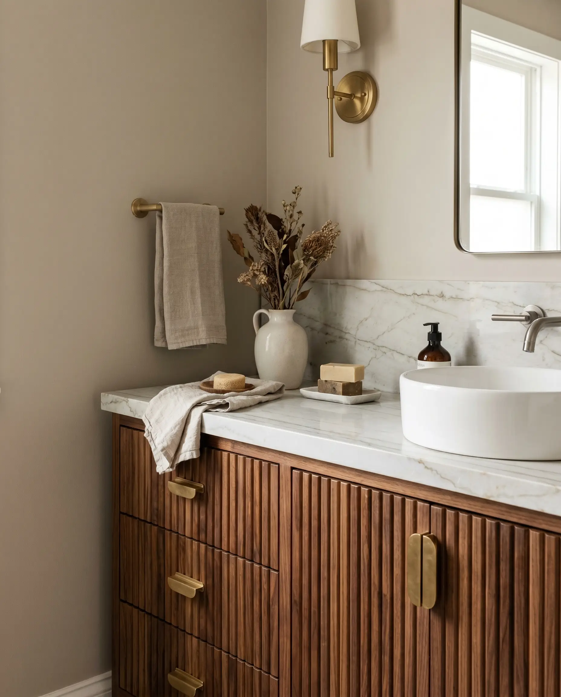
The rich, architectural grain of fluted walnut grounds the airy lightness of the walls. This mid-tone wood pulls out the creamy warmth of the taupe, preventing the room from feeling sterile while introducing a highly tactile surface.
- Vibe: Mid-Century Modern meets Organic Luxury
- Key Materials: Solid walnut, ribbed detailing
- Styling Pro-Tip: Ensure the wood is sealed with a matte, clear finish rather than a yellowing polyurethane, which can cast unwanted amber tones onto the walls.
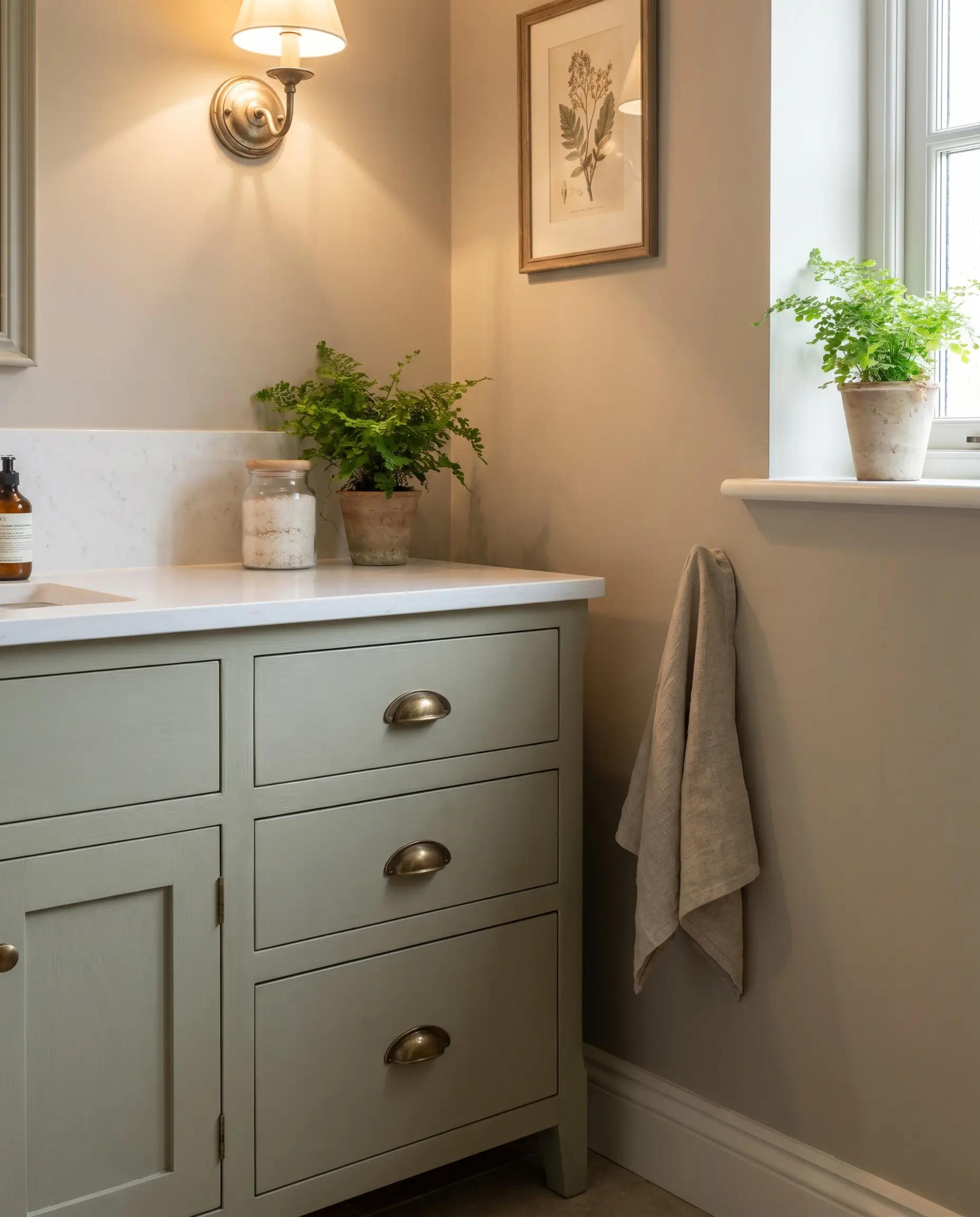
When pairing Pale Oak with a walnut vanity, source heavy, unlacquered brass pulls to bridge the gap between the warm wood and the soft taupe walls.
Designer Note
Create Contrast with a Deep Navy Cabinet
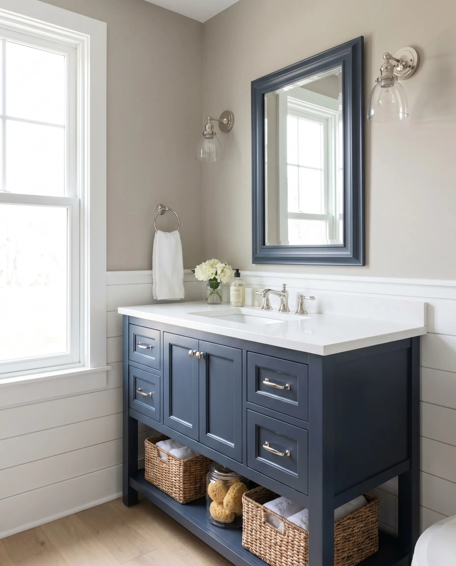
A heavily saturated base like Benjamin Moore Hale Navy (HC-154) forces the lighter greige into the background, creating a crisp, nautical contrast. The cool blue tones actively neutralize any lingering pink undertones in the wall paint.
- Vibe: Transitional Coastal
- Color Match: Benjamin Moore Hale Navy (HC-154)
- Styling Pro-Tip: Use this pairing in bathrooms that receive heavy southern light to balance out the intense natural warmth.
Anchor navy cabinetry with polished nickel hardware; the cool, silvery reflection sharply contrasts the dark paint while keeping the Pale Oak looking fresh and gray.
Designer Note
Embrace Monochromatic Warmth with Bleached White Oak
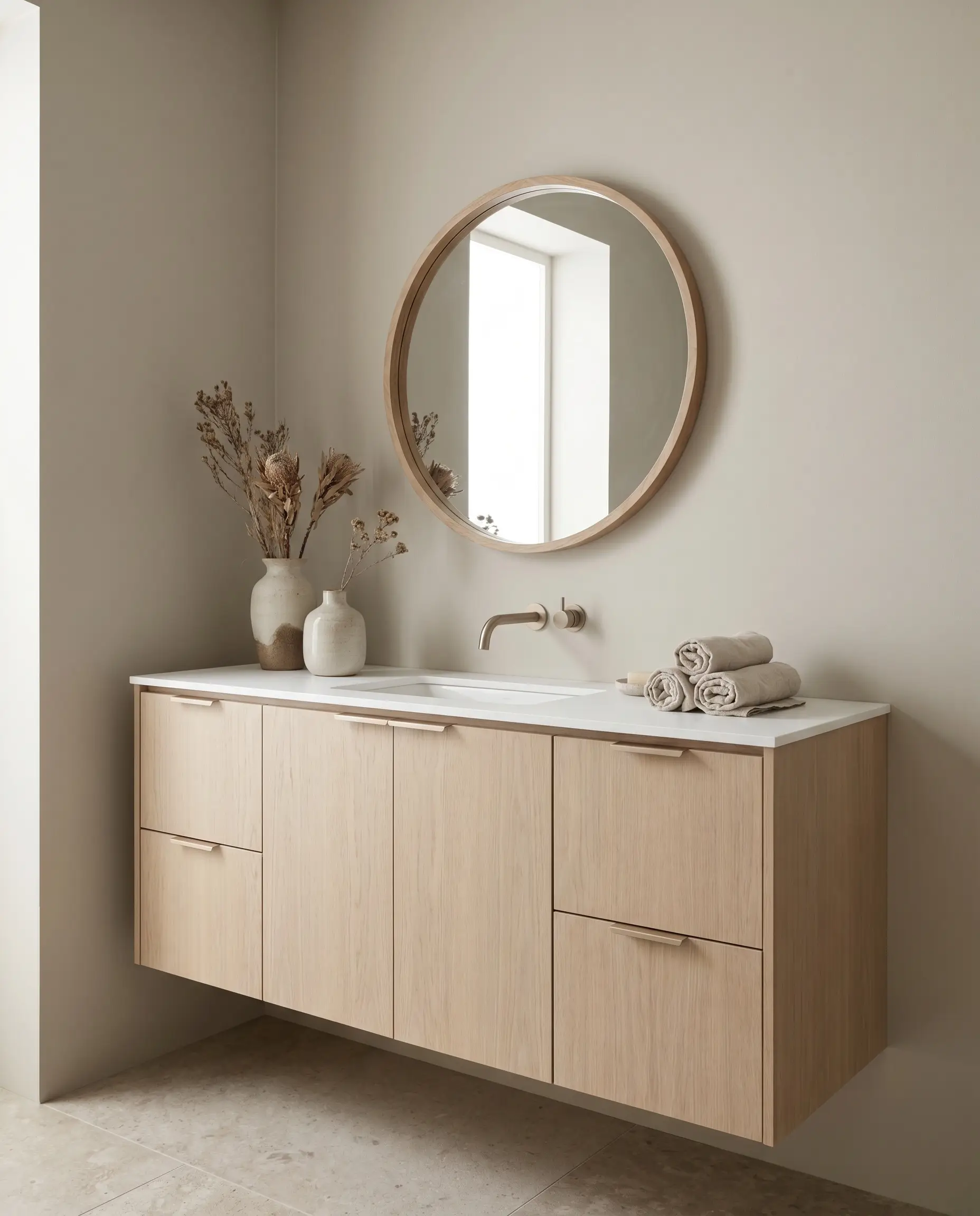
For a continuous, serene wash of color, bleached white oak directly mirrors the lightness of the walls. This creates an uninterrupted spatial flow perfect for tight footprints, letting the room breathe.
- Vibe: Organic Modern
- Key Materials: Flat-panel white oak, clear matte sealant
- Styling Pro-Tip: Keep the countertop ultra-thin (2cm) to maintain the delicate, airy profile of the monochromatic palette.
Install low-profile, edge-pull hardware in a matte white or soft champagne bronze to maintain the seamless, uninterrupted wash of the vanity.
Designer Note
Opt for Crisp Contrast with Matte Black Ash
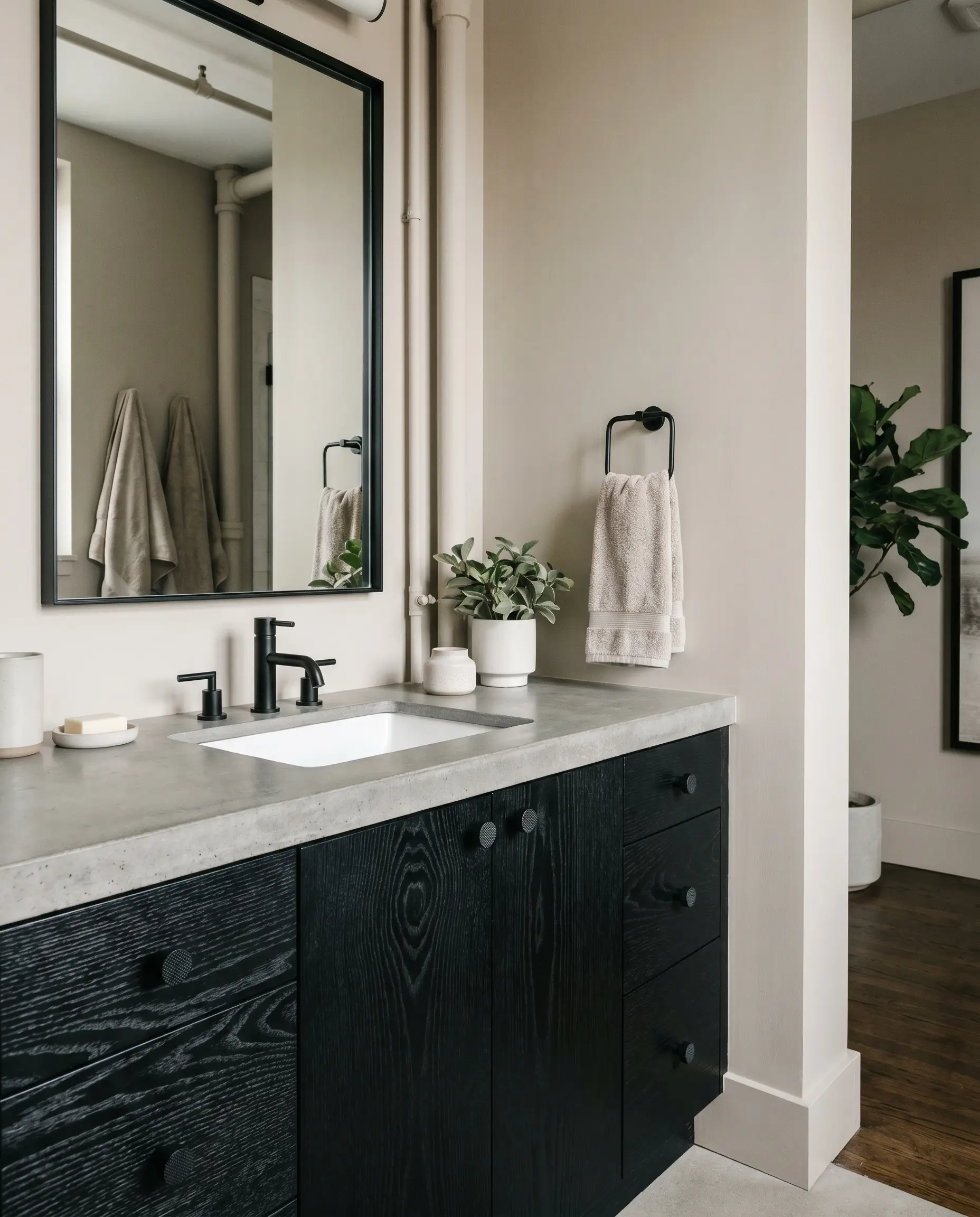
Black ash introduces a heavily textured, graphic anchor that sharpens the soft edges of the room. The stark, absorbing darkness of the wood forces the wall color to read as a clean, highly sophisticated warm gray.
- Vibe: Soft Industrial / Contemporary
- Key Materials: Ebonized ash or matte black oak
- Styling Pro-Tip: Allow the wood grain to remain visible through the black stain to ensure the piece feels organic rather than like a heavy block of plastic.
Utilize knurled matte black hardware to blend directly into the cabinetry, letting the architectural contrast between the black wood and the taupe walls take center stage.
Designer Note
Infuse Depth with a Muted Sage Green
Earthy greens like Benjamin Moore October Mist (1495) or Farrow & Ball Pigeon (25) pull out the natural, stone-like qualities of the taupe. The green acts as a cooling agent against the warm wall, striking a perfect organic balance.
- Vibe: English Cottage / Heritage
- Color Match: Benjamin Moore October Mist (1495) or Farrow & Ball Pigeon (25)
- Styling Pro-Tip: Run a short, 4-inch backsplash in the same material as your countertop to cleanly separate the green vanity from the Pale Oak walls.
Pair muted green cabinetry with aged brass or burnished copper cup pulls to enhance the heritage, time-worn aesthetic of the space.
Designer Note
Tile & Stone Combinations for a Seamless Palette
Bathrooms are heavily dictated by their hardscaping, and the reflection of the tile against the painted walls is critical to managing Pale Oak. The exact finish and texture of your stone will physically alter how the light bounces back onto the taupe drywall.
Ground the Floor with Honed Carrara Marble
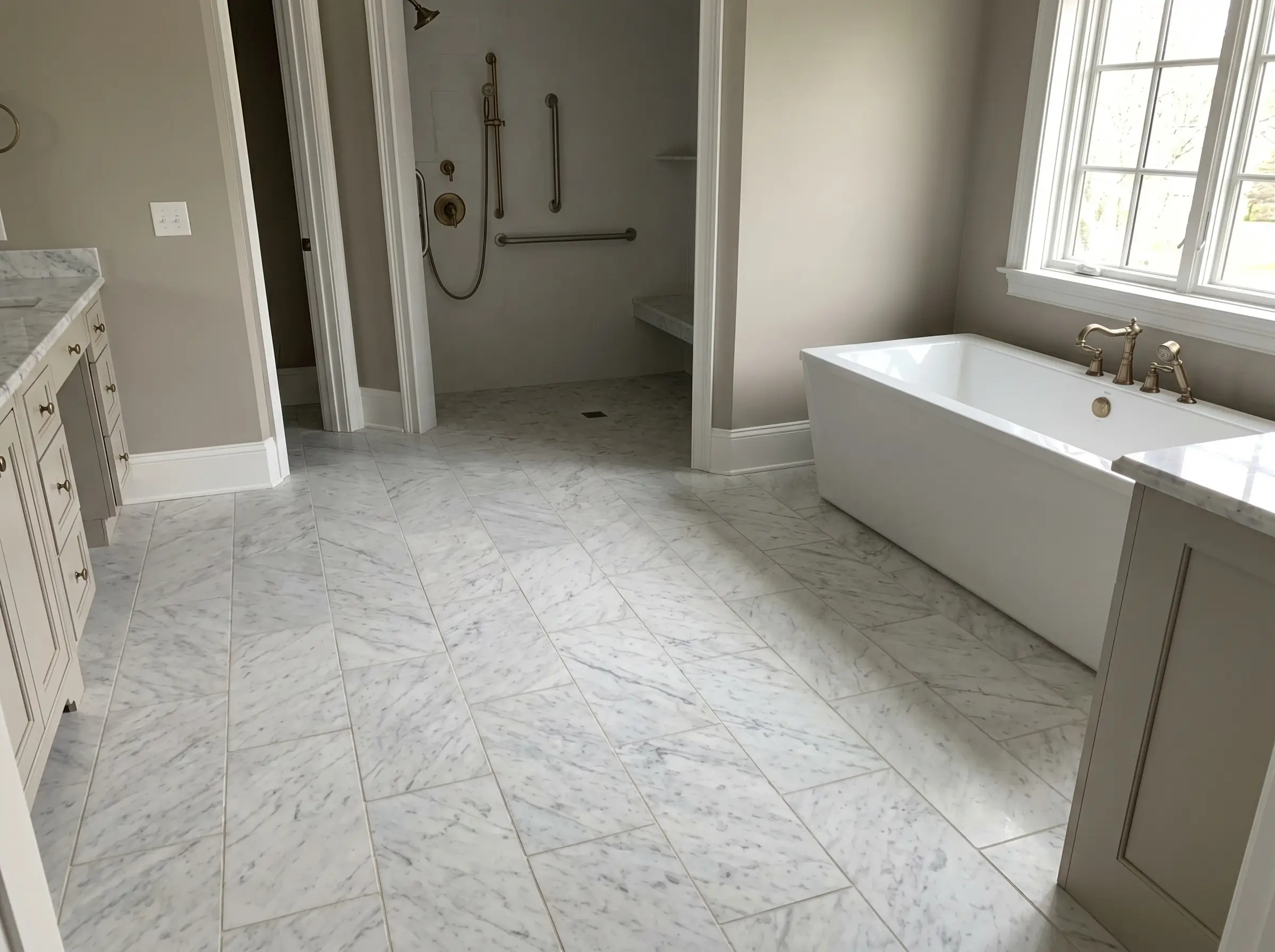
The soft, chalky finish of honed Carrara marble absorbs light rather than aggressively bouncing it around the room. Its inherent cool gray veining acts as a visual counterbalance, actively cooling down the overall room temperature.
- Vibe: Classic Accessible Luxury
- Key Materials: Honed Carrara marble (12×24 or classic hex)
- Styling Pro-Tip: Specify a warm gray grout rather than stark white to bridge the gap between the cool marble and the warm taupe walls.
Add Organic Texture with Cream Zellige Shower Walls
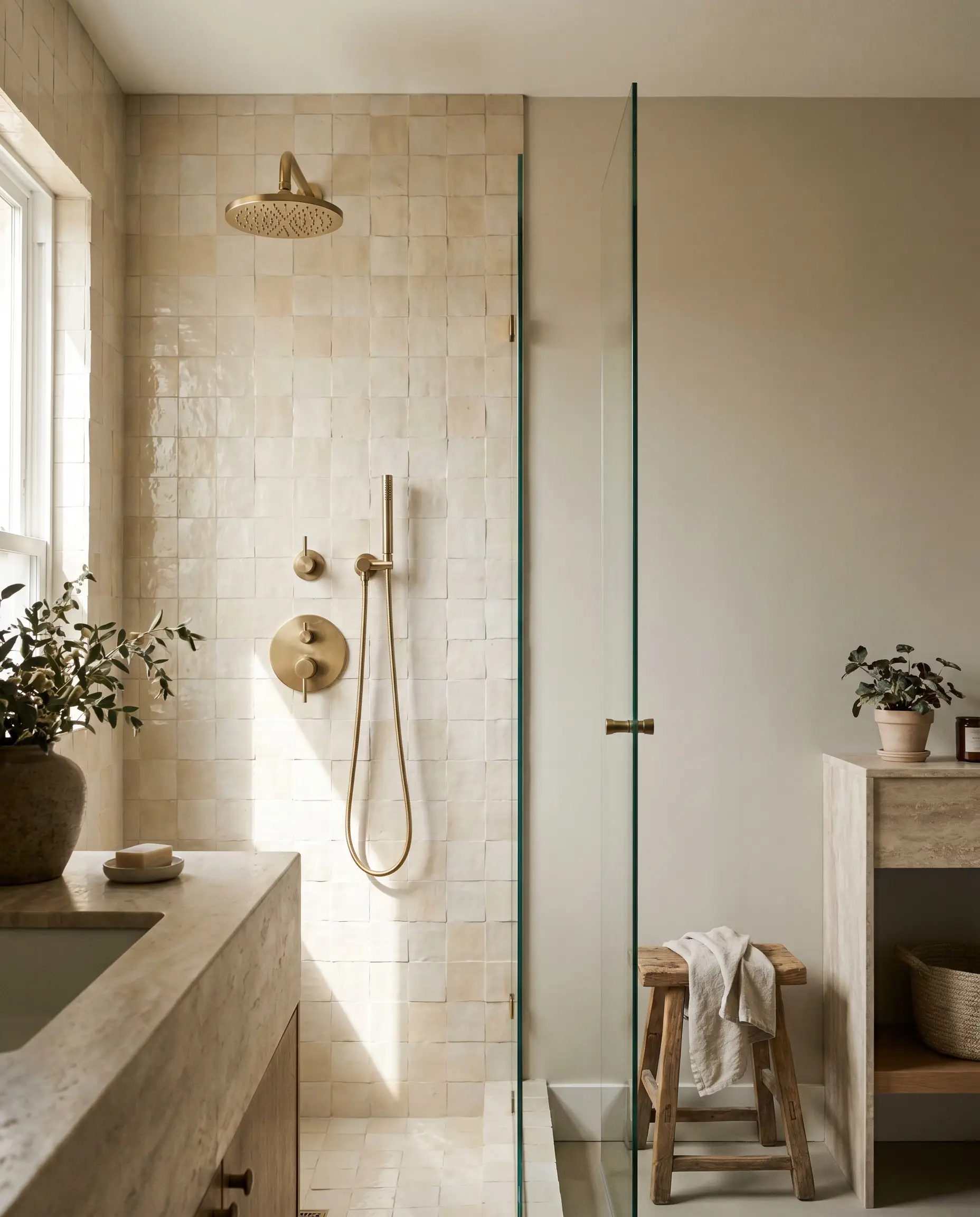
The handmade, undulating surface of zellige tile mimics the plaster-like softness of the greige walls. This pairing creates a highly tactile, dimensional wash of warmth that feels incredibly soothing.
- Vibe: Artisanal Organic Modern
- Key Materials: Unglazed or clear-glazed Moroccan zellige
- Color Recommendation: Warm cream or soft bone
Introduce Earthiness with Muted Terracotta Accents
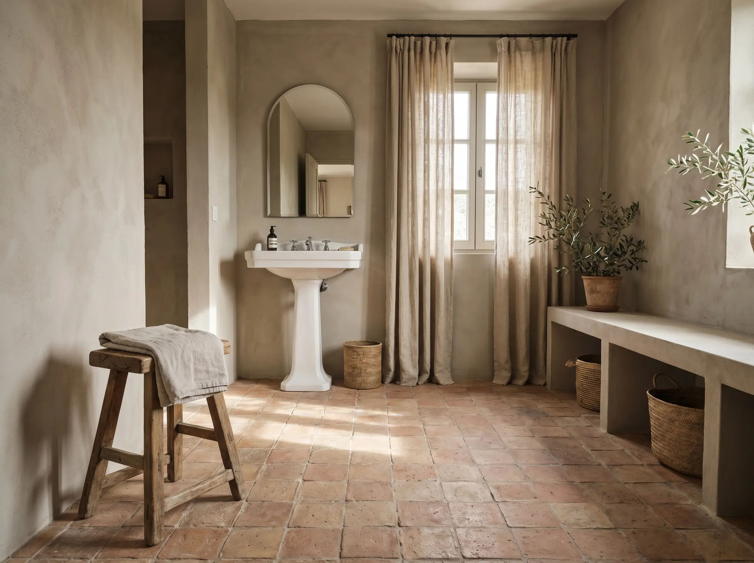
Raw, unglazed terracotta pulls the subtle pink and violet out of the wall color intentionally. By embracing these undertones, you turn a potential lighting flaw into a deliberate, Mediterranean-inspired architectural feature.
- Vibe: Warm Mediterranean
- Key Materials: Hand-pressed terracotta floor tiles
- Styling Pro-Tip: Seal the terracotta heavily to protect it from bathroom humidity, but ensure the sealant is completely matte to retain its raw texture.
Pair with Slate Herringbone for a Transitional Edge
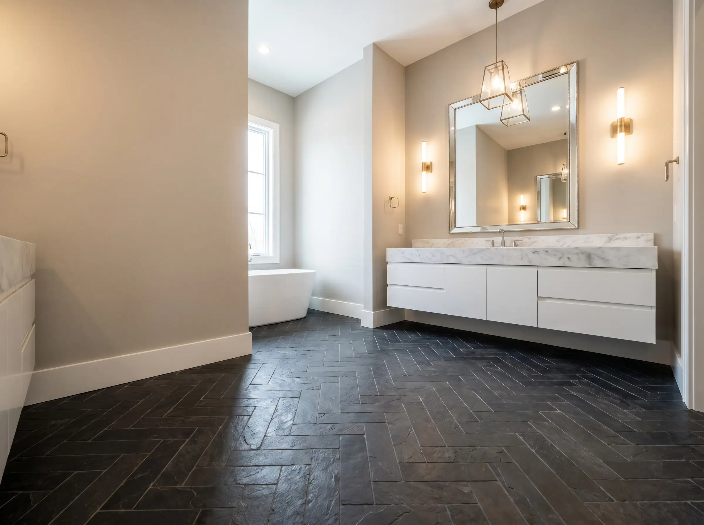
Dark, clefted slate laid in a herringbone pattern provides a rugged, architectural foundation. The deep charcoal tones heavily ground the lightness of the walls, creating a crisp boundary between the floor and the paint.
- Vibe: Modern Heritage
- Key Materials: Natural clefted Montauk slate
- Styling Pro-Tip: Use a charcoal grout to make the floor read as a continuous, dark textural plane, allowing the Pale Oak walls to feel expansive and bright.
Utilize Terrazzo for a Soft Postmodern Nod
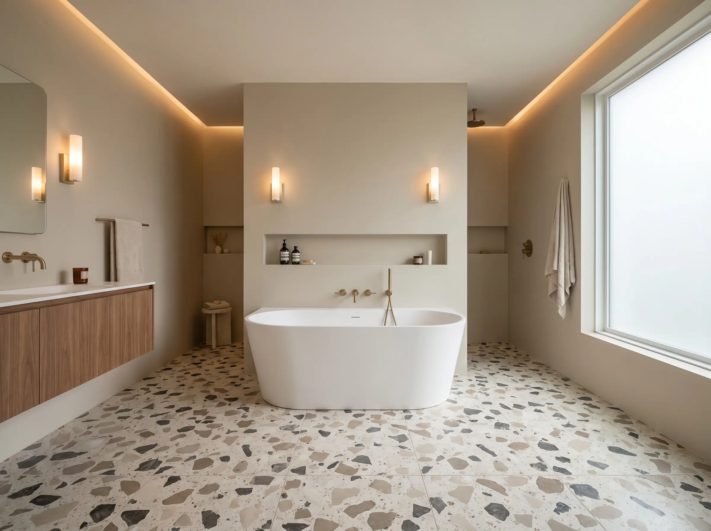
A large-aggregate terrazzo featuring warm beige and gray chips seamlessly ties the entire palette together in one material. The composite stone creates a playful yet highly sophisticated floor that perfectly mirrors the complexity of the taupe paint.
- Vibe: Soft Postmodern
- Key Materials: Cement-based terrazzo with neutral aggregate
- Color Match: Chips in ivory, taupe, and charcoal
Hardware, Mirrors, and Plumbing Fixtures
Metallic accents act as the jewelry of the bathroom, and their specific finishes heavily dictate the temperature of the room. By carefully selecting your sconces, faucets, and mirrors, you can actively warm up or cool down the wall color.
Warm the Tones with Unlacquered Brass Sconces
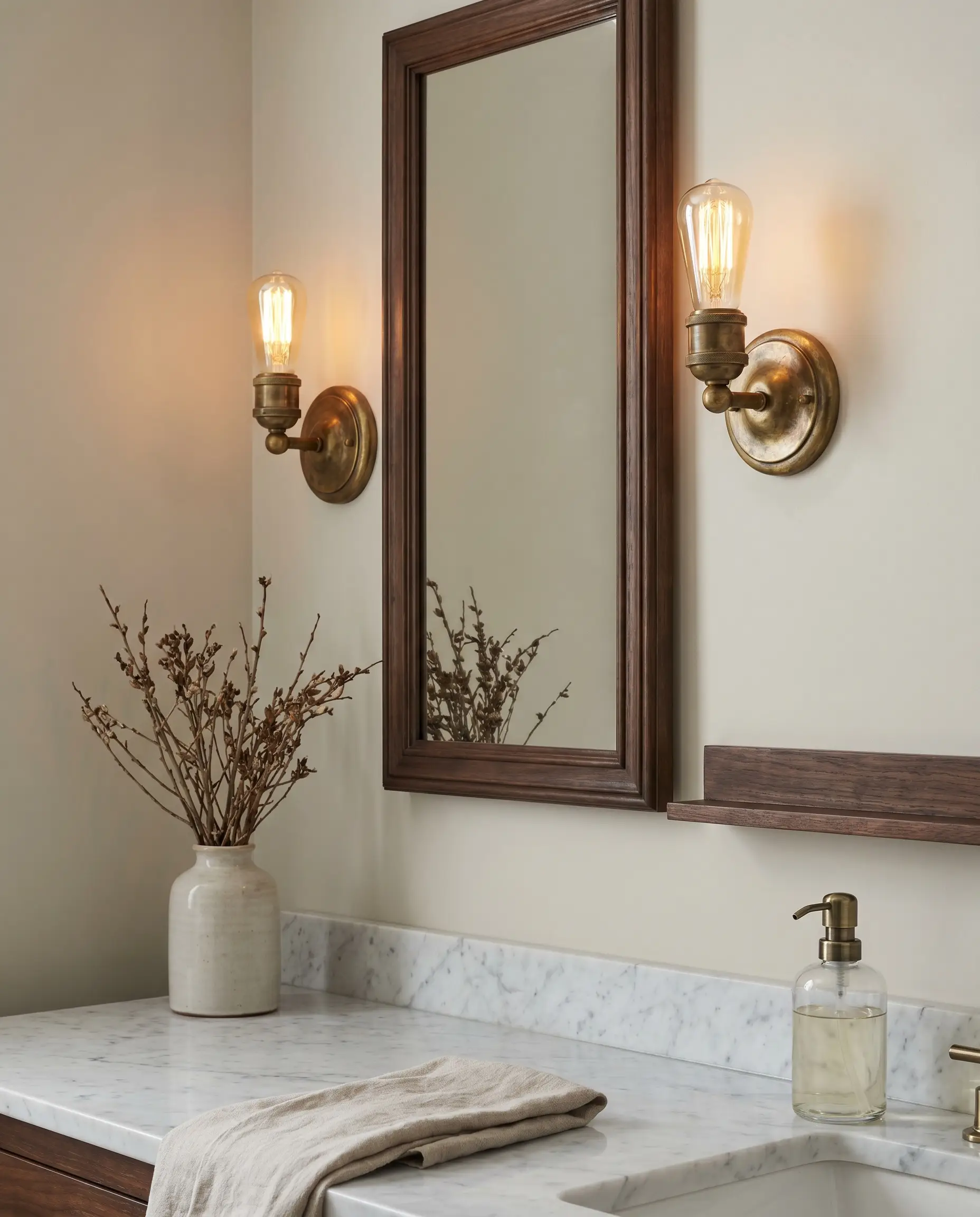
The living finish of unlacquered brass develops a rich, patinated surface over time that beautifully complements the organic nature of a taupe wall. The deep golden tones pull out the creamy, luxurious side of Pale Oak.
- Vibe: Timeless Elegance
- Key Materials: Raw, unlacquered brass
- Styling Pro-Tip: Mount sconces at eye level (around 60 to 65 inches from the floor) to cast the most flattering, warm light across the painted walls.
Keep it Crisp with Polished Nickel Faucets
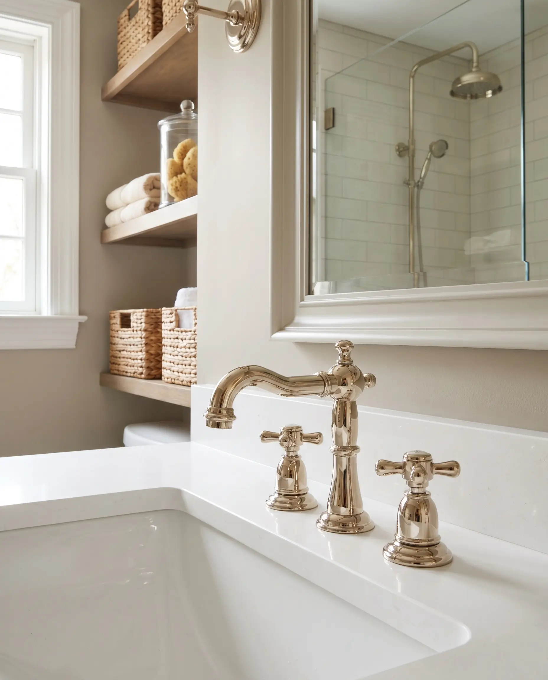
Unlike chrome, which can read cold and blue, polished nickel offers a classic, reflective brightness with a very subtle warm undertone. This creates a highly refined, traditional aesthetic that sharpens the soft greige.
- Vibe: Traditional Coastal
- Key Materials: Solid brass core with polished nickel plating
- Styling Pro-Tip: Carry the polished nickel into the shower fixtures to maintain a cohesive, bright reflection throughout the entire footprint.
Frame the Room with Matte Black Mirrors
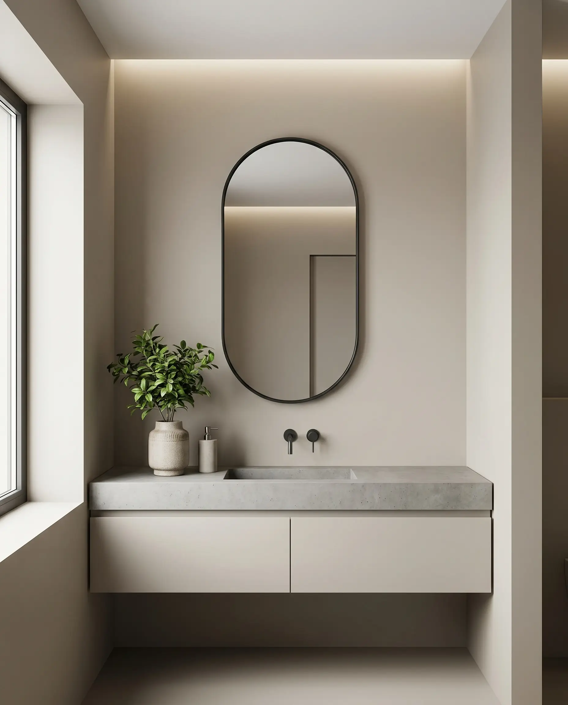
A matte black mirror frame provides a harsh, necessary boundary that stops the eye. This thin, graphic line defines the space and forces the taupe walls to recede, emphasizing their lightness.
- Vibe: Contemporary Precision
- Key Materials: Powder-coated steel or matte black iron
- Styling Pro-Tip: Opt for a pill-shaped or rectangular mirror with rounded corners to soften the aggressive contrast of the black metal.
Soften the Lines with Frameless Arched Glass
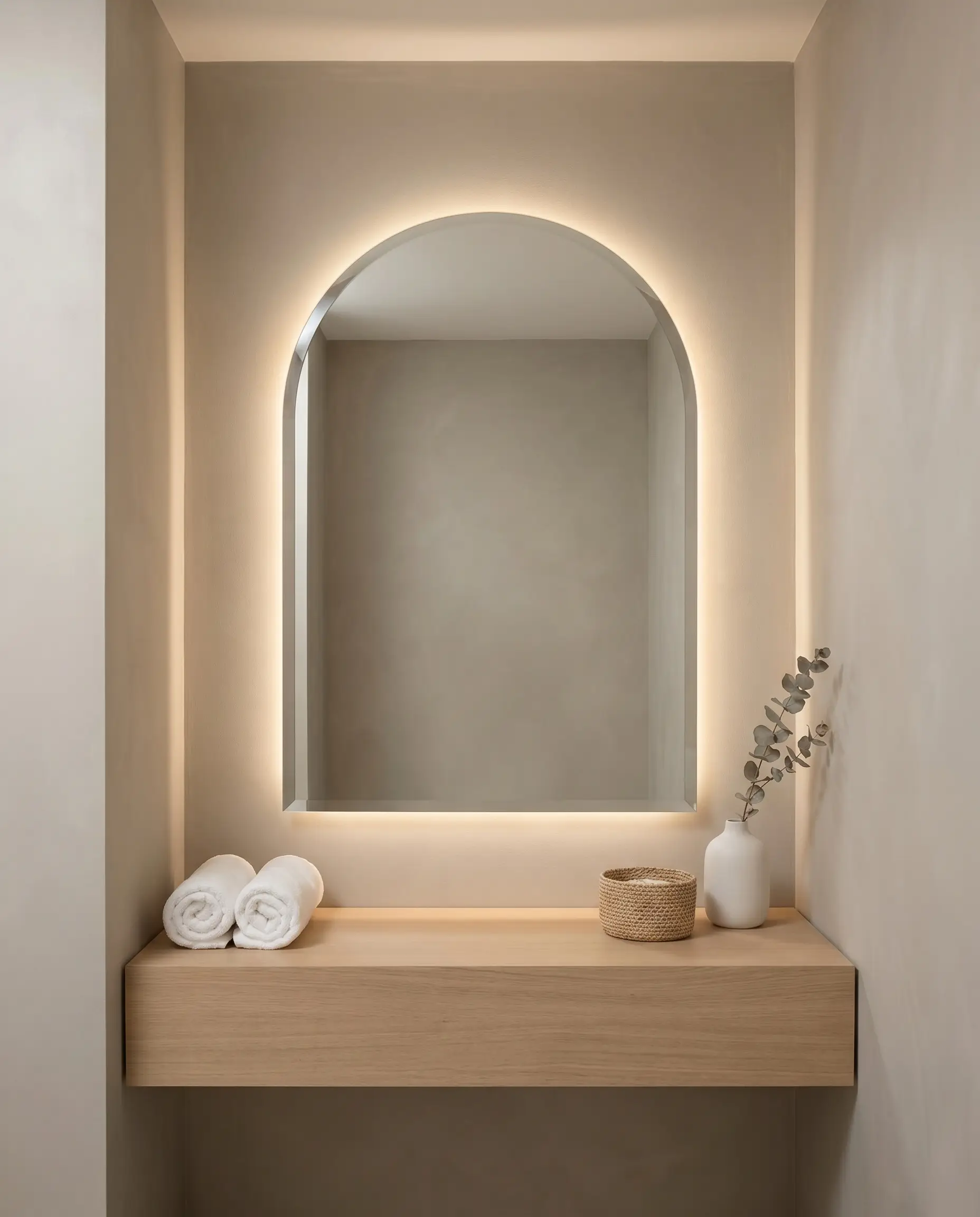
Removing the heavy metal frame entirely allows the wall color to flow uninterrupted. An arched, frameless mirror leans into the plaster-like softness of the paint, creating a highly serene, spa-like environment.
- Vibe: Minimalist Serenity
- Key Materials: Beveled or polished-edge mirrored glass
- Styling Pro-Tip: Float the mirror slightly off the wall and install backlighting to create a glowing halo effect against the Pale Oak.
Architectural Details & Trim Pairings
The structural transitions in a room—baseboards, crown molding, and wainscoting—serve as the frame that defines how the main wall color is perceived. Executing the correct trim color and sheen level is paramount to mastering this greige.
Outline with Crisp Chantilly Lace Trim
Benjamin Moore Chantilly Lace (OC-65) is a highly clarified, stark white with virtually no undertones. Painting your trim this color creates a sharp, definitive boundary that makes Pale Oak read slightly darker and more pronounced.
- Vibe: High-Contrast Traditional
- Paint Recommendation: Benjamin Moore Chantilly Lace (OC-65)
- Sheen Mandate: Execute in a Satin or Semi-Gloss finish for maximum durability and reflective contrast.
Blend Softly with White Dove Baseboards
For a seamless, low-contrast transition, Benjamin Moore White Dove (OC-17) offers a creamy, slightly shaded white. This pairing softens the room’s architecture, creating an incredibly gentle wash of color from the floor to the ceiling.
- Vibe: Soft Transitional
- Paint Recommendation: Benjamin Moore White Dove (OC-17)
- Sheen Mandate: Execute in a Satin finish to provide just enough subtle variation from the matte walls.
Paint the Ceiling a Flat Decorator’s White
Ceilings sit in constant shadow, meaning a warm white will quickly look dingy. Benjamin Moore Decorator’s White (CC-20) has a slight cool gray undertone that cuts through the shadows, keeping the room feeling tall and expansive.
- Vibe: Clean and Expansive
- Paint Recommendation: Benjamin Moore Decorator’s White (CC-20)
- Sheen Mandate: Strictly execute in a Flat finish to hide drywall imperfections and prevent aggressive glare from vanity lighting.
Wrap the Room in Pale Oak Beadboard
Embrace the modern architectural technique of color drenching by painting both the beadboard wainscoting and the upper drywall in the exact same color. This creates a highly immersive, bespoke environment that relies on shadow and texture rather than color contrast.
- Vibe: Bespoke Heritage
- Paint Recommendation: Benjamin Moore Pale Oak (OC-20)
- Sheen Mandate: Paint the upper drywall in Aura Bath & Spa (Matte) and the lower beadboard in Satin to create a subtle, tactile shift.
The Artificial Lighting Caveat: Controlling Undertones
If there is a single secret to mastering Pale Oak in a bathroom, it is artificial lighting control. Because bathrooms frequently lack large windows, your vanity sconces and overhead cans will dictate the paint’s chemistry. Kelvin temperature physically alters the color: too warm, and the taupe becomes muddy and pink; too cool, and the walls look like sterile concrete. Furthermore, you must specify bulbs with a CRI (Color Rendering Index) of 90 or higher to ensure the true color of the paint is accurately displayed.
| Kelvin Rating | Effect on Pale Oak | Best For (Design Style) |
|---|---|---|
| 3000K (Warm White) | Enhances the creamy taupe qualities but frequently pulls out the subtle pink/violet hue. | Traditional, Heritage, spaces relying heavily on brass hardware. |
| 3500K (Neutral White) | The absolute sweet spot. Neutralizes the pink without turning the greige cold. Holds the taupe perfectly balanced. | Organic Modern, Transitional, optimal for applying makeup. |
| 4000K (Cool White/Daylight) | Strips the warmth entirely. Neutralizes all pink but forces the paint to read as a muddy, cold gray. | Soft Industrial, spaces relying heavily on stark black contrast. |
Curating Your Pale Oak Space
Benjamin Moore Pale Oak is not a passive color you simply apply and forget; it is an active architectural element that requires deliberate, highly specific pairings. By actively managing your vanity finish, sourcing the exact marble or zellige tile, and locking in your Kelvin temperatures, you completely neutralize its tricky undertones. Always paint large swatches and test them against your chosen tile in the actual room lighting before committing.
Which cabinetry pairing are you planning to anchor your Pale Oak walls with? Share your architectural plans with us below.