Mocha Ice N150-1
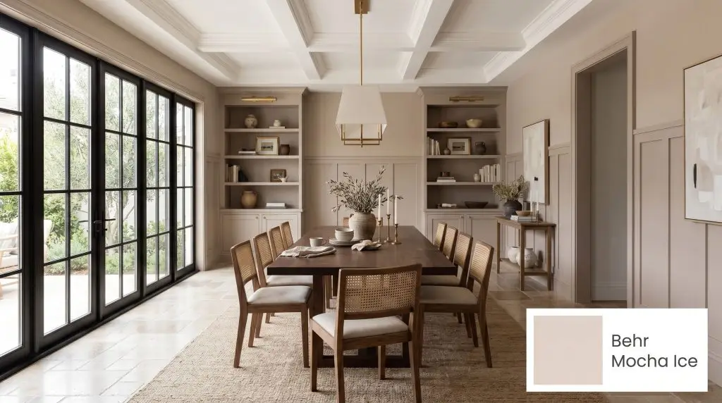
BehrBehr Mocha Ice (N150-1) is a soft, creamy taupe with an LRV of 66. It features a gentle taupe-gray base with warm red and subtle beige undertones, making it a sophisticated, light-reflecting neutral that adds cozy warmth without feeling heavy or dark.
Paint Technical Profile
| Color ID / SKU | N150-1 |
| HEX Code | #DFD2CA |
| Light Reflectance (LRV) | 66 |
| Use | Interior, Exterior |
| Best Exposures | South-facing, East-facing |
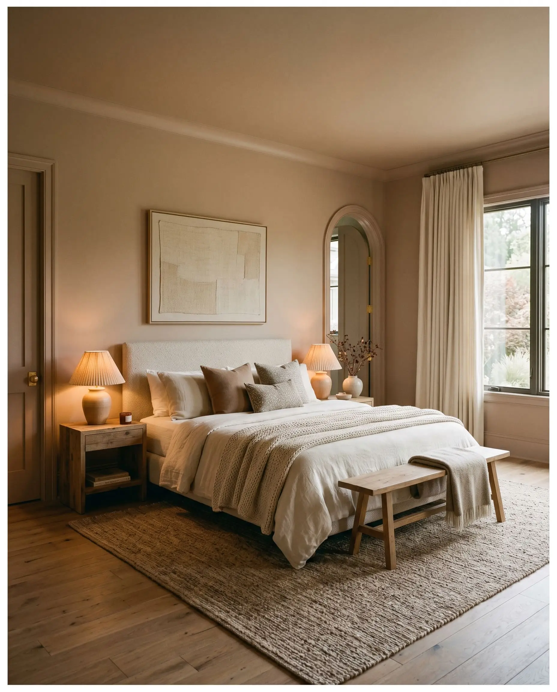
| Best For | Living Rooms, Bedrooms, Kitchen Cabinets, Open Concept Spaces |
Behr Mocha Ice Paint Review: The Ultimate Latte-Inspired Warm Neutral
Are you searching for a soft, sophisticated, and warm neutral that feels cozy and timeless but provides more depth than a standard off-white?
The interior design conversation is currently dominated by one clear answer: Behr Mocha Ice (N150-1). This definitive latte-inspired hue is popular because it masterfully bridges the gap between sterile stark off-whites and heavy, outdated browns, giving your walls the elegant glow you desire.
The Color DNA: Undertones & LRV
Paint is not an abstract art; it is a strict mathematical equation of light and chemistry. Behr Mocha Ice (N150-1) is currently dominating the interior design conversation because it perfectly bridges the gap between stark off-whites and heavy, outdated browns.
We view this shade as a highly engineered architectural material. To use it correctly, you must understand exactly what is happening beneath its surface.
Because of its exact Light Reflectance Value (LRV), which sits at a comfortable 66, Mocha Ice reflects a solid amount of light back into your room. This specific number means the paint keeps spaces feeling bright and airy while retaining enough depth to contrast beautifully against crisp white trim. It will not wash out into a generic white when exposed to direct sunlight, nor will it absorb so much light that your room feels cavernous.
Lighting Effects & The Chameleon Factor
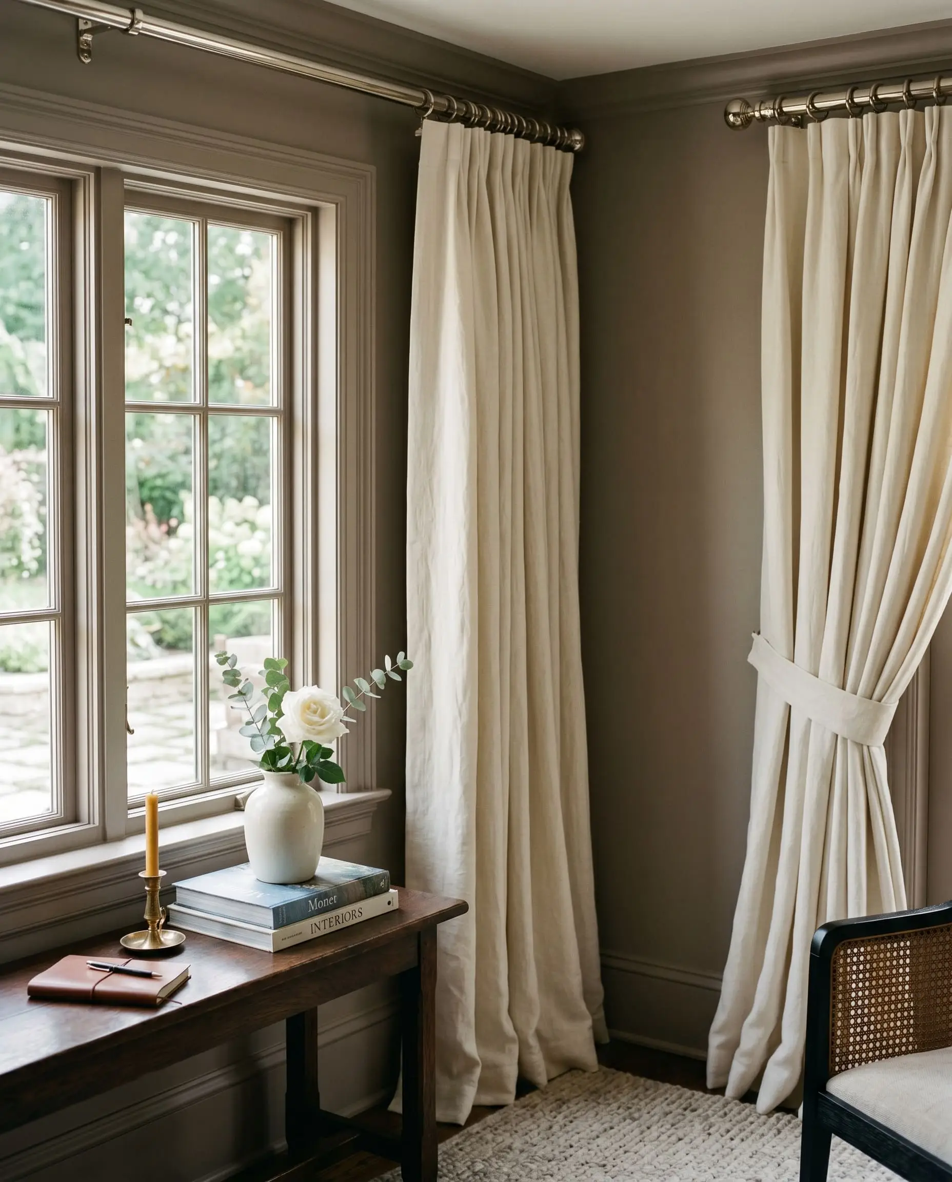
The number one fear homeowners have with N150-1 is that it will look too pink or fleshy on the walls, or worse, turn into a muddy gray in shadows. This is a valid concern, but it is entirely solvable through lighting control.
The gray within the formula acts as a neutralizing agent against the red, but your room’s exposure will ultimately dictate which undertone wins. Understanding how lighting affects warm neutrals is non-negotiable before you commit to this shade.
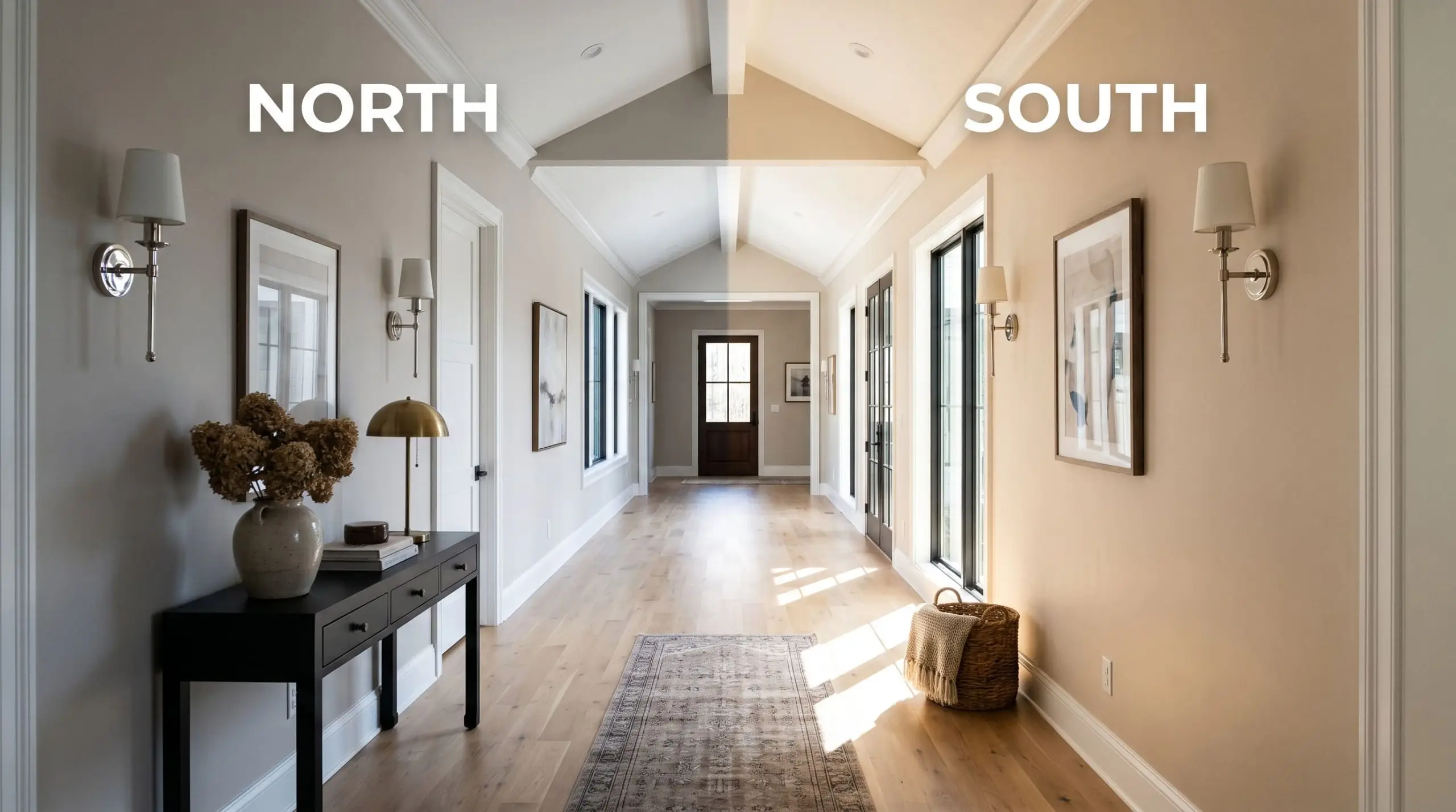
The most dangerous color shift for this paint happens in late afternoon western light. The intense, fiery sun can cause the red undertones to flash slightly “fleshy.” You must test swatches directly on western-facing walls to ensure you are comfortable with this late-day transformation.
Hackrea Pro-Tip
Popular Room Applications
This is a highly adaptable color, but it demands intentionality. Do not slap this on every wall in your house and expect a miracle. If your home lacks natural light, you must be prepared for its moodier, gray-leaning profile to take over.
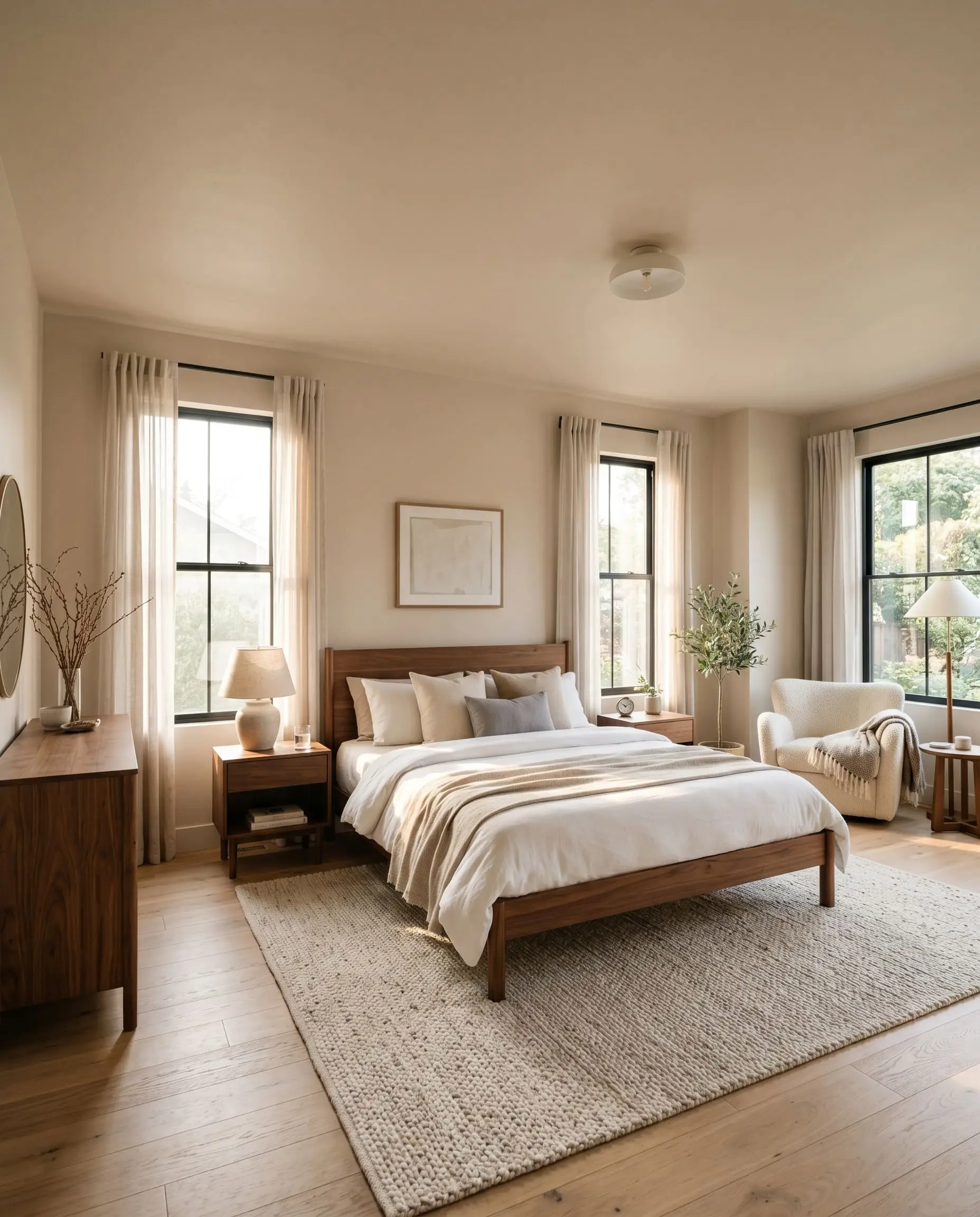
Restful Primary Bedrooms
This warm neutral excels in sleeping spaces because it inherently lowers the visual temperature without feeling cold. For a truly enveloping experience, we recommend color-drenching the entire room—painting the walls, trim, and doors in the exact same shade. This application softens the hard architectural lines of the room, allowing the subtle red undertones to glow warmly under soft bedside lamps. Pair it with heavy linen drapery to maximize the textural warmth.
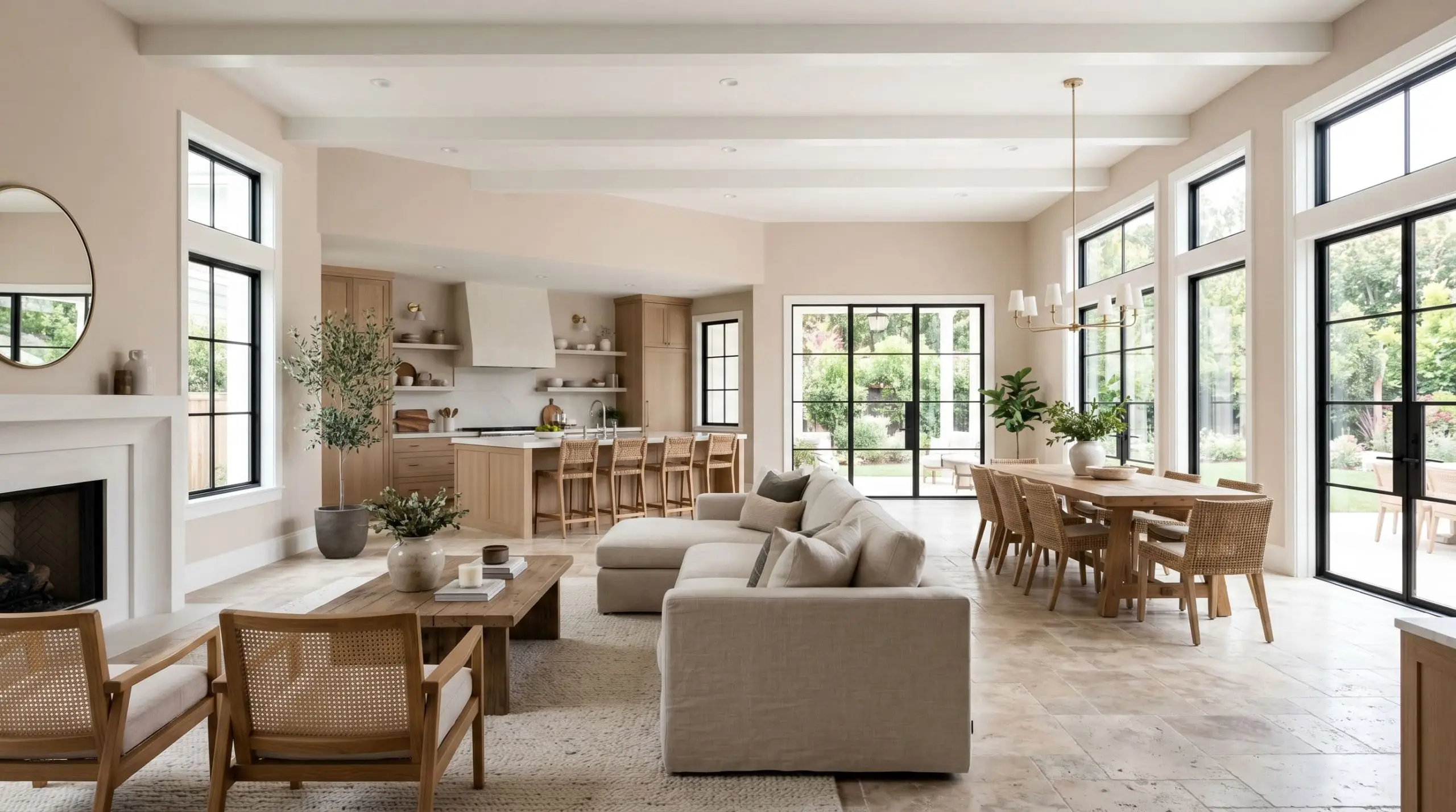
Open-Concept Living Areas
In large, sprawling spaces, stark white walls can feel clinical and alienating. This latte inspired hue grounds expansive living rooms, providing a soft backdrop that bridges the gap between different functional zones. However, you must pay attention to your flooring. If your open-concept layout features heavily yellowed or orange-toned hardwood, this paint will fiercely clash, making the floors look aggressively dated while the walls turn a dirty pink.
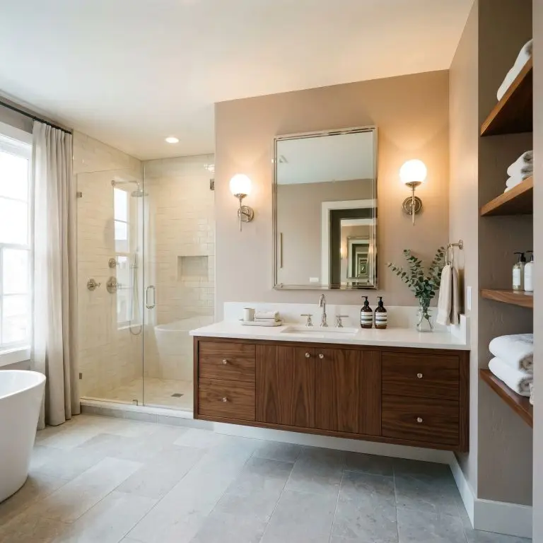
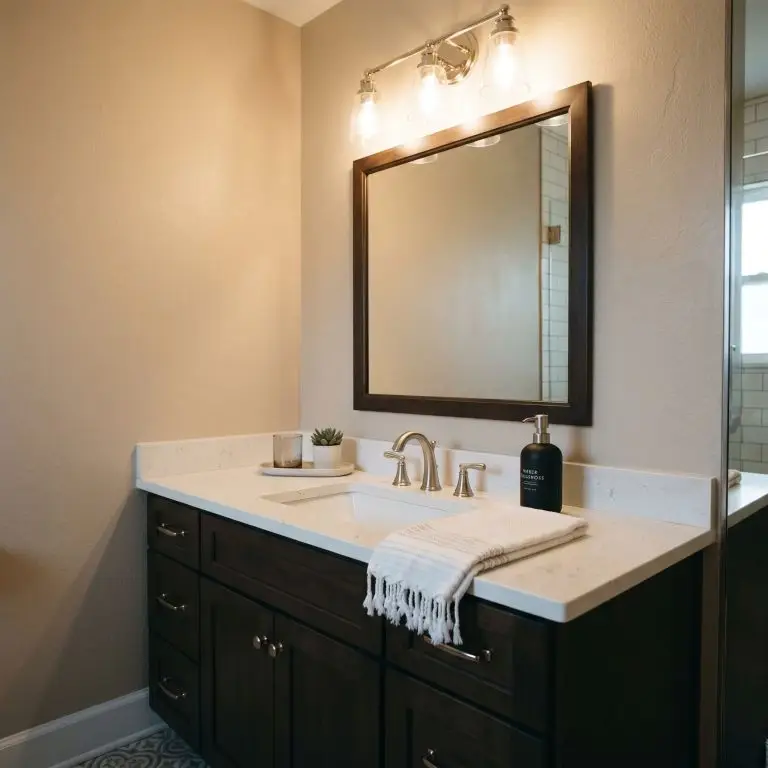
Guest Bathrooms
Bathrooms often suffer from a lack of natural light, relying heavily on harsh overhead vanity fixtures. N150-1 performs beautifully here because its inherent warmth counteracts the sterile feel of porcelain and subway tile. Keep the ceiling bright white to bounce the ambient light downward, and let the walls provide a soft, flattering glow that makes the space feel like a high-end boutique hotel.
Signature Design Ideas & Inspiration
While this creamy taupe works in broad applications, its true architectural power is unlocked when applied to specific, intentional focal points.
Tone-on-Tone Nursery Environments
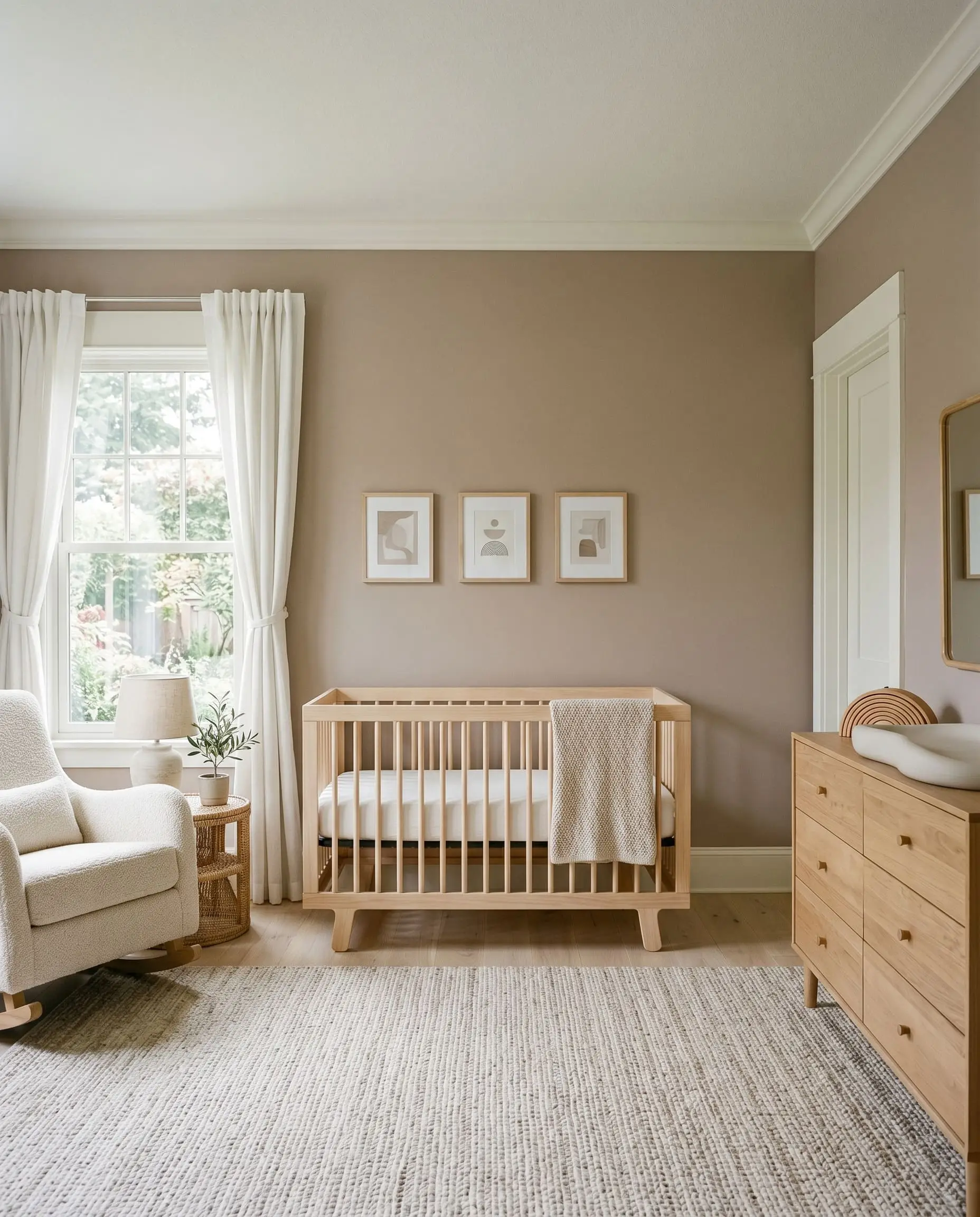
Psychologically, this color lowers the heart rate. When applied to nursery walls and paired with creamy white trim and natural wood cribs, it creates a deeply calming, gender-neutral environment. The soft taupe base grounds the room in nature, avoiding the chaotic energy of primary colors while providing a highly sophisticated, monochromatic aesthetic that the child will not immediately outgrow.
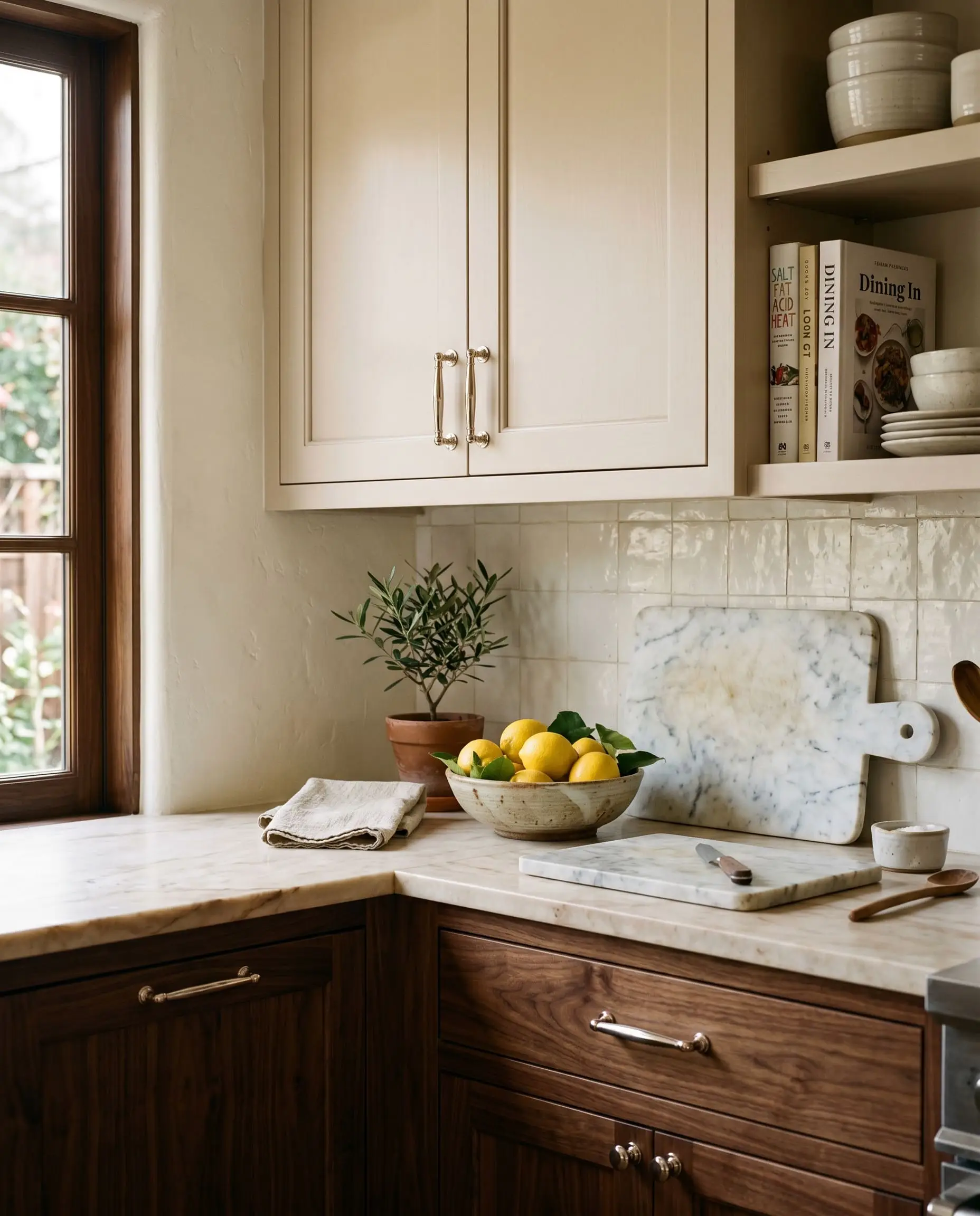
Luminous Upper Kitchen Cabinetry
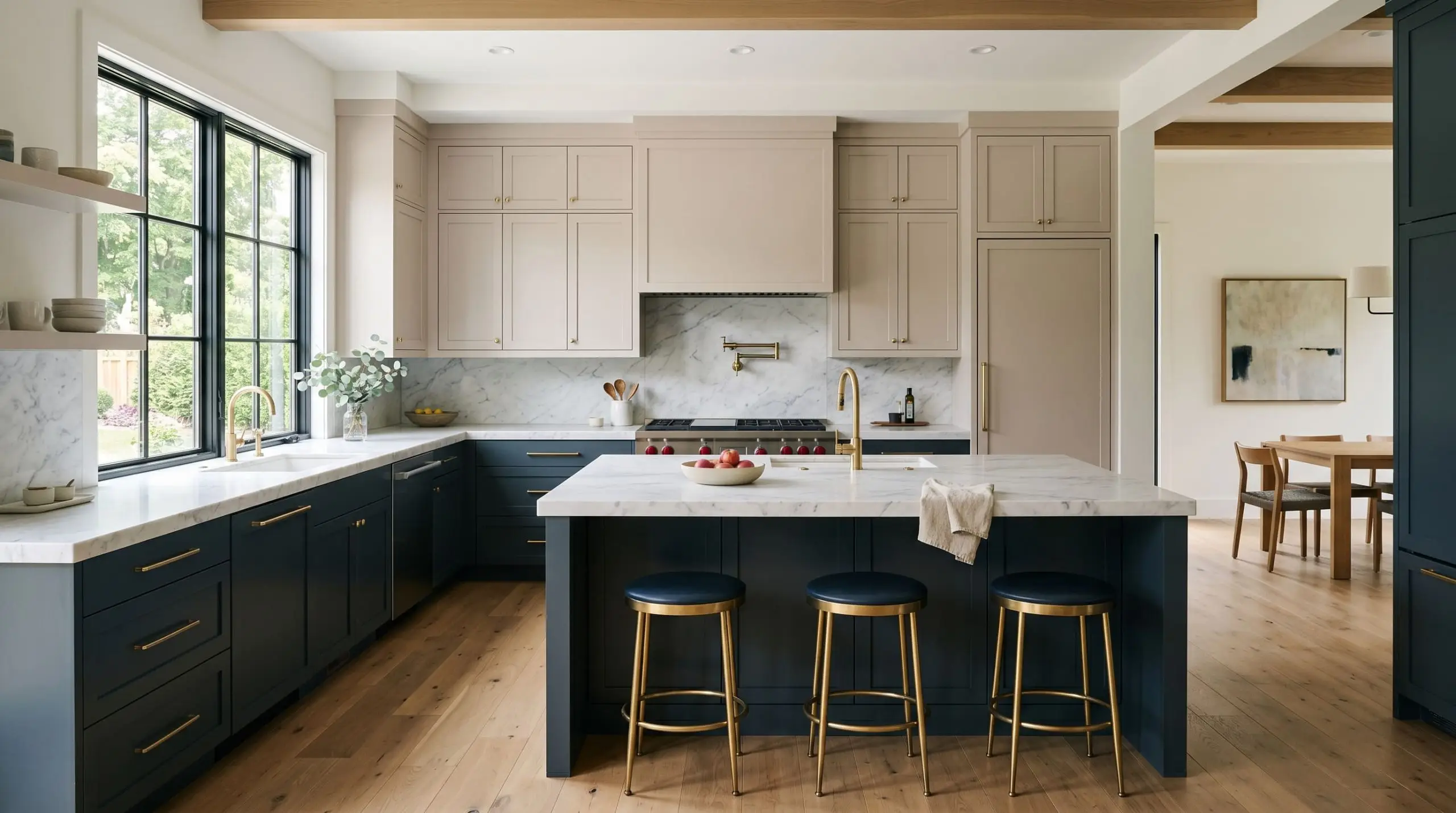
Applying this shade to upper cabinets is a brilliant move, but only if you nail the contrast. If you pair it with equally muted lower cabinets, the kitchen will look completely washed out and lifeless. You must anchor the room with high-contrast, deeply saturated lower cabinets—like a rich navy or a dark walnut—allowing the light-reflecting taupe on top to draw the eye upward and visually expand the ceiling height.
Transitional Board and Batten Accent Walls
Architecturally, board and batten millwork introduces heavy shadows and physical texture to a flat room. Coating these structural elements in Mocha Ice is a staple of transitional design. The physical depth of the wood trim catches the light differently at every angle, emphasizing the dynamic interplay between the paint’s warm beige peaks and its cooler, gray-toned shadows.
The Pairings & Accents Guide
A paint color never exists in a vacuum. Its success is entirely dependent on the materials and colors mathematically interacting with it in the physical space.
Flawless Trim Pairings for Mocha Ice
To keep this shade looking intentional and crisp, you need trim colors that offer high contrast without introducing competing undertones.
Architectural Materials & Hardware
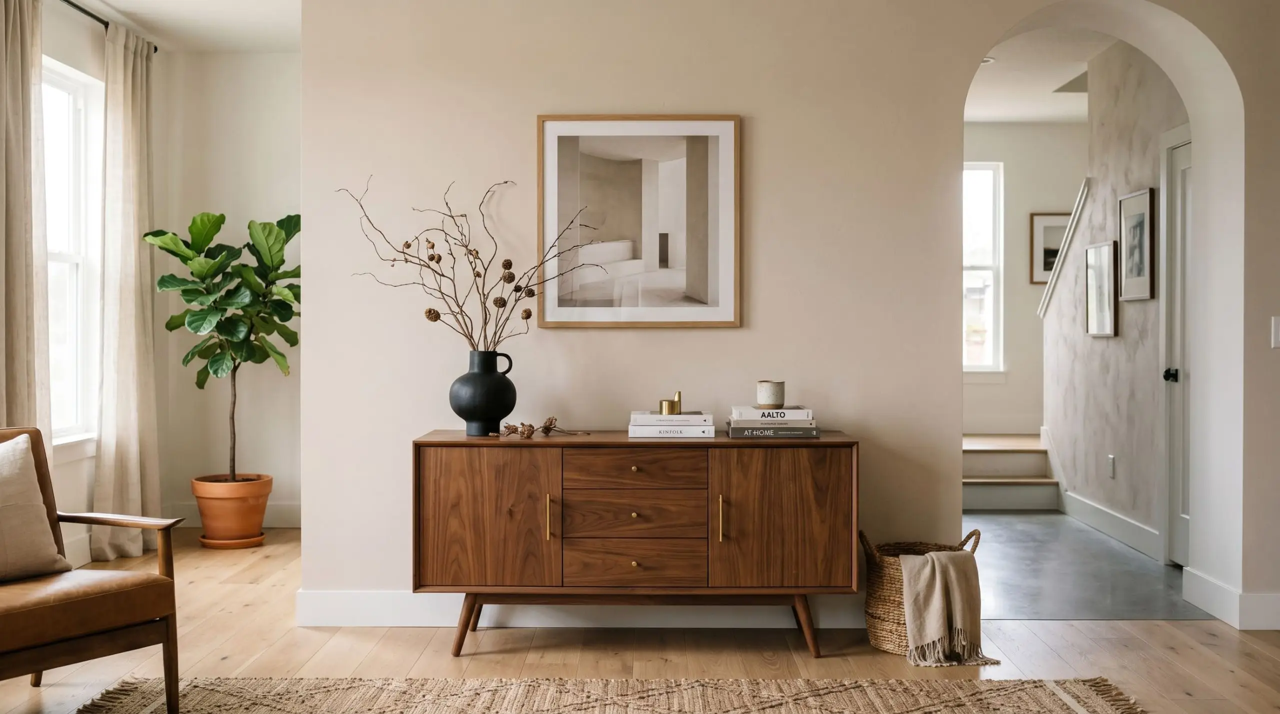
The materials you permanently install alongside this paint will dictate its final vibe. Matte black hardware provides a crucial, modern grounding element that prevents the soft taupe from feeling overly traditional or sleepy. Polished nickel fixtures bring a warm, silvery reflection that perfectly bridges the gap between the paint’s gray and beige identities. Finally, warm walnut wood tones and tumbled travertine tiles pull out the rich, earthy qualities of the base formula.
Coordinating Colors Matrix
Curated Mood Boards
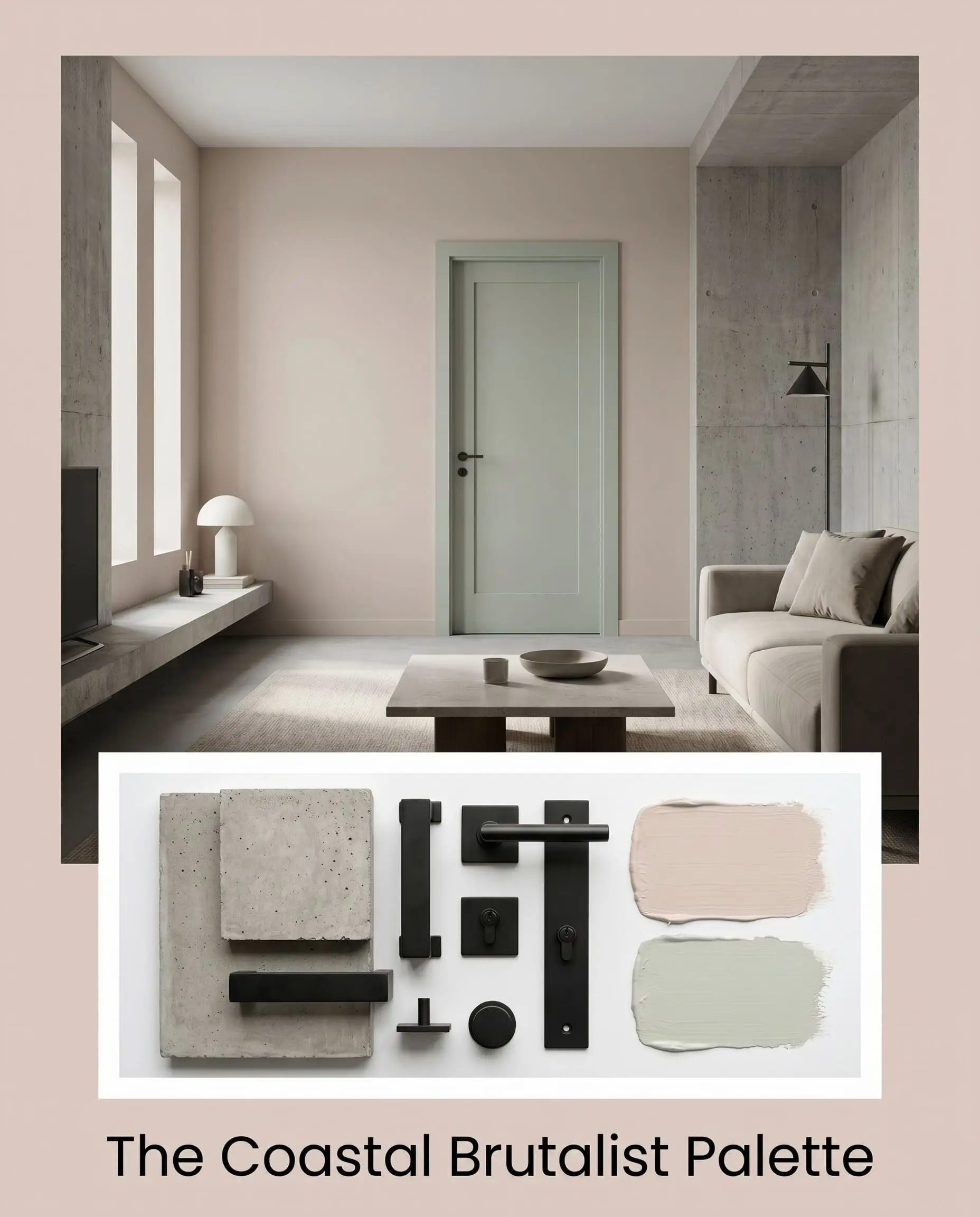
The Coastal Brutalist Palette: This aesthetic aggressively contrasts the soft, organic nature of the paint with hard, unforgiving materials. By pairing the walls with Sherwin-Williams Sea Salt on interior doors and layering the room in raw, unpolished concrete and matte black steel fixtures, you create massive visual tension. The soft taupe warms up the brutalist architecture, preventing the concrete from feeling like a bunker.
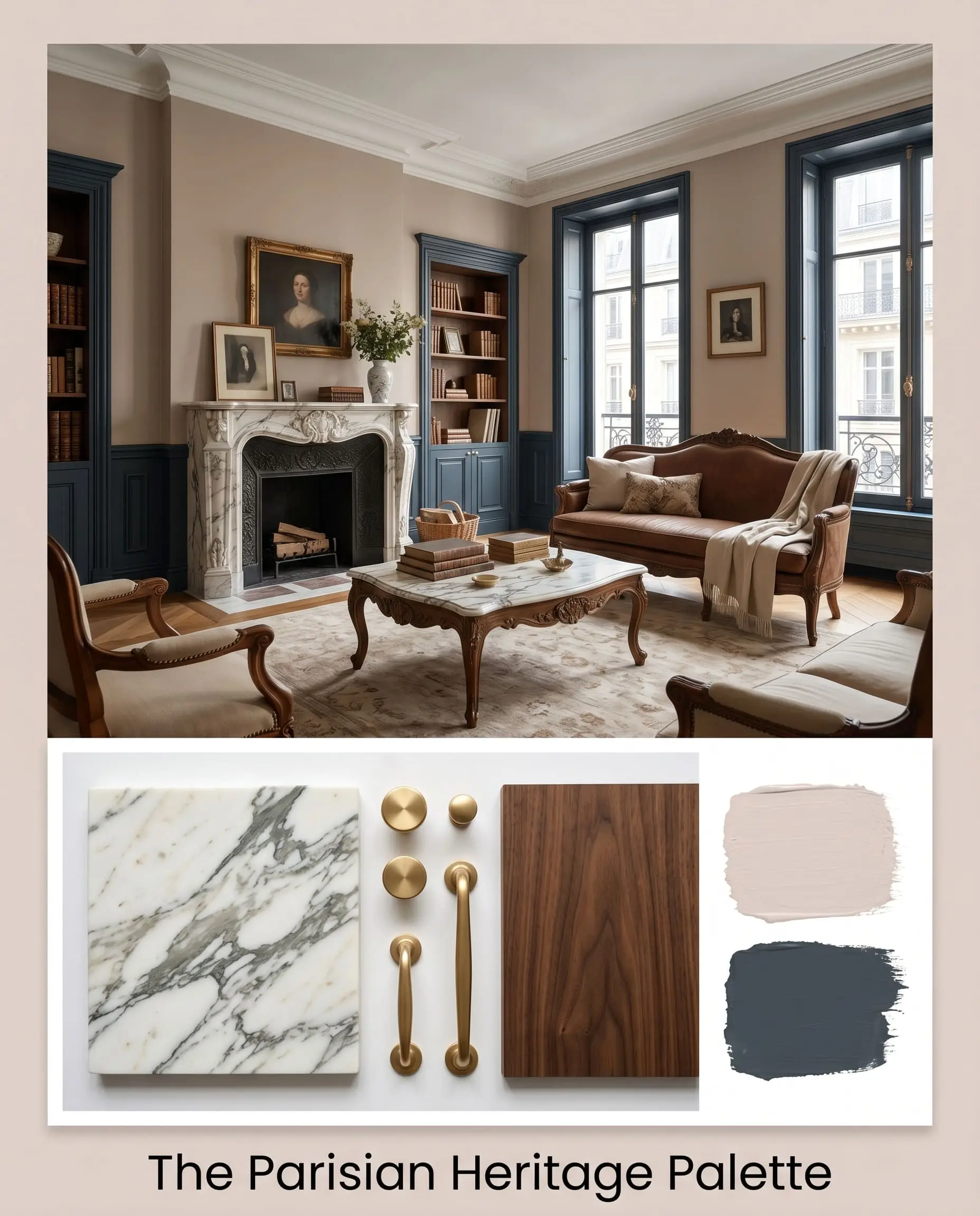
The Parisian Heritage Palette: This look leans entirely into the historic, luxurious potential of the color. Picture the walls drenched in this rich latte shade, anchored by Farrow & Ball Hague Blue on the baseboards and wainscoting. We finish the space with unlacquered brass hardware, heavily veined Calacatta marble, and antique walnut furniture. The deep blue base physically pushes the warm walls outward, creating a deeply enveloping, classic European atmosphere.
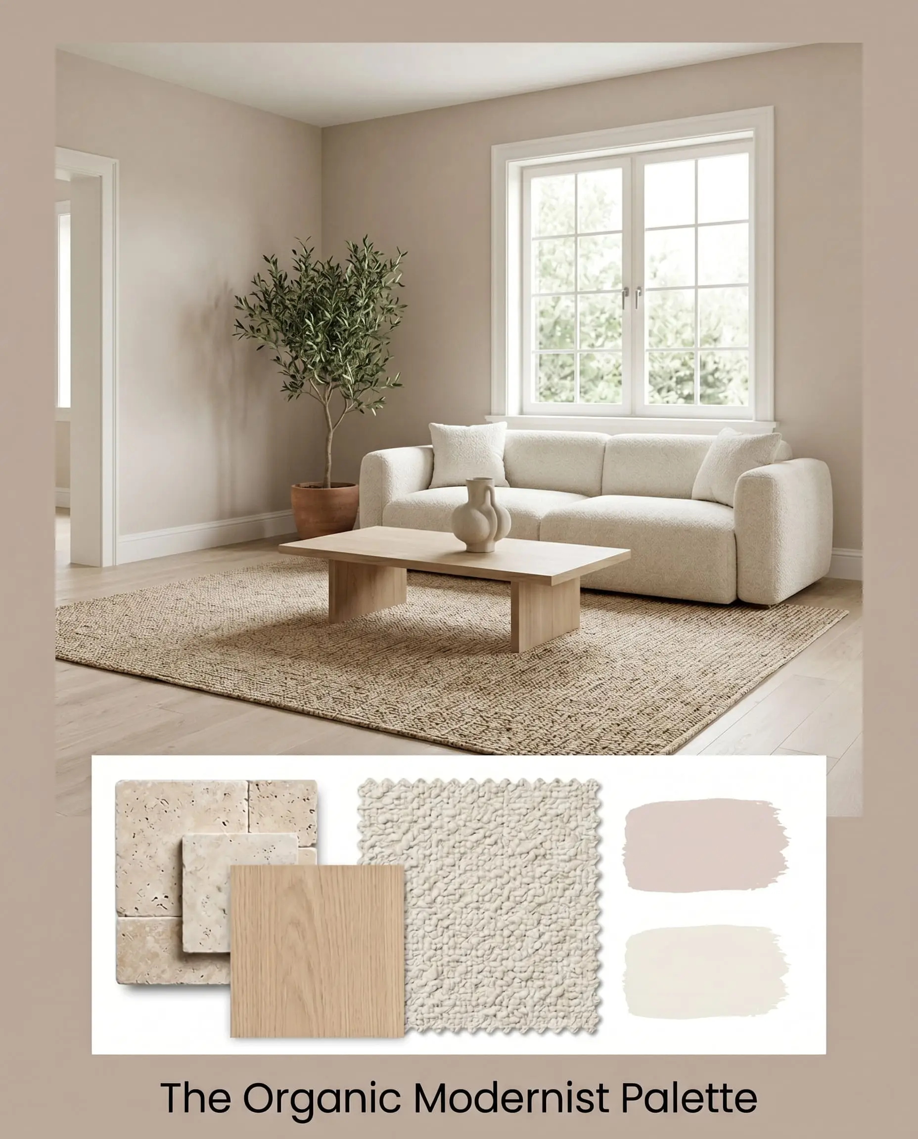
The Organic Modernist Palette: Here, we strip away all heavy contrast and rely entirely on texture. The walls are paired with Sherwin-Williams Alabaster trim to keep the transitions whisper-soft. We introduce tumbled travertine flooring, bleached oak furniture, and heavy boucle fabrics. The exact color math of the taupe-gray base effortlessly bridges the gap between the cool stone floors and the warm textiles, resulting in a seamless, tactile sanctuary.
Head-to-Head Comparisons
Choosing the right neutral often comes down to microscopic differences in chemistry. You cannot rely on a tiny paper swatch; you must compare the data.
Mocha Ice vs. Sherwin-Williams Accessible Beige
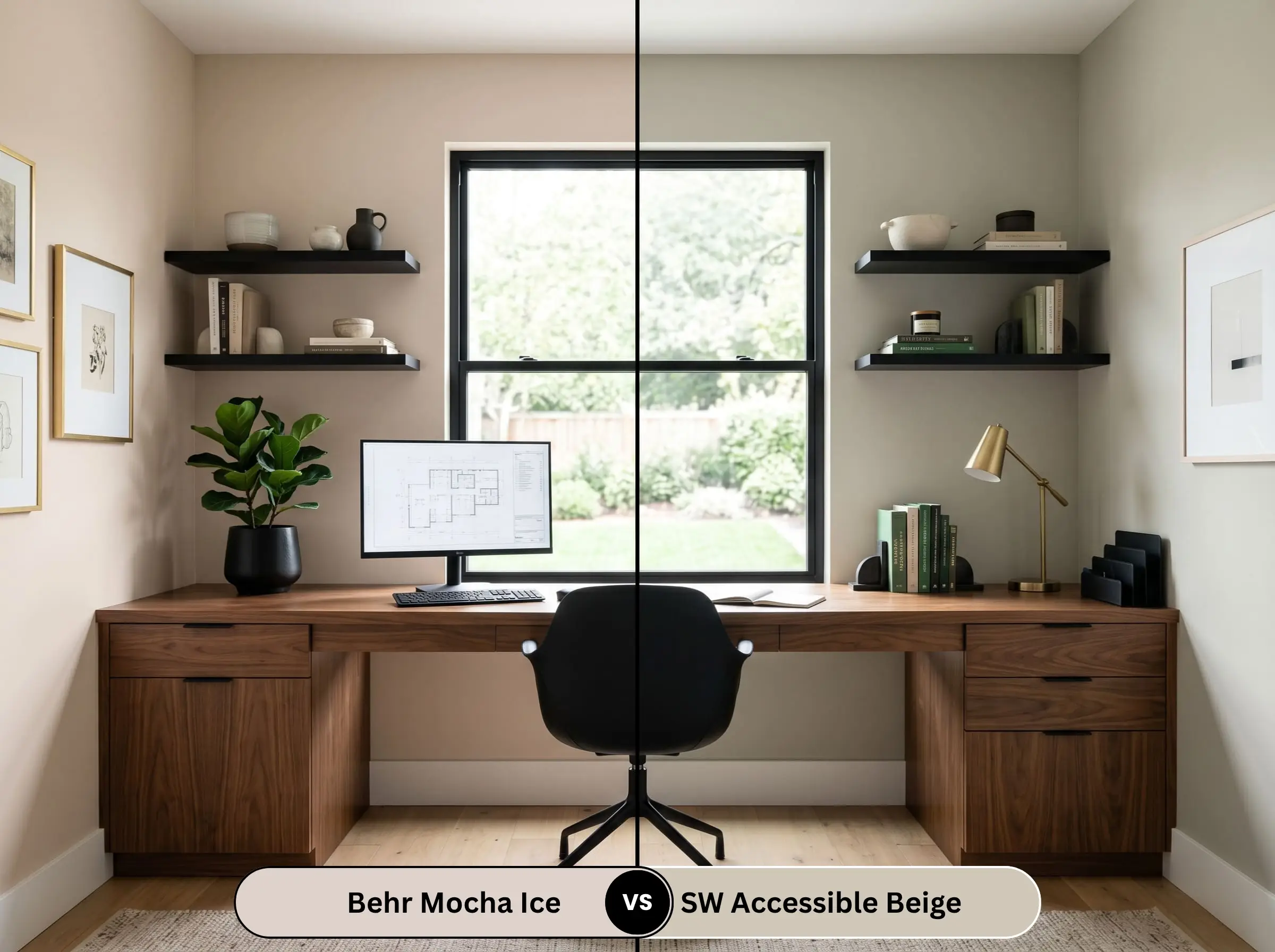
Accessible Beige is an absolute titan in the paint world, but it carries a distinct green-gray undertone. If your room has heavy southern light, Accessible Beige will hold its shape as a true neutral, whereas the Behr option will lean heavily into its red undertones and warm up significantly. Choose Accessible Beige if you fear pink; choose the Behr option if you want a creamier, more inviting glow.
Mocha Ice vs. Benjamin Moore Edgecomb Gray
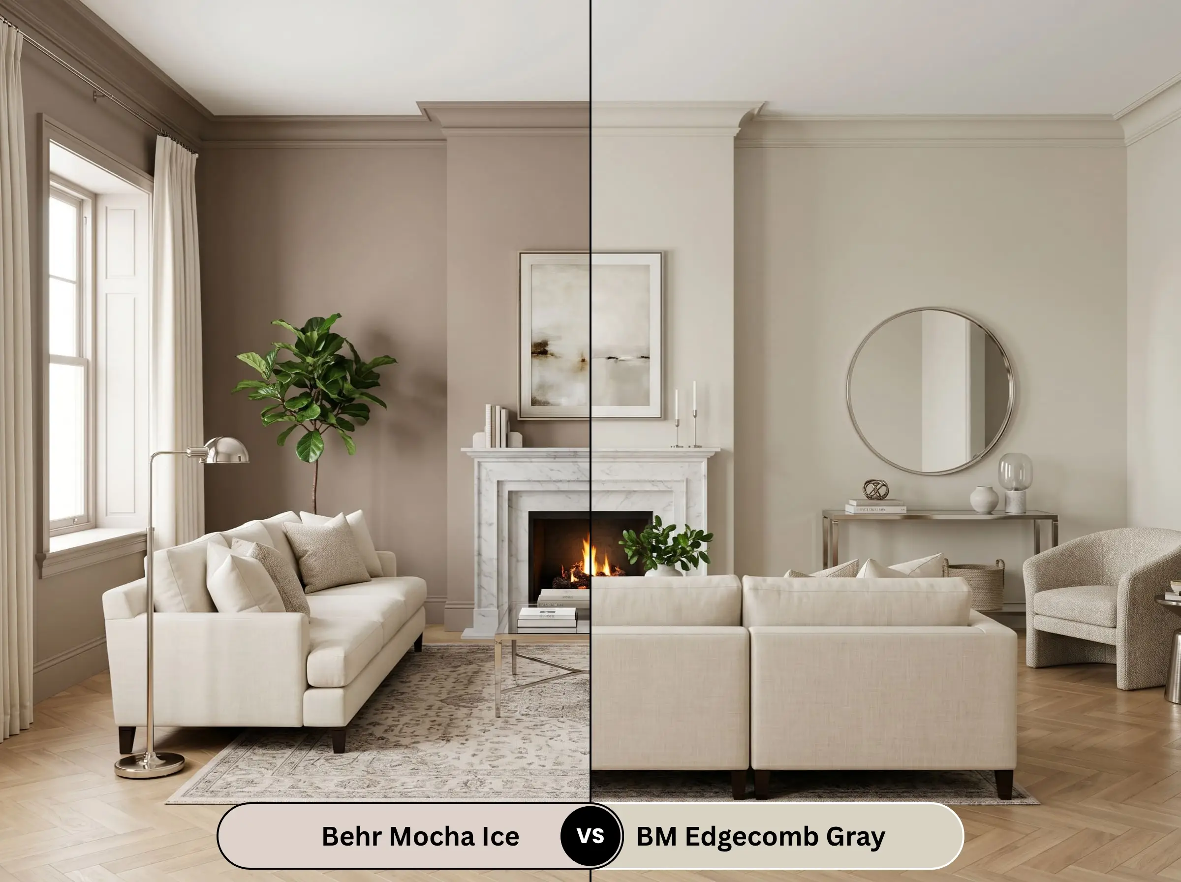
Edgecomb Gray has a slightly higher LRV, making it noticeably lighter on the wall. However, Edgecomb Gray lacks the red undertones entirely, leaning much further into a traditional “greige.” If you want a crisper, more modern backdrop, Edgecomb Gray wins. If you are aiming for a cozy, enveloping atmosphere, the latte-inspired depth of the Behr formula is superior.
Mocha Ice vs. Sherwin-Williams Iced Mocha
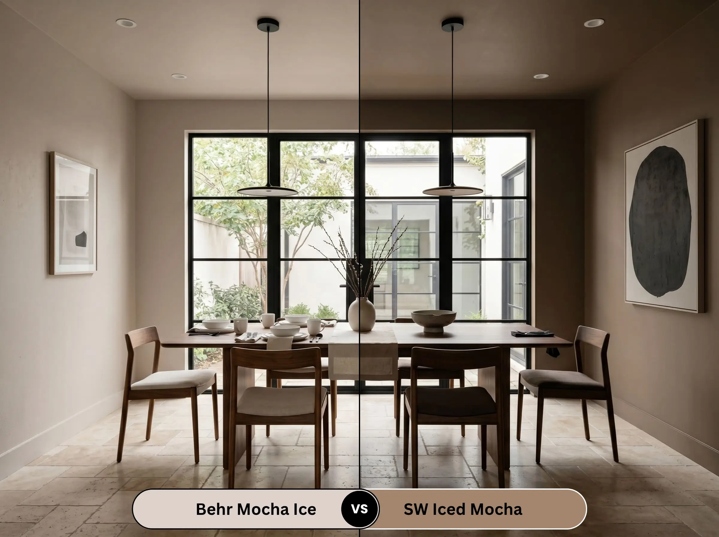
Despite the nearly identical names, these are wildly different paints. Sherwin-Williams Iced Mocha is significantly darker and heavily brown-dominant. It functions more as a dramatic accent color or a grounding cabinet hue. The Behr iteration is a true, light-reflecting neutral meant to carry an entire room.
Similar Colors & Brand Equivalents
If you love the DNA of this color but need to pivot slightly based on your lighting, or if your contractor strictly uses a different brand, here are the exact alternatives.
Behr Alternatives
Cross-Brand Matches
Practical Application & DIY Advice
Executing a flawless paint job requires matching the chemical finish to the physical reality of the room. Review Behr’s top neutral paints to see how this specific formula compares in application.
The Dynamic Sheen Matrix
Primer Strategy for N150-1
Because this color sits at a comfortable mid-range LRV, it does not require a deeply tinted gray primer to achieve its true depth. A standard, high-quality white primer is perfectly sufficient for covering bare drywall. However, if you are applying this over heavy wood grain (like 90s oak cabinets), you must use a heavy-duty, stain-blocking shellac primer to prevent the wood tannins from bleeding through and turning the taupe an ugly, muddy yellow.
Coverage & Touch-Up Realities
If you are upgrading to the premium Behr Dynasty line, you can realistically achieve full coverage in a single coat over light-colored walls. However, touch-ups with warm taupes can be notoriously tricky. If you try to touch up a scuff mark a year later, the new paint will often “flash” (appear as a visible, slightly darker patch) because the original wall paint has subtly faded. Always save a small amount of the original can and feather the edges meticulously with a dry brush.
Frequently Asked Questions
It is definitively a warm paint color. While it contains a subtle gray neutralizing agent, its primary base is a creamy taupe heavily driven by warm red undertones.
It can, depending on your lighting. In balanced natural light, the gray undertones keep the red in check, resulting in a soft latte color. However, in late-afternoon western light, the red undertones can flash, giving the walls a slightly fleshy or pinkish hue.
For a crisp, modern aesthetic, pair it with Benjamin Moore Chantilly Lace. For a softer, more traditional transition that complements its warmth, Sherwin-Williams Alabaster is the superior choice.
It has an LRV (Light Reflectance Value) of 66. This places it firmly in the light-to-medium range, meaning it bounces a good amount of light around a room while retaining enough depth to contrast against white trim.
Final Verdict & Expert Warnings
Behr Mocha Ice is a masterfully balanced, sophisticated neutral that successfully avoids the sterile coldness of pure gray and the heavy, dated feeling of traditional brown. It is the absolute perfect choice for homeowners looking to create a soft, enveloping, latte-inspired aesthetic in primary bedrooms or transitional living spaces.
Clash Warning: You must protect this color from its natural enemies. We explicitly warn against pairing this paint with heavy yellow woods, such as 90s golden oak flooring or cabinetry. The yellow will violently clash with the paint’s red-taupe base, making the walls look dirty and muddy. Furthermore, avoid stark, cool, blue-toned whites in your decor, as they will instantly force Mocha Ice to look aggressively pink by comparison. Stick to warm woods, matte black metals, and creamy whites to let this stunning neutral do its job.