Exterior House Paint Colors 2026: The Ultimate Guide to Warm Neutrals & Moody Tones
Your home’s exterior is its handshake, its smile, and its first impression all rolled into one. It is the visual prelude to the life lived inside. If 2025 was about finding our footing, 2026 is about planting roots. The forecast for exterior house paint colors in 2026 is moving decisively away from the stark, chilly greys of the past decade toward a palette that feels “grounded,” “lived-in,” and deeply connected to nature.
We are seeing a shift toward “Quiet Joy”—colors that don’t just look good but feel good. Whether you are planning a full renovation or just looking to boost your curb appeal, this guide covers the top color trends, specific paint recommendations, technical advice on finishes, and expert tips on choosing the right hue for your architectural style.
📋 Quick Summary: The Top 5 Trends at a Glance
For those in a rush, here is the cheat sheet for the defining looks of 2026:
- The New Beige (Warm Neutrals): Creamy off-whites and rich taupes replace stark whites.
- Forest & Sage Greens: Nature-inspired tones that blend the home with the landscape.
- Moody “Soft Blacks”: Deep charcoals and warm blacks used for the entire exterior body.
- Earthy Terracottas: A revival of desert warmth and Mediterranean clay tones.
- The “Reversed” Palette: Dark bodies with light trim, flipping the traditional script.
The Vibe of 2026: Why Warmth is Winning
Why the shift? In the world of modern architectural design trends, we are seeing a massive move toward biophilic design—architecture that seeks to connect building occupants more closely to nature. This philosophy is now spilling out from the interior to the exterior walls.
Homeowners in 2026 are craving comfort and stability. The “hospital sterile” look of cool greys and blinding whites is officially out. Instead, we want exteriors that promise a warm welcome before we even step through the door. This means undertones are heating up; greys are turning into “greiges” (grey+beige), and whites are softening into creams. It’s a seamless transition from the indoor sanctuary to the outdoor living trends that prioritize relaxation, organic materials, and lush gardens.
Furthermore, with the rise of eco-sustainable interior design trends, homeowners are looking for colors that complement sustainable materials like reclaimed wood, natural stone, and native landscaping. The paint is no longer just a covering; it’s a unifying element.
You can apply wallpapers, paints, etc. on walls and see how they look in various interiors.

Top 5 Exterior Paint Color Trends for 2026
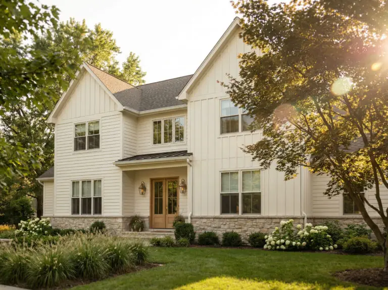
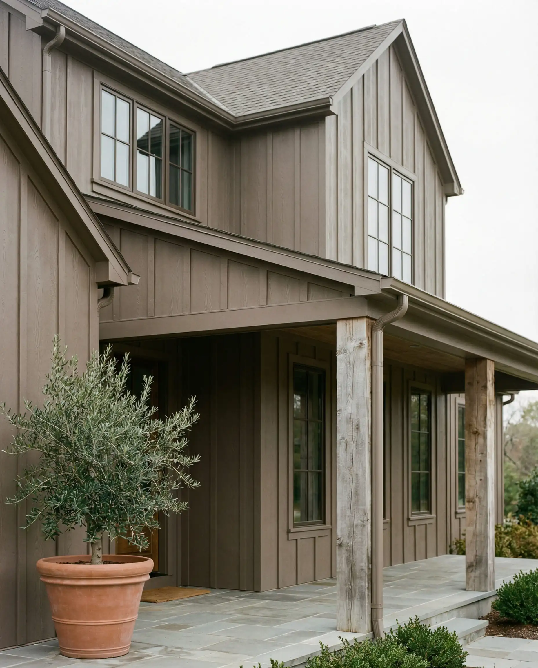
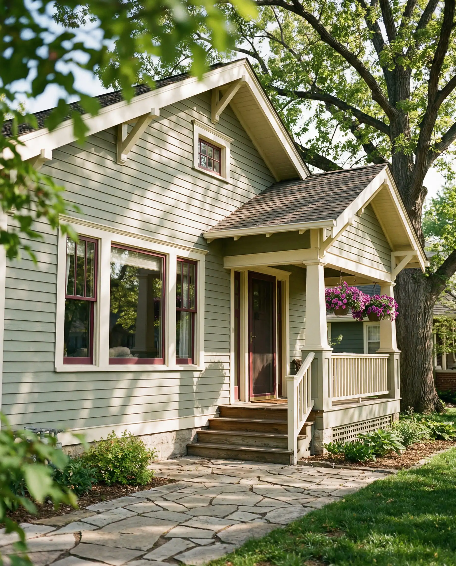
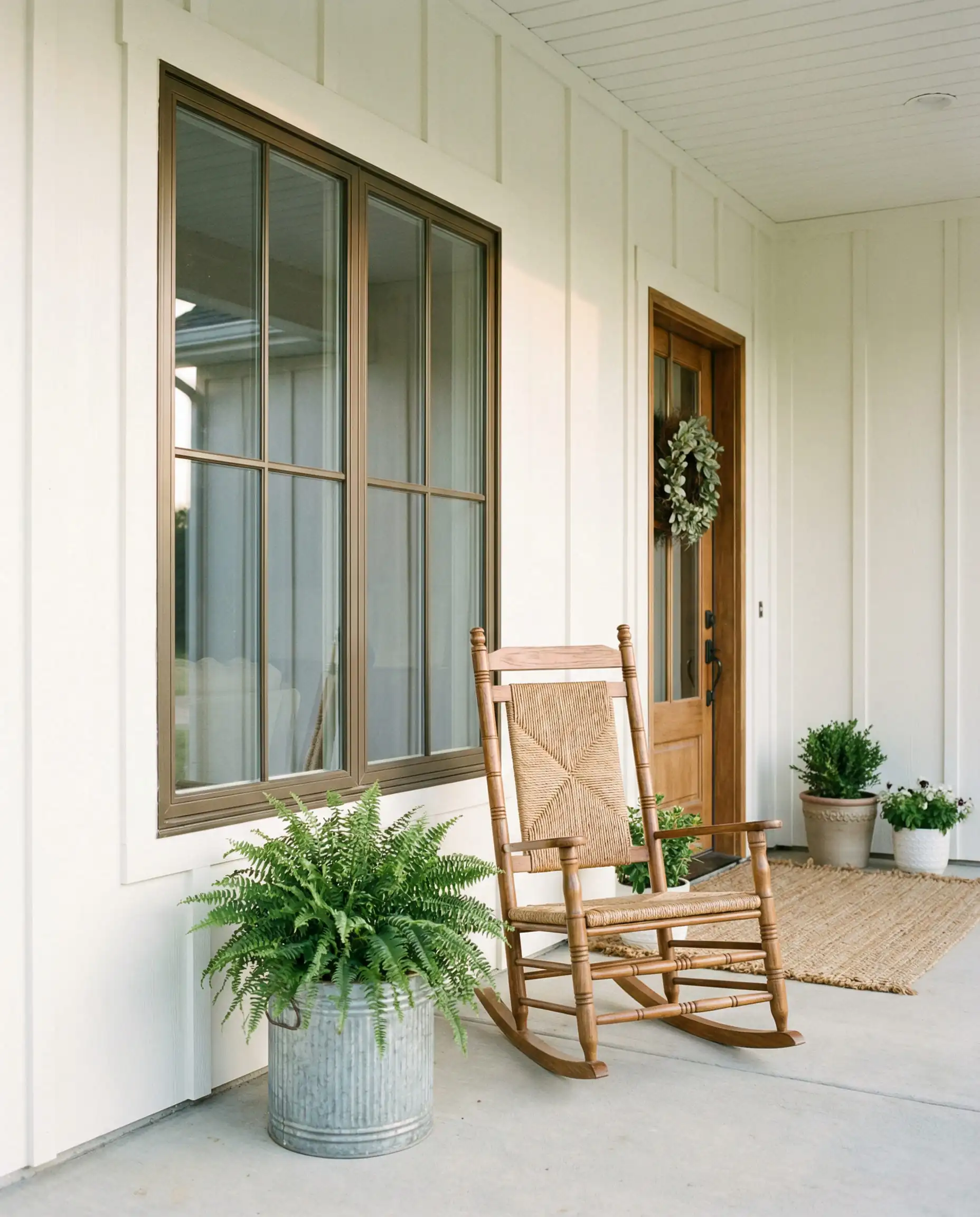
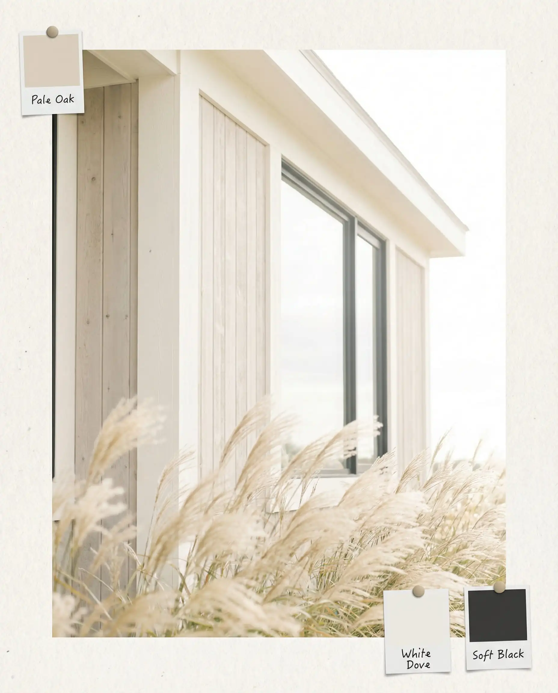
1. The New Neutrals: Cream, Taupe, & Greige
The all-white farmhouse had its moment, but in 2026, it is evolving. The blindingly bright whites are being dimmed down to softer, creamier versions that are easier on the eyes and mix beautifully with stone and wood accents.
- Why it works: It feels historic and established rather than “new build.” It offers a soft backdrop that lets your landscaping shine.
- Top Color Picks:
- Sherwin-Williams Alabaster (SW 7008): A staple that bridges the gap between white and cream perfectly.
- Benjamin Moore Swiss Coffee (OC-45): A soft white with just enough warmth to avoid looking sterile in direct sunlight.
- Behr Blank Canvas: A warmer, welcoming neutral that serves as a perfect backdrop for landscaping.
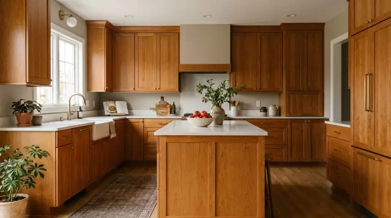
Looking for similar warmth indoors? Check out our guide on kitchen cabinet color trends to see how these creamy tones are taking over the heart of the home.
2. Return to Nature: Deep Moss & Sage Green
Green is arguably the protagonist of 2026. This isn’t about mint or lime; it is about greens that look like they were plucked straight from a dense forest or a drying herb garden.
- Why it works: Green is technically a cool color, but these organic shades read as neutral in an outdoor setting. They anchor the house to the earth.
- Top Color Picks:
- Sherwin-Williams Pewter Green (SW 6208): A cool, dark green that pairs beautifully with natural wood columns.
- Benjamin Moore October Mist (1495): A lighter, silvery sage that works wonders on bungalows and cottages.
- PPG Dried Basil: An herbal tone that feels very 2026—calm, muted, and sophisticated.
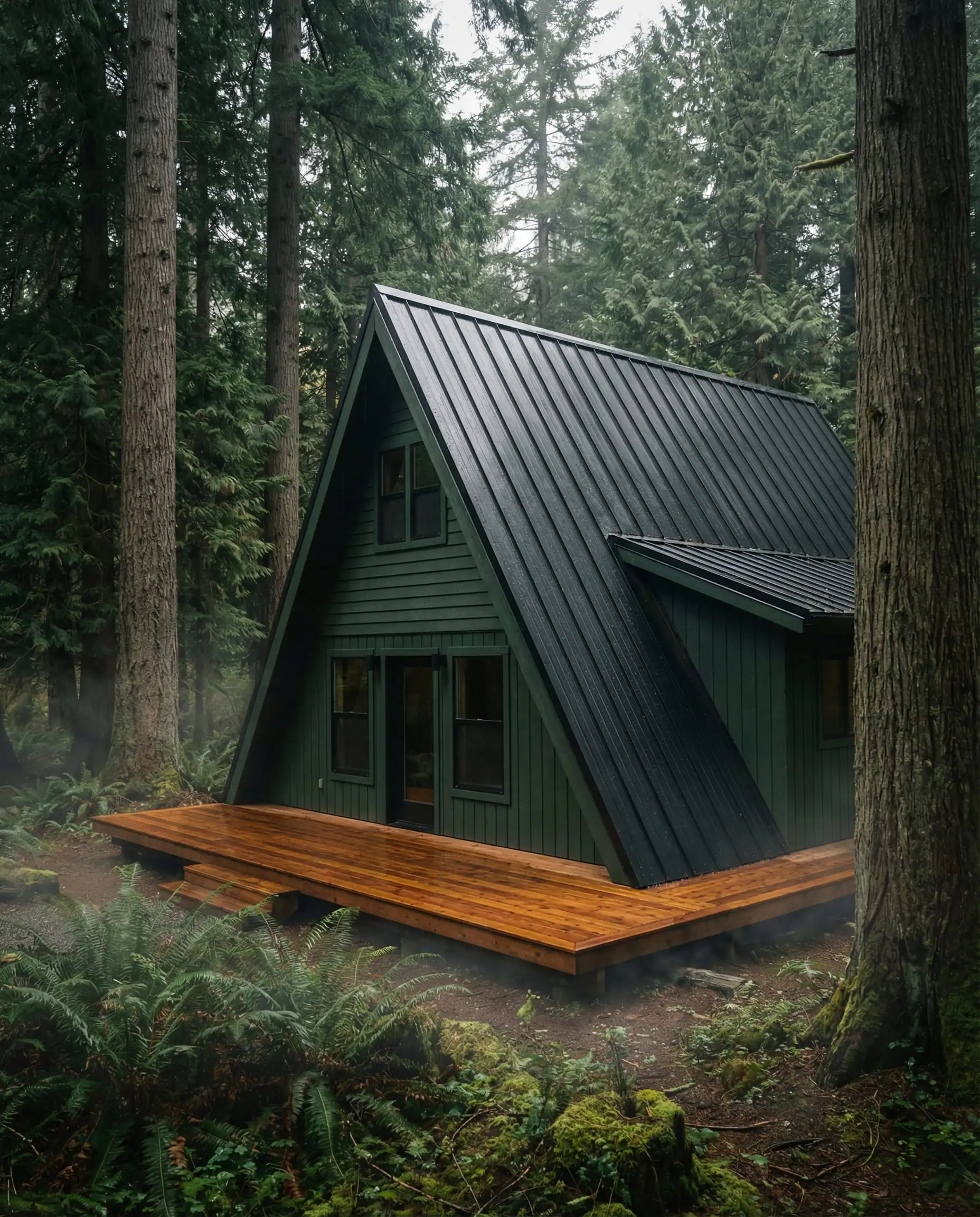
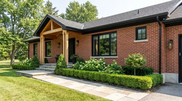
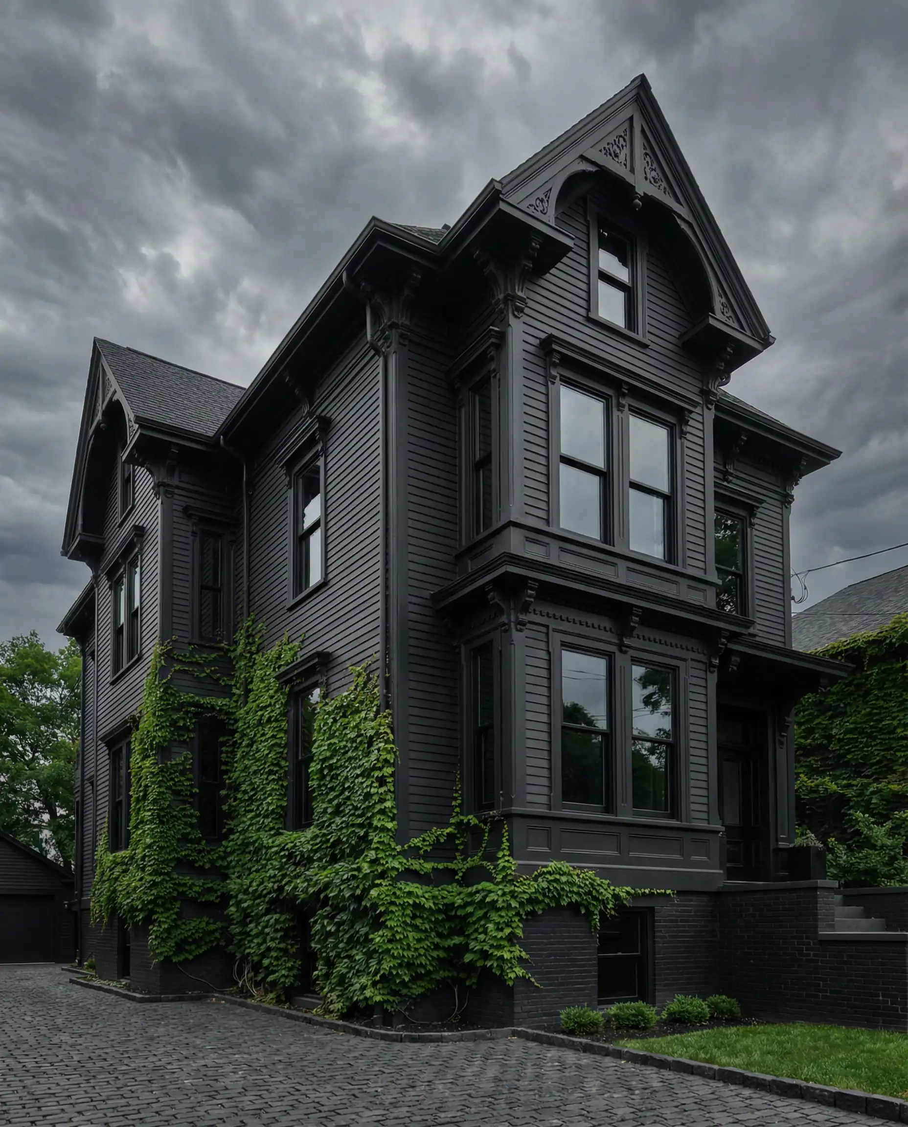
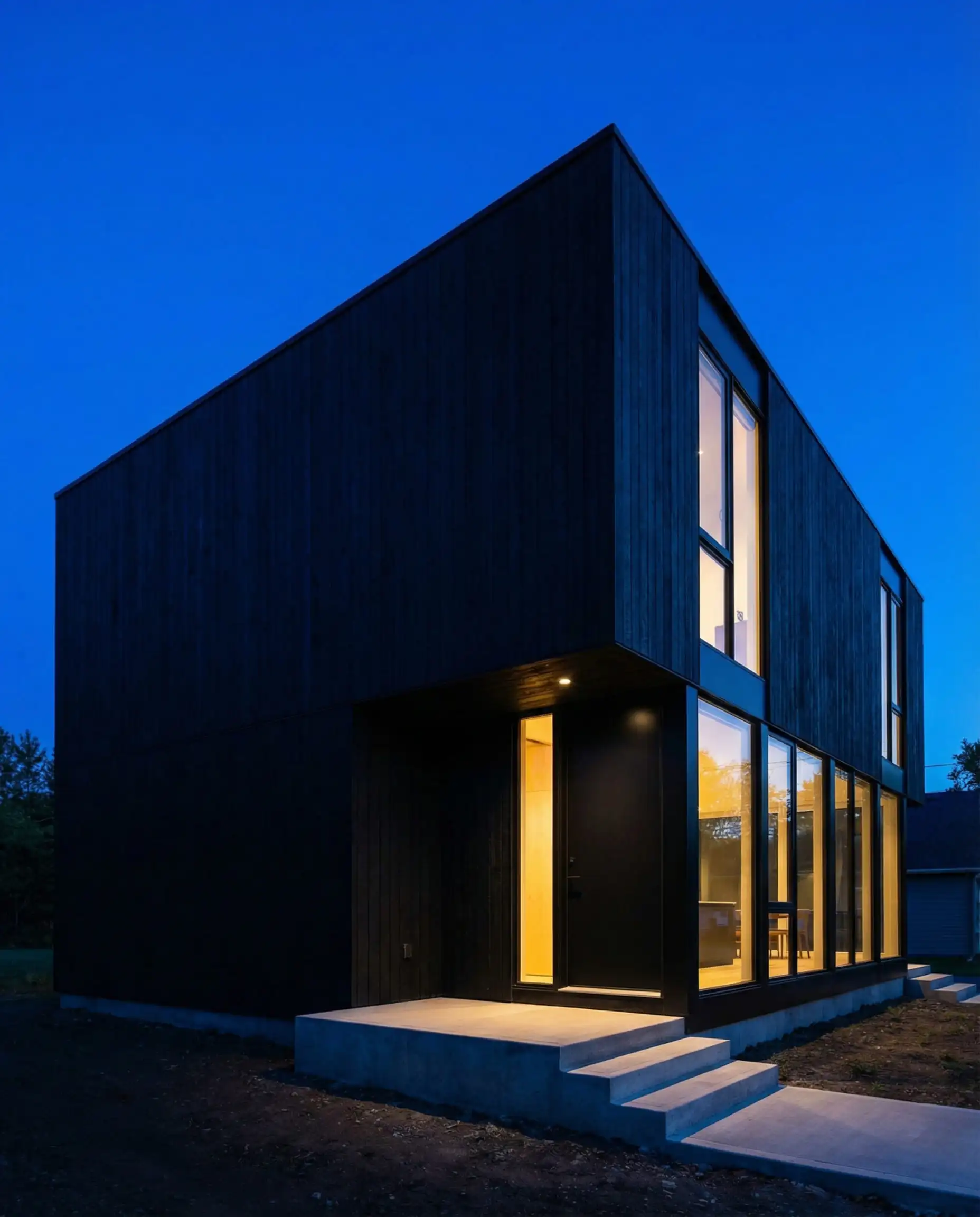
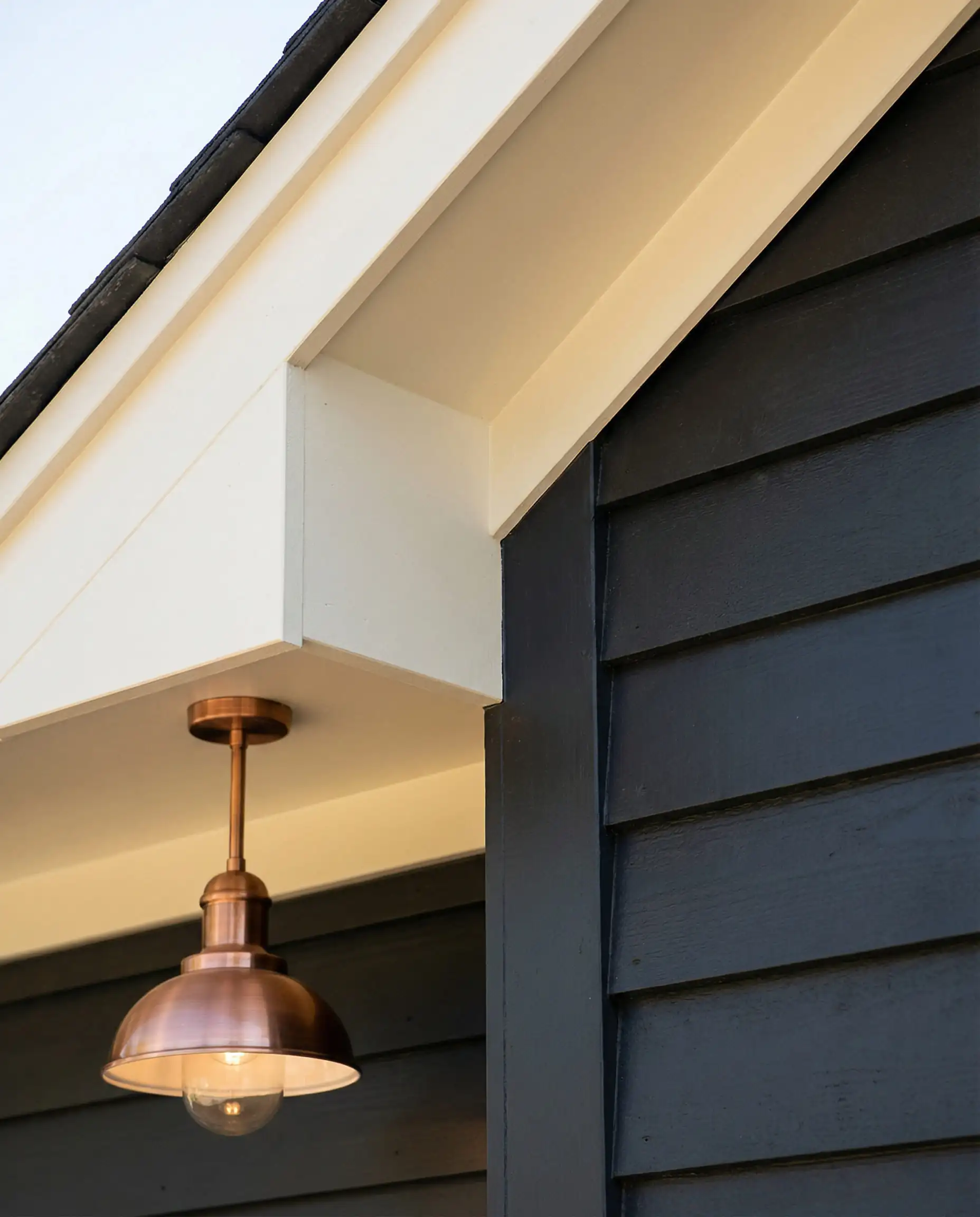
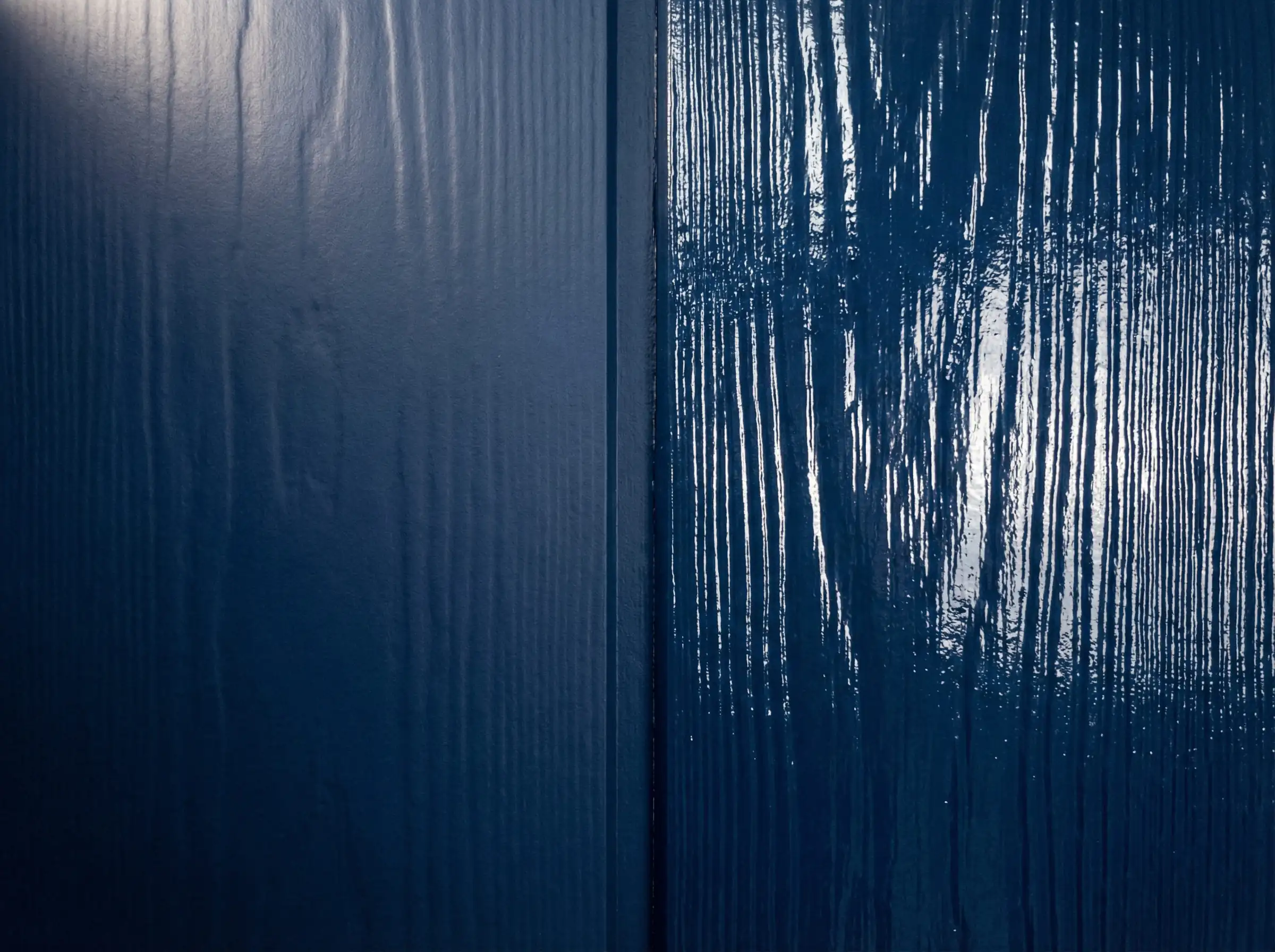
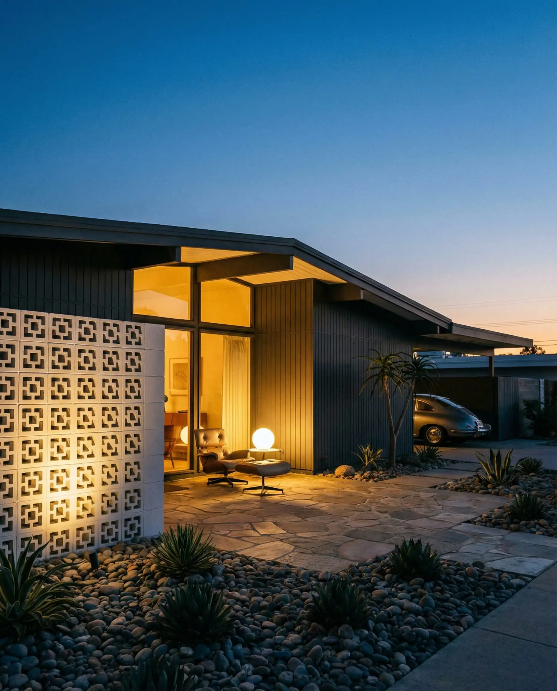
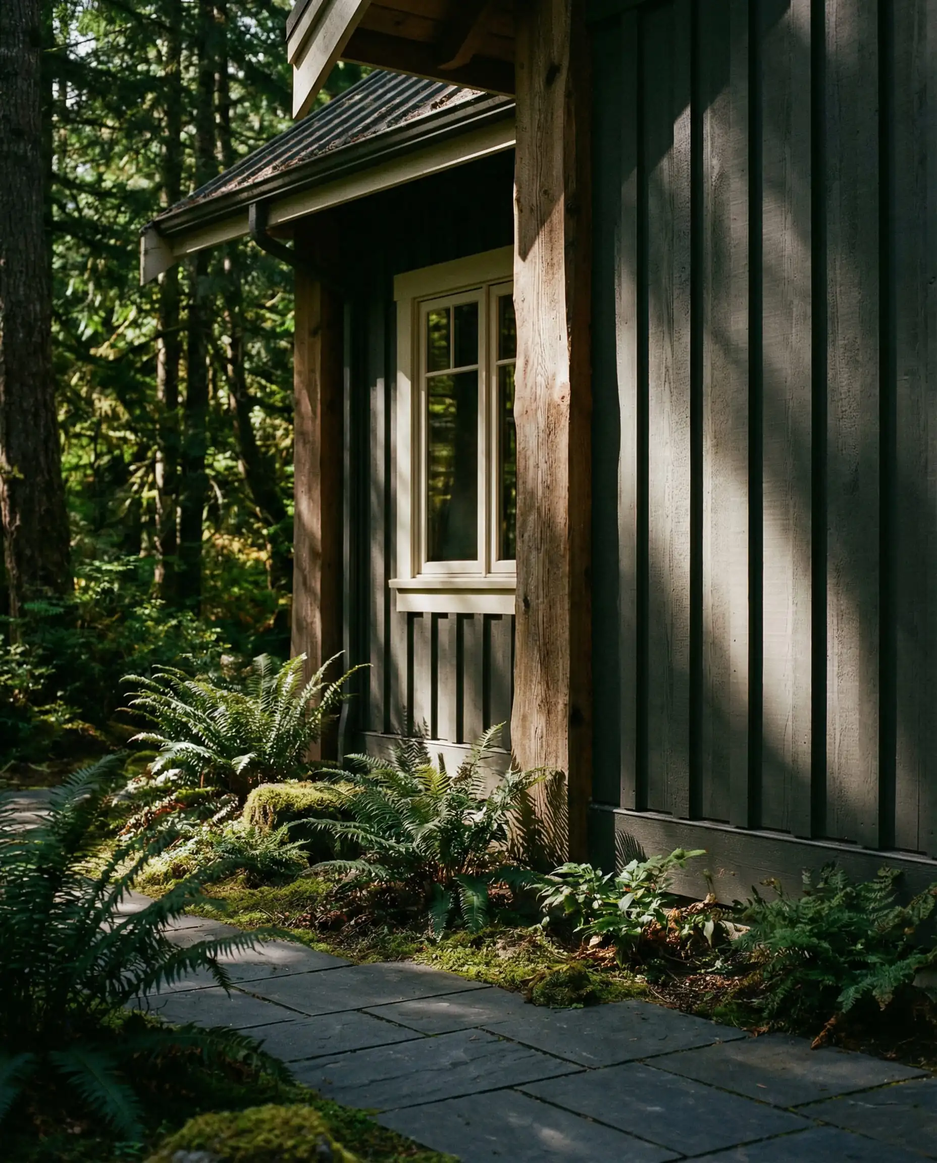
3. Moody Sophistication: The “Soft Black” Exterior
Dark exteriors are no longer just for modern, avant-garde boxes. We are seeing traditional homes—even Colonials and Tudors—being painted in deep, moody charcoals. The key for 2026 is that these aren’t “jet blacks”; they are “soft blacks” with graphite, blue, or green undertones.
- Why it works: It makes a massive statement. A dark exterior can actually make a home look smaller but more substantial and “jewel-box” like. It highlights window frames (especially if they are white) incredibly well.
- Top Color Picks:
- Sherwin-Williams Iron Ore (SW 7069): A rich charcoal that reads as a soft black without the harshness.
- Benjamin Moore Wrought Iron (2124-10): A classic deep grey/black that offers incredible contrast against white trim.
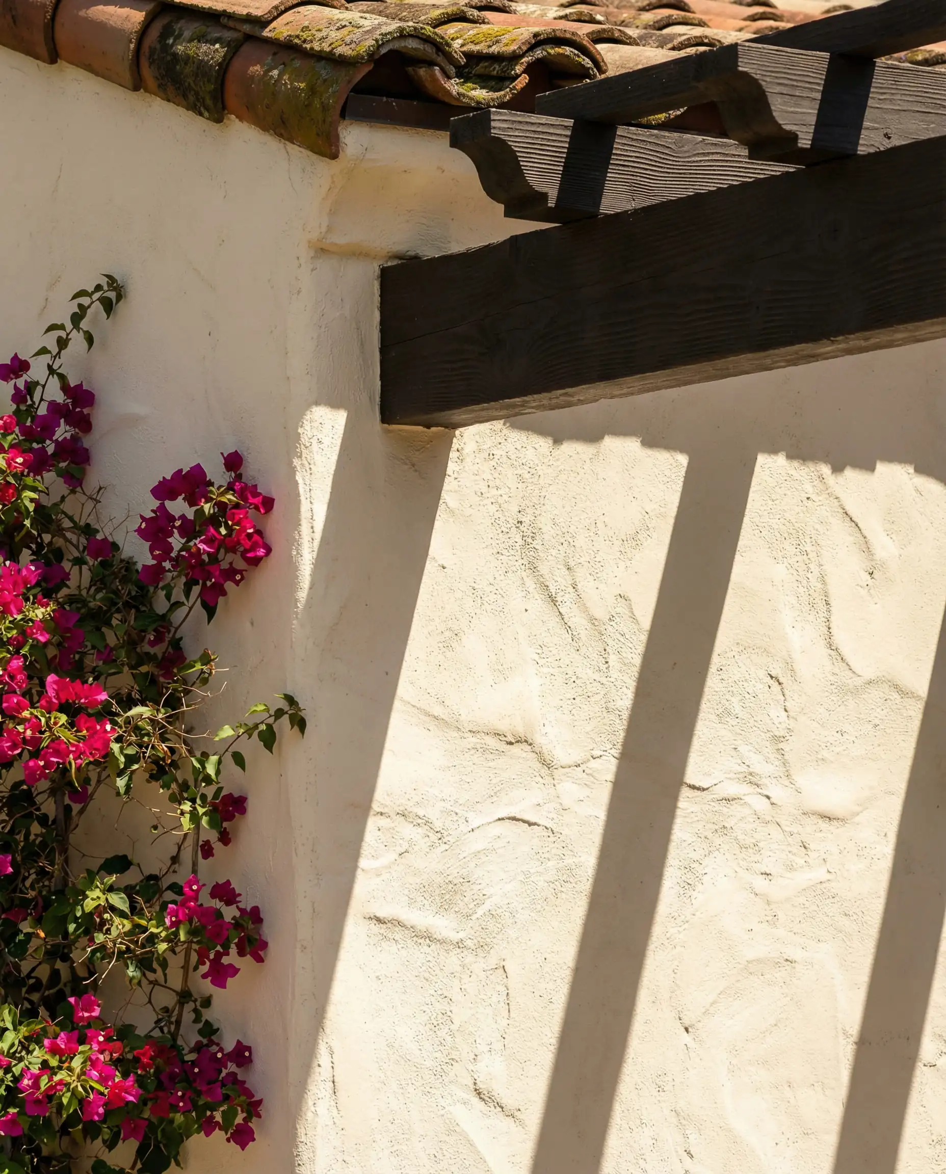
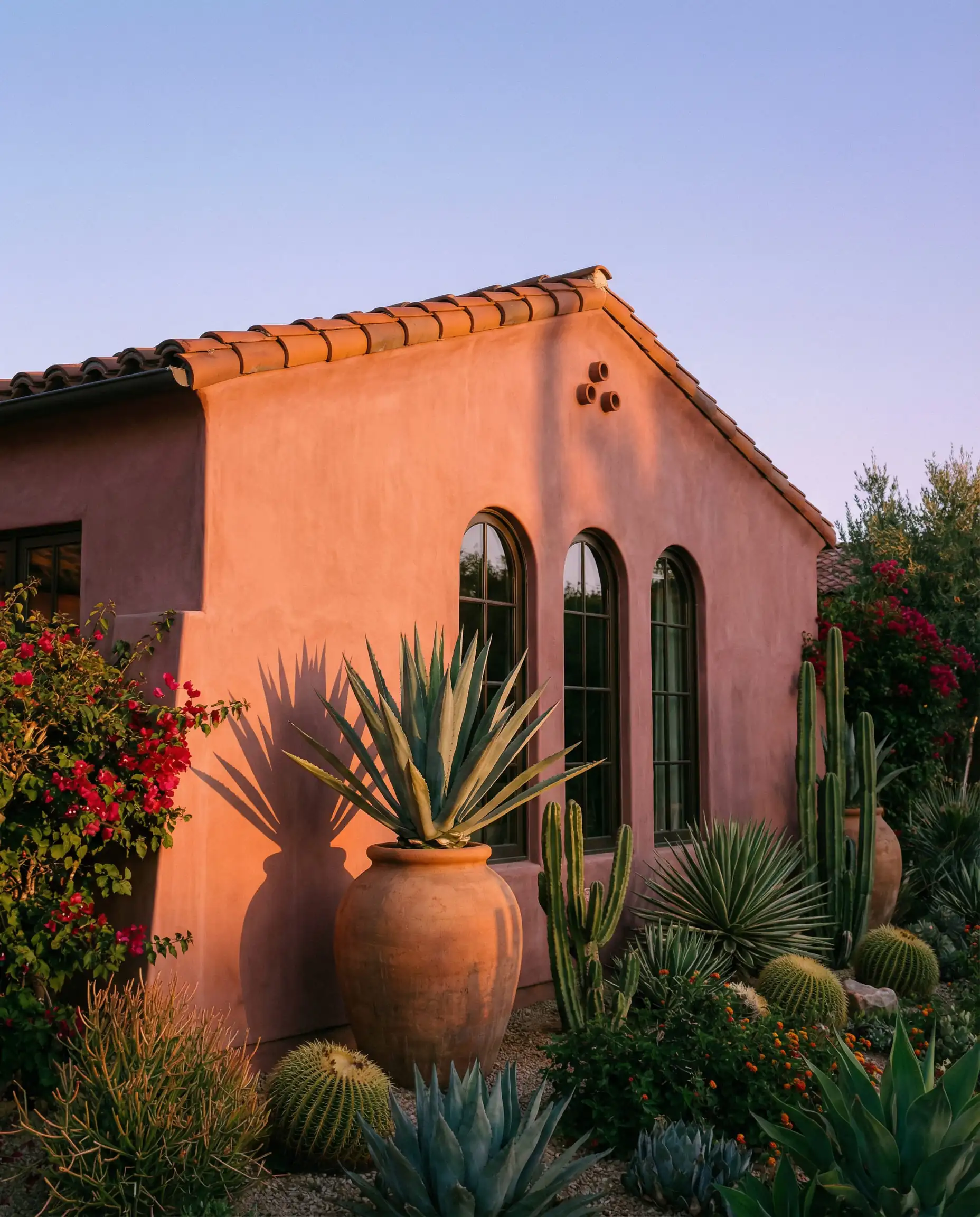
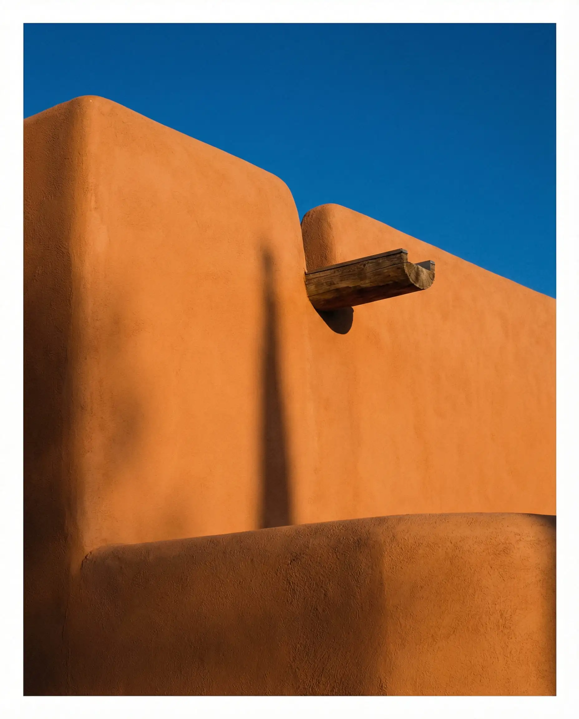
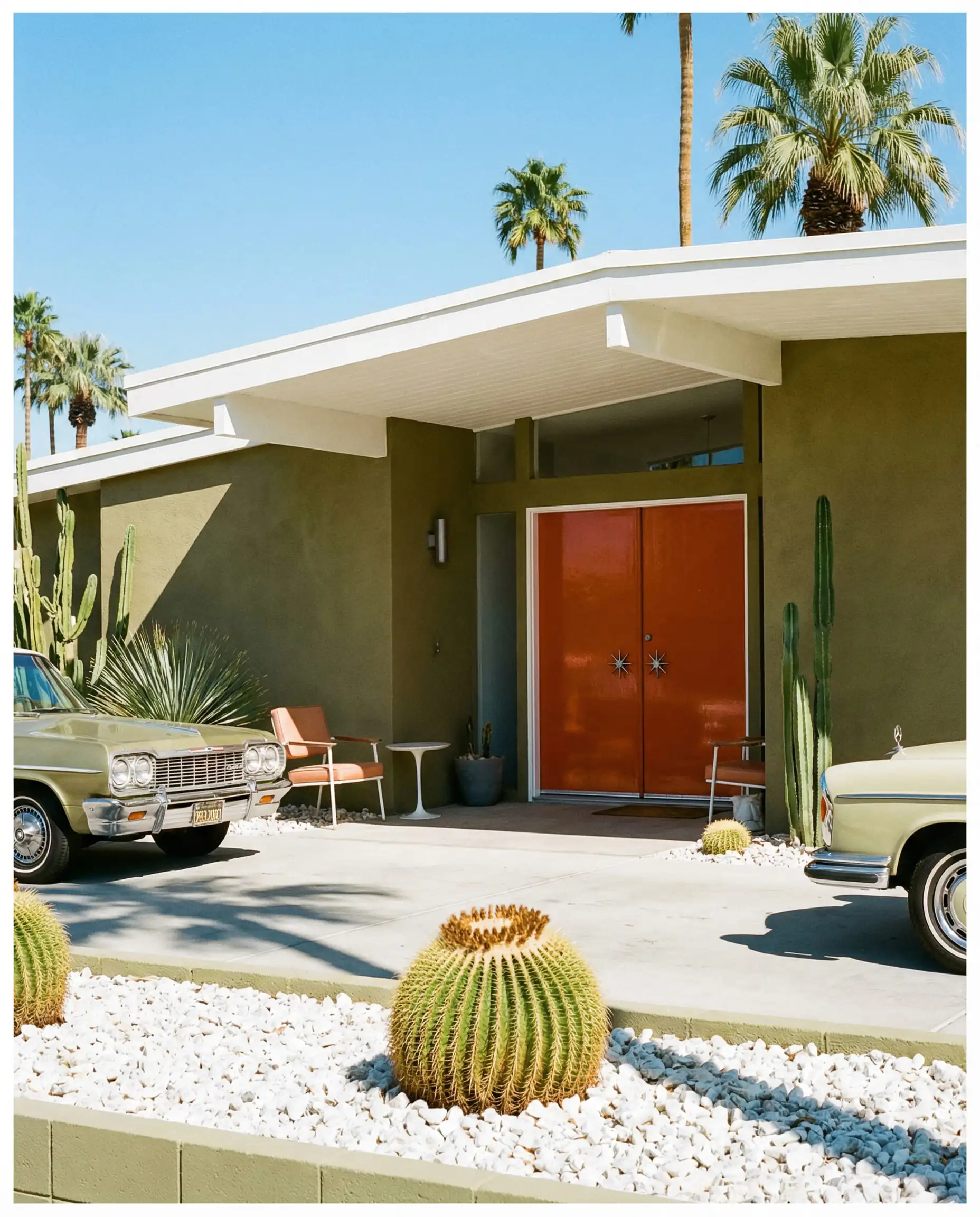
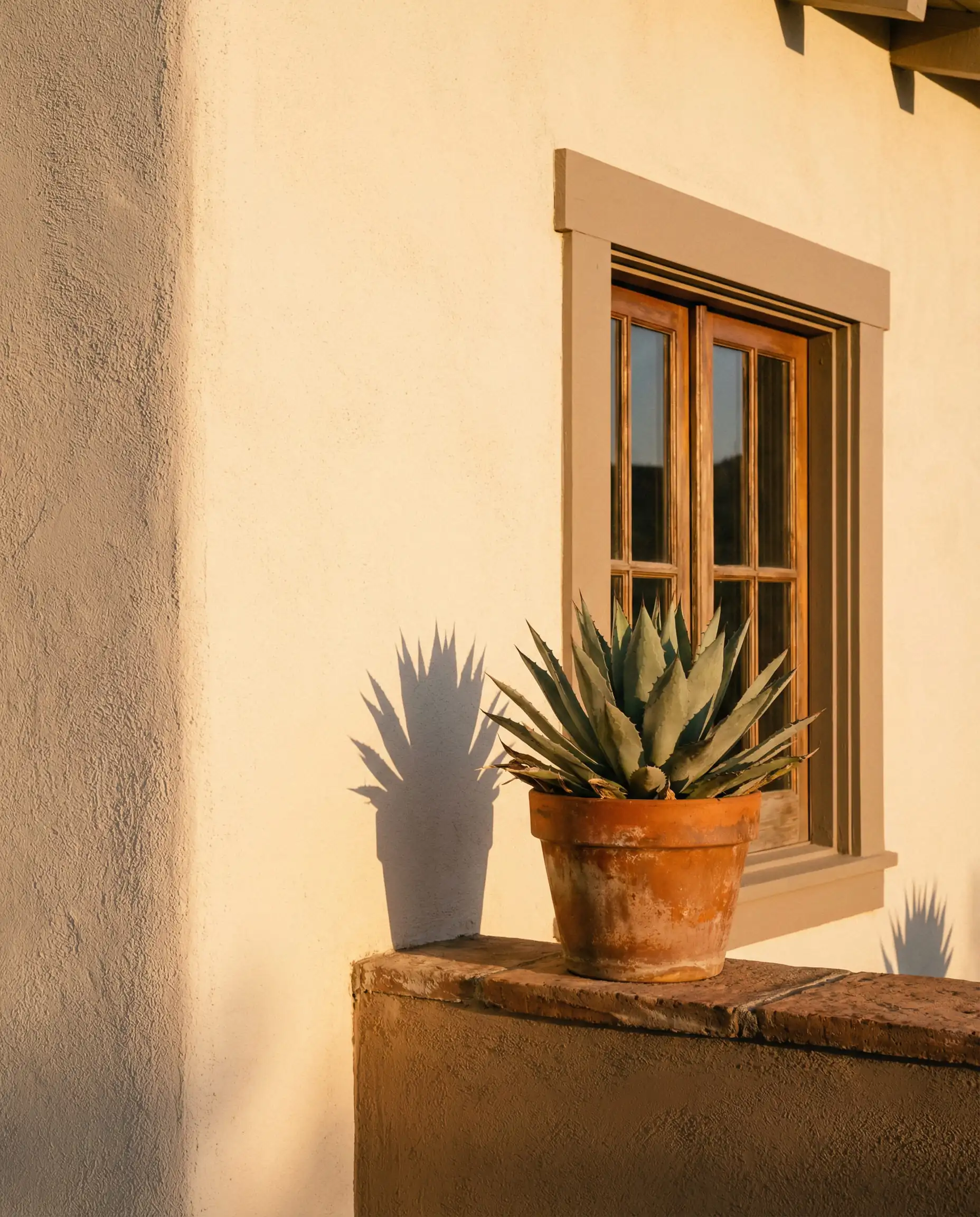
4. Earthy Terracotta & Stone
Reflecting the global interest in warmer climates and travel, clay-based tones are making a comeback. This isn’t the bright orange of the 90s; these are muted, “baked” earth tones that evoke stability.
- Why it works: It provides immediate warmth and pairs exceptionally well with black window sashes and bronze light fixtures.
- Top Color Picks:
- Farrow & Ball Red Earth: A rich blend of red and yellow pigments that changes beautifully with the setting sun.
- Sherwin-Williams Cavern Clay (SW 7701): A nod to the American Southwest, perfect for stucco homes.
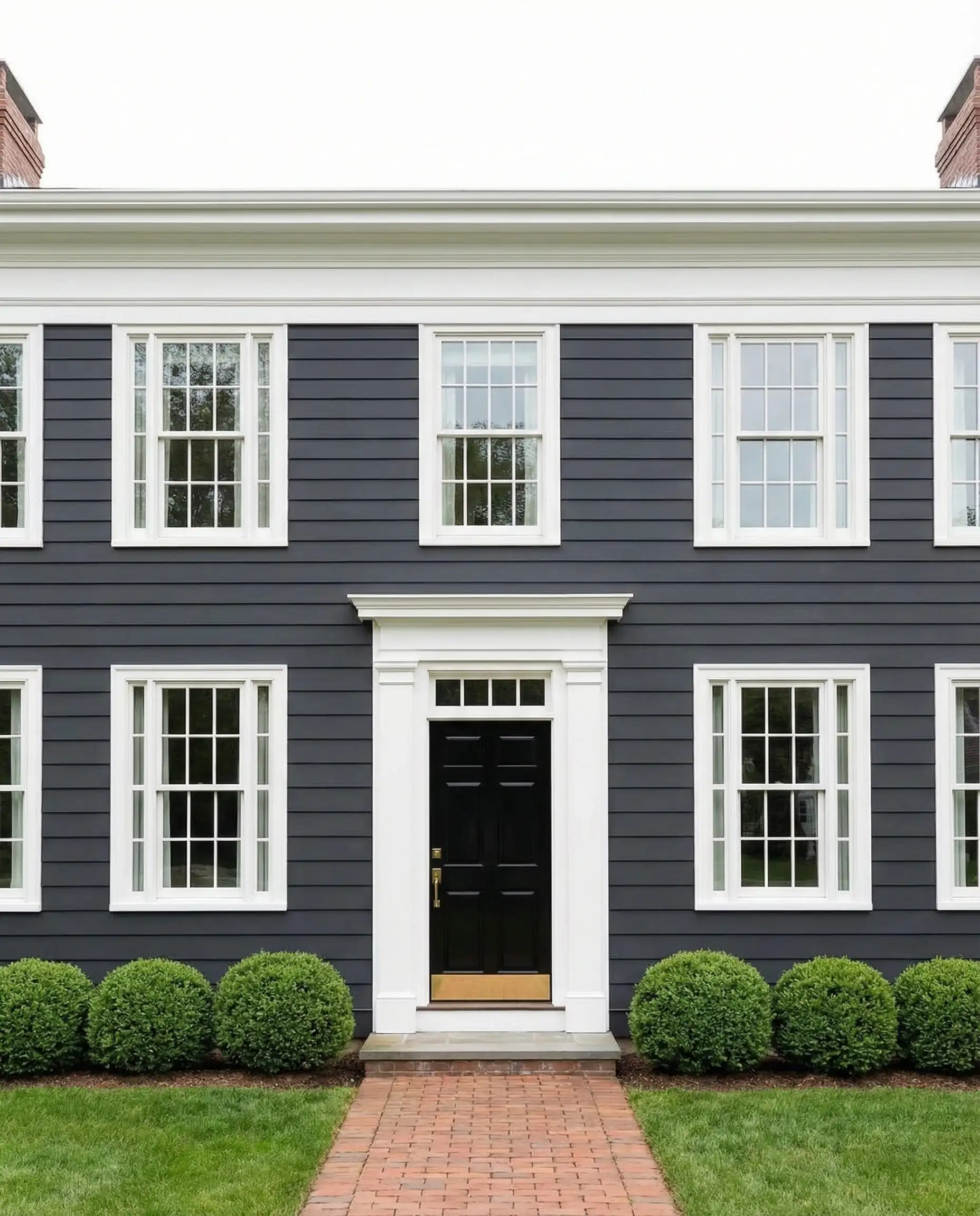
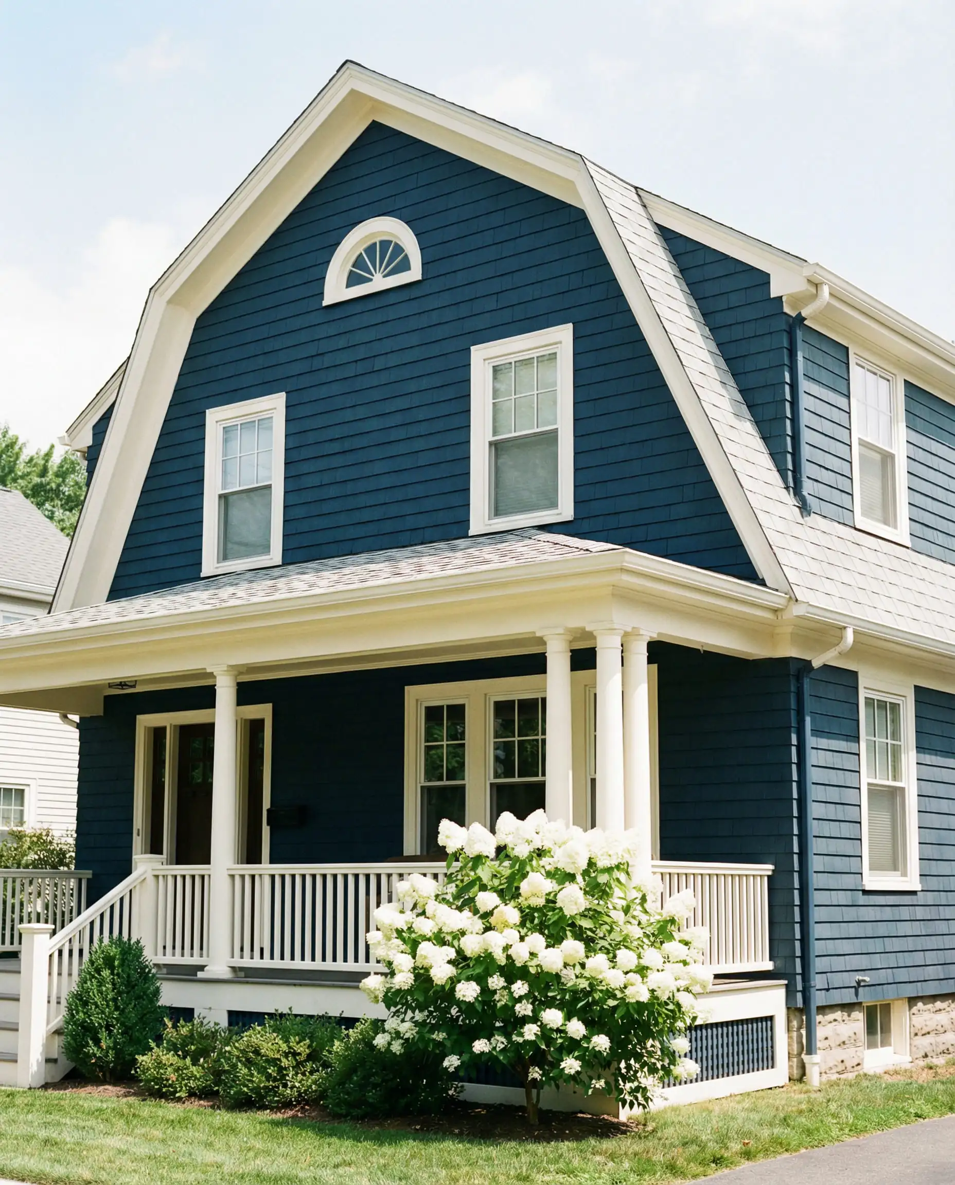
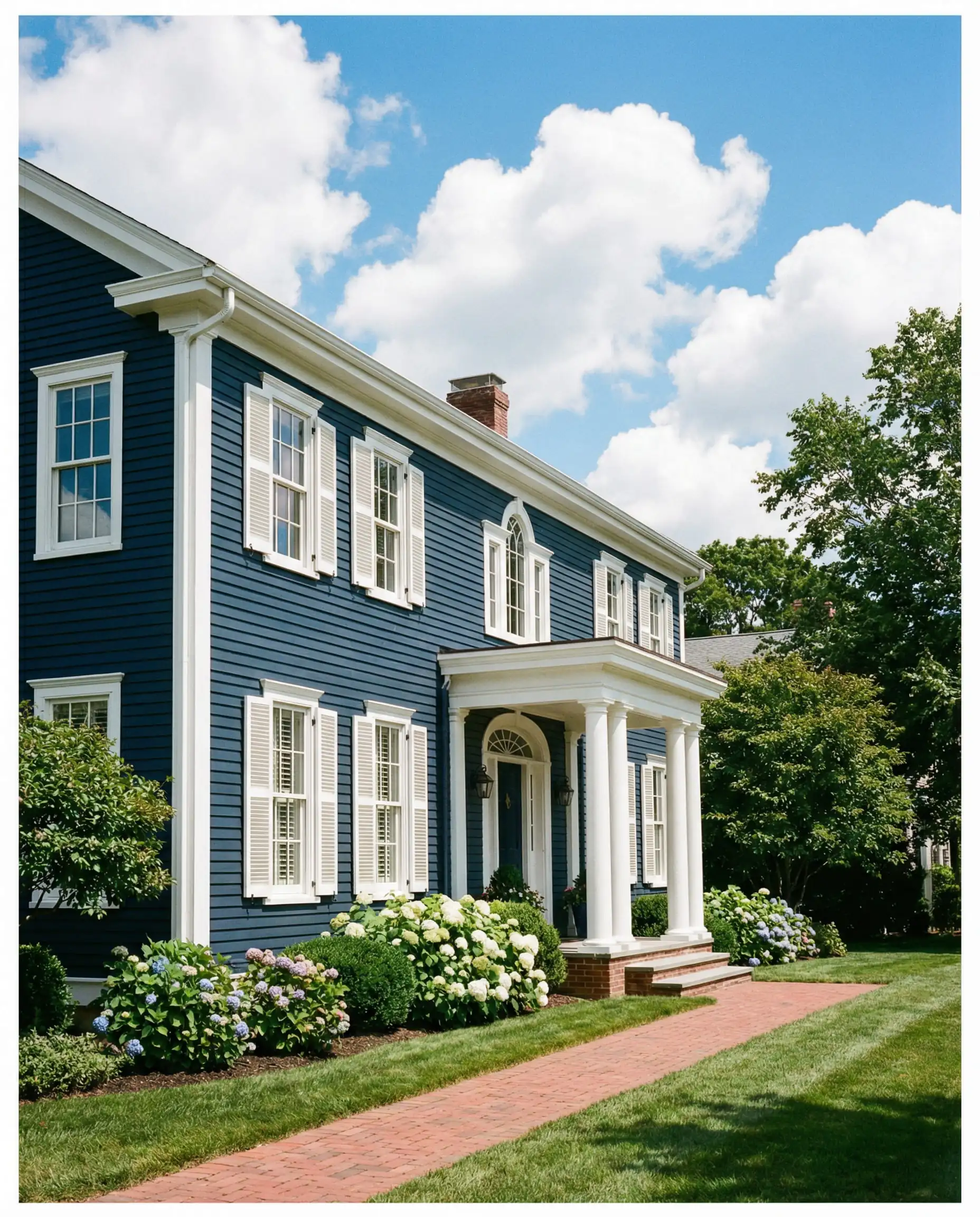
5. The “Reversed” Palette
Traditionally, you paint the body of the house light and the trim dark. In 2026, we are flipping the script. Dark bodies (like Navy, Forest Green, or Charcoal) paired with light trim (Cream or Light Grey) highlight the architectural “bones” of the house in a fresh way.
Visualize Before You Paint
Choosing an exterior color is a big commitment. Small swatches often fail to show how a color will look across an entire two-story facade under the changing sun.
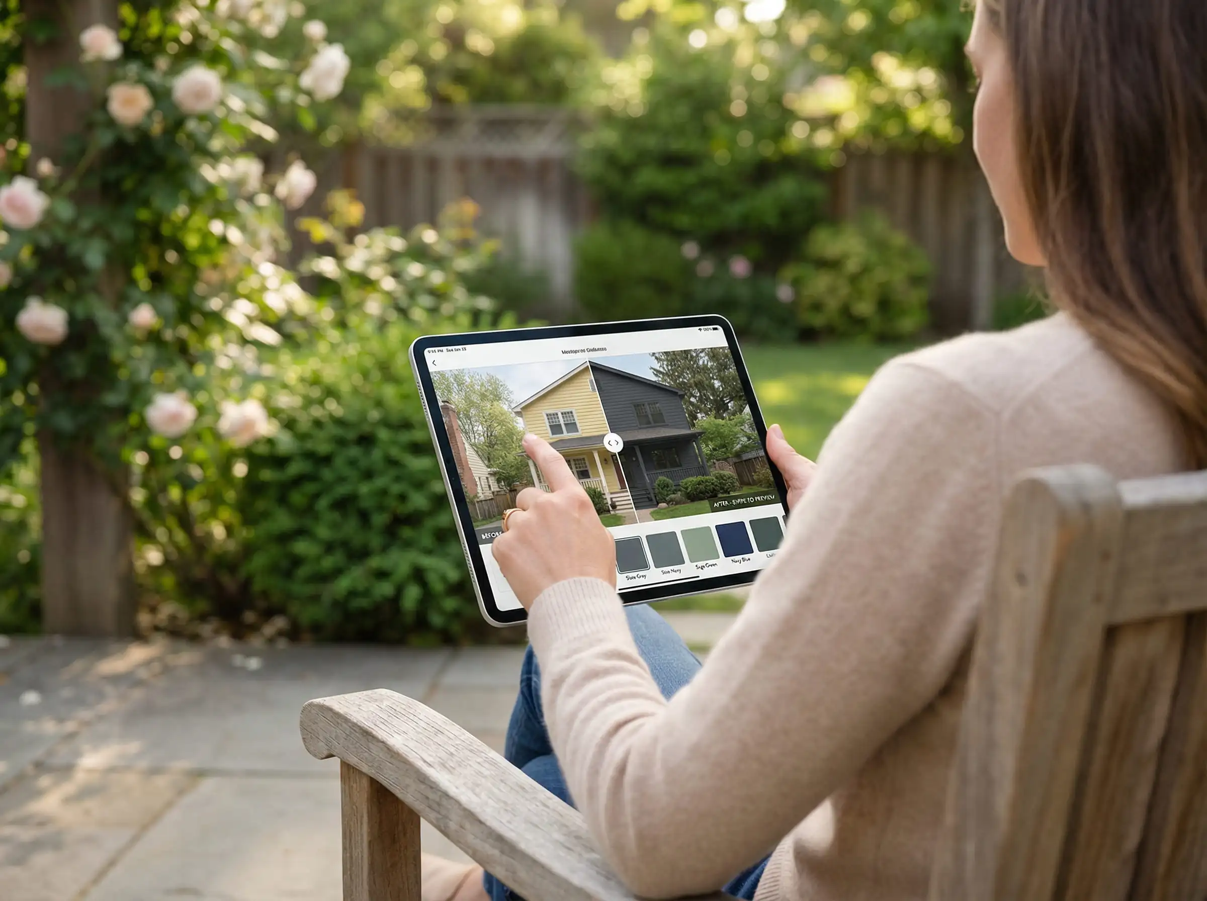
Try the Hackrea Visualizer:
Before you buy 20 gallons of paint, take the guesswork out of the equation. With the Hackrea Paint & Wallpaper Visualizer, you can:
Technical Guide: The Science of Sheen
Choosing the color is only half the battle. The “sheen” (or finish) of the paint dictates how the color looks and how long it lasts. Many homeowners make the mistake of using the wrong sheen, which can highlight imperfections or lead to peeling.
1. Flat / Matte
2. Satin / Eggshell
3. Semi-Gloss / Gloss
For 2026, the most popular combination is a Flat/Matte Body paired with Satin Trim. This creates a subtle textural contrast that looks high-end.
Pro Tip
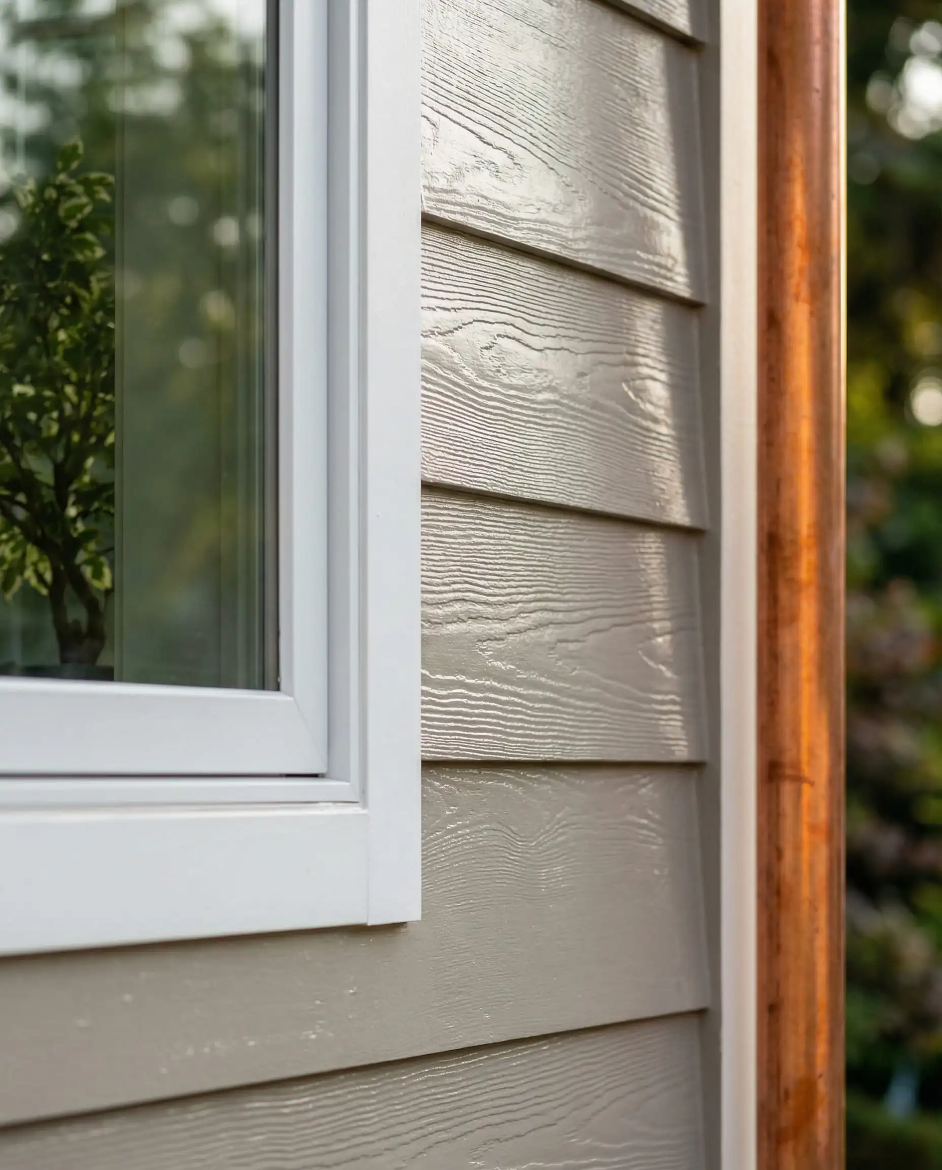
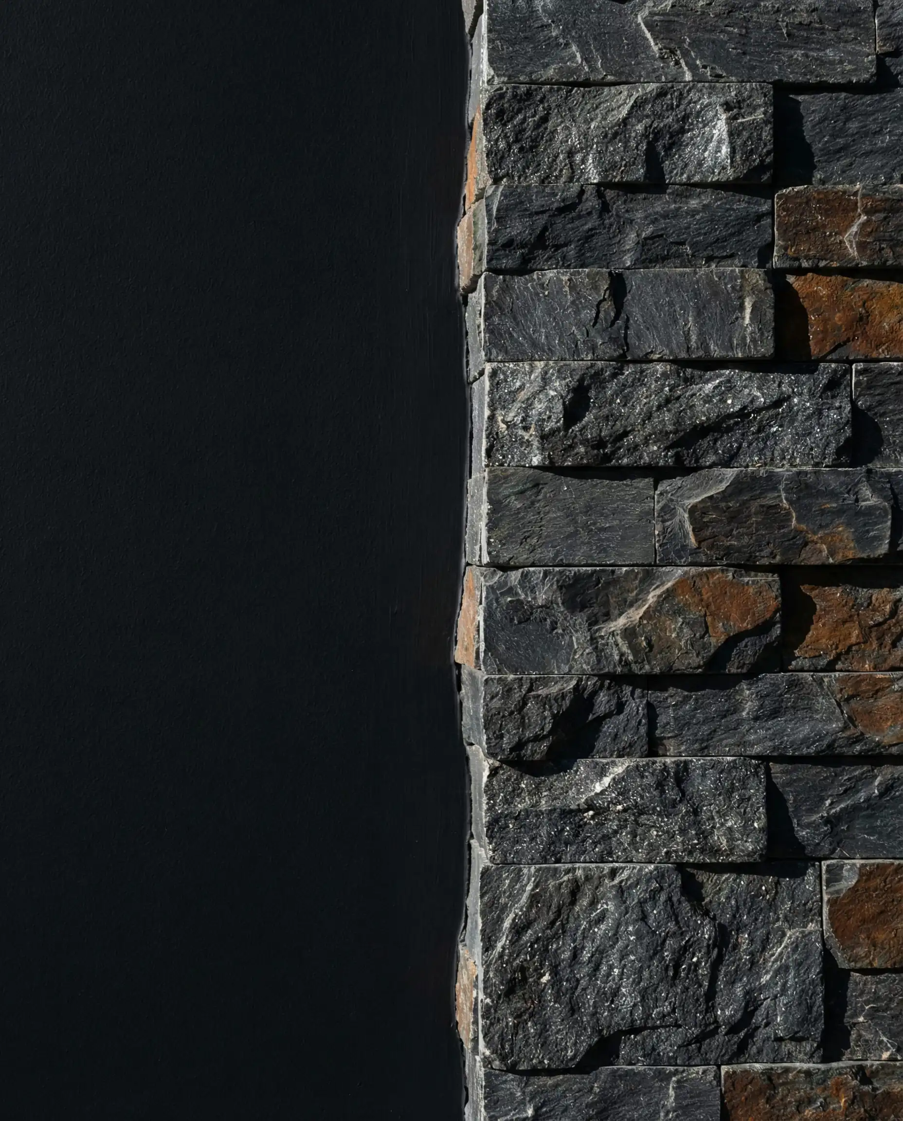
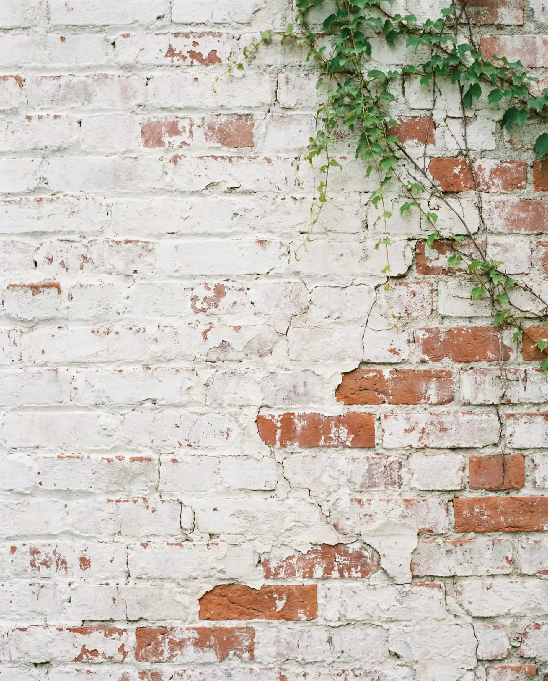
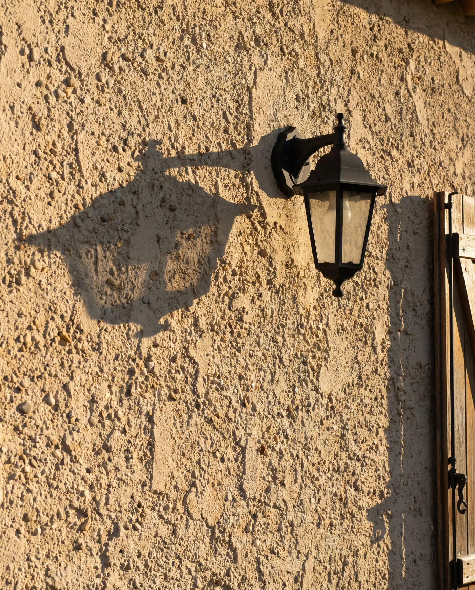
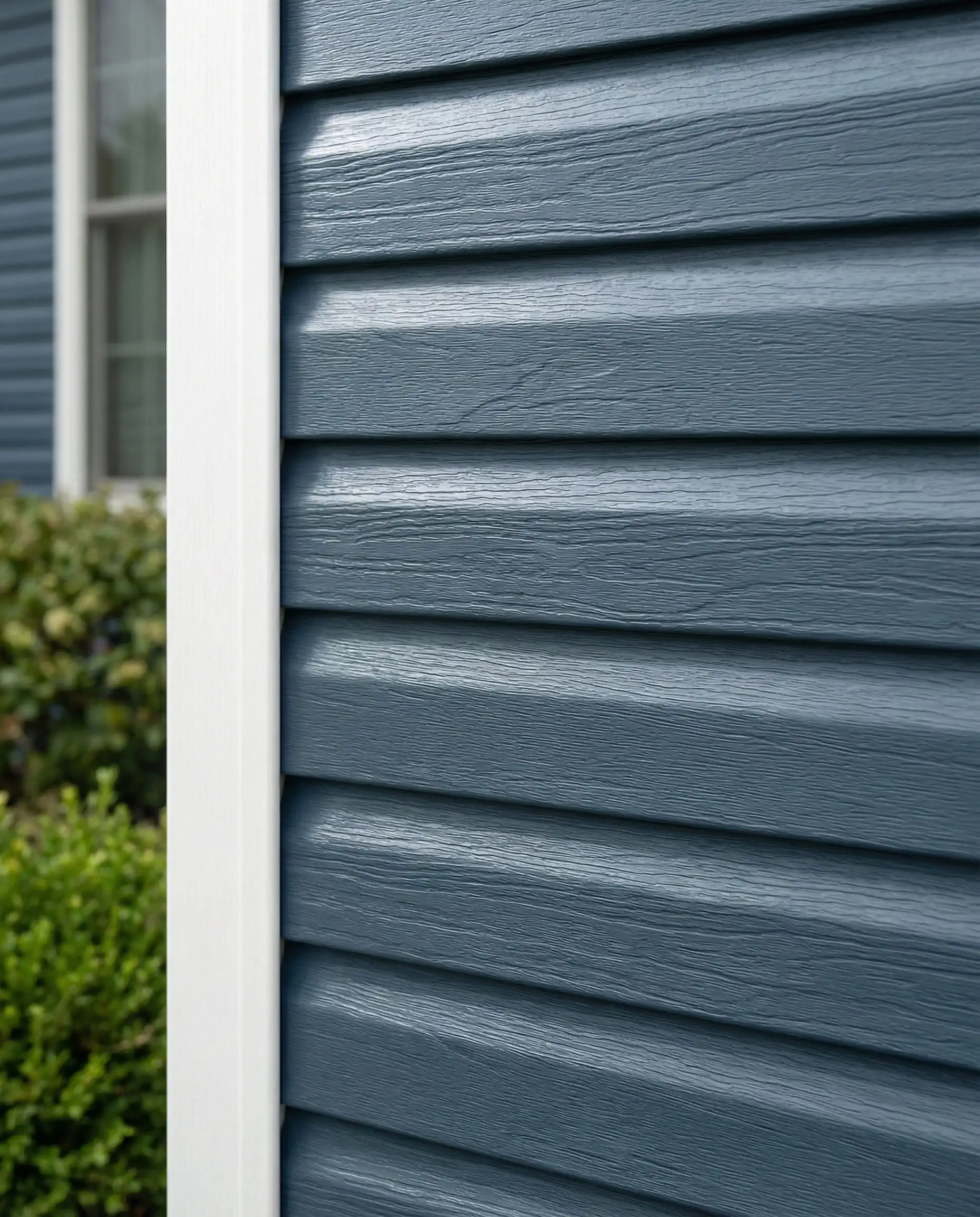
Material Matters: Brick, Stucco, and Siding
Your home’s skin dictates how the paint will behave. Just as we see in wall covering materials trends for interiors, the exterior material changes the approach.
Painting Brick
The trend of “Limewash” or “German Smear” is still stronger than opaque paint for 2026.
Painting Stucco
Stucco absorbs paint greedily.
Painting Vinyl Siding
Best Colors by Architectural Style
Context is everything. A color that looks stunning on a mid-century home might look out of place on a Victorian.
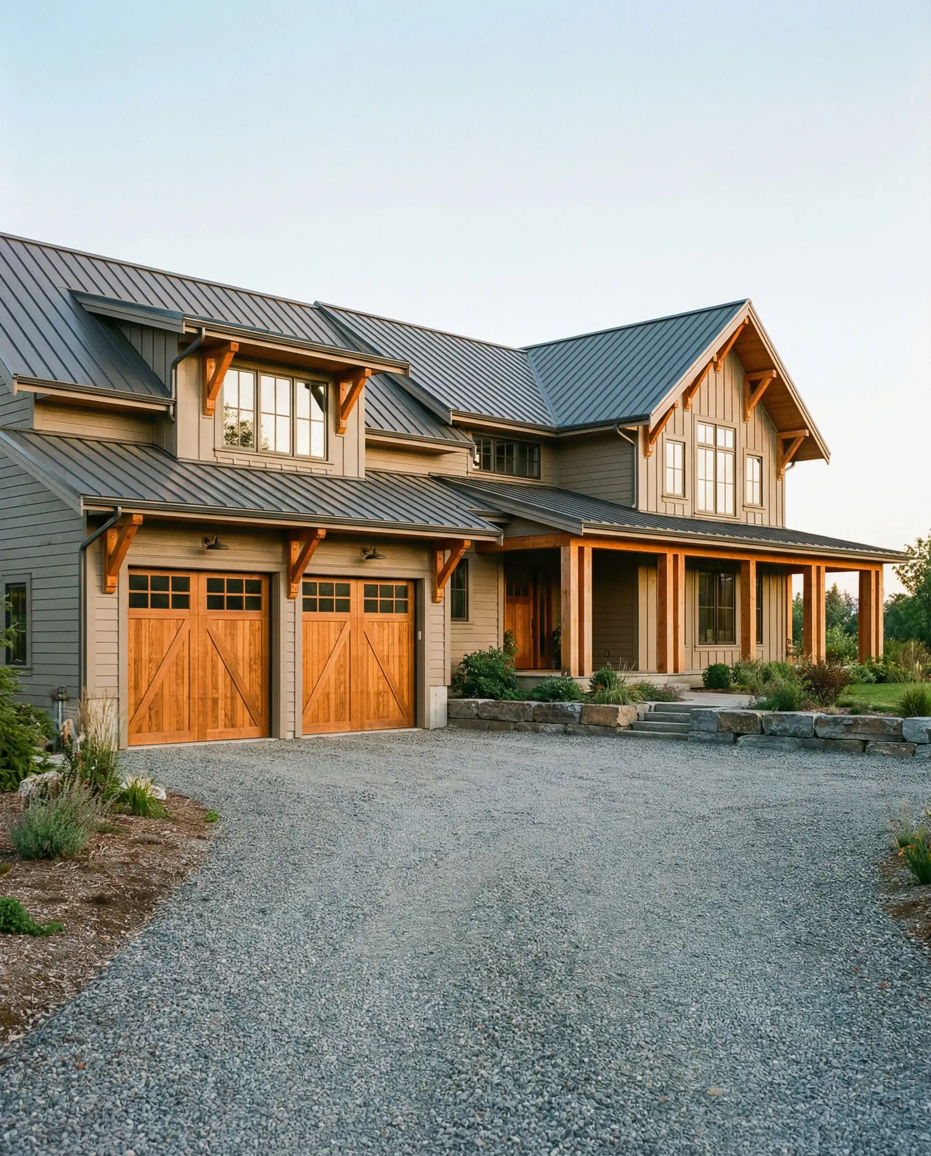
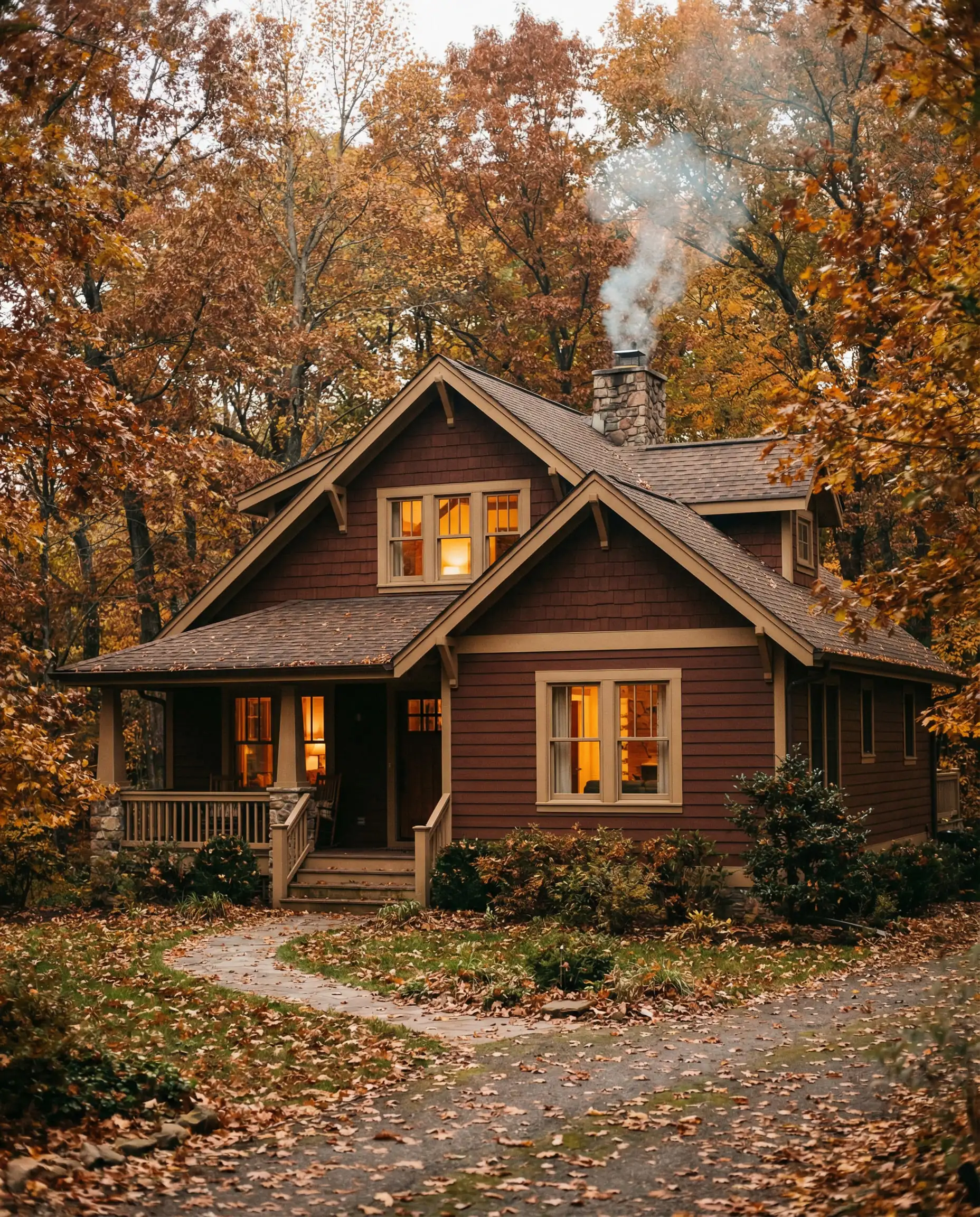
Modern Farmhouse
The modern farmhouse trends are softening. The “Stormtrooper” look (White Body/Black Trim) is feeling a bit dated.
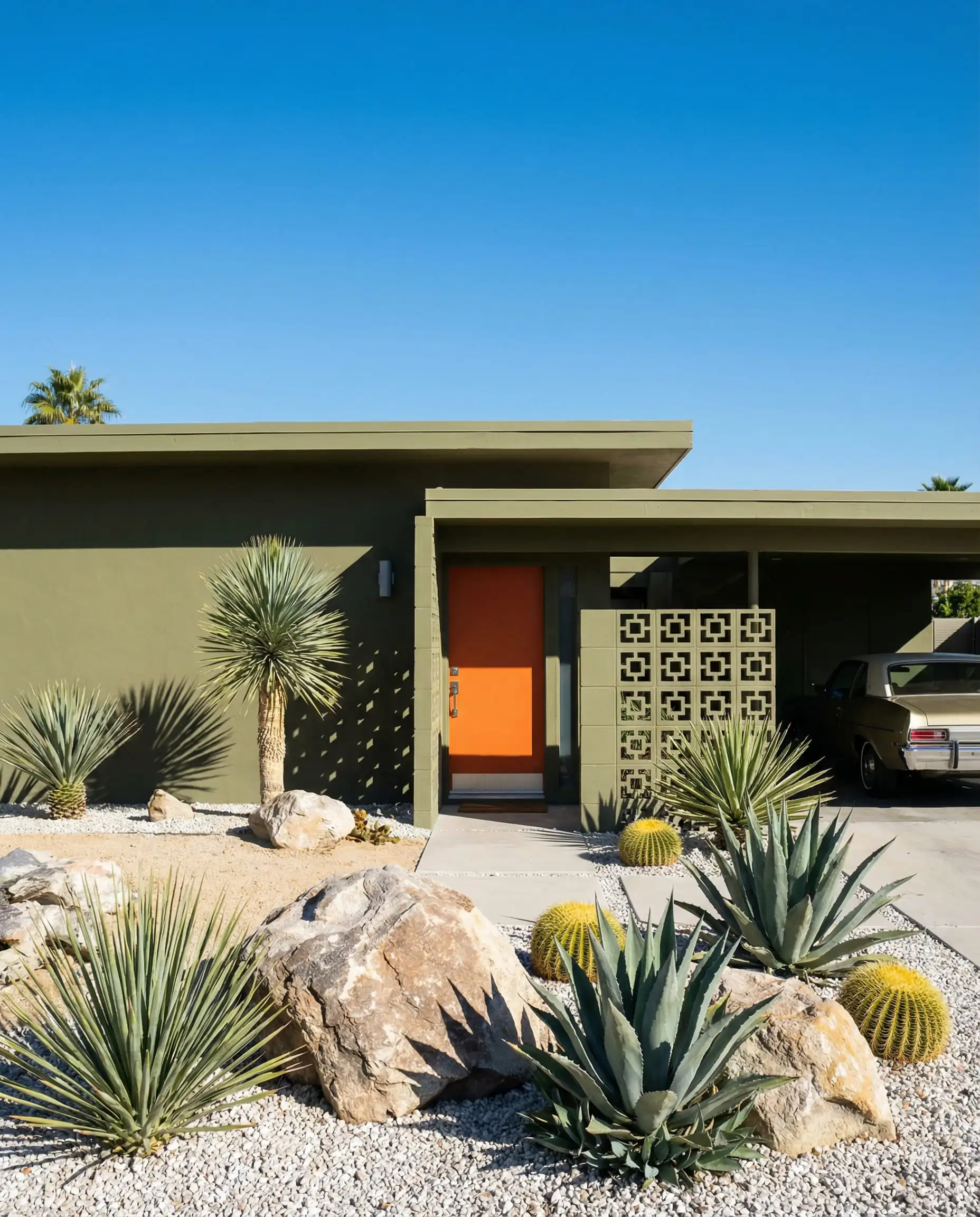
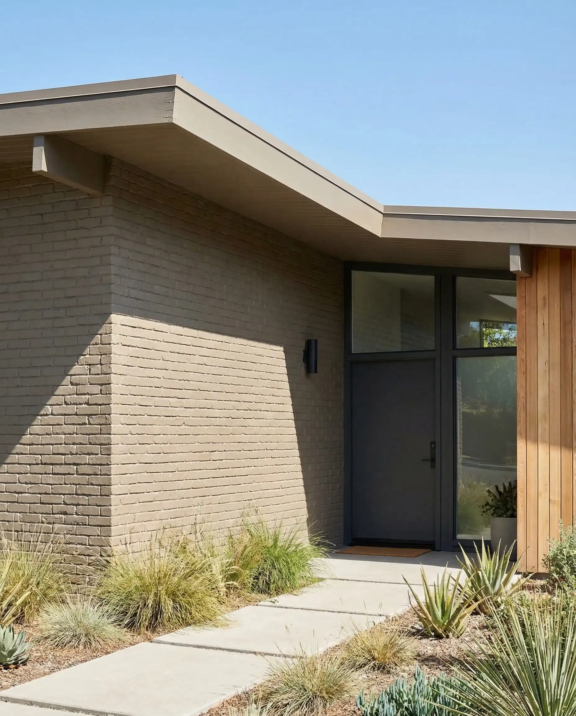
Mid-Century Modern
These homes can handle darker, moodier colors better than most. The low profiles and large windows balance out heavy colors.
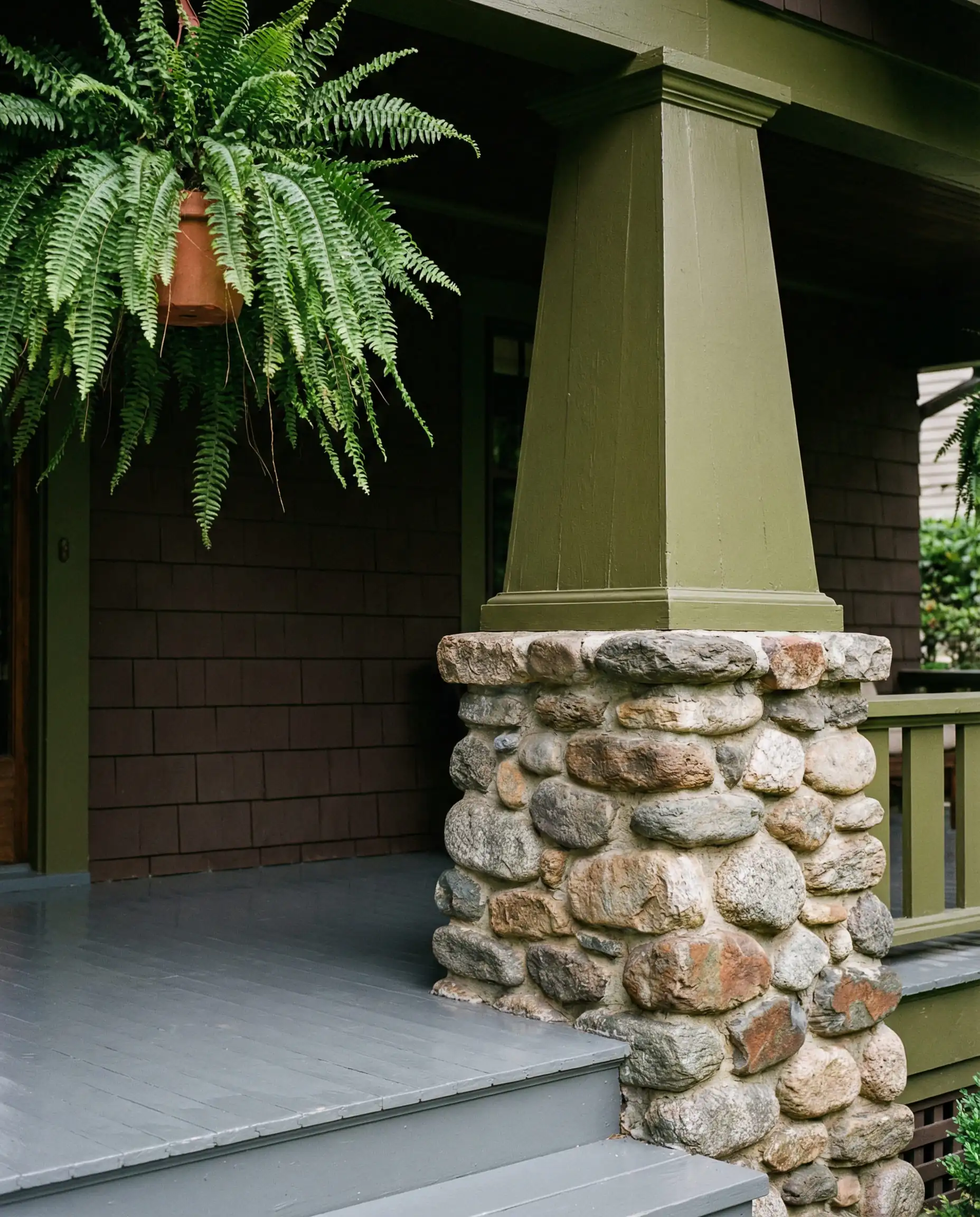
Craftsman & Bungalow
These styles were born from nature. Stick to the Earth & Stone palette. Heavy greens, russet browns, and deep blues highlight the intricate woodwork.
Traditional / Colonial
Symmetry is key here. While white is classic, 2026 is introducing “historic color blocking.”
Curated Color Palettes: 3 Foolproof Combos
If you are struggling to visualize how these colors come together, here are three complete palettes ready to go.
Option 1: The “Organic Modern” (Safe & Sophisticated)
Option 2: The “Forest Retreat” (Bold & Cozy)
Option 3: The “Desert Dusk” (Trendy & Warm)
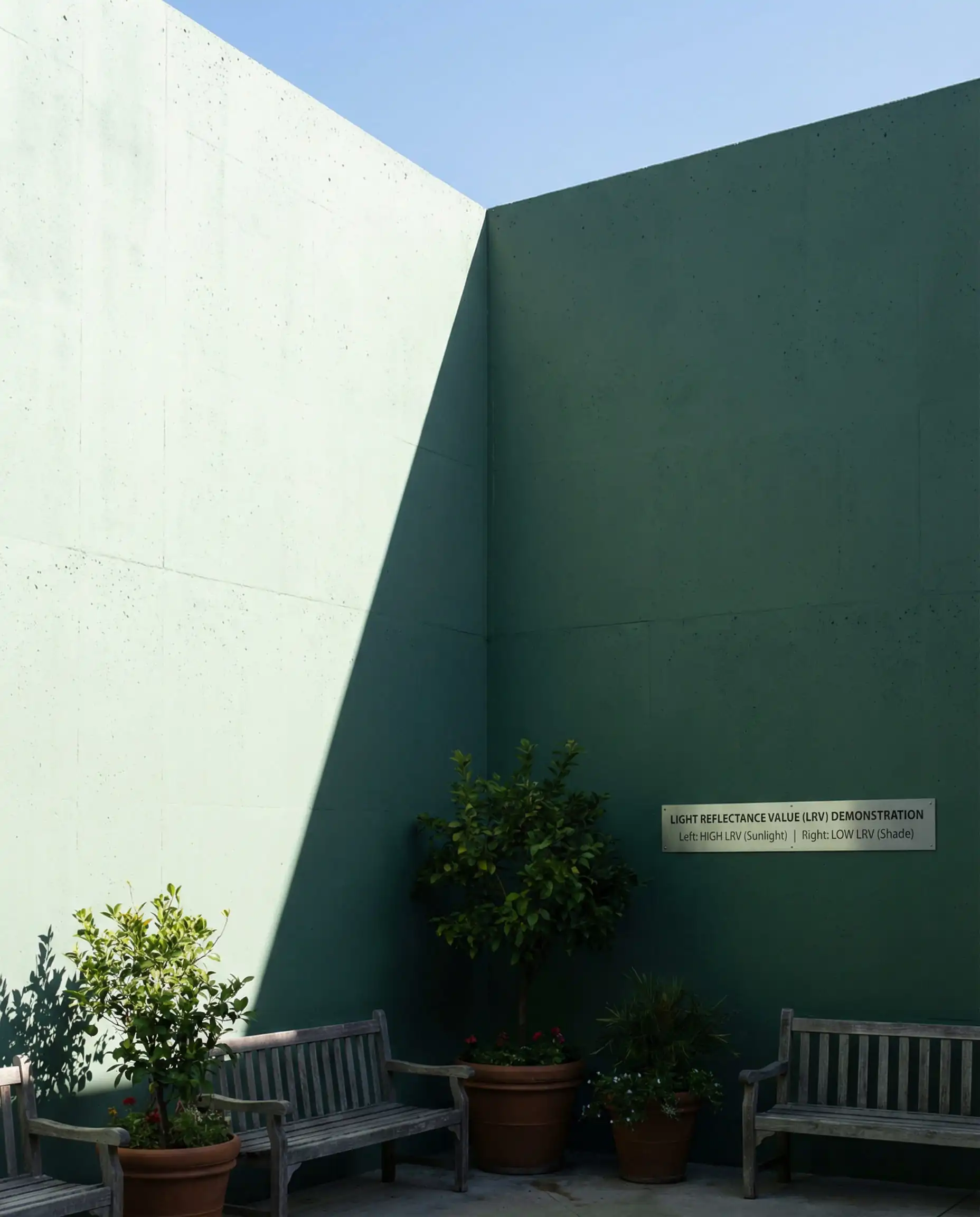
How to Choose: Understanding Light & LRV
Before you buy 20 gallons of paint, you need to understand Light Reflectance Value (LRV). This is a scale from 0 (Black) to 100 (White) that measures how much light a color reflects.
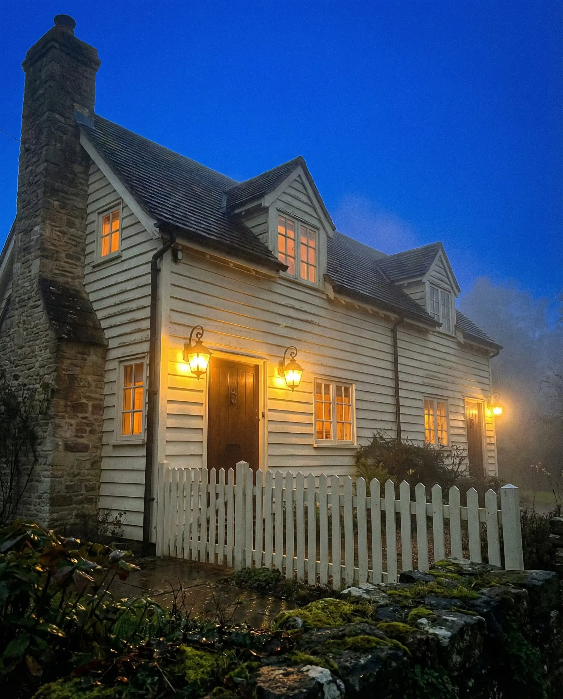
Proper lighting also changes the game. Ensure your lighting trends for the exterior sconces and path lights have the right color temperature (2700K-3000K) to complement your warm paint choice. Blue-hued LEDs (4000K+) can make your warm creamy paint look sickly green at night.
Climate & Durability: Practical Considerations
Just as you would check kitchen trends to avoid before a remodel, you must check “Regional Mistakes” before painting.
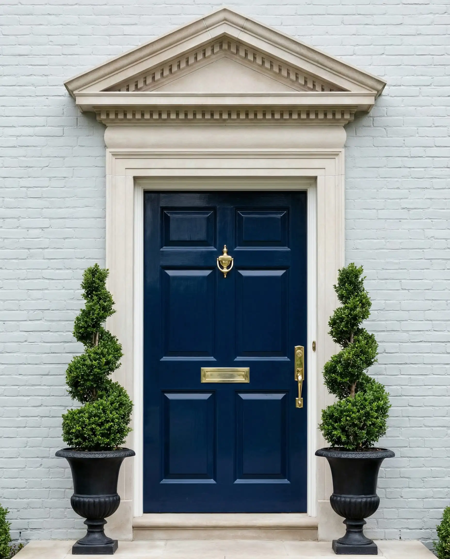
Exterior Door Colors to Watch in 2026
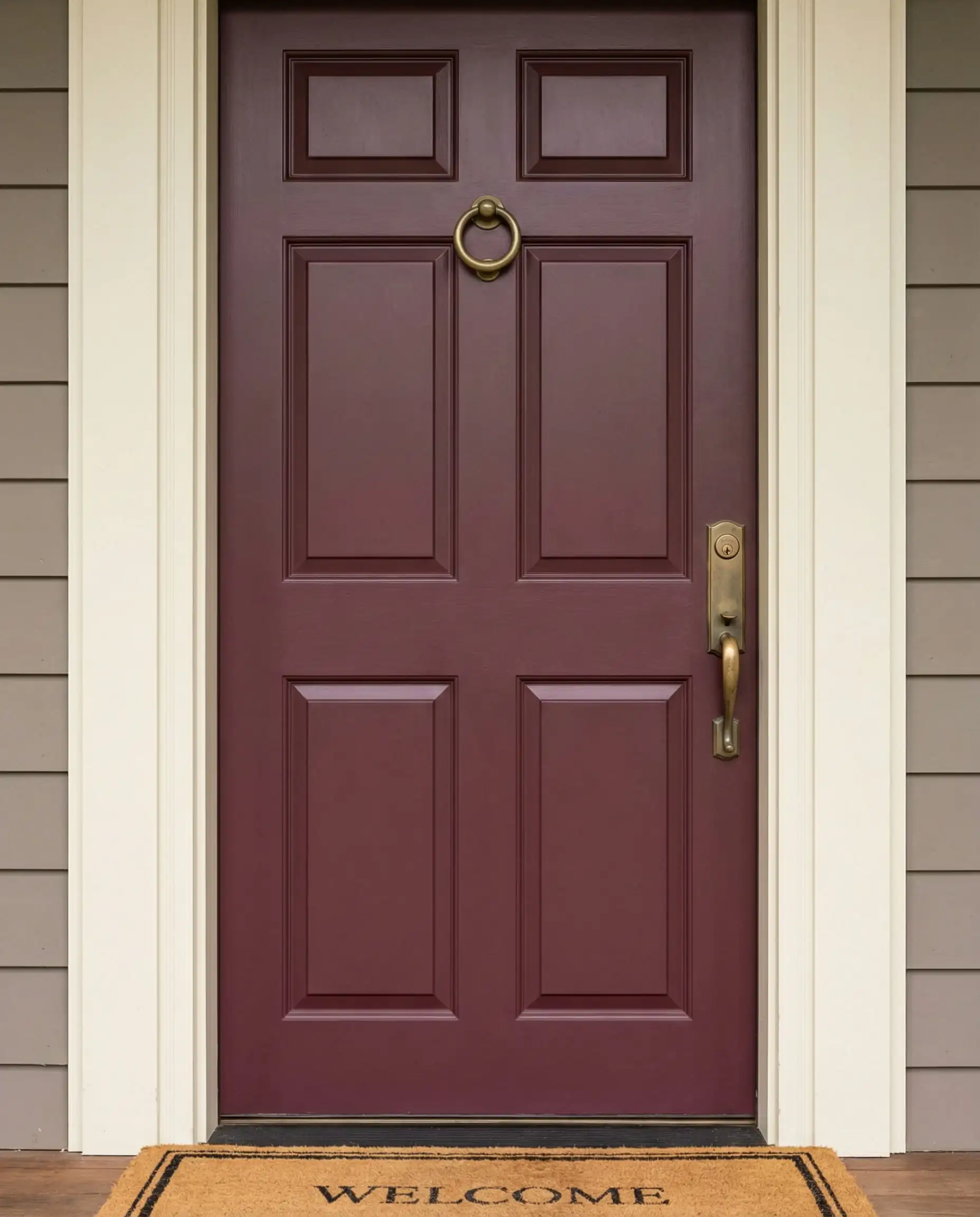
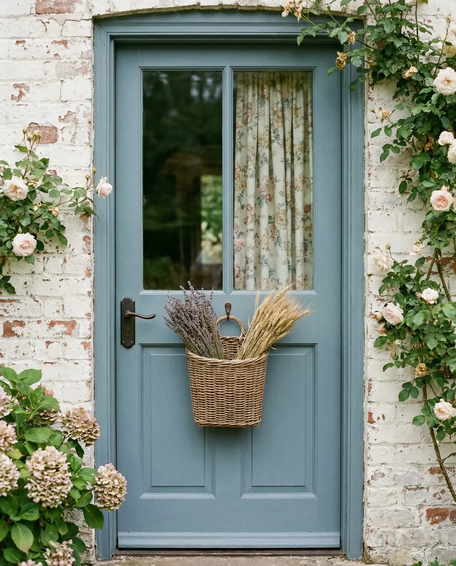
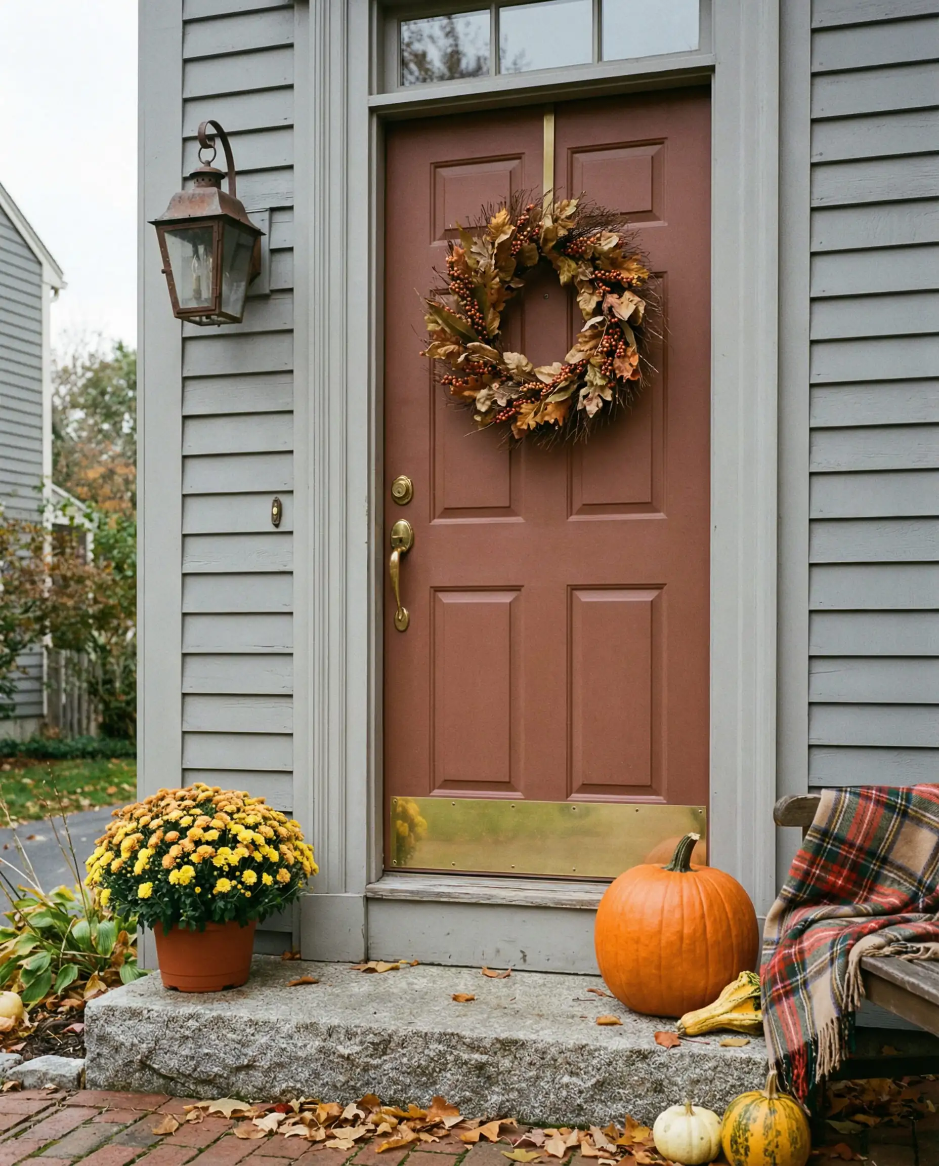
Your front door is the “jewelry” of the exterior. It’s the perfect place to take a risk with color without committing to painting the whole house. According to our latest analysis of modern front door trends and colors, 2026 is seeing two distinct paths:
- The “Pop” is Muted: Instead of fire-engine red, think Merlot or Brick. Instead of electric blue, think Slate or Denim. These muted pops feel more sophisticated.
- Natural Wood: Stripping paint to reveal (or install) natural walnut or white oak doors is hugely popular. It adds texture and breaks up the painted facade. This aligns with flooring trends 2026, where we see a return to natural wood grains in porches and entryways.
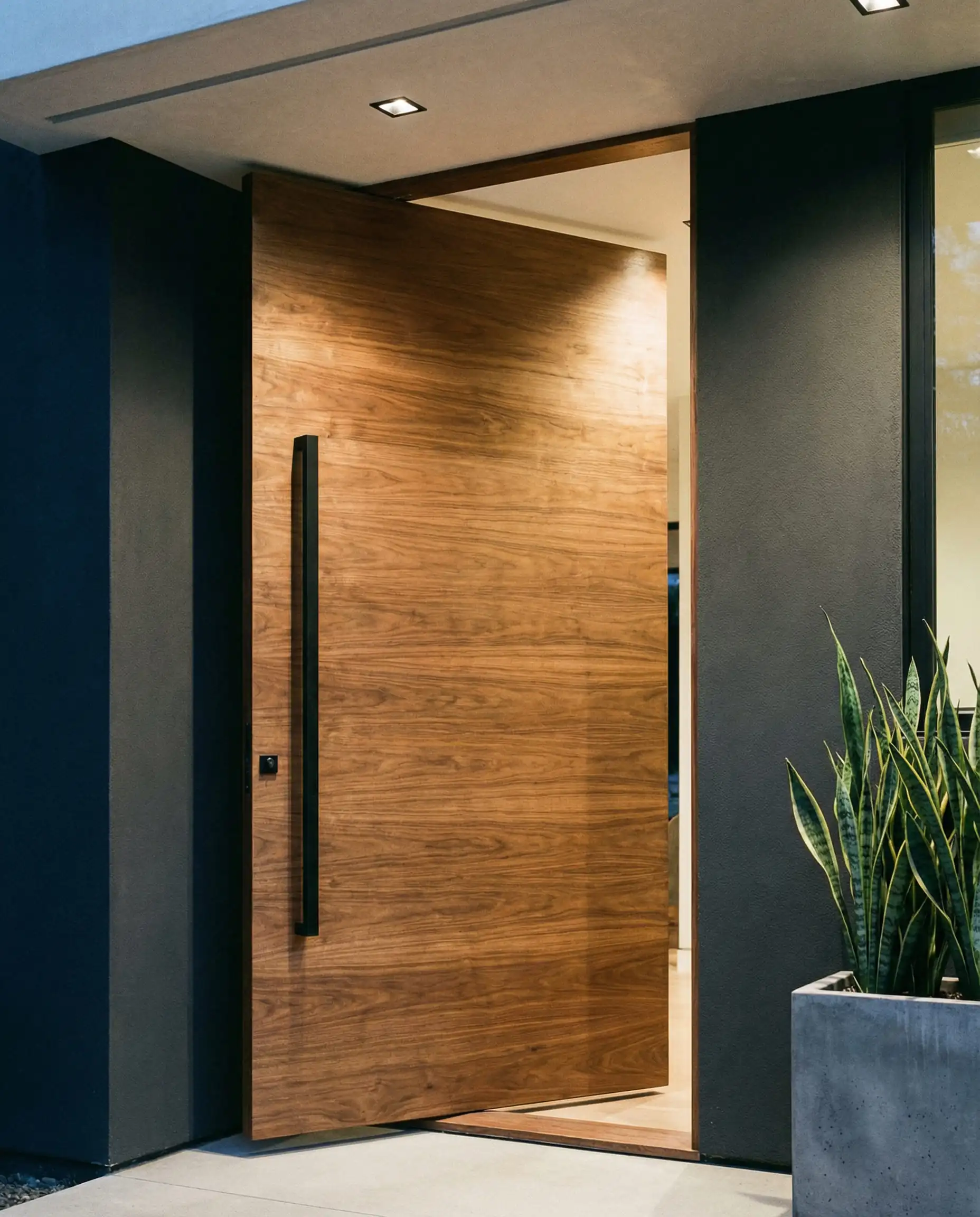
Also, don’t overlook the garage. As noted in our garage door trends article, matching your garage door color to your house body color (camouflaging it) is becoming more popular than highlighting it with white trim.
Frequently Asked Questions (FAQ)
A: Cool, icy, blue-based greys are definitely on the decline. They can feel “dated” to the 2015-2020 era. However, “warm greys” (greiges) and deep, dramatic charcoals are timeless and very much in style.
A: Warm off-whites (like creamy vanilla tones) and nature-inspired sage greens are the top contenders for the most popular colors this year.
A: Black window trim remains popular for a modern look, but 2026 is introducing “Bronze” and “Dark Grey” trim as softer alternatives that look less stark against lighter siding.
A: Your roof covers 40% of your exterior visual! Ensure your paint undertone matches your roof. (e.g., A warm brown roof needs warm creamy paint; a black roof works well with cool greens or greys).
A: Absolutely. A fresh coat of paint offers one of the highest ROIs (Returns on Investment) of any renovation. Sticking to the neutral/natural trends mentioned here ensures the home appeals to the widest range of future buyers.
Conclusion
The exterior paint colors of 2026 are an invitation to slow down and appreciate the natural world. Whether you choose a soothing Sage Green to blend in with your garden, or a bold Iron Ore to make a statement, the goal is to create a home that feels authentic and welcoming.
If you are feeling inspired to continue the renovation indoors, check out our guide on Interior Door Trends 2026 to ensure your entryway flows perfectly from the outside in, or explore window treatment trends to see how your new exterior color frames your view from the inside.
Ready to start painting? Grab a few samples, wait for a sunny day, and let your home’s transformation begin.