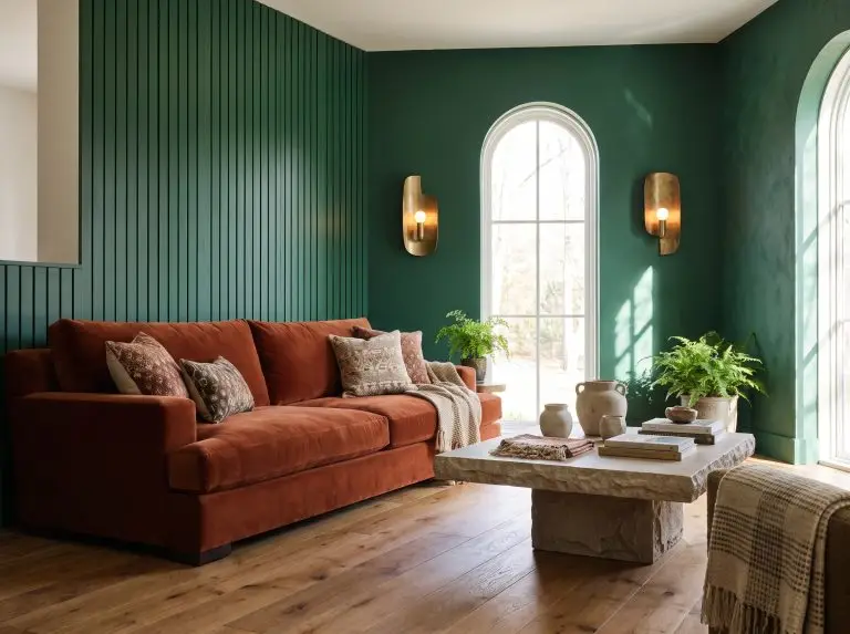
A green accent wall acts as the ultimate bridge between biophilic tranquility and high-end architectural drama, commanding attention without overwhelming a space. Success goes far beyond picking a swatch at the hardware store; it requires a calculated understanding of how physical texture, natural lighting, and adjoining materials interact with your chosen hue.
From moody emerald board-and-batten to soft sage Roman clay, this playbook dictates exactly how to execute a green accent wall with structural precision.
Millwork and Textured Green Accent Walls
Flat paint serves a distinct purpose, but introducing physical dimension through millwork transforms a basic surface into a dynamic focal point. By creating ridges and valleys that catch the light, architectural paneling ensures your green deepens and shifts organically throughout the day.
Modern Fluted Wood Panels in Hunter Green
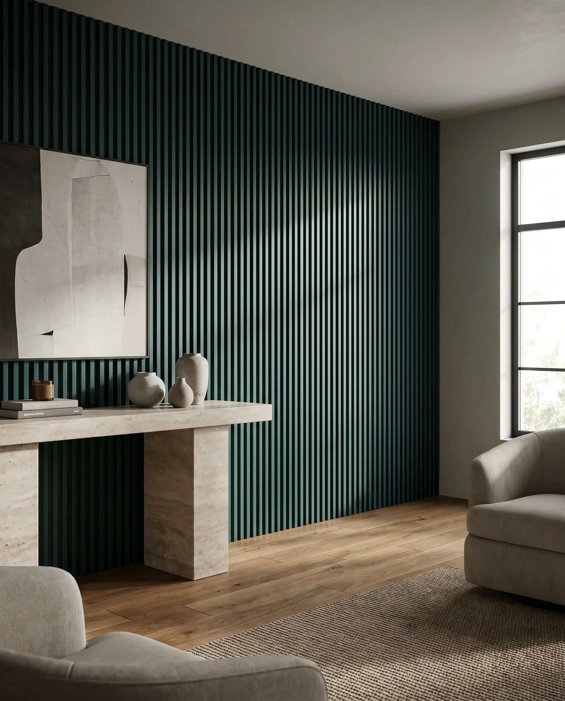
Fluted millwork introduces a tight, rhythmic texture that pulls the eye upward, instantly making ceilings feel taller. When coated in a deeply saturated hunter green, the repetitive ridges create sharp, dramatic shadows that amplify the color’s depth.
- Vibe: Contemporary Bespoke
- Key Materials: Pre-milled MDF fluted panels (for paint-grade stability)
- Paint Recommendation: Benjamin Moore Hunter Green (2041-10)
- Styling Pro-Tip: Pair with a monolithic stone console to contrast the busy linear texture.
Use a satin finish on millwork so it reflects more light than the flat drywall above it, accentuating the 3D profile of the flutes.
Designer Tip
Classic Board and Batten in Rich Emerald
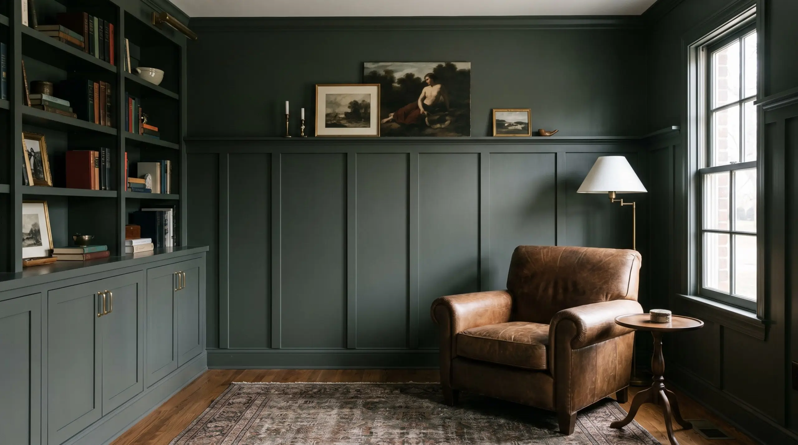
Board and batten grounds a room with structured, traditional geometry while offering a highly durable surface for high-traffic areas. An emerald application modernizes this classic wainscoting, pushing the aesthetic away from farmhouse and toward a sophisticated, transitional library feel.
- Vibe: Transitional Moody
- Key Materials: 1×4 primed pine boards for vertical battens
- Paint Recommendation: Farrow & Ball Studio Green (93)
- Styling Pro-Tip: Anchor the dark green with unlacquered brass hardware for instant warmth.
Always calculate your batten spacing based on the exact width of your wall to avoid awkward, partial rectangles in the corners.
Designer Tip
Picture Frame Moulding for a Transitional Parisian Look
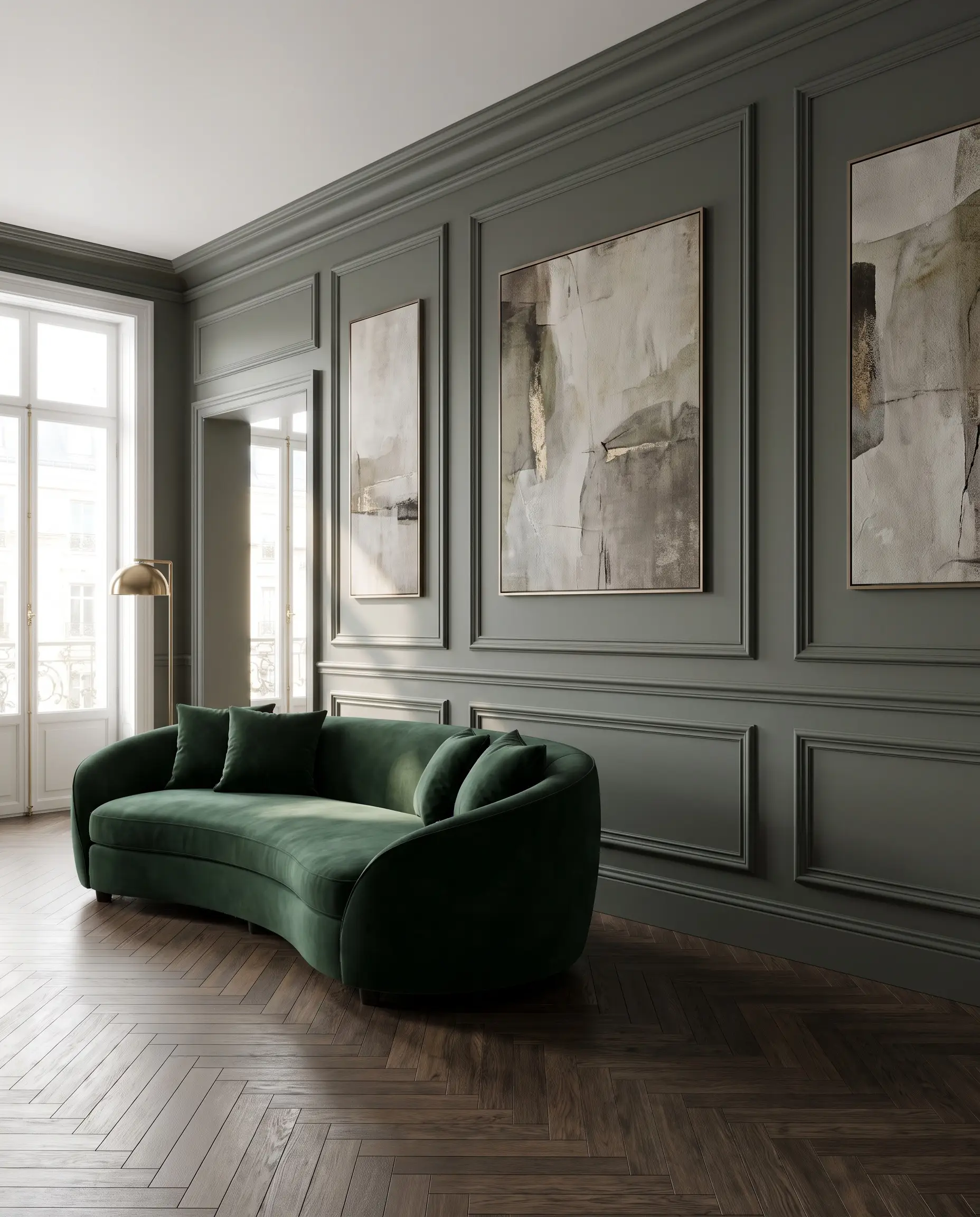
Applied box moulding delivers high-end architectural elegance without the heavy material cost of solid wood paneling. Painting both the drywall and the trim a unified, murky green creates a sophisticated, tonal backdrop that lets modern furniture shine.
- Vibe: Parisian Modern
- Key Materials: Polyurethane or wood panel moulding and a brad nailer
- Paint Recommendation: Sherwin-Williams Pewter Green (SW 6208)
- Styling Pro-Tip: Hang oversized, abstract contemporary art inside the largest moulding boxes.
Map out your boxes with painter’s tape first, ensuring a consistent 4-inch gap between the baseboard, ceiling, and adjacent boxes.
Designer Tip
Vertical Shiplap in Soft Sage for Organic Modernity
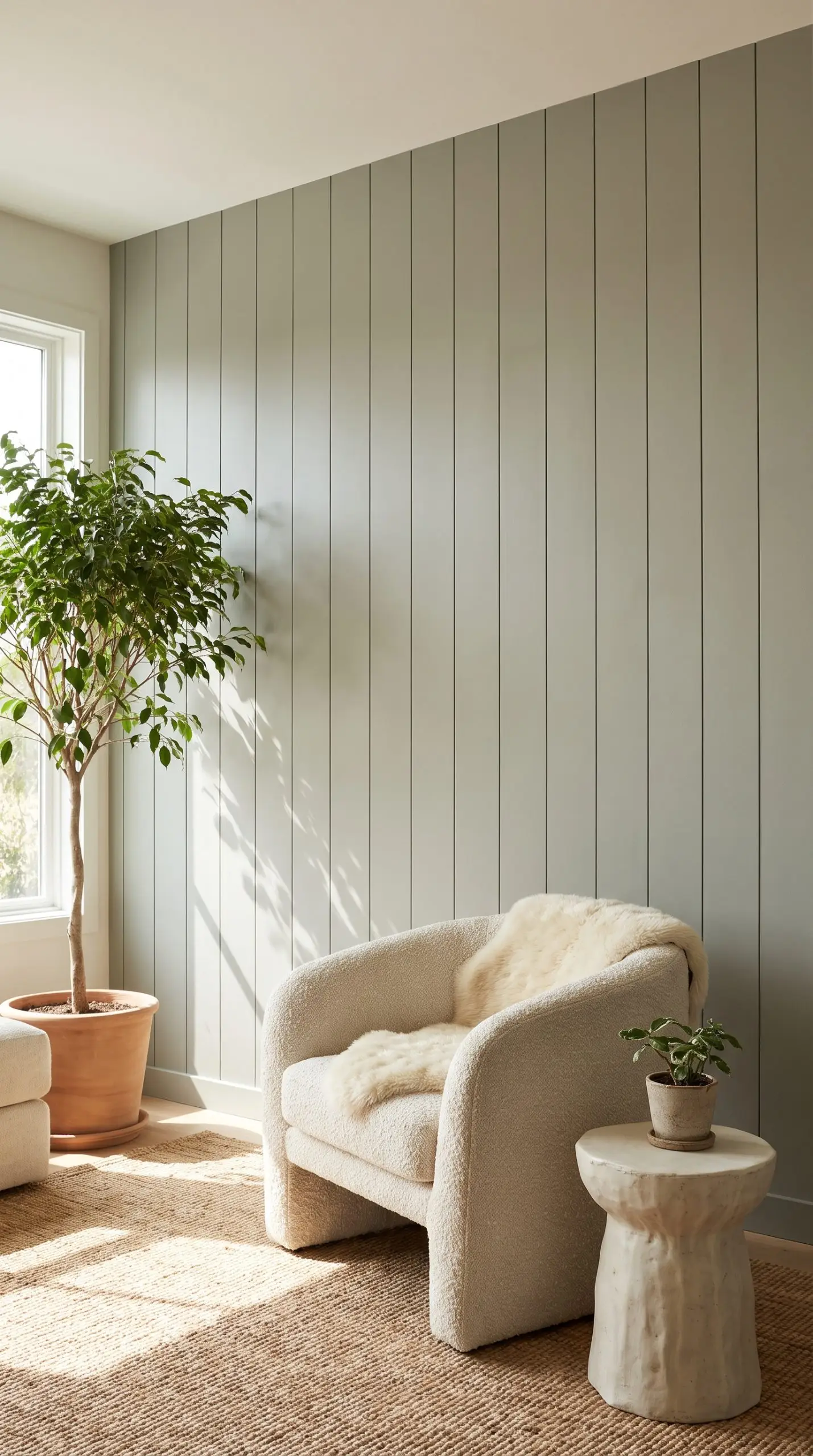
Unlike horizontal applications that lean coastal, vertical shiplap draws the eye up and feels inherently more modern. A soft sage application enhances this biophilic design, offering a tactile, grounding backdrop that pairs flawlessly with raw ceramics and natural light.
- Vibe: Organic Modern
- Key Materials: 5.5-inch nickel gap shiplap boards
- Paint Recommendation: Benjamin Moore October Mist (1495)
- Styling Pro-Tip: Layer with heavily textured boucle or shearling accent chairs.
Blind-nail through the tongue of the shiplap boards to hide your fasteners and achieve a flawless, custom fabrication look.
Designer Tip
Acoustic Slat Walls Over a Matte Green Backdrop
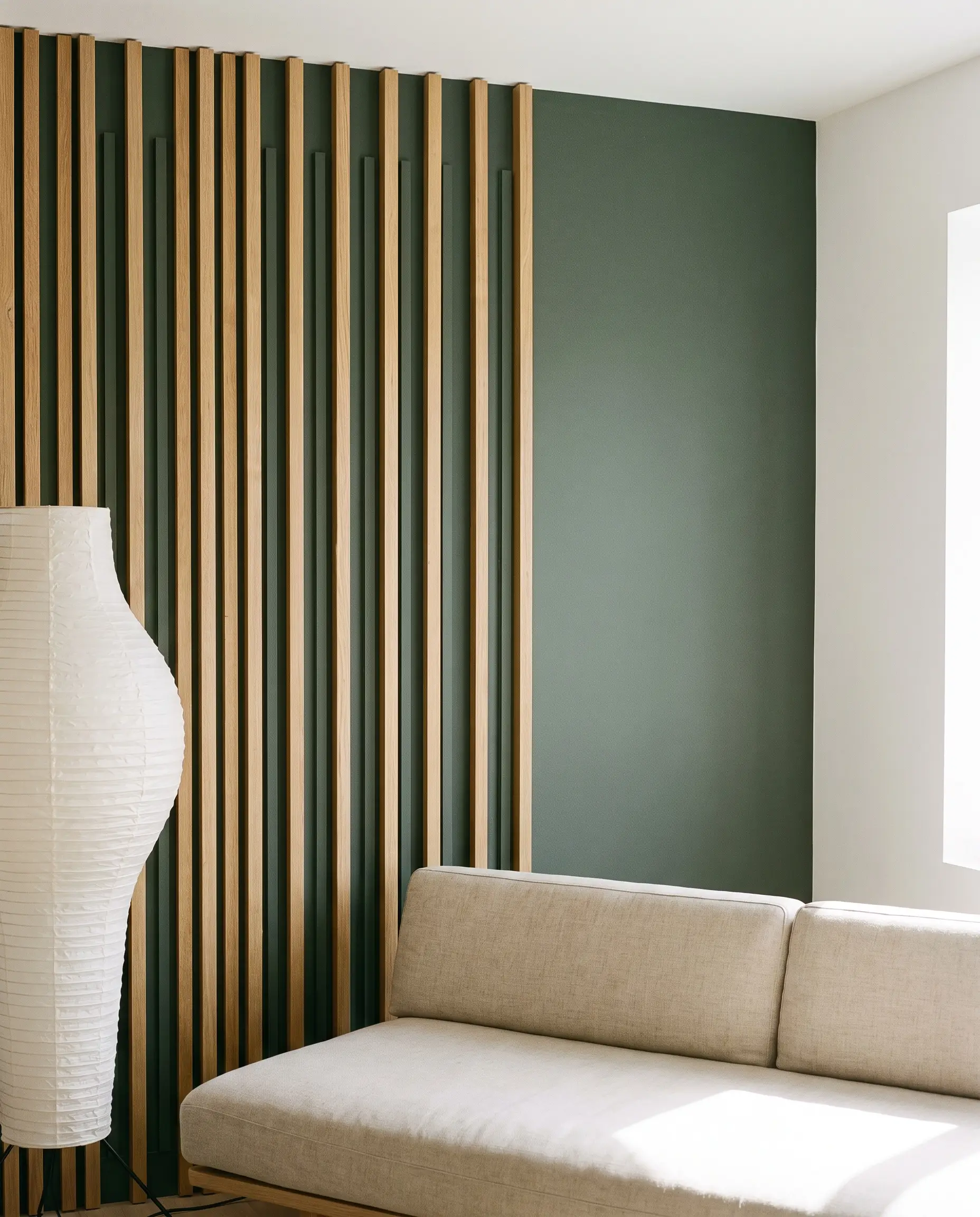
Acoustic slat panels merge high-performance sound dampening with sleek, linear aesthetics. Installing rift-sawn oak slats over a dark, matte green painted wall creates striking contrast, allowing the deep color to peek through the wood grain for a layered, architectural finish.
- Vibe: Japandi / High-End Studio
- Key Materials: White oak acoustic slat panels with a felt backing
- Paint Recommendation: Sherwin-Williams Retreat (SW 6207)
- Styling Pro-Tip: Keep adjacent walls gallery-white to let the wood tones and green undertones pop.
Paint the wall behind the slats a flat or matte finish to recede visually, forcing the natural wood tones to jump forward.
Designer Tip
The Seamless Baseboard: Color-Drenching the Trim
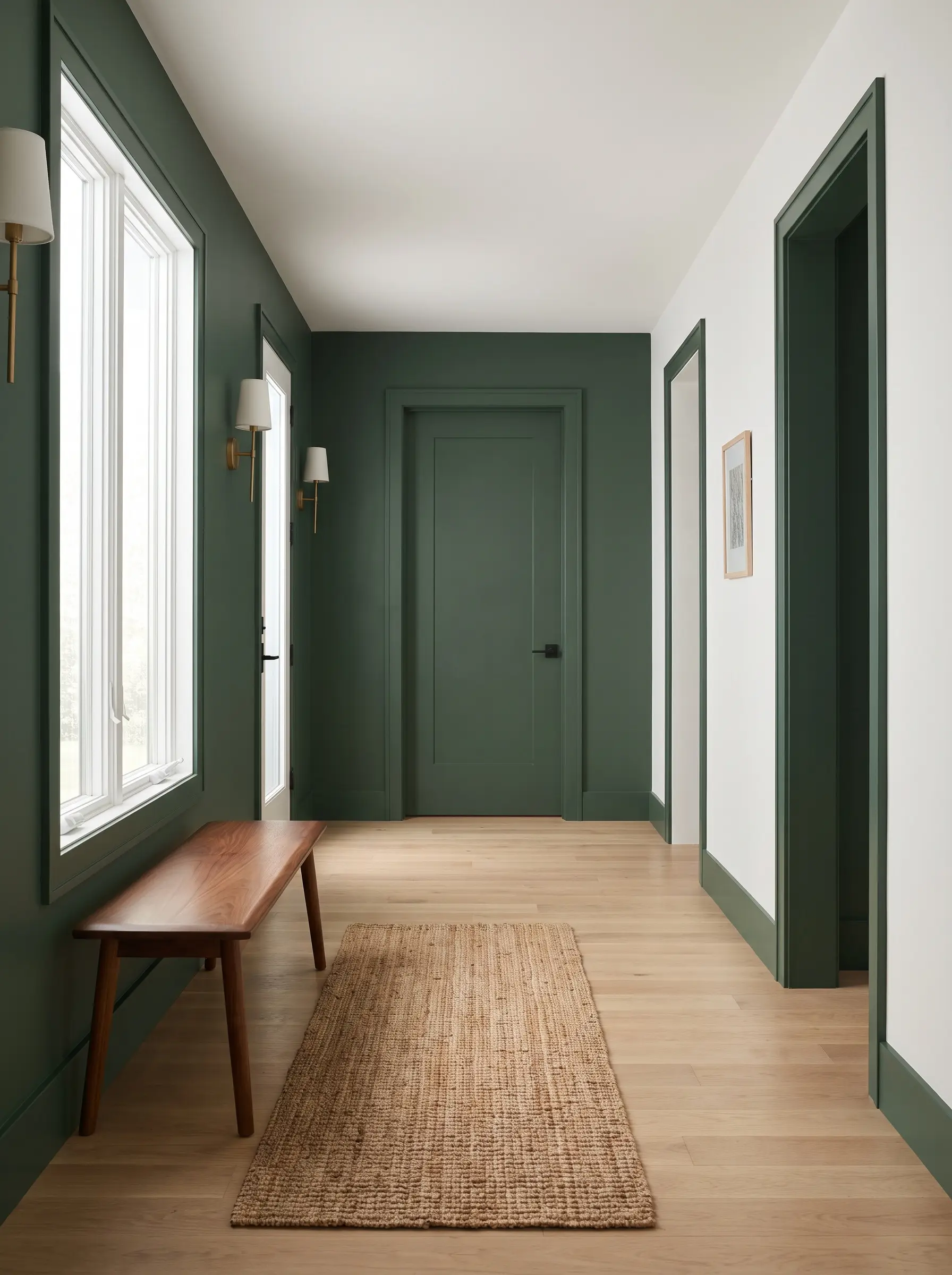
Stopping your accent color at a stark white baseboard fractures the visual height of the room and instantly cheapens the design. Color-drenching the trim in the exact same green creates a seamless, bespoke column of color that elongates the wall.
- Vibe: High-End Contemporary
- Key Materials: High-quality angled trim brush and painter’s tape
- Paint Recommendation: Farrow & Ball Duck Green (W55)
- Styling Pro-Tip: Carry the green onto the interior doors and casings for maximum impact.
Always paint your baseboards the same green as the accent wall to avoid a harsh visual break at the floor line.
Designer Tip
Recessed Arches to Frame Open Shelving
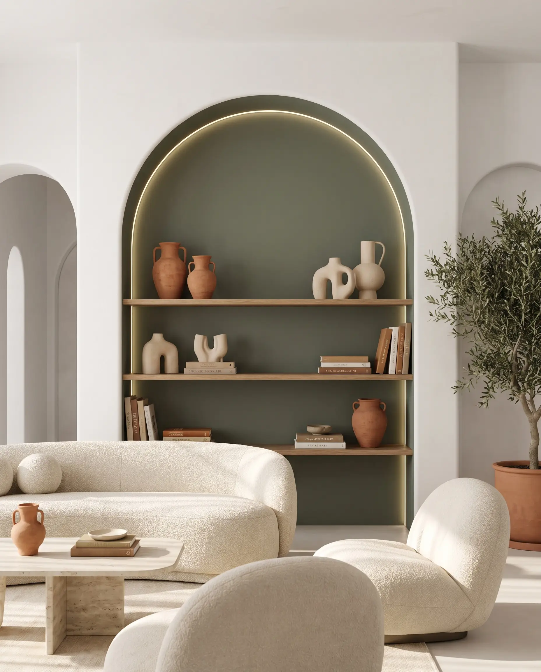
A recessed drywall arch introduces soft, postmodern curves into a space dominated by rigid right angles. Painting the interior of the alcove a deep green transforms the recess into a dimensional shadow box, perfectly framing curated objects or books.
- Vibe: Postmodern / Mediterranean
- Key Materials: Flexible drywall or arch-bead kits
- Paint Recommendation: Benjamin Moore Vintage Vogue (462)
- Styling Pro-Tip: Style the shelves with terracotta and unglazed ceramics to complement the green.
Install hidden LED tape lighting inside the inner lip of the arch to graze the green paint and highlight its undertone.
Designer Tip
Specialty Paint Finishes and Plaster Treatments
The sheen and physical composition of your paint completely dictate how green reads in a room. Moving beyond standard latex into high-end, tactile finishes like plaster or lacquer transforms the wall from a simple color application into a sensory experience.
Roman Clay for a Suede-Like Olive Finish
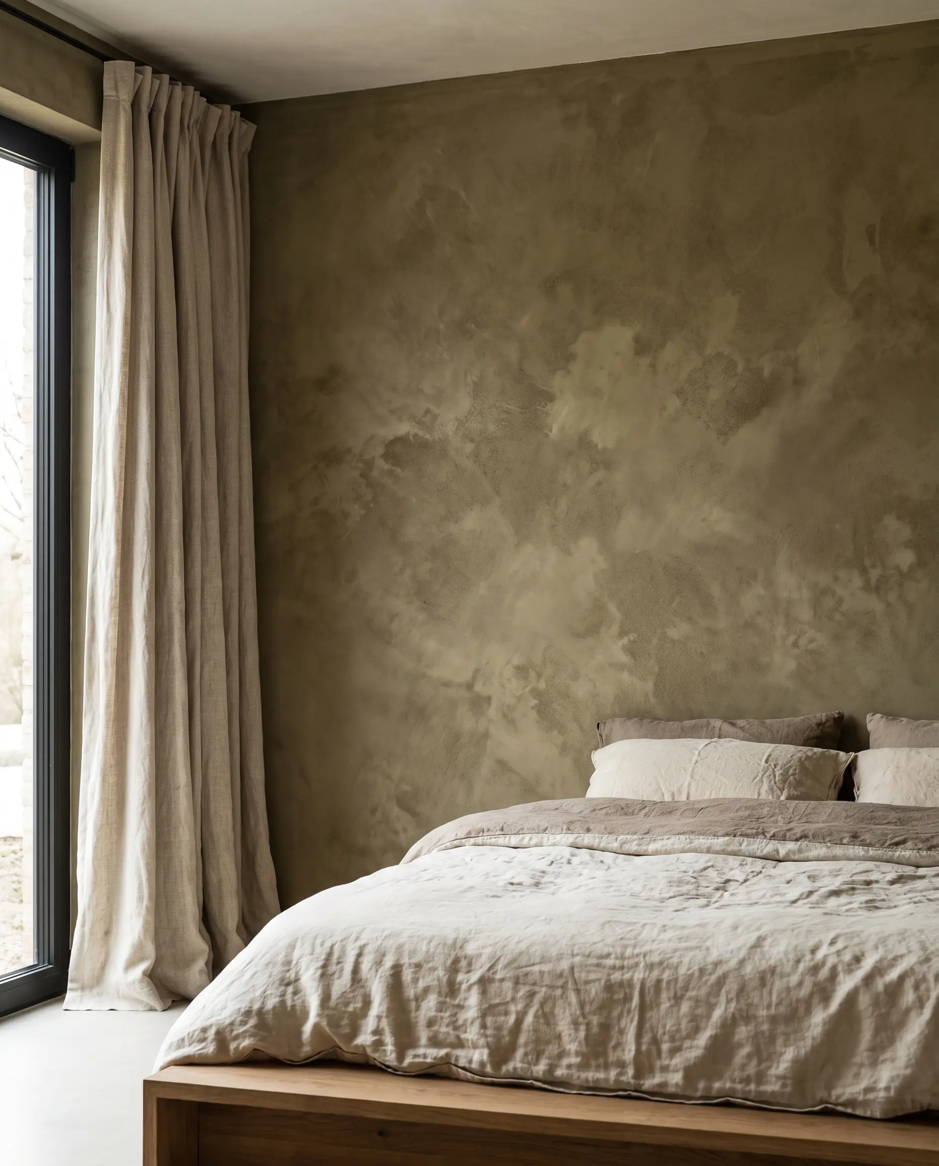
Roman clay is applied with a putty knife, resulting in a mottled, cloudy finish that mimics the look of worn suede or aged stone. An olive green clay application creates an incredibly tactile, earthy focal point that softens the harsh acoustics of a modern room.
- Vibe: Earthy & Bespoke
- Key Materials: Portola Paints Roman Clay, flexible stainless steel trowel
- Color Recommendation: Portola Paints Ponderosa
- Styling Pro-Tip: Pair with raw linen drapery to emphasize the organic texture.
High-Gloss Lacquer for a Moody Jewel-Box Effect
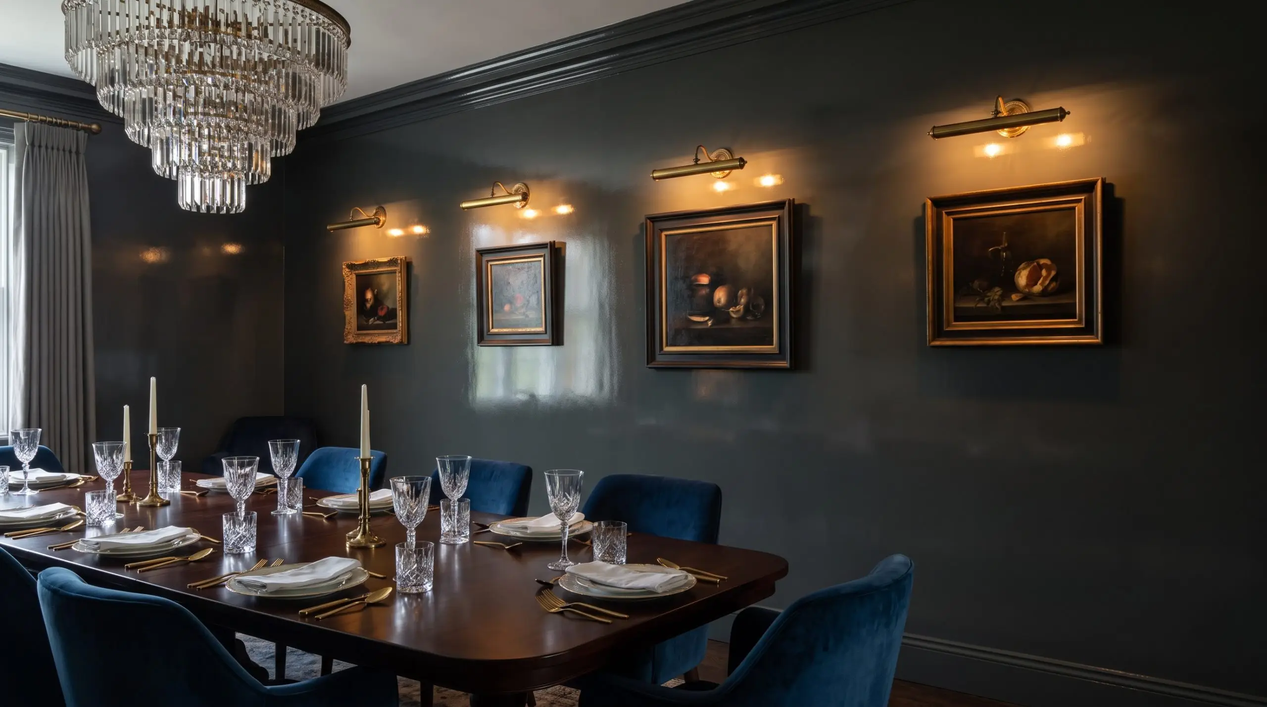
High-gloss lacquer reflects maximum light, turning a dark green wall into a glass-like mirror that bounces illumination around the room. This finish feels intensely glamorous and works beautifully in low-light spaces like libraries or dining rooms where you want a moody, reflective atmosphere.
- Vibe: Glamorous & Moody
- Key Materials: Fine Foam Roller, Oil-based or high-quality urethane enamel
- Paint Recommendation: Farrow & Ball Carriage Green (94) in Full Gloss
- Styling Pro-Tip: Illuminate the wall with brass picture lights to showcase the intense sheen.
High-Gloss Lacquer vs. Limewash:
- High-Gloss: Reflects maximum light, highly durable, glamorous.
- High-Gloss: Exposes every drywall flaw, requires Level 5 skim coat.
- Limewash: Forgives wall imperfections, breathable, biophilic chalky texture.
- Limewash: Cannot be scrubbed easily, requires specific mineral primers.
Limewash Techniques for a Chalky, Biophilic Patina
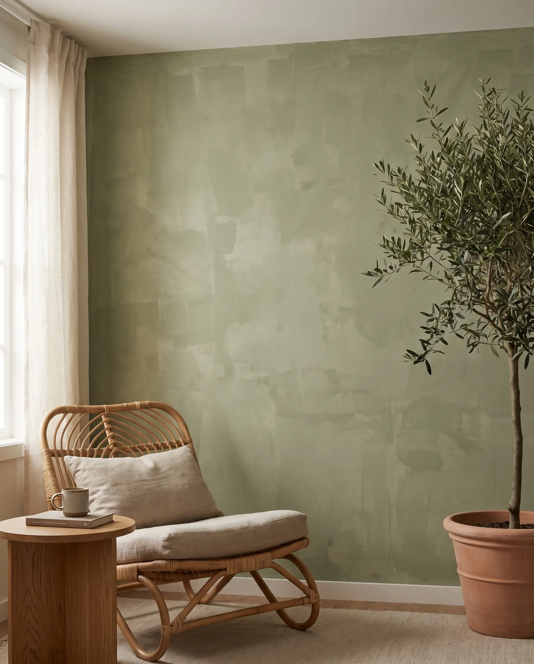
Limewash penetrates the drywall rather than sitting on top of it, curing into a chalky, matte patina that feels distinctly old-world. A green limewash finish brings a raw, biophilic energy into the space, shifting in tone depending on the room’s Light Reflectance Value (LRV) and natural sun exposure.
- Vibe: Old-World Organic
- Key Materials: Bauwerk Colour Limewash, block brush
- Color Recommendation: Bauwerk Colour Dock
- Styling Pro-Tip: Keep lighting soft and diffused to highlight the brushstrokes.
Two-Tone Color Blocking with Green and Warm White
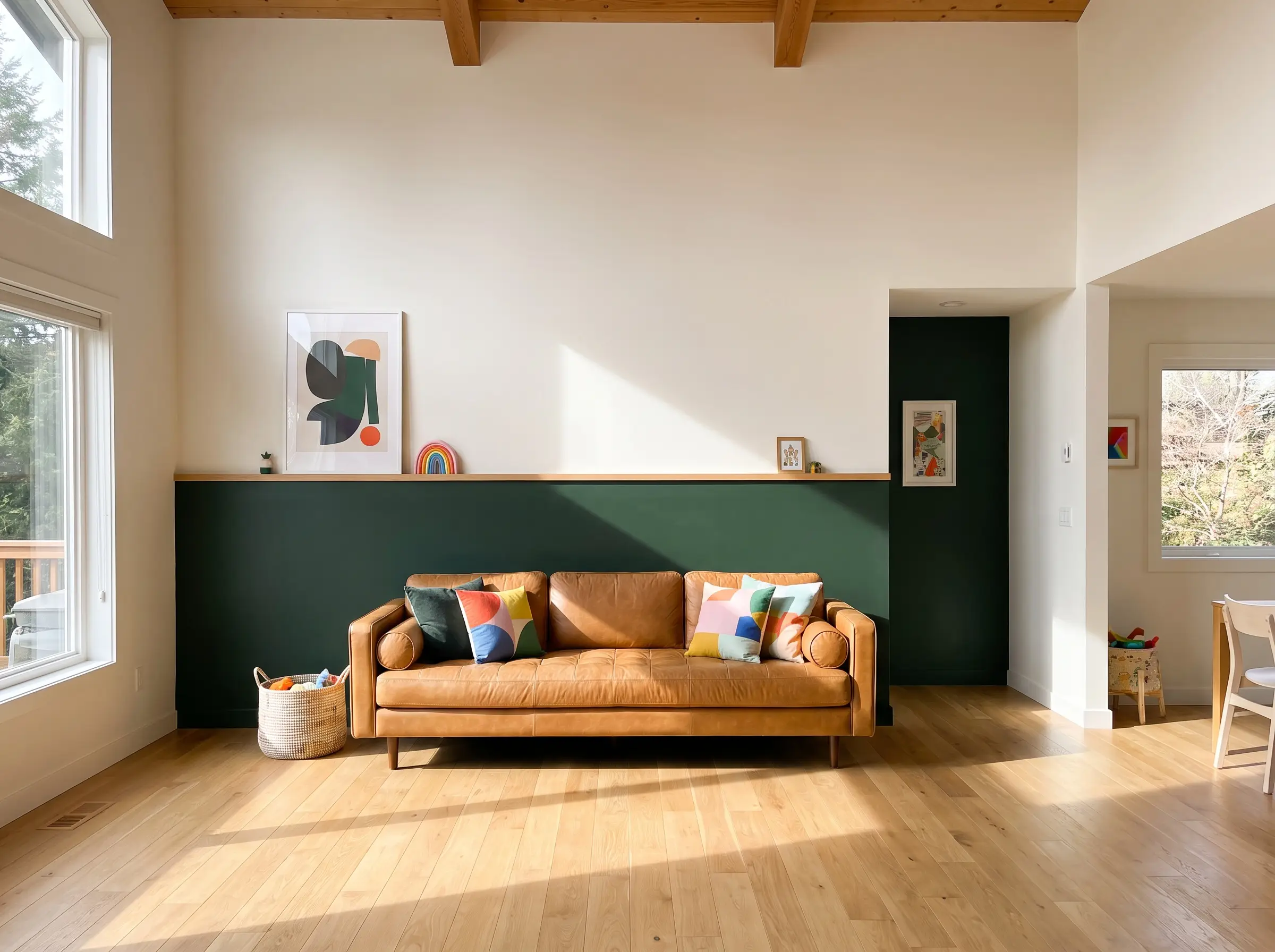
Instead of painting a full wall, color-blocking divides the vertical space, typically running a deep green on the bottom half and a warm white on top. This anchors the room visually, grounding heavy furniture while keeping the ceiling feeling airy and expansive.
- Vibe: Playful & Architectural
- Key Materials: Laser level, premium edge-lock painter’s tape
- Paint Recommendation: Benjamin Moore Essex Green (HC-188) and Sherwin-Williams Alabaster (SW 7008)
- Styling Pro-Tip: Run a slim piece of oak trim along the paint line to create a physical chair rail.
Tone-on-Tone Wallpaper Panels
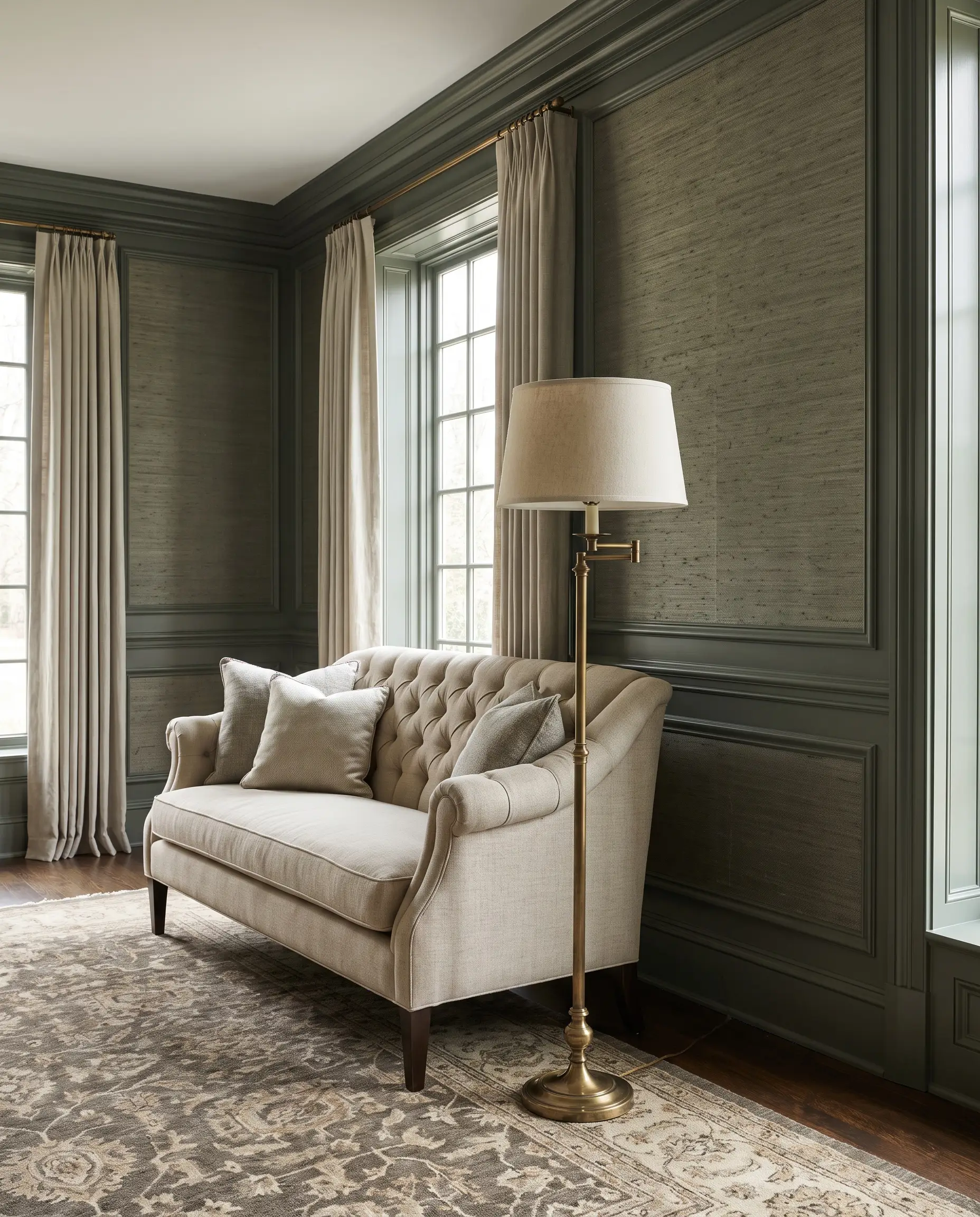
Framing panels of green, textured wallpaper inside painted green millwork creates a layered, tone-on-tone masterpiece. The contrast between the flat painted wood and a textural grasscloth or subtle geometric paper adds incredible depth without breaking the monochromatic palette.
- Vibe: Layered Traditional
- Key Materials: Heavyweight grasscloth wallpaper, wallpaper adhesive
- Color Match: Sherwin-Williams Rosemary (SW 6187)
- Styling Pro-Tip: Ensure your paint matches the darkest undertone in the wallpaper for seamless integration.
Metallic Stencil Overlays on a Matte Green Base
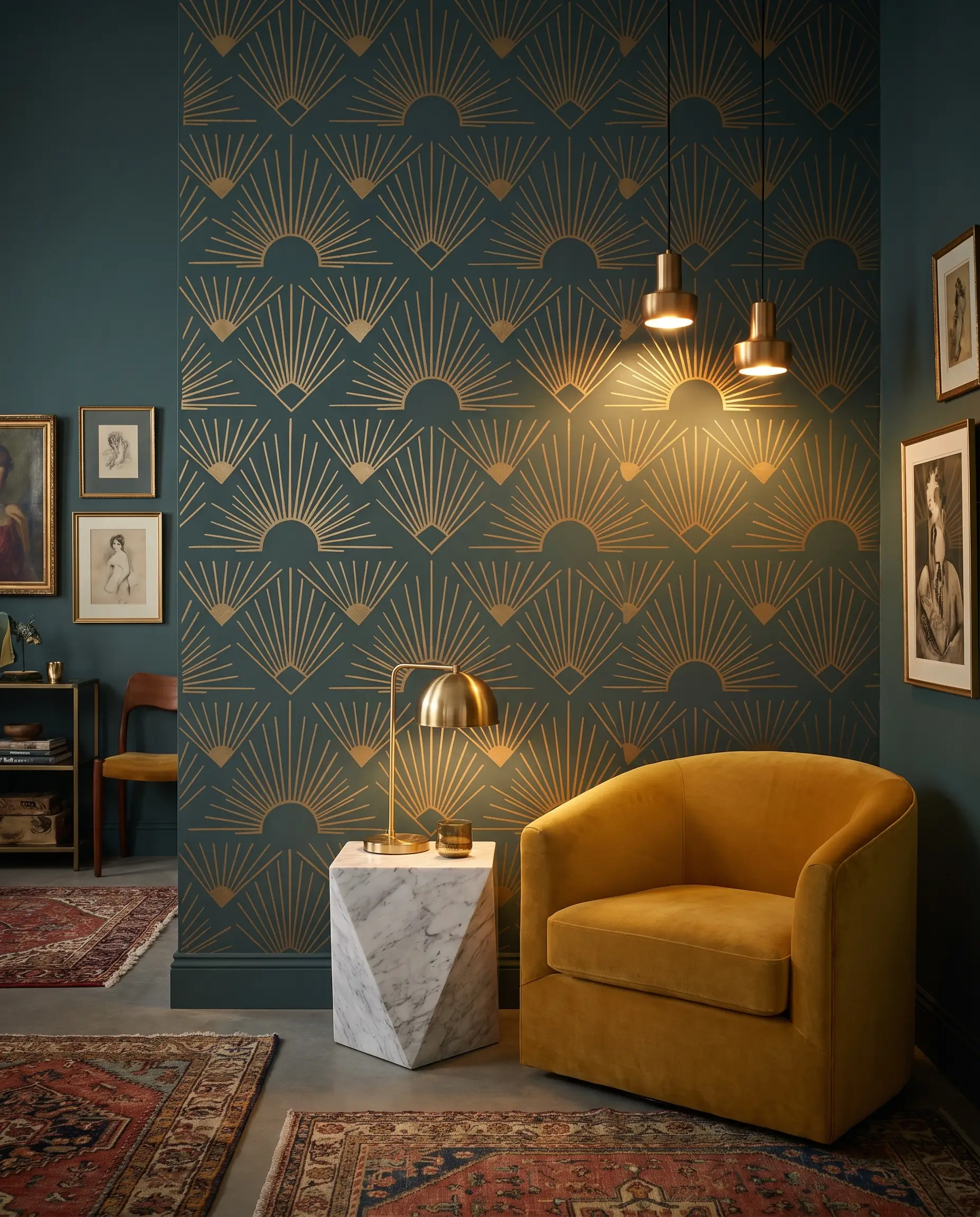
Applying a subtle, repeating metallic pattern over a flat green base creates a custom, wallpaper-like effect at a fraction of the cost. The matte green recedes, while the metallic overlay catches ambient light, making the wall feel dynamic and alive.
- Vibe: Art Deco / Eclectic
- Key Materials: Large-scale wall stencil, dense foam roller, metallic paint
- Paint Recommendation: Benjamin Moore Crisp Romaine (686) base with brass acrylic accents
- Styling Pro-Tip: Use a very dry roller for the stencil to prevent bleeding and ensure crisp lines.
Strategic Accent Wall Placement by Room
Accent walls fail when applied arbitrarily to the first blank surface you see. A green wall must serve a distinct spatial purpose—anchoring heavy furniture, drawing the eye toward a light source, or camouflaging structural flaws.
The Bedroom Headboard Wall: Anchoring with Deep Forest Green
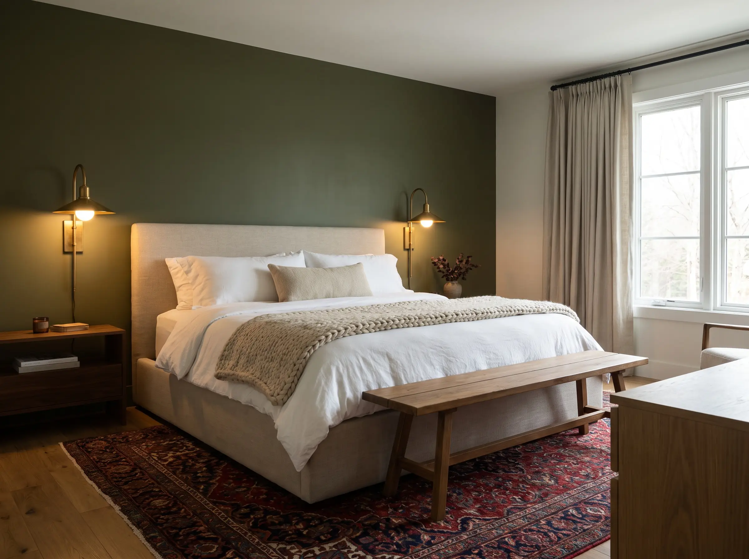
Anchoring the bed against a dark green wall grounds the room’s primary piece of furniture, creating a definitive focal point that instantly draws you in. The deep forest hue absorbs light, promoting a restful, cavernous atmosphere conducive to sleep.
- Spatial Purpose: Grounding the bed and lowering the visual center of gravity
- Key Materials: Matte finish paint to absorb artificial bedside light
- Paint Recommendation: Farrow & Ball Bancha (298)
- Styling Pro-Tip: Flank the bed with oversized brass sconces to warm up the cool, dark tones.
The Living Room TV Wall: Minimizing the Screen with Dark Tones
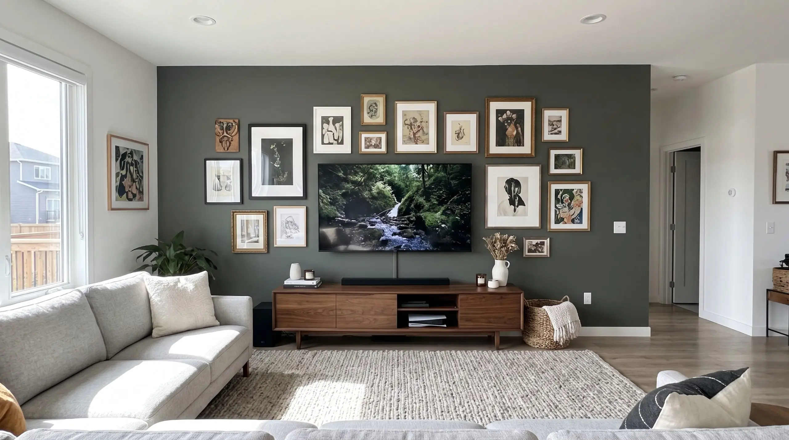
A large, black television can easily dominate a light-colored living room. Painting the media wall a dark, saturated green absorbs the stark black rectangle, effectively camouflaging the technology when it is turned off.
- Spatial Purpose: Camouflaging tech and anchoring the media console
- Key Materials: Eggshell finish for easy cleaning behind electronics
- Paint Recommendation: Sherwin-Williams Pewter Green (SW 6208)
- Styling Pro-Tip: Mount a gallery wall around the TV frame to further distract from the screen.
The Dining Room Nook: Creating Intimacy with Vibrant Malachite
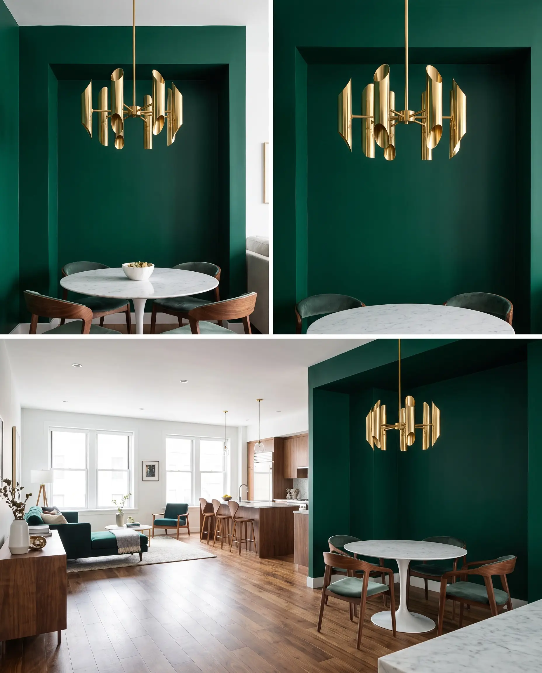
Wrapping a dining alcove in a vibrant, jewel-toned green cultivates an intimate, luxurious atmosphere. The bold color compresses the space slightly, making dinners feel more exclusive and conversations more focused.
- Spatial Purpose: Defining a zone within an open-concept layout
- Key Materials: High-gloss or satin finishes to reflect candlelight
- Paint Recommendation: Benjamin Moore Chrome Green (HC-189)
- Styling Pro-Tip: Suspend a structural, modern chandelier directly in the center of the nook.
The Home Office Zoom Backdrop: Cultivating Focus with Muted Moss
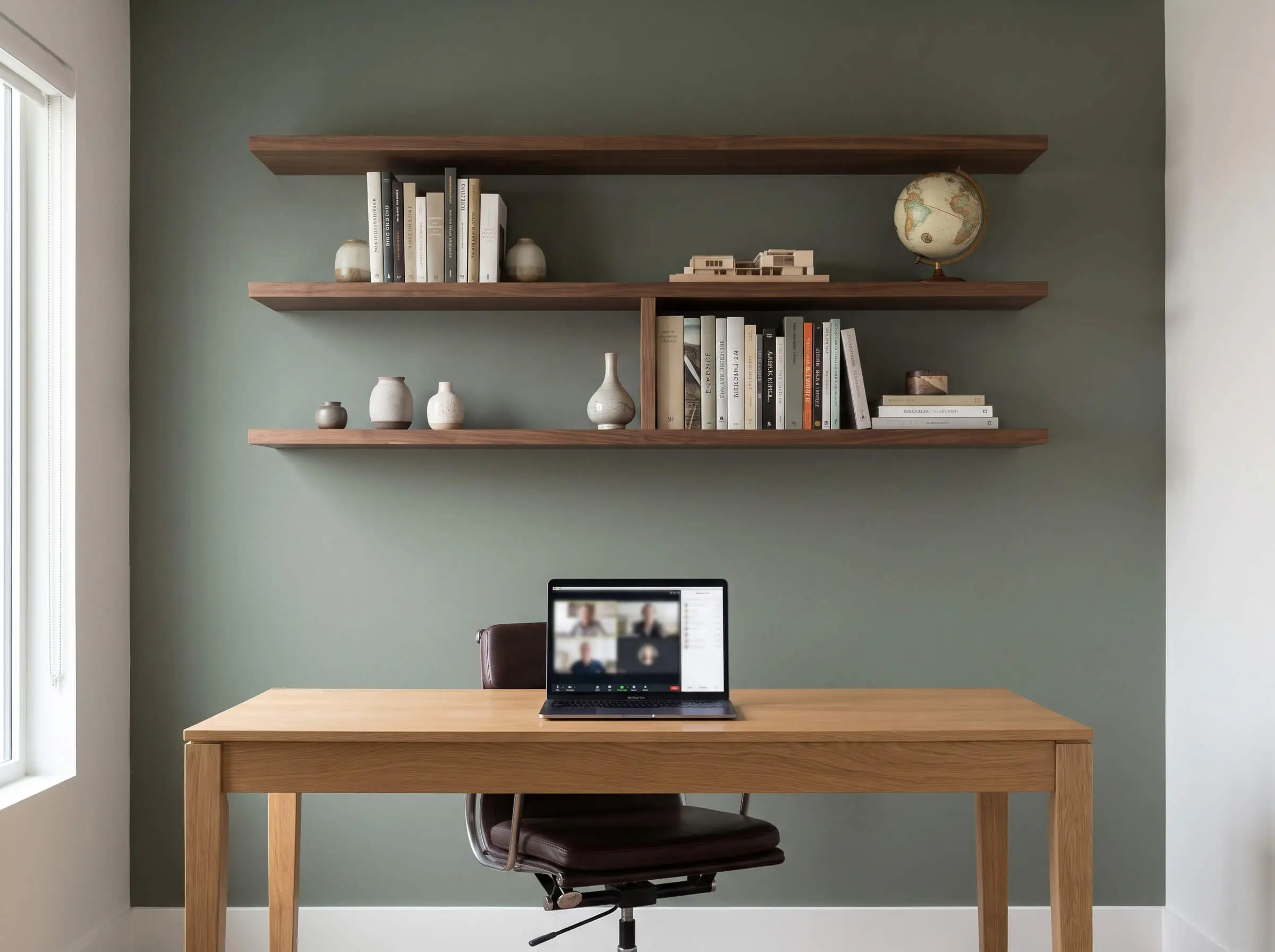
A muted moss green reduces eye strain and projects an air of calm authority on camera. By placing this accent wall directly behind your desk, you create a professional, grounded backdrop that avoids the sterile look of a blank white wall.
- Spatial Purpose: Creating a professional, non-distracting focal plane
- Key Materials: Flat finish to completely eliminate glare on video calls
- Paint Recommendation: Sherwin-Williams Retreat (SW 6207)
- Styling Pro-Tip: Install floating walnut shelves on the green wall for curated, professional styling.
The Bathroom Vanity Wall: Pairing Mint Green with Brass
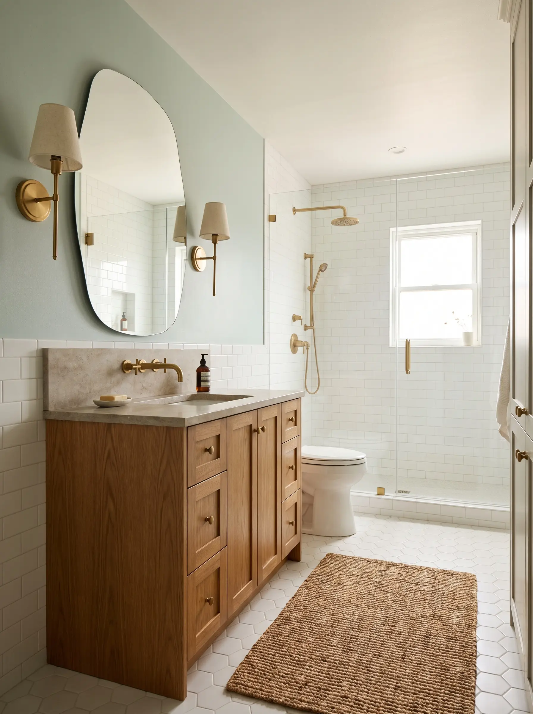
Bathrooms often suffer from an overabundance of cold, hard surfaces like porcelain and tile. A soft mint or sage green wall behind the vanity injects vital warmth and pairs flawlessly with unlacquered brass plumbing fixtures.
- Spatial Purpose: Softening hard architectural lines and adding warmth
- Key Materials: Moisture-resistant bathroom paint formulations
- Paint Recommendation: Sherwin-Williams Sea Salt (SW 6204)
- Styling Pro-Tip: Hang a frameless, organically shaped mirror to break up the linear vanity.
The Kitchen Peninsula: Grounding the Island
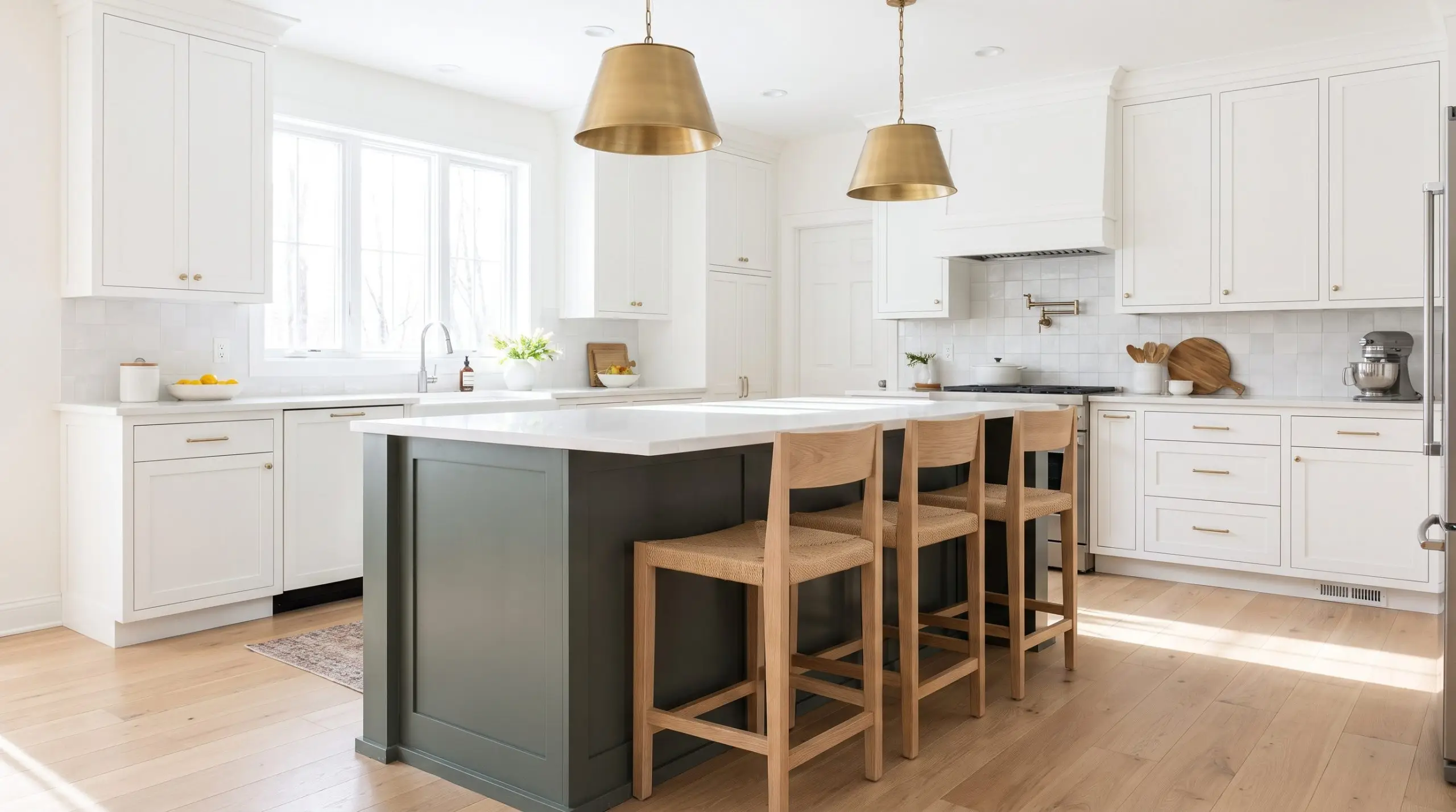
Painting the drywall face of a kitchen peninsula or the base of an island a deep green gives the structure the visual weight of freestanding furniture. This technique breaks up an all-white kitchen without requiring you to paint all the cabinetry.
- Spatial Purpose: Adding visual weight to the lower half of the room
- Key Materials: Scuff-resistant urethane trim enamel
- Paint Recommendation: Benjamin Moore Caldwell Green (HC-124)
- Styling Pro-Tip: Pair with rift-sawn oak barstools to bridge the gap between the green base and the floor.
The Entryway Drop Zone: Welcoming Guests with Olive
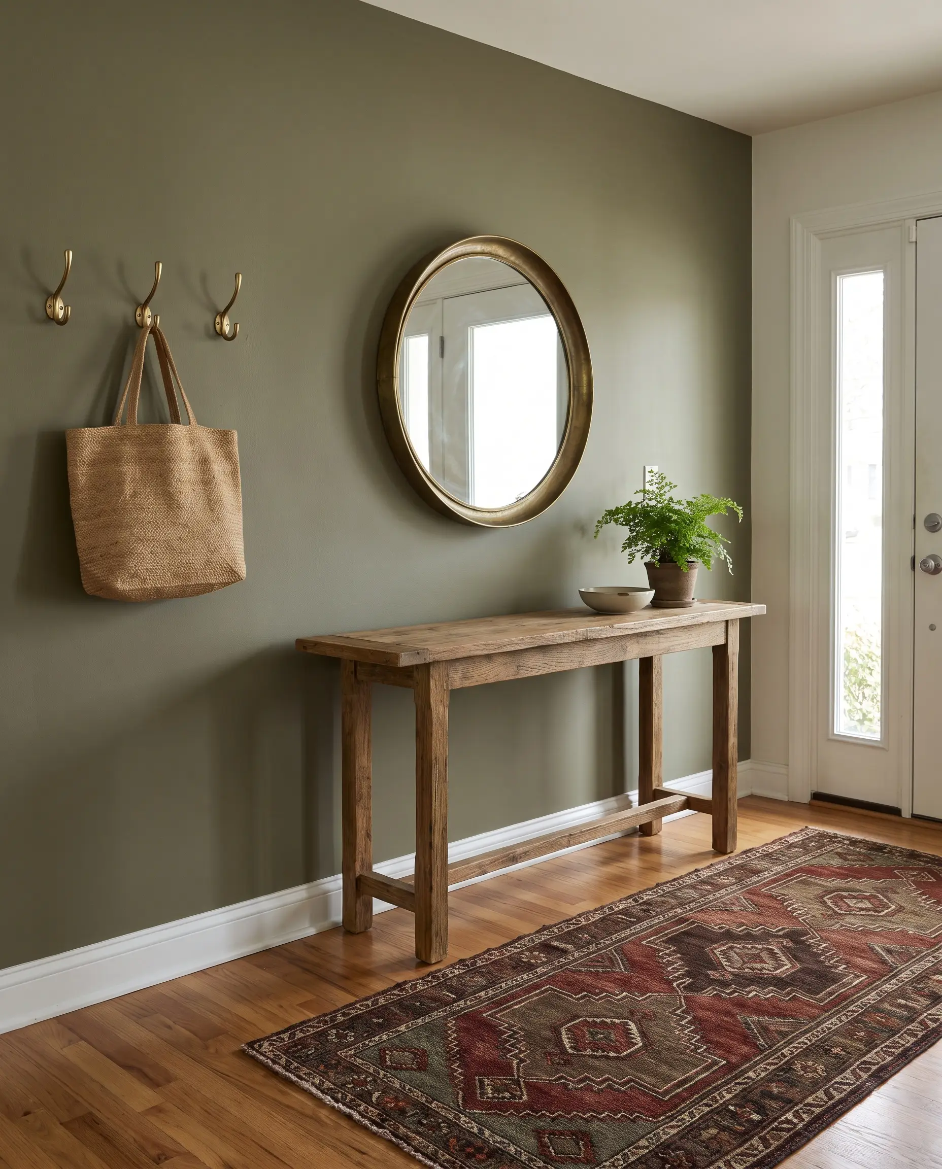
An entryway sets the tone for the entire home. An olive green accent wall immediately establishes a warm, natural transition from the outdoors in, providing a rich backdrop for a console table, mirror, and brass hooks.
- Spatial Purpose: Defining the transition zone and welcoming guests
- Key Materials: Washable matte finish to handle high traffic and scuffs
- Paint Recommendation: Benjamin Moore Tate Olive (HC-112)
- Styling Pro-Tip: Use a vintage Turkish runner rug to pull the olive tones down to the floor.
Material and Hardware Pairings for Green Walls
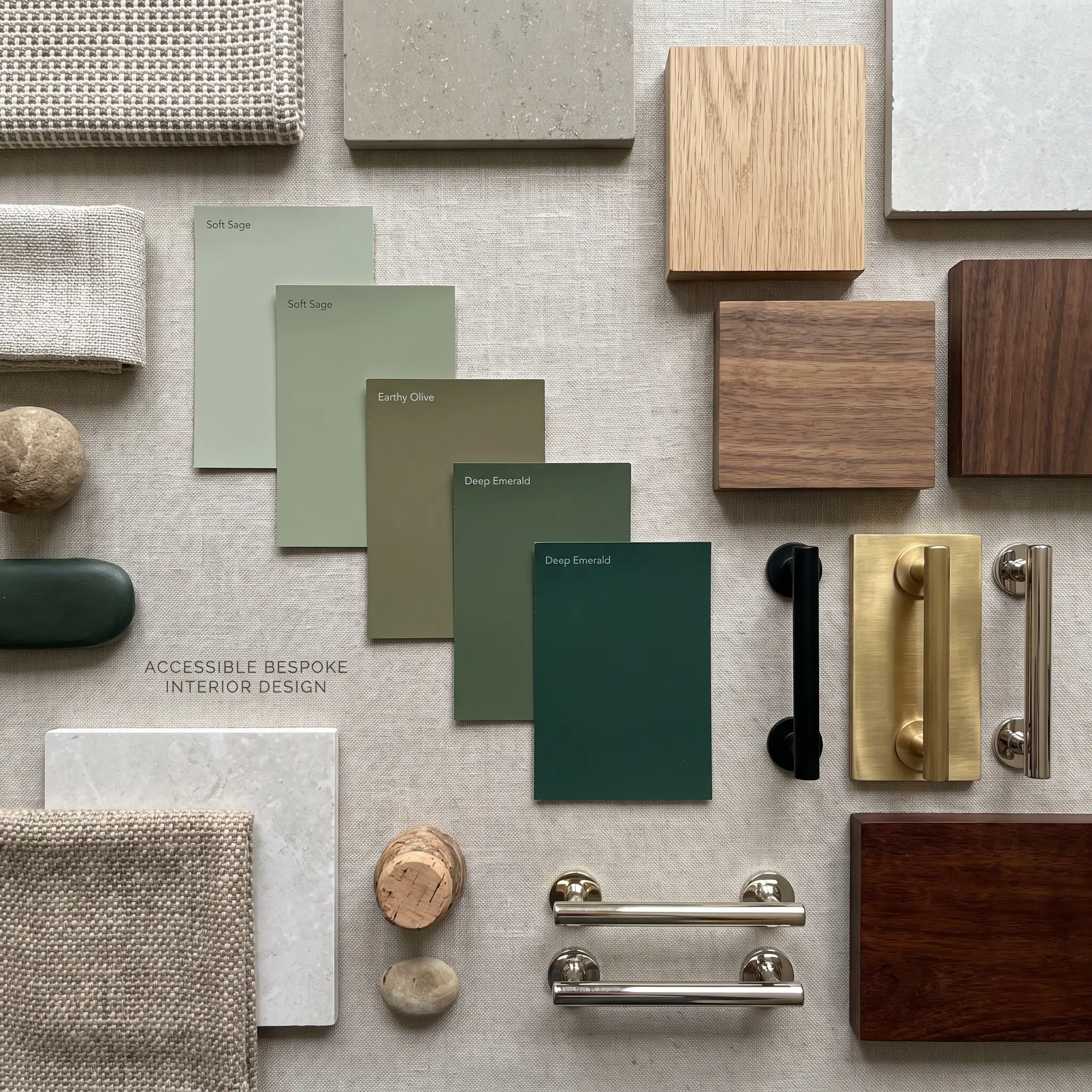
Green never exists in a vacuum; it constantly speaks to the floors, textiles, and cabinet hardware surrounding it. Mastering these adjacencies guarantees your accent wall feels intentional, cohesive, and fully integrated into the room’s architecture.
Color Pairing
| Green Shade Profile | Ideal Wood Tone | Ideal Metal Finish |
|---|---|---|
| Soft Sage (High LRV) | Rift-Sawn White Oak | Matte Black |
| Earthy Olive (Warm Undertone) | Medium Walnut | Unlacquered Brass |
| Deep Emerald (Low LRV) | Dark Mahogany / Ebonized Oak | Polished Brass / Nickel |
Metal Finishes: Unlacquered Brass vs. Matte Black
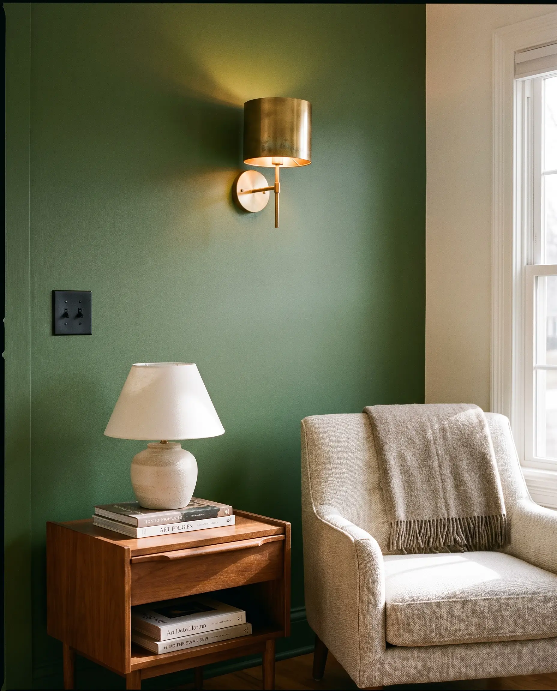
Hardware acts as the jewelry of the room, and green walls demand specific contrasts. Unlacquered brass introduces a living finish that develops a patina, warming up cool greens, while matte black provides a sharp, graphic punch against lighter sages.
- Hardware Strategy: High contrast for modern; warm metals for traditional.
- Key Materials: Solid brass sconces or matte black switch plates.
- Styling Pro-Tip: Never use brushed nickel against olive greens; the cool silver clashes with the warm yellow undertones.
Wood Tones: Rift-Sawn White Oak vs. Dark Walnut
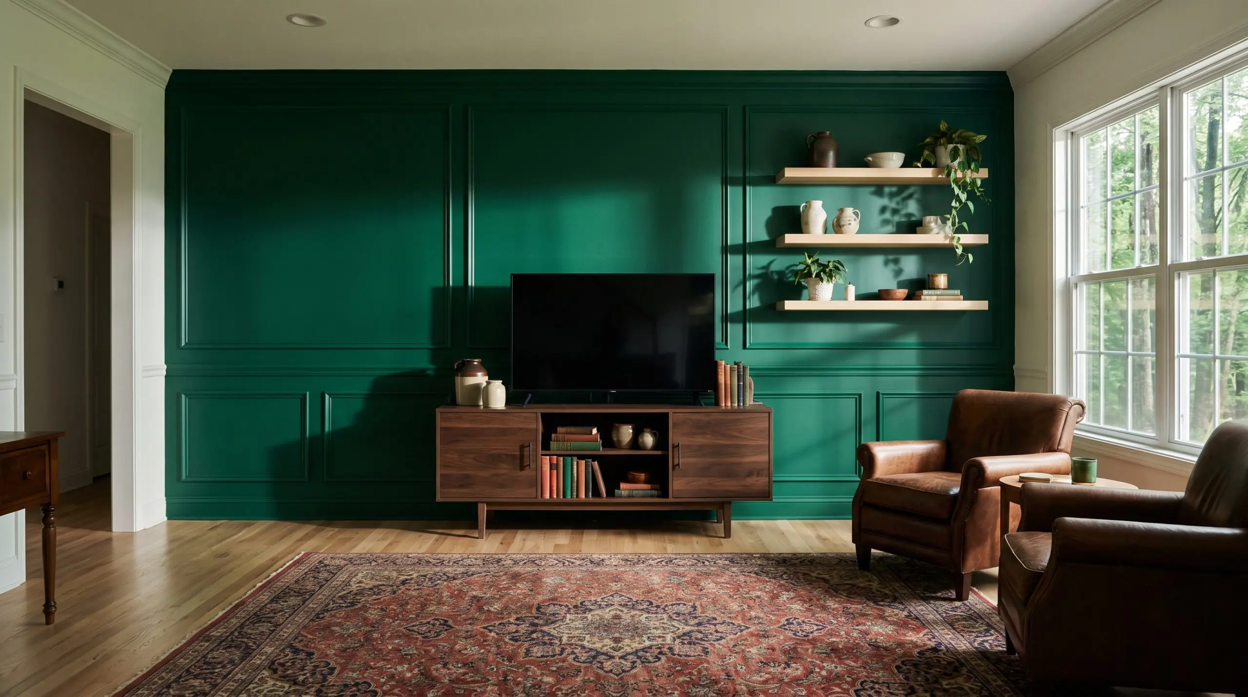
Wood tones dictate the era of the room. Pale, rift-sawn white oak against a green wall pulls the aesthetic toward Organic Modern and Japandi, while rich, dark walnut paired with emerald leans heavily into mid-century or traditional moody design.
- Wood Strategy: Match the visual weight of the wood to the LRV of the paint.
- Key Materials: Floating shelves, media consoles, or hardwood floors.
- Styling Pro-Tip: If you have reddish-toned floors (like cherry), stick to cooler, blue-based greens to neutralize the red.
Textile Styling: Rust Velvet, Bouclé, and Natural Linen
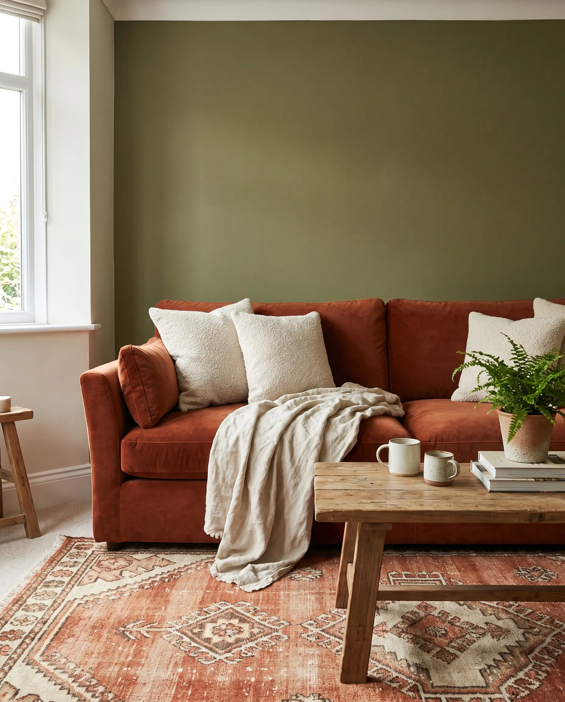
Textiles soften the structural rigidity of an accent wall. Heavy fabrics like rust velvet offer a complementary color contrast to green, while nubby bouclé and natural linen provide the tactile relief needed to keep the room feeling approachable.
- Textile Strategy: Use contrasting textures to prevent the room from feeling flat.
- Key Materials: Velvet drapery, linen throw pillows, wool rugs.
- Styling Pro-Tip: Pull a secondary color from your rug (like burnt orange or mustard) and use it in your textiles to complement the green wall.
Strategic Lighting: Grazing the Wall with Art Sconces
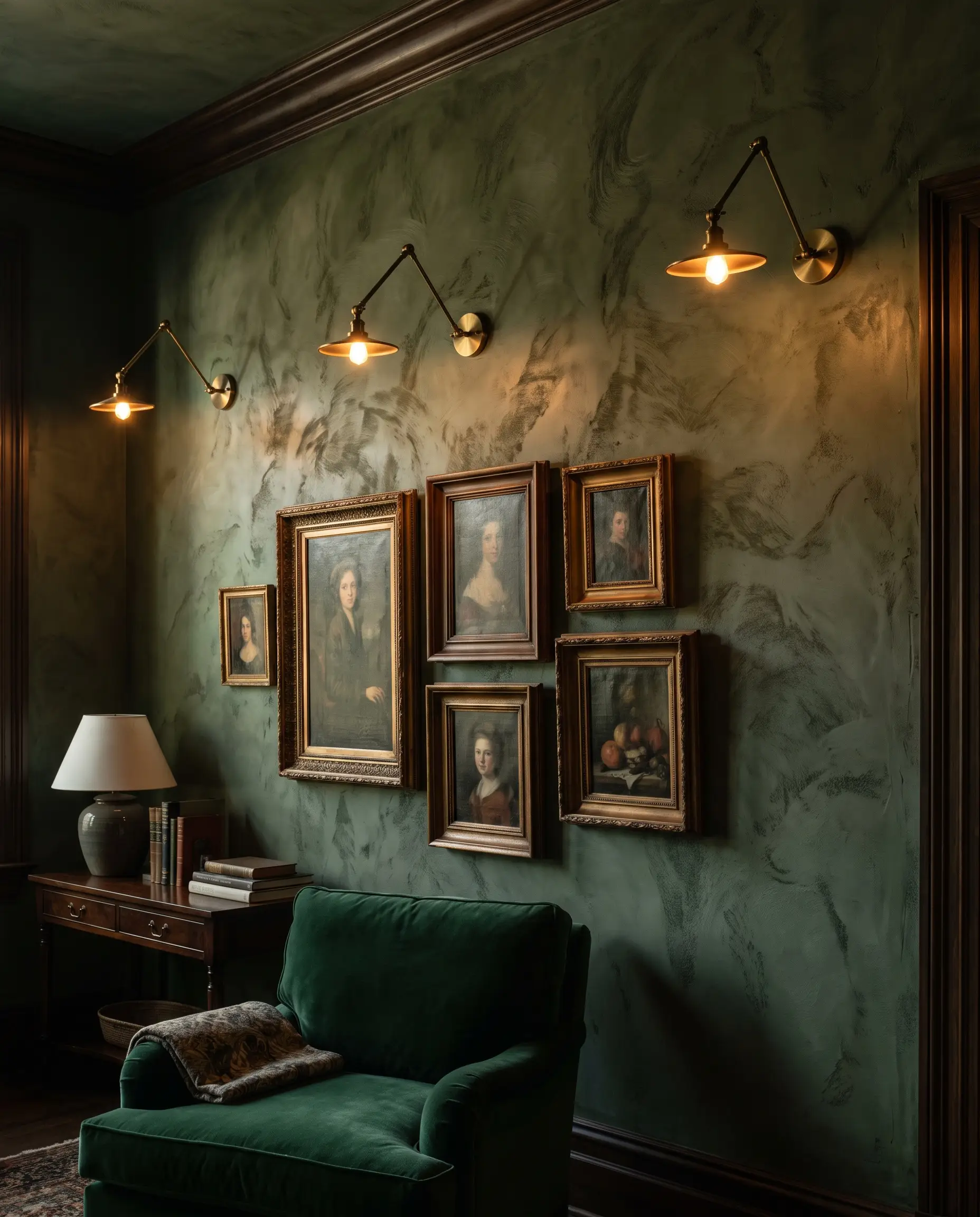
Lighting completely alters the Light Reflectance Value of your green wall. Relying solely on overhead recessed cans washes out the color; instead, use wall-mounted art sconces to graze the surface, highlighting the millwork shadows and plaster textures.
- Lighting Strategy: Layer ambient and accent lighting to control the mood.
- Key Materials: Hardwired brass picture lights or articulating sconces.
- Styling Pro-Tip: Always use bulbs with a color temperature of 2700K to 3000K to keep the green feeling warm and inviting at night.
Finalizing Your Green Accent Wall
Grounding your design in reality means testing the Light Reflectance Value in your actual space before ever picking up a roller. Paint large, two-foot swatches directly on the wall and observe how the undertones shift from the bright morning sun to artificial evening light. If the color reads too neon at noon, drop down to a shade with a lower LRV and a grayer undertone. Lock in your physical texture, select your perfect bespoke shade, and start building. Once your space is complete, share your architectural green wall projects with Hackrea’s social channels to inspire the community’s next build.