The Color Theorist’s Guide to the Best Sage Green Paint Colors: Undertones, LRV, and Perfect Trim Pairings
Sage green sits beautifully at the intersection of a grounding neutral and a statement hue, making it the most requested transitional color in modern architectural design. But sourcing the best sage green paint colors comes with a very specific, paralyzing fear: the dreaded “mint effect.” Selecting a muted, earthy shade from a tiny paper swatch only to watch it cure into a neon, hospital-scrub pastel on your walls is a costly mistake.
As architectural color theorists, we know that paint does not exist in a vacuum. A color’s success relies entirely on its chemical makeup—specifically its Light Reflectance Value (LRV) and dominant undertones—reacting to the directional light in your specific room. We are skipping the generic advice and analyzing the exact formulas interior designers rely on so you get the finish right on the first coat.
To ensure a flawless application, we have categorized this curation strictly by undertone and directional lighting requirements, rather than just alphabetical brand names, so you can confidently match the chemistry of the paint to the architecture of your space.
The Gray-Leaning Sages (Cool, Grounding, and Sophisticated)
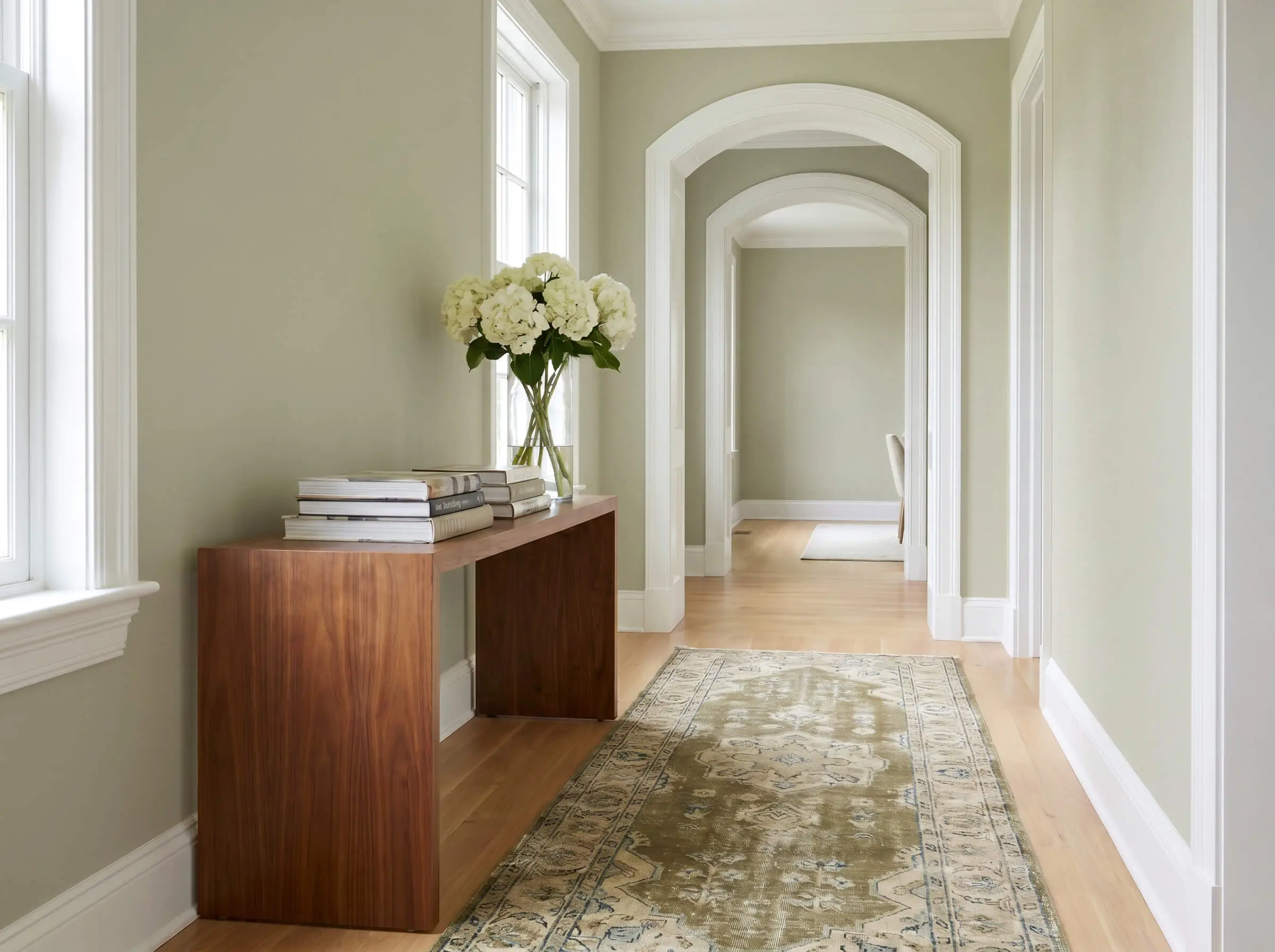
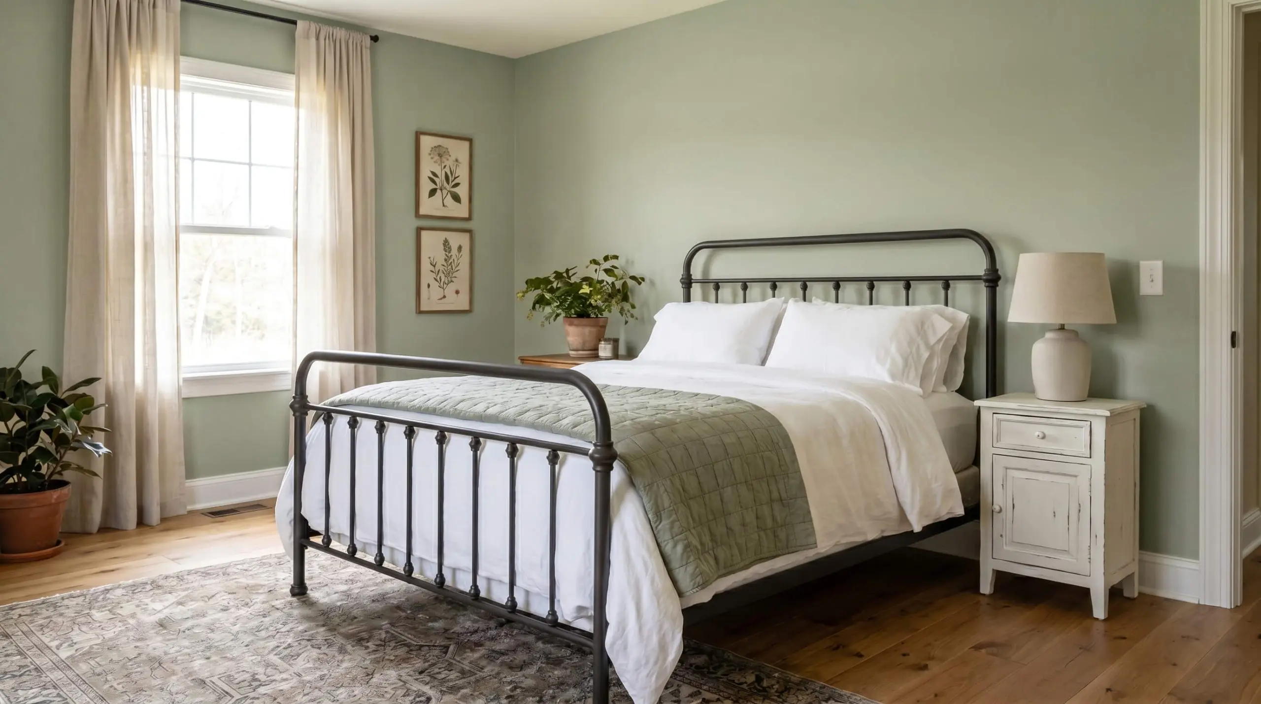
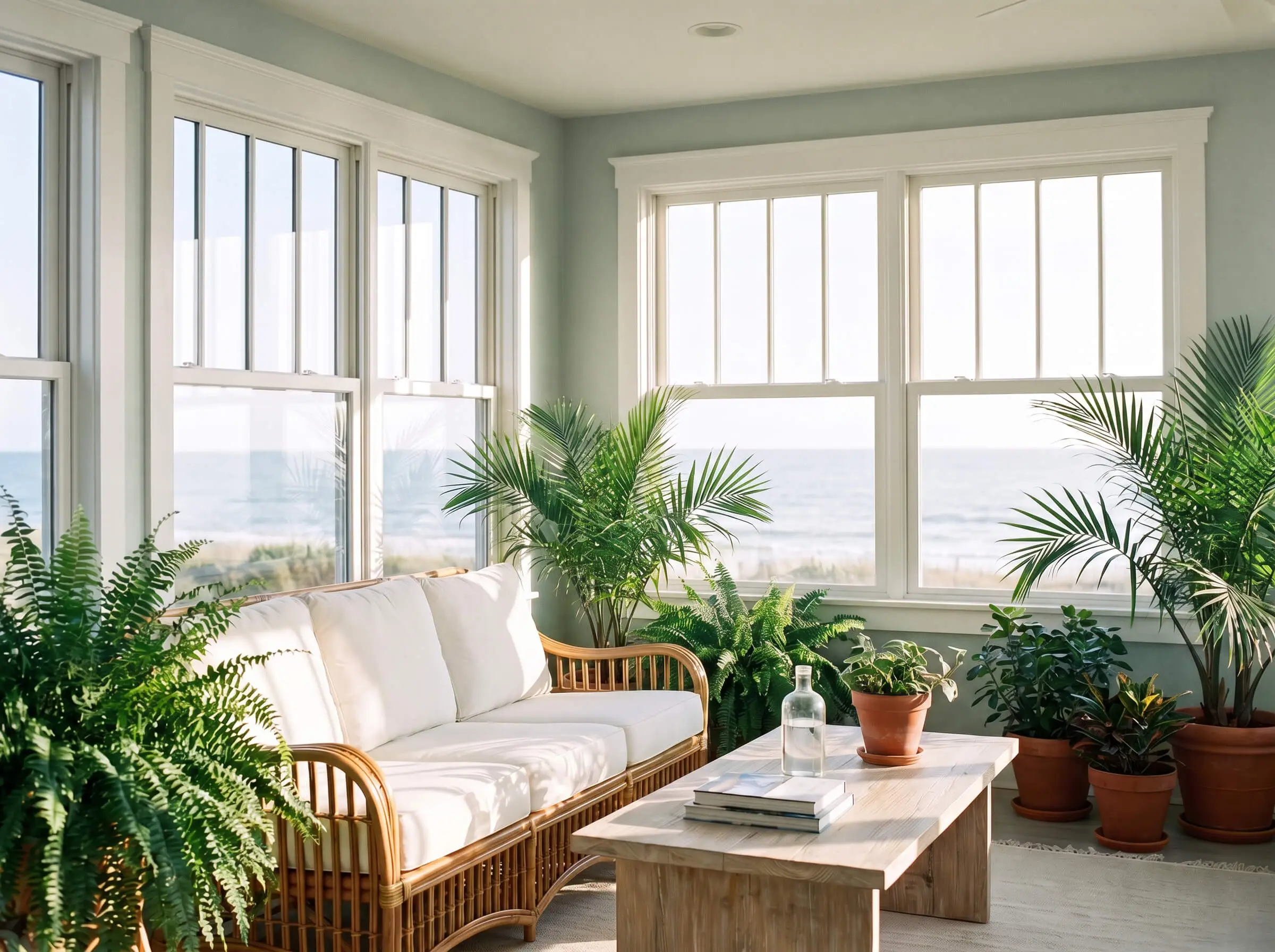
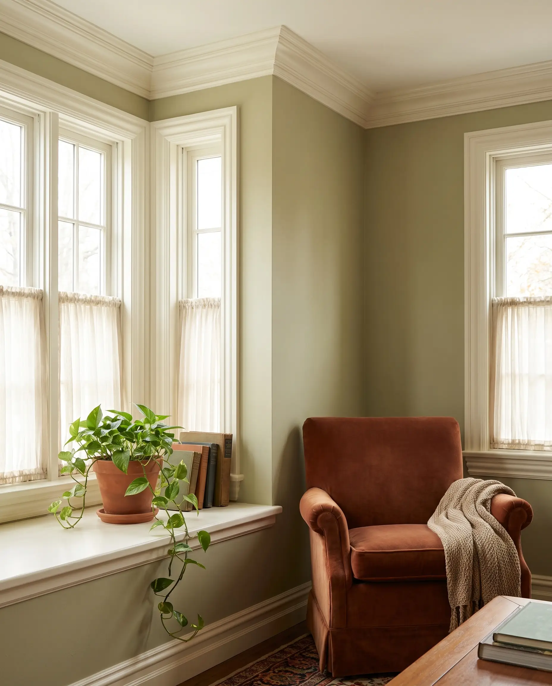
Gray-leaning sages offer the safest entry point for color-phobes transitioning away from stark whites. The heavy gray undertone neutralizes the green saturation, preventing the finish from ever reading as neon or excessively vibrant. These shades perform exceptionally well in South-facing rooms, where intense warm sunlight might otherwise aggressively amplify a true green.
Benjamin Moore October Mist 1495
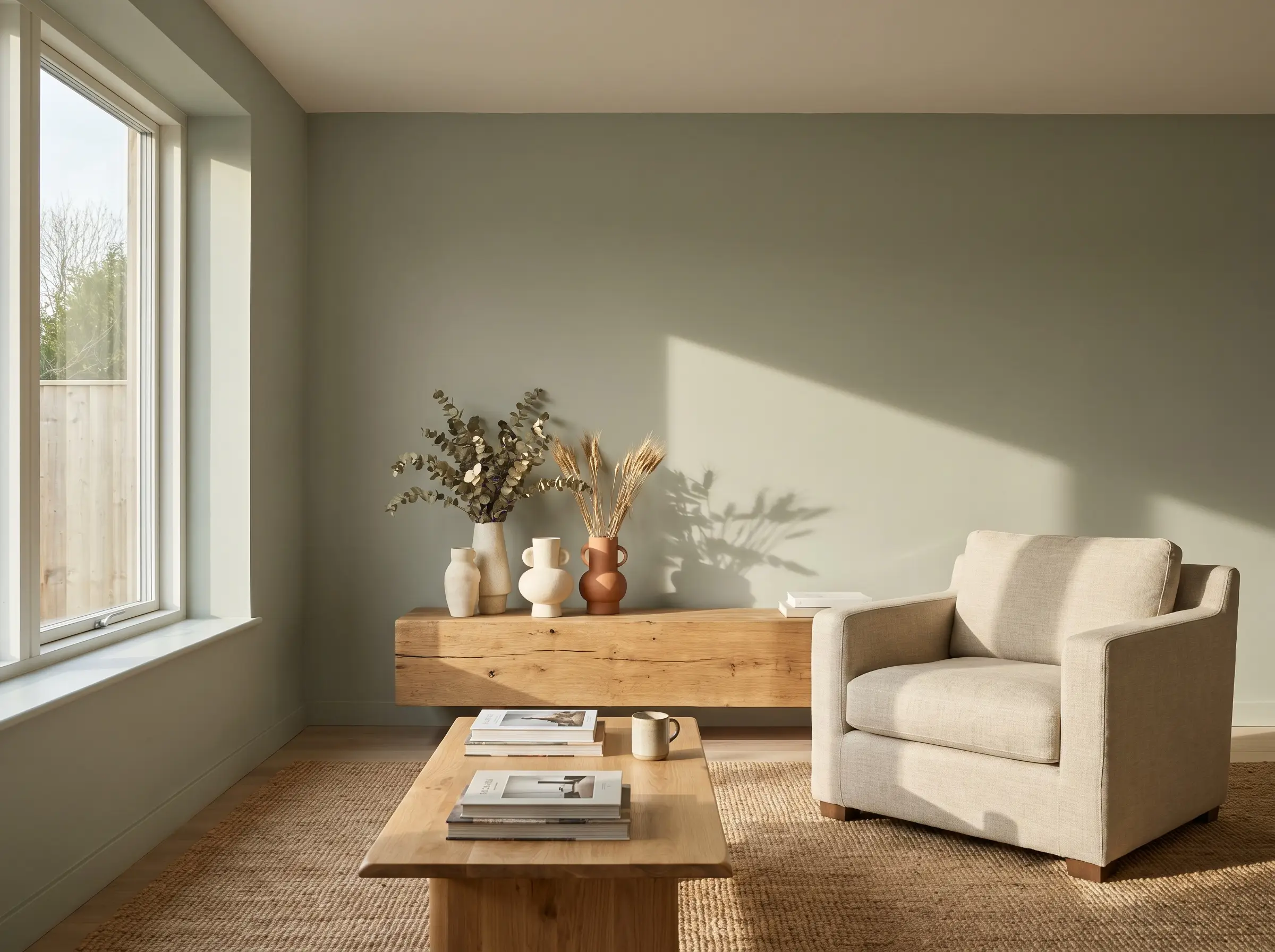
This former Color of the Year possesses a silvery, stem-like quality that brings a quiet, sophisticated rhythm to organic modern living rooms. Its muted nature allows it to act as a soft architectural backdrop without overpowering natural wood tones or textured fabrics.
- Brand: Benjamin Moore
- LRV: 46.33
- Dominant Undertone: Silver/Gray
- Ideal Room Light: South/West-facing
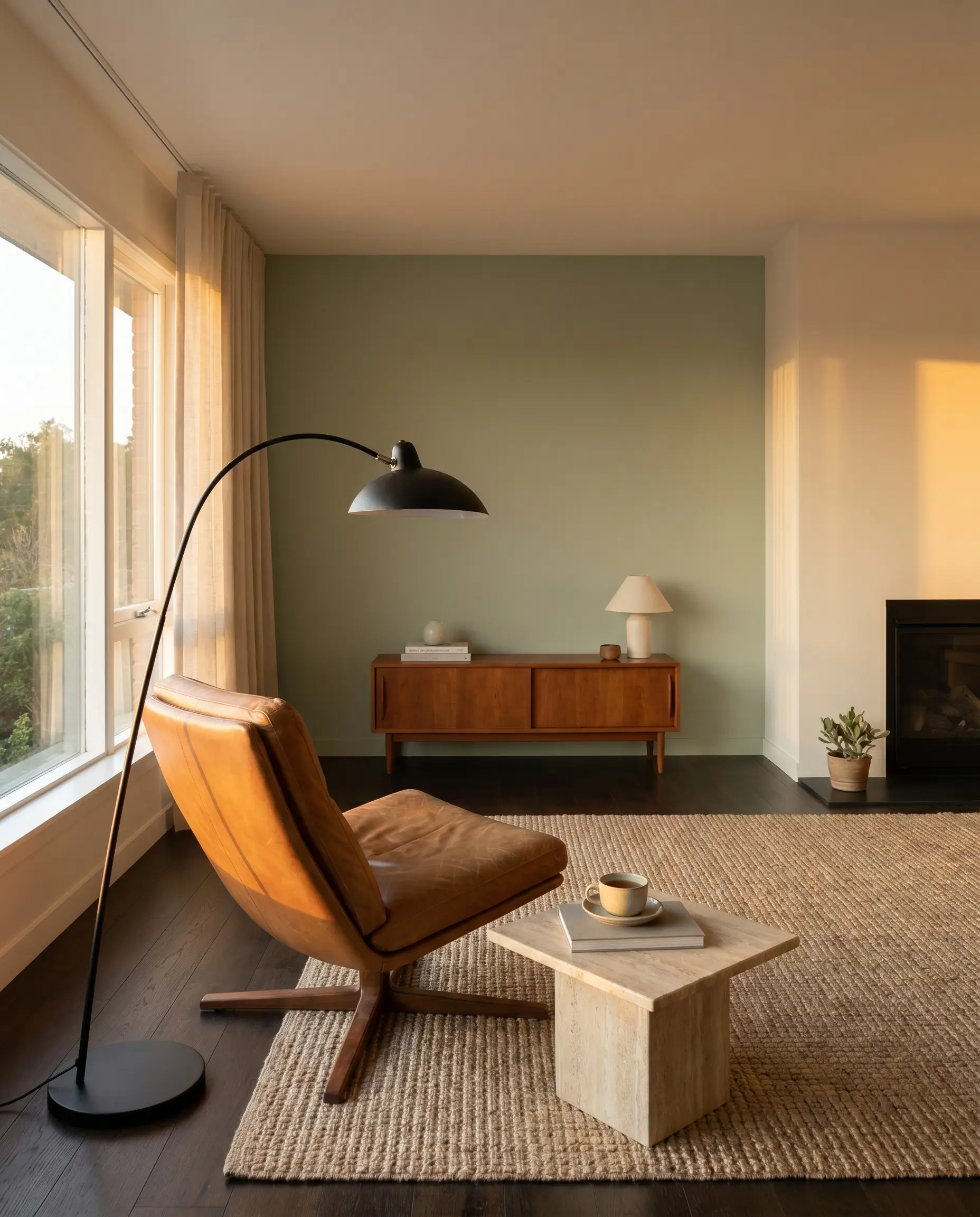
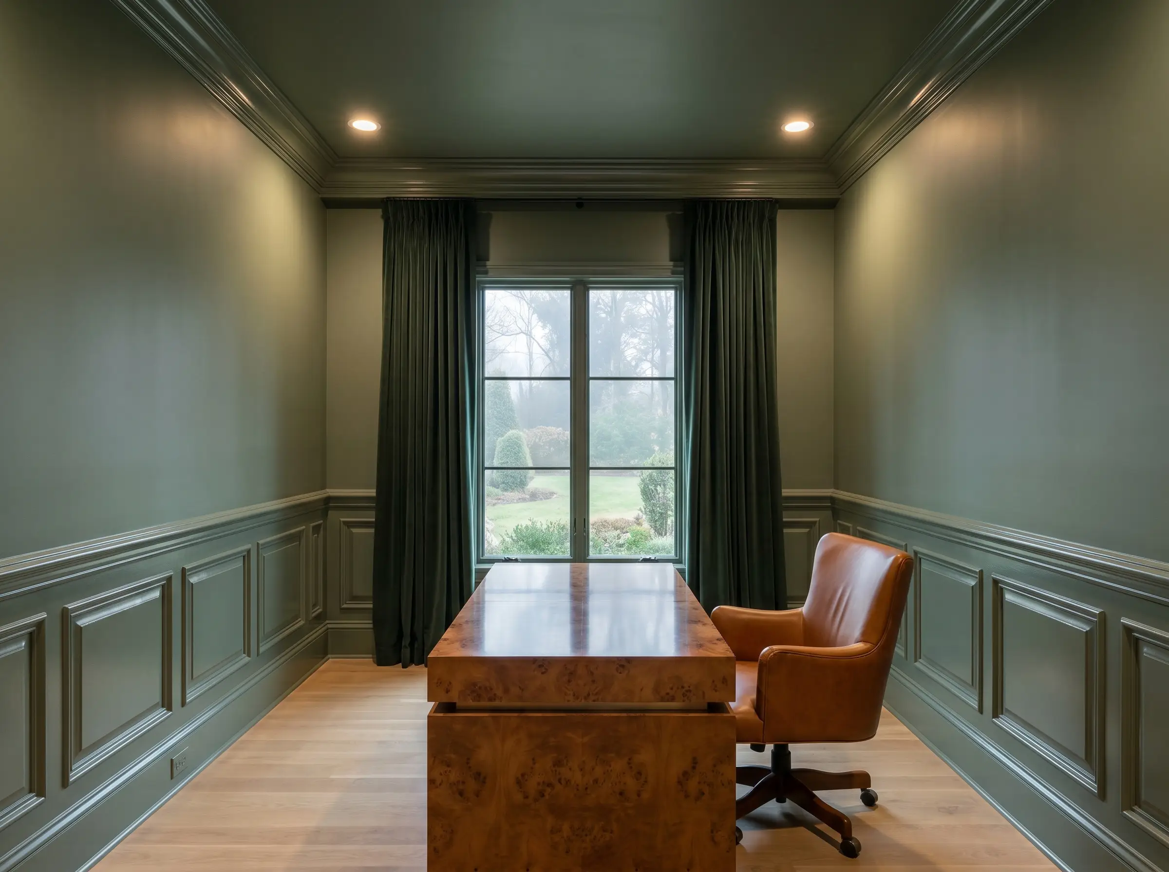
Sherwin-Williams Evergreen Fog SW 9130
A wildly popular, slightly deeper gray-green that acts as a true chameleon color across different lighting environments. It feels incredibly grounding and provides a stunning, velvet-like contrast when applied to custom kitchen cabinets or heavy millwork.
- Brand: Sherwin-Williams
- LRV: 30
- Dominant Undertone: Gray/Blue
- Ideal Room Light: Any
Farrow & Ball French Gray No. 18
Despite the name, this highly pigmented formula reads as a soothing, historic sage green that shifts beautifully throughout the day. The complex chemical makeup ensures the color responds actively to changing shadows, giving walls a dynamic, lived-in depth.
- Brand: Farrow & Ball
- LRV: 24
- Dominant Undertone: Gray/Brown
- Ideal Room Light: East-facing
Sherwin-Williams Oyster Bay SW 6206
Introducing a whisper of blue-gray, this cooler variation is ideal for bedrooms where a tranquil, spa-like atmosphere is the primary spatial goal. The cooler tones recede visually, making tight spaces feel slightly more expansive and breathable.
- Brand: Sherwin-Williams
- LRV: 44
- Dominant Undertone: Blue/Gray
- Ideal Room Light: South-facing
Benjamin Moore Night Train 1567
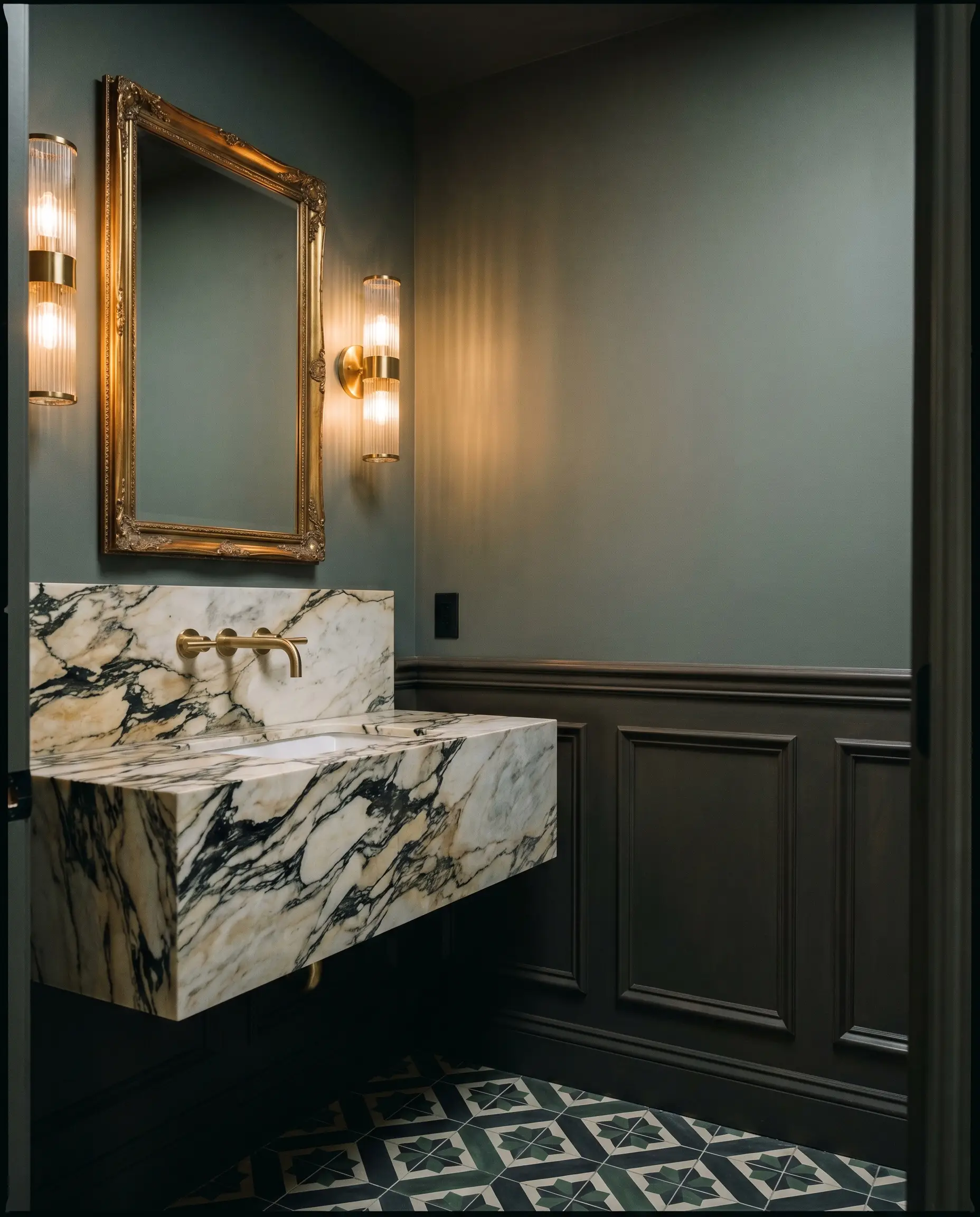
This is a darker, moodier take on a gray-sage that creates immediate intimacy and architectural depth in smaller footprints. It wraps powder rooms or studies in a rich, enveloping shadow that feels highly intentional and sophisticated.
- Brand: Benjamin Moore
- LRV: 22
- Dominant Undertone: Deep Gray
- Ideal Room Light: Well-lit rooms
Sherwin-Williams Austere Gray SW 6184
A very light, airy gray that flashes a distinct green hue depending on the ambient color temperature of the hour. It provides a subtle chromatic shift that keeps transitional spaces feeling fresh and highly responsive to natural light.
- Brand: Sherwin-Williams
- LRV: 51
- Dominant Undertone: Yellow/Gray
- Ideal Room Light: North-facing
You can apply wallpapers, paints, etc. on walls and see how they look in various interiors.

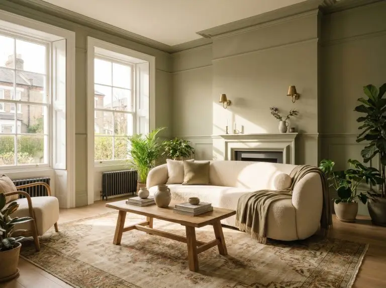
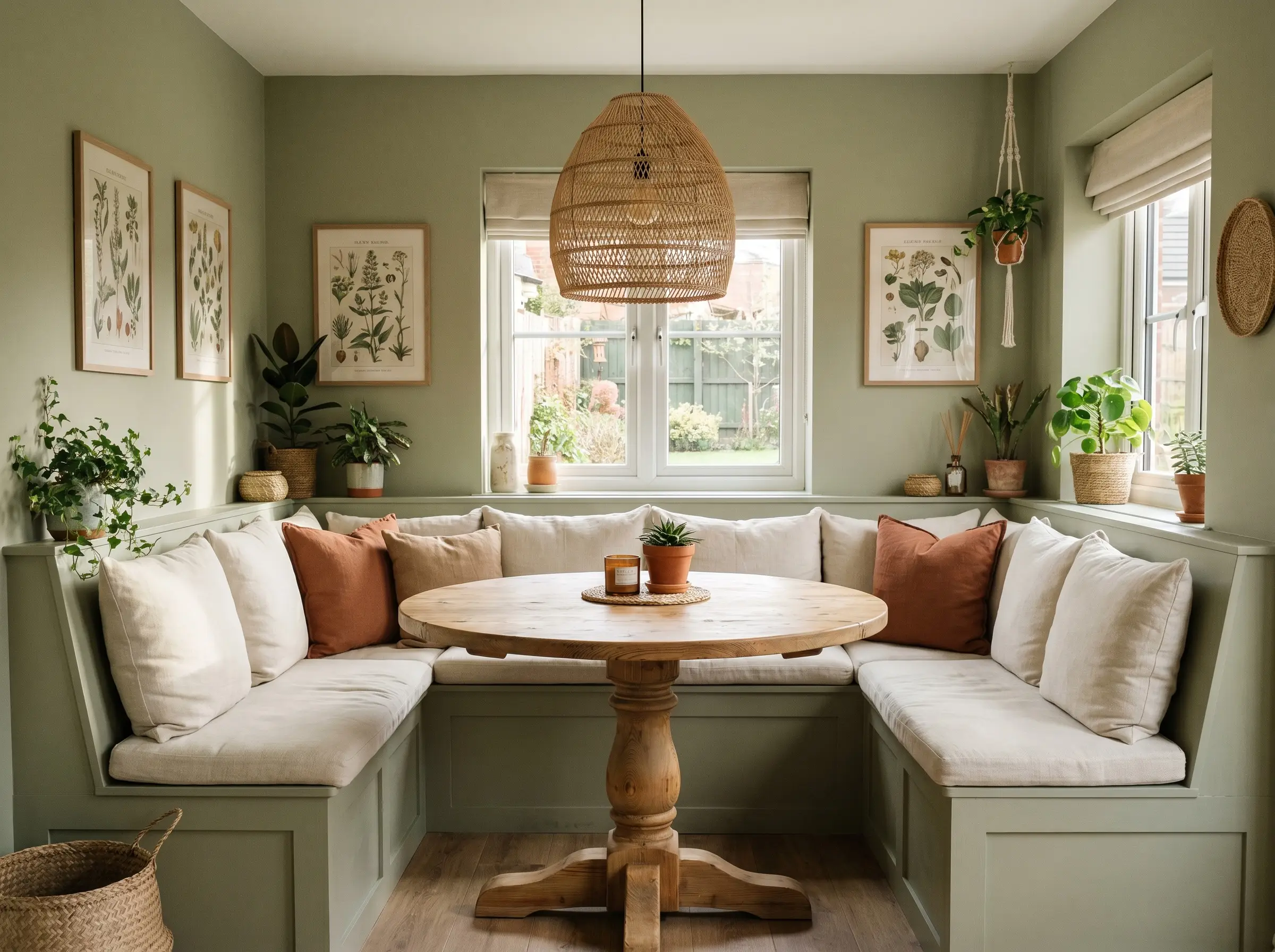
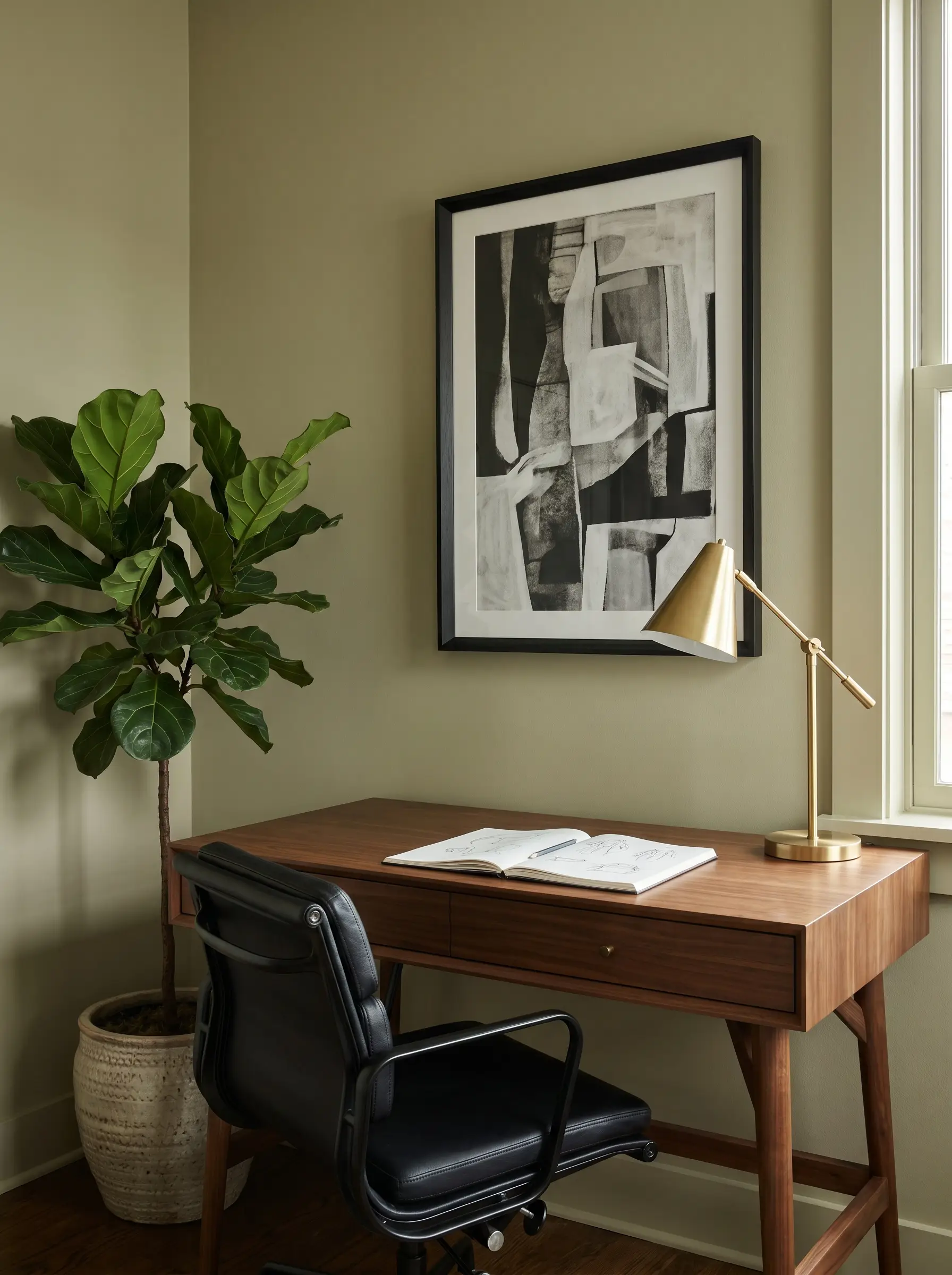
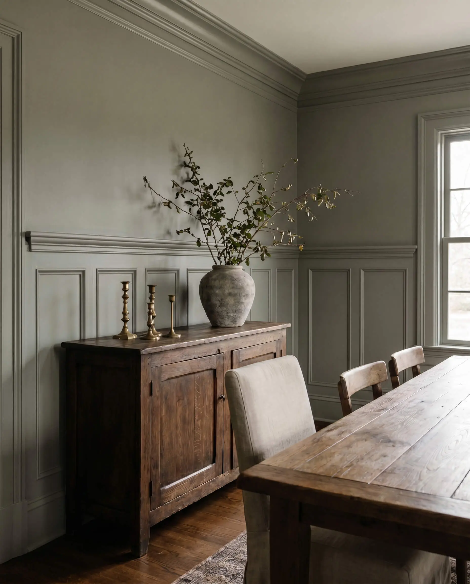
The Warm & Earthy Sages (Yellow & Brown Undertones)
Yellow and brown undertones inject vital life and warmth into cold, shadowy spaces. These earthy variations are mandatory for North-facing rooms, which naturally cast a cool, blue light that can easily strip a gray-sage of its vitality and make it look like wet cement.
The North-Facing Light Mandate If your room faces North, you must choose a sage green with a yellow or brown base. The warm undertones will counteract the icy, indirect light entering the window, keeping the green feeling organic rather than clinical.
Hackrea Color Theorist Rule
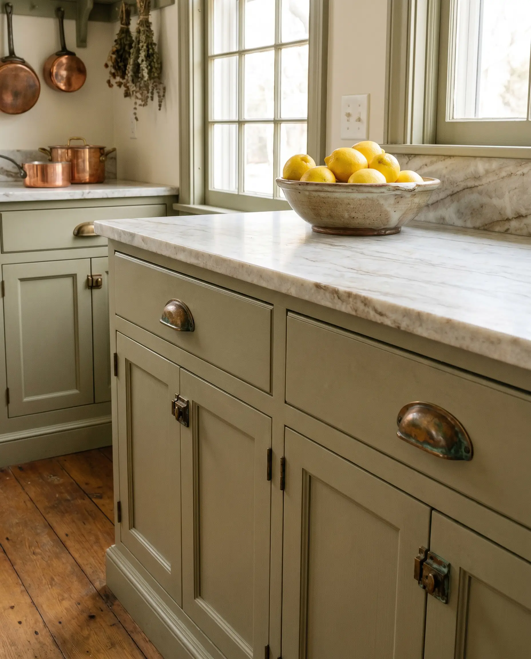
Benjamin Moore Saybrook Sage HC-114
Pulled straight from the Historical Collection, this shade carries a distinct, baked warmth that feels deeply traditional and rich. It excels when applied to traditional wainscoting, grounding the lower half of a room with substantial visual weight.
- Brand: Benjamin Moore
- LRV: 45.46
- Dominant Undertone: Yellow/Brown
- Ideal Room Light: North-facing
Sherwin-Williams Clary Sage SW 6178
An herbal, soft green with just enough yellow to feel exceptionally cozy without ever leaning sickly or overly acidic. It perfectly bridges the gap between botanical vibrancy and neutral restraint.
- Brand: Sherwin-Williams
- LRV: 41
- Dominant Undertone: Yellow
- Ideal Room Light: North/East-facing
Benjamin Moore Soft Fern 2144-40
Lighter and slightly more vibrant, this optimistic shade brings a cheerful energy to cottage, farmhouse, or transitional layouts. The higher light reflectance keeps the room feeling airy while maintaining a distinct earthy footprint.
- Brand: Benjamin Moore
- LRV: 56
- Dominant Undertone: Warm Yellow
- Ideal Room Light: North-facing
Benjamin Moore Urban Nature AF-440
Reminiscent of dried eucalyptus, this muted, earthy tone is part of the Affinity collection, explicitly engineered to pair seamlessly with other complex hues. The olive-leaning base brings a sophisticated, grounded maturity to living spaces.
- Brand: Benjamin Moore
- LRV: 35.5
- Dominant Undertone: Brown/Olive
- Ideal Room Light: West-facing
Sherwin-Williams Contented SW 6191
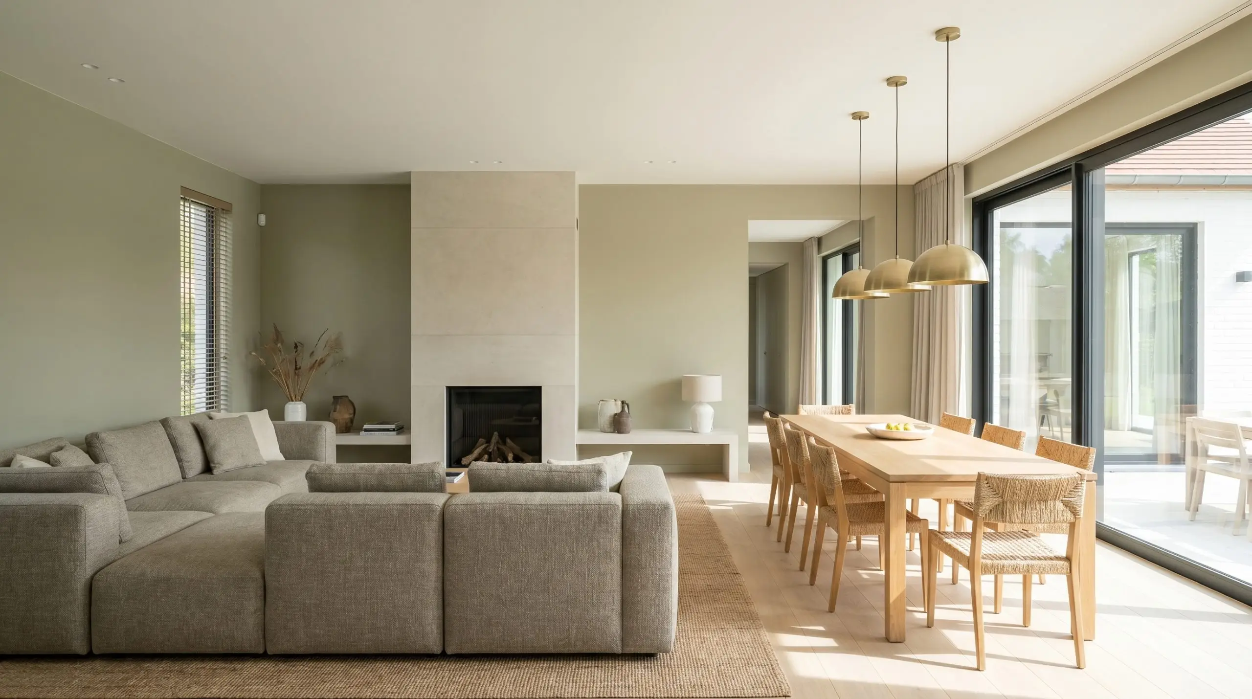
This highly approachable, warm green feels incredibly natural and unobtrusive, acting as a gentle anchor for your walls. It offers a flawless balance of warmth and neutrality, making it an incredibly safe bet for open-concept floor plans.
- Brand: Sherwin-Williams
- LRV: 52
- Dominant Undertone: Warm Gray
- Ideal Room Light: Any
Behr Sage Brush (S370-3)
A highly accessible, budget-friendly light olive and sage hybrid that punches far above its weight class in architectural sophistication. The rich brown base anchors the pigment, ensuring it reads as a premium, complex neutral.
- Brand: Behr
- LRV: 41
- Dominant Undertone: Olive/Brown
- Ideal Room Light: North/West-facing
The Deep & Architectural Sages (Low LRV for High Drama)
Sage does not have to be pastel or strictly mid-tone. Dropping the LRV below 25 creates a rich, architectural presence perfect for libraries, custom built-ins, or the immersive technique of color-drenching—painting your walls, trim, and ceiling the exact same shade for unbroken visual drama.
Benjamin Moore Gloucester Sage HC-100
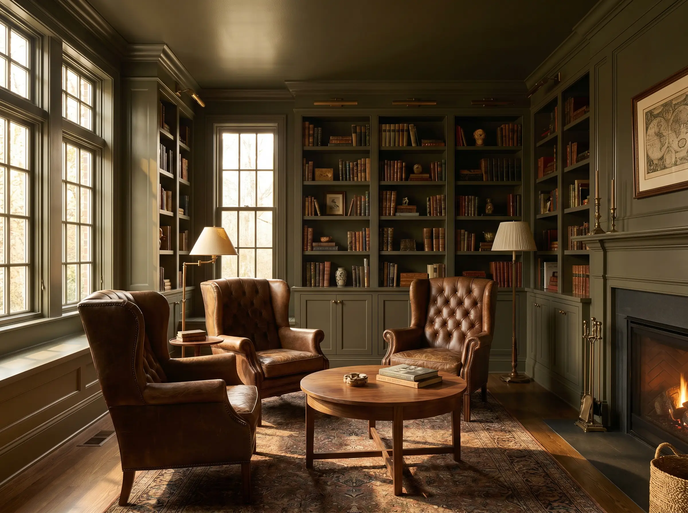
A dark, historic green-brown that feels incredibly bespoke and tailored, wrapping a room in undeniable luxury. The heavy brown undertones make it the ultimate companion for rich walnut wood tones and aged leather.
- Brand: Benjamin Moore
- LRV: 19
- Dominant Undertone: Brown/Green
- Ideal Room Light: South-facing
Farrow & Ball Treron No. 292
Serving as a darker, more architectural sibling to French Gray, this shade feels organic, historic, and incredibly luxurious. It carries a heavy, grounding visual weight that commands attention while remaining deeply connected to nature.
- Brand: Farrow & Ball
- LRV: ~20
- Dominant Undertone: Deep Gray-Green
- Ideal Room Light: Any
Sherwin-Williams Retreat SW 6207
A dusty, deep green that acts as a stunning, low-reflective backdrop for warm textiles and metallic accents. The muted saturation ensures the dark tone feels welcoming rather than oppressive or cavernous.
- Brand: Sherwin-Williams
- LRV: 21
- Dominant Undertone: Blue-Gray
- Ideal Room Light: South-facing
Portola Paints Aberdeen (Limewash Sage)
Stepping away from standard latex paints, this limewash option provides actual physical texture and a suede-like finish. The raw, mineral composition transforms the sage green into a bespoke architectural feature, interacting with ambient lighting to create mottled, earthy depth.
- Brand: Portola Paints
- LRV: N/A (Textured)
- Dominant Undertone: Earthy Warm
- Ideal Room Light: Layered ambient lighting
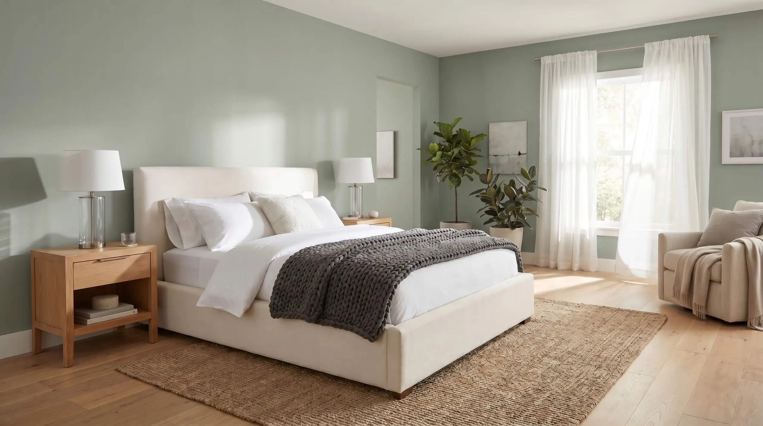
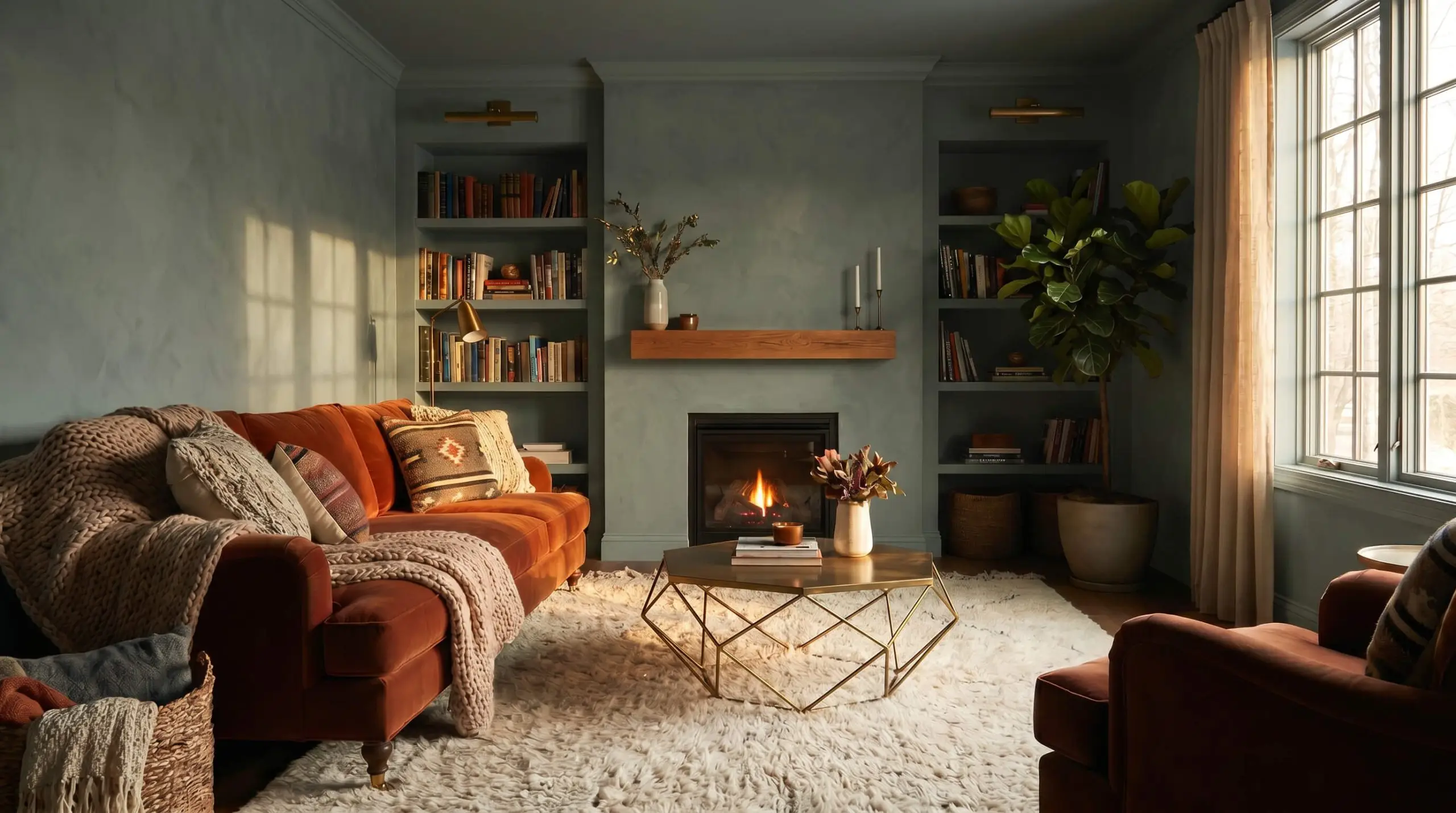
The Coastal & Crisp Sages (Blue-Leaning)
Blue-leaning sages offer a fresher, coastal aesthetic that feels incredibly crisp and airy. However, we must issue a firm warning: these cooler formulas are the most likely to read as an unwanted “mint” if applied in the wrong lighting environment. They require warm, South-facing light to balance out the cool blue undertones.
Sherwin-Williams Sea Salt SW 6204
This iconic, incredibly popular shade dances effortlessly between blue, green, and gray depending on the hour and the angle of the sun. It brings a breezy, salt-washed crispness to spaces that receive ample warm, natural light.
- Brand: Sherwin-Williams
- LRV: 63
- Dominant Undertone: Blue/Gray
- Ideal Room Light: South/West-facing
Because of its high LRV and strong blue undertone, avoid using Sea Salt in shadowy, North-facing rooms unless you explicitly want a chilly, icy visual effect.
Designer Warning
Benjamin Moore Quiet Moments 1563
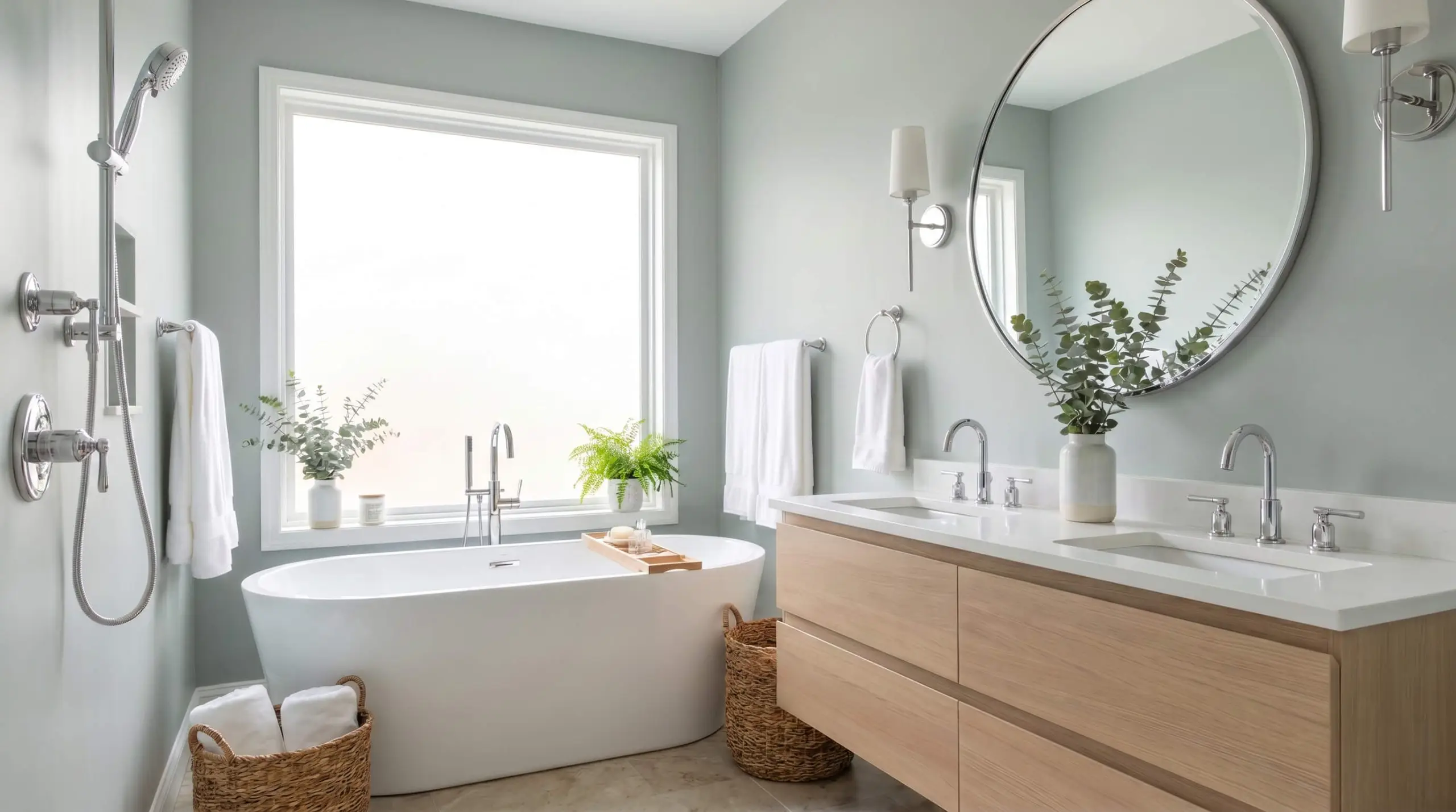
A tranquil, light blue-green that mimics the crisp, optimistic feeling of an early morning sky. It is the perfect restorative hue for spa-like bathrooms where relaxation and visual clarity are the primary spatial objectives.
- Brand: Benjamin Moore
- LRV: 60.7
- Dominant Undertone: Blue
- Ideal Room Light: South-facing
Farrow & Ball Cromarty No. 285
A very light, misty green that feels incredibly refined and subtle, offering just enough pigment to contrast cleanly with white trim. The muted blue-gray base ensures the finish remains sophisticated and restrained.
- Brand: Farrow & Ball
- LRV: ~52
- Dominant Undertone: Blue-Gray
- Ideal Room Light: South-facing
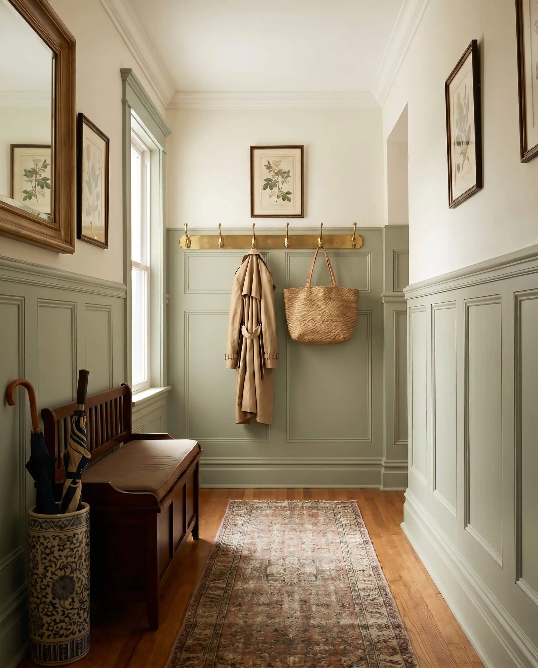
The Millwork & Hardware Pairing Matrix
A wall color fails instantly if the adjacent millwork and trim clash with its chemical base. You cannot pair a warm, yellow-leaning sage with a stark, cool white trim—the conflicting color temperatures will force the trim to look icy blue and the walls to appear muddy.
Crisp White Trim Pairings (For Gray & Coastal Sages)
Cooler, blue or gray-leaning sages require a bright, clean white with virtually zero undertones to achieve a sharp, modern architectural contrast. These pure whites prevent the cooler greens from feeling washed out.
- Primary Match: Benjamin Moore Chantilly Lace
- Secondary Match: Sherwin-Williams High Reflective White
- Vibe: Sharp, clean, and highly modernized.
Creamy White Trim Pairings (For Warm & Earthy Sages)
Earthy sages with yellow or brown undertones demand a warmer, creamier white to maintain a harmonious visual transition. A stark white would create a harsh, clinical contrast, whereas these warmer whites blend beautifully with the organic nature of the green.
- Primary Match: Benjamin Moore White Dove
- Secondary Match: Benjamin Moore Swiss Coffee
- Alternative Match: Sherwin-Williams Alabaster
The Tone-on-Tone Execution (Color Drenching)
Ditch the white trim entirely by painting the baseboards, wainscoting, and crown molding the exact same sage green as the drywall. To create subtle structural definition, you must shift the sheen levels to catch the light differently.
- Wall Finish: Eggshell or Matte
- Trim & Millwork Finish: Satin or Semi-Gloss
- Ceiling Finish: Flat (or Eggshell for high drama)
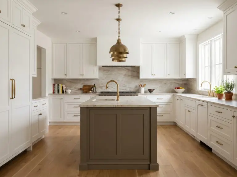
Metallic Hardware Pairings: Unlacquered Brass
Warm metals are the ultimate complement to the earthy, botanical nature of sage green. Unlacquered brass provides a living, oxidizing patina that enhances the organic, historic feel of the space over time.
- Do: Pair unlacquered brass with warm, brown-leaning sages (like Saybrook Sage) for a rich, historic aesthetic.
- Don’t: Mix highly polished, lacquered brass with dusty gray-sages, as the artificial shine will aggressively clash with the muted, natural walls.
Metallic Hardware Pairings: Matte Black & Polished Nickel
For a sharper, more tailored approach, cool-toned or highly contrasting metals provide excellent structural definition. Matte black grounds the space with a modern edge, while polished nickel adds a traditional, silvery shine that works beautifully with heritage colors.
- Matte Black: Best paired with gray-leaning sages (like Evergreen Fog) to anchor the room with sharp, modern contrast.
- Polished Nickel: Ideal for Farrow & Ball shades, reflecting ambient light and adding a layer of historic sophistication.
The Painter’s Sign-Off: Testing and Committing to Your Sage
Never purchase gallons of paint based solely on a digital screen or a two-inch paper swatch. To truly master the architectural color theory we’ve discussed, you must observe how the pigment reacts to your specific lighting across a full 24-hour cycle.
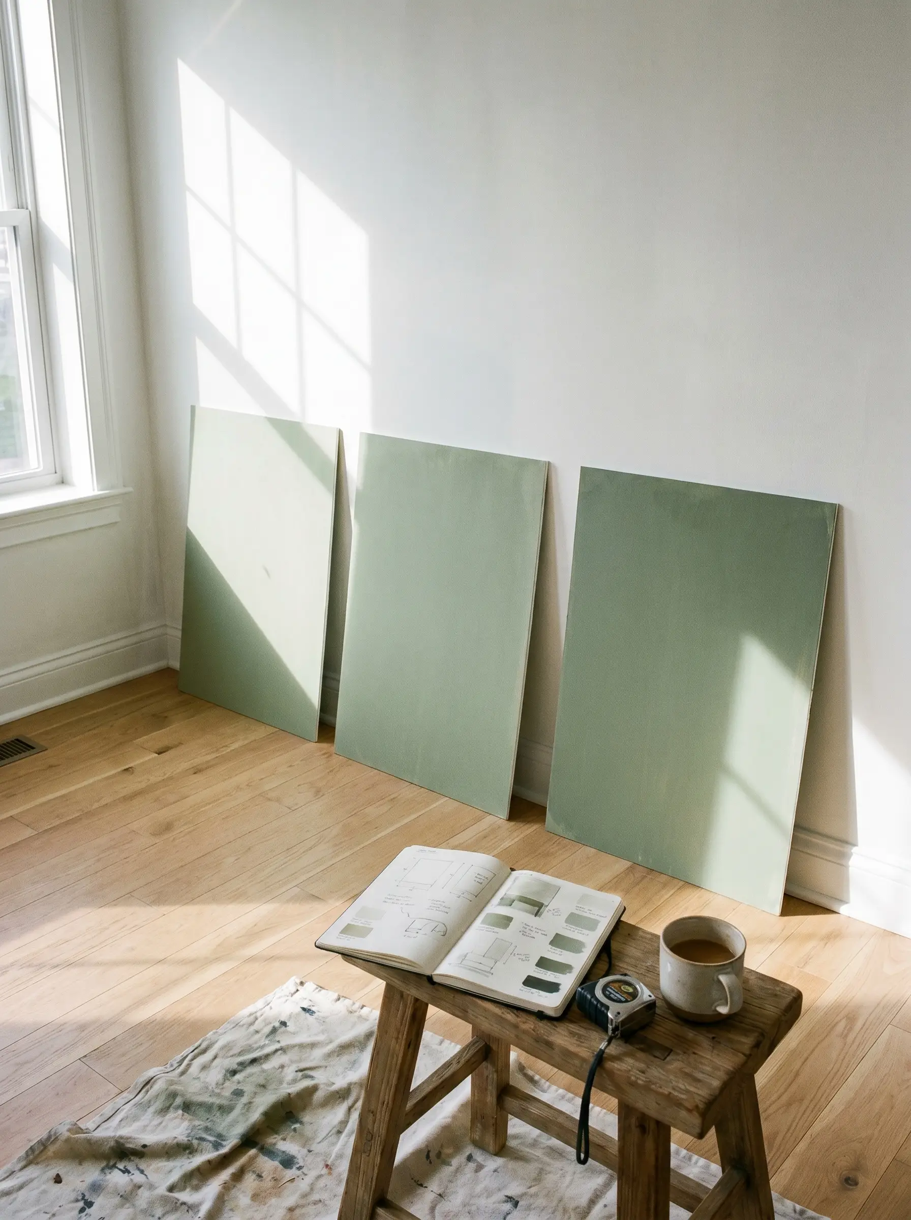
Command your space by purchasing large, peel-and-stick samples (like Samplize) or painting massive foam poster boards with your top three contenders. Move these samples from the darkest corner of the room to the wall directly opposite the window. Observe the chromatic shift at 9 AM in crisp morning light, 2 PM in full sun, and 8 PM under your artificial ambient lighting. Once you see how the undertones behave in your exact environment, you can confidently commit to the perfect shade.
Ready to finalize your palette? Let us know which sage green you are testing, or click through to our complete guide on the Best White Paint Colors for Trim and Ceilings to lock in your perfect millwork pairing.
Hackrea Design Ally Tip