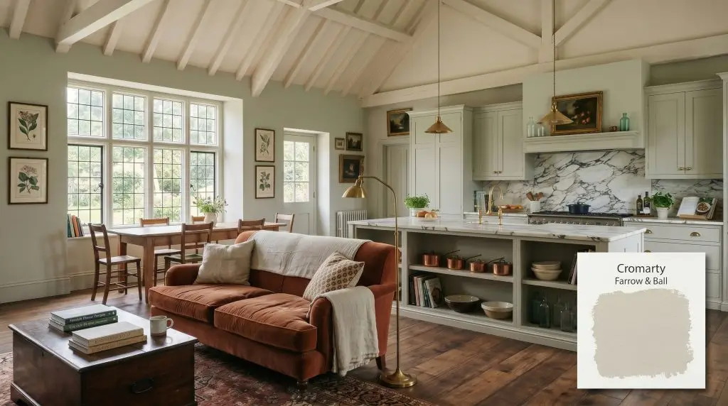
Cromarty 285
Farrow & BallFarrow & Ball Cromarty (No. 285) is a highly sophisticated, muted green-grey paint color with an LRV of 60. Inspired by the misty Cromarty Firth estuary, it serves as an atmospheric neutral that shifts beautifully between soft green and warm grey depending on the surrounding architectural lighting.
Paint Technical Profile
| Color ID / SKU | 285 |
| HEX Code | #caccc0 |
| Light Reflectance (LRV) | 60 |
| Use | Interior, Exterior |
| Best Exposures | South-Facing, West-Facing, East-Facing |
| Best For | Living Rooms, Bedrooms, Cabinetry, Paneling |
Farrow & Ball Cromarty Review: Mastering the Ultimate Atmospheric Green-Grey
Farrow & Ball’s Cromarty takes its name from the sweeping, misty weather of the Cromarty Firth estuary, a staple of the iconic Shipping Forecast.
It is a shade engineered for those who crave a sophisticated, atmospheric neutral but are terrified of accidentally turning their living room into a minty, overly sweet nursery.
This muted green-grey masters the delicate balance between earthy depth and airy sophistication. It grounds a room with quiet heritage energy while maintaining a crisp, tailored edge.
Farrow & Ball Cromarty: Undertones & LRV
To answer the most pressing question immediately: this historic shade is a definitively warm-leaning neutral. It achieves this warmth through a highly intentional balance of soft green and subtle earthy tones, avoiding the icy chill of standard greys.
At an LRV (light reflectance value) of 60, Cromarty sits beautifully in the light-medium reflective band. It absorbs enough light to hold its rich pigment depth and contrast elegantly against crisp white trim, yet it bounces enough illumination to keep the room feeling open and expansive. Understanding its exact pigment structure is highly useful when comparing it to other options in our [guide to green-grey neutrals].
Lighting Effects & The Chameleon Factor
The greatest fear with any green-leaning paint is that it will lose its sophisticated edge and turn into a harsh, artificial mint on the wall. Because of its complex pigment depth, this color is highly reactive to its environment, constantly color shifting throughout the day.
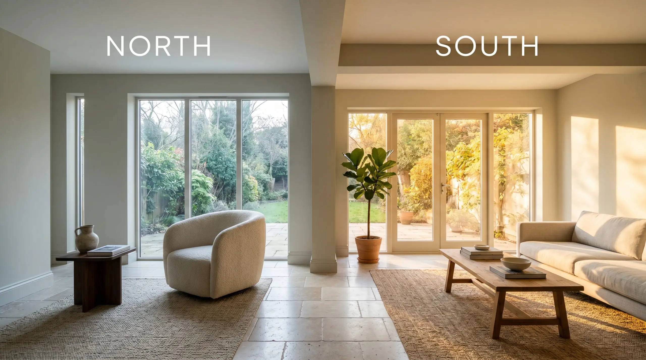
Always test your swatches vertically on the wall, not flat on a table. The way light hits a vertical surface fundamentally alters how you perceive the khaki undertones versus the cooler grey notes, especially in rooms with shifting afternoon shadows.
Hackrea Pro-Tip (Illumination)
Curating Spaces with this Atmospheric Neutral
This paint demands intentionality, bringing a grounded, heritage energy to any home. It acts as a brilliant foundational layer, allowing you to layer rich textures and premium materials without the walls ever feeling loud or demanding.
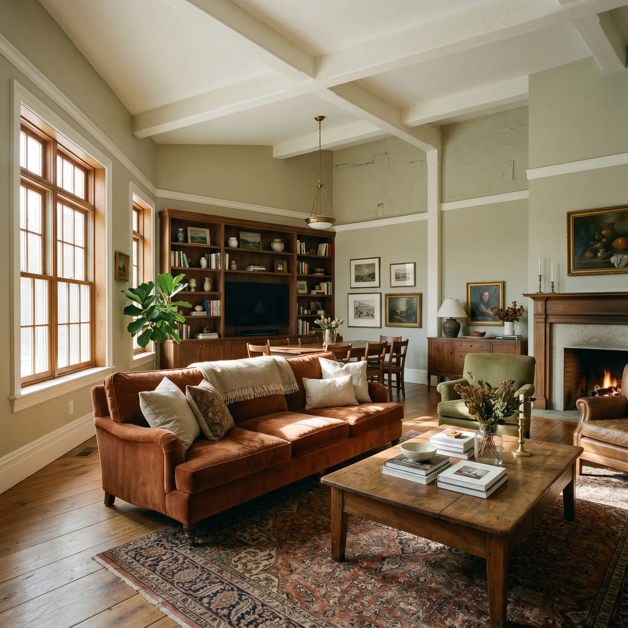
Living Rooms
This shade provides a stunning, restorative backdrop for main gathering spaces. It pairs beautifully with heavy, textural fabrics like rust-toned velvet sofas or crisp, tailored linen armchairs. If your room receives heavy afternoon sun, lean into the warmth with brass accents and rich walnut furniture. For a more contemporary edge, pair it with sleek, matte black iron lighting fixtures to cut through the softness of the green. If your space lacks natural sunlight, exploring the [best Farrow & Ball colors for low-light rooms] can provide helpful alternatives to ensure your walls never feel flat.
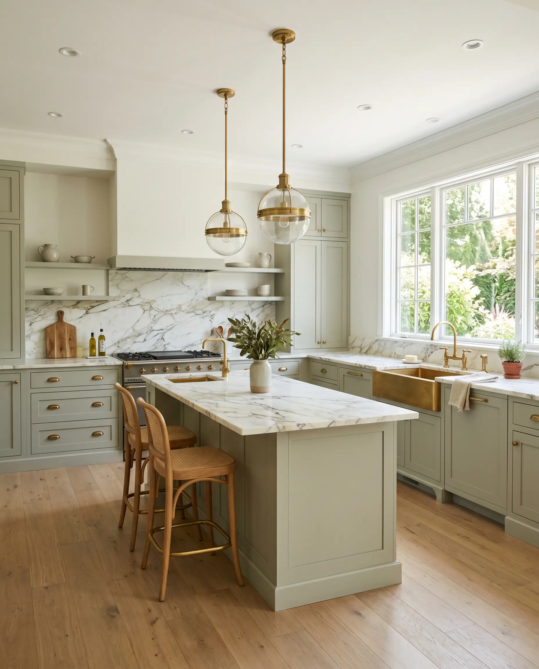
Kitchen Cabinetry & Islands
Using this muted green-grey on kitchen cabinetry elevates the heart of the home far beyond standard white. It shines beautifully on shaker-style doors, especially when paired with heavily veined marble countertops or warm butcher block. For a truly premium look, run the color across all the lower cabinets and the island, grounding the space while keeping the upper walls bright and airy. It also serves as a brilliant backdrop for open shelving displaying raw ceramics and copper cookware.
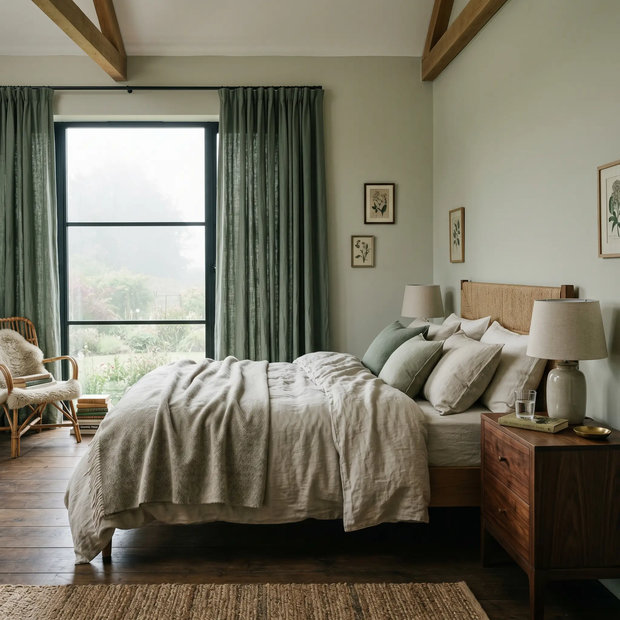
Bedrooms
In sleeping quarters, this color creates a deeply calming, restorative retreat. It wraps the room in a quiet, misty energy that promotes relaxation. Layer the bed with heavy, textural linens in soft oatmeals, deep charcoals, or even muted terracotta to pull out the warmth of the khaki undertones. To heighten the elegance, install floor-to-ceiling drapery in a matching tonal green to create a seamless, enveloping perimeter.
Wood Paneling & Wainscoting
This is where the heritage DNA of the paint truly comes alive. Applied to beadboard, picture frame molding, or traditional wainscoting, the shadows cast by the millwork highlight the complex grey and stone undertones. This approach is especially critical when [navigating paint undertones in historic homes], as the architectural details force the paint to reveal its full depth.
Exterior Trim & Shutters
On an exterior facade, natural sunlight will wash out the color slightly, making it appear lighter and more grey. It is a brilliant choice for exterior trim, window sashes, or front doors on classic brick homes or crisp white stucco exteriors. Use it to create a soft, organic transition between the architecture of the home and the surrounding landscaping.
Distinctive Architectural Applications
Moving beyond standard walls and trim, this highly adaptable shade offers incredible opportunities for elevated, distinctive design moments.
The Immersive Utility Mudroom
Transform a highly functional, often overlooked space by wrapping the entire mudroom—walls, ceiling, built-in cubbies, and trim—in this single shade. The enveloping color-drenching technique elevates standard utility into a tailored, high-end transition zone. Pair this application with rugged, tumbled limestone flooring and unlacquered brass hardware that will naturally patina over time. The earthy green-grey easily hides everyday scuffs while maintaining a fiercely stylish, curated entrance.
The Restorative Conservatory
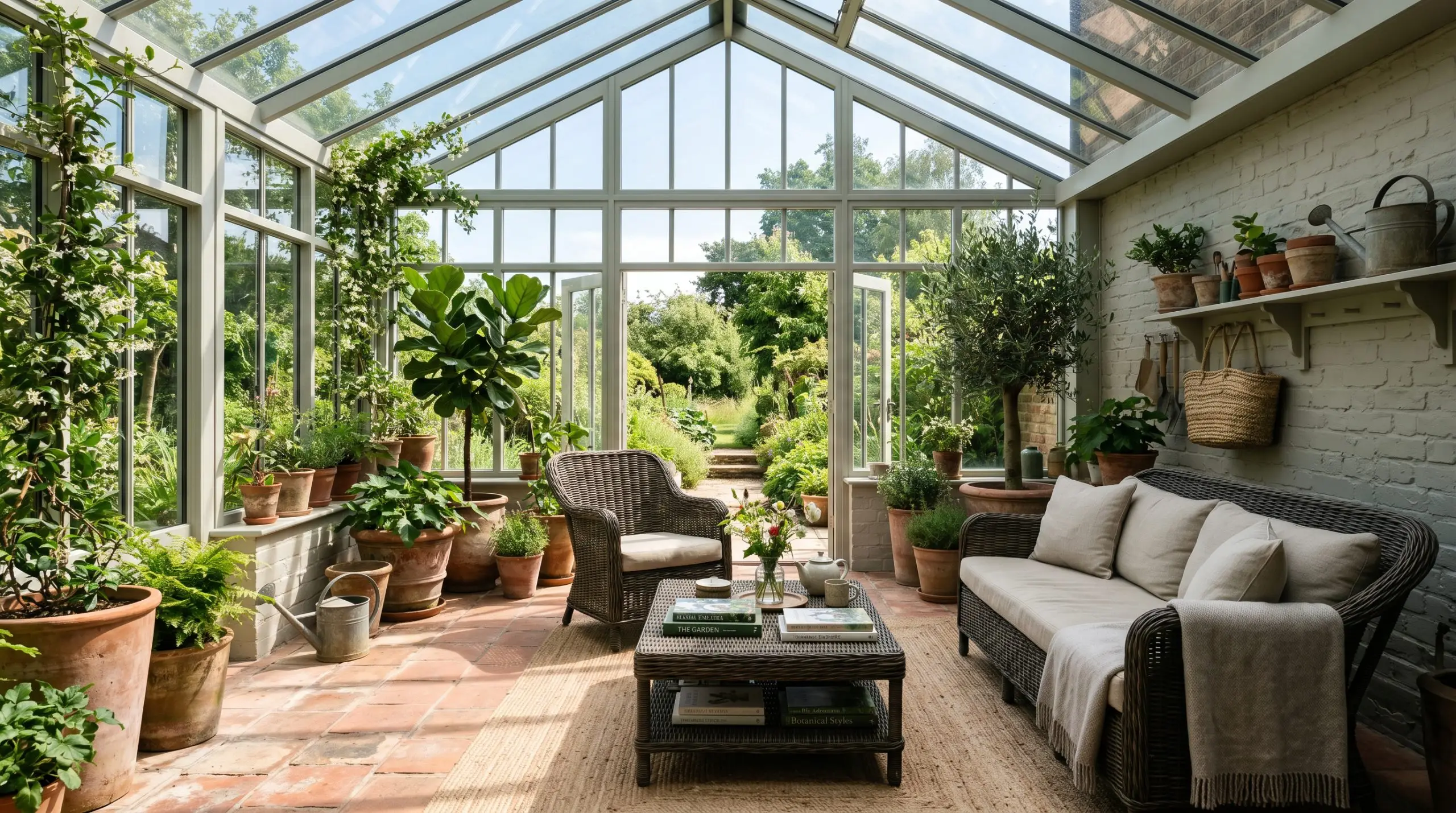
For sunrooms, enclosed porches, or heavily glazed extensions, use this shade on the structural framing and interior masonry. The heavy influx of natural light will amplify the warm sage notes, blurring the boundary between the interior living space and the exterior garden. Contrast the soft walls with heavy, dark-stained rattan furniture and oversized terracotta planters to ground the airy brightness.
The Heritage Scullery Pantry
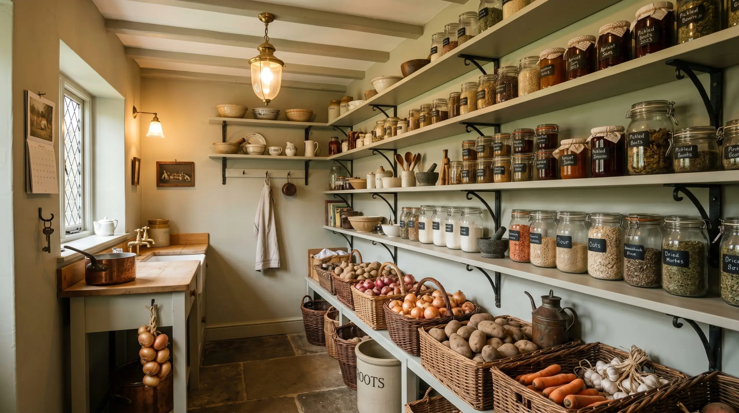
Create a jewel-box moment in a walk-in pantry or secondary prep kitchen. By painting the open shelving, brackets, and walls in this atmospheric neutral, you create a deeply traditional, highly functional backdrop for storing glass jars, woven baskets, and root vegetables. The color provides a quiet elegance that makes mundane household storage feel incredibly intentional and magazine-ready.
Material Pairings & Cromarty Palette Styling
This shade thrives on visual balance, requiring either crisp, tailored boundaries to feel modern or rich, textural layering to feel historic.
Trim & Baseboards
Hardware & Tactile Elements
Coordinating Colors
Designer Mood Boards
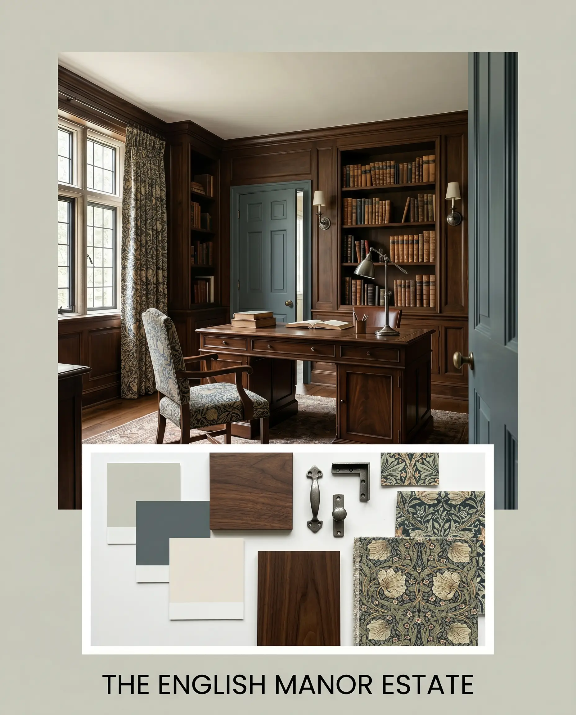
The English Manor Estate: This palette leans heavily into the paint’s historic roots. Layer the walls with rich, dark walnut antiques, heavily patterned William Morris-inspired textiles, and aged pewter lighting fixtures. The deep Inchyra Blue No. 289 serves as a dramatic accent on the interior doors, while Slipper Satin No. 2004 on the ceiling keeps the room feeling expansive and softly glowing.
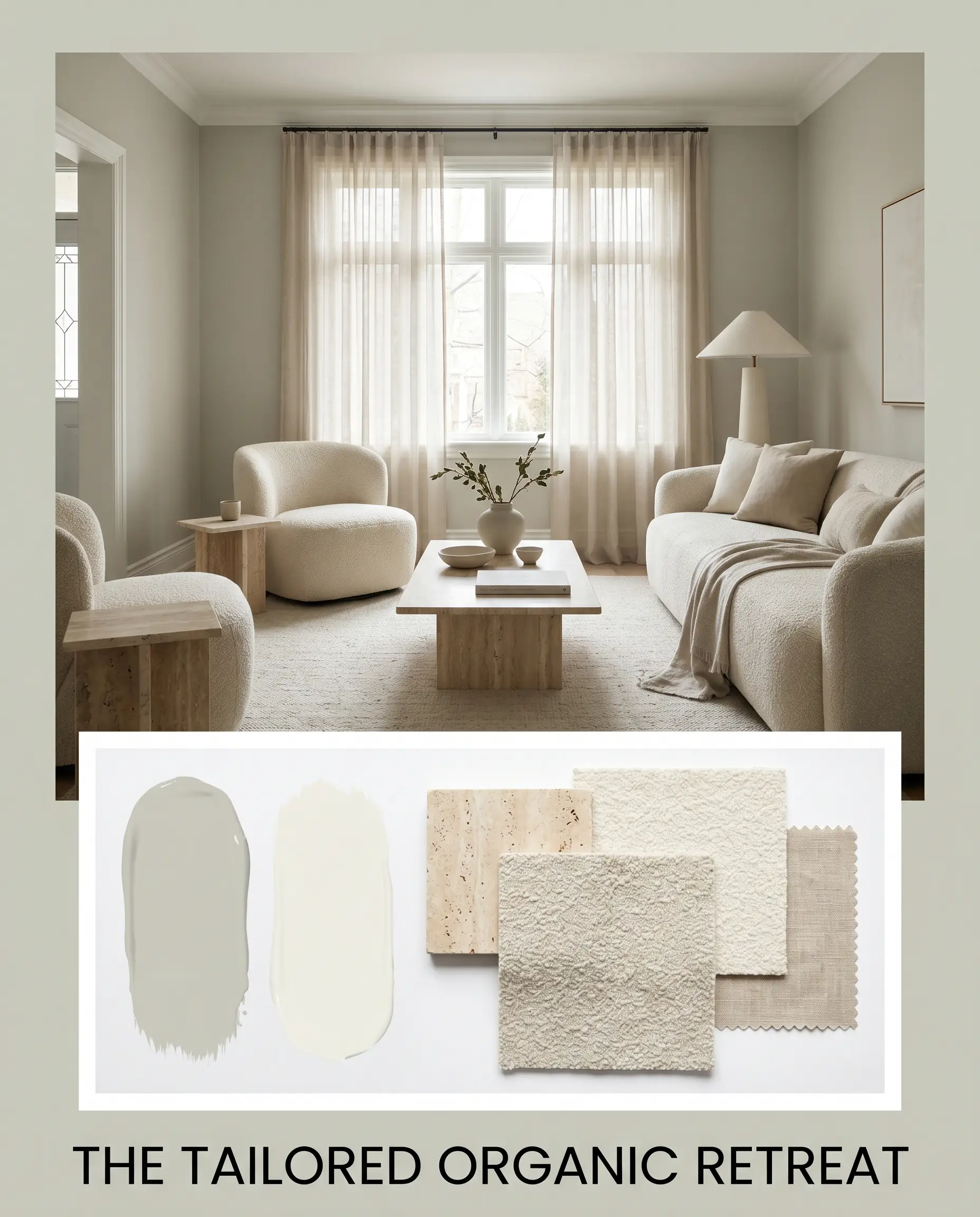
The Tailored Organic Retreat: Focusing on serenity and texture, this combination utilizes matte, honed finishes. Pair the green-grey walls with creamy bouclé seating, raw, unsealed travertine side tables, and sheer, natural linen window treatments. Keep the contrast low and the textures high. Use White Dove OC-17 on the trim to maintain a warm, seamless perimeter that feels effortlessly curated.
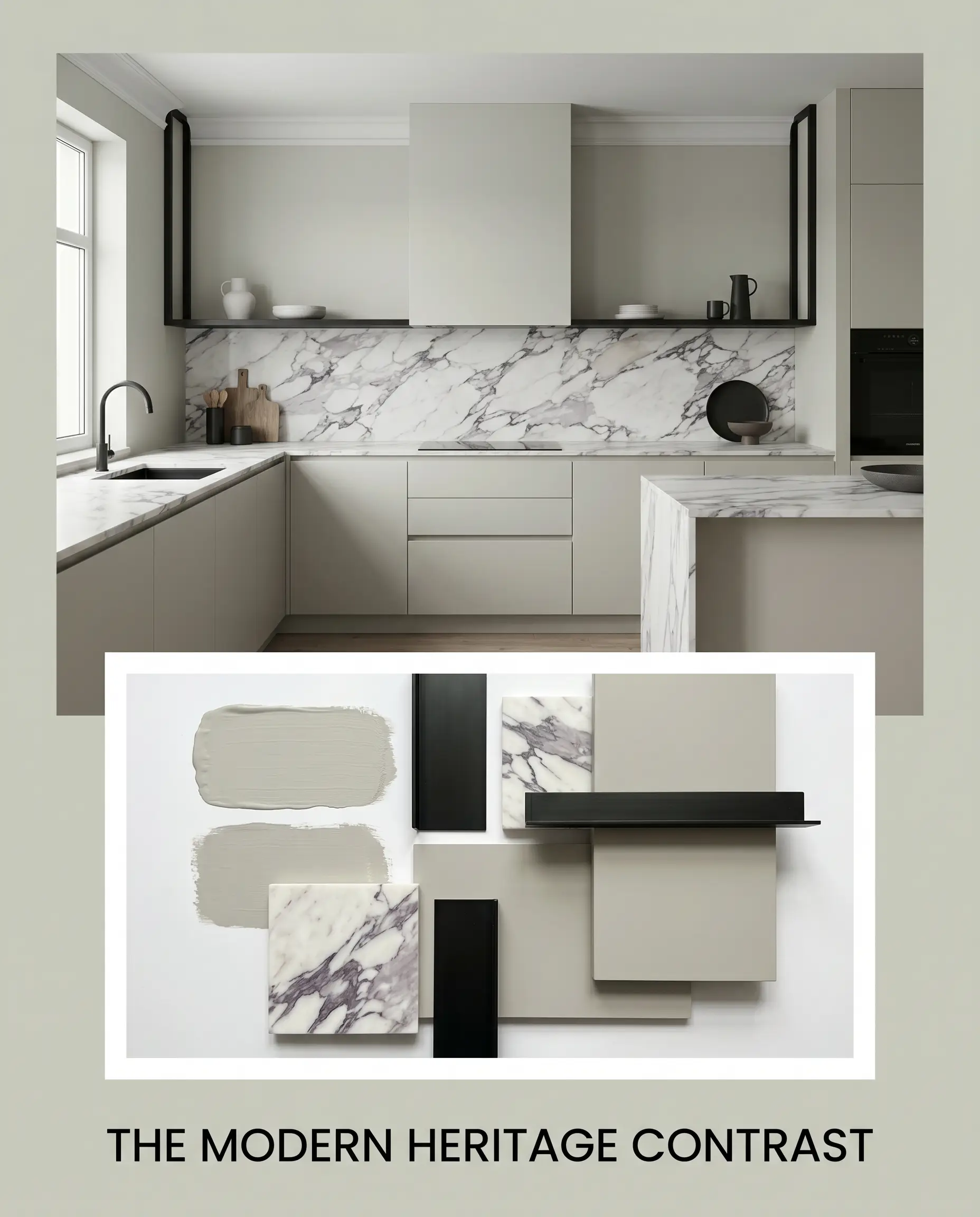
The Modern Heritage Contrast: This approach injects contemporary energy into the traditional shade. Frame the soft walls with sharp, matte black linear ironwork and sleek, handleless cabinetry. Introduce heavily veined Calacatta Viola marble as a dramatic backsplash or coffee table. The high-tension contrast between the quiet walls and the aggressive stone creates a fiercely stylish, highly memorable interior.
Farrow & Ball Cromarty Head-to-Head Comparisons
When selecting premium Farrow & Ball neutrals, the subtle shifts in undertone dictate the entire success of the room.
Farrow & Ball Cromarty vs. Farrow & Ball Mizzle No. 266
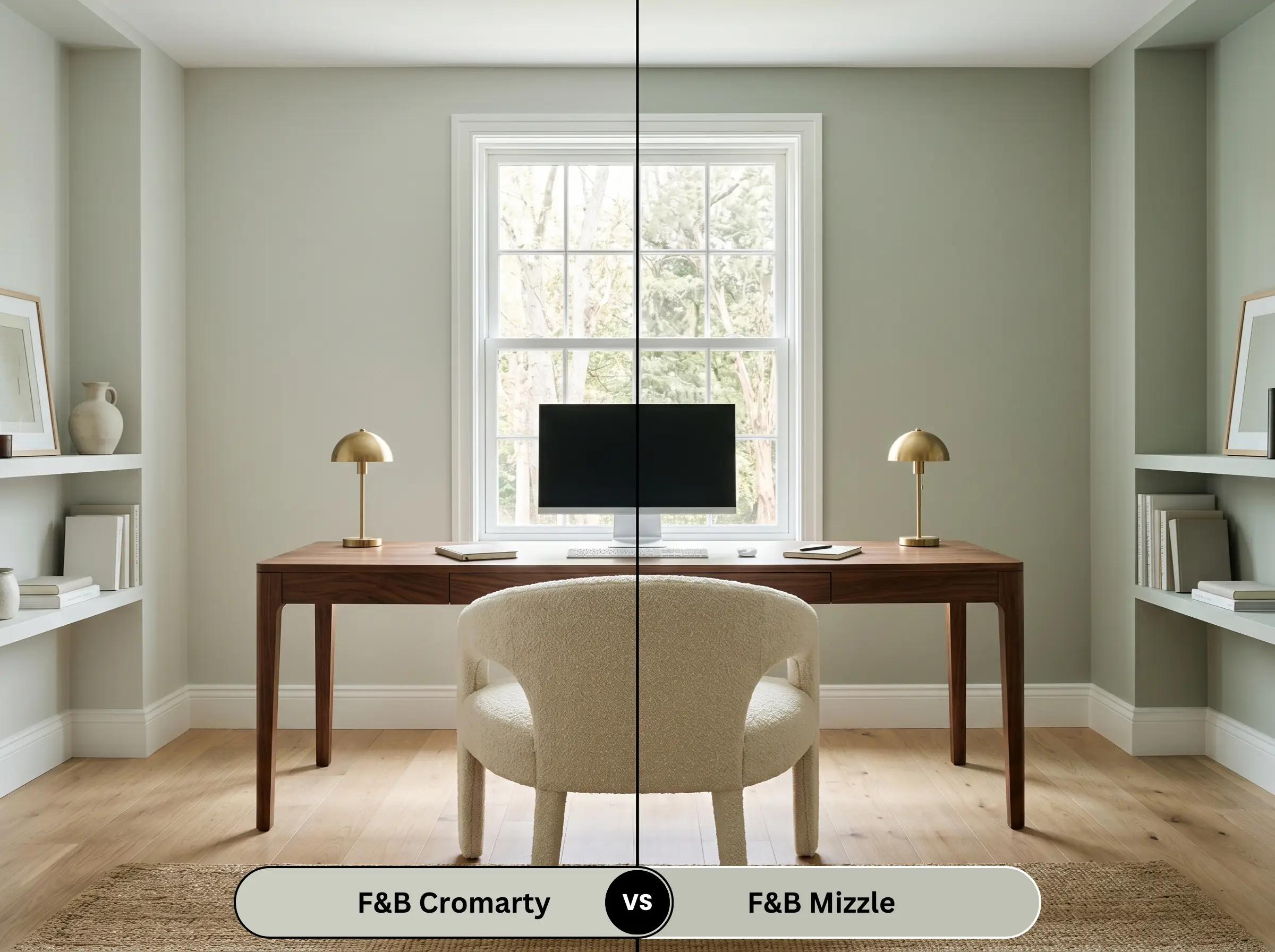
Mizzle No. 266 is the direct sibling to this shade but carries a slightly deeper pigment and a much stronger, more pronounced green presence. If your room receives heavy, cool northern light that washes out lighter colors, Mizzle will hold its green identity much better. However, if you want a subtle, misty neutral that acts more like a grey than a true green, the lighter option is the superior choice.
Farrow & Ball Cromarty vs. Farrow & Ball French Gray No. 18
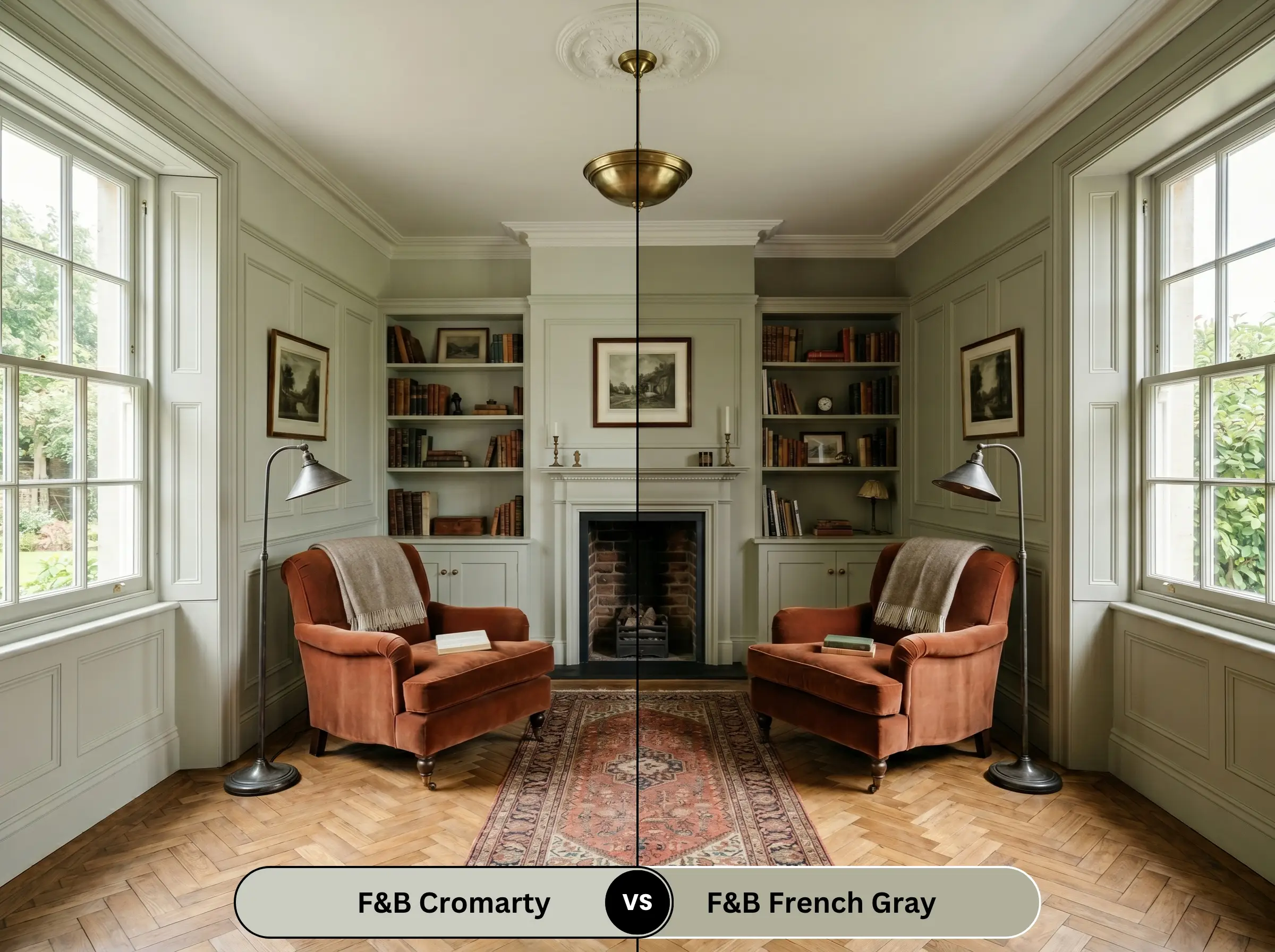
French Gray No. 18 is significantly darker and leans heavily into a warm, earthy olive tone. It lacks the misty blue micro-nuance entirely. If you are painting exterior woodwork or a cozy, low-lit study where you want a rich, enveloping historical green, French Gray wins. If you need an airy, versatile color for an open-plan living space, stick to the lighter, more reflective grey-green.
Farrow & Ball Cromarty vs. Benjamin Moore October Mist 1495
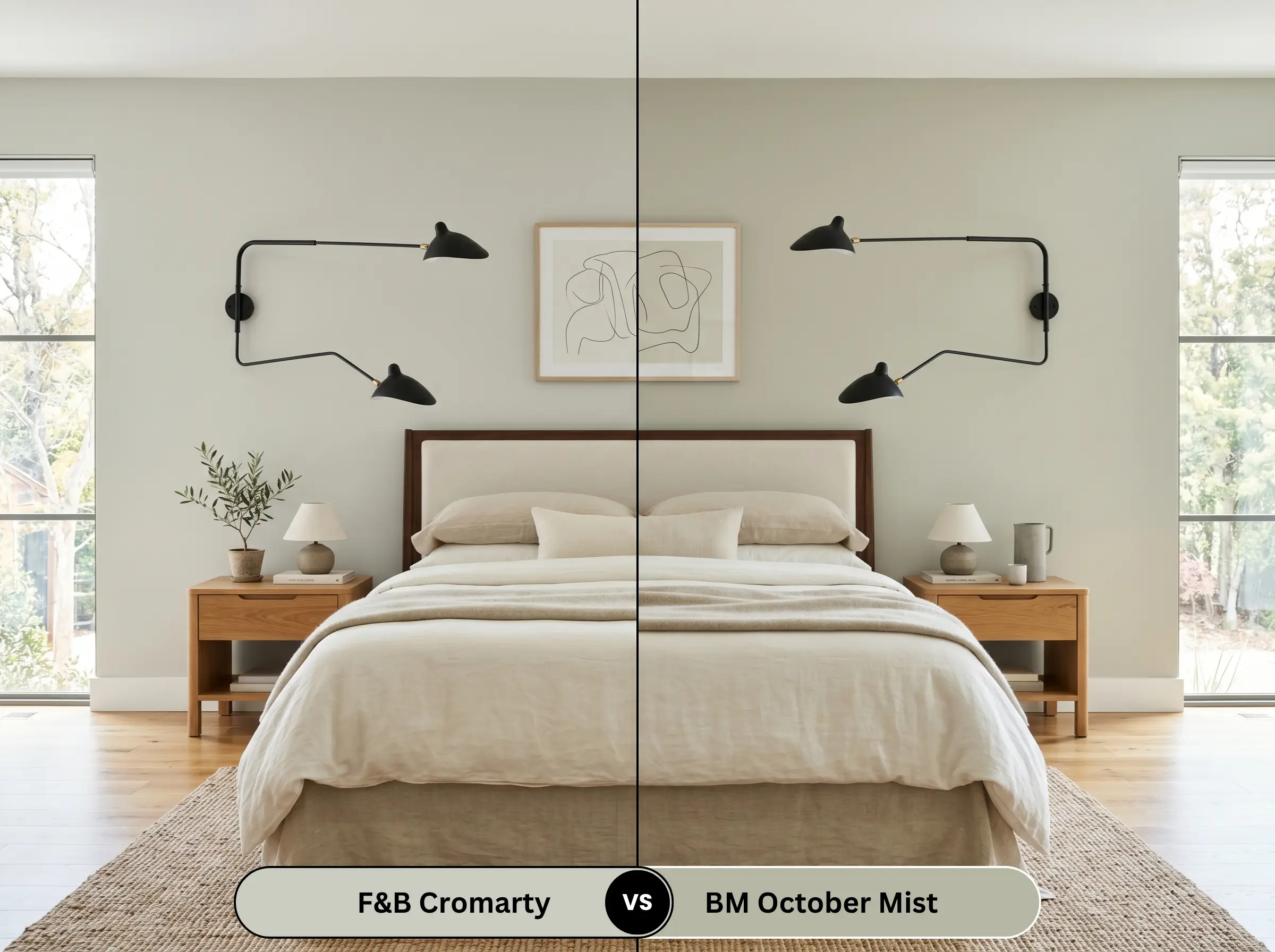
October Mist 1495 is a cleaner, slightly more vibrant silvery-sage. It lacks the heavy, chalky stone undertones found in the Farrow & Ball formulation. If you prefer a crisper, more modern sage that feels slightly more energetic, the Benjamin Moore option is excellent. If you specifically desire that moody, historic, slightly weathered aesthetic, the Farrow & Ball pigment depth cannot be matched.
Color Matches & Muted Green-Grey Alternatives
If you need to adjust the depth of the color or source an alternative brand for your project, these options provide excellent pivoting points.
Same-Brand Alternatives
Cross-Brand Matches
Farrow & Ball Estate Emulsion: Application & Finishes
Executing a premium paint job requires matching the specific sheen to the architectural function of the surface.
The Dynamic Sheen Guide
Primer Strategy
To achieve the true, complex depth of this shade, you must use the Farrow & Ball Mid Tones Primer & Undercoat. Applying this color over a stark white builder-grade primer will wash out the khaki undertones and make the final coat appear thin and overly minty. If painting raw wood paneling, ensure you use a dedicated knot-blocking primer first to prevent yellow resins from bleeding through the green.
Coverage & Success Tips
This highly pigmented shade typically requires two full, generous coats over the tinted primer to achieve complete opacity.
Beware of “flashing” when touching up this specific finish. The chalky Estate Emulsion does not blend easily once dry. If you scuff the wall weeks later, simply dabbing new paint on the spot will leave a visible, shiny mark. You will often need to repaint the entire wall corner-to-corner to maintain a flawless, premium appearance.
Hackrea Pro-Tip (Application)
Frequently Asked Questions
Because of its warm khaki and stone undertones, it actually pairs beautifully with natural terracotta. The earthy qualities of the paint harmonize with the baked clay, creating a rich, grounded, Mediterranean or rustic English country aesthetic rather than a harsh clash.
In spaces completely lacking natural light, the ultra-matte chalky finish absorbs the artificial illumination, making the color appear slightly darker and more enveloping. It enhances the moody, historic atmosphere, turning a basic powder room into a highly curated, intimate space.
Absolutely. Its complex, muted pigment structure perfectly mimics the lead-based, heavily desaturated colors favored during the Victorian era. It brings authentic architectural gravitas to original millwork without feeling overly dark or heavy.
Heavy, bright green landscaping directly outside a window will bounce green light back into the room. Because this paint already has a sage base, that reflected light can amplify the green tones, occasionally pushing it slightly brighter than intended. Counteract this by using warm white trim and warm 2700K interior lighting to re-anchor the grey and stone undertones.
The Final Verdict
Farrow & Ball’s Cromarty is a brilliant, highly sophisticated neutral for the homeowner who wants the elegance of grey with the organic warmth of the natural world. It excels in spaces that demand quiet heritage, working flawlessly in tailored living rooms, high-end kitchen cabinetry, and restorative bedrooms. It is the ultimate choice for those who appreciate complex, shifting undertones and want a wall color that acts as a quiet, atmospheric backdrop for premium textiles and warm woods.
However, this paint requires careful curation. While it elevates natural stones and warm metals, it strongly conflicts with highly saturated, red-leaning cherry or mahogany woods, as well as glossy, stark-white ceramic tiles. The aggressive red tones in those specific woods will pull the green out of the paint far too aggressively, creating an unwanted, highly contrasting holiday effect rather than a sophisticated retreat. Similarly, clinical, cool-toned whites will make the beautiful khaki undertones look dingy and unwashed. Pair it with creamy whites, natural textures, and muted accents, and it will reward you with an incredibly elegant, timeless space.