Farrow & Ball Mizzle (No. 266) is a soft, hazy grey-green that captures the essence of a misty coastal morning. Depending on the light, it shifts beautifully between a muted sage green and a cool, silvery blue-grey, making it an incredibly versatile neutral.
| Temperature | Cool to Neutral |
|---|---|
| Primary Undertone | Grey |
| Hidden Undertones | Blue, soft sage |
| Best Exposures | South-facing or North-facing |
| Best For | Kitchen cabinets, living rooms, bedrooms, exterior trim, wainscoting |
Hackrea Review
Mizzle is arguably one of Farrow & Ball's most atmospheric greens. It avoids the clinical feel of standard greys by injecting just enough chromatic depth to feel organic and grounded. While the Estate Emulsion finish requires a delicate touch, the color payoff and architectural finish are undeniably gorgeous.Architectural Styling & Application Recipes
Kitchen Cabinets
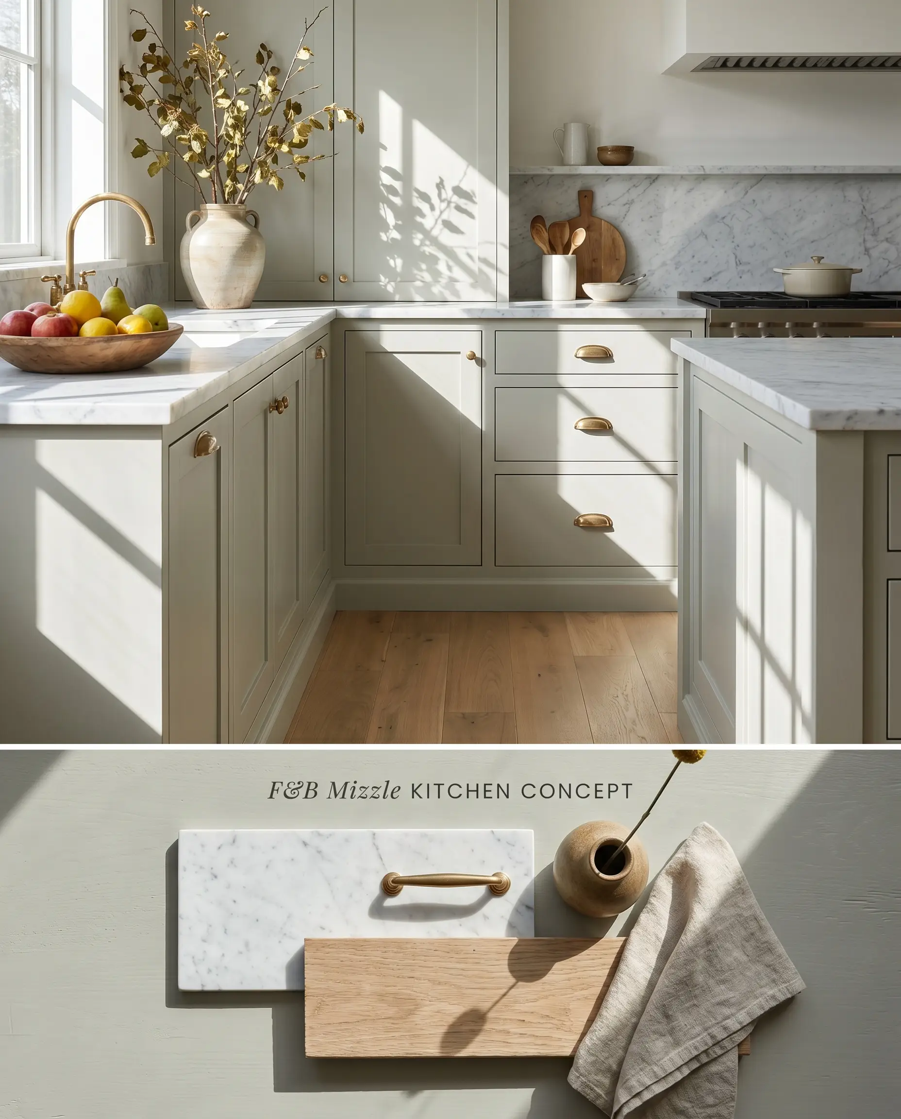
Mizzle grounds kitchen layouts by introducing a hazy grey-green that anchors lower cabinetry without visually compressing the space. The color’s sage cast naturally bridges the gap between cool marble countertops and neutral white oak flooring, provided the wood lacks strong yellow undertones.
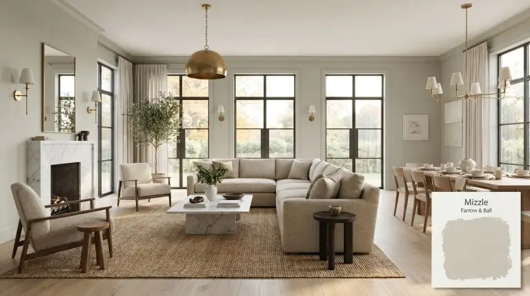
Living Rooms
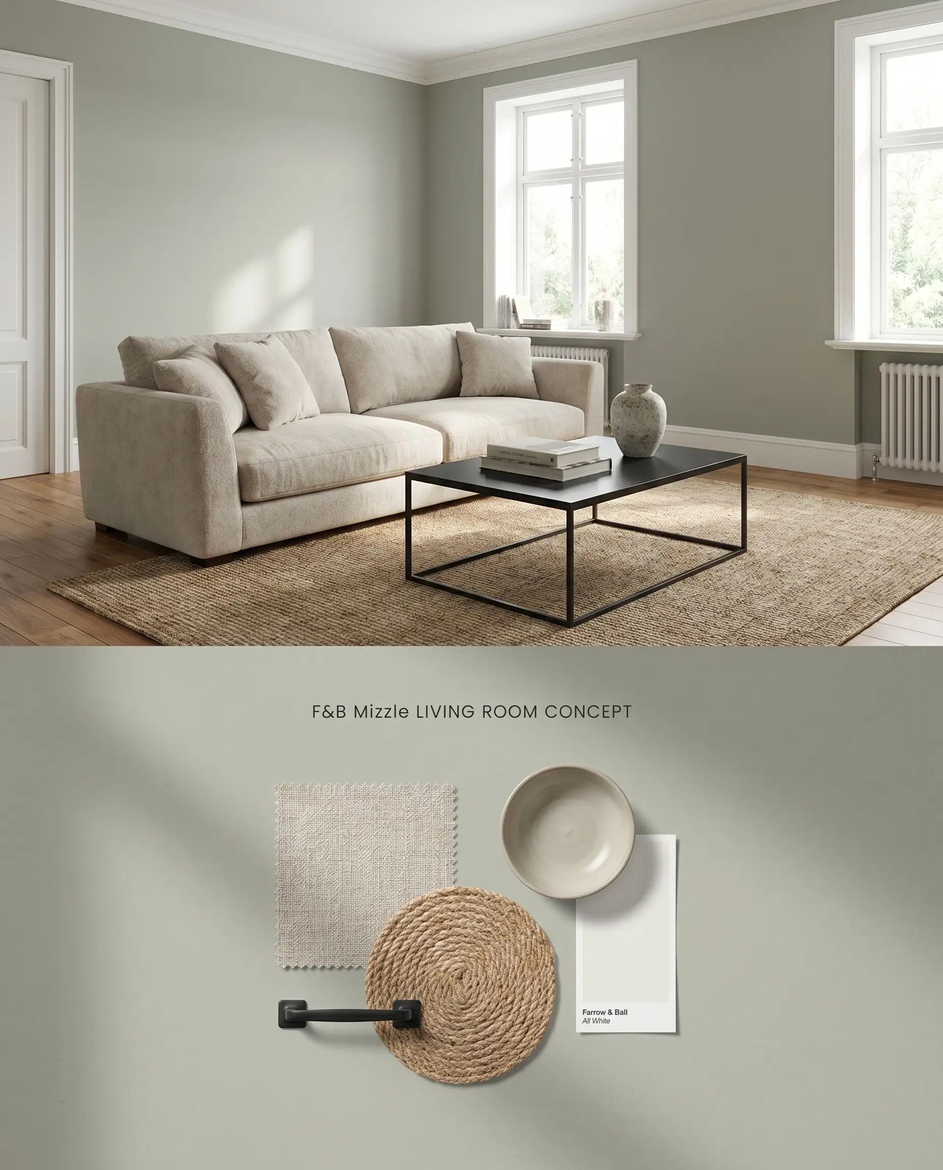
Applied to all four walls, this atmospheric neutral expands the perceived footprint of a living room by receding slightly under natural light. The silvery-blue undertone activates against crisp white trim, creating a tailored, structured perimeter that supports transitional and contemporary furnishings.
Bedrooms
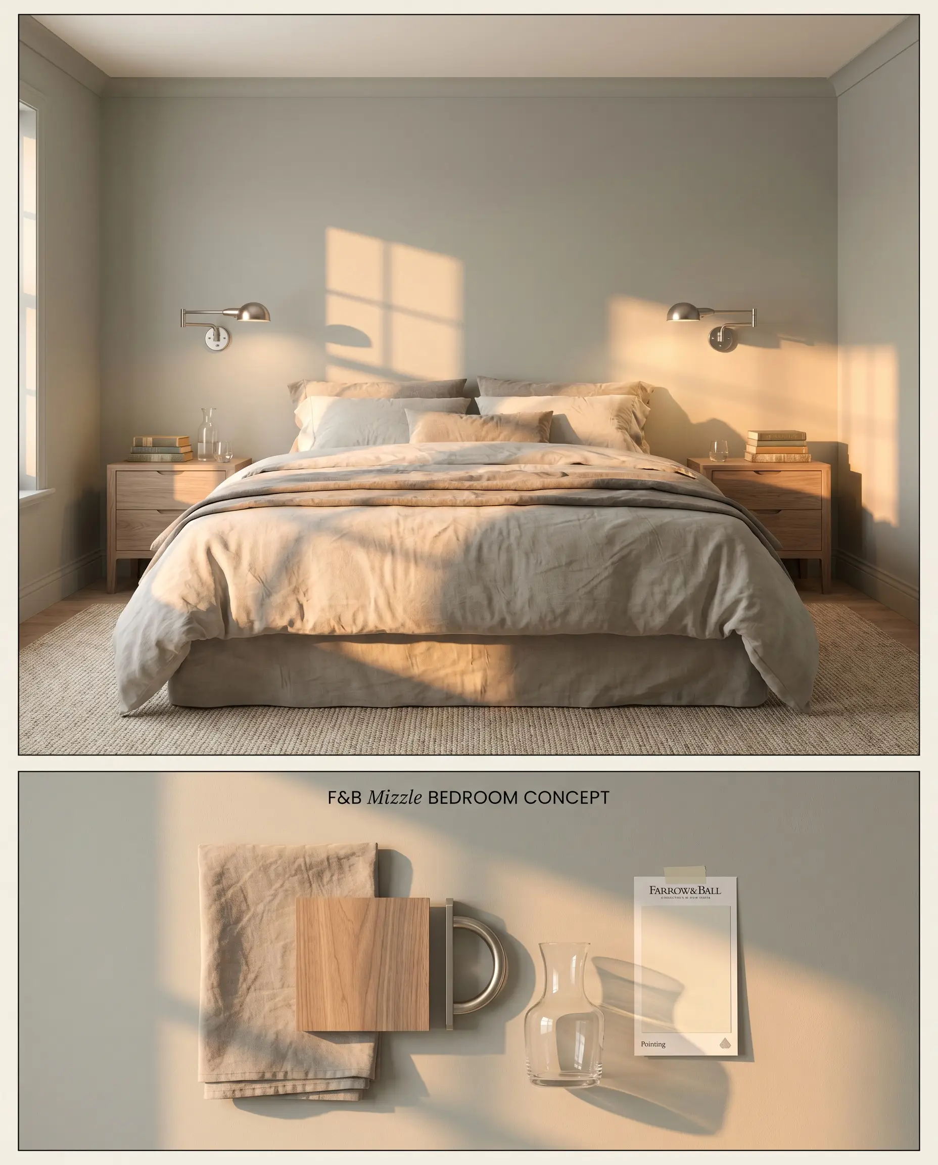
Farrow & Ball No. 266 acts as a restorative coastal palette anchor in bedrooms, shifting subtly throughout the day as the sun tracks across the sky. The light reflectance value of 51.6 provides enough depth to feel enveloping while remaining bright enough to avoid a dim, enclosed appearance.
Exterior Trim
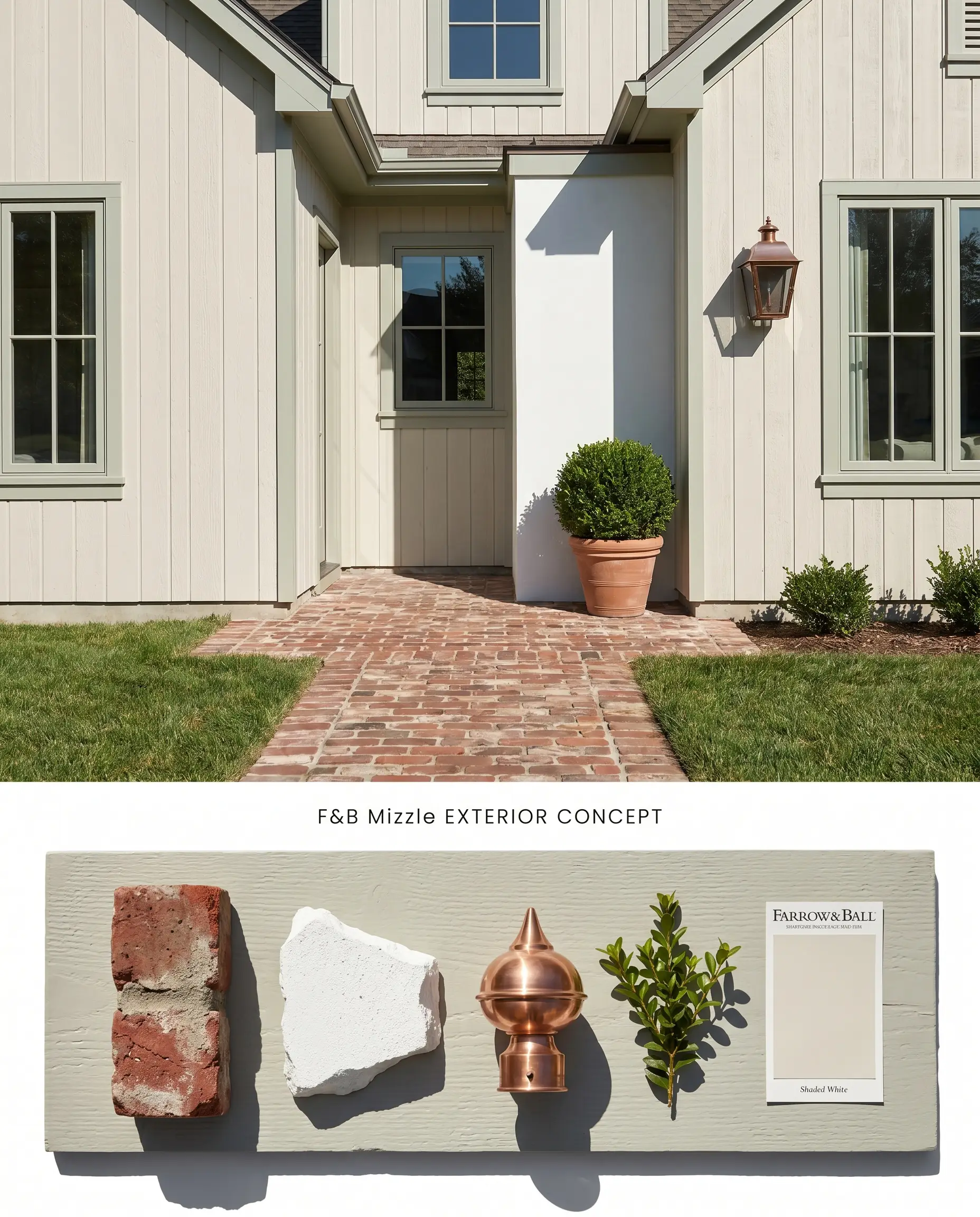
When utilized outdoors, intense UV exposure strips away the subtle green, shifting the chromatic profile toward a pale, silvery-grey. This makes it an ideal, understated accent for historic brick facades or crisp white stucco where a stark black or dark grey trim would feel too harsh.
Wainscoting
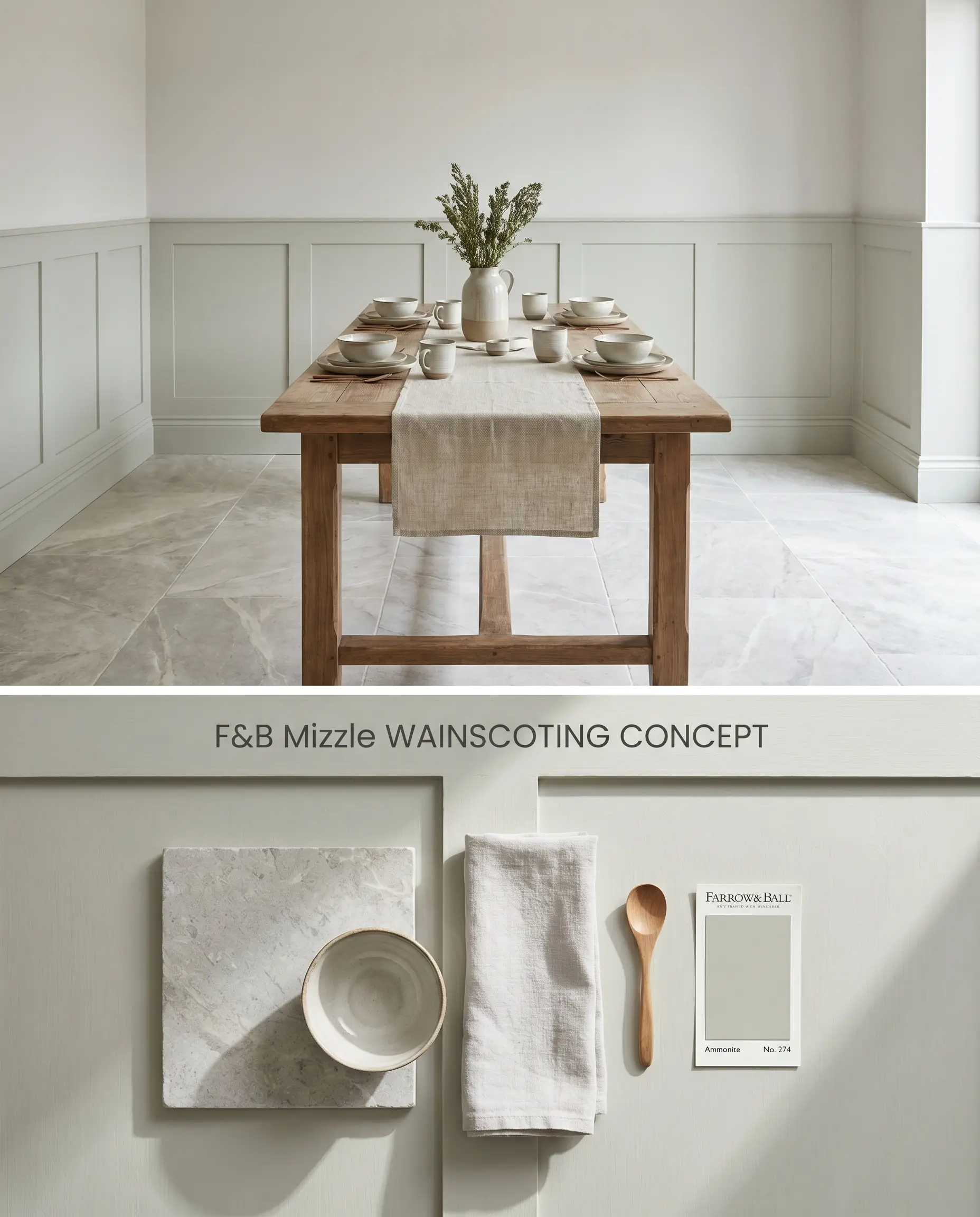
Using this shade on lower wall paneling introduces a grounded color structure that anchors a dining room or hallway. By isolating the color to the lower half of the wall, you mitigate the risk of the green base overwhelming the space while establishing a clear architectural datum line.
You can apply wallpapers, paints, etc. on walls and see how they look in various interiors.

Head-to-Head Comparisons: Farrow & Ball Mizzle vs. Industry Rivals
Farrow & Ball Mizzle vs. Sherwin Williams Sea Salt SW 6204
Sea Salt SW 6204 operates with a higher LRV (63) compared to the 51.6 of Farrow & Ball No. 266, making the Sherwin Williams option noticeably lighter and more reflective. Sea Salt leans strongly into a crisp, minty blue-green, whereas the Farrow & Ball formulation retains a muddier, grey-dominant sage cast. Specify Sea Salt for spaces needing maximum light bouncing and a distinct coastal feel, and reserve the Farrow & Ball option for rooms requiring a more grounded, historical atmospheric neutral.
Farrow & Ball Mizzle vs. Benjamin Moore Gray Wisp 1570
Gray Wisp 1570 is historically considered a close match to Sea Salt but shares the tendency of Farrow & Ball No. 266 to shift blue in cool light. Gray Wisp lacks the proprietary high-resin depth of the boutique brand, resulting in a flatter finish on the wall. Deploy Gray Wisp when budget constraints dictate a standard formulation, but upgrade to Farrow & Ball when the architectural design relies on the chalky, light-absorbing texture unique to Estate Emulsion.
Farrow & Ball Mizzle vs. Sherwin Williams Comfort Gray SW 6205
Comfort Gray SW 6205 shares a nearly identical depth (LRV 54), but its undertones pull significantly warmer, leaning toward a true olive-grey. The prominent silvery-blue undertone in the Farrow & Ball paint makes it the superior choice alongside cool stones like Carrara marble. Select Comfort Gray when working alongside warm wood tones or earthy terracotta tiles that might otherwise clash with cooler chromatic profiles.
Technical Application FAQs
Yes, north-facing light amplifies the cooler tones in the paint, pulling out a prominent silvery-blue and minimizing the organic sage green.
Yes, the yellow-dominant tones in honey oak flooring directly clash with the silvery-blue undertones of the paint, often making the green base look sickly or washed out.
In extremely bright, direct sunlight, the green cast washes out due to the bounce effect, leaving a pale, almost silvery-grey appearance on exterior surfaces.
No, the Estate Emulsion finish is notoriously delicate and touching up scuffs often results in visible flashing; a highly washable finish like Dead Flat is required for busy hallways.
Similar Paint Colors
Same Brand
Cross-Brand Equivalents