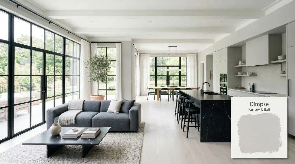
Farrow & Ball Dimpse (No. 277) is a cool, delicate architectural grey with subtle blue undertones. Named after the West Country dialect for twilight, this crisp neutral boasts an LRV of 68, making it an ideal choice for modern, minimalist spaces seeking a clean, sophisticated edge.
Will Dimpse clash with your room?
Paint Technical Profile
| Color ID / SKU | 277 |
| HEX Code | #d4d4d2 |
| Light Reflectance (LRV) | 68 |
| Use | Interior, Exterior |
| Best Exposures | South-Facing, West-Facing |
| Best For | Modern Kitchens, Minimalist Living Rooms, Trim & Cabinetry |
Farrow & Ball Dimpse 277: The Ultimate Guide to a Crisp, Modern Architectural Grey
The pursuit of the perfect modern grey is fraught with design casualties. You want a sleek, intentional neutral that feels bespoke, but you are terrified of accidentally turning your home into a sterile, builder-grade box.
Farrow & Ball Dimpse 277 is the antidote to that anxiety. Named after a West Country dialect term describing the fading light of dusk, this highly specific shade is the pinnacle of minimal living. It is not a lazy, one-size-fits-all neutral.
This is a razor-sharp, sophisticated hue designed for those who treat color as a structural element. When deployed correctly, this cool neutral transforms ordinary drywall into something resembling poured concrete or fine limestone.
Unpacking the Core Profile of Farrow & Ball Dimpse
To master this paint, you must understand the hidden pigment profile driving its behavior. F&B 277 is incredibly deceptive in the tin, requiring a strict respect for its underlying structure.
With a light reflectance value of 68, this shade sits comfortably in the light-medium category. It absorbs just enough ambient light to maintain a profound visual weight against pure white trim. Yet, it reflects enough illumination to keep your spatial footprint feeling expansive and breathable. It will never wash out into a blinding white unless subjected to intense, direct southern sun.
Mastering Directional Lighting & Temperature Shifts
The greatest fear with any cool grey is the dreaded “baby blue” effect. Farrow & Ball Dimpse is a reactive chameleon, and its tonal shifts are dictated entirely by your window placement and bulb temperature. You must control the light to control the mood.
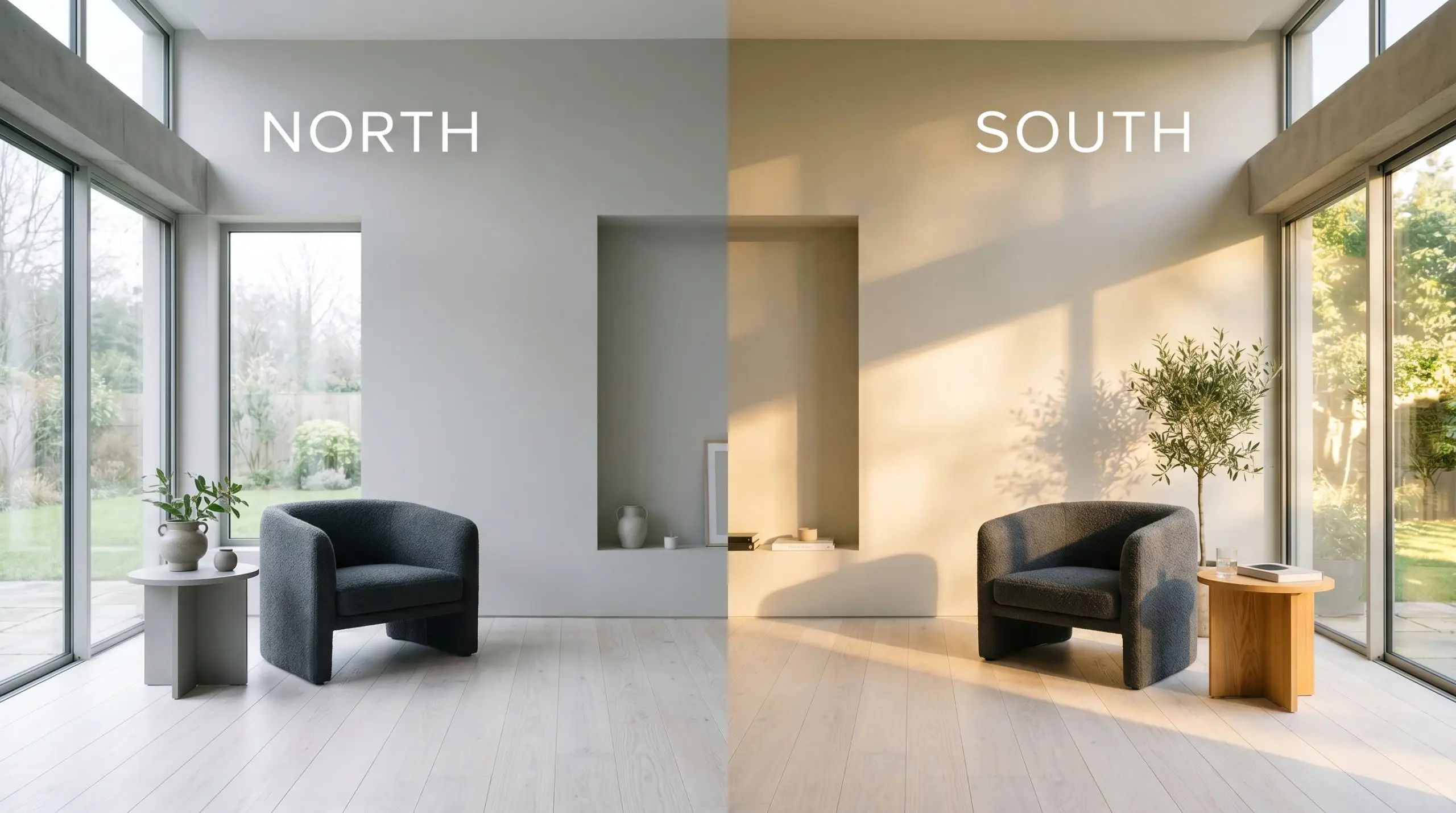
Will Dimpse work with your specific lighting, floor, or furniture?
Spatial Dynamics for Modern Architectural Spaces
This shade is a precision tool, not a universal bandage. It demands crisp lines and ample natural light to truly thrive. If your home leans heavily rustic, traditional, or suffers from low light, this color will feel institutional and sterile.
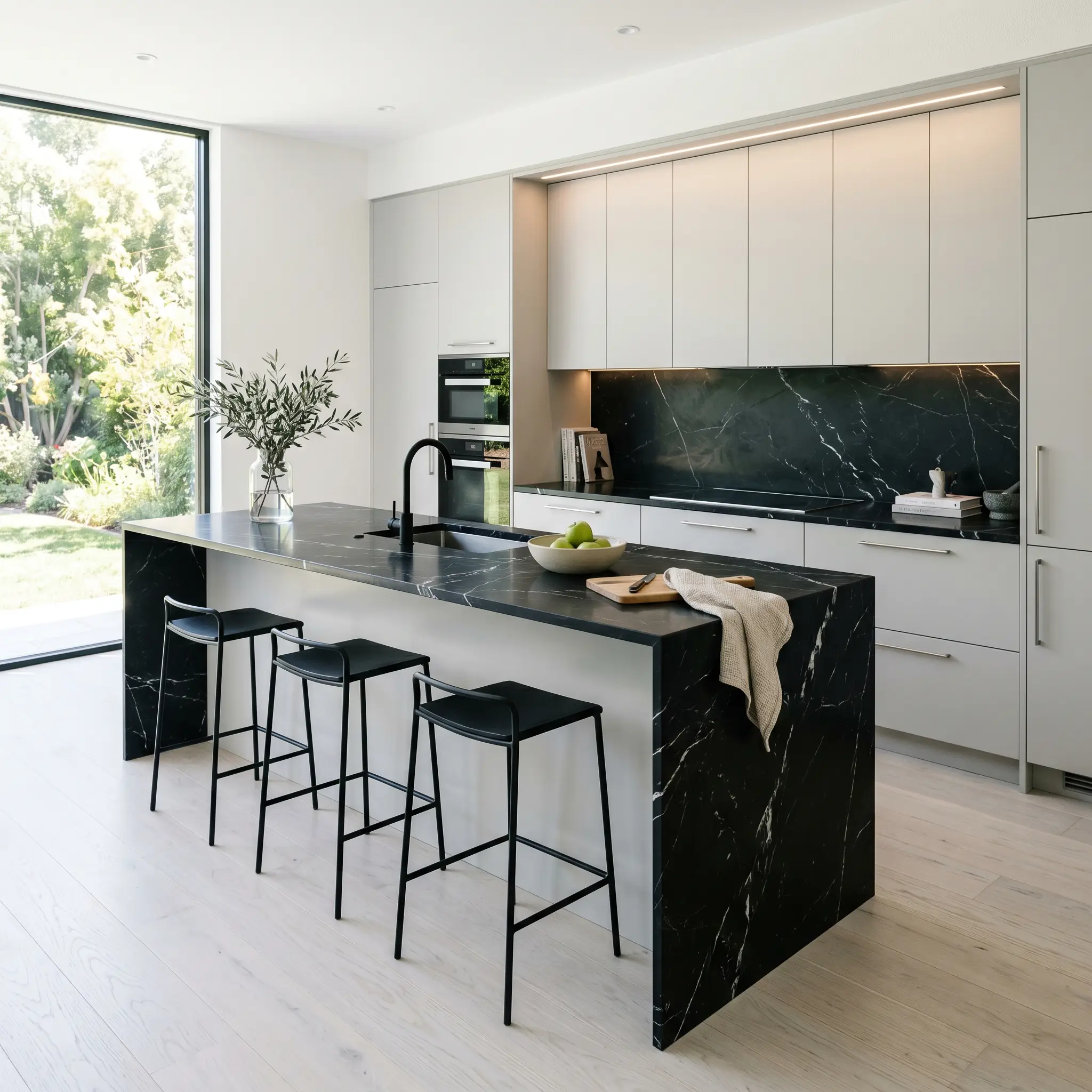
Culinary Workspaces
In a kitchen, this pigment profile demands sleek, unadorned surfaces. It pairs flawlessly with flat-panel cabinetry, waterfall stone islands, and minimalist hardware. The cool nature of the paint recedes visually, allowing your high-end appliances and stone countertops to act as the focal points. If you are exploring the best cool greys for kitchen cabinets, this shade offers a tailored, bespoke alternative to standard white, provided your lighting is dialed in perfectly.
Gathering Zones
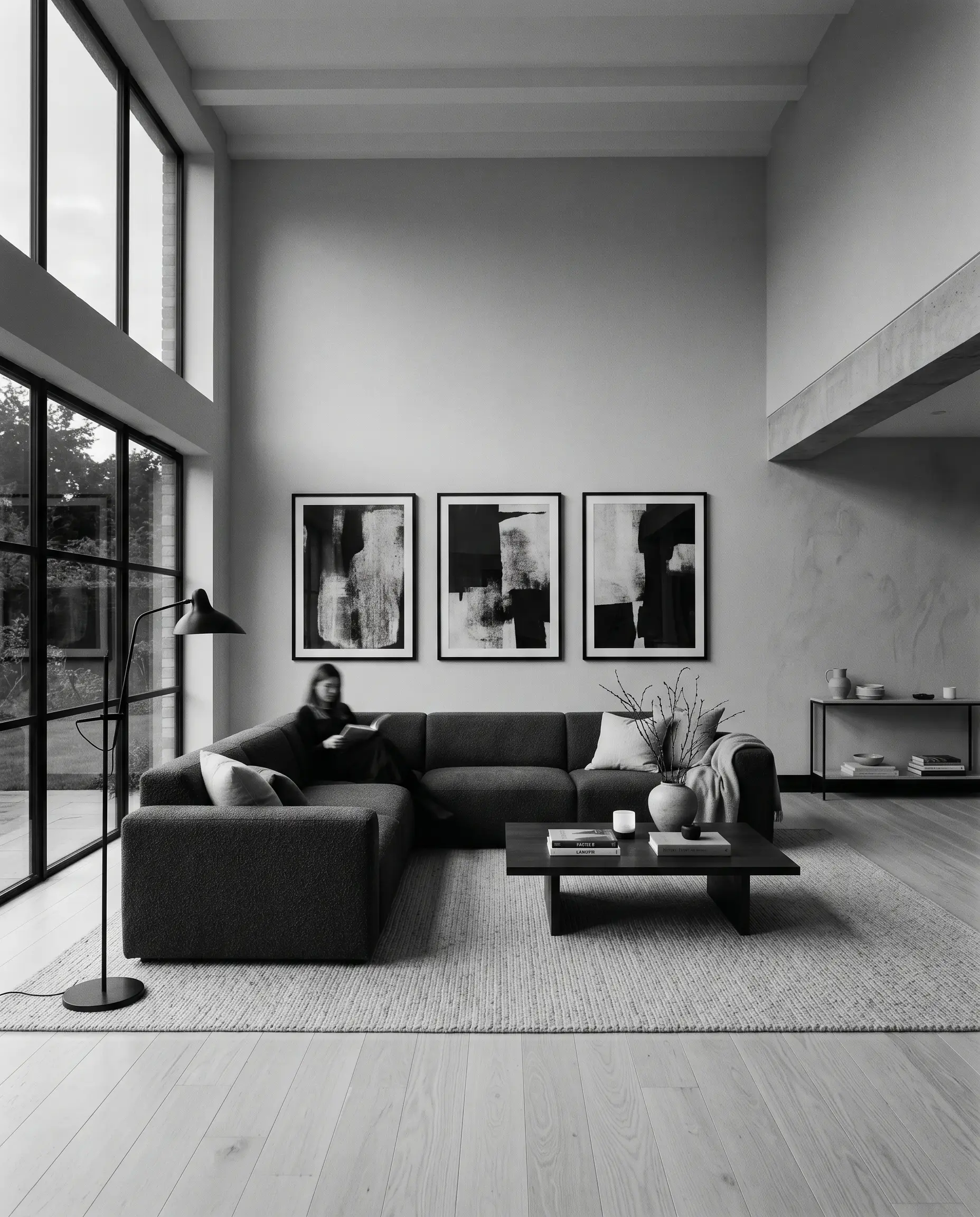
When applied to a broad living area, this neutral establishes a hushed, gallery-like atmosphere. It is the perfect backdrop for striking, modern furniture silhouettes and oversized contemporary art. To prevent the room from feeling stark, you must introduce heavy textural contrast through your upholstery and flooring choices. The sheer volume of a large room allows the pigment to breathe, showcasing its subtle shifts from morning to dusk.
Transitional Corridors
Hallways and entryways are often starved of natural light. If you use this shade in a windowless corridor, you must rely heavily on your artificial lighting strategy. Use high-quality, neutral-temperature sconces to wash the walls, highlighting the crispness of the grey. When executed properly, it creates a palate-cleansing transition between the more saturated rooms of your home.
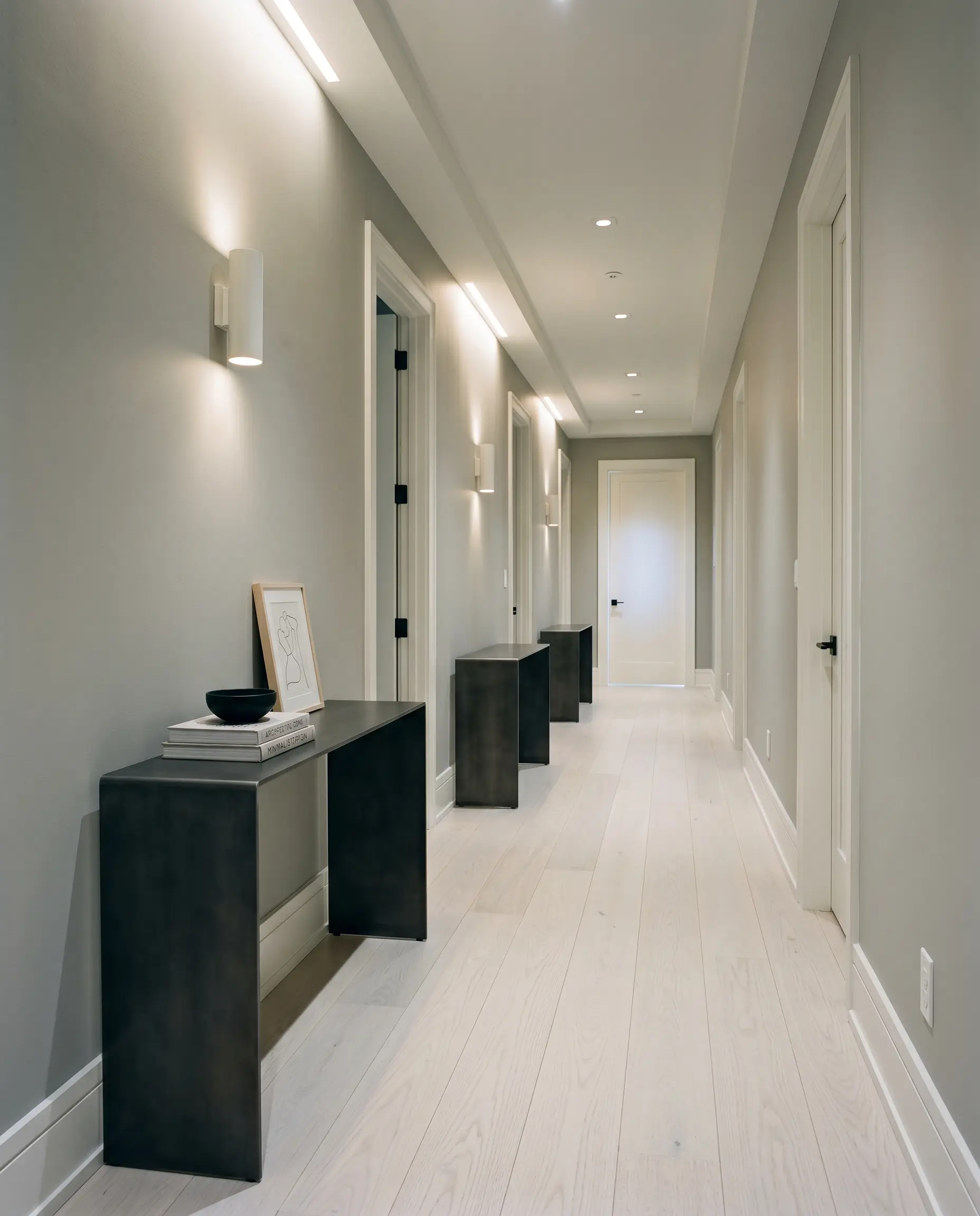
Restorative Quarters
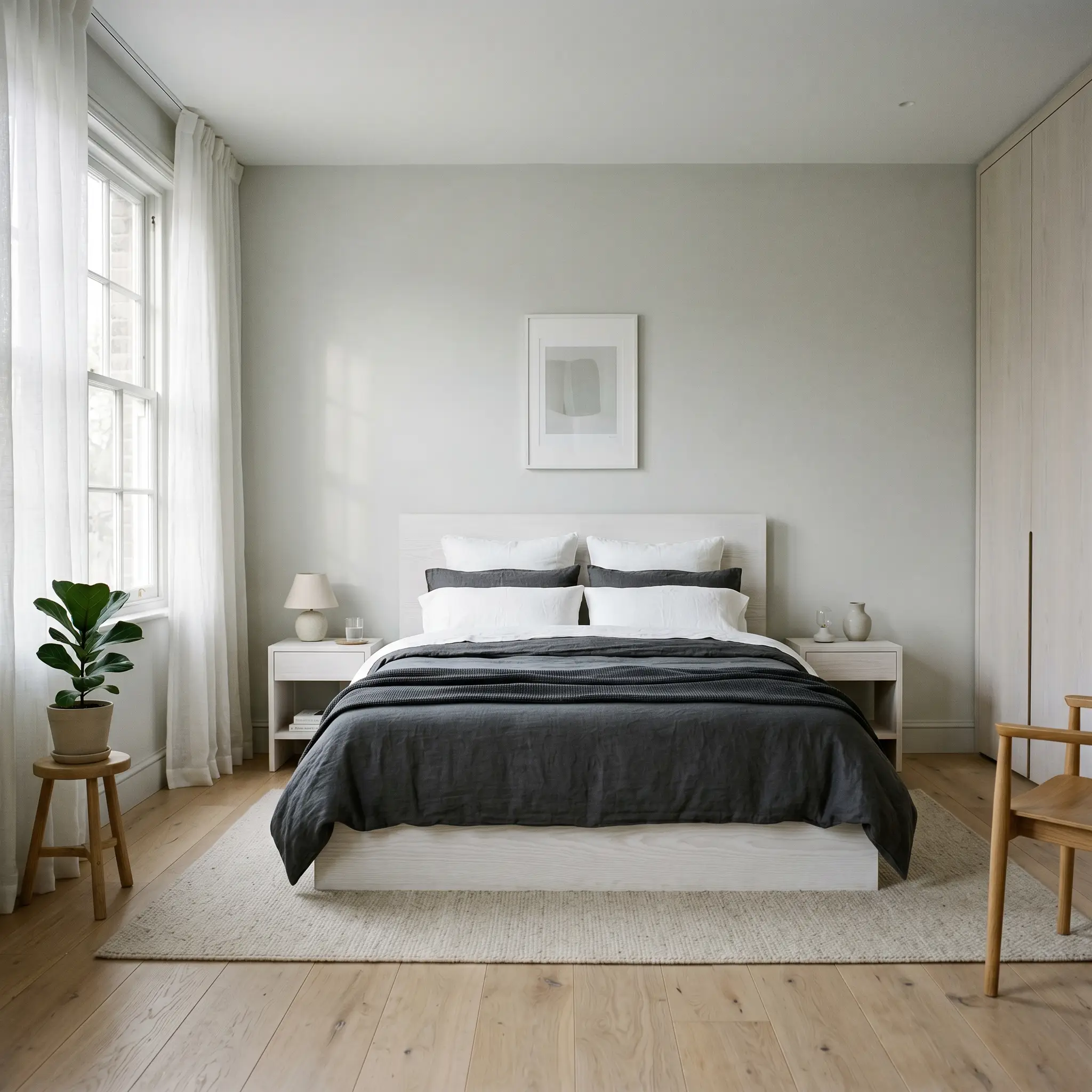
In a bedroom, this cool neutral fosters an environment of intense calm and restraint. It pairs beautifully with low-profile platform beds and monochromatic, layered bedding. The key here is to avoid visual clutter. Let the soothing, twilight-inspired tones dictate a minimalist approach to your styling, relying on the interplay of morning shadows across the walls for visual interest.
Bespoke Architectural Implementations for Dimpse
Moving beyond broad rooms, the true magic of F&B 277 reveals itself when applied to specific structural features. This is where we leverage its DNA to manipulate perceived space.
Dimpse requires smooth, flawless surfaces. If you apply this crisp grey to knockdown, popcorn, or heavy orange-peel textures, the resulting micro-shadows will trap the blue undertone. Your walls will look bruised, dirty, and unintentionally distressed.
Hackrea Pro-Tip: The Texture Clash Warning.
Flush-Mount Millwork & Sleek Cabinetry
Will Dimpse work with your specific lighting, floor, or furniture?
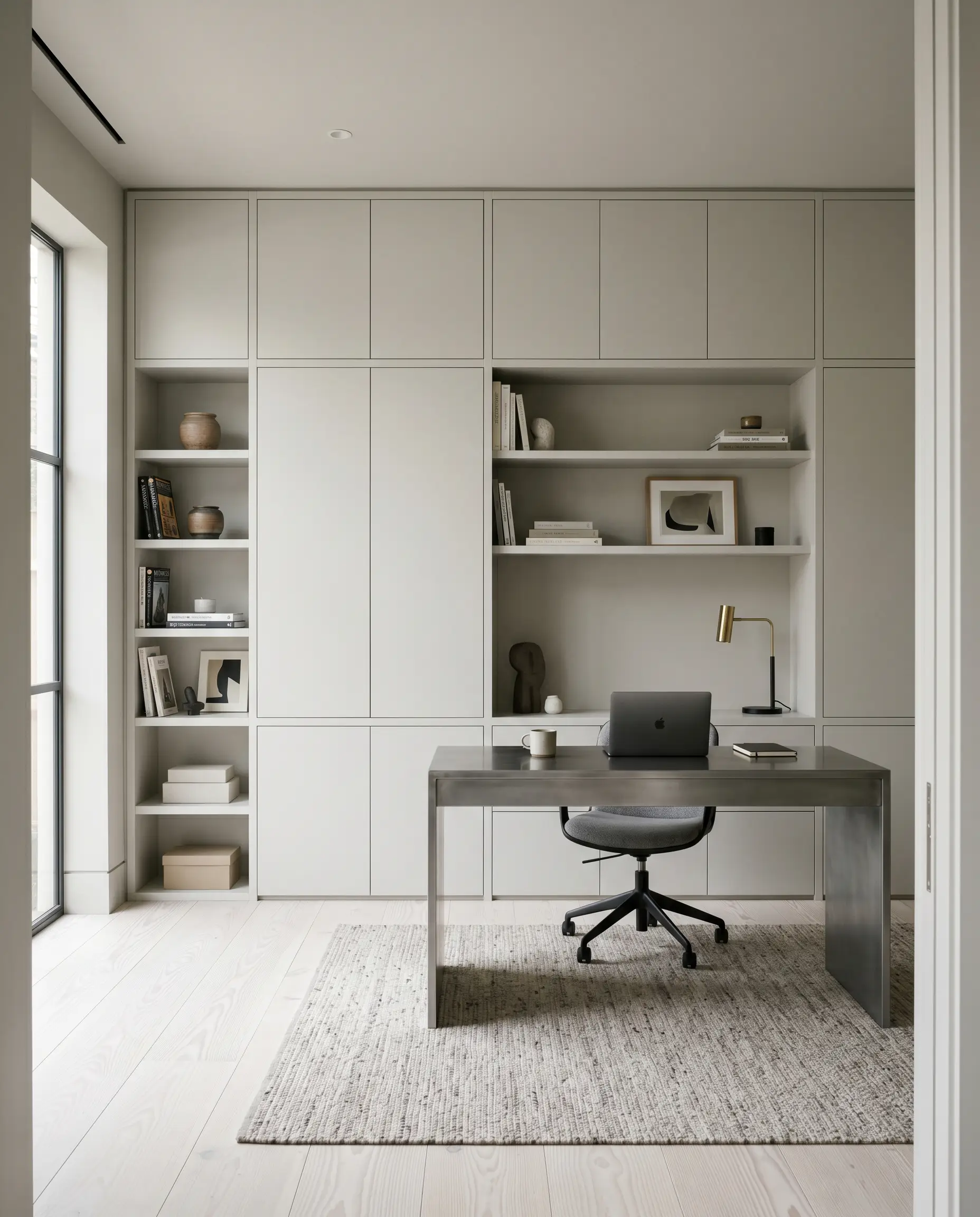
Applying this shade to floor-to-ceiling, flat-panel millwork creates a breathtaking spatial illusion. Because the color recedes, painting an entire wall of built-ins in this tone makes the cabinetry feel as though it is melting into the architecture. You must use a durable, low-sheen finish to maintain the modern aesthetic. If you use a high-gloss, the reflective glare will highlight every imperfection in the wood and amplify the icy undertones.
Color-Drenched Vaulted Ceilings
Will Dimpse work with your specific lighting, floor, or furniture?
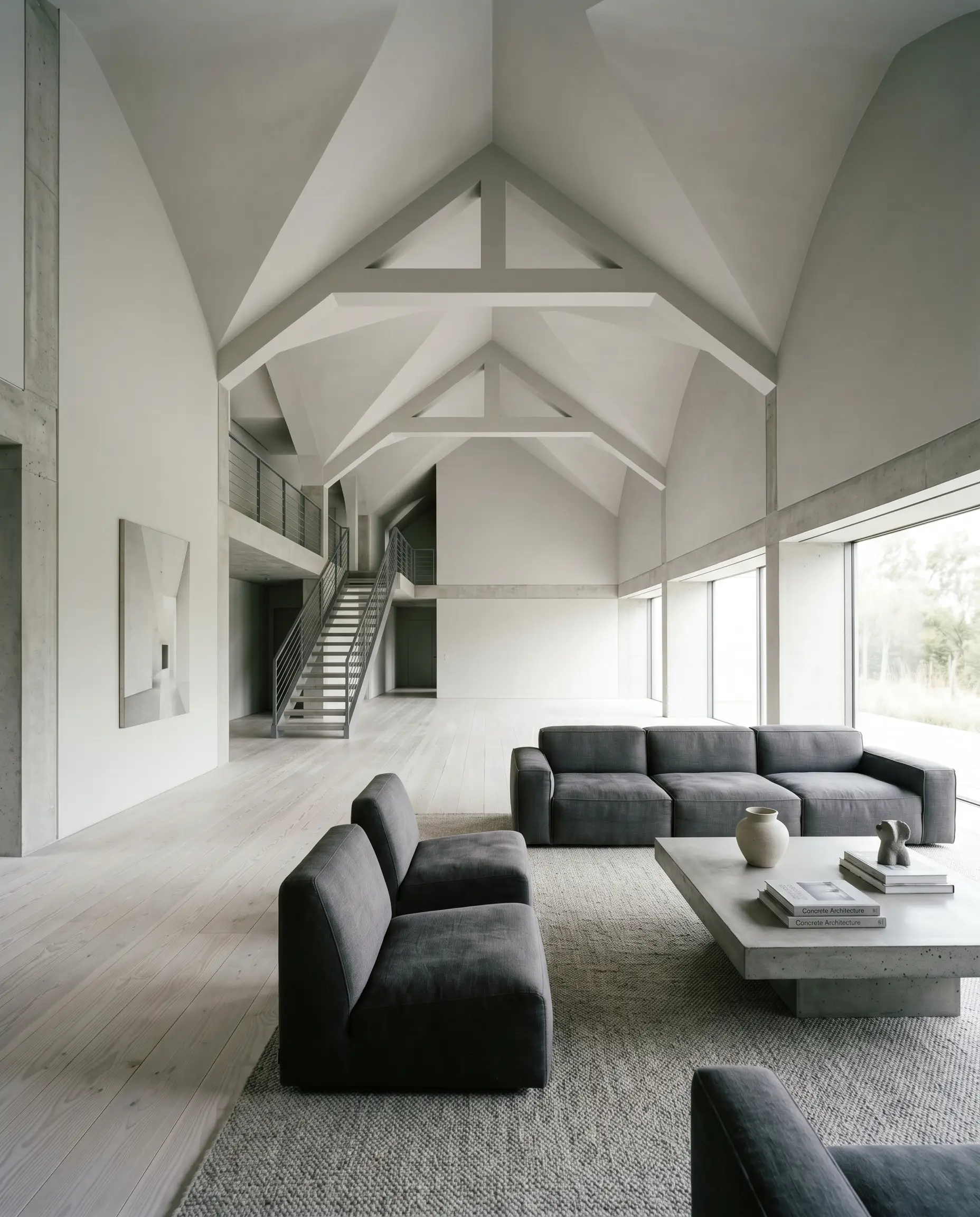
Taking this grey up the walls and directly across a vaulted ceiling erases the visual boundary of the room’s corners. This application technique manipulates the geometry of the space, making the ceiling feel infinite, much like a cloudy dusk sky. The subtle violet undertone prevents the ceiling from feeling oppressive, instead drawing the eye upward into a soft, atmospheric canopy.
Framing Oversized Fenestration
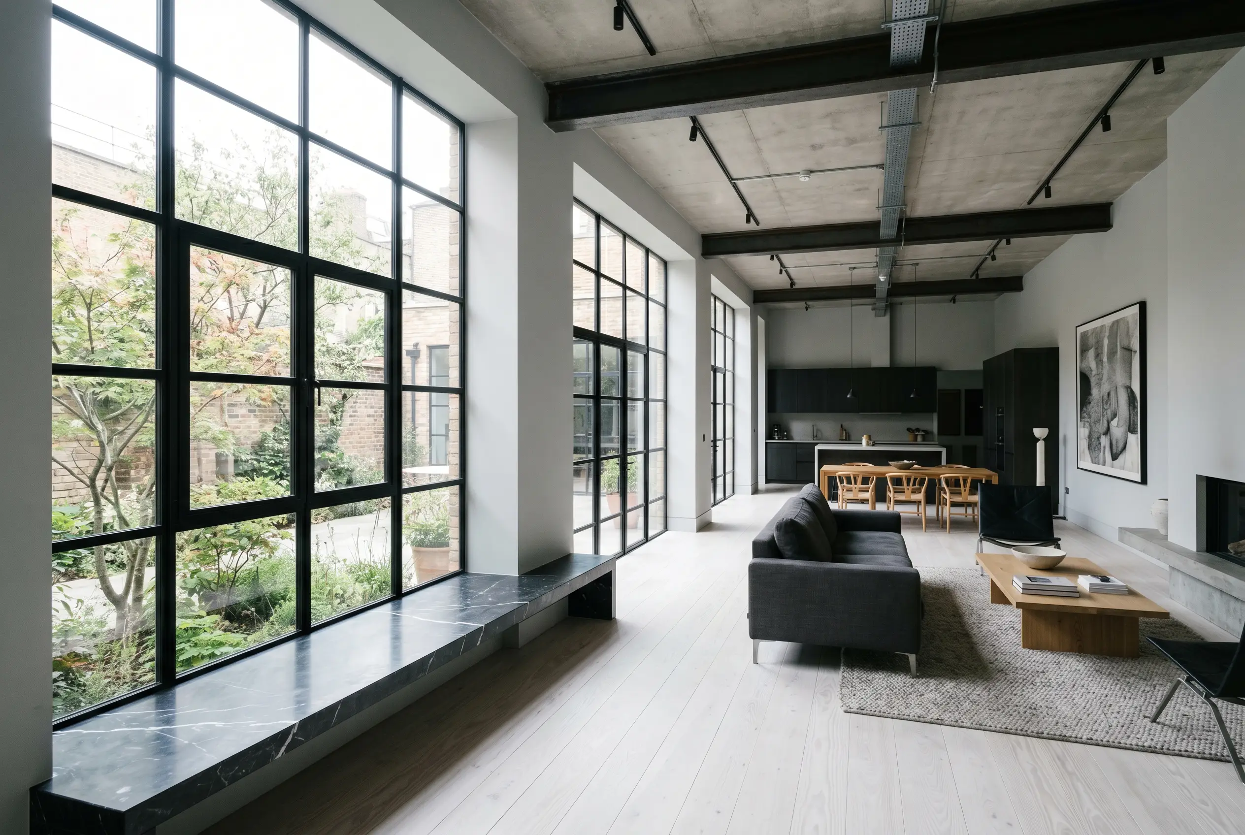
If you have massive, black steel-framed windows, this is the ultimate framing color. Painting the surrounding walls and deep window returns in this crisp neutral creates a high-contrast architectural loop. The cool grey acts as a visual bridge between the harsh black steel and the natural landscape outside. It softens the transition without relying on a warm, traditional white that would clash with the modern industrial vibe.
Curating the Surrounding Ecosystem
A paint is only as successful as the materials it touches. Because this is a strict architectural grey, your pairings dictate whether the space feels like a curated museum or a sterile clinic.
Crisp Millwork & Baseboards
To maintain the sharp, modern edge, you must pair this grey with incredibly clean, cool whites.
Tactile Finishes & Textiles
You must ground this cool paint with materials that offer visual weight and texture, strictly avoiding anything that leans orange or yellow.
You must strictly avoid warm travertine, heavily veined Tuscan granites (like Santa Cecilia), and yellow-toned limestone; they will force the walls to look like baby blue primer. Never use oil-rubbed bronze or unlacquered antique brass, as their orange/brown patina clashes violently with this cool grey. Finally, banish orange-leaning woods (Brazilian cherry, knotty pine) and warm textiles (mustard, rust, warm beige) from the space entirely.
Clash Warning: The 3-Pillar Avoidance Strategy.
The Coordinating Palette
When building a multi-room flow, these specific shades interact perfectly with our primary grey.
Curated Mood Boards
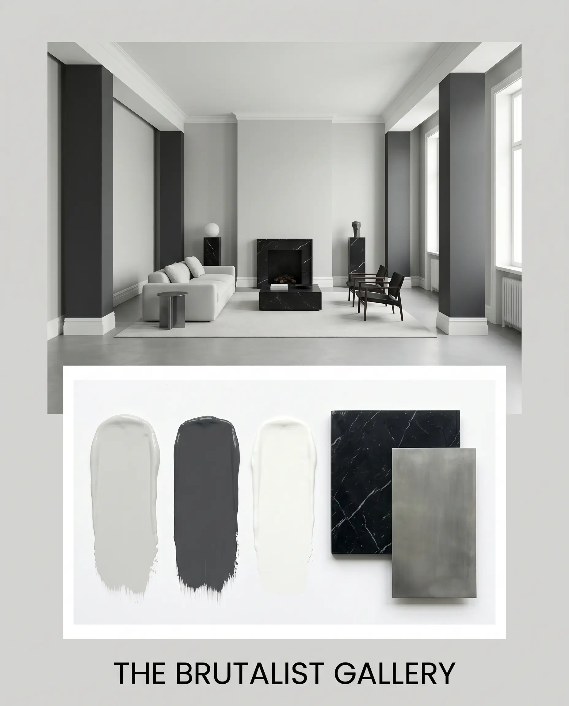
The Brutalist Gallery: This palette thrives on the tension between raw, unyielding materials and atmospheric softness. By combining the crisp grey walls with Honed Nero Marquina marble, cold-rolled steel accents, and stark Benjamin Moore Chantilly Lace trim, the environment becomes a study in high-contrast minimalism. The introduction of Sherwin-Williams Cyberspace on structural columns grounds the airy pigment, resulting in a space that feels fiercely tailored, deeply intentional, and unapologetically modern.
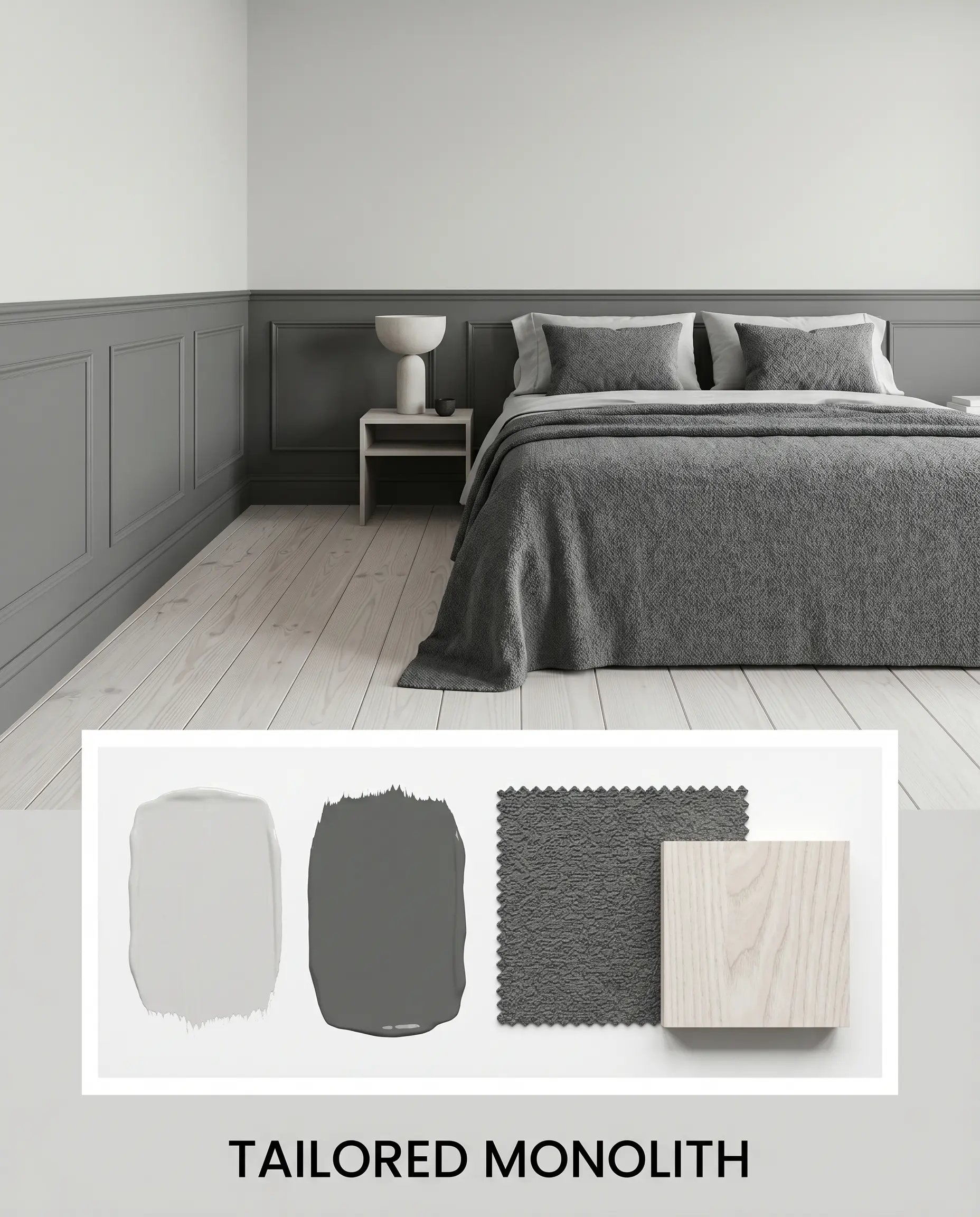
Tailored Monolith: Focusing on tactile depth, this aesthetic uses Farrow & Ball Down Pipe to anchor the lower half of the room, while the lighter twilight grey floats above. We introduce white-washed ash wood and heavy slate bouclé to soften the acoustic and visual harshness of the cool tones. The resulting vibe is incredibly serene but structurally rigid, utilizing the subtle blue undertones to evoke the quiet, hushed atmosphere of a high-end design atelier just after dusk.
Will Dimpse work with your specific lighting, floor, or furniture?
Farrow & Ball Dimpse vs. The Industry Titans
When finalizing your specification, you must understand how this pigment holds up against its direct rivals. The microscopic differences dictate the entire mood.
Farrow & Ball Dimpse vs. Farrow & Ball Pavilion Gray
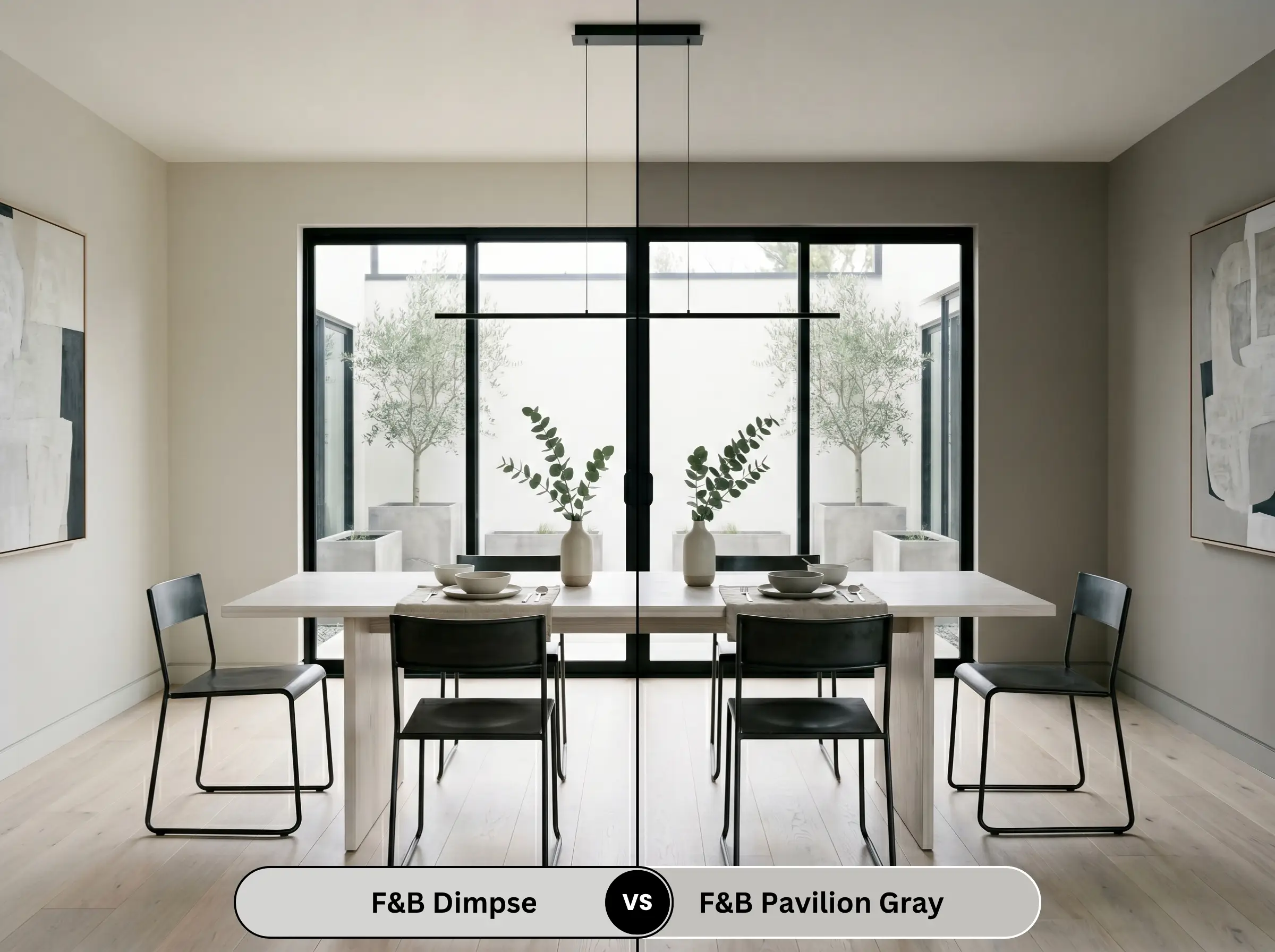
Pavilion Gray (242) is significantly warmer and more traditional. While Dimpse leans into a cool, blue-violet twilight, Pavilion Gray relies on a subtle brown undertone to create a Swedish-inspired, soft neutral. If your space has rustic elements or warm woods, Pavilion Gray is the safer choice; if you want stark modernism, stick to F&B 277.
Farrow & Ball Dimpse vs. Benjamin Moore Stonington Gray
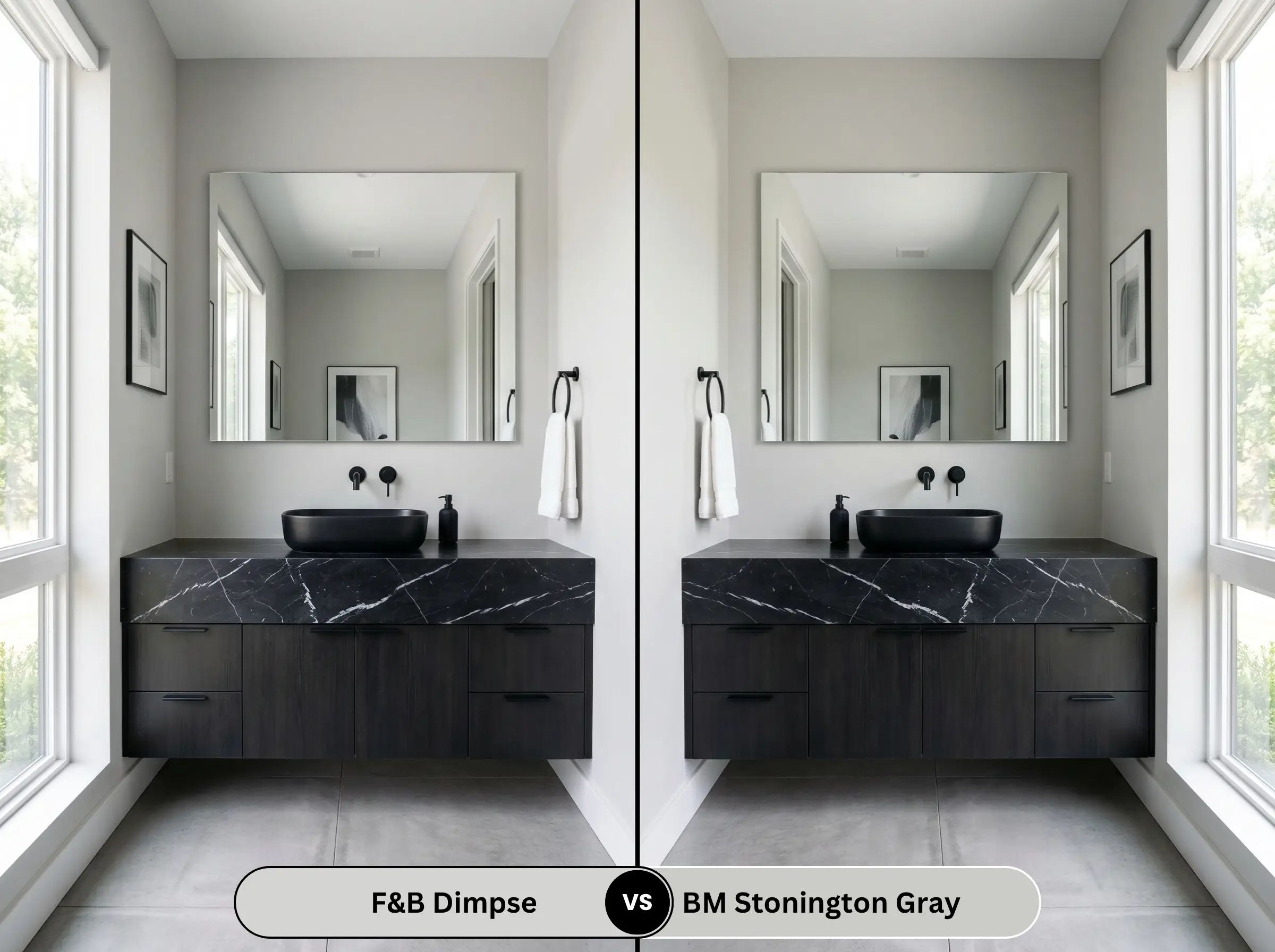
Stonington Gray (HC-170) is a legendary cool grey, but it carries a distinct blue-green undertone compared to the blue-violet of our F&B shade. Stonington can occasionally flash slightly minty in certain coastal lighting conditions. Dimpse remains icier, crisper, and more strictly architectural in its presentation.
Farrow & Ball Dimpse vs. Sherwin-Williams Repose Gray
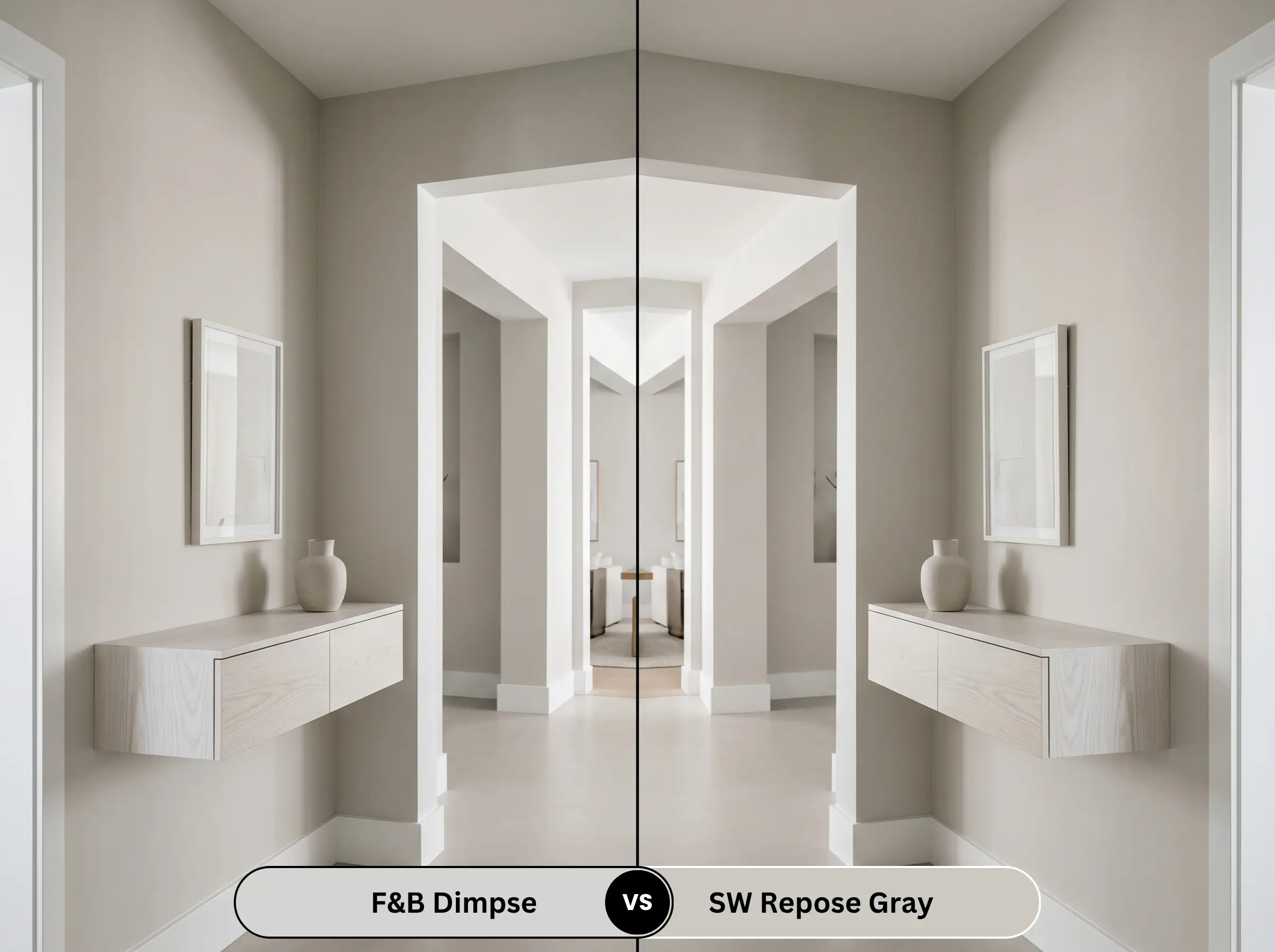
Will Dimpse work with your specific lighting, floor, or furniture?
Repose Gray (SW 7015) is a true greige with a notable green-brown base. It is vastly warmer and more universally forgiving than the F&B shade. Repose Gray will bridge the gap between warm floors and cool furniture effortlessly, whereas the F&B grey will aggressively reject any warm flooring you pair it with.
Exploring Tonal Alternatives
If the undertones of our primary subject are too intimidating, consider these lateral moves within the color sphere.
Within the Farrow & Ball Archive
Industry Matches
Technical Execution & Finish Selection
Translating this color from a swatch to drywall requires strict adherence to professional application standards. The finish you choose will radically alter how the undertones present.
The Dynamic Sheen Guide
Precision Priming Strategy
Because this is a highly desaturated, cool color, you cannot prime with a standard stark white. You must use the brand’s recommended White & Light Tones primer. If you are painting over raw wood, a stain-blocking primer is mandatory; any tannin bleed will introduce a yellow stain that ruins the crisp blue-grey surface.
Opacity & Touch-Up Realities
This specific depth requires two generous coats over a properly tinted primer to achieve true opacity. Do not stretch the paint. Because of the dead-flat sheen required for walls, touch-ups are notoriously difficult. If you scuff the wall, you must feather the touch-up perfectly, or the new paint will flash, catching the light and ruining the monolithic illusion.
Addressing Your Core Concerns
Yes, it absolutely can. Without warm natural sunlight to neutralize the pigment, the artificial lighting will dictate the color. If you use cool white or daylight bulbs (3500K+), the blue-violet undertones will dominate, creating a chilly, baby-blue effect.
Direct exterior sunlight washes out paint colors significantly. On stucco or brick, this shade will lose much of its grey depth and read as an incredibly bright, icy white with a faint blue cast. It is exceptional for modern coastal exteriors, but it will not look like a medium grey outdoors.
It depends entirely on the marble. It pairs beautifully with cool, grey-veined Carrara or the stark black-and-white of Nero Marquina. However, if you pair it with a heavily veined, warm marble like Calacatta Gold, the crisp grey will clash with the creamy, golden tones of the stone.
For a mudroom, you must abandon the flat Estate Emulsion and upgrade to Modern Emulsion for the walls. It provides a washable, scuff-resistant surface while keeping the sheen level at a highly sophisticated 7%, preserving the architectural integrity of the color.
The Final Verdict on F&B 277
Farrow & Ball Dimpse 277 is an absolute triumph for strict, uncompromising modernism. It is not a paint for the faint of heart, nor is it a quick fix for a dated living room. This is a highly specialized architectural neutral designed to elevate minimalist spaces, sleek cabinetry, and high-contrast, industrial-leaning environments. It is perfect for the design purist who understands how to manipulate directional light and control a strict, cool-toned material palette.
However, if your home features warm Tuscan stonework, orange-toned hardwoods, or rustic, heavily textured walls, you must walk away immediately. In the wrong environment, this brilliant twilight grey will turn into a sterile, bruised, and icy mistake. Respect its DNA, pair it with stark whites and raw materials, and it will reward you with one of the most sophisticated backdrops in the design world.
Room Compatibility & Clashes Diagnoses
Hackrea's reports evaluating the compatibility of Dimpse in real rooms.No compatibility tests for Dimpse yet.
Be the first to see how this color reacts to your space. Run a free architectural diagnostic now.
Closest Cross-Brand Equivalents
The absolute closest scientific color matches for Dimpse across top paint brands.