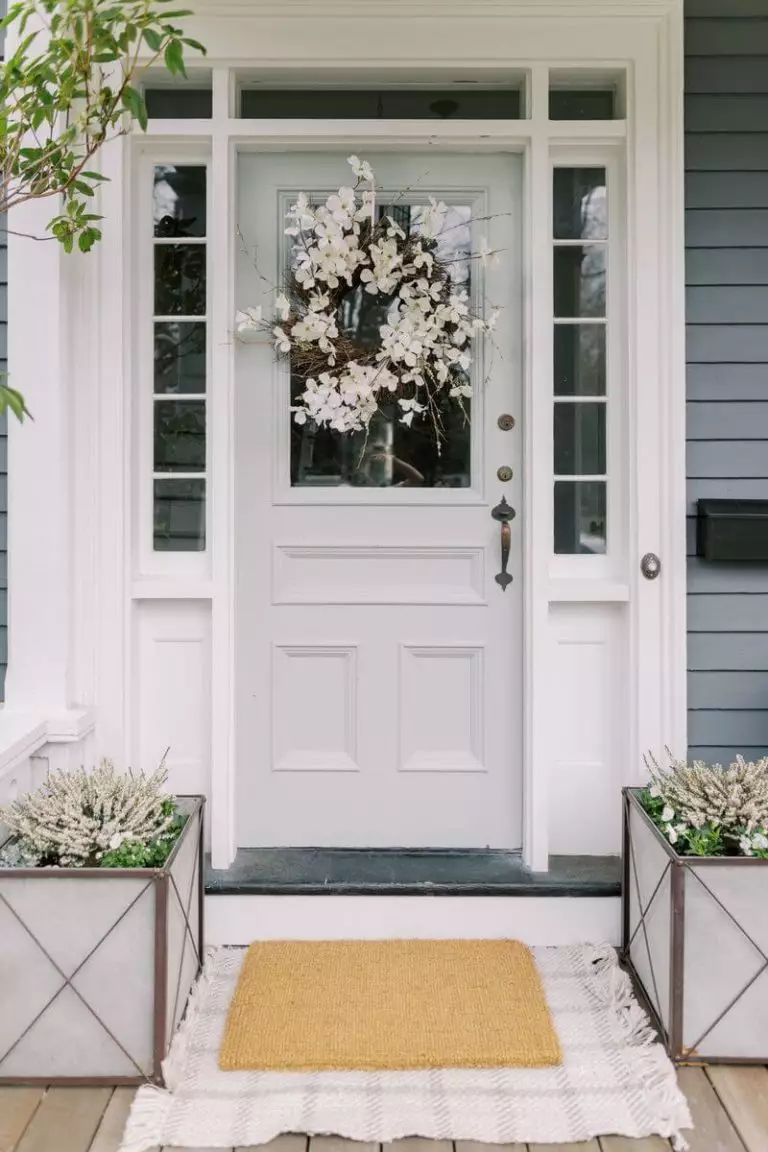
Stonington Gray HC-170
Benjamin MooreA perfect gray shade for those looking for neutrals that feel cool yet soft, low-key yet unique, and add a special sense of elegance to the overly simplified contemporary interiors.
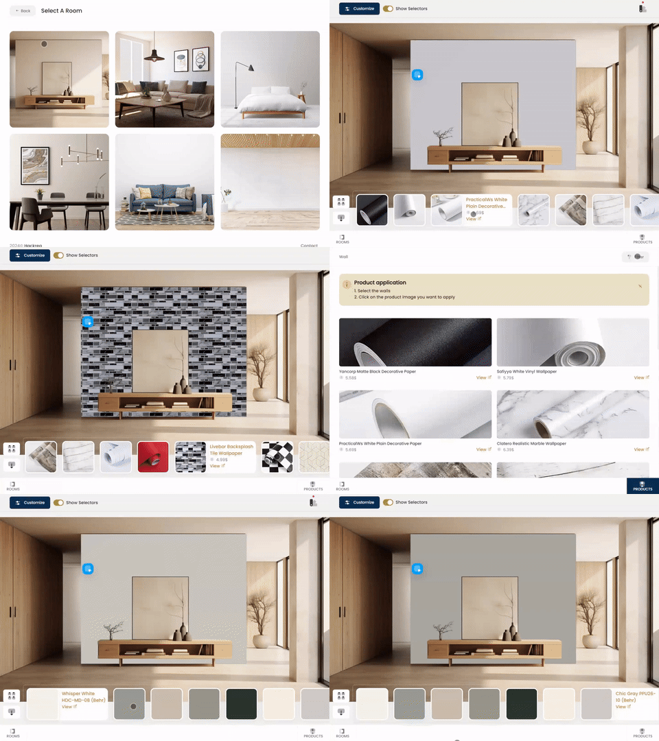
Try Stonington Gray paint in a room with Hackrea Visualizer
Stonington Gray HC-170 (Benjamin Moore): what color is, review, and use
Another color review, another shade of gray, and a popular one. Could we go through gray variations and skip a favorite? Never. We would like to present to you one of the trendiest gray shades at Benjamin Moore, which stands at the top of designers’ favorite colors, and not least, keeps pace with such popular paint colors as Gray Owl OC-52 and Revere Pewter HC-172 from the same brand color. Ladies and gentlemen: Stonington Gray.
The HC-170 paint color is a medium-tone gray with a coolish base (please note: coolish since it is not icy but rather a soft kind of cool). This shade reflects America’s history and traditional values as part of the Historic Color collection. It is more than gray; it is an elegant and refined shade that reaches the level of a timeless paint color, which goes for traditional interiors and exteriors no less than for modern ones. Behind any hue stands a whole scientific process, and it seems that colorists at Benjamin Moore managed this task at the highest level in this case. Let’s find out what makes this paint color an all-time favorite!
Stonington Gray paint color features
The new variation of gray is a rather coolish shade that, in contrast with other colors alike, is not a bright gray; there is more depth to it. One should note that we do not call it darker by any means. However, its relatively saturated notes perfectly emphasize its inner beauty without letting the external factors steal from its rich composition. As usual, we try to answer the question: what does it feel like? Stonington Gray is, first of all, neutral, which instantly makes it calm, even a bit refreshing. Next comes its complex notes, a combination of gray and a slight hint of blue, adding refinement and making this paint color stand out. Shortly, HC-170 is a perfect gray shade for those looking for neutrals that feel cool yet soft, low-key yet unique, and add a special sense of elegance to the overly simplified contemporary interiors.
You can apply wallpapers, paints, etc. on walls and see how they look in various interiors.
Stonington Gray: is it warm or cold?
Stonington Gray is definitely not cold nor warm. We cannot speak, in this sense, about a balance either. As already stated, it is rather cool, while a hint of softness keeps this color far from feeling cold. To be precise: the fabulous gray from BM is a combination of cool notes that unobtrusively refreshes the space, accompanied by calming and relaxing notes. We have not mentioned it yet, but this mix of scents offers this shade a modern appearance, which is undoubtedly a compliment for any interior or exterior.
How does lighting affect Stonington Gray?
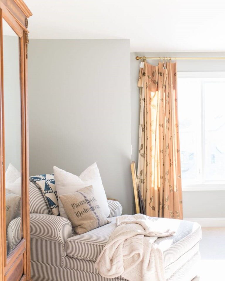
Regardless of how true a color stays to its inner beauty, there is always lighting that says the last word. In north-facing rooms, Stonington Gray seems even cooler, while the blue undertones penetrate the surface to the fullest. At particular times, it may even look blue at all. On the other hand, in east and west-facing spaces, particularly in rooms with south-facing windows, HC-170 acquires its softest appearance. This is when the warm lighting notes connect with the cool base of the color for a perfect balance between the two extremities. When it comes to artificial lighting, you can always play with cool or warm undertones to influence how this color behaves within your space.
Stonington Gray LRV
The Light Reflectance Value of Stonington Gray is 59,75 on a scale from 0 to 100. Now, you know what we mean by saying that HC-170 is a middle tone paint color, which refers to the idea that it is neither too dark nor too light, although directed towards the latter. In plain words, Stonington Gray has quite impressive abilities to reflect the light and even make the room feel spacious.
Stonington Gray undertones
It is clear so far that this paint color is diluted with a drop of blue that stands behind its cool appearance, which can reveal itself at its finest in north-facing rooms particularly. Still, it is not emphasized in spaces bathed in the warm sun rays that penetrate them through south-facing windows. Nevertheless, the coolish base of this color, which is the result of these blue notes, is always part of this color, revealing itself differently according to particular conditions.
Similar colors
If you are a gray lover, you certainly know that there is a wide range of variations when it comes to shades, even when tackling the cool grays only. Undoubtedly, Stonington Gray has a lot of cousins both at BM and other paint manufacturers. Let’s see what alternatives there are!
Coordinating colors
Like any other neutral, Stonington Gray is very flexible and wants to collaborate with colors from almost any category. Therefore, you can use it as a background for the boldest splashes of color. Still, it perfectly works with other gray variations within monochromatic settings and particular white variations. If you are free to play with bright colors, the latter categories require special attention. So, we will get more specific.
Use of Stonington Gray in interior
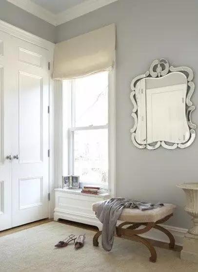
HC-170 is versatile, meaning it works with almost any shade and adapts to a wide range of styles. Next comes its suitability within traditional and modern settings, which opens more design possibilities. Therefore, you can play with this shade any way you want, using it as a background. Still, we would like to give you an insight into what it looks like within the interior. Let’s take a look!
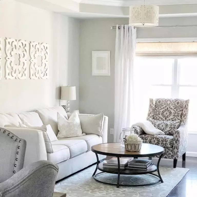
Living room
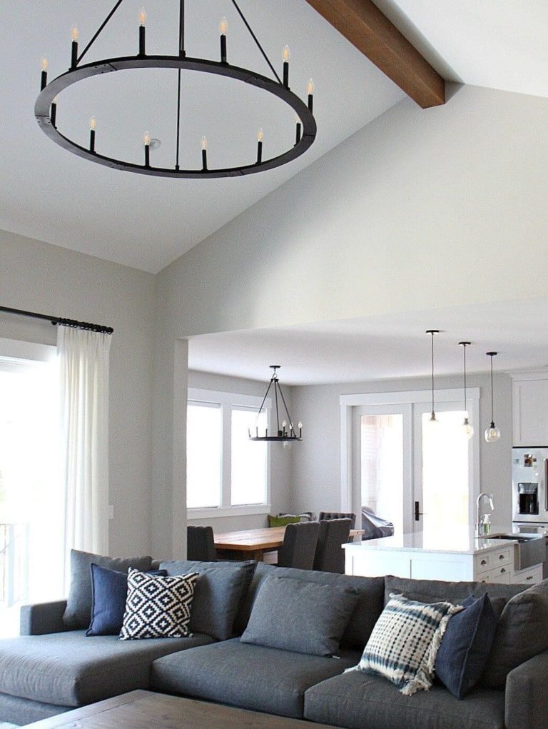
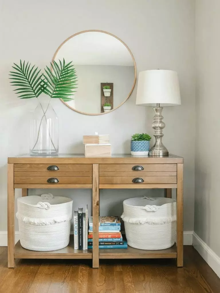
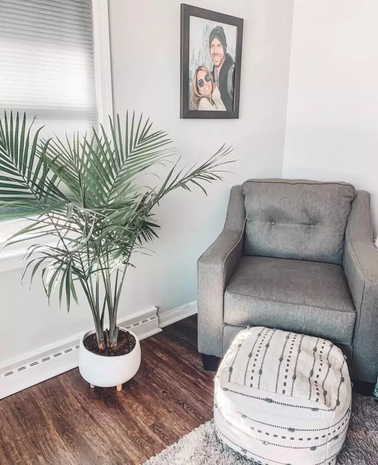
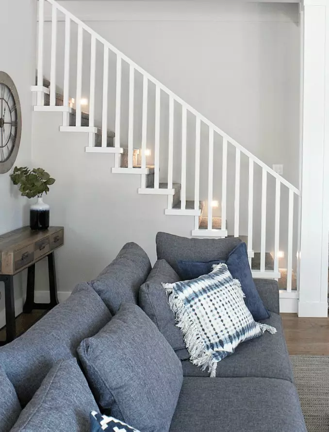
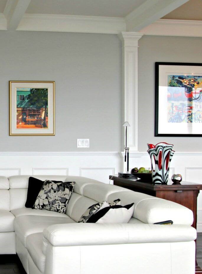
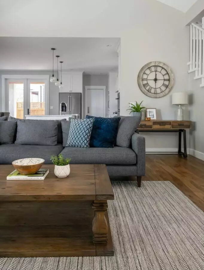
As free as you are to play with colors on this gray background, designers suggest sticking to monochromatic palettes and complementing the walls painted in Stonington Gray with other gray variations and mandatorily white. In this sense, the furthest you could go is considering dark wood, which works in perfect harmony with this shade of gray. Additionally, you can opt for splashes of soothing blue to resonate with similar undertones of the gray shade from BM.
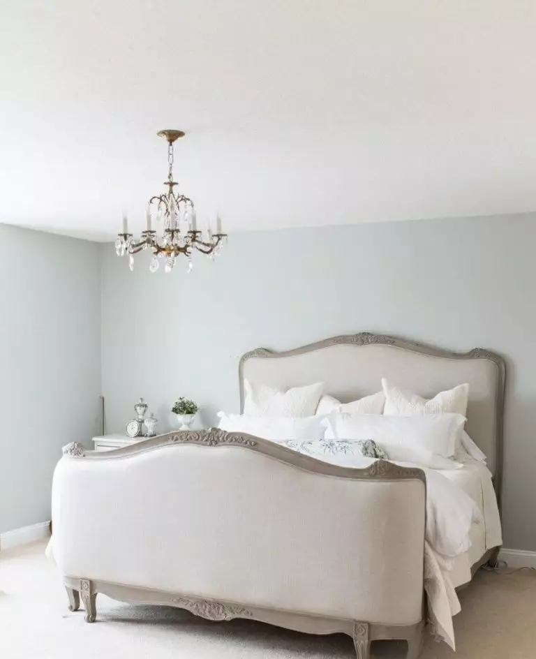
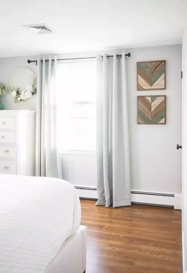
Bedroom
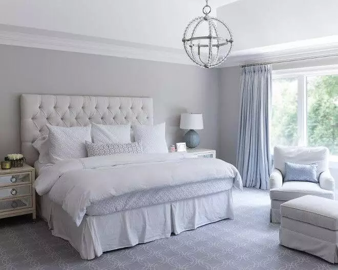
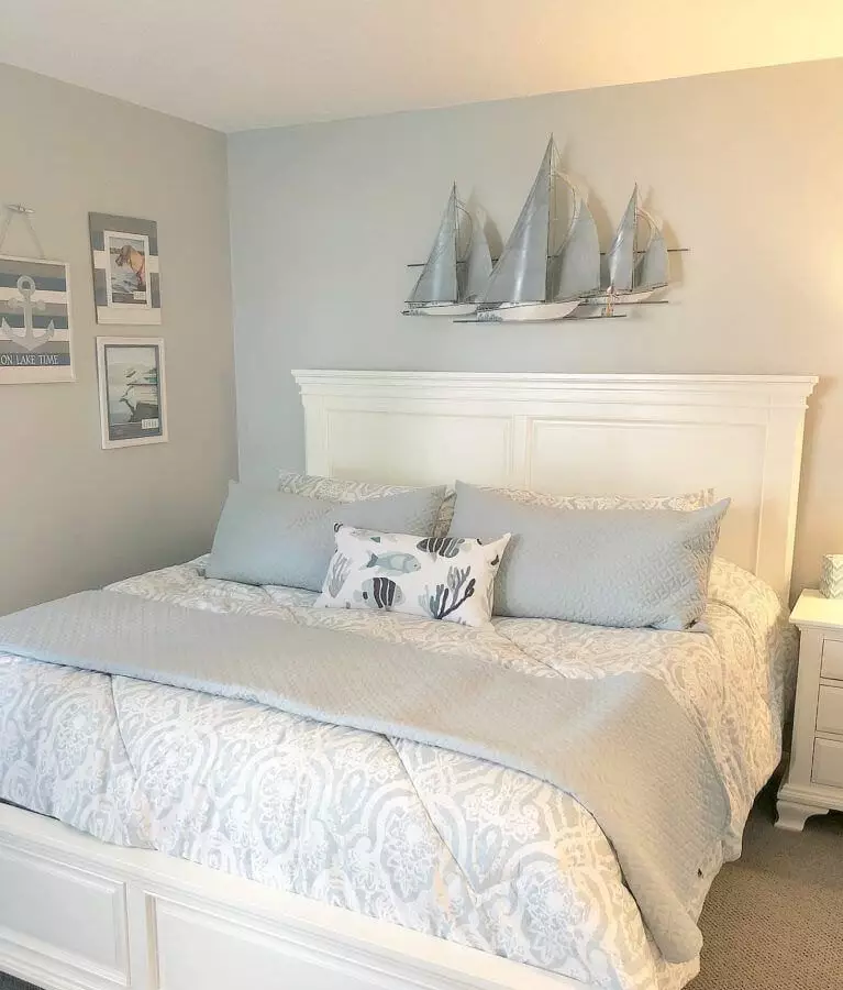
This space supposes design approaches not that far from the previous ones. Experts insist on monochromatic interiors with Stonington Gray for the walls and other shades of gray and white for the rest. This way, you can opt for a gray headboard and white bedding. Furniture should also be painted white to keep it low-key. The result is a light bedroom comfortable to fall asleep in and pleasant to wake up in. If it seems too serene for you, consider a coastal approach by integrating soft blue textiles to harmonize with Stonington Gray’s blue undertones.
Nursery
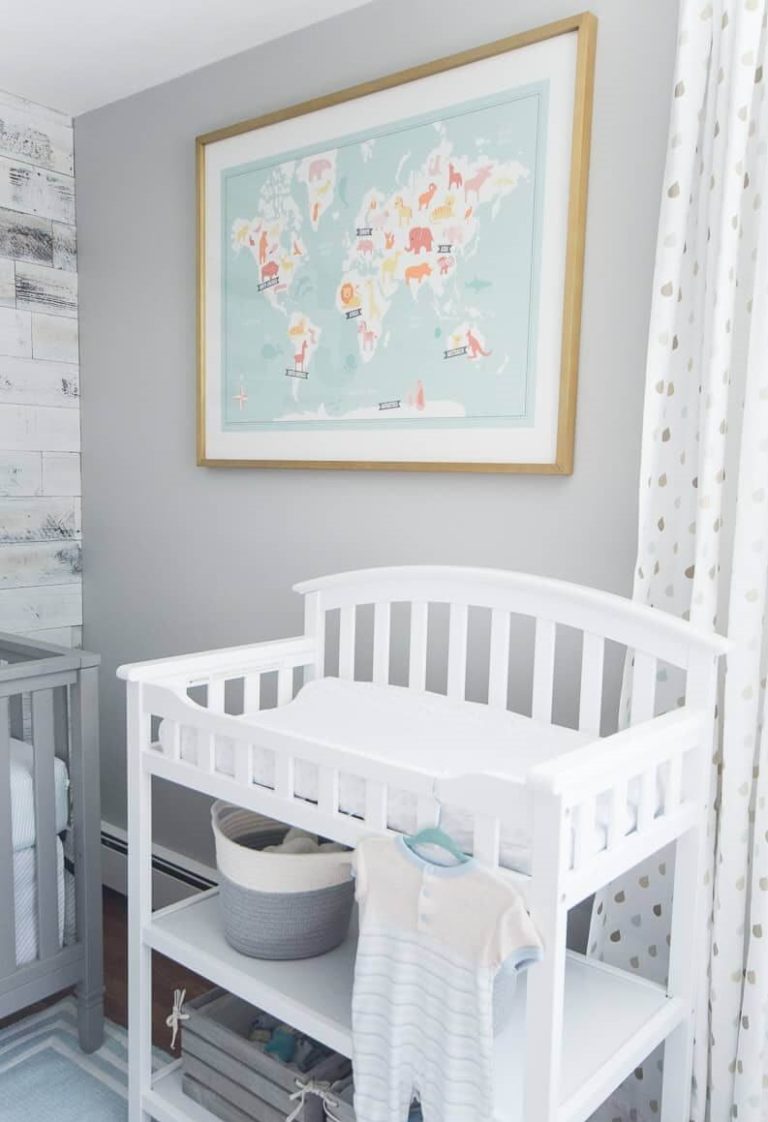
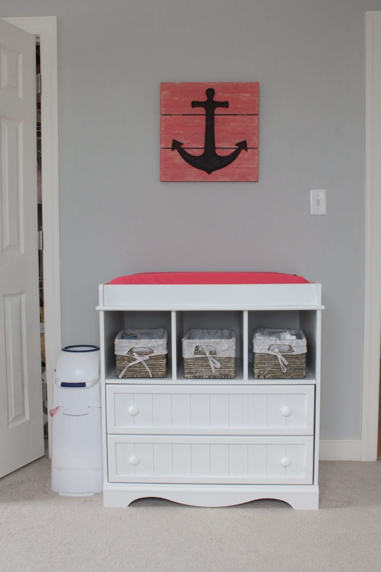
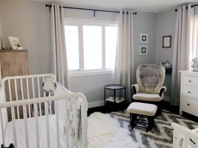
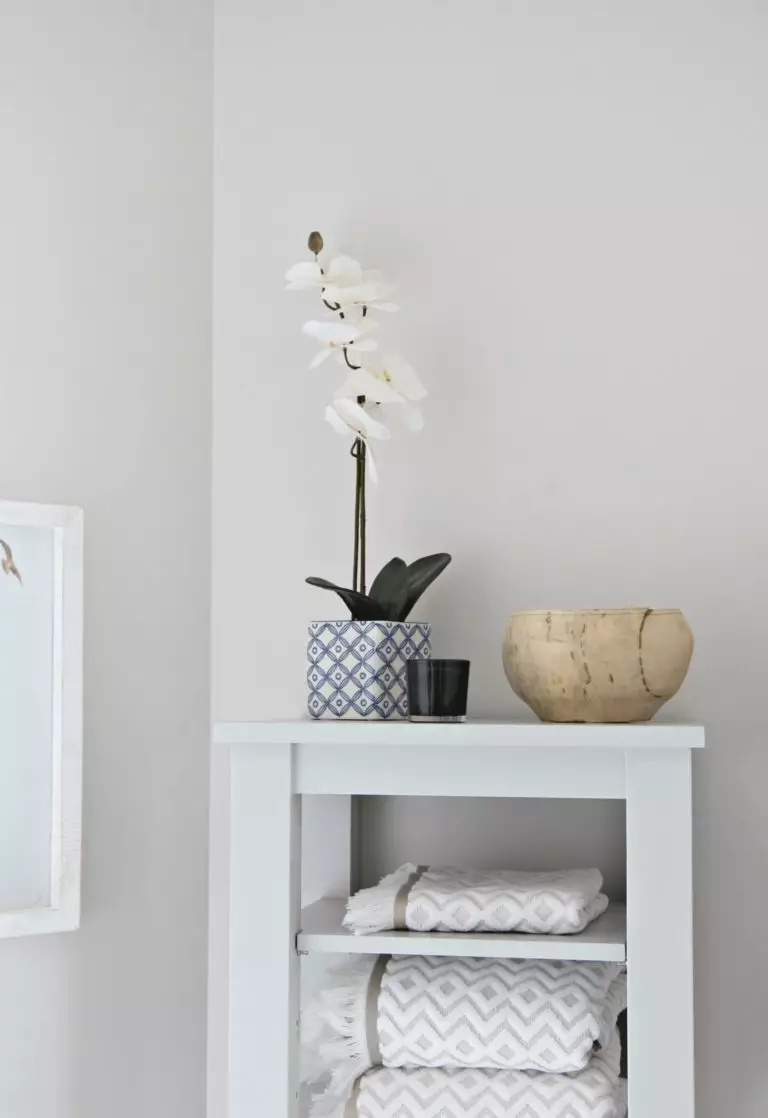
Stonington Gray does not want to give up on its favorite white and other gray shades. Furthermore, this combination feels perfect for such a calm space that a nursery should be: the impeccable gray from BM for the walls, white for the furniture, and other gray variations for textiles. Again, blue is the invited guest to complete the interior with vibrancy. It should be noted that HC-170 will certainly come in handy when your child grows up, serving as a background for design solutions to come.
Kitchen and dining room
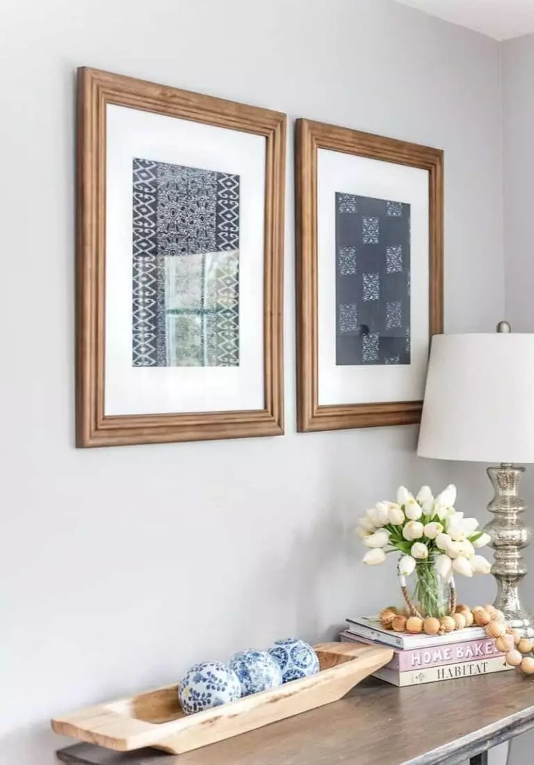
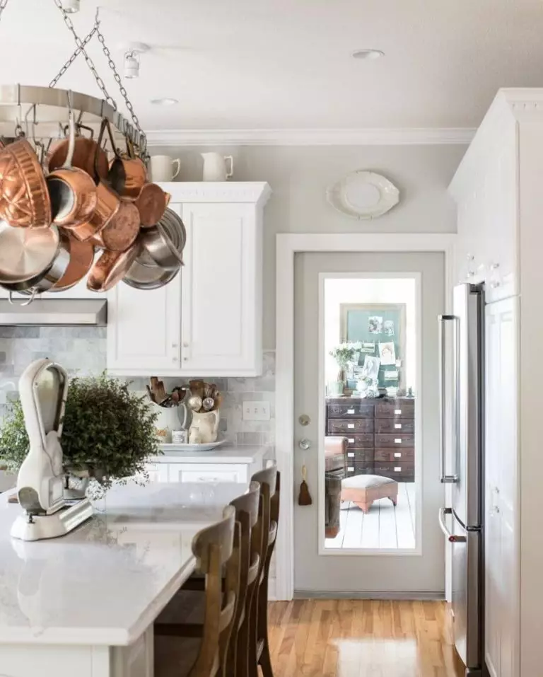
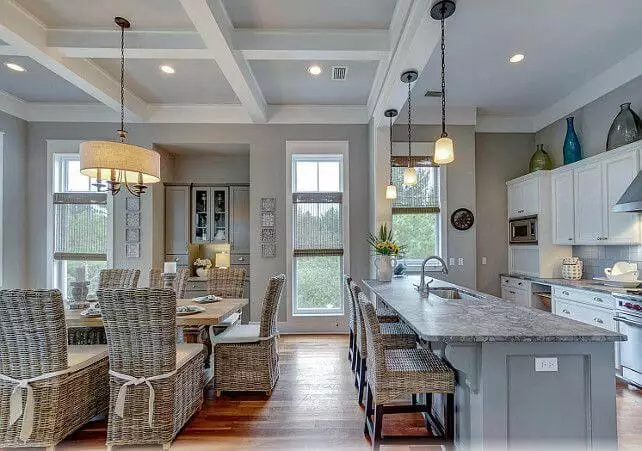
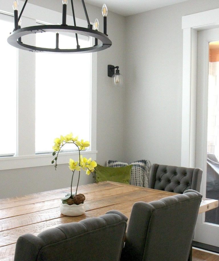
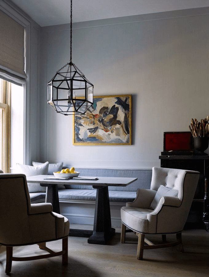
That’s right! Stonington Gray for the walls and white for the cabinets in the kitchen. Although this combination works for any style, designers claim it suits traditional interiors, particularly when paired with wood. The dining space is not far from this approach, which implies the bluish-gray as a background, white for the trim, darker gray for upholstered chairs, and natural wood for the table. Don’t hesitate to add a juicy contrast, such as an abstract painting on the wall or a pot with a vibrantly colored plant.
Bathroom
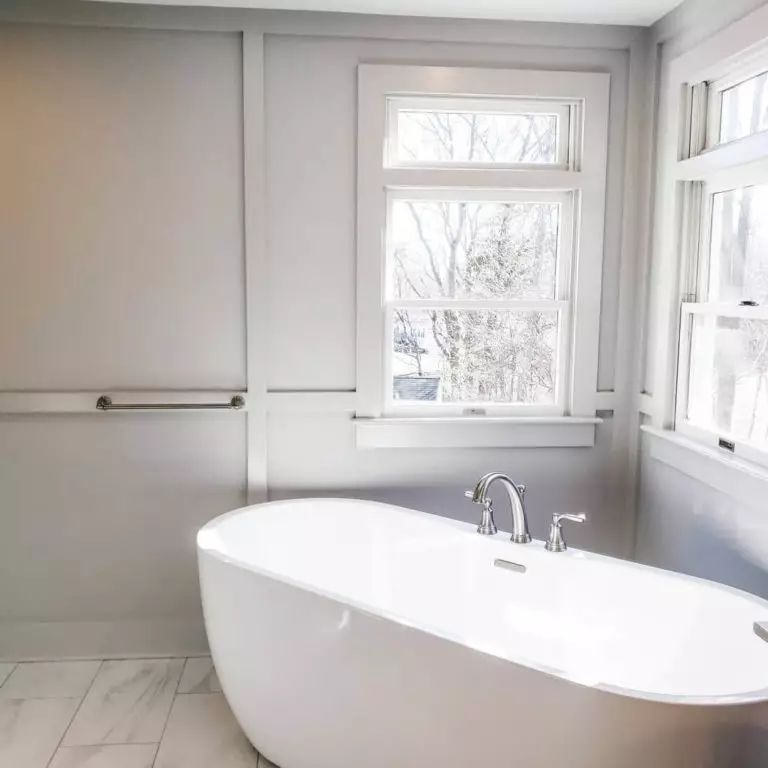
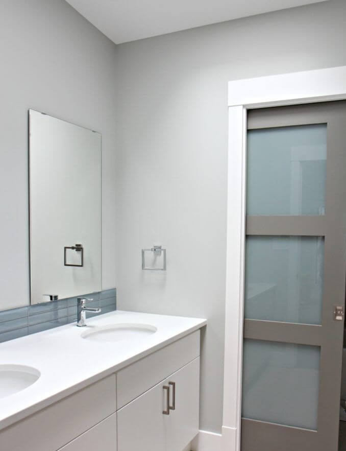
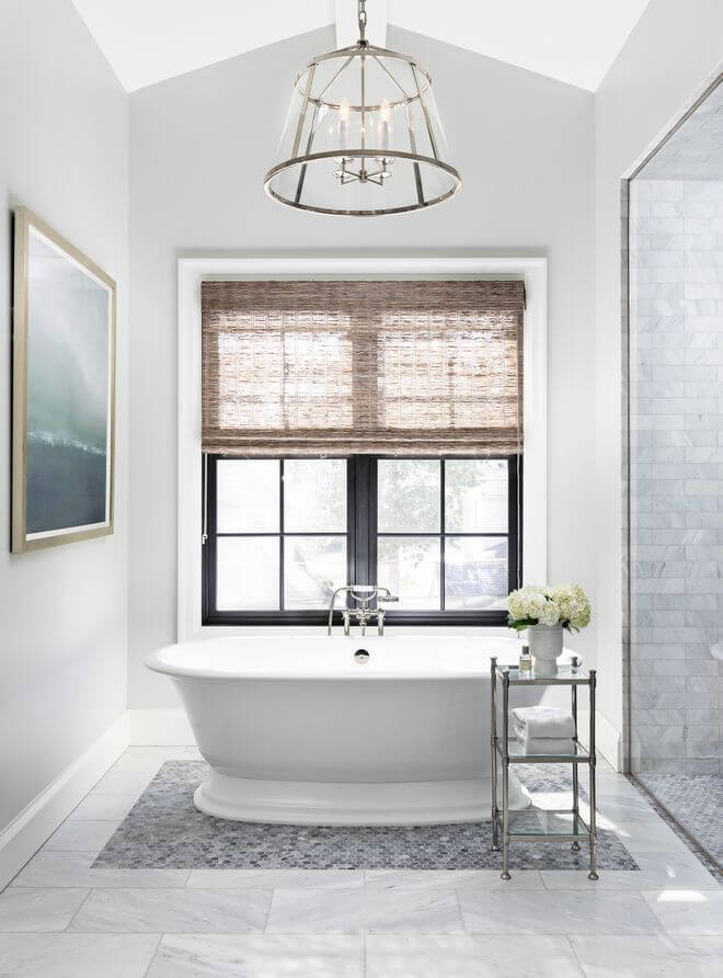
Don’t you dare use Stonington Gray any other way but for the walls. Of course, we are kidding. Still, it has been proved that this shade works best as a background. The irreplaceable white cabinets compliment the interior for a clean environment. Dilute the palette a bit with splashes of greeneries without going too extra. As promised, your bathroom will acquire a modern look.
Use of Stonington Gray for house exterior
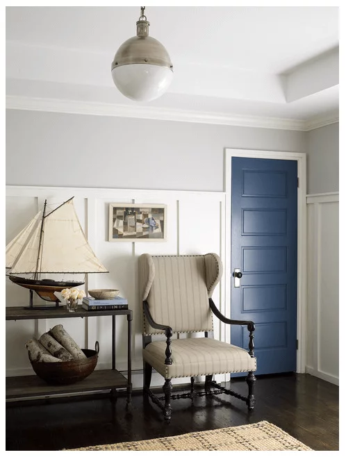
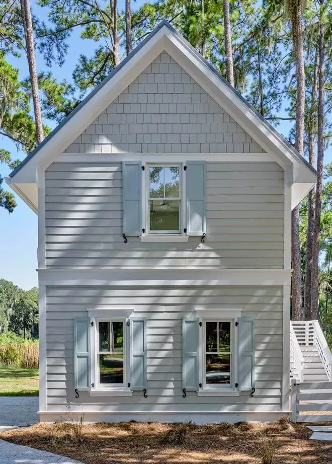
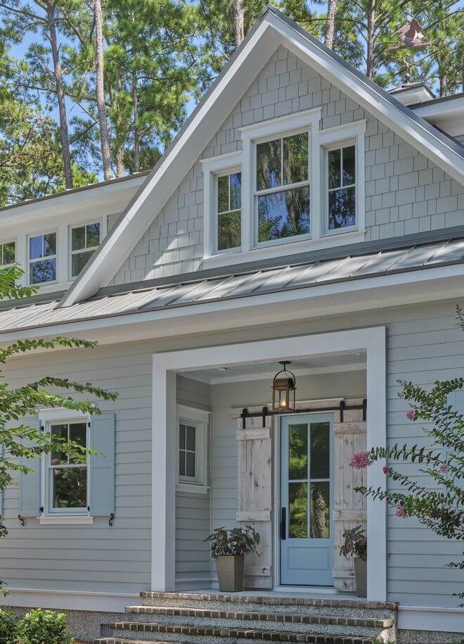
Although looking much lighter when applied to the house exterior, Stonington Gray does not lose its impeccable charm. Consider this paint color for coastal cottages in particular, where its blue undertones would resonate with the fresh ocean breeze. Nevertheless, this blue-gray shade suits any other style due to its modern appearance. Consider soothing blue for the front door and shutters to harmonize with the main color or go with bold accents, such as black, for an impressive contrast. When used in smaller quantities, Stonington Gray can show its inner beauty to the fullest, which makes it a perfect color for the front door, particularly on a dark gray background.
The Stonington Gray HC-170 paint color from Benjamin Moore is a timeless gray, perfect for modern monochromatic interiors and exteriors, yet no less collaborative with bold accents. Versatile, invigorating, and softening, all this is considered when HC-170 is regarded as a neutral, which plans to stay a favorite for years to come. It seems that everything points to the fact that you should definitely give it a try.

