Grounded & Rich: How to Perfect the Olive Green Accent Wall in Your Living Room
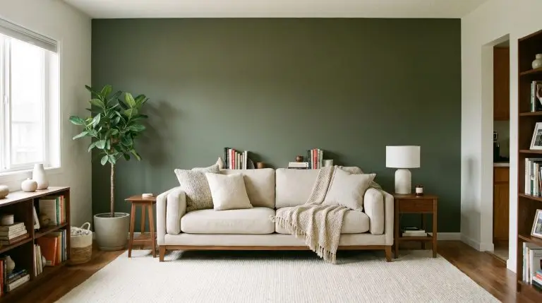
Ready to embrace a moodier, more grounded living space without turning it into a cave? Executing an olive green accent wall living room design is an exceptional way to introduce rich character while maintaining a sophisticated, neutral baseline. We treat the accent wall not merely as a random coat of paint, but as an architectural anchor that dictates the room’s entire lighting and material palette. Let’s explore exactly how to select the right shade, apply the perfect texture, and pair it with materials that make the space feel intentionally curated.
Architectural & Textural Applications
Standard flat drywall is rarely the best canvas for dark hues. By introducing textural depth, you allow natural light to catch the surface differently throughout the day, preventing an olive tone from feeling dead or flat in low lighting.
Apply a Suede-Like Finish with Olive Roman Clay
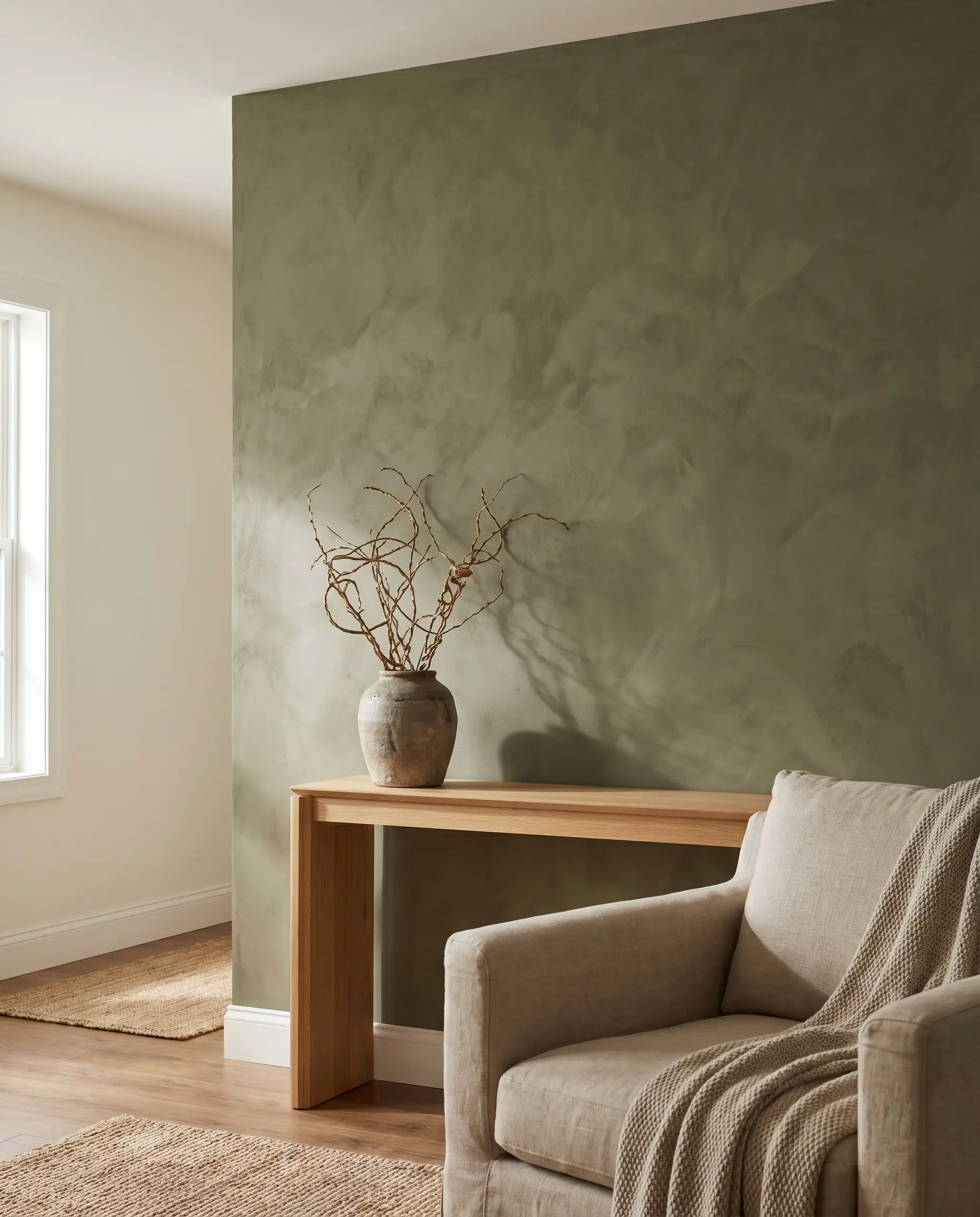
Roman clay provides a subtle, plaster-like mottling that immediately gives an olive green wall a lived-in, organic modern feel. The tactile, suede-like finish absorbs light beautifully, softening the intensity of the dark pigment.
- Vibe: Organic Modern, Wabi-Sabi
- Key Material: Portola Paints Roman Clay (or similar plaster finishes)
- Best For: Smooth drywall surfaces needing tactile warmth
Install Vertical Board and Batten for Height
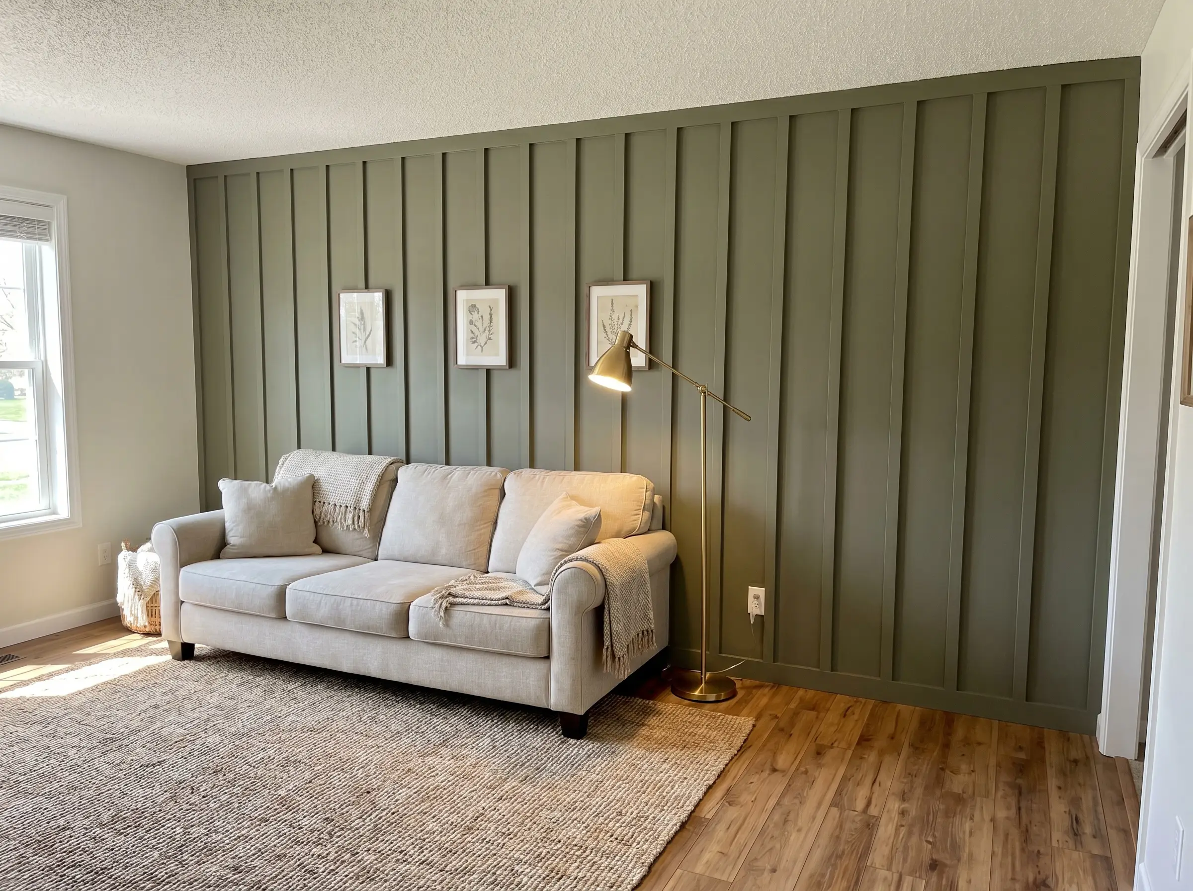
A three-quarter height or floor-to-ceiling board and batten installation completely alters the room’s proportions. The vertical lines actively draw the eye upward, beautifully offsetting the heavy visual weight of a saturated dark green.
- Vibe: Moody Transitional, Craftsman
- Structural Element: 1×3 MDF or pine batting strips
- Best For: Rooms with standard 8-foot ceilings
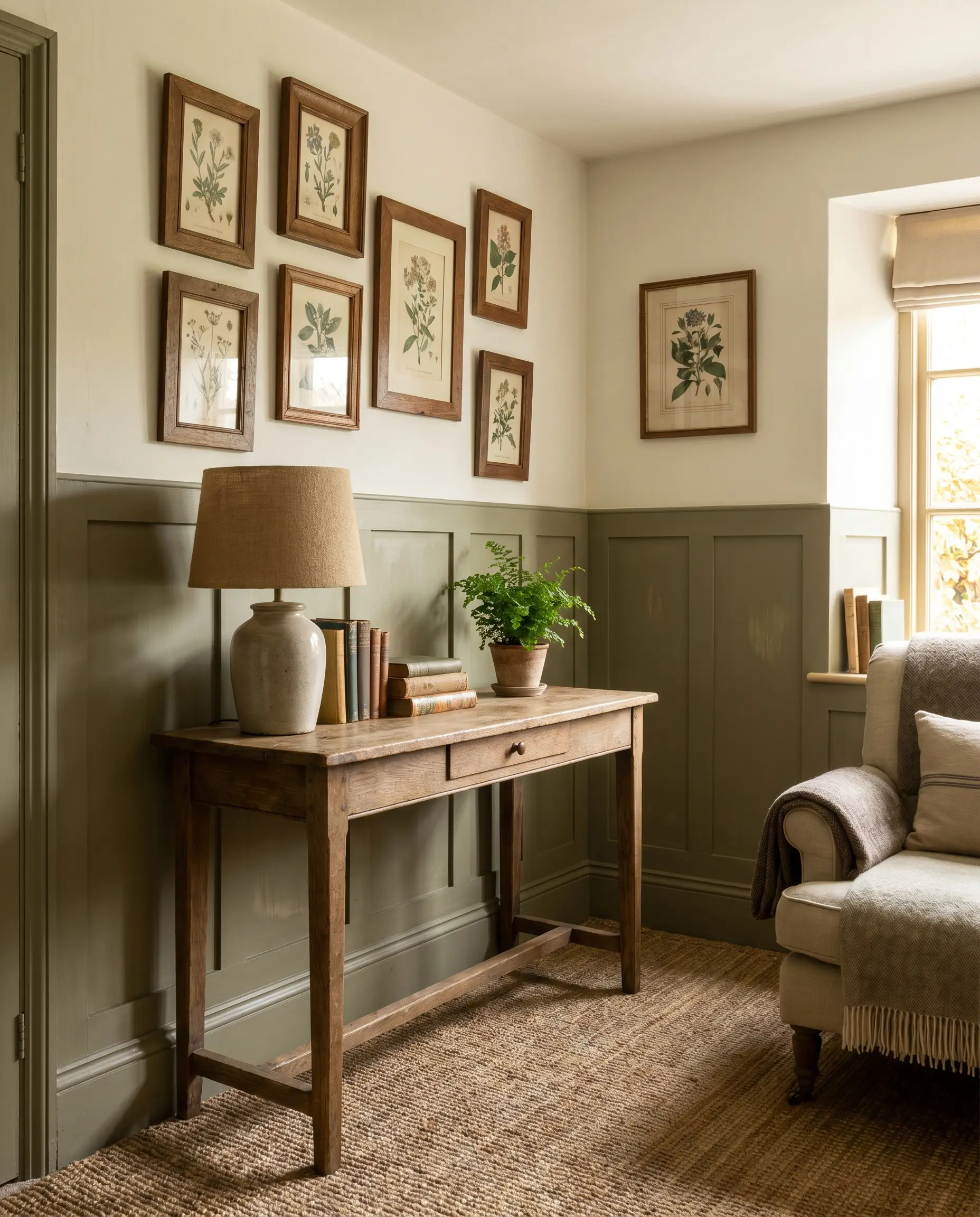
Embrace Cottage Character with Beadboard
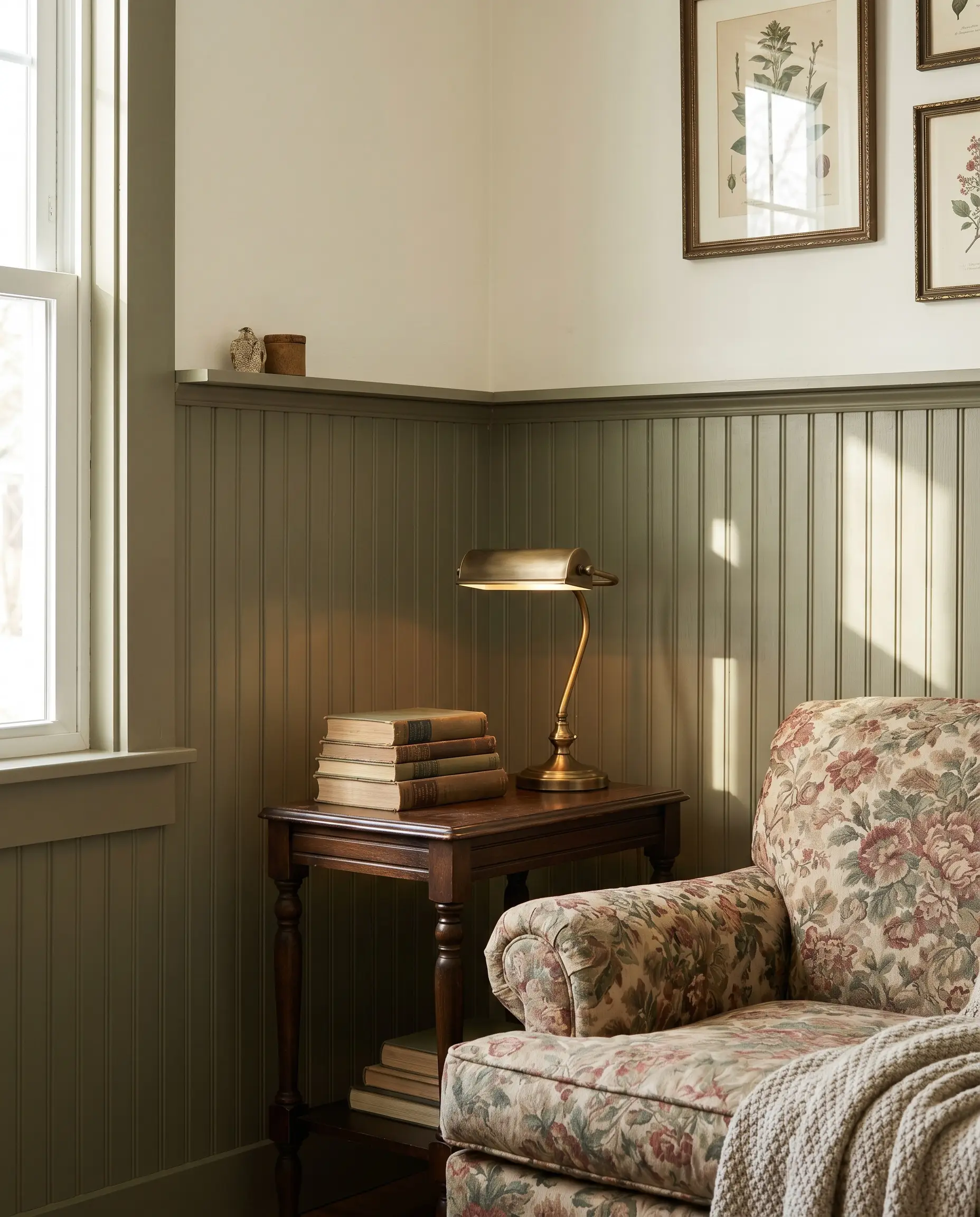
Painting lower-half beadboard in a drab olive instantly grounds a living room with historic charm. This wainscoting application leaves the upper walls free for a creamy, warm white, perfectly balancing the room’s light reflectance.
- Vibe: English Cottage, Traditional
- Paint Recommendation: Farrow & Ball Treron
- Color Match: Creamy white upper walls (e.g., Benjamin Moore Swiss Coffee)
Use Olive Limewash for a Chalky, Matte Patina
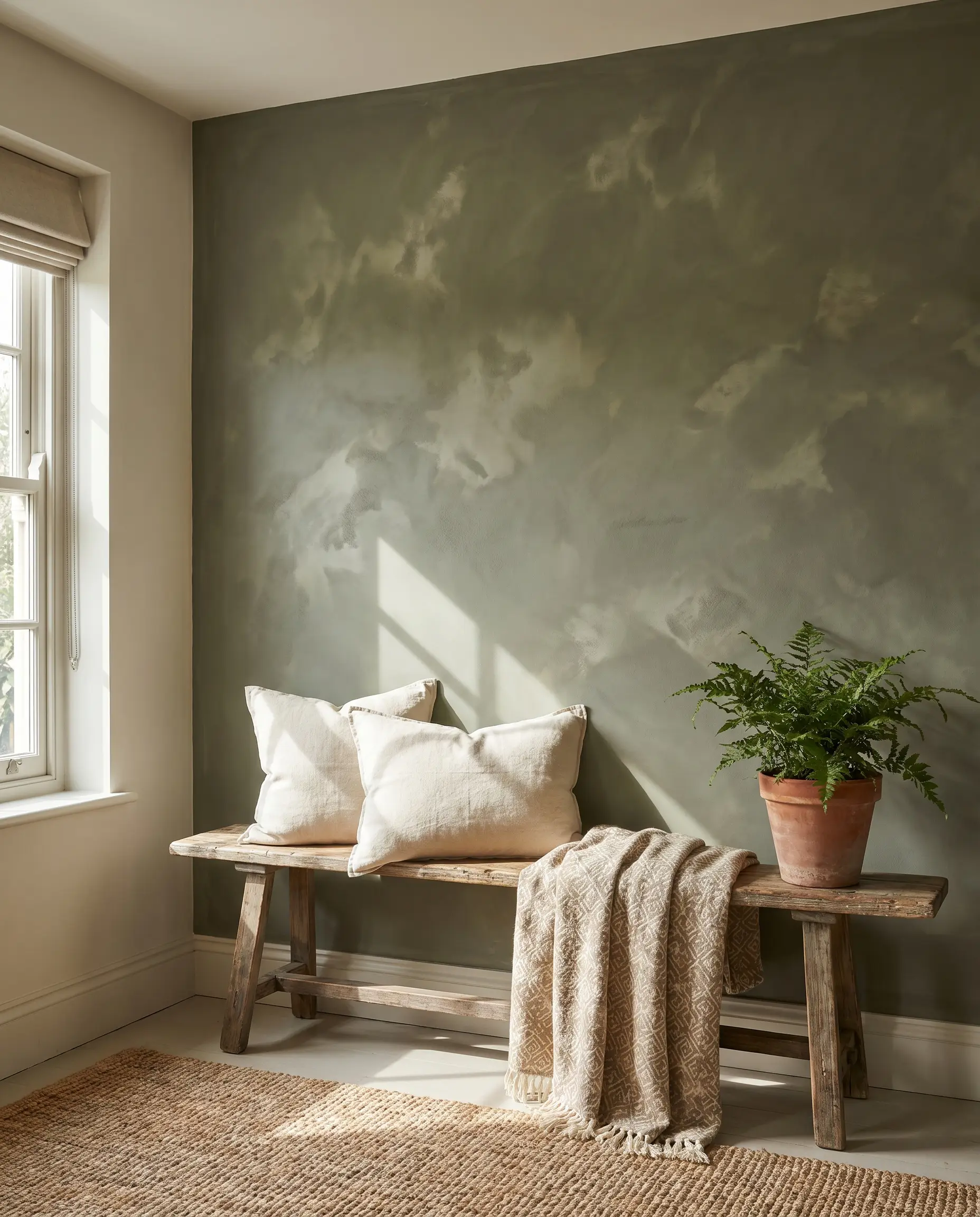
Unlike the subtle movement of Roman clay, limewash delivers a distinctively chalky, matte patina that ages gracefully over time. This breathable finish blooms with lighter and darker variations of olive, creating unmatched depth.
Limewash is highly porous and can easily absorb oils. Avoid using this finish on walls directly exposed to heavy traffic, sticky hands, or leaning furniture unless you apply a specialized dead-flat sealer.
Hackrea Material Warning
- Vibe: Rustic, European Villa
- Key Material: Portola Paints Limewash
- Best For: Well-lit focal walls where the chalky texture can be highlighted
Integrate Slatted Wood Panels Over Dark Green
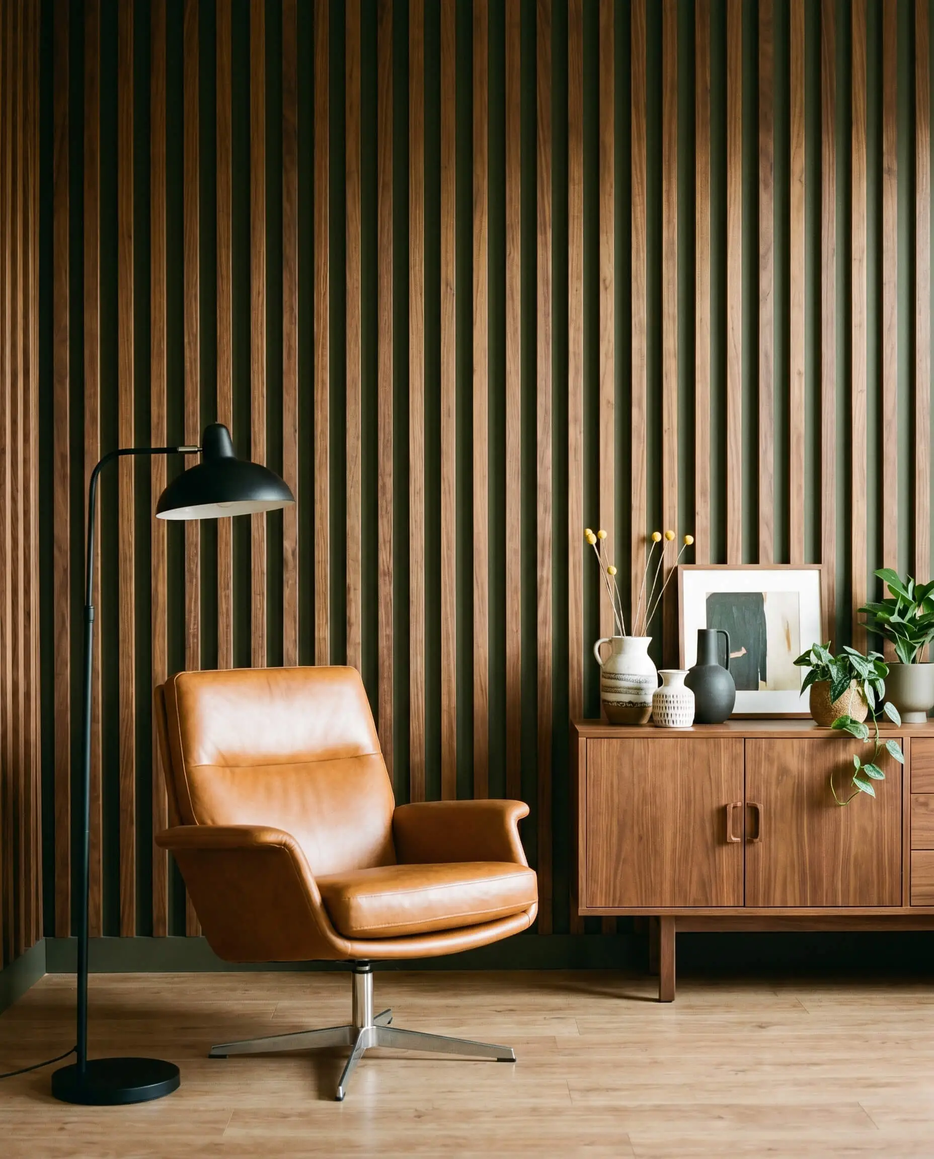
Painting your wall a deep olive and installing vertical acoustic wood slats over the top is a premium architectural upgrade. The rich green peeking through the warm wood creates a striking, high-contrast shadow line.
- Vibe: Mid-Century Modern, Contemporary
- Key Material: Walnut or white oak acoustic slat panels
- Color Match: Dark, moody olive base (e.g., Benjamin Moore Dark Olive)
You can apply wallpapers, paints, etc. on walls and see how they look in various interiors.

Strategic Placement: Selecting the Right Wall
The most common DIY mistake is painting a wall simply because it looks blank. An accent wall must make architectural sense and actively tie to the room’s primary focal point.
- Choose a wall that lacks windows, ensuring incoming light illuminates the color rather than putting it in shadow.
- Ensure the wall anchors a major piece of furniture or architectural feature.
- Avoid floating accent walls that wrap awkwardly around corners without a clear stopping point.
Anchor the Media Console and TV
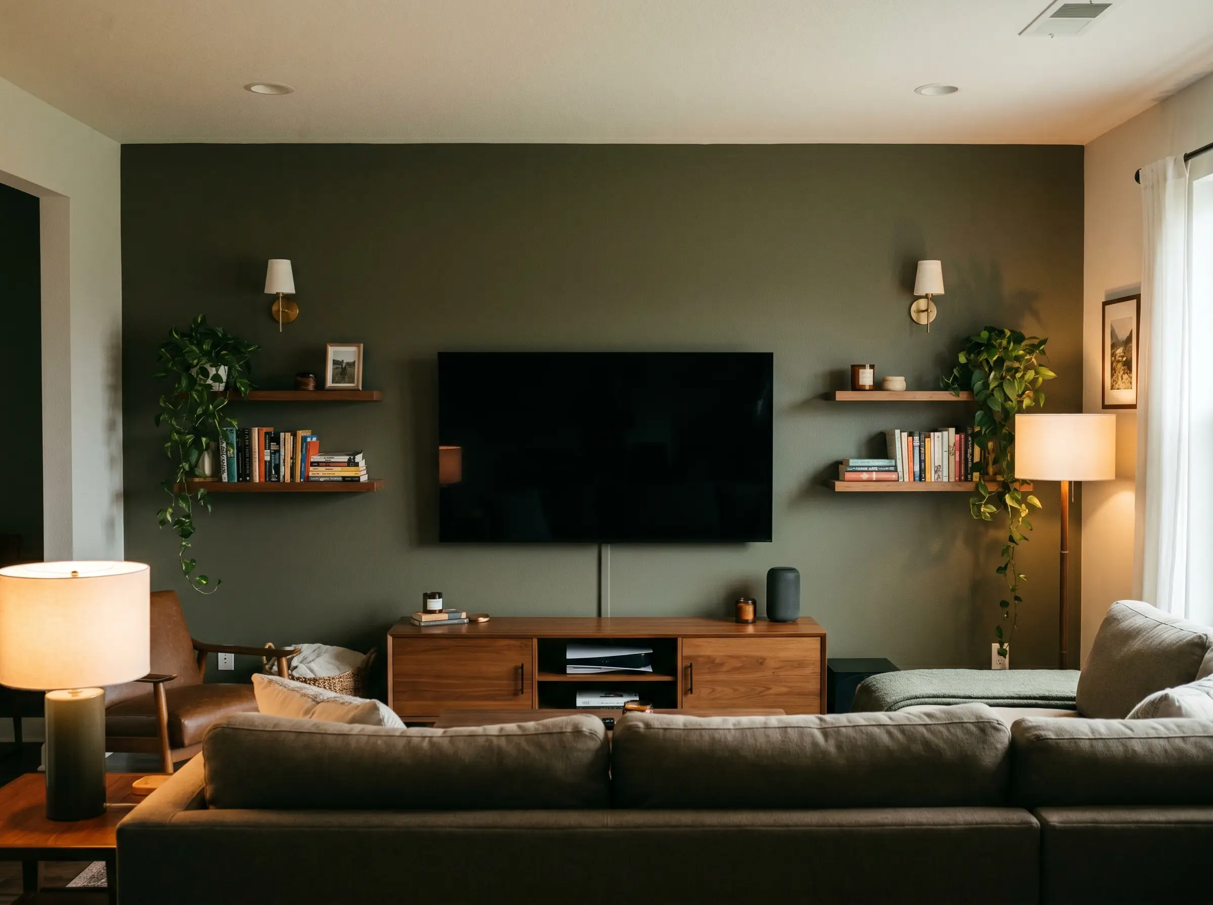
Deep olive green acts as the perfect camouflage for large black flat-screen televisions. Instead of a jarring black rectangle dominating a white wall, the TV visually recedes into the dark, earthy background.
Low-LRV (Light Reflectance Value) greens are exceptional at reducing screen glare. Painting your media wall a dark olive drastically improves the room’s television viewing experience by absorbing ambient light bounce.
Designer Secret
- Vibe: Cinematic, Grounded
- Key Material: Matte or flat paint finish
- Styling Pro-Tip: Mount the TV flush and flank it with warm wood shelving
Frame the Fireplace Surround
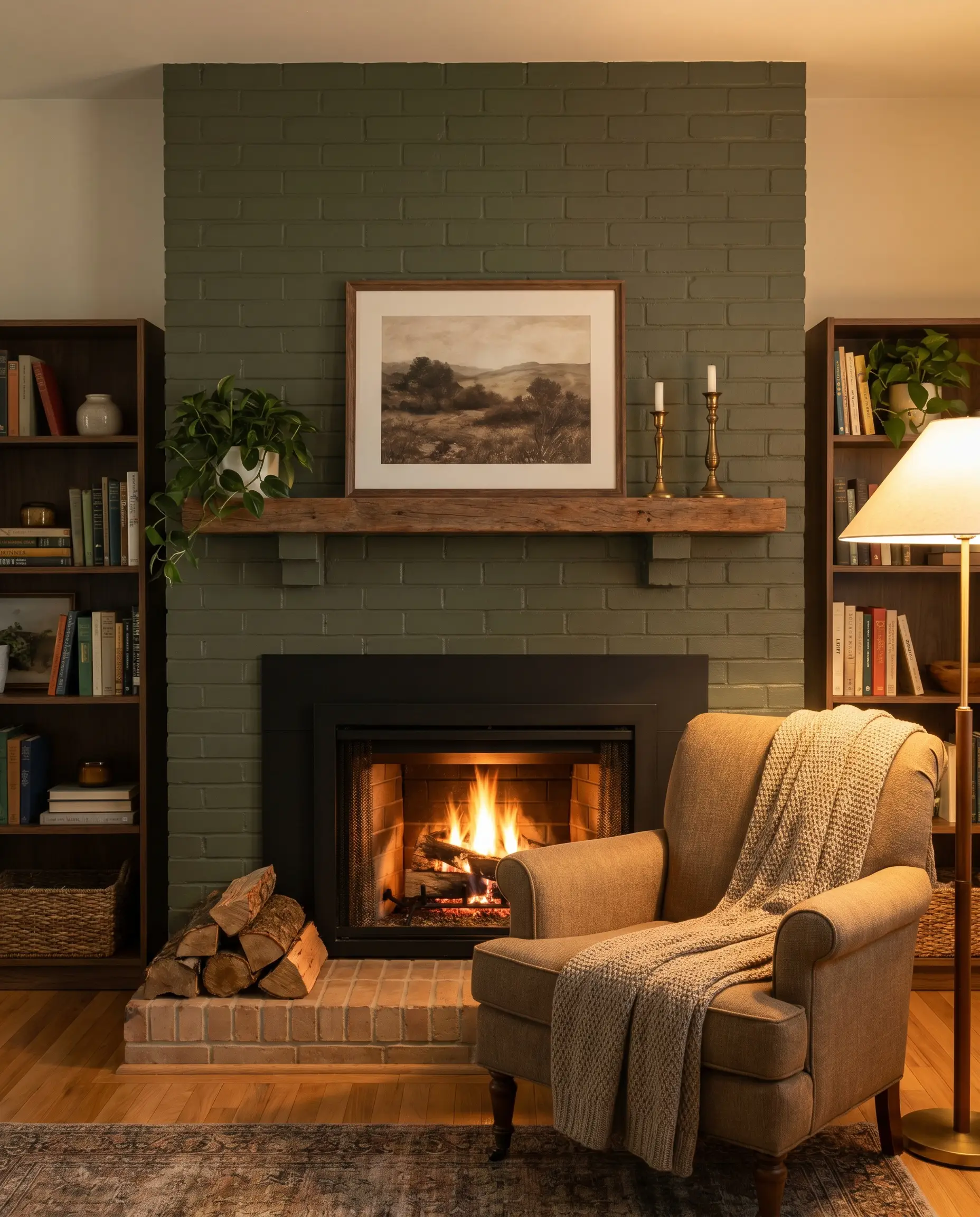
Painting the chimney breast or surrounding built-ins creates an immediate, commanding focal point. The rich olive tone contrasts beautifully against the raw texture of a brick hearth or the sleekness of black slate.
- Vibe: Cozy, Architectural
- Key Material: Heat-resistant masonry paint (if painting brick) or standard flat for drywall
- Color Match: Black firebox surrounds or natural terracotta brick
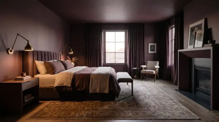
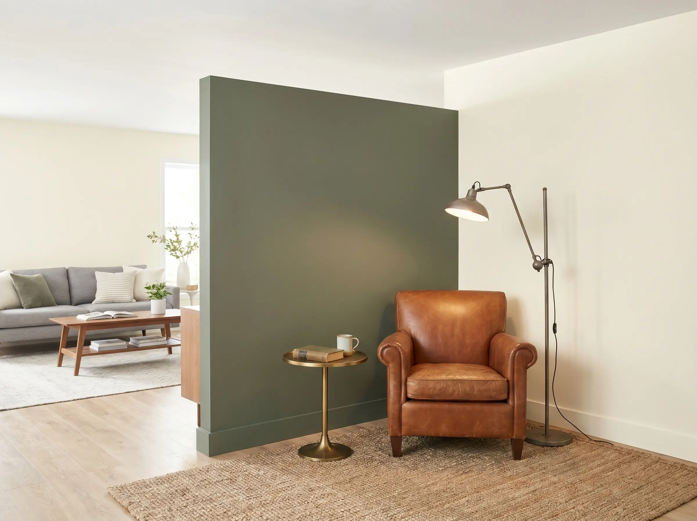
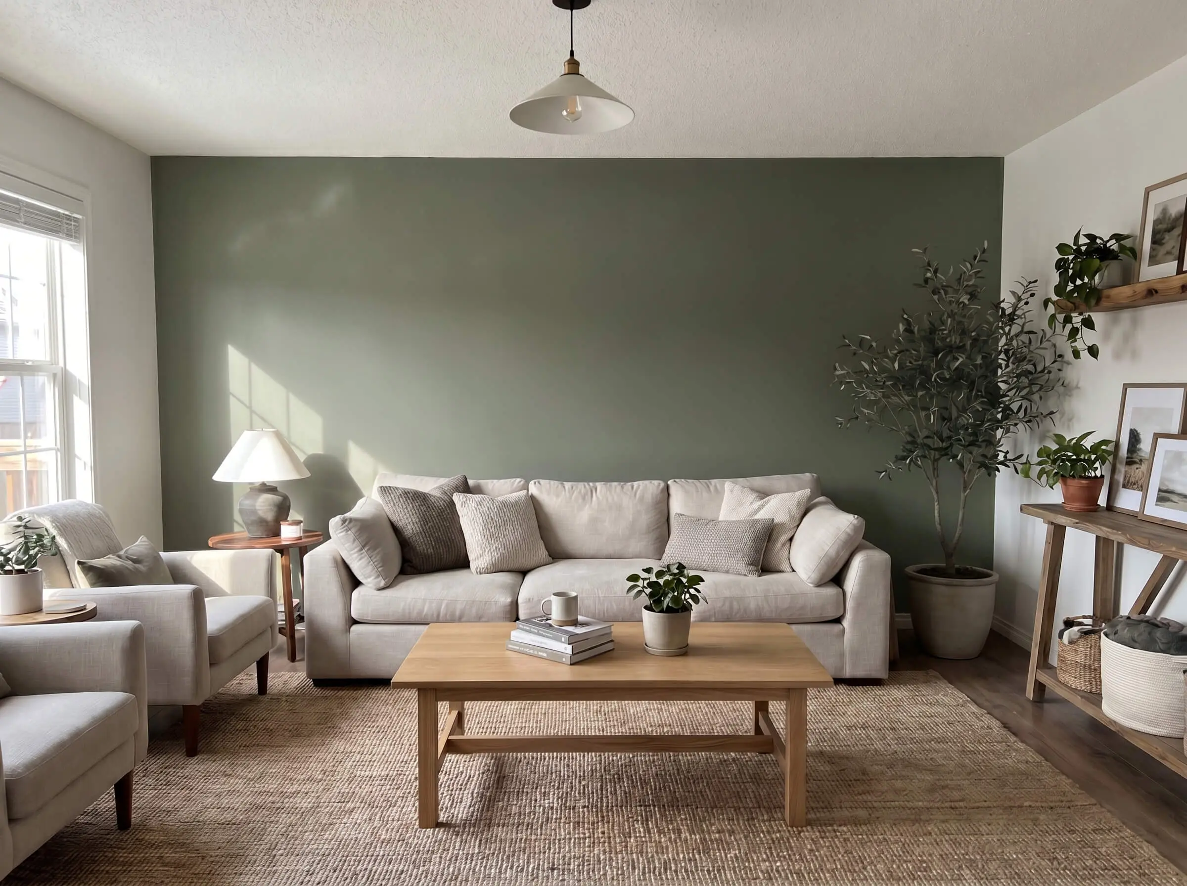
Ground the Sofa Wall
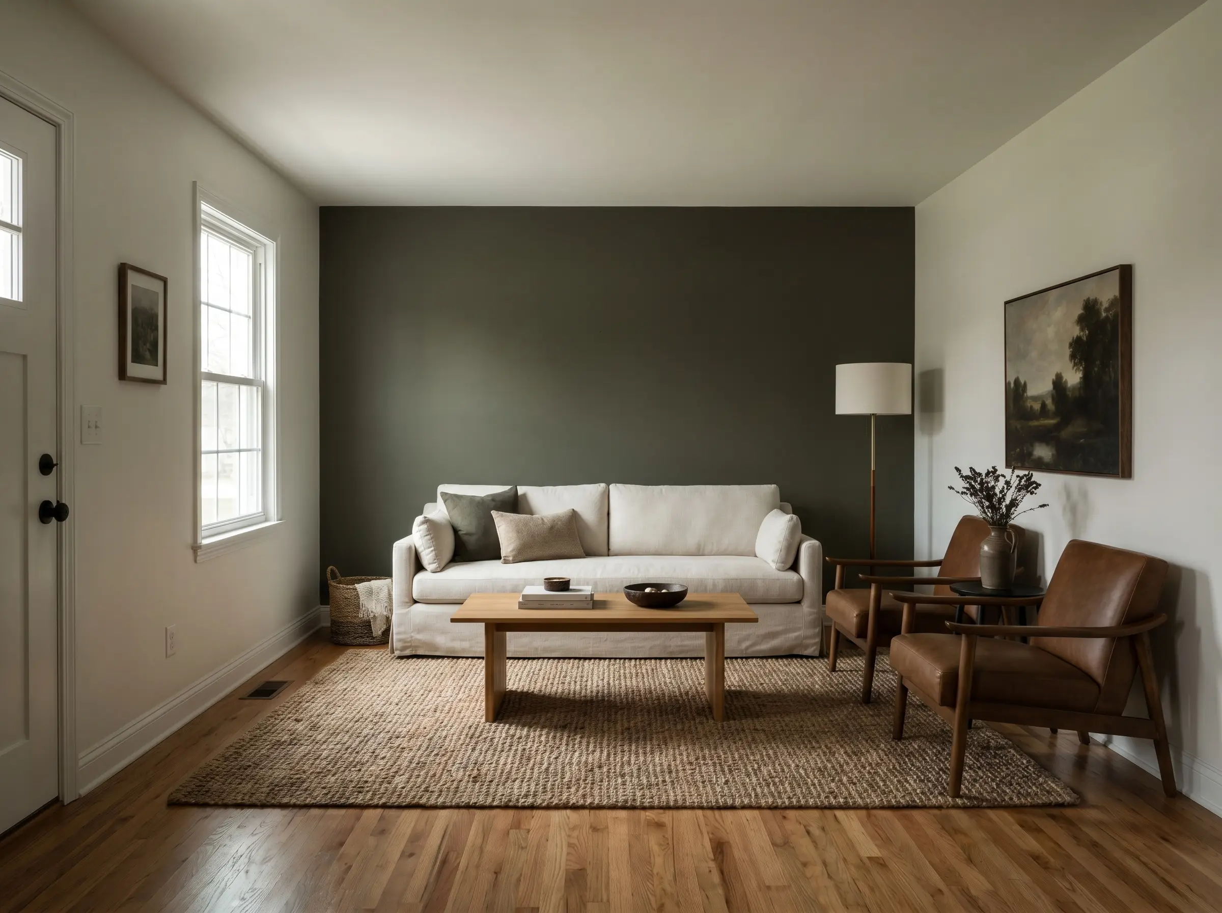
Grounding the space behind your main seating arrangement is a classic execution that creates instant, striking contrast. The dark wall pushes forward visually, making the seating area feel intimate and anchored.
- Vibe: Moody Transitional, Sophisticated
- Furniture Recommendation: Light-colored sofa (ivory, oatmeal, or light linen)
- Best For: Long, narrow living rooms to visually pull the back wall closer
Define an Open-Concept Nook
An olive accent wall effectively sections off a reading nook or small home office zone within a larger, open-plan living room. This color zoning uses color psychology to establish a calm, focused micro-environment separate from the main entertaining space.
- Vibe: Curated, Functional
- Styling Pro-Tip: Center a comfortable leather reading chair directly against the painted section
- Color Match: Keep adjacent walls a warm, neutral white
Essential Material & Furniture Pairings
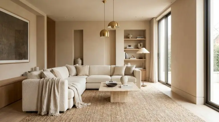
Olive green is a true chameleon that responds heavily to its surrounding materials. To successfully pull off this earthy hue, you must intentionally layer textiles, woods, and metals that complement its yellow and brown undertones.
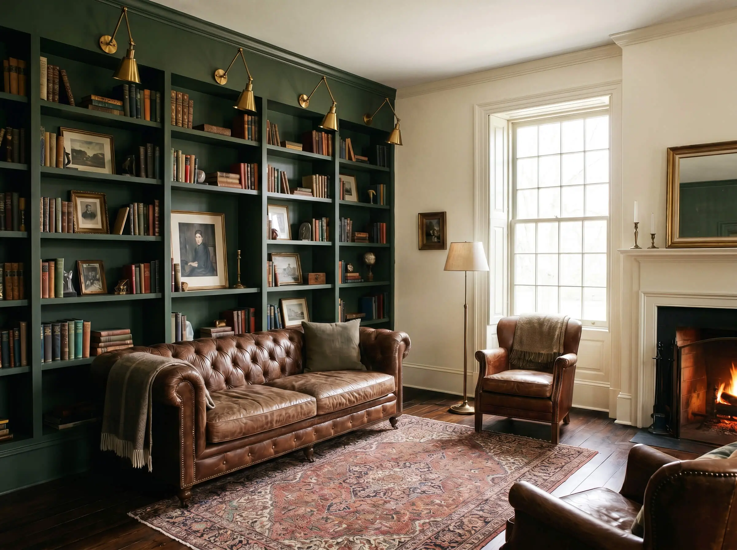
Warm the Room with Walnut and Teak Woods
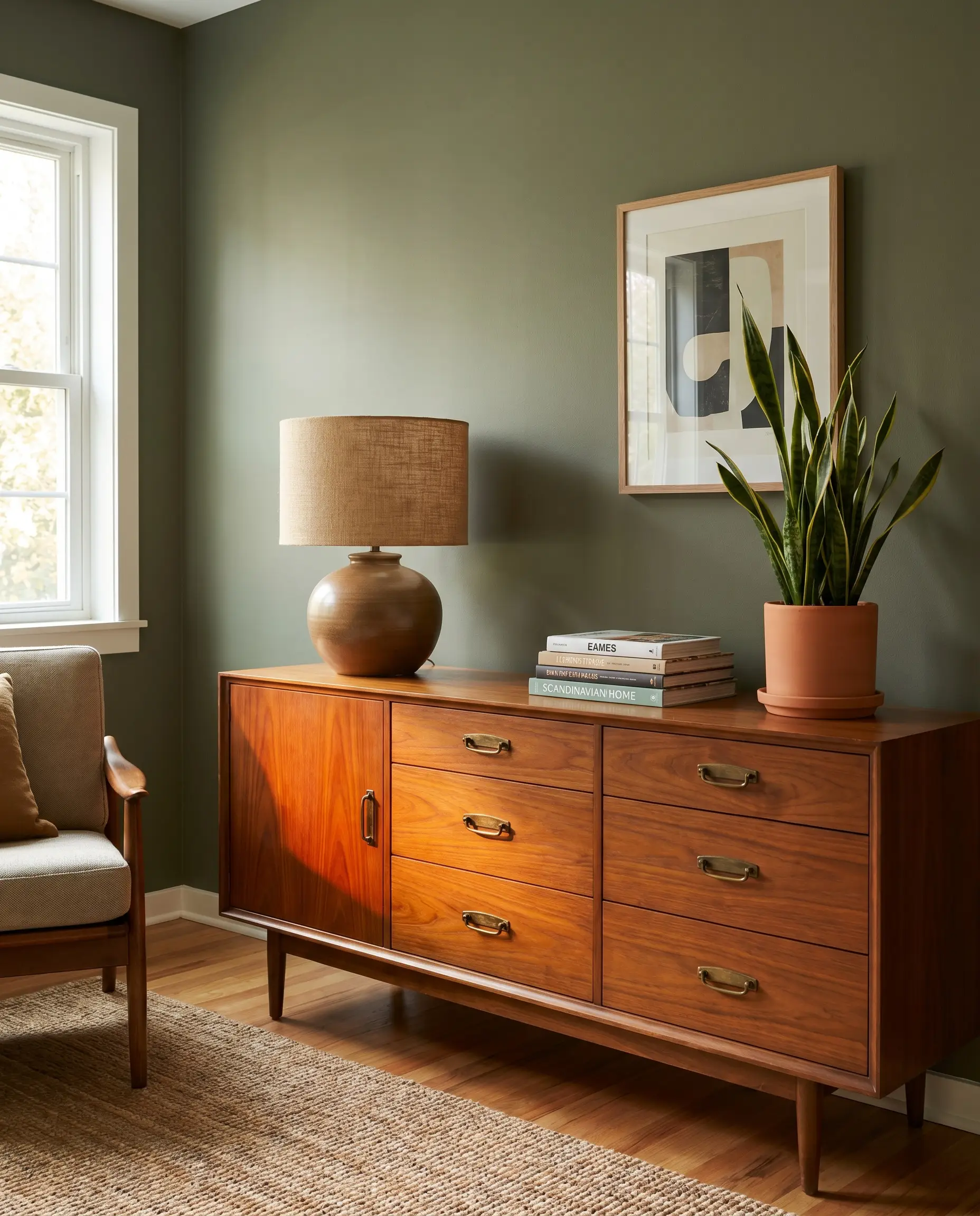
Mid-tone, warm woods like walnut and teak look infinitely better against olive than cool, gray-washed woods. The subtle orange and red undertones in the wood grain pop vibrantly against the matte green surface.
- Vibe: Mid-Century Modern, Warm
- Key Material: Solid walnut or teak credenzas and side tables
- Styling Pro-Tip: Maintain a matte or satin wood finish to match the earthy aesthetic
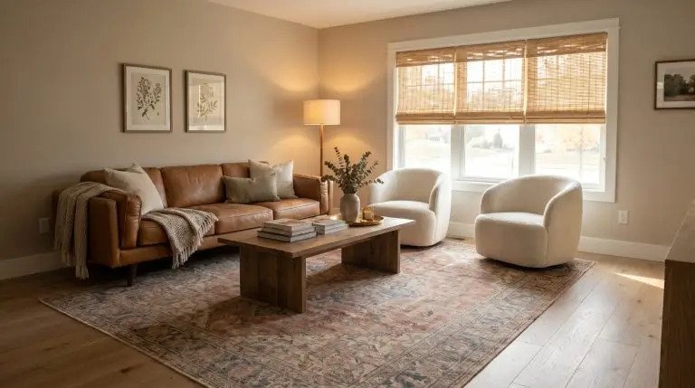
Introduce Cognac Leather Seating
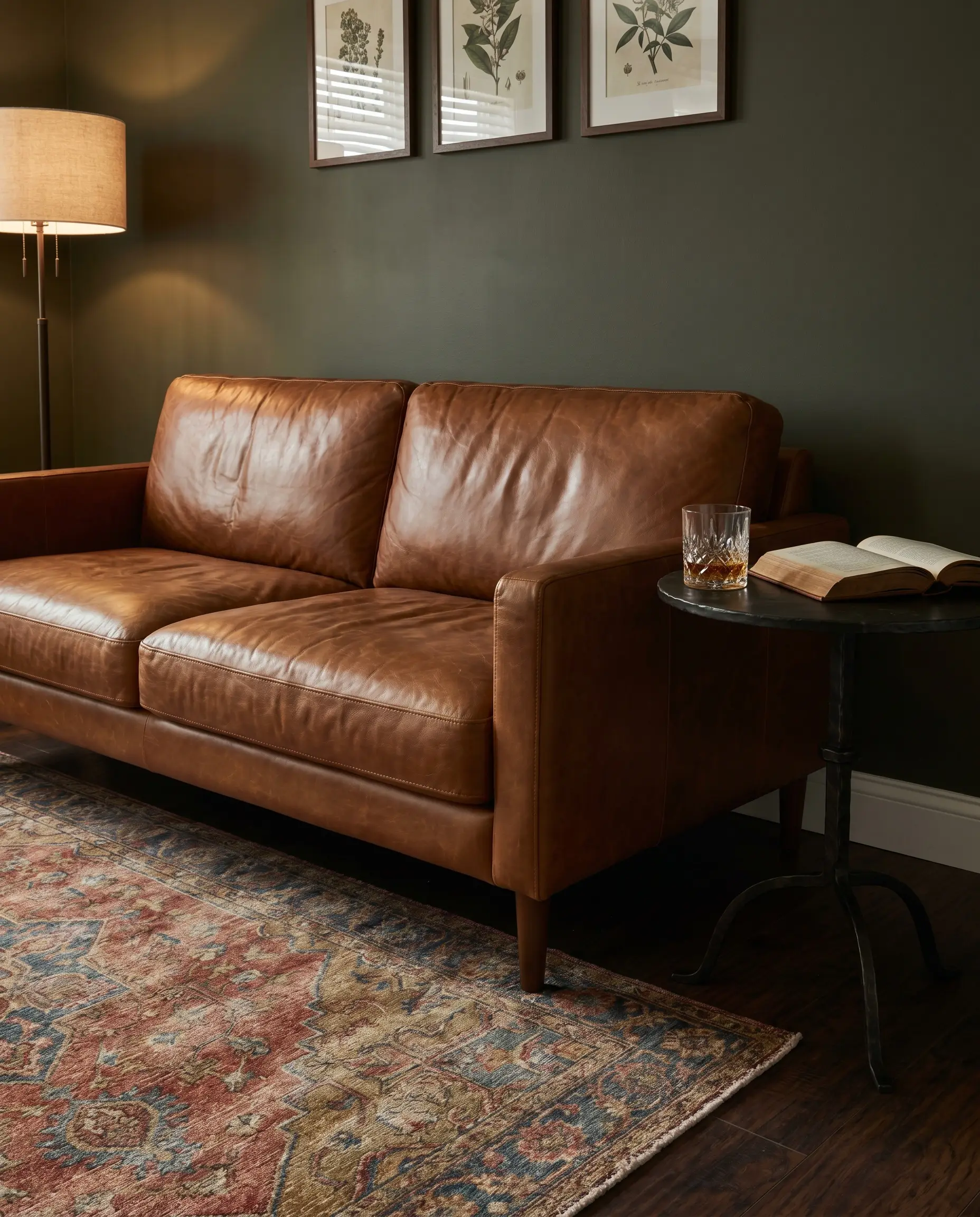
A cognac leather accent chair or sofa positioned against an olive wall creates an instant, sophisticated club-room aesthetic. The rich, amber tones of the leather provide necessary warmth to keep the green from feeling overly cool or severe.
- Vibe: Moody Transitional, Masculine
- Key Material: Full-grain cognac or caramel leather
- Best For: Mid-Century and Moody Transitional style profiles
Soften the Contrast with Ivory Bouclé
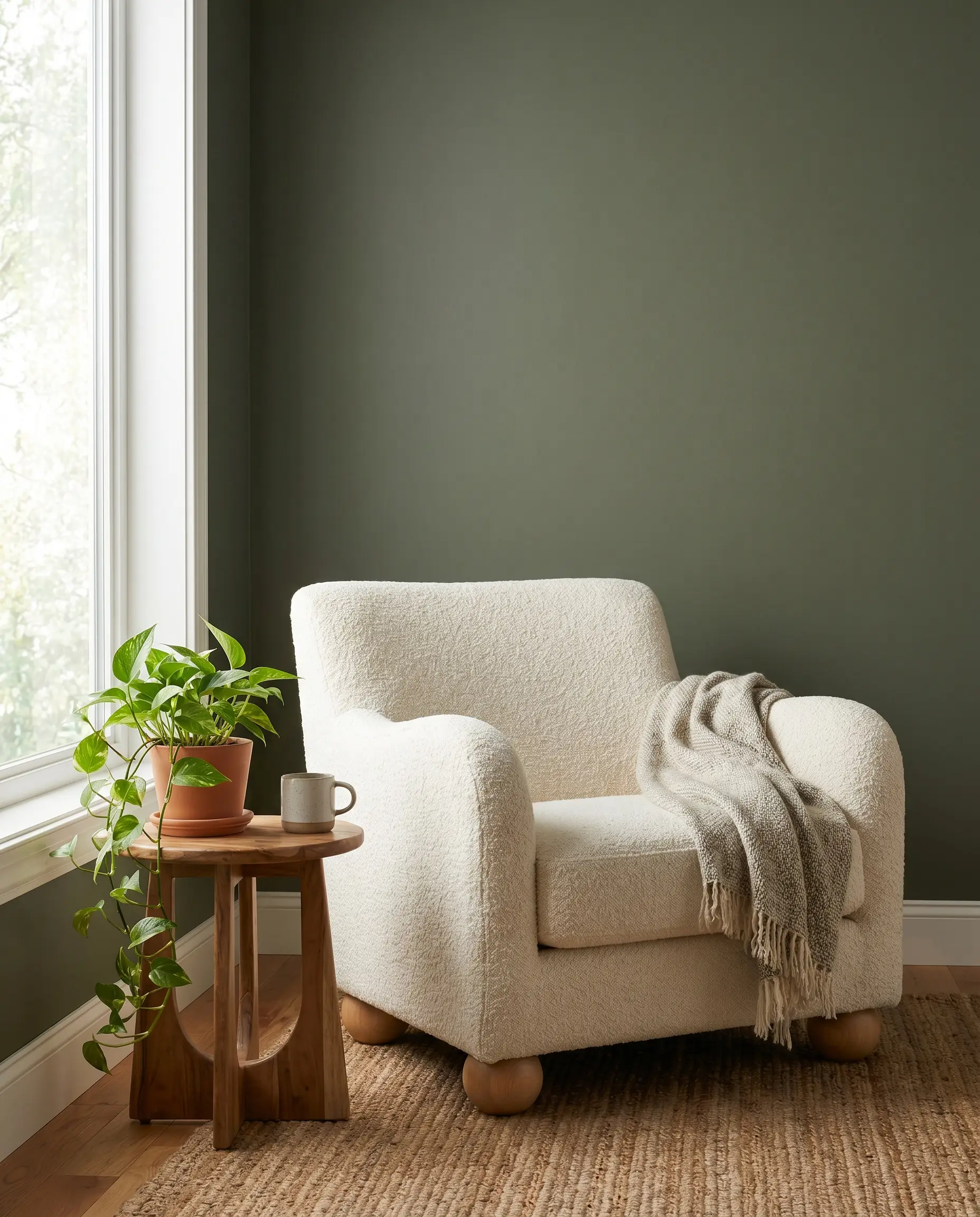
Ivory bouclé provides extreme textural contrast against a flat, dark wall, bringing an essential Organic Modern softness to the space. This juxtaposition of hard, dark paint and soft, light upholstery creates perfect visual balance.
- Vibe: Organic Modern, Tactile
- Key Material: Ivory or cream bouclé accent chairs
- Styling Pro-Tip: Pair with natural wood legs to tie the chair to the room’s earthy palette
Accentuate with Unlacquered Brass Hardware
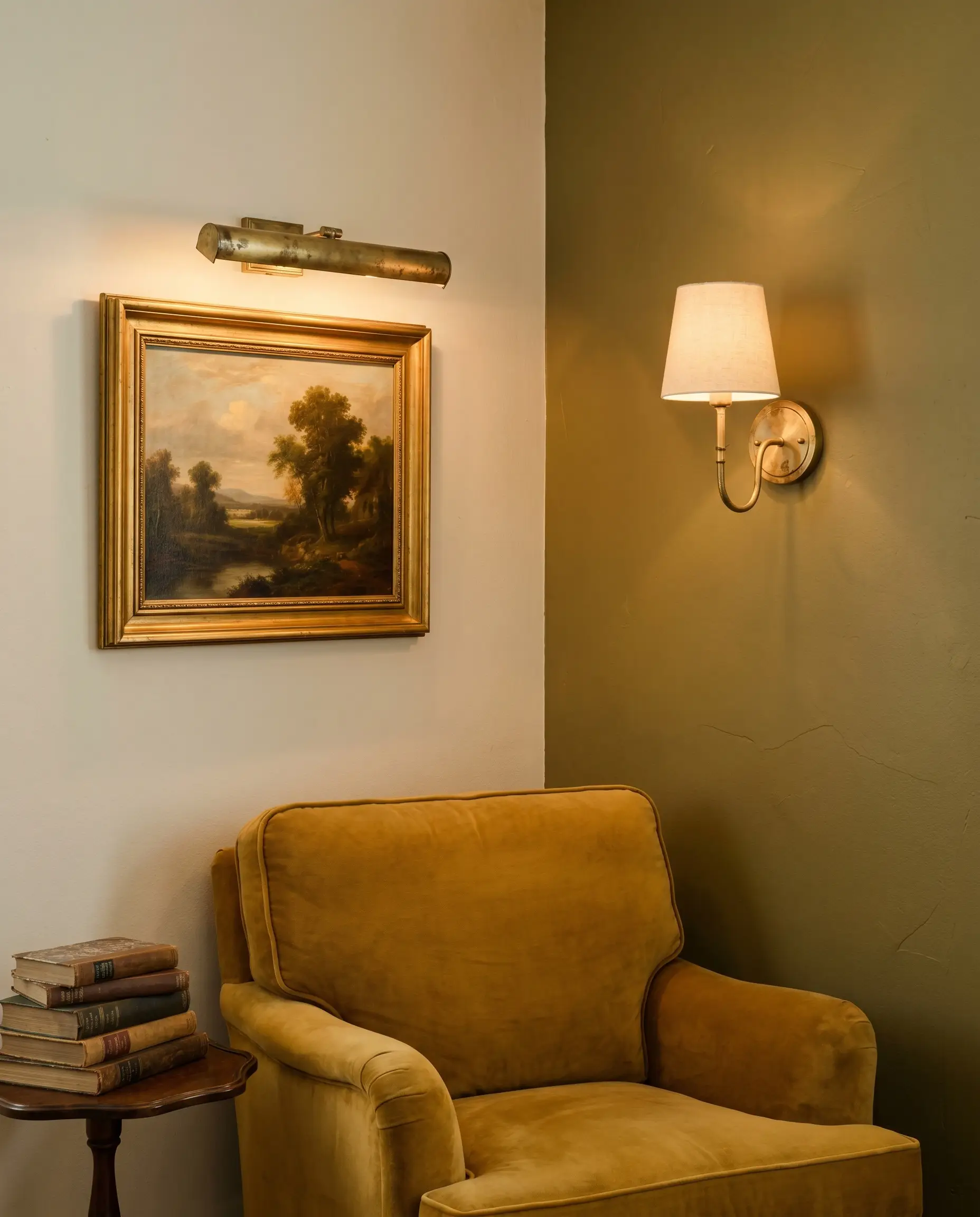
The yellow-gold tones of raw, unlacquered brass harmonize flawlessly with the warm undertones of a true olive. Whether through sconces, picture lights, or gallery frames, the metal adds a crucial touch of reflective brilliance.
Do not mix olive green walls with brushed nickel or cool, silver-toned metals. The blue/gray cast of nickel violently clashes with the yellow/brown base of olive, making the paint look swampy and sickly.
Undertone Warning
- Vibe: Timeless, Elegant
- Key Material: Unlacquered brass or aged brass hardware
- Styling Pro-Tip: Allow the brass to patina naturally over time for a lived-in look
Layer Natural Stone and Travertine
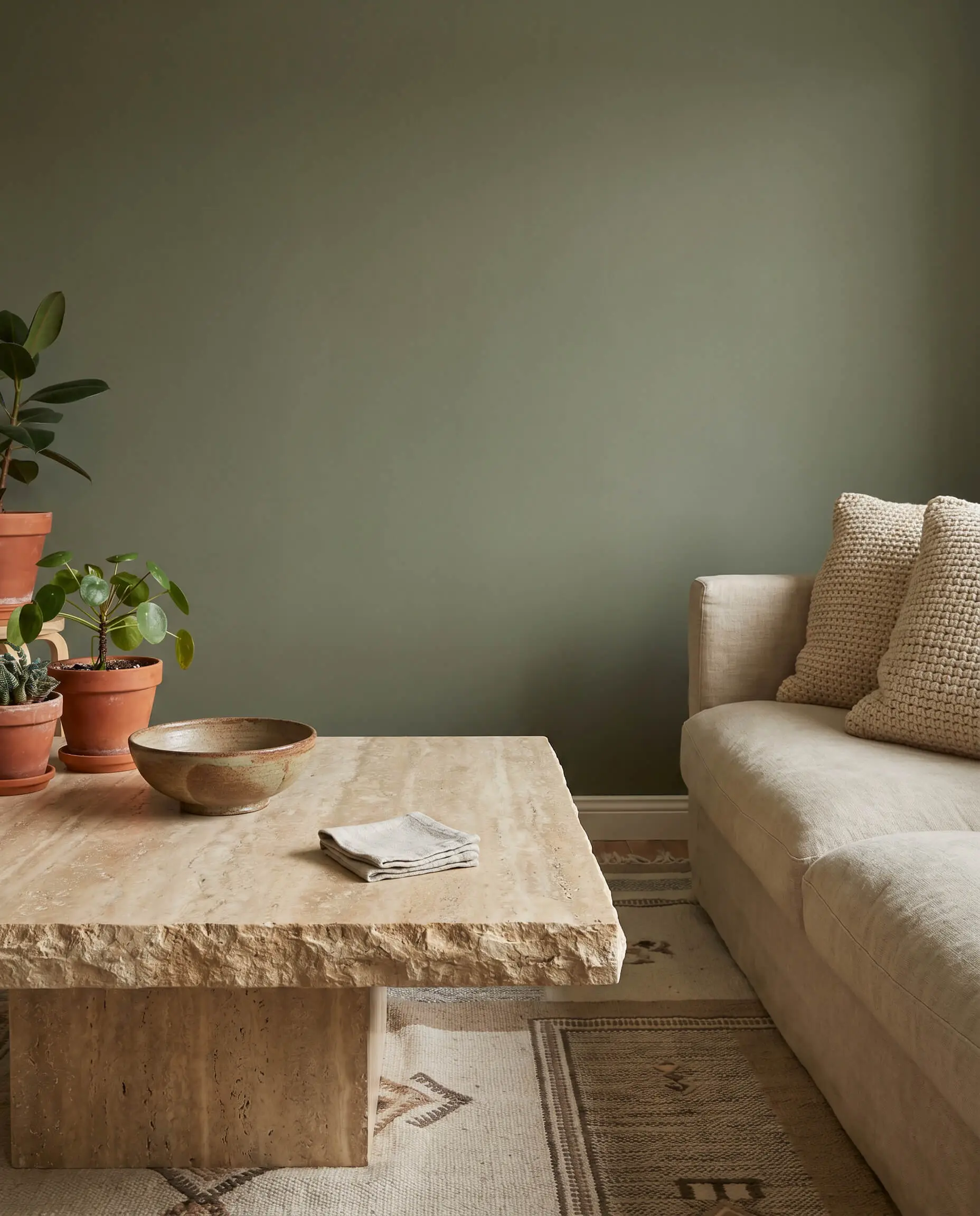
Layering a travertine coffee table or a limestone fireplace surround against the olive wall keeps the earthy, organic palette perfectly consistent. Honed, matte stones complement the grounded nature of the paint much better than highly polished marble.
- Vibe: Earthy, Architectural
- Key Material: Honed travertine, limestone, or soapstone
- Best For: Coffee tables, side tables, or hearth materials
Specific Color Profiles & Paint Selection
Choosing the right shade requires understanding LRV (Light Reflectance Value) and how the color reacts to your room’s specific orientation. Dark greens strictly require flat or matte sheens to hide drywall imperfections and absorb light, ensuring the color feels rich rather than plasticky.
| Brand | Color Name | LRV | Best For/Undertone |
|---|---|---|---|
| Benjamin Moore | Dark Olive (2140-30) | 13.01 | Bright rooms / Brown undertones |
| Sherwin Williams | Rosemary (SW 6187) | 14.00 | Organic Modern / Balanced gray-green |
| Farrow & Ball | Treron (No. 292) | 26.00 | English Cottage / Heavy gray-brown base |
| Benjamin Moore | Tate Olive (HC-112) | 19.55 | Mid-Century / Vibrant yellow base |
Deep and Moody: Benjamin Moore Dark Olive
This is a rich, heavily saturated olive that leans beautifully into a historical, library-esque aesthetic. Because its LRV sits around 13, it absorbs a massive amount of light, giving the room profound depth.
Do not use Benjamin Moore Dark Olive in completely windowless rooms unless you are intentionally creating a dark, cavernous media room. It requires ample natural light to prevent it from reading as black.
Hackrea Application Warning
- Vibe: Library, Historical
- Paint Recommendation: Benjamin Moore Dark Olive
- Sheen: Flat or Matte
Earthy and Organic: Sherwin Williams Rosemary
Rosemary is a highly popular, perfectly balanced green with just enough gray to keep it from looking like a vibrant crayon. This is the safest, most crowd-pleasing option for beginners wanting a true Organic Modern feel.
- Vibe: Organic Modern, Approachable
- Paint Recommendation: Sherwin Williams Rosemary
- Sheen: Flat or Matte
The True Drab: Farrow & Ball Treron
Treron is a classic, chalky olive with heavy gray and brown undertones that feels incredibly authentic to historical homes. It excels in traditional wainscoting applications where its drab, muted quality can shine.
- Vibe: English Cottage, Drab
- Paint Recommendation: Farrow & Ball Treron
- Sheen: Estate Emulsion (for walls) or Estate Eggshell (for trim)
Vibrant and Botanical: Benjamin Moore Tate Olive
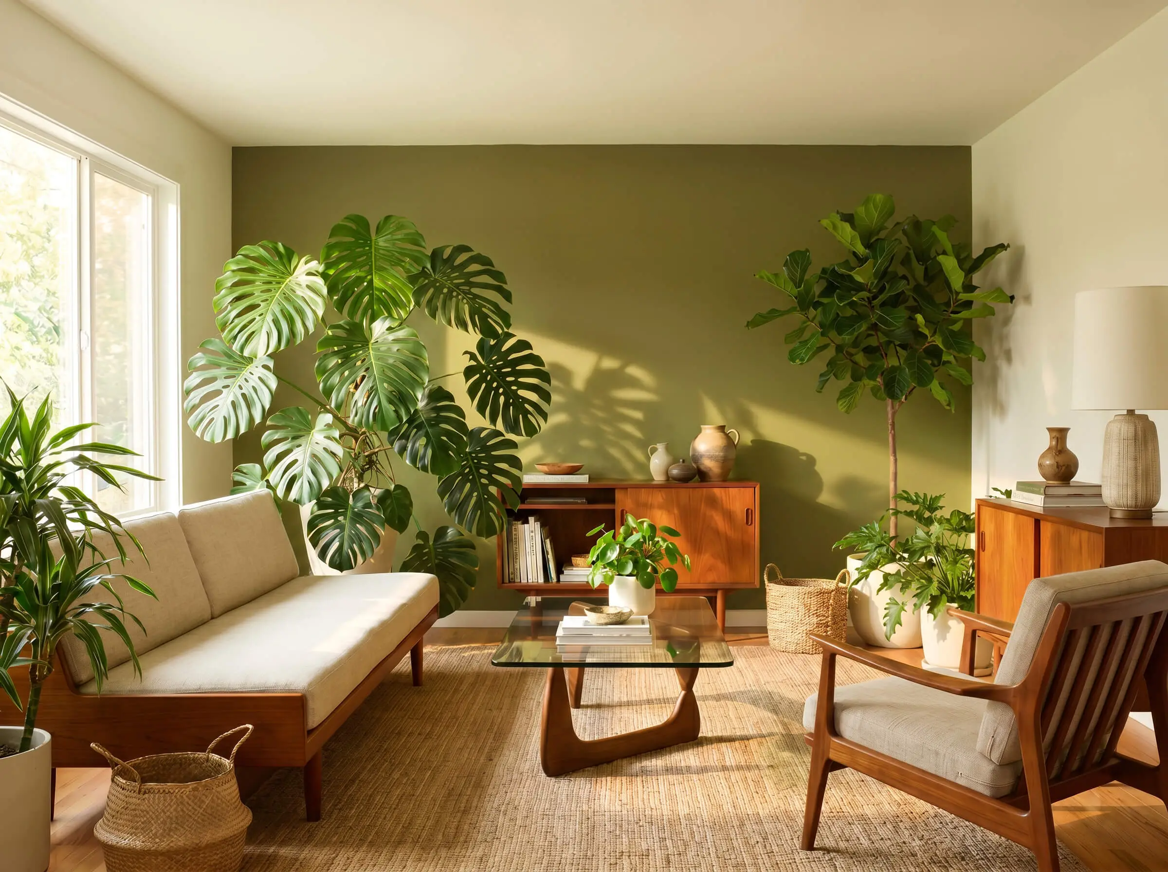
Tate Olive carries a slightly more yellow, vibrant base that injects immediate energy into the room. It acts as a stunning backdrop for spaces that prioritize organic elements and heavy indoor landscaping.
- Vibe: Botanical, Mid-Century Modern
- Paint Recommendation: Benjamin Moore Tate Olive
- Styling Pro-Tip: Pair heavily with natural indoor plants like Ficus Audrey or Monstera
Styling the Olive Wall (Art & Decor)
Once the wall is painted and your furniture is anchored, the surface must be styled so it doesn’t read as a massive dark void. Strategic art and lighting placements are required to break up the visual expanse.
Install Oversized Neutral Canvas Art
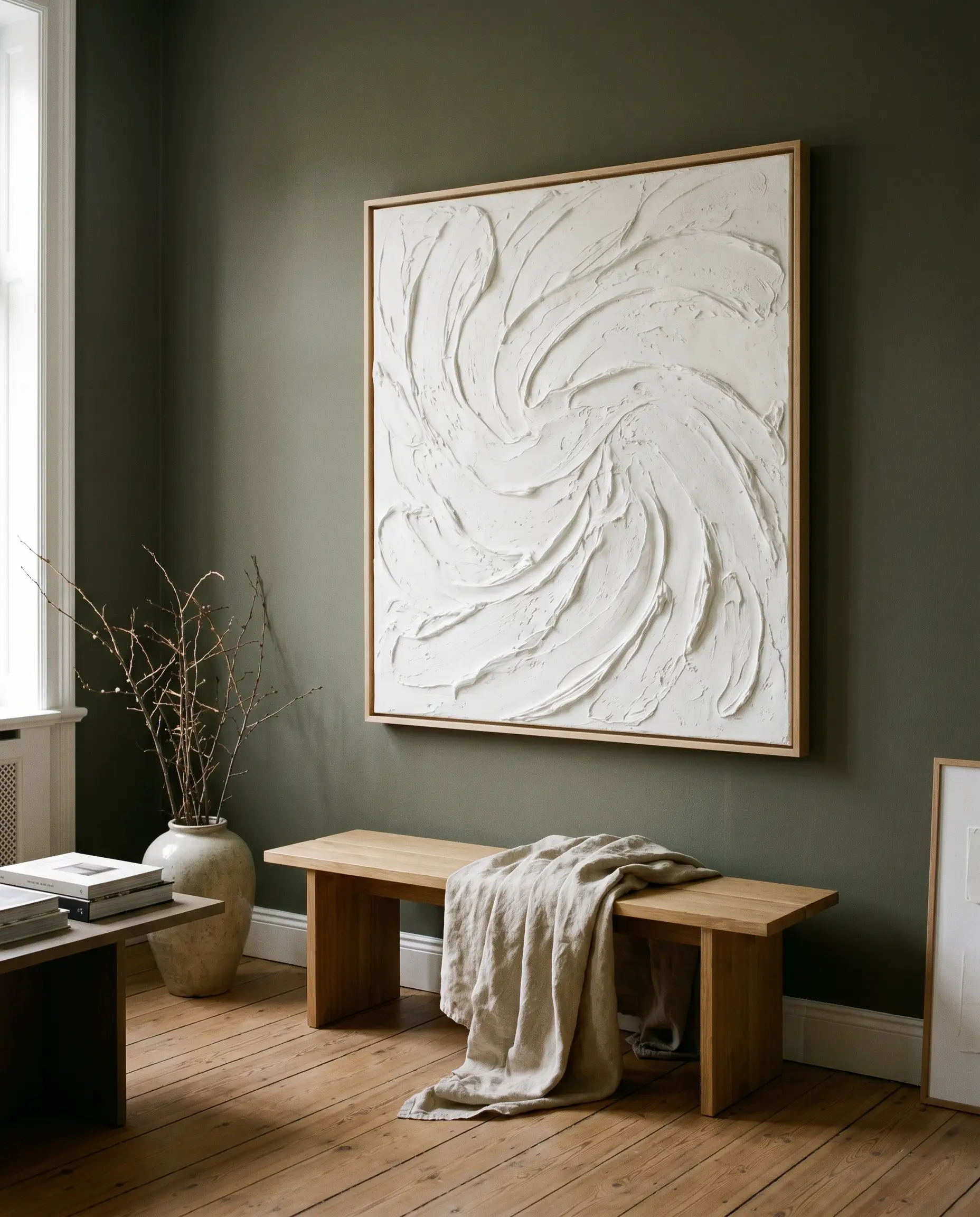
Breaking up the dark expanse with a large, textured white or cream canvas provides a crucial visual break that instantly brightens the room. Abstract or plaster art adds three-dimensional texture without cluttering the aesthetic.
- Vibe: Gallery, Minimalist
- Key Material: Plaster art, textured linen canvas
- Styling Pro-Tip: Use a light wood or brass float frame to separate the art from the wall
Mount Asymmetrical Brass Wall Sconces
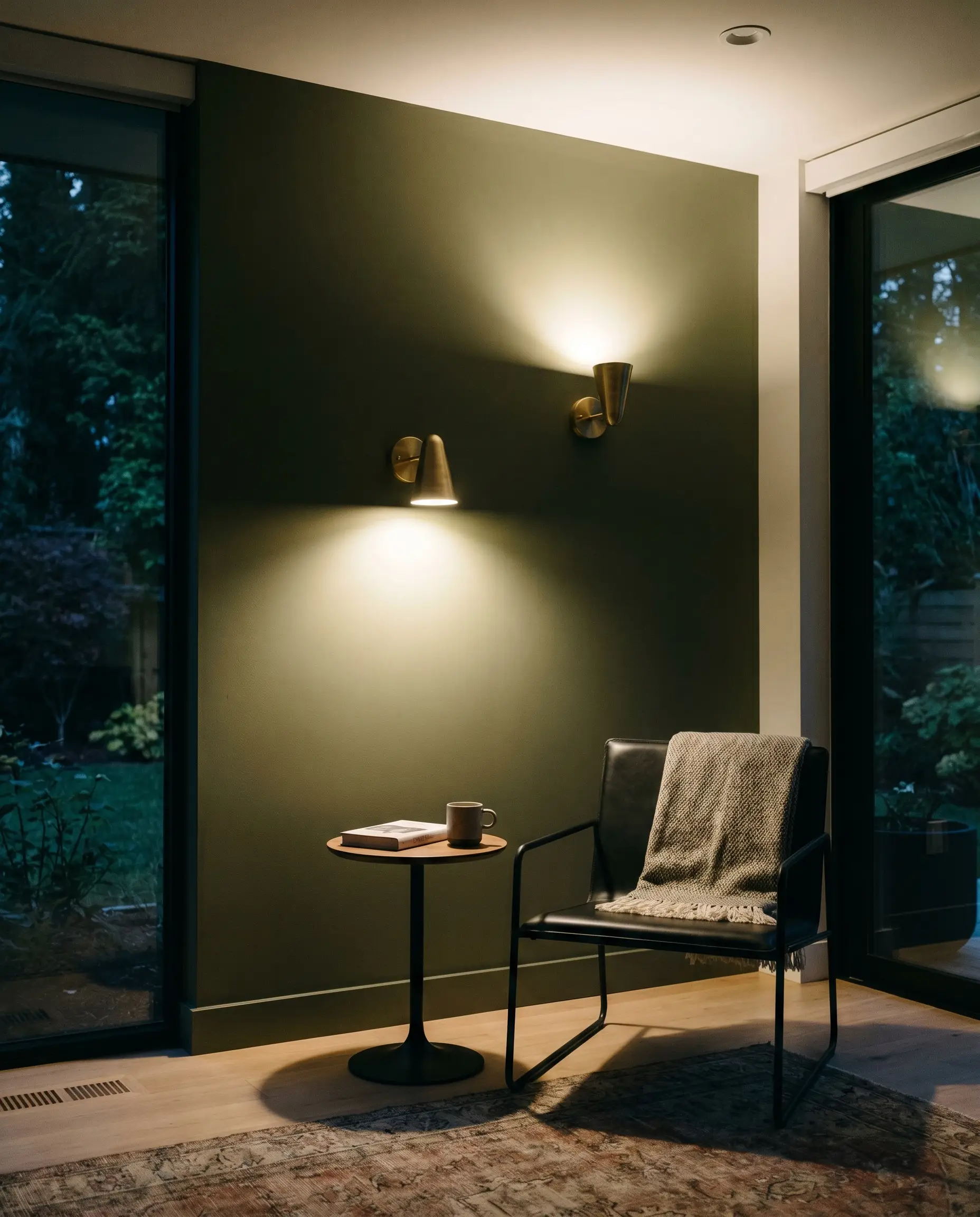
Hardwired or plug-in brass sconces cast warm, directional pools of light directly onto the olive paint, emphasizing its rich undertones. Positioning them asymmetrically adds a modern, architectural edge to the layout.
- Vibe: Architectural, Moody
- Key Material: Unlacquered brass sconces
- Color Match: 2700K warm-temperature LED bulbs to enhance the green at night
Curate a Floating Walnut Bookshelf
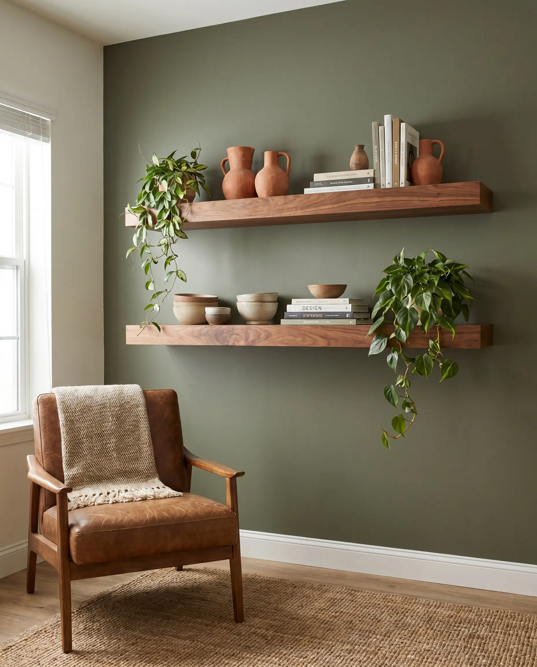
Installing a single or double floating walnut shelf directly against the green wall ties back perfectly to the room’s warm wood material palette. Styling it with terracotta ceramics and trailing greenery bridges the gap between architecture and decor.
- Vibe: Curated, Earthy
- Key Material: Solid walnut floating shelves
- Styling Pro-Tip: Keep shelf styling minimal to let the olive background show through
Executing Your Olive Green Anchor (Next Steps)
Your accent wall is an architectural anchor, not an afterthought. Before you start cutting in edges, order peel-and-stick samples or sample pots of your top three shades and observe how the undertones shift from morning to evening. Pick your preferred texture, secure your paint, and review our Living Room Lighting Placement guide to ensure your newly grounded, earthy space receives the exact illumination it deserves.
The Hackrea Style Desk treats interior decoration as an exact visual science. Rather than focusing on demolition or floor plans, this desk masters the art of color theory, undertone matching, material pairings, and spatial proportion. From balancing the visual weight of mixed metals to finding the perfect bridging tone between disparate wood species, this desk provides the rigorous aesthetic rules needed to achieve high-end, editorial-quality harmony in any space.