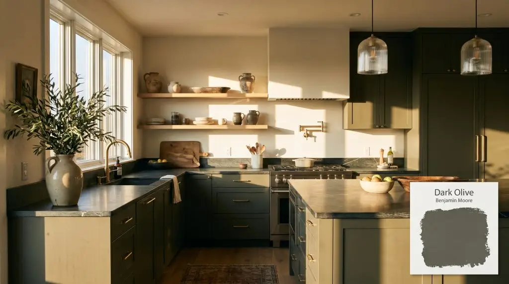
Benjamin Moore Dark Olive (2140-30) is a deeply saturated, muted green with strong earthy, yellow-brown undertones. With an LRV of 13.52, it absorbs significant light, creating a moody, sophisticated atmosphere perfect for cabinetry, dramatic bedrooms, and grounding accent walls.
Will Dark Olive clash with your room?
Paint Technical Profile
| Color ID / SKU | 2140-30 |
| HEX Code | #616253 |
| Light Reflectance (LRV) | 13.52 |
| Use | Interior, Exterior |
| Best Exposures | South-facing, West-facing, or North-facing (for moody depth) |
| Best For | Cabinets, accent walls, moody bedrooms, exterior trim |
Benjamin Moore Dark Olive: The Substantial Green That Roots Your Space
When homeowners want to make a dramatic statement, the default instinct is often to reach for a stark charcoal or a predictable navy. But there is a much more nuanced way to establish presence in a room without resorting to cold, flat tones. Benjamin Moore Dark Olive 2140-30 steps into this role beautifully, offering a dense, living color that stabilizes a space while feeling deeply connected to the natural world.
This specific shade is not your typical vibrant emerald or playful mint. It is a highly sophisticated, moody architectural finish that commands attention the moment you walk into the room. By understanding its unique chromatic profile, you can use this rich green to completely transform the energy and visual boundaries of your home.
Undertones & LRV of Dark Olive
If you are wondering whether Benjamin Moore Dark Olive leans warm or cool, the definitive answer is warm. This inherent warmth is the secret to its versatility, allowing it to feel cozy and inviting even in spaces that lack abundant natural light. To truly understand how this color behaves on the wall, we have to look at the specific elements that make up its DNA.
With a light reflectance value (LRV) of 13.52, this paint is highly light-absorbing. It operates as a substantial, dense tone that physically draws the walls inward, creating a sense of intimacy and wrapping the room in a comforting embrace. Rather than reflecting light around the space, it absorbs ambient lighting to create a rich, velvety atmosphere.
Lighting Effects & The Chameleon Factor
Because of its complex color structure, this muted green hue is highly reactive to its environment. The direction of your natural light will completely alter which part of its personality steps forward.
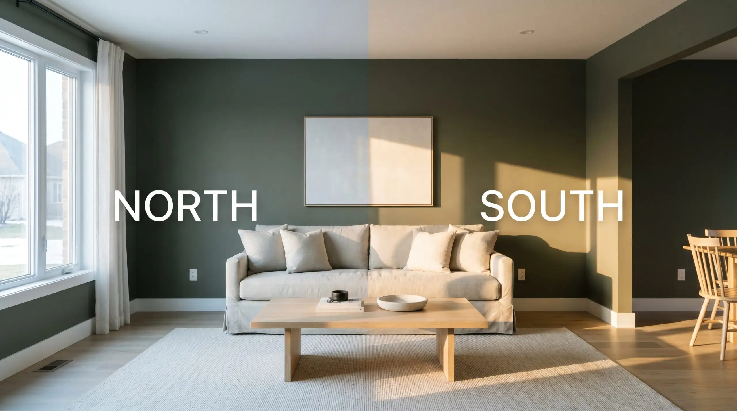
Popular Applications for BM 2140-30
Understanding how this color shifts in the light is only half the battle. The real magic happens when you strategically apply this earthy base to the right architectural features and spaces in your home.
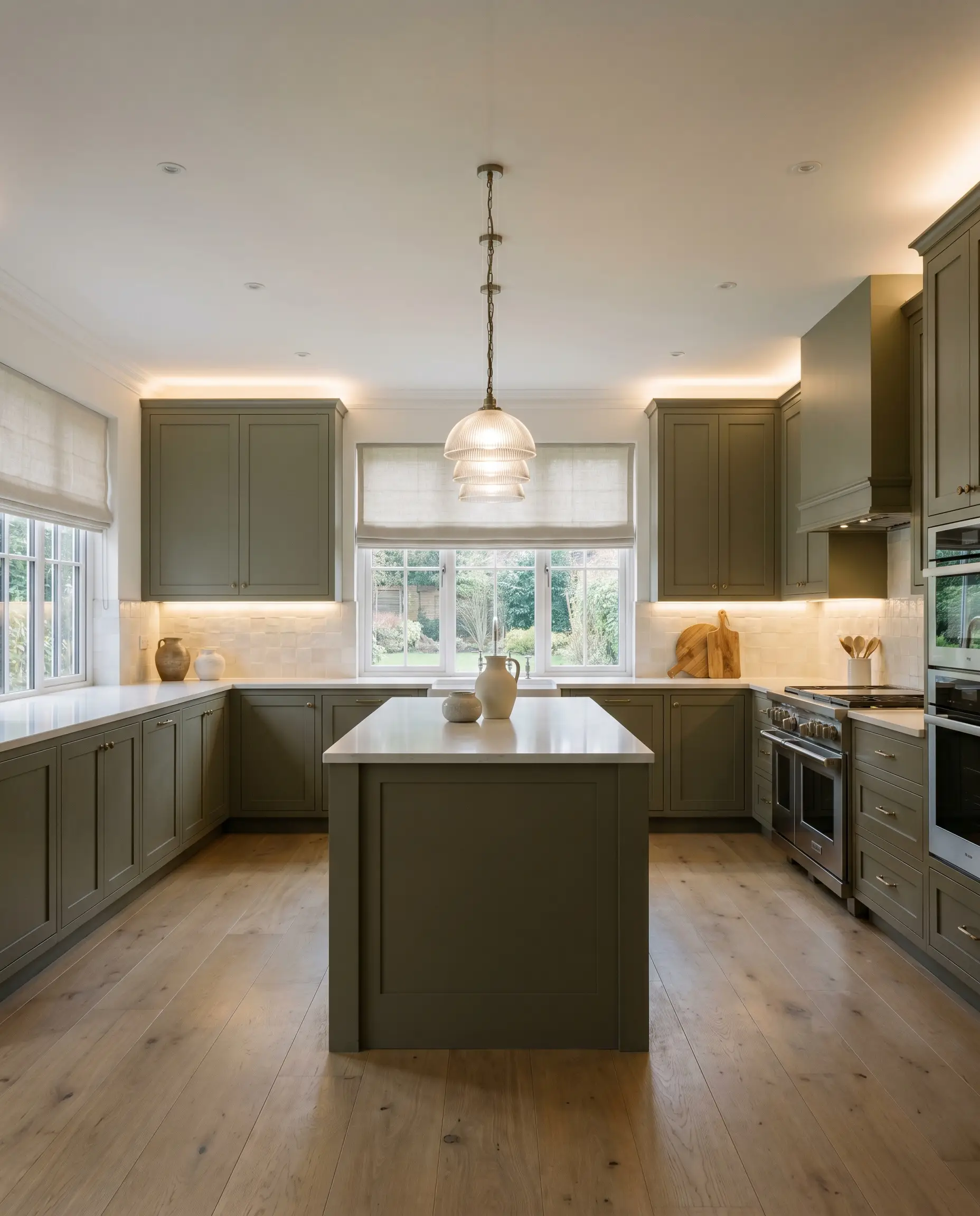
Kitchen and Bathroom Cabinetry
Using this dense green on cabinetry immediately elevates standard builder-grade kitchens and bathrooms into bespoke, curated spaces. For an Organic Modern approach, pair flat-panel cabinets with honed soapstone countertops and floating white oak shelves. The organic warmth of the wood beautifully highlights the khaki undertones in the paint.
If you prefer a Transitional style, apply it to classic shaker doors. Always opt for a satin or semi-gloss finish on cabinetry to ensure durability and to give the dark pigment a subtle, light-catching sheen. It looks incredibly striking when set against a backdrop of handmade zellige tile and fluted glass pendants.
Will Dark Olive work with your specific lighting, floor, or furniture?
Moody Primary Bedrooms
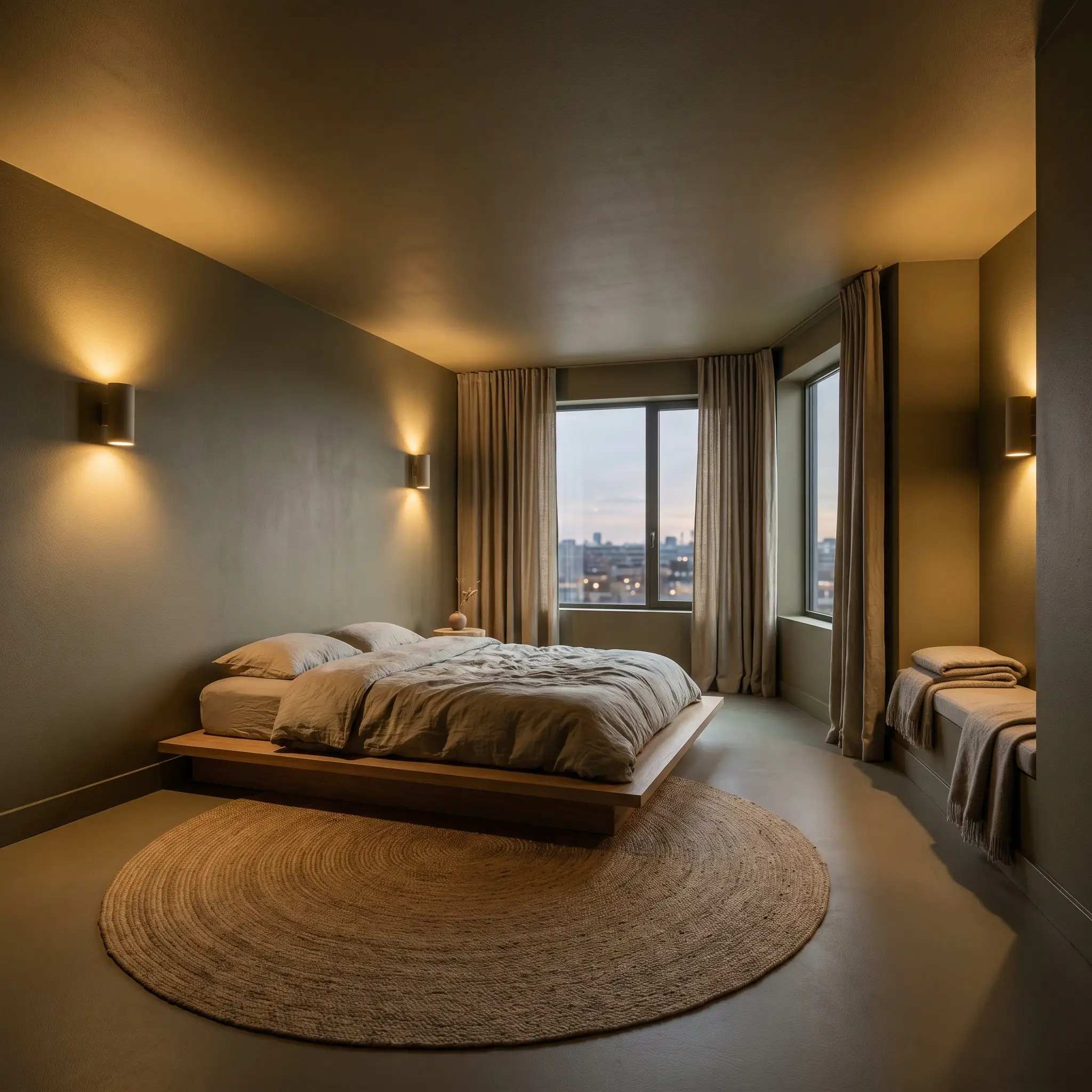
This color is practically built for spaces where you want to unwind and disconnect. To maximize its immersive qualities, consider color-drenching the room by taking the paint across the walls, baseboards, and even the ceiling. This technique erases the visual boundaries of the room, creating a seamless, tent-like canopy.
To keep the room from feeling like a cave, introduce plenty of tactile contrast. Layer the bed with washed linen sheets, a nubby boucle accent chair, and raw silk drapery. These varied textures catch the ambient lighting differently, adding necessary visual movement against the dark walls.
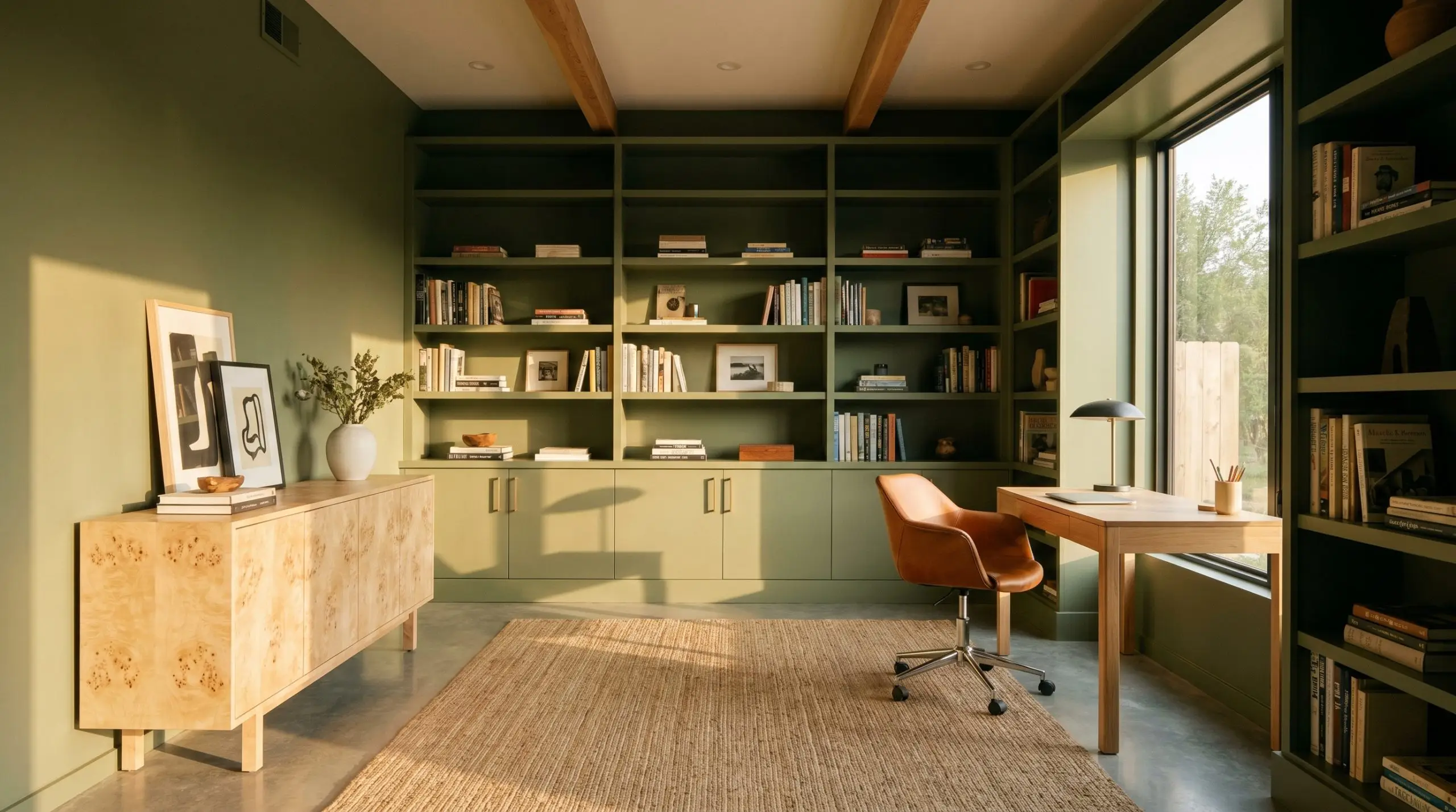
Home Offices and Libraries
You do not need a historic, wood-paneled mansion to create a sophisticated study. Painting standard built-in bookcases and the surrounding walls in this rich olive instantly mimics the feel of a high-end library. The yellow-brown cast provides a brilliant backdrop for styling open shelving with stacked vintage art, asymmetrical pottery, and brass gallery rails.
When using a color this saturated in a workspace, avoid pairing it with equally dark, heavy furniture. Instead, introduce a saddle leather desk chair or a light-toned burl wood credenza to create intentional, breathable contrast.
Hackrea Pro-Tip (The Upholstery Balance)
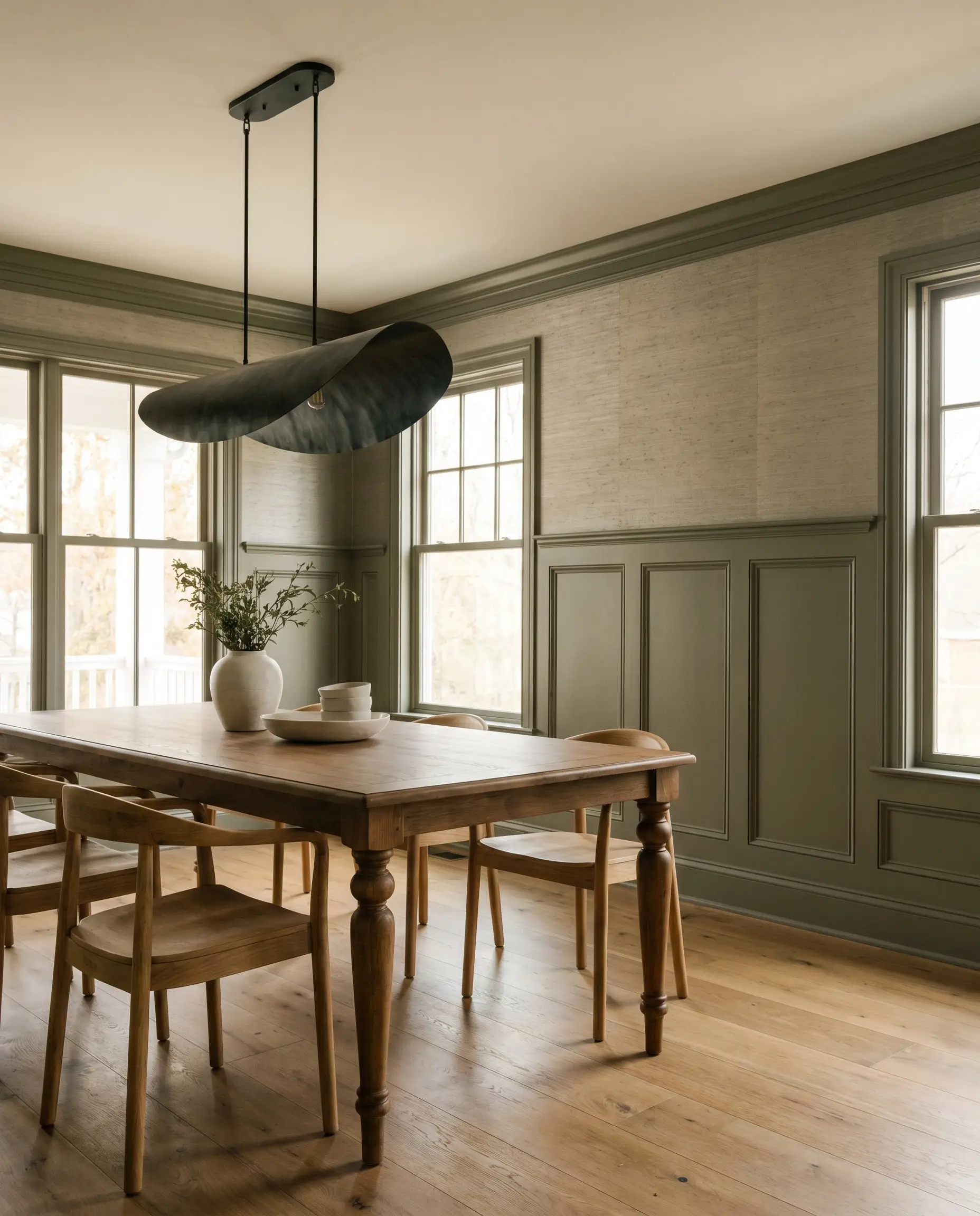
Dining Rooms with Traditional Wainscoting
If you are hesitant to commit to a fully dark room, classic wainscoting offers the perfect architectural compromise. Applying this paint to the lower third of the wall tethers the dining room, providing a substantial base for the furniture. Keep the upper walls light and airy, or introduce a subtle metallic grasscloth wallpaper for a touch of evening glamour.
To modernize the traditional paneling, avoid predictable crystal chandeliers. Instead, hang a sculptural, blackened steel light fixture and bring in an oversized abstract canvas. This unexpected mix of classic architecture and modern styling keeps the room feeling fresh and dynamic.
Coordinating Colors & Best Pairings
The secret to styling this earthy green lies in how you manage its visual weight. Because it is so dense, it requires thoughtful material and color pairings that either match its richness or provide a crisp, illuminating contrast.
Trim & Baseboards
To maintain the sophisticated energy of the room, your trim color needs to respect the warm olive tone. Sherwin-Williams Greek Villa SW 7551 is a phenomenal choice; its subtle creaminess prevents a harsh, jarring contrast while still providing a tailored boundary. If you want a slightly softer, more historic transition, Farrow & Ball School House White No. 291 offers a beautifully muted, shadowed edge that blends seamlessly with the green.
Hardware, Wood & Material Pairings
When selecting materials, you want elements that speak directly to the yellow-brown cast hidden within the paint. A mix of accessible, everyday textures and one high-end finish will make the space feel effortlessly curated.
Coordinating Colors
Building a bespoke palette around this paint requires secondary colors that either gently cool it down or boldly enhance its warmth.
Designer Mood Boards
To help you visualize how these elements interact, here are two distinct aesthetic pathways for utilizing this color in your home.
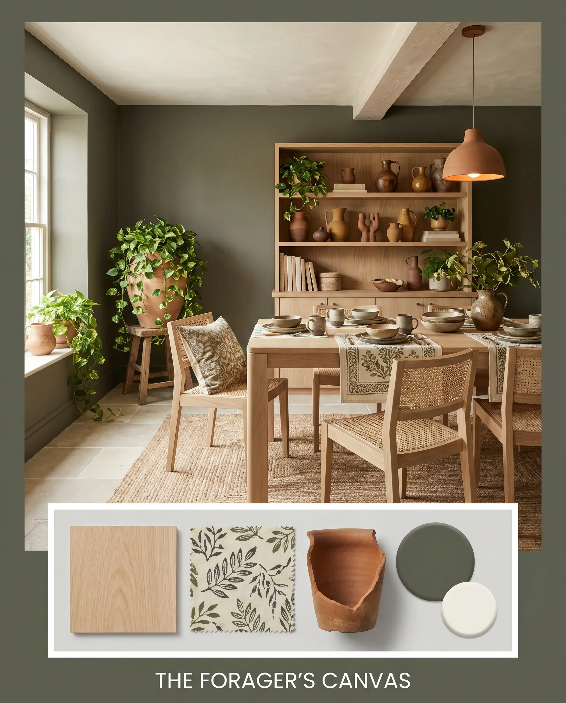
The Forager’s Canvas This palette leans entirely into the organic, earthy nature of the paint. Imagine the walls acting as a lush backdrop for pale white oak furniture and heavily textured, block-printed cotton textiles. We introduce Swiss Coffee on the ceiling to keep the atmosphere expansive, while handmade terracotta pottery and trailing pothos plants add layers of natural, tactile warmth. The overall energy is incredibly serene, grounded, and deeply connected to the outdoors.
Will Dark Olive work with your specific lighting, floor, or furniture?
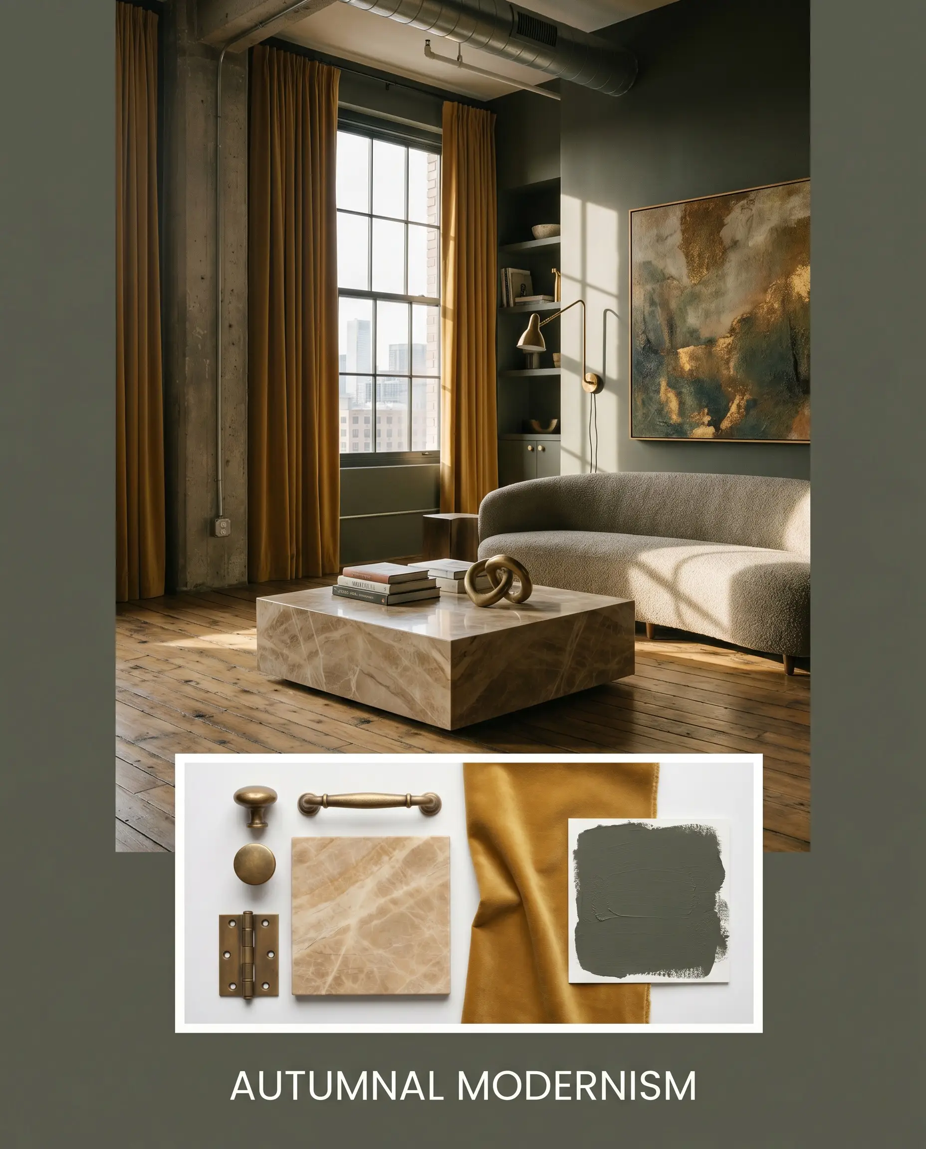
Autumnal Modernism For a more sophisticated, high-contrast aesthetic, we amplify the drama. The rich olive walls are punctuated by the bold, mustard warmth of Tarnished Trumpet on an accent piece or through velvet drapery. Unlacquered brass hardware provides that essential metallic shine, catching the light and breaking up the dark pigment. By styling the space with a sleek marble plinth coffee table and an oversized abstract canvas, the mood shifts to something highly curated, tailored, and undeniably modern.
Will Dark Olive work with your specific lighting, floor, or furniture?
Head-to-Head Comparisons
Sometimes, the specific lighting in your home dictates that you need a slight pivot. Comparing this shade to its closest rivals helps clarify exactly which green will perform best on your walls.
Benjamin Moore Dark Olive vs. Sherwin-Williams Rosemary
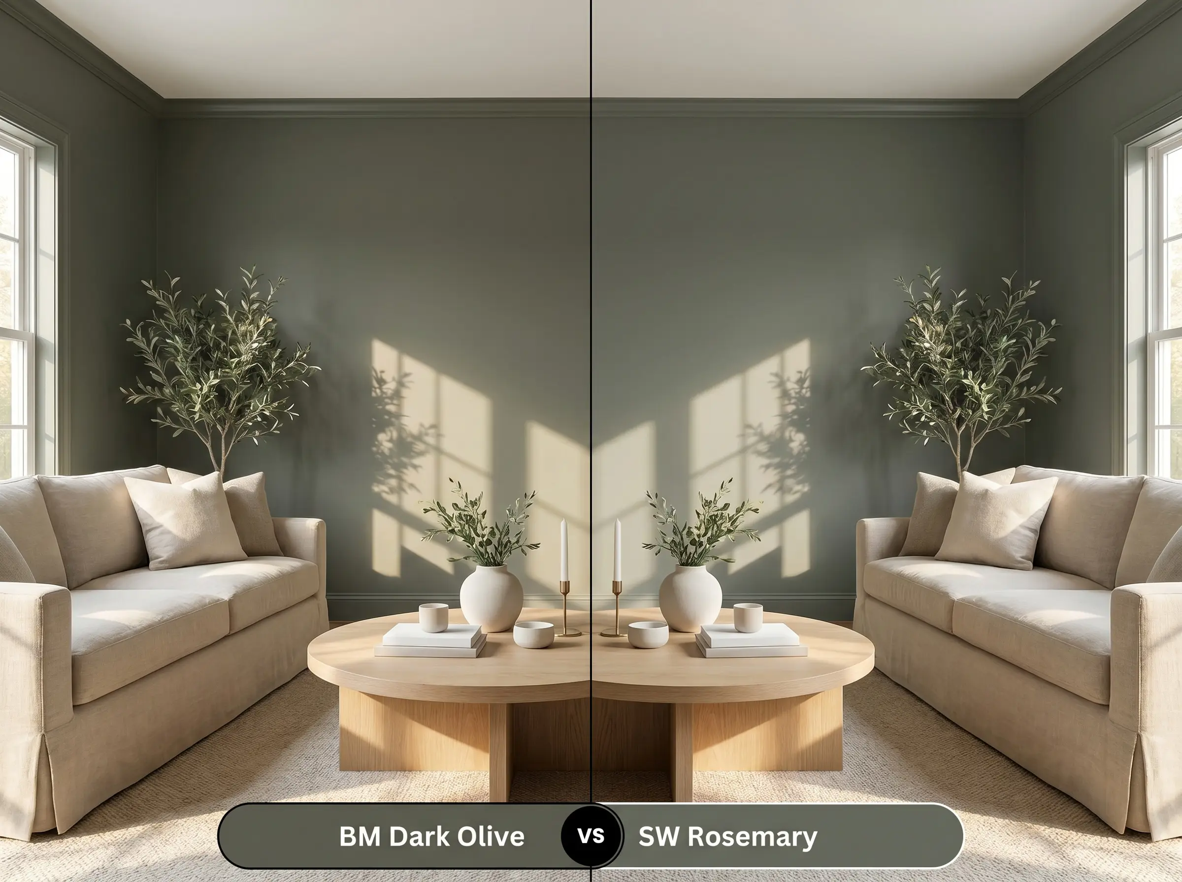
Sherwin-Williams Rosemary SW 6187 shares a similar depth but carries a slightly cooler, more traditional green profile. If your room receives an abundance of warm, southern light that makes BM 2140-30 pull too yellow or muddy for your taste, Rosemary is the better choice. It holds its crisp, botanical shape much better under intense afternoon sun.
Benjamin Moore Dark Olive vs. Farrow & Ball Bancha
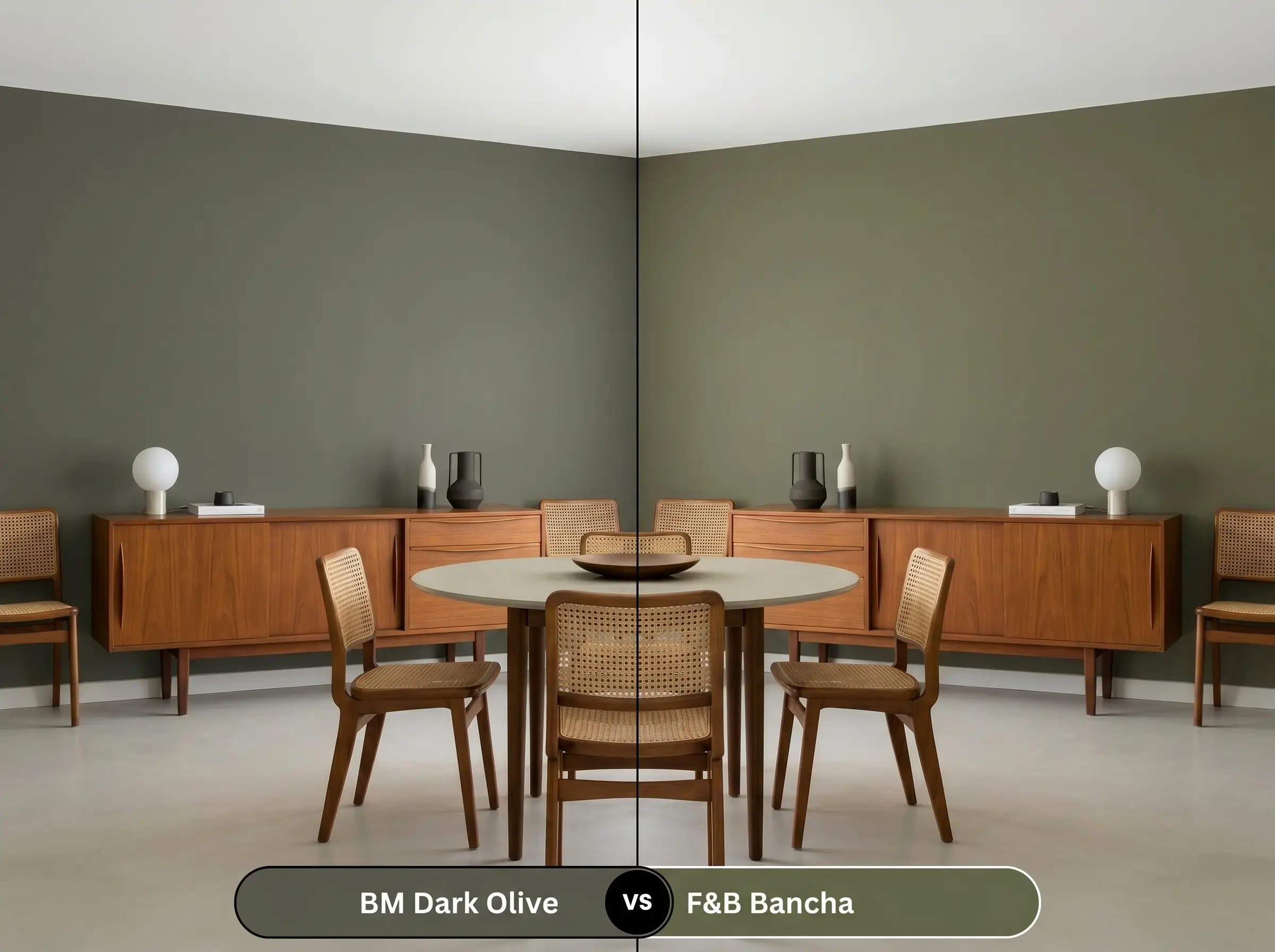
Farrow & Ball Bancha No. 298 is a mid-century modern favorite that feels notably brighter and more olive-forward. If you want a green that feels lively and slightly more energetic, Bancha delivers a cleaner punch of color. However, if your goal is to create a moody, shadowed retreat that feels rooted and historic, the heavier, browner base of the Benjamin Moore option will serve you better.
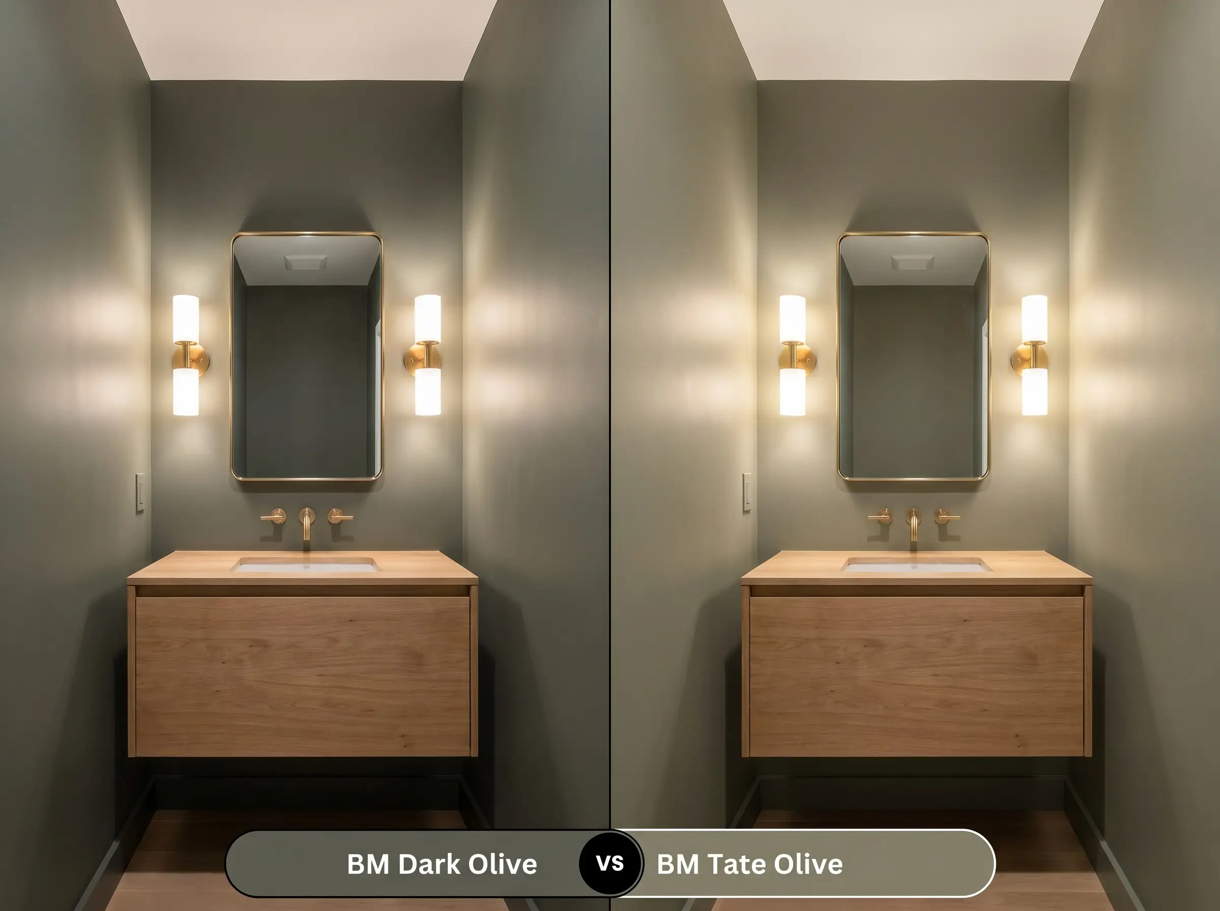
Benjamin Moore Dark Olive vs. Benjamin Moore Tate Olive
Will Dark Olive work with your specific lighting, floor, or furniture?
Benjamin Moore Tate Olive HC-112 is significantly lighter and carries a much stronger yellow-gray undertone. If you are painting a windowless hallway or a small powder room and fear that an LRV of 13.52 will simply look black in the shadows, Tate Olive is your safety net. It provides that same earthy warmth but reflects enough light to keep the space feeling open.
Similar Colors & Brand Equivalents
If you love the general vibe of this color but need a subtle adjustment in depth, or if you simply need to source your paint from a different hardware store, there are excellent alternatives available.
If you are matching brands across different paint counters, consider these equivalents:
Practical Application & DIY Advice
Moving from a paint chip to a fully painted room requires a solid understanding of how dark pigments behave. The physical application of a color this dense demands a bit more patience and strategy than a standard neutral.
A crucial warning for DIYers: Dark, highly saturated colors are notorious for “flashing”—those visible, uneven roller marks that appear when the paint dries at different rates. To avoid this, you must use a high-quality primer tinted to a deep gray before applying your topcoats. Plan for at least two generous coats, and always maintain a “wet edge” as you roll to ensure the finish dries into a flawless, velvety expanse.
Frequently Asked Questions
Because of its low LRV and yellow-brown base, it can indeed read a bit muddy or overly shadowed in spaces with zero natural light. To counter this, you must introduce layered artificial lighting, like warm sconces and an overhead fixture, to properly illuminate the green pigment.
The earthy base actually harmonizes beautifully with red oak floors. Instead of clashing, the khaki undertones in the paint tone down the harsh orange of the wood, creating a warm, cohesive, and deeply organic palette.
Yes, it performs exceptionally well on exteriors. However, because direct sunlight tends to wash out dark colors, the heavy yellow-brown base is an asset here; it ensures the color retains its rich, earthy warmth rather than turning into a cold, concrete gray.
Under a 3000K bulb, the paint will feel warm, inviting, and slightly more olive-toned. If you switch to a 4000K daylight bulb, the warm undertones are stripped away, leaving you with a much cooler, charcoal-leaning green that feels far more sterile.
Final Verdict
Benjamin Moore Dark Olive 2140-30 is a masterfully crafted color perfect for homeowners who want to introduce dramatic depth without the coldness of a stark black or navy. Its absolute best application is in spaces designed for focus or relaxation, such as moody primary bedrooms, sophisticated home offices, or striking kitchen cabinetry. By leaning into its organic, earthy warmth, you can effortlessly elevate both Transitional and Modern homes into spaces that feel rich, curated, and intentionally grounded.
This paint is NOT for spaces dominated by stark, icy finishes. If your home features cool-toned gray luxury vinyl plank flooring, bright white marble with harsh blue veining, and 4000K daylight LED bulbs, this earthy green will violently clash. The cool environment will fight the paint’s natural yellow-brown warmth, making the walls look dirty and disjointed rather than rich and sophisticated.
Hackrea Design Secret (The Temperature Clash)
Room Compatibility & Clashes Diagnoses
Hackrea's reports evaluating the compatibility of Dark Olive in real rooms.No compatibility tests for Dark Olive yet.
Be the first to see how this color reacts to your space. Run a free architectural diagnostic now.
Closest Cross-Brand Equivalents
The absolute closest scientific color matches for Dark Olive across top paint brands.