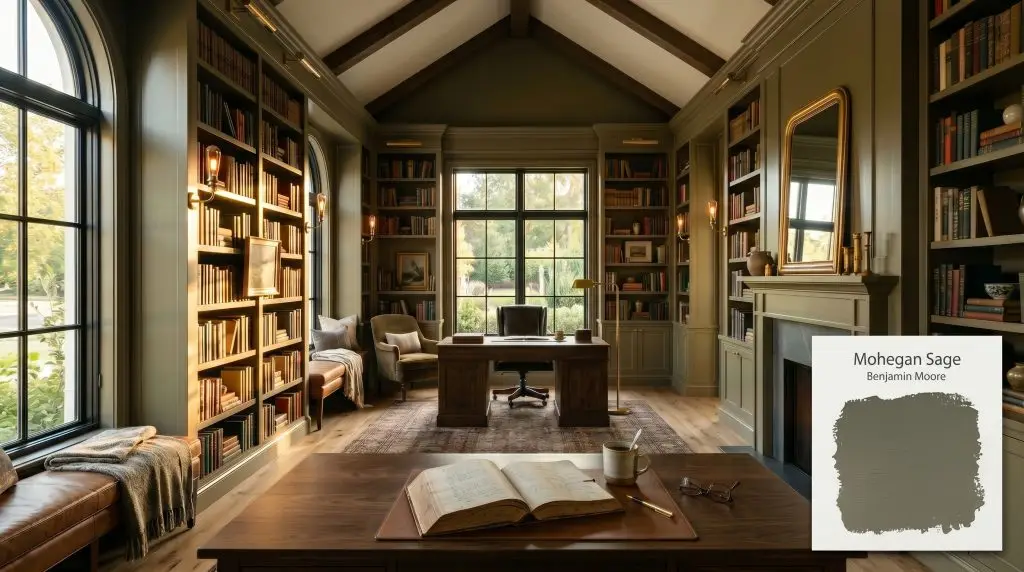
Mohegan Sage 2138-30
Benjamin MooreBenjamin Moore Mohegan Sage (2138-30) is a deeply muted, dark green-gray paint color with strong warm olive and bronze undertones. With an LRV of 12.37, it is a moody, earthy hue that brings sophisticated, organic depth to cabinets, exteriors, and dramatic accent spaces.
Paint Technical Profile
| Color ID / SKU | 2138-30 |
| HEX Code | #5F5E50 |
| Light Reflectance (LRV) | 12.37 |
| Use | Interior, Exterior |
| Best Exposures | South, East |
| Best For | Cabinets, Home Offices, Exterior Siding, Millwork |
Benjamin Moore Mohegan Sage: Mastering the Grounded, Earthy Sophistication of a Historic Green
We crave spaces that feel rooted and permanent. When searching for a moody hue, most people want a color that is organic and calming, without looking like a literal pine forest.
Benjamin Moore Mohegan Sage 2138-30 delivers exactly that. It taps perfectly into the current demand for biophilic design, offering an earthy sophistication that grounds a room instantly.
However, this is not a simple color to manipulate. To use it correctly, you must understand the exact chemistry happening beneath its surface. For those exploring the best dark green paint colors, this specific shade requires a highly strategic approach.
Unpacking the Color DNA of Mohegan Sage
To master this shade, you must first strip away the romantic idea of a pure green and look at the literal color math. It is a complex formula that behaves more like a dark neutral than a vibrant jewel tone.
With an official LRV (Light Reflectance Value) of 12.37, this formula sits firmly in the “Medium Dark” category. This low-LRV absorption means the paint acts like a sponge for light. Without intentional illumination, it will read as a flat, heavy shadow rather than a rich architectural color.
Lighting & The Chameleon Factor
The biggest anxiety we hear from readers is that this color will turn into a swampy, muddy brown shift in low light, making a space feel dreary. This fear is entirely justified if you ignore your exposure.
Because of its heavy graying-out process, this chameleon hue shifts aggressively depending on the light source. You must control its undertones with precise lighting.
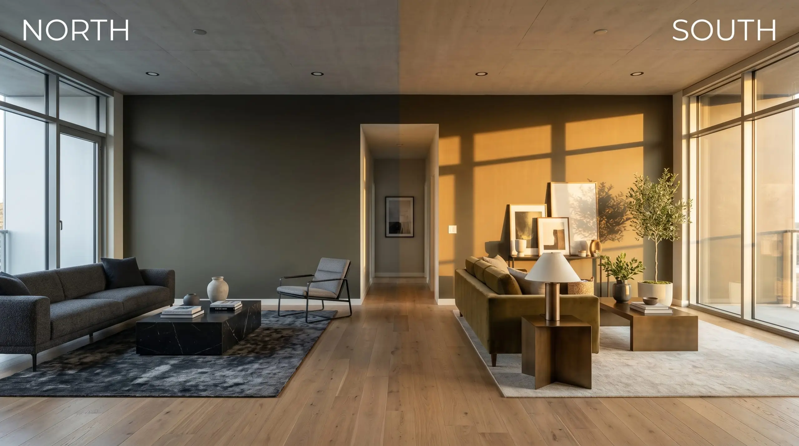
Understanding how lighting affects paint undertones is non-negotiable when dealing with a shade this reactive.
Popular Room Applications
Let us be fiercely honest: this bronze-leaning shade is not a universally versatile neutral. It is a stubborn, opinionated color that demands specific architectural conditions and ample light to succeed.
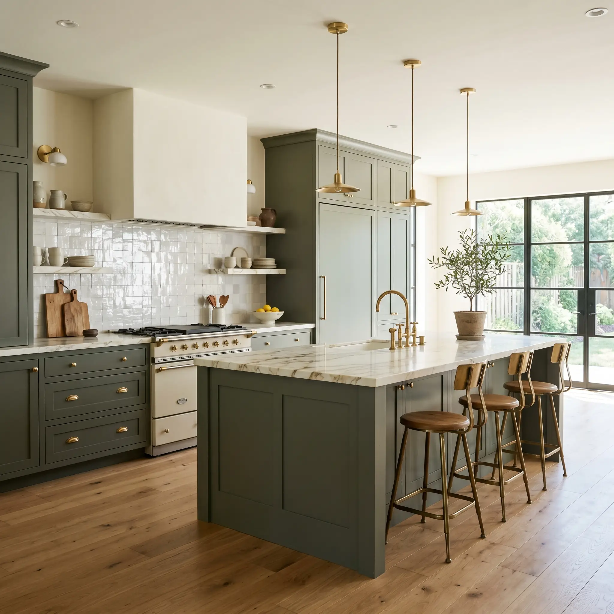
Kitchen Cabinetry & Islands
Do not just paint your cabinets and hope for the best. This shade requires high contrast to avoid looking visually heavy and oppressive. Pair it with highly reflective surfaces like glazed zellige tile or bright, veined marble to bounce light back onto the millwork. You must rely on polished or honed textures to break up the dark mass of the cabinetry.
Home Offices & Libraries
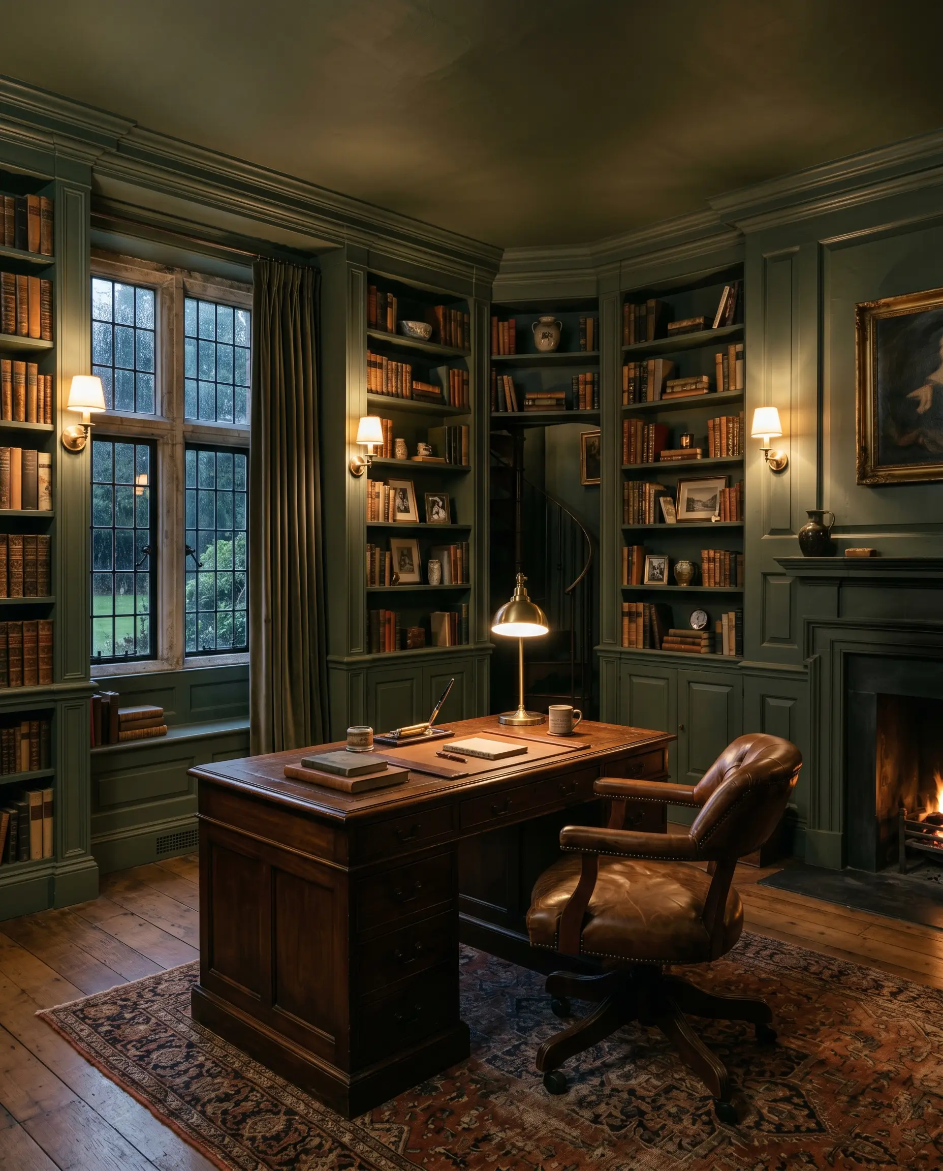
This is where the color thrives. Color-drenching a library creates a moody, intellectual atmosphere that feels deeply historic. However, you must ensure you have layered task lighting and ambient wall sconces to prevent the room from feeling like a cave. The interplay of shadows in corners will emphasize the bronze undertones beautifully.
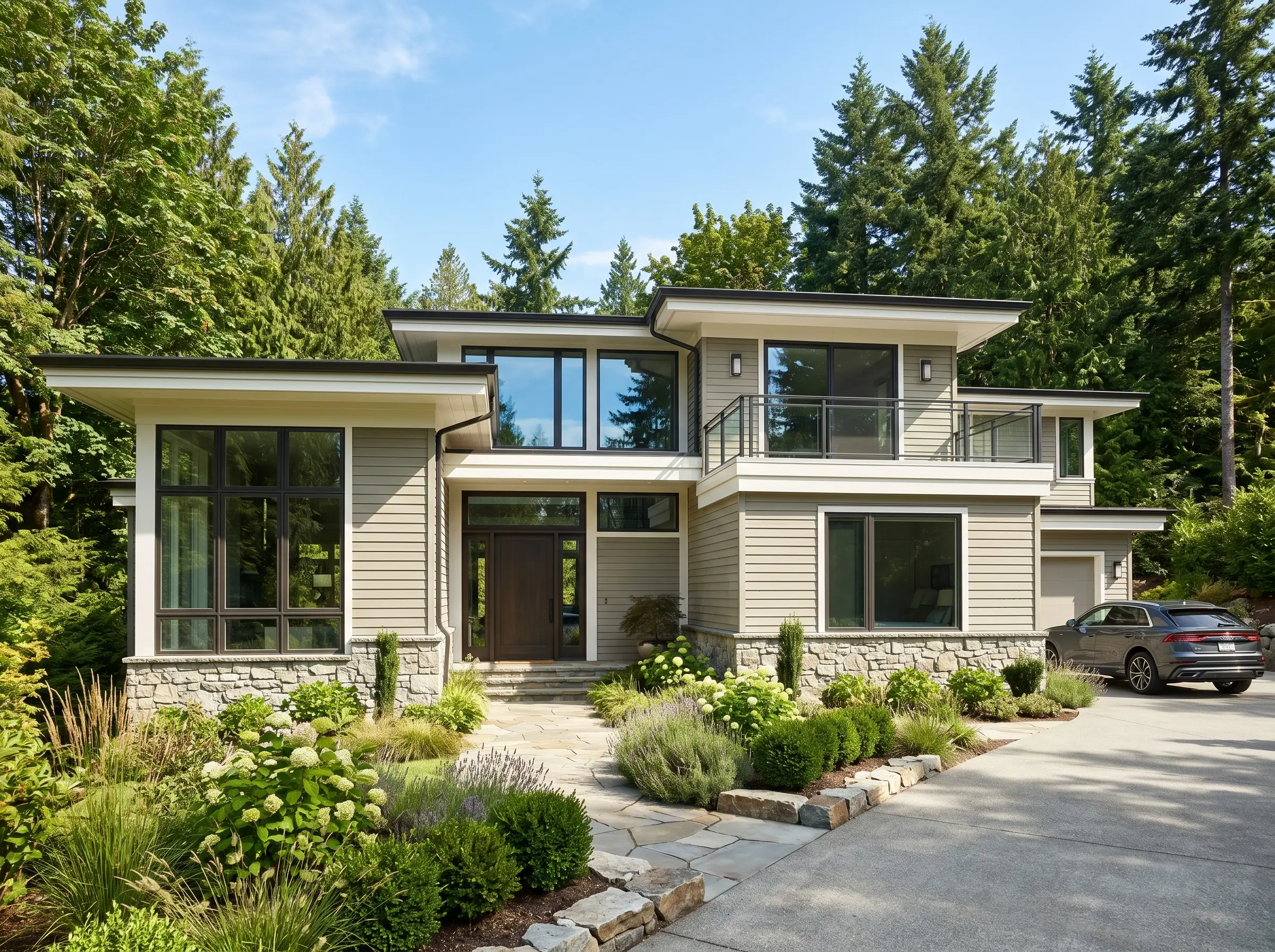
Exterior Siding & Trim
Outside, the harsh sun washes out dark colors. On exterior siding, this shade will appear significantly lighter and greener than it does on an indoor swatch. Use it as a grounding anchor against natural stone or brick. It is exceptionally effective at tying a home’s architecture directly into the surrounding natural landscape.
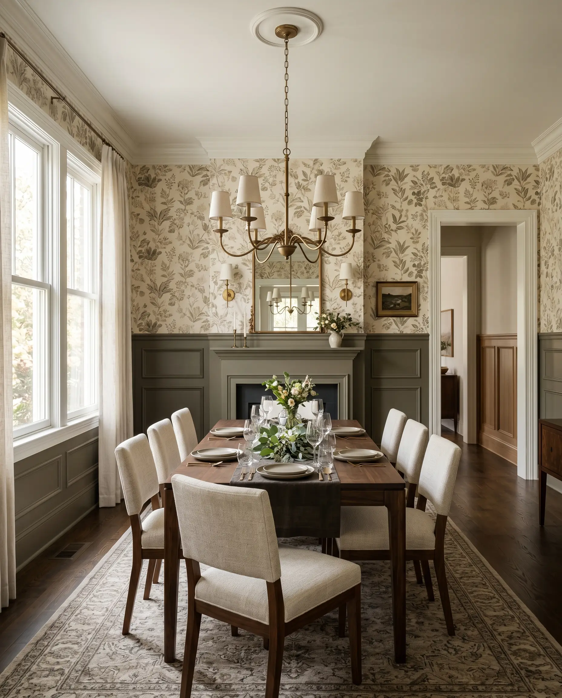
Dining Rooms
If you apply this above a chair rail in a dining room, you risk making the ceiling feel oppressively low. Anchor it on the bottom half of the walls to ground the room. This allows a lighter, textural wallpaper or a creamy paint to carry the eye upward, balancing the heavy visual weight of the lower walls.
Signature Architectural Ideas for This Historic Green-Gray
Moving beyond broad applications, there are specific architectural executions where this paint formula truly dominates.
The Monochromatic Study
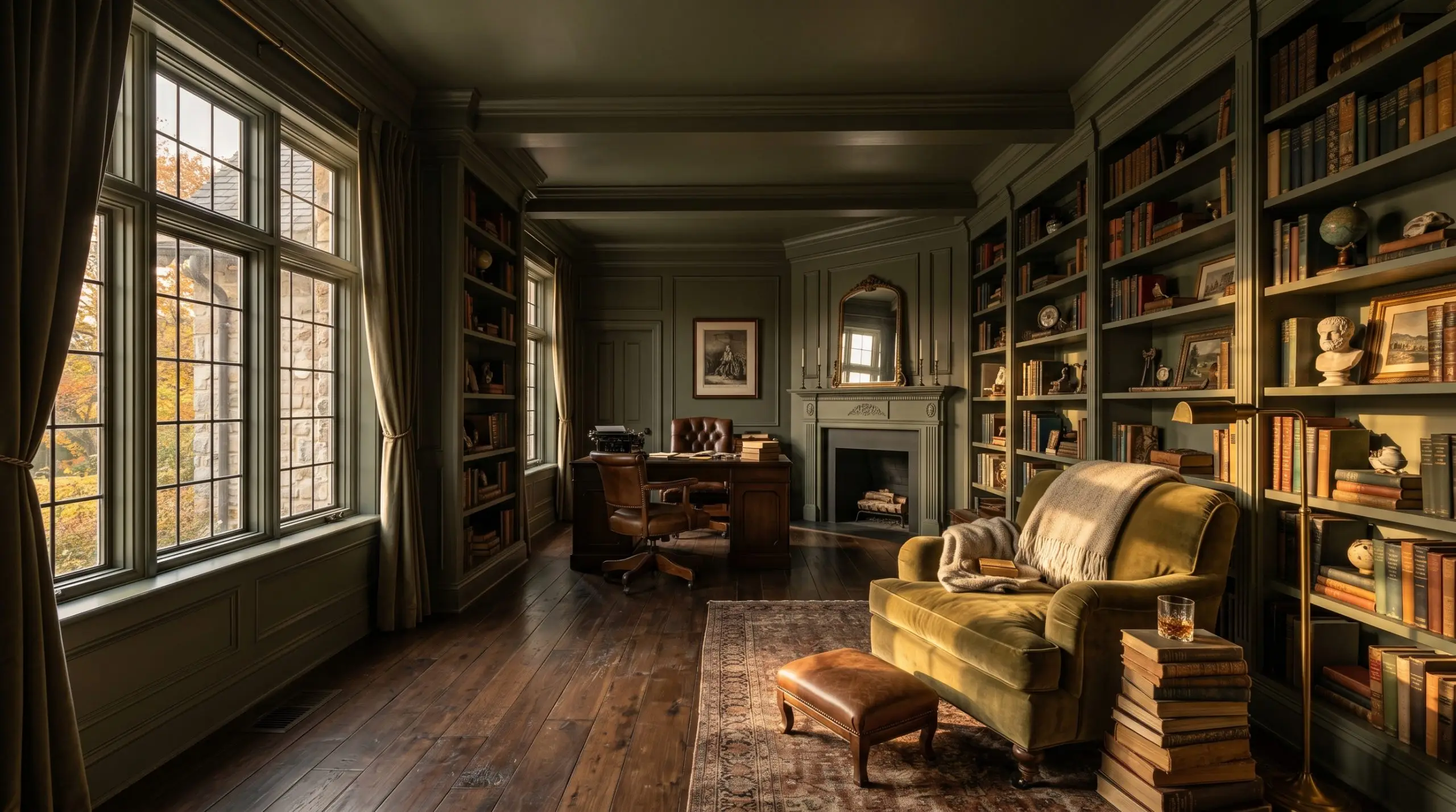
Color-drenching a study—walls, ceiling, and built-in bookshelves—entirely in 2138-30 manipulates the perceived temperature of the room. It makes the environment feel instantly insulating and secure.
The unbroken envelope of dark olive wraps the space in a cocoon-like warmth. If you leave the ceiling white, you shatter this illusion and visually chop the room in half. Commit to the drench.
Cottage Exterior Trim
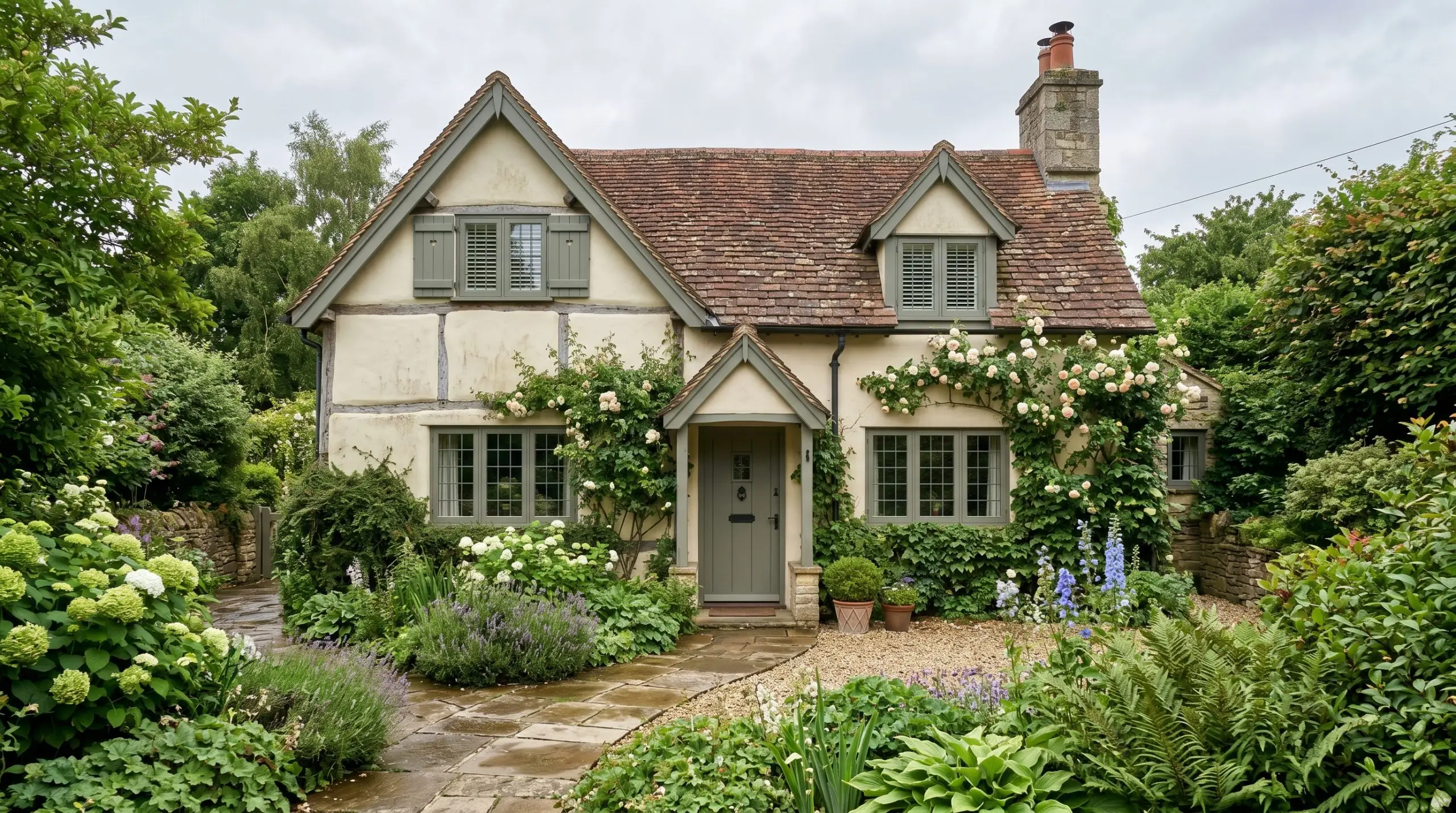
Applying this earthy tone to exterior window sashes, shutters, and fascia boards instantly evokes an authentic English cottage aesthetic. It ties the architecture directly to the surrounding foliage.
The bronze undertones bridge the gap perfectly between creamy stucco facades and natural stone pathways. It feels intentional, historic, and permanent.
Transitional Wainscoting
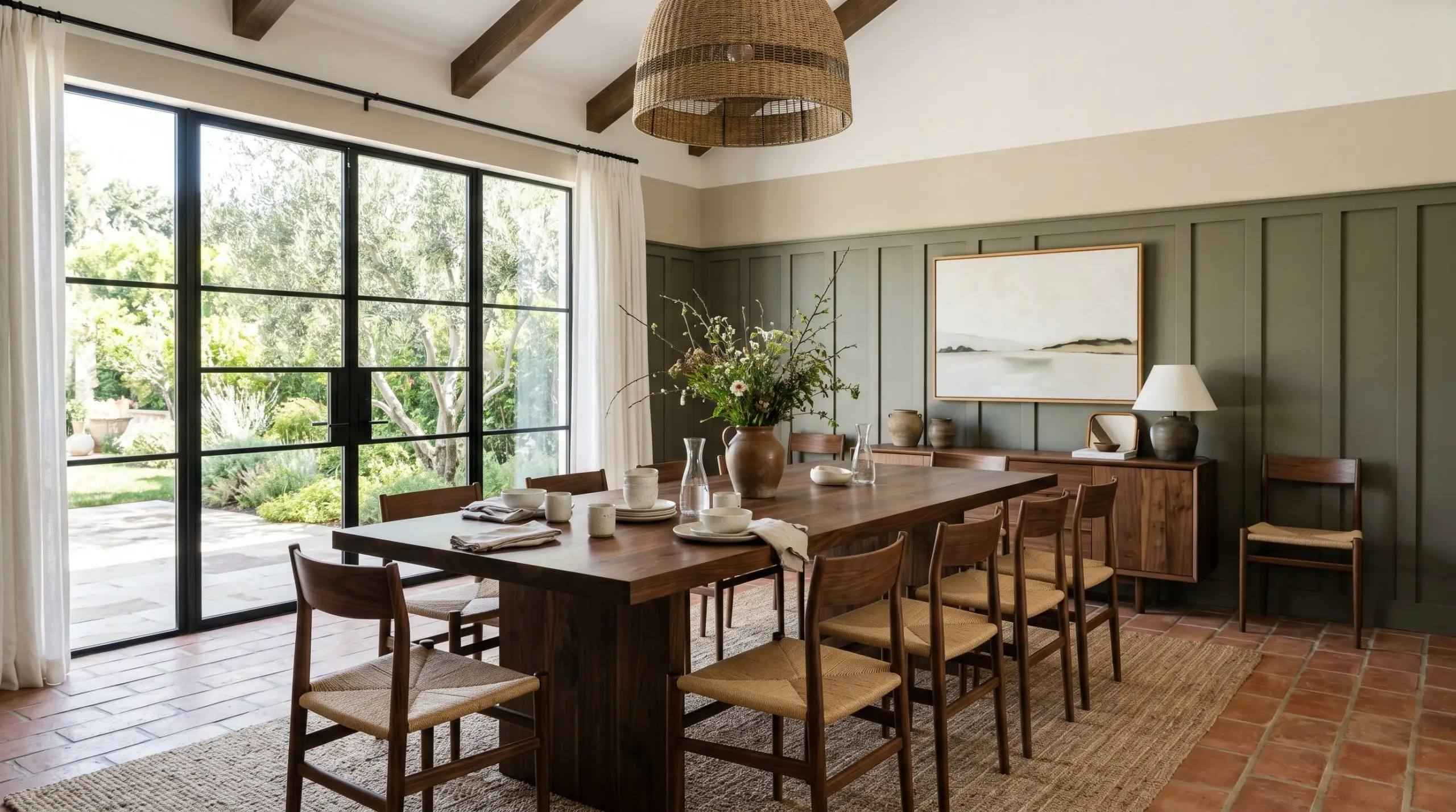
Applying this deeply muted green to board-and-batten wainscoting creates a stunning architectural anchor for a dining space.
If you pair it with a stark white upper wall, the contrast will be jarring and cheapen the look. You must pair it with a warm, botanical-print wallpaper or a creamy beige to maintain the organic transition.
Hackrea Pro-Tip
The Pairings & Accents Guide for Mohegan Sage
A successful room relies on the chemical interaction between your wall color and the surrounding materials. You cannot guess these pairings; they must be calculated.
Trim & Baseboard Selection
To establish the right contrast, you need a trim color with enough warmth to harmonize with the olive base. Benjamin Moore White Dove (OC-17) provides a soft, greige-leaning contrast that avoids harsh lines. Alternatively, Sherwin-Williams Alabaster (SW 7008) offers a slightly creamier edge that pulls out the bronze without looking yellow.
Harmonizing Architectural Materials
Polished, cool metals will look entirely out of place here. Unlacquered brass hardware brings a living finish that ages beautifully alongside the historic green-gray. Honed soapstone countertops and medium-to-dark walnut wood tones enrich the organic narrative, while terracotta floor tiles amplify the earthy warmth.
Coordinating Color Chemistry
Curated Mood Boards
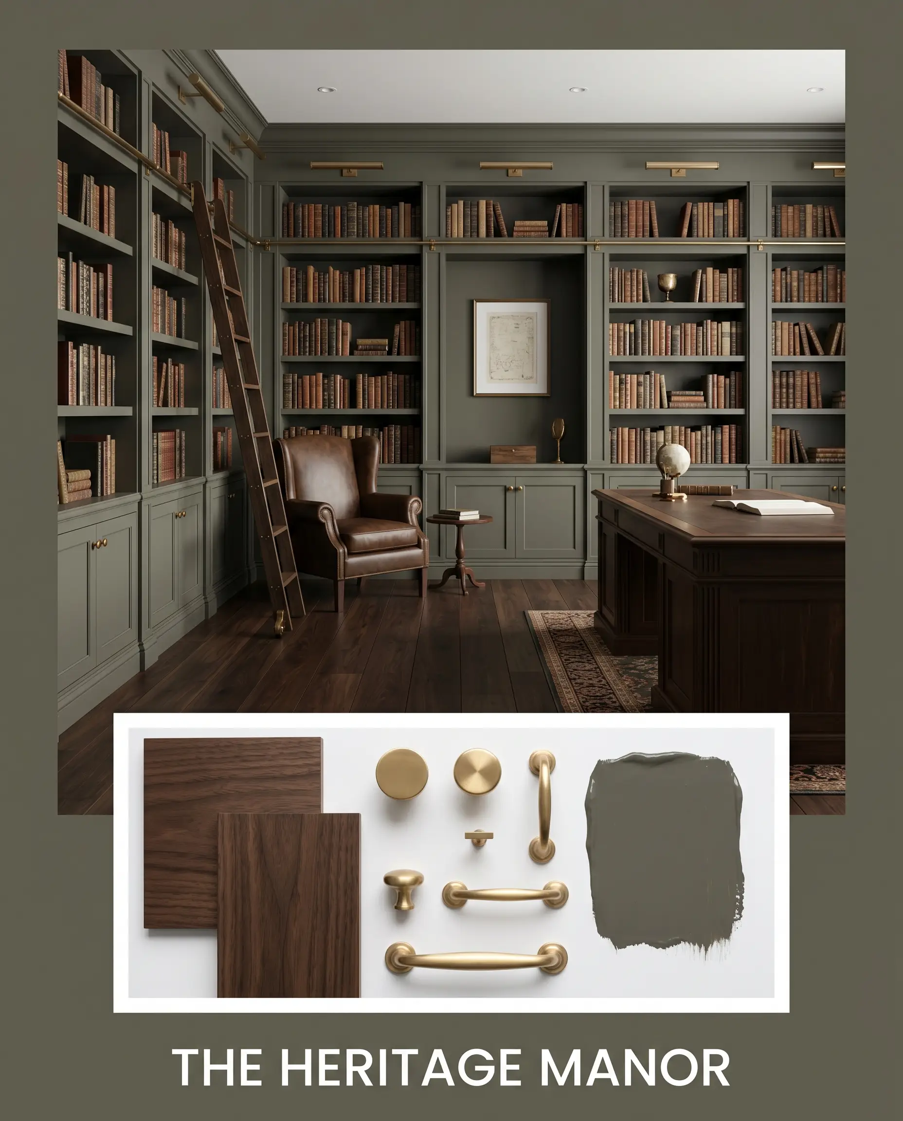
The Heritage Manor: This palette relies on the heavy visual weight of dark walnut and unlacquered brass to establish a sense of permanence. By pairing the dark wall color with Grant Beige, the atmosphere becomes deeply rooted and historically resonant. The materials absorb light, creating a quiet, library-like stillness that feels incredibly expensive.
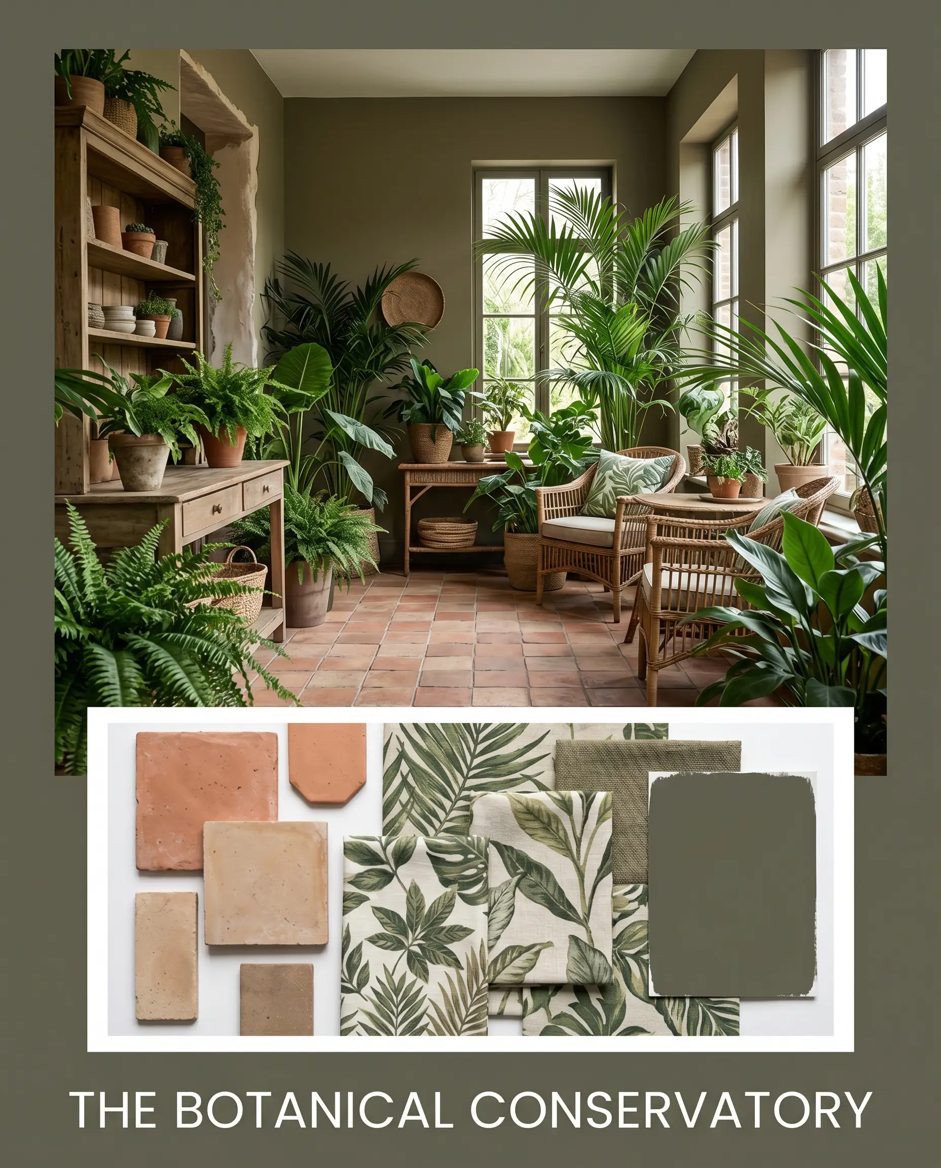
The Botanical Conservatory: Driven by the tension between Setting Plaster and the deep olive base, this aesthetic feels vibrant yet aged. The addition of terracotta introduces a raw, baked-earth texture that grounds the dusty pinks. It is a study in organic chemistry, relying on complementary color math to stimulate the eye without overwhelming the senses.
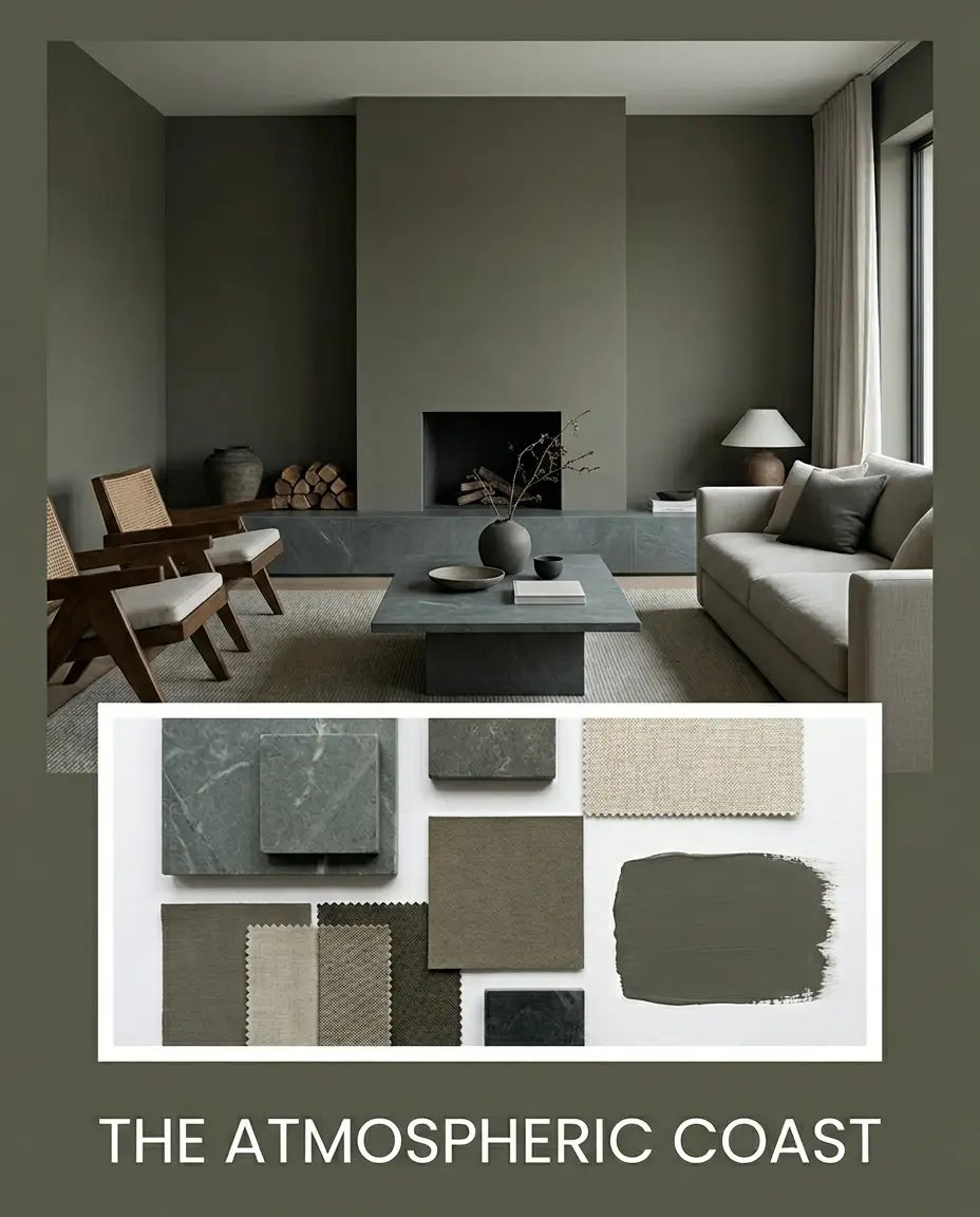
The Atmospheric Coast: Here, Approaching Storm introduces a cool, overcast tension against the warm bronze chemistry of the primary paint. Honed soapstone adds a tactile, matte surface that bridges the gap between the cool gray-blue and the earthy green. The mood is moody, reflective, and softly diffused.
Head-to-Head Paint Comparisons
Choosing the right dark green requires examining the microscopic differences between direct industry rivals.
Benjamin Moore Mohegan Sage vs. Sherwin-Williams Rosemary
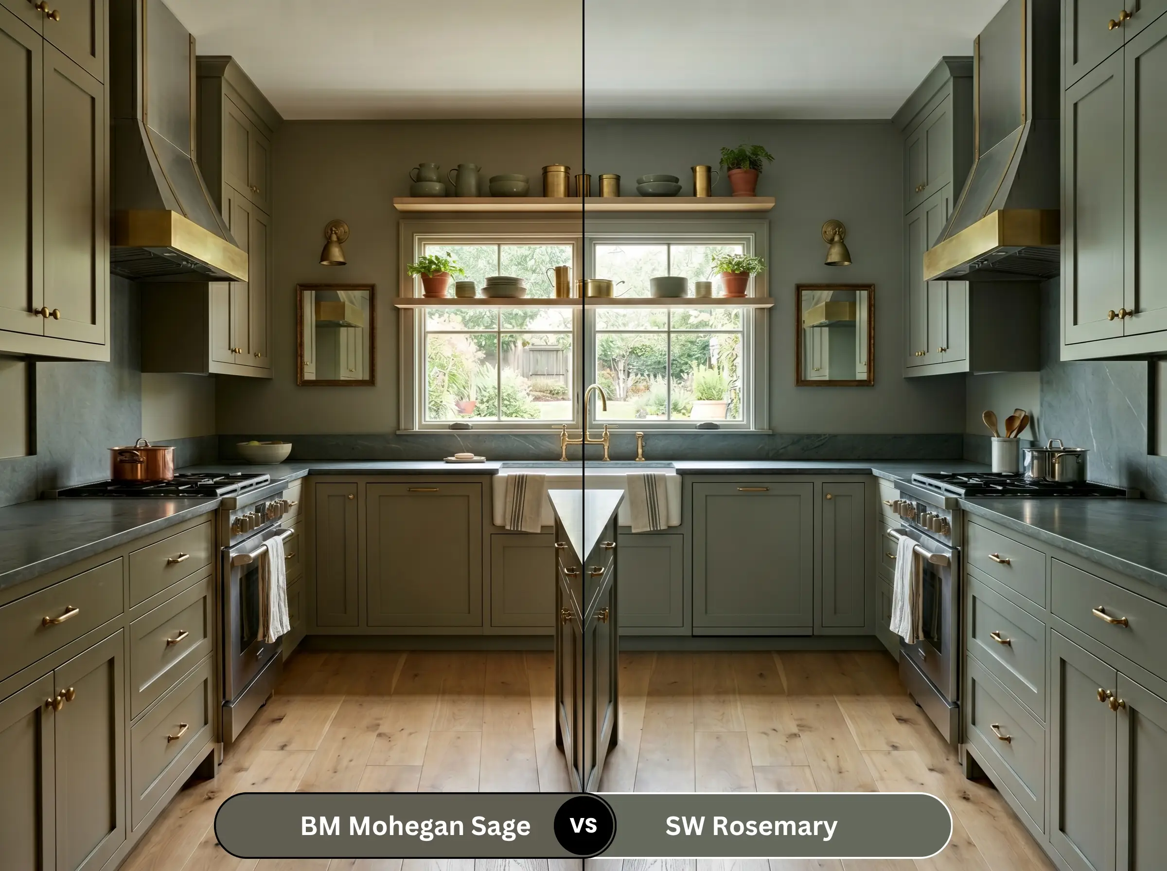
Rosemary is significantly greener and more vibrant. If you want a literal, recognizable green, choose Sherwin-Williams. If you want a muddy, ambiguous bronze-gray, stick with Benjamin Moore.
Benjamin Moore Mohegan Sage vs. Benjamin Moore Dark Olive
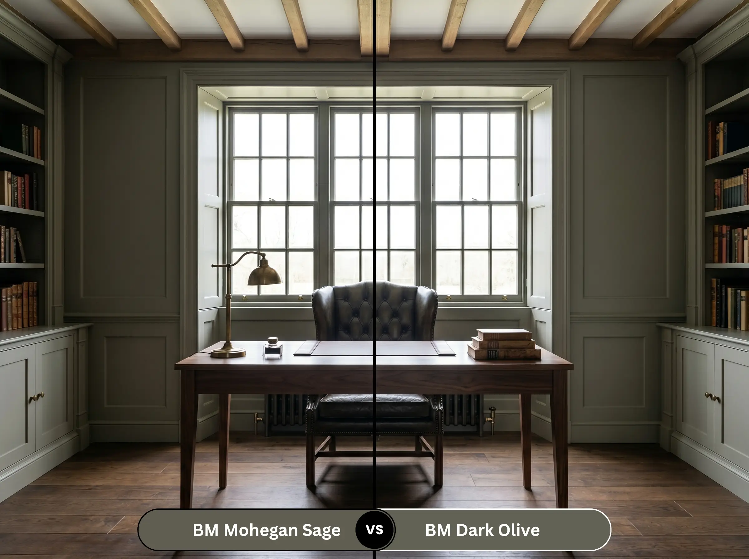
Dark Olive is deeper, slightly cooler, and lacks the heavy brown shift found in 2138-30. Dark Olive feels more like a traditional military green, whereas its rival leans heavily into a historic, grayed-out decay.
Benjamin Moore Mohegan Sage vs. Farrow & Ball Treron
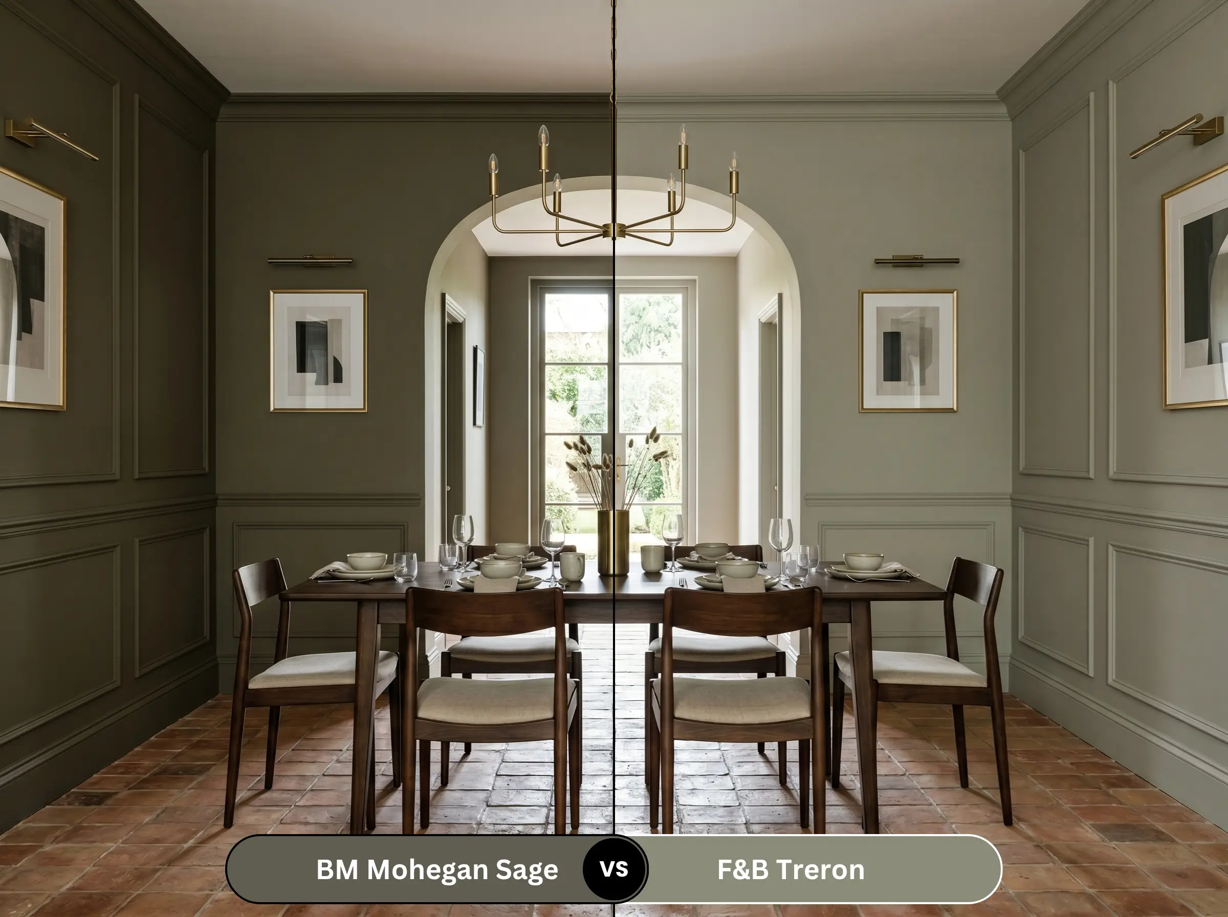
Treron is lighter and carries a much stronger gray-green presence. It feels chalkier and more muted in direct sunlight. Choose Treron for a softer, more ethereal space, and the Benjamin Moore option when you need commanding, dark architectural weight.
Brand Equivalents & Similar Shades
If the primary color doesn’t perfectly align with your lighting, these alternatives offer slight mathematical adjustments.
Benjamin Moore Alternatives
Cross-Brand Matches
Practical Application & DIY Advice
Theoretical design means nothing if the paint is applied poorly. Here is how to handle the physical reality of this formula.
The Dynamic Sheen Matrix
Professional Primer Strategy
Because of its low-LRV absorption, you cannot use a standard white primer. You must use a high-quality, deep-tinted gray primer. A white primer will cause the dark olive to look streaky, requiring up to four coats to achieve true opacity.
Coverage & Touch-Up Warnings
Dark, earthy greens are notoriously difficult to touch up. If you try to fix a scuff mark a year later, the new paint will “flash” and look like a shiny, obvious patch. Always paint corner-to-corner when doing repairs on walls painted with this deep shade.
Frequently Asked Questions
Yes, absolutely. Without natural daylight to activate the green, the bronze chemistry takes over. If you use this in a windowless powder room, you must install 4000K daylight sconces to prevent it from looking like a dark, muddy brown cave.
Dark colors absorb more UV radiation, meaning this shade will fade faster than a mid-tone green. On exterior stucco, expect the bronze undertones to bleach out over a decade, leaving a softer, chalkier gray-green behind.
We strongly advise against this combination. The visual weight of black granite combined with this low-LRV paint will create a massive, light-absorbing void in your kitchen. You need high-contrast, light countertops to balance the darkness of the cabinetry.
It will visually lower the ceiling even further, creating a heavy, oppressive atmosphere. Unless you are intentionally designing a dark, cinematic media room, this color will make a low-ceilinged subterranean space feel claustrophobic.
Final Verdict & Expert Warnings
Mohegan Sage is not a playful accent color; it is a serious, architectural neutral masquerading as a green. It is the absolute best choice for homeowners who want a historic, grounded atmosphere in a well-lit library or on exterior trim.
Clash Warning: If you have cool-toned Carrara marble, cherry or mahogany wood floors, or gray-washed luxury vinyl plank (LVP), you must avoid this paint.
The red tones in cherry wood will aggressively pull out the green, creating an accidental, permanent “Christmas” effect. Meanwhile, gray-washed floors will make this beautiful historic green-gray look like dirty swamp water. Respect the color math, control your lighting, and this shade will reward you with unparalleled depth.
Closest Cross-Brand Equivalents
The absolute closest scientific color matches for Mohegan Sage across top paint brands.