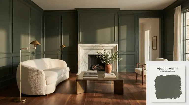
Benjamin Moore Vintage Vogue (462) is an ultra-dark, smoky olive green that acts as a stunning alternative to black or brown. With its deep, moody presence and subtle brown and gray undertones, it brings sophisticated warmth and grounded elegance to cabinets, accent walls, and exteriors.

LRV 11.85
A photorealistic living room featuring walls painted in Benjamin Moore Vintage Vogue (Hex #565D4F), complemented by a Calacatta Gold marble fireplace and a cream boucle sofa.
TemperatureWarm-neutral
Primary UndertoneOlive Green
Hidden UndertonesBrown, Black, Gray
Best ExposuresSouth-facing, West-facing
Best ForKitchen Cabinets, Built-in Bookshelves, Mudrooms, Accent Walls, Exteriors, Dining Rooms

Hackrea Review

Vintage Vogue is a sophisticated chameleon. We love how it grounds a room without the harshness of pure black. It’s a moody, dramatic choice that shines on cabinetry and wainscoting, offering a luxurious depth that feels both historic and remarkably modern.
  • The Coverage Catch: Because of its ultra-dark, saturated nature, Vintage Vogue often requires a tinted primer and at least two to three coats to achieve a perfectly even, opaque finish without flashing.
  • The Lighting Shift: In low-light or North-facing rooms, this color easily loses its green identity, shifting into a heavy charcoal, dark brown, or near-black.
  • The Clash Warning: It can clash with stark, cool whites, making them look harsh. It pairs much better with creamy, warm whites like White Dove or Swiss Coffee. Also, avoid pairing it with cool, blue-toned grays which can make the olive undertones look muddy.
  • The Bounce Effect: With an LRV of 11.85, it absorbs a massive amount of light. It will not bounce light around the room, which can make a space feel smaller or 'cave-like' if not balanced with adequate artificial or natural lighting.
  • The Low Light Trap: In windowless rooms or hallways, the brown and black undertones take over completely, turning the green into a flat, heavy dark brown.
  • The Touch Up: Dark matte and eggshell finishes in this depth are prone to burnishing (scuffing) and can flash noticeably when touched up. Consider a satin or semi-gloss finish for high-traffic areas like cabinets or mudrooms.

Our color consultants analyzed r/interiordecorating, r/DesignMyRoom, Houzz Forums to detect the problems Real Homeowners have with this specific paint.

Architectural Applications for Vintage Vogue 462

Kitchen Cabinets and Islands

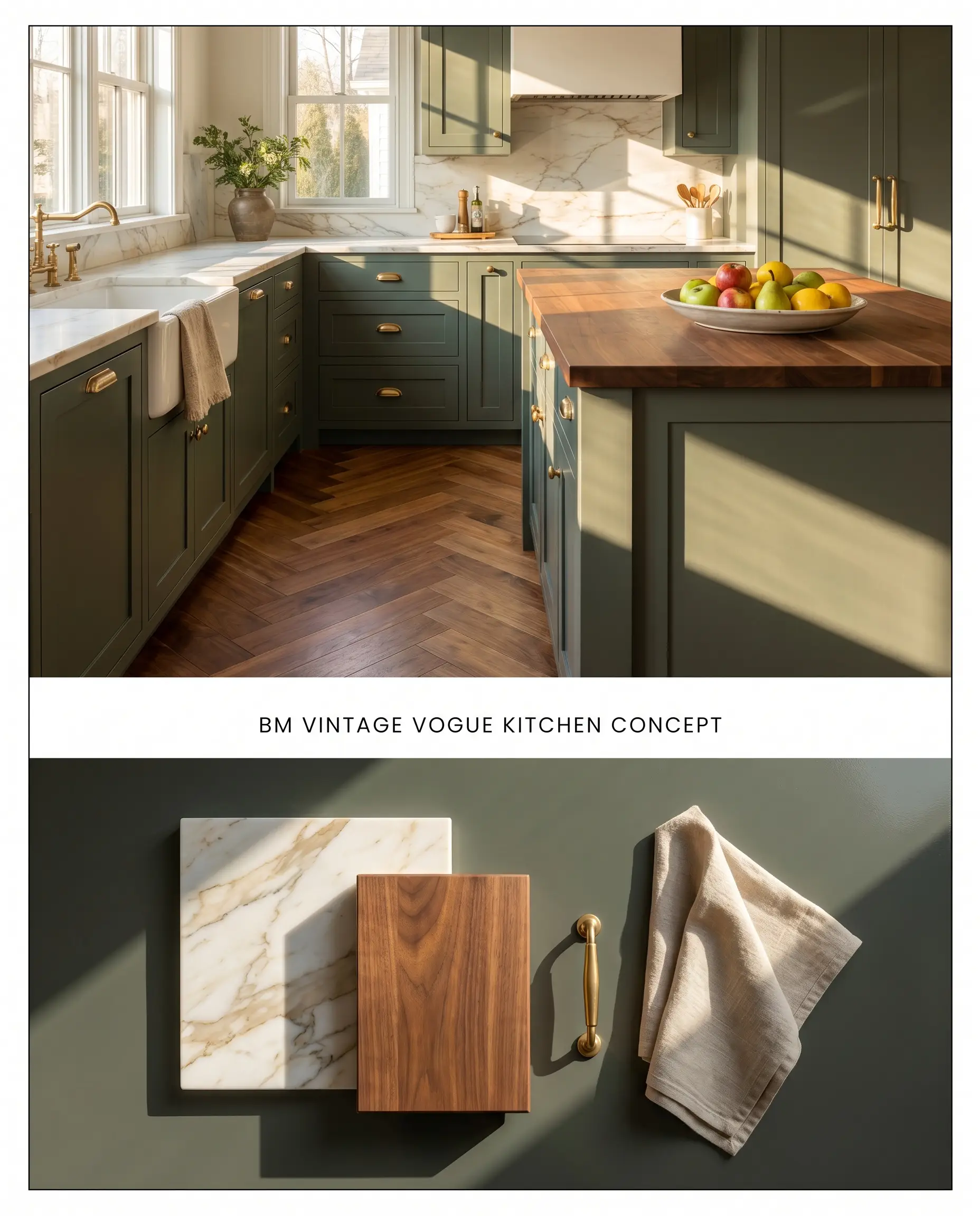
The subtle brown undertones in this smoky olive green anchor the lower visual plane of a kitchen, preventing the cabinetry from floating against lighter walls. By utilizing a saturated hue on the base units, the chromatic profile grounds the room while contrasting physically with porous materials like honed marble or unlacquered brass.

  • Lighting/Exposure: Requires expansive Southern or Eastern exposures; without ample natural light, the green identity shifts into a flat, near-black charcoal.
  • Countertop Pairing: Honed Calacatta Gold marble or warm walnut butcher block to complement the warm-neutral base.
  • Hardware Finish: Unlacquered brass or aged bronze; avoid polished chrome, which reads too stark against the deep sage cast.
  • The Consultant’s Finish: Advance Interior ($$$ (Premium/Professional Tier)). A waterborne alkyd that cures to a hard, furniture-quality enamel finish, providing outstanding durability against chipping and daily wear on high-touch millwork.

Built-in Bookshelves and Office Cabinetry

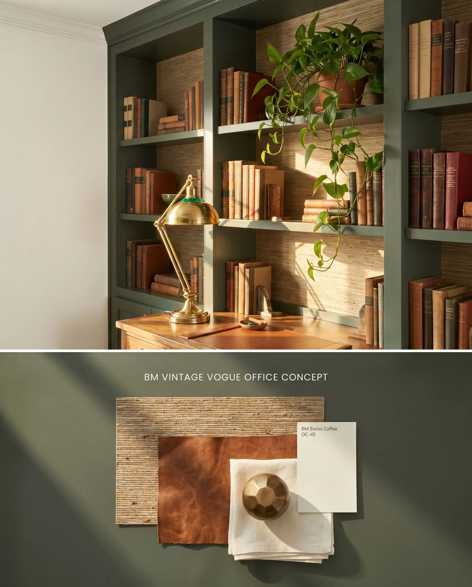
Applying this deep hue to floor-to-ceiling built-ins absorbs ambient light, reducing glare around computer screens while establishing a grounded elegance in workspaces. The dark value recedes visually, pushing the spines of books and curated objects forward into the viewer’s focal range.

  • Lighting/Exposure: Thrives in West-facing rooms where late afternoon sun pulls the underlying green out of the brown base.
  • Wall Pairing: Benjamin Moore Swiss Coffee OC-45 on adjacent walls prevents the stark clash associated with cool, blue-toned whites.
  • Texture Integration: Woven grasscloth wallpaper applied to the back of the shelving units introduces physical friction against the smooth painted millwork.
  • The Consultant’s Finish: Advance Interior ($$$ (Premium/Professional Tier)). A waterborne alkyd that cures to a hard, furniture-quality enamel finish, providing outstanding durability against chipping and daily wear on high-touch millwork.

Mudroom Lockers and Trim

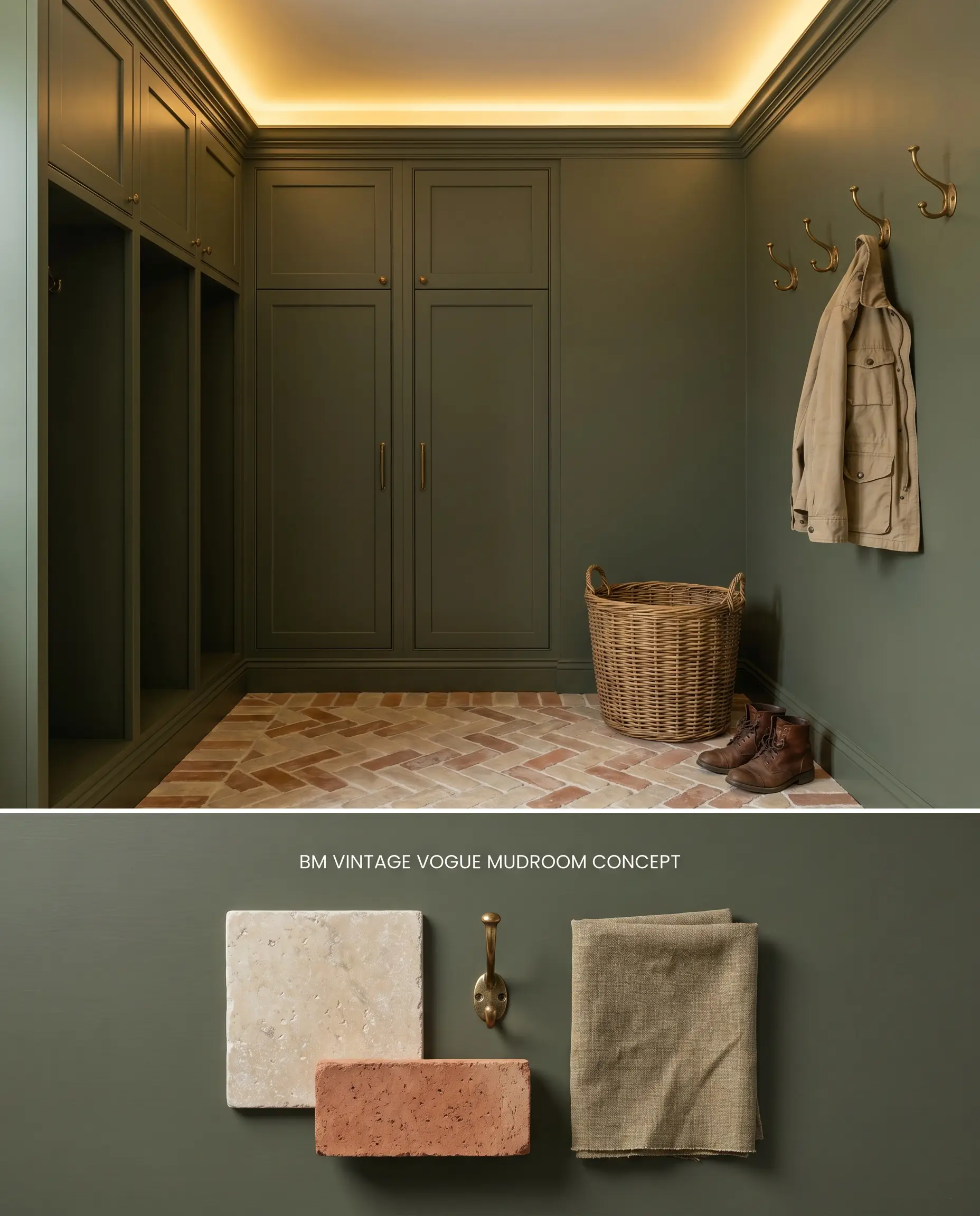
Mudrooms demand visual weight to mask daily dirt accumulation, making this saturated olive an ideal architectural finish for utility millwork. The color structure pairs seamlessly with natural stone flooring, bridging the gap between exterior landscaping and interior living spaces.

  • Lighting/Exposure: Needs overhead artificial layering (3000K LED) if natural light is blocked by exterior porches to prevent the color from turning muddy.
  • Flooring: Tumbled limestone or warm terracotta brick laid in a herringbone pattern.
  • Trim Application: Wrap the color across the baseboards and crown molding to create a cohesive, built-in aesthetic.
  • The Consultant’s Finish: Advance Interior ($$$ (Premium/Professional Tier)). A waterborne alkyd that cures to a hard, furniture-quality enamel finish, providing outstanding durability against chipping and daily wear on high-touch millwork.

Accent Walls in South-Facing Living Rooms

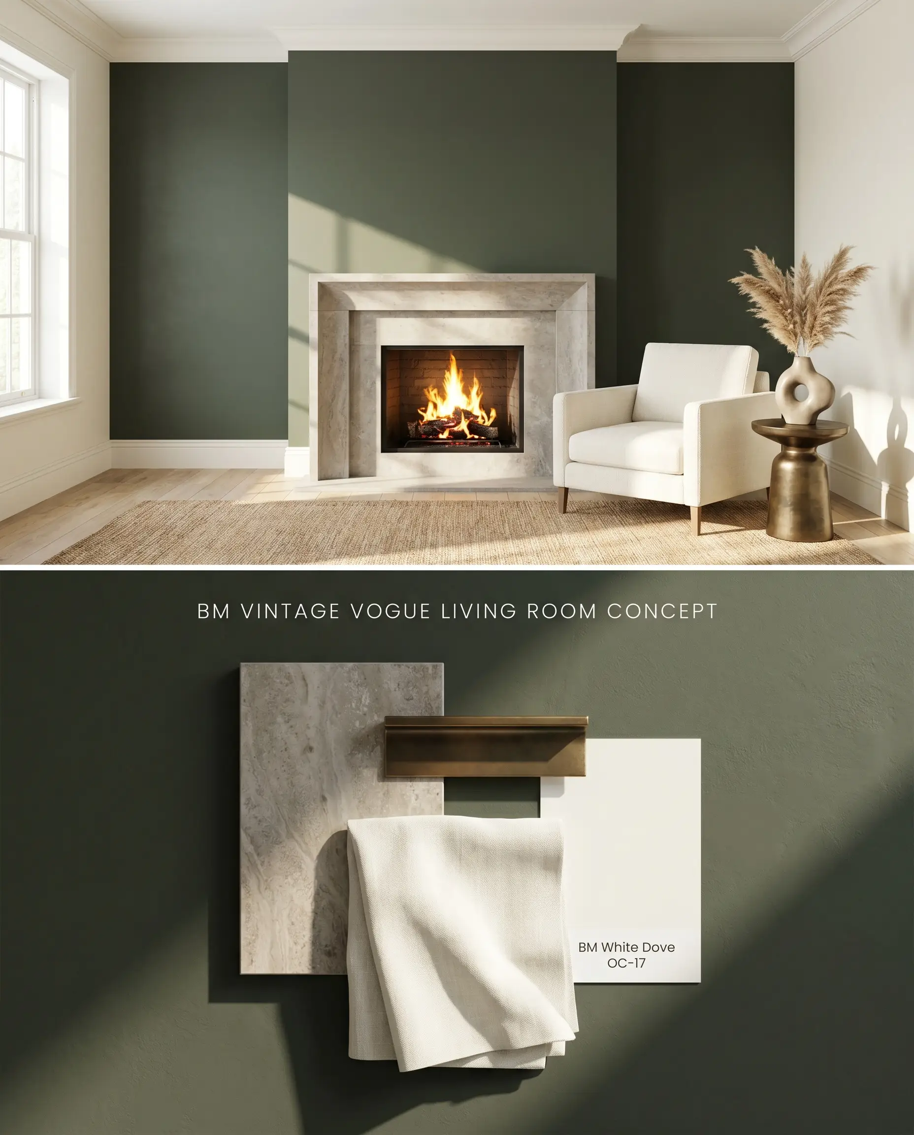
An accent wall in this deep sage cast physically anchors a focal point, such as a fireplace surround, by absorbing light and pulling the wall inward. The low LRV of 11.85 requires the intense, direct light of a southern exposure to activate the green without letting the brown undertones dominate.

  • Lighting/Exposure: South-facing light is mandatory; this orientation provides the sustained, warm UV rays necessary to highlight the green rather than the dense charcoal shadow.
  • Coordinating Trim: Benjamin Moore White Dove OC-17 provides a creamy, warm boundary that softens the transition from the dark accent wall.
  • Execution Warning: A tinted primer and at least two to three coats are required to achieve a perfectly even, opaque finish without flashing.
  • The Consultant’s Finish: Aura Interior Matte ($$$$ (Ultra-Premium Tier)). Utilizes proprietary Color Lock technology to deliver unparalleled color depth and rub-resistance in an elegant matte profile, ideal for formal dining and living spaces.

Exterior Siding and Shutters

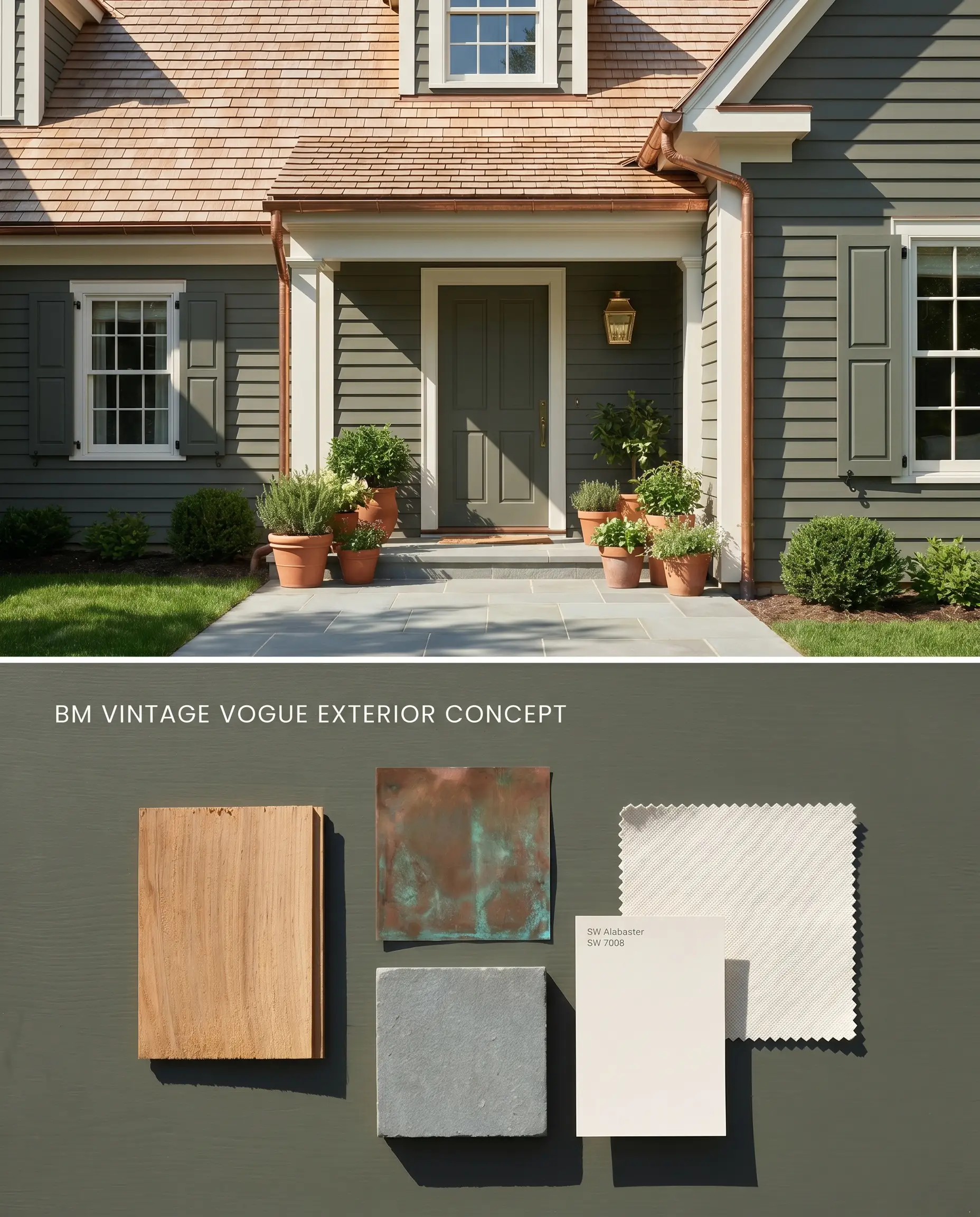
On exterior elevations, intense sunlight washes out paint colors, making this dark olive read as a vibrant, natural green rather than a murky brown. The warm-neutral base harmonizes with the organic tones of surrounding foliage and natural stone foundations.

  • Lighting/Exposure: Full sun exposure; shaded, wooded lots will force the siding to read as a near-black void.
  • Material Pairing: Natural cedar shingles, copper gutters, and Pennsylvania bluestone walkways.
  • Accent Color: Sherwin-Williams Alabaster SW 7008 on the exterior trim to maintain warmth without stark contrast.
  • The Consultant’s Finish: Aura Exterior ($$$$ (Ultra-Premium Tier)). Provides ultimate fade resistance and protects against harsh weather conditions, peeling, and UV damage with advanced cross-linking resin technology.

Formal Dining Rooms

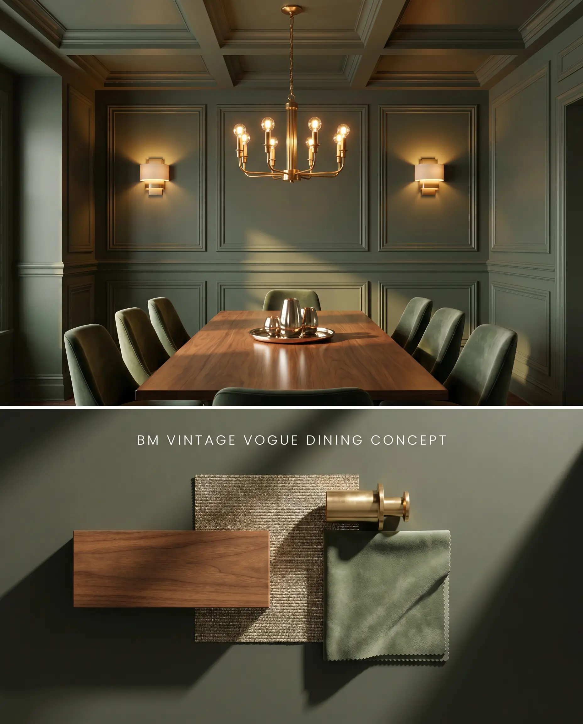
Wrapping an entire dining room in this moody luxe shade blurs the physical boundaries of the walls, pushing them outward under low evening light. The dark, light-absorbing envelope directs visual focus strictly onto the dining table and the reflective metallic surfaces of the light fixtures.

  • Lighting/Exposure: Artificial evening lighting is the primary driver; use layered ambient sconces and a central chandelier (2700K) to cast warm, directional pools of light.
  • Ceiling Treatment: Extend the color onto the ceiling or use a warm metallic grasscloth to prevent a white ceiling from acting as a distracting, high-contrast lid.
  • Millwork: Apply picture frame molding (wainscoting) painted in the exact same color to add shadow lines and structural depth without breaking the monochromatic envelope.
  • The Consultant’s Finish: Aura Interior Matte ($$$$ (Ultra-Premium Tier)). Utilizes proprietary Color Lock technology to deliver unparalleled color depth and rub-resistance in an elegant matte profile, ideal for formal dining and living spaces.
New
Visualize 500+ products in different rooms!
You can apply wallpapers, paints, etc. on walls and see how they look in various interiors.
Hackrea Visualizer

Chromatic Profile & Color Structure: Head-to-Head Comparisons

Benjamin Moore Vintage Vogue 462 vs. Sherwin-Williams Vogue Green SW 0065

Benjamin Moore Vintage Vogue 462 (LRV 11.85) leans firmly into its subtle brown undertones, anchoring it as an earthy, muted olive. Sherwin-Williams Vogue Green SW 0065 (LRV 8) is noticeably darker and projects a purer, more emerald-leaning forest green without the brown muddiness. Use SW Vogue Green in spaces where you need a crisp, jewel-toned green that resists turning brown, but specify BM Vintage Vogue 462 when bridging organic materials like walnut and unsealed terracotta.

Benjamin Moore Vintage Vogue 462 vs. Sherwin-Williams Pewter Green SW 6208

Sherwin-Williams Pewter Green SW 6208 (LRV 12) operates with a distinct cool, silver-gray undertone, contrasting sharply with the warm-neutral base of Benjamin Moore Vintage Vogue 462. Under cool Northern light, Pewter Green amplifies its frosty gray cast, while Vintage Vogue 462 shifts toward charcoal and dark brown. Deploy Pewter Green when coordinating with cool Carrara marble or blue-toned slate, but rely on Vintage Vogue 462 to warm up spaces dominated by aged brass and creamy whites.

Benjamin Moore Vintage Vogue 462 vs. Farrow & Ball Studio Green 93

Farrow & Ball Studio Green 93 (LRV 8) is a notorious chameleon that reads as a true black in low light before revealing a deeply saturated, black-green under direct illumination. Benjamin Moore Vintage Vogue 462 maintains a marginally higher LRV and retains its olive-brown identity much longer before succumbing to shadows. Reserve Studio Green for dramatic, high-contrast trim or cabinetry in sun-drenched rooms, utilizing Vintage Vogue 462 when you require a softer, more legible green across larger expanses.

Architectural Specifications & Technical FAQs

Does Vintage Vogue look too black in North-facing or low-light rooms?

Yes, in windowless rooms, hallways, or North-facing exposures, the lack of warm light strips away the green identity. The color shifts drastically into a dense charcoal, dark brown, or near-black void.

Will the brown undertones in Vintage Vogue clash with cool gray flooring or stark white trim?

Vintage Vogue clashes directly with stark, cool whites and blue-toned grays, making the olive undertones appear muddy and the whites look harsh. It requires creamy, warm whites like White Dove or Swiss Coffee to maintain architectural harmony.

How does Vintage Vogue behave on exterior siding under intense, direct UV sunlight?

Intense exterior UV light washes out the dark value, preventing the brown undertones from dominating and allowing it to read as a vibrant, natural olive green. However, on heavily shaded lots, it will recede into a near-black shadow.

What is the best sheen for Vintage Vogue on kitchen cabinets to prevent burnishing and scuffing?

Dark matte and eggshell finishes at this depth are highly prone to burnishing and will flash noticeably when touched up. You must use a satin or semi-gloss enamel finish, such as Benjamin Moore Advance, to provide the necessary durability for high-traffic millwork.

Similar Paint Colors

Same Brand

Ashwood Moss
Rosepine

Cross-Brand Equivalents

If you enjoyed this article, you'll want to be the very first to see our next one.