If the last few years of interior design were about finding our footing, 2026 is about planting our feet firmly in the earth. The era of cool, sterile grays is officially behind us. In its place, we are welcoming a rich, sensory era defined by “cocooning”—creating spaces that feel safe, warm, and deeply personal.
Benjamin Moore’s 2026 forecast perfectly captures this shift. The brand has moved away from the stark contrasts of the past toward a palette of “enchanting pales” and “handsome midtones.” These are colors that don’t just sit on the wall; they envelop you. Whether you are looking to refresh a single powder room or overhaul your entire home’s palette, this guide covers the official 2026 Color of the Year, the trending supporting cast, and the timeless bestsellers that (thankfully) never go out of style.
Quick Guide: The Best Benjamin Moore Colors for 2026
In a hurry? Here is the essential cheat sheet for this year’s top paint trends and timeless favorites.
Let’s dive into the colors that will define our homes for the next year and beyond.
The 2026 Color of the Year: Silhouette (AF-655)
The Vibe: Sultry, Sophisticated, and Unexpectedly Cozy.
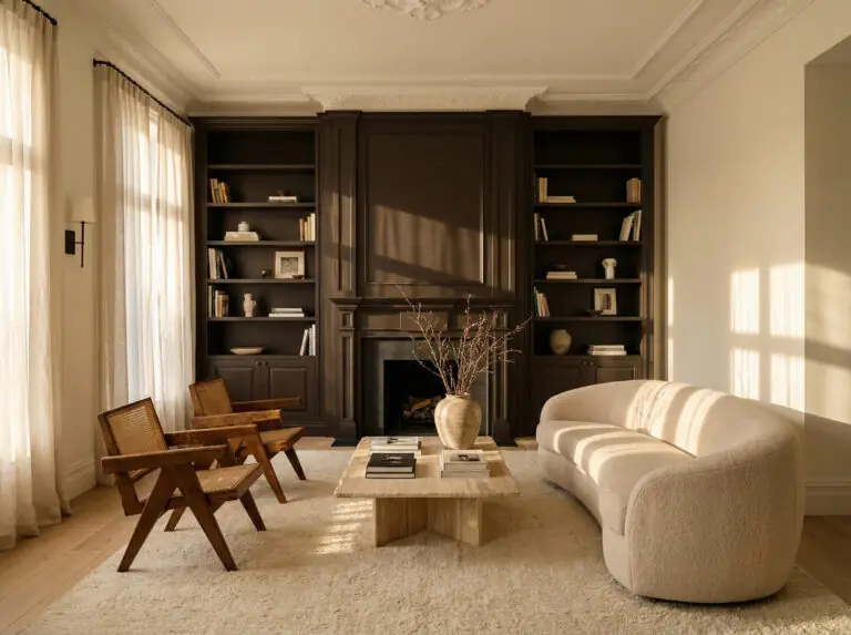
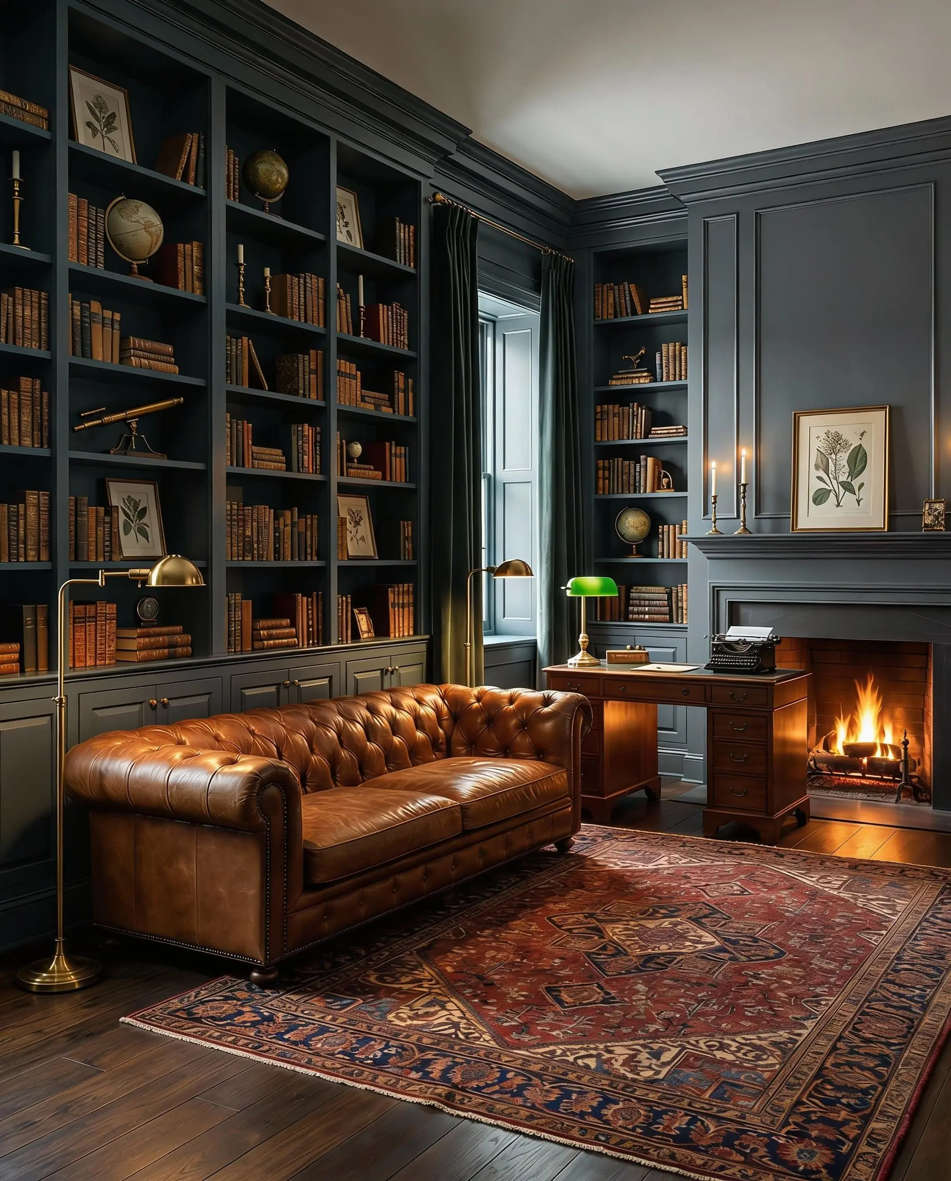
If you thought brown was boring, think again. Benjamin Moore’s Silhouette (AF-655) is the headliner for 2026, and it is a masterclass in modern elegance. Described by the brand as a “modern take on classical suiting,” this color is a deep, rich espresso brown with heavy charcoal undertones.
It is not the flat chocolate brown of the 1970s. Silhouette is complex. Depending on the light, it can read as a soft black, a deep urban gray, or a luxurious warm earth tone. It anchors a room with immediate gravity but—crucially—retains a warmth that pure black often lacks.
Why We Love It
In a digital world, we are craving physical warmth. Silhouette provides that “hug” we are looking for. It taps into the broader architectural design trends of 2026, where designers are using darker materials to create intimacy in open-plan spaces. It’s the color of a leather armchair, a dark roast coffee, or a wool coat—comforting and classic.
Best Ways to Use Silhouette
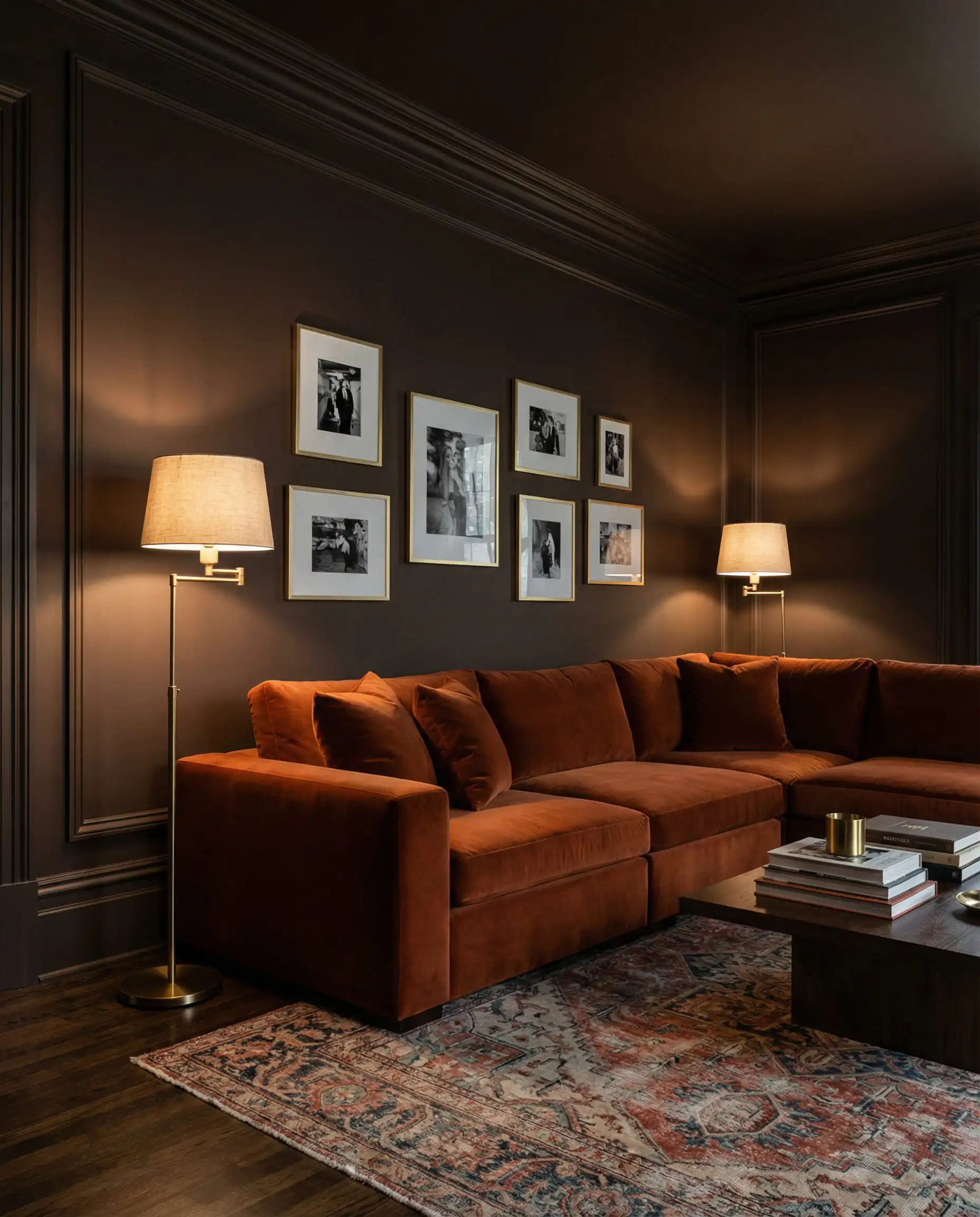
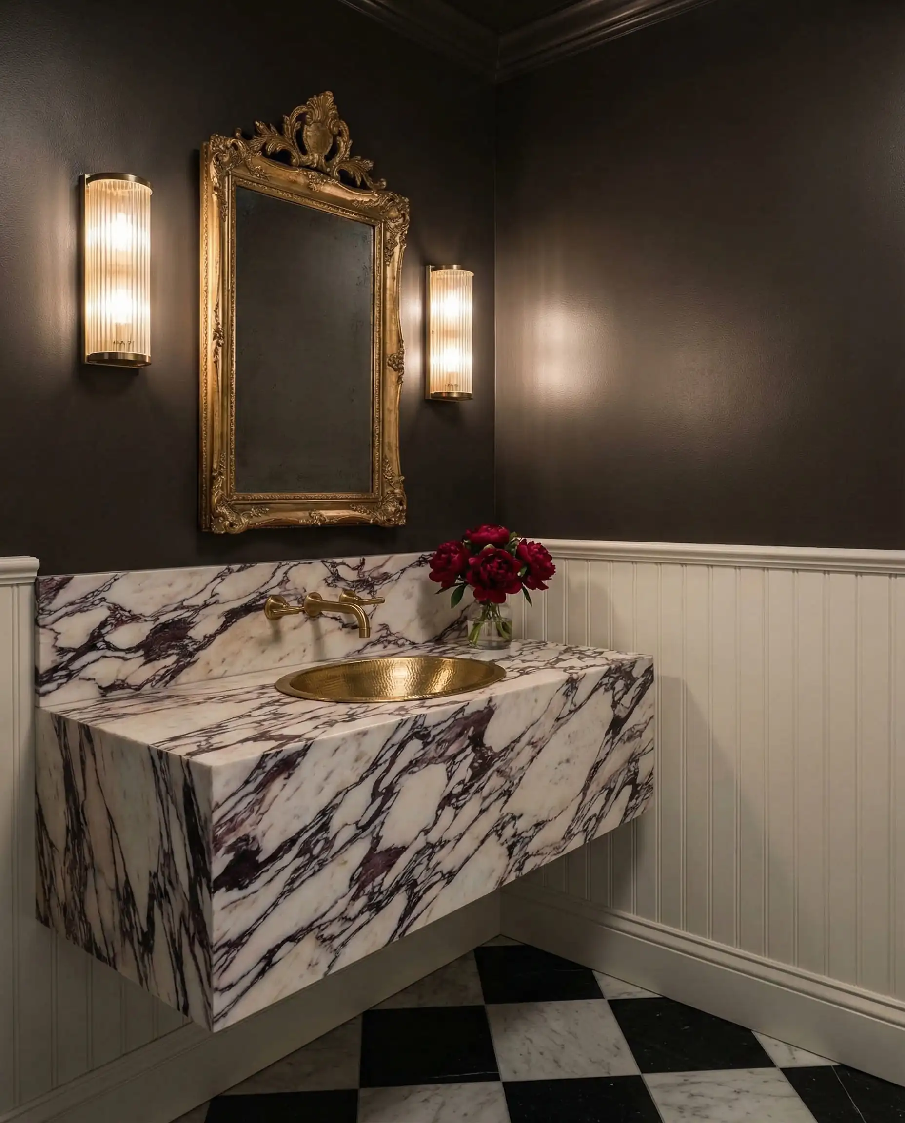
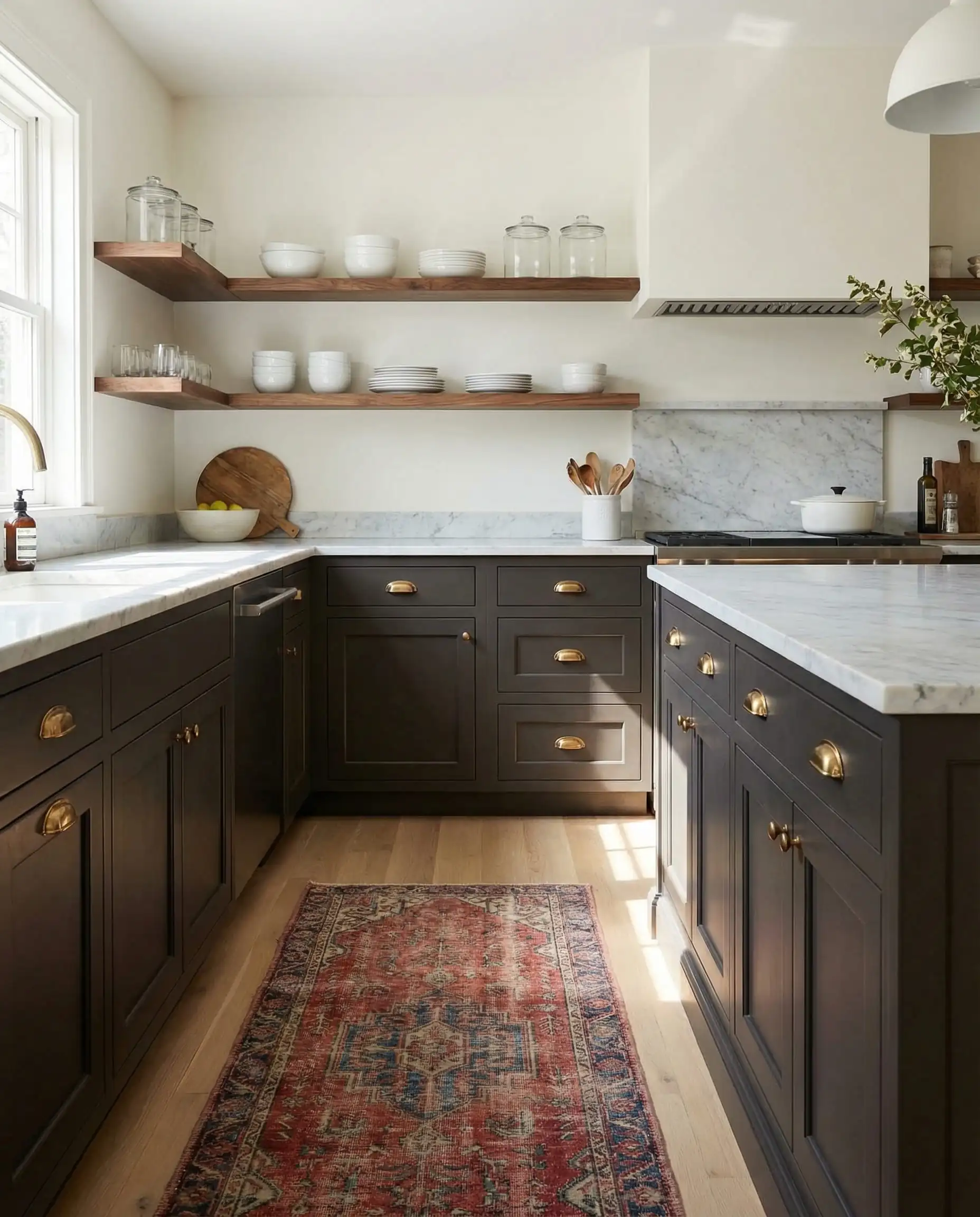
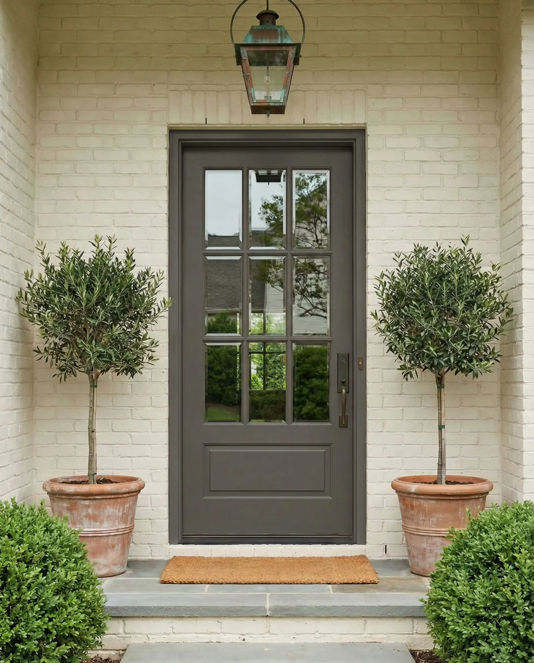
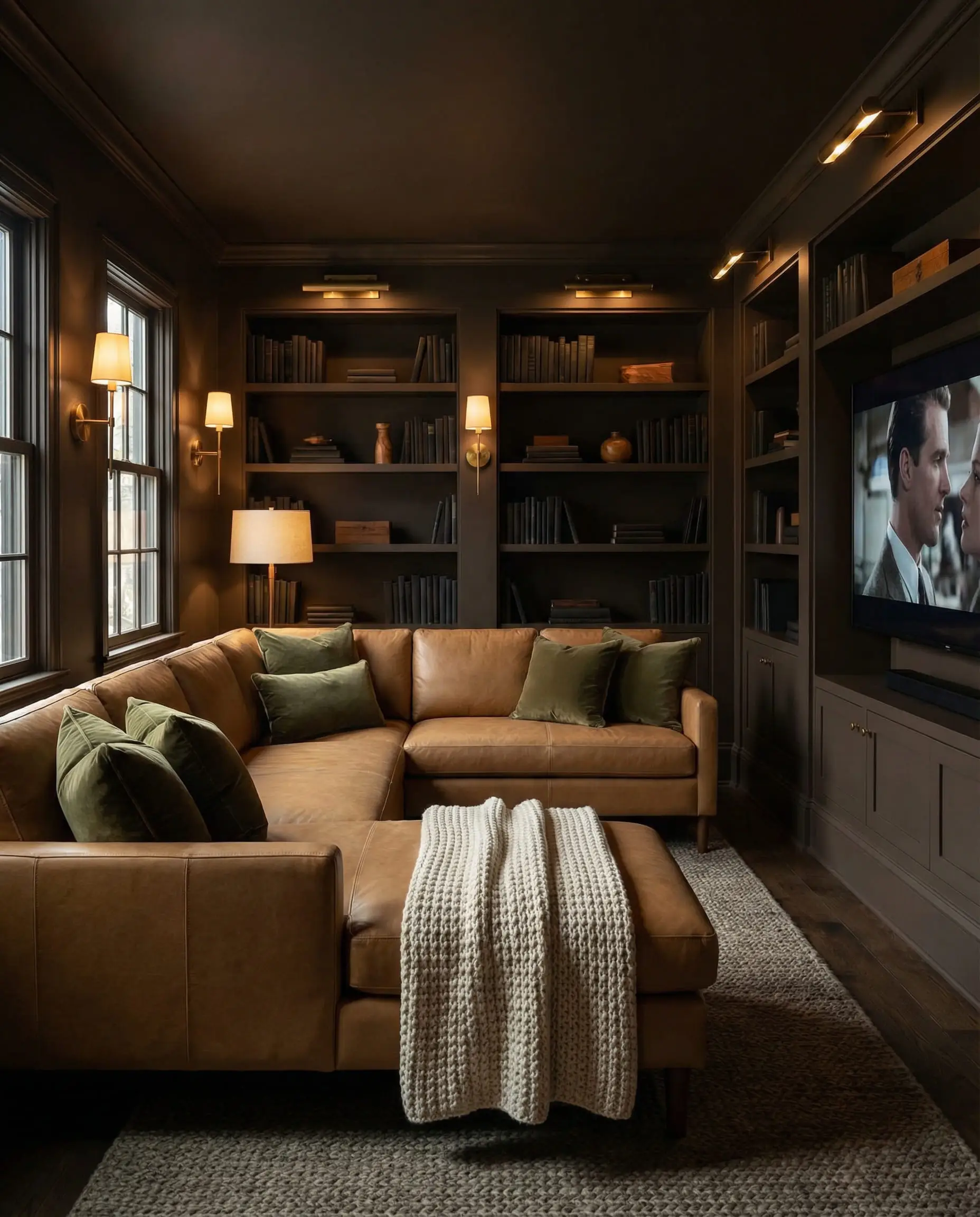
Don’t fear the dark! The biggest myth in design is that dark colors make a room look small. Actually, dark colors like Silhouette blur the edges of a room, creating an “infinity effect” that adds depth. To keep it from feeling like a cave, ensure you have multiple layers of warm lighting (sconces + lamps). 💡
🎨 Designer Tip
The 2026 Trending Palette
While Silhouette steals the show, the supporting palette is equally stunning. Benjamin Moore has divided the 2026 trends into two distinct moods: Enchanting Pales (ethereal, misty neutrals) and Handsome Midtones (earthy, grounding shades).
1. Enchanting Pales: The New Neutrals
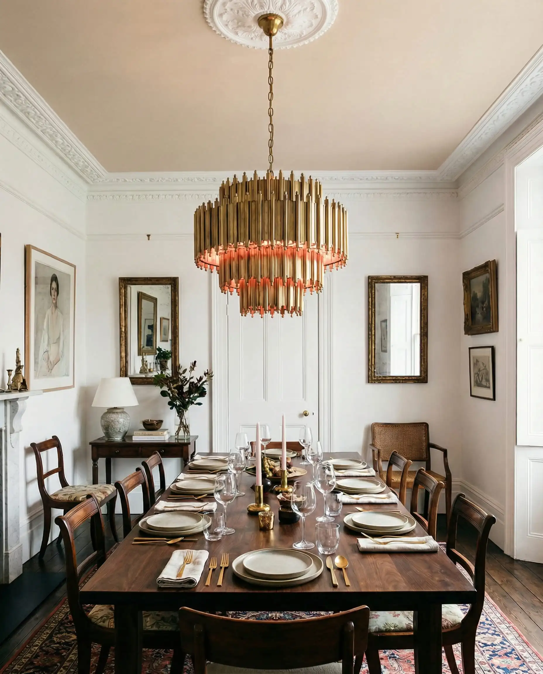
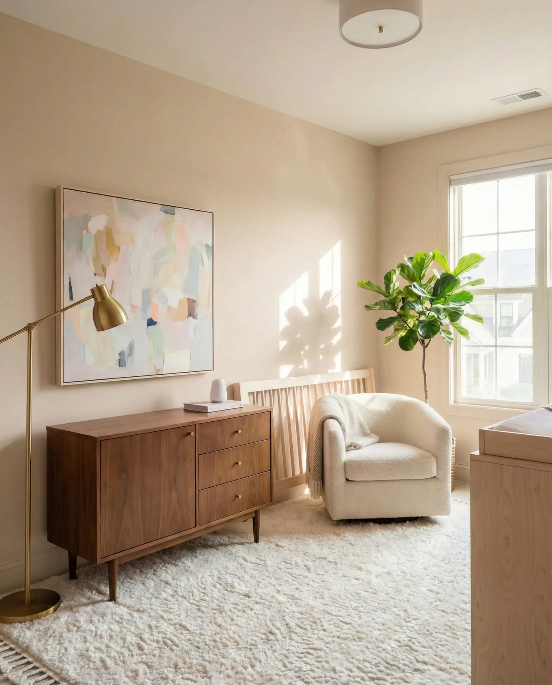
These aren’t your standard builder-grade beiges. These colors have a “dusty” quality that makes them feel vintage and lived-in from day one.
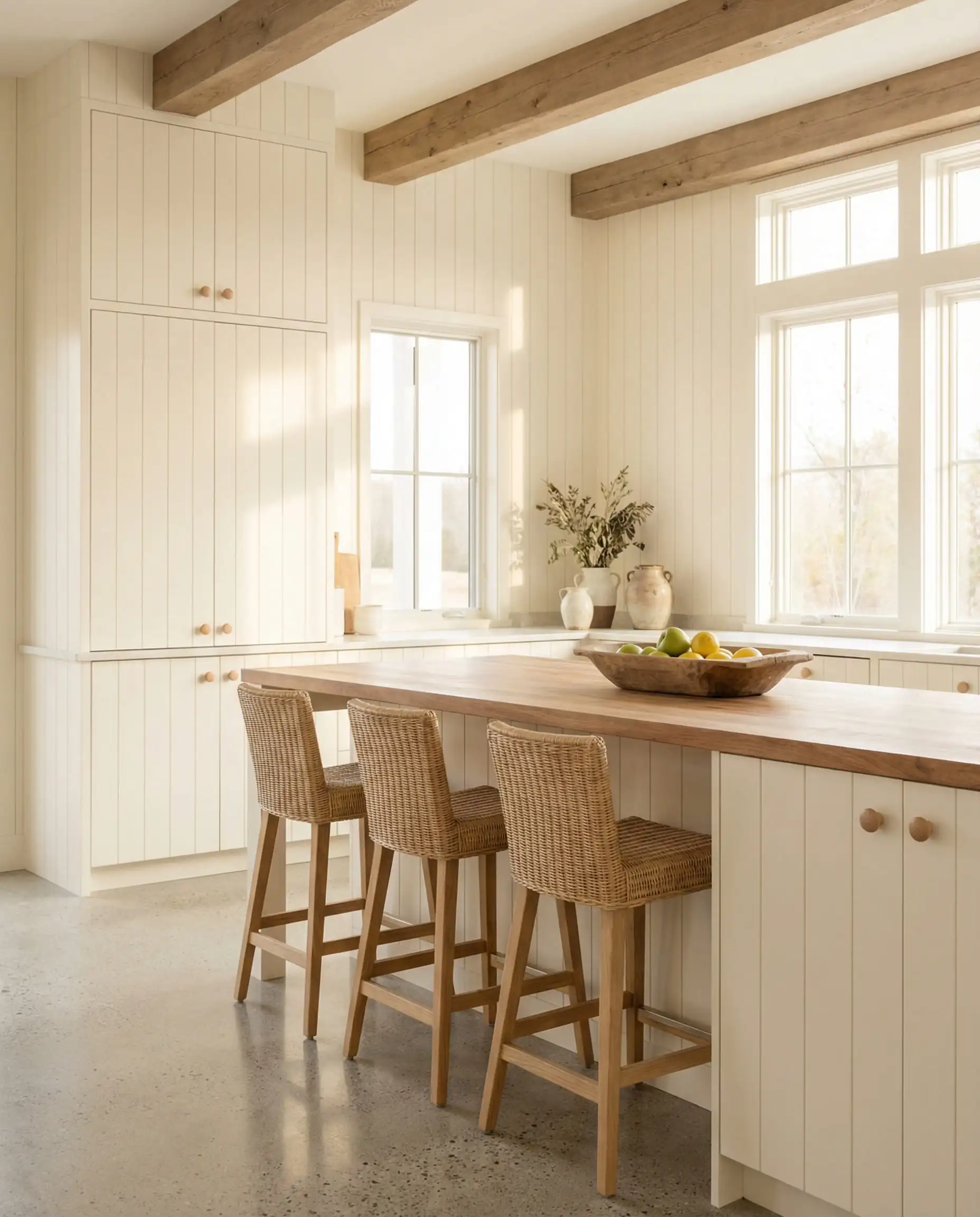
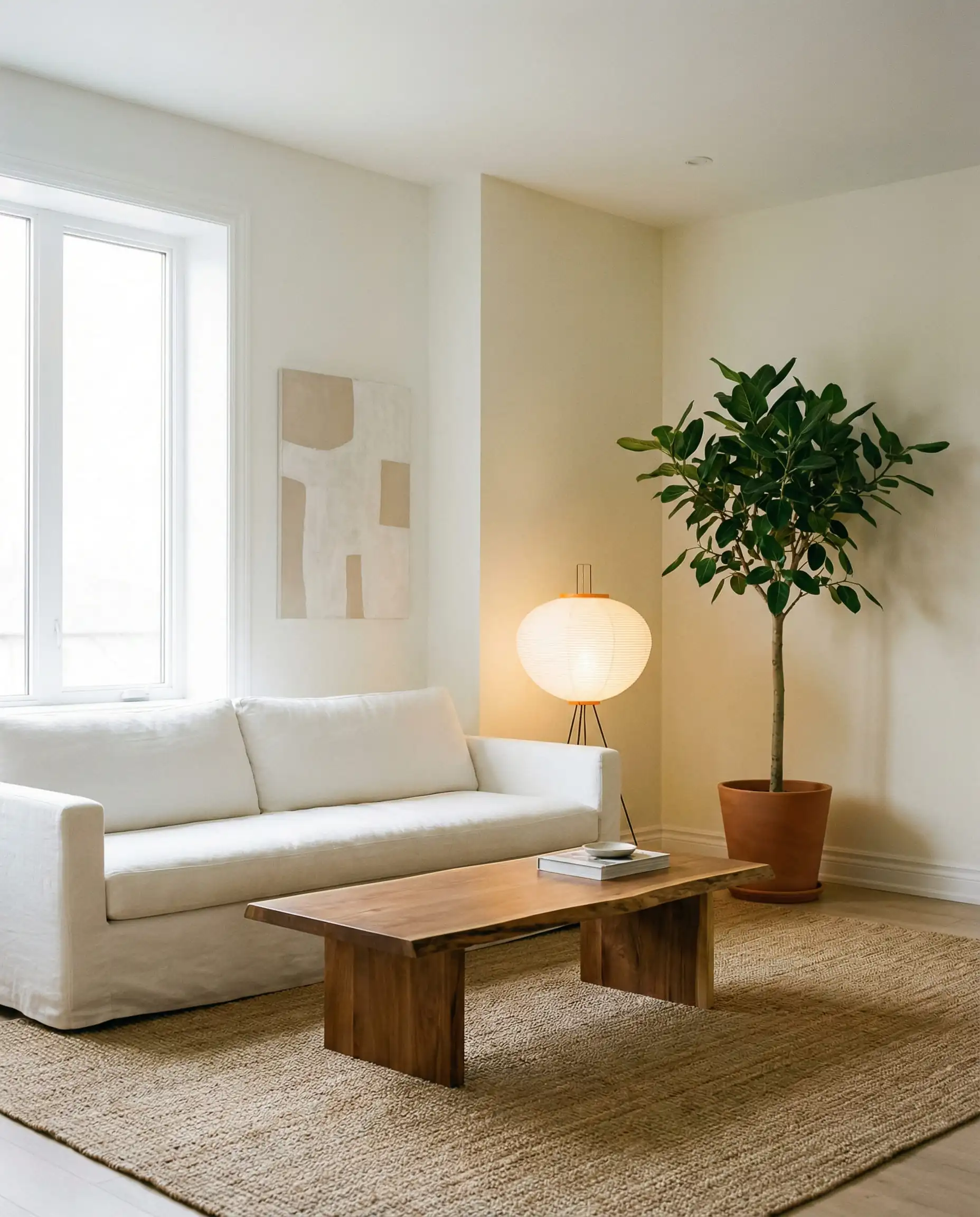
Swiss Coffee (OC-45)
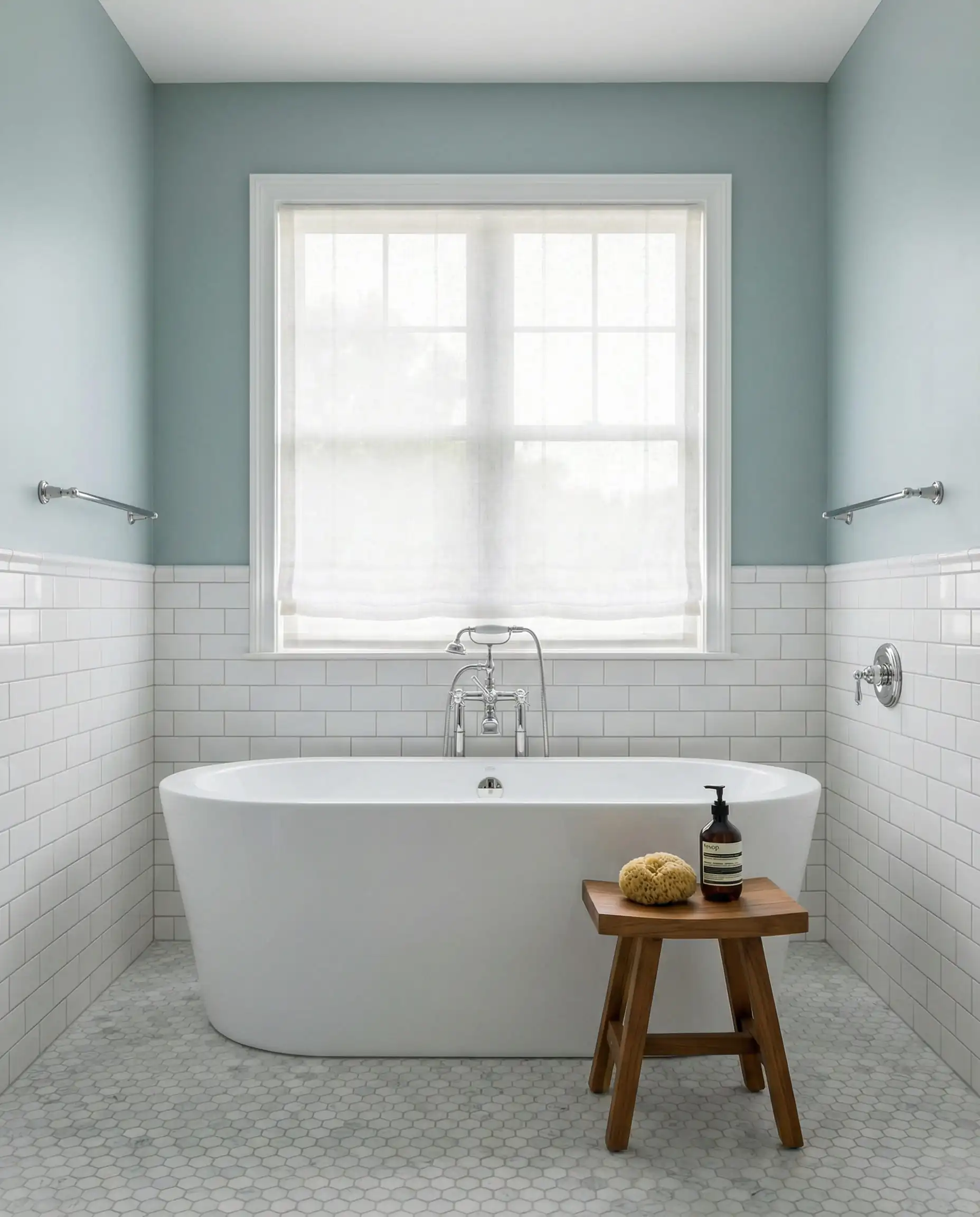
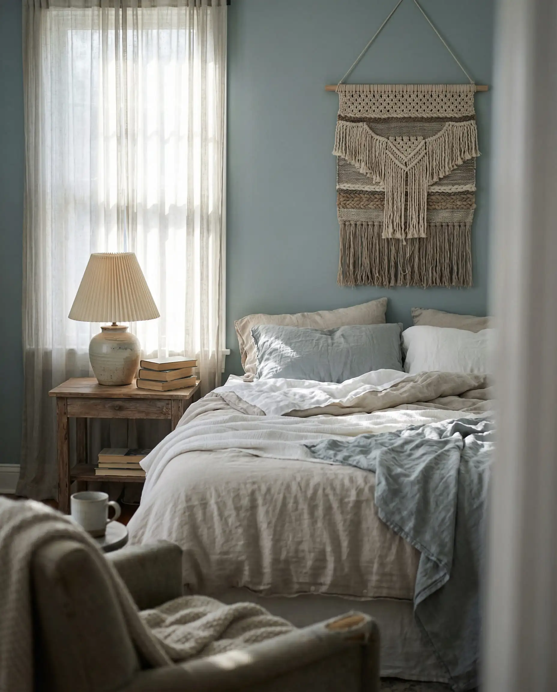
Raindance (1572)
First Crush (CSP-310)
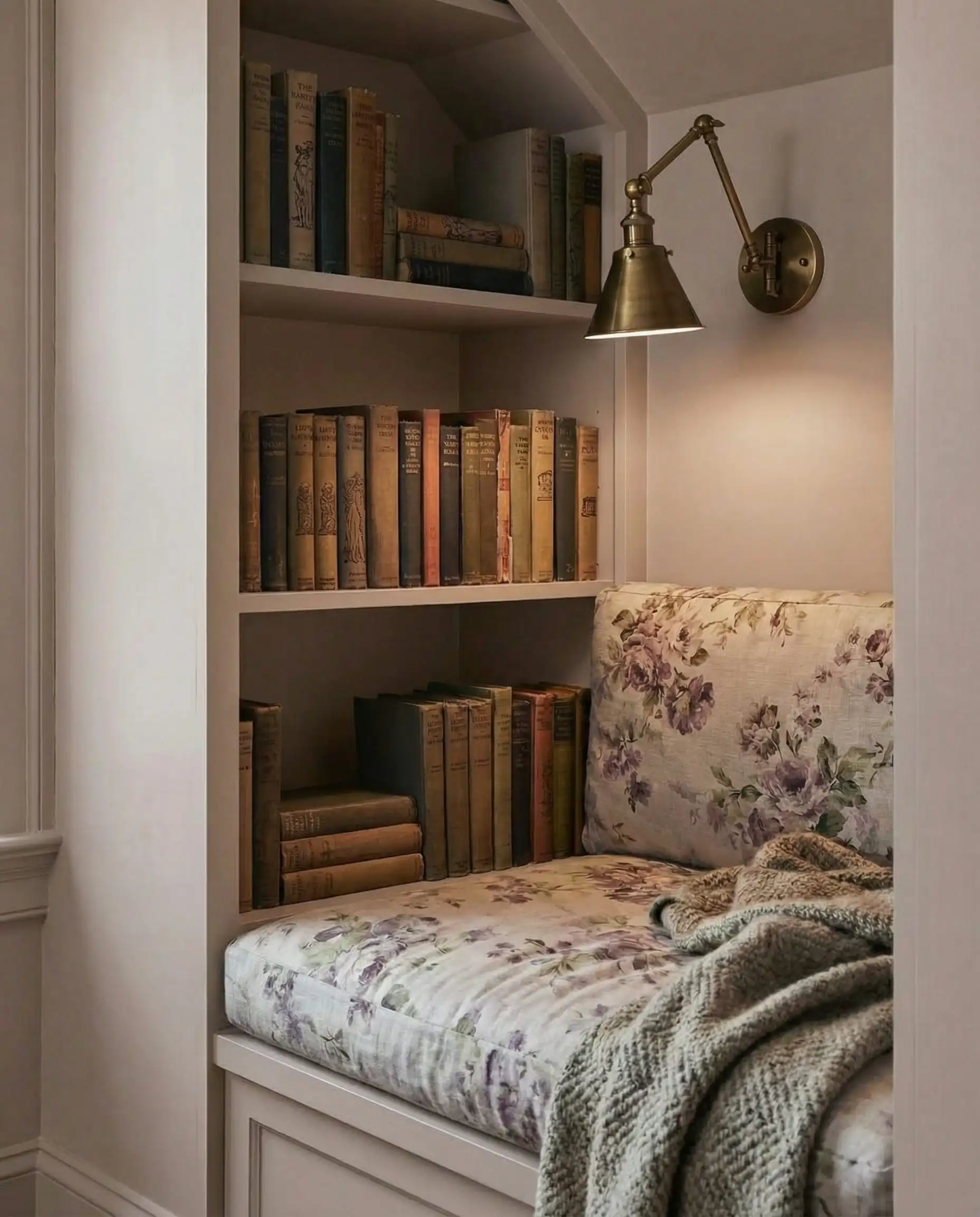
Batik (AF-610)
2. Handsome Midtones: Depth & Drama
If you are ready to step away from white walls but aren’t ready for the darkness of Silhouette, these midtones are your sweet spot.
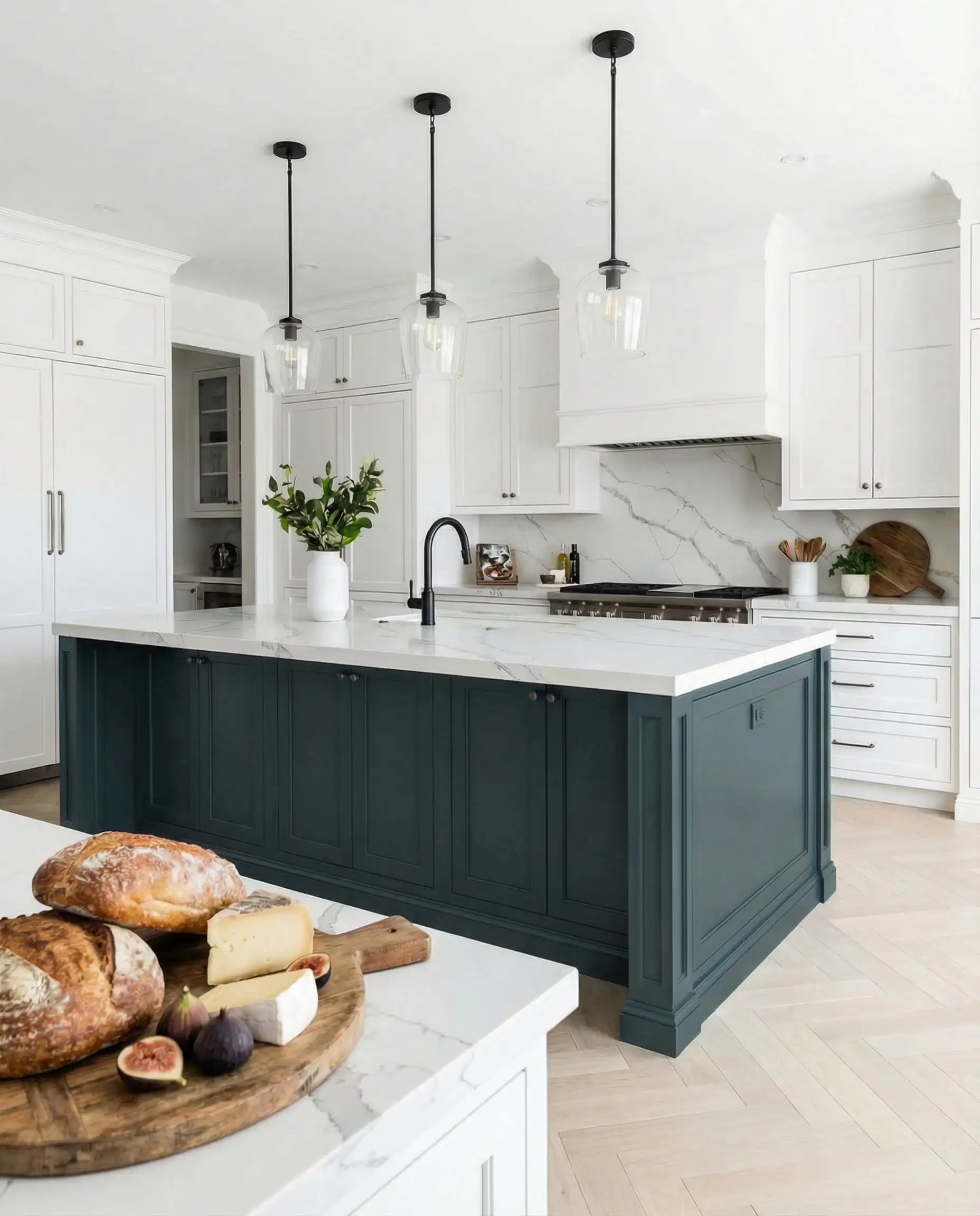
Narragansett Green (HC-157)
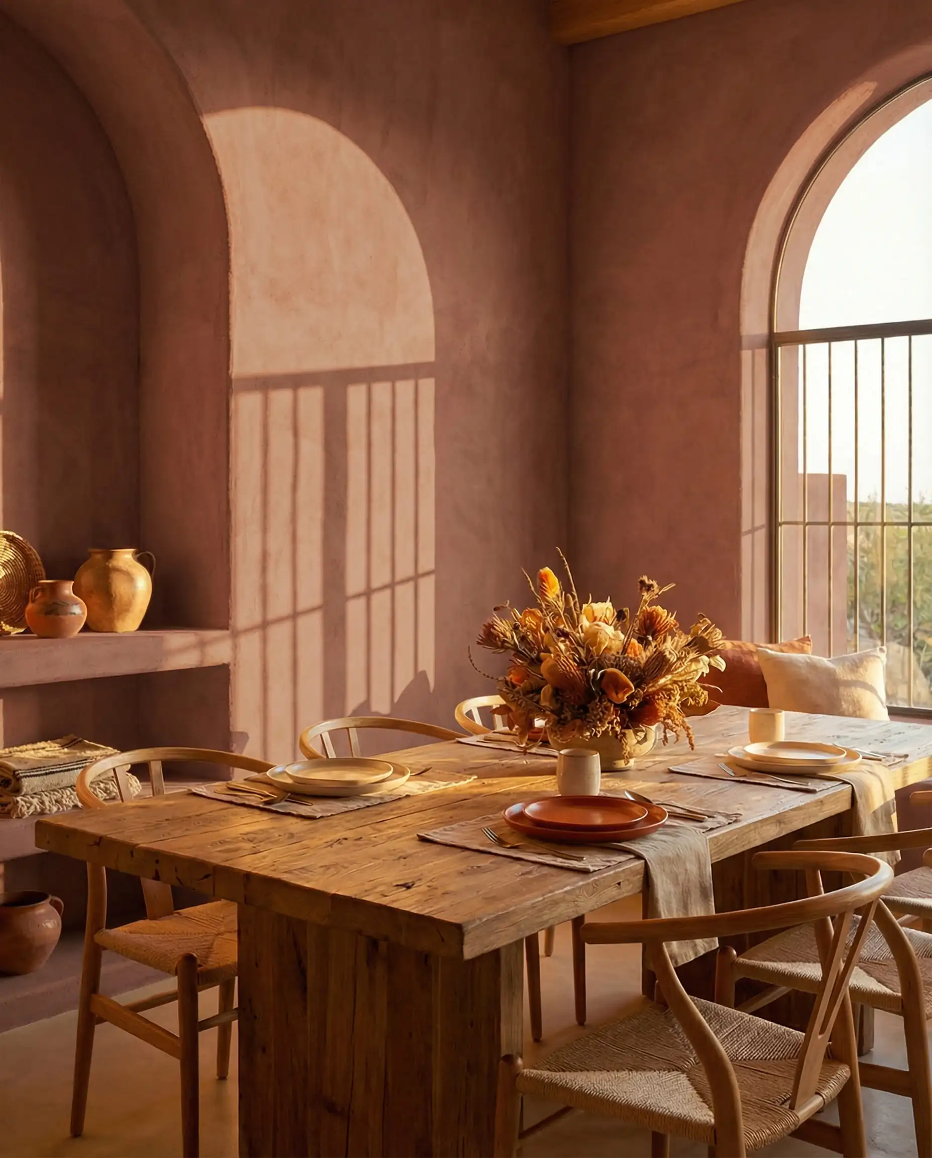
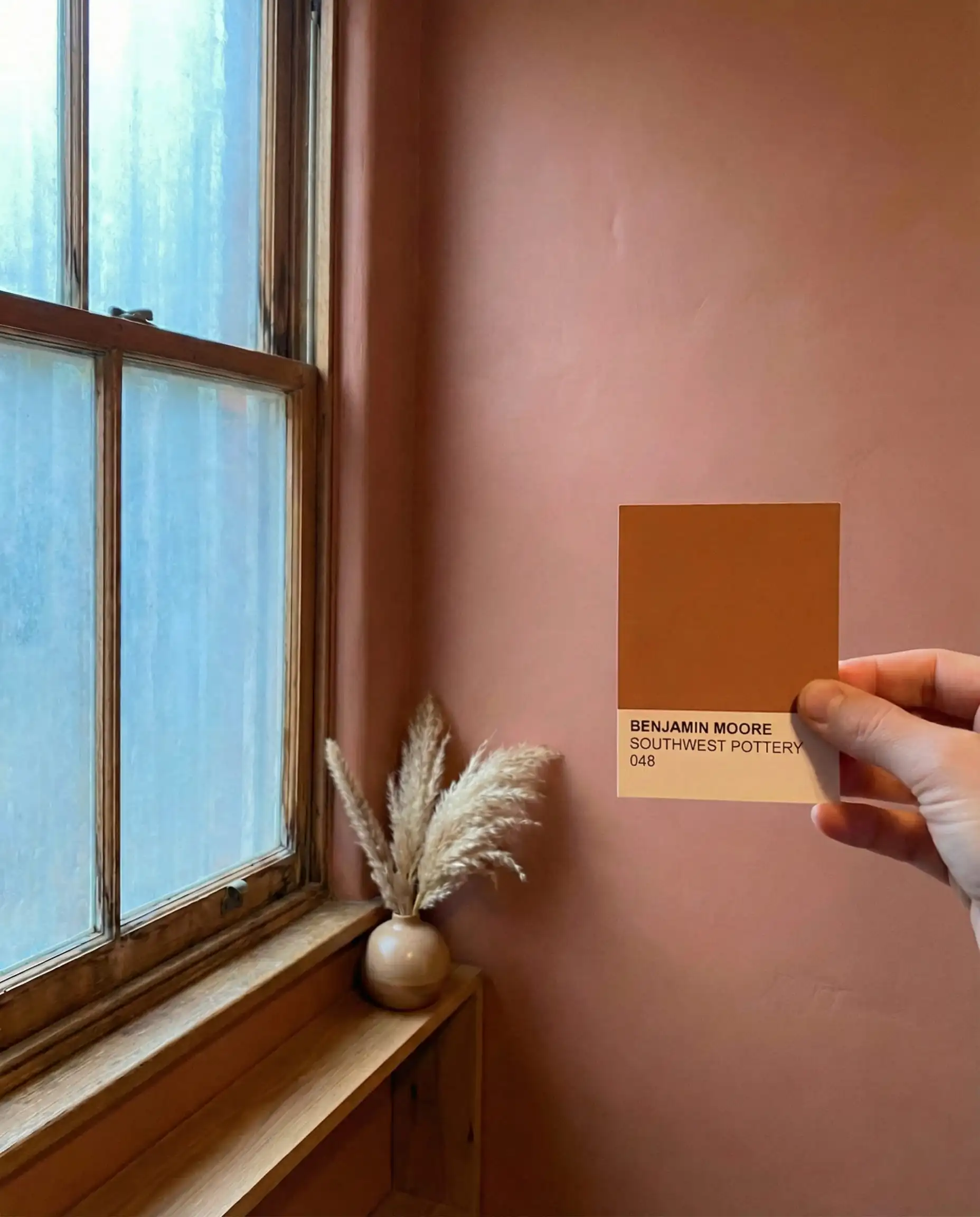
Southwest Pottery (048)
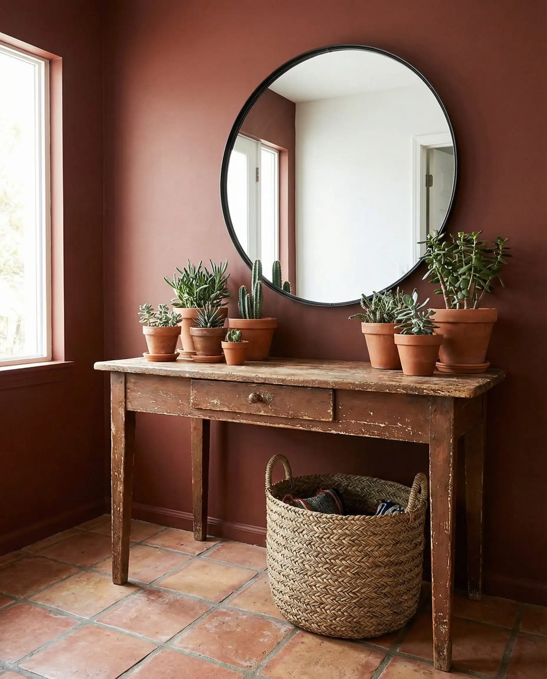
Sherwood Tan (1054)
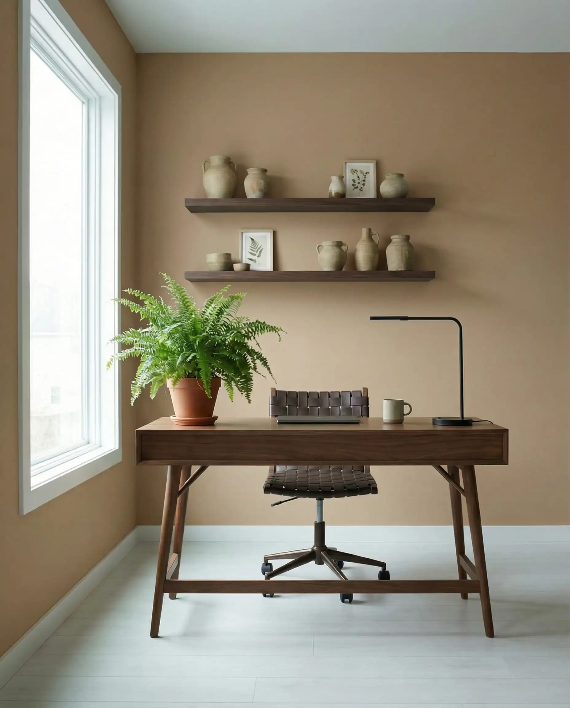
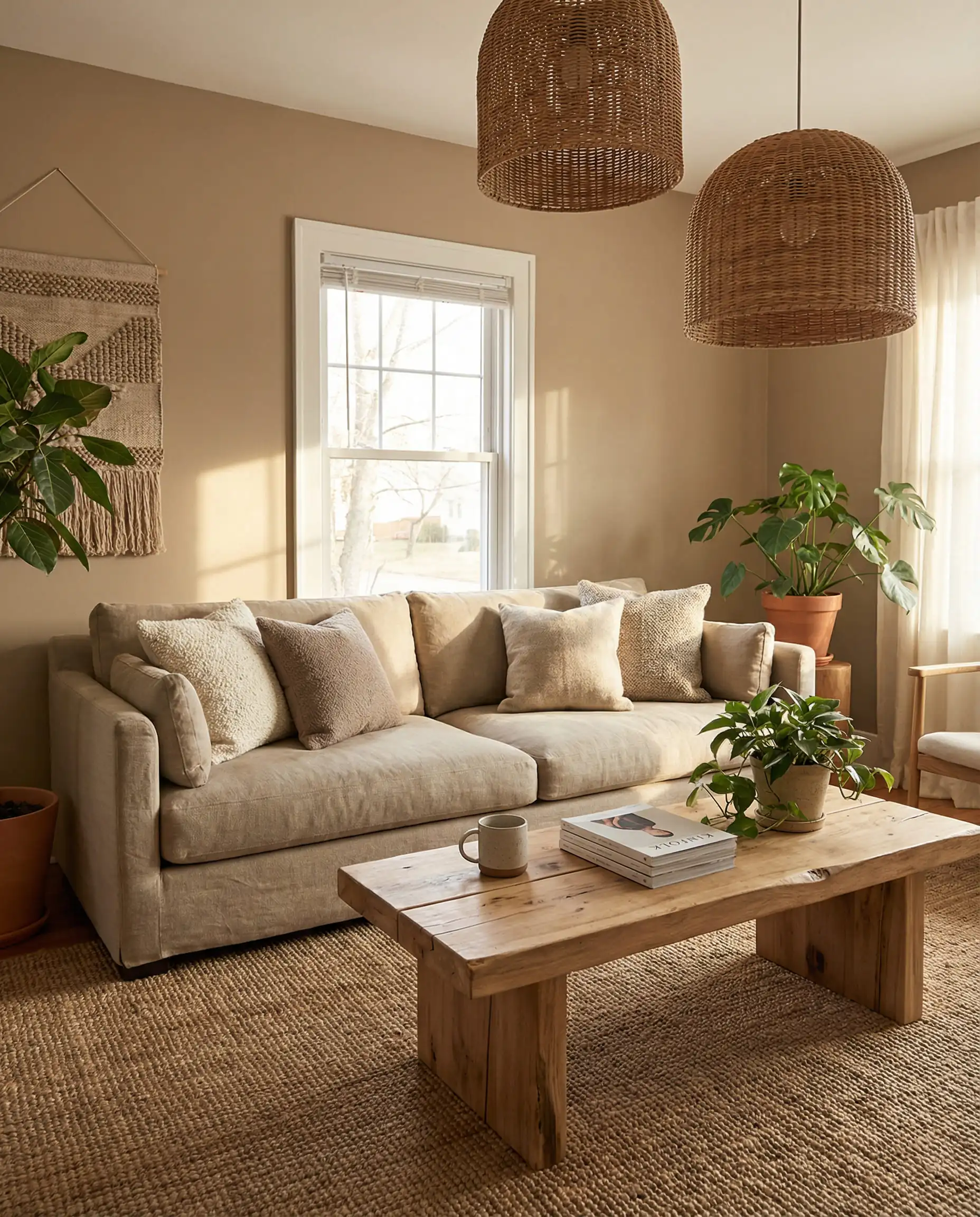
The “Enchanting Pales” and “Handsome Midtones” are designed to be mixed! Try painting the walls in First Crush and the trim in Southwest Pottery for a warm, monochromatic look that feels very high-fashion. 💅
🎨 Designer Tip
The “Hall of Fame”: Best-Selling Benjamin Moore Colors
While trends are exciting, sometimes you just want a color that is guaranteed to work. These are the “Hall of Fame” colors—the shades that designers return to decade after decade. If the 2026 trends feel too bold for you, you can never go wrong with these classics.
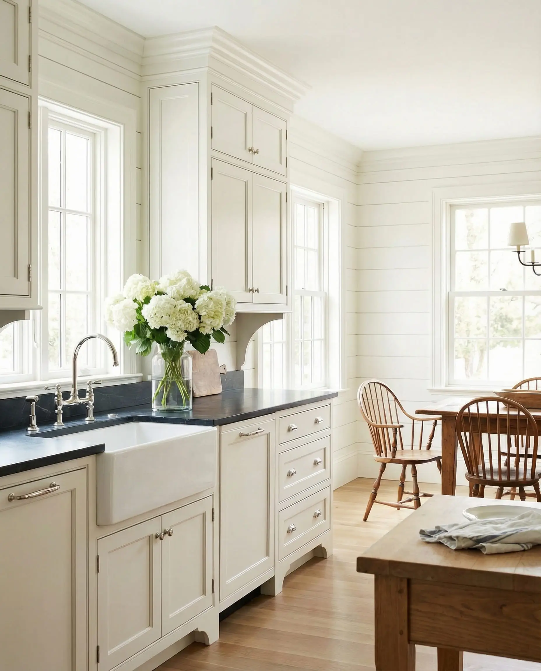
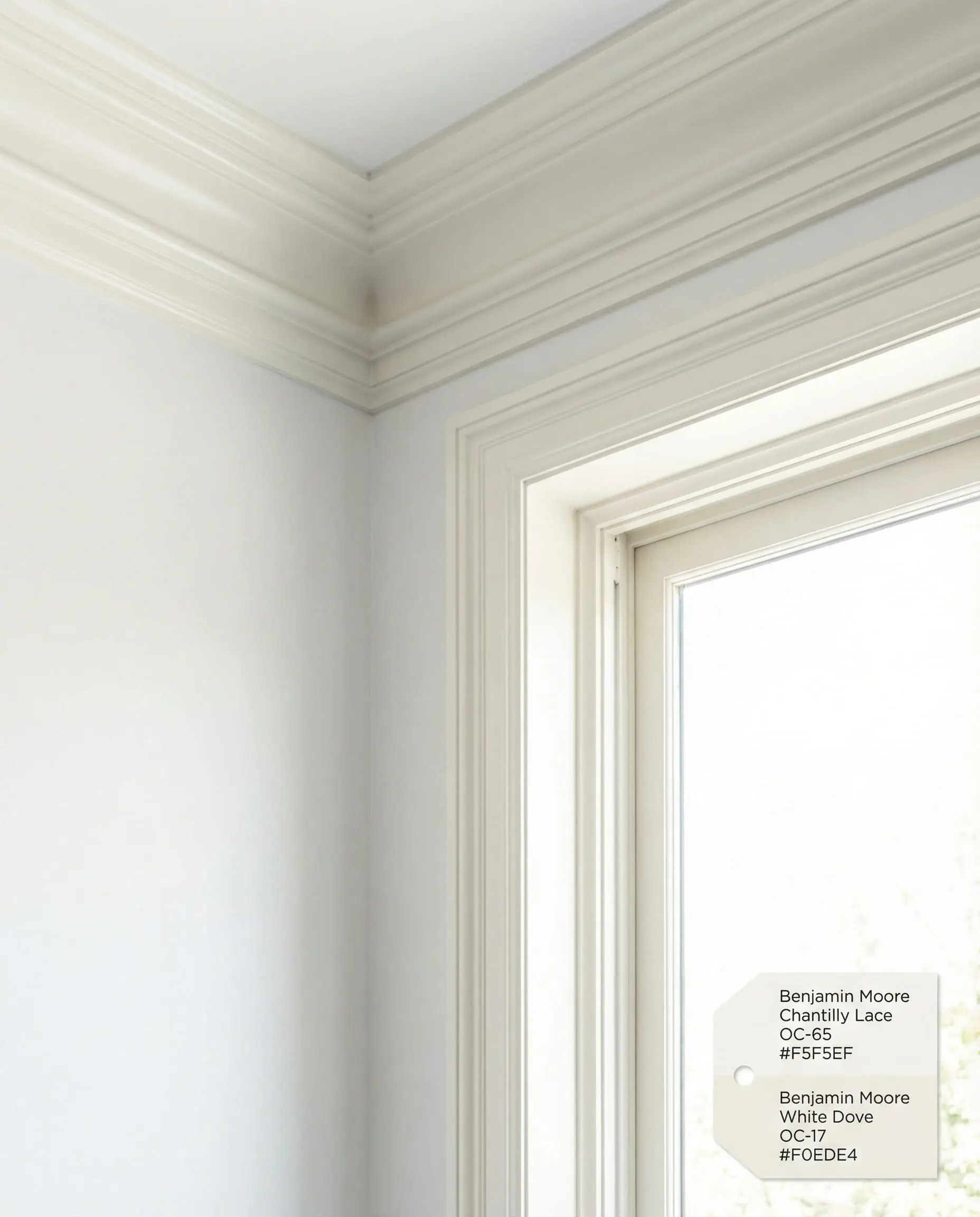
🏆 Best White Paints
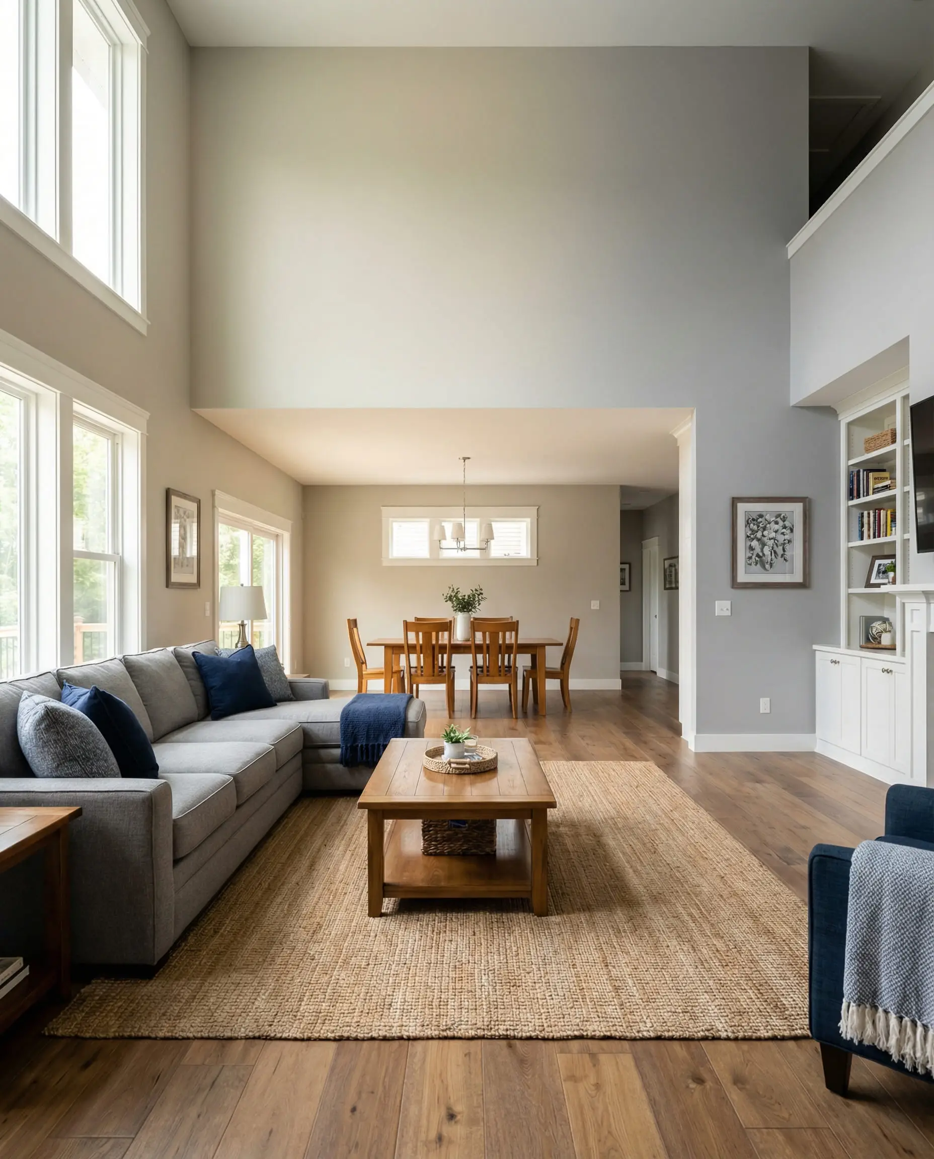
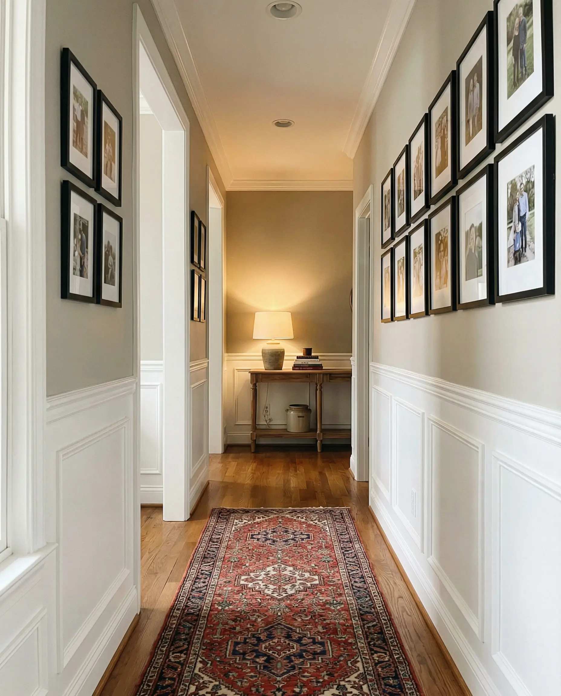
🏆 Best Gray & Greige Paints
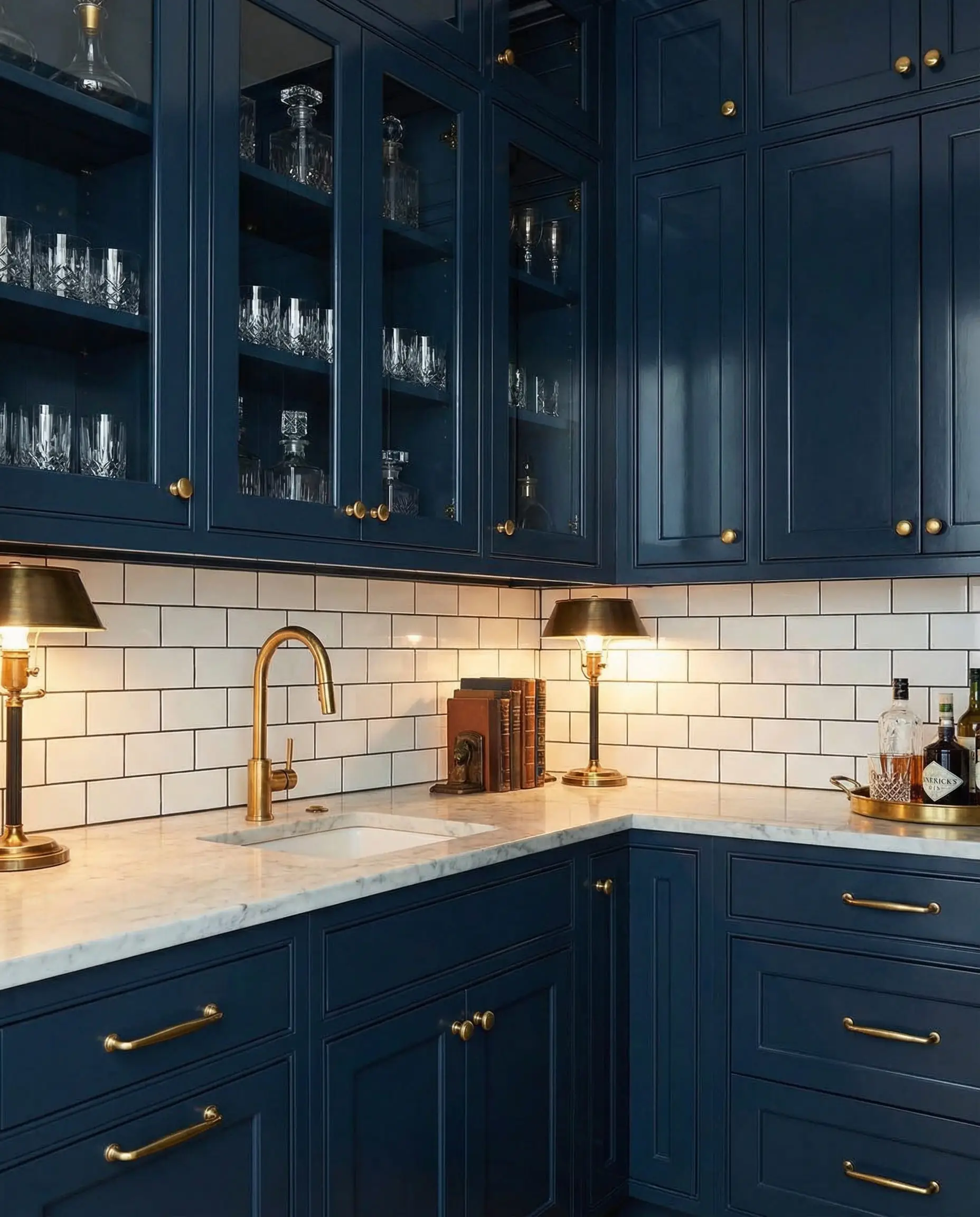
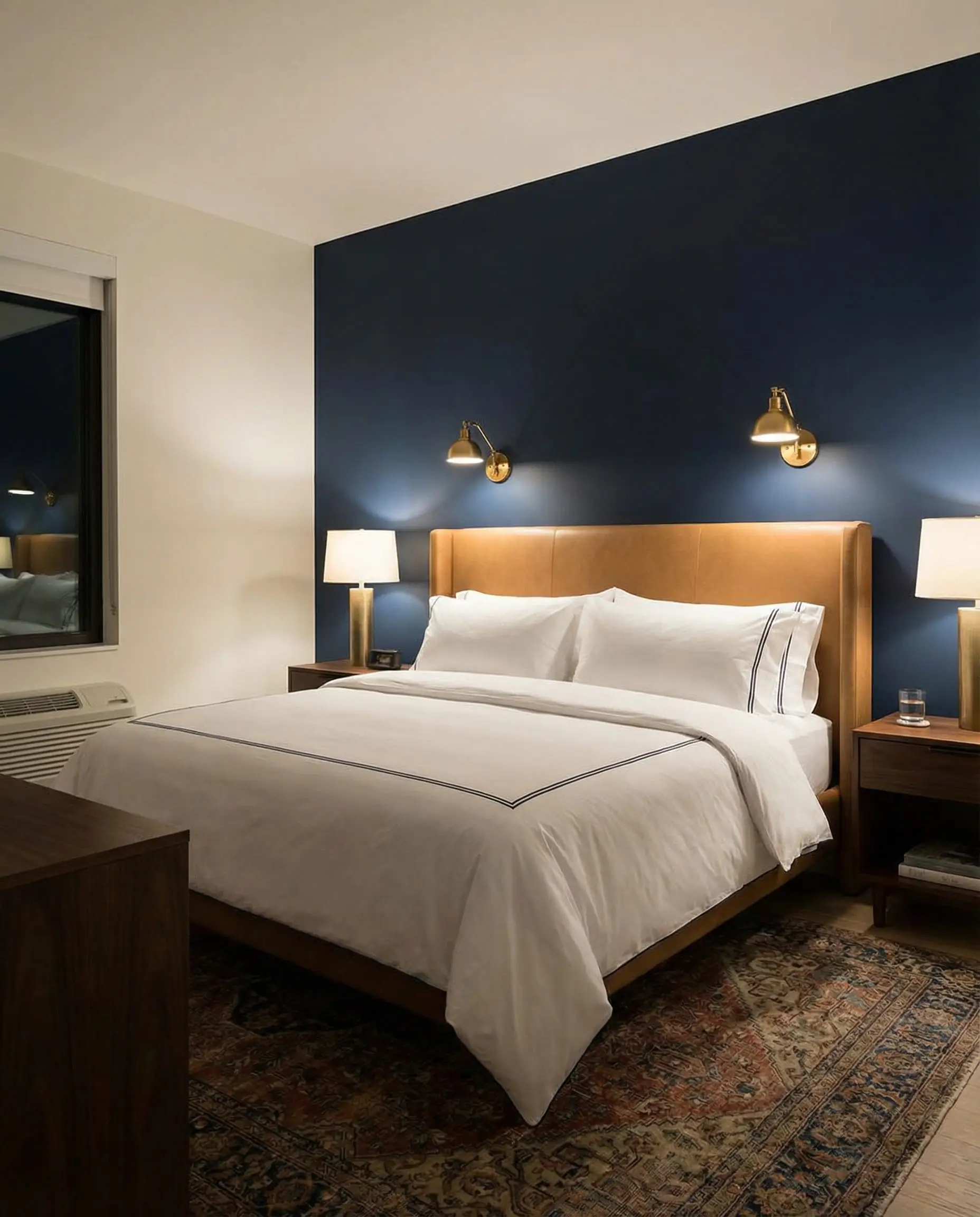
🏆 Best Dark & Moody Paints
How to Choose the Right Color for Each Room
Choosing a color is about more than just what looks good on a swatch; it’s about the energy you want to create in a specific space.
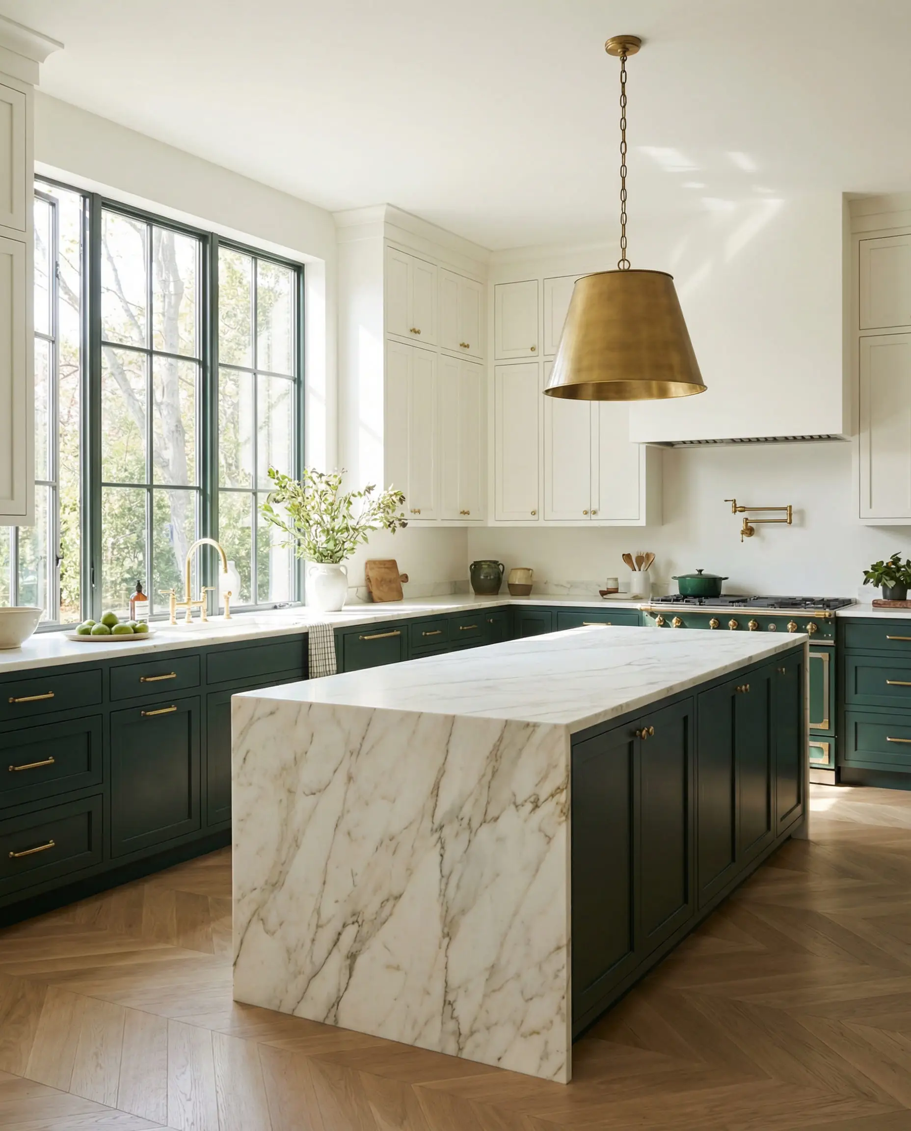
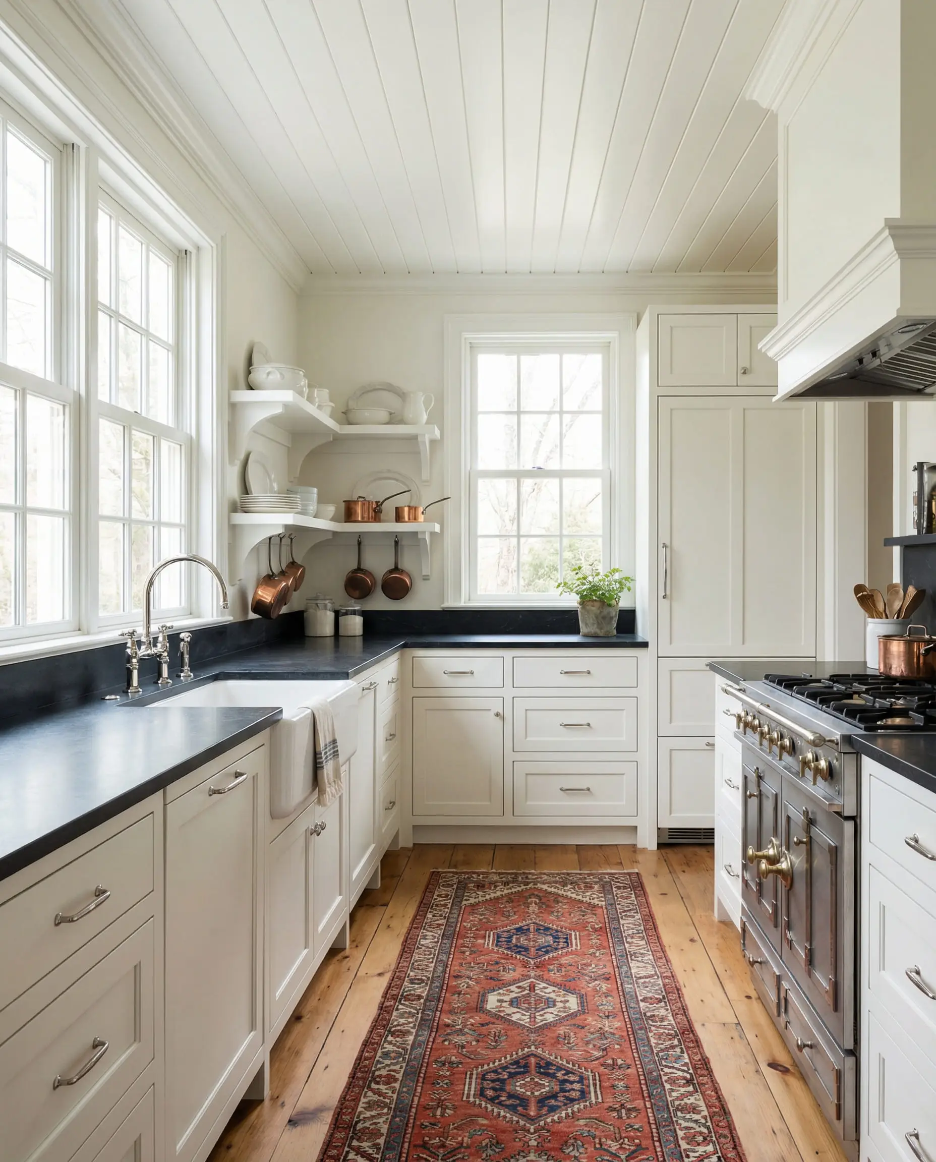
🍽️ The Kitchen
The Trend Choice: Narragansett Green on the lower cabinets with Swiss Coffee on the uppers. This “tuxedo” look grounds the space while keeping it airy.
The Classic Choice: White Dove everywhere. It’s clean, resale-friendly, and makes food look good.
🛋️ The Living Room
The Trend Choice: Silhouette (Color Drenching). Paint the walls, trim, and baseboards all in this rich brown for a cozy, cinema-room vibe.
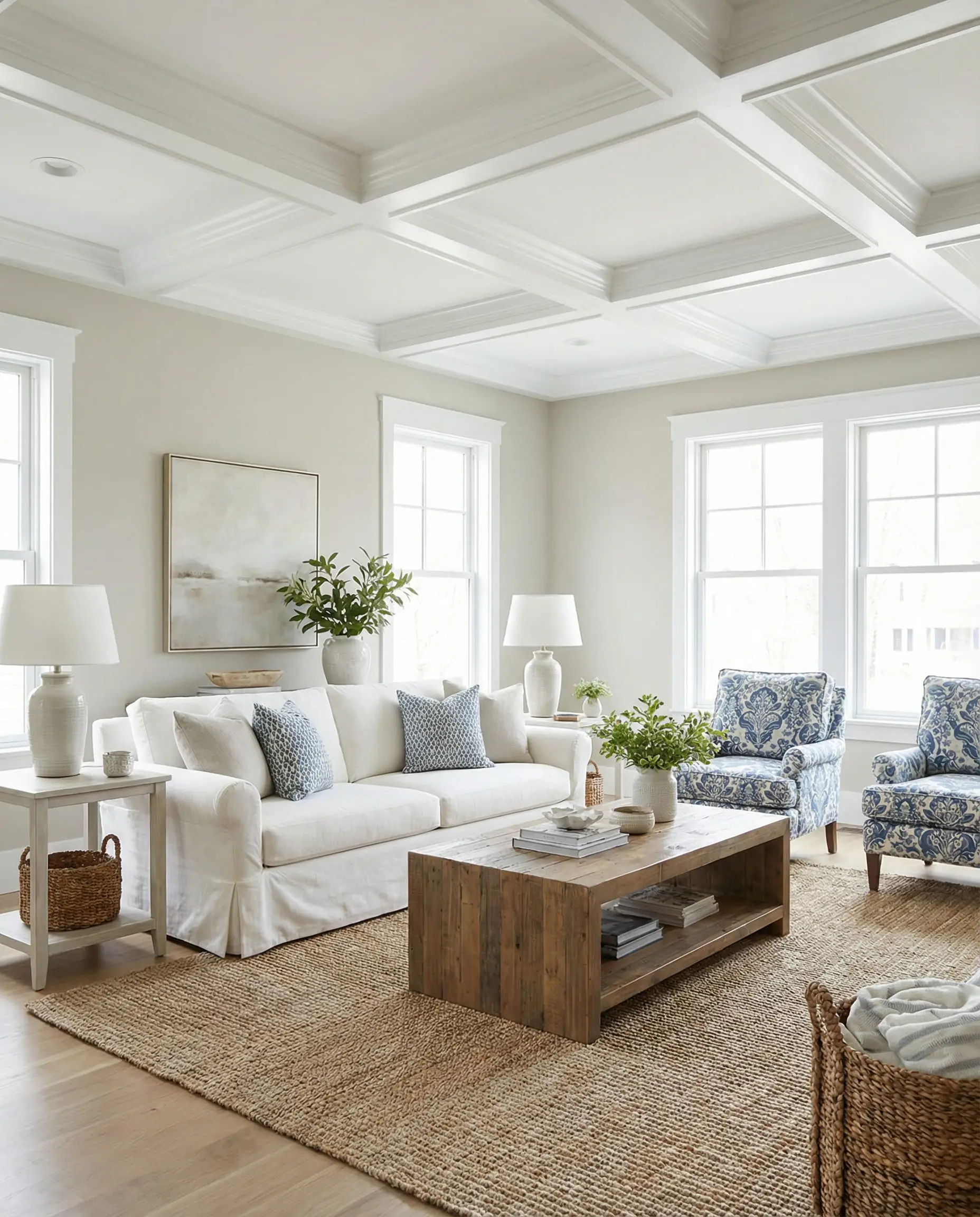
The Classic Choice: Revere Pewter. It is flexible enough to handle changing furniture styles and works with any color sofa. Check out our guide on living room paint colors for more inspiration.
🛌 The Bedroom
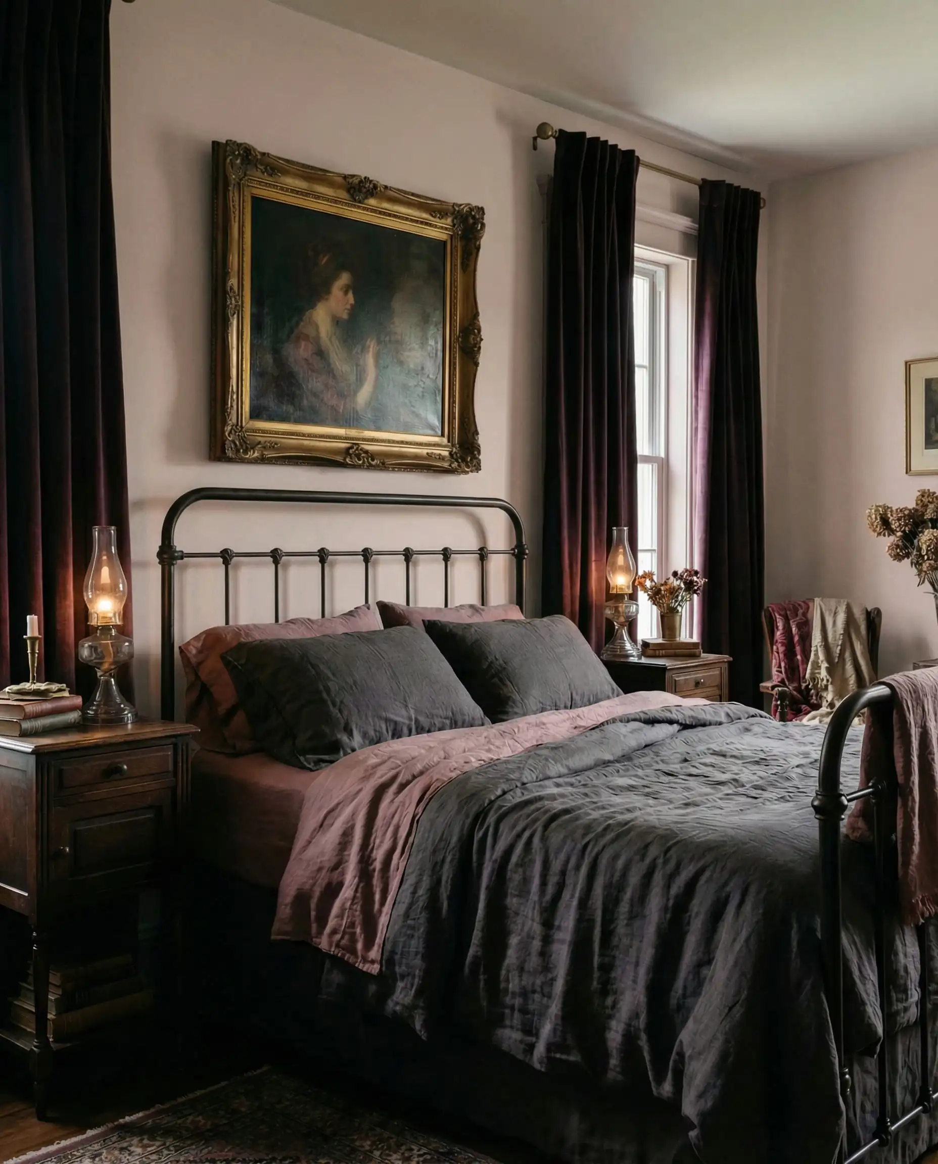
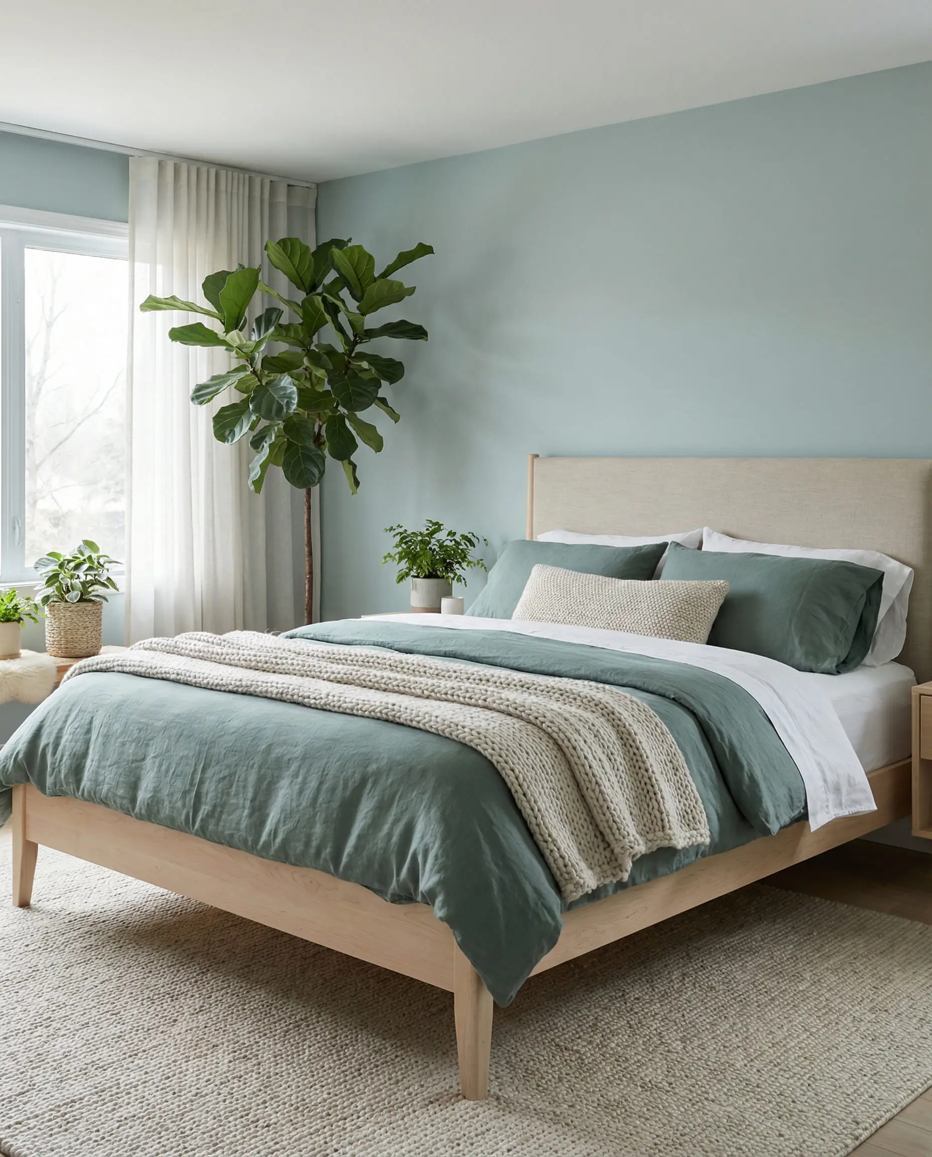
The Trend Choice: Raindance or Batik. These dusty shades promote relaxation and sleep by softening the visual noise in the room.
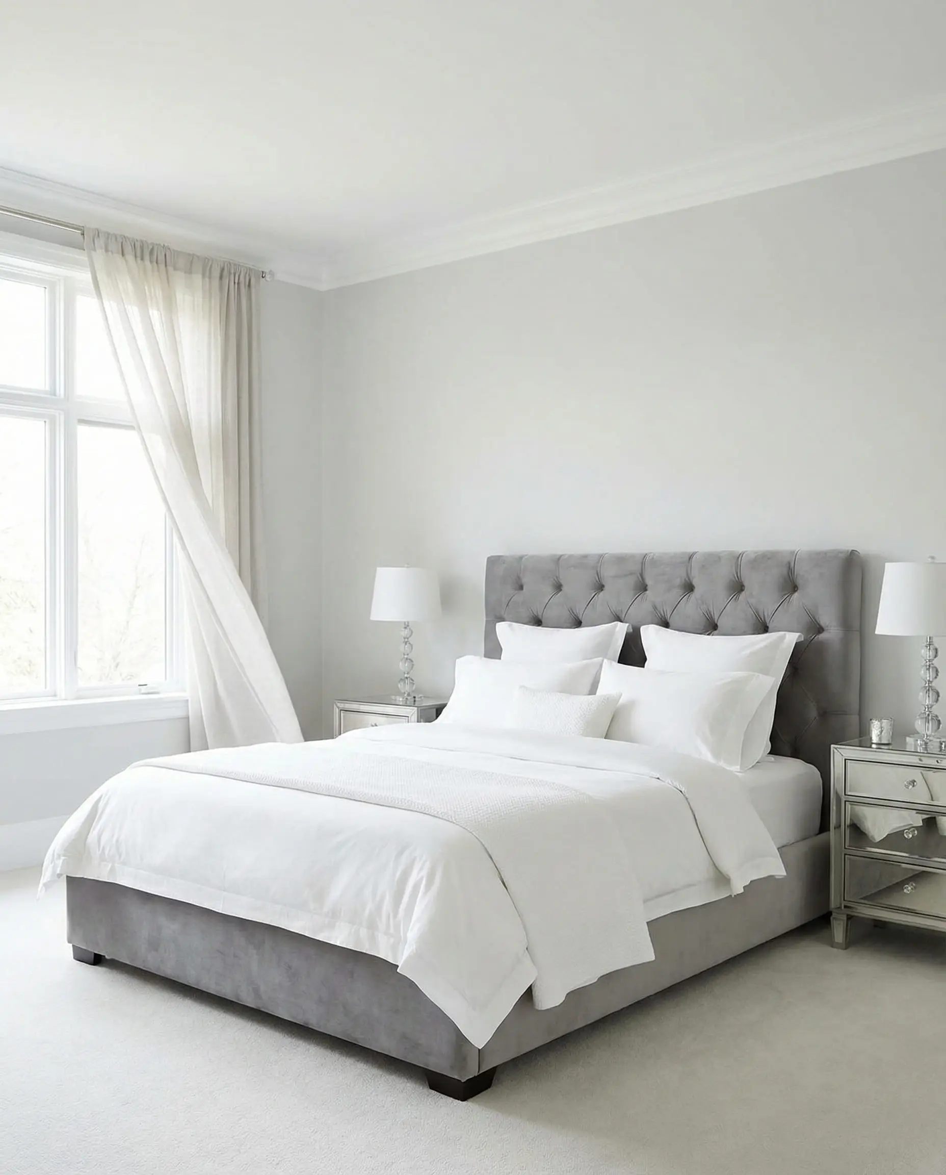
The Classic Choice: Classic Gray. It’s peaceful and serene, allowing your bedding to be the star of the show.
Expert Tips for Testing Paint Colors
You’ve picked your favorites—now what? Please, do not buy a gallon yet! Paint is a chameleon; it changes based on the lighting, the time of day, and even the greenery outside your window.
1. The Light Factor
2. Sample the Right Way
Don’t paint swatches directly on the wall! The existing wall color will distort your perception of the new shade.
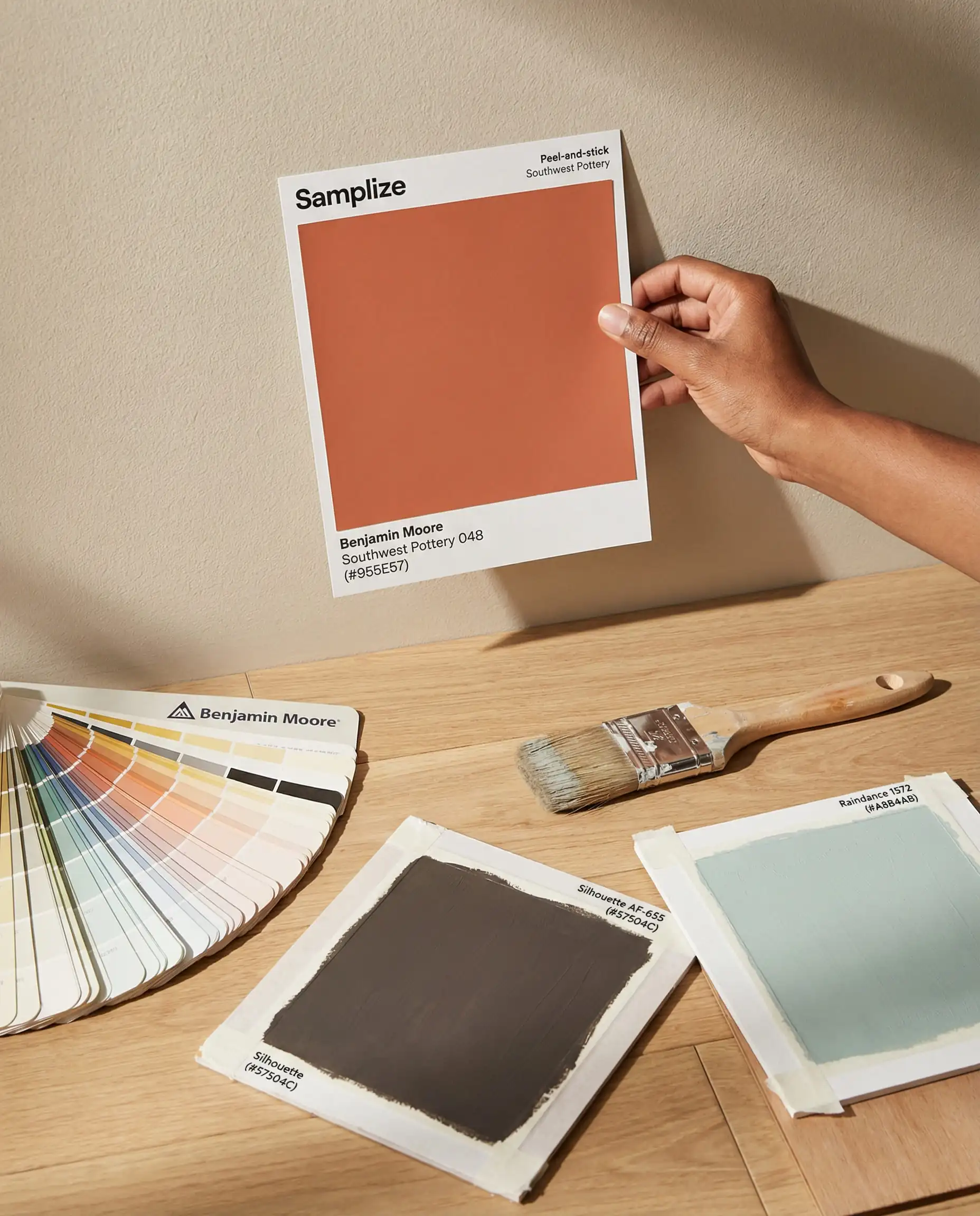
Check your samples at three times of day: Morning (cool light), Afternoon (brightest light), and Night (artificial light). A color like Batik might look gray in the morning and purple at night! 🕰️
🎨 Designer Tip
Frequently Asked Questions (FAQ)
A: Cool, icy grays are definitely on the decline. They are being replaced by “warm grays” (taupes) and browns like Silhouette. If you love gray, look for shades with brown or green undertones (like Revere Pewter) rather than blue undertones.
A: Swiss Coffee (OC-45) is the white of the moment. It aligns perfectly with the warmer, organic trends. However, White Dove remains a close second for its versatility.
A: Absolutely. Dark colors in small rooms (like powder rooms or offices) create a “jewel box” effect. It feels intentional and high-design. Just ensure you have good lighting.
A: Silhouette is a neutral, so it pairs with almost anything. For a chic look, pair it with Swiss Coffee. For a moody, monochromatic vibe, pair it with Sherwood Tan. For a pop of color, it looks incredible with First Crush (blush) or unlacquered brass accents.
Final Thoughts
Whether you are ready to embrace the moody drama of Silhouette or want to stay safe with the creamy warmth of Swiss Coffee, the 2026 palette offers something for everyone. The common thread this year is feeling. These aren’t just colors to look at; they are colors to live in.
Ready to start painting? Grab your samples, watch the light change, and trust your gut. Your home should be the best story you ever tell.