Staring at the Behr fan deck in the middle of Home Depot is a fast track to decision fatigue. You pick what looks like a pristine, expensive neutral, spend $300 and your entire weekend rolling it on, only to watch in horror as the afternoon sun turns your living room baby blue or sickly green. This is the dreaded chameleon effect, and it ruins countless DIY projects before the paint even dries.
A paint chip lies. To achieve a bespoke, high-end look using accessible paints, you have to stop looking at the swatch and start looking at the science. We judge every hue based on its LRV (Light Reflectance Value) and its hidden undertones. LRV measures how much natural light a color will bounce around the room versus how much it will absorb, dictating whether your space feels airy or cavernous.
You do not need to hire an expensive color consultant to get this right. We broke down the exact specifications, lighting rules, and precise trim pairings for the top Behr gray paints. Here is how to decode the fan deck and nail a flawless finish on the first try.
The Warm Grays & Greiges: The Safe Whole-Home Neutrals
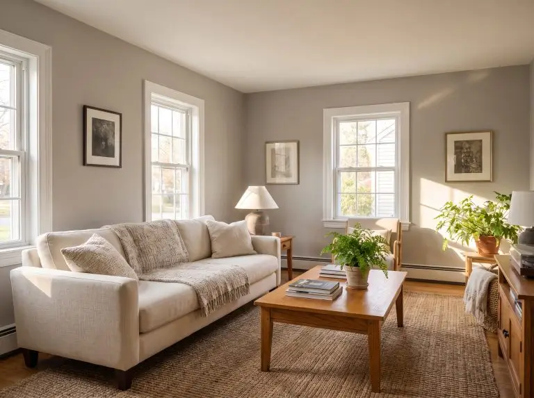
Warm grays—often referred to as greige—infuse a space with subtle yellow, brown, or taupe undertones, making them your strongest defense against a room feeling cold or sterile. These adaptable shades are the absolute safest bet for open-concept floor plans and North-facing rooms that receive cooler, bluer natural light.
Silver Drop (790C-2): The Luminous Whole-Home Favorite
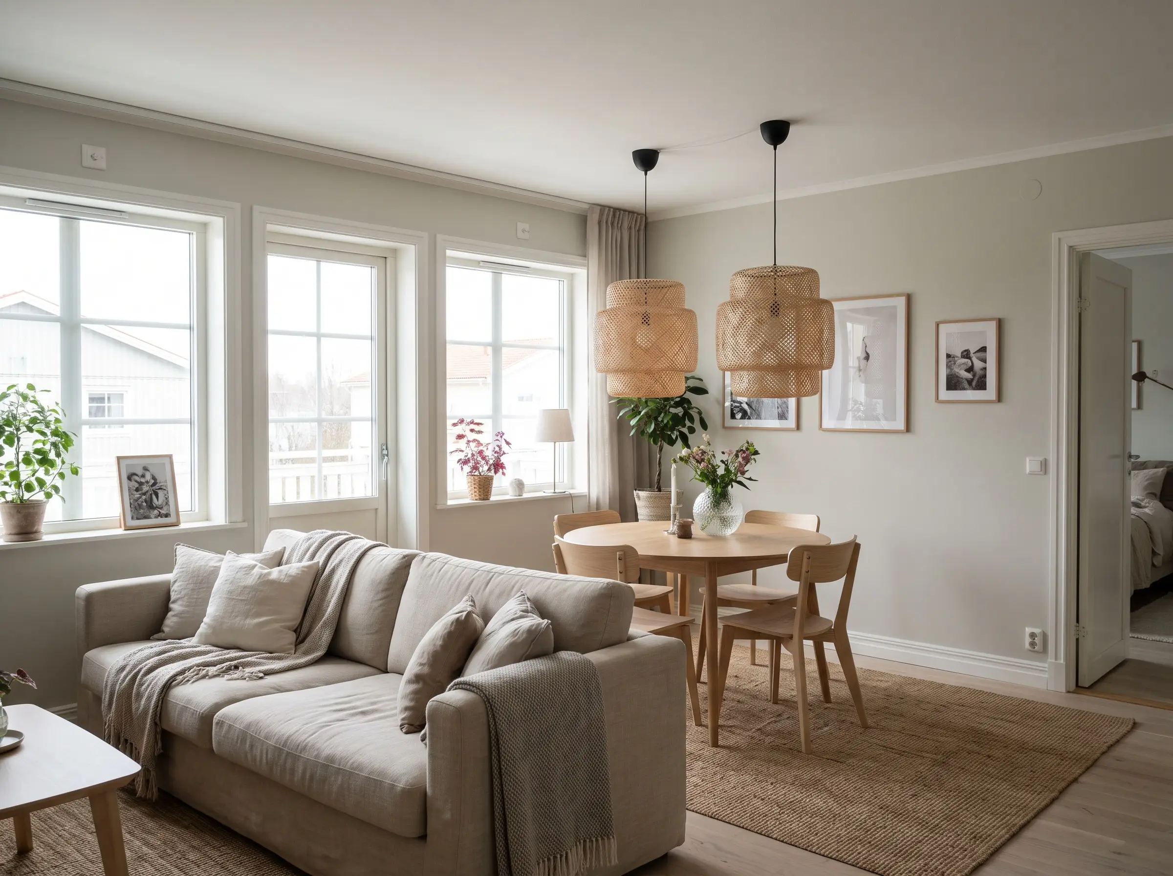
- Color Code: 790C-2
- LRV: 70
- Sneaky Undertone: A very soft, warm green whisper.
- Best Room Exposure: North-facing or any open-concept space.
Silver Drop acts beautifully as an off-white in bright spaces, bouncing light effortlessly without looking stark. Because of that microscopic green undertone, it avoids feeling clinical, making it the perfect foundational color for whole-home continuity or rental updates.
Chic Gray (PPU26-10): The Sophisticated Taupe
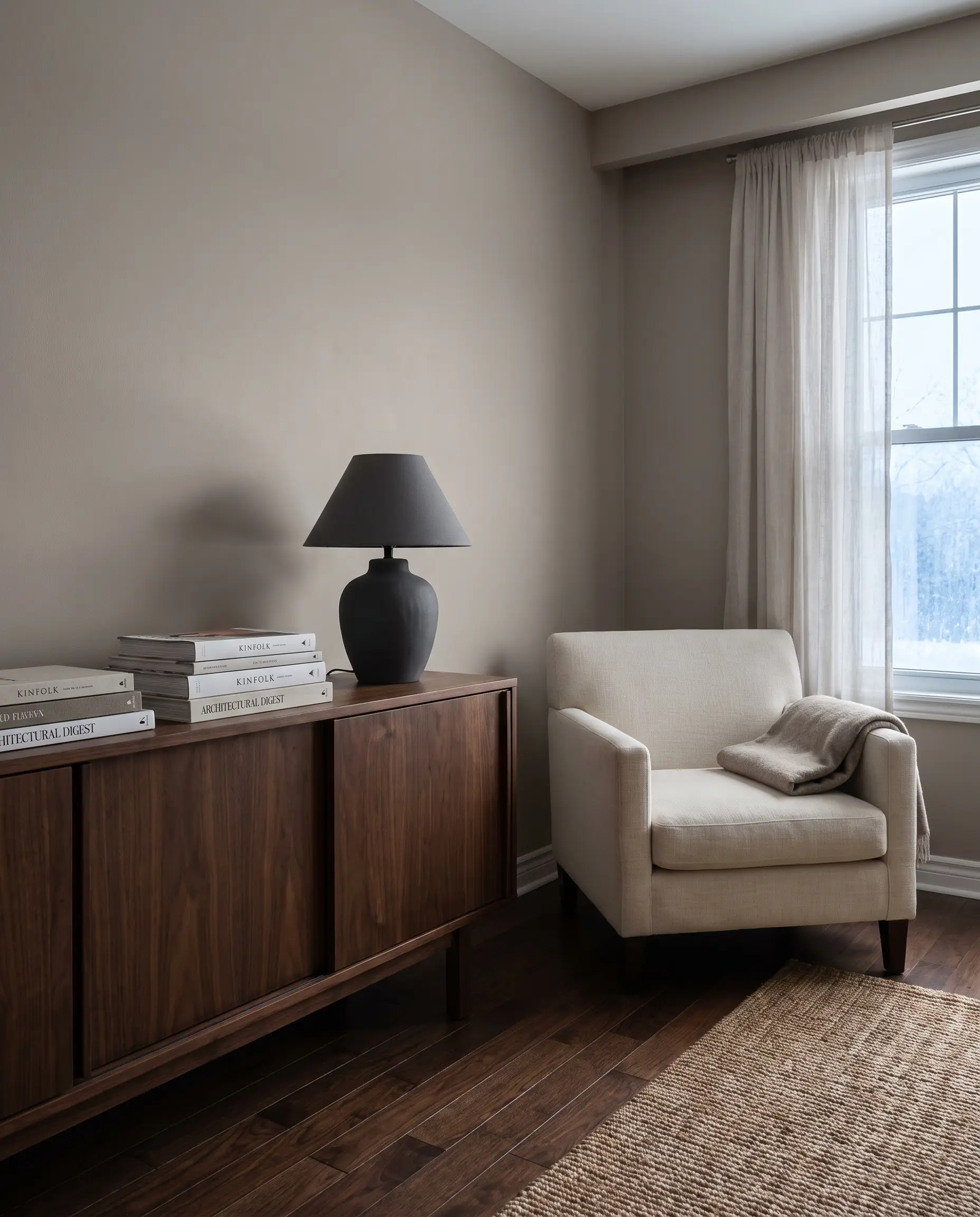
- Color Code: PPU26-10
- LRV: 60
- Sneaky Undertone: A slight pink/purple bias.
- Best Room Exposure: North-facing rooms with controlled lighting.
This mid-tone warm gray brings a distinct, high-end elegance to a room, leaning heavily into a rich taupe profile. To keep the space grounded, pair it exclusively with neutral or dark walnut wood tones.
Be incredibly careful with your flooring pairings here. If you place Chic Gray next to yellow or honey oak floors, the contrast will instantly amplify its sneaky purple flash.
Designer Warning
Natural Gray (PPU18-10): The Perfectly Balanced Mid-Tone
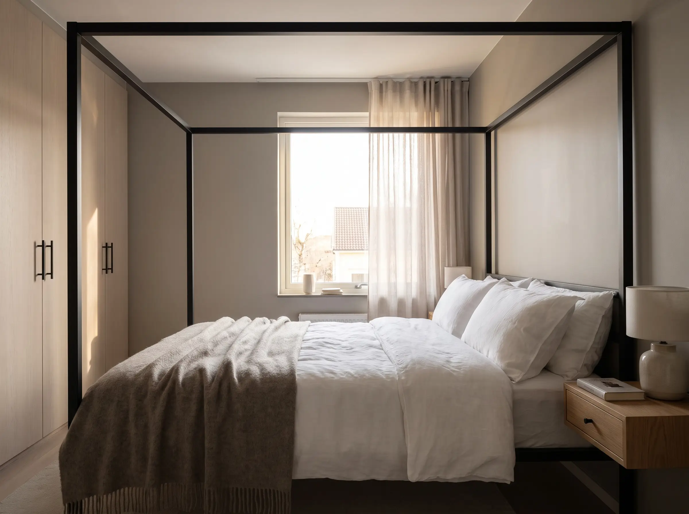
- Color Code: PPU18-10
- LRV: 53
- Sneaky Undertone: Faint, earthy taupe.
- Best Room Exposure: Highly adaptable; works well in East or West-facing rooms.
Sitting right in the middle of the spectrum, this true warm neutral absorbs light beautifully without making your room feel like a cave. For a highly architectural look, pair this rich hue with matte black hardware and clean, modern lines.
Toasty Gray (N320-2): The Cozy Grounding Hue
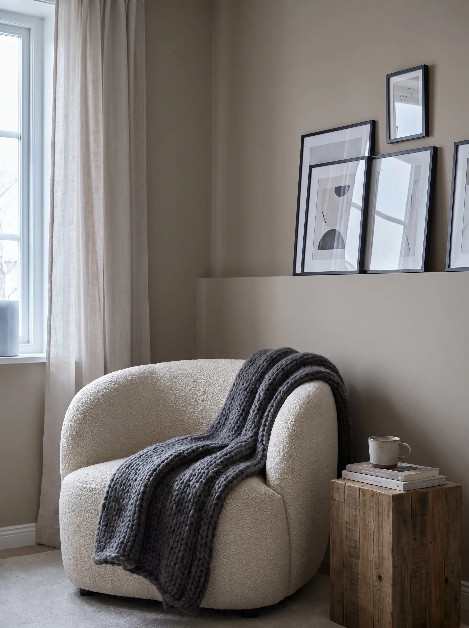
- Color Code: N320-2
- LRV: 58
- Sneaky Undertone: Warm beige-brown.
- Best Room Exposure: North-facing spaces needing warmth.
Toasty Gray seamlessly bridges the gap between traditional beige and modern gray, offering a deeply comforting visual weight. It is the absolute best choice for intimate living rooms or bedrooms where a cozy, hygge atmosphere is the primary goal.
The Cool & Crisp Silvers: For Fresh, Modern Spaces
Cool grays carry distinct blue, green, or violet undertones that thrive in South-facing rooms. In these spaces, the warm, golden afternoon sun actively neutralizes the coolness of the paint, resulting in a crisp, clean finish rather than an icy chill.
Light French Gray (720E-2): The Spa-Like Retreat
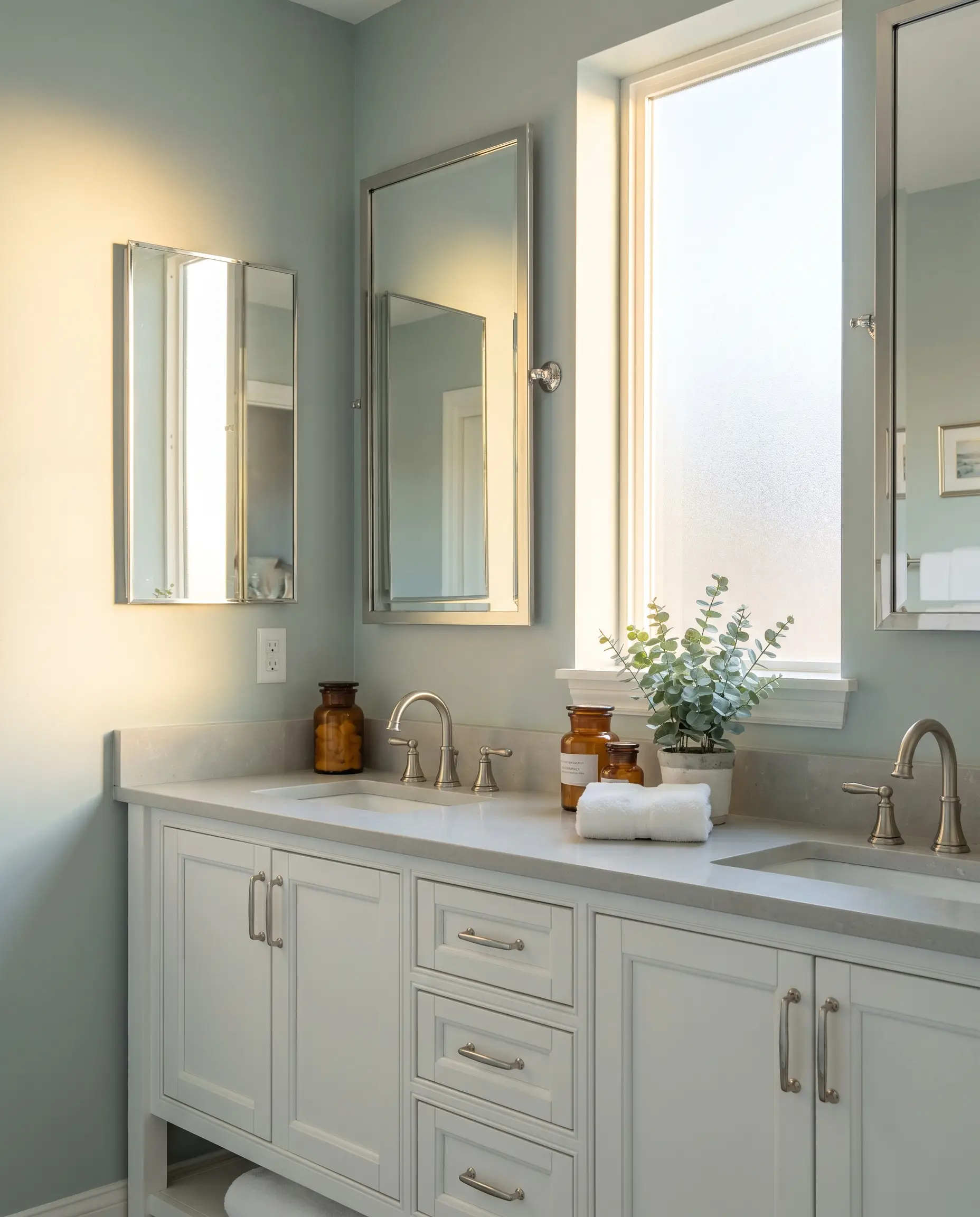
- Color Code: 720E-2
- LRV: 70
- Sneaky Undertone: Cool blue-green.
- Best Room Exposure: South-facing or bright West-facing rooms.
This is the premier choice for bathrooms and bedrooms where you want to construct a serene, restorative atmosphere. The distinct blue-green base pairs flawlessly with polished nickel or chrome plumbing fixtures, creating a highly polished, fresh environment.
Classic Silver (PPU18-11): The True Modern Neutral
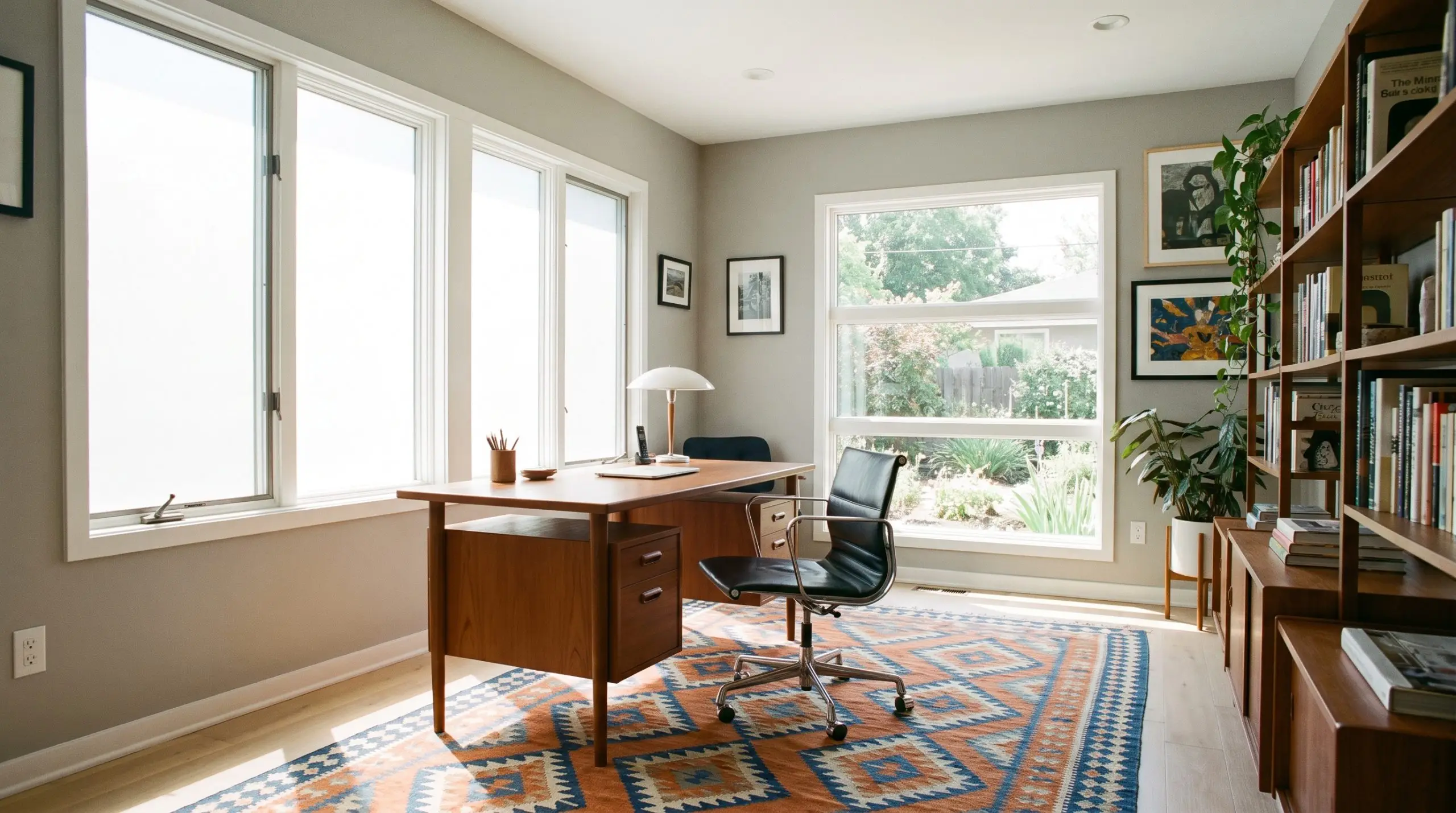
- Color Code: PPU18-11
- LRV: 58
- Sneaky Undertone: Microscopic hint of warmth (nearly neutral).
- Best Room Exposure: South-facing rooms or heavily windowed spaces.
Acting as a pure silver, this mid-tone color holds just enough hidden warmth to ensure your walls do not look like poured concrete. It is an exceptionally strong candidate for modern home offices or authentic Mid-Century Modern interiors.
Dolphin Fin (790C-3): The Confident Chameleon
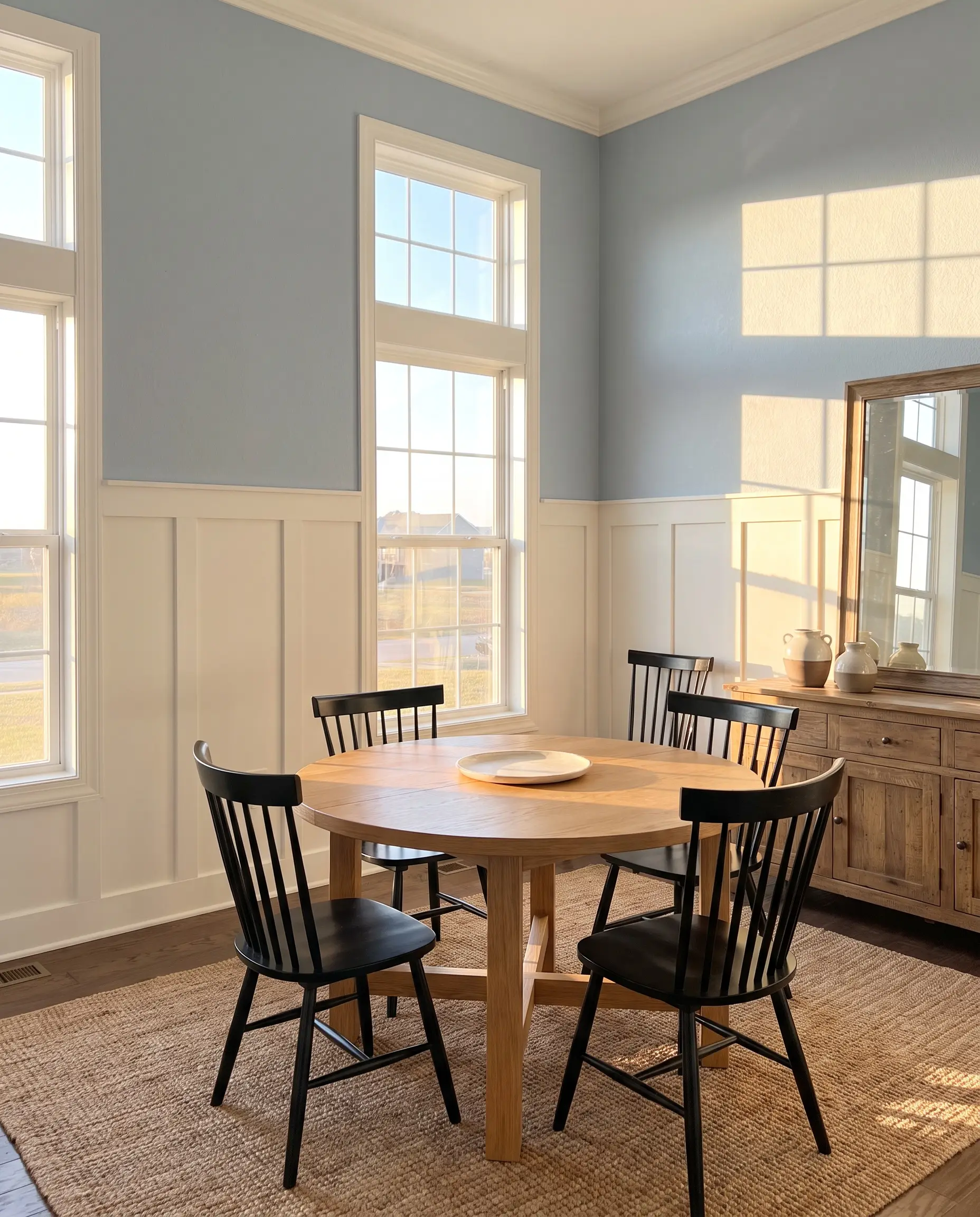
- Color Code: 790C-3
- LRV: 59
- Sneaky Undertone: Soft cool blue.
- Best Room Exposure: South-facing rooms with ample natural light.
Slightly deeper than a standard silver, Dolphin Fin is a confident, structured gray that anchors a room without overwhelming it. It shows its true potential when backed by striking architectural millwork, creating incredible contrast against bright white wainscoting or board-and-batten walls.
Platinum (PPU26-11): The Silvery Fresh Backdrop
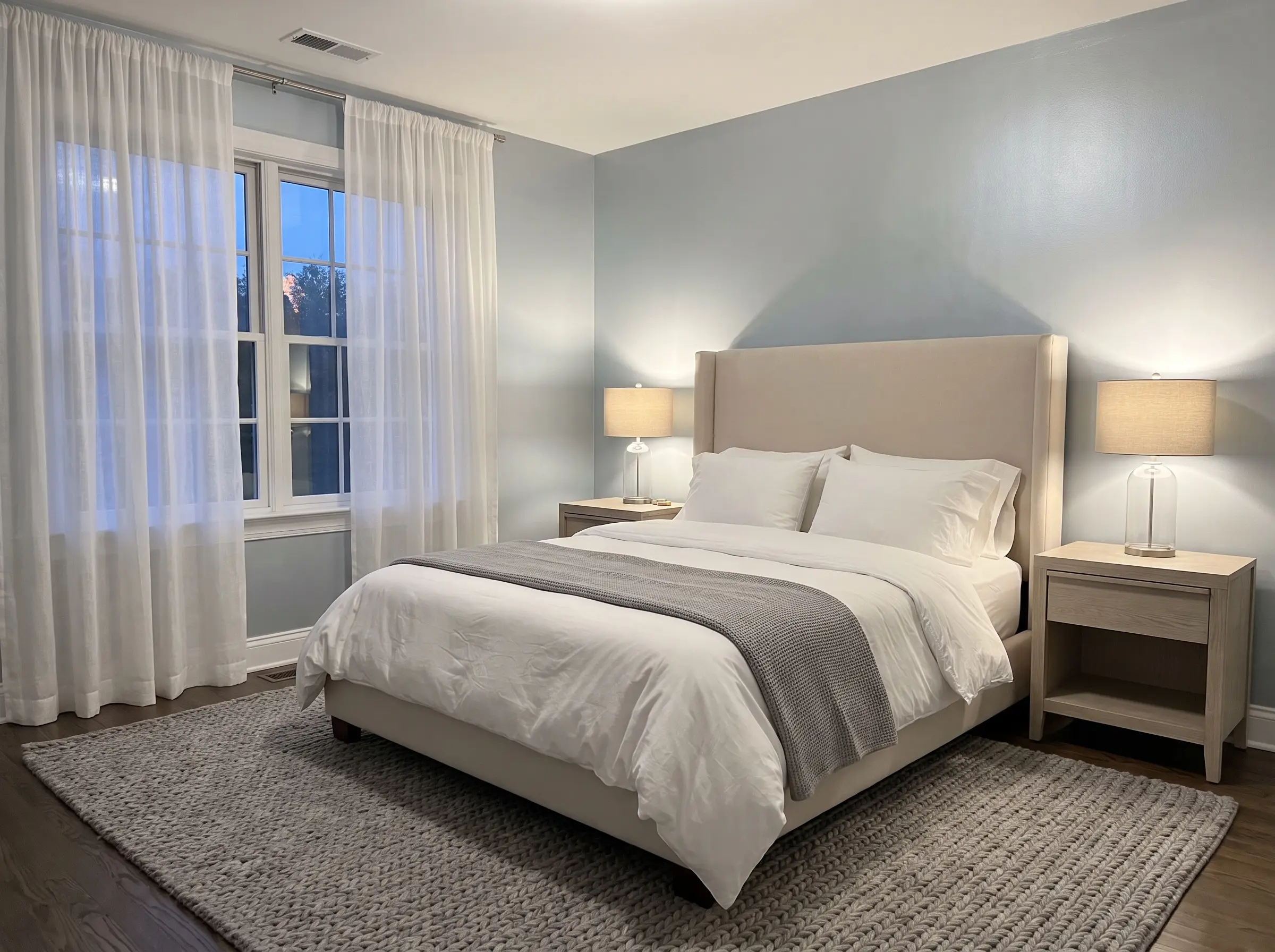
- Color Code: PPU26-11
- LRV: 69
- Sneaky Undertone: Icy blue-silver.
- Best Room Exposure: Low-light or South-facing rooms.
Soft, fresh, and highly reflective, Platinum is designed to bounce as much ambient light around a space as possible. It is a fantastic tool for brightening up low-light rooms where you want a luminous finish without defaulting to stark white.
The Moody & Dramatic Grays: For Accent Walls and Cabinetry
Dark, saturated grays are the designer’s secret weapon for manufacturing depth and defining architectural boundaries. They are the perfect high-impact choice for anchoring kitchen islands, wrapping built-in bookshelves, or enveloping moody powder rooms.
Cracked Pepper (PPU18-01): The Soft, Near-Black Statement
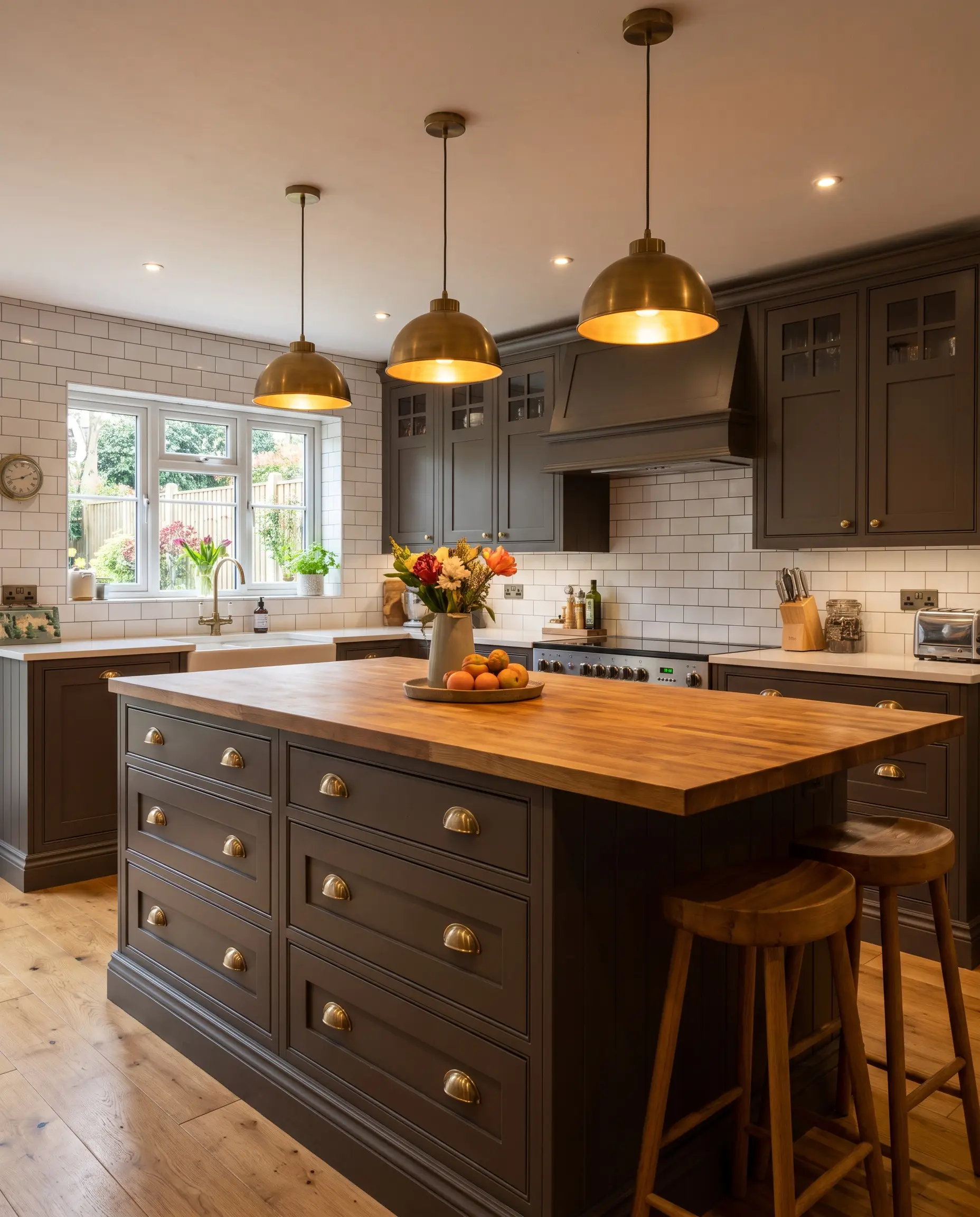
- Color Code: PPU18-01
- LRV: 8
- Sneaky Undertone: Deep, warm brown.
- Best Room Exposure: Any (highly adaptable due to its depth).
Serving as a softer, vastly more livable alternative to pure black, this dramatic charcoal uses its subtle brown undertones to maintain a sense of warmth. Named Behr’s 2024 Color of the Year, it looks incredibly expensive on kitchen cabinets or deployed as a striking bedroom accent wall.
Mined Coal (PPU18-18): The Livable Charcoal
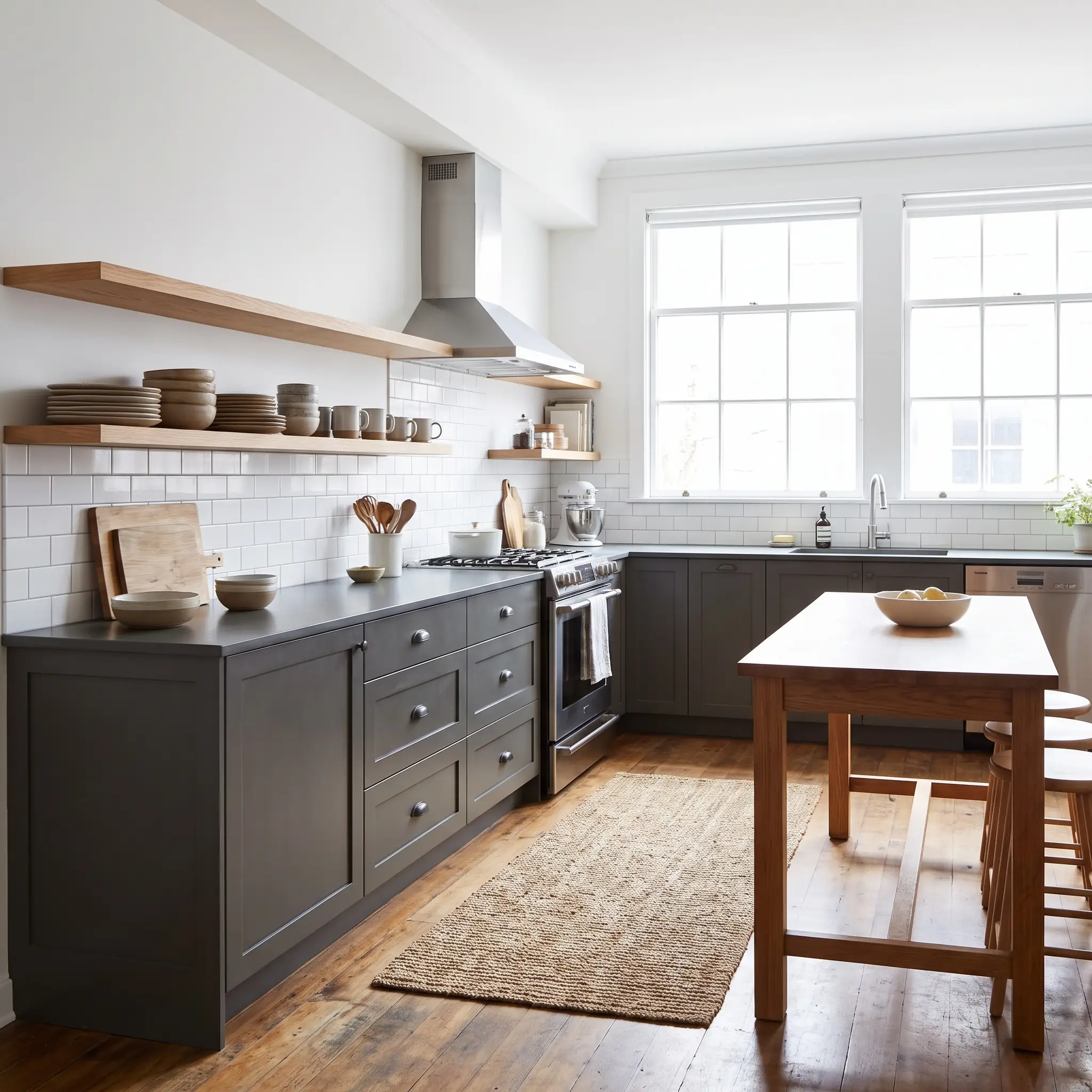
- Color Code: PPU18-18
- LRV: 12
- Sneaky Undertone: Cool, stony slate.
- Best Room Exposure: Any exterior or well-lit interior.
Sitting comfortably between a mid-tone and a true black, Mined Coal provides a heavy, anchoring visual weight to any application. It is a phenomenal exterior choice for doors and shutters, but equally powerful inside when used to ground lower kitchen cabinets.
Fashion Gray (PPU18-15): The Rich, Brown-Leaning Mid-Tone
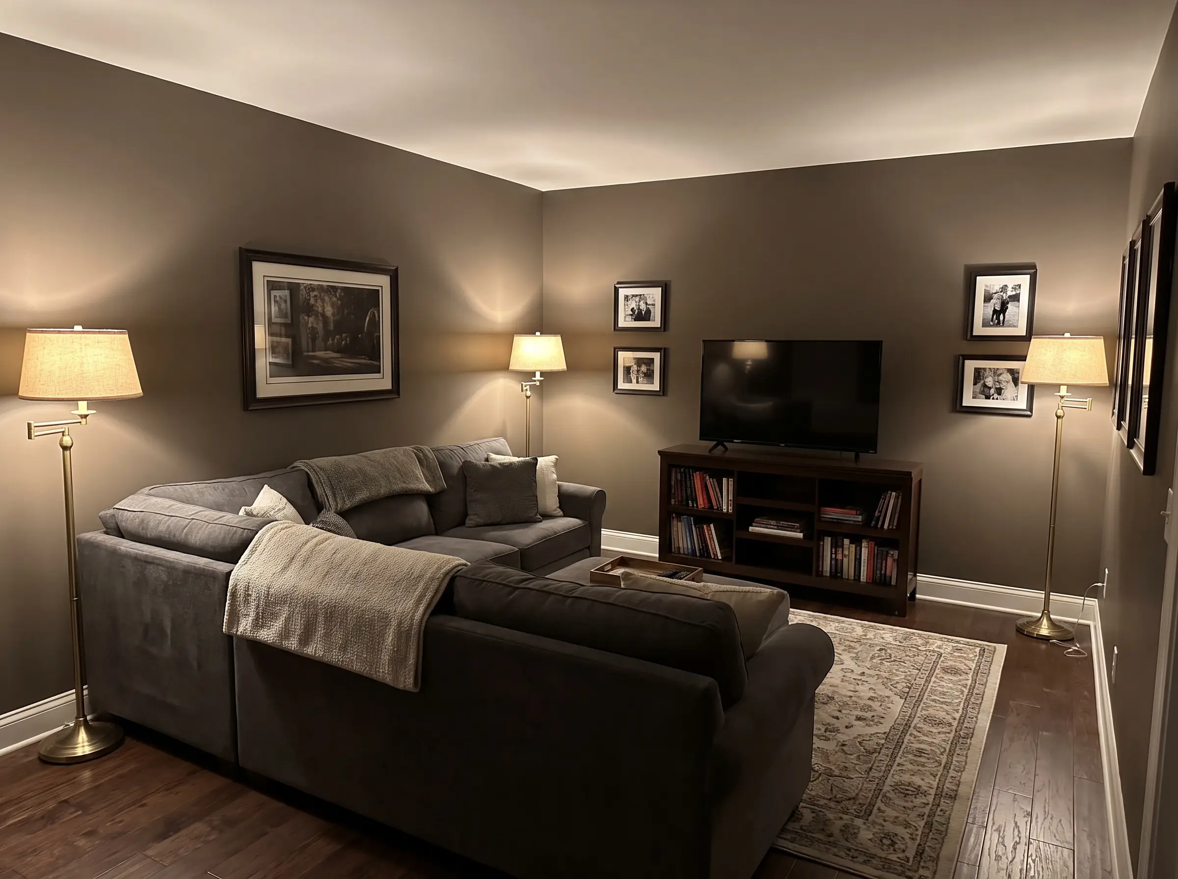
- Color Code: PPU18-15
- LRV: 31
- Sneaky Undertone: Strong brown-taupe.
- Best Room Exposure: North-facing or artificially lit intimate rooms.
Carrying a strong brown-taupe lean, this shade has commanding presence on a wall while retaining a highly approachable warmth. It is the ideal selection for dens, media rooms, or feature walls where you want enveloping depth without committing to a full chocolate brown.
The Colorist’s Playbook: How to Execute Behr Grays Flawlessly
Picking the perfect gray is only half the battle; if you frame it with the wrong white trim, you will instantly pull out the wrong undertones and ruin the entire aesthetic.
The North vs. South Lighting Rule
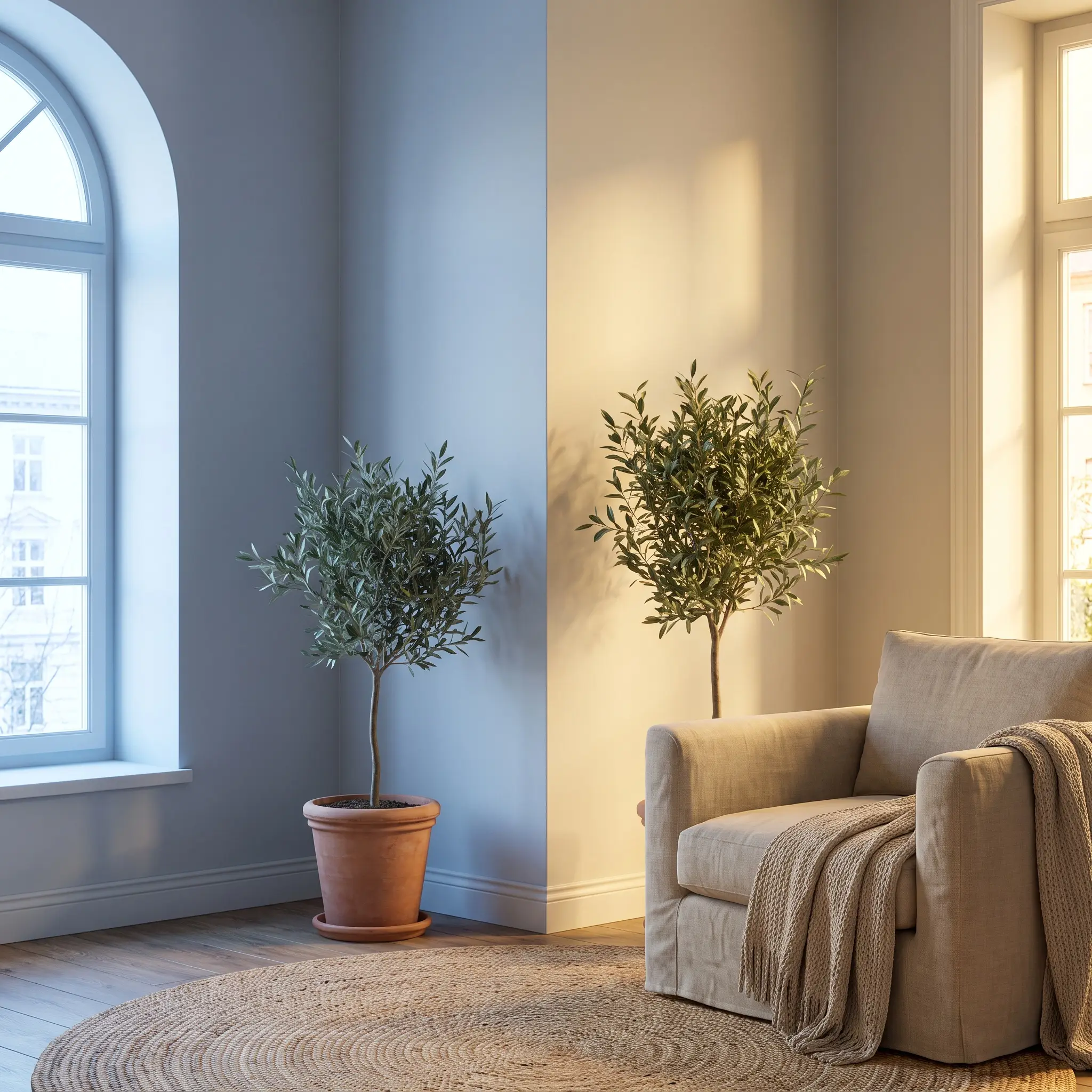
Directional sunlight actively changes the chemical appearance of paint on your walls. You must match your paint’s temperature to your room’s specific light exposure to prevent the color from turning icy or muddy.
- North-Facing Rooms: These spaces receive cool, blue-tinted light. Cool grays will look like sterile ice boxes here. You MUST use warm grays (like Toasty Gray or Natural Gray) to balance the chill and bring life back to the walls.
- South-Facing Rooms: These rooms are flooded with warm, yellow light. Warm grays can quickly turn muddy or brown in this exposure. Cool grays (like Light French Gray) thrive here, as the intense sun perfectly neutralizes their blue bases.
The Behr White Trim Cheat Sheet
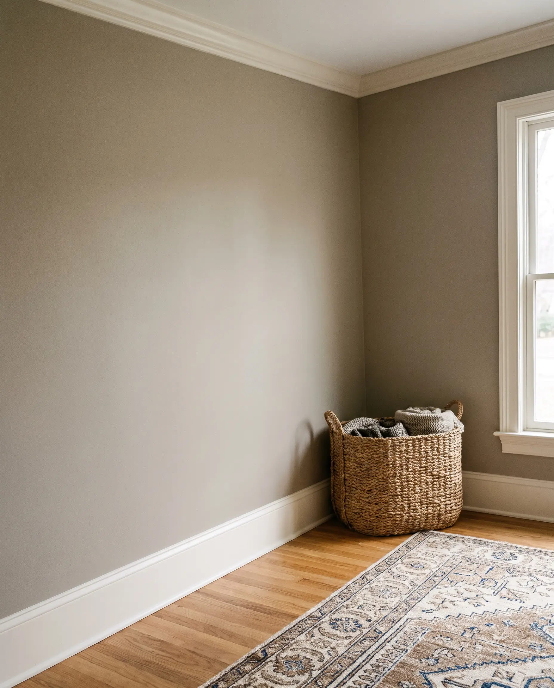
Your baseboards, crown molding, and ceilings require a white paint that harmonizes with your wall color. To read more about finishing your architectural borders, check out our complete guide to the best white paint colors for trim.
- If you chose Cool Grays: Use Behr Ultra Pure White (1850). It is the cleanest, brightest white Behr manufactures, containing zero undertones to offer a crisp, modern contrast against silver walls.
- If you chose Warm Grays/Greiges: Use Behr Swiss Coffee (12) or Behr Blank Canvas (DC-003). A stark white will make a warm gray look dirty; these creamy, softer whites harmonize flawlessly with taupe undertones for a cohesive, expensive finish.
Final Swatch: Committing to Your Perfect Neutral
The golden rule of interior painting is simple: never buy the gallon first. That tiny paper swatch in the hardware store cannot account for your home’s unique lighting or shadows. Always purchase the 8-ounce sample jar and paint a large square directly onto multiple walls in your room. Check the dry paint at 8 AM, 2 PM, and 8 PM to watch how the undertones shift as the sun moves across your house. Grab a brush, test your top three favorites, and finally nail the flawless neutral backdrop your home deserves.

The Aesthetics Desk curates the visual direction for Hackrea. Specializing in design history, global architectural movements, and interior styling, this desk focuses on the psychology of space and how to translate high-end, magazine-quality aesthetics into approachable residential design without falling into fleeting micro-trends.