Raindance 1572
Benjamin MooreBenjamin Moore Raindance (1572) is a sophisticated, medium-light steely green with prominent gray and subtle blue undertones. With an LRV of 43.47, it acts as a moody chameleon, shifting between a tranquil spa-green in warm light and a muted slate-blue in cooler exposures.
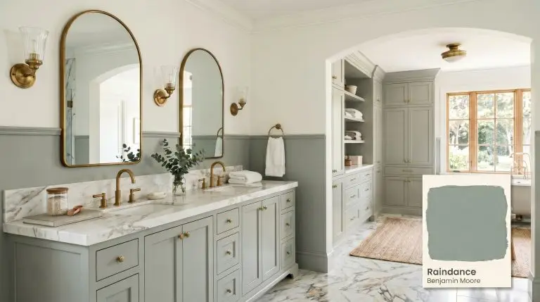
Benjamin Moore Raindance Review: The Mature, Steely Green for a Spa-Like Retreat
| Best Exposures | South-facing or West-facing |
|---|---|
| Best For | Bathrooms, Bedrooms, Kitchen Islands, Home Offices, Exterior Trim |
The pursuit of a nature-inspired sanctuary often leads homeowners down a treacherous path of pastel regrets. You want an earthy, sophisticated escape, but you are terrified of accidentally turning your primary suite into a minty, baby-blue nursery. We hear this fear daily. Fortunately, Benjamin Moore Raindance 1572 is the absolute antidote to amateur pastels. This is a mature, grounded hue that leverages a heavy gray base to act as a built-in neutralizer. It completely eliminates the risk of a neon, sugary finish, providing the architectural gravitas your space deserves.
The Color Chemistry of Benjamin Moore Raindance
To master this shade, you must understand the math driving its behavior. Its complex color chemistry is what separates it from standard, one-dimensional coastal brights.
With a light reflectance value of 43.47, this steely green absorbs a significant amount of light. It is not a light, airy whisper of color. This mid-tone possesses substantial depth and physical presence. It will hold its color integrity beautifully in brightly washed-out rooms, but it demands absolute respect in the shadows.
You can apply wallpapers, paints, etc. on walls and see how they look in various interiors.

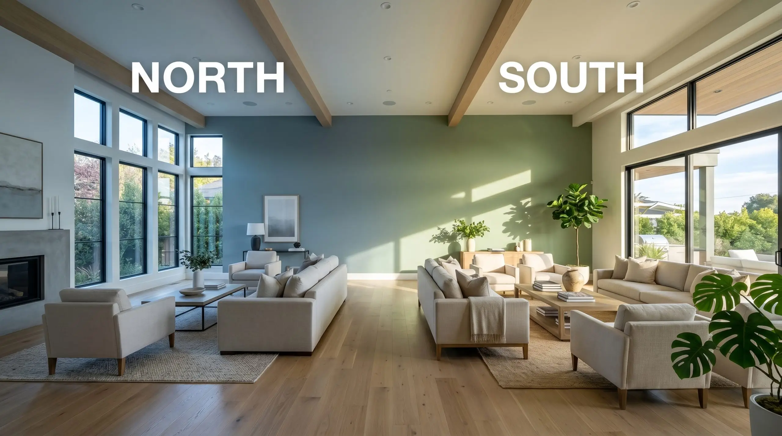
Lighting Effects & The Chameleon Factor
Because of its heavy gray base, this shade is highly reactive to its environment. If you put it in a windowless room without adequate lumens, it will look dead, flat, and muddy. It requires light to activate its complexity.
Popular Room Applications for BM 1572
This is not a foolproof, slap-it-everywhere neutral. It requires deliberate lighting strategy and intentional styling to succeed. When placed correctly, it transforms standard architecture into a custom, high-end experience.
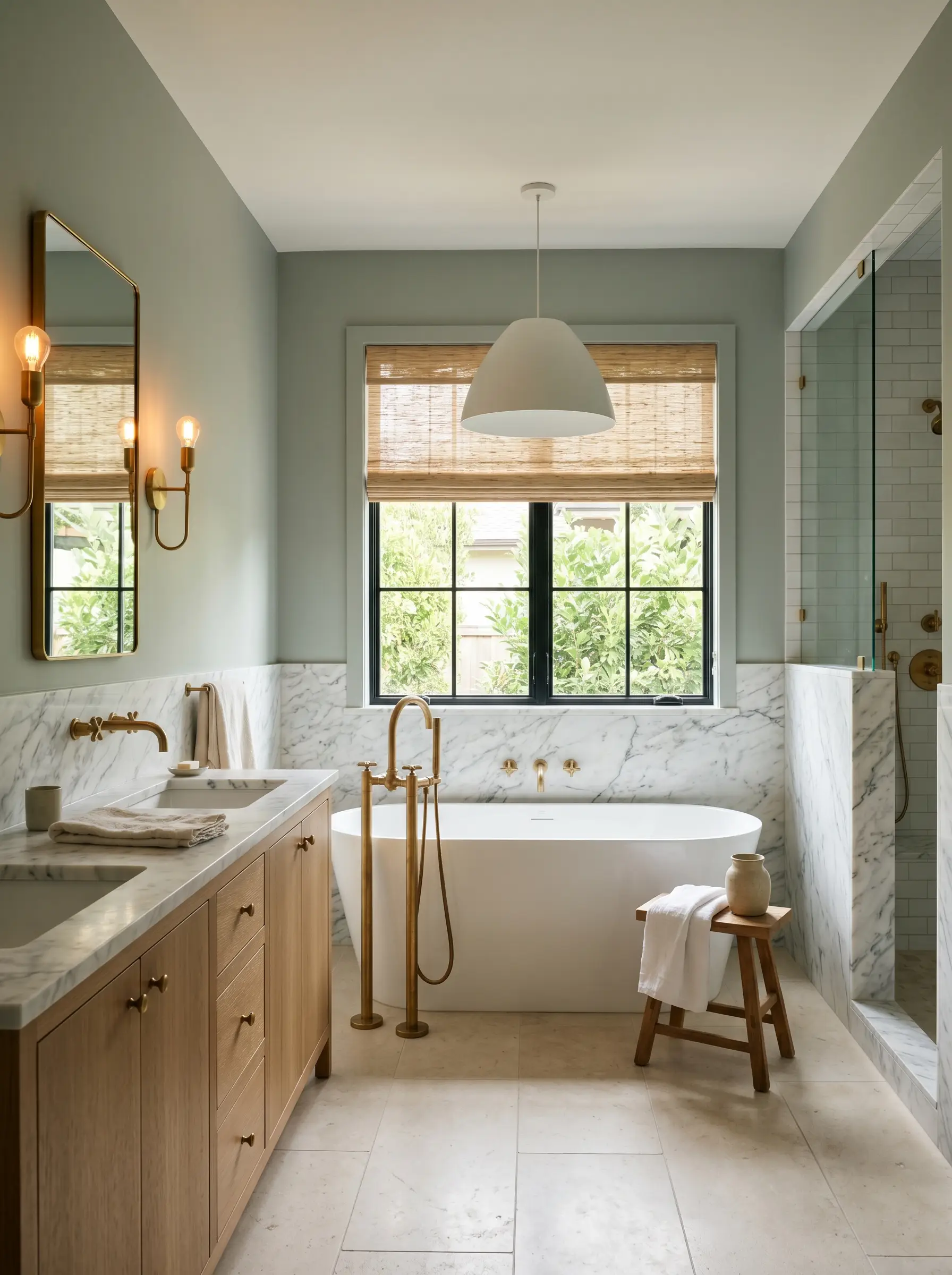
Primary Bathrooms & Sanctuaries
This is the quintessential application for a spa-like retreat. However, success hinges entirely on your bulb temperature and natural light access. When wrapped around a well-lit washroom, the blue-green shift feels incredibly restorative. Pair it with heavily veined marble and organic textures to prevent the space from feeling sterile.
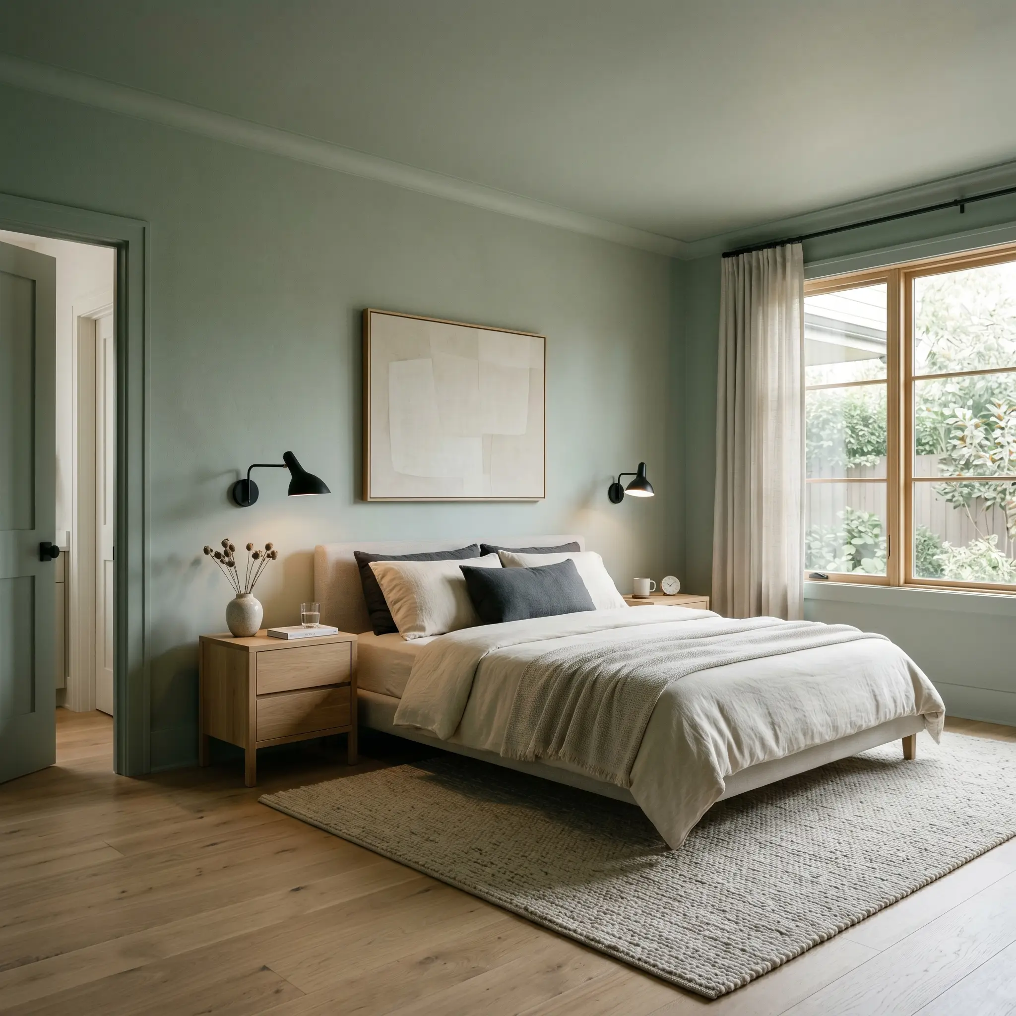
Tranquil Bedrooms
For sleeping quarters, we highly recommend utilizing color massing by painting the walls, trim, and doors in the exact same finish. This envelops the room in a continuous, calming chromatic gray. The heavy LRV naturally absorbs harsh morning light, keeping the room grounded, quiet, and deeply restful.
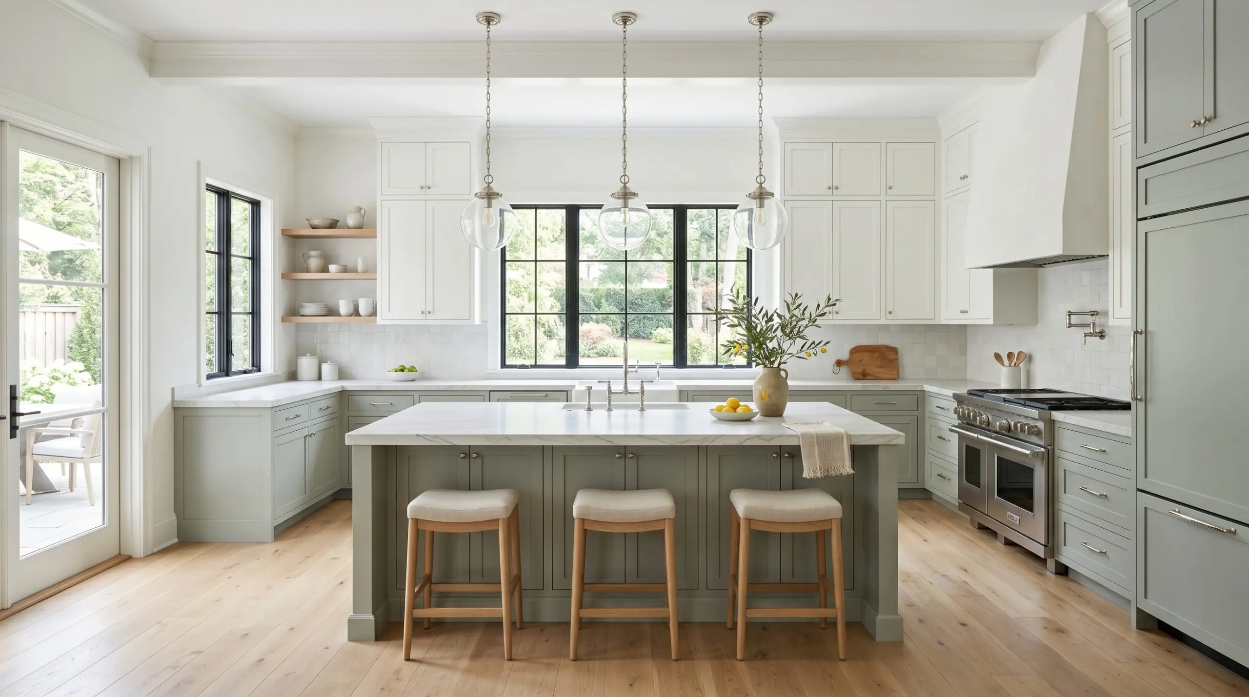
Kitchen Cabinetry
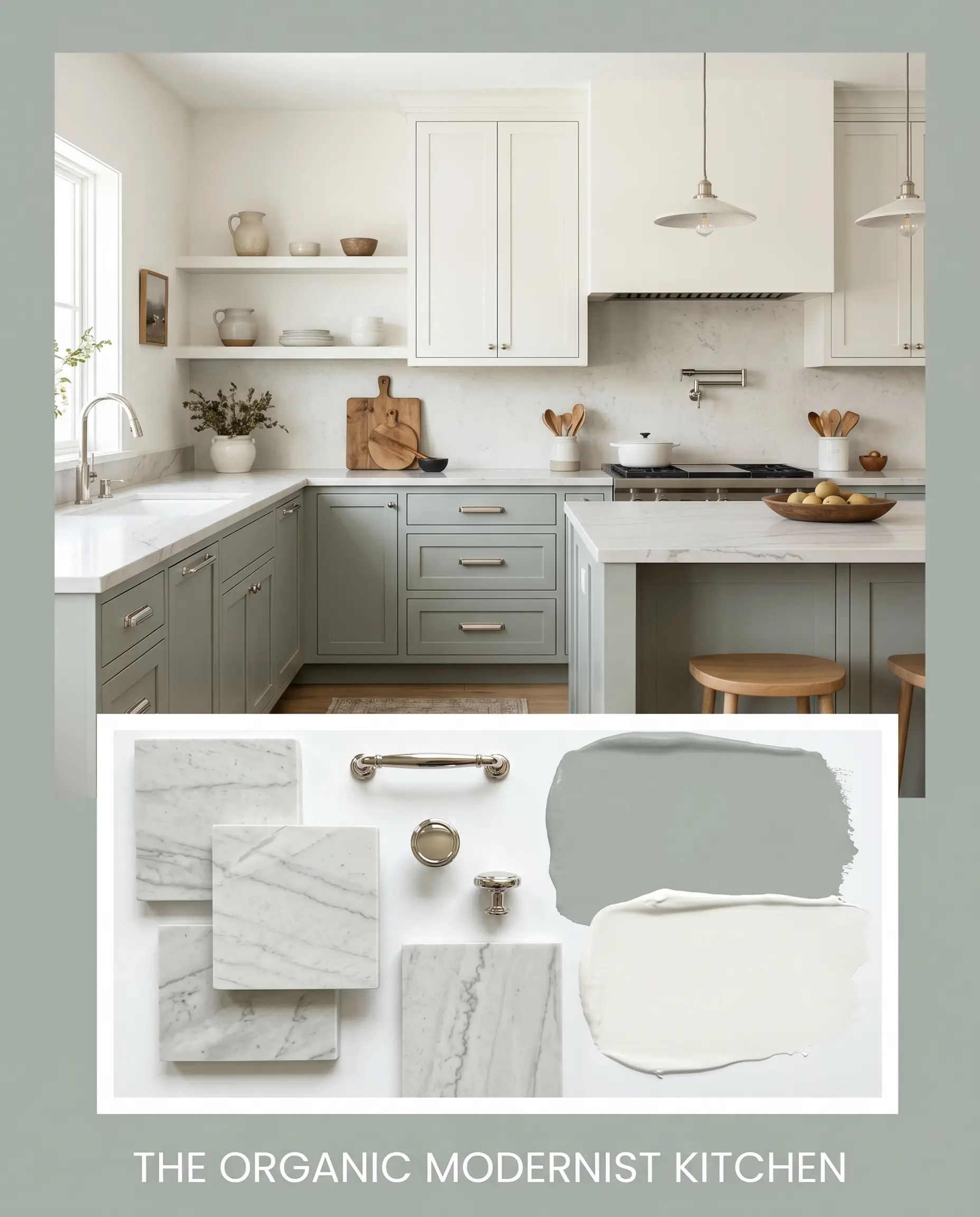
Using this shade on lower cabinets or a central island grounds a kitchen beautifully, especially when paired with crisp white uppers. If you are researching how to paint kitchen cabinets, understand that this specific hue requires a flawless, smooth application to highlight its sophisticated undertones. Rough roller marks will instantly cheapen the look and ruin the light reflection.
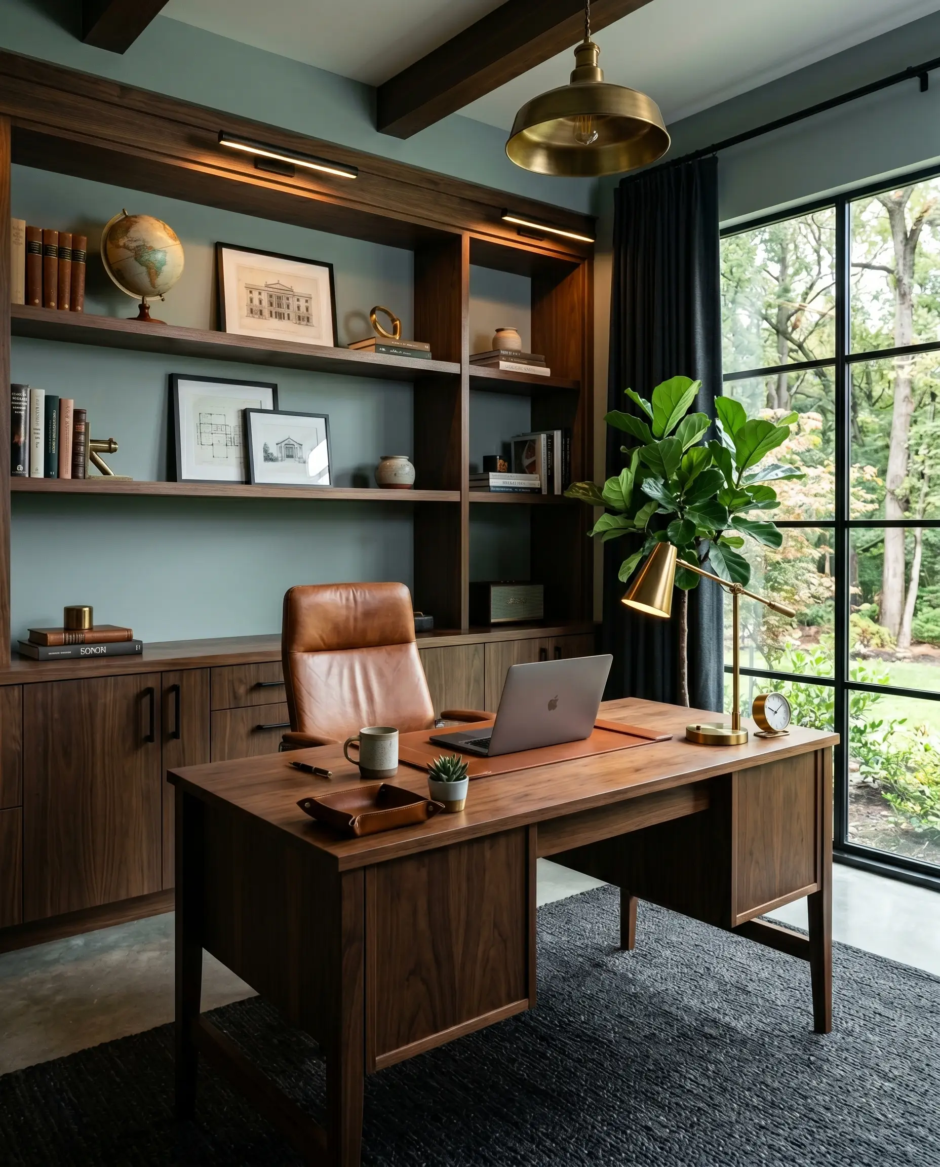
Focused Home Offices
The slate-blue undertones promote immense focus, making it an excellent choice for a study. Because offices often rely heavily on computer screens and task lighting, the gray base keeps the walls from becoming a visual distraction. Use warm brass desk lamps to keep the room from feeling too corporate or cold.
Signature Architectural Ideas & Inspiration
Moving beyond standard drywall, the true magic of this historic shade emerges when applied to specific architectural features. This is where the color moves from a mere backdrop to a structural focal point.
Beadboard & Wainscoting in Mudrooms
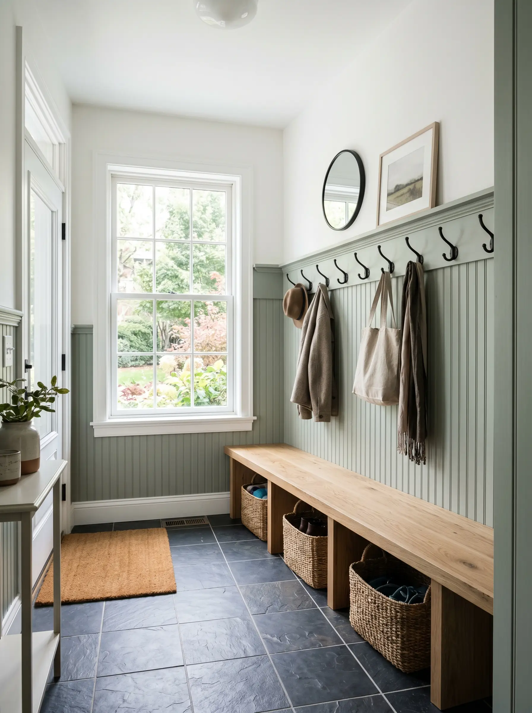
Applying this muted green to lower beadboard in an entryway grounds the space while expertly hiding daily scuffs. If you fail to contrast it with a stark, crisp white on the upper walls, however, the mudroom will feel like a dark, enclosed cavern. The tension between the dark lower half and the bright upper half is non-negotiable here.
Bespoke Bathroom Vanities
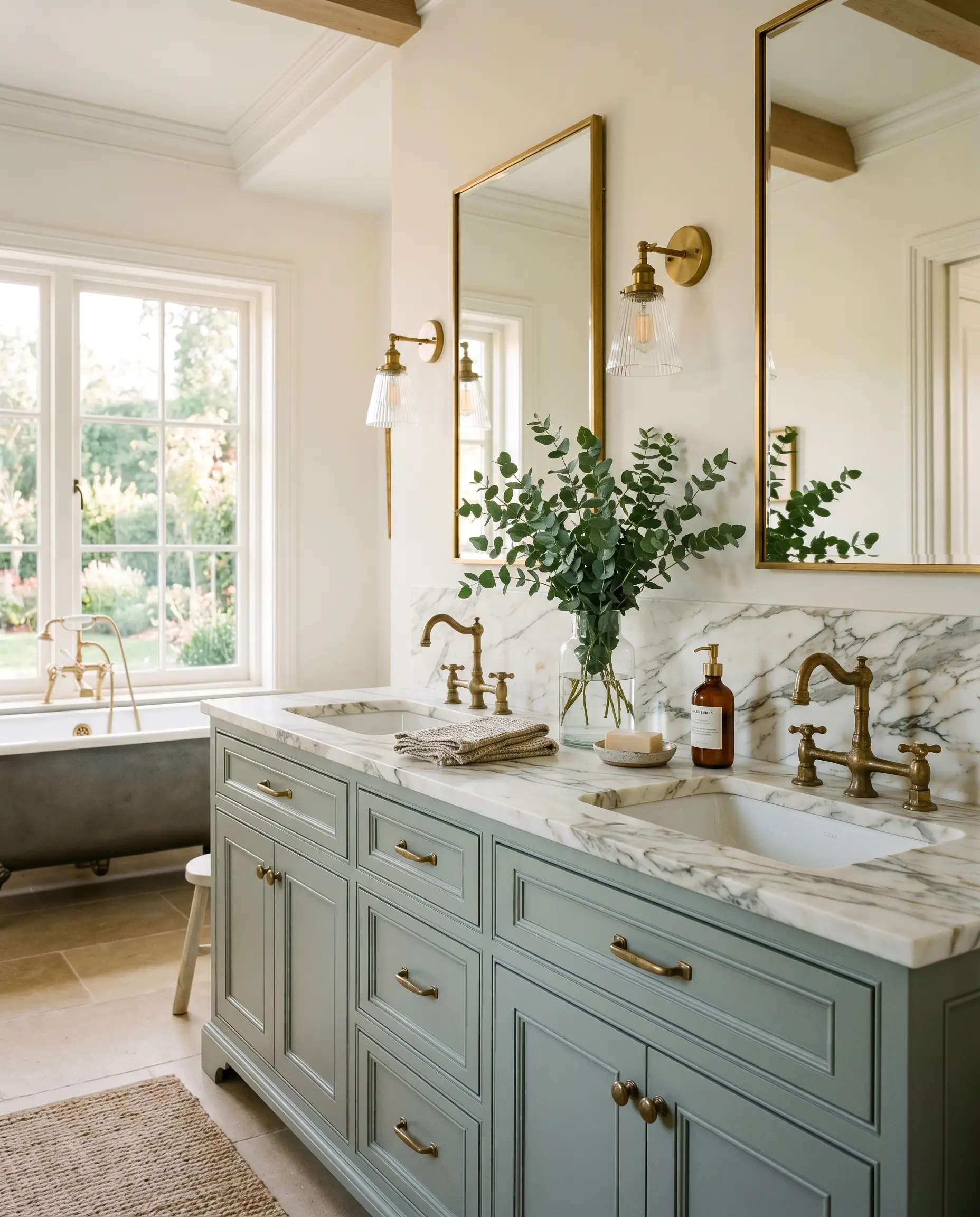
A custom vanity painted in this hue becomes a tactile masterpiece when paired with unlacquered brass hardware. The living finish of the raw brass warms up the steely green, creating a rich, organic friction. When you top it with heavily veined Calacatta marble, the visual texture of the stone dances with the slate-blue undertones, resulting in a deeply luxurious, sensory experience.
Exterior Window Sashes & Trim
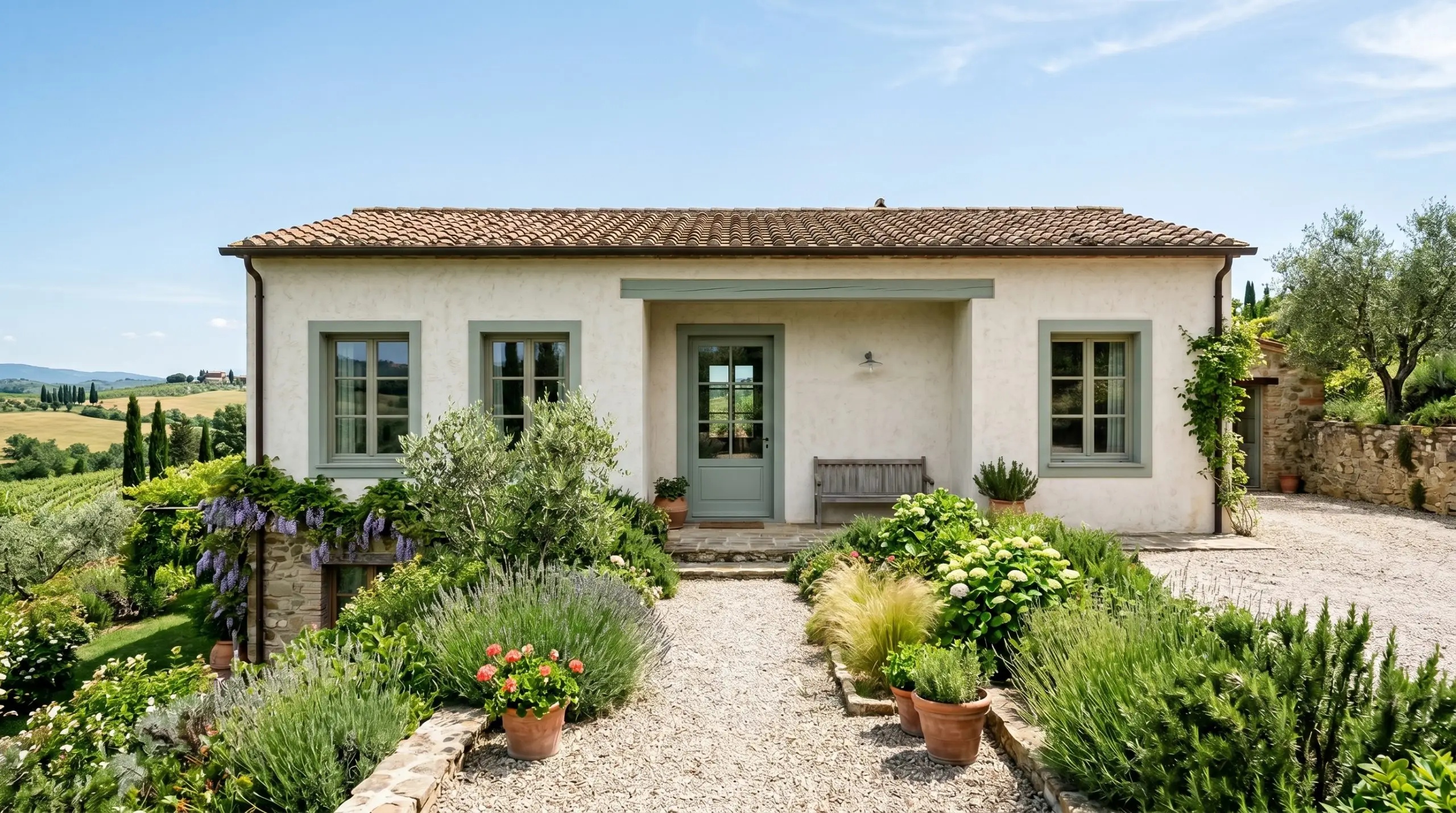
Using this shade as an unexpected exterior accent on window sashes against creamy white stucco forces the eye to acknowledge the architecture. The earthy, muted tone bridges the gap between the built environment and the surrounding landscape. It frames the view outside while grounding the home’s facade in nature.
Sunroom & Enclosed Porch Ceilings
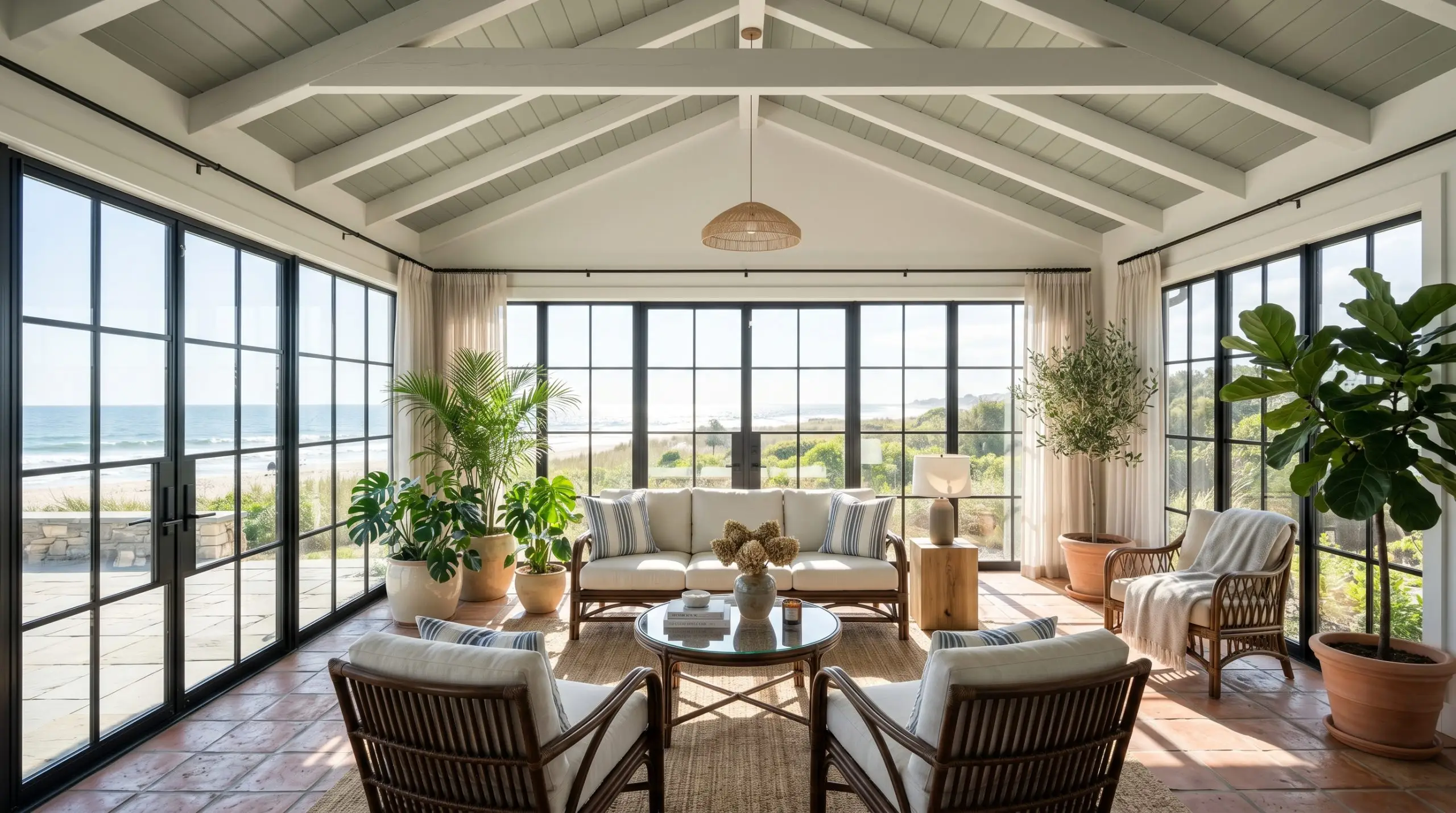
Painting a sunroom ceiling in this specific chromatic gray brilliantly manipulates the perceived temperature of the space. It mimics a muted, overcast sky, instantly cooling down a room that might otherwise feel stiflingly hot in the afternoon sun. It draws the eye upward, creating an illusion of infinite, calming space above.
The Pairings & Accents Guide for Raindance
A paint color is only as successful as the materials placed next to it. To master this complex blue-green, you must ruthlessly curate your trim, metals, and coordinating palette.
Trim & Baseboards
Because of the heavy gray base, you must use a highly reflective, clean white for your trim to force contrast. Benjamin Moore Chantilly Lace provides a stark, icy snap that sharpens the green. For a slightly softer transition that still maintains a crisp edge, Sherwin-Williams Pure White is an exceptional choice.
Hardware & Metal Pairings
Do not use brushed nickel with this paint. The cool silver tones will bleed into the gray base, resulting in a flat, lifeless aesthetic.
Hackrea Pro-Tip
You must introduce warmth or stark contrast through your metals. Unlacquered brass is our top recommendation, as its golden warmth aggressively counters the cool slate undertones. Polished nickel works beautifully for a high-contrast, reflective snap, while matte black hardware provides a sharp, modern, graphic edge.
Coordinating Colors
Curated Mood Boards
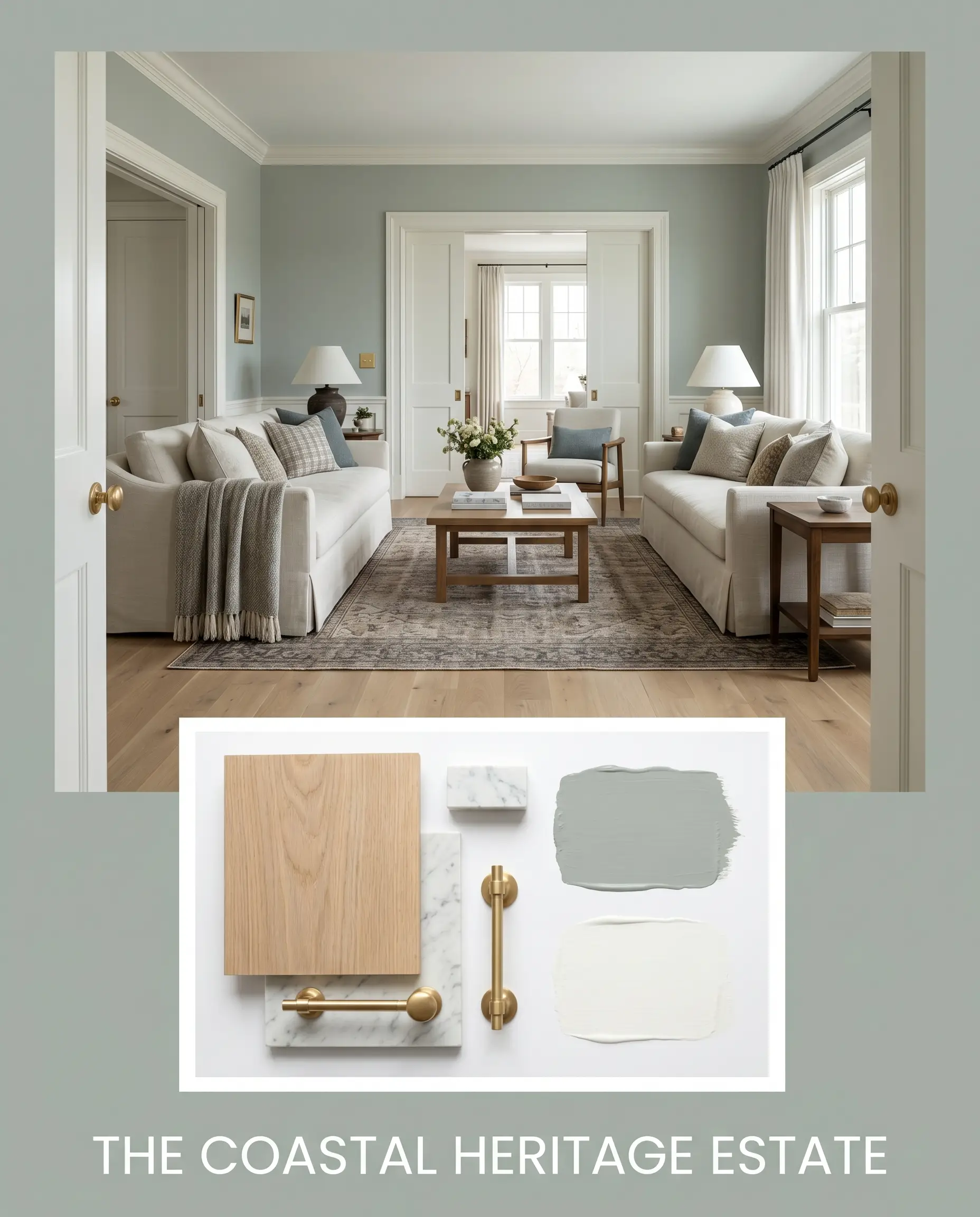
The Coastal Heritage Estate: This palette relies on the tension between cool walls and warm, historic materials. Imagine walls drenched in Raindance 1572, anchored by matte, clear water-based finished White Oak floors. The millwork is coated in Chantilly Lace, while unlacquered brass plumbing fixtures and heavily veined Carrara marble countertops inject a sense of timeless, old-world luxury.
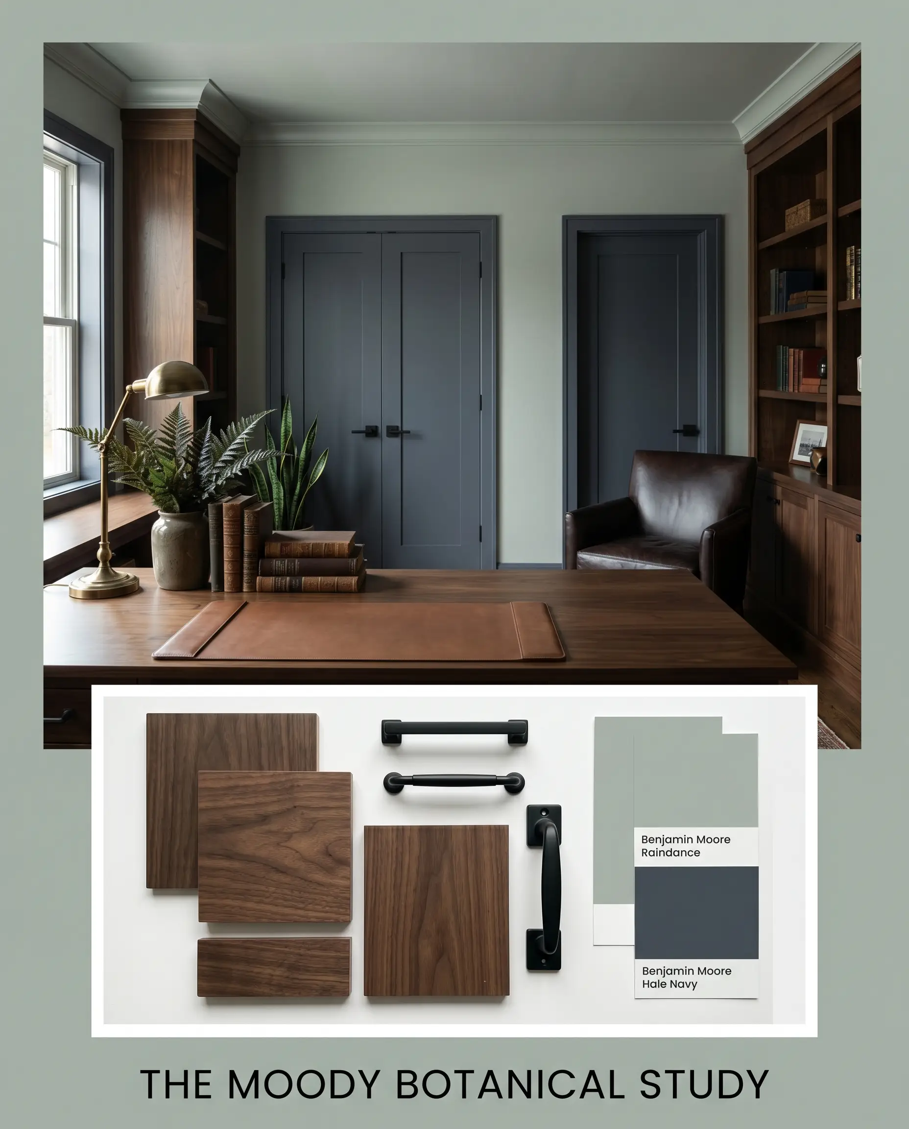
The Moody Botanical Study: Designed for deep focus, this aesthetic leans heavily into the slate-blue undertones. The primary shade covers the walls and ceiling, contrasted sharply by matte black hardware and dark walnut furniture. Benjamin Moore Hale Navy is used on adjoining doors or built-in bookcases to deepen the chromatic shadow, creating a rich, enveloping masculine retreat.
The Organic Modernist Kitchen: A fresh, highly textural approach. Lower cabinets painted in this steely green sit below crisp White Dove upper walls. The countertops are White Macaubas Quartzite, which echoes the gray undertones perfectly. Polished nickel hardware provides a brilliant, reflective snap against the muted cabinetry, keeping the visual energy high and modern.
Head-to-Head Comparisons
Choosing the right gray-green requires splitting hairs. Here is exactly how this specific formula stacks up against its fiercest competitors in the marketplace.
Benjamin Moore Raindance vs. Benjamin Moore Beach Glass
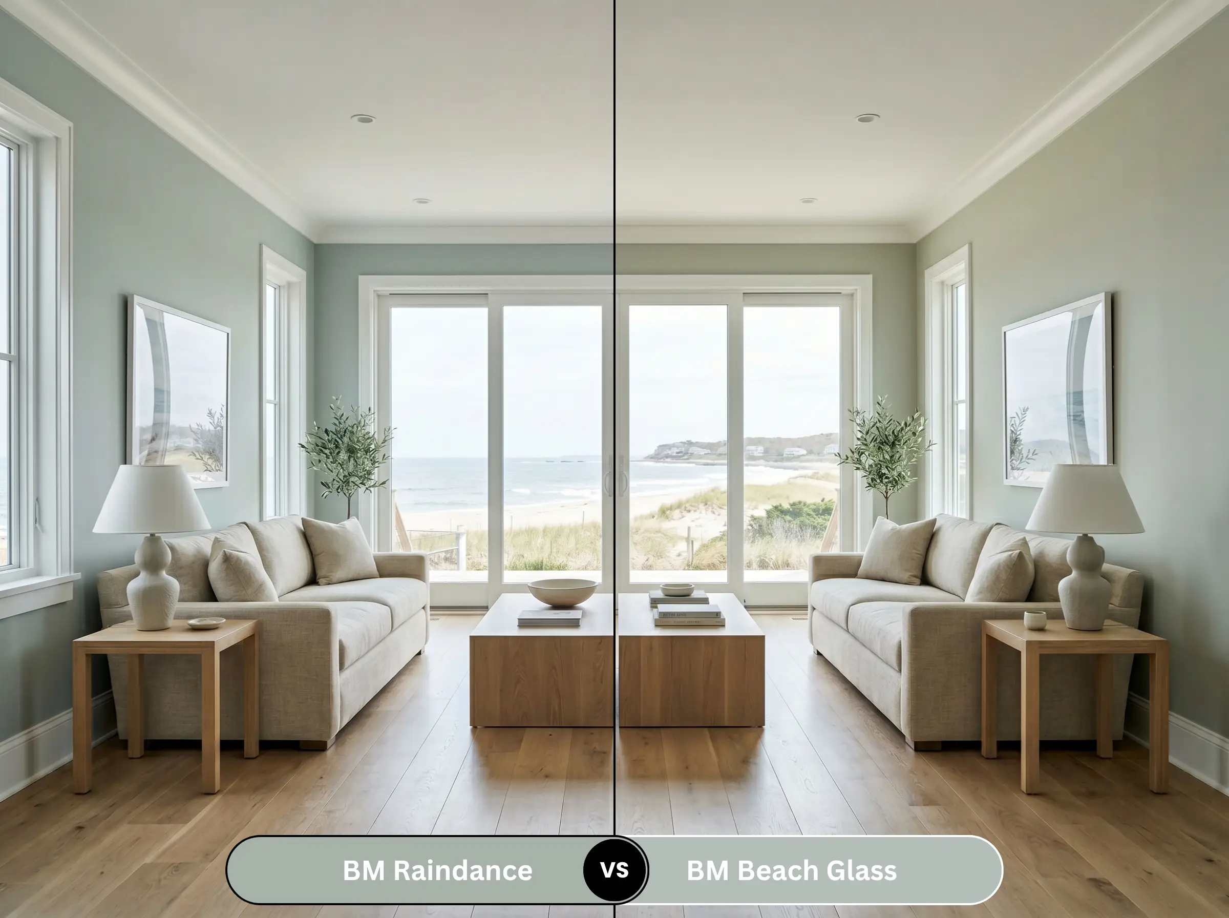
Beach Glass is significantly lighter and leans much heavier into its blue undertones. If you want a breezy, undeniable coastal-inspired feel, Beach Glass is the safer bet. However, if you need a mature, grounded color with more physical weight and green presence, Raindance is the superior architectural choice.
Benjamin Moore Raindance vs. Sherwin-Williams Sea Salt
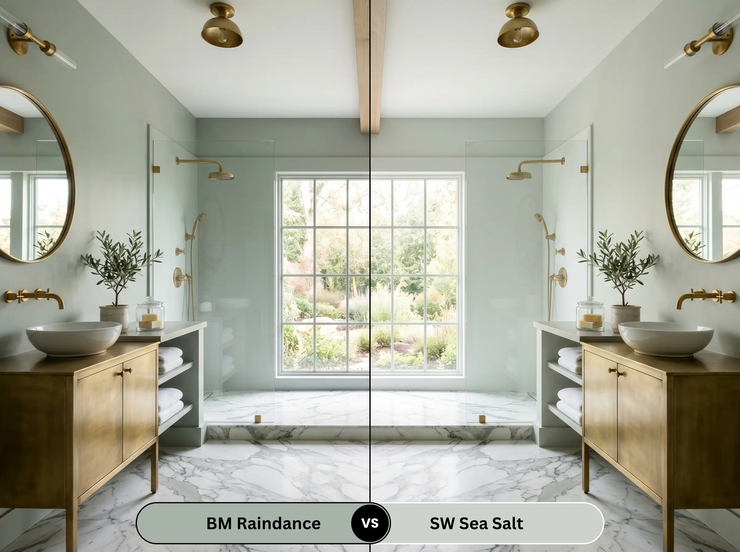
Sea Salt is a cult-classic, but it is highly volatile and much lighter (LRV 63). Sea Salt can easily flash minty or silvery-blue depending on the hour. Raindance, with its heavy charcoal base and lower LRV, is far more stable and refuses to ever look like a pastel.
Benjamin Moore Raindance vs. Benjamin Moore Quiet Moments
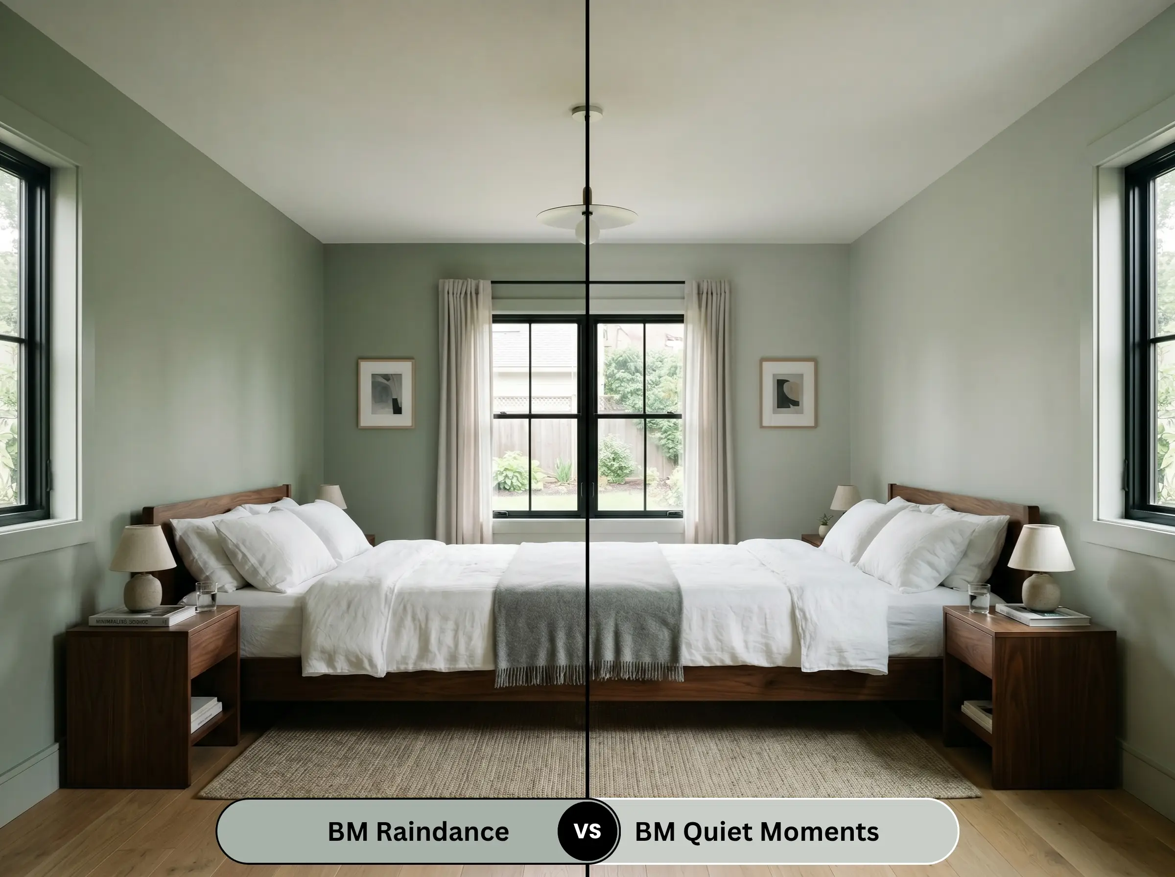
Quiet Moments is essentially the lighter, airier sibling in the exact same color family. It is excellent for low-light rooms where you just want a whisper of gray-green. Choose Benjamin Moore 1572 only when you have the natural light to support its depth and want a more dramatic, enveloping mood.
Similar Colors & Cross-Brand Equivalents
If the LRV isn’t quite right for your lighting, or you are locked into a different paint manufacturer, here are the closest scientific matches.
Brand Alternatives
Cross-Brand Matches
Practical Application & DIY Advice
Theoretical color science means nothing if the paint is applied poorly. Here is exactly how to specify the finishes and prep your surfaces for this specific mid-tone.
The Dynamic Sheen Matrix
Primer Strategy
Because of its 43.47 LRV, this color requires a high-quality, tinted gray primer. A standard white primer will force you to paint three coats to achieve true color depth. If you are painting over raw wood or previous oil-based finishes, a stain-blocking bonding primer is absolutely critical to prevent tannin bleed-through.
Coverage & Touch-Ups
Expect a strict two-coat minimum, even with premium paint lines. This specific depth of gray-green is highly susceptible to “flashing” (visible roller marks) if you do not maintain a wet edge. Touch-ups on a matte or eggshell finish will likely be visible in raking natural light, so paint corner-to-corner if repairs are needed.
Frequently Asked Questions
The heavy gray base makes it exceptionally stable against UV degradation. Unlike pure greens or blues that fade quickly, the chromatic gray undertones anchor the pigment, ensuring it ages gracefully without chalking into a washed-out pastel.
Yes, absolutely. The mid-tone LRV absorbs enough light to visually pull the ceiling down, creating a cozier, more intimate atmosphere. It mimics the weight of an overcast sky, which psychologically grounds a cavernous, towering space.
No, it actually creates a brilliant biophilic synergy. The vibrant, highly saturated greens of Monstera or Ficus plants contrast sharply against the muted, steely background. The paint acts as a sophisticated, earthy canvas that makes the living plants become the focal point.
It is highly reactive. If you wash it in warm amber LEDs, it will turn into a murky, muddy brown-gray. If you use cool blue or purple LEDs, the slate-blue undertones will aggressively amplify, turning the walls into a deep, icy charcoal.
Final Verdict & Expert Warnings
Benjamin Moore Raindance is not for the faint of heart, but it is an absolute triumph for those seeking a mature, spa-like retreat. It is the ultimate architectural antidote to sugary pastels, offering a grounded depth that commands respect. However, it comes with strict rules of engagement.
Clash Warning: You must ruthlessly avoid pairing this shade with warm, yellow-toned woods like honey oak or heavily veined warm granites. The yellow-orange will aggressively clash with the blue-green, making the paint look sickly and the wood look neon orange. Furthermore, keep it far away from cherry wood and pinkish-beige travertine.
If you have abundant natural light, crave a sophisticated biophilic design, and are willing to curate your metals and woods with absolute precision, this steely green will reward you with one of the most luxurious, restorative atmospheres achievable in modern design. If your room is dark and windowless, look elsewhere.