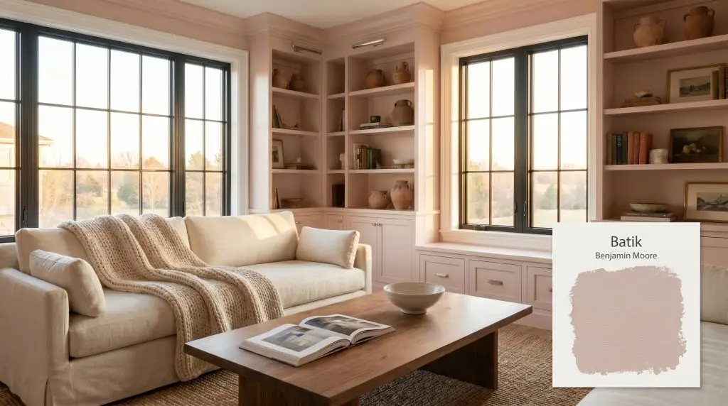
Batik AF-610
Benjamin MooreBenjamin Moore Batik AF-610 is a warm, medium-light dusty violet rose paint color. With an LRV of 50, it offers a sophisticated, muted blend of pink, red, and violet undertones that creates a cozy, elegant atmosphere without feeling overly sweet.
Paint Technical Profile
| Color ID / SKU | AF-610 |
| HEX Code | #CCB9B5 |
| Light Reflectance (LRV) | 50 |
| Use | Interior |
| Best Exposures | South-Facing, West-Facing |
| Best For | Bedrooms, Bathrooms, Accent Walls, Cabinetry |
Benjamin Moore Batik: A Sophisticated Muted Mauve for Layered Interiors
Transforming a standard, builder-grade bedroom into a curated retreat requires a wall color that carries intentional visual weight without plunging the room into darkness. Benjamin Moore Batik AF-610 steps into this role beautifully, offering a highly nuanced balance of depth and softness.
Because it sits precisely at the midpoint of light reflection, this dusty violet rose anchors a room with undeniable presence. It provides a stunning, complex backdrop that makes everyday linens and standard baseboards feel instantly elevated.
Part of the highly regarded Affinity Color collection, this shade proves that you do not need massive architectural renovations to create a premium atmosphere. By simply allowing its hidden purple notes to interact with your lighting and furnishings, you can build a richly layered, highly personalized home.
Benjamin Moore Batik: Undertones & LRV
Benjamin Moore Batik is a distinctly warm color, though its highly complex pigmentation gives it a remarkably balanced, almost neutral edge. If you are searching for a traditional, sugary pastel, this shade will surprise you with its grounded, muddy depth.
Instead of reading as a juvenile blush, it behaves like a mature, earthy pink that adapts beautifully to sophisticated interior styling.
To truly understand how this paint will dictate the mood of your home, we have to look closely at its structural makeup:
When evaluating a paint’s light reflectance value, the number tells you exactly how the color will manage illumination in your space. With an LRV of 50, Batik sits exactly at the dead center of the scale.
This means it absorbs and reflects light in perfectly equal measures. It will hold its rich color saturation beautifully on a bright exterior facade, while still maintaining enough buoyancy to keep a shaded interior room from feeling heavy or enclosed.
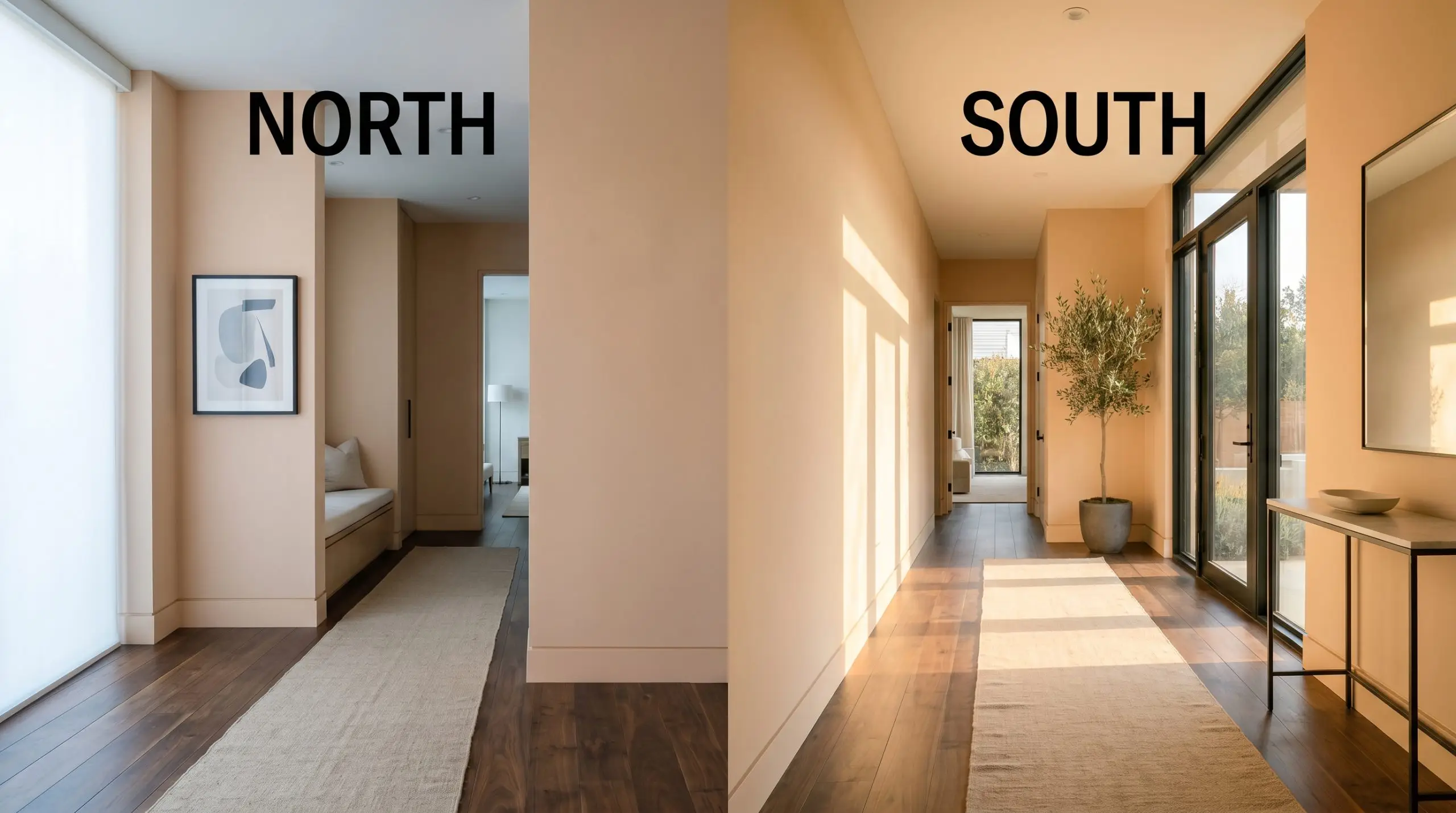
The Chameleon Factor: Lighting Benjamin Moore Batik
The greatest risk when applying a heavily muted shade like AF-610 is ignoring the natural light exposure of your room. If you place this color in a deeply shadowed, cold environment without balancing it with warm textures, its violet notes can suddenly amplify, turning the walls into a chilly, bruised purple.
Understanding your home’s unique lighting direction is the key to controlling the paint’s visual temperature. Always test large swatches on multiple walls to see how the color transitions from morning to night.
Popular Room Applications
Because of its perfectly balanced light reflection, Batik brings a quiet, enveloping energy to a home. It demands to be paired with tactile materials and thoughtful styling, naturally encouraging a slower, more intentional approach to everyday living.
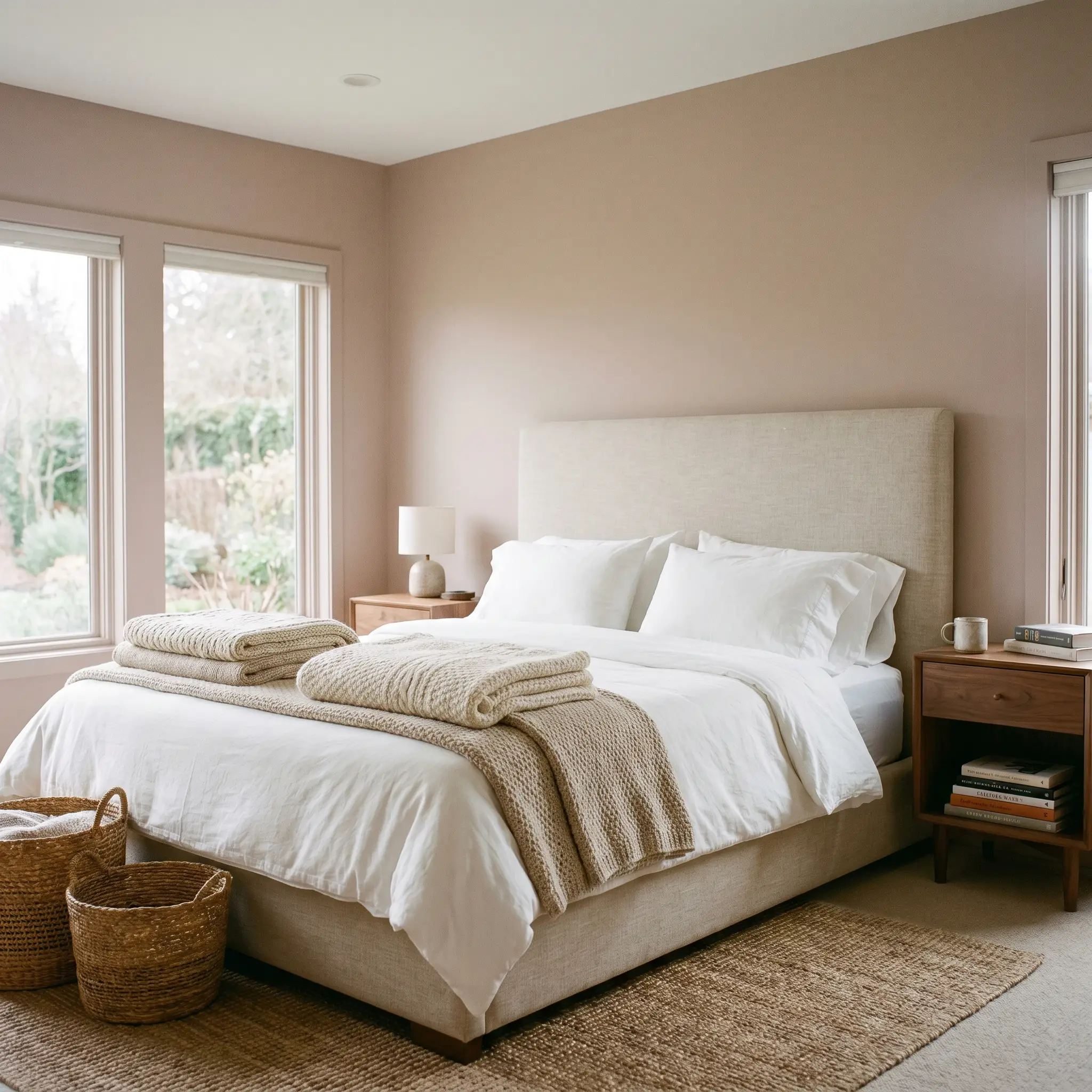
Primary Bedrooms
This shade excels in private retreats where you want to foster a sense of calm without resorting to generic beige. It provides a gorgeous foundation for a transitional design style, effortlessly bridging the gap between classic silhouettes and modern minimalism.
You can lean into its warmth by pairing it with an upholstered linen headboard and layered, chunky knit throws. Alternatively, if you prefer a sharper, more contemporary edge, it serves as a stunning contrast against crisp white bedding and sleek, dark-bronze reading sconces.
Powder Rooms and Bathrooms
Small, enclosed spaces are the perfect canvas for a mid-tone color to wrap the room in warmth. When applied from baseboard to ceiling, it creates a jewel-box effect that feels incredibly high-end.
It grounds the stark, reflective surfaces of typical bathroom fixtures, softening the glare of porcelain sinks and subway tile. For a truly elevated look, pair it with a heavily veined marble vanity top and classic polished nickel plumbing fixtures.
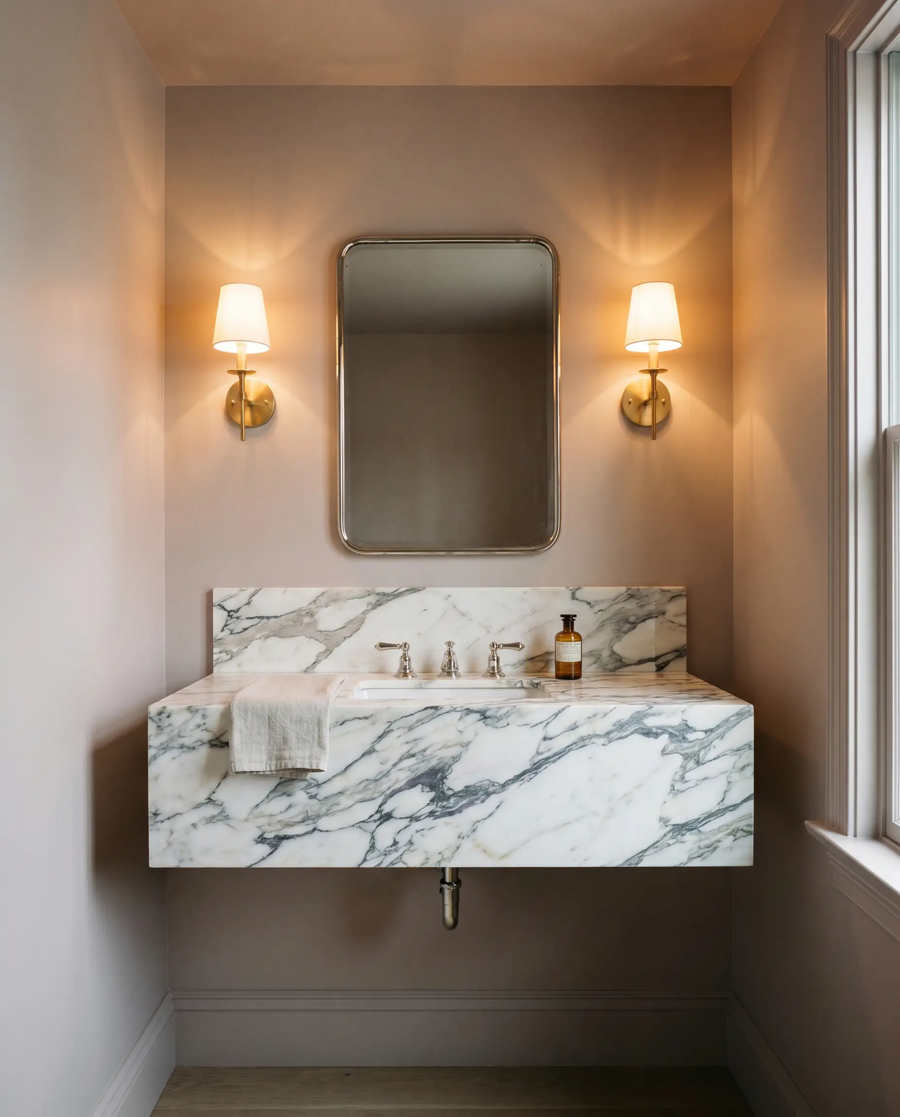
When painting a small powder room with a mid-LRV shade like AF-610, paint the ceiling the exact same color as the walls. This erases the hard visual boundary line at the top of the room, making the ceiling feel infinitely higher and the overall design far more intentional.
Hackrea Design Secret (The Wrap Effect)
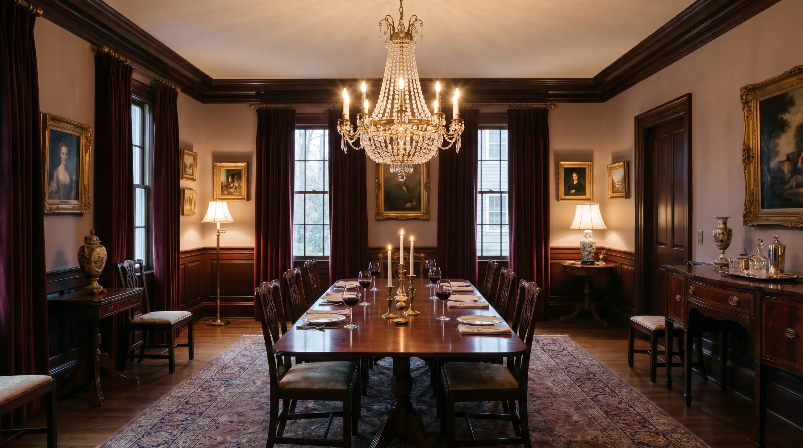
Dining Rooms
In a space dedicated to entertaining, this color provides a sophisticated, conversational backdrop. It is particularly effective for those who love to mix vintage and modern pieces around the table.
If you are decorating with muted mauves and dusty roses, a dining room allows you to play with ambient evening lighting to highlight the paint’s richer undertones. It looks magnificent behind a classic mahogany dining set, yet it easily adapts to a relaxed, bohemian vibe when paired with a light rattan pendant and mismatched cane chairs.
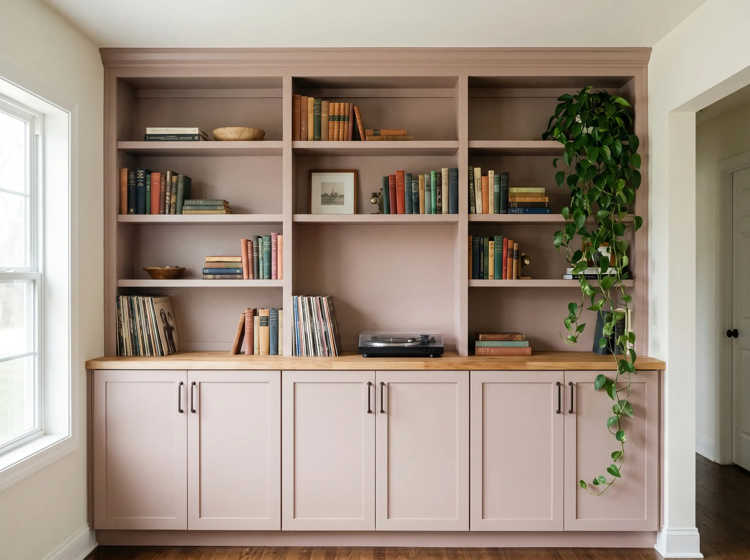
Custom Built-in Cabinetry
Using a mid-tone color on millwork is a brilliant way to make standard carpentry feel entirely custom. Whether applied to living room bookshelves or a hallway drop-zone, it instantly turns utilitarian storage into a focal point.
The color carries enough depth to ground the lower half of a room, especially when topped with natural butcher block or a simple quartz counter. Keep the surrounding walls a soft, warm white to ensure the cabinetry commands the attention it deserves.
Creative Ways to Use Benjamin Moore Batik
Moving beyond standard drywall applications opens up a world of highly curated, impactful design moments.
The Revitalized Antique Armoire
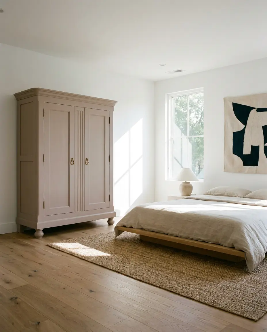
Transforming a heavy, outdated piece of dark wood furniture with this earthy pink completely reinvents its purpose. Applied with a smooth satin finish, the color softens the imposing scale of an antique wardrobe, making it a brilliant, unexpected addition to a modern guest room. Pair the freshly painted piece with unlacquered brass teardrop pulls to introduce a touch of living patina that complements the warm undertones.
A Textured Mediterranean Sunroom Ceiling
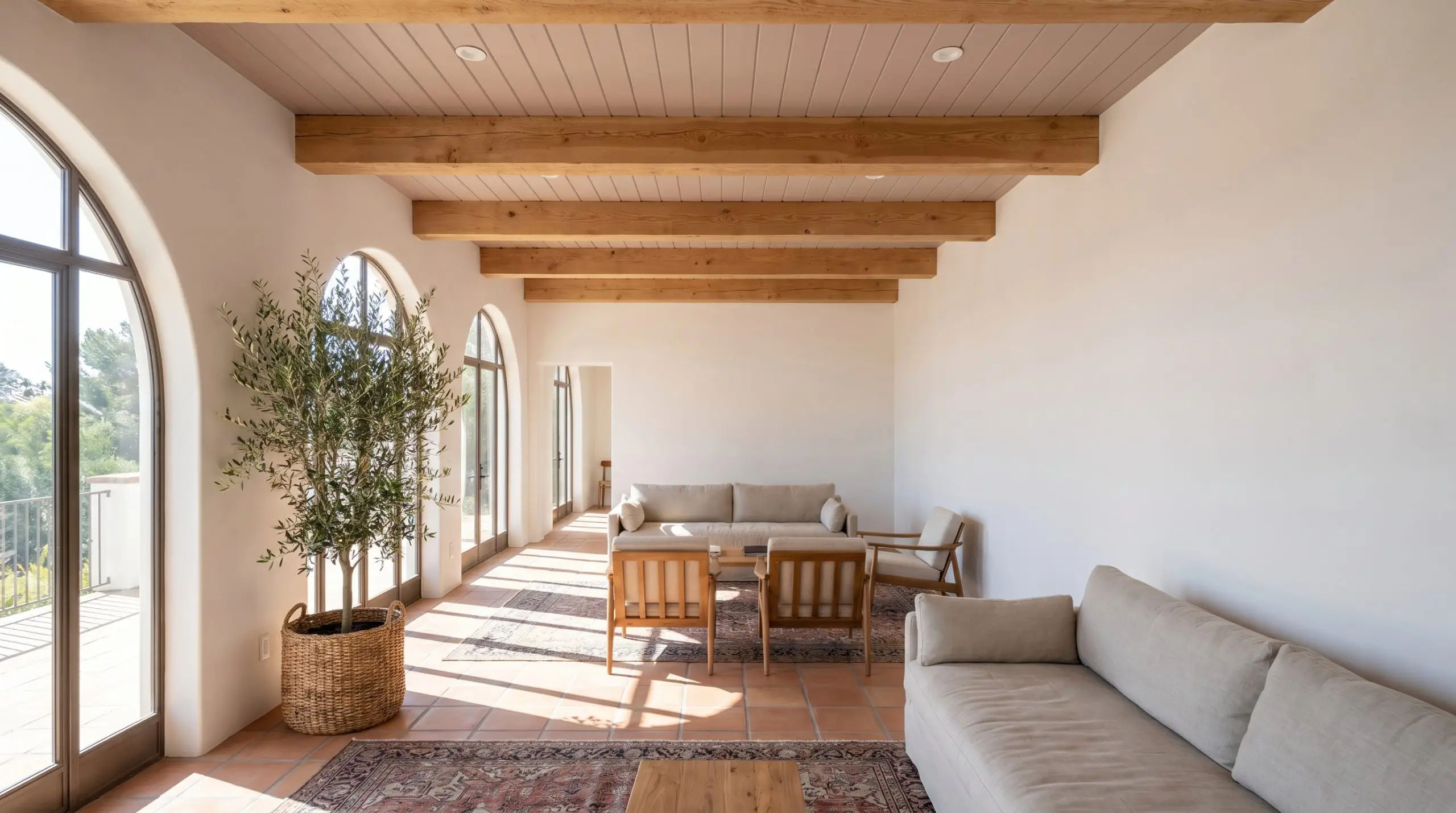
Instead of leaving a sunroom ceiling a forgotten white, brushing this shade between exposed, rough-sawn cedar beams draws the eye upward. The abundant natural light will highlight the paint’s softest rose qualities, creating an atmosphere reminiscent of a sun-baked European villa. It beautifully echoes the terra cotta floor tiles below, enveloping the room in a continuous loop of earthy warmth.
The Color-Drenched Home Office
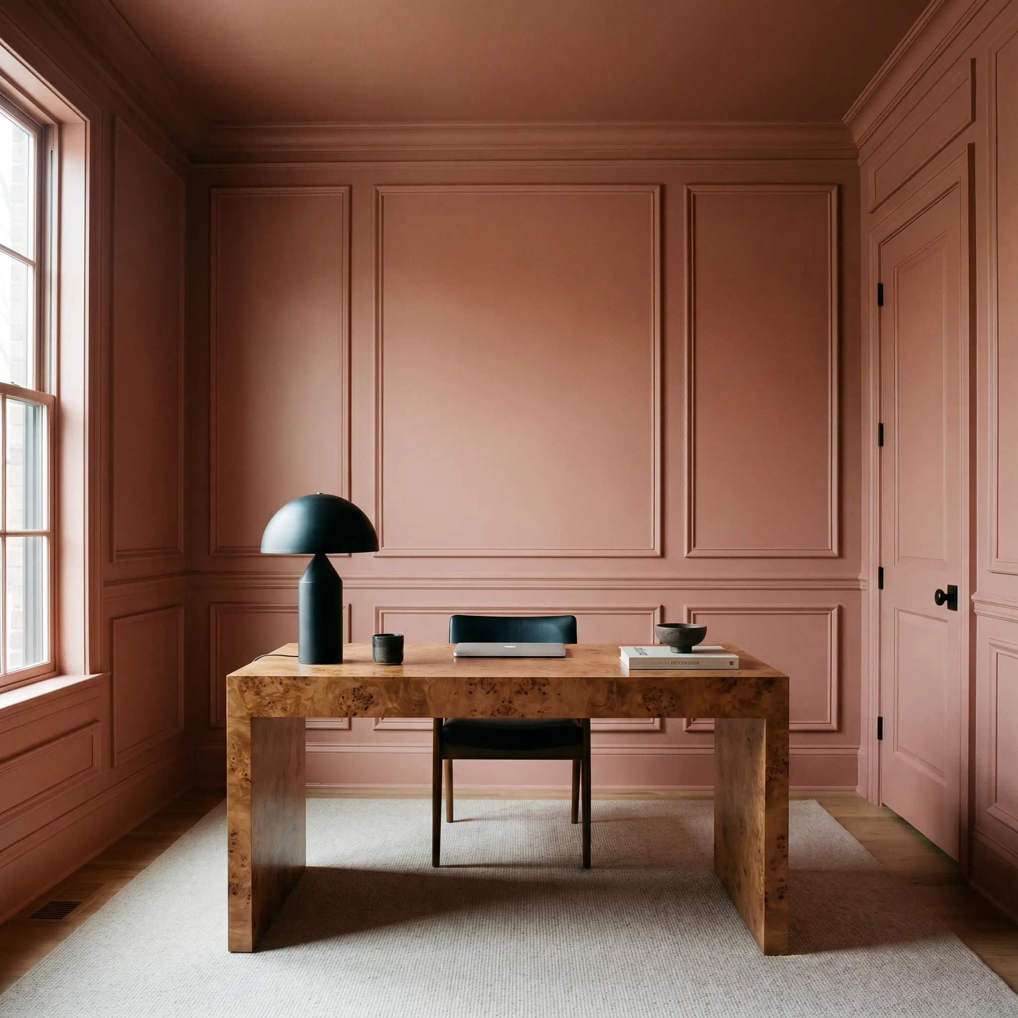
For a workspace that feels inspiring rather than sterile, applying AF-610 across all the walls, trim, and interior doors creates a deeply immersive environment. This monochromatic technique modernizes traditional picture-frame molding, allowing the architectural details to provide texture rather than visual clutter. Against this seamless backdrop, a sleek burl wood desk and a modern, sculptural task lamp become the undeniable stars of the room.
Coordinating Colors & Best Pairings
To make this complex shade feel purposeful, you must decide whether you want to frame it with sharp, tailored boundaries or let it melt into soft, tonal transitions.
Trim & Baseboards
The wrong white trim can instantly make a dusty rose look dingy or overly purple. You need a trim color that carries just enough warmth to harmonize with the wall, without looking yellow.
For more guidance on selecting the perfect architectural framing, explore our comprehensive breakdown of the best warm whites for trim.
Hardware, Wood & Material Pairings
The materials you introduce will dictate exactly how this paint behaves in your home.
Coordinating Colors
Building a whole-home palette around this shade requires secondary colors that either cool it down or emphasize its earthy roots.
Designer Mood Boards
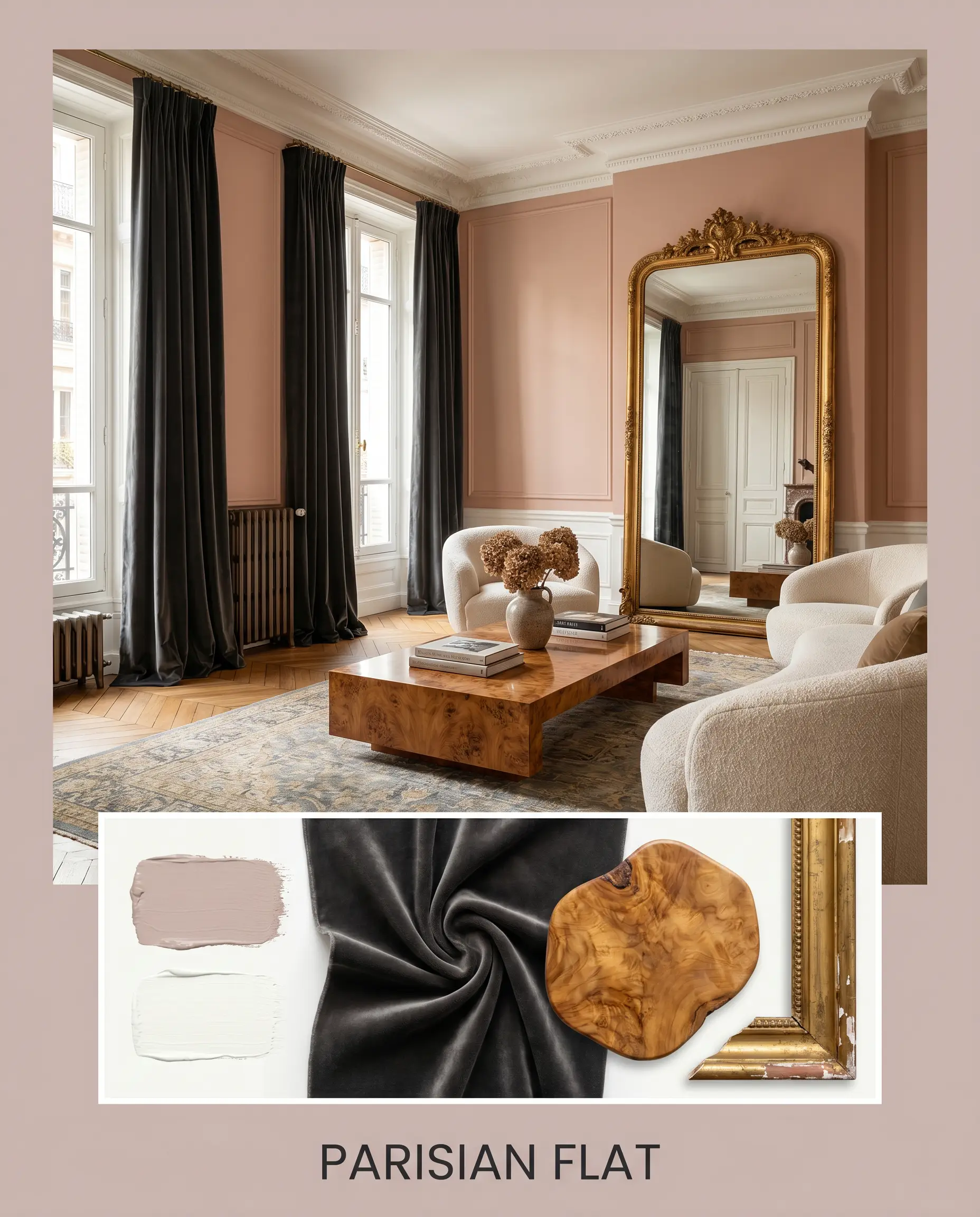
Parisian Flat This palette leans heavily into classic, romantic architecture while maintaining a modern edge. The walls are bathed in AF-610, framed tightly by Benjamin Moore Chantilly Lace on the crown molding. To ground the softness, we introduce heavy velvet drapery in a deep charcoal, a vintage gilded mirror resting on the mantel, and a sleek, low-profile burl wood coffee table to inject organic warmth.
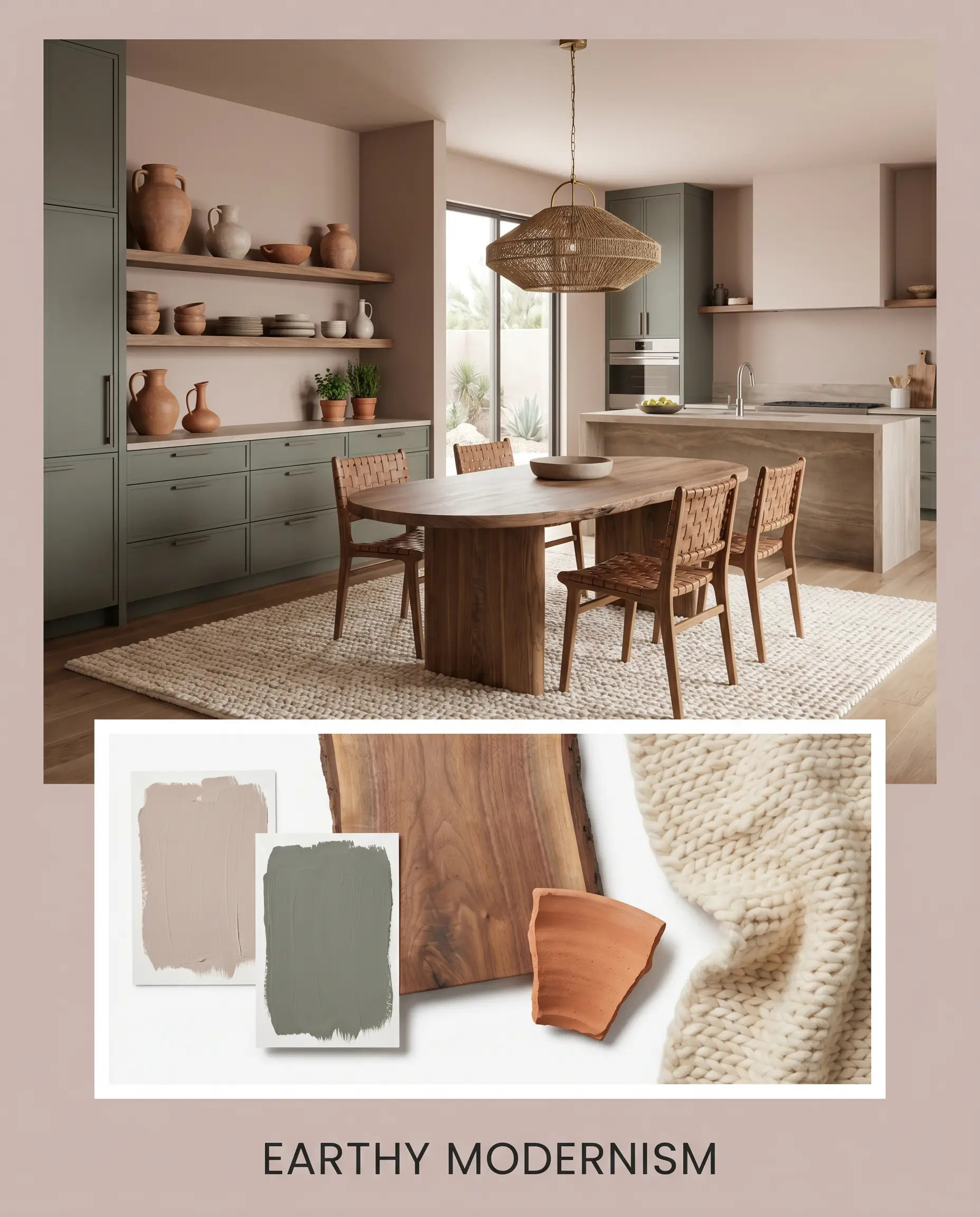
Earthy Modernism Focusing on the muddy, grounded side of the paint, this combination pairs the walls with the dusty green of Sherwin-Williams Retreat on adjacent cabinetry. The styling relies on highly tactile, matte finishes: natural walnut floating shelves, unglazed terracotta pottery, and a chunky, cream-colored wool rug to absorb light and create a deeply calming, grounded energy.
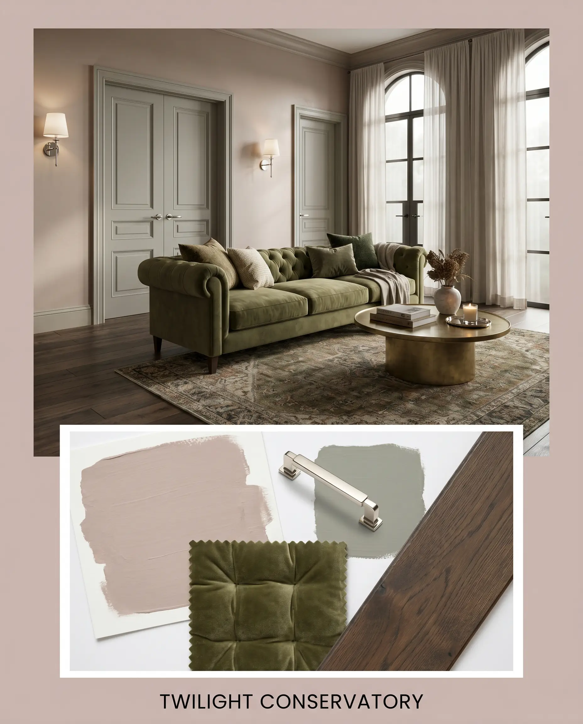
Twilight Conservatory This mood board embraces the cooler, violet-shifting nature of the paint when used in a shaded space. The walls are paired with the moody depth of Farrow & Ball Pigeon on the interior doors. The room is styled with polished nickel wall sconces to bounce available light, alongside a deeply tufted olive-green sofa and dark, wide-plank oak flooring to anchor the sophisticated, evening-ready atmosphere.
Head-to-Head Comparisons: Benjamin Moore Batik
When committing to a nuanced color, understanding exactly how it performs against its closest rivals is essential for making a confident final decision.
Benjamin Moore Batik vs. Benjamin Moore Sonoma Clay 1242
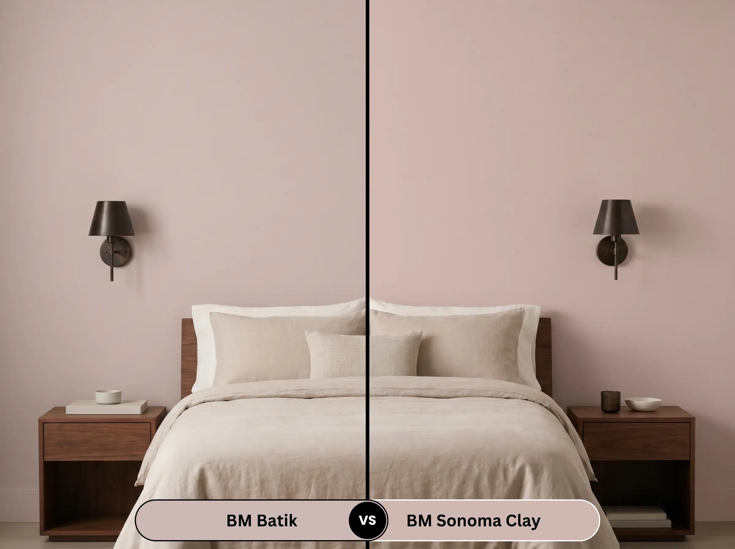
If your room receives a heavy dose of cool, northern light, Batik might pull too far into a chilly violet for your taste. In this scenario, Sonoma Clay is the better candidate. It carries a much stronger, undeniable red-brown base. While AF-610 feels like a dusty rose, Sonoma Clay reads as a muted terracotta, offering significantly more inherent warmth to combat dreary, shadowed rooms.
Benjamin Moore Batik vs. Benjamin Moore First Light 2102-70
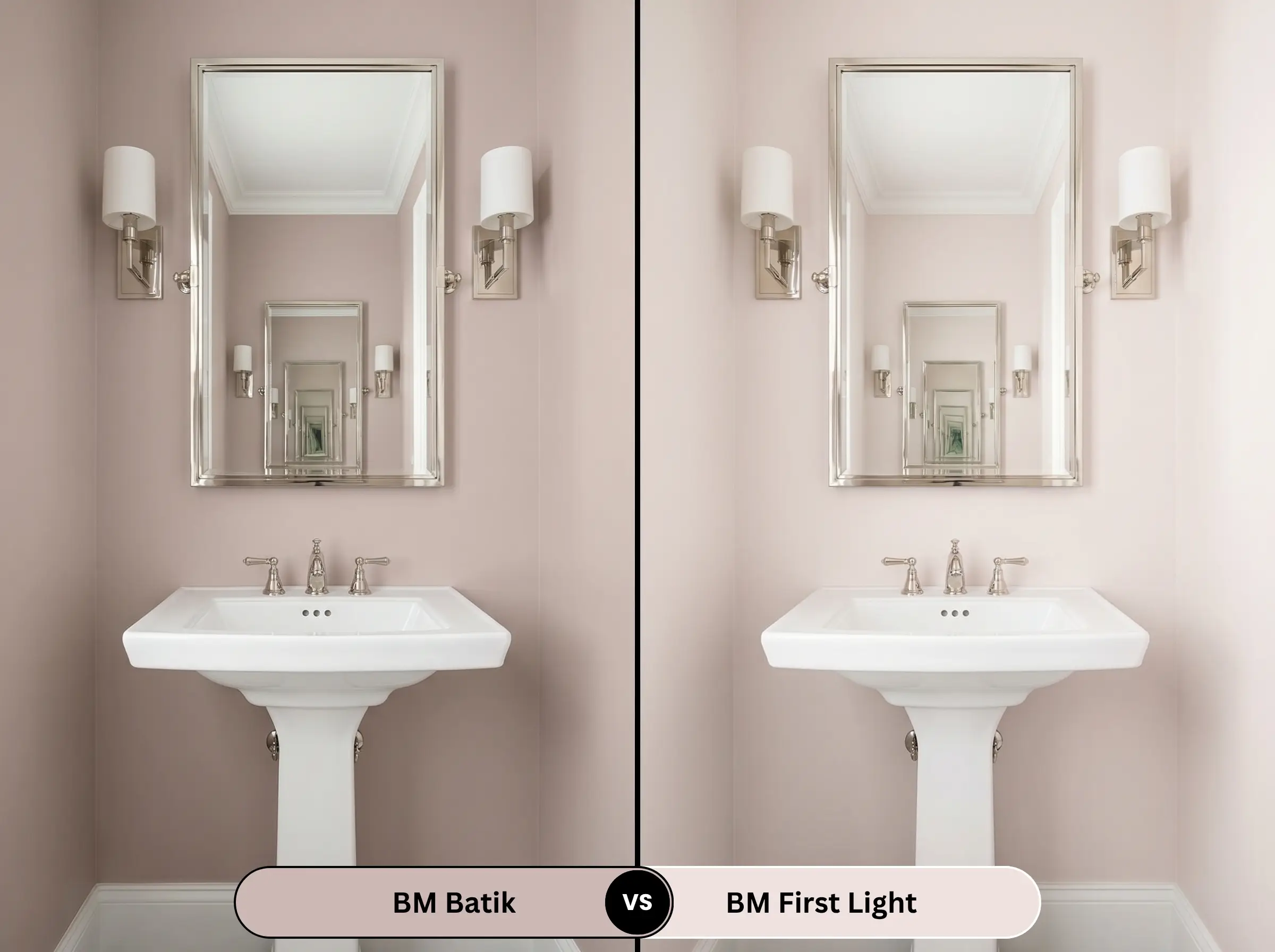
When you are working with a smaller, enclosed space and need maximum brightness, First Light is the superior choice. First Light has a much higher light reflectance, acting as a true, airy pastel pink. Batik, by contrast, is heavily muted and muddy. If you want a crisp, cheerful morning energy, choose First Light; if you want a moody, sophisticated evening vibe, stick with AF-610.
Benjamin Moore Batik vs. Sherwin-Williams Malted Milk SW 6057
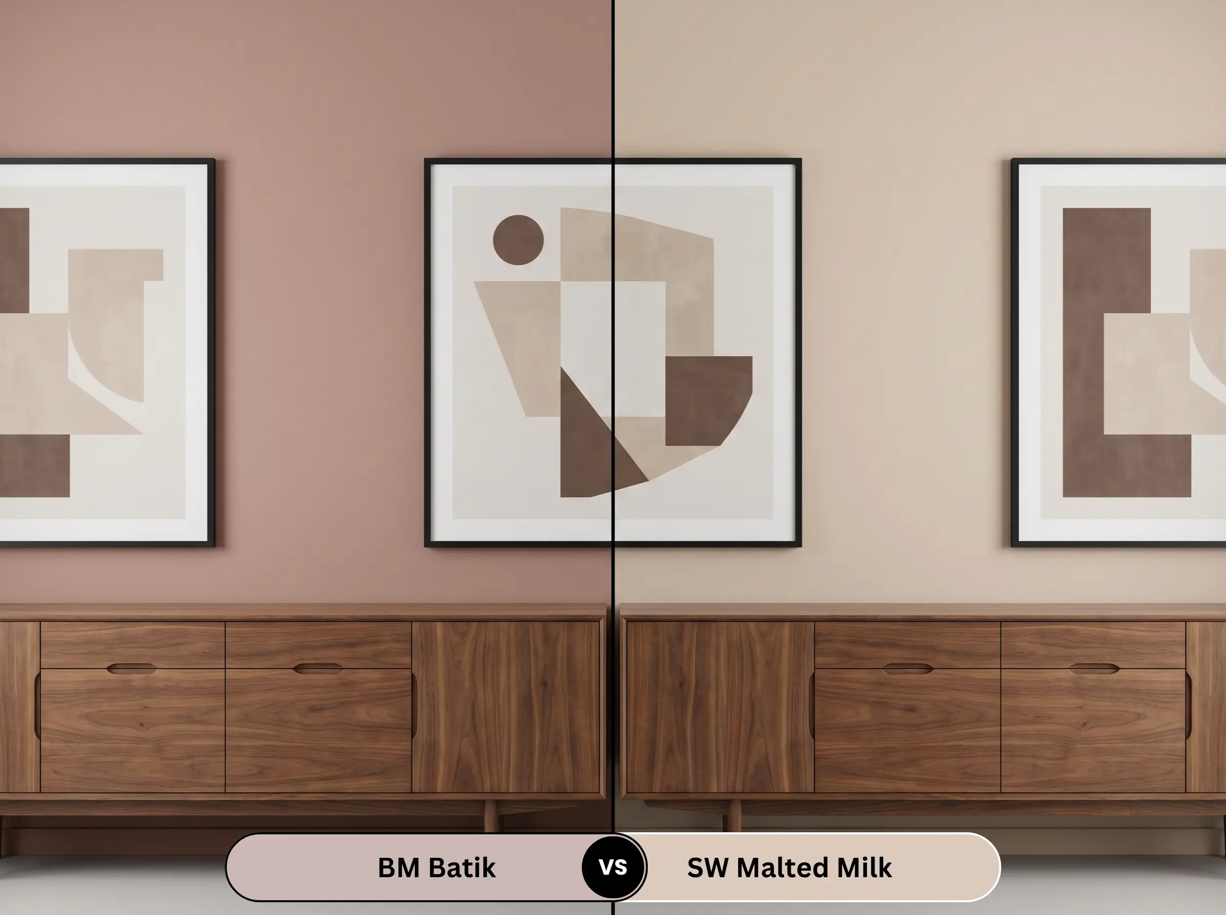
For homeowners who are hesitant to commit to a true pink, Malted Milk offers a safer bridge. Malted Milk leans much further into a warm, beige-taupe territory, with only a whisper of blush. Batik is undeniably more saturated and purple-leaning. If you want the walls to read as a warm neutral with a hint of color, Malted Milk succeeds; if you want the color to make a definitive design statement, Batik is the answer.
Similar Colors & Brand Equivalents
Sometimes a paint is almost perfect, but you need a minor adjustment in depth, or perhaps you are limited by the brands available at your local hardware store.
Similar Colors
Cross-Brand Equivalents
Practical Application & DIY Advice
The Dynamic Sheen Guide
Primer Strategy
Because this shade sits right in the middle of the reflectance scale, a standard white primer will often suffice over previously painted, light-colored walls. However, if you are painting over a dark, highly saturated color (like a navy or forest green), you must use a high-quality, high-hiding white primer first. Failing to block out the dark base will cause the muddy undertones of the pink to look bruised and uneven.
Coverage & Success Tips
You should plan for two full, careful coats to achieve the true, complex depth of this color.
Be highly aware of your roller technique; mid-tone shades with complex undertones are prone to “flashing” if applied unevenly. This means that if you press too hard on the roller or fail to keep a wet edge, you will see visible, shiny streaks when the light hits the wall. Work systematically in small sections, and avoid the temptation to touch up a spot once the paint has begun to tack up and dry.
Frequently Asked Questions
Because this paint carries a significant amount of purple-leaning mauve, it can actually emphasize the orange tones in standard red oak floors through complementary color theory. To bridge the gap gracefully, anchor the room with a large, neutral area rug to create a visual break between the warm wood and the cool-leaning pink walls.
Without natural sunlight to draw out the warm red base, the violet notes will absolutely dominate in a windowless space. To prevent the room from feeling like a cold, bruised cavern, you must rely heavily on warm artificial lighting (2700K to 3000K bulbs) and introduce highly reflective, warm materials like polished brass or natural wood vanities.
Yes, its mid-range LRV allows it to hold its saturation remarkably well outdoors. However, direct, blinding exterior sunlight will wash out its subtle complexities, making it look much lighter and slightly grayer than it does on an interior swatch. Always view a large painted sample outside at high noon before committing.
Dark, light-absorbing metals like matte black or oil-rubbed bronze provide the absolute best grounding effect. These dark finishes offer a sharp, masculine contrast that cuts through the softness of the mauve, ensuring the overall design feels tailored, intentional, and balanced.
Final Verdict & Expert Warnings
Benjamin Moore Batik AF-610 is an incredibly sophisticated, moody anchor for homeowners who want to introduce color without sacrificing elegance. It performs best in spaces that invite lingering, such as primary bedrooms, dining rooms, and custom millwork projects. By embracing its shifting, chameleon-like nature, you can use this muted mauve to bridge the gap between traditional warmth and sleek, contemporary styling, creating a home that feels deeply personal and richly layered.
However, you must be highly strategic with your existing fixed elements before committing to this shade. If your home features prominent, yellow-leaning beige carpets, heavily yellow-toned travertine tile, or stark, icy-blue gray stonework, this paint will fight those surfaces relentlessly. The muddy violet notes in the paint will clash against the yellow, making the floors look dirty and the walls look unpleasantly purple. Success with this color demands either crisp, clean whites or warm, earthy counterparts; forcing it to cooperate with outdated, yellow-heavy finishes will completely compromise its premium appeal.
Expert Warning (Fixed Elements Clash)