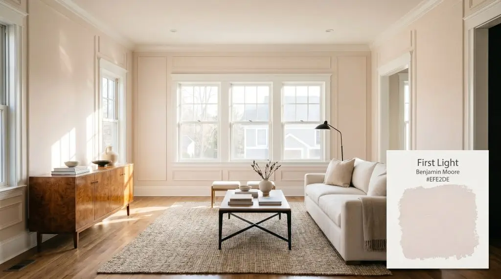
First Light 2102-70
Benjamin MooreBenjamin Moore First Light 2102-70 is a soft, airy blush pink that serves as a refreshing alternative to traditional warm neutrals. With an LRV of 75.86, it reflects a high amount of light, imparting a subtle, optimistic warmth without feeling overly sweet or juvenile.
Paint Technical Profile
| Color ID / SKU | 2102-70 |
| HEX Code | #EFE2DE |
| Light Reflectance (LRV) | 75.86 |
| Use | Interior |
| Best Exposures | North, East, West |
| Best For | Bedrooms, Bathrooms, Living Rooms, Ceilings |
Benjamin Moore First Light: The Sophisticated Blush Redefining Modern Neutrals
Pink is often misunderstood as a novelty, but the right variation acts as a wildly sophisticated backdrop. Benjamin Moore First Light 2102-70 strips away the sugary sweetness of traditional pastels, leaving behind a highly tailored, luminescent tint.
This color physically alters the energy of a room, casting a subtle, flattering glow that makes everyday spaces feel both expansive and incredibly deliberate.
When you pair this muted tone with the right architectural details and curated furnishings, it immediately stops reading as a simple color choice and starts functioning as a premium interior foundation.
Benjamin Moore First Light: Undertones & LRV
If you are wondering whether this shade leans warm or cool, First Light is fundamentally a warm neutral. On the color wheel, it sits comfortably in the red sector but is heavily muted to prevent any harsh, vibrant saturation. This specific color structure creates an earthy, welcoming atmosphere rather than a stark or clinical environment.
With a light reflectance value of 75.86, this architectural finish is exceptionally bright. It bounces a tremendous amount of natural and artificial illumination across the room. This high reflectivity makes tight quarters feel instantly larger and more buoyant, while still providing enough contrast against crisp white trim to look intentional.
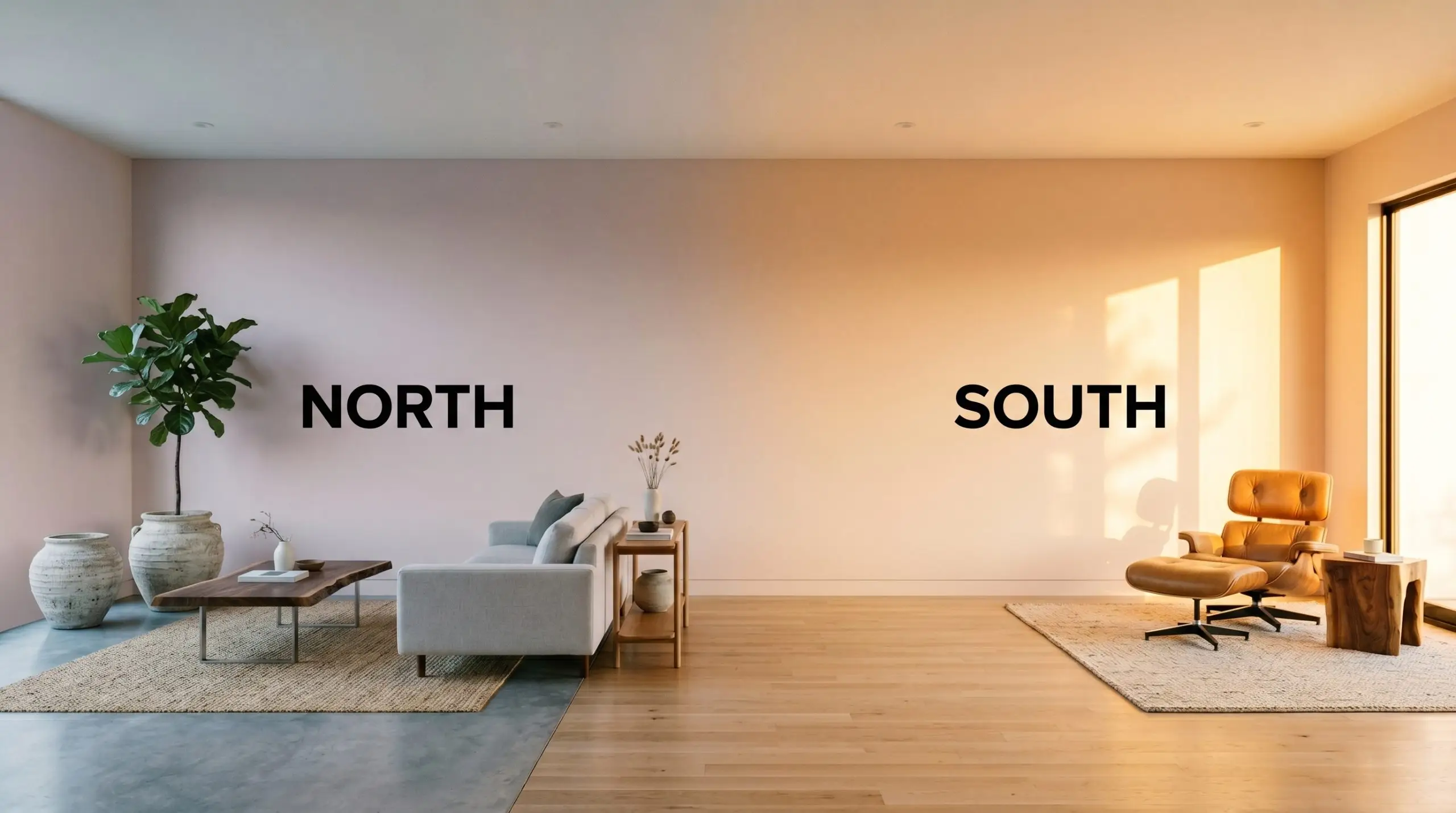
Directional Lighting & The Chameleon Factor
No paint exists in a vacuum, and this soft pastel is highly reactive to the shifting path of the sun. The Gennex Color Technology within the formula ensures the pigment retains its integrity, but the perceived temperature will swing dramatically depending on your windows.
Curating the Interior Palette: Popular Applications
Moving past the outdated notion that blush is strictly for children’s spaces opens up a massive realm of design possibilities. This specific tint acts as an aesthetic chameleon, adapting seamlessly to a variety of styling approaches and architectural features.
Primary Bedrooms & Nurseries
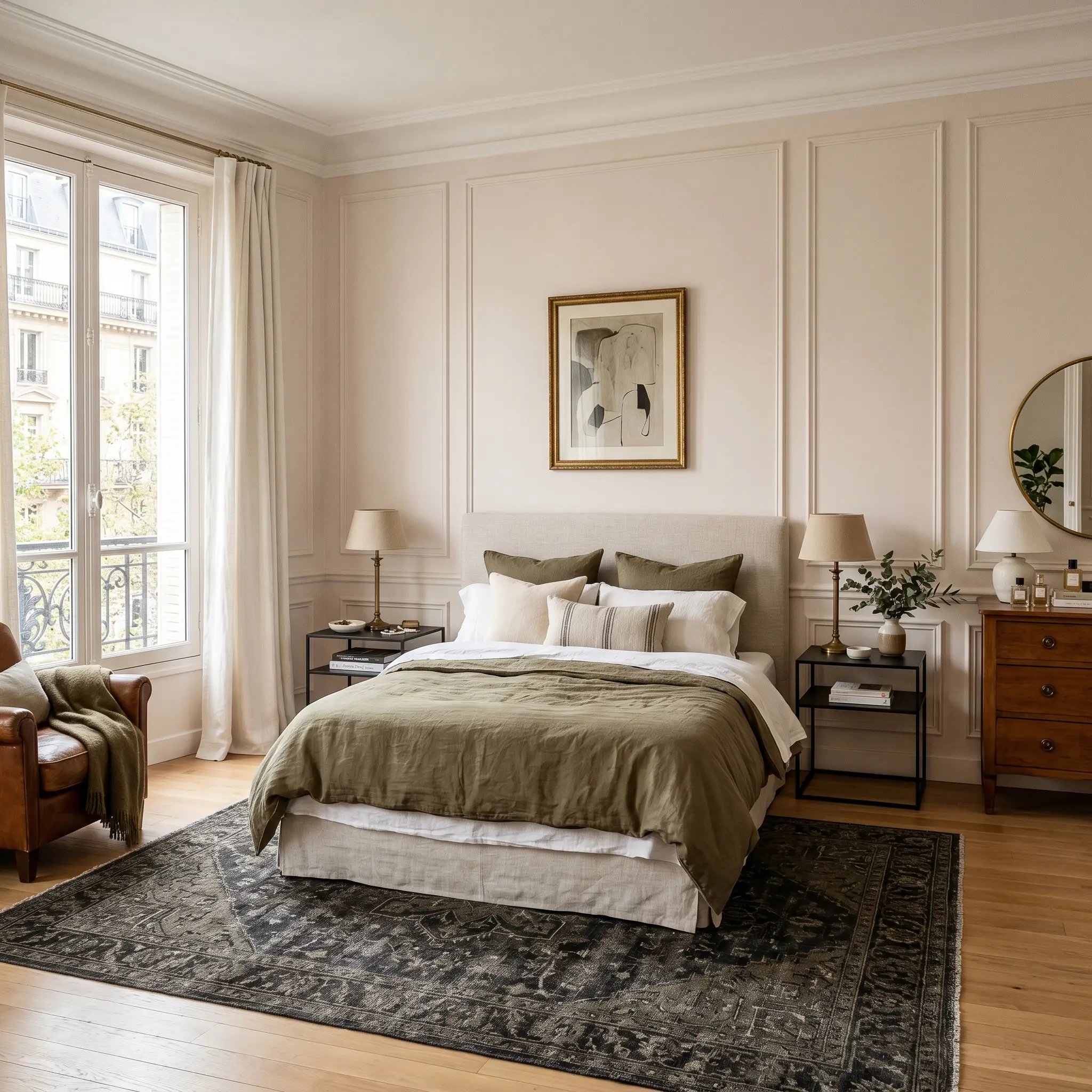
While often requested for a newborn’s space, treating this shade as a sophisticated master suite foundation yields stunning results. Pair it with crisp picture molding and a slipcovered linen bed to channel effortless Parisian chic. If you want to temper the sweetness, introduce contrasting materials like blackened steel nightstands or a vintage charcoal rug.
For a younger resident, avoid the predictable pastel explosion by layering in warm white oak furniture and subtle pinstripe textiles.
To ensure a bedroom feels like a primary suite rather than a playroom, restrict your secondary colors to muddy tones like olive or rust. High-contrast, weighty accents instantly stabilize the softer walls.
Hackrea Design Secret (The Mature Contrast)
Windowless Bathrooms & Powder Rooms
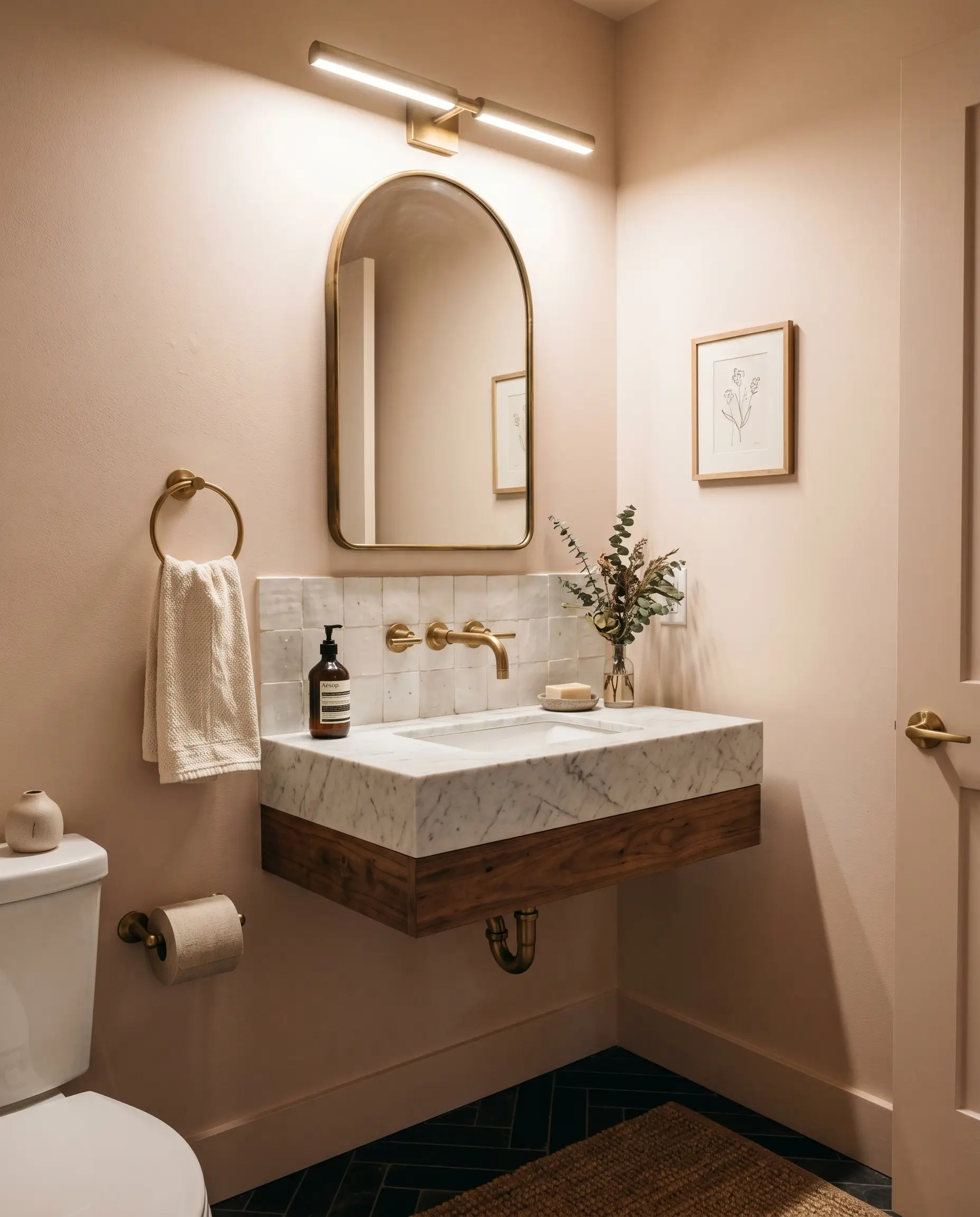
Interior spaces lacking natural sunlight often feel sterile, making this warm hue an excellent antidote. Wrapping a tiny powder room in this color instantly creates a jewelry-box effect that flatters the skin under artificial vanity lighting.
Elevate the everyday vanity by pairing the painted walls with an unlacquered brass faucet and a honed marble sink. For a more tactile, organic vibe, contrast the smooth drywall with a backsplash of irregular, handmade zellige tile.
Living Room Accent Walls or Full Wraps
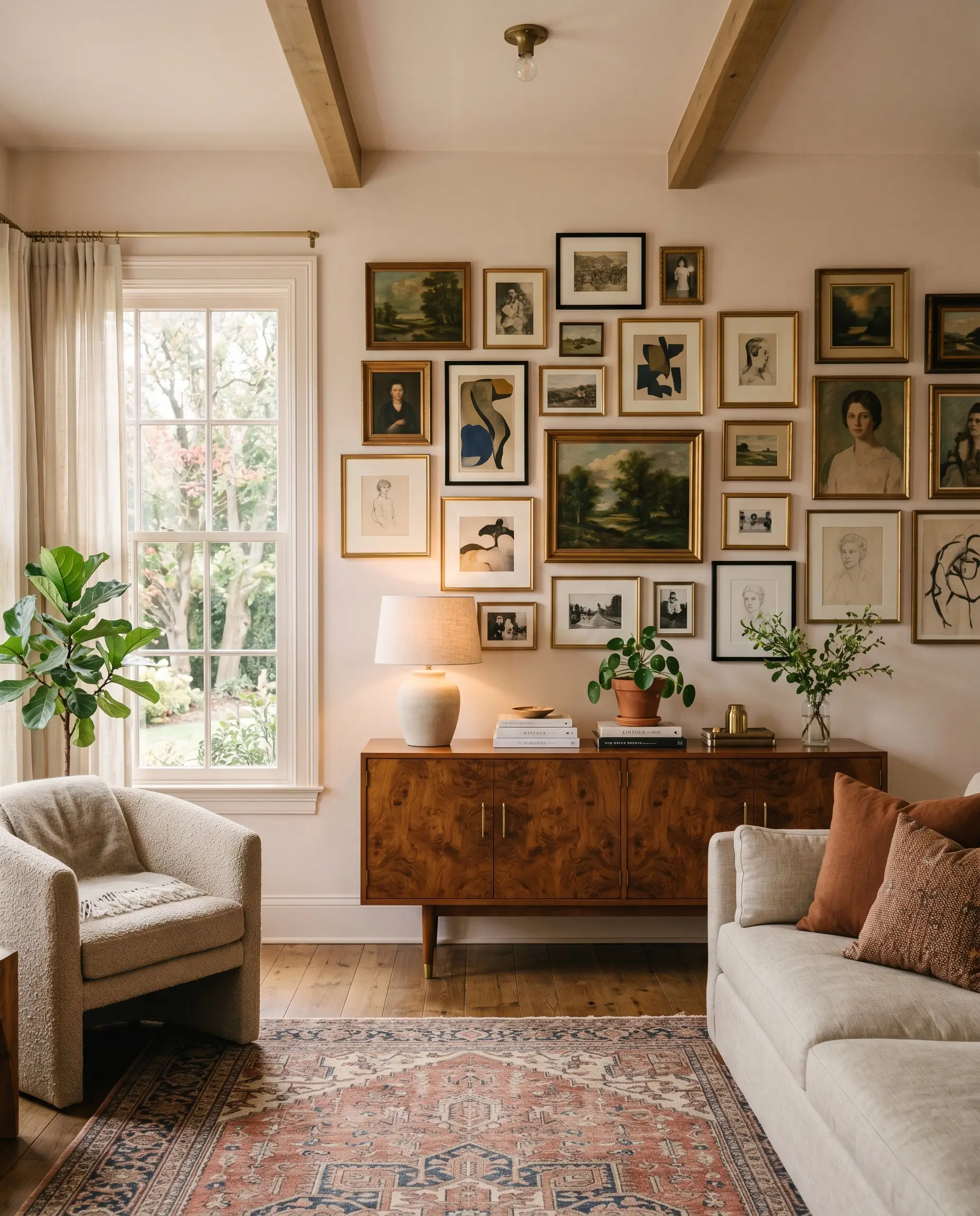
The era of the timid, singular accent wall is evolving into more immersive color experiences. Color drenching your living space—painting the walls, baseboards, and window casings in the identical finish—creates a seamless, highly custom look that feels incredibly intentional.
This approach provides a beautifully cohesive backdrop for a mid-century burl wood credenza or a sprawling, asymmetrical gallery wall. If a full wrap feels too intense, try a half-wall split using classic beadboard on the lower half painted in a soft greige.
“Fifth Wall” Ceilings
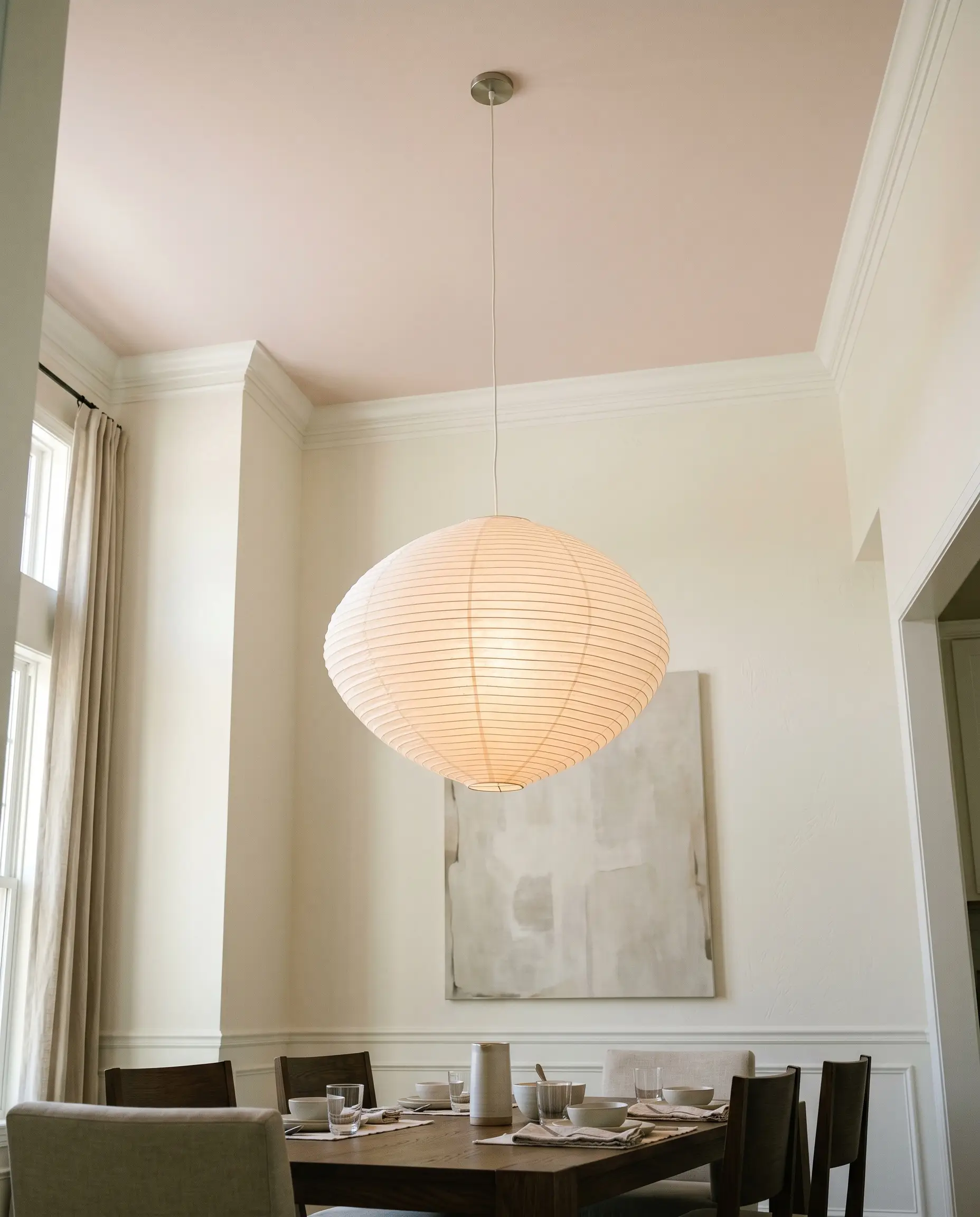
Leaving a ceiling flat, builder-grade white is a missed opportunity for adding subtle character to a room. Rolling this luminous tint overhead casts a warm, ambient glow downward, softening the entire room below.
This technique works exceptionally well in dining rooms or transitional spaces featuring tall, stark white walls that need a touch of visual warmth. Pair the painted ceiling with an oversized, sculptural paper lantern or a vintage brass chandelier to draw the eye upward.
When painting a ceiling a color other than white, pay close attention to your crown molding. If your trim is a stark, cool white, the transition can look harsh; opt for a slightly warmer, creamier white trim to ensure a seamless visual flow.
Clash Warning (The Ceiling Trim Transition)
Designing Around First Light: Materials & Palettes
This muted plum-meets-blush requires intentional contrast to maintain its sophisticated edge. Rather than bleeding into other soft pastels, this specific pigment thrives when pushed against crisp boundaries or deeply saturated tones.
Tailoring the Trim
To keep the walls feeling mature, you need a trim color that provides a sharp, clean break. Benjamin Moore Chantilly Lace OC-65 strips away any creamy yellow casts, offering a stark, brilliant border that forces the blush to read as a deliberate architectural choice.
If you prefer a slightly softer transition, Sherwin-Williams High Reflective White SW 7757 offers an equally crisp edge with just enough warmth to prevent the room from feeling icy. Farrow & Ball All White No. 2005 is another stellar option, acting as a pure, un-tinted white that lets the rosy walls glow without any competing undertones.
Hardware, Wood & Tactile Pairings
The Curated Color Palette
Designer Mood Boards
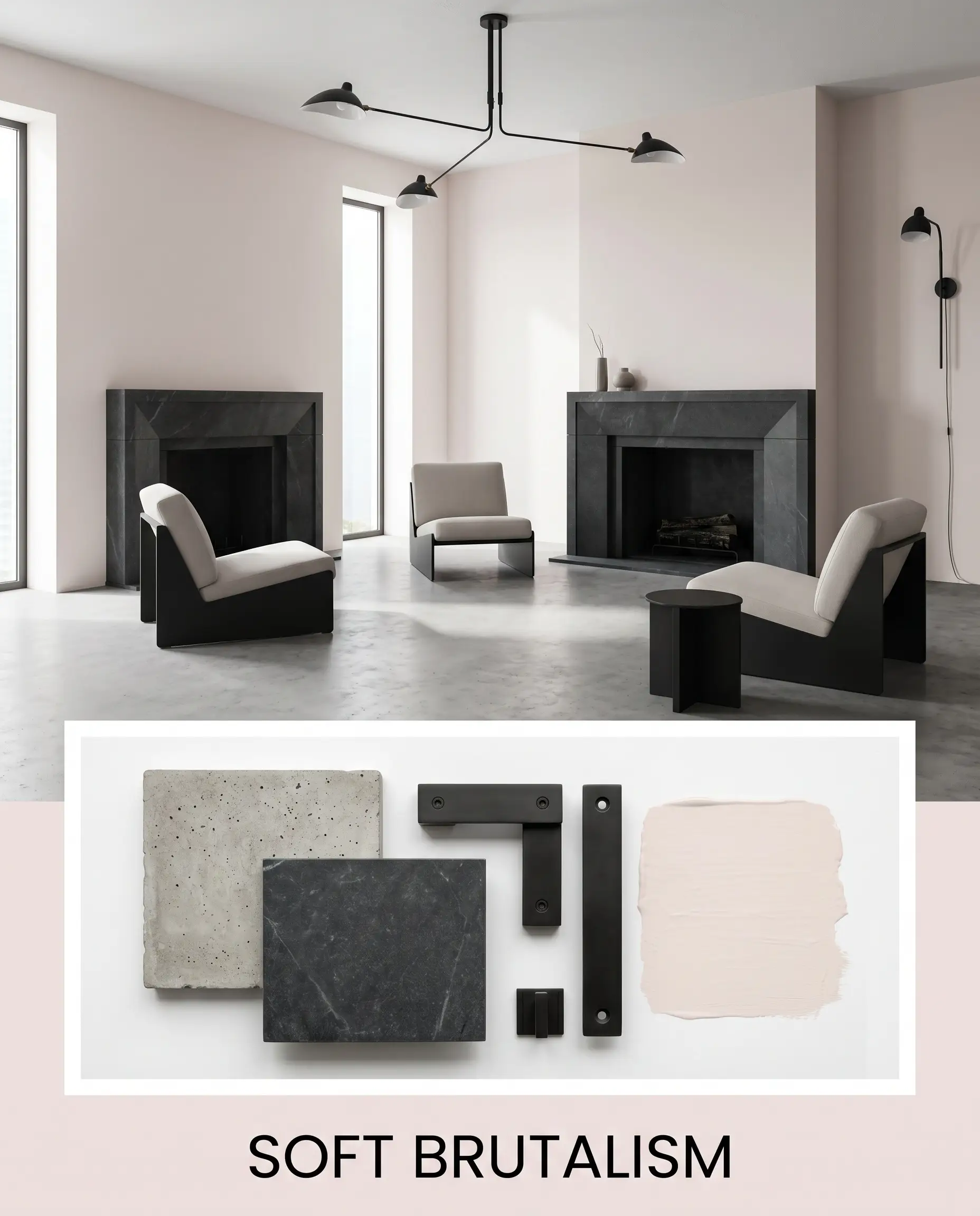
Soft Brutalism This aesthetic proves that a rosy tint can thrive in a highly modern, minimalist environment. The foundation relies on the stark contrast between the luminous walls and raw, unpolished materials like concrete floors or chunky soapstone accents. Layer in blackened steel lighting fixtures and low-profile, sculptural accent chairs to emphasize the architectural edge. The tension between the delicate wall color and the brutalist furniture silhouettes creates a fiercely intentional, avant-garde energy.
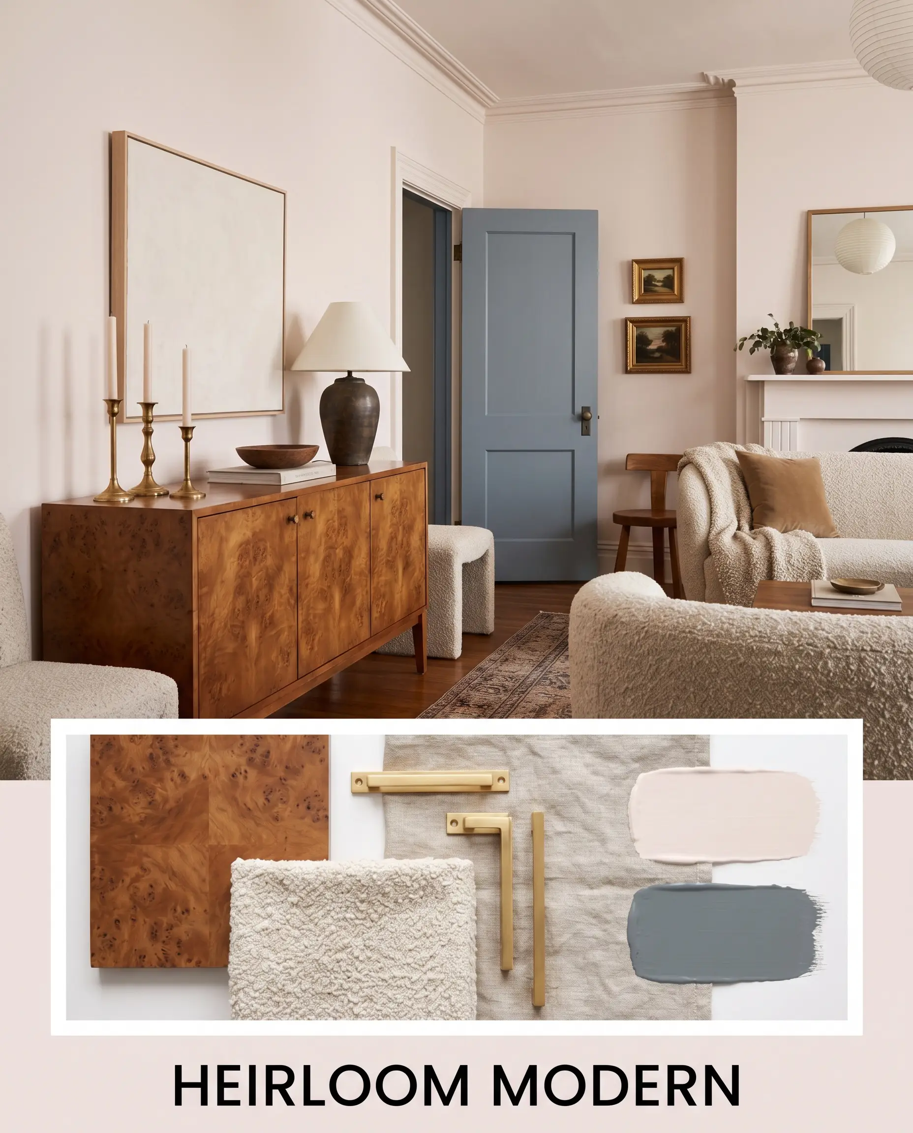
Heirloom Modern This approach leans into a collected, richly layered atmosphere that feels both historic and freshly updated. The walls serve as a warm, flattering backdrop for mid-century burl wood credenzas and unlacquered brass candlesticks. Introduce textiles like nubby bouclé or washed linen to soften the hard edges of the vintage furniture. Ground the airy room by painting the interior doors in a moody shade like Benjamin Moore Normandy 2129-40, completing the highly curated, transitional vibe.
First Light vs. The Competition
While this specific Benjamin Moore formula is incredibly versatile, certain lighting conditions or specific design goals might require a slightly different pigment structure. If your room receives very cool northern light, or if you need a deeper, more saturated tone to hold its own against dark woodwork, you may need to pivot.
Benjamin Moore First Light vs. Sherwin-Williams Romance
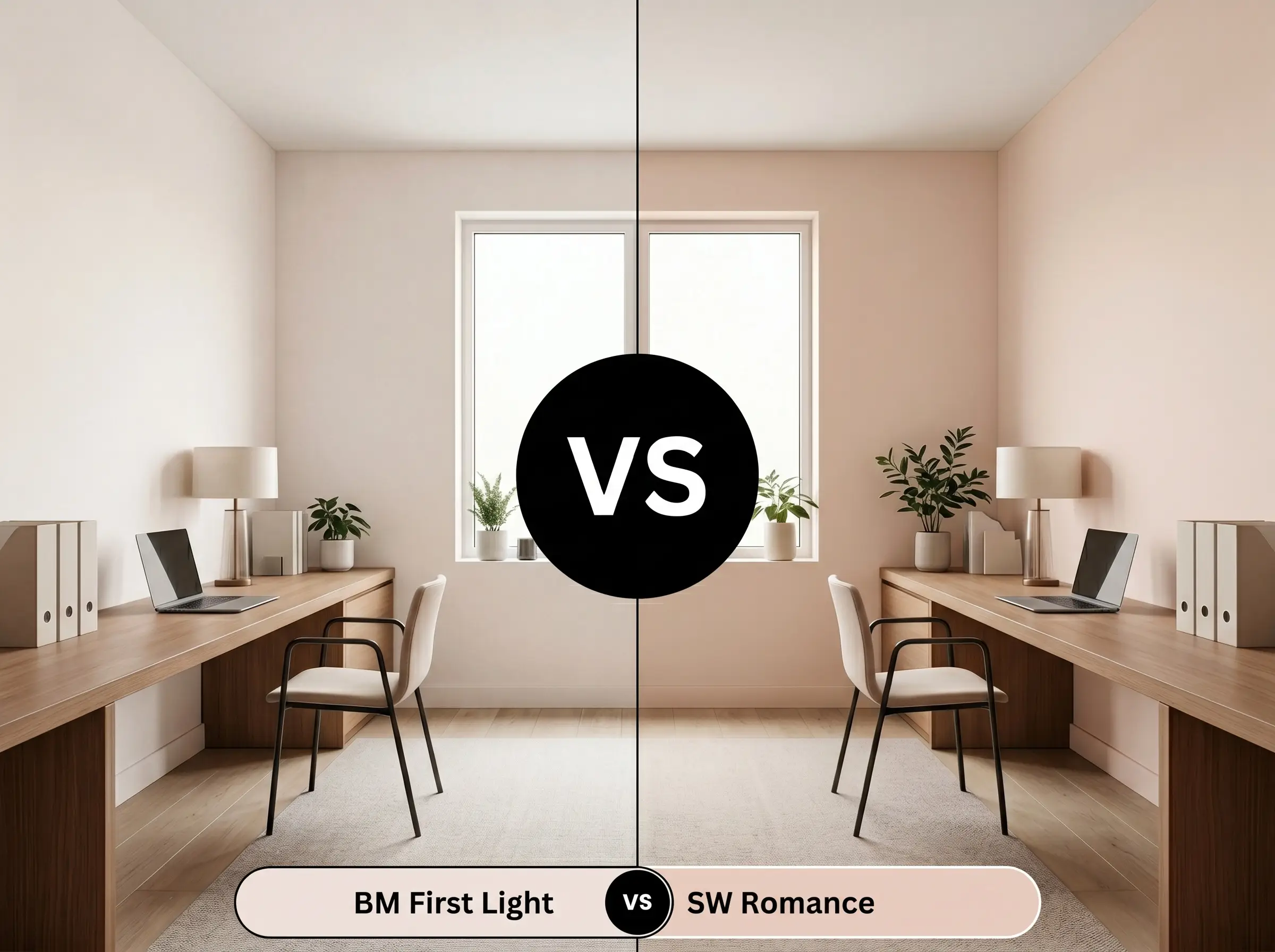
Sherwin-Williams Romance carries a slightly lower LRV and a more pronounced, peach-leaning warmth. If your room feels icy and you need to aggressively inject warmth, Romance will perform better. However, if you want a subtle, airy glow that leans closer to a true neutral blush, the Benjamin Moore option remains the superior choice.
Benjamin Moore First Light vs. Farrow & Ball Setting Plaster
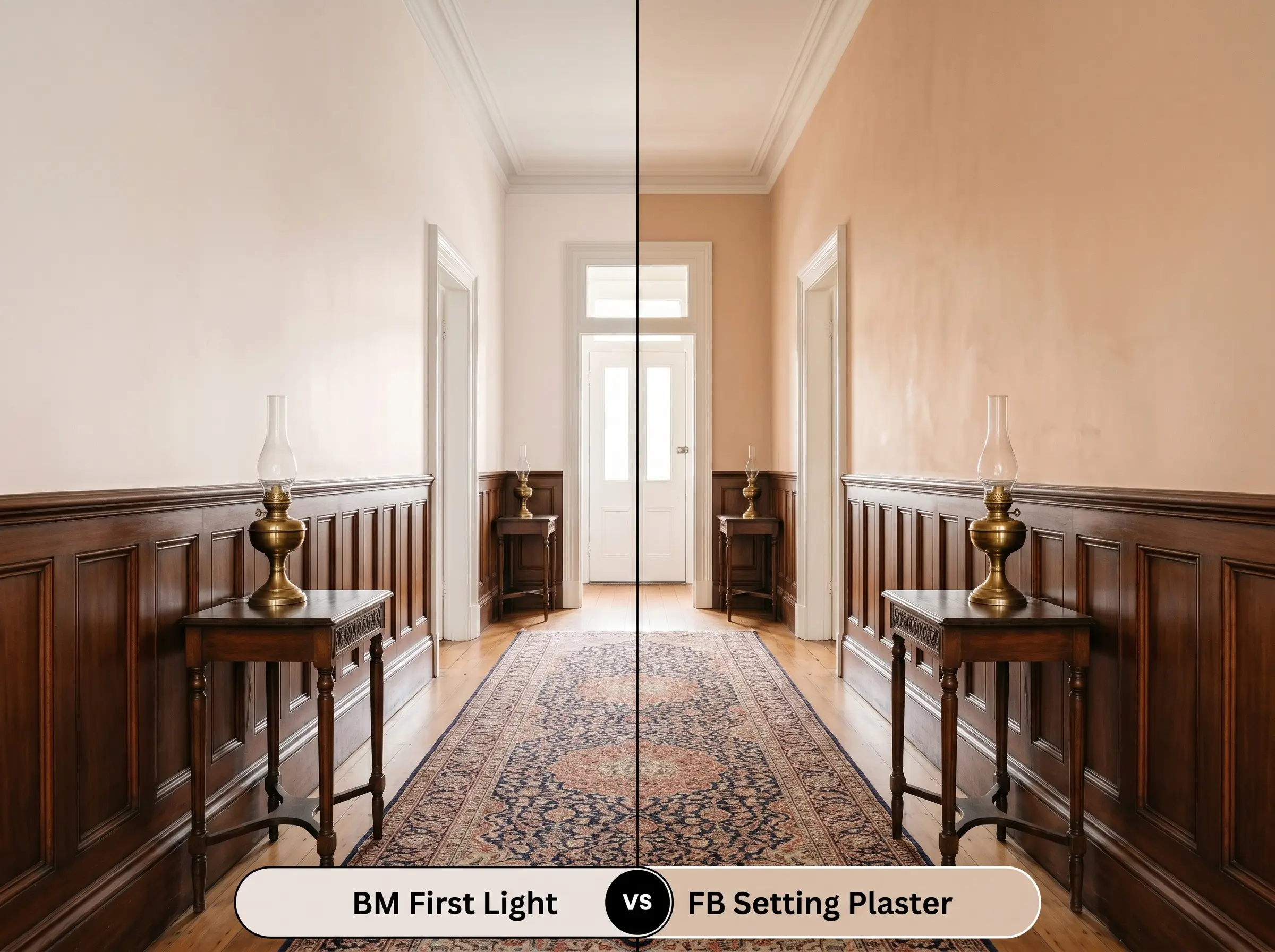
Farrow & Ball Setting Plaster is famous for its muddy, historic yellow-ochre undertones. If you are working with a heritage property and want a color that looks like aged, bare plaster, choose the Farrow & Ball. Conversely, if you are designing a fresh, modern space that requires a cleaner, brighter finish, First Light will deliver that necessary luminescence.
Benjamin Moore First Light vs. Benjamin Moore Pleasant Pink
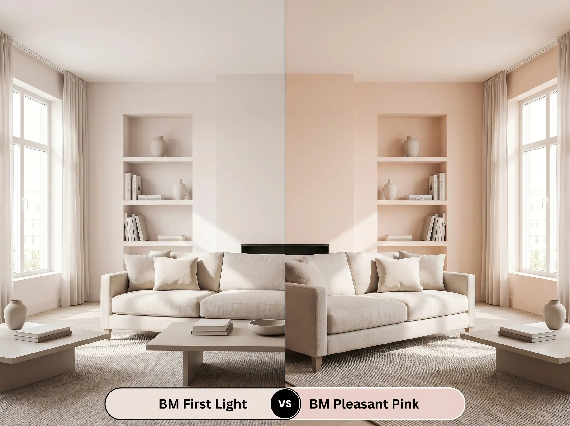
Pleasant Pink 2094-60 sits a few steps darker on the color card, bringing more noticeable brown and red saturation to the wall. If you are painting a large, sun-drenched room that washes out lighter tints, Pleasant Pink will hold its shape beautifully. If you are dealing with tight quarters or lower light, stick with the higher reflectivity of First Light to keep the room feeling expansive.
Exploring Alternatives to This Luminous Tint
Sometimes a color looks perfect on a swatch but behaves unexpectedly once it interacts with your specific floors or lighting. Whether you need a subtle shift in warmth or a direct match from a different manufacturer, these alternatives provide excellent backup options.
Same-Brand Variations
Cross-Brand Matches
Putting Benjamin Moore First Light on the Wall
Translating a beautiful color from a tiny paper swatch to a full room requires strategic application. The finish you choose and the preparation you do beforehand will entirely dictate the final aesthetic.
The Dynamic Sheen Guide
Primer Strategy & Coverage Tips
Because this formula has such a high light reflectance value, it requires a pristine, uniform canvas to perform correctly. A high-quality, bright white primer is absolutely essential to prevent any dark, existing wall colors from muddying the delicate pink tones.
Expect to apply two full coats for a professional, opaque finish. When rolling this light, luminescent color, maintain a wet edge to avoid “flashing,” which occurs when overlapping dry and wet paint creates visible, uneven streaks on the wall.
Light colors with warm undertones are notorious for showing brush strokes around the edges of a room. Always roll as close to your trim as possible immediately after cutting in with a brush to ensure the texture blends seamlessly.
Hackrea Pro-Tip (The Cutting-In Strategy)
Frequently Asked Questions
Because of its muted, earthy undertones, this shade actively resists looking like a novelty pastel. When paired with mature materials like burl wood or blackened steel, it acts as a highly sophisticated, warm neutral.
It performs beautifully as a ‘fifth wall’ color, casting a warm, flattering ambient glow downward. It softens the starkness of a room much more effectively than a standard, icy ceiling white.
The earthy red base of this paint actually harmonizes quite well with warm woods, but you must ensure there is enough visual contrast. Layering in a cool-toned vintage rug or dark charcoal accents will prevent the room from feeling overwhelmingly warm.
Yes, the lighting temperature will dramatically shift how this color is perceived. A 3000K bulb will amplify the cozy, peachy warmth, while a cooler 4000K bulb will strip away the heat, making the walls look slightly more lavender or icy.
The Final Verdict on First Light
Benjamin Moore First Light 2102-70 is a brilliant, highly adaptable foundation for anyone looking to inject warmth and sophisticated personality into their home. It is perfect for urban apartments, transitional estates, or organic modern spaces that need a luminescent lift without resorting to a sterile white. This paint excels when it is treated as a deliberate architectural feature, bouncing gorgeous, flattering light across living rooms, primary suites, and windowless powder rooms alike.
However, this airy tint is not universally flawless. If your home is dominated by heavily yellow-toned beige tiles or Tuscan-style granite countertops, this delicate blush will actively fight against those muddy, yellow-orange surfaces. The resulting visual friction makes the paint look washed out, while simultaneously making the yellow hard finishes appear dingy and dated. To succeed with this color, you must commit to crisp whites, rich charcoals, or deeply saturated greens that allow the rosy pigment to shine clearly.
Closest Cross-Brand Equivalents
The absolute closest scientific color matches for First Light across top paint brands.