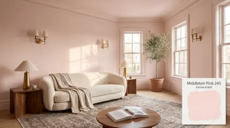
Middleton Pink 245
Farrow & BallMiddleton Pink by Farrow & Ball is a delicate, fresh pastel pink with a subtle underlying warmth. It offers a clean, uncomplicated hue that avoids looking overly sugary or blue-toned, making it an elegant choice for both playful and sophisticated architectural finishes.
| Temperature | Warm |
|---|---|
| Primary Undertone | Clean Pink |
| Hidden Undertones | Subtle yellow and peach |
| Best Exposures | North, East, South |
| Best For | Nurseries, bedrooms, powder rooms, ceilings, accent furniture |
Hackrea Review
Middleton Pink is an absolute delight if you're chasing that quintessential, fresh pastel tone. It avoids the trap of looking too bubblegum or overly gray. However, because of its high LRV, this chromatic profile can wash out in intensely bright rooms, so it shines best in spaces where you want to gently bounce light without overwhelming the senses.Architectural Applications for Farrow & Ball Middleton Pink 245
Nurseries
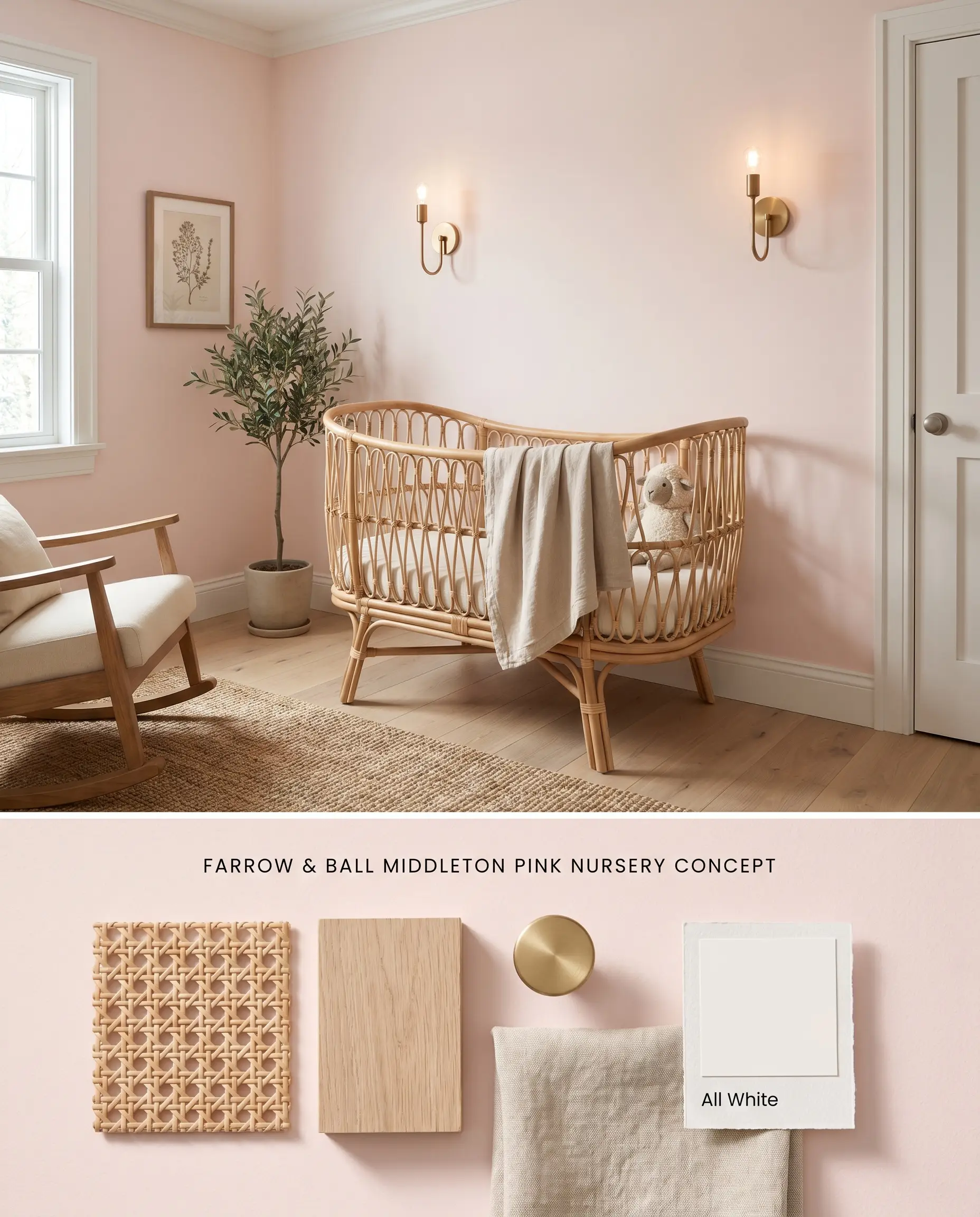
The subtle yellow base of this pastel pink anchors the color structure, preventing the hue from turning dull or muddy in spaces with limited natural sunlight. Pairing it with warm, unlacquered brass hardware and natural cane textures absorbs excess light bounce, grounding the room. Avoiding stark blue-grays ensures the chromatic profile remains soft rather than jarring.
Dead Flat ($$$$ (Boutique/Luxury Tier)). A multi-surface, ultra-matte finish that offers exceptional scuff resistance and washability, making it the premier choice for busy hallways, kids’ rooms, and continuous color-drenching.
The Consultant’s Finish
Bedrooms
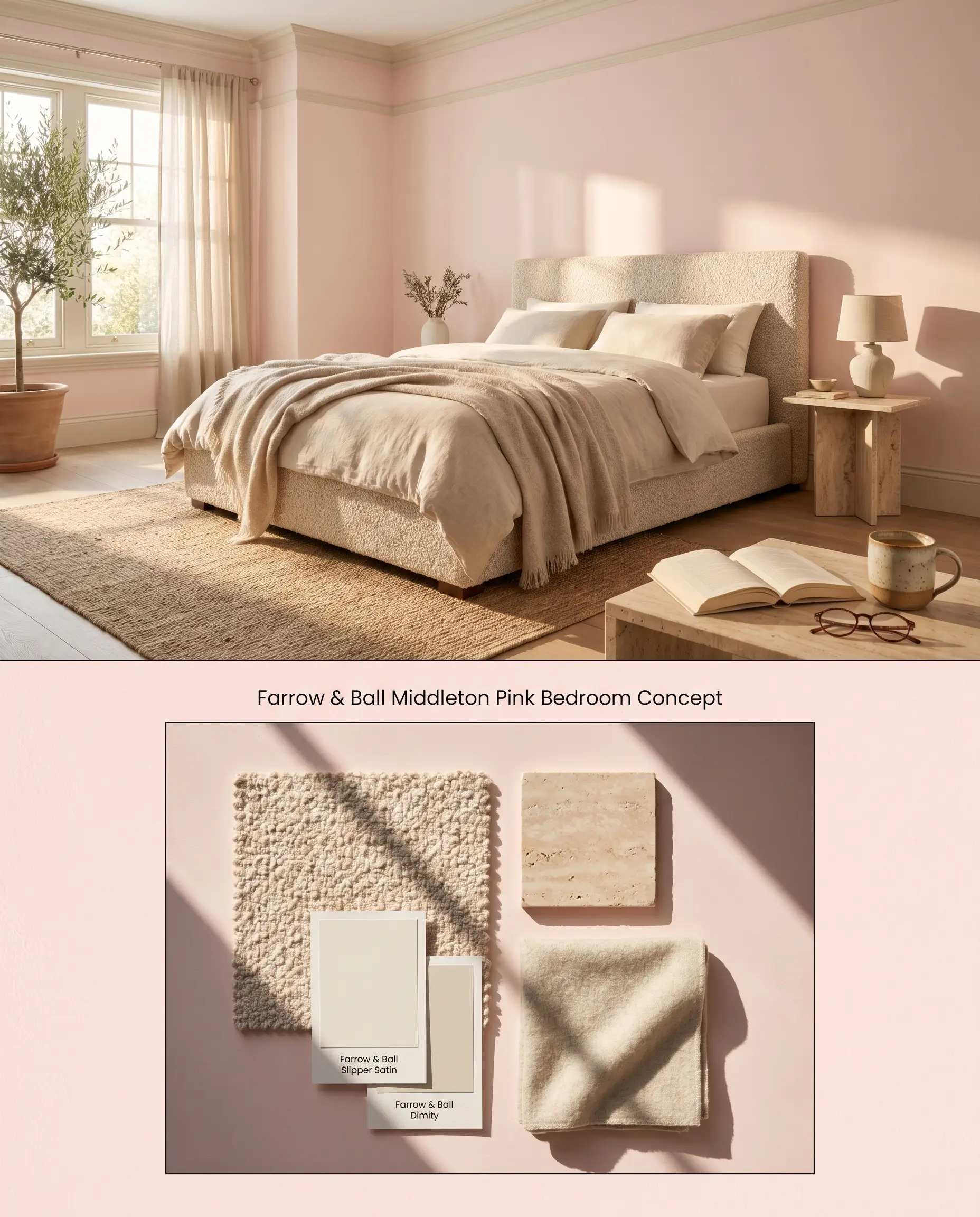
Channeling the tailored elegance associated with Catherine Middleton, applying this hue to primary sleeping quarters utilizes its high light reflectance value (LRV 84.97) to actively expand the perceived volume of the space. Under warm incandescent bedside lighting, a distinct peach cast emerges, elevating the tone from a juvenile pink into a sophisticated, architectural finish. Layering warm neutrals like oatmeal linen prevents the walls from reading overly sweet.
Estate Emulsion ($$$$ (Boutique/Luxury Tier)). Delivers Farrow & Ball’s signature, chalky matte finish with unparalleled depth of color, perfect for formal living rooms and master bedrooms where aesthetic impact is prioritized over scrubbing.
The Consultant’s Finish
Powder Rooms

In enclosed spaces with minimal natural light, the pigment’s inherent warmth prevents the walls from collapsing into a flat, shadowy gray. The color curator approach involves wrapping the entire room—walls and trim—in the same hue to eliminate visual breaks and amplify the soft glow. Polished nickel plumbing fixtures reflect the pink cast, creating a cohesive, luminous environment.
Modern Emulsion ($$$$ (Boutique/Luxury Tier)). Features a specialized mold- and water-resistant formulation that brings highly pigmented color to bathrooms and kitchens without sacrificing a luxurious matte aesthetic.
The Consultant’s Finish
Ceilings
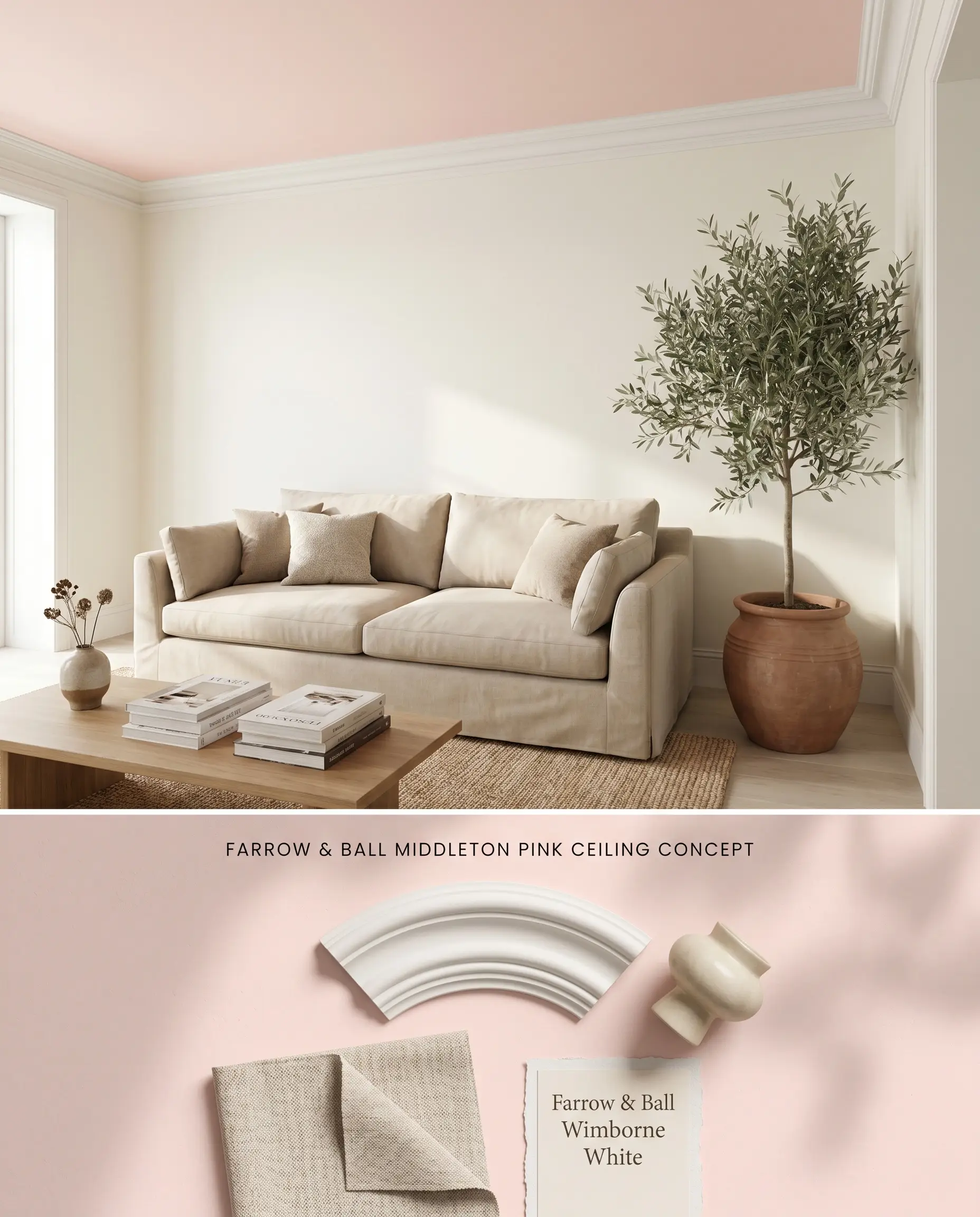
Applying this hue overhead in rooms with limited direct sun draws the eye upward while maintaining a soft, enveloping warmth. The ultra-matte chalky finish absorbs harsh glare, allowing the subtle pink to register without overwhelming the spatial boundaries. In excessively bright, sun-drenched rooms, this overhead application washes out and registers simply as a warm, off-white canopy.
Dead Flat ($$$$ (Boutique/Luxury Tier)). Its ultra-matte profile minimizes light bounce, expertly hiding plaster imperfections while allowing for seamless ‘color-drenching’ from walls up onto the ceiling.
The Consultant’s Finish
Accent Furniture
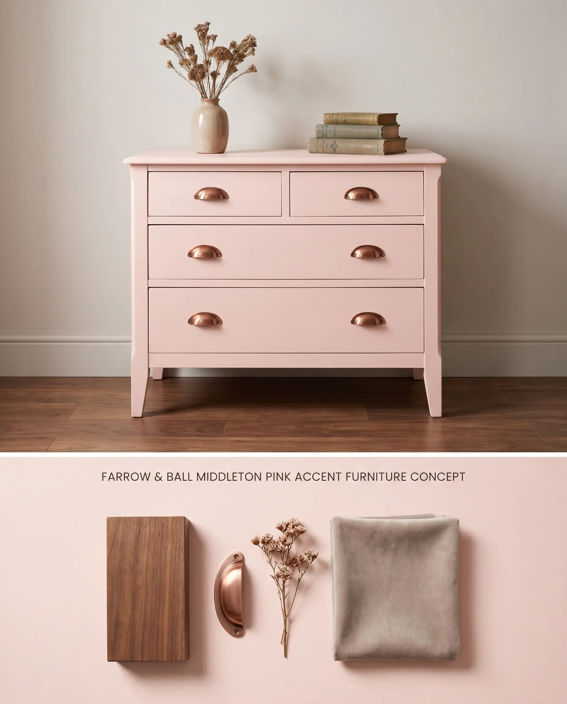
Coating a vintage dresser or modern vanity in this hue introduces a targeted strike of color without dominating the room’s palette. The yellow undertone harmonizes with natural wood grains, particularly warm walnut or aged oak. Utilizing a mid-sheen enamel ensures the paint cures into a hard, protective shell capable of withstanding daily friction.
Modern Eggshell ($$$$ (Boutique/Luxury Tier)). An exceptionally durable, mid-sheen waterborne finish designed to withstand the wear of cabinetry, doors, and millwork, ensuring a flawless, long-lasting surface.
The Consultant’s Finish
You can apply wallpapers, paints, etc. on walls and see how they look in various interiors.

Head-to-Head Chromatic Profile Comparisons
Farrow & Ball Middleton Pink 245 vs. Farrow & Ball Calamine 230
Farrow & Ball Calamine 230 carries a distinct gray undertone that pulls it closer to a muted plaster, whereas Farrow & Ball Middleton Pink 245 relies on a clear yellow base for its buoyancy. In a North-facing room, Calamine 230 will absorb the cool light and lean noticeably gray, while Middleton Pink 245 will hold its warmth. Choose Calamine 230 for a more subdued, historical aesthetic, and reserve Middleton Pink 245 for spaces requiring a brighter, cleaner lift.
Farrow & Ball Middleton Pink 245 vs. Benjamin Moore Touch Of Pink 2008-70
Benjamin Moore Touch Of Pink 2008-70 presents a slightly cooler, more traditional pastel profile compared to the nuanced peachiness of Farrow & Ball Middleton Pink 245. When exposed to harsh Southern light, Touch Of Pink 2008-70 maintains a truer pink identity, whereas the Farrow & Ball option will wash out into a warm off-white due to its massive light reflectance value. Deploy Touch Of Pink 2008-70 when you need a steadfast pink regardless of the sun’s intensity, and utilize Middleton Pink 245 when you want a highly reactive, shifting finish.
Farrow & Ball Middleton Pink 245 vs. Farrow & Ball Pink Ground 202
Farrow & Ball Pink Ground 202 is fundamentally a warm neutral with a high dose of yellow pigment, reading almost like a dusty beige next to the cleaner, more vibrant Farrow & Ball Middleton Pink 245. Pink Ground 202 excels in grounding large, open-concept living areas without reading as a definitive color, while Middleton Pink 245 acts as a deliberate pastel statement. Select Pink Ground 202 for earthy, muted palettes, and opt for Middleton Pink 245 when pairing with crisp whites like Farrow & Ball All White 2005.
Technical FAQs: Mastering the Color Structure
Yes, under warm artificial lighting or in South-facing rooms, the yellow base amplifies, revealing a distinct peach cast. This shift actively benefits the color structure, preventing the walls from feeling like a juvenile nursery and elevating the hue into a sophisticated architectural finish.
With a high LRV of 84.97, this shade bounces light aggressively across a room. In very bright, sun-drenched spaces, the delicate tint will wash out and register more like a warm off-white rather than a definitive pink.
The warm yellow base of this paint clashes directly with stark, cool blue-grays and icy stones. To maintain visual harmony, it must be paired with warm neutrals, clean whites, or warm-veined stones like Calacatta Gold.
The ultra-matte nature of Estate Emulsion enhances the signature chalky finish, giving the pale pink unparalleled depth and softness. However, this specific finish is highly sensitive to touch-ups, which can flash and appear patchy if not blended carefully over the original coat.
Similar Paint Colors
Same Brand
Cross-Brand Equivalents