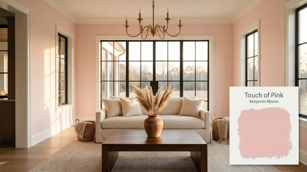
Touch of Pink 2008-70
Benjamin MooreBenjamin Moore Touch of Pink (2008-70) is a light, warm blush pink with a subtle peach undertone. With an LRV of 81.28, it acts as a highly reflective, airy architectural finish that brings a delicate, cheerful warmth to interior spaces without feeling overwhelmingly vibrant.
Paint Technical Profile
| Color ID / SKU | 2008-70 |
| HEX Code | #FDE8E6 |
| Light Reflectance (LRV) | 81.28 |
| Use | Interior |
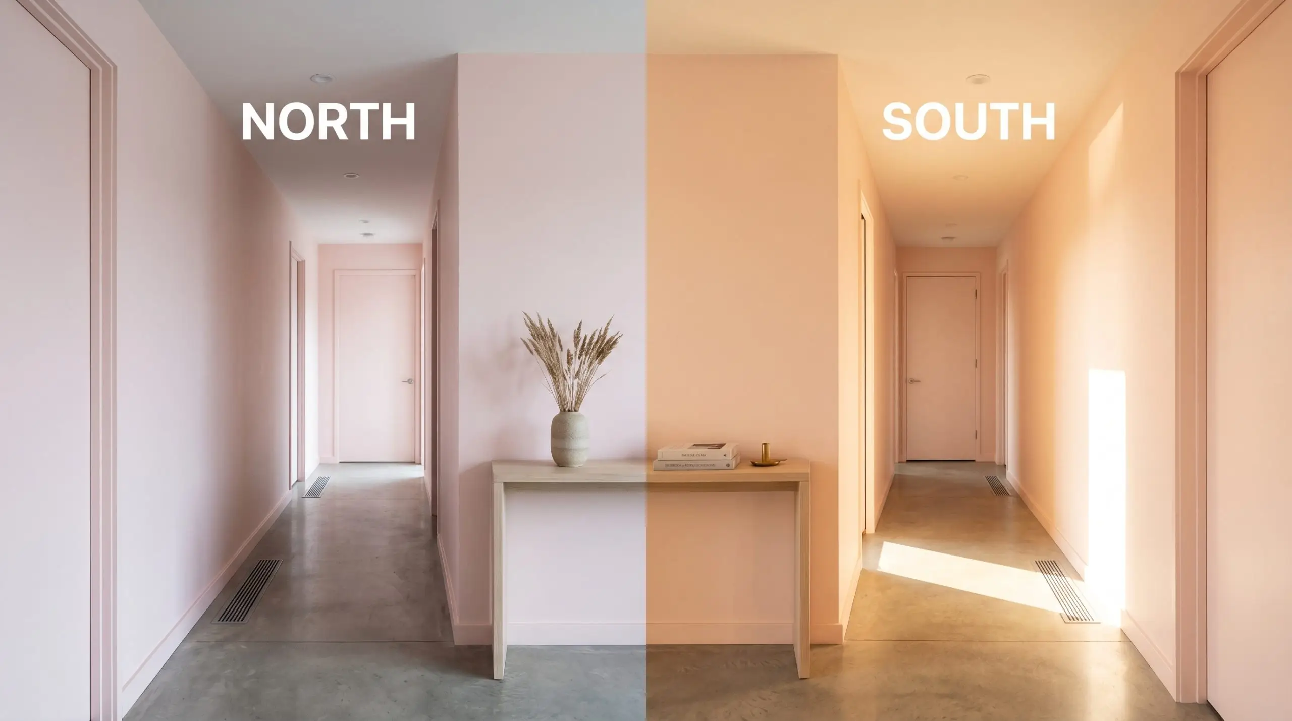
| Best Exposures | North, East |
| Best For | Nurseries, Powder Rooms, Ceilings |
Why Benjamin Moore Touch of Pink is the Ultimate Architectural Blush
True blush is one of the most misunderstood tools in interior design. When executed poorly, it reads as a juvenile pastel, but when calibrated perfectly, it acts as a highly sophisticated lighting mechanism. Benjamin Moore Touch of Pink 2008-70 strips away the sugary sweetness often associated with this color family, leaving behind a highly structural, radiant tint.
It visibly warms the air in a room, turning cold, flat light into an enveloping glow.
Undertones & LRV: Analyzing the Color Structure
Is this paint warm or cool? This architectural finish is undeniably warm, fundamentally rooted in the red-orange spectrum. Resting at a precise hue angle of approximately 5 degrees, its color structure prevents it from feeling like an icy, sterile pastel, offering a soft, enveloping warmth.
Let’s look at the exact anatomy of this color:
At a light reflectance value (LRV) of 81.28, this tint is incredibly reflective. It absorbs very little natural daylight, meaning it will wash out into a near-white with a faint rosy glow when exposed to direct, intense afternoon sun. However, in shadowed or dimly lit environments, it holds its chromatic profile beautifully, wrapping the room in a gentle, warm embrace.
The Chameleon Factor: Mastering Shifting Light
Because of its high reflectivity and peach undertones, this color visibly shifts as the sun moves across your home’s exterior and filters through your windows.
Here is exactly how the light manipulates BM 2008-70:
If you want to maintain the sophisticated peach cast at night, avoid cool LED bulbs entirely. Stick to 2700K lighting to ensure the walls retain their premium, terracotta-leaning warmth.
Hackrea Design Secret (The Bulb Rule)
Popular Room Applications for Benjamin Moore Touch of Pink
While its name might suggest a narrow utility, this highly reflective blush is an incredibly versatile architectural material. When paired with intentional styling and the right mix of finishes, it transitions seamlessly from playful to profoundly elegant.
Nurseries and Children’s Bedrooms
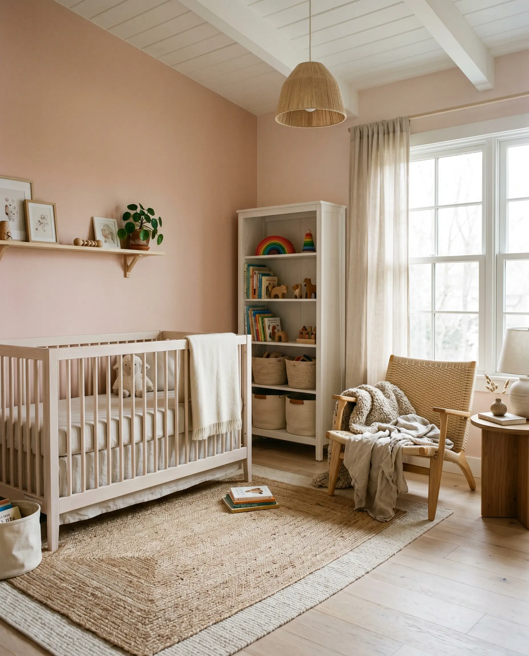
It is incredibly easy to default to a predictable, overly sweet aesthetic in a child’s room, but this color offers an opportunity for elevated, lasting design. Instead of pairing it with standard white furniture and ruffled fabrics, use it as a foundation for a soft, Scandinavian-inspired retreat.
Bring in bleached white oak spindle beds, layered jute rugs, and nubby wool textiles to add necessary visual friction. The warmth of the paint beautifully complements natural, tactile materials like woven cane webbing and raw linen. By treating the walls as a soft, organic backdrop rather than a thematic focal point, the room will effortlessly grow with the child.
Powder Rooms and Guest Bathrooms
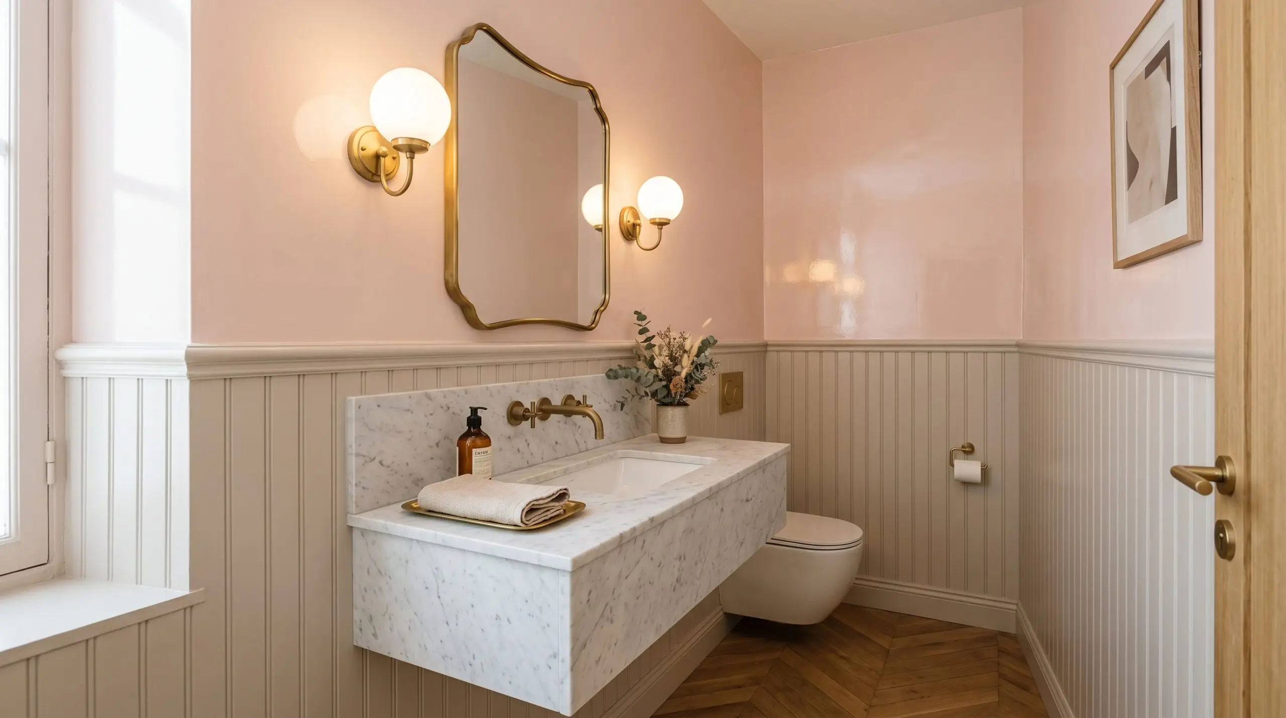
Powder rooms are the perfect environment to experiment with a sophisticated, Parisian Modern aesthetic. Because these spaces often lack abundant natural light, the high reflectivity of this tint prevents the room from feeling small or closed off.
Be incredibly careful when pairing this blush with stark, cool-toned gray tiles or icy chrome fixtures. The conflicting temperatures will make the walls look muddy and the tile look sterile.
Clash Warning (The Tile Temperature)
Instead, warm up the space by pairing the paint with unlacquered brass plumbing fixtures and a honed Carrara marble vanity. If the bathroom features traditional beadboard paneling, consider painting the paneling a soft greige and applying this radiant tint to the upper walls for a premium, custom-built contrast.
Dining Rooms (Above Wainscoting)
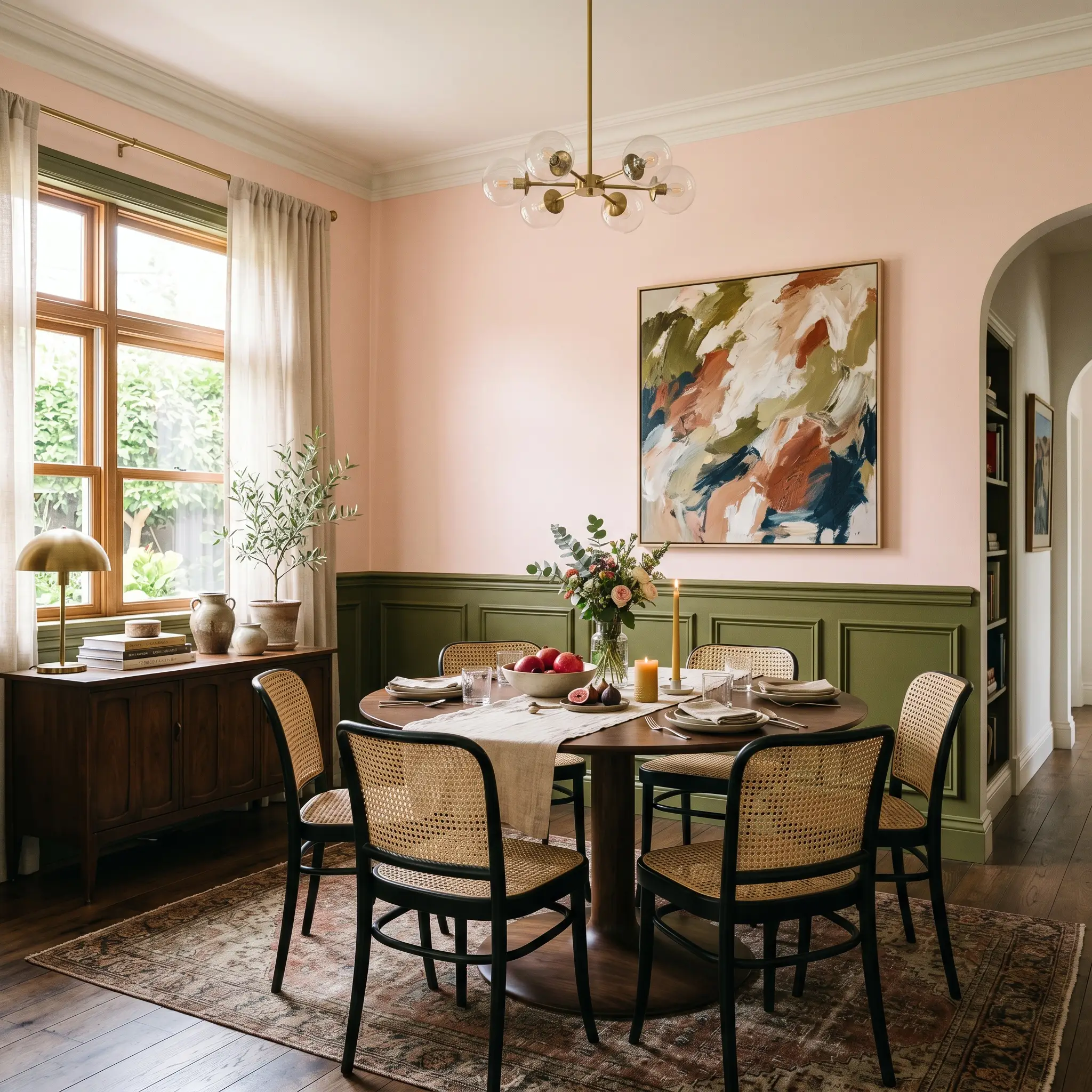
Applying this color above traditional wainscoting completely modernizes a formal dining space without requiring a massive structural renovation. The key to making this application feel curated and high-end is introducing a deliberate, unexpected contrast below the chair rail.
Paint the lower wainscoting a rich, intense olive green or a moody charcoal gray. This sharp juxtaposition instantly neutralizes the sweetness of the blush, creating a beautifully tense, transitional dining room. Finish the space with a pedestal dining table, French bistro chairs, and an oversized, abstract canvas to solidify the modern edge.
Ceilings (As a “Fifth Wall” Accent)
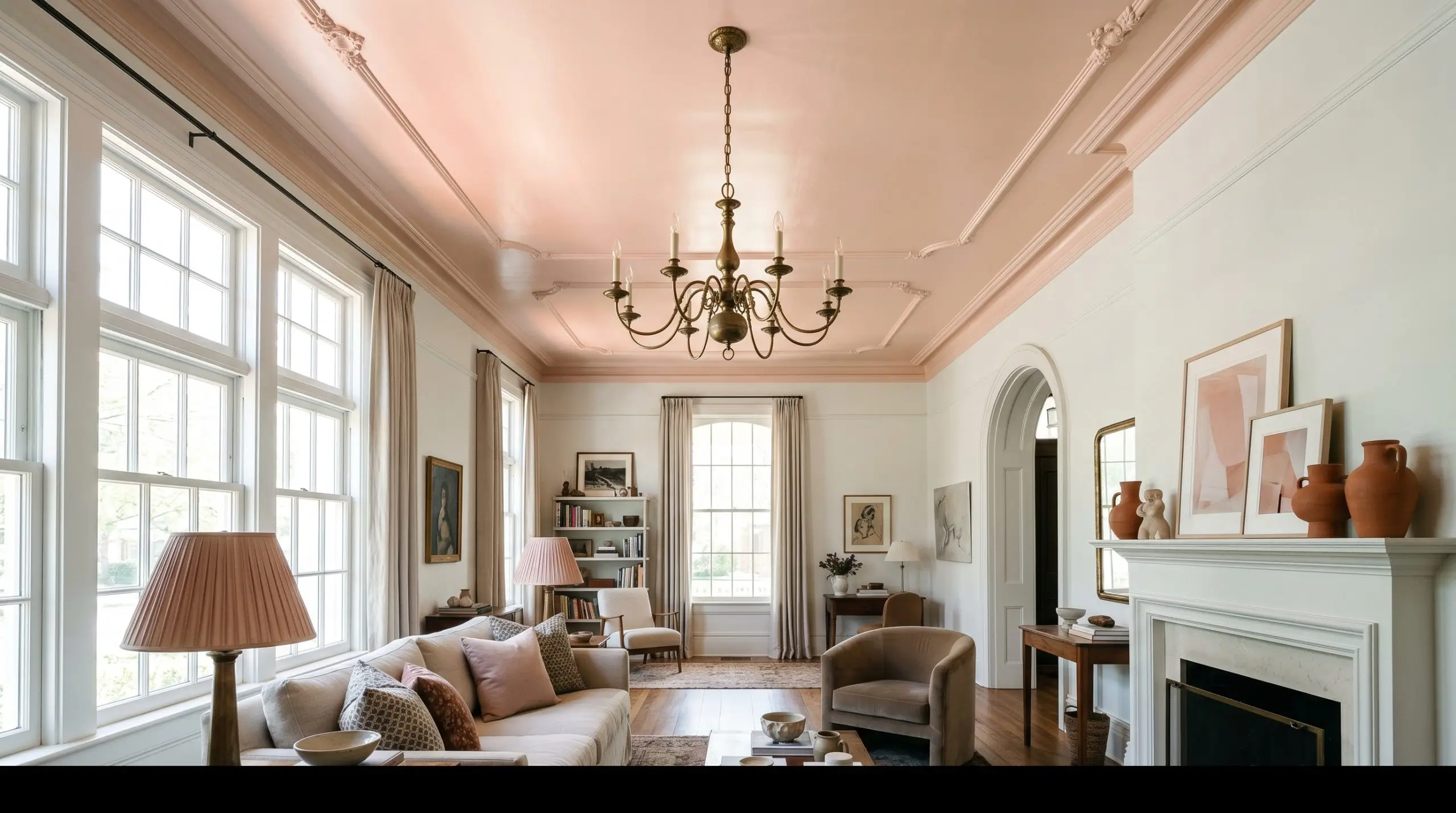
Painting the ceiling is one of the most impactful ways to completely alter the atmosphere of a room. When applied overhead, this warm tint acts as a giant reflector, bouncing a flattering, rosy glow down onto the furniture and inhabitants below.
This technique is incredibly effective in a living room with crisp white walls and expansive windows. The subtle color overhead draws the eye upward, highlighting architectural features like crown molding or a vintage chandelier. To keep the styling intentional, echo the fifth wall accent with small, curated details throughout the room, such as terracotta vessels, a faded vintage runner, or a pleated lampshade.
Building a Palette Around Benjamin Moore Touch of Pink
This delicate hue demands deliberate contrast to hold its shape within a room. Rather than letting it bleed into similarly soft pastels, you must pair it with crisp architectural boundaries and weighted textures to prevent the design from feeling overly sweet.
Finding the Perfect White Boundary
A high-reflectance white trim acts as a necessary visual palate cleanser against the warmth of the walls. Benjamin Moore Chantilly Lace OC-65 provides a razor-sharp, neutral edge that frames the blush without pulling out unwanted yellow tones.
For an even starker contrast, Sherwin-Williams High Reflective White SW 7757 delivers a brilliantly clean border that modernizes the entire room. If you prefer a slightly softer transition, Farrow & Ball All White No. 2005 offers a pure, pigment-free boundary that feels incredibly elegant and serene.
Tactile Elements That Ground the Lightness
Secondary Shades That Elevate the Room
Curated Aesthetics: Three Distinct Ways to Style This Hue
The Modernist’s Canvas This aesthetic thrives on the sharp, unexpected tension between delicate color and rigid geometry. By pairing the soft walls with blackened steel picture frames and a sleek, low-profile track-arm sectional, the energy feels distinctly urban and curated. Sherwin-Williams Urbane Bronze SW 7048 painted on the interior doors provides a bold, graphic punch that instantly modernizes the entire environment.
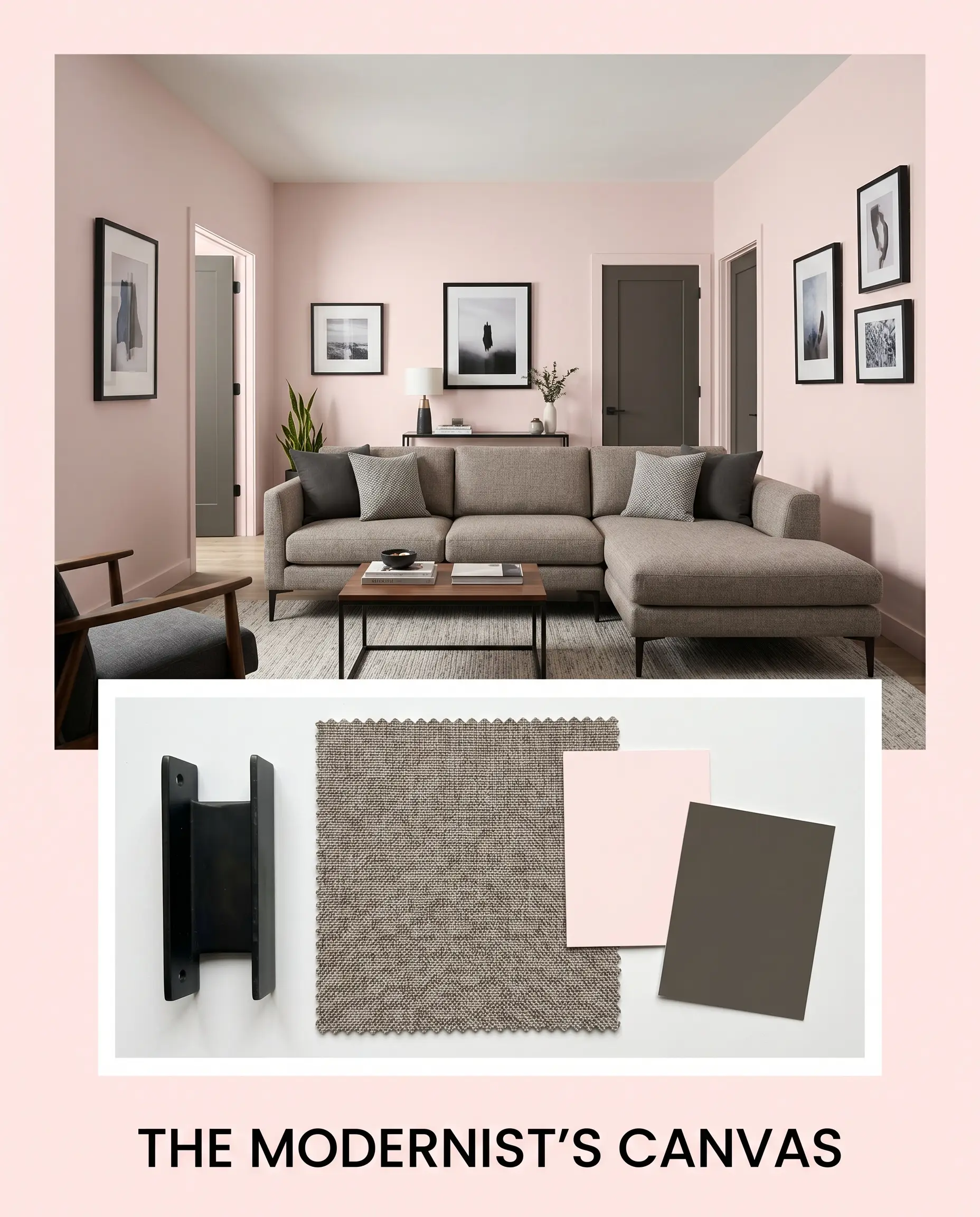
Accent the space with asymmetrical styling and minimalist line art to keep the mood effortlessly cool.
The Tactile Retreat If you want a space that feels like a warm, enveloping exhale, lean entirely into organic textures and tonal layering. The walls serve as a luminous backdrop for a deep, plush slipcovered sofa and rich walnut nesting tables that anchor the airy atmosphere. Layering a secondary color like Benjamin Moore Foggy Morning 2106-70 on the trim creates a seamless, low-contrast boundary that encourages deep relaxation.
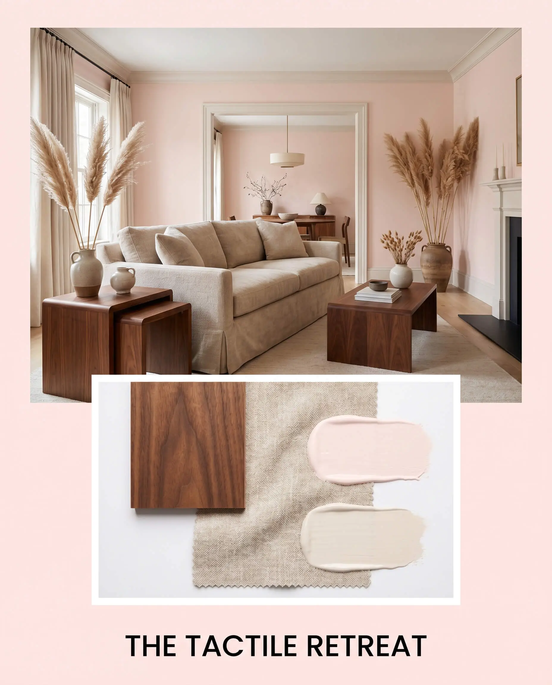
Finish the look with dried pampas and irregular ceramic vessels to emphasize a highly sensory, collected vibe.
Heritage Redefined This palette takes classic, traditional silhouettes and injects them with a fresh, spirited energy. The walls provide a surprisingly sophisticated backdrop for antique Persian runners and unlacquered brass sconces framing an oversized leaning mirror. Ground the lightness with a rich accent of Farrow & Ball London Clay No. 244 on built-in bookshelves or traditional wainscoting.
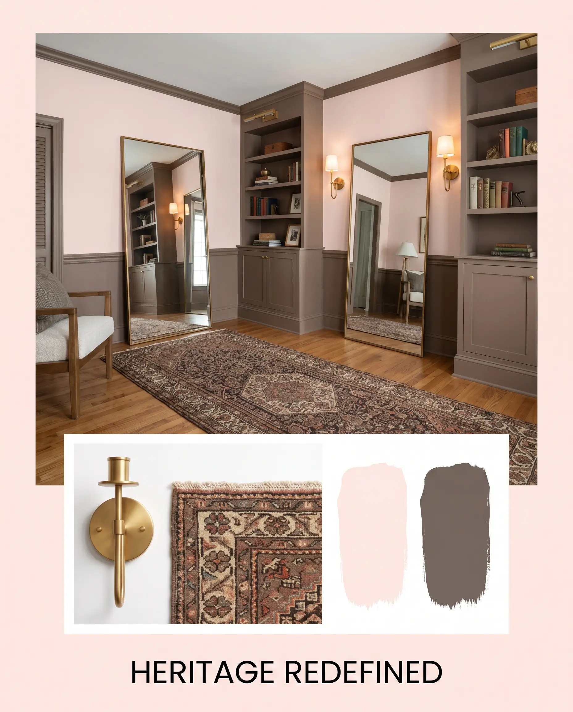
The resulting atmosphere is deeply nostalgic yet entirely refreshed, proving that this tint can handle serious, historical design elements.
Comparing Touch of Pink to Rival Blushes
Choosing the right blush often comes down to your home’s specific lighting conditions and architectural flow. If your space lacks natural light or features competing warm tones, this specific paint might pull slightly too orange, signaling the need for a cooler or more muted alternative.
Benjamin Moore Touch of Pink vs. Benjamin Moore First Light 2102-70
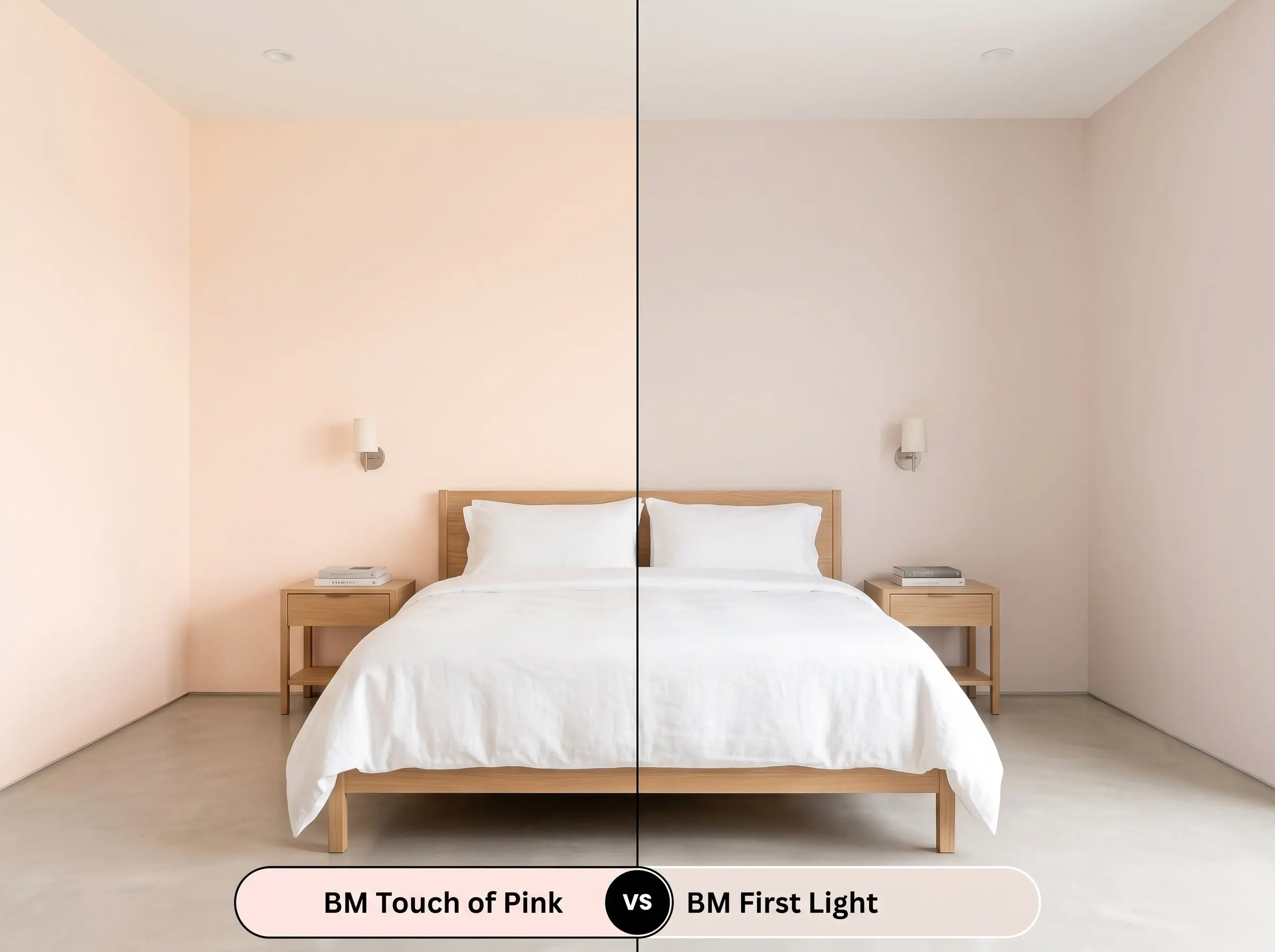
First Light is significantly cooler and features a much cleaner, blue-based undertone compared to the peach-leaning warmth of its sibling. If your room receives intense western afternoon sun, First Light will maintain a crisp, true pink appearance. Conversely, Touch of Pink will amplify that golden hour light, leaning directly toward a soft coral glow.
Benjamin Moore Touch of Pink vs. Sherwin-Williams Intimate White SW 6322
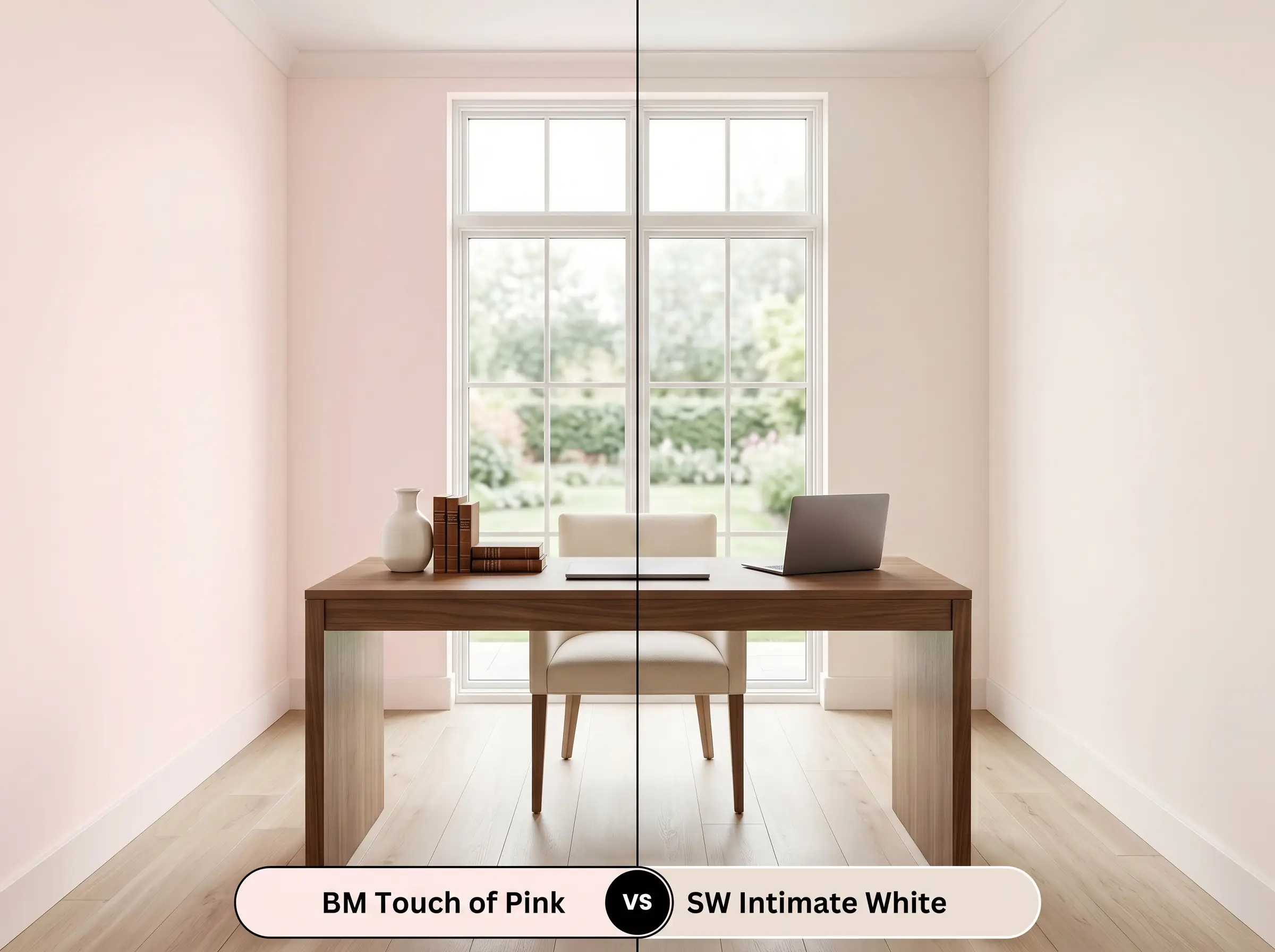
Intimate White operates with a slightly lower reflectivity and carries a more pronounced, dusty rose influence. If you are trying to coordinate with cool-toned gray flooring or stark marble, Intimate White bridges that gap with far less friction. However, if your goal is to visibly warm up a chilly, north-facing space, the Benjamin Moore option is the far superior choice.
Benjamin Moore Touch of Pink vs. Farrow & Ball Middleton Pink No. 245
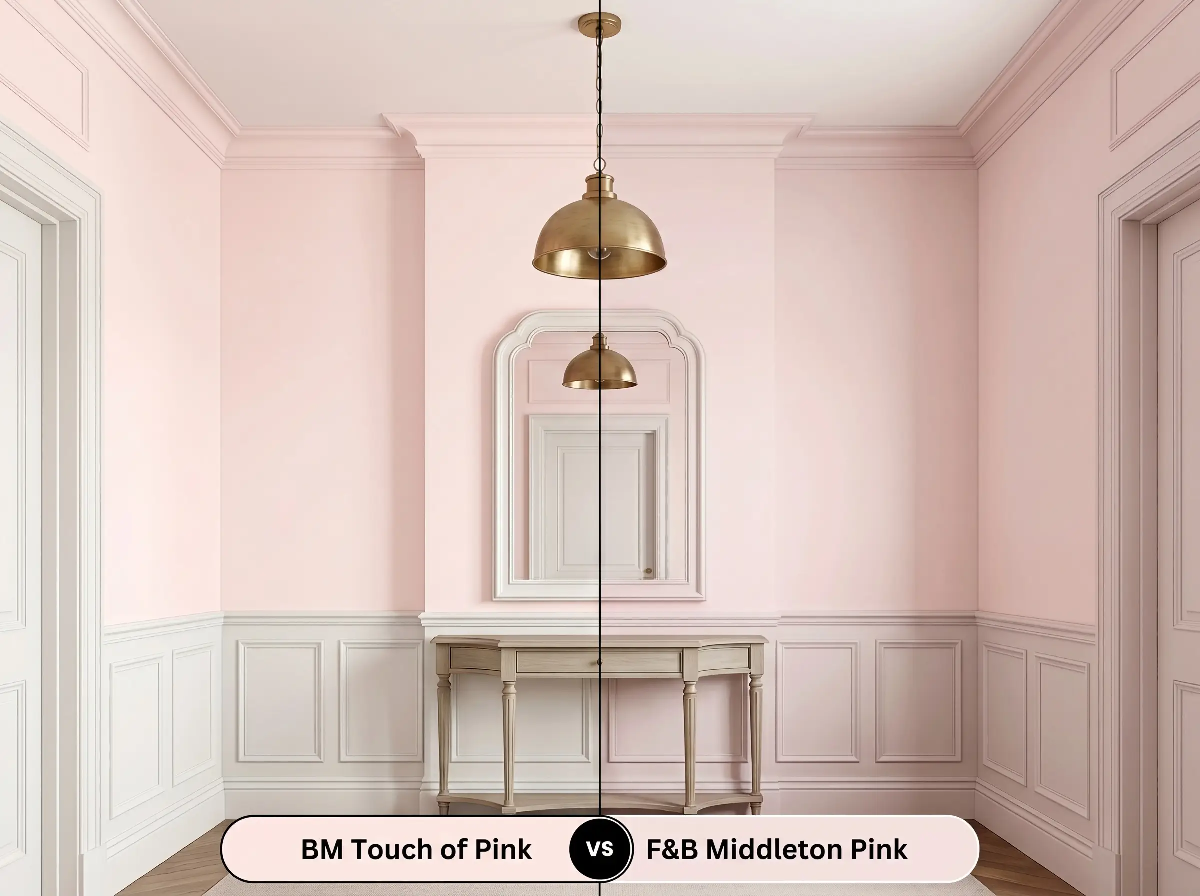
Middleton Pink is a remarkably pure, delicate pastel that lacks the distinct orange micro-nuance found in the Benjamin Moore formulation. It feels slightly more traditional and requires excellent natural light to prevent it from falling flat. Choose the Farrow & Ball option if you want a classic, crisp aesthetic, but stick with the Benjamin Moore if you need a color that actively radiates warmth in shadows.
Exploring Alternative Soft Corals and Tints
Sometimes a color is almost perfect, but your specific lighting demands just a fraction more depth or a slightly crisper finish. Whether you need to stay within the same fan deck or color-match with a different manufacturer, these alternatives offer subtle shifts in intensity.
Same-Brand Alternatives
Cross-Brand Matches
Getting This Radiant Tint on the Wall
Transitioning this beautiful concept from a tiny swatch to a full room requires careful planning and the right materials. The inherent lightness of this specific hue means it is unforgiving of poor prep work or incorrect roller techniques.
The Dynamic Sheen Guide
Primer Strategy
Because this shade is highly reflective and relatively sheer, you must start with a premium, high-hiding white primer. Never use a gray-tinted primer under this color, as it will muddy the delicate peach foundation and eliminate the radiant glow. A pure white base ensures the final coats remain luminous and true to the swatch.
Coverage & Success Tips
Expect to apply a minimum of two generous coats to achieve full opacity and true color representation. Because lighter colors can be prone to flashing—where the sheen looks uneven or roller marks remain visible—you must maintain a wet edge while painting.
Avoid pressing too hard on your roller when applying that final coat. Let the nap do the work to ensure a flawlessly smooth, professional-grade finish that won’t require frustrating touch-ups later.
Hackrea Pro-Tip (The Roller Rule)
Common Questions About This Color
Because of its sophisticated peach base, it actually avoids the ‘bubblegum’ trap beautifully. In south-facing rooms, the abundant sunlight amplifies those warm, coral-leaning notes, making it feel radiant and architectural rather than sugary sweet.
The red-orange foundation of the paint harmonizes quite well with the red undertones in mahogany and cherry. However, to prevent the room from feeling overwhelmingly warm, you must introduce crisp white trim or cool metallic accents to provide visual relief.
This is one of the most brilliant applications for this specific color. Painting the ceiling this warm tint acts as a subtle reflector, bouncing a soft, flattering glow into the room and effectively neutralizing the chilly, blue-tinted northern light.
While 3000K bulbs are relatively neutral, they can indeed pull forward the hidden peach cast, making the walls lean slightly more coral. If you want a purer, cooler appearance at night, consider upgrading to 4000K bulbs to flatten that inherent warmth.
The Final Word on Benjamin Moore Touch of Pink
Benjamin Moore Touch of Pink 2008-70 is an incredibly effective design tool for anyone looking to inject a sophisticated, luminous warmth into their home. It performs best in spaces that need an atmospheric lift, transforming flat, uninspiring rooms into glowing, curated retreats. This shade is perfect for the design enthusiast who appreciates soft organic or transitional aesthetics and understands how to balance delicate walls with grounded, tactile materials.
While this radiant tint is beautifully versatile, it is fundamentally incompatible with stark, blue-leaning grays and icy, sterile finishes. If your home features cool-toned luxury vinyl plank flooring or predominantly cool gray fixed materials like concrete counters, applying this warm blush will create an immediate, uncomfortable visual friction.
Hackrea Design Secret (The Temperature Clash)
The walls will suddenly appear dirty or overly orange, while your expensive cool-toned finishes will look remarkably cold and uninviting. To ensure success, you must surround this color with equally warm, organic elements or crisp, pure whites that respect its delicate underlying structure.
Closest Cross-Brand Equivalents
The absolute closest scientific color matches for Touch of Pink across top paint brands.