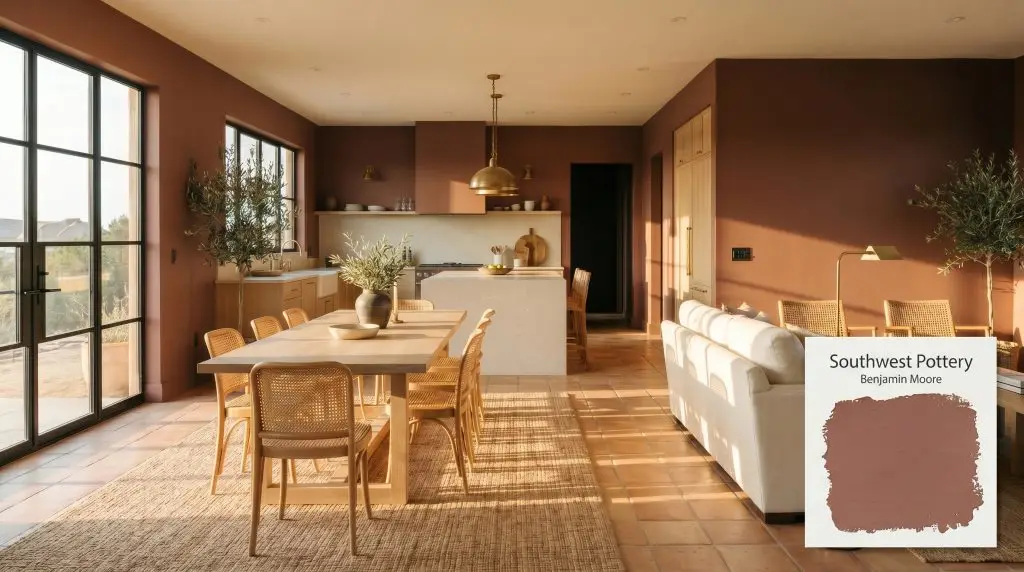
Southwest Pottery 048
Benjamin MooreBenjamin Moore Southwest Pottery (048) is a warm, earthy red-brown paint color reminiscent of sun-baked clay. With an LRV of 16.56, it serves as a grounded, sophisticated mid-tone that adds cozy depth to dining rooms, exteriors, and accent walls.
Paint Technical Profile
| Color ID / SKU | 048 |
| HEX Code | #975F57 |
| Light Reflectance (LRV) | 16.56 |
| Use | Interior, Exterior |
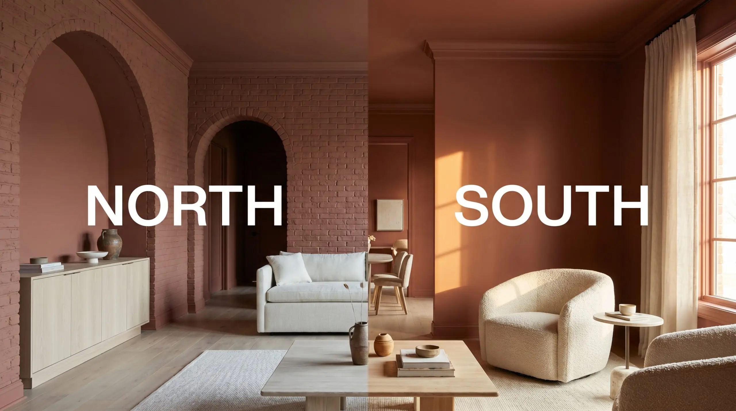
| Best Exposures | South-Facing, West-Facing |
| Best For | Accent Walls, Dining Rooms, Kitchen Cabinets, Exteriors |
Benjamin Moore Southwest Pottery: A Grounding Anchor for Sun-Baked Interiors
Benjamin Moore Southwest Pottery (048) brings instant architectural history to an otherwise sterile room. When you are dealing with a vast, builder-grade open-concept layout that feels floating and disconnected, you need a color with enough visual gravity to pull the walls inward. This rich, kiln-fired clay immediately wraps the space, transforming standard drywall into an intimate, curated retreat.
The true magic of this shade lies in its ability to bridge contrasting design styles effortlessly. It serves as a stunning, earthy mid-tone that can ground a relaxed bohemian living room just as easily as it elevates a highly tailored dining space. Let’s explore exactly how this complex pigment behaves on the wall and how to pair it flawlessly.
Undertones & LRV of Benjamin Moore Southwest Pottery
When evaluating Benjamin Moore Southwest Pottery, the verdict on its color temperature is definitively warm. Sitting with a hue angle of 7.6, this shade is built on a foundation of red-orange pigments that radiate a welcoming, sun-baked energy. It avoids any icy leanings, instead embracing a deeply grounded nature.
With a light reflectance value (LRV) of 16.56, this paint absorbs a significant amount of the light hitting your walls. It functions as a dark mid-tone, carrying enough weight to hold its richness outdoors without washing out. However, bringing this depth indoors requires thoughtful lighting to keep the room feeling enveloped rather than enclosed.
Lighting Effects & The Chameleon Factor
Because this shade relies heavily on its brown-red base, its greatest risk is turning into a flat, muddy brown in heavily shaded rooms. If you apply this paint in a dim space with zero natural light and pair it with cool gray furnishings, the vibrant clay energy will completely vanish. Understanding how your specific windows dictate the final look is crucial before committing to a gallon.
Popular Room Applications for Southwest Pottery
This earthy mid-tone demands to be used in spaces where you want people to linger, converse, and feel completely at ease. Its inherent warmth acts as a natural gathering point, making it highly adaptable across various architectural styles.
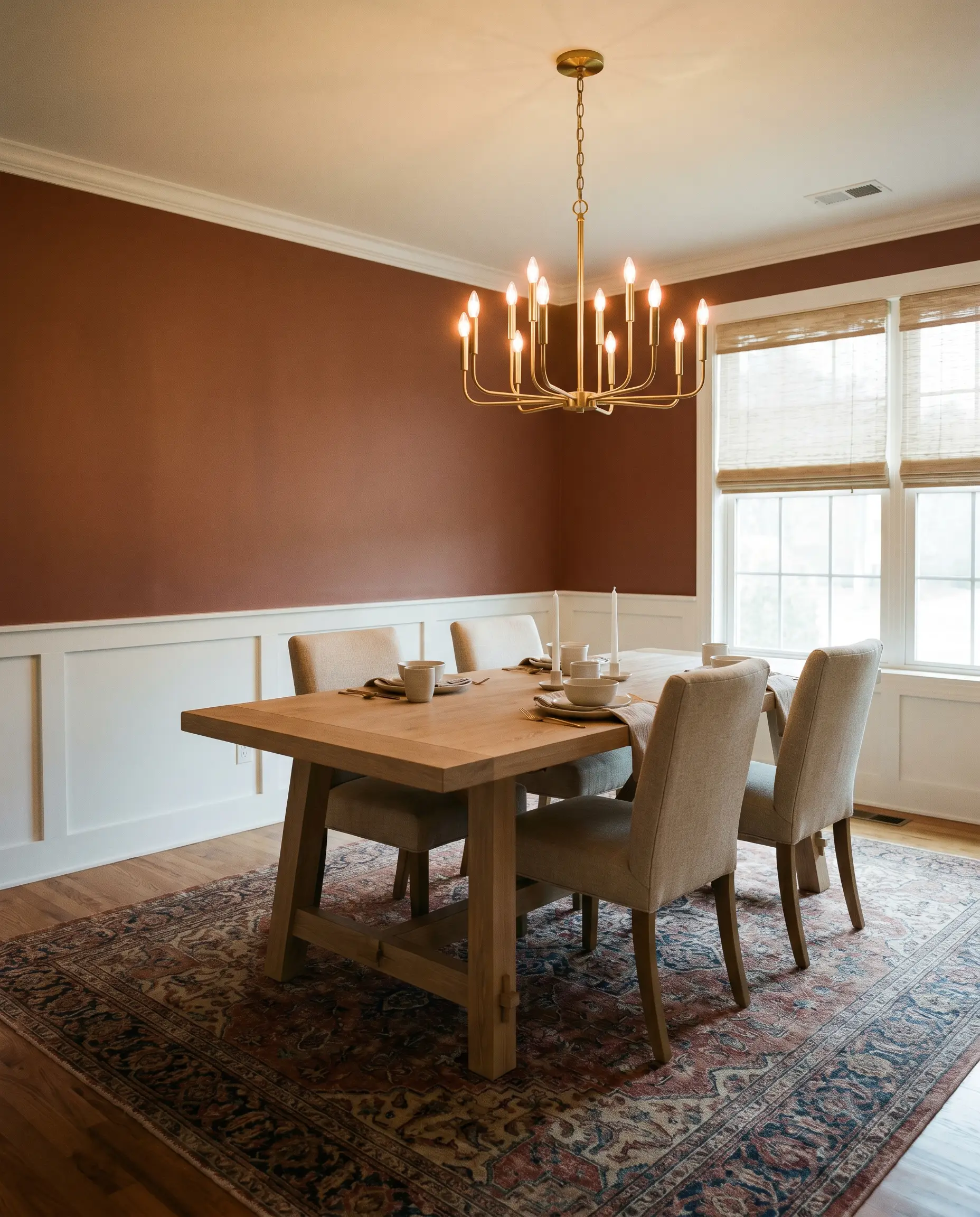
Dining Rooms
A dining space craves intimacy, and wrapping the walls in BM 048 delivers an incredible sense of enclosure. You can lean into a global, eclectic style by pairing it with woven seating and a vintage Persian rug, or take it in a crisp, elegant direction. For a more tailored approach, frame the rich terracotta walls with bright white wainscoting to create a stunning high-contrast dining experience.
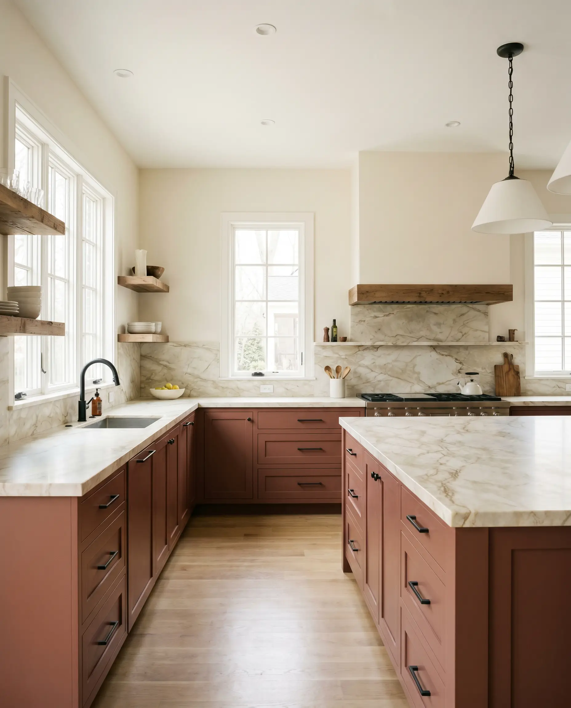
Kitchens
While stark white kitchens will always have their place, grounding the room with a colored island or lower cabinetry brings massive visual interest. This warm brown-red works beautifully on base cabinets, especially when topped with a creamy quartz or a heavily veined marble. It warms up the utilitarian nature of a kitchen, pairing flawlessly with both sleek, modern hardware and rustic, floating wood shelves.
Entryways & Mudrooms
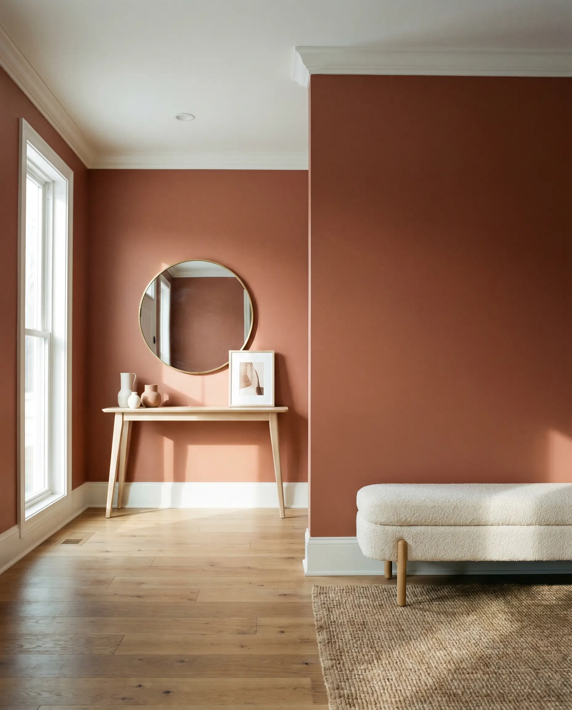
An entryway should set a welcoming tone for the rest of the house. As a standout shade in the Classic Color Collection, using this deep hue in a foyer establishes an immediate sense of character, especially in homes that lack historical architectural details. It provides a gorgeous, saturated backdrop that makes everyday elements—like a simple brass mirror or a light oak console table—pop beautifully against the wall.
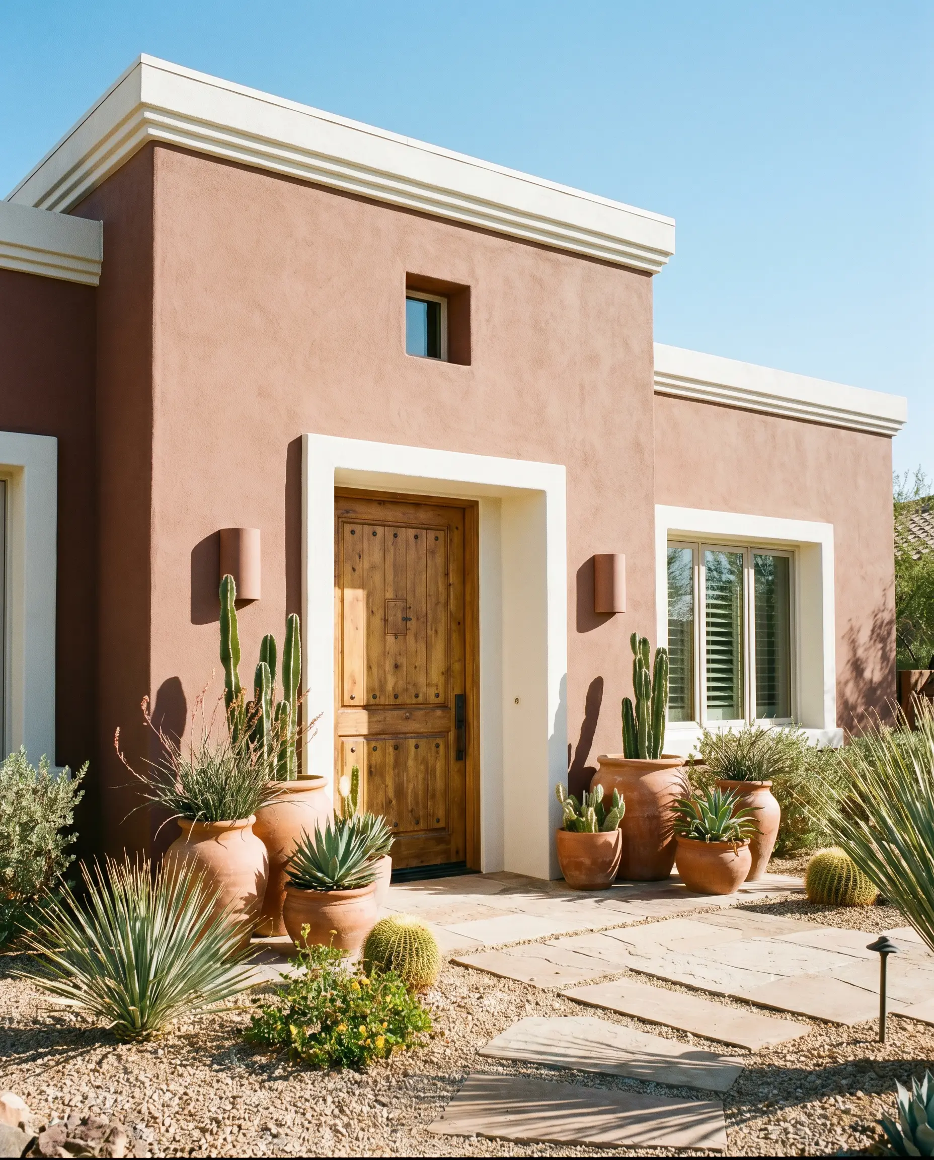
Exteriors
Outdoors, the heavy 16.56 LRV is an incredible asset because the sun easily washes out lighter colors. On a stucco facade, it creates a breathtaking Mediterranean or desert-modern vibe that feels highly organic to the landscape. If painting the entire exterior feels too bold, brushing this rich clay onto a front door or window trim offers a brilliant, welcoming accent against a creamy white house.
Unique Design Ideas & Inspiration
Beyond the standard four walls, this versatile pigment is an incredible tool for highly curated, custom projects. By treating the paint as an architectural material, you can use it to completely redefine the focal points in your home.
The Color-Blocked Archway
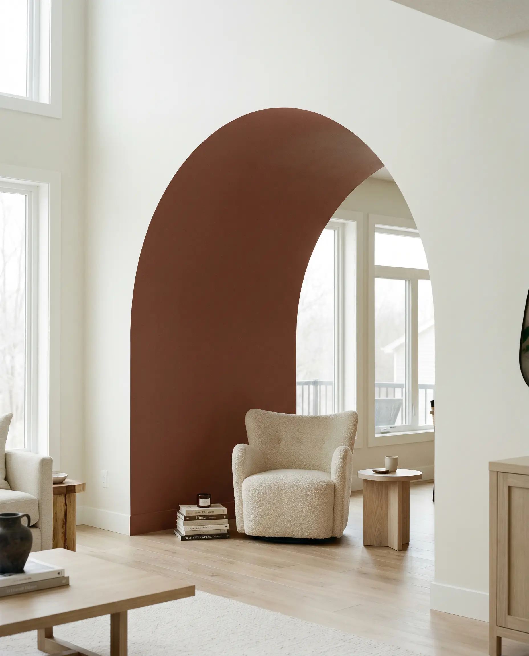
If you have an open-concept layout that lacks definition, painting an architectural archway or creating a color-blocked zone instantly establishes a room-within-a-room. Using this rich terracotta to outline a transition space or a reading nook provides a brilliant punch of warmth. It visually separates the areas without requiring you to build actual drywall partitions.
A Custom Mudroom Built-In
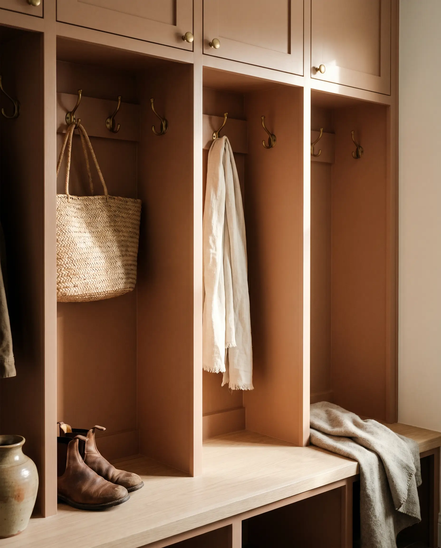
Upcycling a standard mudroom bench or building custom entryway lockers is a highly accessible weekend project that yields premium results. Coating that woodwork in Southwest Pottery highlights the artisanal layers of the color, as the shadows play beautifully within the cubbies and hooks. This treatment turns a purely functional drop-zone into a bespoke architectural feature.
The Boutique Guest Retreat
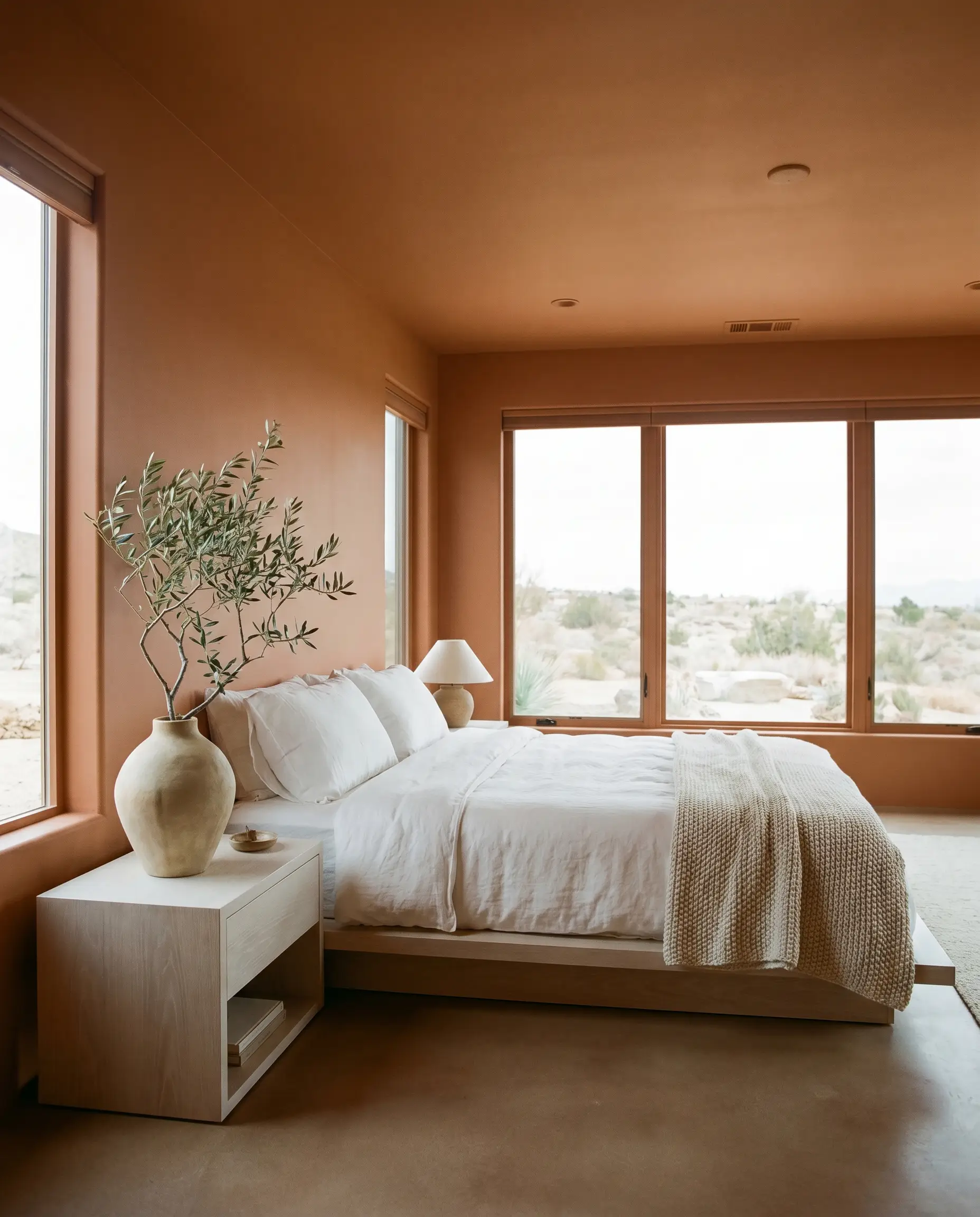
Transform a spare bedroom into a high-end, desert-inspired hospitality suite by washing the walls, ceiling, and trim in this single, continuous shade. This enveloping technique blurs the room’s boundaries, making a small space feel incredibly chic and intentional. Add crisp white linen bedding and a statement olive-tree branch to complete the elevated getaway vibe.
When painting a small room entirely in a dark mid-tone, carry the color straight across the ceiling. Leaving a stark white ceiling against dark walls visually chops the room in half and lowers the perceived height.
Hackrea Pro-Tip (The Ceiling Wrap)
Coordinating Colors & Best Pairings
To make this shade feel cohesive rather than chaotic, you must intentionally manage its surrounding palette. The goal is to either provide crisp boundaries that let the clay tones shine or introduce soft, natural textures that complement its earthy nature.
Trim & Baseboards
The right trim dictates the entire posture of the room, determining whether the walls feel softly glowing or sharply defined.
Hardware, Wood & Material Pairings
Coordinating Colors
Designer Mood Boards
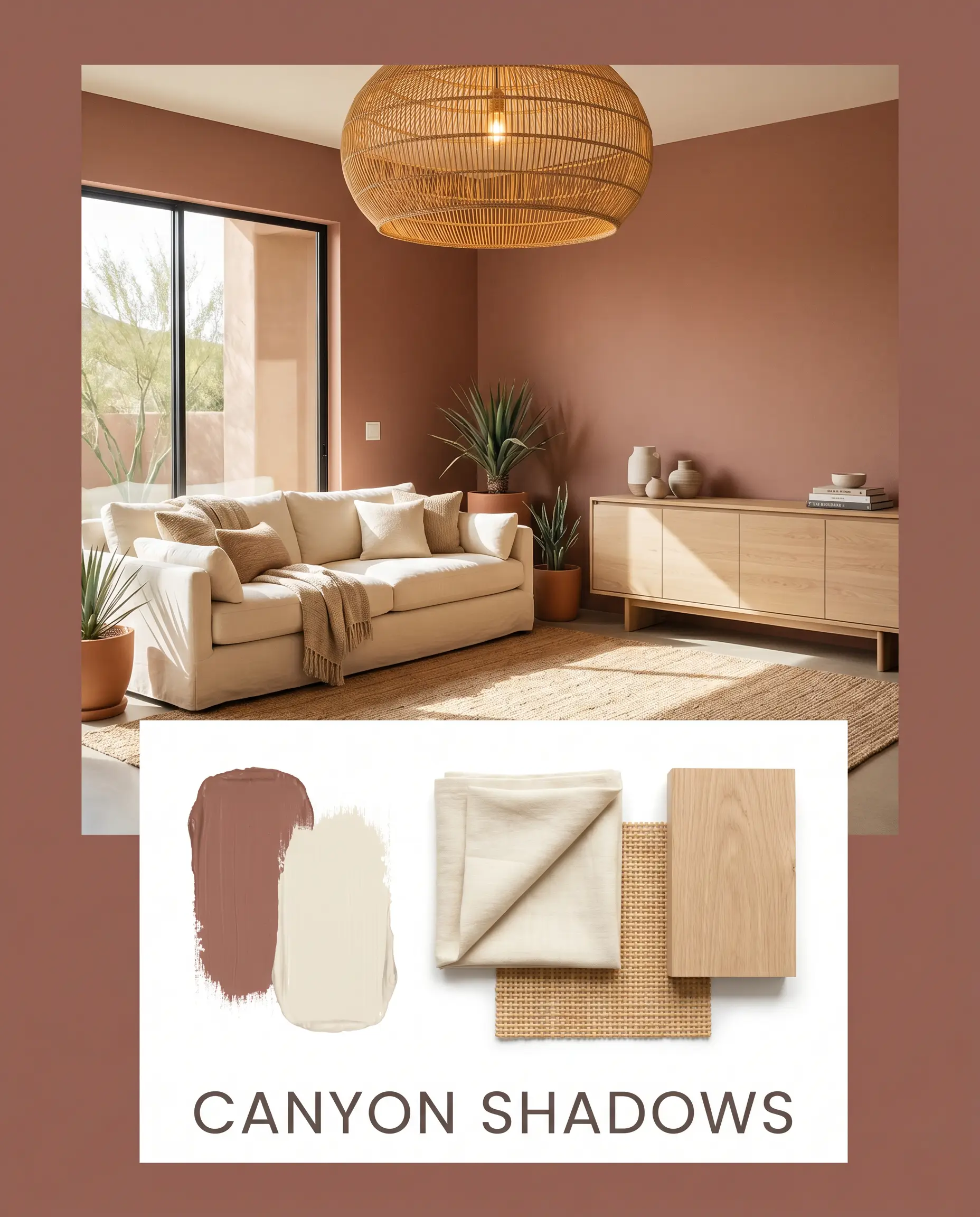
Canyon Shadows: This palette leans into a relaxed, desert-modern aesthetic. We ground the room with Southwest Pottery on the walls, introducing a light white oak credenza and a creamy Navajo White linen sofa. An oversized woven rattan chandelier overhead provides the necessary textural tension to keep the room feeling curated and organic.
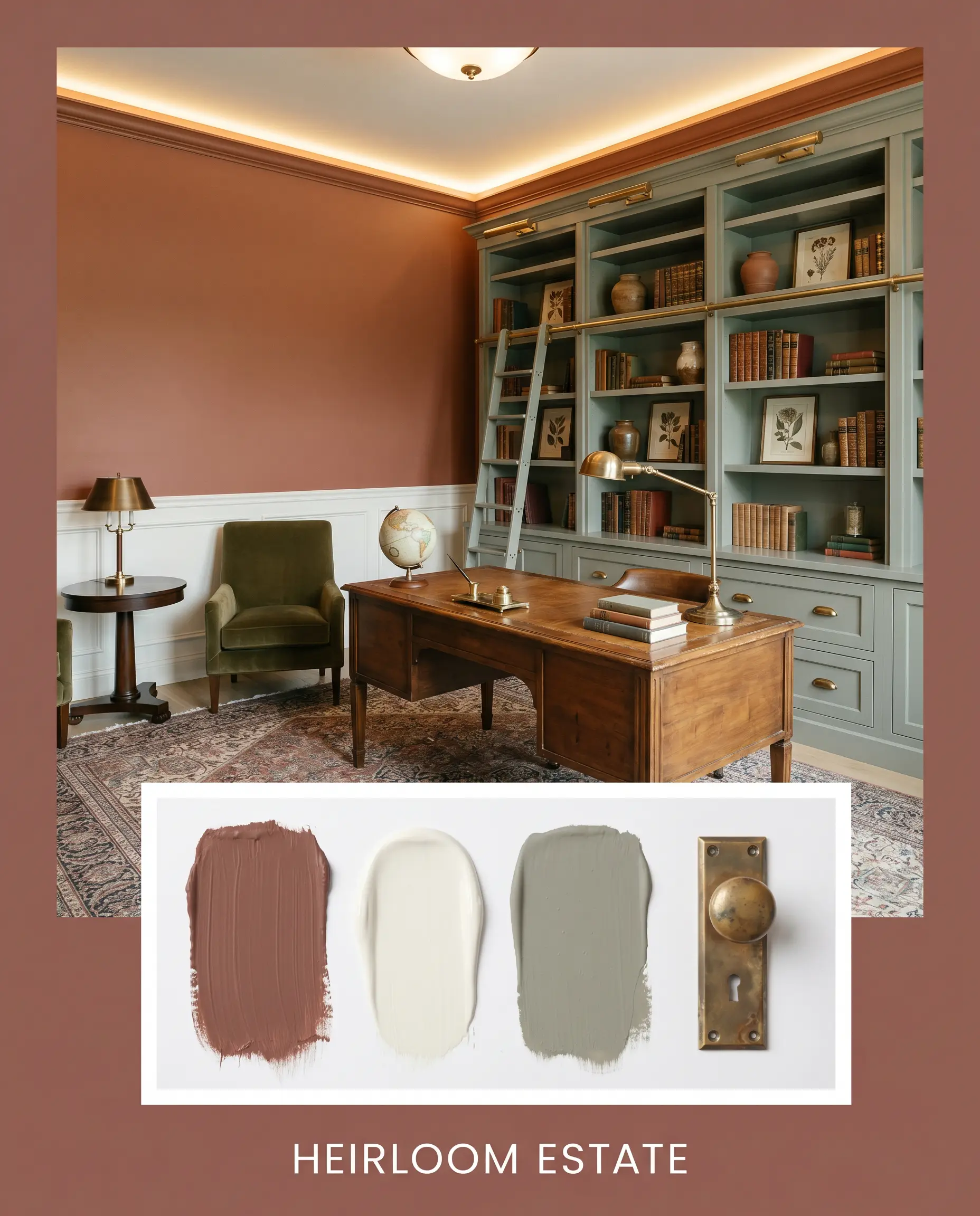
Heirloom Estate: A highly tailored approach that celebrates historic charm. Picture the rich brown-red paint framed by crisp White Dove wainscoting, accented by heavy, aged unlacquered brass hardware. We weave in Farrow & Ball Pigeon on an adjacent built-in bookcase to create a deeply layered, sophisticated atmosphere.
Head-to-Head Comparisons
Choosing the perfect sun-baked shade often comes down to analyzing the subtle shifts in lighting and architecture. If your room pulls too much shadow or your exterior demands a slightly different energy, a rival paint might be the superior choice.
Benjamin Moore Southwest Pottery 048 vs. Sherwin-Williams Cavern Clay SW 7701
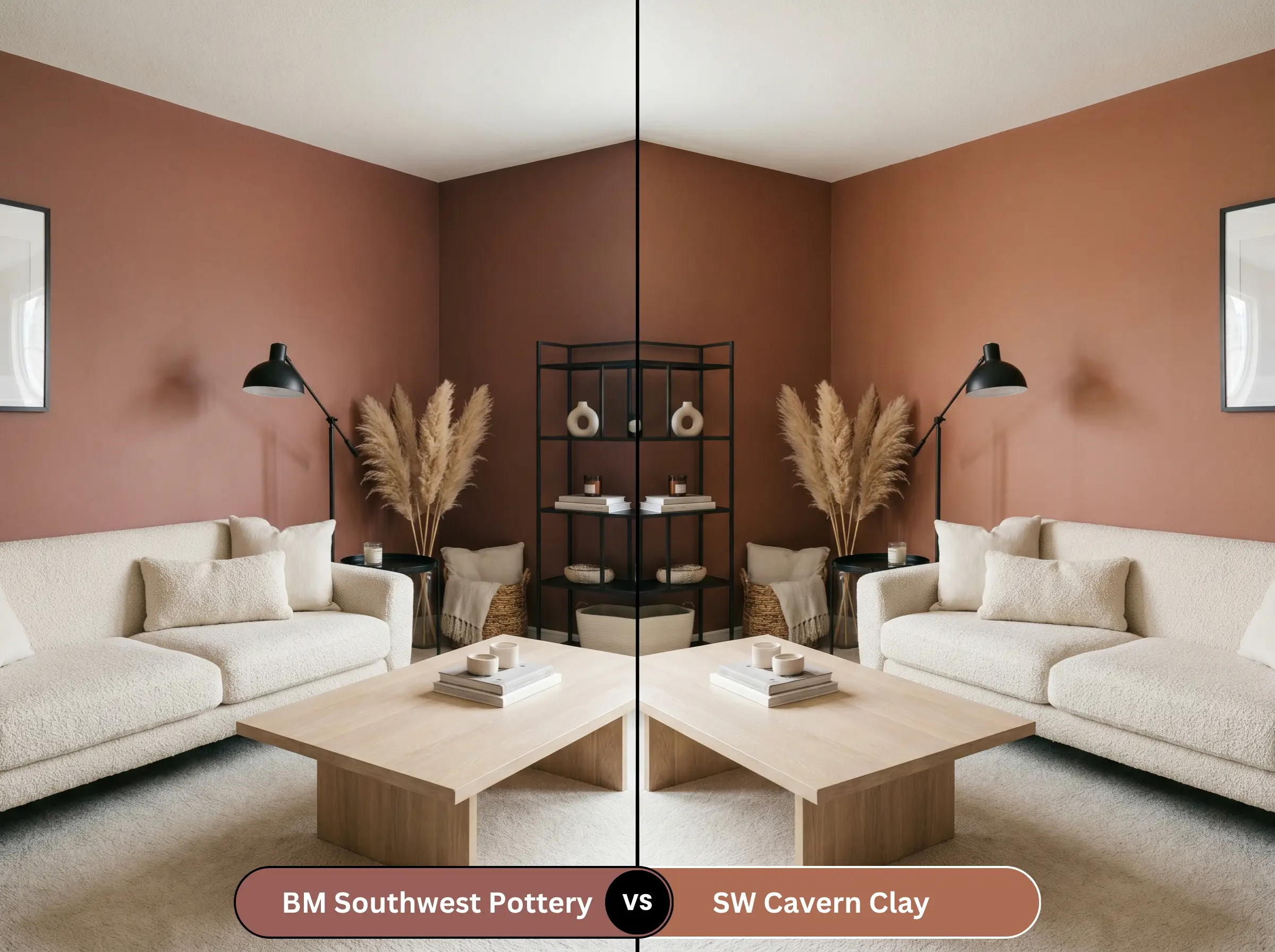
Cavern Clay is famously vibrant and leans much heavier into a true, bright orange-terracotta. If you are designing a playful, bohemian space that craves intense energy, the Sherwin-Williams option will pop significantly more. However, if you need a sophisticated backdrop that feels slightly more historic and restrained, the heavy brown undertones of BM 048 make it the safer, more elegant choice.
Benjamin Moore Southwest Pottery 048 vs. Benjamin Moore Boston Brick 2092-30
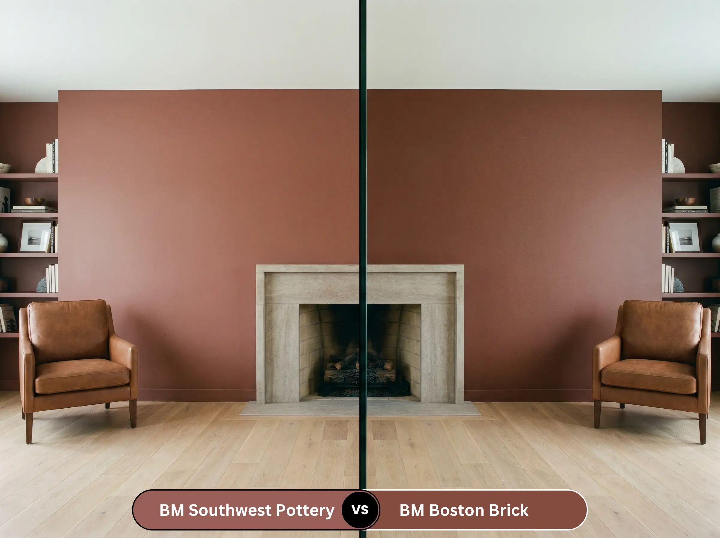
Boston Brick carries a distinct, cooler red profile that mimics traditional historic masonry, stripping away much of the orange influence. If your room features cool-toned stone fireplaces or icy gray flooring, Boston Brick will harmonize better with those fixed elements. Southwest Pottery, conversely, is strictly for spaces that demand an infusion of undeniable, glowing warmth.
Benjamin Moore Southwest Pottery 048 vs. Farrow & Ball Picture Gallery Red No. 42
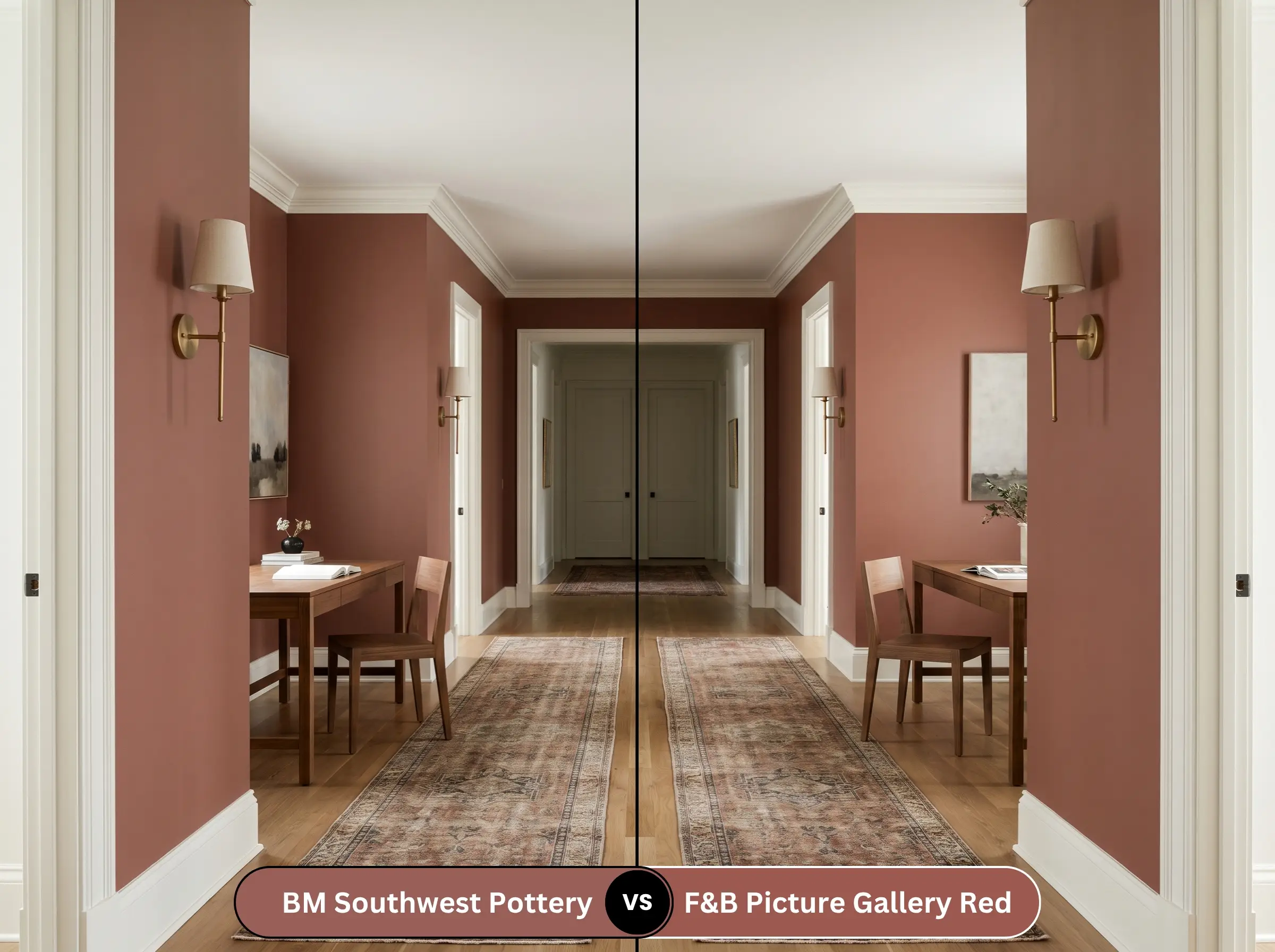
Picture Gallery Red is a highly pigmented, classic brown-red that feels incredibly stately and European. It carries a slightly higher LRV, making it a bit more luminous in dimly lit hallways or studies. If you are looking for an ultra-premium boutique finish with a slightly softer edge, the Farrow & Ball shade is magnificent, but the Benjamin Moore option delivers an almost identical earthy gravity.
Similar Colors to Benjamin Moore 048
Whether you need a subtle shift in depth or require a match from a different manufacturer, there are excellent alternatives available.
Benjamin Moore Alternatives
Cross-Brand Matches
Practical Application & DIY Advice
Transitioning this gorgeous pigment from a swatch to your actual walls requires a strategic approach to application. Deep, earthy tones behave very differently on a roller than standard off-whites.
The Dynamic Sheen Guide
Primer Strategy
You cannot paint a color this saturated over a standard white wall without the proper foundation. You must use a high-quality, gray-tinted primer to help the dark pigment build its true depth. Using a bright white primer will force you to apply three or four coats of the expensive topcoat just to stop the white from glowing through the red.
Coverage & Success Tips
Due to the Gennex Color Technology, this paint covers beautifully, but deep reds are notoriously finicky during application. You must maintain a “wet edge” while rolling to avoid flashing, which is when overlapping roller marks dry at different rates and leave visible, shiny streaks.
Dark, matte finishes like this are incredibly difficult to touch up seamlessly later on. If a wall gets scuffed, you will likely need to repaint the entire wall corner-to-corner, rather than just dabbing a brush on the scratch, to maintain a flawless finish.
Hackrea Design Secret (The Touch-Up Warning)
Frequently Asked Questions
Direct southern sunlight will absolutely amplify the orange and red nuances, making it significantly brighter than it appears on an indoor swatch. However, the heavy brown base prevents it from looking like a neon or artificial orange. It will look like a vibrant, authentic sun-baked clay, which is stunning for a Mediterranean aesthetic.
Because it absorbs a lot of light, it will feel very dark and moody in a windowless space. This is actually a brilliant opportunity to lean into a jewel-box aesthetic. By adding warm sconce lighting and a large mirror, you can create a highly intimate, dramatic powder room that feels intentionally enveloping.
You can, but it requires careful styling to prevent the room from feeling like a cave. Since both the walls and the floor carry significant visual weight, you must break up the darkness with a large, light-colored area rug. Introduce bright white trim and plenty of reflective metals to bounce light around the room.
Crisp, cool lighting at 4000K or above will act as a visual dampener on the warm red-orange pigments. The paint will lose much of its cozy, fiery energy and shift toward a flatter, dustier brown. To preserve the intended warmth of the color, always opt for bulbs in the 2700K to 3000K range.
Final Verdict & Expert Warnings
Benjamin Moore Southwest Pottery (048) is a spectacular, grounding choice for homeowners who want to inject their spaces with undeniable, architectural warmth. It excels in dining rooms, on custom cabinetry, and across broad exterior facades where its earthy, sun-baked nature can truly shine. It is the ultimate tool for bridging the gap between relaxed, organic styling and sophisticated, tailored design.
However, this specific depth of warmth demands absolute respect regarding your home’s existing fixed finishes. If your house is currently outfitted with cool, blue-gray luxury vinyl plank flooring, icy marble countertops, or an abundance of brushed chrome hardware, you must step away from this paint. The fiery red-orange base will fiercely fight against those cool, synthetic gray tones, making your floors look sickly and the paint feel entirely out of place. Instead, this shade requires the company of natural, warm-toned woods, creamy stones, and living metals to successfully anchor a room.