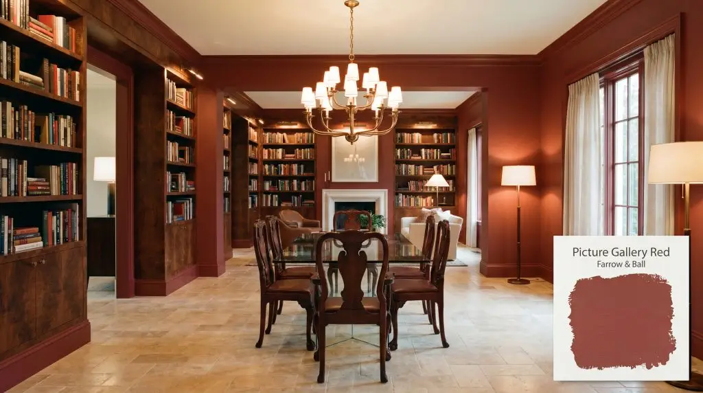
Picture Gallery Red 42
Farrow & BallFarrow & Ball's Picture Gallery Red (No. 42) is a rich, brown-based heritage red. With an LRV of 15.67, this deep russet hue provides a warm, auburn-toned backdrop that grounds formal spaces and beautifully highlights artwork and architectural features.
Paint Technical Profile
| Color ID / SKU | 42 |
| HEX Code | #9b594f |
| Light Reflectance (LRV) | 15.67 |
| Use | Interior, Exterior |
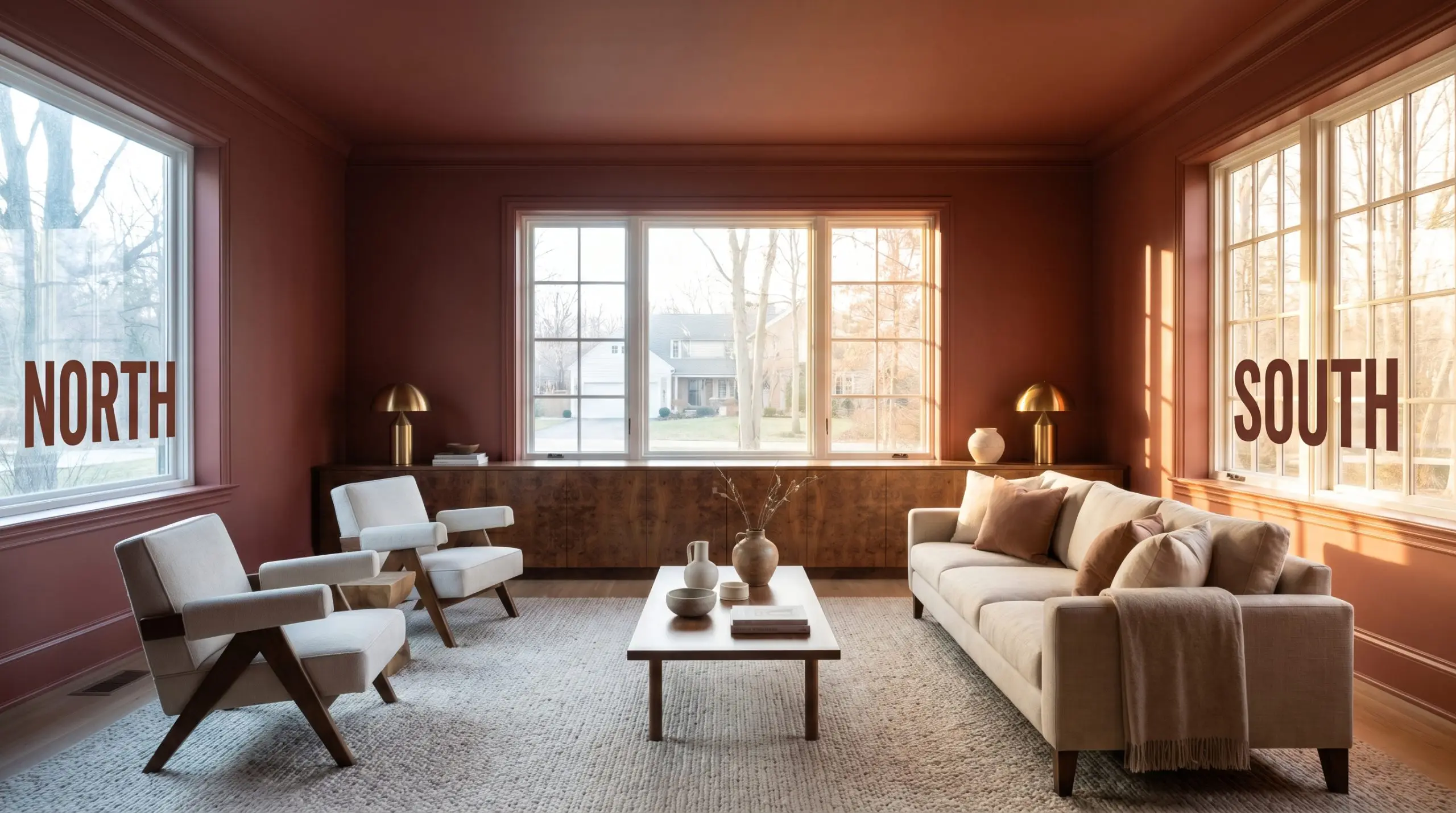
| Best Exposures | North, South, West |
| Best For | Dining Rooms, Libraries, Cabinetry |
Farrow & Ball Picture Gallery Red: A Smoldering Anchor for Curated Architectural Layers
When you introduce a pigment with the light-absorbing depth of Farrow & Ball Picture Gallery Red 42 into a sunlit culinary space, it instantly grounds the room’s floating energy. This rich, russet brown-based red acts as a visual anchor, beautifully counterbalancing the chaotic veining of a heavily patterned marble island.
It completely transforms the atmosphere from airy and unmoored to intentional and deeply rooted. Whether you are wrapping an entire study in its warmth or using it to emphasize striking millwork, this shade demands attention without ever shouting.
Farrow & Ball Picture Gallery Red 42: Undertones & LRV
If you are wondering whether this striking pigment leans warm or cool, it is undeniably, radiantly warm. Picture Gallery Red builds its foundation on an earthy, baked warmth that completely bypasses the harshness of a primary color. This complex temperature profile makes it an incredibly versatile foundation for richer, layered styling.
Registering at an LRV of 15.67, this pigment carries immense visual weight. Instead of bouncing illumination around the room, it absorbs it, bringing the walls inward to create a deeply enveloping, protective atmosphere.
Lighting Shifts & The Environmental Response
The biggest environmental risk for this auburn cast is placing it in a room dominated by heavily filtered, green-tinted light from dense exterior foliage. The green reflection will fiercely clash with the terracotta warmth, turning the finish slightly bruised and murky.
Because Farrow & Ball relies on incredible pigment complexity, this shade reacts dramatically to the shifting path of the sun. You must observe how the light physically alters the mood before committing to a full room.
Where Picture Gallery Red Excels in the Home
This deeply saturated tone craves architectural boundaries and rich textures. It brings a profound sense of permanence to a space, instantly elevating standard rooms into curated, intentional retreats.
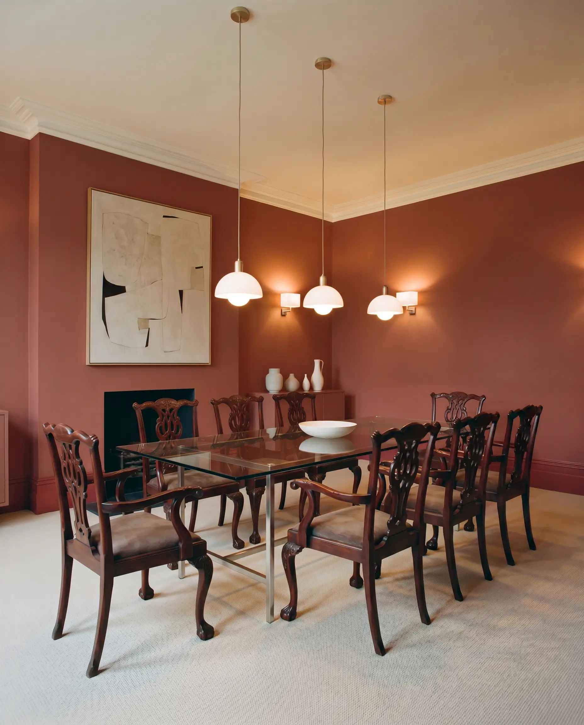
Formal Dining Rooms
By wrapping the walls in this earthy tone, you create a glowing backdrop that flatters ambient fixtures and serves as a striking canvas for eclectic styling. It easily bridges the gap between a sleek, Bauhaus-inspired glass table and heavily carved mahogany chairs. To maximize the mood, carry the color across the baseboards to eliminate visual interruptions.
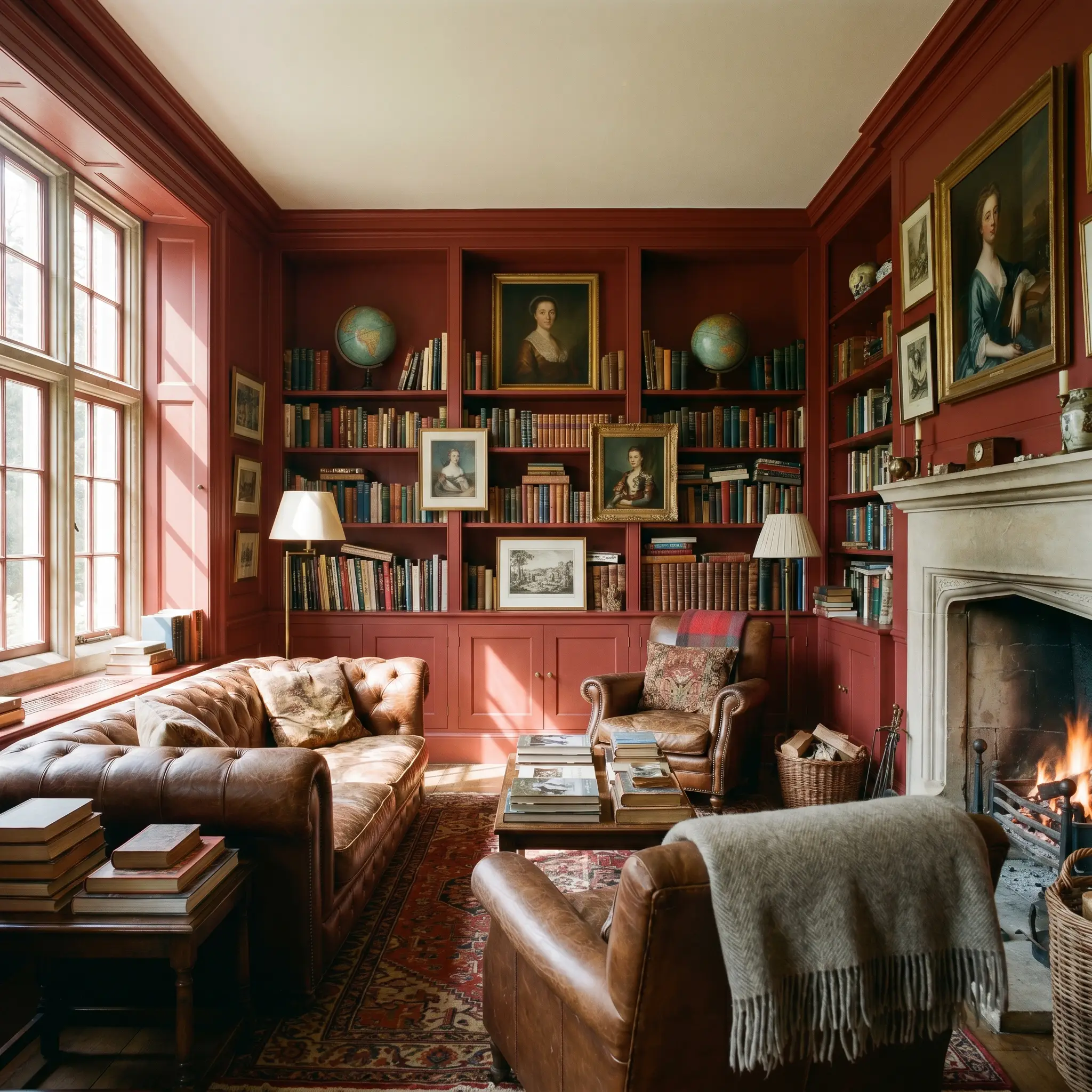
Home Libraries & Studies
In spaces dedicated to focus, the heavy visual weight of this shade provides an instant sense of enclosure. The rich brown base beautifully complements wall-to-wall shelving, allowing framed artwork to pop against the saturated background. It effortlessly anchors a moody, English-Country aesthetic when paired with worn leather seating, or leans into a sharp, Mid-Century Modern vibe alongside teak desks.
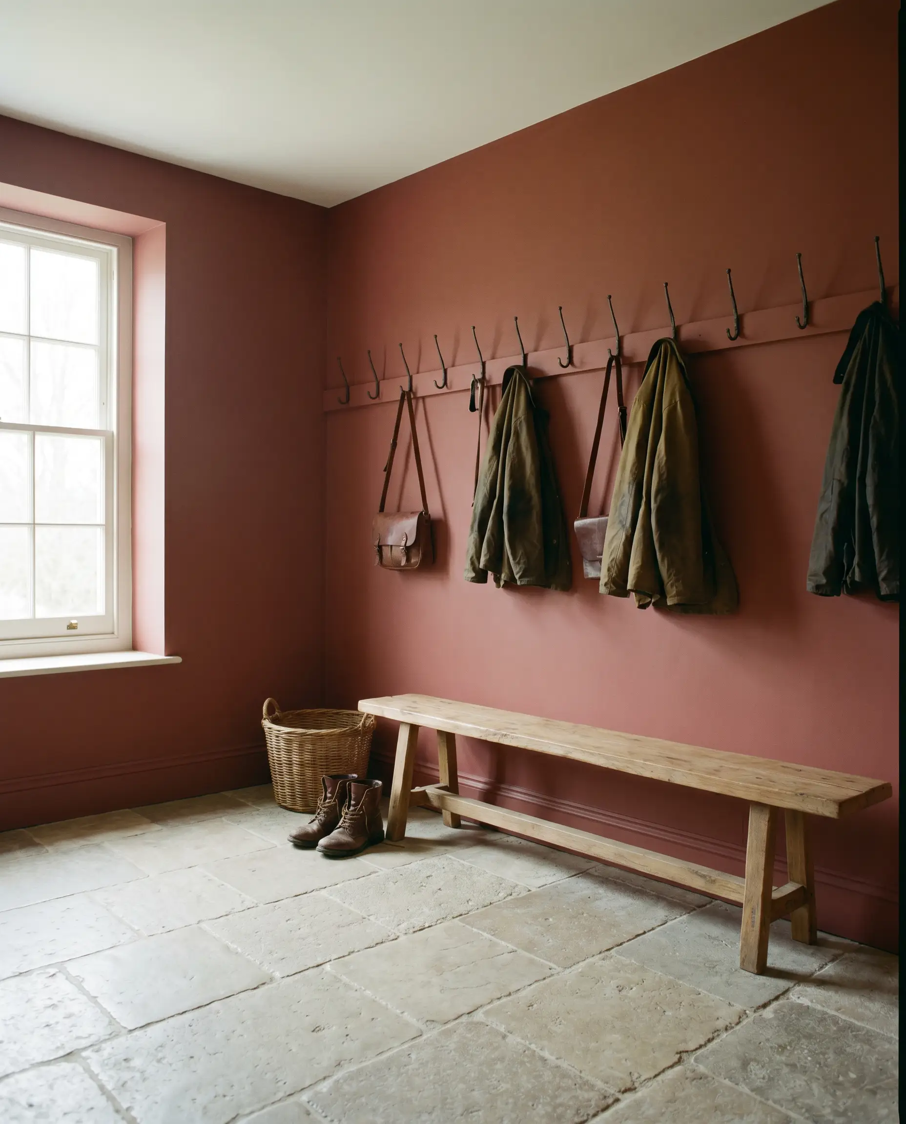
Mudrooms & Boot Rooms
Transitional spaces are the perfect canvas for a bold, enveloping color application. Using this baked shade in a high-traffic entry immediately establishes a warm, welcoming energy while effectively hiding everyday wear. Contrast the rich walls with durable, tumbled limestone flooring and sleek iron hooks for a brilliant mix of rustic utility and refined curation.
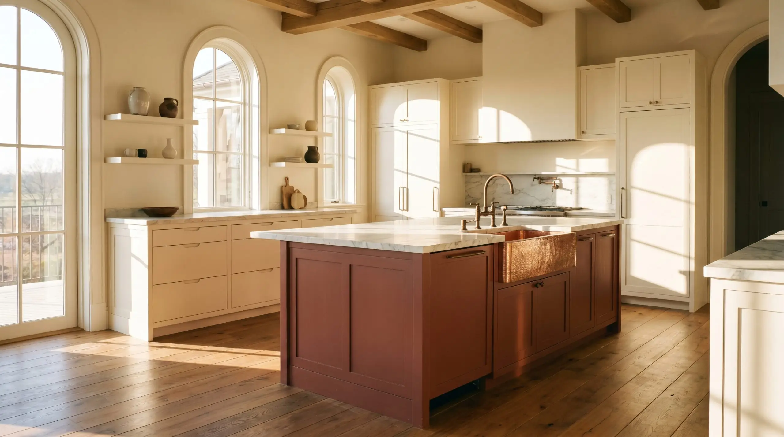
Kitchen Island Cabinetry
If you are hesitant to commit to a fully saturated room, applying this tone to a central island creates a magnificent focal point. The earthy warmth grounds the center of the culinary space, especially when surrounded by creamy perimeter cabinets. It sings alongside a polished copper sink or unlacquered bronze fixtures, turning a functional unit into a premium, custom-built feature.
Creative Architectural Placements for F&B 42
Beyond standard four-wall applications, the depth of this pigment makes it a brilliant tool for highly specific, curated interventions. Here are a few inventive ways to manipulate the architecture with this rich tone.
The Color-Drenched Powder Room
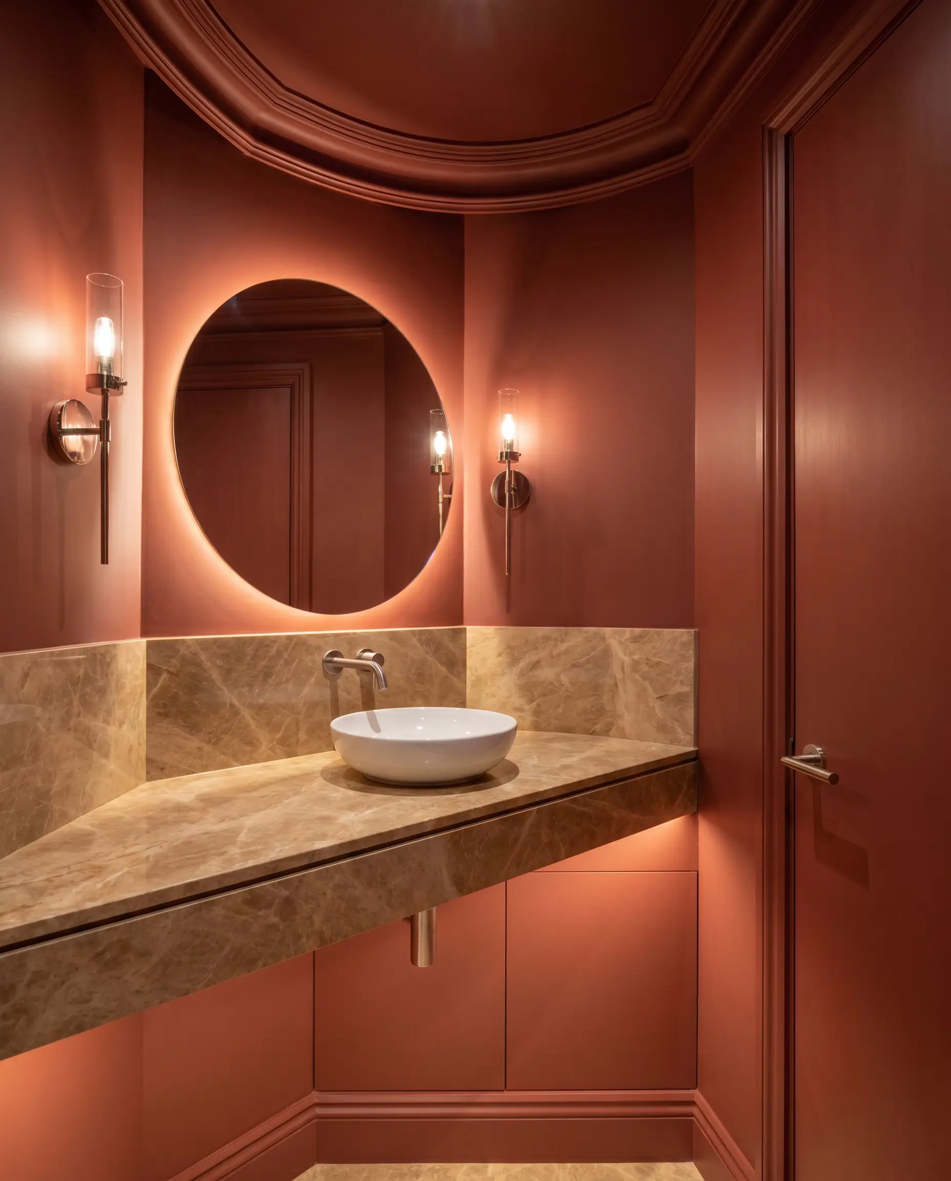
Transform a tiny, windowless guest bathroom into a jewel-box experience through complete color drenching. By painting the walls, trim, ceiling, and even the back of the door in this exact shade, you erase the visual boundaries of the room. Pair this immersive application with a floating marble vanity and polished nickel sconces for a striking, high-contrast surprise.
Restoring a Period Fireplace Surround
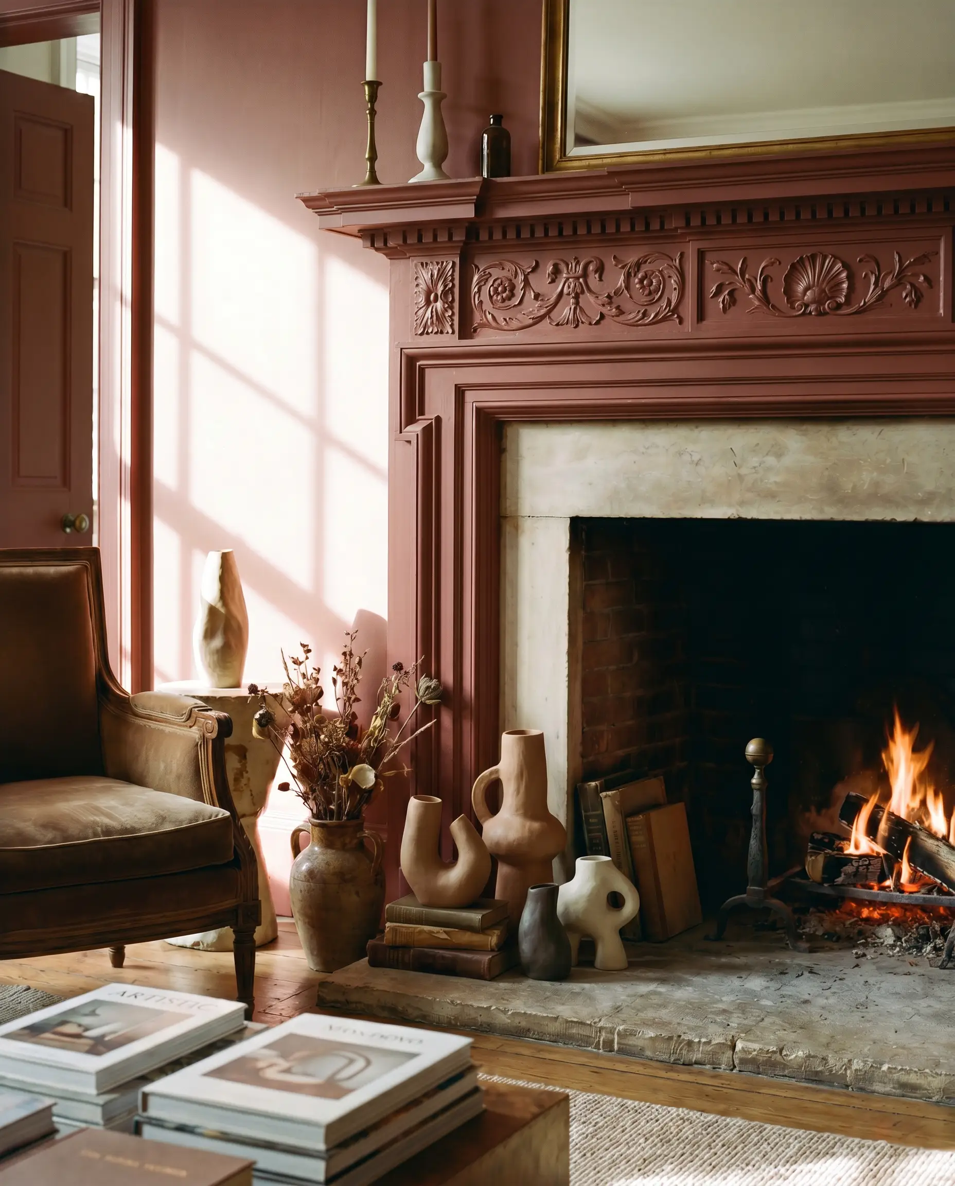
Drawing inspiration from its historical roots in the famed Attingham Park gallery, use this heritage hue to revitalize an ornate, carved wooden mantelpiece. The heavy saturation instantly turns the fireplace into a commanding architectural anchor, drawing the eye inward. Style the hearth with modern, asymmetrical ceramics to create a beautiful tension between the historical pigment and contemporary art.
The High-Gloss Ceiling Treatment
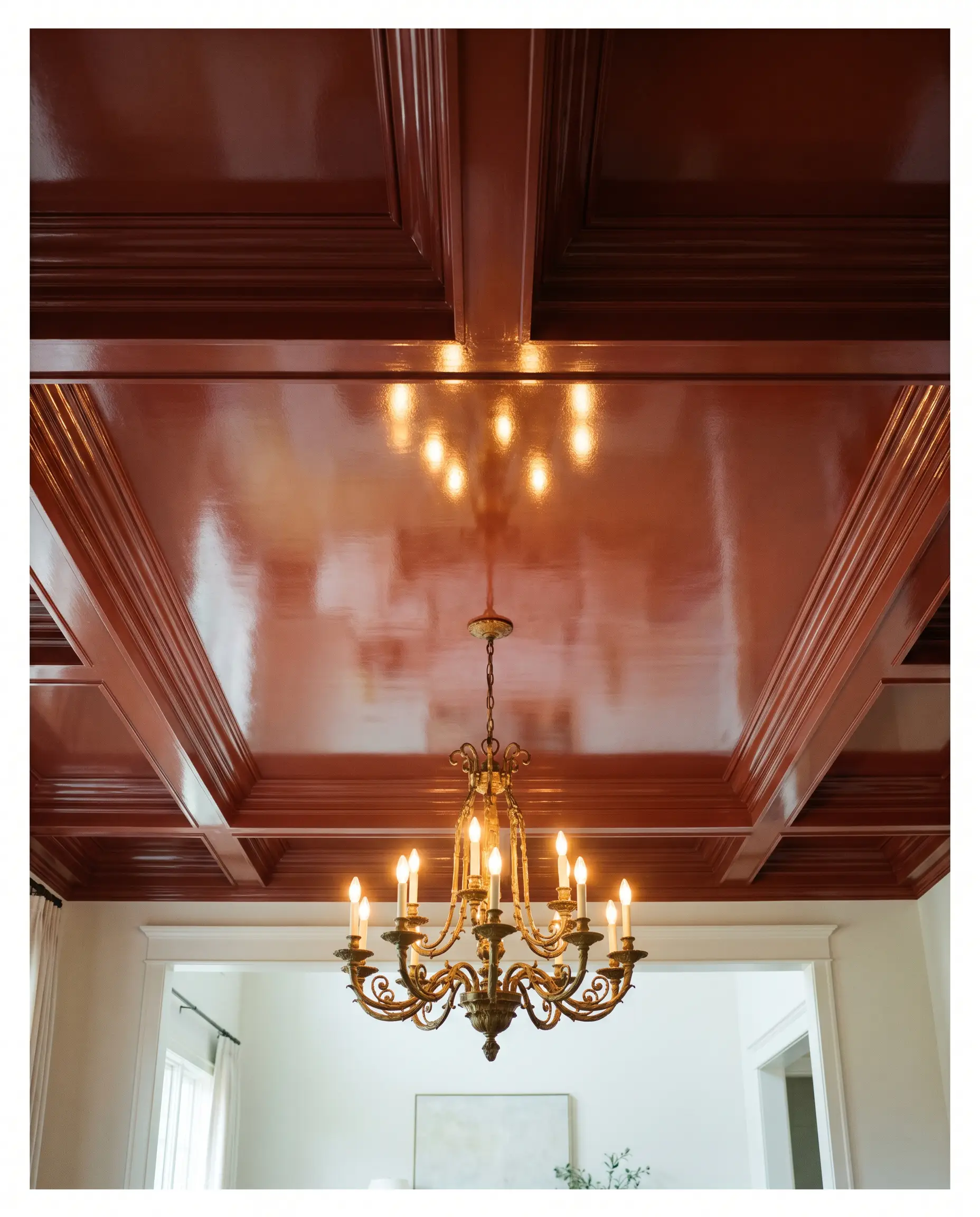
For a truly breathtaking dining experience, apply this shade in a brilliant, reflective finish across a tray ceiling. The high-gloss woodwork bouncing the light from a central chandelier creates an illusion of endless height while dripping with opulent warmth.
When applying a high-sheen finish to a ceiling, the surface must be flawlessly smooth. Any imperfections in the drywall will be magnified by the reflective gloss, so invest in a Level 5 skim coat before the primer goes on.
Hackrea Pro-Tip (The Reflection Trick)
A Mediterranean-Inspired Sunroom Floor
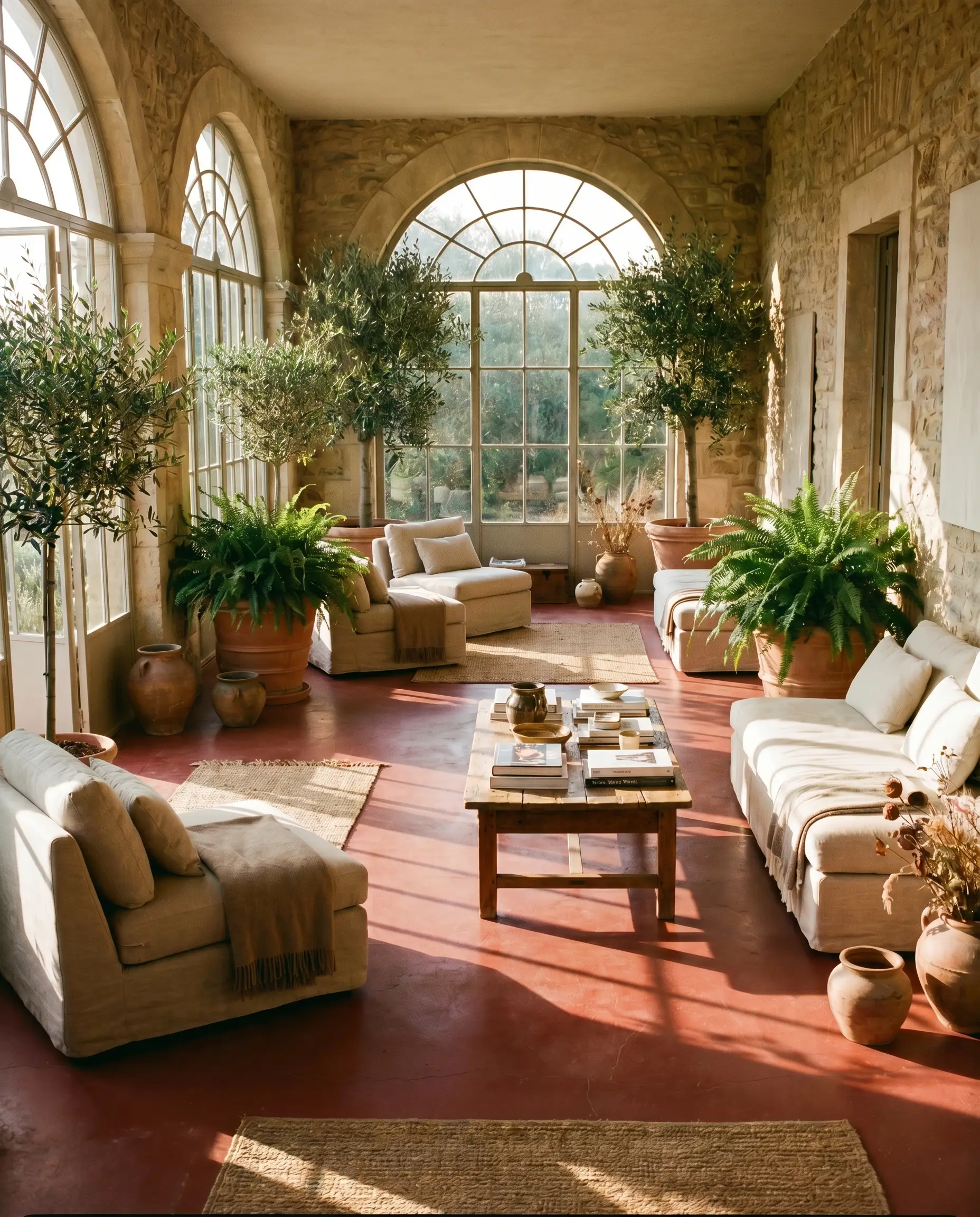
Instead of traditional tile, paint a concrete or wooden sunroom floor in this baked earthy tone to mimic the feel of aged terracotta. The sun will pull out the fiery vibrancy of the pigment, warming the entire room from the ground up. Anchor the space with lush, oversized indoor trees and sleek, low-profile linen lounging chairs.
Material Pairings & Coordinating Palettes for Picture Gallery Red
To truly elevate this smoldering shade, you must surround it with elements that either match its intensity or offer a crisp, intentional contrast. The right structural materials and secondary tones dictate the final energy of the space.
Trim & Baseboards
For a clean, tailored boundary that doesn’t feel jarring, Benjamin Moore Swiss Coffee OC-45 provides a beautifully soft, creamy edge. Its subtle warmth harmonizes with the earthy red, preventing the stark, clinical contrast that a pure white would create. If you prefer a slightly more muted, sophisticated transition, Sherwin-Williams Alabaster SW 7008 offers a gentle, chalky border that beautifully frames the saturated walls.
Hardware, Wood & Material Pairings
This pigment demands tactile companions that can stand up to its visual weight.
Coordinating Colors
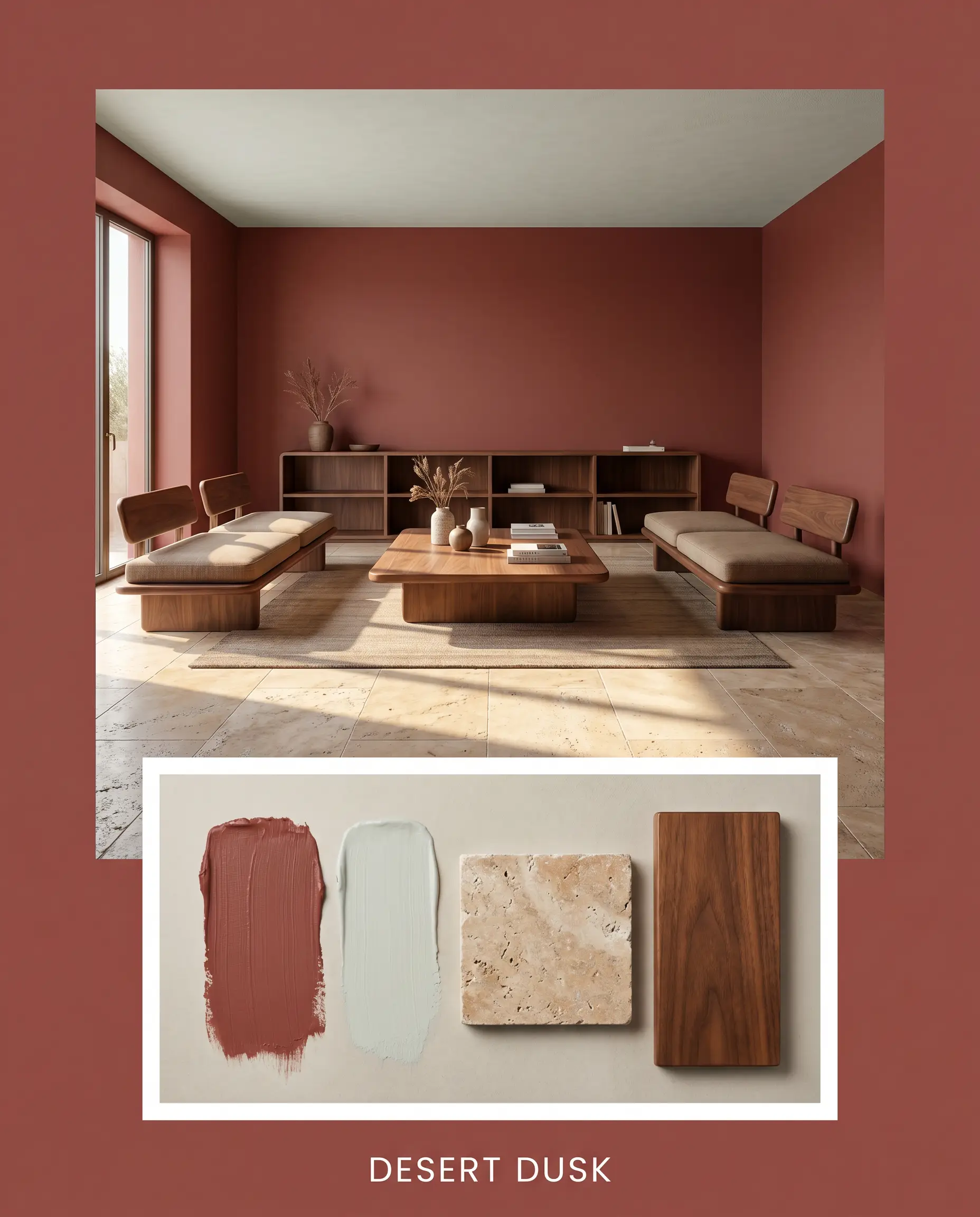
Desert Dusk
This palette channels the fading light over an arid landscape, blending F&B 42 with the chalky coolness of Sherwin-Williams Sea Salt SW 6204. Incorporate expansive slabs of tumbled travertine and sleek, low-slung walnut furniture. The tension between the heavy walls and the breezy secondary color creates a serene, deeply grounded retreat.
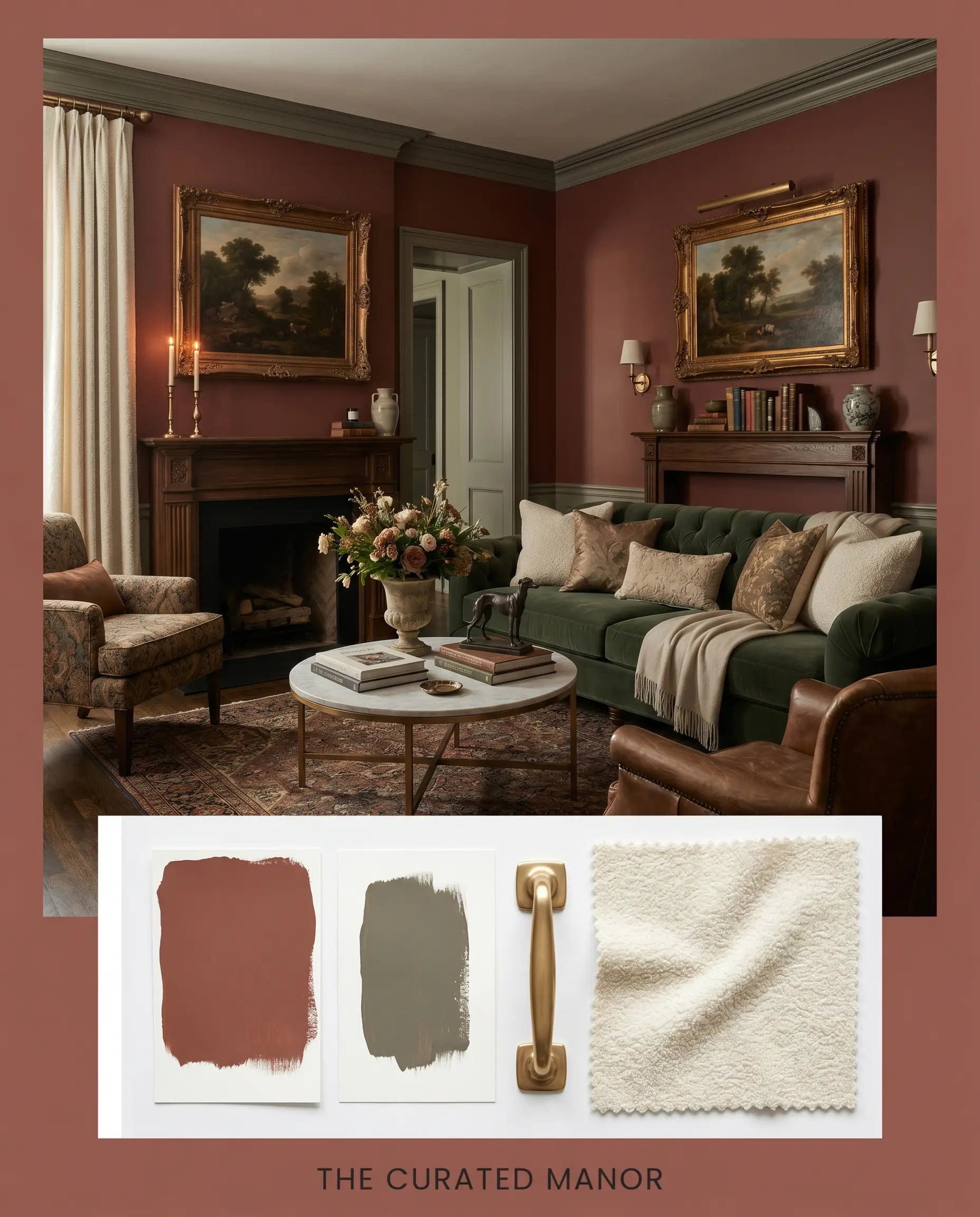
The Curated Manor
Leaning into the paint’s historical roots, this combination pairs the deep red walls with the lush, earthy contrast of Benjamin Moore Gloucester Sage HC-100. Enhance the sophisticated mood with polished unlacquered bronze fixtures and heavy, tailored velvet drapery. It is a rich, enveloping aesthetic that feels both fiercely traditional and sharply modern.
Head-to-Head Paint Comparisons
When finalizing a saturated color, evaluating it against its closest rivals is mandatory to ensure you are capturing the exact mood your architecture requires. Here is how this specific shade stacks up against other popular earthy tones.
Farrow & Ball Picture Gallery Red 42 vs. Farrow & Ball Eating Room Red 43
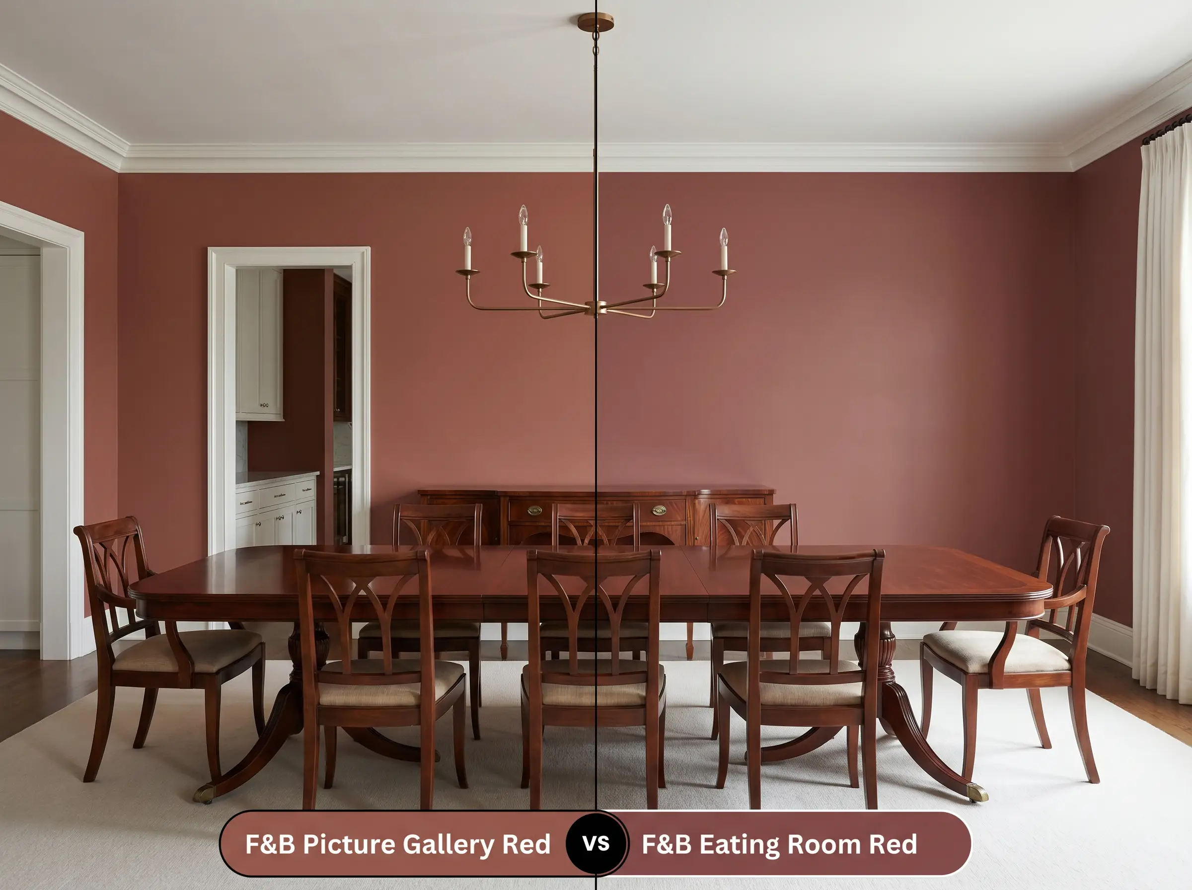
If your space lacks abundant natural light, F&B Eating Room Red offers a slightly deeper, more blackened profile that leans heavily into a burgundy aesthetic. Picture Gallery Red 42, by contrast, retains significantly more of its brown and auburn vibrancy. Choose Picture Gallery Red if you want a baked, terracotta energy, but pivot to Eating Room Red if you require a formal, deeply shadowed dining experience.
Farrow & Ball Picture Gallery Red 42 vs. Sherwin-Williams Cavern Clay SW 7701
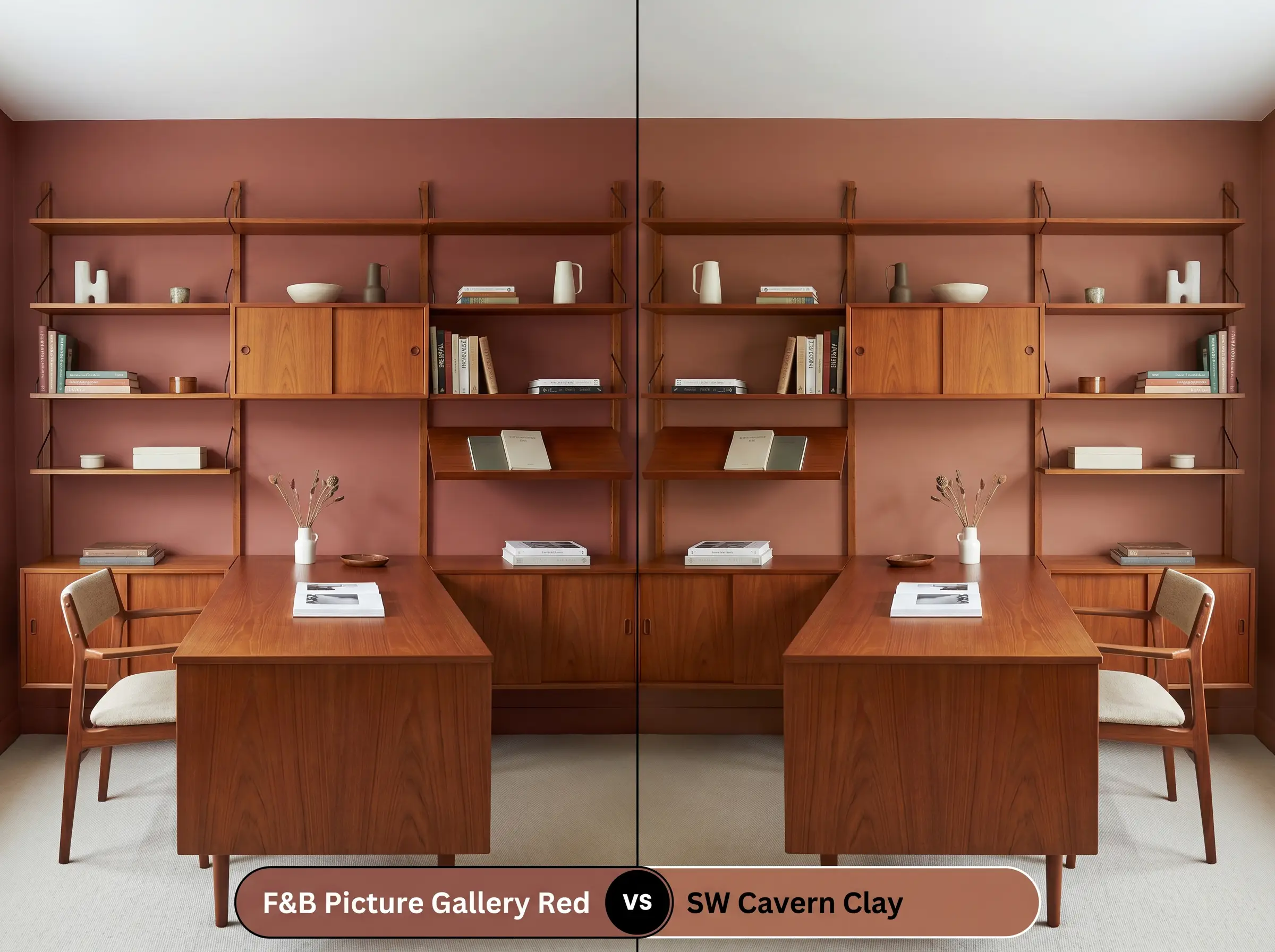
Cavern Clay is a significantly brighter, more unmistakable orange-leaning terracotta with a much higher light reflectance. If you are painting a sun-drenched exterior facade and want a vibrant, Southwestern glow, Cavern Clay is the better candidate. However, if you need a sophisticated, muted anchor for an interior study, F&B 42 provides the necessary restraint and depth.
Alternative Russet Tones & Brand Equivalents
Whether you need a subtle shift in vibrancy or require a match from a different manufacturer for local sourcing, these alternatives offer a similar enveloping energy.
Similar Colors from Farrow & Ball
Cross-Brand Matches
Application Strategy & Finish Selection
Transitioning this complex pigment from the tin to your walls requires a deliberate strategy. The deep, light-absorbing nature of this color demands proper preparation to achieve a flawless, premium result.
The Ideal Sheen Guide
Primer Requirements
You cannot apply a color this saturated over standard white primer without compromising its depth. You must use a dedicated Red & Warm Tones undercoat or a deeply tinted dark gray primer. A stark white base will fight the pigment, requiring endless coats and resulting in a streaky, translucent finish.
Coverage Expectations & Application
Even with the correct tinted primer, expect to apply a minimum of two generous coats to achieve the true, smoldering opacity. Because of the heavy brown and auburn colorants, this paint is highly susceptible to flashing. You must maintain a generous wet edge while rolling and completely avoid going back to touch up semi-dry spots, or you will leave permanent, visible roller marks across the wall.
Deeply pigmented colors take significantly longer to fully cure than pale neutrals. While the wall may feel dry to the touch in hours, wait at least two weeks before leaning furniture against it or scrubbing any scuff marks.
Hackrea Design Secret (The Curing Window)
Frequently Asked Questions
Because of its heavy brown base, it will certainly lean darker and earthier without natural sunlight. However, this is exactly what makes it so successful in small spaces; it leans into the shadows to create a rich, moody, and highly intentional atmosphere rather than fighting the lack of light.
A high-gloss finish acts like a mirror, bouncing ambient light and actually highlighting the fiery auburn edges hidden within the brown pigment. It transforms the cabinetry into a luminous, jewel-like focal point, giving older, ornate woodwork a brilliantly refreshed, lacquered energy.
Yes, provided you use a premium exterior masonry formulation and UV-resistant topcoats. While all saturated reds are prone to UV degradation, the heavy brown undertones in this specific shade actually help it age gracefully, allowing it to weather into a beautiful, historic terracotta rather than a washed-out pink.
Applying this heavy, warm tone overhead immediately drops the perceived height of the room, creating an incredibly cozy, cave-like enclosure. It eliminates distracting light reflections from the screen and wraps the viewer in a protective, comforting warmth.
The Final Verdict on Farrow & Ball’s Russet Classic
Farrow & Ball Picture Gallery Red 42 is the ultimate tool for homeowners who want to inject profound, historical warmth into their architecture without relying on stark, primary colors. It performs most brilliantly in formal dining spaces, intimate libraries, or as a striking accent on custom millwork, effortlessly bridging the gap between grand, traditional heritage and sharp, eclectic modernism. Its baked, earthy energy provides a masterfully grounded backdrop for those who love to layer rich textiles and premium woods.
However, this heavy pigment will aggressively clash with cool-toned, blue-gray flooring, icy marble veining, or stark, blue-leaning white trim. Placing this fiery russet against a cool, icy foundation creates a jarring, disjointed visual friction that makes the red feel dirty and the gray feel sterile. If your home is dominated by cool-toned fixed finishes or stark, modern chrome fixtures, this smoldering terracotta will constantly fight its surroundings rather than elevating them.