Baked Terra Cotta 1202
Benjamin MooreBenjamin Moore Baked Terra Cotta (1202) is a rich, warm earth tone with distinct orange and brown undertones. Boasting an LRV of 20.93, it is a medium-dark shade that brings a grounding, Mediterranean-inspired warmth to dining rooms, kitchens, and exterior accents.
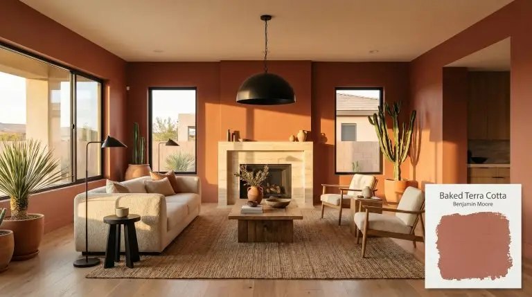
Benjamin Moore Baked Terra Cotta: A Stabilizing Foundation for High-Contrast Interior Design
| Best Exposures | North, East |
|---|---|
| Best For | Dining Rooms, Kitchens, Accent Walls, Exteriors |
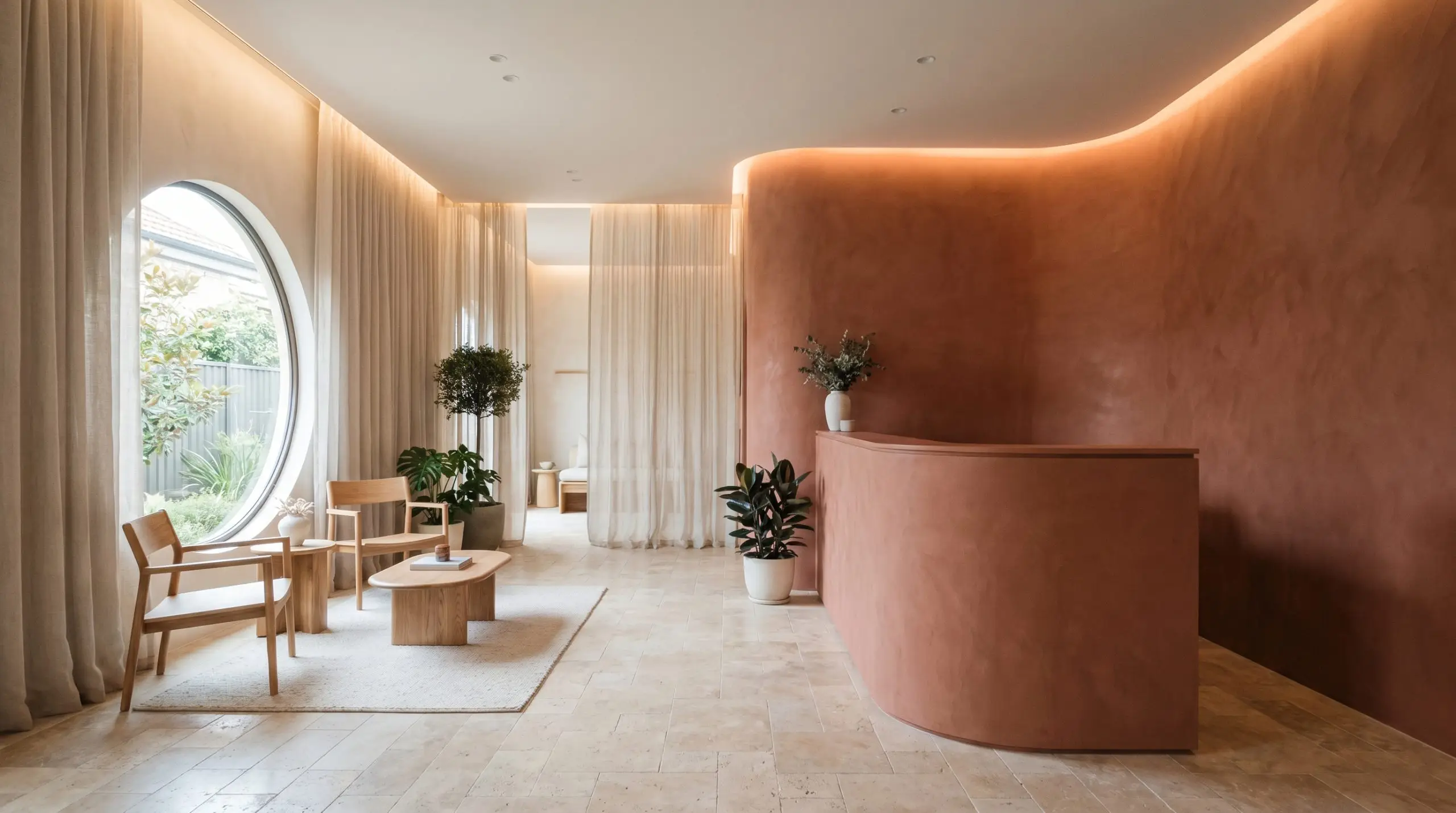
It takes a truly intentional color to transform a vast, echoing suburban living room into an intimate, velvet-like retreat. When you are working with a paint that carries a heavy visual weight, the instinct is often to pull back and play it safe with neutrals.
However, embracing a rich, light-absorbing hue like Benjamin Moore Baked Terra Cotta (1202) is the secret to making standard architecture feel incredibly custom. This color wraps a room in a sophisticated, earthy warmth that completely changes how you experience the home’s natural light and everyday furnishings.
By understanding how its deep pigment structure interacts with your existing materials, you can use this muted clay to elevate everything from a casual dining space to a highly curated entryway.
Undertones & LRV of Benjamin Moore Baked Terra Cotta
Benjamin Moore Baked Terra Cotta is a definitively warm paint color. Far removed from the neon intensity of pure orange or the starkness of primary red, this shade relies on a heavily muted, grounded base to create its signature earthy charm.
The Anatomy of the Color:
With a medium-dark LRV (Light Reflectance Value) of 20.93, this color is a light-absorbing material. It will not bounce ambient sunshine around the room to make it feel larger. Instead, it deliberately pulls the walls inward, creating a deeply comforting, grounding quality that works beautifully when you want a space to feel enclosed, rich, and highly intentional.
You can apply wallpapers, paints, etc. on walls and see how they look in various interiors.

Lighting Effects & The Chameleon Factor
The greatest risk when using Benjamin Moore 1202 is underestimating how heavily its brown base reacts to shadows. In environments with poor natural light or overly cool LED bulbs, this rich clay can quickly lose its Mediterranean allure and flatten into a heavy, muddy rust.
To prevent this, you must strategically layer your lighting and understand exactly how the sun moves through your home.
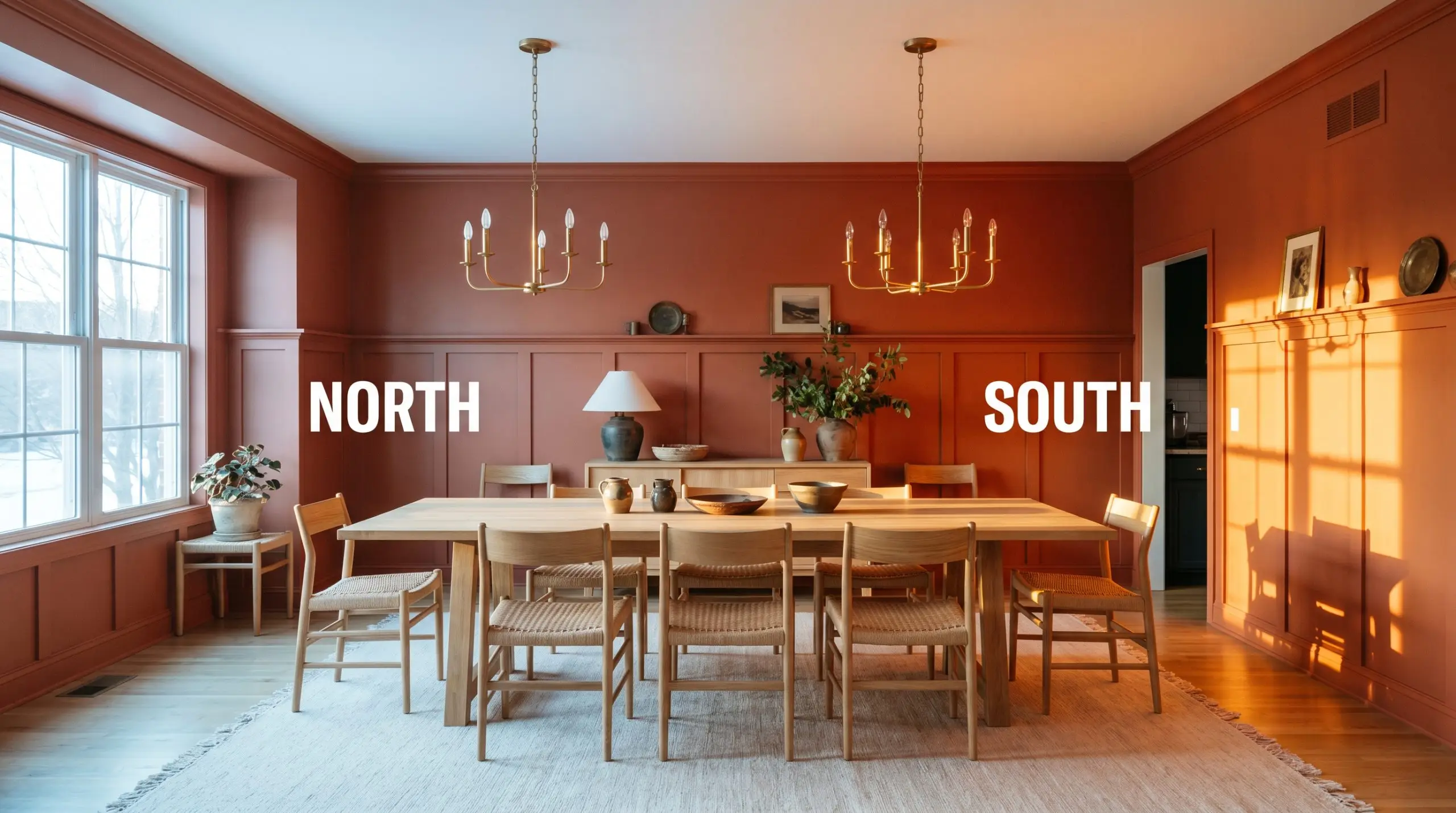
Because this color absorbs so much light, using an eggshell or satin finish on the walls instead of a flat matte will introduce a subtle, elegant sheen. This tiny amount of reflection helps the deep pigments bounce just enough light to keep the room feeling dynamic rather than heavy.
Hackrea Pro-Tip (The Sheen Shift)
Everyday Spaces: Elevating the Home
Baked Terra Cotta brings a commanding, cohesive energy to a home, demanding that every surrounding element steps up to its level of sophistication. It transitions flawlessly between contrasting design styles, shifting its mood based entirely on the architecture and textiles you surround it with.
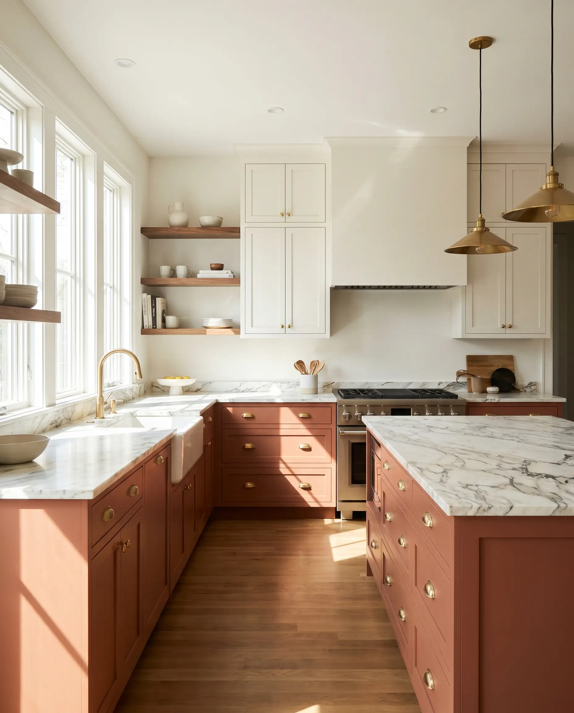
Kitchens
In a kitchen, this earthy rust acts as a brilliant anchor for a Transitional or Desert Modern aesthetic. Instead of painting the entire room, use it to ground the lower cabinetry or a central island, pairing it with creamy white upper cabinets and heavily veined marble countertops. It provides a stunning backdrop for natural walnut floating shelves, while beautifully complementing unlacquered brass hardware for a lived-in, highly curated culinary space.
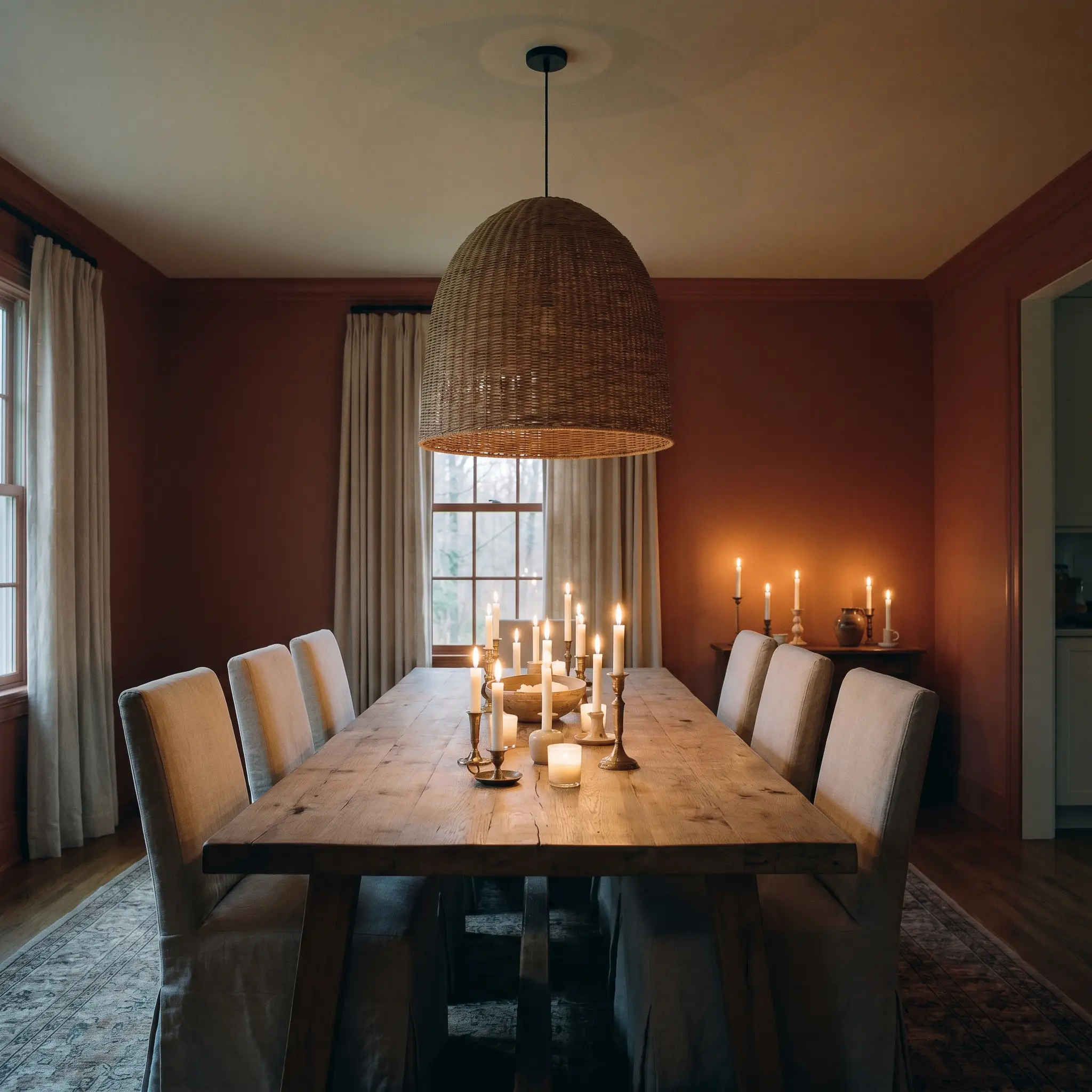
Dining Rooms
This shade was virtually made for dining spaces, where the goal is often to encourage lingering conversations over a long meal. When wrapped around the entire room, it creates a deeply intimate, candlelit atmosphere that suits both a relaxed Wabi-Sabi aesthetic and a more formal English Country vibe. Pair it with a heavy, reclaimed oak dining table, slipcovered linen chairs, and an oversized woven pendant light to balance the rich walls with breezy, tactile textures.
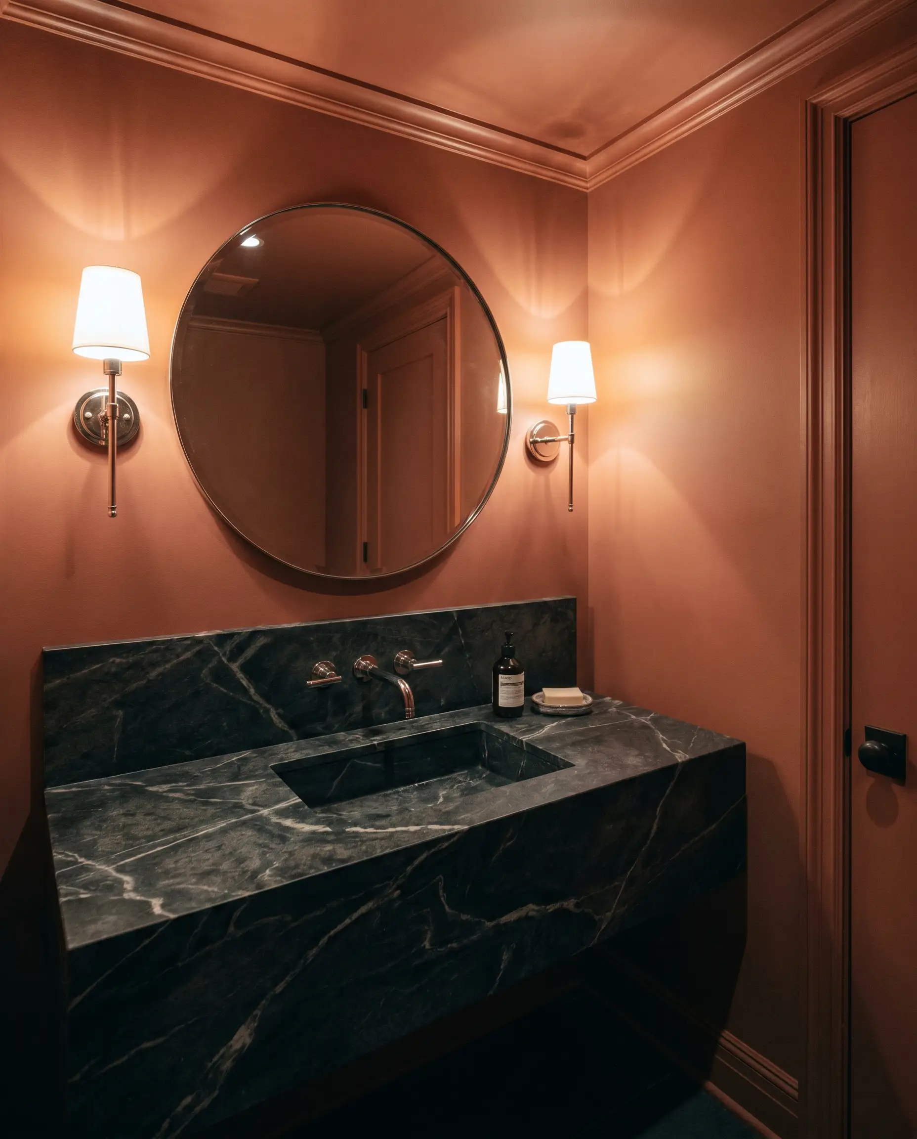
Powder Rooms
A small, windowless bathroom is the perfect canvas to lean fully into the color’s shadowy depth. By taking BM 1202 across the walls, trim, and even the ceiling, you create a seamless jewel box effect. Introduce a heavily veined dark soapstone vanity and polished nickel sconces to bounce slivers of light around the room, proving that small spaces often benefit from bold, dark color choices rather than stark whites.
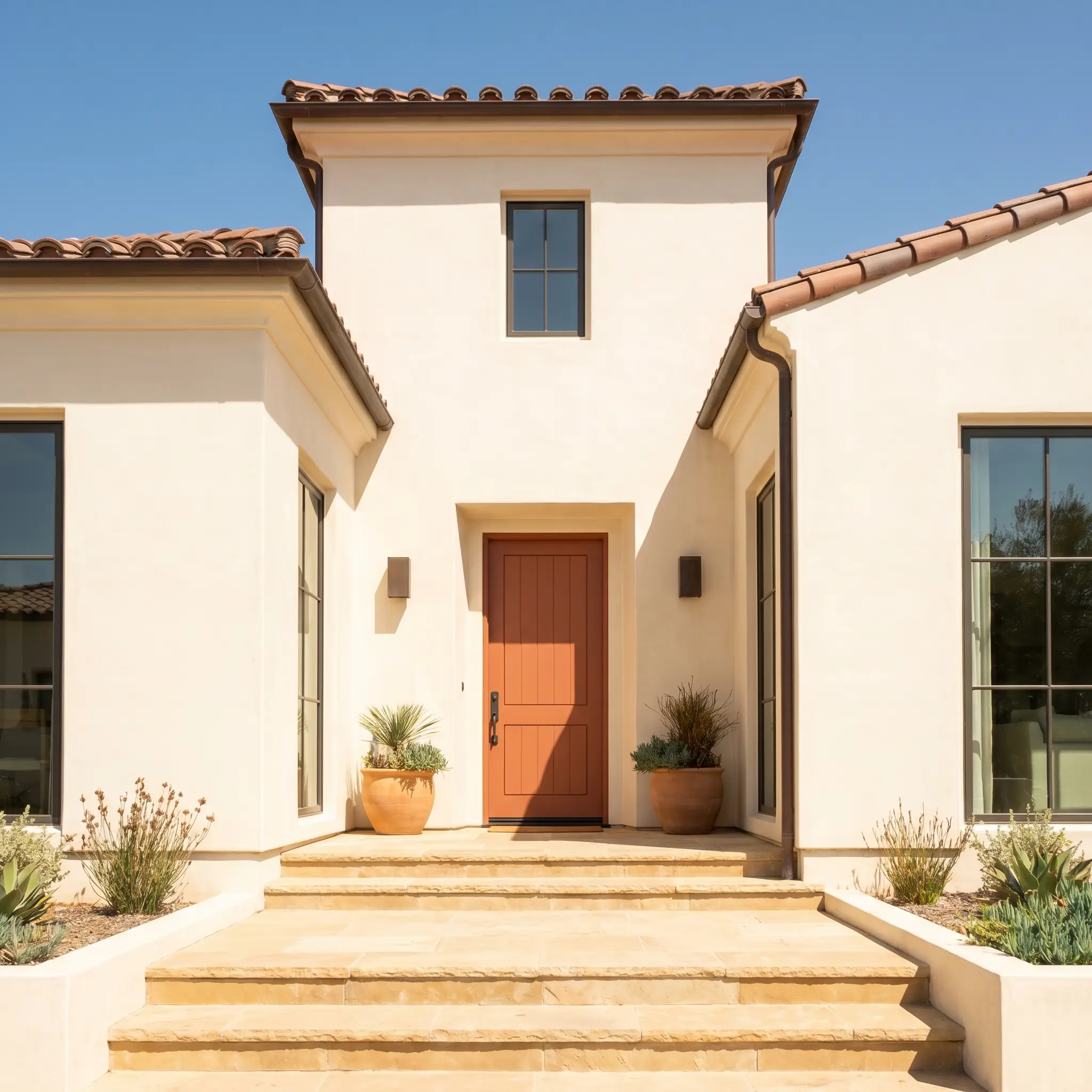
Exterior Front Doors
For a facade update, this shade offers a welcoming, sun-baked greeting that instantly boosts curb appeal. It works exceptionally well against creamy stucco or warm stone exteriors, offering a nod to classic Mediterranean architecture. Always test exterior swatches in direct sunlight, as the intense outdoor exposure will wash out some of the brown, making the door appear slightly brighter and more orange than it does on an interior swatch.
Creative Ways to Use Benjamin Moore 1202
The Continuous Mudroom Wrap
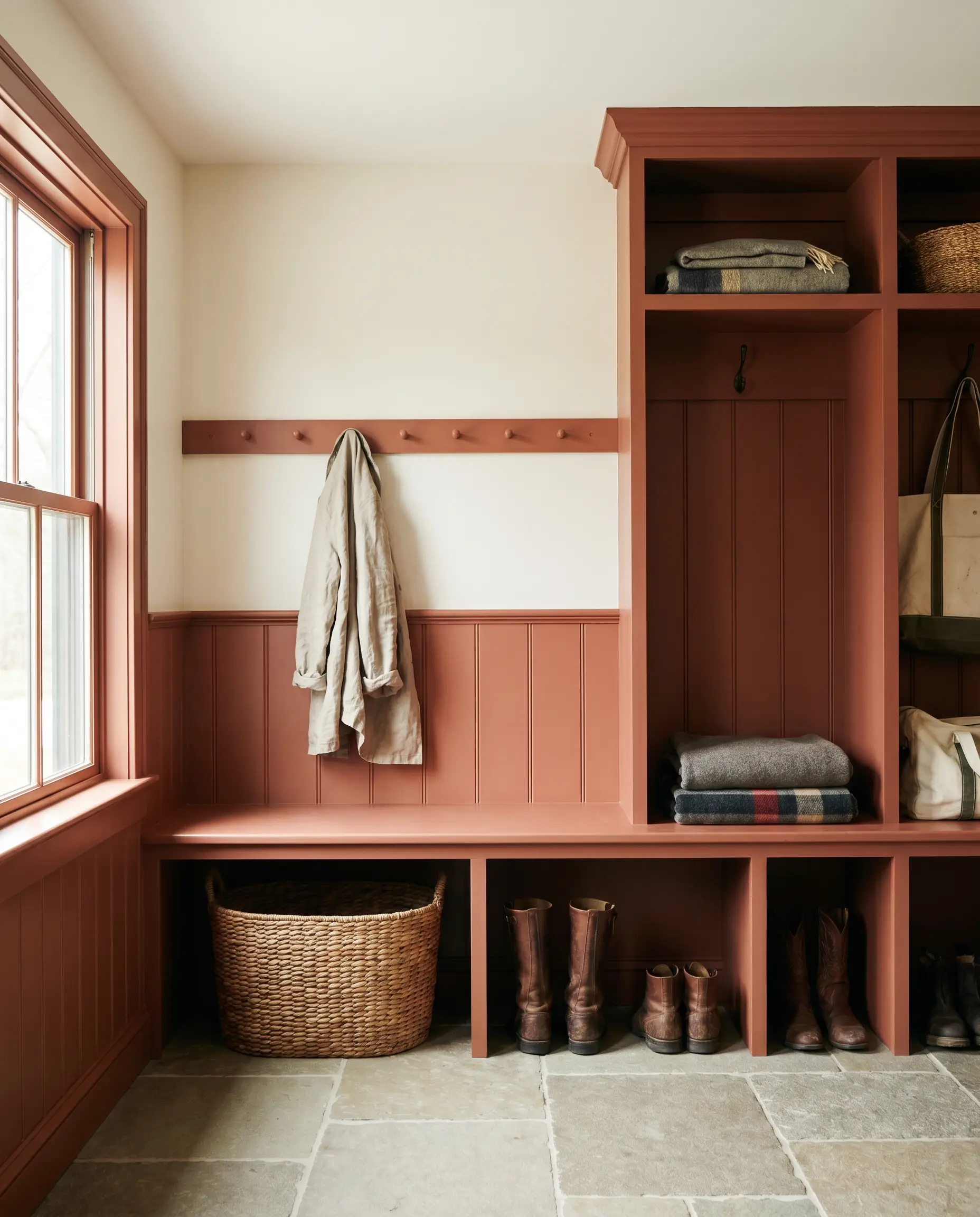
Transform a utilitarian entryway into a striking architectural moment by applying this shade to a continuous wainscoting wrap, including the built-in bench, cubbies, and peg rail. By keeping the upper half of the wall a soft, warm white, you ground the heavy traffic area in a durable, dirt-forgiving color while maintaining a bright, airy feeling overhead.
Restoring a Vintage Library Bookcase
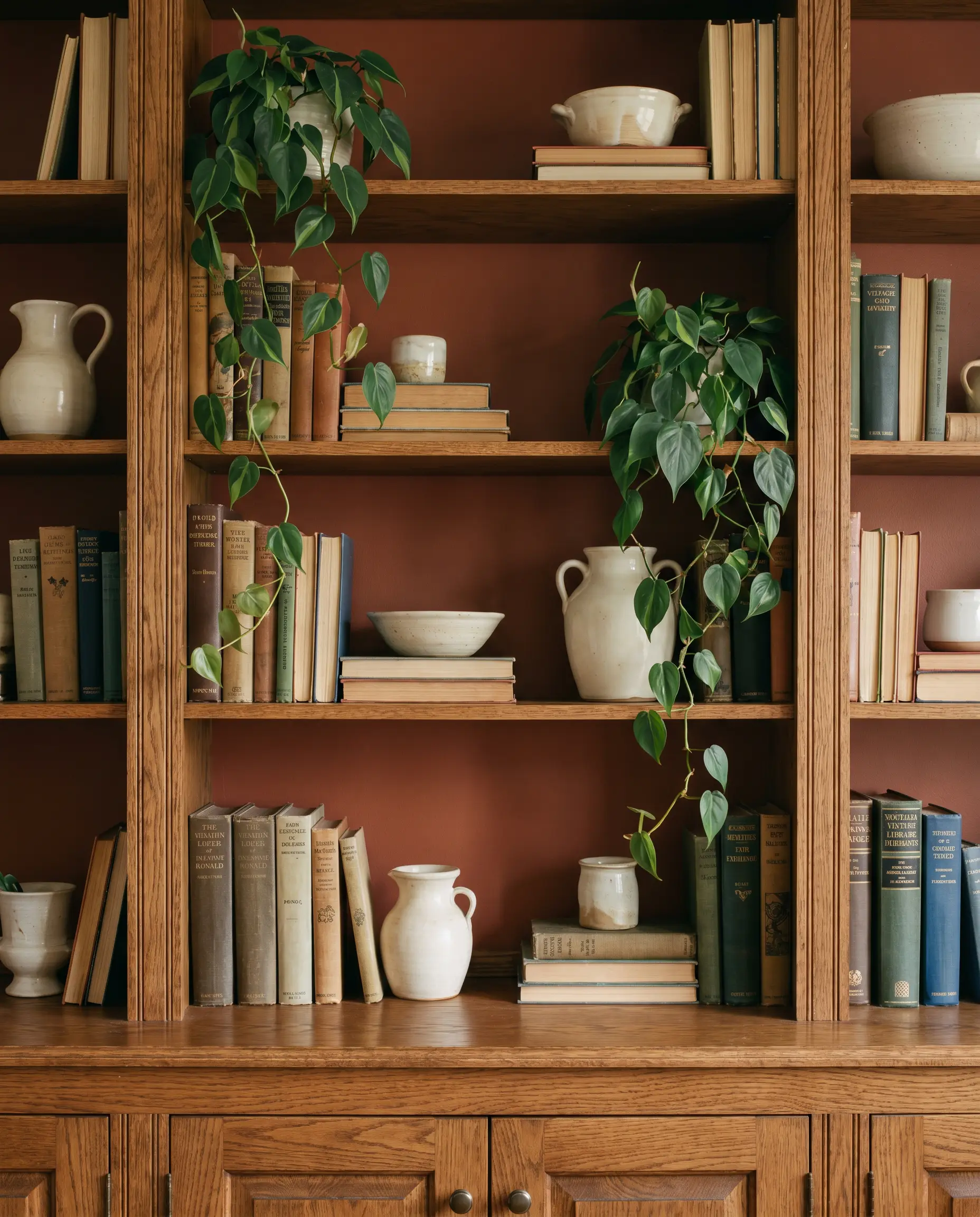
Breathe new life into a thrifted, heavy-timbered bookcase by finishing the interior back panels in this warm earth tone. The deep terracotta backdrop will instantly highlight the spines of vintage books, creamy ceramics, and trailing green plants, turning a standard piece of furniture into a highly intentional focal point for a home office.
A Holistic Wellness Studio Reception
For commercial spaces seeking a calming yet grounded atmosphere, this shade is brilliant for a custom reception desk or a textured plaster accent wall. Paired with tumbled travertine floors, sheer linen drapery, and abundant indirect cove lighting, the color immediately signals warmth, grounding the client the moment they walk through the door.
Curating the Palette: Best Pairings for Baked Terra Cotta
Because this shade carries such a heavy visual weight, it requires surrounding colors and textures that either provide a crisp, refreshing boundary or lean into its natural, organic warmth.
Trim & Baseboards
To keep the room feeling updated and intentional, avoid stark, hospital-white trim, which will create a jarring, unappealing boundary against the earthy walls.
If you are evaluating other options for your home’s architectural details, reviewing the best warm off-whites for earth tone walls will help you find the perfect subtle contrast.
Hardware, Wood & Material Pairings
Coordinating Colors
Designer Mood Boards
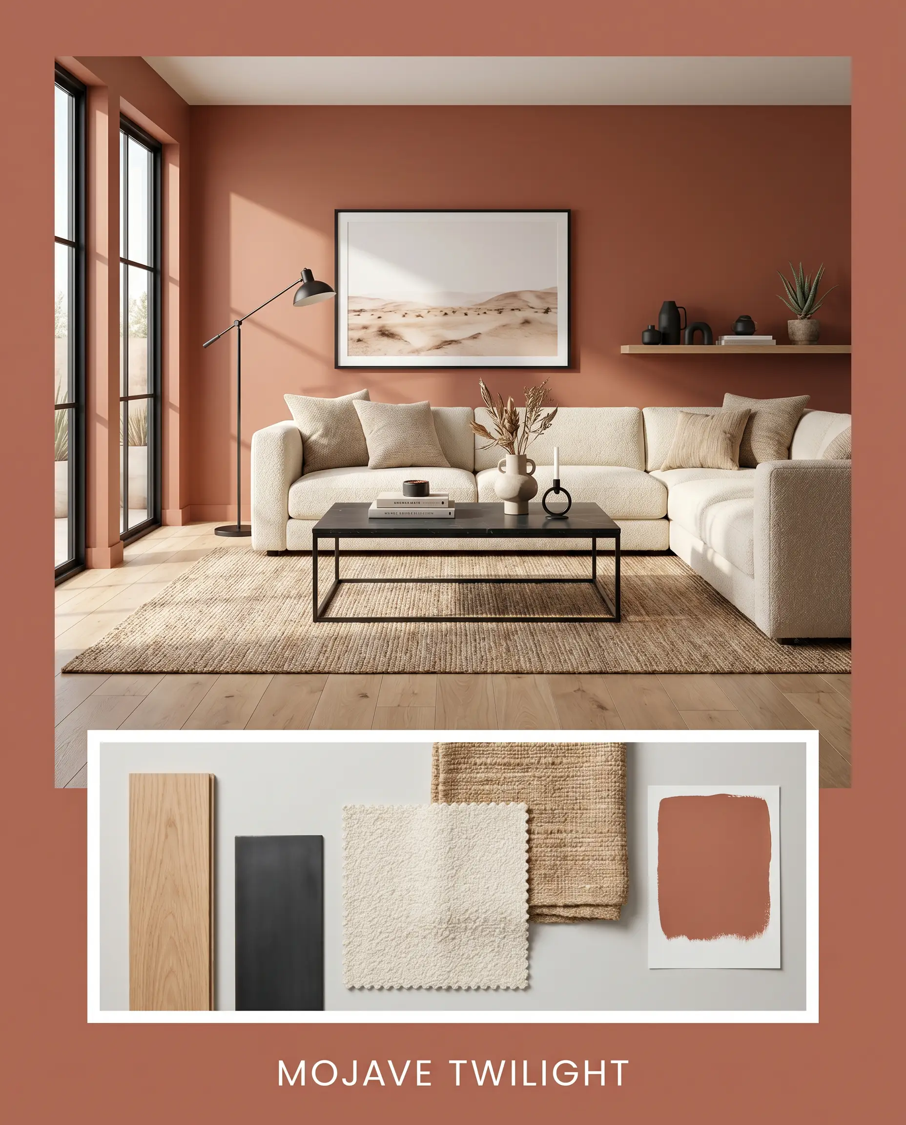
Mojave Twilight This palette leans heavily into a relaxed, Desert Modern aesthetic. The grounded warmth of BM 1202 is paired with light, natural white oak flooring and accents of matte black iron. Styling elements like a chunky, cream-colored bouclé sofa and a heavily textured jute rug soften the dark walls, creating an atmosphere that feels incredibly serene, warm, and effortlessly stylish.
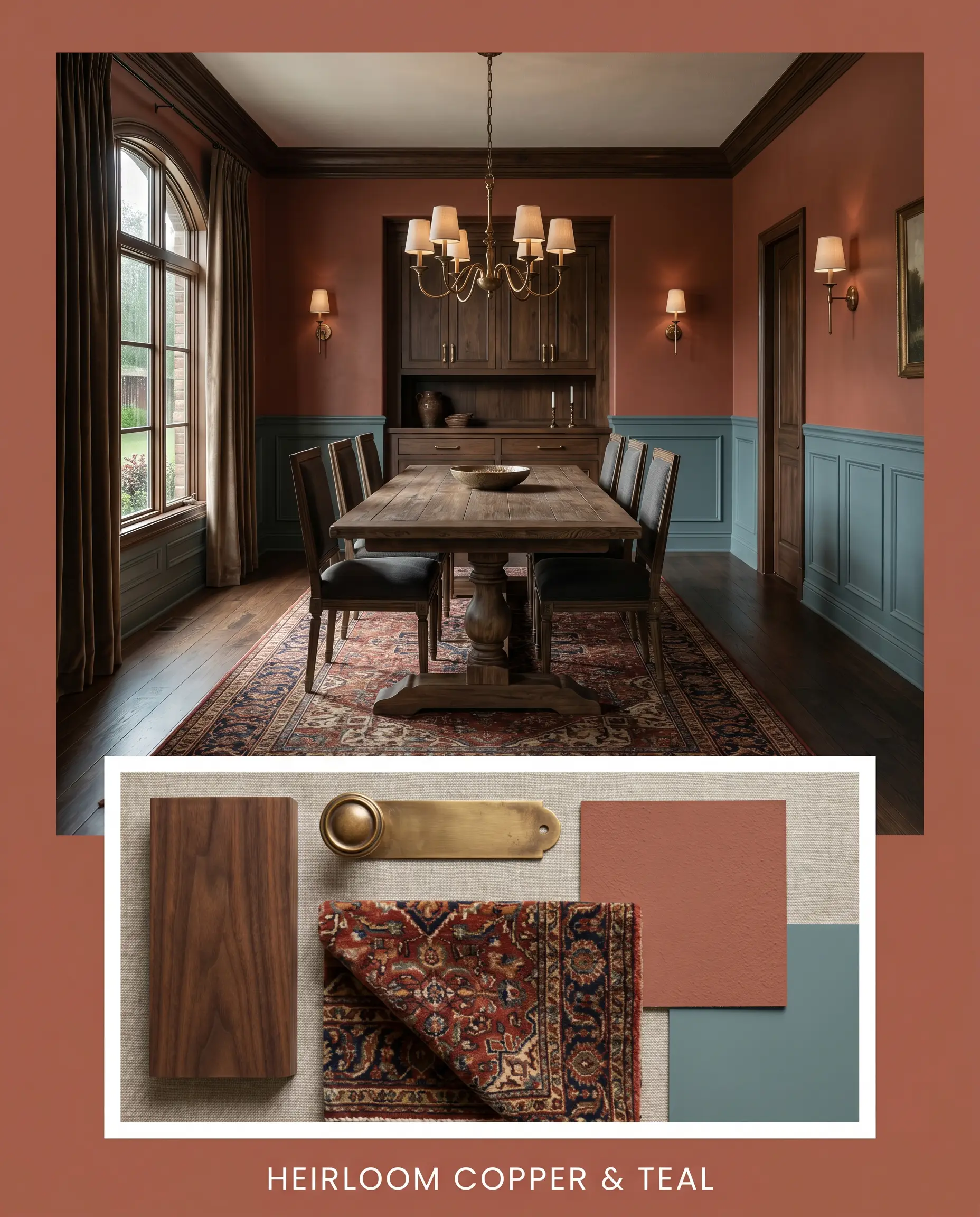
Heirloom Copper & Teal Focusing on a richer, more Traditional vibe, this board uses the terracotta shade as a backdrop for high-contrast, moody elegance. The introduction of Benjamin Moore Aegean Teal on adjoining doors or wainscoting creates a striking visual tension. Paired with aged unlacquered brass hardware, a vintage Persian runner featuring deep navy blues, and dark walnut accents, this combination feels historic, collected, and deeply comforting.
Head-to-Head Comparisons: The Terra Cotta Showdown
When narrowing down the perfect earthy shade, understanding how a color shifts against its closest rivals is the key to making a confident decision.
Benjamin Moore Baked Terra Cotta 1202 vs. Sherwin-Williams Cavern Clay SW 7701
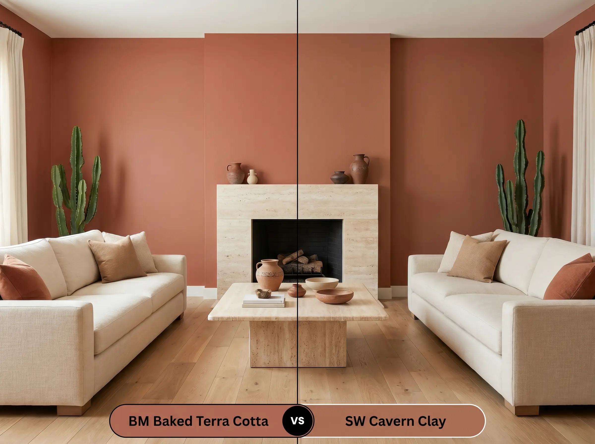
If you are deciding between these two, the choice comes down to vibrancy. Sherwin-Williams Cavern Clay has a notably higher LRV and significantly less brown in its base. If your room lacks natural light and you want a color that still feels distinctly like a bright, Southwestern clay, Cavern Clay is the better choice. However, if you want a moodier, more sophisticated rust that feels anchored and historic, BM 1202 provides that necessary shadowy depth.
Benjamin Moore Baked Terra Cotta 1202 vs. Farrow & Ball Picture Gallery Red No. 42
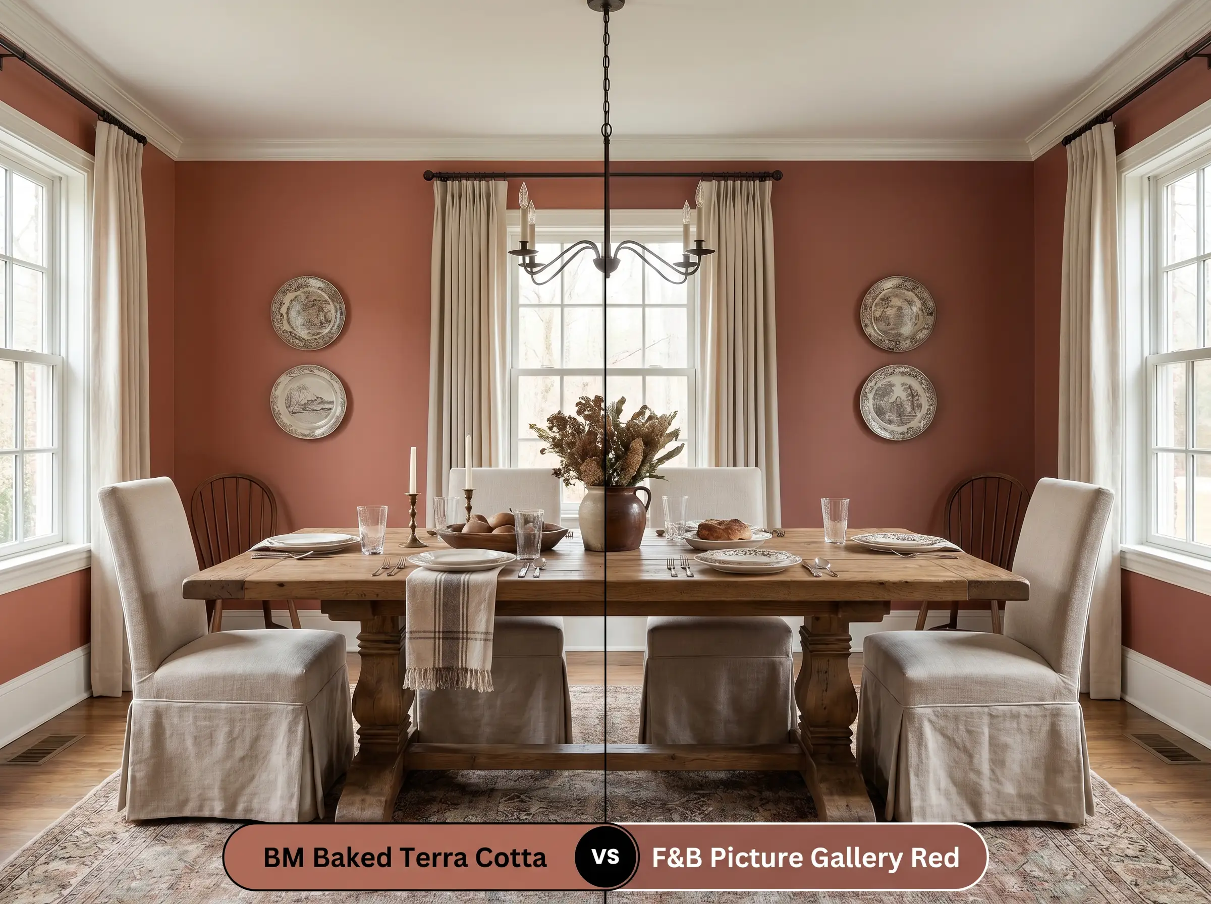
Farrow & Ball’s Picture Gallery Red leans much further into a true, historic brown-red, completely abandoning the orange notes found in the Benjamin Moore shade. If you are designing a highly traditional dining room and want a color that reads as a classic, aged brick, Picture Gallery Red is stunning. If you prefer a shade that feels slightly more relaxed, sun-baked, and Mediterranean, Baked Terra Cotta offers that crucial touch of orange warmth.
Exploring Similar Colors to BM 1202
Sometimes the architecture of a specific room demands just a slight tweak in depth or saturation to achieve the perfect glow.
Same-Brand Alternatives
Cross-Brand Matches
Practical Application: Painting with Baked Terra Cotta
Executing a dark, heavily pigmented color requires a strategic approach to materials and application to ensure a flawless, premium finish.
The Dynamic Sheen Guide
Primer Strategy
You cannot skip primer with a color this deep. Applying BM 1202 directly over builder-grade white walls will result in a streaky, uneven finish. You must use a high-quality, gray-tinted primer. The gray base stops the bright white from glowing through the paint film, allowing the rich brown and orange pigments to achieve true opacity much faster.
Coverage & Success Tips
Even with a tinted primer, expect to apply a minimum of two generous coats to achieve full, even coverage. Thanks to Benjamin Moore’s Gennex Color Technology, the color will lay down beautifully, but you must maintain a “wet edge” while rolling. If you let a section dry and then roll over it, you risk “flashing”—visible, shiny roller marks that ruin the smooth, velvet-like illusion of the dark walls.
Deep, light-absorbing colors are notoriously difficult to touch up later because the fresh paint often dries to a slightly different sheen. Always save a small amount of your original paint, and when touching up a scuff, lightly dab the paint on with a sponge rather than a brush to mimic the original roller texture.
Hackrea Design Secret (Touch-Ups)
Frequently Asked Questions
Because both the paint and cherry wood share intense red and orange undertones, pairing them together can make the room feel overwhelmingly warm and visually heavy. To make this work, you must break up the visual plane with a large, cool-toned area rug (like a faded vintage blue or a crisp cream) to give the eye a place to rest.
Yes, but you must manage your expectations regarding its vibrancy. In deep shade, the lack of direct sunlight will cause the brown undertones to dominate, making the stucco look like a deeply muted, historic rust rather than a bright Mediterranean clay.
Instead of feeling claustrophobic, wrapping a windowless room in this deep, warm shade actually creates a sense of profound comfort and enclosure. The earthy tones mimic natural elements, immediately grounding the user and making the small space feel like a deliberate, luxurious retreat rather than a forgotten closet.
Absolutely. The stark contrast between a bright white wall and this deep, brown-based red will cause the white to bleed through, requiring three or four coats of expensive paint to hide. A gray-tinted primer neutralizes the wall, allowing the paint to show its true depth in just two coats.
Final Verdict & Expert Warnings
Benjamin Moore Baked Terra Cotta 1202 is a masterful, grounding anchor for homeowners who want to inject their spaces with sophisticated, earthy warmth. It thrives in dining rooms, curated kitchens, and intimate living spaces where its medium-dark LRV can wrap the room in a comforting, sun-baked glow. This color is perfect for those who love the High/Low mix, as its rich, historic depth provides a premium backdrop that makes even standard, everyday furnishings look incredibly intentional and expensive.
However, this rich clay is not universally forgiving, and pairing it with the wrong fixed elements will create a jarring visual conflict. You must avoid using this color in homes dominated by cool-toned, gray luxury vinyl plank flooring, as the icy gray will aggressively clash with the warm brown and orange base, making the floors look cheap and the walls look muddy. Similarly, skip pairing this paint with bright, polished chrome hardware or stark, blue-toned white trim; these icy elements will fight the paint’s natural warmth, breaking the cozy, cohesive illusion and leaving the space feeling disjointed and poorly planned.
Expert Warning (Clash Avoidance)
When supported by warm woods, creamy off-whites, and living metals, this shade is an absolute standout.