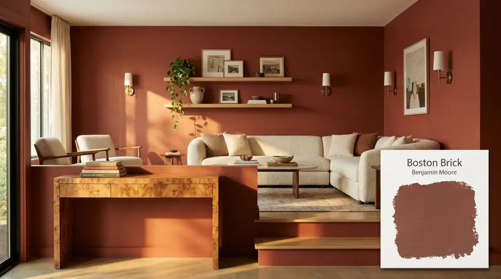
Benjamin Moore Boston Brick (2092-30) is a deeply saturated, earthy red with strong brown and terracotta undertones. Boasting an LRV of 11.54, this warm, moody hue absorbs significant light, making it an exceptional architectural finish for dramatic dining rooms, historic exteriors, or cozy libraries.
Will Boston Brick clash with your room?
Paint Technical Profile
| Color ID / SKU | 2092-30 |
| HEX Code | #864B40 |
| Light Reflectance (LRV) | 11.54 |
| Use | Interior, Exterior |
| Best Exposures | North or West |
| Best For | Dining rooms, libraries, exterior accents, front doors |
Benjamin Moore Boston Brick: The Earthy Red That Redefines Modern Warmth
Some colors simply refuse to sit flat on a wall. Benjamin Moore Boston Brick is one of those rare, transformative shades that feels less like a liquid coating and more like a tangible building material. When applied, it immediately creates the illusion of texture, turning standard drywall into a surface that feels remarkably rich and tactile.
This is not a loud, primary hue demanding attention from across the room. Instead, this earthy red operates as a quiet, substantial foundation that wraps a space in undeniable comfort. It thrives on the tension between rustic familiarity and curated sophistication.
Whether you are updating a suburban facade or reimagining a lackluster interior, Boston Brick establishes an immediate sense of permanence. It acts as an architectural finish in its own right, giving standard rooms a custom, intentional atmosphere. By mastering how this color interacts with light and surrounding materials, you can completely alter the emotional resonance of your home.
Benjamin Moore Boston Brick: Undertones & LRV
If you are wondering whether this color reads warm or cool, the answer is unapologetically warm. Benjamin Moore Boston Brick is entirely devoid of the icy blue or purple flashes that often complicate traditional reds. Instead, it relies on a deeply rooted, baked-clay color structure to generate its inviting temperature.
To truly understand how this shade will behave in your home, we have to look closely at its chromatic profile. It is built upon a very specific blend of pigments that keep it grounded.
At an LRV of 11.54, Boston Brick is a natural light-absorber. Rather than bouncing illumination around the room, it pulls the walls inward, creating a highly enveloping, intimate atmosphere. You must pair this low LRV with strategic lighting to ensure the room feels cozy rather than overly shadowed.
Lighting Dynamics: How Boston Brick Shifts in Your Space
Because of its complex brown and terracotta makeup, this paint is highly reactive to the shifting temperature of the sun. The direction your windows face will completely alter which undertone takes center stage.
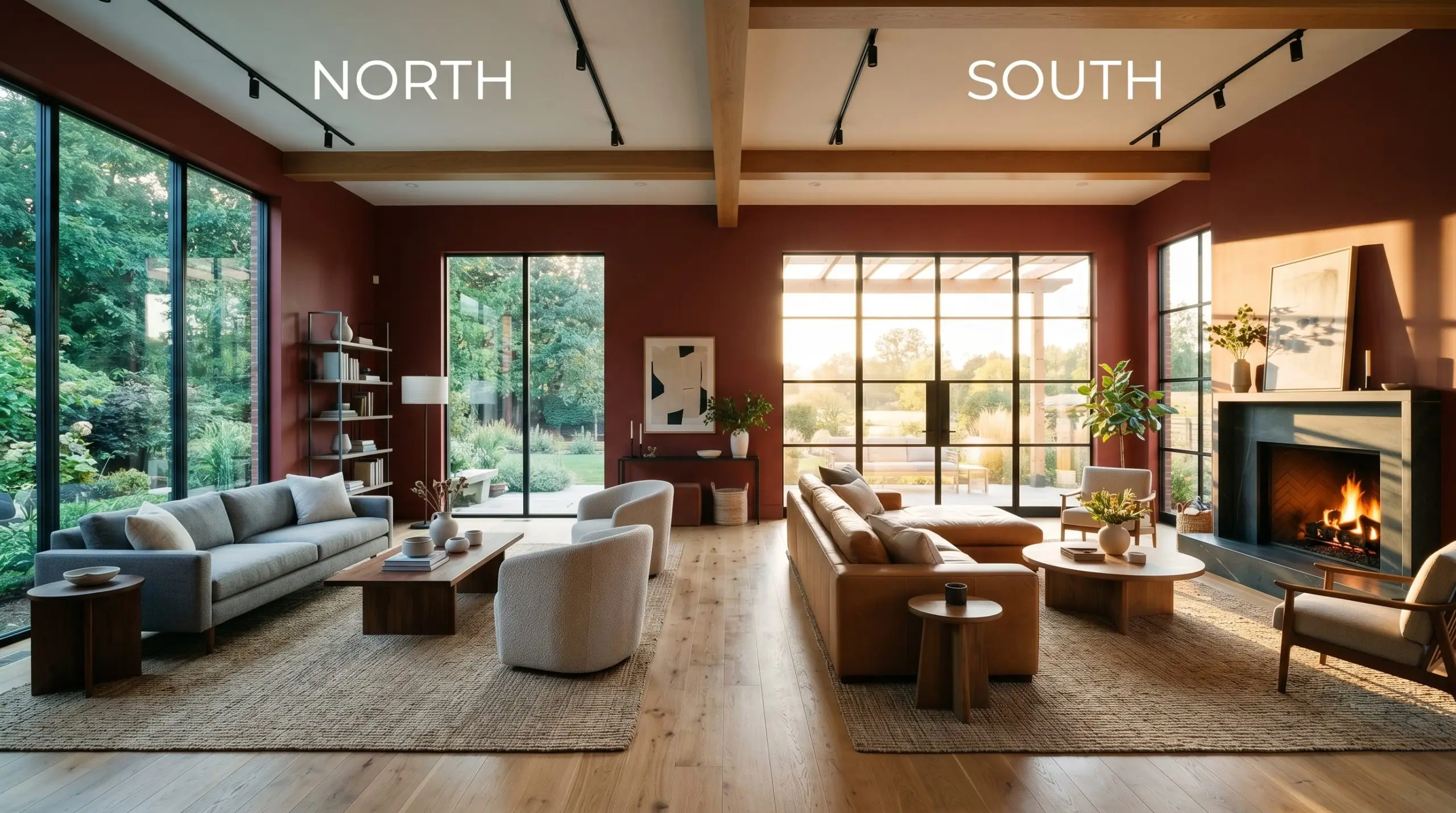
If you are using this color in a room with limited natural windows, avoid relying solely on overhead recessed lighting. Layer your light sources by combining brass wall sconces and ceramic table lamps to wash the walls in a soft, multidimensional glow, highlighting the paint’s inherent richness.
Hackrea Lighting Secret
Popular Applications for Boston Brick
The true brilliance of this color lies in its adaptability. While it certainly has the pedigree to support classic architecture, it is equally capable of rooting highly modern, eclectic spaces. Here is how to harness its warmth across different areas of your home.
Formal Dining Rooms
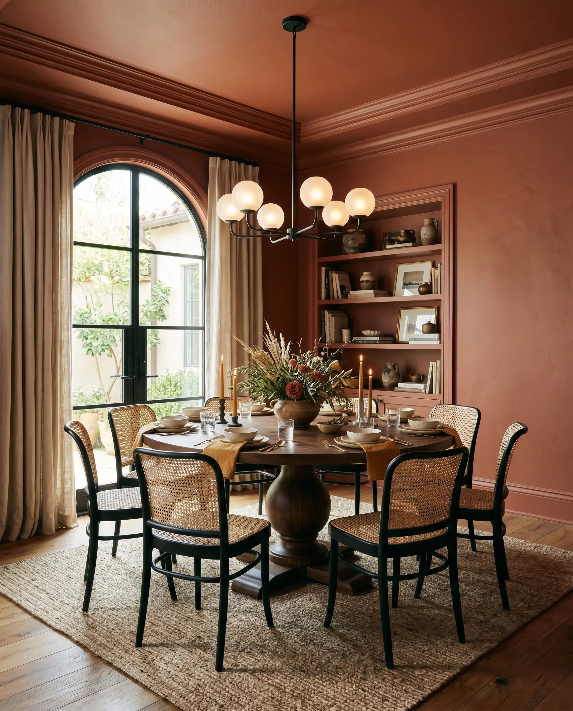
For young professionals who love hosting intimate dinner parties, this shade offers a brilliant alternative to the standard neutral dining space. Instead of breaking up the walls with traditional white trim, consider color-drenching the entire room—painting the walls, baseboards, and crown molding in the exact same finish. This seamless application modernizes the hue, turning the room into a continuous, immersive wrap of color.
To balance the saturated walls, introduce contrasting, tactile materials. A sleek pedestal table paired with cane-backed dining chairs adds necessary visual breathing room. Finish the space with a striking blackened steel chandelier and soft washed linen napkins to create an atmosphere that feels both curated and effortlessly relaxed.
Home Libraries and Studies
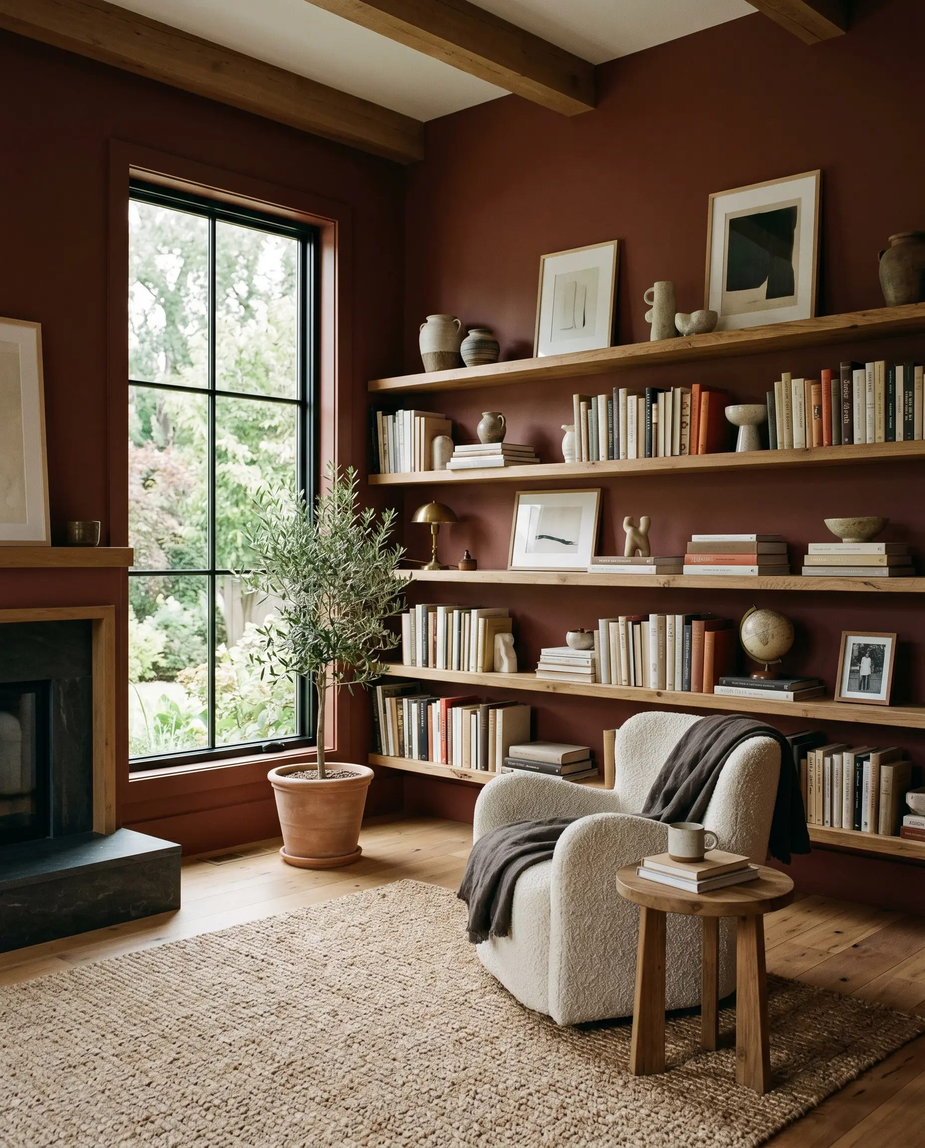
If you work from home, a dedicated study painted in this shade provides immense psychological comfort without feeling sleepy. While it is tempting to lean into a predictable, traditional library aesthetic, you can easily push this color toward an organic modern vibe. The trick is to pair the painted walls with plenty of pale, natural textures.
Install floating reclaimed oak shelves against the rich red backdrop to create immediate, striking contrast. Style the room with a nubby bouclé accent chair and an oversized jute rug to soften the room’s visual weight. The resulting space feels incredibly sophisticated, offering a calm, focused environment for daily creative work.
Exterior Brick Facades and Front Doors
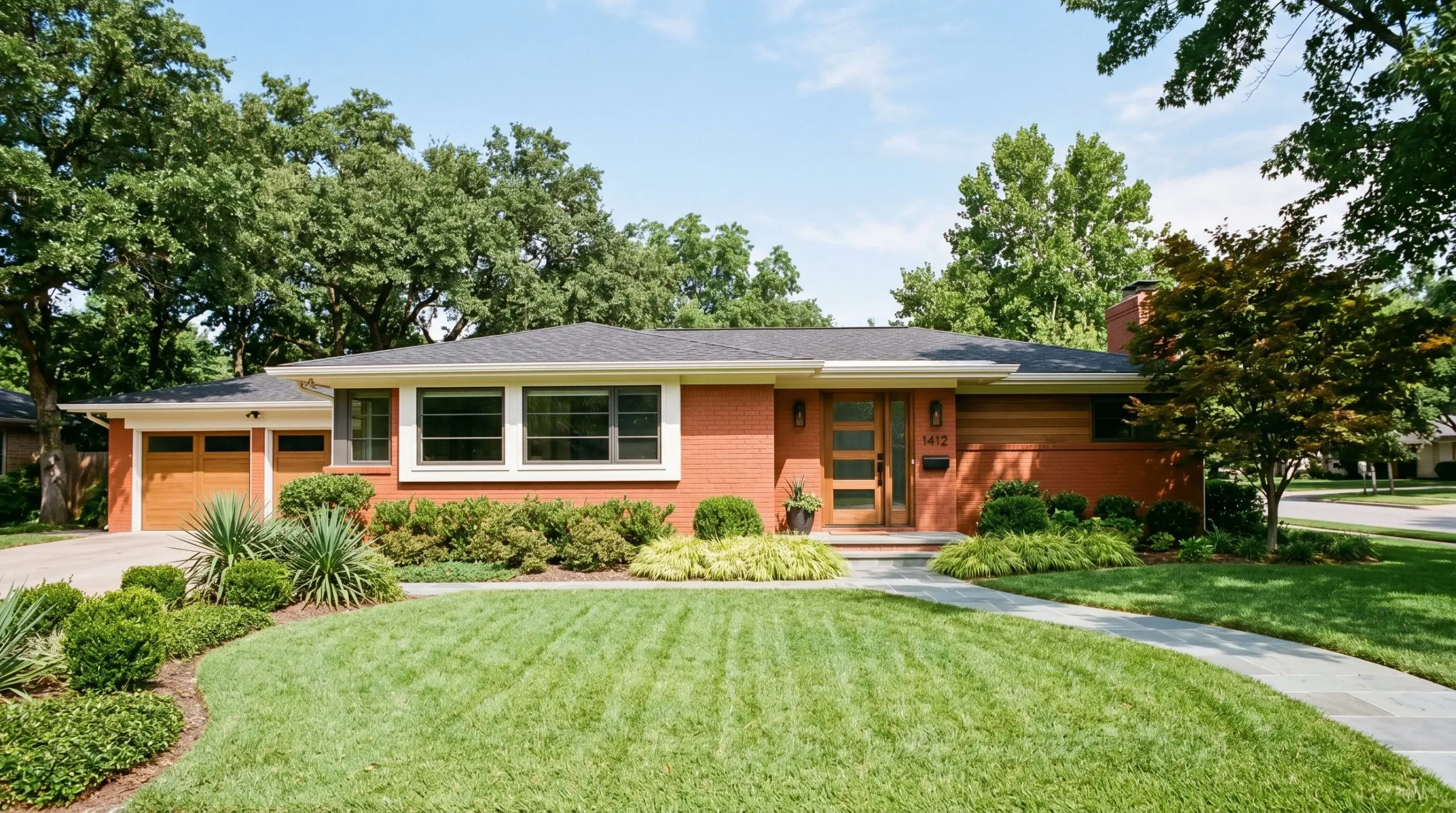
This hue is an absolute classic for historic exteriors, seamlessly blending with traditional masonry and mature landscaping. However, it is also a phenomenal tool for suburban families looking to update a mid-century ranch or a transitional modern farmhouse. When applied to an exterior facade, the sheer volume of direct sunlight will naturally lighten the color, bringing those vibrant terracotta notes to life.
If you are using it on a front door to create a welcoming focal point, pair it with crisp, warm cream exterior trim to make the red truly pop. Elevate the entry with unlacquered brass house numbers and oversized matte black planters.
Direct sunlight washes out paint colors significantly. What looks like a rich, earthy red on an interior swatch may read as a much brighter, faded clay on a south-facing exterior wall. Always test a large, two-foot sample directly on your exterior masonry and observe it at high noon before committing to the entire house.
Exterior Application Warning
Powder Rooms (Above Wainscoting)
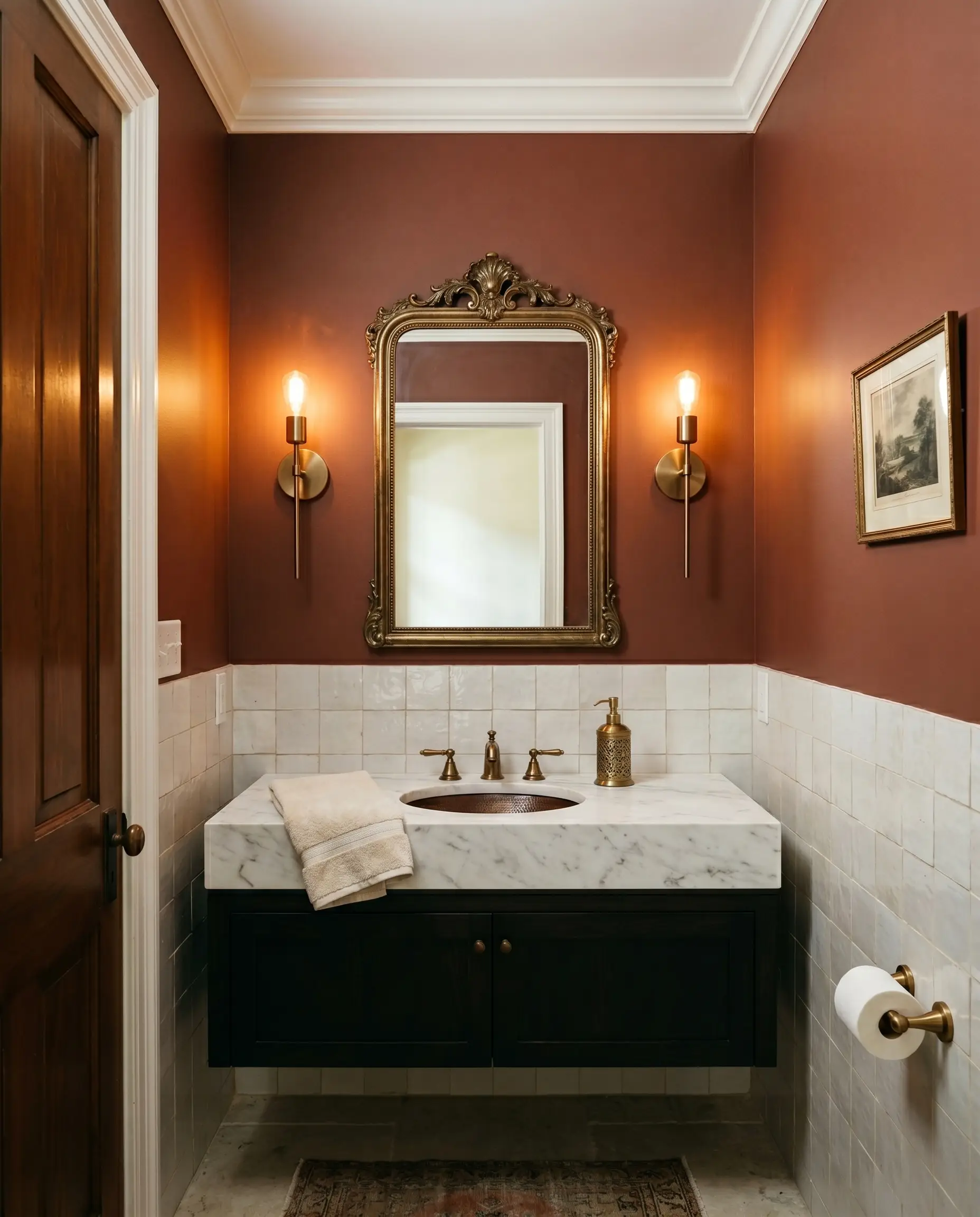
Powder rooms are the perfect testing ground for bolder colors, and applying this shade above wainscoting is a brilliant weekend design project. To keep the space from feeling dated, skip the standard builder-grade beadboard. Instead, install a lower half of glossy, off-white zellige tiles, allowing the organic, handmade texture of the tile to contrast beautifully with the smooth, painted drywall above.
The earthy red upper walls will instantly warm up the small footprint, making the ceiling feel intentionally cozy. Incorporate a honed marble vanity top and brushed bronze sconces flanking an antique mirror. This high/low mix of standard drywall updates and premium hardware creates a jewel-box effect that feels incredibly high-end.
Styling Benjamin Moore Boston Brick: Material Pairings & Palettes
Because of its dense pigmentation, this shade requires intentional contrast to prevent it from absorbing all the energy in a room. It thrives when placed next to elements that either bounce light back into the space or offer a crisp, cool counterpoint to its inherent heat.
Selecting the Right Trim
Crisp, stark whites will visually fight against this earthy red, creating a harsh and uninviting boundary. Instead, you need a trim color that carries a touch of softness to bridge the transition seamlessly. Sherwin-Williams Alabaster SW 7008 is an exceptional choice, as its faint creamy undertone harmonizes with the baked-clay warmth without looking yellow.
If you prefer a slightly more luminous, historical glow, Farrow & Ball Pointing No. 2003 offers a delicate, warm edge. It beautifully frames the rich walls while maintaining a serene, traditional elegance.
Material Pairings
To balance the visual density of this shade, introduce materials that manipulate light and texture. Fluted glass is a brilliant, tactile addition, particularly in cabinetry or lighting, as it refracts light and breaks up the solidity of the dark walls. For an aspirational focal point, incorporate burl wood furniture into the space. Its swirling, organic grain speaks directly to the mahogany cast of the paint while adding incredible visual interest.
To ground the warmth, rely on a cool, matte surface like soapstone for countertops or fireplace surrounds. Finally, finish the room with brushed bronze hardware. This metal subtly pulls the hidden terracotta notes forward while maintaining a softly muted, sophisticated profile.
A Curated Supporting Palette
Modernist Clay
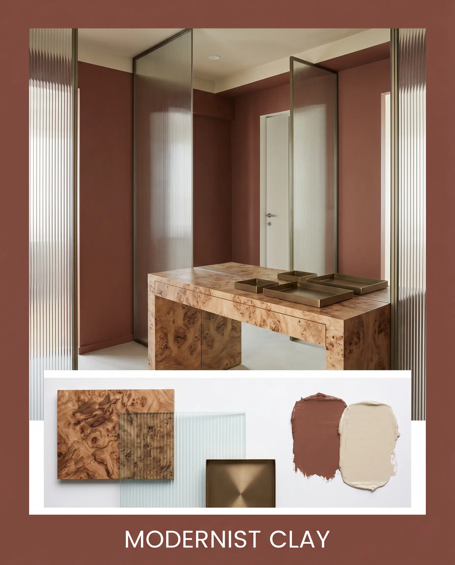
This aesthetic strips away traditional clutter to focus entirely on sculptural shapes and raw textures. By pairing the earthy red walls with sleek fluted glass partitions and a striking burl wood console, the energy feels both grounded and highly intentional. A subtle ceiling accent in Manchester Tan softens the overhead light, while brushed bronze geometric trays add a quiet, metallic pulse to the serene atmosphere.
The Collected Conservatory
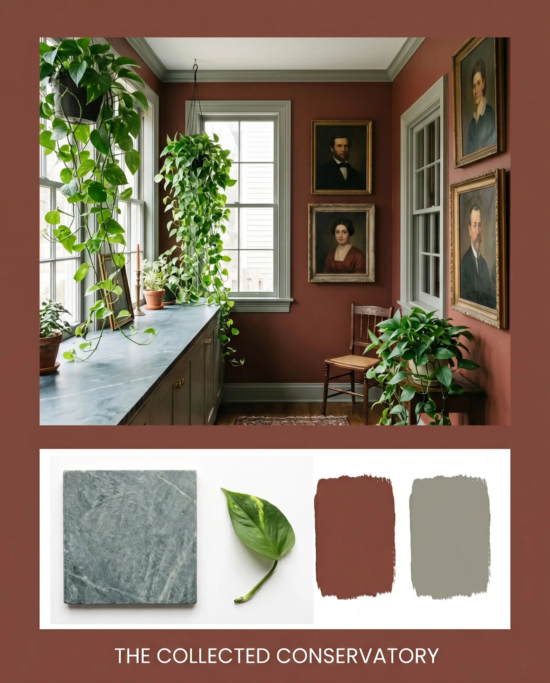
Rooted in botanical inspiration, this vibe feels incredibly lush, restorative, and slightly mysterious. The warmth of the baked-clay walls is beautifully offset by trim painted in Evergreen Fog, creating a natural, leafy boundary. Layering a cool soapstone surface with oversized trailing pothos and vintage oil portraits establishes a deeply immersive, lived-in mood that invites you to linger.
How Benjamin Moore Boston Brick Compares to Rival Hues
Choosing the right dark tone often comes down to the specific lighting conditions of your home. If your space lacks natural light or if you are dealing with conflicting permanent finishes, you may need a shade with a slightly different foundational structure.
Benjamin Moore Boston Brick vs. Benjamin Moore Caliente AF-290
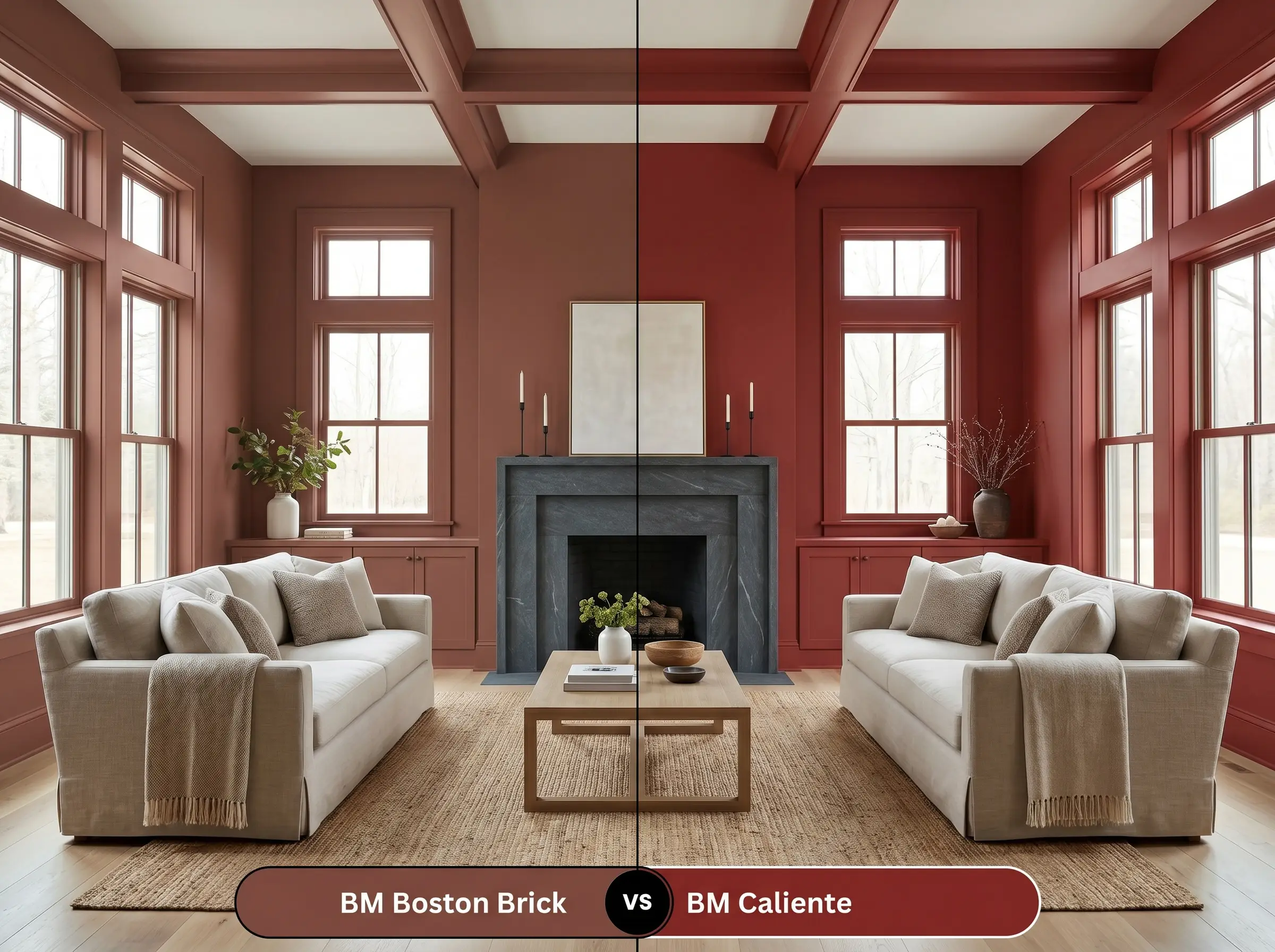
Caliente is a significantly more vibrant, energetic red with a much higher light reflectance. If you want a bold, undeniable statement color that commands attention, Caliente is the clear winner. However, if you are looking for a muted, enveloping shade that acts more like a neutral backdrop, stick with the grounded brown base of the Boston Brick formulation.
Benjamin Moore Boston Brick vs. Sherwin-Williams Rookwood Red SW 2802
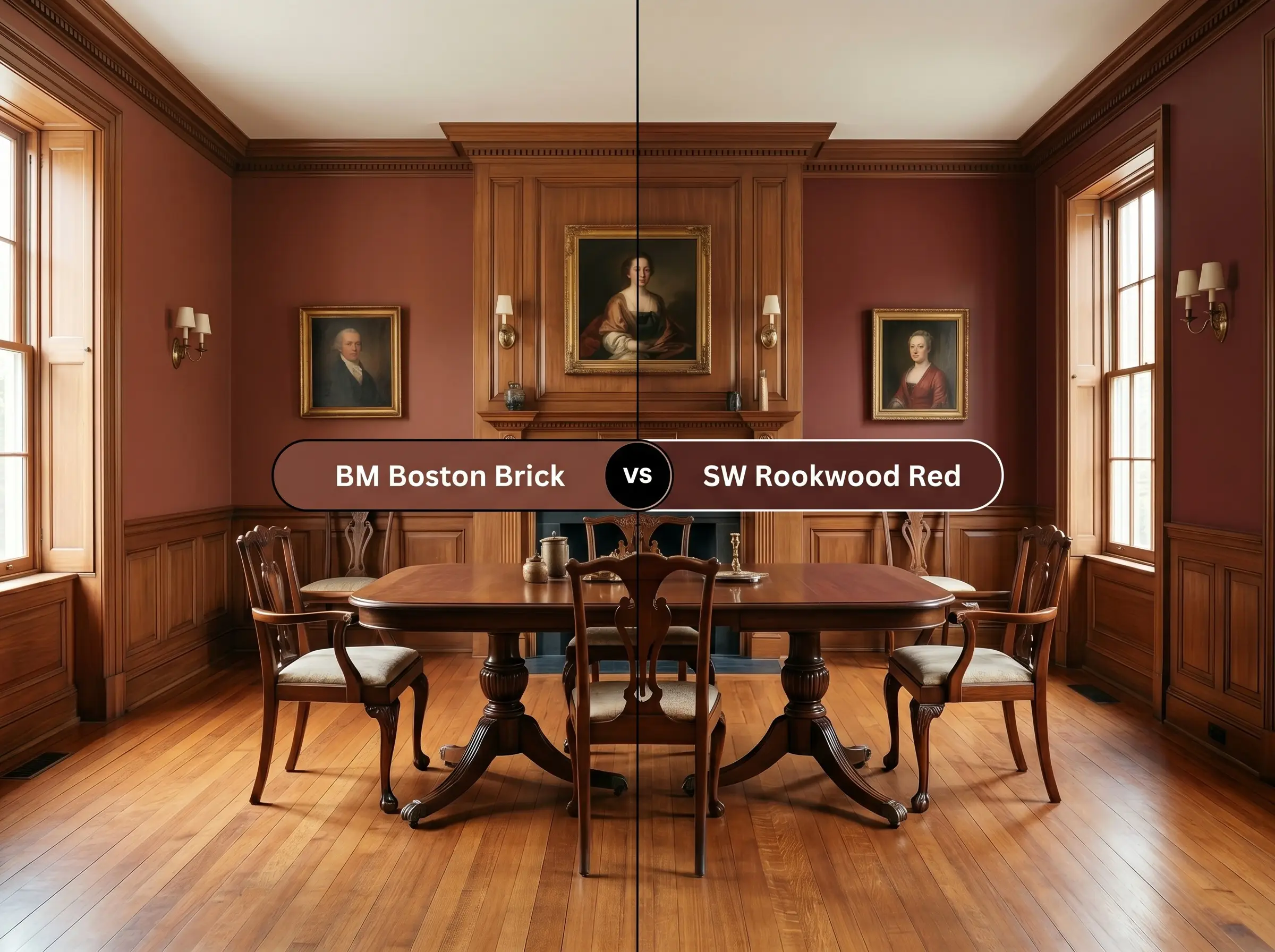
These two colors share a similar historical pedigree, but their underlying temperatures diverge. Rookwood Red carries a distinctly cooler, almost purplish undertone that becomes very apparent in north-facing light. If your room features warm wood floors or brass accents, Boston Brick is the safer choice, as its terracotta notes will harmonize rather than clash with those golden elements.
Benjamin Moore Boston Brick vs. Farrow & Ball Picture Gallery Red No. 42
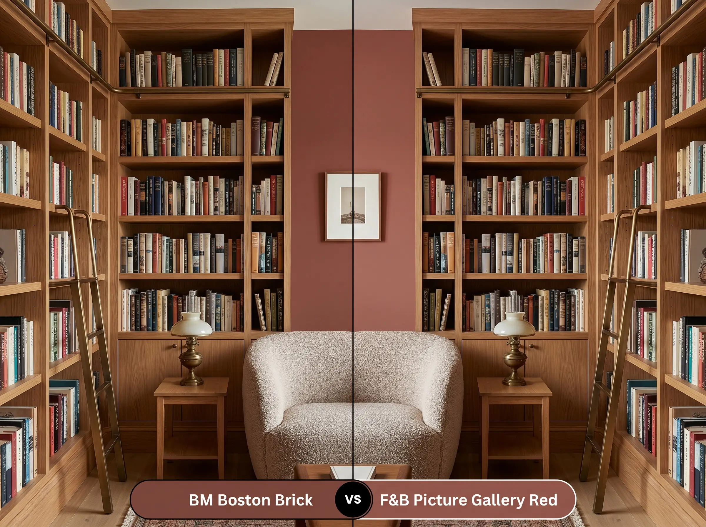
Picture Gallery Red is a softer, slightly more faded hue that feels incredibly relaxed and pastoral. If you are aiming for a gentle, worn-in aesthetic that feels like a sun-faded tapestry, the Farrow & Ball option excels. Conversely, if you need a shade with substantial visual presence to anchor a large architectural feature, the deeper light-absorption of the Benjamin Moore option provides the necessary gravity.
Alternative Earthy Reds to Consider
Sometimes a color is almost perfect, but you need a minor adjustment in depth or a match from a different manufacturer. Here are the closest alternatives that maintain a similar restorative energy.
Closest Benjamin Moore Alternatives
Cross-Brand Color Matches
Executing Your Paint Project Flawlessly
Transitioning from color theory to application requires a shift in strategy. Darker, heavily pigmented shades demand careful preparation to ensure the final result looks professional and intentional.
Selecting the Right Sheen
Primer and Coverage Strategy
A standard white primer will aggressively fight against the depth of this earthy red, leading to a frustrating painting experience. You must use a high-quality, gray-tinted primer to establish a dark foundation before applying your topcoats.
Even with a tinted primer, expect to apply at least two generous coats to achieve full opacity. Work in small sections and maintain a wet edge on your roller to prevent flashing, as dark matte finishes will easily highlight uneven overlaps once dry.
Common Questions About This Shade
Because it is built on a distinctly warm, brown-leaning foundation, it is highly resistant to turning purple. In the cool morning light of an east-facing exposure, it will actually read as a very grounded, historic brick tone rather than pulling any icy berry notes.
Pairing this dark shade with walnut creates a deeply immersive, monochromatic effect. To prevent the windowless room from feeling overly shadowed, you must introduce strategic contrast through polished brass lighting or a light, textured rug to visually lift the space.
Applying this dark, light-absorbing hue to a soaring ceiling is a brilliant architectural trick. It visually pulls the ceiling downward, transforming a cold, echoing room into a much more intimate and grounded dining experience.
Instead of clashing, these elements share a similar earthy DNA that beautifully harmonizes. The paint actually acts as an anchoring force, tying the rustic warmth of the terracotta floors into the rest of the room’s design.
The Ultimate Verdict on Boston Brick
Benjamin Moore Boston Brick is an exceptional choice for homeowners who want to inject their spaces with foundational, unapologetic warmth. It excels in environments where its rich, tactile nature can be celebrated, acting as a stunning backdrop for organic textures and metallic accents. Whether you are wrapping a cozy study in color or updating a traditional exterior, this shade delivers a sophisticated, restorative energy that feels instantly permanent.
While this color is incredibly inviting, it is absolutely not the right choice for spaces dominated by stark, cool-toned permanent fixtures. If your home features cool Carrera marble floors or bright white vinyl windows, the baked-clay warmth of the paint will aggressively fight against those icy elements, making the walls look muddy and the finishes look sterile. In those specific scenarios, you are much better off selecting a deeply saturated charcoal or a cool navy to complement your existing architecture.
Hackrea Design Secret (Knowing When to Walk Away)
Real-World Inspiration Be the first to upload a real photo of Boston Brick!
No Photos Yet
Includes +20 First Upload Bonus!
Real Experiences
Insights from people who have used Boston Brick.No reviews yet
Be the first to share your experience with Boston Brick.
Earn 15 points instantly!