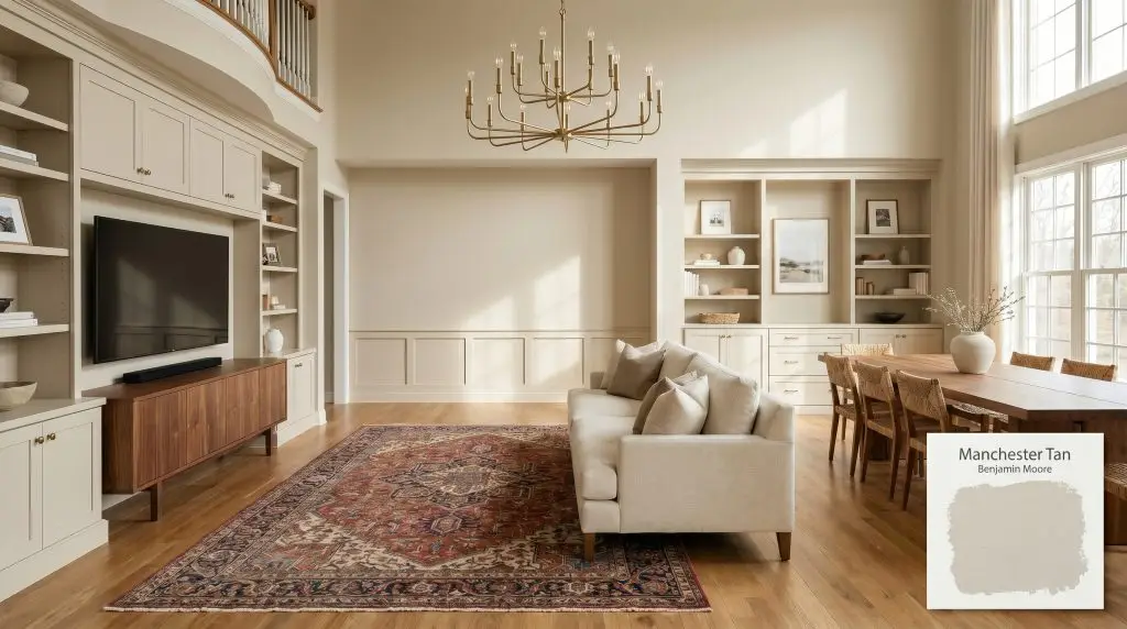
Manchester Tan HC-81
Benjamin MooreBenjamin Moore Manchester Tan (HC-81) is a warm, sophisticated beige with subtle khaki and yellow-green undertones. Boasting an LRV of 63.24, it acts as a highly versatile, medium-light neutral that brings timeless elegance to both interior spaces and traditional exteriors without washing out.
Paint Technical Profile
| Color ID / SKU | HC-81 |
| HEX Code | #DBD2BC |
| Light Reflectance (LRV) | 63.24 |
| Use | Interior, Exterior |
| Best Exposures | South, East |
| Best For | Living rooms, hallways, traditional exteriors, open-concept spaces |
Benjamin Moore Manchester Tan: Grounding Expansive Interiors with Earthy Warmth
There is a specific kind of architectural anxiety that comes with updating a cavernous, early-2000s suburban floor plan where the drywall seems to stretch on forever. Finding a color that wraps these vast, undefined perimeters in an inviting embrace without turning the home into a yellow-tinted time capsule is a delicate balancing act. Benjamin Moore Manchester Tan (HC-81) acts as the ultimate grounding mechanism for these challenging layouts.
Part of the brand’s revered historical collection, this warm beige paint brings an immediate sense of curated history to otherwise stark environments. It gently softens harsh angles and fills empty corners with a quiet, confident glow.
Undertones & LRV of Benjamin Moore Manchester Tan
Homeowners constantly ask if this celebrated neutral leans warm or cool on the wall. The definitive answer is that Manchester Tan is undeniably warm, but it carries a brilliant secret weapon that keeps it incredibly sophisticated.
With an LRV of 63.24, this medium-light neutral reflects plenty of daylight while maintaining enough pigment density to hold its ground against crisp white ceilings. It provides a beautiful, soft contrast that defines architectural boundaries without visually shrinking the room.
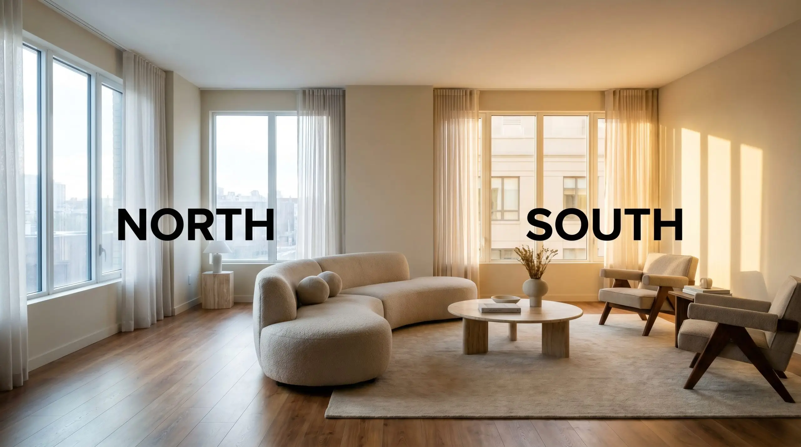
Lighting Effects & The Chameleon Factor
Because of its nuanced pigment profile, this earthy tone is highly reactive to the shifting path of the sun. You must test this color thoroughly, as the wrong exposure can accidentally amplify its hidden green notes, leaving the walls feeling slightly murky rather than luminous.
Popular Room Applications
This versatile pigment demands an environment where its subtle warmth can anchor the surrounding elements. Whether it is wrapping a cozy interior or refreshing a weathered facade, it brings an undeniable sense of cohesion to the property.
Open-Concept Living Areas
It provides a stunning, continuous backdrop that effortlessly connects adjoining rooms without overwhelming the senses. Pair it with an oversized, tailored linen sofa and rich walnut media consoles to create an elevated, transitional aesthetic.
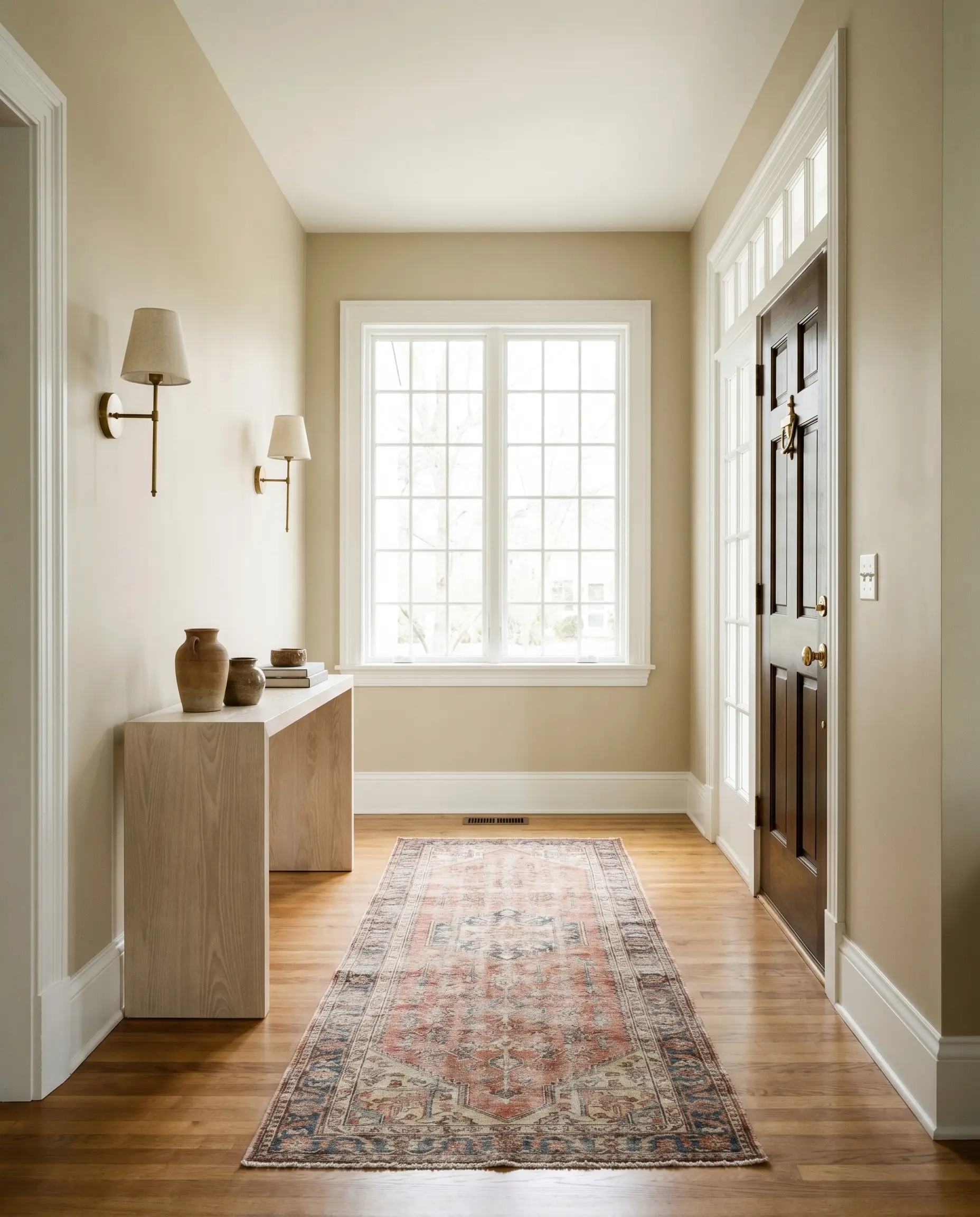
Traditional Entryways & Hallways
This shade acts as a welcoming embrace the moment you step through the front door. It looks brilliant alongside aged brass sconces and vintage Persian runners, offering a timeless first impression.
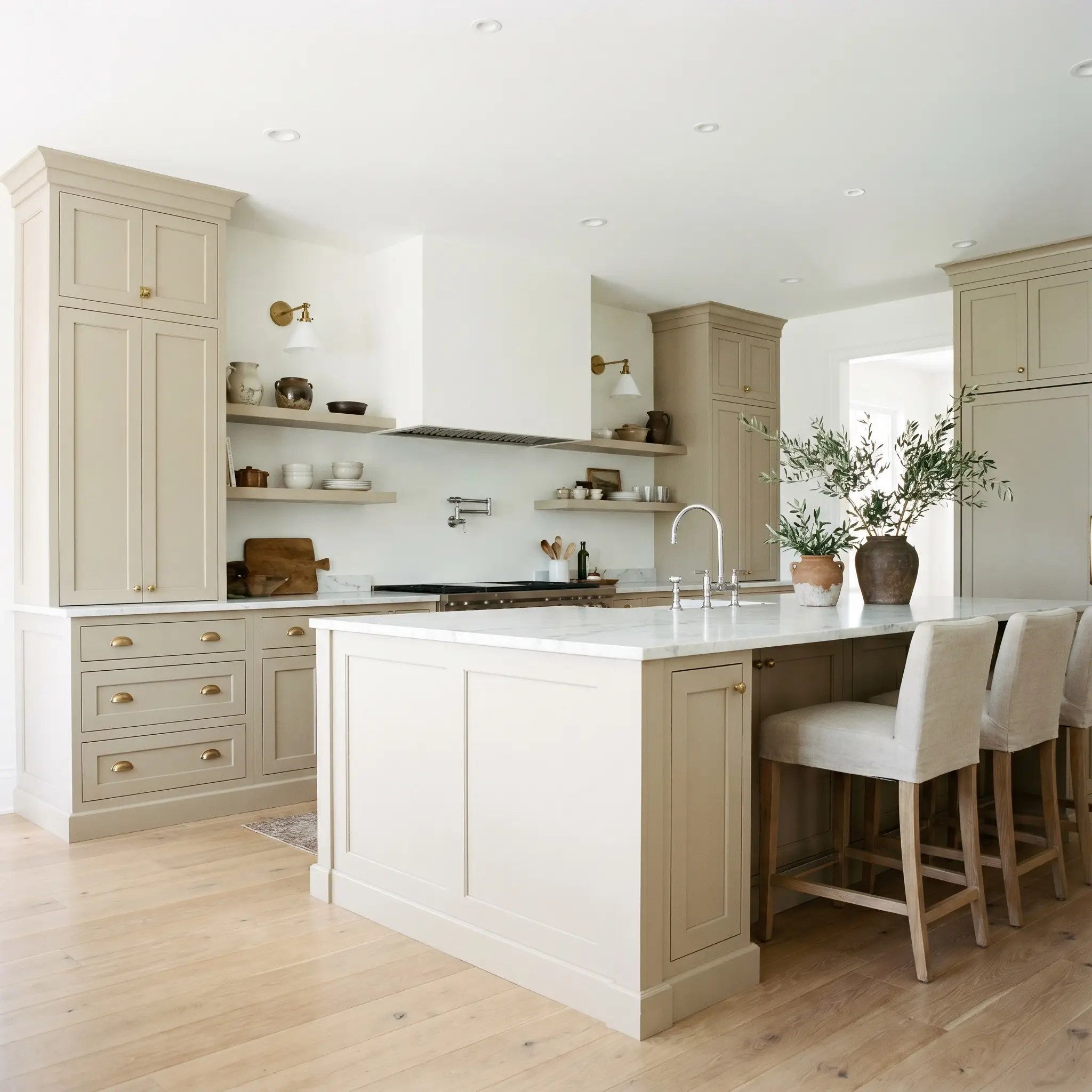
Kitchen Cabinets
Moving away from stark white, painting your island and perimeter cabinetry in this soft hue introduces a relaxed, custom charm. It pairs exceptionally well with honed marble countertops and unlacquered brass cup pulls for a classic, high-end culinary space.
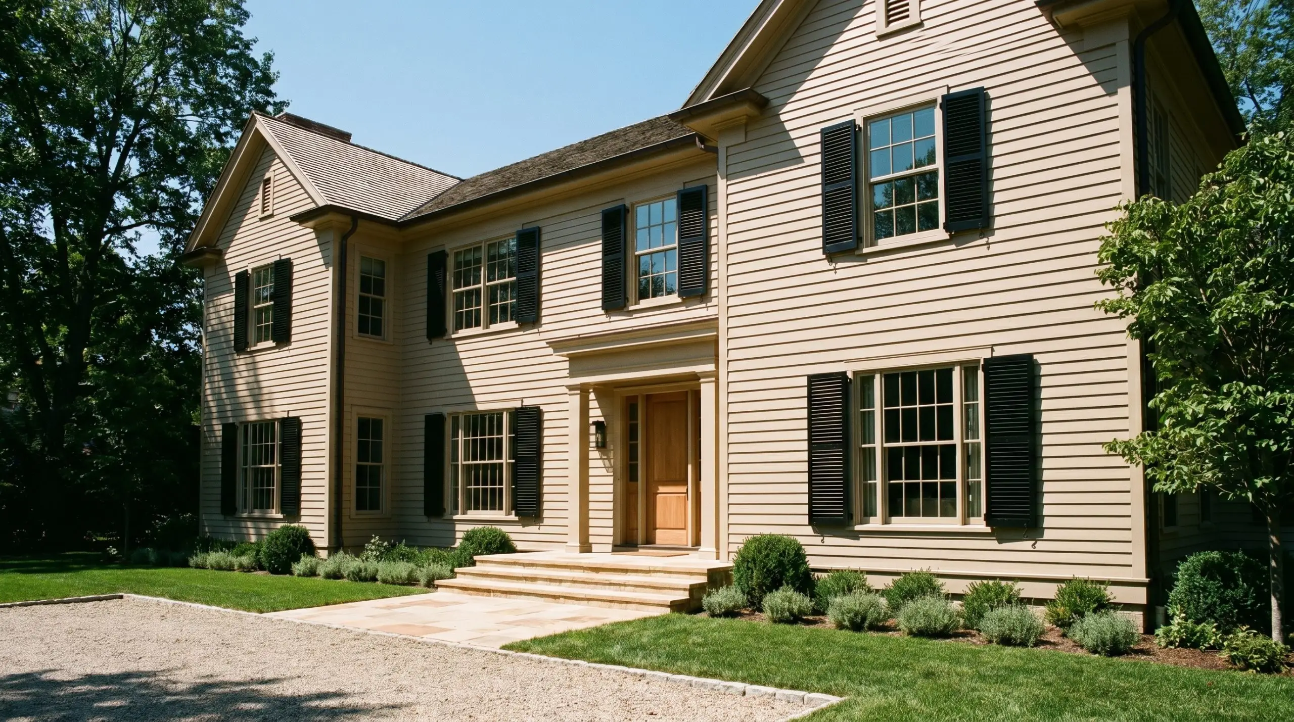
Exterior Siding & Trim
As a traditional exterior siding color, it holds its depth beautifully even under the harsh glare of the midday sun. It is a fantastic choice for a sandstone facade or classic clapboard, especially when framed by glossy black shutters.
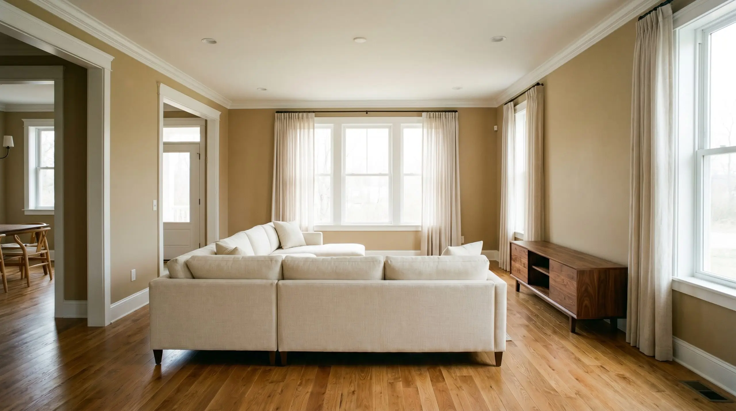
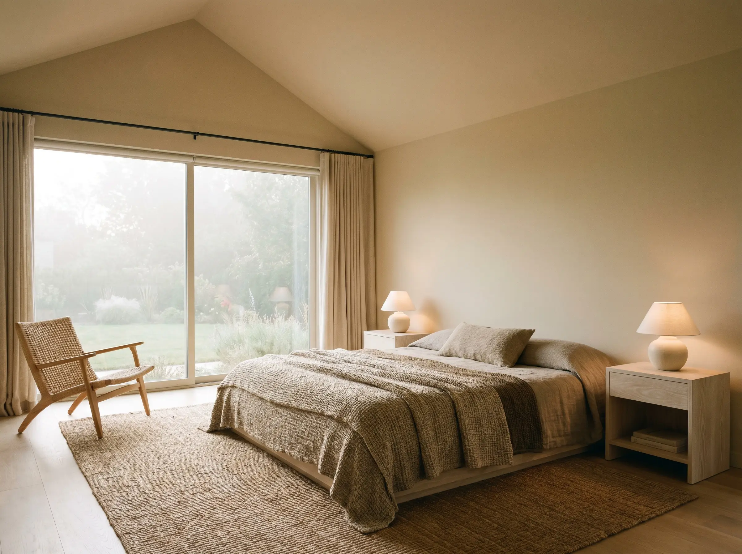
Warm, Earthy Bedrooms
Transform a sleeping quarters into a serene retreat by letting this color envelop the walls and ceiling. Layer in heavy, woven cotton throws, rattan accent chairs, and soft, ambient table lamps to maximize its restful energy.
Creative Ways to Use Manchester Tan
Beyond standard wall applications, this adaptable neutral shines when used strategically to highlight specific architectural features or custom projects.
The Reclaimed Dining Table Base
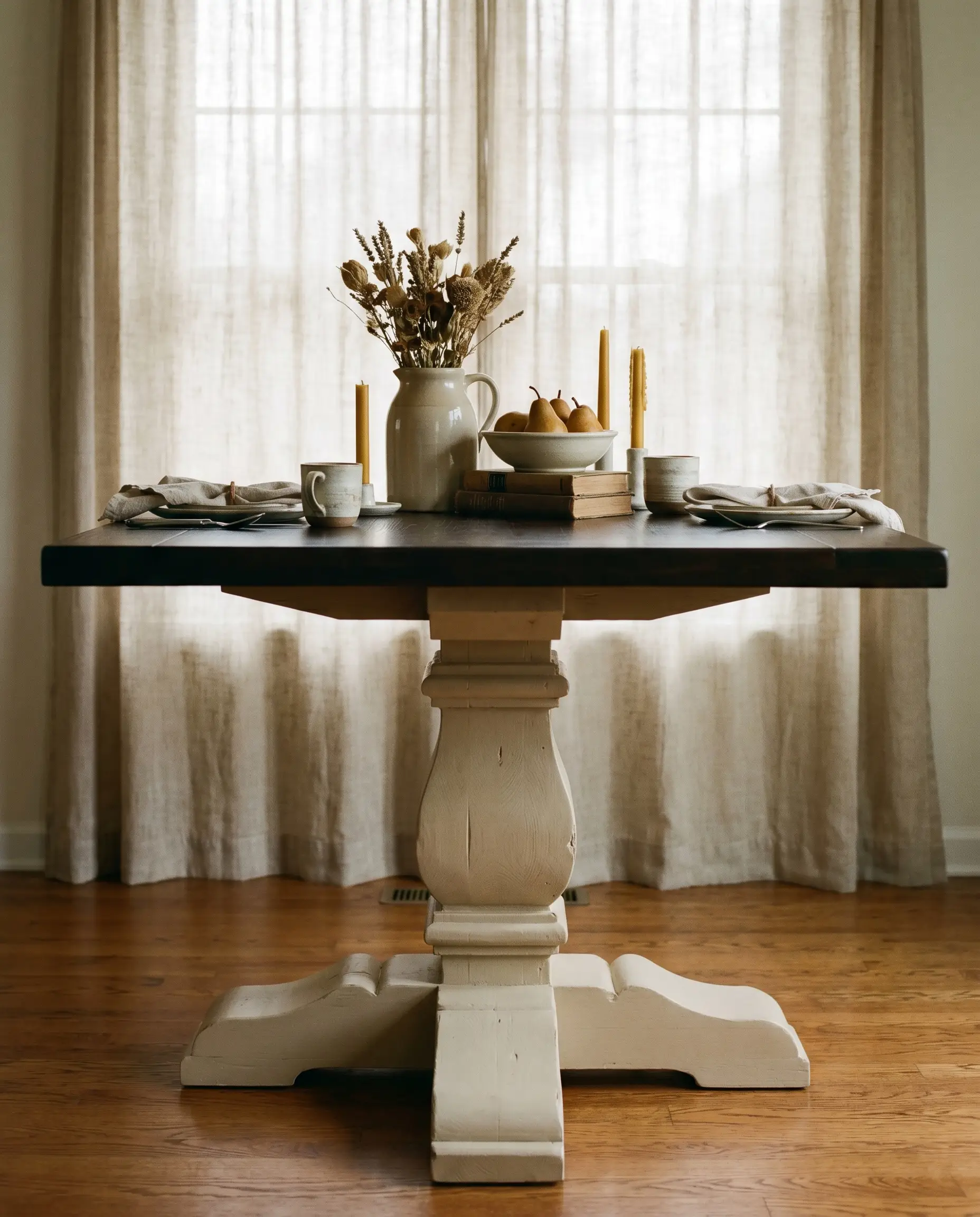
Breathe new life into a heavily distressed, thrifted dining table by coating the chunky pedestal base in this earthy hue. The subtle khaki notes provide a stunning contrast against a dark, espresso-stained wood top, creating a custom, farmhouse-chic centerpiece.
A Color-Drenched Reading Nook
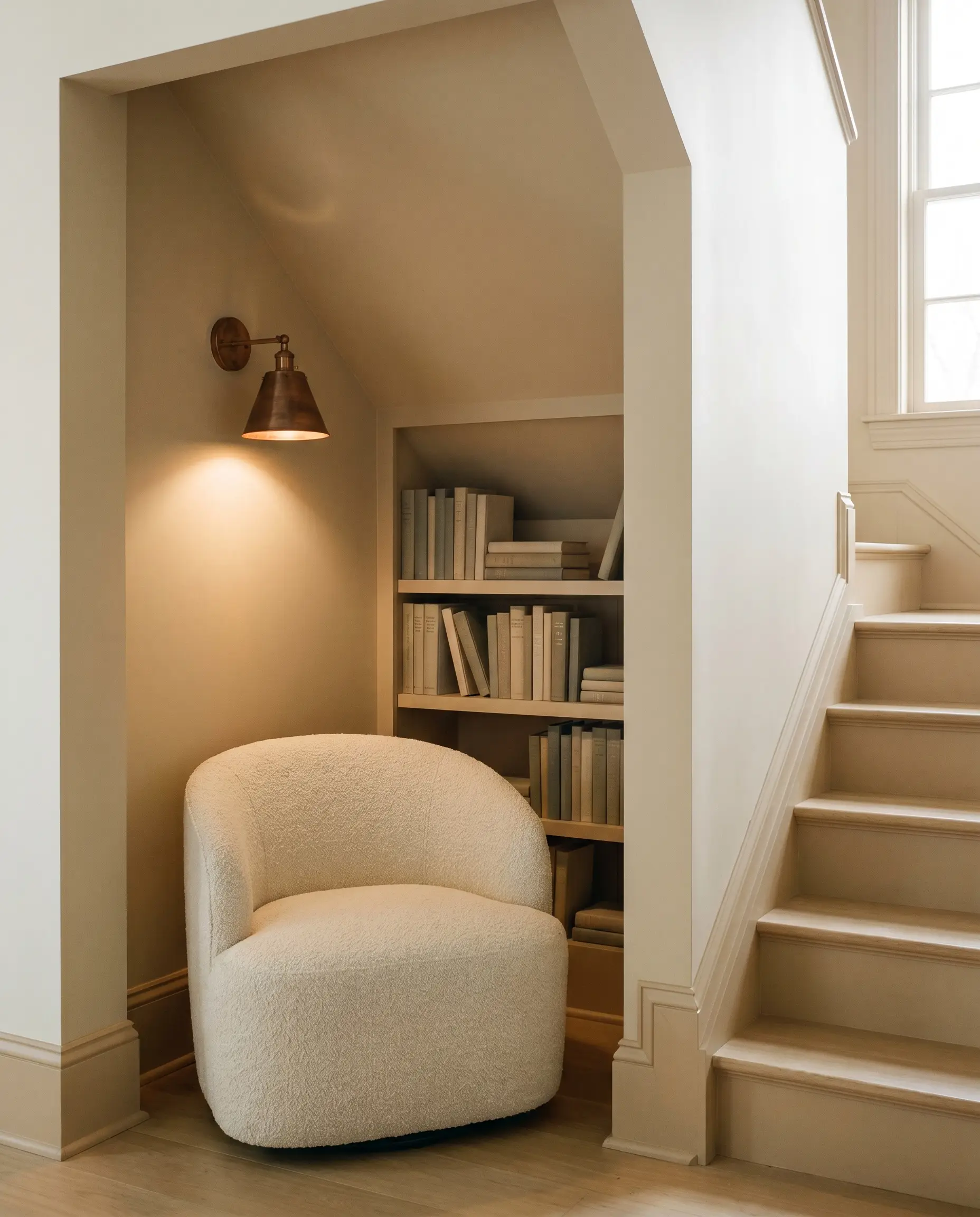
Transform an awkward alcove under the stairs into a sophisticated hideaway by painting the walls, built-in shelving, and trim entirely in this shade. The seamless, monochromatic application makes the tight layout feel incredibly intentional and deeply enveloping.
A High-End Restaurant Washroom
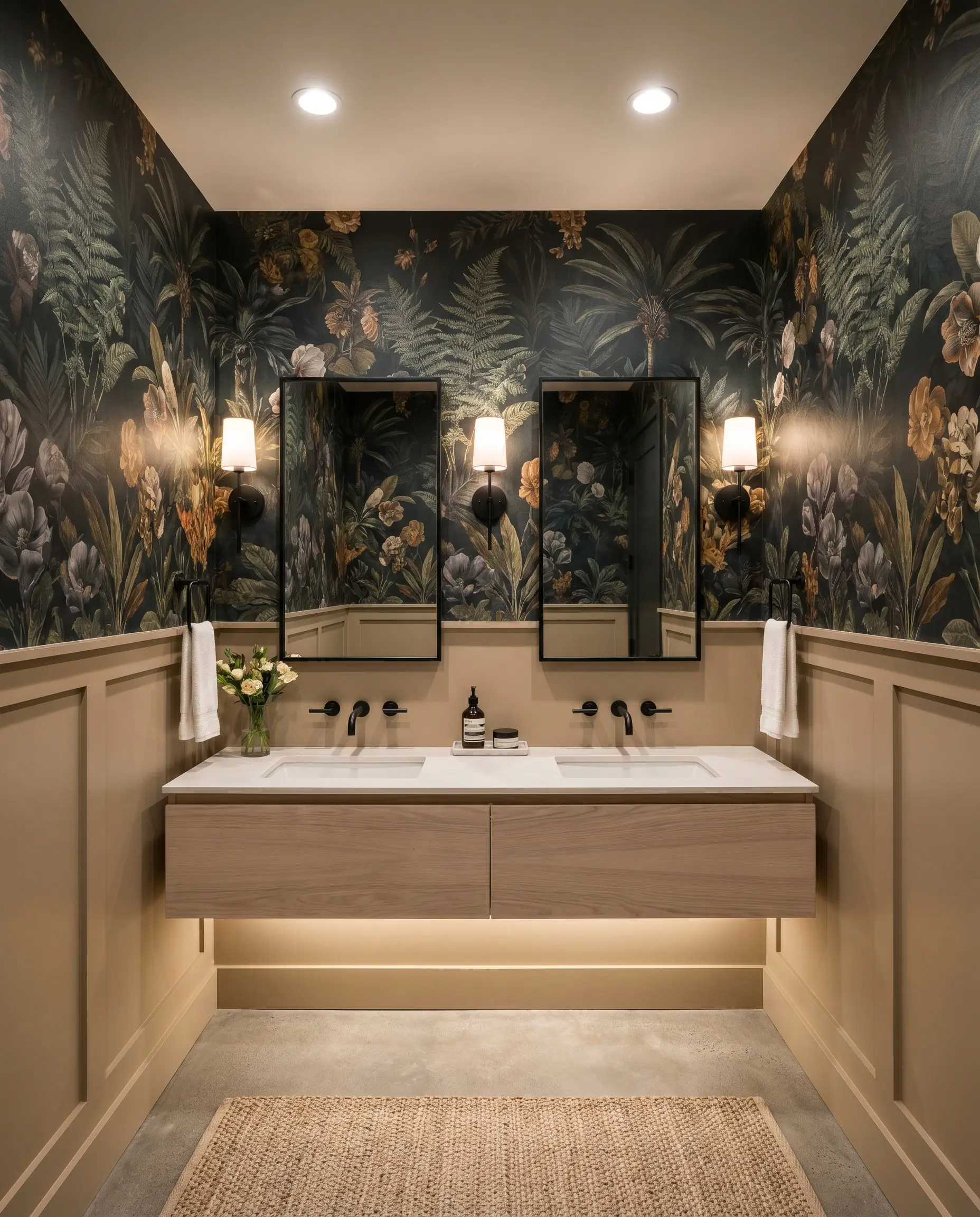
Elevate a tiny commercial bathroom by pairing this beige on the lower half of the walls with a dramatic, botanical-print wallpaper above. The warmth of the paint grounds the busy pattern, offering a luxurious, highly curated experience for visitors.
Coordinating Colors & Best Pairings
This versatile neutral thrives on intentional styling, requiring either crisp, high-contrast borders to feel modern or rich, earthy companions to lean into its historical roots.
Trim & Baseboards
Benjamin Moore Chantilly Lace OC-65 provides a stark, brilliant boundary that makes the wall color feel incredibly fresh and updated. Sherwin-Williams Alabaster SW 7008 offers a softer, creamier transition, perfect for historic homes that want to avoid jarring, bright white lines. For a delicate, warm glow that harmonizes beautifully with the beige’s inherent yellow base, Farrow & Ball Pointing No. 2003 is a flawless choice.
Hardware, Wood & Material Pairings
Coordinating Colors
Designer Mood Boards
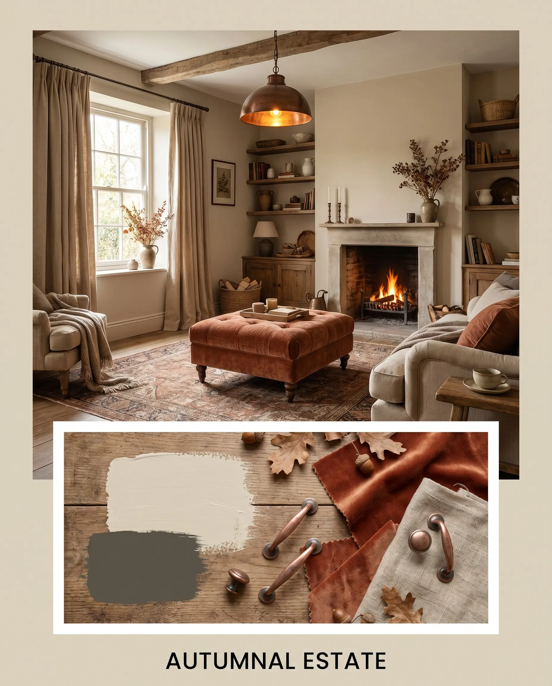
Autumnal Estate: This palette weaves the deep richness of Benjamin Moore Aegean Olive 1491 alongside our featured beige. Ground the space with aged copper light fixtures, a plush rust-toned velvet ottoman, and heavily textured linen drapery to evoke the cozy, grounded energy of a countryside retreat.
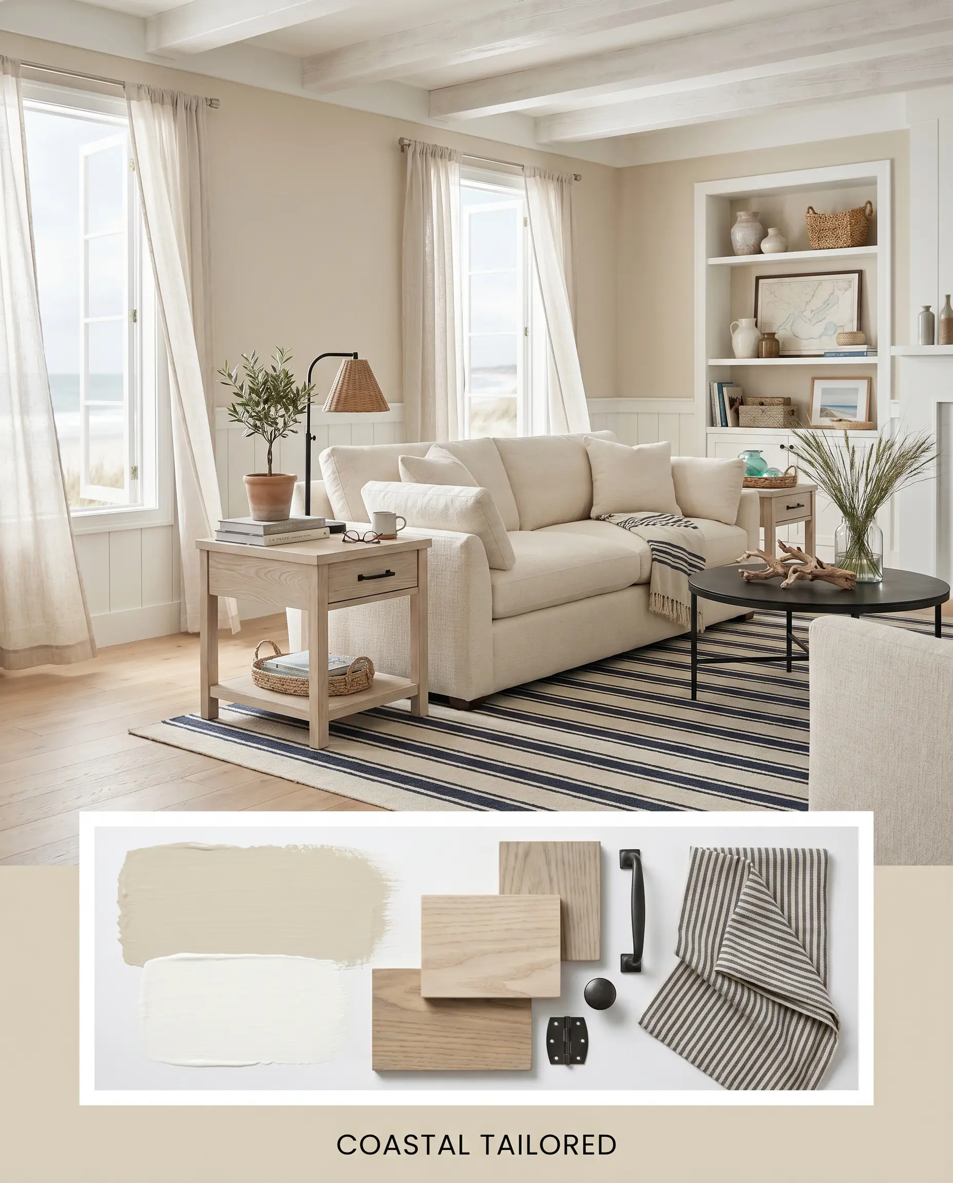
Coastal Tailored: By pairing the sharp boundary of Benjamin Moore Chantilly Lace OC-65 with the main wall color, this aesthetic feels incredibly crisp. Introduce bleached ash wood side tables, matte black iron hardware, and a navy-and-cream striped area rug for a breezy, sophisticated maritime vibe.
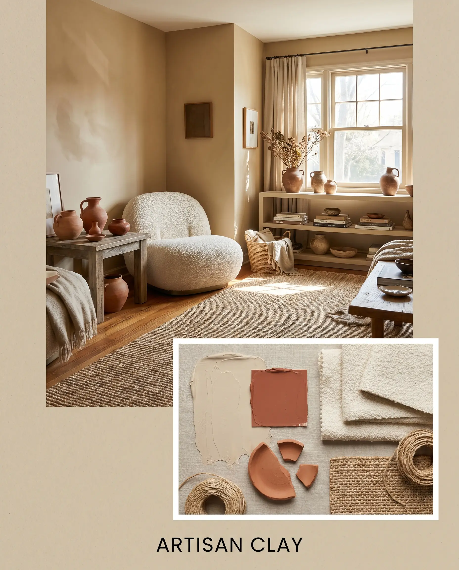
Artisan Clay: This mood board embraces the vibrant energy of Sherwin-Williams Cavern Clay SW 7701 against the soft neutral backdrop. Incorporate handmade terracotta pottery, a cream bouclé accent chair, and woven sisal rugs to cultivate a warm, collected, and highly tactile environment.
Head-to-Head Comparisons
Choosing the perfect neutral often comes down to analyzing the specific lighting conditions and architectural style of your home, as seemingly identical shades can behave drastically differently on the wall.
Benjamin Moore Manchester Tan vs. Benjamin Moore Edgecomb Gray HC-173
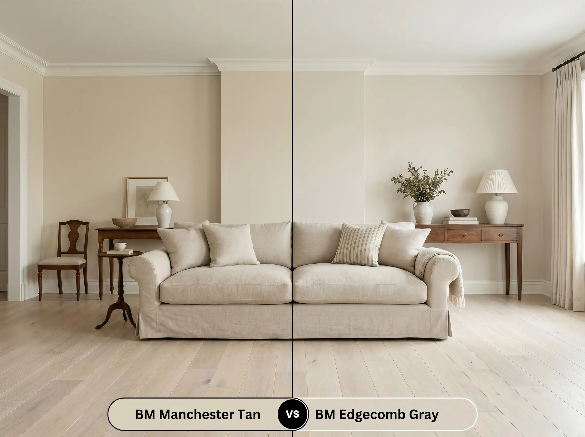
If your room lacks abundant natural light, Edgecomb Gray HC-173 often performs better because its slightly higher light reflectance and grayish base keep it from feeling heavy. However, if you want a distinctly warm, traditional embrace, the deeper yellow base of our featured beige is the clear winner.
Benjamin Moore Manchester Tan vs. Sherwin-Williams Accessible Beige SW 7036
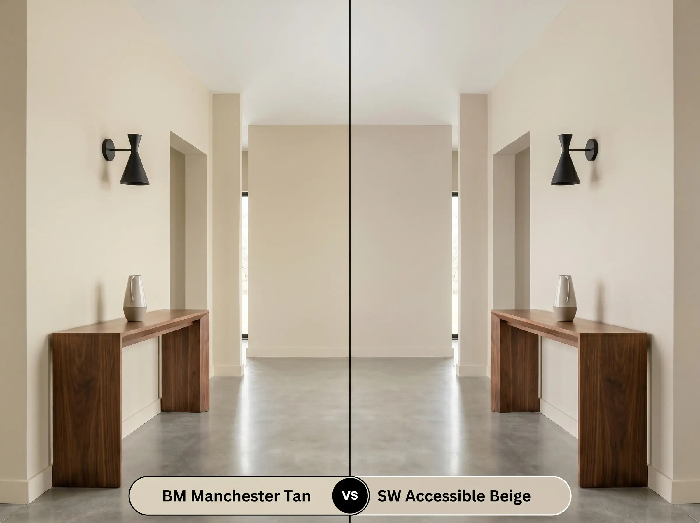
Accessible Beige SW 7036 leans much heavier into gray and taupe territory, making it a safer bet for strictly modern interiors. Choose the Benjamin Moore option if you need to counteract cool northern light with a stronger injection of sunny warmth.
Benjamin Moore Manchester Tan vs. Benjamin Moore Bleeker Beige HC-80
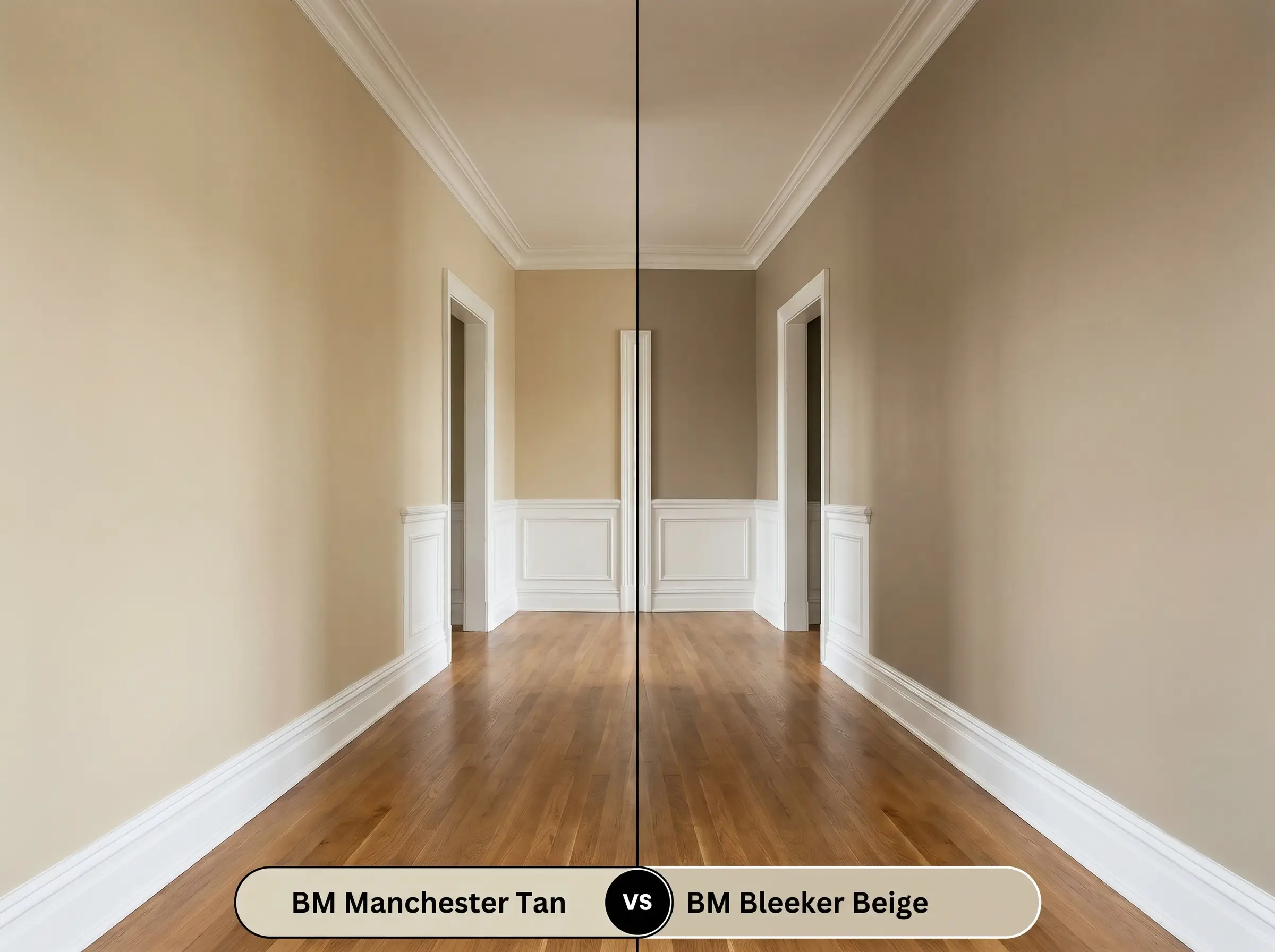
Bleeker Beige HC-80 is noticeably deeper and carries a stronger golden-peach undertone. If you are working with a dark hallway, the lighter, greener nuance of Manchester Tan will feel far more elegant and less overwhelming.
Similar Colors & Brand Equivalents
Sometimes a design project requires just a slight shift in light reflectance or a different undertone to perfectly align with existing flooring or cabinetry.
Same-Brand Alternatives
Cross-Brand Matches
Practical Application & DIY Advice
Transitioning this beautiful color from a tiny swatch to a full-room application requires a strategic approach to finish and preparation.
The Dynamic Sheen Guide
Primer Strategy
Because this is a medium-light shade, a standard high-quality white primer is usually sufficient over bare drywall. However, if you are painting over a dark, saturated color, a lightly tinted gray primer is required to prevent the old hue from altering the final warmth of the beige.
When applying this color to raw wood cabinets or an older exterior facade, you must use a dedicated stain-blocking primer. The yellow base of this paint will easily highlight bleeding wood tannins if the surface is not properly sealed.
Hackrea Pro-Tip (The Tannin Block)
Coverage & Success Tips
Expect to apply two full coats to achieve the true, rich depth of the color. To avoid flashing—those frustrating, shiny roller marks that catch the light—maintain a wet edge at all times and avoid overworking the paint once it begins to tack up.
Frequently Asked Questions
Because of its khaki undertones, this color can easily lose its sunny warmth in spaces lacking natural light. To prevent it from feeling dingy in a basement, you must rely heavily on warm, layered artificial lighting, specifically 2700K LED bulbs, to pull the yellow base forward.
The yellow base of this paint actually harmonizes quite beautifully with warm wood tones. Instead of clashing, it creates a rich, earth-toned palette that feels cohesive and traditional, though it will amplify the overall warmth of the room significantly.
While it is a stunning traditional exterior siding color, using it as a limewash over red brick requires caution. The underlying red of the brick can pull out the green/khaki undertones of the paint, creating an unexpected color shift that needs to be tested on a small, inconspicuous area first.
Yes, environmental reflections play a massive role in how this paint behaves. If you have dense, bright green trees directly outside a window, the incoming light will actively bounce that green hue onto the walls, significantly amplifying the paint’s hidden khaki notes.
Final Verdict & Expert Warnings
Benjamin Moore Manchester Tan (HC-81) is a brilliant example of approachable, historic warmth. It is the perfect choice for homeowners looking to soften vast, open layouts or infuse a sterile, modern build with a sense of grounded, earthy character.
However, this color is not universally flattering. You must proceed with extreme caution if your home features heavily cool-toned, blue-gray slate flooring or stark, icy white quartz countertops. When forced to sit next to these chilly, modern materials, the paint’s yellow base will visually conflict with the surrounding finishes, making the beige appear dated rather than intentional. Furthermore, pairing it with bright, cool-toned chrome fixtures will create a harsh, disjointed energy that completely undermines the soft, historic elegance this color is meant to provide.
Closest Cross-Brand Equivalents
The absolute closest scientific color matches for Manchester Tan across top paint brands.