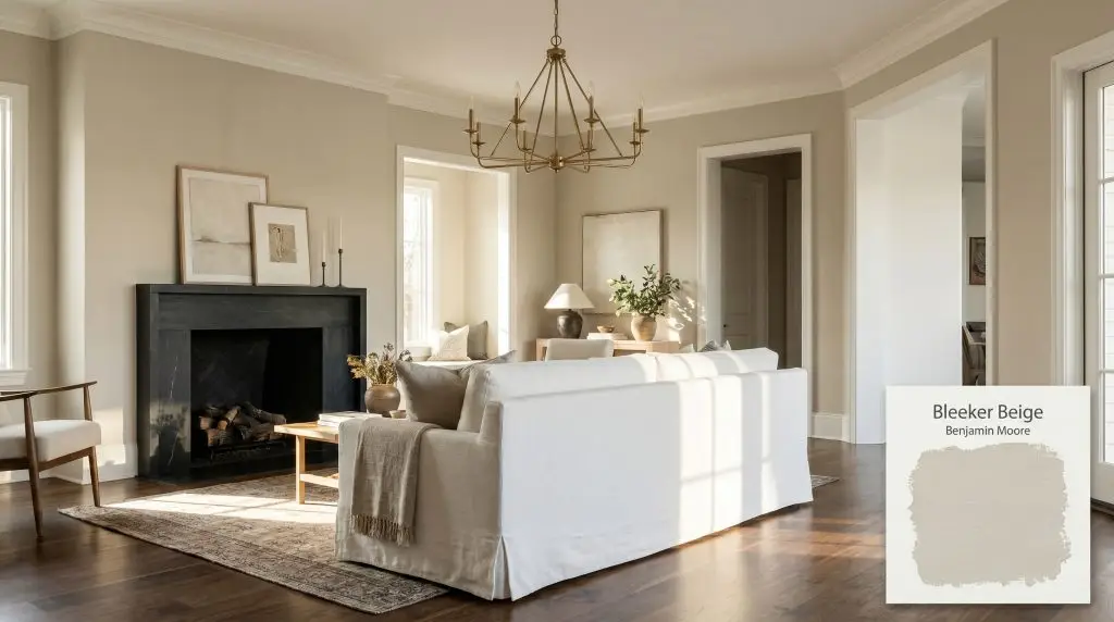
Bleeker Beige HC-80
Benjamin MooreBenjamin Moore Bleeker Beige (HC-80) is a versatile, mid-tone buff neutral with subtle gray undertones. Boasting an LRV of 51.66, it strikes a perfect balance between warm beige and cool greige, making it an incredibly adaptable choice for traditional and transitional spaces alike.
Paint Technical Profile
| Color ID / SKU | HC-80 |
| HEX Code | #CDC0A8 |
| Light Reflectance (LRV) | 51.66 |
| Use | Interior, Exterior |
| Best Exposures | South-facing, East-facing |
| Best For | Living rooms, transitional spaces, traditional interiors, millwork |
Benjamin Moore Bleeker Beige: Crafting Grounded Spaces with a Masterful Mid-Tone Buff
True neutrals rarely possess a strong point of view, but Benjamin Moore Bleeker Beige (HC-80) breaks that mold entirely. Rooted firmly in the brand’s highly respected historical color collection, this shade completely bypasses the flat, fleshy peach tones that plagued the beige trends of the late 1990s. Instead, it offers a deeply curated, architectural presence that instantly grounds a room.
This paint acts as a structural anchor rather than just a background color. Its rich pigment profile absorbs shadows and interacts beautifully with natural light, creating a velvet-like softness on drywall and trim alike.
Whether you are restoring the original millwork in a colonial home or warming up a stark, modern apartment, this warm greige adapts seamlessly to its surroundings. By balancing a traditional buff base with a highly sophisticated undertone, it provides the perfect foundation for a beautifully layered, high-contrast interior.
Demystifying the Undertones & LRV of Bleeker Beige
When evaluating whether this paint leans warm or cool, the definitive answer is that it is a highly regulated warm neutral. It offers the inviting, sunlit energy of a traditional tan but employs a crucial cooling mechanism to keep the warmth from spiraling out of control.
Understanding the anatomy of this color requires looking past the initial impression:
With a light reflectance value of 51.66, Benjamin Moore Bleeker Beige sits perfectly in the center of the lightness scale. It absorbs nearly as much light as it bounces back into the room, granting it significant visual weight. This means it has enough depth to contrast sharply against bright white ceilings, but it requires thoughtful lighting strategies to maintain its clarity in darker corners.
Lighting Effects: How Benjamin Moore Bleeker Beige Adapts to Your Space
The most significant environmental risk for this specific shade is heavy, shaded exterior foliage combined with a north-facing window. If your room looks out onto a dense canopy of green trees, the ambient light absorption can pull the hidden gray-green undertones too far forward, making the walls feel surprisingly heavy and damp.
Because of its complex chromatic shift, you must observe how this paint behaves as the sun moves across your home throughout the day.
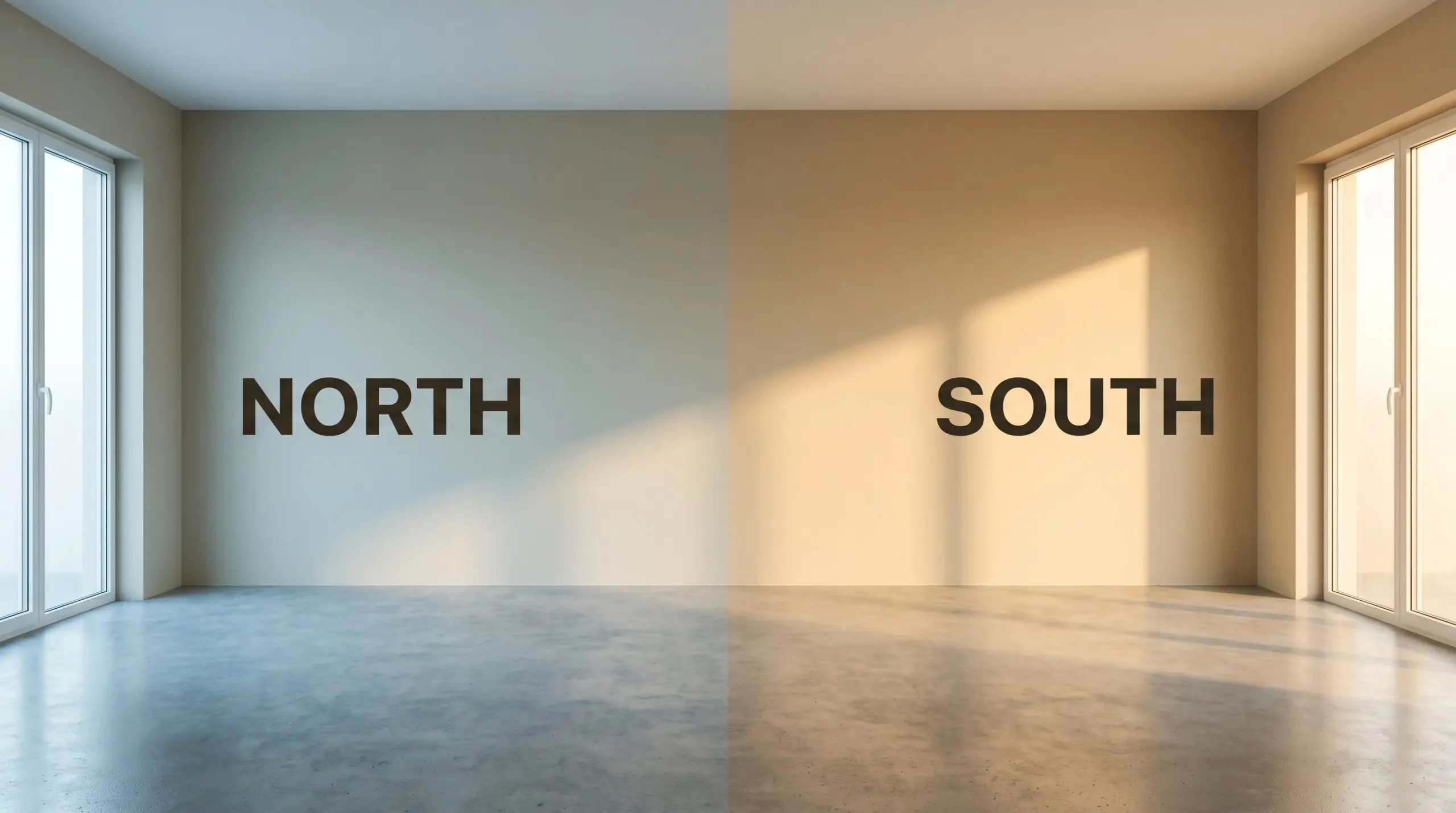
If you find the color pulling too green in the evening, swap your standard bulbs for 3000K LEDs. This specific temperature provides a clean, neutral glow that perfectly balances the buff and gray elements without distorting either.
Hackrea Pro-Tip (The Bulb Strategy)
Functional Architecture: Where This Warm Greige Thrives
The foundational depth of this mid-tone buff actively reshapes the boundaries and energy of everyday living areas. Rather than simply coating the walls, it provides profound spatial anchoring, allowing your furniture and architectural features to stand out with intentionality.
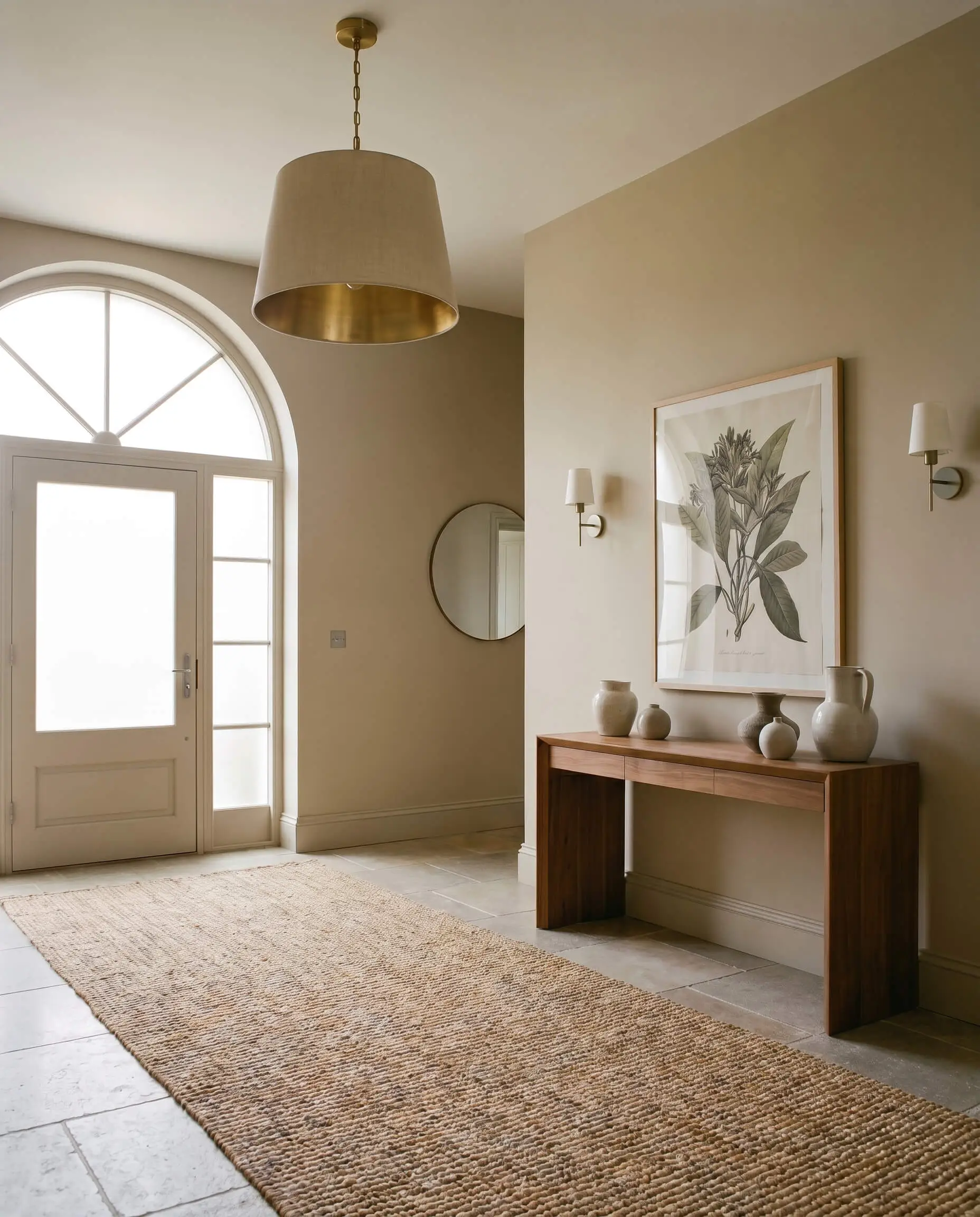
Transitional Hallways and Entryways
Hallways often suffer from a lack of natural light, but a mid-tone neutral can turn that limitation into an asset. Using this shade in an entryway creates a warm, enveloping transition zone that feels deeply welcoming. Pair it with a simple, readily available jute runner and a high-end unlacquered brass pendant light. The earthy undertones of the paint will harmonize with the natural fibers of the rug, while the brass adds a necessary spark of premium contrast to wake up the shadows.
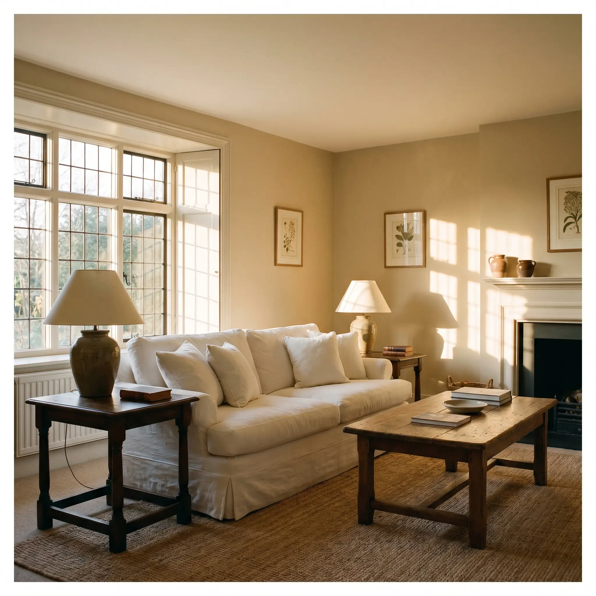
Traditional Living Rooms
In a main gathering space, this paint excels at unifying diverse furniture profiles and textures. It serves as a brilliant backdrop for an English Cottage aesthetic, especially when layered with slipcovered linen sofas and vintage, dark-stained oak side tables. Because the color holds its own visual weight, you can confidently hang large-scale, dramatic artwork without the walls feeling overpowered or visually cluttered.
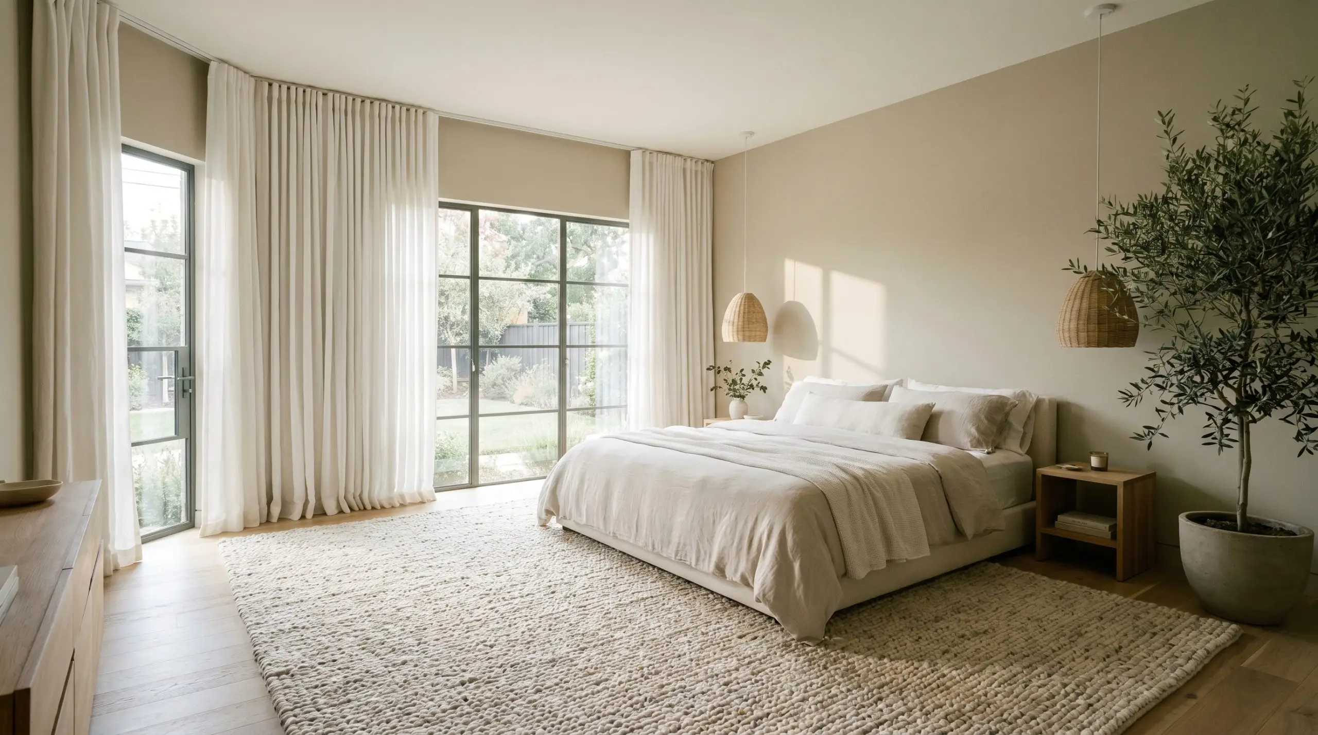
Primary Bedrooms
To cultivate a serene, restorative environment, lean into the gray undertones of this shade. In a bedroom, it pairs effortlessly with an Organic Modern styling approach. Frame the windows with floor-to-ceiling, soft white linen drapes to draw the eye upward, and anchor the bed with a heavily textured, looped wool rug. The paint’s muted warmth ensures the room feels cozy at night, while the crisp white textiles keep the morning energy feeling fresh and breathable.
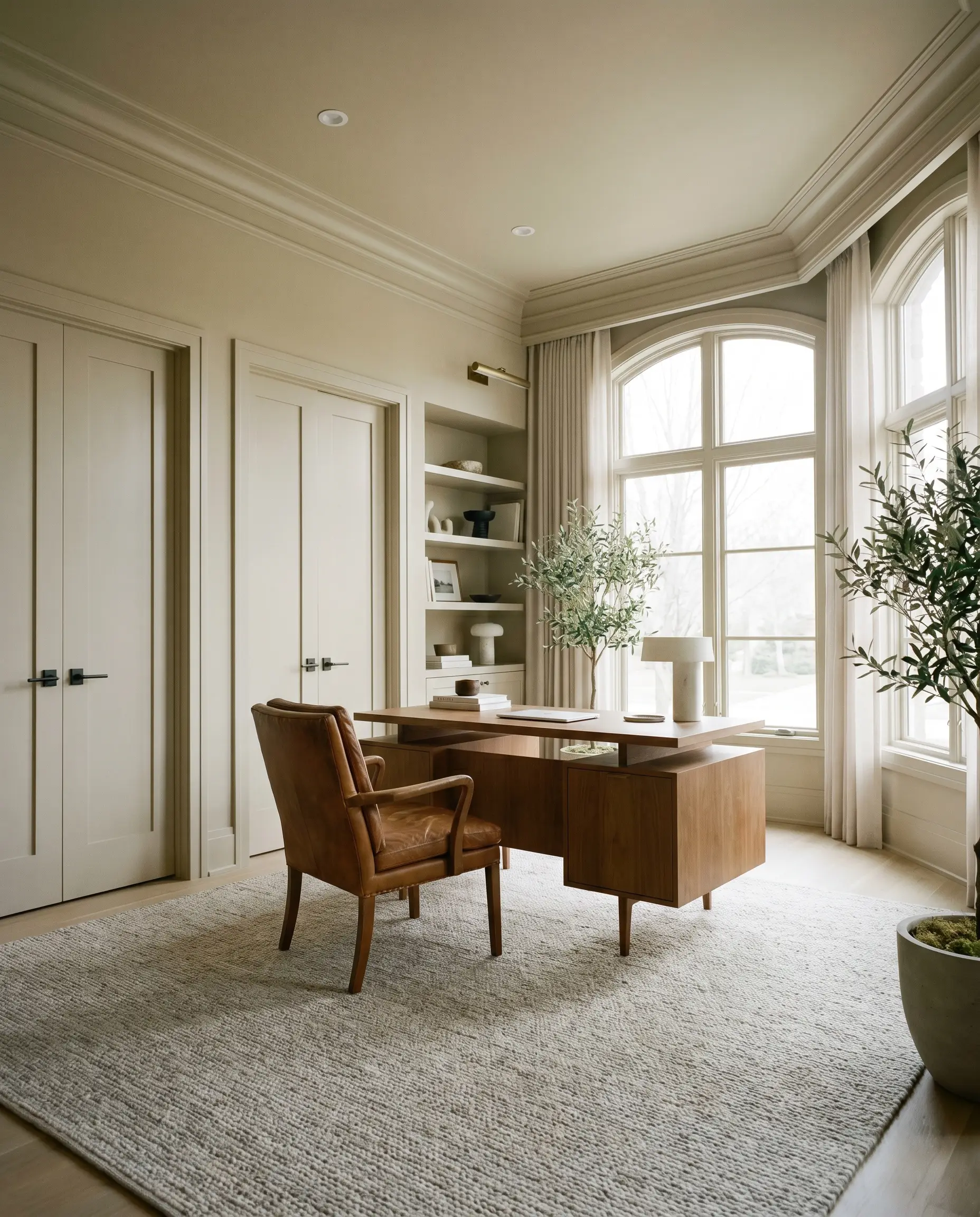
Home Offices
Focus demands a grounded environment, and this color delivers a highly sophisticated, distraction-free backdrop. It works incredibly well when paired with deep, saturated leather seating—think a classic cognac or espresso brown desk chair. If your office features standard, flat-panel doors or basic trim, painting the walls and the trim in the exact same finish creates a seamless, color-drenched envelope that instantly elevates the perceived value of the room.
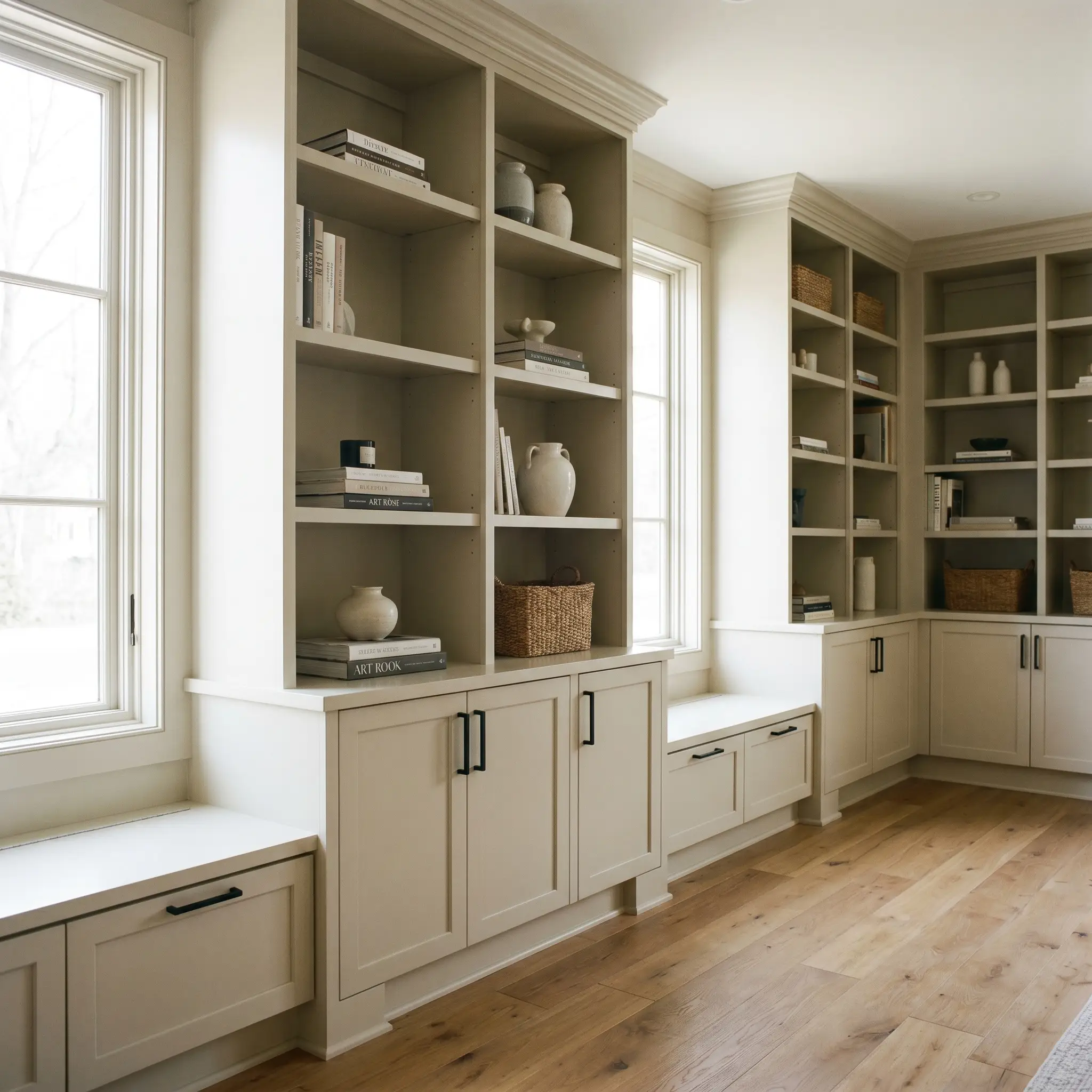
Custom Millwork and Built-ins
When applied to cabinetry, wainscoting, or library shelving, this paint mimics the look of historic, bespoke craftsmanship. A dedicated millwork application allows the light to catch the varied angles of the wood, highlighting the subtle gray-green shifts in the corners and recesses. Pair these built-ins with sleek, matte black hardware to inject a sharp, contemporary edge into the traditional architectural vernacular.
Curated Inspiration: Pushing the Boundaries of Benjamin Moore Bleeker Beige
When you step away from standard wall applications, the true versatility of this pigment profile reveals itself. This shade acts as a powerful catalyst for highly intentional, deeply atmospheric design projects.
The Grounded Library
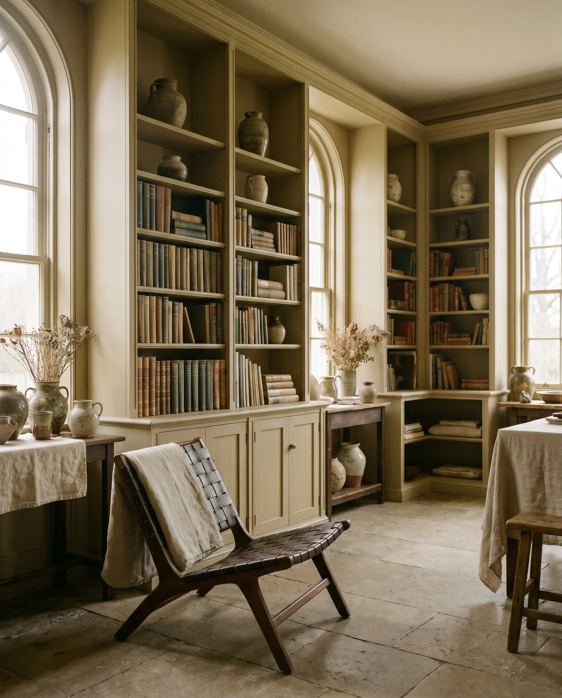
Imagine a floor-to-ceiling expanse of built-in library shelving, heavily loaded with textured books and subtle ceramics. By coating the entire structure in this earthy neutral, you create a deeply calming, low-stimulation environment perfect for an ADHD-friendly retreat. The muted buff absorbs chaotic visual energy, allowing the mind to rest. The shelves become less about displaying clutter and more about offering a quiet, tactile embrace, especially when paired with a highly structured, low-profile reading chair.
The Coastal Travertine Lobby
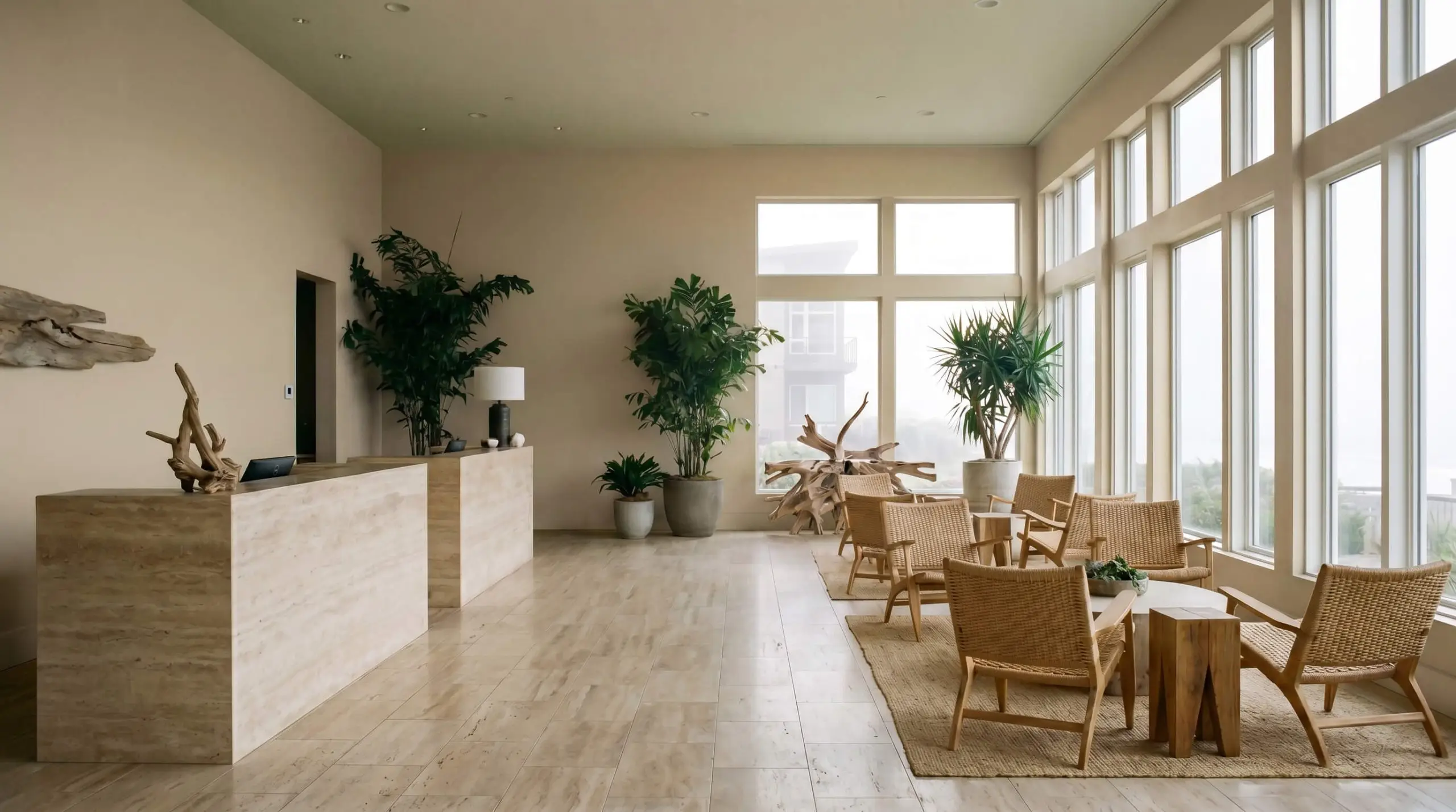
In the misty, indirect light of the Pacific Northwest, this paint transforms a boutique hotel lobby into an organic sanctuary. The walls serve as a warm, stabilizing canvas against the installation of raw, unfilled travertine reception desks and flooring. The gray-green undertone of the paint speaks directly to the cool, damp landscape outside, while the buff base warms up the heavy, porous stone. It creates an immediate sense of rugged, natural luxury that feels entirely native to the environment.
The Slow-Living Threshold
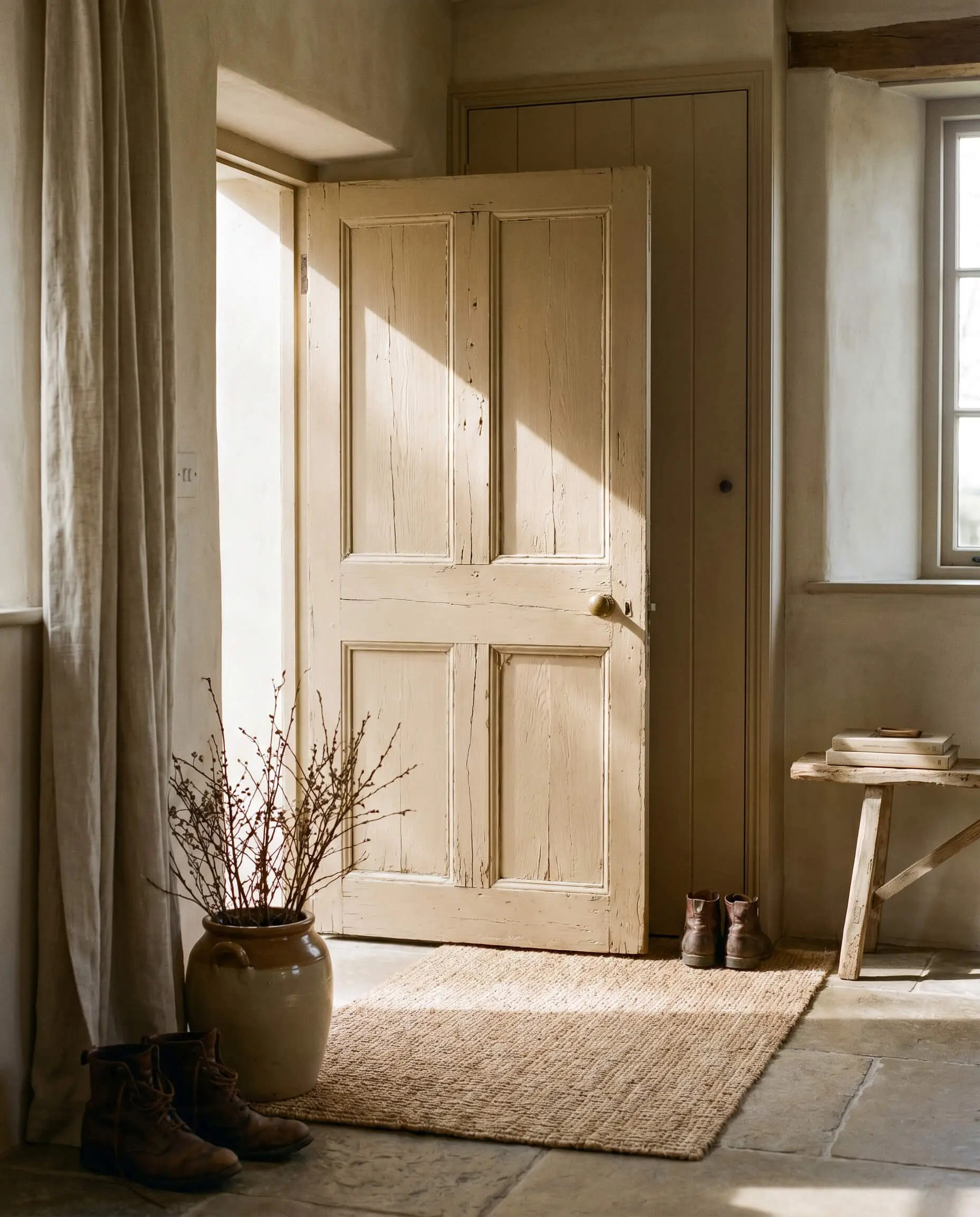
Reclaimed, heavily weathered interior doors gain an entirely new life when painted in this sophisticated hue. As the light shifts throughout the day, the gray undertone becomes a catalyst for a slow-living philosophy, encouraging inhabitants to pause and appreciate the simple transition between rooms. The paint highlights the natural imperfections and grain of the salvaged wood, turning a basic functional threshold into a celebrated architectural moment.
Material Pairings & Coordinating Palettes
The secret to maximizing the impact of this neutral lies in understanding its relational dynamic. Because it is a heavily muted mid-tone, it requires deliberate textural contrast to prevent the space from feeling flat. It craves materials that either sharply define its edges or enhance its earthy warmth.
Trim & Baseboards
To maintain a crisp, tailored boundary, you must pair this shade with a highly intentional white trim.
Hardware, Wood & Material Pairings
Coordinating Colors
Designer Mood Boards
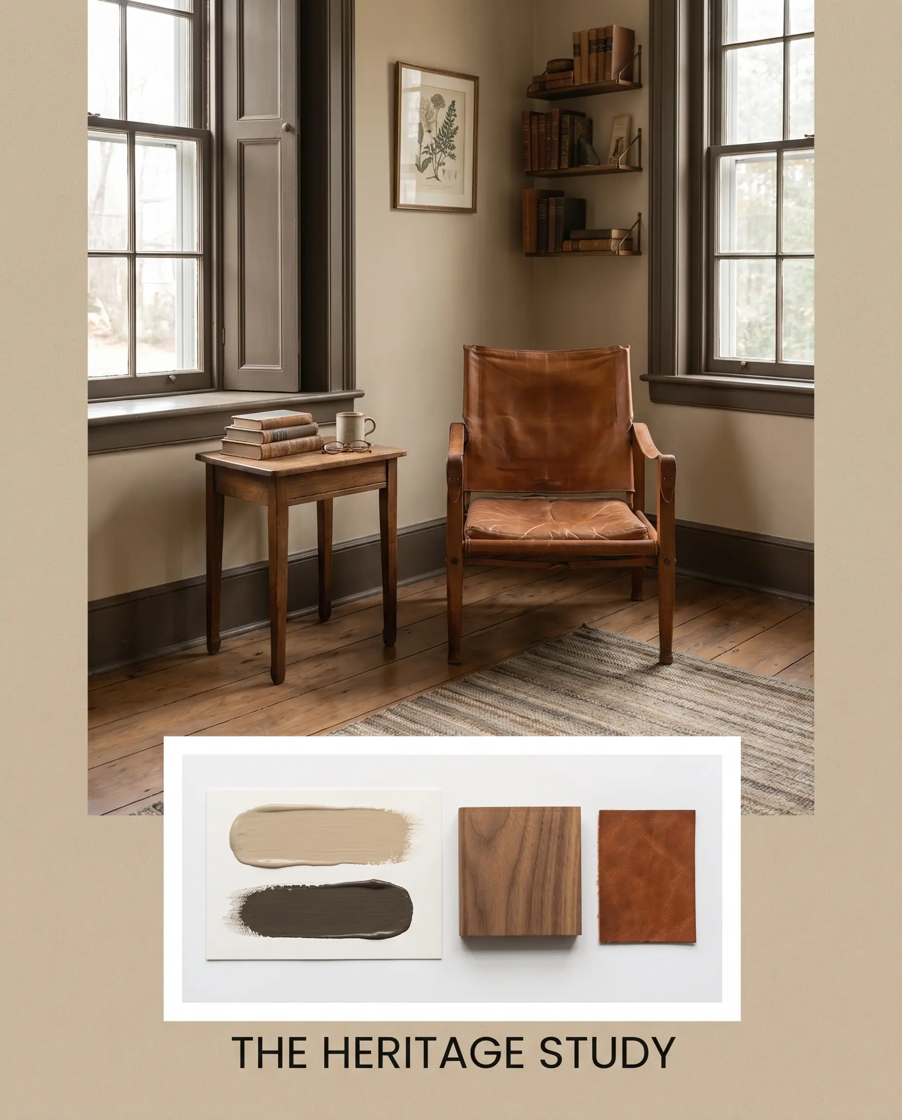
The Heritage Study This palette leans heavily into the historical roots of the paint. Imagine the walls coated in Benjamin Moore Bleeker Beige (HC-80), grounded by natural walnut flooring. Add a heavily worn, cognac leather sling chair in the corner and frame the space with Benjamin Moore Night Horizon 2134-10 on the window sashes. The energy is quiet, studious, and deeply comforting, perfect for a room dedicated to reading and reflection.
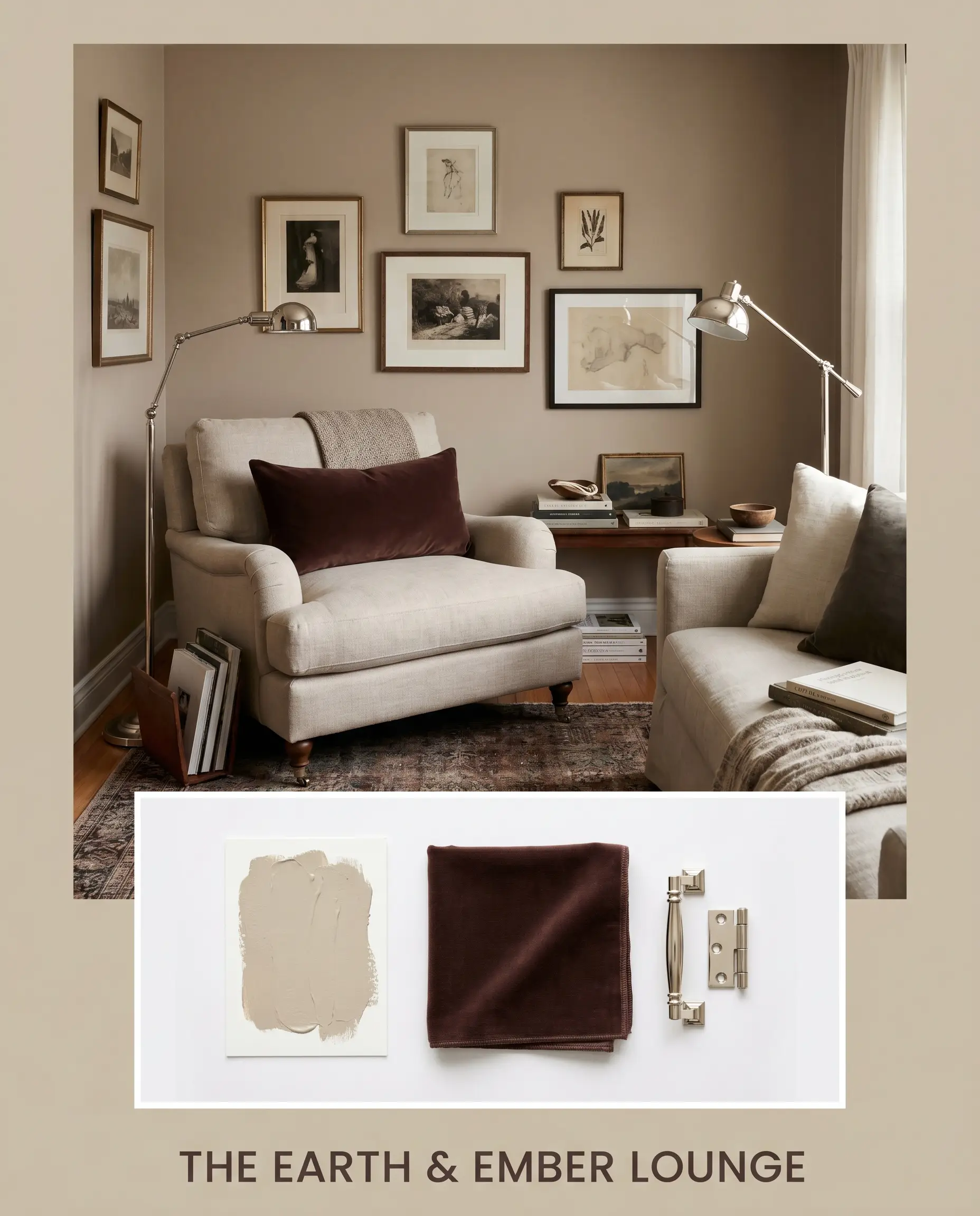
The Earth & Ember Lounge This combination focuses on drawing out the warmth of the buff base. Pair the mid-tone walls with accents of Sherwin-Williams Carnelian SW 7580—perhaps through a heavy velvet lumbar pillow or a woven tapestry. Introduce sleek polished nickel reading lamps to keep the warm tones from feeling heavy. The resulting vibe is incredibly inviting, highly curated, and perfect for intimate evening conversations.
Head-to-Head: Benjamin Moore Bleeker Beige vs. Industry Rivals
When finalizing your color selection, it is crucial to understand how this specific pigment profile holds up against its closest competitors. Subtle differences in light reflectance and hidden undertones will dictate which paint succeeds in your specific lighting environment.
Benjamin Moore Bleeker Beige vs. Benjamin Moore Shaker Beige HC-45
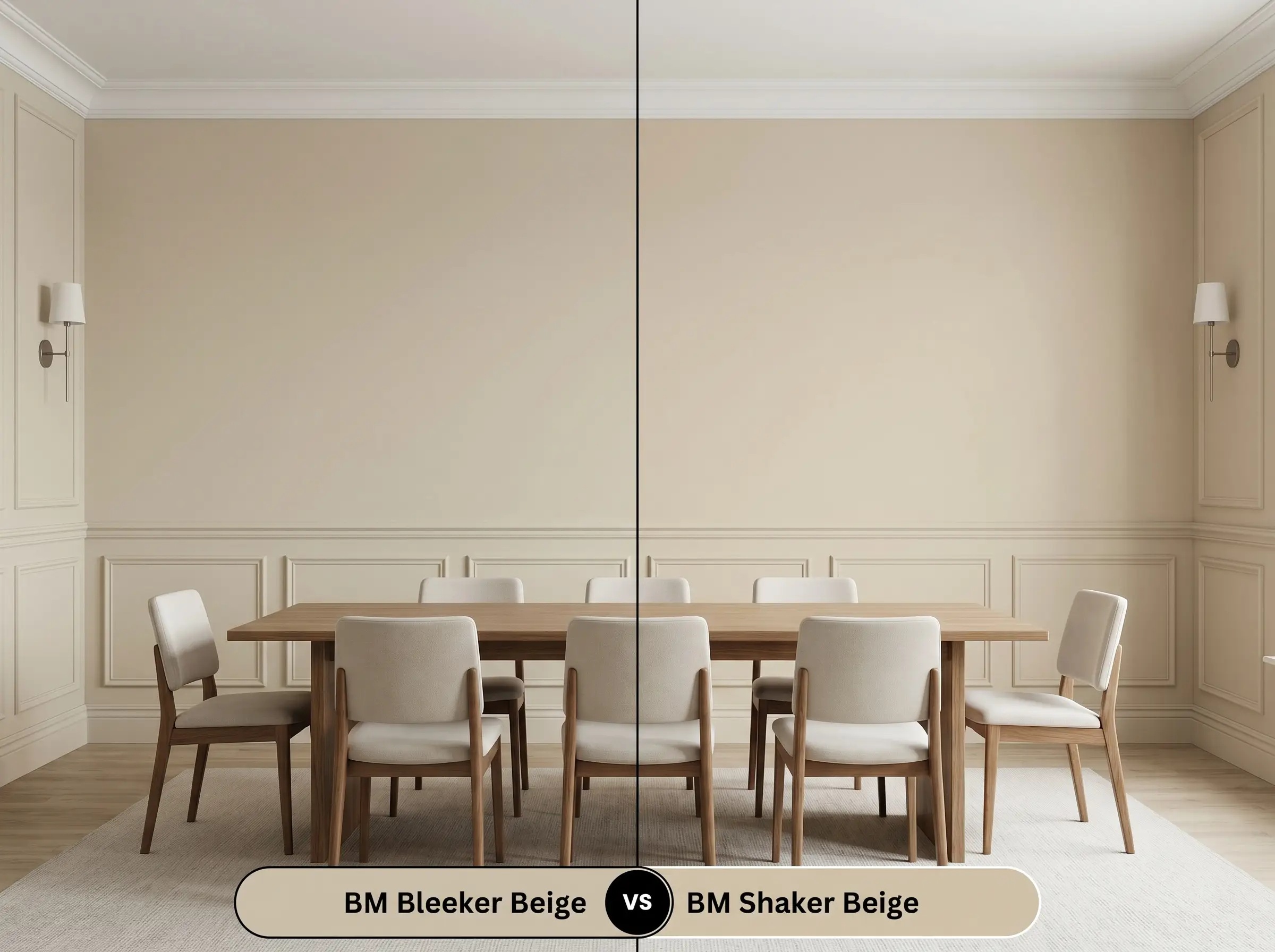
Shaker Beige is noticeably warmer and leans heavily into a traditional, golden-tan profile. If your room is north-facing and you are terrified of the paint turning gray or green, Shaker Beige is the safer, warmer choice. However, if you want a more modern, transitional look that plays well with cool-toned stones and crisp whites, Bleeker Beige offers the necessary gray stabilization that Shaker Beige lacks.
Benjamin Moore Bleeker Beige vs. Benjamin Moore Manchester Tan HC-81
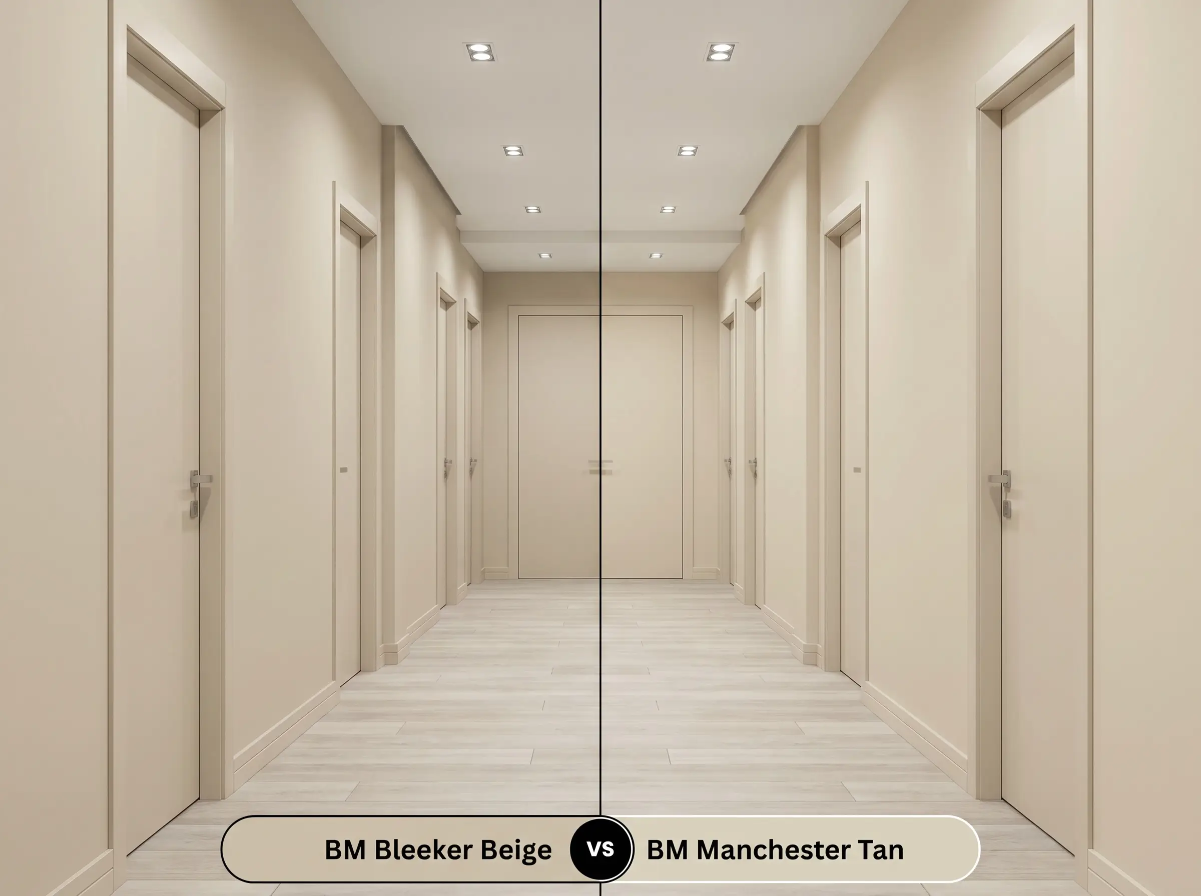
Manchester Tan has a significantly higher LRV, making it much lighter and more reflective. It also carries a prominent green-yellow undertone. If you are painting a dark, enclosed hallway and need the walls to bounce light, Manchester Tan is the better option. Bleeker Beige is much heavier and should be reserved for rooms where you actively want to create depth, coziness, and distinct color massing.
Benjamin Moore Bleeker Beige vs. Sherwin-Williams Accessible Beige SW 7036
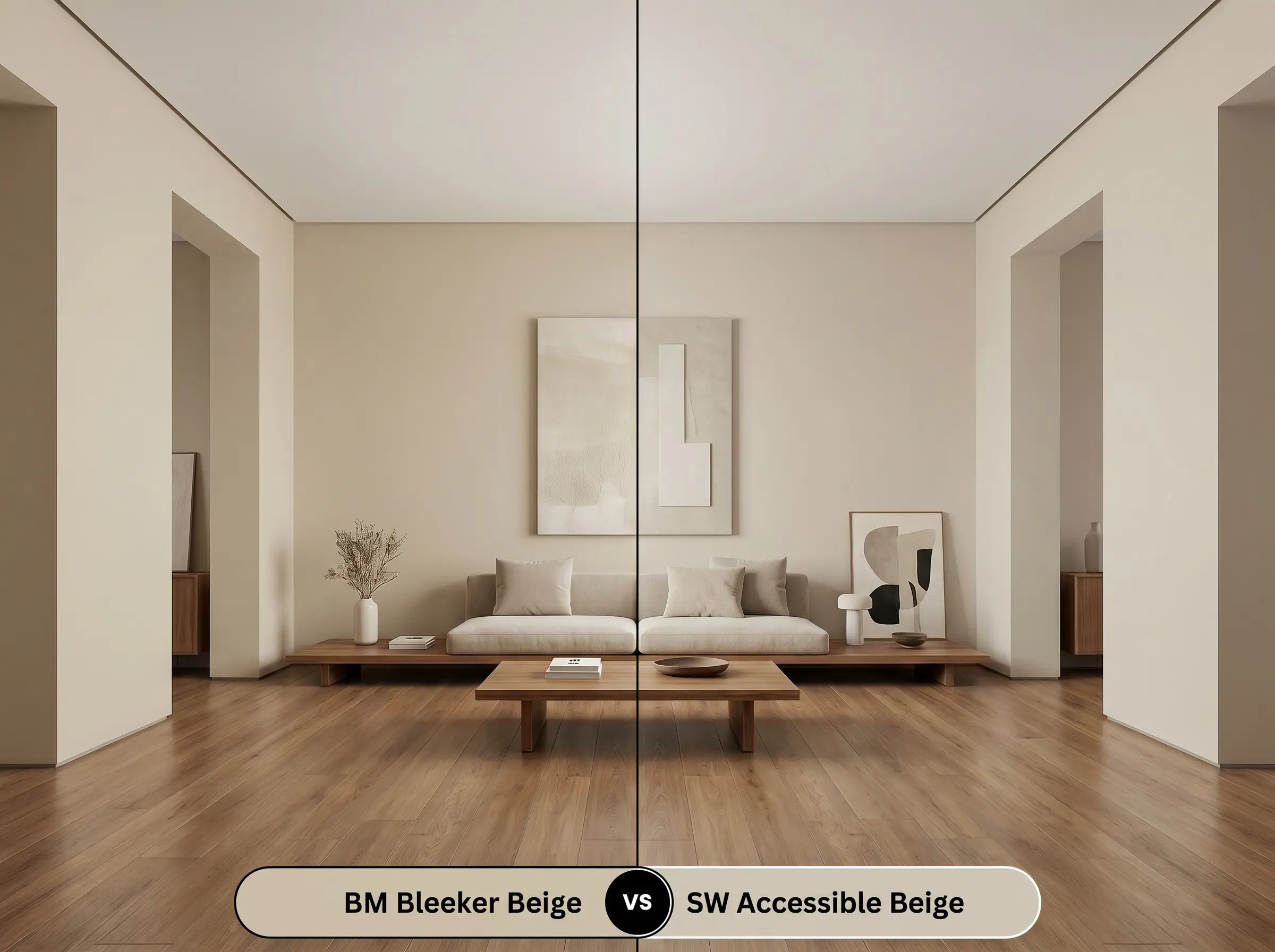
Accessible Beige is the undisputed king of the “greige” category, but it leans much further into the gray spectrum than its Benjamin Moore rival. If you have warm wood floors and want to cool the room down significantly, Accessible Beige is highly effective. Bleeker Beige, by contrast, retains much more of its traditional buff warmth, making it the better choice if you want to maintain a cozy, earthy atmosphere without going fully gray.
Similar Colors & Cross-Brand Alternatives
If the general profile of this paint appeals to you but the specific depth or brand availability does not align with your project, there are several highly reliable alternatives to consider.
Same-Brand Alternatives
Cross-Brand Matches
Execution & Application: Getting This Mid-Tone Buff Right
Transitioning from design theory to the physical reality of a roller and brush requires an understanding of how this specific depth of color behaves during application.
The Dynamic Sheen Guide
Primer Strategy
Because this is a solid mid-tone with significant depth, a standard white primer will force you to apply three coats to achieve true opacity. Instead, request a high-quality primer tinted to a light gray. The gray base prevents the warm buff pigments from flashing (showing streaks) and ensures the green undertones develop evenly across the wall.
Coverage & Success Tips
Benjamin Moore’s premium lines generally offer excellent coverage, but this specific pigment profile can be tricky if applied too thin. Plan for two generous, even coats.
Mid-tone colors with complex undertones are notoriously difficult to touch up later. If you try to patch a spot six months down the line, the new paint will likely flash and appear slightly darker. Always keep a tightly sealed sample of your exact batch, and when touching up, feather the edges with a dry brush to blend it into the surrounding wall.
Hackrea Design Secret (The Touch-Up Warning)
Frequently Asked Questions
Yes, it certainly can. Heavy exterior foliage filters the incoming sunlight, turning it distinctly green. This green light amplifies the paint’s hidden gray-green undertones, which can cause the warm buff base to look heavy, shadowed, or slightly muddy in the corners.
Crisp 4000K daylight bulbs will instantly strip away the cozy, traditional warmth of the beige. Under this cool lighting, the paint will read as a sharp, modern, and highly structural gray-green, completely changing the vibe of the windowless space.
Because of its earthy, muted profile, it performs beautifully as an exterior masonry paint. However, direct, unshielded sunlight will wash out the color significantly, making it appear much lighter and creamier than it does on an interior color swatch.
The gray-green undertone acts as a complementary contrast to the heavy red and orange tones found in red oak. Instead of flashing purple, the paint will subtly emphasize its own green notes, creating a balanced, earthy harmony between the walls and the floor.
The Final Verdict on Benjamin Moore Bleeker Beige
Benjamin Moore Bleeker Beige (HC-80) is an exceptionally grounded, highly versatile neutral that excels in spaces requiring architectural weight and quiet sophistication. It is the perfect choice for the homeowner who loves the cozy, inviting energy of a traditional tan but requires the modern restraint of a cool gray undertone. Whether you are wrapping a study in floor-to-ceiling color or warming up a stark entryway, this mid-tone buff delivers a deeply curated, historic atmosphere that feels both permanent and effortless.
However, this paint requires strict relational boundaries to succeed, and you must be highly cautious of your existing fixed elements. If your home is filled with cool, icy blue-gray tiles, stark Carrara marble, or heavily red-toned cherry cabinetry, this paint will struggle. The warm buff base will violently clash with the icy stones, making the walls look dirty and aged, while the cherry wood will drag the hidden green undertones out in a way that feels unintentional and disjointed. To make this color sing, you must commit to earthy, natural textures, crisp white trim, and a lighting plan that honors its complex, shifting nature.
Closest Cross-Brand Equivalents
The absolute closest scientific color matches for Bleeker Beige across top paint brands.