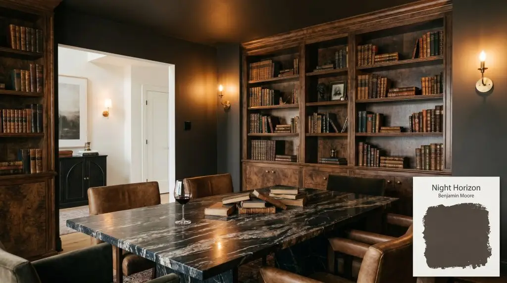
Benjamin Moore Night Horizon (2134-10) is a deeply saturated, warm black paint color with distinct brown and violet undertones. With an LRV of 6.68, it acts as a rich, moody alternative to stark black, bringing sophisticated depth to cabinetry, trim, and dramatic accent walls.
Will Night Horizon clash with your room?
Paint Technical Profile
| Color ID / SKU | 2134-10 |
| HEX Code | #4B433D |
| Light Reflectance (LRV) | 6.68 |
| Use | Interior, Exterior |
| Best Exposures | South-Facing, West-Facing |
| Best For | Accent walls, cabinetry, dramatic dining rooms, exterior trim, interior doors |
Benjamin Moore Night Horizon: The Bruised Espresso Paint Redefining Moody Interiors
We often treat dark paint as a simple binary choice between stark charcoal or flat navy, completely missing the nuanced shades that actually make a room feel alive. Benjamin Moore Night Horizon (2134-10) shatters that limitation by offering something far more compelling than a standard dark neutral. This is a deeply saturated, bruised espresso that shifts and breathes as the sun moves across your home.
Instead of absorbing all the energy in a room, this warm black paint acts as an anchor for rich textiles, warm metals, and layered lighting. It is a cornerstone of the Benjamin Moore Color Preview collection, designed to bring an undeniable sense of gravity and intention to your floor plan.
Whether you are sweeping it across a dining room ceiling or grounding a wall of standard cabinetry, Night Horizon forces you to rethink how dark hues behave. Let’s break down exactly how to harness its hidden complexities to create a beautifully curated, high-end aesthetic.
Benjamin Moore Night Horizon 2134-10: Undertones & LRV
If you are wondering whether this shade leans warm or cool, the answer is definitively warm. Benjamin Moore Night Horizon is not a true, stark black, but rather a deeply complex brown-black that radiates a quiet, smoldering heat.
To truly understand how this color will behave on your walls, we have to look at its structural DNA:
With a light reflectance value (LRV) of 6.68, this is undeniably a low LRV paint. It absorbs a massive amount of light, functioning almost as a visual void in shadowy corners. However, that subtle 6.68 reflectance is just enough to keep the color from feeling entirely flat or dead, allowing the rich, plummy warmth to bounce back into the room when struck by direct illumination.
How Light Transforms the Night Horizon Paint Color
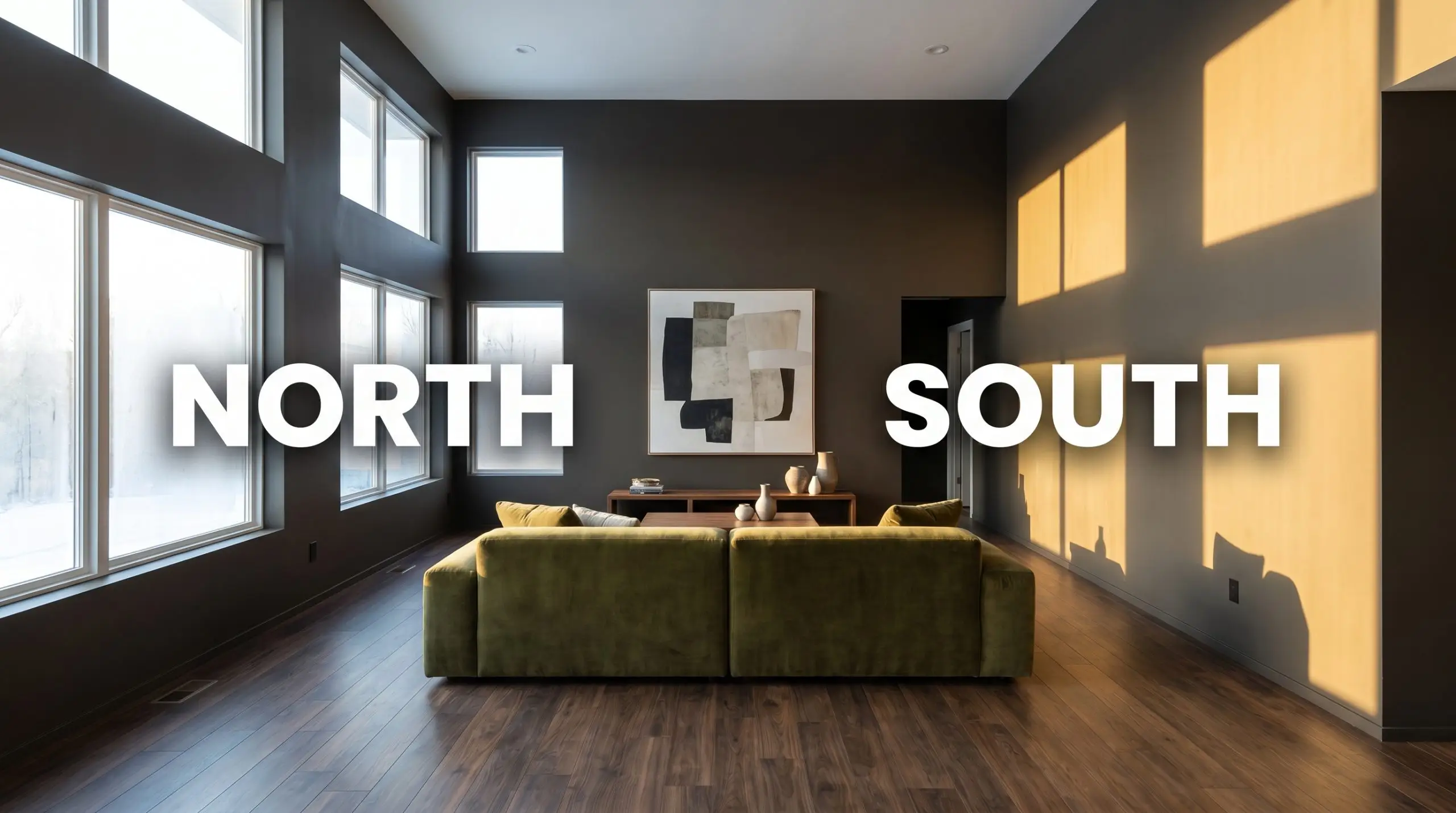
The biggest risk with a color this dark is starving it of the right illumination, which causes its complex violet notes to vanish entirely. If you place this shade in a stark, north-facing room with cool overhead lighting, it will immediately flatten out into a heavy, lifeless charcoal.
To get the most out of this chameleon-like hue, you must be highly intentional about your light sources. Always test large, painted swatches on multiple walls to watch how the undertones travel throughout the day.
If you want to maintain the sophisticated brown-black identity of this color after the sun goes down, strictly avoid bulbs cooler than 3000K. Cool blue light clashing with a warm, violet-laced dark paint creates a muddy, confusing visual.
Hackrea Pro-Tip (The Bulb Rule)
Where to Apply Benjamin Moore Night Horizon in Your Home
This color brings an immediate, grounding gravity to residential architecture, fundamentally changing how a room wraps around you. Instead of feeling heavy, it creates a tailored, enveloping atmosphere that pushes furniture and artwork to the foreground.
Formal Dining Rooms
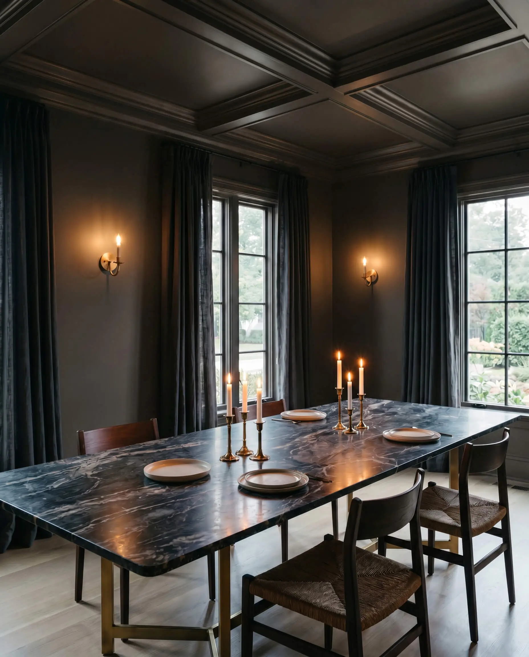
This is a spectacular dramatic dining room color that thrives in the evening hours. By wrapping the walls—and ideally the ceiling—in this rich shade, you create an intimate, candlelit atmosphere that instantly elevates standard dining furniture. Pair it with heavily veined marble tables, unlacquered brass sconces, and linen drapery to balance the visual weight of the dark walls.
Libraries and Studies
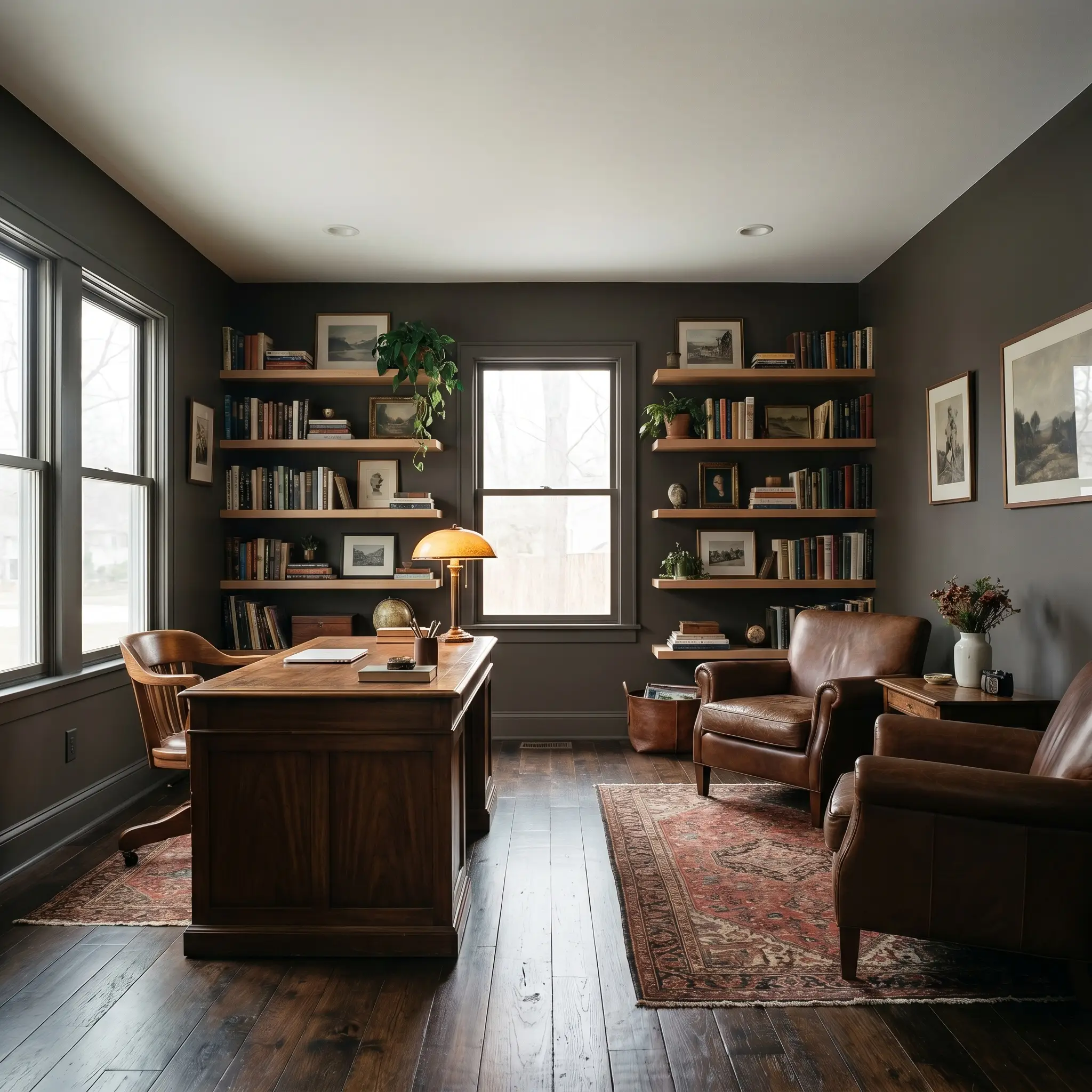
For a moody interior design approach, this hue is practically built for home libraries and offices. It provides a stunning, high-contrast backdrop for natural wood tones, making everything from standard oak floating shelves to vintage walnut desks look incredibly rich. Use a matte finish on the walls to absorb the light, allowing the spines of your books and the glow of your desk lamp to become the focal points of the room.
Kitchen Cabinetry & Islands
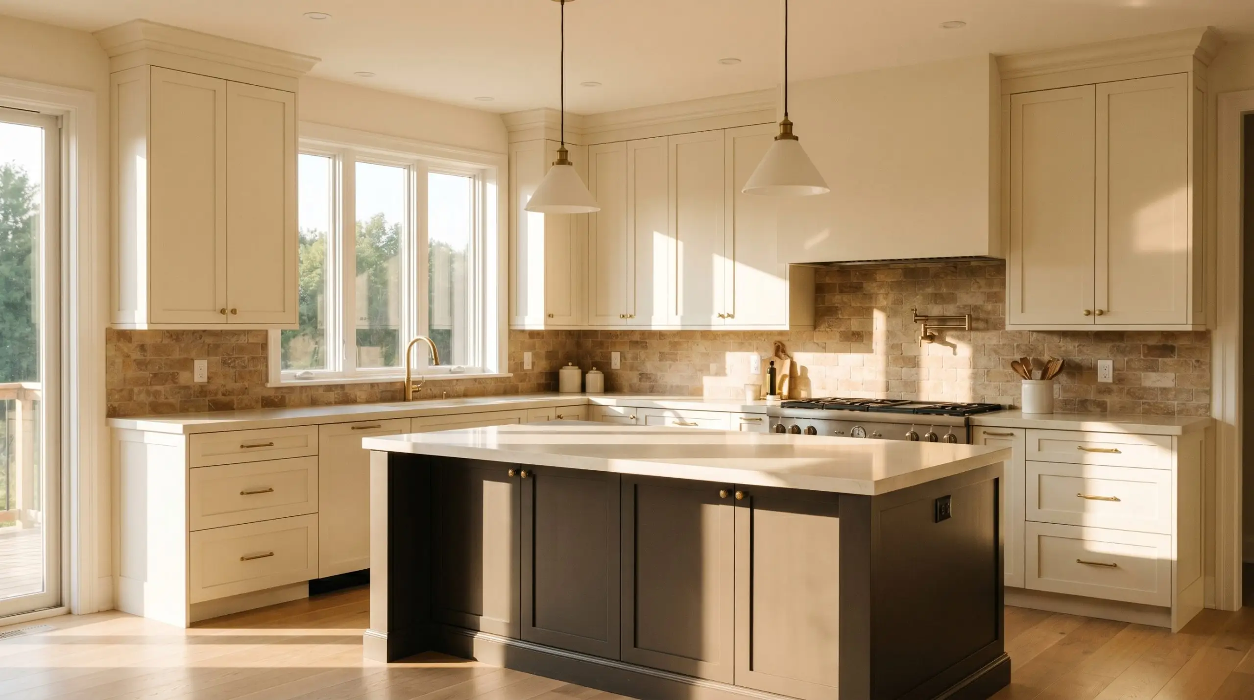
As a dark cabinetry paint, 2134-10 offers a softer, more sophisticated alternative to stark industrial black. It looks brilliant on standard shaker-style fronts, especially when paired with creamy quartz countertops and tumbled stone backsplashes. If you are nervous about committing to a fully dark kitchen, use this shade exclusively on the center island to anchor the room while keeping the perimeter cabinets light and airy.
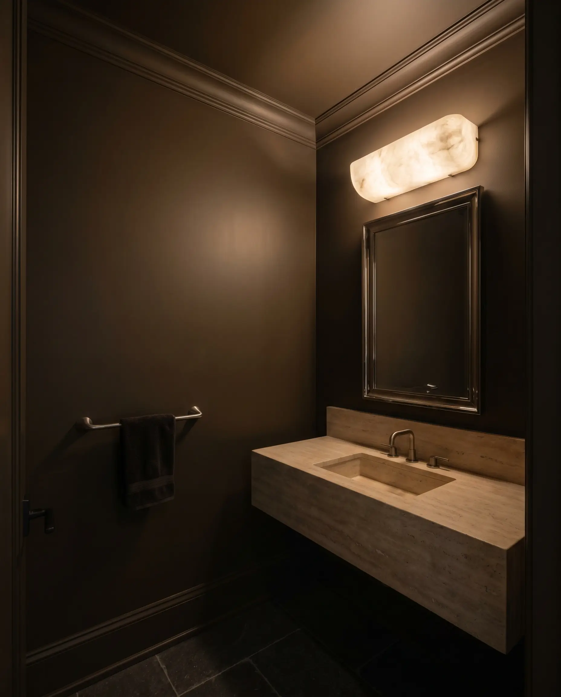
Windowless Powder Rooms
Embrace the lack of natural light by leaning into the drama. Color drenching a small powder room—painting the walls, ceiling, and trim in this exact shade—erases the visual boundaries of the room, making the tight quarters feel endless rather than cramped. Mount a polished nickel mirror and a warm alabaster sconce to create a brilliant, glowing focal point against the dark backdrop.
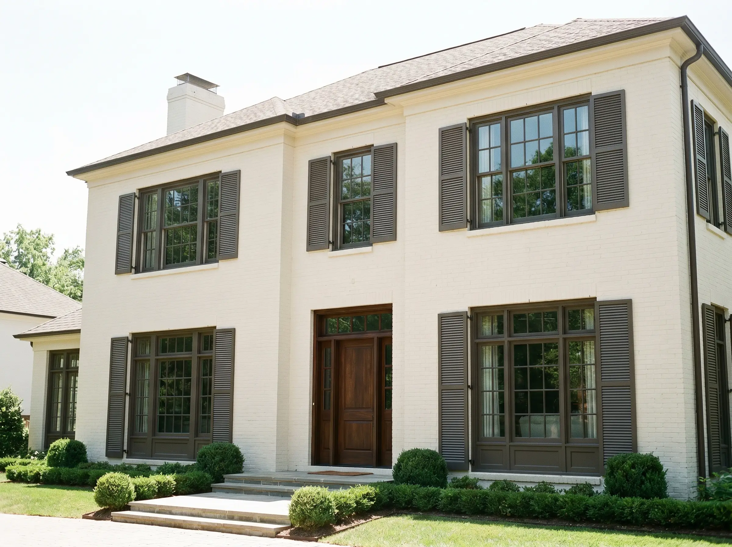
Exterior Trim & Shutters
On an exterior facade, the intense natural sunlight will wash out some of the color’s depth, making it read slightly lighter and warmer than it does indoors. It is a stunning choice for shutters and window trim against a creamy off-white stucco or painted brick house. The subtle violet undertone provides a sophisticated, historic charm that standard black exterior paint simply cannot replicate.
Custom Architectural Features Using Night Horizon
The bruised espresso nature of this paint inspires highly custom, intentional architectural framing. When applied strategically, it can manipulate the perceived scale of a room or turn overlooked transitional zones into stunning design moments.
The “Speakeasy” Pantry
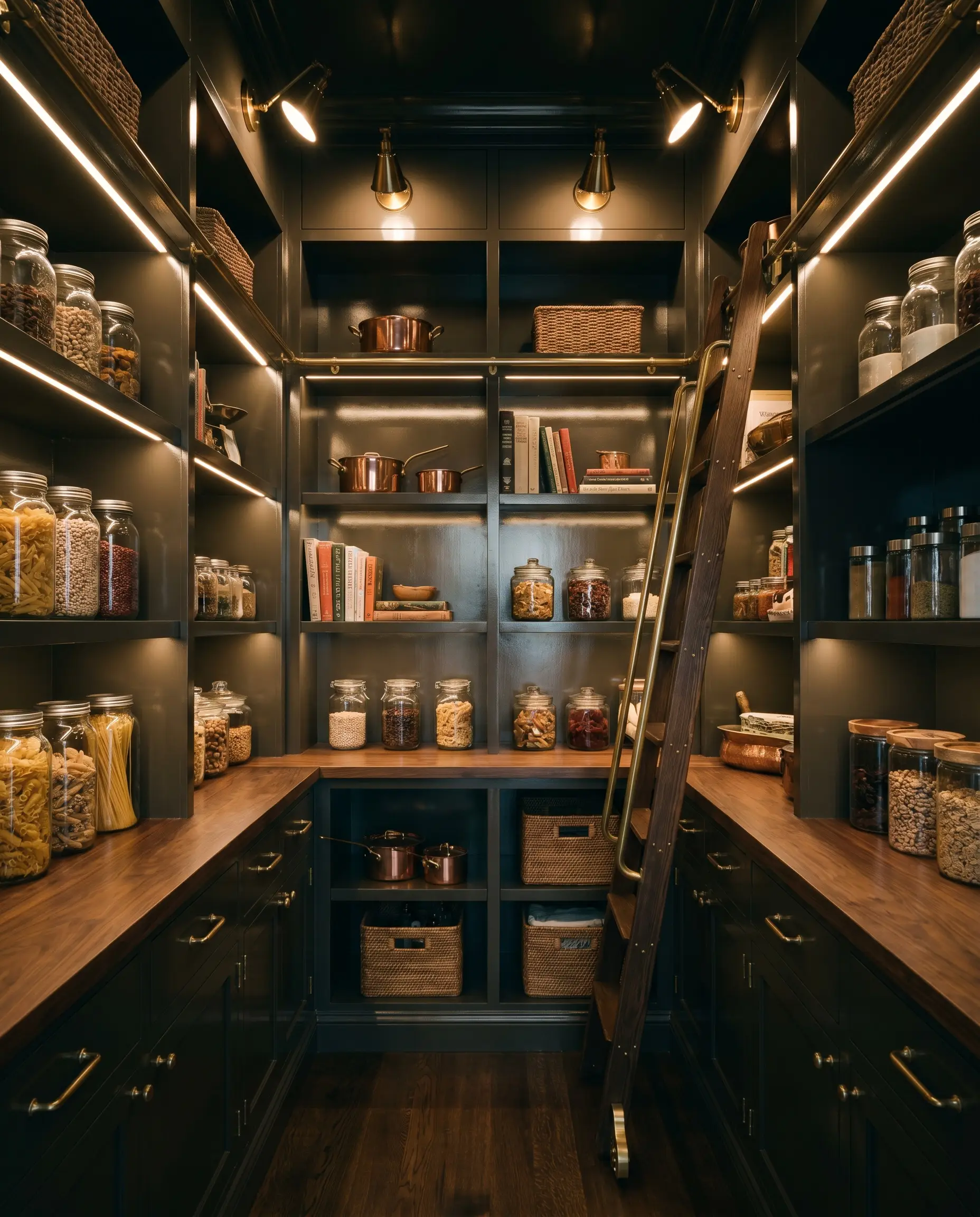
Transform an overlooked utilitarian space into a high-end jewel box by drenching a windowless walk-in pantry in a high-gloss lacquer finish. For the culinary aficionado, this reflective, deeply saturated backdrop makes dry goods, glass jars, and unlacquered brass hardware pop brilliantly. The high-gloss sheen bounces the minimal light around the tight space, ensuring the dark hue feels intentional and glamorous rather than restrictive.
The Violet-Glow Library
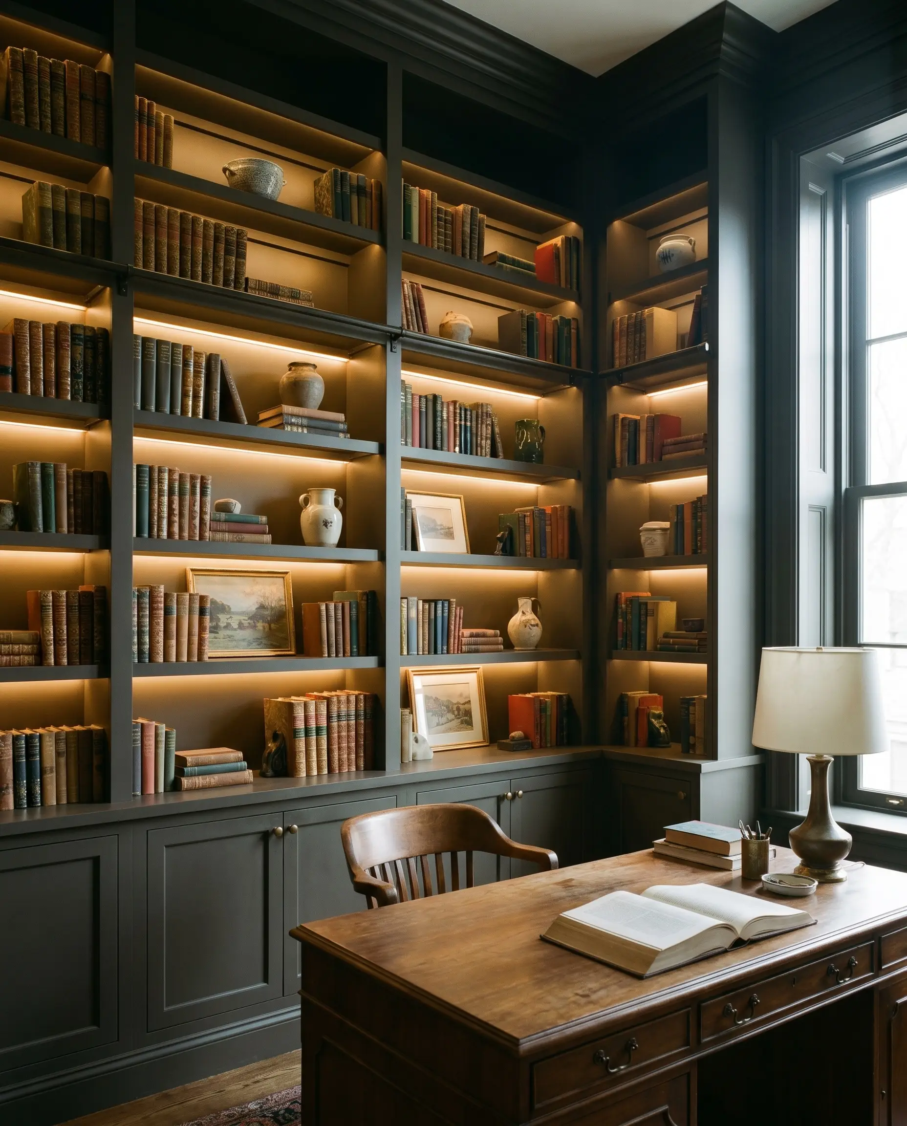
For the historic home renovator, this color offers a brilliant way to highlight built-in library shelving. By applying 2700K LED strip lighting behind shelves painted in a dead-flat matte finish, you intentionally extract the hidden violet undertones. This warm, glowing halo effect beautifully frames antique book spines and curated ceramics, turning a standard built-in into a stunning, glowing focal point.
The Grounded Archway
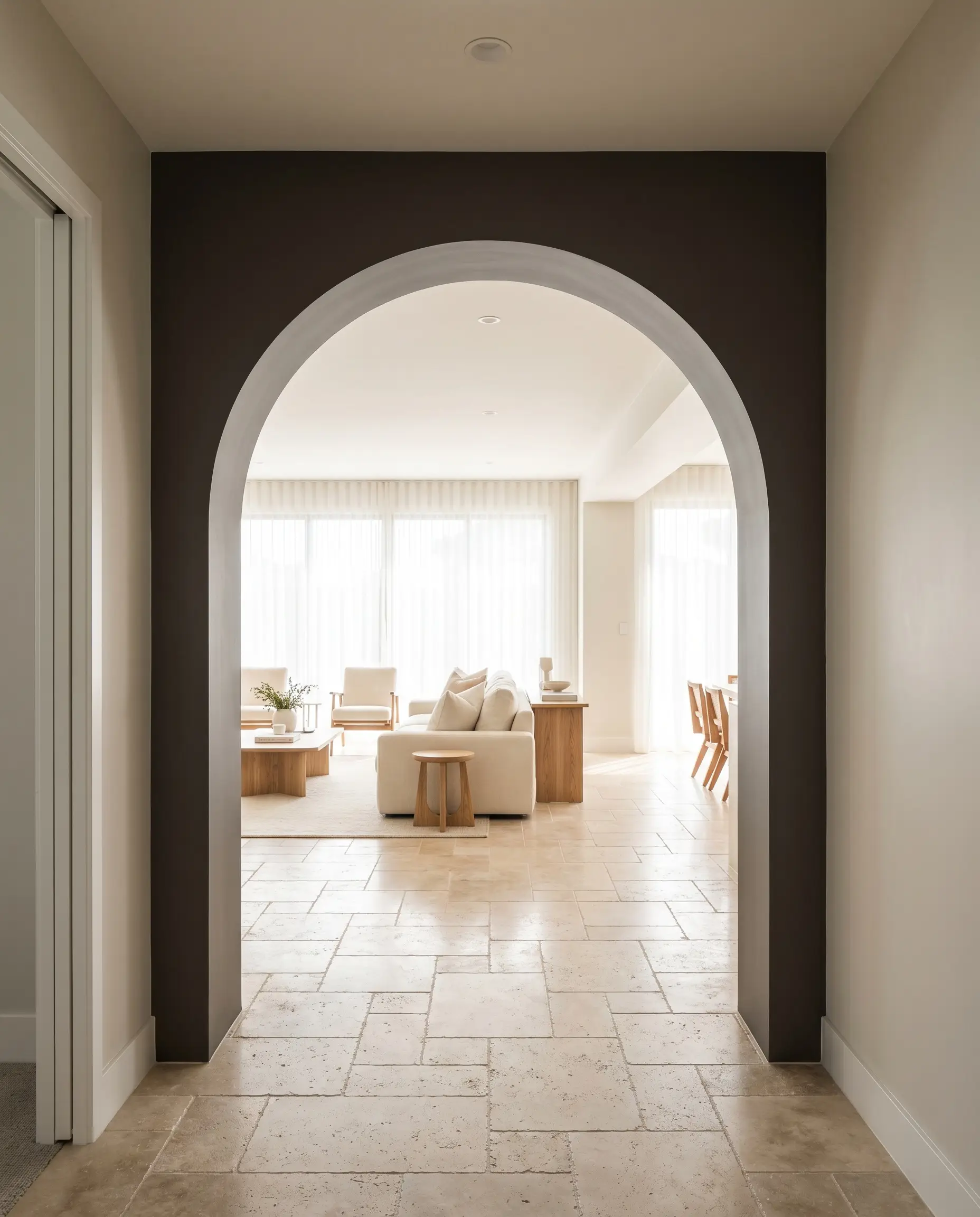
Use this shade to create a psychological “reset” zone for a person seeking calm between high-stimulation living areas. By matte color-drenching a thick threshold or a transitional hallway archway entirely in this deep hue, you create a quiet, grounding pause in the floor plan. This dark, enveloping passage makes the rooms on either side feel significantly brighter and more expansive by comparison.
The Coastal Gothic Mullions
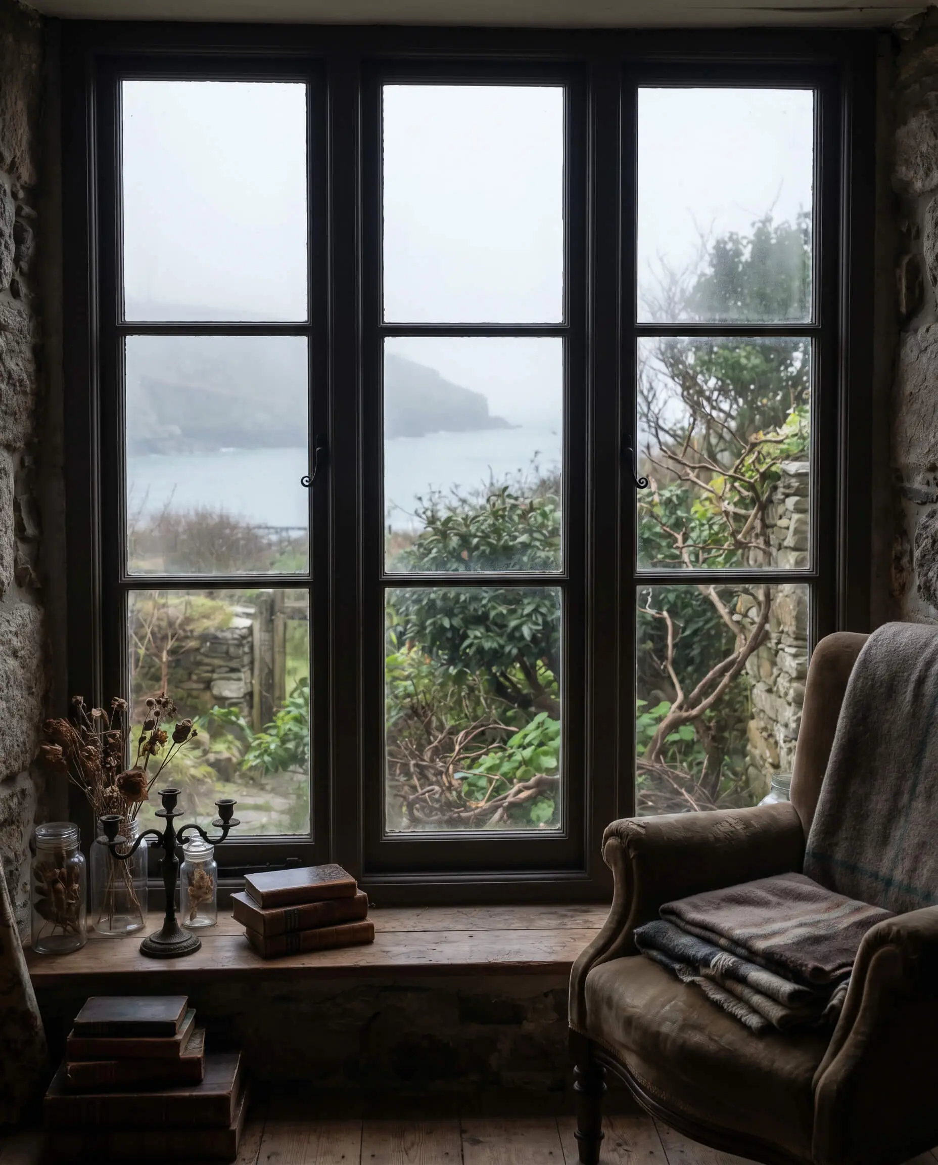
For the coastal gothic enthusiast, painting interior window mullions in this warm brown-black acts as a biophilic framing device. It provides a softer, warmer alternative to stark industrial black, beautifully framing foggy coastal views or lush garden landscapes. The subtle plum undertone connects organically with the natural greens and grays outside, blurring the line between the interior and the exterior.
Material Pairings & Night Horizon Coordinating Colors
This color requires a thoughtful relational dynamic; it needs the right surrounding textures to either hold its crisp boundaries or soften its heavy visual weight.
Trim & Baseboards
When selecting a high-contrast trim, you have two distinct pathways depending on the mood you want to set.
Hardware, Wood & Material Pairings
To bring out the absolute best in this complex hue, surround it with tactile materials that play off its warmth and depth.
Coordinating Colors
To avoid the standard, predictable black-and-white pairings, we must isolate and complement the paint’s violet micro-nuance.
Designer Mood Boards
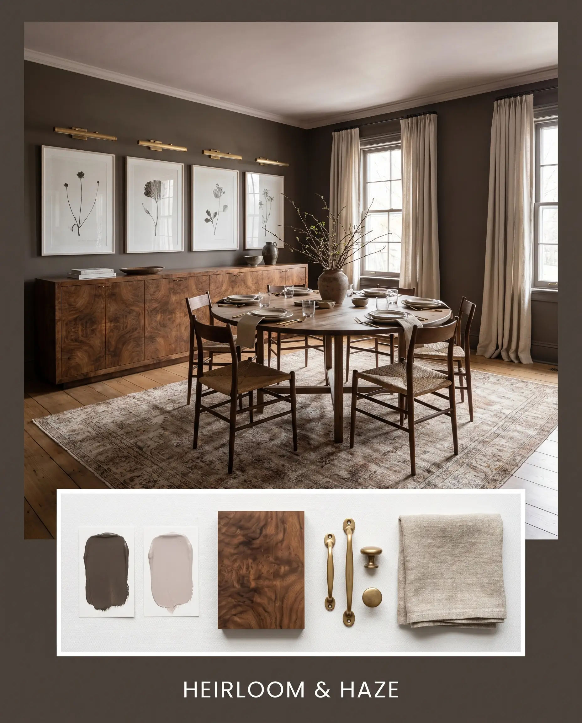
Heirloom & Haze This palette is rooted in quiet, historic elegance. By pairing the bruised espresso walls with Farrow & Ball Peignoir No. 286 on the ceiling, you create a soft, romantic tension. Anchor the space with heavily burled walnut sideboards, unlacquered brass picture lights, and heavily textured linen drapery to build a room that feels both grounded and incredibly serene.
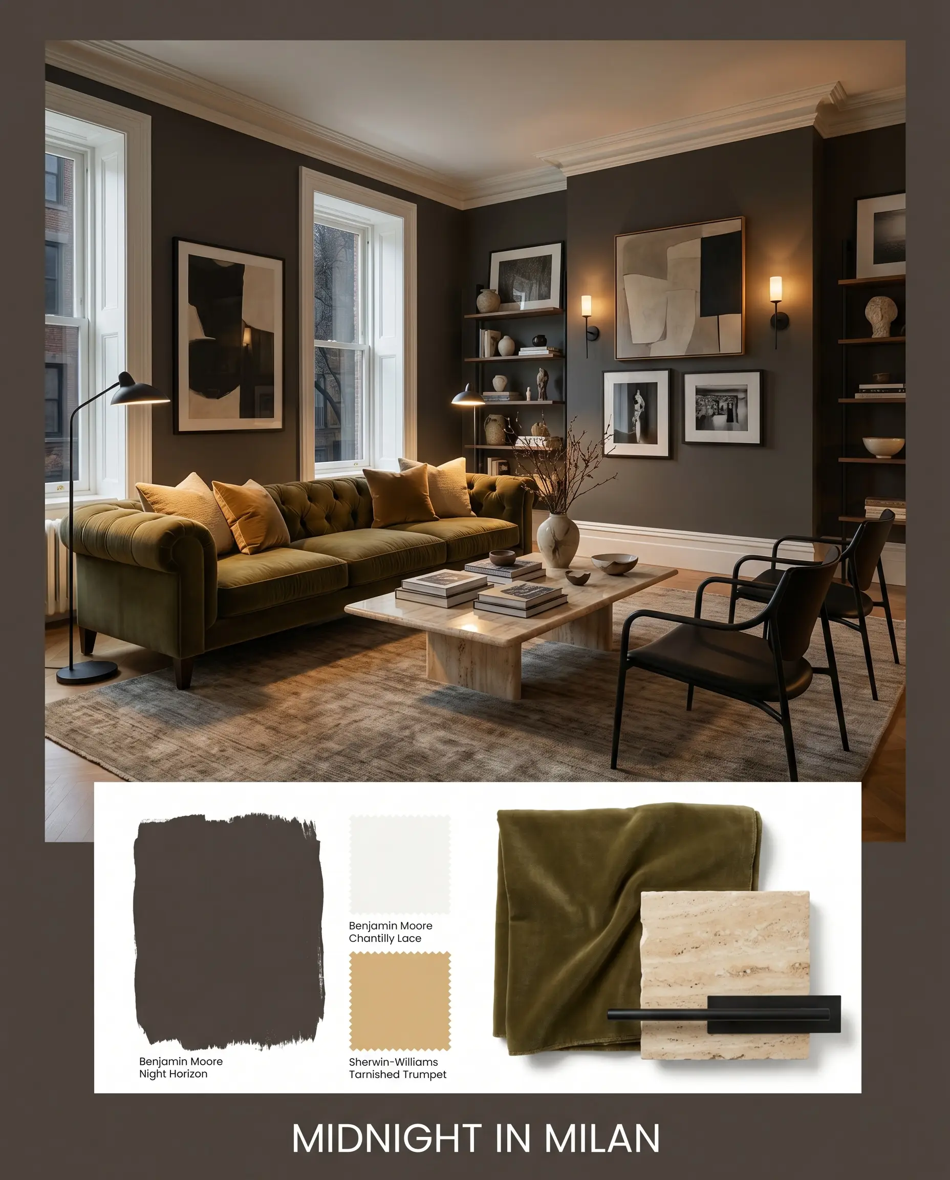
Midnight In Milan A sharp, highly tailored aesthetic that leans into the color’s dramatic edge. Use Benjamin Moore Chantilly Lace OC-65 on the trim for a crisp boundary, and introduce accents of Sherwin-Williams Tarnished Trumpet SW 9026 through throw pillows or artwork. Style the space with a deeply tufted olive mohair sofa, a polished travertine coffee table, and sleek, matte black architectural lighting to create a sophisticated, high-contrast environment.
Head-to-Head Paint Comparisons
Sometimes, the specific lighting in your home dictates that a similar shade might actually perform better. Here is how this hue stacks up against its closest rivals.
Benjamin Moore Night Horizon vs. Benjamin Moore Midsummer Night
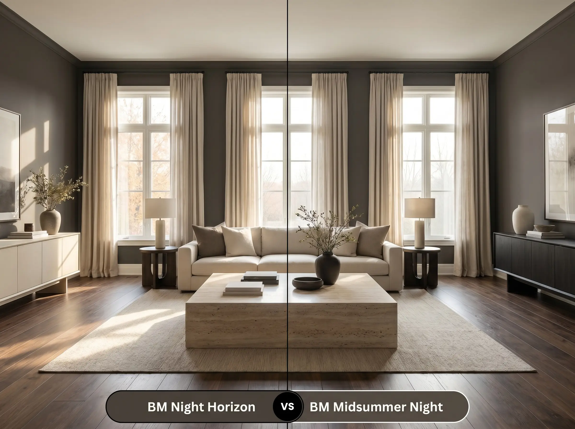
Midsummer Night 2134-20 is slightly lighter and lacks the distinct violet undertone found in its darker sibling. If your room receives heavy, warm southern light, Midsummer Night might read a bit too brown and muddy. In that scenario, the deeper, plummy richness of 2134-10 holds its shape and sophistication much better under intense sunlight.
Benjamin Moore Night Horizon vs. Sherwin-Williams Black Fox
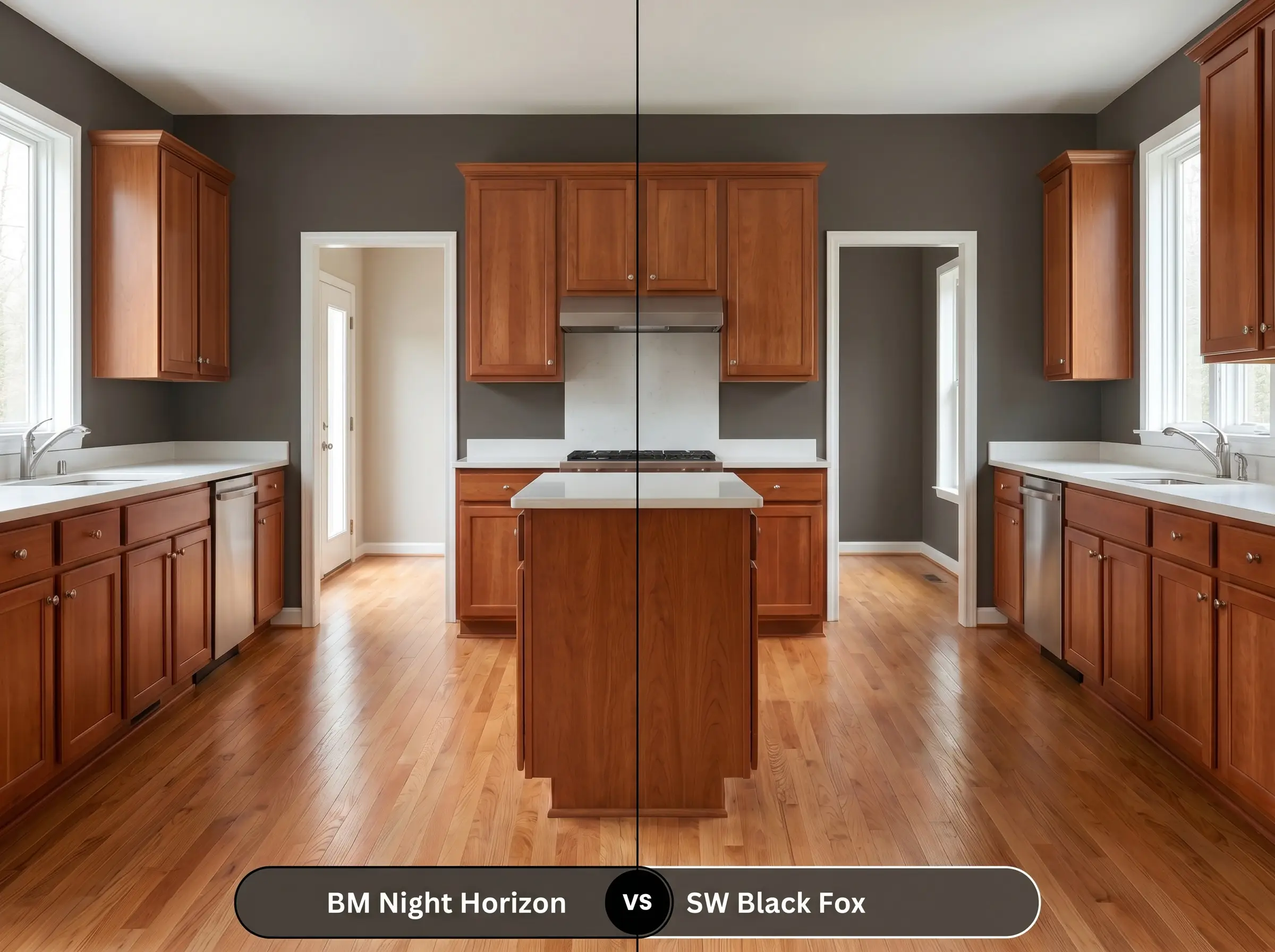
Sherwin-Williams Black Fox SW 7020 is a very popular warm charcoal, but it leans much more heavily into a green-gray base. If your home features a lot of warm red-oak flooring or cherry cabinetry, the green undertones in Black Fox can clash uncomfortably. The purple-brown base of the Benjamin Moore option complements red-toned woods far more naturally, creating a cohesive, harmonious flow.
Benjamin Moore Night Horizon vs. Benjamin Moore Black Beauty
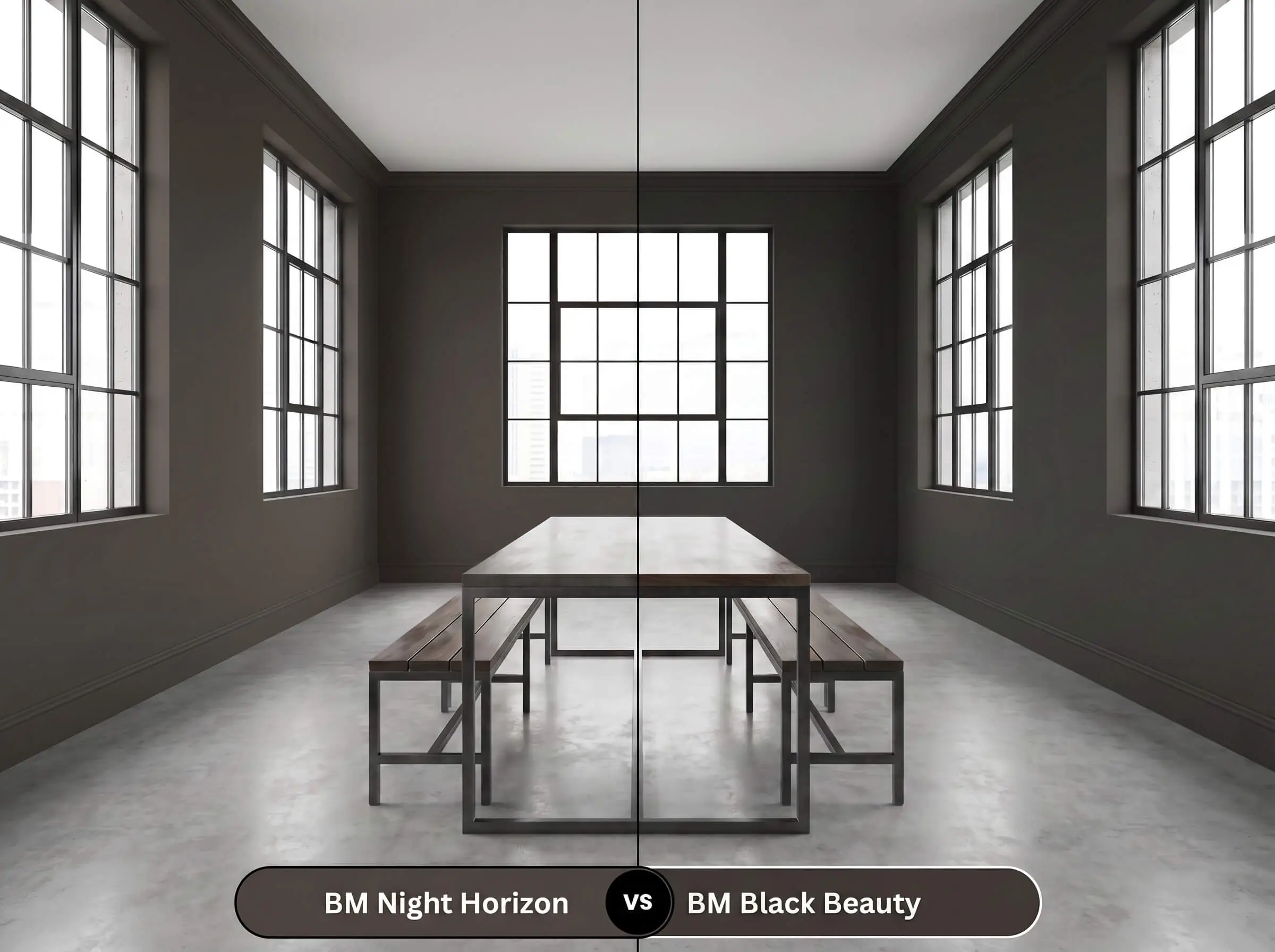
Black Beauty 2128-10 is a much truer, more traditional black with a very subtle warm undertone. If you are painting thin window mullions or exterior modern trim, Black Beauty provides that stark, industrial punch. However, if you are wrapping an entire dining room or library, Black Beauty can feel overwhelmingly heavy, whereas the brown-violet notes of 2134-10 provide a softer, more livable embrace.
Similar Hues & Cross-Brand Color Matches
If you need to pivot your color choice based on local availability, subtle undertone preferences, or slightly different light reflectance needs, here are the best alternatives.
Similar Colors from Benjamin Moore
Cross-Brand Equivalents
Executing a Flawless Finish with Night Horizon
Transitioning from design theory to the physical reality of a roller and brush requires a specific strategy, especially when working with Benjamin Moore’s Gennex Color Technology in such a dark base.
The Dynamic Sheen Guide
Dark, matte paints are notorious for “flashing”—showing highly visible, uneven streaks where the roller marks overlap. To avoid this, you must maintain a wet edge while painting, never rolling back over paint that has started to dry. If you are a novice DIYer, consider hiring a professional for large, uninterrupted walls.
Hackrea Design Secret (The Flashing Warning)
Primer Strategy
You cannot simply roll this color over a white wall and expect true depth. You must use a high-quality primer tinted to a deep gray. A tinted primer reduces the number of topcoats required and ensures the subtle violet-brown undertones develop fully without the old wall color bleeding through and muddying the final result.
Coverage & Success Tips
Even with a tinted primer, expect to apply a minimum of two generous coats to achieve full opacity. Be highly meticulous during application, as touching up dark, matte paint later often leaves visible marks.
Frequently Asked Questions
Because of its hidden violet undertones, direct, intense sunlight will absolutely pull those plum notes forward. While it won’t look like a bright, vibrant purple, it will read as a very warm, bruised brown-black rather than a stark charcoal.
Standard black can often feel cold, flat, and cavernous in spaces without natural light. The deep brown and subtle violet base in this shade provides a much softer, enveloping warmth that makes a windowless room feel intimate and luxurious instead of restrictive.
Yes, painting a soaring ceiling in this warm black is a brilliant architectural trick to bring the visual ceiling line down, making the room feel cozier. Because of its warm undertones, it acts like a comforting evening sky rather than a heavy, oppressive lid.
A dead-flat or matte finish is the absolute best choice for hiding bumps and uneven drywall texture. The matte finish absorbs the light, preventing glare from highlighting the flaws, while allowing the rich, warm brown pigment to remain deep and saturated.
The Final Ruling on Night Horizon
Benjamin Moore Night Horizon is not a color for those who want a safe, invisible background. It is a deeply intentional, architectural pigment perfect for homeowners who want to inject high-end, moody sophistication into their dining rooms, libraries, or kitchen cabinetry. By harnessing its complex violet and brown undertones, you can create a space that feels incredibly tailored, grounded, and rich.
However, this bruised espresso hue requires careful handling to avoid visual conflict. You must be extremely cautious when pairing it with yellow-toned woods (like honey oak or clear pine) or stark, cool-toned gray flooring. The warm, plummy depths of this paint will fiercely reject those cool, yellow-green elements, making the wood look sickly and the paint look muddy. Keep your material palette rooted in warm walnuts, earthy stones, and rich metallic finishes, and this complex hue will reward you with a breathtakingly curated room.
Real-World Inspiration Be the first to upload a real photo of Night Horizon!
No Photos Yet
Includes +20 First Upload Bonus!
Real Experiences
Insights from people who have used Night Horizon.No reviews yet
Be the first to share your experience with Night Horizon.
Earn 15 points instantly!
Closest Cross-Brand Equivalents
The absolute closest scientific color matches for Night Horizon across top paint brands.