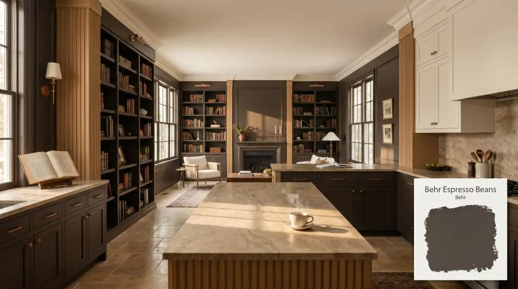
Behr Espresso Beans (PPU5-01) is a rich, caffeinated dark brown with subtle warm undertones. Boasting an LRV of 6, it acts as a bold, moody neutral that brings sophisticated depth to cabinetry, accent walls, and exteriors without appearing overly red or harsh.
Will Espresso Beans clash with your room?
Paint Technical Profile
| Color ID / SKU | PPU5-01 |
| HEX Code | #4c443e |
| Light Reflectance (LRV) | 6 |
| Use | Interior, Exterior |
| Best Exposures | South-Facing, North-Facing |
| Best For | Cabinetry, Accent Walls, Exterior Trim, Dining Rooms |
Behr Espresso Beans: The Caffeinated Dark Brown That Anchors Every Room
Deep, saturated browns are currently reclaiming their position as the ultimate foundational layer in modern homes. When a standard black feels too severe and a charcoal reads too cold, a caffeinated dark brown steps in to provide immediate, undeniable warmth. This specific shade acts as a heavy anchor, instantly giving standard rooms a sense of custom-built permanence.
Behr Espresso Beans (PPU5-01) is a brilliant example of this shift. It offers the dramatic weight of a near-black but carries just enough velvety mocha undertones to keep the atmosphere inviting. Whether you are aiming for a moody aesthetic in a dining space or grounding a bright kitchen, this color manipulates shadows beautifully to redefine the boundaries of your home.
Undertones & LRV of Behr Espresso Beans
When evaluating its core temperature, Behr Espresso Beans is definitively warm. It carries a heavy, enveloping richness that immediately warms up the surrounding architecture, making it an incredible tool for spaces that need a dose of intimacy.
However, its underlying structure is incredibly complex, preventing it from ever looking like a simple chocolate bar.
With a Light Reflectance Value (LRV) of exactly 6, this color absorbs a massive amount of light. In a brightly lit room, it will read as a deeply saturated brown, but the moment it slips into the shadows, it acts as a heavy, grounding anchor that reads as a near-black.
Lighting Effects & The Chameleon Factor
The biggest risk when working with a low-chroma character like this is treating it like a standard neutral in a poorly lit space. If you apply this deep brown in a windowless, dimly lit room without layering your artificial lighting, the beautiful mocha warmth will completely collapse, leaving you with a flat, lifeless wall.
Because of its hidden charcoal notes, this paint requires adequate light to reveal its true personality. You must test it on multiple walls to see how the shifting sun pulls its hidden undertones forward throughout the day.
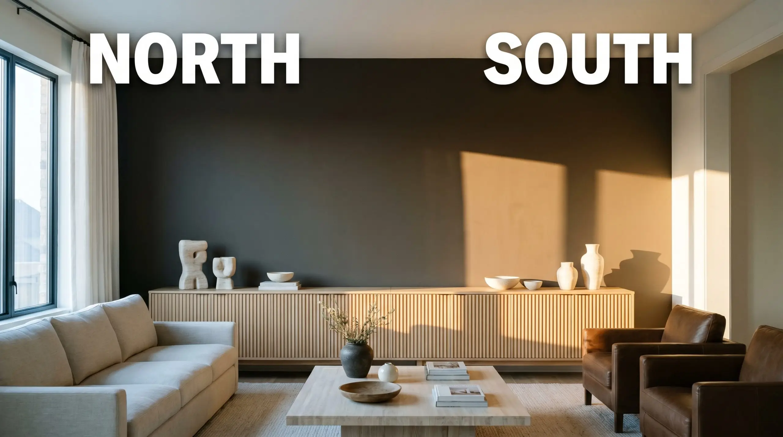
When using a color this dark, always layer your lighting. Relying solely on overhead recessed lights will cast harsh shadows. Use wall sconces and table lamps with warm bulbs to wash the dark walls in a soft, inviting glow.
Hackrea Pro-Tip (Lighting Strategy)
Popular Room Applications
This color brings a heavy, custom warmth to standard drywall and basic stock elements. By utilizing its deep, light-absorbing qualities, you can easily trick the eye into perceiving standard rooms as highly intentional, curated spaces.
Kitchens
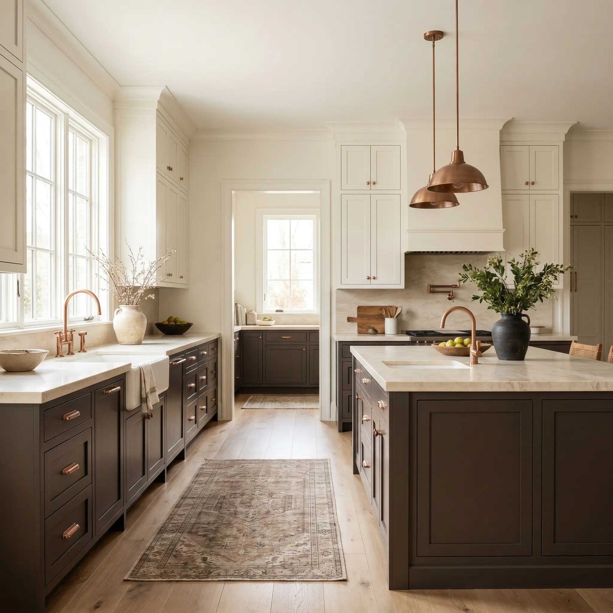
Using this deep brown on lower cabinetry or a central island is a brilliant way to ground the entire room. It pairs beautifully with creamy upper cabinets and natural stone counters, hiding scuffs effortlessly while providing a rich, organic base. If you are planning a renovation, our dark brown kitchen cabinets guide is an excellent resource for balancing these heavy tones with the right hardware and lighting.
Formal Dining Spaces
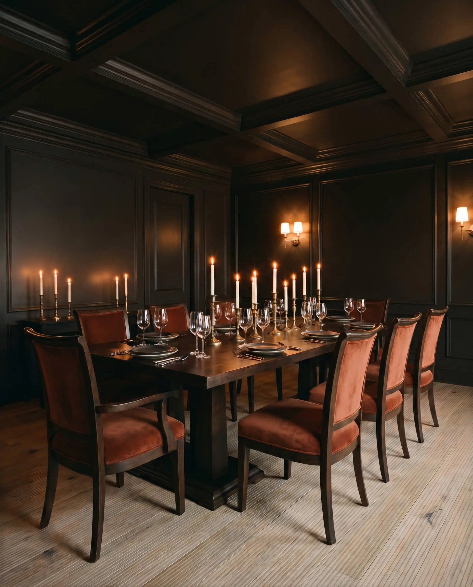
This is the perfect candidate for color drenching a dining room. By painting the walls, trim, and even the ceiling in this rich hue, you blur the hard architectural lines of the space. The result is a deeply intimate, candlelit atmosphere that makes standard dining furniture feel incredibly elevated and expensive.
Will Espresso Beans work with your specific lighting, floor, or furniture?
Exteriors
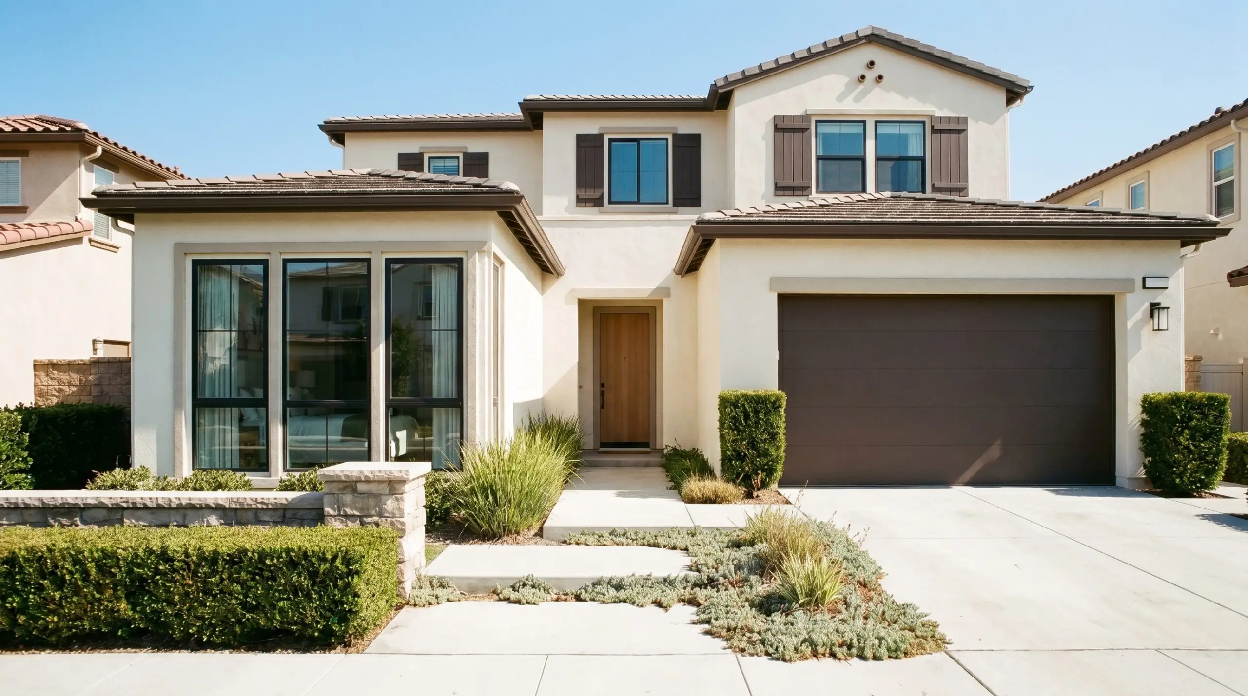
On the outside of a home, bright sunlight washes out dark colors significantly. What looks almost black indoors will read as a clear, warm brown on a sunny facade. It is one of the best moody exterior trim colors for highlighting architectural framing, shutters, or garage doors against a creamy white or soft taupe stucco.
Studies & Libraries
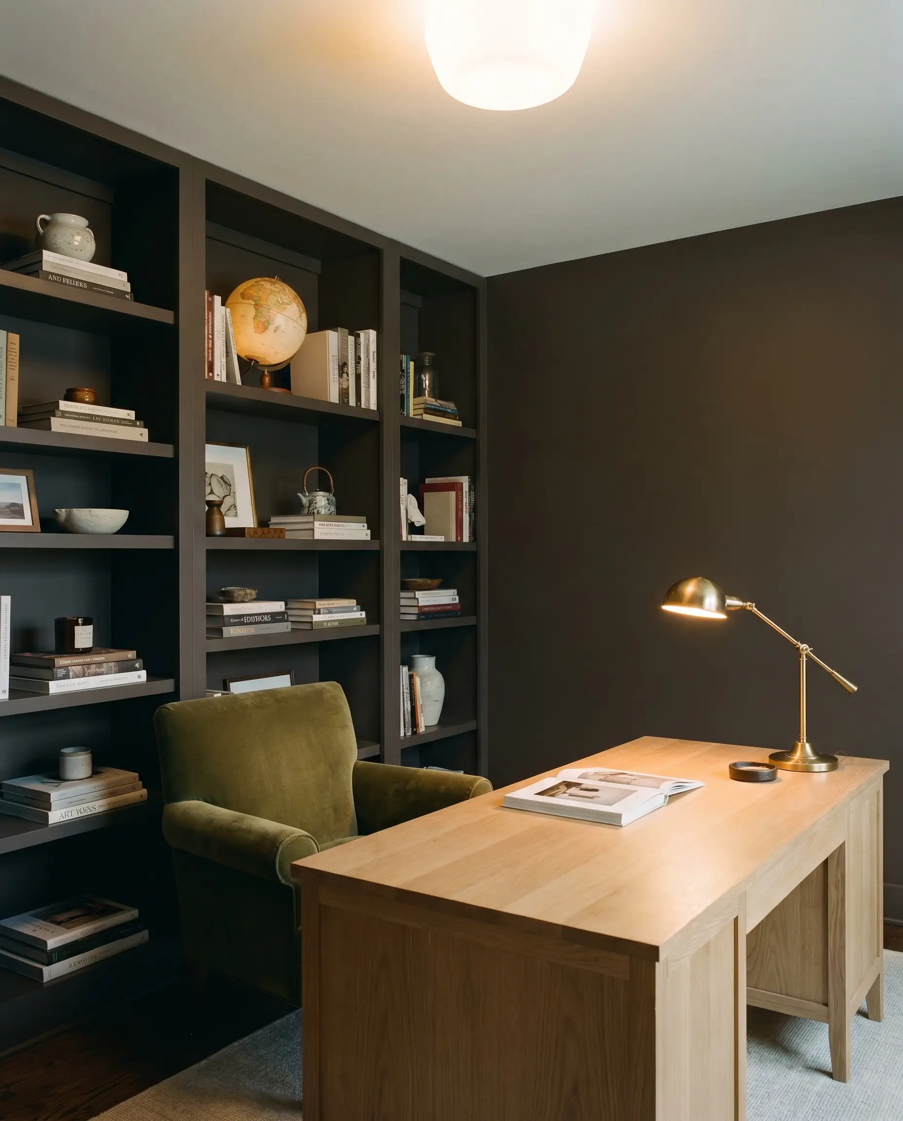
If you have a home office or a quiet reading room, wrapping the space in this deep mocha creates immediate focus. It provides a beautiful, dark backdrop that makes the spines of books, metallic desk lamps, and rich wood tones absolutely glow.
Will Espresso Beans work with your specific lighting, floor, or furniture?
Creative Ways to Use This Caffeinated Dark Brown
While it shines on standard walls, the true power of this deep brown lies in its ability to transform overlooked architectural elements into striking focal points.
The Grounded Threshold
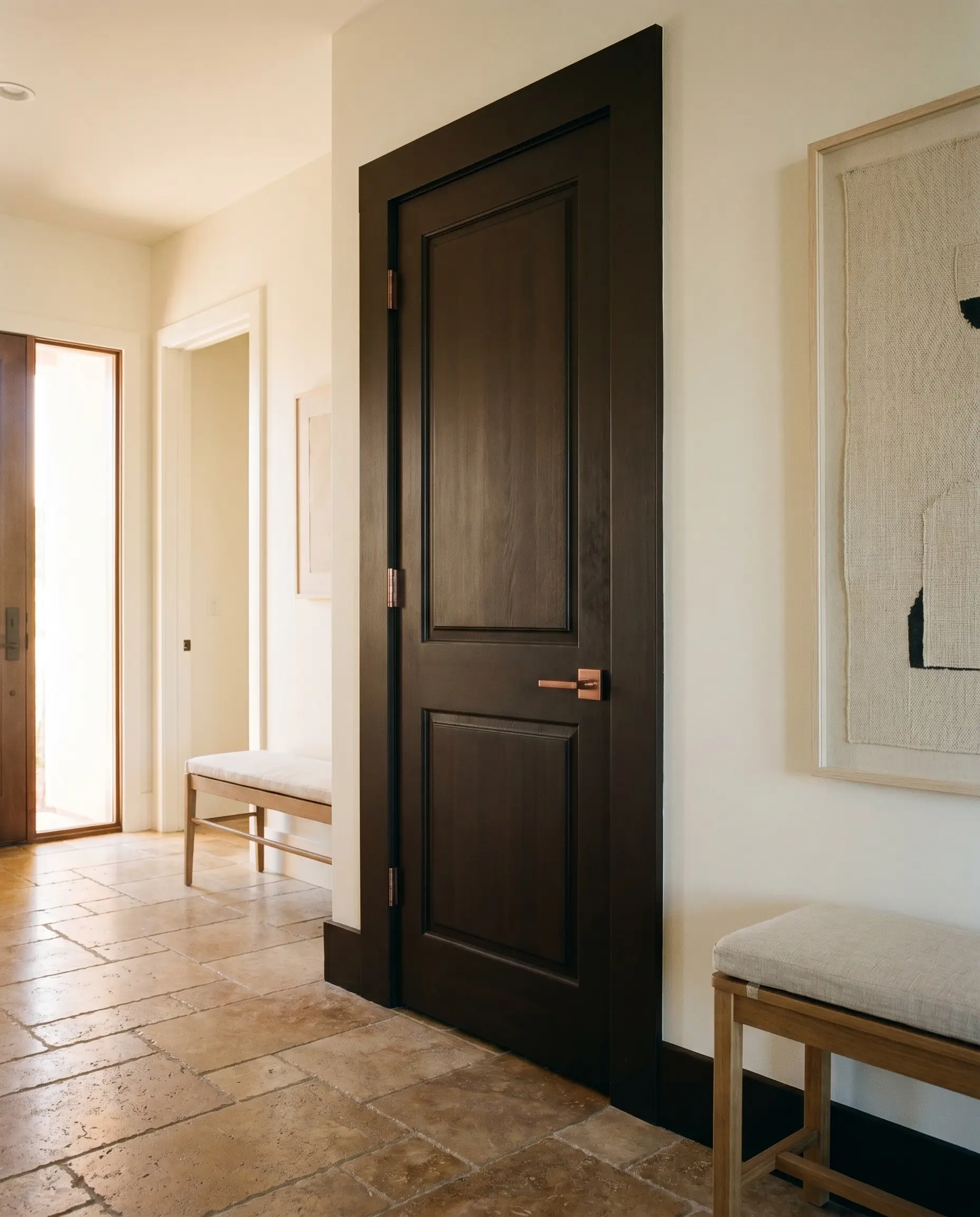
Standard interior doors and their surrounding trim are often painted a default white, which can look jarring against softer wall colors. Painting your interior doors and casings in this rich dark brown immediately adds architectural weight to the hallway. It anchors the transition zones of your home, making hollow-core doors feel heavier and more substantial.
Dramatic Display Shelving
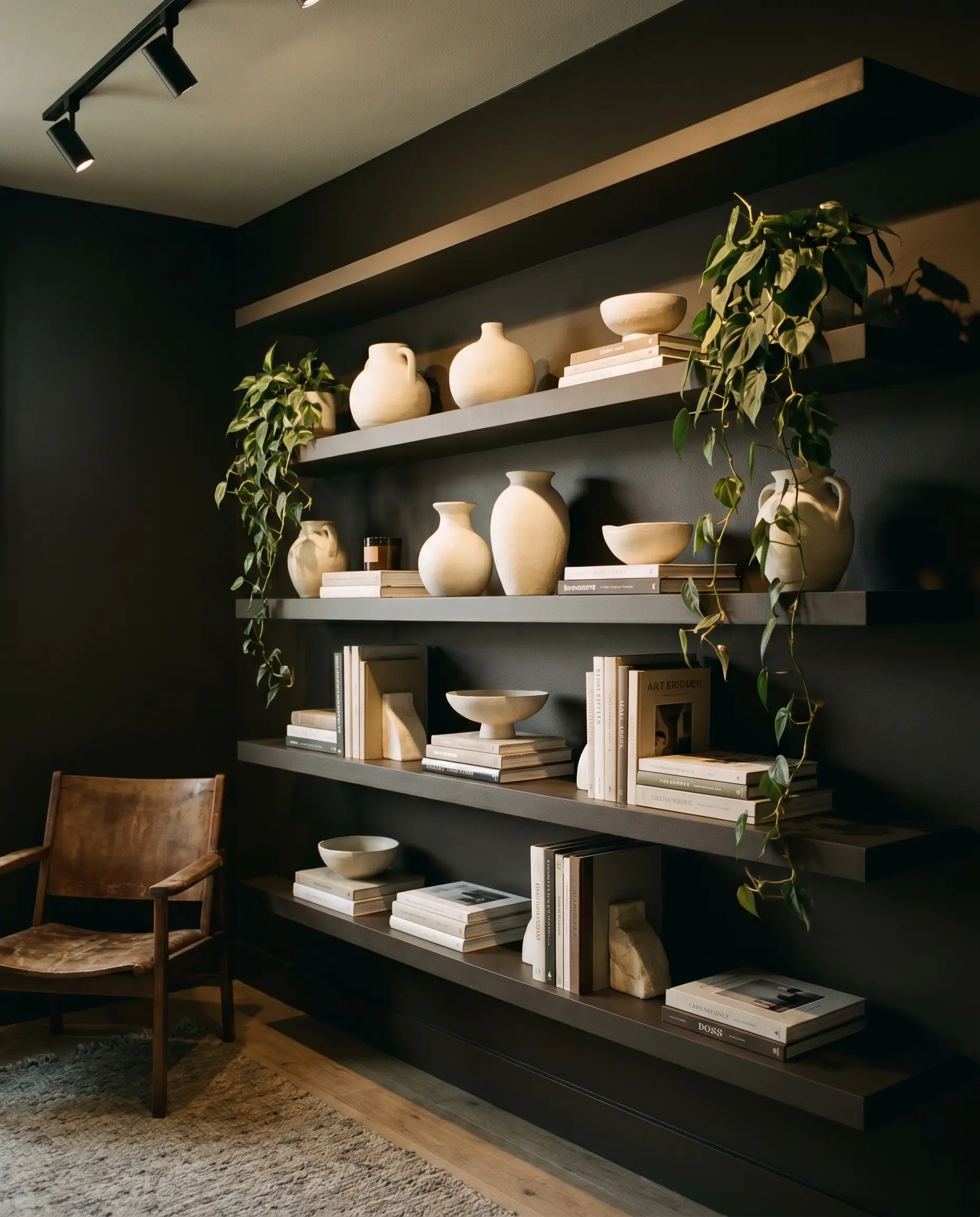
If you have basic MDF built-ins or floating shelves, coating them in this dark hue transforms them into a gallery-like display. The deep, light-absorbing backdrop forces the eye to focus entirely on the objects placed on the shelves. Light-colored ceramics, stacked books, and trailing greenery pop beautifully against the velvety shadows.
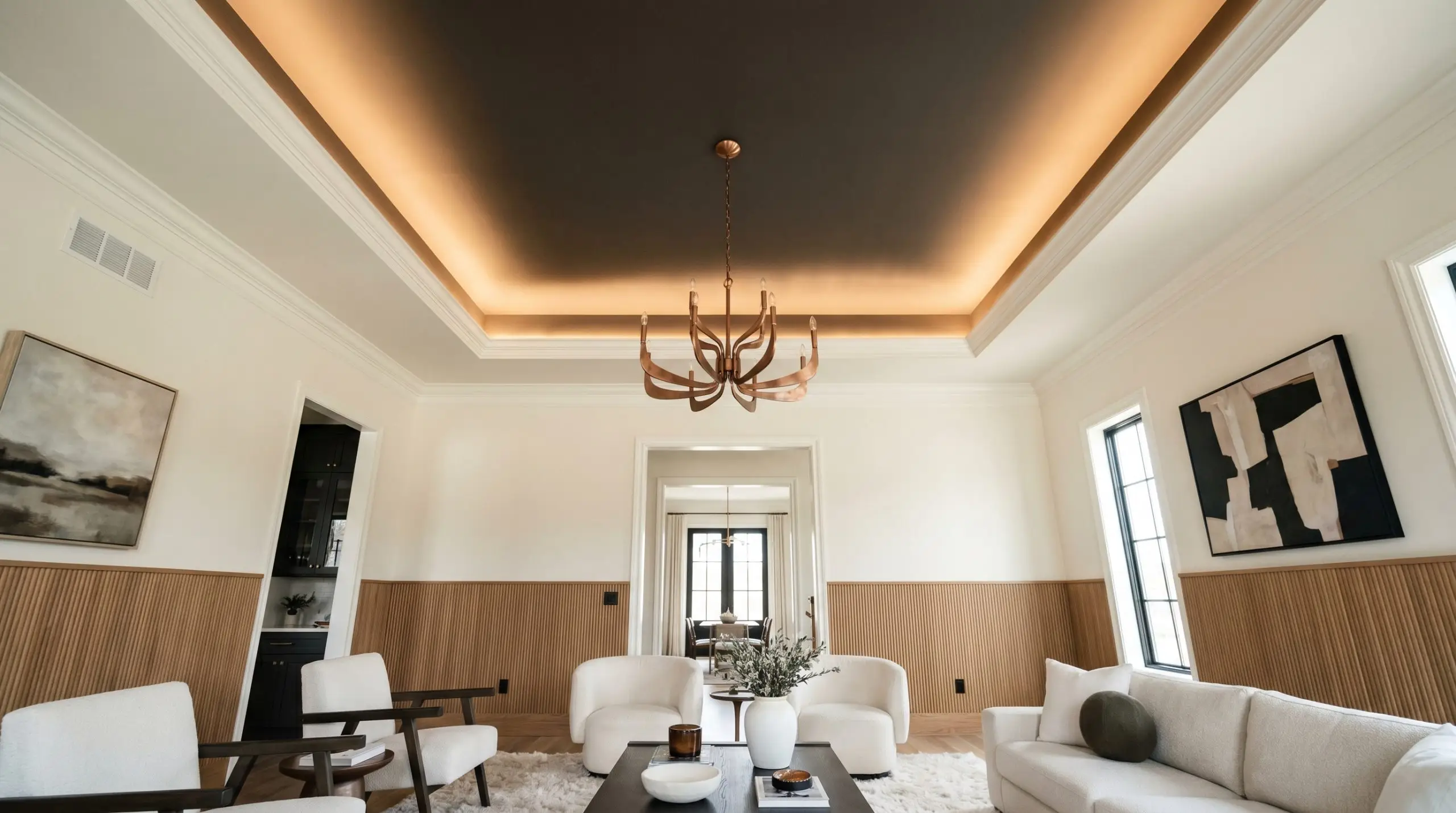
The Anchored Tray Ceiling
Will Espresso Beans work with your specific lighting, floor, or furniture?
In rooms with tray ceilings or deep structural coffers, painting the recessed ceiling area in this dark shade is a brilliant trick. While conventional wisdom says dark ceilings lower a room, the charcoal micro-nuance in this paint actually mimics the night sky, causing the ceiling line to visually recede and adding a layer of cinematic moodiness to the space.
Coordinating Colors for Behr Espresso Beans
The secret to styling this deep hue is understanding its relational boundaries. Because of its dark charcoal undertone, it requires complex, slightly muted companions to thrive; stark, cool-toned pairings will immediately make the brown look muddy and bruised.
Trim & Baseboards
When framing this deep wall color, you must avoid brilliant, blue-leaning whites at all costs. Instead, opt for soft, creamy whites that bridge the gap between the dark walls and the lighter ceiling.
Hardware & Material Pairings
To bring out the best in this paint, you need to introduce textures and finishes that either catch the light or lean into its organic warmth.
Coordinating Colors
To build a cohesive palette, lean into complex, muted tones that pull out the sophisticated depth of the dark brown.
Designer Mood Boards
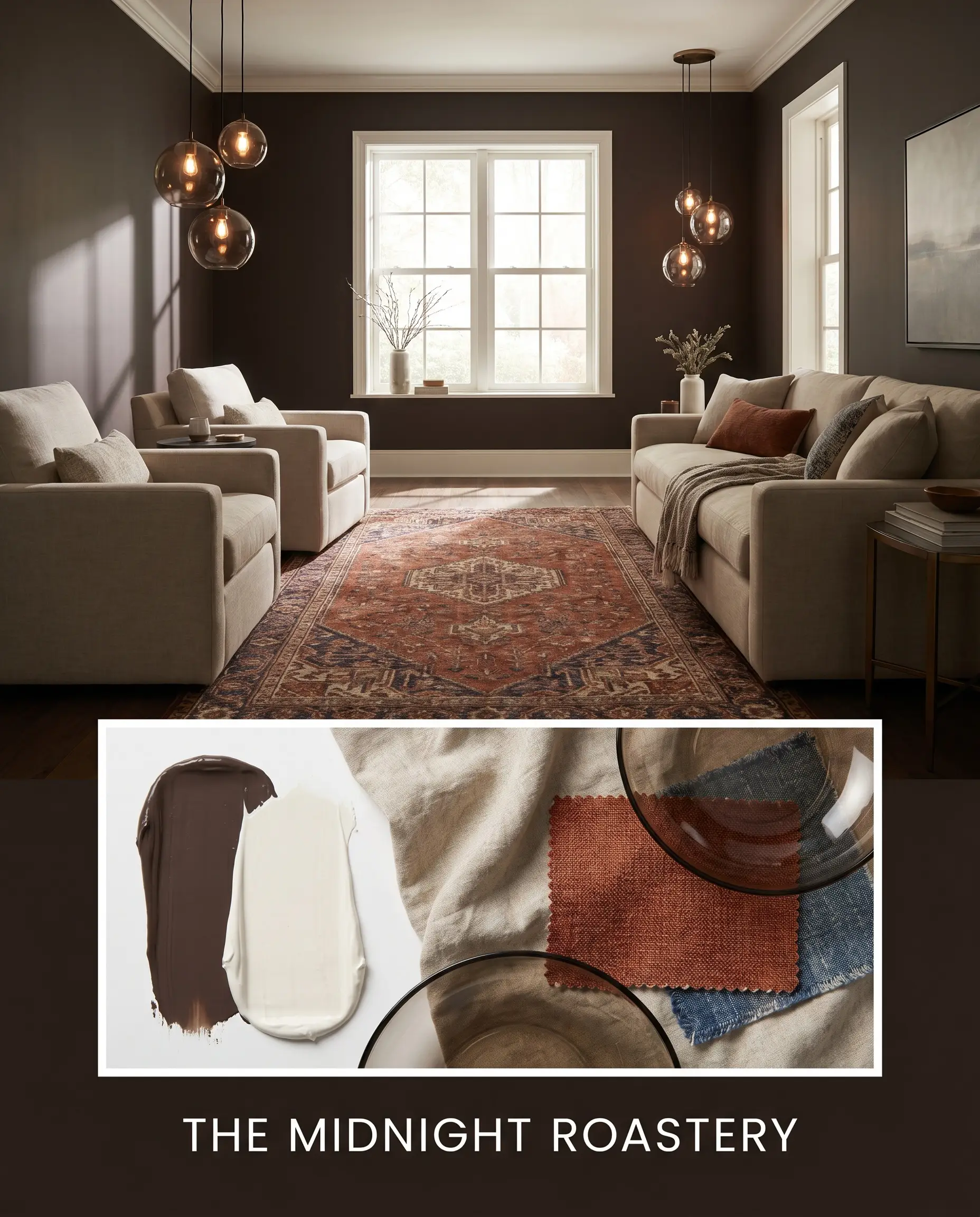
The Midnight Roastery This palette leans heavily into the warm, caffeinated richness of the paint. Pair the dark walls with warm Behr Swiss Coffee 12 trim. Introduce heavily textured linen seating in a soft oatmeal tone, and anchor the room with a vintage Persian runner featuring deep rust and faded indigo. Finish the space with smoked glass globe lights to bounce a moody, ambient glow around the room.
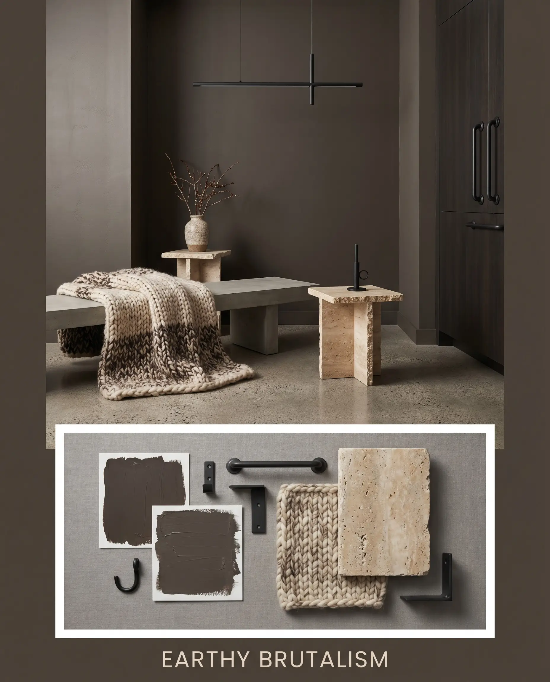
Earthy Brutalism For a more structural, modern vibe, use the dark brown as a heavy backdrop against raw, tactile elements. Pair it with Sherwin-Williams Urbane Bronze SW 7048 on adjacent accent walls. Style the space with a chunky wool throw, tumbled travertine side tables, and matte black steel hardware. The result is an incredibly grounded, textural atmosphere that feels both ancient and modern.
Head-to-Head Comparisons
When selecting a color this dark, understanding exactly how it behaves compared to its closest rivals is the only way to make a confident decision.
Behr Espresso Beans vs. Sherwin-Williams Urbane Bronze
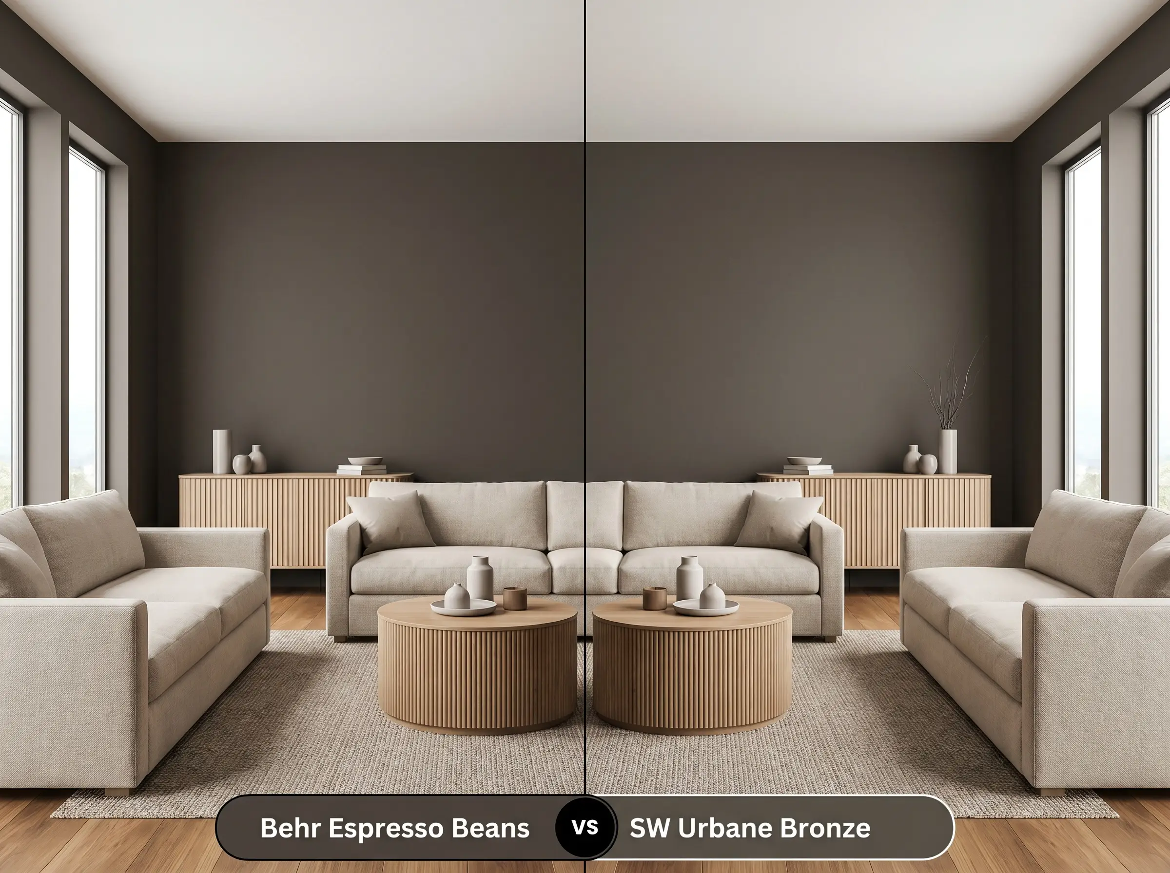
While both are incredibly popular dark neutrals, their core DNA is entirely different. Urbane Bronze SW 7048 is fundamentally a dark gray with a heavy brown/bronze undertone, meaning it will always read cooler and more industrial. Behr PPU5-01 is a true brown with a charcoal micro-nuance. If your room has plenty of warm wood tones and you want a rich, cozy embrace, choose the Behr option; if you want a sleeker, more modern gray-leaning anchor, Urbane Bronze is the winner.
Behr Espresso Beans vs. Benjamin Moore Espresso Bean
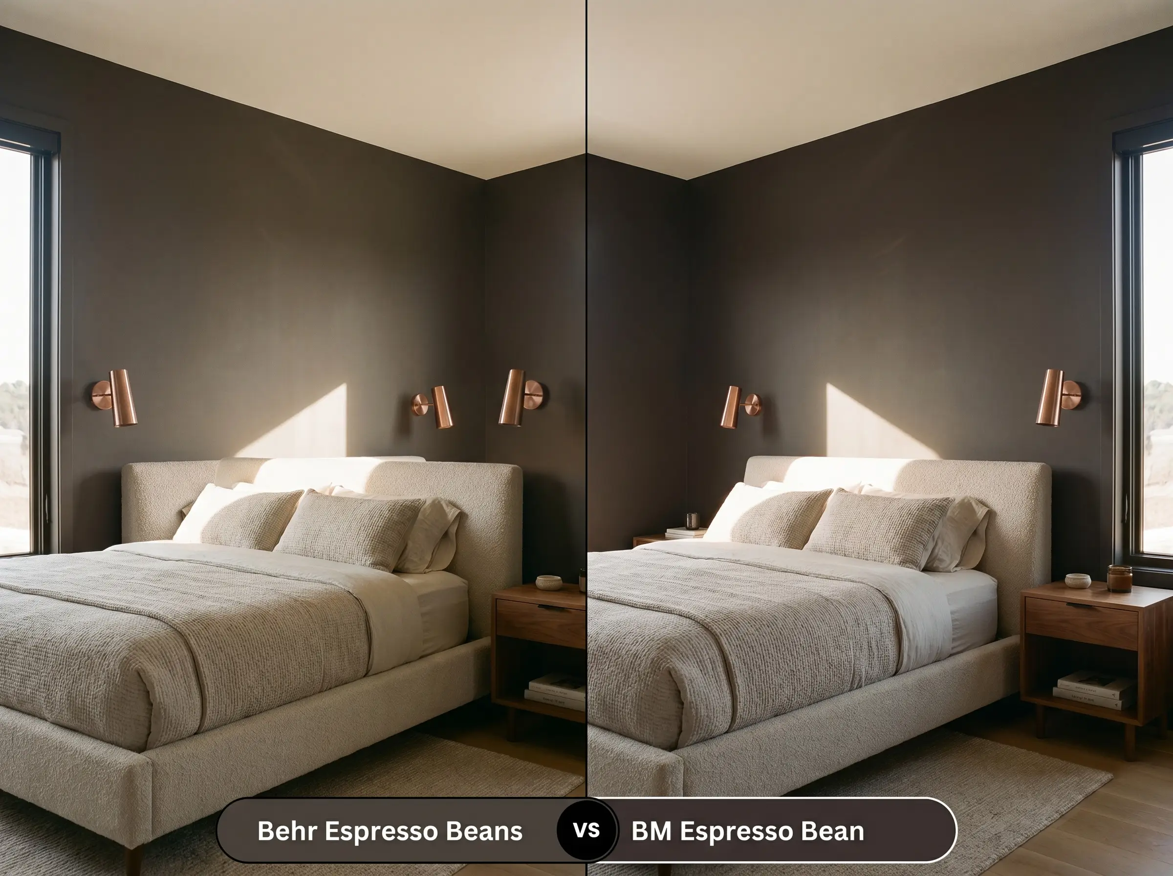
Will Espresso Beans work with your specific lighting, floor, or furniture?
Despite the nearly identical names, these two colors behave differently on the wall. Benjamin Moore Espresso Bean CSP-30 has a slightly higher LRV and leans a bit more into a red/purple undertone, giving it a slightly more traditional, mahogany feel. The Behr version is darker, heavier, and relies on its charcoal base to stay neutral. If you are worried about your brown walls looking too red in south-facing light, the Behr formulation is the safer, more modern choice.
Similar Colors & Brand Equivalents
If you love the concept of this deep brown but need a slight adjustment for your specific lighting or local store availability, there are excellent alternatives to consider.
Same-Brand Alternatives
Cross-Brand Matches
Painting with Behr Espresso Beans: Practical Advice
Executing a flawless finish with a color this dark requires strategic planning. Dark paints show imperfections much more readily than light colors, so preparation is key.
The Dynamic Sheen Guide
Primer Strategy
You cannot skip primer when painting with a color this deep. Applying it directly over a light wall will result in a streaky, uneven finish. You must use a high-quality primer tinted to a dark gray. A tinted primer creates a solid, neutral base that allows the rich brown to achieve its true depth in just two coats, saving you time and expensive paint.
Dark colors are notorious for “flashing”—a visual failure where the paint looks shiny or uneven in certain spots due to overlapping roller marks. To avoid this, always maintain a “wet edge” while rolling, work in small sections, and never go back over paint that has already started to dry.
Hackrea Pro-Tip (The Flashing Warning)
Coverage & Success Tips
Even with a tinted gray primer, expect to apply a minimum of two full coats to achieve the true, saturated color. If you are painting highly porous surfaces like raw wood or builder-grade flat paint, a third coat may be necessary to ensure the charcoal undertones distribute evenly. Touch-ups on dark, flat paint are notoriously difficult; always feather your touch-ups lightly with a nearly dry brush to blend the edges.
Frequently Asked Questions
Because natural sunlight significantly washes out dark colors, it will rarely look like a true black on an exterior facade. In direct sun, it will read as a very deep, rich brown, though it may appear black in heavy shade or under deep eaves.
It offers a much softer, more organic look than a true black. While black cabinets can sometimes feel stark or industrial, the warm mocha undertones in this paint make the kitchen feel inviting, grounded, and beautifully custom.
Absolutely, but you must lean into the moodiness. Because there is no natural light to pull out the warmth, it will read very dark. Counteract this by using layered, warm artificial lighting (2700K sconces) and reflective metallic hardware to bounce light around the small space.
Cooler lighting temperatures (like 4000K daylight bulbs) will neutralize the warm mocha notes entirely. The paint will lose its cozy richness and shift heavily toward its charcoal base, resulting in a stark, slightly sterile dark gray-brown.
Final Verdict & Expert Warnings
Behr Espresso Beans PPU5-01 is an incredibly powerful architectural tool for anyone looking to add heavy, grounded drama to their home. Its absolute best application is in spaces that crave intimacy and warmth—think color-drenched dining rooms, cozy home libraries, or as a rich, grounding base for lower kitchen cabinetry. It is perfect for the homeowner who wants the striking contrast of black trim or dark walls, but prefers an aesthetic that feels organic, welcoming, and deeply layered.
However, you must be highly strategic with your existing fixed elements. This caffeinated dark brown will clash severely with heavy, red-toned cherry wood floors, as the competing warm tones will fight for dominance and make the paint look muddy. Similarly, if your home is filled with cool, icy gray carpets or stark blue-white countertops, this heavy brown will look entirely out of place, creating a disjointed, chaotic energy. To succeed with this color, you must commit to a palette of warm, complex neutrals, organic textures, and layered, intentional lighting.
Room Compatibility & Clashes Diagnoses
Hackrea's reports evaluating the compatibility of Espresso Beans in real rooms.No compatibility tests for Espresso Beans yet.
Be the first to see how this color reacts to your space. Run a free architectural diagnostic now.
Closest Cross-Brand Equivalents
The absolute closest scientific color matches for Espresso Beans across top paint brands.